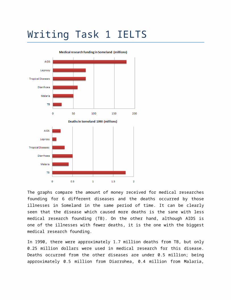
Writing Task 1 IELTS The graphs compare the amount of money received for medical researches founding for 6 different diseases and the deaths occurred by those illnesses in Someland in the same period of time. It can be clearly seen that the disease which caused more deaths is the sane with less medical research founding (TB). On the other hand, although AIDS is one of the illnesses with fewer deaths, it is the one with the biggest medical research founding. In 1990, there were approximately 1.7 million deaths from TB, but only 0.25 million dollars were used in medical research for this disease. Deaths occurred from the other diseases are under 0.5 million; being approximately 0.5 million from Diarrohea, 0.4 million from Malaria,
Transcript
Writing Task 1 IELTS
The graphs compare the amount of money received for medical researchesfounding for 6 different diseases and the deaths occurred by thoseillnesses in Someland in the same period of time. It can be clearlyseen that the disease which caused more deaths is the sane with lessmedical research founding (TB). On the other hand, although AIDS isone of the illnesses with fewer deaths, it is the one with the biggestmedical research founding.
In 1990, there were approximately 1.7 million deaths from TB, but only0.25 million dollars were used in medical research for this disease.Deaths occurred from the other diseases are under 0.5 million; beingapproximately 0.5 million from Diarrohea, 0.4 million from Malaria,
0.3 million from tropical diseases, 0.2 million from AIDS and about0.1 million from Leprosy.
In terms of medical research funding, AIDS was the disease with thebiggest funding (about 170 million), followed by Leprosy and tropicaldiseases with 75 million each. In the third place is Diarrohea (60million), then is Malaria (50 million) and finally TB with nearly 0.25million. (181 words)
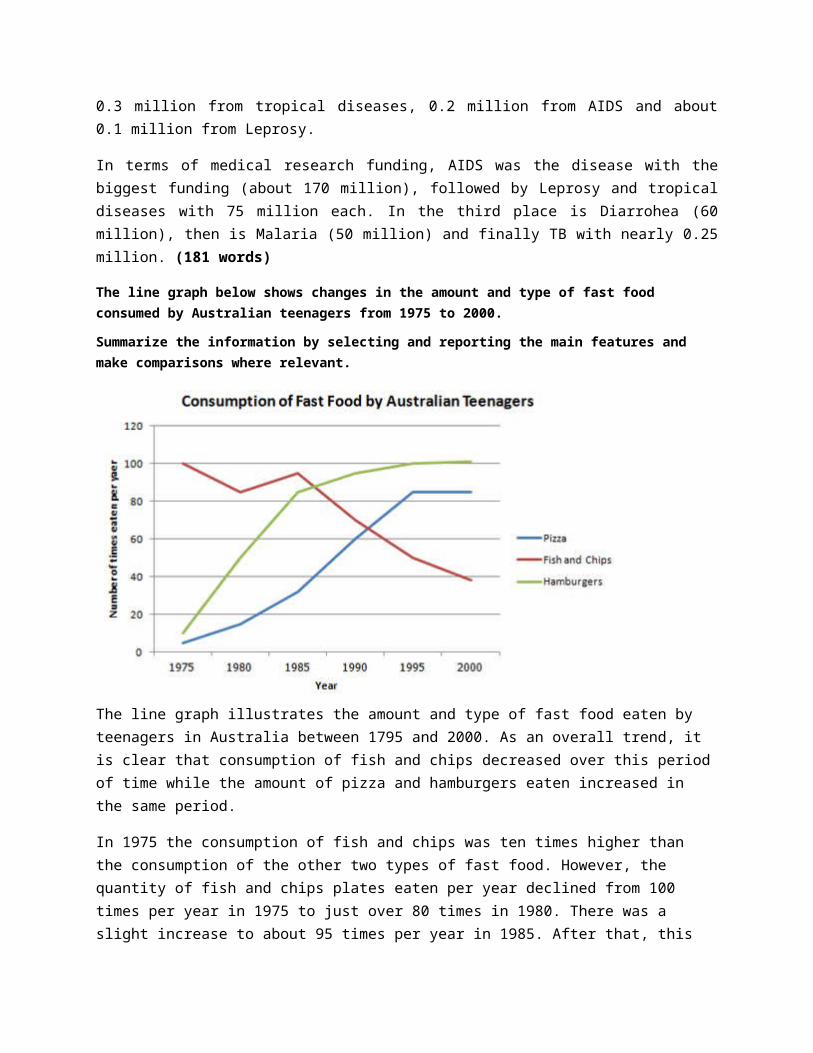
The line graph below shows changes in the amount and type of fast food consumed by Australian teenagers from 1975 to 2000.
Summarize the information by selecting and reporting the main features and make comparisons where relevant.
The line graph illustrates the amount and type of fast food eaten by teenagers in Australia between 1795 and 2000. As an overall trend, it is clear that consumption of fish and chips decreased over this periodof time while the amount of pizza and hamburgers eaten increased in the same period.
In 1975 the consumption of fish and chips was ten times higher than the consumption of the other two types of fast food. However, the quantity of fish and chips plates eaten per year declined from 100 times per year in 1975 to just over 80 times in 1980. There was a slight increase to about 95 times per year in 1985. After that, this
trend kept falling and reached the lowest point in 2000 (just under 40times that year).
In contrast, the amount of hamburgers and pizzas eaten rose constantlyfrom about 10 times for hamburgers and 5 times for pizzas in 1975 to approximately 1400 times and 85 times respectively in 1995 and this remained constant for the next 5 years. (177 words)
From model answer:
In sharp contrast to this, teenagers ate the other two fast foods at much higher levels. Pizza consumption increased gradually until it overtook the consumption of fish and chips in 1990. It then leveled off from 1995 to 2000. The biggest rise was seen in hamburgers, increasing sharply throughout the 1970’s and 1980’s, exceeding fish and chips consumption in 1985. It finished at the same level that fishand chips began, with consumption at 100 times a year.
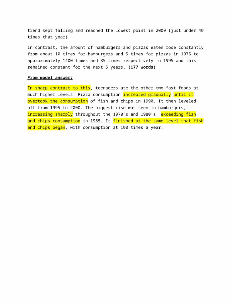
The pie chart shows the amount of money that a children's charity located in the USA spent and received in one year.Summarize the information by selecting and reporting the main featuresand make comparisons where relevant.
The pie charts illustrate the revenue sources and expenditures of achildren´s charity in the USA in one year. Overall, it can be seenthat the principal income came from donated food and that the biggestexpenditure by far was program services. Money received was justenough to cover all the expenses.
Donated food was the biggest source of revenue with more than four-fifths of the total, followed by community contributions with justover 10%. Other sources of income reported by the children´s charitysummed 2.8% of the total received. These other sources were: Programrevenue (2.2%), investment income (0.2%), government grants (0.2%) andother income (0.4%).
There were just three expenditure items being program services theprincipal one accounting 95.8% of the total. The other two categorieswere fundraising and management and general (2.6% and 1.6%respectively). The total income was $53,561,580 exceeding with a
little more than $330,000 the amount of money spent in one year($53,224,896). (159 Words)
From model answer:
The other categories were much smaller. Community contributions, whichwere the second largest revenue source, brought in 10.4% of overallincome, and this was followed by program revenue, at 2.2%. Investmentincome, government grants, and other income were very small sources ofrevenue, accounting for only 0.8% combined.
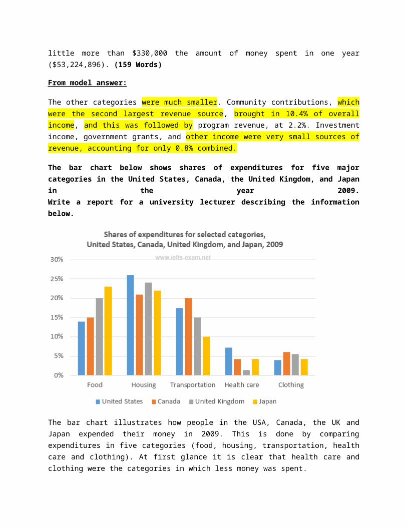
The bar chart below shows shares of expenditures for five majorcategories in the United States, Canada, the United Kingdom, and Japanin the year 2009.Write a report for a university lecturer describing the informationbelow.
The bar chart illustrates how people in the USA, Canada, the UK andJapan expended their money in 2009. This is done by comparingexpenditures in five categories (food, housing, transportation, healthcare and clothing). At first glance it is clear that health care andclothing were the categories in which less money was spent.
In 2009, housing had the highest expenditures in all countries exceptJapan. It represented between 20% and 25% of total expenditures. TheUSA had the highest housing expenditure share being just above 25%. InJapan food expenditure share was the biggest but it was just slightlyabove housing share at around 23%.
People in Canada spent 20 % in transportation which was the largestshare of all four countries. This figure was just under housing shareexpenditure in Canada.
The UK was the country with the lowest health care expenditure in 2009at approximately 1%. The country with the highest expenditure in thiscategory was the USA with about 7% of the total. (167 words)
The pie chart below shows the main reasons why agricultural land becomes lessproductive. The table shows how these causes affected three regions of theworld during the 1990s.Summarise the information by selecting and reporting the main features, andmake comparisons where relevant.
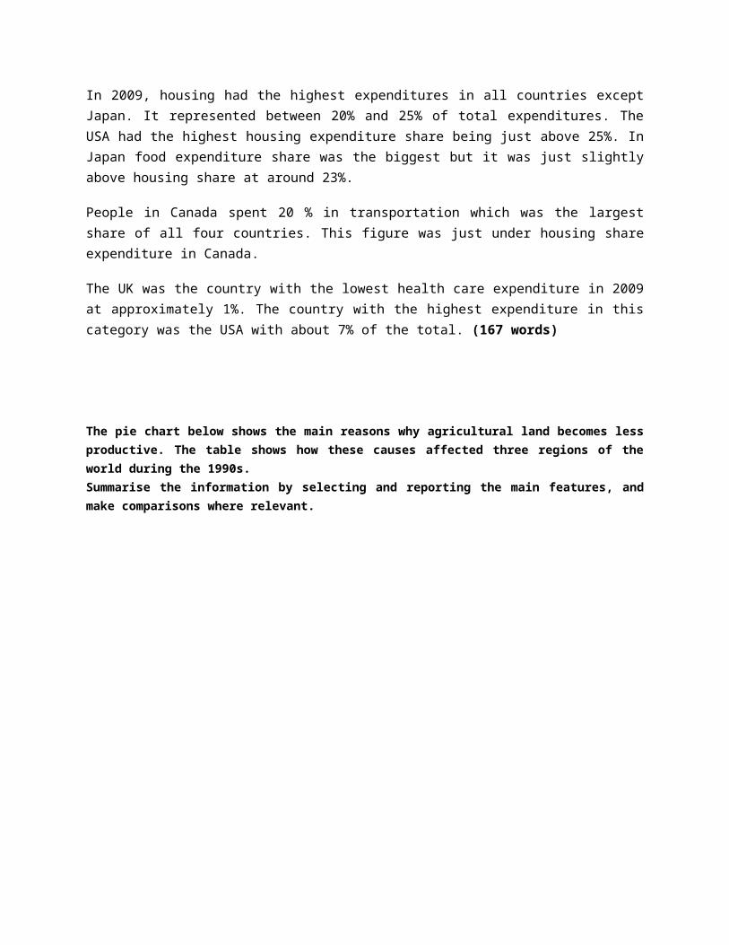
The pie chart illustrates the principal causes of land degradation worldwidewhile the table shows the main reasons of land degradation in three regions:North America, Europe and Oceania in the 90’s.
There are three principal causes of this problem: over-grazing, deforestationand over-cultivation. It is evident that the main cause worldwide is over-grazing. However, it can be seen from the table that during the 1990’s themain cause was different in each region.
Over-grazing is the principal reason of land degradation worldwide accounting35%. The second cause is deforestation which accounts 5% less than over-grazing. Finally, over-cultivation is the third main reason with 28%. Otherreasons sum 7% of the total.
During the 1990’s Europe was the country with the highest land degradedpercentage (23%) among the three regions. The reasons of land degradation inEurope were deforestation (9,8%), over-cultivation (7,7%) and over-grazing(5,5%). Oceania followed Europe accounting 13%, but in this region the maincause was over-grazing (11,3%), and over-cultivation was not a cause of land
degradation. Finally, in North America just 5% of the land was degraded, andover-cultivation was the principal reason of land degradation in this region.(192 words)
The table shows the Proportions of Pupils Attending Four Secondary School Types Between 2000 and 2009Summarize the information by selecting and reporting the main features and make comparisons where relevant.
The table illustrates the percentage of school students attending fourdifferent types of secondary schools from 2000 to 2009. Overall, it isevident that the percentage of pupils attending community schoolsincreased during the nine-year period, while the proportion ofstudents assisting the other three types of secondary schools(specialist schools, grammar schools and voluntary-controlled schools)experienced a decrease over the same period.
In 2000 approximately half of the students attended voluntary-controlled schools, but this proportion declined constantly andreached 20% in 2009. The second most attended type of secondary schoolin 2000 was grammar schools, which also experience a reduction in theattendance from 24% to 12% in 2009. Specialist schools attendanceremained almost constant with a decrease of 2% during the same period.
In contrast, the percentage of pupils attending community schools roseconstantly from 12% in 2000 (the same proportion of attendance tospecialist schools in that year) to almost three-fifths after nineyears. Among the four types of secondary schools, community schoolswere the only type which experienced an increase in the attendancefrom 2000 to 2009. (181 words)
From model answerTo begin, the proportion in voluntary-controlled schools fell from just overhalf to only 20% or one fifth from 2000 to 2009. Similarly, the relativenumber of children in grammar schools -- just under one quarter -- dropped byhalf in the same period. As for the specialist schools, the relatively smallpercentage of pupils attending this type of school (12%) also fell, althoughnot significantly.
However, while the other three types of school declined in importance, theopposite was true in the case of community schools. In fact, while only asmall minority of 12% were educated in these schools in 2000, this figureincreased to well over half of all pupils during the following nine years.
Below is a map of the city of Brandfield. City planners have decided to build a new shopping mall for the area, and two sites, S1 and S2 have been proposed.Summarize the information by selecting and reporting the main features and make comparisons where relevant.
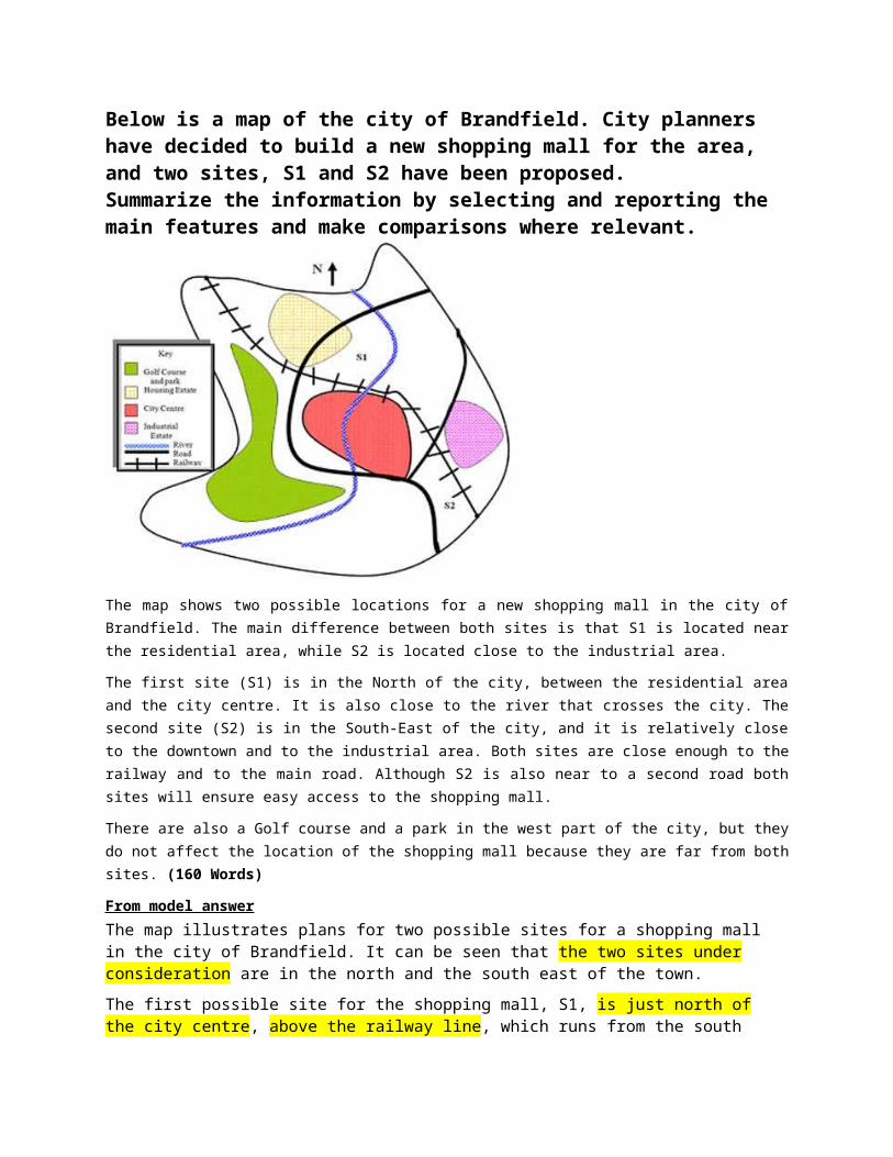
The map shows two possible locations for a new shopping mall in the city ofBrandfield. The main difference between both sites is that S1 is located nearthe residential area, while S2 is located close to the industrial area.
The first site (S1) is in the North of the city, between the residential areaand the city centre. It is also close to the river that crosses the city. Thesecond site (S2) is in the South-East of the city, and it is relatively closeto the downtown and to the industrial area. Both sites are close enough to therailway and to the main road. Although S2 is also near to a second road bothsites will ensure easy access to the shopping mall.
There are also a Golf course and a park in the west part of the city, but theydo not affect the location of the shopping mall because they are far from bothsites. (160 Words)
From model answerThe map illustrates plans for two possible sites for a shopping mall in the city of Brandfield. It can be seen that the two sites under consideration are in the north and the south east of the town.The first possible site for the shopping mall, S1, is just north of the city centre, above the railway line, which runs from the south
east of the city to the north west. If it is built here, it will be next to a large housing estate, thus providing easy access for those living on the estate and in the city centre. It will also be next to the river, which runs through the town.The site in the south east, S2, is again just by the railway line and fairly close to the city centre, but it is near to an industrial estate rather than housing.There is a main road that runs through the city and is close to both sites, thus providing good road access to either location. A large golf course and park in the west of the town prevents this area from being available as a site.
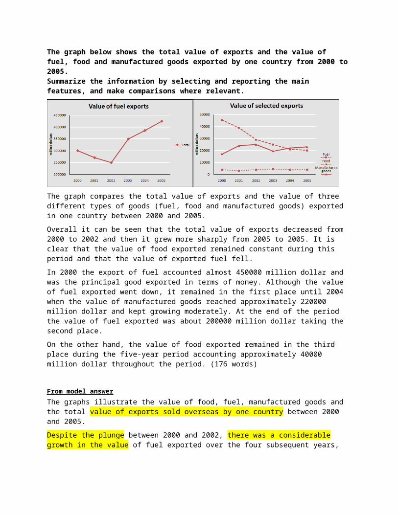
The graph below shows the total value of exports and the value of fuel, food and manufactured goods exported by one country from 2000 to2005.Summarize the information by selecting and reporting the main features, and make comparisons where relevant.
The graph compares the total value of exports and the value of three different types of goods (fuel, food and manufactured goods) exported in one country between 2000 and 2005.Overall it can be seen that the total value of exports decreased from 2000 to 2002 and then it grew more sharply from 2005 to 2005. It is clear that the value of food exported remained constant during this period and that the value of exported fuel fell.In 2000 the export of fuel accounted almost 450000 million dollar and was the principal good exported in terms of money. Although the value of fuel exported went down, it remained in the first place until 2004 when the value of manufactured goods reached approximately 220000 million dollar and kept growing moderately. At the end of the period the value of fuel exported was about 200000 million dollar taking the second place.On the other hand, the value of food exported remained in the third place during the five-year period accounting approximately 40000 million dollar throughout the period. (176 words)
From model answerThe graphs illustrate the value of food, fuel, manufactured goods and the total value of exports sold overseas by one country between 2000 and 2005. Despite the plunge between 2000 and 2002, there was a considerable growth in the value of fuel exported over the four subsequent years,
reaching 350000 million dollars in 2003, and rising further to a new height well above 400000 million dollars by the year 2005. Despite a slight fall in 2003, there was a marked upward trend for thenext years showing a little more than 20,000 in 2005. In terms of food, this remained relatively stable throughout the period, fluctuating below 5,000 million dollars.
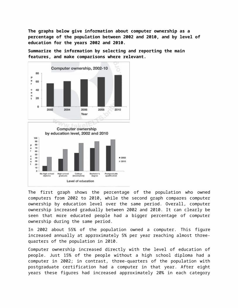
The graphs below give information about computer ownership as a percentage of the population between 2002 and 2010, and by level of education for the years 2002 and 2010.Summarize the information by selecting and reporting the main features, and make comparisons where relevant.
The first graph shows the percentage of the population who ownedcomputers from 2002 to 2010, while the second graph compares computerownership by education level over the same period. Overall, computerownership increased gradually between 2002 and 2010. It can clearly beseen that more educated people had a bigger percentage of computerownership during the same period.In 2002 about 55% of the population owned a computer. This figureincreased annually at approximately 5% per year reaching almost three-quarters of the population in 2010.Computer ownership increased directly with the level of education ofpeople. Just 15% of the people without a high school diploma had acomputer in 2002; in contrast, three-quarters of the population withpostgraduate certification had a computer in that year. After eightyears these figures had increased approximately 20% in each category
of education level. People studying at the college or with a degree(bachelor or postgraduate) had higher percentages of ownership in 2010(between 85% and 95%), while lower percentages corresponded to peoplewith or without a high school diploma (between 40% and 65% in 2010).(184 words)