

1
1403 Appendices: Excel
Table of Contents
Page
I. Three Ways to Load Excel 2
II. Excel Ribbons 3
a. Home
b. Insert
c. Page Layout
d. Review
e. View
III. Setting Up Quick Access Toolbar 4
IV. Using Quick Access Toolbar 6
a. Save
b. Save As
c. Undo
d. Redo
V. Format Cells 7
a. Quick Access Toolbar Functions
i. Number Tab
ii. Alignment Tab
iii. Font Tab
iv. Border Tab
v. Fill Tab
b. Insert Symbol
c. Formatting a Spreadsheet 10
i. Merge Cells/Wrap Text
ii. Subscript/Superscript
iii. Font Size
iv. Bold/Italics/Underline
v. Font Style
vi. Greek Symbols
VI. Creating a Graph from Data 14
a. Insert Chart (Graph)
b. Create Graph Titles
VII. Adding Mathematical Fits to Graphs 16
VIII. Mathematical Manipulation of Data 19
IX. Changing Data in a Graph 20
Note: online video tutorials are available at: http://www.ualr.edu/rebelford/labs/excelvideo.htm

2
I. Three Ways to Open Excel
1. Right-click on Desk Top, Click New/Microsoft Excel Worksheet.
Note this places a worksheet called “New Microsoft Excel Worksheet” on your desktop.
You should now click on the name (not icon and change the name). Once this is done,
double click on the worksheet.
2. Double click either the Microsoft Excel icon on the desktop.
3. Click the start menu at the bottom left corner.
a. Click the Excel Icon if present .
b. Click /All Programs/Microsoft Office/Microsoft 2010 Excel 2010.

3
II. Using the Excel Ribbon
The ribbon in Excel consists of a series of tabs with buttons to allow the user to have
additional abilities and functions with quick access while working with spreadsheets.
Among using the tabs on the ribbon the user will be able to apply formatting options,
page layout options and to specify data or graphing needs. This will be done by first
selecting the appropriate ribbon tab for a desired action, followed by the button within the
new tab to achieve a specific function.
Quick Access Toolbar Individual Functions for Home Ribbon
Ribbons Tabs
Some of the major functions of the Ribbon bar used in chemistry are:
Home: Clipboard: Copy, Paste, Cut
Font: Size, Effects, Color, Type, Fill\
Alignment: Merge, Wrap, Indent\
Insert: Tables, Pictures, Shapes, Illustrations, Charts, Text
Boxes, Headers, Footers, Equations, Symbols
Page Layout: Margins, Orientation, Page formatting
Review: Spelling
View: Zoom, Workbook Views

4
III. Setting up the Quick Access Toolbar
The Quick access toolbar allows for frequently used functions to be placed at the top of
the Excel Ribbon. This makes these functions available no matter which ribbon tab the
user is currently on. Follow these steps to customize the quick access toolbar.
1. Start by right clicking on the Quick Access tool bar. This will give you several options
to choose from. Choose the option that says “Customize Quick Access
Right click in blank space
2. This will open a window allowing the user to add or remove buttons from the quick
access toolbar. This is also the same window that controls many other settings, such
as defining where to save a document and many of the general settings and behaviors
used within excel.
Notes:
1. A second technique to add a function icon to the quick access toolbar is to right
click on the icon in any Ribbon, and choose the “Add to Quick Access Toolbar”
option.
2. In the SCLB computer lab the quick access toolbar will be different for different
user logins. So you should try and use the same computer each time, or
customize multiple computers. But once you have customized it, other students
will not change it when they are logged in.
Tip: familiarize yourself with the right click options and then add to the quick access
toolbar those options which are not available through the right click.

5
Recommended Functions to be added to the Quick Access Toolbar Include “Save”, “Save As”,
“Undo”, “Redo”, “Format cells: Font”, “Equation Symbols”, “Insert Chart”, “Chart Layouts”,
and “Insert Function”
3. Make sure that the
tab for “Quick Access
Toolbar” is selected.
4. Elect the dropdown box for “choose commands
from” and select “All Commands” (the default is
“Popular Commands”.
5. Click the needed tabs to
highlight them and then click the
add button to move the function
into the current toolbar.
6. The new functions will be
placed in the box above. Once all
needed functions are added, click
OK to return to the Excel
Worksheet.

6
IV. Using the Quick Access Toolbar Buttons
Quick Access Buttons
a) Save
b) Save As
c) Undo
d) Redo
a. Save (Ctrl + S)
Clicking the Save button will allow the user to save a copy of the excel worksheet if
the file has already been previously saved. If the file has not been previously saved,
the “save as” window will open asking for a location and name for the file to be
saved. YOU SHOULD SAVE YOUR WORK FREQUENTLY – every time you
have done something that took time!
b. Save As (F12)
Clicking this button will bring up the “Save As” window asking for a location and
name to save the file regardless of whether the file has been previously saved. This is
very useful when multiple revisions must be made. You can also save the file in
different formats.
c. Undo (Ctrl + Z)
Clicking this button will take the spreadsheet back before the last command was
made allowing unnecessary changes to be corrected. You can go back several steps.
This is very useful if you make a mistake
d. Redo (Ctrl + Y)
This will undo and undo, (to add a command that was previously undone).
Save
Save As
Undo
Redo
Format Cells:Font
Cells:Font Insert Chart (Graph)
Insert Sympol Chart (Graph) Layouts

7
V. Format Cells
a. Quick Access Toolbar Format Cells: Font Functions Format Cells: Font NOTE: RIGHT CLICK will often get you these functions
1. Number Tab
2. Alignment Tab
3. Font Tab
4. Border Tab
5. Fill Tab
i. Number tab
Allows several categories or pre-defined
formats to be selected for one or more cells.
The most commonly used will be General,
Number, Date, Percentage, Fraction and
Scientific. After selecting the category,
more options may appear to the right to
further define the format of the cell. Select
appropriate options followed by the OK
button at the bottom right of the window to
apply the new settings.
ii. Alignment tab
Will allow for horizontal and vertical
alignment settings to be set for one or
more cells using the drop down. The most
important and useful options within this
tab include the wrap text and merge cells.
Use the wrap text to keep the width of a
cell at a standard size and the cell will add
depth to compensate for cropping
characters. The Merge cell box will make
multiple cells into one to make presentable
tables.

8
iii. Font tab
chose font type (symbols have
Greek prefixes)
Italic/bold
font size
subscripts
superscripts
font color
iv. Border tab
Select one or more cells in a
worksheet and then access this
dialog box. Apply a color and style
for the border.
Data cells should have solid
borders. This is done by clicking
outline and inside

9
b. Insert Symbol
There are several convenient ways to insert Greek Symbols when working with
Excel.
v. Fill Tab
allows for the shading of cells.
Select a single cell or multiple cells
and open this dialog box. Then
select a color and fill effects if
needed. This is a very useful tool
in helping to separate Column
headings from the data underneath.
2. Click the Quick Access Toolbar button “Symbol”. A new window will appear

10
c. Formatting a Spread Spreadsheet
i. Merge Cells/Wrap Text
ii. Subscript/Superscript
iii. Font Size
iv. Bold/Italics/Underline
v. Font Style
vi. Greek Characters
i.) Merge Cells & Wrap Text
From the alignment option you can also control the location of the text within the cell.
1. Start by selecting the cells
that you would like to merge.
2. Then select the Quick Access
Button “Format Cells: Font”
3. A new window will
appear. Make sure that
the Alignment tab is
selected.
To Merge Cells: Put a check in the box
labeled “Merge Cells” and hit OK.
To Wrap Text: Put a check in the box labeled
“Wrap Text” and hit OK.

11
ii.) Subscripts/Superscript using Right Click
1. Begin by highlighting text to be converted to a
subscript/Superscript.
2. Once the text is highlighted, right click on the
converted text and select format cells.
.
iii.) Font/Size
Font size can be selected either before typing or after typing and normal font options are
available in the Home Ribbon
Select the drop down box for the font size selection after double clicking the cell to be formatted
and select desired size.
Another way to change font size is to double click within a
cell and right click, selecting format cells. A new window
will appear allowing for the selection of a font size.
3. A new window will appear with
text formatting options. Select
either the checkbox for subscript
or superscript. Select “OK”
If it is necessary to just increase or decrease font
size without a particular value in mind, the text can
be highlighted and font formatting buttons can be
used to increase and decrease to the next available
size.

12
iv.) Bold/Italics/Underline Font formatting
Bold Italics Underline
v.) Font Style:
The style of font may selected using the toolbar buttons
above before typing or after typing by selecting relevant
text, followed by the appropriate button.
Text may also be highlighted, and then followed by a
right click and selecting format cells. In the new
window select the Font style needed and then OK.
vi.) Greek Symbols
There are several convenient ways to insert Greek Symbols when working with Excel.
1. Start by clicking within a cell and setting
the cursor where you want the Greek
Symbol to be placed.
2. Click the Quick Access Toolbar
button “Symbol”. A new window
will appear

13
There is an alternate way to Insert Greek Symbols which is through the keyboard and may be
more beneficial if several Greek symbols are needed within a cell.
1. Start by placing the cursor within a cell or text box where the needed symbols will go.
Then select the quick access toolbar button “Format Cells: Font” and choose symbol. This
can also be accessed from the dropdown box on the “home” ribbon or through a right click.
2. Select the Font
“Symbol” and click Ok.
3. Now with the font specified you
may type symbols through your
keyboard.
This window has many options. Select the font option Symbol
Select the symbol from the recently used symbols or the large grid above. To insert a symbol double
click on the icon or click once to highlight and then click the insert button at the bottom right.

14
VI. Creating a Graph from Data a. Insert Chart (Graph)
Step 1: Highlight data of two columns
you wish to graph. The left column
will be the x-axis and the right will
be the y-axis.
If the columns are not near each other
highlight the first, then while pressing
the “ctrl” key, highlight the second.
Step 2: Click the Insert Chart Icon
of the Quick Access Toolbar (above)
Step 3: Choose X,Y Scatter
You have several options
Scatter with only markers
scatter with markers
Scatter with smooth lines
Scatter with straight lines
and markers
Scatter with straight lines
Chart will display as an object
in spreadsheet. Move the graph
to where it looks good.
Make sure the graph is not
on a page edge when you
print it
Use Insert Chart Icon
15
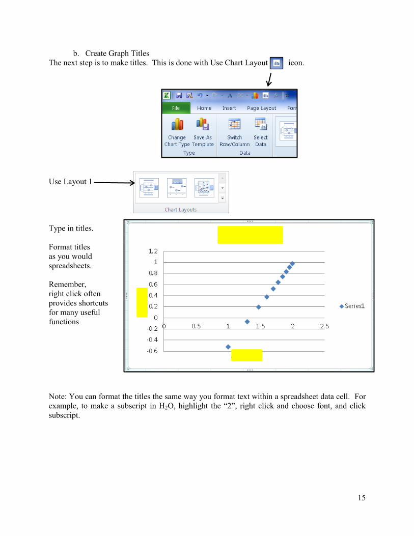
b. Create Graph Titles
The next step is to make titles. This is done with Use Chart Layout icon.
Use Layout 1
Type in titles.
Format titles
as you would
spreadsheets.
Remember,
right click often
provides shortcuts
for many useful
functions
Note: You can format the titles the same way you format text within a spreadsheet data cell. For
example, to make a subscript in H2O, highlight the “2”, right click and choose font, and click
subscript.

16
VII. Adding Mathematical Fits to Graphs
You will be doing linear, power and exponential fits to your data by adding a trendline, and then
showing he equation on your graph.
i. Adding a Trendline
To add a trendline, make sure that the graph is complete and all of the needed data has
been plotted. A completed graph is shown below using the X-Y scatter design with an
option to not connect the points with a line.
1. To add a trend line, begin by right
clicking on a data point. There should be an
option that says “Add Trendline” as shown
in the figure to the right. Select this option
and a new window with many options will
appear.
2. The new window will usually select
“Linear” regression type by default as
the window opens. Any changes made
on this window will automatically apply
to the graph in real time without having
to close the window. The most
commonly used will be “Linear”,
“Exponential”, and “Power”. Note, a
power function must go through origin
(0,0) and do not try and plot data where
either x or y is not equal to zero when
the other is.

17
ii. Show Trendline Equation
Usually when adding a trendline, you will want to select two options to go with the
Trendline being added.
1. When the window opens
while adding a “Trendline”,
there will be several options.
At the bottom of the
window, there will be
several check boxes. For
most Trendlines used this
semester, you will want to
show the equation and the
R-squared value. To do this
select, both check boxes.
The graph below shows
these options when selected.

18
iii. Force Trendline Through Origin
Sometimes you will want to force the trendline through the origins.
Note, for a linear fit y-mx+b the equation becomes y = mx when you force
the line through the origin.
1. To make the Trendline go
through the origin, right click
on the Trendline and select
“Format Trendline”. A new
window will open.
2. At the bottom of the
window select the option
“Set Intercept” and make
sure the value is set to “0,0”.
This should stretch the
Trendline through the origin
as shown below.

19
VIII. Mathematical Manipulation of Data
You will often have to perform mathematical operations on a column of data. Here we will look
at two data columns from a series of experiments, one of mass, and one of volume. We will then
calculate the density for each experiment
Other operations you will use
this semester are
1. base 10 logs: =log(cell value)
2. Natural logs: =ln(cell value)
3. Reciprocal Values =1/(cell value)
4. multiplication (here by 2) =2*(cell value)
5. exponentiation (squared) =(cell value)^2
Into column d we are are going to
calculate the density from from the
data in columns B and C.
Into cell D2 we type the
equation =()/()
Place the curser between the
first set of parenthesis (by left
clicking) and then click onto
cell B2 and press enter
Repeat this for the second set
of parenthesis, but click on cell
C2 and press enter.
Cell D2 should now have the
equation =(B2)/(C2)
You will now see the number
0.941627
Click on this cell and you will
see a little square in the bottom
right corner
Place the curser on this cell and
drag down
This will repeast the operation
for all the rows you drag over
(rows 2-10 here)

20
IX. Changing Data for a Graph
a. Change Graph Data
b. Switch Axis
Once you have created a spreadsheet you can use it as a template for future experiments. So for
a future experiment, you can click on the graphs from experiment 1, save with a new file name,
and then simply change the data associated with a graph. You now need to edit the spreadsheet
and graphs to fit the new experiment, but this can save you a lot of time. We will now look at
Changing data
Figure VIII.1 Shows a plot of solubility as a function of temperature from the data in “run 1”.
We will now take new data from run 2 and make a plot of the rate as a function of time.
1). Right Click in graph area and a pop-up box will appear
2). Click “Select Data”
A new option box will open (fig VIII.2). Note
The data being plotted from Run 1 is outlined:
3). Click Edit (if more than one series of data is plotted you need to choose which series you
wish to edit). The Edit Series box appears (Fig VIII.3)
Fig VIII.1: Plot of run 1
Fig VIII.2: Select Data Source box is activated.

21
4). To change x-Axis data click grid box
to left of Series X values
The data that is originally plotted will now
be outlined (Fig VIII.4)
5). Highlight the new data you want to plot and click the grid box on the edit series pop-up
window.
6). Repeat for the Y-axis, and click OK twice
Note the scales automatically adjusted. You now need to edit the titles and save the graph with a
new name.
The same technique can be used to swap axis if you accidentally plotted the wrong columns.
Fig VIII.3: Edit Series box .
Fig VIII.4: After clicking grid box on x-axis you can
See what was plotted by the double lines .
Fig VIII.5: Highlighting new data associates it with the graph. Then click the box
Fig VIII.6: New data being plotted in graph


![Sod Crystal - Use Excel instead instead.docx · Web viewOpen a blank Excel worksheet then click menu [in 2010] DATA / FROM OTHER SOURCES / FROM MICROSOFT QUERY.](https://static.documents.pub/doc/80x56/5e0ca4a82128b95ee23e88c3/sod-crystal-use-excel-insteaddocx-web-viewopen-a-blank-excel-worksheet-then.jpg)


