

The Azania font catalogue Spring2012
Azania™

2
A NEW TEXT TYPEFACE FAMILY OF 12 FONTS
designed by Jan Erasmus circa2012
†Licensed and
distributed by CyberGraphics cc
© 2 0 1 2
Azania™
In the period when
Apartheid South Africa had diplomatic relations with the Republic of China on Taiwan,
the People’s Republic of China
officially referred to
“Azania” South Africa as
called Azania.
there was a placeOnce upon a time

2 3
of a humanist slab-serif designed by Benton Hasebe and was released by Emigre in 2010 halfway through my project that served as a reality check.
Azania was started over 2 years ago and developed at CyberGraphics, Kensington, Johannesburg. I decided to design a humanist slab-serif typeface specifically designed to work in small sizes instead of a geometric slab-serif witch there are 100s of designs without no modulation and boring with exceptions like Archer from H&FJ.
I wanted to create a humanist text face that would achieve legibility by avoiding the usual contrast, especially in the Book weight. There is only a slight amount of contrast visible in the thinning of curves as they join the vertical stems as optical ad-justments to prevent those awkward areas from becoming too
AzaniaAnewhumanistslab-seriffont
The slab-serif letterforms underwent tremendous shifts in form and use within a time span of merely little more than a century. It was originally conceived as a new kind of typeface that broke away from traditional book typography to satisfy the needs of advertising, but by now evolved into something quite far from its original purpose – book typography. This aspect created enough curiosity for me to attempt a contemporary version.
I made a study of Clarendon a branch of slab-serifs, that was gentle, with marked modulation of thick’s and thins, vertical stress and bracketed serifs. Also studied Solus from Eric Gill in 1929 as a revivalist font, but found that the font lacked the “black-ness and insistent slab serifs” that was expected of an Egyptian typeface. He called it a “lite Egyptian”. His Joanna and Solus were clearly slab-serf typefaces that were designed for book typogra-phy, not advertising.
Geometric slab-serif fonts like Karnak, Benton, Rockwell and Memphis did not interest me much as they are almost essentially Futura with added slab serifs added. Not suitable for the setting of lengthy text, cold very cold and impersonal.
I also looked at Humanist slab-serifs from the late 20th century called Scala designed by Marin Mjoor released in 1991 as well as the font Cæcilia, a slab-serif typeface designed by Peter Matthias Noordzij in 1991 witch is optically compensated mono-linear typeface with humanist proportions. Alda, also came under scrutiny. I found that it a very good example

54
dark. It also had to have great display value for headlines and posters in its boldest format. I soon realized that the Extra Bold weigh would need more contrast than the Medium and Bold weigh to avoid clogging. The contrast increases, as the font gets bolder to give enough modulation for visual compensation. Some of the letters like the h, k, u, v, w, x and y required the design to change through the weights to avoid collisions of serifs and keep it open at smaller sizes. I also bulged the caps B, D, P and R above and bellow the x height to sweeten it up a bit but still retain the sturdy, powerful and brave feel.
I spent many months sketching with pencil in a book which were then scanned and used as a templates in FontLab to redrawing the first font in Bold trying to establish its armature and details that determine its darkness and look. I ended up with serifs that are as thick as the main stokes. Clearly a slab serif that is proud to be one.
The tapered serif was inspired by the CAMPARI logo type serifs and seen again recently in the font Council designed by John Downer and Zuzana Licko’s Fairplex, was a given for me. It got rid of the staunches that bothered me about typical geometric slab-serifs. The serif style is called a Detriot style serif done during the early 1900s by sign writers. The tapered serifs are slightly thinner than the main stems but in fact optically equal. The end result was that the top serifs are sloping; its lower serifs are slabs as a style.
The cut and then curve techniques applied to the font were derived from the motion of the broad nib pen, allowing for cuts in the inner counter and outer edges as a result of the calligraphic tendencies of the pen. A bit of the Dwiggins M-formula was also applied to the font. The M in M-Fomula stands for “marionette,” and refers to the principle in puppet making that explains that for the face of a marionette to “read” for viewers sitting far away, the would-be soft features must be translated as sharp planes – “These sharp-cut planes, when viewed on the stage, by some magic transformed themselves into delicately rounded curves and subtle modeling’s; and the faces looked like young girls from clear across the room, as well as from the front benches.” Dwig-gins then gœs on to explain that the curves and lines can be combined to impart a design with “dynamic grace.”
Theitalicsarenotwhatweknowastrueslab-serifitalicsbutmorereminiscentofSansserifitalics.Idrewthemata10degreeslantwithfarlessserifsandjustahintatscript.Theonly2charactersthatarethesameindesignastheRomanistheoandz.

6
And lastly, the name of the font was very important to me. I called it Azania as South Africa was know by some people. In the period when Apartheid South Africa had diplomatic relations with the Republic of China on Taiwan, the People’s Republic of China officially referred to South Africa as “Azania”.
The first mention of the name Azania with a South African connection appeared in the 1930s archæological reports of excavations at Mapungubwe in the northern Transvaal. The skeletal remains were referred to as “ancient Azanians” meaning they were probably Cushitic peoples who had filtered down the Great Rift Valley from Ethiopia and East Africa.
The modern use of Azania as an alternative name for South Africa among revolutionary Black African nationalists only began to become popular in 1979, however, appearing in the names of groups such as the Azanian People’s Organisation, the Pan Africanist Congress of Azania and the Socialist Party of Azania.
At the time of the 1994 multi-racial elections, some proposed “Azania” as an alternative official name for the country, but this never received widespread support - reflecting the overwhelming ANC electoral victory and the PAC's marginalization.

2
Azania BookDefault figures are
Proportional Old-style numbers with an additional
set of Tabular Lining figures.
Advanced OpenType features: Tabular Lining figures
Fractions Standard Ligarures
Discretionary Ligatures
ABCDEFGHIJKLMNOP QRSTUVWXYZabcdefghijklm nopqrstuvwxyz0123456789 ¹²³¾¼½¦&$¢£¥€%‰ 0123456789ÁÀÂÄÃÅÉÈÊË ÍÌÎÏÑÇÓÒÔÖÕÚÙÛÜŸÝÐŁŠ ŽØáàâäãåçéêêëíìîïñóòôöõú ùûüýÿšžøƒ¶§†‡fiflßÆŒ æœThctgiipstÆ挜fiflffffifflfbffbfhffhfjffjfkffkfrffrftfftfyffyky tvttvtwttwtyttybÞþłð∆∏∑π {([b])} +±÷‹«≤<=>≥›»¤√∫≈≠◊ @®©™ ªºµ#ı*^`×´¨• °~¬∞ ,.…:;„¿?¡!‘’“”"', /|\-–—·<> «» ¸˝˛ˇ _ˆ˜¯˘˙˚āăąćĉċčďđēĕėęěĝğġģĥħĩīĭįıijĵ ķĸĺļľŀńņňʼnŋōŏőŕŗřśŝşţťŧ ũūŭůűųŵŷźżžſșțȷĀĂĄĆĈĊČ ĎĐĒĔĖĘĚĜĞĠĢĤĦĨĪĬĮİIJĴĶ ĹĻĽĿŃŅŇŊŌŎŐŔŖŘŚŜŞŢŤŦ ŨŪŬŮŰŲŴŶŹŻŽȘȚ
AzaniaBookItalicDefault figures are
Proportional Old-style numbers with an additional
set of Tabular Lining figures.
Advanced OpenType features: Tabular Lining
figures, Fractions, Discretionary Ligatures.
ABCDEFGHIJKLMNOPQRSTUVWXYZabcdefghijklmnopqrstuvwxyz0123456789¹²³¾¼½¦&$¢£¥€%‰0123456789ÁÀÂÄÃÅÉÈÊËÍÌÎÏÑÇÓÒÔÖÕÚÙÛÜŸÝÐŁŠŽØáàâäãåçéêêëíìîïñóòôöõúùûüýÿšžøƒ¶§†‡fiflßÆŒæœThctgiipstÆ挜fiflffffifflfbffbfhffhfjffjfkffkfrffrftfftfyffykytvttvtwttwtyttybÞþłð∆∏∑π{([b])}+±÷‹«≤<=>≥›»¤√∫≈≠◊@®©™ªºµ#ı*^`×´¨•°~¬∞,.…:;„¿?¡!‘’“”"',/|\-–—·<>«»¸˝˛ˇ_ˆ˜¯˘˙˚āăąćĉċčďđēĕėęěĝğġģĥħĩīĭįıijĵķĸĺļľŀńņňʼnŋōŏőŕŗřśŝşţťŧũūŭůűųŵŷźżžſșțȷĀĂĄĆĈĊČĎĐĒĔĖĘĚĜĞĠĢĤĦĨĪĬĮİIJĴĶĹĻĽĿŃŅŇŊŌŎŐŔŖŘŚŜŞŢŤŦŨŪŬŮŰŲŴŶŹŻŽȘȚ
AZANIA BOOK & BOLD PACKAGE 1
Book
BookItalicsBook Small Caps
Bold Bold Italic
Bold SMALL CAPS
US$ 149.00AZANIA VOLUME ALL
12 FONTS
US$ 238.00AZANIA SINGLES
US$ 35.00ALL PRICES
EXCLUDES 14% VAT
SOFTWARE FORMATS
Mac, Win and Linux OpenType PS1 and TrueType
flavoured.
Character set: Basic Latin + Latin-1
supliment + Latin Extended-A
210
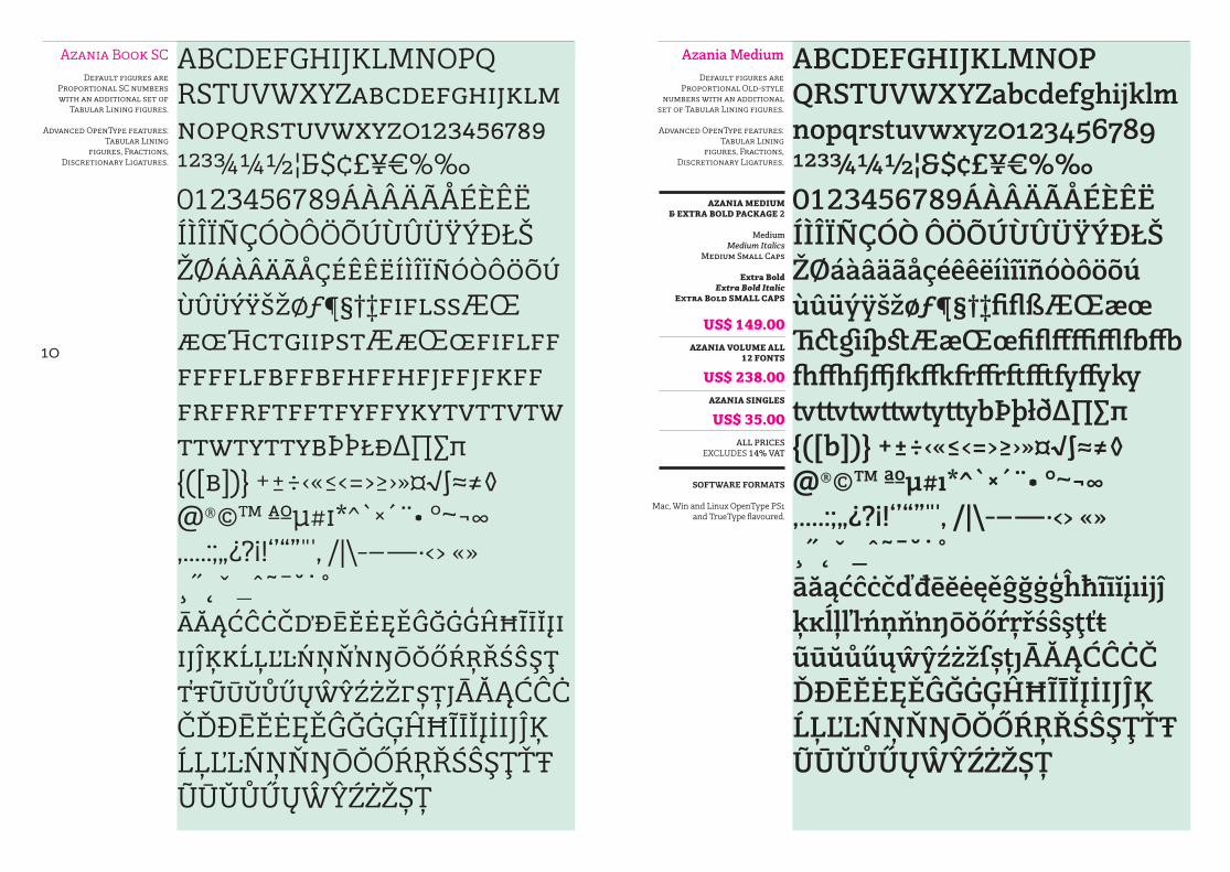
Azania Book SCDefault figures are
Proportional SC numbers with an additional set of
Tabular Lining figures.
Advanced OpenType features: Tabular Lining
figures, Fractions, Discretionary Ligatures.
ABCDEFGHIJKLMNOPQ RSTUVWXYZabcdefghijklm nopqrstuvwxyz0123456789 ¹²³¾¼½¦&$¢£¥€%‰ 0123456789ÁÀÂÄÃÅÉÈÊË ÍÌÎÏÑÇÓÒÔÖÕÚÙÛÜŸÝÐŁŠ ŽØáàâäãåçéêêëíìîïñóòôöõú ùûüýÿšžøƒ¶§†‡fiflßÆŒ æœThctgiipstÆ挜fiflff fffflfbffbfhffhfjffjfkff frffrftfftfyffykytvttvtw ttwtyttybÞþłð∆∏∑π {([b])} +±÷‹«≤<=>≥›»¤√∫≈≠◊ @®©™ ªºµ#ı*^`×´¨• °~¬∞ ,.…:;„¿?¡!‘’“”"', /|\-–—·<> «» ¸˝˛ˇ _ˆ˜¯˘˙˚āăąćĉċčďđēĕėęěĝğġģĥħĩīĭįı ijĵķĸĺļľŀńņňʼnŋōŏőŕŗřśŝşţ ťŧũūŭůűųŵŷźżžſșțȷĀĂĄĆĈĊ ČĎĐĒĔĖĘĚĜĞĠĢĤĦĨĪĬĮİIJĴĶ ĹĻĽĿŃŅŇŊŌŎŐŔŖŘŚŜŞŢŤŦ ŨŪŬŮŰŲŴŶŹŻŽȘȚ
Azania MediumDefault figures are
Proportional Old-style numbers with an additional
set of Tabular Lining figures.
Advanced OpenType features: Tabular Lining
figures, Fractions, Discretionary Ligatures.
ABCDEFGHIJKLMNOP QRSTUVWXYZabcdefghijklm nopqrstuvwxyz0123456789 ¹²³¾¼½¦&$¢£¥€%‰ 0123456789ÁÀÂÄÃÅÉÈÊË ÍÌÎÏÑÇÓÒ ÔÖÕÚÙÛÜŸÝÐŁŠ ŽØáàâäãåçéêêëíìîïñóòôöõú ùûüýÿšžøƒ¶§†‡fiflßÆŒæœ ThctgiipstÆ挜fiflffffifflfbffb fhffhfjffjfkffkfrffrftfftfyffyky tvttvtwttwtyttybÞþłð∆∏∑π {([b])} +±÷‹«≤<=>≥›»¤√∫≈≠◊ @®©™ ªºµ#ı*^`×´¨• °~¬∞ ,.…:;„¿?¡!‘’“”"', /|\-–—·<> «» ¸˝˛ˇ _ˆ˜¯˘˙˚āăąćĉċčďđēĕėęěĝğġģĥħĩīĭįıijĵ ķĸĺļľŀńņňʼnŋōŏőŕŗřśŝşţťŧ ũūŭůűųŵŷźżžſșțȷĀĂĄĆĈĊČ ĎĐĒĔĖĘĚĜĞĠĢĤĦĨĪĬĮİIJĴĶ ĹĻĽĿŃŅŇŊŌŎŐŔŖŘŚŜŞŢŤŦ ŨŪŬŮŰŲŴŶŹŻŽȘȚ
AZANIA MEDIUM & EXTRA BOLD PACKAGE 2
Medium
Medium ItalicsMedium Small Caps
Extra Bold Extra Bold Italic
Extra Bold SMALL CAPS
US$ 149.00AZANIA VOLUME ALL
12 FONTS
US$ 238.00AZANIA SINGLES
US$ 35.00ALL PRICES
EXCLUDES 14% VAT
SOFTWARE FORMATS
Mac, Win and Linux OpenType PS1 and TrueType flavoured.

212
Azania Medium Italic
Default figures are Proportional Old-style
numbers with an additional set of Tabular Lining figures.
Advanced OpenType features:
Tabular Lining figures, Fractions,
Discretionary Ligatures.
ABCDEFGHIJKLMNOP QRSTUVWXYZabcdefghijklm nopqrstuvwxyz0123456789 ¹²³¾¼½¦&$¢£¥€%‰ 0123456789ÁÀÂÄÃÅÉÈÊË ÍÌÎÏÑÇÓÒÔÖÕÚÙÛÜŸÝÐŁŠ ŽØáàâäãåçéêêëíìîïñóòôöõú ùûüýÿšžøƒ¶§†‡fiflßÆŒæœ ThctgiipstÆ挜fiflffffifflfbffb fhffhfjffjfkffkfrffrftfftfyffyky tvttvtwttwtyttybÞþłð∆∏∑π {([b])} +±÷‹«≤<=>≥›»¤√∫≈≠◊ @®©™ ªºµ#ı*^`×´¨• °~¬∞ ,.…:;„¿?¡!‘’“”"', /|\-–—·<> «» ¸˝˛ˇ _ˆ˜¯˘˙˚āăąćĉċčďđēĕėęěĝğġģĥħĩīĭįıijĵ ķĸĺļľŀńņňʼnŋōŏőŕŗřśŝşţťŧ ũūŭůűųŵŷźżžſșțȷĀĂĄĆĈĊČ ĎĐĒĔĖĘĚĜĞĠĢĤĦĨĪĬĮİIJĴĶ ĹĻĽĿŃŅŇŊŌŎŐŔŖŘŚŜŞŢŤŦ ŨŪŬŮŰŲŴŶŹŻŽȘȚ
Azania Medium SC
Default figures are Proportional SC numbers with an additional set of
Tabular Lining figures.
Advanced OpenType features: Tabular Lining
figures, Fractions, Discretionary Ligatures.
ABCDEFGHIJKLMNOPQ RSTUVWXYZabcdefghijklm nopqrstuvwxyz0123456789 ¹²³¾¼½¦&$¢£¥€%‰ 0123456789ÁÀÂÄÃÅÉÈÊË ÍÌÎÏÑÇÓÒÔÖÕÚÙÛÜŸÝÐŁŠ ŽØáàâäãåçéêêëíìîïñóòôöõú ùûüýÿšžøƒ¶§†‡fiflßÆŒ æœThctgiipstÆ挜fiflff fffflfbffbfhffhfjffjfkff frffrftfftfyffykytvttvtw ttwtyttybÞþłð∆∏∑π {([b])} +±÷‹«≤<=>≥›»¤√∫≈≠◊ @®©™ ªºµ#ı*^`×´¨• °~¬∞ ,.…:;„¿?¡!‘’“”"', /|\-–—·<> «» ¸˝˛ˇ _ˆ˜¯˘˙˚āăąćĉċčďđēĕėęěĝğġģĥħĩīĭįı ijĵķĸĺļľŀńņňʼnŋōŏőŕŗřśŝşţ ťŧũūŭůűųŵŷźżžſșțȷĀĂĄĆĈ ĊČĎĐĒĔĖĘĚĜĞĠĢĤĦĨĪĬĮİIJĴ Ķ ĹĻĽĿŃŅŇŊŌŎŐŔŖŘŚŜŞŢŤ Ŧ ŨŪŬŮŰŲŴŶŹŻŽȘȚ

214
Azania Bold
Default figures are Proportional Old-style
numbers with an additional set of Tabular Lining figures.
Advanced OpenType features:
Tabular Lining figures, Fractions,
Discretionary Ligatures.
ABCDEFGHIJKLMNOP QRSTUVWXYZabcdefghijklm nopqrstuvwxyz0123456789 ¹²³¾¼½¦&$¢£¥€%‰ 0123456789ÁÀÂÄÃÅÉÈÊË ÍÌÎÏÑÇÓÒÔÖÕÚÙÛÜŸÝÐŁŠ ŽØáàâäãåçéêêëíìîïñóòôöõú ùûüýÿšžøƒ¶§†‡fiflßÆŒæœ ThctgiipstÆ挜fiflffffifflfb ffbfhffhfjffjfkffkfrffrftfftfyffy kytvttvtwttwtyttybÞþłð∆∏∑π {([b])} +±÷‹«≤<=>≥›»¤√∫≈≠◊ @®©™ ªºµ#ı*^`×´¨• °~¬∞ ,.…:;„¿?¡!‘’“”"', /|\-–—·<> «» ¸˝˛ˇ _ˆ˜¯˘˙˚āăąćĉċčďđēĕėęěĝğġģĥħĩīĭįıijĵ ķĸĺļľŀńņňʼnŋōŏőŕŗřśŝşţťŧ ũūŭůűųŵŷźżžſșțȷĀĂĄĆĈĊČ ĎĐĒĔĖĘĚĜĞĠĢĤĦĨĪĬĮİIJĴĶ ĹĻĽĿŃŅŇŊŌŎŐŔŖŘŚŜŞŢŤŦ ŨŪŬŮŰŲŴŶŹŻŽȘȚ
Azania Bold Italic
Default figures are Proportional Old-style
numbers with an additional set of Tabular Lining figures.
Advanced OpenType features:
Tabular Lining figures, Fractions,
Discretionary Ligatures.
ABCDEFGHIJKLMNOP QRSTUVWXYZabcdefghijklm nopqrstuvwxyz0123456789 ¹²³¾¼½¦&$¢£¥€%‰ 0123456789ÁÀÂÄÃÅÉÈÊË ÍÌÎÏÑÇÓÒÔÖÕÚÙÛÜŸÝÐŁŠ ŽØáàâäãåçéêêëíìîïñóòôöõú ùûüýÿšžøƒ¶§†‡fiflßÆŒæœ ThctgiipstÆ挜fiflffffifflfb ffbfhffhfjffjfkffkfrffrftfftfyffy kytvttvtwttwtyttybÞþłð∆∏∑π {([b])} +±÷‹«≤<=>≥›»¤√∫≈≠◊ @®©™ ªºµ#ı*^`×´¨• °~¬∞ ,.…:;„¿?¡!‘’“”"', /|\-–—·<> «» ¸˝˛ˇ _ˆ˜¯˘˙˚āăąćĉċčďđēĕėęěĝğġģĥħĩīĭįıijĵ ķĸĺļľŀńņňʼnŋōŏőŕŗřśŝşţťŧ ũūŭůűųŵŷźżžſșțȷĀĂĄĆĈĊČ ĎĐĒĔĖĘĚĜĞĠĢĤĦĨĪĬĮİIJĴĶ ĹĻĽĿŃŅŇŊŌŎŐŔŖŘŚŜŞŢŤŦ ŨŪŬŮŰŲŴŶŹŻŽȘȚ

216
Azania Bold SC
Default figures are Proportional SC numbers with an additional set of
Tabular Lining figures.
Advanced OpenType features: Tabular Lining
figures, Fractions, Discretionary Ligatures.
ABCDEFGHIJKLMNOPQRS TUVWXYZabcdefghijklm nopqrstuvwxyz0123456789 ¹²³¾¼½¦&$¢£¥€%‰ 0123456789ÁÀÂÄÃÅÉÈÊË ÍÌÎÏÑÇÓÒÔÖÕÚÙÛÜŸÝÐŁŠ ŽØáàâäãåçéêêëíìîïñóòôöõ úùûüýÿšžøƒ¶§†‡fiflßÆŒ æœThctgiipstÆ挜fiflff fffflfbffbfhffhfjffjfkff frffrftfftfyffykytvttv twttwtyttybÞþłð∆∏∑π {([b])} +±÷‹«≤<=>≥›»¤√∫≈≠◊ @®©™ ªºµ#ı*^`×´¨• °~¬∞ ,.…:;„¿?¡!‘’“”"', /|\-–—·<> «» ¸˝˛ˇ _ˆ˜¯˘˙˚āăąćĉċčďđēĕėęěĝğġģĥħĩīĭį ıijĵķĸĺļľŀńņňʼnŋōŏőŕŗřśŝ şţťŧũūŭůűųŵŷźżžſșțȷĀĂĄ ĆĈĊČĎĐĒĔĖĘĚĜĞĠĢĤĦĨĪĬĮİ IJĴĶĹĻĽĿŃŅŇŊŌŎŐŔŖŘŚŜŞ ŢŤŦŨŪŬŮŰŲŴŶŹŻŽȘȚ
Azania Extra BoldDefault figures are
Proportional Old-style numbers with an additional
set of Tabular Lining figures.
Advanced OpenType features: Tabular Lining
figures, Fractions, Discretionary Ligatures.
ABCDEFGHIJKLMNOP QRSTUVWXYZ abcdefghijklmnopqrst vwxyz0123456789 ¹²³¾¼½¦&$¢£¥€%‰ 0123456789ÁÀÂÄÃÅÉÈÊË ÍÌÎÏÑÇÓÒÔÖÕÚÙÛÜŸÝÐŁŠ ŽØáàâäãåçéêêëíìîïñóòôöõú ùûüýÿšžøƒ¶§†‡fiflßÆŒæœ ThctgiipstÆ挜fiflffffifflfb ffbfhffhfjffjfkffkfrffrftfftfyffy kytvttvtwttwtyttybÞþłð∆∏∑π {([b])} +±÷‹«≤<=>≥›»¤√∫≈≠◊ @®©™ ªºµ#ı*^`×´¨• °~¬∞ ,.…:;„¿?¡!‘’“”"', /|\-–—·<> «» ¸˝˛ˇ _ˆ˜¯˘˙˚āăąćĉċčďđēĕėęěĝğġģĥħĩīĭįı ijĵķĸĺļľŀńņňʼnŋōŏőŕŗřśŝşţťŧ ũūŭůűųŵŷźżžſșțȷĀĂĄĆĈĊČ ĎĐĒĔĖĘĚĜĞĠĢĤĦĨĪĬĮİIJĴĶ ĹĻĽĿŃŅŇŊŌŎŐŔŖŘŚŜŞŢŤ ŦŨŪŬŮŰŲŴŶŹŻŽȘȚ

218
Azania Extra Bold Italic
Default figures are Proportional Old-style
numbers with an additional set of Tabular Lining figures.
Advanced OpenType features:
Tabular Lining figures, Fractions,
Discretionary Ligatures.
ABCDEFGHIJKLMNOP QRSTUVWXYZ abcdefghijklmnopqrst vwxyz0123456789 ¹²³¾¼½¦&$¢£¥€%‰ 0123456789ÁÀÂÄÃÅÉÈÊË ÍÌÎÏÑÇÓÒÔÖÕÚÙÛÜŸÝÐŁŠ ŽØáàâäãåçéêêëíìîïñóòôöõú ùûüýÿšžøƒ¶§†‡fiflßÆŒæœ ThctgiipstÆ挜fiflffffifflfb ffbfhffhfjffjfkffkfrffrftfftfy ffykytvttvtwttwtyttybÞþłð∆∏ ∑π{([b])} +±÷‹«≤<=>≥›»¤√∫≈≠ ◊@®©™ ªºµ#ı*^`×´¨• °~¬∞ ,.…:;„¿?¡!‘’“”"', /|\-–—·<> «» ¸˝˛ˇ _ˆ˜¯˘˙˚āăąćĉċčďđēĕėęěĝğġģĥħĩīĭįı ijĵķĸĺļľŀńņňʼnŋōŏőŕŗřśŝşţťŧ ũūŭůűųŵŷźżžſșțȷĀĂĄĆĈĊČ ĎĐĒĔĖĘĚĜĞĠĢĤĦĨĪĬĮİIJĴĶ ĹĻĽĿŃŅŇŊŌŎŐŔŖŘŚŜŞŢŤ ŦŨŪŬŮŰŲŴŶŹŻŽȘȚ
Azania Extra Bold SC
Default figures are Proportional SC numbers with an additional set of
Tabular Lining figures.
Advanced OpenType features: Tabular Lining
figures, Fractions, Discretionary Ligatures.
ABCDEFGHIJKLMNOP QRSTUVWXYZ abcdef-ghijklmnopqrstvwxyz 0123456789¹²³¾¼½¦ &$¢£¥€%‰ 0123456789 ÁÀÂÄÃÅÉÈÊËÍÌÎÏÑÇÓÒÔÖ ÕÚÙÛÜŸÝÐŁŠŽØáàâäãåç éêêëíìîïñóòôöõúùûüýÿšž øƒ¶§†‡fiflßÆŒæœThct giipstÆ挜fiflffffiffl fbffbfhffhfjffjfkffk frffrftfftfyffykytv ttvtwttwtyttybÞþłð∆∏ ∑π{([b])} +±÷‹«≤<=>≥›»¤√∫≈≠ ◊@®©™ ªºµ#ı*^`×´¨• °~¬∞ ,.…:;„¿?¡!‘’“”"', /|\-–—·<> «»¸˝˛ˇ _ˆ˜¯˘˙˚āăąćĉċčďđ ēĕėęěĝğġģĥħĩīĭįıijĵķĸĺļľŀ ńņňʼnŋōŏőŕŗřśŝşţťŧũūŭ ůűųŵŷźżžſșțȷĀĂĄĆĈĊČĎĐ ĒĔĖĘĚĜĞĠĢĤĦĨĪĬĮİIJĴĶĹĻ ĽĿŃŅŇŊŌŎŐŔŖŘŚŜŞŢŤ ŦŨŪŬŮŰŲŴŶŹŻŽȘȚ

CyberGraphics
CyberGraphics cc, 31 Doris Street, Kensington, Johannesburg, RSACopyright © 2012 Jan Erasmus. All rights reserved. No part of this publication may be reproduced without written permis-sion from Cyber Graphics. Trademarks: Azania
Web: http://www.cybergraphics.bz Mail to: [email protected] voice contact hours: Mon-Thu: 9h00-14h00\16h00-18h00. Friday: 9h00-15h00Voice: +27 (0) 11.624.1711Cell: 072.395.1259Skype: cyber0116241711
Buying and licensing fonts Order online or via email: [email protected] or order by phone: 011.624.1711 When we receive an emailed PDF receipt for payment made by 15h00 SA standard time, fonts are emailed to you the same day in your preferred format. Order by Mail: CyberGraphics, 31 Doris Street, Kensington, Johannesburg, 2094, RSA. Enclosed payment by check: all checks must be payable through a RSA bank, in ZAR. Licensing: Each CyberGraphics font package is automatically licensed for use on a single output device/printer and 5 seats at the same location. Unlike most other software which must be purchased at full price fore each device, you may upgrade your CyberGraphics fonts to multiple printer or multiple CPU use at a substantial discount; starting at 50% off for the 2nd 5 seats and ranging up to 95% off for over 255 seats. (The upgrade price is calculated as a percentage of the original package price)
Urgent order: Also available right now from;www.fonts.com www.linotype.comwww.itcfonts.com
Test fonts before you buy
Test fonts before you buy is an on-line typesetting tool that allows you to type in words or full sentences and view them in any Azania font. This way, you can quickly see how a particular word looks when set in a certain font. Try it at http://www.cybergraphics.bz/font_design.html or at the appropriate place on the above mentioned 3 domains.
Technical specks
CyberGraphics Fonts are available in Mac and Win. OpenType PostScript 1 and TrueType formats for use with Mac, Windows, UNIX and Linux OS systems. To maximize usefulness and avoid confusion for single platform us-ers, our regular retail fonts do include Cross-Platform capability.
Default figures in Azania are Proportional Old-style numbers with an additional set of Tabular Lining figures. Advanced OpenType features: Tabular Lining figures, Fractions, Discretionary Ligatures.
Character CE set This CyberGraphic fonts contain the following characters:
ABCDEFGHIJKLMNOPQRST UVWXYZabcdefghijklmno pqrstuvwxyz 0123456789 ¹²³¾¼½¦ &$¢£¥€%‰ 0123456789 ÁÀÂÄÃÅÉÈÊË ÍÌÎÏÑÇÓÒ ÔÖÕÚÙÛÜŸÝÐŁŠŽØ áàâäãåçéêêëíìîïñóòôöõú ùûüýÿšžøƒ¶§†‡fiflßÆŒæ œThctgiipstÆ挜fiflffffifflfbffbfhffhfjffjfkffkfrffrftfftfyffy kytvttvtwttwtyttybÞþłð∆∏∑π {([b])} +±÷‹«≤<=>≥›»¤√∫≈≠◊ @®©™ ªºµ#ı*^`×´¨• °~¬∞ ,.…:;„¿?¡!‘’“”"', /|\-–—·<> «» ¸˝˛ˇ _ˆ˜¯˘˙˚āăąćĉċčďđēĕėęěĝğġģĥħĩīĭįıijĵ ķĸĺļľŀńņňʼnŋōŏőŕŗřśŝşţťŧ ũūŭůűųŵŷźżžſșțȷ ĀĂĄĆĈĊČĎĐĒĔĖĘĚĜĞĠĢĤ ĦĨĪĬĮİIJĴĶĹĻĽĿŃŅŇŊŌŎŐ ŔŖŘŚŜŞŢŤŦ ŨŪŬŮŰŲŴŶŹ ŻŽȘȚ


