

BRAND
GRAPHIC STANDARDS 2018


S O U B R AN D S TAN DAR DS | 3
The purpose of this guide is to define the elements of the university brand identity system, state the rules for their use and provide references to assist you in their implementation. Examples are shown to serve as models for both existing and new design applications.
Southern Oregon University retains all ownership rights associated with the images shown in this publication. This expressly includes the determination of the appropriateness of all images, such as how and where these images are reproduced and displayed. The standards described herein must be followed when reproducing university materials, regardless of where the materials are produced or the source of funding.
If you have a question about the standards or need original logo materials, please contact:
Southern Oregon UniversityDepartment of Marketing and CommunicationsChurchill Hall Room 2221250 Siskiyou BoulevardAshland, Oregon 97520-5022
541-552-7246
Topics addressed in this guide:
• University Identity
• Logotype Family
• Brands within the SOU brand
• Color Palette
• Typography Standards
• Stationery Standards
• Design examples
INTRODUCTION
S O U B R AN D S TAN DAR DS | 4
UNIVER SITY IDENTITYSouthern Oregon University’s institutional image and strong brand identity serve as important tools to further the university’s strategic goals. The consistency of university messages and unified graphic identity play a key role in the success of this effort.
Standards have been outlined in this guide to establish the proper use of SOU logos thus eliminating confusion and helping to create a stronger image. We encourage you to refer to and become familiar with the Style Guide and to apply its rules to any communications or materials you develop on behalf of the university.
Why following the rules set forth in the Style Guide is important:
• To maintain a consistent image because each communication reflects on the university as a whole and messages from internal entities build upon one another and increase the overall impact.
• To avoid confusing our audiences by presenting a consistent visual identity so we distinguish our institution from our competitors.
• To show unity of purpose. Visual consistency relays that the university is unified, even while it pursues a wide range of interests, which is an attractive image to potential faculty, staff and students.

S O U B R AN D S TAN DAR DS | 5
LOGOTYPE FAMILYTo provide for the needs of a university identity program, a family of related marks has been designed. This allows for targeted logo usage while retaining the major visual themes of the parent logo, the formal word mark. Each mark has its own specific arena of usage and should be used only when appropriate. These usages are outlined in this guide.
These are the primary logotypes for the Southern Oregon University Identity System:
• Formal Word Mark (horizontal and vertical formats)
• Official Seal of the University
• Informal Word Mark
• Spirit Mark
• Mascot “Rocky”
Formal Word Mark Horizontal format
Formal Word Mark Vertical format

S O U B R AN D S TAN DAR DS | 6
Official Seal of the University
Informal Word Mark

S O U B R AN D S TAN DAR DS | 7
Spirit Mark
Mascot

S O U B R AN D S TAN DAR DS | 8
FORMAL WORD MARKL O G O T Y P E F O R M - S T R U C T U R A L
The primary element of identification for Southern Oregon University is the formal word mark (logotype). Its purpose is to establish the identity and attain easy recall and recognition for the university in a competitive graphic environment.
The logotype has the following distinguishable characteristics:
• The initials “S” and “O” are placed above a unique “U” and connected by two rules.
• The word “Southern” is set in upper and lower case defining the regional aspect of the university.
• The descender of the “R” character in the word “UNIVERSITY” has been offset to a lower baseline.
The specific visual relationship of the letter forms of the logotype are fixed and may not be altered in any way. Due to physical size limitations, both horizontal and vertical configurations are provided. The structure of the SOU logotype as illustrated in Figure 1 and Figure 2 are the only approved and acceptable structures.
Figure 1
Figure 2

S O U B R AN D S TAN DAR DS | 9
FORMAL WORD MARKL O G O T Y P E F O R M - S T R U C T U R A L D O N ’ T S
Figure 3 represents some examples of alterations considered unacceptable.
The logotype may never be redrawn, reconstructed or altered in any way, nor may any other letter forms or styles be substituted for it.
Special photographic or “effect” treatments such as outlines, italicizing, curving, rotating, tapering, compressing, expanding, distorting and perspectives may not be utilized.
7
FORMAL WORD MARKLOGOTYPE FORM - STRUCTURAL DON’TS
Figure3representssomeexamplesofalterations considered unacceptable.
The logotype may never be redrawn, reconstructed or altered in any way, nor may any other letter forms or styles be substituted for it.
Specialphotographicor“effect”treatmentssuchas outlines,italicizing,curving,rotating,tapering,compressing,expanding,distortingandperspectivesmaynotbeutilized.
Figure 3 Figure 3

S O U B R AN D S TAN DAR DS | 10
Note: Color blocks here are only to show logo in reverse. Containing blocks are never part of the logo’s design.
FORMAL WORD MARKL O G O T Y P E U S A G E - C O L O R P A L E T T E
The approved colors, Pantone 186 red and black, are an integral part of the identification system.
White is a passive color in the design.
The acceptable color usage of the logotype as follows:
Pantone 186 and Black on light background to be used when printed on white (Figure 4) or light-colored background. (Figure 5)
White and Black on red background (Figure 6). The logo should never appear on any red background than Pantone 186.
Figure 4
Figure 5
Figure 6

S O U B R AN D S TAN DAR DS | 11
Pantone 186 and White on dark background to be used when printed on black (Figure 7) or dark-colored background. (Figure 8)
Figure 7
Figure 8
Figure 9
Figure 10
4-color process background usage: CMYK 100 MAG / 100 YEL / 10 BLK on light background (figure 9) and CMYK 100 MAG / 100 YEL / 10 BLK on dark background (figure 10) NOTE: Examples show Drop Shadow applied at 99% opacity, offset 0p1 to right and bottom, sized 0p2, with Blending Mode set on Multiply.

S O U B R AN D S TAN DAR DS | 12
FORMAL WORD MARKL O G O T Y P E U S A G E - C O L O R P A L E T T E D O N T ’ S
Figure 11 represents some examples of color usage considered unacceptable for impeding the logotype’s dominant presence and readability.
Pantone 186 and Black logo should never appear printed on a background which has an equivalent value darker than 50% black
The logo should never appear printed on a textured background
Pantone 186 and White logo should never appear printed on a background which has an equivalent value lighter than 30%
The logo should never appear as a background for overprinting or as a background pattern of any kind.
10
FORMAL WORD MARKLOGOTYPE USAGE - COLOR PALETTE DONT’S
Figure11representssomeexamplesofcolorusage considered unacceptable for impeding the logotype’s dominant presence and readability.
Figure 11
Pantone 186 and Black logo should never appear printed on a background which has an equivalent value darker than 50% black
The logo should never appear printed on a textured background
Pantone 186 and White logo should never appear printed on a background which has an equivalent value lighter than 30%
The logo should never appear as a background for overprintingor as a background pattern of any kind.
•TODAY’S CAMPUS EVENTS•
Figure 11
Pantone 186 and Black logo should never appear printed on a background which has an equivalent value darker than 50% black
Pantone 186 and White logo should never appear printed on a background which has an equivalent value lighter than 30%
The logo should never appear printed on a textured background
The logo should never appear as a background for overprinting or as a background pattern of any kind.

S O U B R AN D S TAN DAR DS | 13
Note: Black block here are only to show logo in reverse. Containing blocks are never part of the logo’s design.
FORMAL WORD MARKL O G O T Y P E U S A G E - S I N G L E C O L O R
The logo should not appear printed in a single color other than black. There are two exceptions to this standard:
#1 Situations that are unavoidable due to mechanical limitations such as printing an architectural blueprint.
#2 Printing the logotype in an unconventional manner such as stone signage or gold jewelry. In these cases, the entire logotype is to be printed as a solid or fair representation of the color version.
IMPORTANT: The usage of color is strictly limited to the acceptable usages described in this section. Colors may never be transposed between elements of the logotype, nor may other colors be substituted for them.
Black and 50% Black on white background (Figure 12) The entire logotype prints in black when necessary. Pantone 186 red is represented by a 50% screen of black.
Reversed to White (Figure 13) The entire logotype reverses out of a color or image to White when necessary. Pantone 186 red is represented by a 50% screen of black. When reversing out of red, see instructions on Figure 6.
Figure 12
Figure 13

S O U B R AN D S TAN DAR DS | 14
Figure 14
OFFICIAL SEAL OF THE UNIVER SITYL O G O U S A G E
The official seal of the university has been designed for the purpose of authentication. Usage is strictly limited, and should be protected above all other marks as exclusive. It represents the authority and authenticity of Southern Oregon University as an institution of higher education.
The logo has the following distinguishable characteristics:
• The unique SO - U Informal Word Mark.
• Two feathers symbolizing location and heritage
• The inset date 1872 - the date of establishment for SOU
These three features represent qualities of tradition, authority and the integrity of the university. The specific visual relationship of the letter forms of the seal are fixed and may not be altered in any way. The structure as illustrated in Figure 14 is the only approved and acceptable use.
IMPORTANT: The seal should never appear printed in an informal setting or where the standards are not protected. The seal should not be reproduced at a size smaller than 1” in diameter The usage standard for the Seal is strictly limited to the acceptable examples displayed in Figures 15 through 19. It may never be redrawn, reconstructed or altered in any way, nor may any other letter forms or styles be substituted. Special photographic or distortion treatments such as outlines, italicizing, curving, rotating, tapering and perspectives may not be utilized. Refer to Formal Word Mark Figures 3 and 11 for examples considered unacceptable.

S O U B R AN D S TAN DAR DS | 15
OFFICIAL SEAL OF THE UNIVER SITYC O L O R U S A G E
The approved colors, Pantone 186 and black, are integral part of the identification system. White is a passive color in the design that comes to the forefront in some applications. The acceptable color treatments of the logo are as follows:
Figure 15
Figure 16
Figure 17
Figure 18
Pantone 186 and Black on a White Background (Figure 15) This seal is to be used when printed on white or light-colored background
Black on White Background (Figure 16) This seal is to be used when printed on white or light-colored background. The red elements are represented by a 50% screen of black
Blind Embossed, Foil or Metal (Figure 17) This seal art is to be used when physically embossing or stamping into official archival documents. The seal may be reproduced in metal foil for heat stamping, or cast in metal for plaques or for jewelry.
Watermark (figure 18) All elements are 20% black This seal is provided for the purpose of simulating a watermark on official documents.

S O U B R AN D S TAN DAR DS | 16
Note: Color blocks here are only to show logo in reverse. Containing blocks are never part of the logo’s design.
INFORMAL WORD MARKL O G O U S A G E
The secondary element of identification for Southern Oregon University is the informal word mark (logo). Its purpose is to support the brand identity and achieve easy recognition for the university in a competitive graphic environment.
The logo has the following distinguishable characteristics:
• The initials “S” and “O” are placed above a unique “U” and connected by two rules.
The specific visual relationship of the letter forms of the logo are fixed and may not be altered in any way. The structure and colors of the SOU logo as illustrated in Figure 19 are the only approved and acceptable structure and colors.
IMPORTANT: The usage standard for the Informal Word Mark is strictly limited to the acceptable examples displayed in Figure 15. Colors may never be transposed between elements of the logotype, nor may other colors be substituted for them. It may never be redrawn, reconstructed or altered in any way, nor may any other letter forms or styles be substituted. Special photographic or distortion treatments such as outlines, italicizing, curving, rotating, tapering and perspectives may not be utilized. Refer to Formal Word Mark Figures 3 and 11 for examples considered unacceptable.
Figure 19

S O U B R AN D S TAN DAR DS | 17
SPIR IT MARKL O G O U S A G E
The spirit mark of the university has been designed to give the student body an informal mark that serves as a rallying point, and a unifying visual. Its purpose is to support the brand identity of the university’s athletic department.
The logo has the following distinguishable characteristics:
• The descender of the “R” character has been offset to a lower baseline - matching the “R” of the university’s formal word mark.
• The characters are connected by a bold black outline
• Southern Oregon University is spelled out in full and aligned with the descender of the “R” character
The specific visual relationship of the letter forms of the logo are fixed and may not be altered in any way. The structure of the Raiders logo as illustrated in Figure 20 is the only approved and acceptable structure.
IMPORTANT: The usage standard for the Spirit Mark is strictly limited to the acceptable examples displayed in Figure 20. It may never be redrawn, reconstructed or altered in any way, nor may any other letter forms or styles be substituted. Special photographic or distortion treatments such as outlines, italicizing, curving, rotating, tapering and perspectives may not be utilized. Refer to Formal Word Mark Figures 3 and 11 for examples considered unacceptable.
Figure 20

S O U B R AN D S TAN DAR DS | 18
SPIR IT MARKL O G O T Y P E U S A G E - C O L O R P A L E T T E
The approved colors, Pantone 186 red and black, are an integral part of the identification system. White is a passive color in the design. The acceptable color usage of the logotype as follows:
Figure 21
Figure 22
Figure 23
Figure 24
Pantone 186 and Black on light background to be used when printed on white (Figure 21) or light-colored background. (Figure 22)
Pantone 186 and Black with white rule outline on red background (Figure 23), and on black background (Figure 24). The logo should never appear on any red background than Pantone 186 or CMYK equivalent.

S O U B R AN D S TAN DAR DS | 19
Note: Color blocks here are only to show logo in reverse. Containing blocks are never part of the logo’s design.
Figure 25
Figure 26
SPIR IT MARKL O G O T Y P E U S A G E - S I N G L E C O L O R
The logo should not appear printed in a single color other than black. There are two exceptions to this standard:
#1 Situations that are unavoidable due to mechanical limitations such as printing an architectural blueprint.
#2 Printing the logotype in an unconventional manner such as stone signage or gold jewelry. In these cases, the entire logotype is to be printed as a solid or fair representation of the color version.
IMPORTANT: The usage of color is strictly limited to the acceptable usages described in this section. Colors may never be transposed between elements of the logotype, nor may other colors be substituted for them.

S O U B R AN D S TAN DAR DS | 20
THE SOUTHERN OREGON UNIVER SITY RAIDER SPIR IT MARKOur spirit mark is a simple, powerful graphic intended for use in consistent fashion. The mark may be used as shown on white or a background color; however, the mark must always be used with its custom border shape when placed on any background other than white. This border is built into the electronic file—by using the correct EPS file, whenever the mark is placed on a background of any kind, the border will be present. The border is always white. These guidelines apply to print and electronic media, as well as clothing and memorabilia applications. Please help us maintain an exciting and consistent identity by using our Raider in the way it is intended. Thank you!
Mascot on white
Mascot on black
Mascot on red
S O U B R AN D S TAN DAR DS | 21
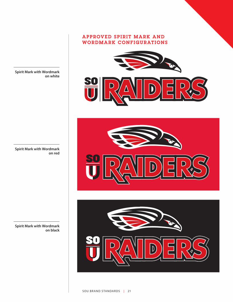
APPROVED SPIR IT MARK AND WORDMARK CONFIGURATIONS
Spirit Mark with Wordmark on white
Spirit Mark with Wordmark on red
Spirit Mark with Wordmark on black

S O U B R AN D S TAN DAR DS | 22 21
EXAMPLES OF IMPROPER USE
The Raider always flies in white skies, the built- in border assures this.
The Raider is built from shapes, and doesn’t need lines . . .
The Raider is never presented in the negative.
The Raider always flies straight . . .
The Raider always flies in white skies, the built-in
border assures this.
The Raider is built from shapes, and doesn’t need
lines .
The Raider is never presented in the negative.
The Raider has a customized white border
built into its original file (see page 20). Any border
or outline effect such as what is shown here
indicates that the wrong file is being used.
EXAMPLE S OF IMPROPER MASCOT USE

S O U B R AN D S TAN DAR DS | 23
21
EXAMPLES OF IMPROPER USE
The Raider always flies in white skies, the built- in border assures this.
The Raider is built from shapes, and doesn’t need lines . . .
The Raider is never presented in the negative.
The Raider always flies straight . . .
21
EXAMPLES OF IMPROPER USE
The Raider always flies in white skies, the built- in border assures this.
The Raider is built from shapes, and doesn’t need lines . . .
The Raider is never presented in the negative.
The Raider always flies straight . . .
EXAMPLE S OF IMPROPER MASCOT USE
The Raider always flies straight.
Never distort the proportions of the Raider.

S O U B R AN D S TAN DAR DS | 24
ROCKY THE RAIDER SOU MASCOTThe SOU Rocky Raider Mascot is a graphic representation of our university symbol, the red-tailed hawk.
Having a polished graphic of Rocky allows the mascot to appear on SOU promotional materials.
1) The graphic represents Rocky as a friendly, approachable character embodying school spirit, health, and a positive, optimistic attitude.
2) Rocky reflects the natural coloring of the red-tailed hawk while also clearly sporting SOU colors of red, black, and white.
3) The mascot wears the Raider and SOU logos to fully support the SOU brand and identity wherever the mascot appears.
The Rocky graphic is appropriate for use in
materials relating to school spirit and Raider
athletics, not academics or SOU administration.
When in doubt, check with the Marketing Office on
implementing this asset.

S O U B R AN D S TAN DAR DS | 25
The Rocky graphic has a built-in white “standoff”
form that allows placement on colored backgrounds.
Rocky can be used facing left or right for layout
flexibility

S O U B R AN D S TAN DAR DS | 26
OTHER LOGOS THAT SUPPORT SOU G RAPHIC IDENTITYMany vital programs make up the diverse totality that is Southern Oregon University. Here are some examples of sub-brands that continue to present a consistent look and feel to the public (Figure 27.
These logos have been created by the SOU Marketing Office and show program differentiation while maintaining brand continuity.
When developing sub-brands, consideration is given to :
1) school colors (red, black, and white)
2) typography (Futura in various weights)
3) dynamic simplicity (clean forms, careful spacing and alignment)
4) visual compatibility with existing approved SOU branding
MENTOR PROGRAM
SERVICE CENTER
SERVICE CENTERSERVICE
CENTER
SOUTHERN OREGON UNIVERSITY
Figure 27

S O U B R AN D S TAN DAR DS | 27
MORE ON SUB -LOGOSThere are times when red and black are counter-intuitive to a program’s message. Figure 28 shows some examples of color variation that maintain brand consistence through typography and approach. These logos rely on use of the Futura typeface to echo the SOU brand and avoid sending mixed messages.
SERVICES DEPARTMENTLANDSCAPE
Figure 28

S O U B R AN D S TAN DAR DS | 28
STATIONERYLetterhead utilizes the Formal Wordmark in the horizontal format. You may order pre-printed stationery from SOU Print and Copy Services. Print and Copy will ensure your information is typeset according to brand standards. The letterhead is available in color and black only versions.
You may also request an MS Word doc with your department information included as header and footer with correct logo and typography. Please contact the Marketing Office with Word stationery requests.
April 11, 2016
Dear Reader,
Quiam ex elisqui omnis saectio to ipsa vella doluptu rehenient odic toresed quisi doluptatet
pre consequi vollandenda qui custio bernatis dusda veliquature ex et de nimo moloris ut
exera voloreres assum ut audae. Apienia ecepre, quidem nonemperum iunt officiunt occus,
ipsantionse omni debit eatemposti in porposs itatur res aut aspersp erchic te nit, si tem
idigenis et, unt estis es eat accuptus, sapitamendem iunt.
Agnitatur, simus eatur aut invendi omni nihillacium eosam voluptumet quideribus.
Agni dici del ium rerfernatur, tection sequissit offictur molorecte asperum quunto to
officius magnis reribus, ommoluptur aceprov itiusa pratur sitatet acid expel incienecus,
volorem net quae re ene que sa sim everit labor apel exceptio. Lecus net ius et aut asit fuga.
Et odicianda dia iliqui to comnis sam faccabo rpores ratiistes dolendebit aspicitiae. Obis
ipsum esequi sequaes dolorem volut que re num repel eium, volum que rerere volum nit ut
rehenit, volupta dolut eost aliqui consentem reprepuda quam escias restotatur?
Pienia ecepre, quidem nonemperum iunt officiunt occus, ipsantionse omni debit
eatemposti in porposs itatur res aut aspersp erchic te nit, si tem idigenis et, unt estis es eat
accuptus, sapitamendem iunt.
Sincerly,
Nicolle Aleman
Director of Marketing
MARKETING

S O U B R AN D S TAN DAR DS | 29
ENVELOPE S AND BUSINE SS CARDSEnvelopes and business cards utilize Formal Wordmark in the horizontal format. You may order pre-printed envelopes and cards from SOU Print and Copy Services.
Office of Marketing and Communications
Churchill Hall Suite 222
1250 Siskiyou Boulevard
Ashland, OR 97520-5043

S O U B R AN D S TAN DAR DS | 30
Myriad Pro Light CondensedMyriad Pro Light Condensed ItalicMyriad Pro CondensedMyriad Pro Condensed ItalicMyriad Pro Semibold CondensedMyriad Pro Semibold Condensed ItalicMyriad Pro Bold CondensedMyriad Pro Bold Condensed ItalicMyriad Pro Black CondensedMyriad Pro Black Condensed Italic
TYPOG RAPHYThe SOU Office of Marketing and Communications uses two main typefaces (fonts) for all print materials. These are augmented with additional accent typefaces that change periodically to reflect design trends and brand messaging.
Myriad Pro is the Sans Serif typeface for Southern Oregon University. This book is set primarily in Myriad Pro. Here is the Myriad Pro Type family:
Myriad Pro LightMyriad Pro Light ItalicMyriad Pro RegularMyriad Pro ItalicMyriad Pro SemiboldMyriad Pro Semibold ItalicMyriad Pro BoldMyriad Pro Bold ItalicMyriad Pro BlackMyriad Pro Black Italic
Minion Pro is the Serif typeface for Southern Oregon University. Here is the Minion Pro Type family:
Minion Pro RegularMinion Pro ItalicMinion Pro MediumMinion Pro Medium Italic
Current accent typefaces for SOU Branding are:
ITC Lubalin Book
ITC Lubalin Demi
Homestead regular
Homestead inline
Just Lovely SlantedNOTE: Futura is to be used only for logos that fit within the SOU brand, as well as assorted signage and display applications. It is not used for text type.
Futura Medium / Futura Bold / Futura Extra Bold
Minion Pro SemiboldMinion Pro Semibold ItalicMinion Pro BoldMinion Pro Bold Italic
Figure 31
Figure 32
Figure 33

S O U B R AN D S TAN DAR DS | 31
COLORSouthern Oregon University school colors are red and black. Marketing and Communications uses these colors predominantly, while featuring an additional palette of support colors to help tell the SOU story.
Raider Red:Pantone Matching System
186 or CMYK values 100 mag, 100 yel, 10 blk
Raider Black:CMYK values
20 cyan, 20 mag, 20 yel, 100 blk
Light Green:
CMYK values
40 cyan,
100 yel, 10 blk
Gold:
CMYK values
15 mag,
75 yel, 10 blk
Dark Green:
CMYK values
50 cyan, 100 yel,
40 blk
Orange:
CMYK values
40 mag,
100 yel, 20 blk
Light Blue:
CMYK values
20 cyan, 25 blk
Dark Red:
CMYK values
100 mag,
100 yel, 40 blk
Dark Blue:
CMYK values
100 cyan, 10 mag,
40 blk
Brown:
CMYK values
60 mag,
100 yel, 70 blk
Figure 34
Figure 35

S O U B R AN D S TAN DAR DS | 32
MOVE MENTIntroducing a 45 degree angle allows flexibility and a note of distinction to framing and borders. Angled tabs at one or two corners of any square layout bring a sense of motion and light. The angle treatment suggests the slopes and vistas found throughout our Rogue Valley environment.
Figure 36
Figure 37

S O U B R AN D S TAN DAR DS | 33
THE SOU BRAND IN ACTION
Pages from 2017 Admissions Viewbook
Pages from 2017 Admissions Initial Contact Booklet

S O U B R AN D S TAN DAR DS | 34
Pages from 2016 Raider Alumni Magazine
Alumni Contact Postcard 2016

S O U B R AN D S TAN DAR DS | 35
22PORT L A N D | M E T RO
2
WHERE YOU CAN BE YOU
Visit Us!PREVIEW DAYS
November 17, 2017 > April 6, 2018
PREVIEW WEEKENDSJanuary 19-20, 2018 > February 16-17, 2018
You’ve been nominated for SOU’s BRIDGE PROGRAM!
You’re Home
SO U . E DU | 8 5 5 - 4 70 - 3 3 7 7
Once you become a Southern Oregon University Raider, you’re home. Our supportive campus environment and fierce commitment to inclusion and diversity provide limitless opportunities for you to reach your fullest potential.
We offer 35 majors, exceptional faculty with the highest degrees in their fields, a beautiful, vibrant campus, and easy access to an array of natural wonders. There’s something for everyone at Southern Oregon University.
Call us and arrange a campus tour today. Trim Size: 8.375 x 10.875
Live: 7.875 x 10.375
Bleed Size: 8.625 x 11.125
Heads up on this. Just took out a full page ad with them. We will probably want to put a WUE spin on it.
You’re HomeOnce you become a Southern Oregon University Raider, you’re home. Our supportive Ashland campus environment and fierce commitment to spirit, inclusion and diversity provide limitless opportunities for you to reach your fullest potential.
We offer 36 majors, exceptional faculty with the highest degrees in their fields, a beautiful, vibrant campus, and easy access to an array of natural wonders. There’s something for everyone at Southern Oregon University.
Western Undergraduate Student ExchangeResidents of California will automatically receive the Western Undergraduate Exchange (WUE) tuition rate upon admission to SOU—a savings of over $11,000 per academic year. WUE applies to all majors at Southern Oregon University.
Call us and arrange a campus tour today!
8 5 5 - 4 70 - 3 3 7 7
SO U . E DU
You’re Home
SO U . E D U | 8 5 5 - 4 70 - 3 3 7 7
YOU’RE
Once you become a Southern Oregon University Raider, you’re home. Our supportive campus environment provides limitless opportunity for you to reach your fullest potential.
We offer 35 majors, exceptional faculty with the highest degrees in their fields, a beautiful, vibrant campus, and easy access to an array of natural wonders. There’s something for everyone at Southern Oregon University.
Call us and arrange a campus tour today.
SO U . E DU
8 5 5 - 4 70 - 3 3 7 7
Admissions Postcards 2016-17
Admissions Die Cut Stat Card 2017
Inside Front Cover Ad, San Francisco 49ers 2016 Program
Medford Mail Tribune Football Issue Ad 2017
Southern Oregon Magazine Ad 2017
average class size
student: faculty ratio
incoming freshmen
total enrollment
% women/ men
avg SAT score(ERW+M)
avg ACT score
26 21:1 652
1013 22 3.32 35
athletic teams in NAIA
avg high school GPA
campus size in acres
sou.edu
degree programs
60/40 6098
175 13
STATS
2017–2018 Cost of Attendance Oregon Western Out-of- Resident Undergraduate State Exchange (WUE)
Tuition* $7,427 $11,140 $22,725
Fees $1,860 $1,860 $1,860
Room & Board† $12,831 $12,831 $12,831
TOTAL‡ $22,118 $25,831 $37,416
* Tuition estimates are based on full-time status of 15 credits per term for Fall, Winter, and Spring. Per credit rates are $165.04 per credit hour for Oregon residents, $505 for out-of-state, and $247.56 for WUE.
† Room & board based on Greensprings double-occupancy with a “red” or “black” meal plan. Shasta double-occupancy with a “red” or “black” meal plan is $13,764.
‡ Not fixed costs; varies depending on credit load and housing/board choices.

S O U B R AN D S TAN DAR DS | 36
You can use it to:> Receive Holds and Notifications
> Search the Directory search
> Track your schedule
> Check your grades
> Find your way around campus
> Stay updated on important campus announcements, events, and games
> Twitter contest alert! We’re giving away a $25 SOU Bookstore Gift Certificate every week of Fall Term. To enter, download the app, take a selfie on campus and tweet us at
@SOUAshland with hashtags #SOU2Go and #RaiderUp.
One winner per student, must be registered for fall classes.
app yet?SOU2Go
Have you downloaded the
To get SOU 2 Go, download the
Elucian Go App on your mobile
device, then enter Southern Oregon
University.
CIVIC ENGAGEMENTP R O G R A M
October 18, 2017
11am – 1:30 pm
SU Rogue River Room
Join us for Southern Oregon university’s third annual Volunteer Fair. Connect
with students to share opportunities for meaningful involvement in your nonprofit
organization, group, or agency.
Register for a tabe at tinyurl.com/souvfair.
InvitedYou’re To the SOU
Volunteer Fair
2016-17 Raider Basketball Playbook
2016 Financial Aid Brochure
2016 President’s Recognition Award
SOU 2 Go Mobile App Poster 2017
Volunteer Fair Poster 2017

S O U B R AN D S TAN DAR DS | 37
University Website 2017

Department of Marketing and Communications1250 Siskiyou Boulevard
Ashland, Oregon 97520-5022

![4/23/13 [example background] LOTUS VARIATIONS: ONE-COLOR ... · for use on light background: (GH green letters only) for use on light background:(GH green preferred) full-color lotus:](https://static.documents.pub/doc/80x56/5f0c6e637e708231d4355dd9/42313-example-background-lotus-variations-one-color-for-use-on-light-background.jpg)


