
Discovery Phase

Content
1. Business Goals & Challenges 2. Discovery goals3. ooVoo.com existing site analysis4. Competitive design analysis5. UX analysis of current site6. Stakeholder interviews7. Conclusions and Recommendations
8. Appendix
2
page 2

Business Goals & Challenges
page 3
1. Communicate mulitple messages/segments ie: Business vs. Consumer, Web vs Download, etc.2. Increase traffic to either region ‑ V’Spot or Download3. Adapt look and feel to brand refresh4. Increase SEO integration to improve results5. Morph site into destination location

Stakeholder Interviews
page 4

Stakeholder InterviewsInterviewees
page 5
Robert Jackman ‑ ChairmanScott Richardson ‑ Product MapSeth Cummings ‑ Product MapLara Peterson ‑ Consumer PromotionsFrank Miele ‑ Rewards / MyAccountRoberta Lynn ‑ SupportMatt de Ganon ‑ Brand MarketingJosh Weisler ‑ SEOBrian Liebler ‑ Ad SalesBrogan Taylor ‑ BusinessSusan Ferrari ‑ ResearchAriel Maayan ‑ Seperia (SEO)Aurli Bokovza ‑ PR

Stakeholder InterviewsBrand Descriptors
page 6
Intimate
Edgy
Fun
Hip
Vibrant
Live
CoolImpactful
Spontaneous
Young
Connection
Fighter
Exciting
If you had to describe ooVoo in three (3) words, what adjectives would you use?

Stakeholder InterviewsBrand Elevator Pitch
page 7
If you had to describe ooVoo in one sentence, what would you say?
The ooVoo BrandooVoo is a facilitation and love of people being together.
ooVoo is a fun place for people to spend time chatting with their closest friends.
ooVoo is live video calls.
ooVoo is a new breed of video chat targeted to a younger consumer with incredible quality, clarity and flexibility ‑ providing a spontaneous way for the next generation to text/chat.

Stakeholder InterviewsBrand Differentiation
page 8
If you had to describe ooVoo in one sentence, what would you say?
ooVoo vs. its competitorsIf you are familiar with Skype ‑ then we are similar but offer a higher level of quality.
ooVoo is a much more user‑oriented company than its peer group.
We’re a video chat service that is #2 to Skype but better in terms of audio/video quality across all platforms.
ooVoo is the world’s leading provider of cloud drive quality video chat.

Stakeholder InterviewsThe ooVoo Consumer
page 9
What does your audience do on the website?
1. Download ooVoo product.
2. Research the brand and how to use ooVoo.
3. Buy packages.
4. Get support.

Competitive AnalysisStakeholder’s Conclusions
page 10
Two kinds of competitors: Business and ConsumerThere is no competitors that goes after both sectors well.
Current competitors: Skype, Tinychat, TangoFuture competitors: Google and Microsoft
Skype’s home page is clean and clear but navigation can be difficult after the home page. However, their brand message is a bit disjointed and focuses on a much older, international demographic while trying to be fun and even a bit young.
Tinychat brings their users and social functionality to the forefront of the experience. That said, their website is cluttered and provides a difficult search experience.
Tango is much more simple than ooVoo but at the same time is much more plain and boring from a brand perspective.

Discovery Goals
page 11

Discovery Goals
page 12
Goals of Meeting:1. Communicate Key Discovery Learnings2. Close URL Strategy3. Close Content Strategy4. Present Initial Visualizations Next Steps:1. Develop Messaging & Product Matrix 2. Wireframes

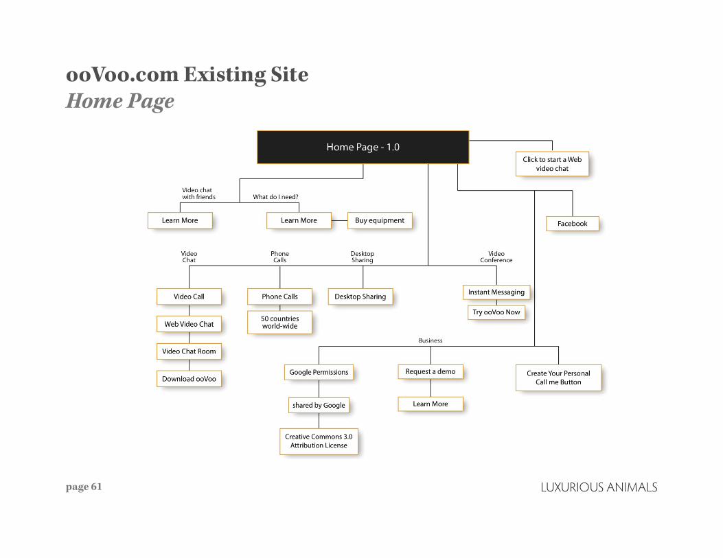
ooVoo.com Existing SiteHome Page
page 13

ooVoo.com Existing SiteHow To Page
page 14

ooVoo.com Existing SiteFlowcharts
page 15

ooVoo.com Existing SiteHeader
page 16

ooVoo.com Existing SiteHow To Page
page 17

ooVoo.com Existing SiteHow To Page (cont.)
page 18

ooVoo.com Existing SiteHow To Page (cont.)
page 19

ooVoo.com Existing SiteConclusions
page 20
Several nav items going to similar content
Several redundancies that dilute the message and distract the user
Home page: doesn’t speak to either lifestyle or business. The company’s product seems like a utility.
How to page: cluttered, confusing and currently has 20 secondary sections
Business section: looks like an afterthought
Competitive AnalysisDesign and Trends
page 21

Competitive Design AnalysisCompetitors at-a-glance
page 22

Competitive Design Analysis - Consumer and Business
page 23
Our thoughts:Skype is a destination site, in that you can sign in and start chatting, but it’s not a place to come back and hang out, business is not the frontrunner, it’s falls in line with other features of the site. The brand is hip, trendy, young, fun and international.
Stakeholder’s thoughts:It’s really easy to navigate. But since a lot of the business features are lumped in with other features skype has to offer, there isn’t a re‑ally call to action that represents Skype as a business tool.

Competitive Design Analysis - Consumer
page 24
Our thoughts:The social is definitely cool, but can be a little overbearing from a UX perspective. You can start chatting with people immediately, but it becomes difficult to find more info about the product. Feature infor‑mation is secondary to experienc‑ing the product first hand. It’s frus‑trating to be forced to give Tiny Chat personal information before reading about or experiencing first hand what TinyChat is all about.
Stakeholder’s thoughts:Tiny Chat you is a destination site, live chat rooms to sign into, you can connect to Facebook. Tiny Chat is about connectig internationally, staying connected with friends, fun.

Competitive Design Analysis - Consumer
page 25
Our thoughts:Tango is simple, straight to the point, easy to navigate. I know immediately what product I’m getting. Tango is working on coming out with a Win‑dow’s PC version. They lack personal‑ity and don’t take a strong definitive side as to whether they are a business tool or a social product.
Stakeholder’s thoughts:Tango could be perceived as more business friendly because they aren’t really pushing this as a business product, they use a lot of examples of being about to stay connected with your family and friends. While is closer to finding the happy medium between social life and business, it doesn’t seem to reflect any definitive personality. The underlying theme is that tango is a tool.

Competitive Design Analysis - Consumer and Business
page 26
Mac Facetime is similar to tango, except the brand does reflect a lifestyle, bridges the gap between business and social, owns up to being a home name brand, a lifestyle‑oriented. Stay in touch with relatives and friends.

Competitive Design Analysis - Consumer
page 27
Facebook is a social brand that companies wouldn’t hold meetings on. The biggest accessibility is access to your closest friends.
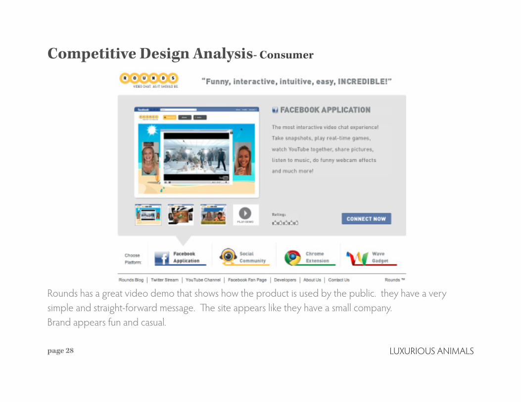
Competitive Design Analysis- Consumer
page 28
Rounds has a great video demo that shows how the product is used by the public. they have a very simple and straight‑forward message. The site appears like they have a small company. Brand appears fun and casual.

Competitive Design Analysis- Consumer and Business
page 29
Google provides a product showcase. Their brand is personal and approachable for lifestyle and businesss.
Competitive Design Analysis - Consumer and Business
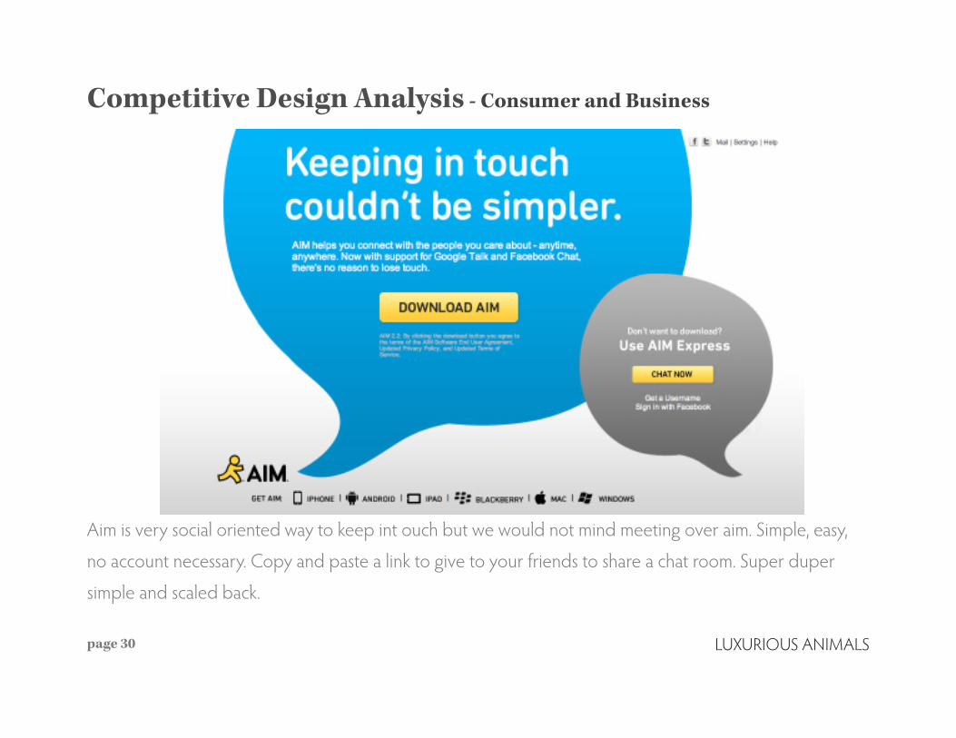
page 30
Aim is very social oriented way to keep int ouch but we would not mind meeting over aim. Simple, easy,
no account necessary. Copy and paste a link to give to your friends to share a chat room. Super duper
simple and scaled back.

Competitive Design Analysis - Consumer and Business
page 31
Yahoo appears to a business and lifestyle consumer with a place on international.
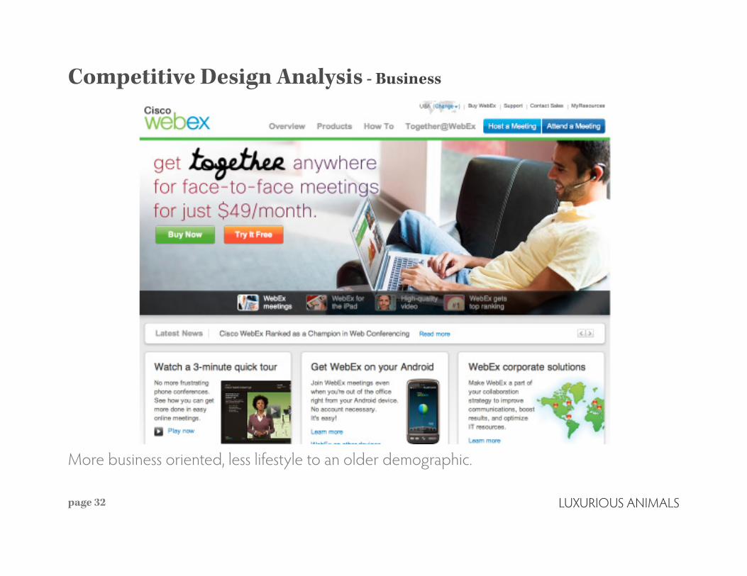
Competitive Design Analysis - Business
page 32
More business oriented, less lifestyle to an older demographic.

Competitive Design Analysis - Business
page 33
GoToMeeting is business oriented only and a tool kit for your company.
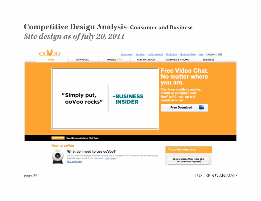
Competitive Design Analysis- Consumer and Business
Site design as of July 20, 2011
page 34

Competitive Design Analysis - Consumer and Business
Site design as of August 3, 2011
page 35

Competitive AnalysisLuxurious Conclusions
page 36
What is ooVoo.com doing well?‑Convincing people to download without learning about the product.‑Using friends as the unpaid salesperson to convince people to download.‑Captured both a lifestyle and business market unlike other competitive websites.
Where does ooVoo.com need to be?‑A destination site.‑A place for social gatherings.‑Make “higher quality video chat” a stronger value proposition.‑Speak to both the lifestyle crowds and business crowds equally yet be voiced for the proper audience.

UX Analysis
page 37

UX Analysisoovoo.com Web Analytics
page 38
Traffic Statistics
Traffic overview:Direct traffic ‑ 65.5%Google (search engine) ‑ 14.86%ooVoo.com (referral) ‑ 4.64%m.oovoo.com (referral) ‑ 2.13%Facebook.com (referral) ‑ 1.59%
Average time of pages:Home.Page.en (00:00:48)Download.Page.en (00:00:30)home.aspx (00:00:17)Next.downloadwin.en (00:02:46)Click.dw.Button.win (00:00:13)

UX AnalysisooVoo.com Web Analytics
page 39
Technical Statistics Browsers being used: IE ‑ 68.07%, Firefox ‑ 11.04%, Chrome ‑ 9.83%, Safari ‑ 8.64%,Opera ‑ 1.25%
Android users are 35.84% of all visitors from a mobile device and spend an average of 3 minutes on the site. iPod users are 31.50% and iPhone at 19.08%
Operating Systems: Windows ‑ 89.84%, Mac ‑ 6.25%, Linux ‑ 0.22%
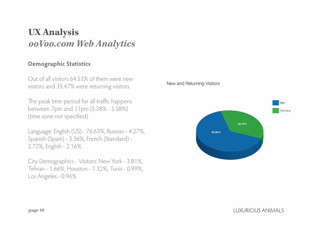
UX AnalysisooVoo.com Web Analytics
page 40
Demographic Statistics Out of all visitors 64.53% of them were new visitors and 35.47% were returning visitors.
The peak time period for all traffic happens between 7pm and 11pm (5.28% ‑ 5.58%) (time zone not specified)
Language: English (US) ‑ 76.63%, Russian ‑ 4.27%, Spanish (Spain) ‑ 3.36%, French (Standard) ‑ 2.72%, English ‑ 2.16%
City Demographics ‑ Visitors: New York ‑ 3.81%, Tehran ‑ 1.66%, Houston ‑ 1.32%, Tunis ‑ 0.99%, Los Angeles ‑ 0.96%

UX AnalysisooVoo.com Web Analytics
page 41
UX AnalysisConclusions
page 42
Direct traffic is great, potential for being a destination site.
The 35% returning visitors are users looking for upgrades, help and support.
Opportunity for SEO to make a bigger impact.

Conclusions and Recommendations
page 43

Conclusions and RecommendationsOverview
page 44
ooVoo is currently aiming to become a more lifestyle, home name brand. While it has been a tool for business interaction, it wants and attempts to bridge the gap between social and business.
ooVoo is:intimatechatting with your friendshigher quality video

Conclusions and RecommendationsUX Overview
page 45
The business button on the site currently marks that you can toggle between the two kinds of interactions. It’s the opposite approach that Skype takes where business falls in line with other features and doesn’t take as much presence as their push for being a social platform.
Functional:Invite friends while we’re downloading the appAuto‑detect the system you are using for download

Conclusions and RecommendationsSites we admire
page 46
Google Chrome – Landing Page‑Simple design – neutral
‑States what the product is
and why they should down‑
load it
‑Download button on land‑
ing page
‑auto detects OS (with other
OS options available)

page 47
Spotify – Landing Page‑Hip, edgy, new design
‑States who they are and
what their product does
‑Lists some key features
‑Good visual hierarchy
page 48
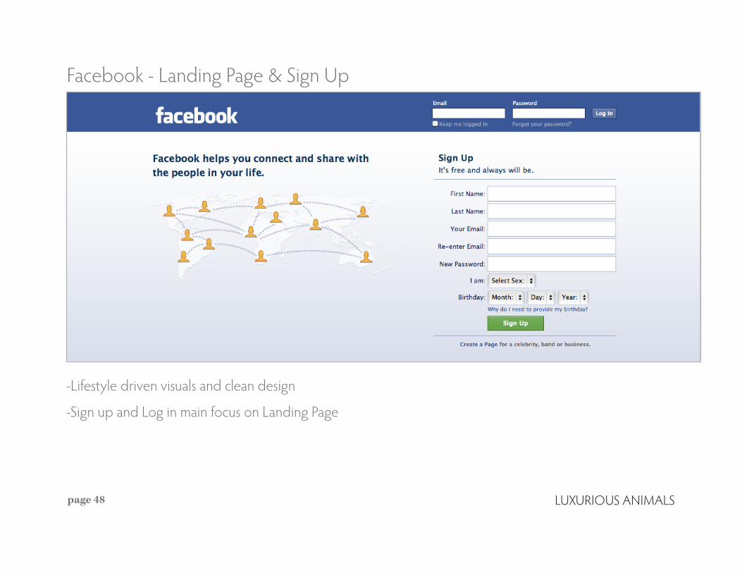
Facebook ‑ Landing Page & Sign Up
‑Lifestyle driven visuals and clean design
‑Sign up and Log in main focus on Landing Page

page 49
Spotify – Packages
‑Clear specific information on what each package includes and costs

page 50
Spotify – Features‑Clean and organized
‑Easy to navigate
‑Second to Landing Page on
nav bar
‑Includes images that relate
to the feature being high‑
lighted

Skype – Add Friends
page 51
‑Easy to invite friends to
download app or join video
chat room
‑Gives the user the option
to invite multiple friends at
once

Apple – Tech Support
‑Icons and imagery used for easy navigation through technical support section
‑Clearly labeled and organized sections

Conclusions and RecommendationsOur Final Thoughts
page 53
ooVoo.com should be a consumer‑driven, simplified message
Create ooVoo.biz route for business‑driven messaging only.
ooVoo.me will be used for the social messaging platform.
There should be cross‑platform access across all three sites.
Download acquisition is still the number one priority.

Conclusions and RecommendationsooVoo Home Page
page 54

Conclusions and RecommendationsooVoo Home Page
page 55

Conclusions and RecommendationsooVoo Download/Features Page
page 56
Appendix
page 57

ooVoo.com Existing SiteWireframes and Flowcharts
page 58

ooVoo.com Existing SiteHome Page Wireframe
page 59

ooVoo.com Existing SiteDownload Page Wireframe
page 60
ooVoo.com Existing SiteHome Page
page 61

ooVoo.com Existing SiteDownload Page
page 62

ooVoo.com Existing SiteMobile Page
page 63

ooVoo.com Existing SiteFeatures & Pricing
page 64

ooVoo.com Existing SiteBusiness
page 65

ooVoo.com Existing SiteFooter
page 66

Who We Are continued
Inspiring Animals • Moving Herds
www.luxanimals.com


