
1 Copyright © 2014, 2012, 2009 Pearson Education, Inc.
Chapter 3
Displaying and
Summarizing
Quantitative Data
2 Copyright © 2014, 2012, 2009 Pearson Education, Inc.
3.1
Displaying
Quantitative
Variables

3 Copyright © 2014, 2012, 2009 Pearson Education, Inc.
Histograms
• Histogram: A chart that
displays quantitative data
• Great for seeing the distribution of the data
• Most earthquake generating tsunamis have magnitudes
between 6.5 and 8.
• Japan and Sumatra quakes (9.0 and 9.1) are rare.
• Quakes under 5 rarely cause tsunamis.
• Quakes between 7.0 and 7.5 most common for
causing tsunamis
A histogram of tsunami generating earthquakes

4 Copyright © 2014, 2012, 2009 Pearson Education, Inc.
Choosing the Bin Width
• Different bin widths tell different
stories.
• Choose the width that best shows
the important features.
• Presentations can feature two
histograms that present the same
data in different ways.
• A gap in the histogram means that
there were no occurrences in that
range.
5 Copyright © 2014, 2012, 2009 Pearson Education, Inc.
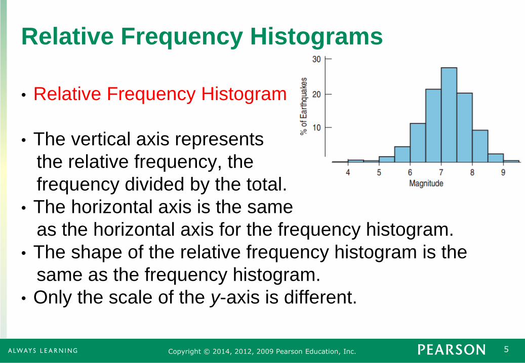
Relative Frequency Histograms
• Relative Frequency Histogram
• The vertical axis represents
the relative frequency, the
frequency divided by the total.
• The horizontal axis is the same
as the horizontal axis for the frequency histogram.
• The shape of the relative frequency histogram is the
same as the frequency histogram.
• Only the scale of the y-axis is different.
6 Copyright © 2014, 2012, 2009 Pearson Education, Inc.
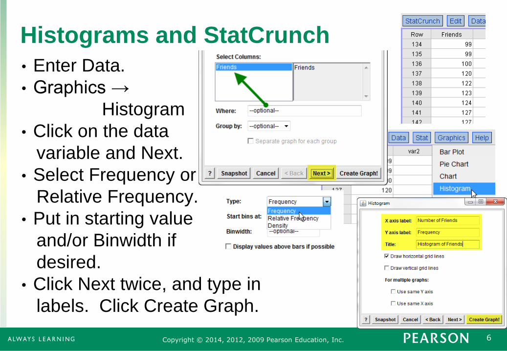
Histograms and StatCrunch
• Enter Data.
• Graphics →
Histogram
• Click on the data
variable and Next.
• Select Frequency or
Relative Frequency.
• Put in starting value
and/or Binwidth if
desired.
• Click Next twice, and type in
labels. Click Create Graph.
7 Copyright © 2014, 2012, 2009 Pearson Education, Inc.
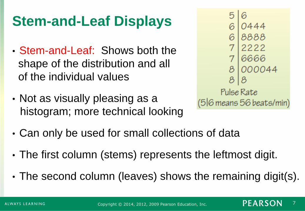
Stem-and-Leaf Displays
• Stem-and-Leaf: Shows both the
shape of the distribution and all
of the individual values
• Not as visually pleasing as a
histogram; more technical looking
• Can only be used for small collections of data
• The first column (stems) represents the leftmost digit.
• The second column (leaves) shows the remaining digit(s).

8 Copyright © 2014, 2012, 2009 Pearson Education, Inc.
Stem and Leaf with StatCrunch
• Enter Data
• Graphics → Stem and Leaf
• Click on the variable name
and Next
• Select Outlier Trimming
Type and Create Graph!
9 Copyright © 2014, 2012, 2009 Pearson Education, Inc.
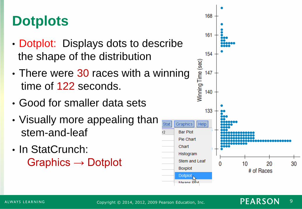
Dotplots
• Dotplot: Displays dots to describe
the shape of the distribution
• There were 30 races with a winning
time of 122 seconds.
• Good for smaller data sets
• Visually more appealing than
stem-and-leaf
• In StatCrunch:
Graphics → Dotplot
10 Copyright © 2014, 2012, 2009 Pearson Education, Inc.
Think Before you Draw
• Is the variable quantitative? Is the answer to the survey
question or result of the experiment a number whose
units are known?
• Histograms, stem-and-leaf diagrams, and dotplots
can only display quantitative data.
• Bar and pie charts display categorical data.

11 Copyright © 2014, 2012, 2009 Pearson Education, Inc.
3.2
Shape

12 Copyright © 2014, 2012, 2009 Pearson Education, Inc.
Modes
• A Mode of a histogram is a hump or high-frequency bin.
• One mode → Unimodal
• Two modes → Bimodal
• 3 or more → Multimodal
Unimodal Multimodal Bimodal

13 Copyright © 2014, 2012, 2009 Pearson Education, Inc.
Uniform Distributions
• Uniform Distribution: All the bins have the same
frequency, or at least close to the same frequency.
• The histogram for a uniform distribution will be flat.

14 Copyright © 2014, 2012, 2009 Pearson Education, Inc.
Symmetry
• The histogram for a symmetric distribution will look the
same on the left and the right of its center.
Symmetric Not
Symmetric Symmetric

15 Copyright © 2014, 2012, 2009 Pearson Education, Inc.
Skew
• A histogram is skewed right if the longer tail is on the
right side of the mode.
• A histogram is skewed left if the longer tail is on the left
side of the mode.
Skewed Left Skewed Right

16 Copyright © 2014, 2012, 2009 Pearson Education, Inc.
Outliers
• An Outlier is a data value that is far above or far below
the rest of the data values.
• An outlier is sometimes just
an error in the data collection.
• An outlier can also be the
most important data value.
• Income of a CEO
• Temperature of a person with
a high fever
• Elevation at Death Valley

17 Copyright © 2014, 2012, 2009 Pearson Education, Inc.
Example
• The histogram shows the amount
of money spent by a credit card
company’s customers. Describe
and interpret the distribution.
• The distribution is unimodal. Customers most
commonly spent a small amount of money.
• The distribution is skewed right. Many customers
spent only a small amount and a few were spread out
at the high end.
• There is an outlier at around $7000. One customer
spent much more than the rest of the customers.

18 Copyright © 2014, 2012, 2009 Pearson Education, Inc.
3.3
Center

19 Copyright © 2014, 2012, 2009 Pearson Education, Inc.
The Median
• Median: The center of the
data values
• Half of the data values are to
the left of the median and half
are to the right of the median.
• For symmetric distributions, the median is directly
in the middle.
20 Copyright © 2014, 2012, 2009 Pearson Education, Inc.
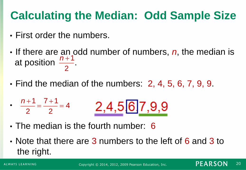
Calculating the Median: Odd Sample Size
• First order the numbers.
• If there are an odd number of numbers, n, the median is
at position .
• Find the median of the numbers: 2, 4, 5, 6, 7, 9, 9.
•
• The median is the fourth number: 6
• Note that there are 3 numbers to the left of 6 and 3 to
the right.
1
2
n
1 7 14
2 2
n

21 Copyright © 2014, 2012, 2009 Pearson Education, Inc.
Calculating the Median: Even Sample Size
• First order the numbers.
• If there are an even number of numbers, n, the median
is the average of the two middle numbers: .
• Find the median of the numbers: 2, 2, 4, 6, 7, 8.
•
• The median is the average of the third and the fourth
numbers:
6
32 2
n
, 12 2
n n
4 6Median 5
2

22 Copyright © 2014, 2012, 2009 Pearson Education, Inc.
3.4
Spread

23 Copyright © 2014, 2012, 2009 Pearson Education, Inc.
Spread
• Locating the center is only part of the story
• Are the data all near the center or are they spread out?
• Is the highest value much higher than the lowest value?
• To describe data, we must discuss both the center and
the spread.

24 Copyright © 2014, 2012, 2009 Pearson Education, Inc.
Range
• The range is the difference between the maximum and
minimum values.
Range = Maximum – Minimum
• The ages of the guests at your dinner party are:
16, 18, 23, 23, 27, 35, 74
• The range is: 74 – 16 = 58
• The range is sensitive to outliers. A single high or low
value will affect the range significantly.

25 Copyright © 2014, 2012, 2009 Pearson Education, Inc.
Percentiles and Quartiles
• Percentiles divide the data in one hundred groups.
• The nth percentile is the data value such that n percent
of the data lies below that value.
• For large data sets, the median is the 50th percentile.
• The median of the lower half of the data is the 25th
percentile and is called the first quartile (Q1).
• The median of the upper half of the data is the 75th
percentile and is called the third quartile (Q3).
26 Copyright © 2014, 2012, 2009 Pearson Education, Inc.
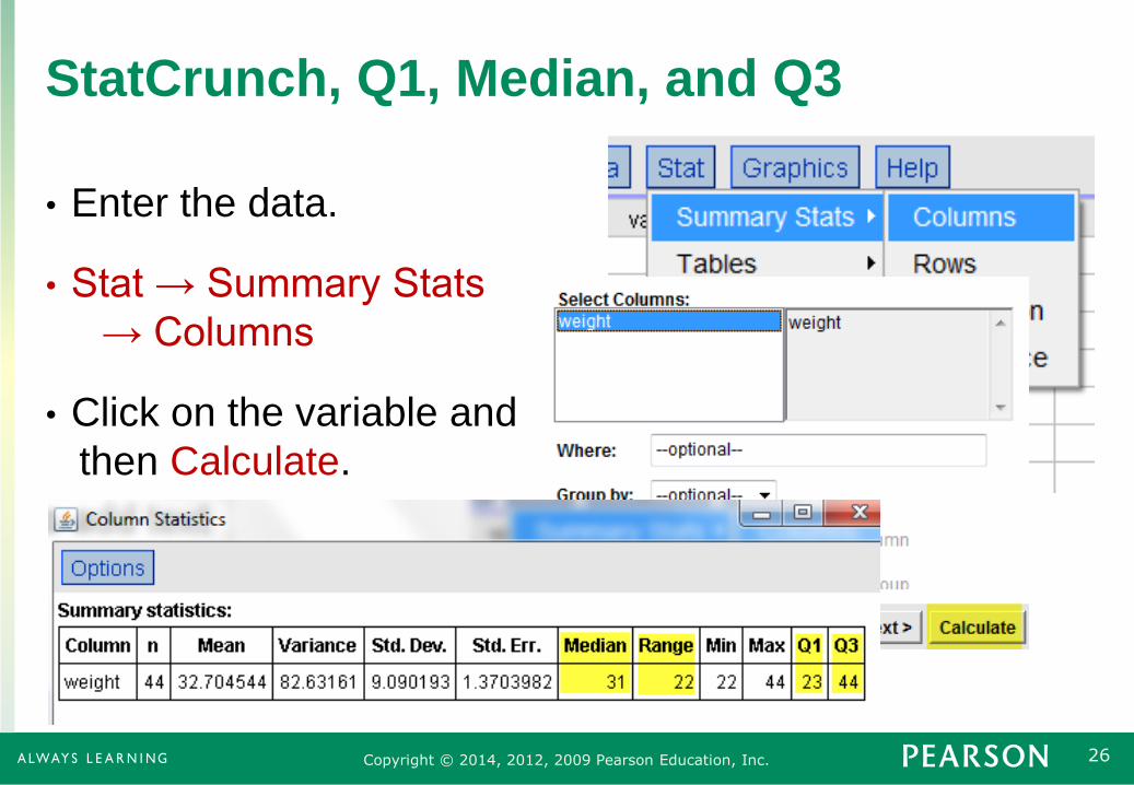
StatCrunch, Q1, Median, and Q3
• Enter the data.
• Stat → Summary Stats
→ Columns
• Click on the variable and
then Calculate.
27 Copyright © 2014, 2012, 2009 Pearson Education, Inc.
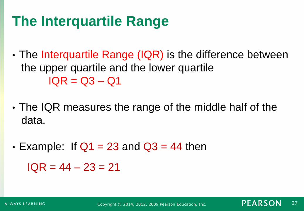
The Interquartile Range
• The Interquartile Range (IQR) is the difference between
the upper quartile and the lower quartile
IQR = Q3 – Q1
• The IQR measures the range of the middle half of the
data.
• Example: If Q1 = 23 and Q3 = 44 then
IQR = 44 – 23 = 21

28 Copyright © 2014, 2012, 2009 Pearson Education, Inc.
The Interquartile Range
• The Interquartile Range for earthquake causing
tsunamis is 0.9.
• The picture below shows the meaning of the IQR.

29 Copyright © 2014, 2012, 2009 Pearson Education, Inc.
Benefits and Drawbacks of the IQR
• The Interquartile Range is not sensitive to outliers.
• The IQR provides a reasonable summary of the spread
of the distribution.
• The IQR shows where typical values are, except for the
case of a bimodal distribution.
• The IQR is not great for a general audience since most
people do not know what it is.

30 Copyright © 2014, 2012, 2009 Pearson Education, Inc.
3.5
Boxplots and
5-Number
Summaries

31 Copyright © 2014, 2012, 2009 Pearson Education, Inc.
5-Number Summary
• The 5-Number Summary provides a numerical
description of the data. It consists of
• Minimum
• First Quartile (Q1)
• Median
• Third Quartile (Q3)
• Maximum
• The list to the right shows the
5-Number Summary for the
tsunami data.

32 Copyright © 2014, 2012, 2009 Pearson Education, Inc.
Interpreting the 5-Number Summary
• The smallest tsunami-causing earthquake
had magnitude 3.7.
• The largest tsunami-causing earthquake
had magnitude 9.1.
• The middle half of tsunami-causing
earthquakes is between 6.7 and 7.6.
• Half of tsunami-causing earthquakes have
magnitudes below 7.2 and half are above 7.2.
• A tsunami-causing earthquake less than 6.7 is small.
• A tsunami-causing earthquake more than 7.6 is small.

33 Copyright © 2014, 2012, 2009 Pearson Education, Inc.
Boxplots
• A Boxplot is a chart that displays the
5-Point Summary and the outliers.
• The Box shows the Interquartile Range.
• The dashed lines are called fences,
outside the fences lie the outliers.
• Above and below the box are the whiskers
that display the most extreme data values
within the fences.
• The line inside the box shows the median.

34 Copyright © 2014, 2012, 2009 Pearson Education, Inc.
Finding the Fences
• The lower fence is defined by
Lower Fence = Q1 – 1.5 × IQR
• The upper fence is defined by
Upper Fence = Q3 + 1.5 × IQR
• Tsunami Example: Q1 = 6.7, Q3 = 7.6
IQR = 7.6 – 6.7 = 0.9
• Lower Fence = 6.7 – 1.5 × 0.9 = 5.35
• Upper Fence = 7.6 + 1.5 × 0.9 = 8.95

35 Copyright © 2014, 2012, 2009 Pearson Education, Inc.
StatCrunch and Boxplots
• Enter data and go to
Graphics → Boxplot.
• Click on the variable and
Next.
• Check “Use fences to
identify outliers.” Then
Next
• Type in labels and click on
Create Graph.

36 Copyright © 2014, 2012, 2009 Pearson Education, Inc.
Step-by-Step Example of Shape, Center,
Spread: Flight Cancellations • Question: How often are flights cancelled?
• Who? Months
• What? Percentage of Flights Cancelled at U.S. Airports
• When? 1995 – 2011
• Where? United States
• How? Bureau of Transportation Statistics Data

37 Copyright © 2014, 2012, 2009 Pearson Education, Inc.
Flight Cancellations: Think
• Identify the Variable
• Percent of flight cancellations at U.S. airports
• Quantitative: Units are percentages.
• How will be data be summarized?
• Histogram
• Numerical Summary
• Boxplot
38 Copyright © 2014, 2012, 2009 Pearson Education, Inc.
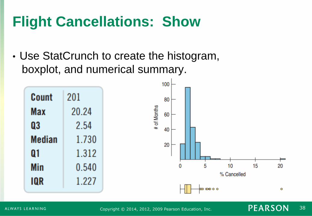
Flight Cancellations: Show
• Use StatCrunch to create the histogram,
boxplot, and numerical summary.
39 Copyright © 2014, 2012, 2009 Pearson Education, Inc.
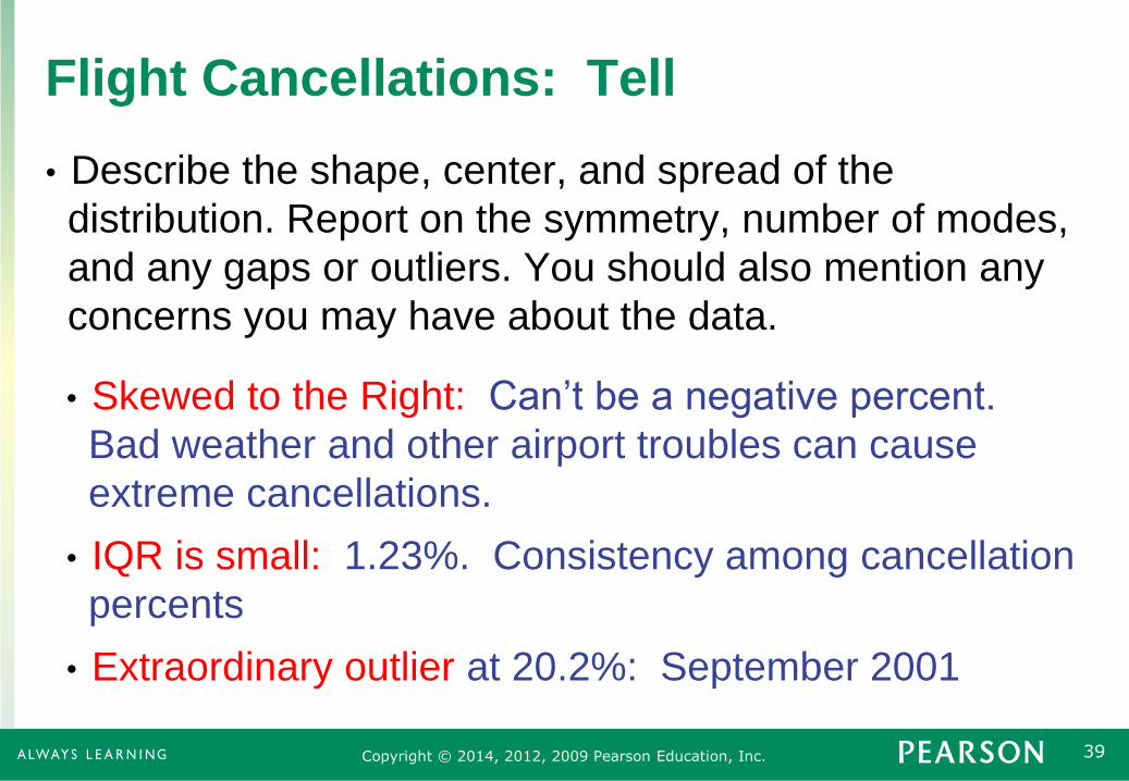
Flight Cancellations: Tell
• Describe the shape, center, and spread of the
distribution. Report on the symmetry, number of modes,
and any gaps or outliers. You should also mention any
concerns you may have about the data.
• Skewed to the Right: Can’t be a negative percent.
Bad weather and other airport troubles can cause
extreme cancellations.
• IQR is small: 1.23%. Consistency among cancellation
percents
• Extraordinary outlier at 20.2%: September 2001

40 Copyright © 2014, 2012, 2009 Pearson Education, Inc.
3.6
The Center of
Symmetric
Distributions:
The Mean
41 Copyright © 2014, 2012, 2009 Pearson Education, Inc.
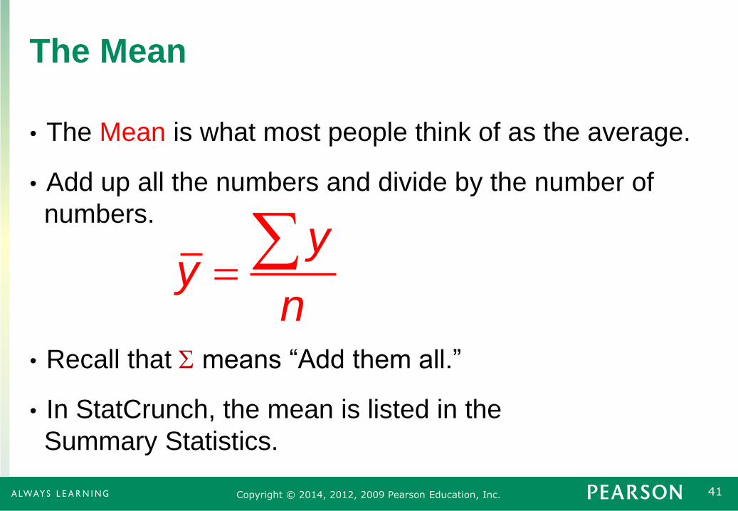
The Mean
• The Mean is what most people think of as the average.
• Add up all the numbers and divide by the number of
numbers.
• Recall that S means “Add them all.”
• In StatCrunch, the mean is listed in the
Summary Statistics.
yy
n
42 Copyright © 2014, 2012, 2009 Pearson Education, Inc.
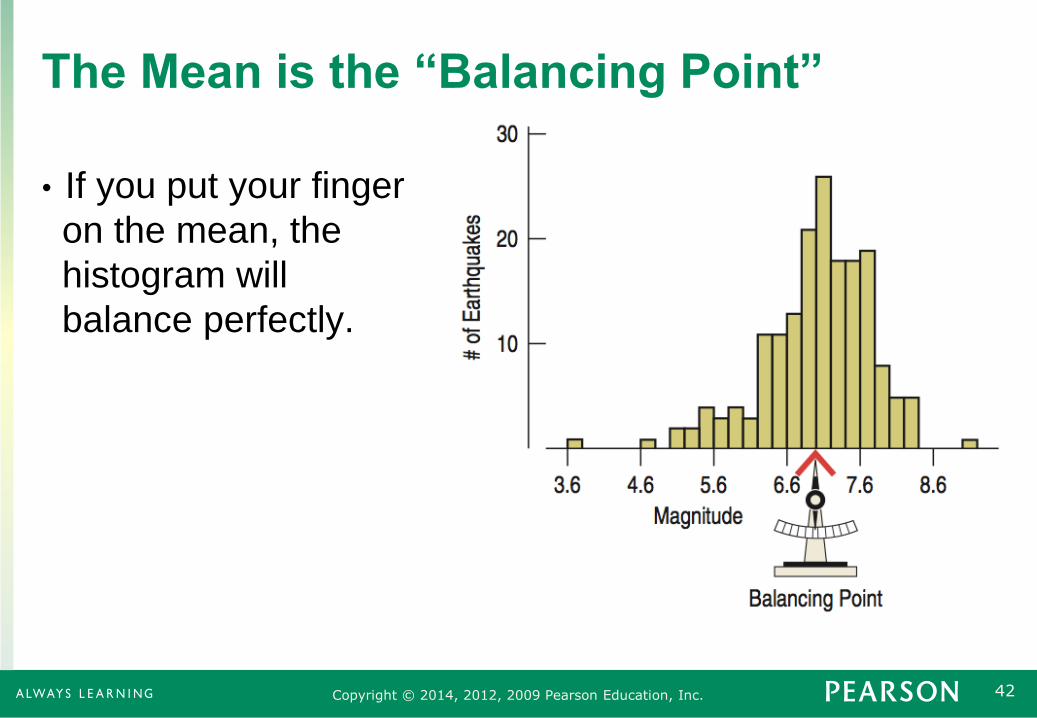
The Mean is the “Balancing Point”
• If you put your finger
on the mean, the
histogram will
balance perfectly.

43 Copyright © 2014, 2012, 2009 Pearson Education, Inc.
Mean Vs. Median
• For symmetric distributions, the mean and the median
are equal.
• The balancing point is at the center.
• The tail “pulls” the mean towards it more than it does to
the median.
• The mean is more sensitive to outliers than the median.

44 Copyright © 2014, 2012, 2009 Pearson Education, Inc.
The Mean Is Attracted to the Outlier
• The mean is larger
than the median
since it is “pulled”
to the right by the
outlier.
• The median is a better
measure of the center
for data that is skewed.

45 Copyright © 2014, 2012, 2009 Pearson Education, Inc.
Why Use the Mean?
• Although the median is a better measure of the center,
the mean weighs in large and small values better.
• The mean is easier to work with.
• For symmetric data, statisticians would rather use the
mean.
• It is always ok to report both the mean and the median.
46 Copyright © 2014, 2012, 2009 Pearson Education, Inc.
3.7
The Spread of
Symmetric
Distributions:
The Standard
Deviation

47 Copyright © 2014, 2012, 2009 Pearson Education, Inc.
The Variance
• The variance is a measure of how far the data is spread
out from the mean.
• The difference from the mean is: .
• To make it positive, square it.
• Then find the average of all of these distances, except
instead of dividing by n, divide by n – 1.
• Use s2 to represent the variance.
• The variance will mostly be used to find the standard
deviation s which is the square root of the variance.
y y
2
2
1
y ys
n

48 Copyright © 2014, 2012, 2009 Pearson Education, Inc.
Standard Deviation
• The variance’s units are the square of the original units.
• Taking the square root of the variance gives the
standard deviation, which will have the same units as y.
• The standard deviation is a number that is close to the
average distances that the y values are from the mean.
• If data values are close to the mean (less spread out),
then the standard deviation will be small.
• If data values are far from the mean (more spread out),
then the standard deviation will be large.
2
1
y ys
n

49 Copyright © 2014, 2012, 2009 Pearson Education, Inc.
The Standard Deviation and Histograms
A B C
Answer: C, A, B
Order the histograms below from smallest standard deviation to largest standard deviation.

50 Copyright © 2014, 2012, 2009 Pearson Education, Inc.
3.8
Summary—What
to Tell About a
Quantitative
Variable
51 Copyright © 2014, 2012, 2009 Pearson Education, Inc.
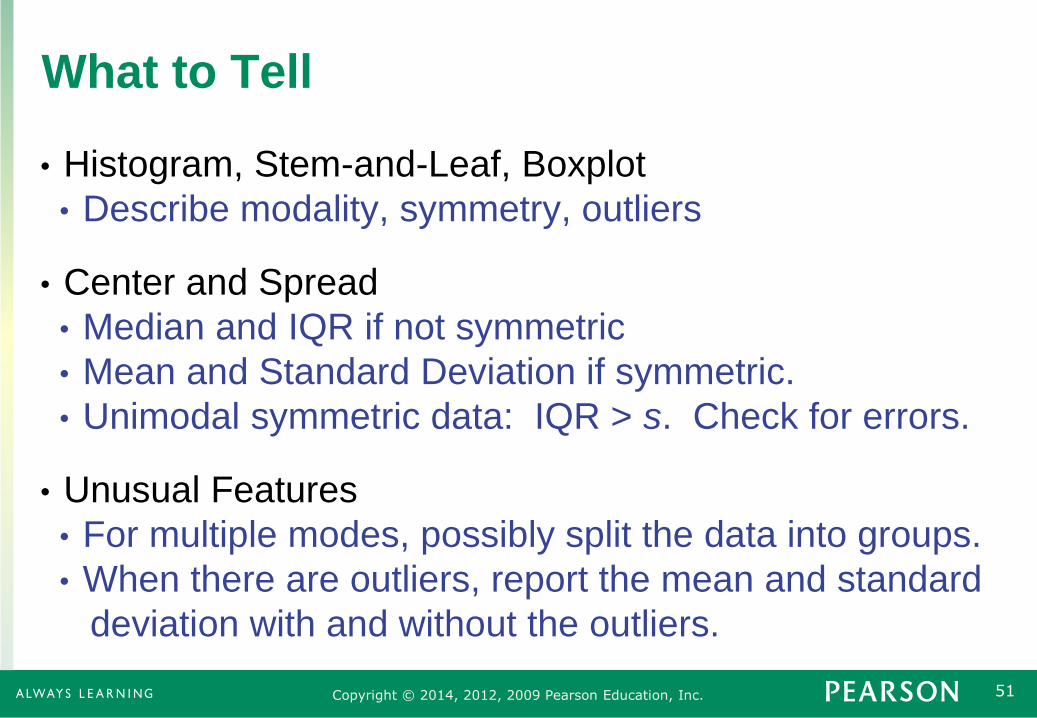
What to Tell
• Histogram, Stem-and-Leaf, Boxplot
• Describe modality, symmetry, outliers
• Center and Spread
• Median and IQR if not symmetric
• Mean and Standard Deviation if symmetric.
• Unimodal symmetric data: IQR > s. Check for errors.
• Unusual Features
• For multiple modes, possibly split the data into groups.
• When there are outliers, report the mean and standard
deviation with and without the outliers.

52 Copyright © 2014, 2012, 2009 Pearson Education, Inc.
Example: Fuel Efficiency
• The car owner has checked the fuel efficiency each time
he filled the tank. How would you describe the fuel
efficiency?
• Plan: Summarize the distribution of the car’s fuel
efficiency.
• Variable: mpg for 100 fill ups, Quantitative
• Mechanics: show a histogram
• Fairly symmetric
• Low outlier
53 Copyright © 2014, 2012, 2009 Pearson Education, Inc.
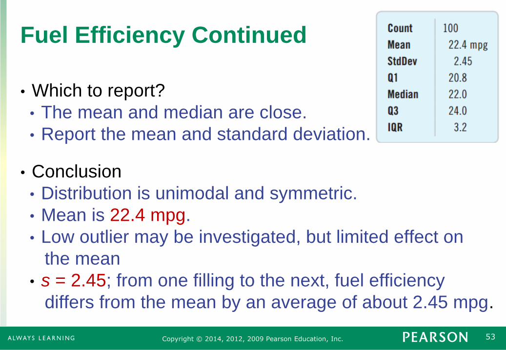
Fuel Efficiency Continued
• Which to report?
• The mean and median are close.
• Report the mean and standard deviation.
• Conclusion
• Distribution is unimodal and symmetric.
• Mean is 22.4 mpg.
• Low outlier may be investigated, but limited effect on
the mean
• s = 2.45; from one filling to the next, fuel efficiency
differs from the mean by an average of about 2.45 mpg.

54 Copyright © 2014, 2012, 2009 Pearson Education, Inc.
What Can Go Wrong?
• Don’t make a histogram for categorical data.
• Don’t look for shape, center,
and spread for a bar chart.
• Choose a bin width appropriate
for the data.

55 Copyright © 2014, 2012, 2009 Pearson Education, Inc.
What Can Go Wrong? Continued
• Do a reality check
• Don’t blindly trust your calculator. For example, a
mean student age of 193 years old is nonsense.
• Sort before finding the median and percentiles.
• 315, 8, 2, 49, 97 does not have median of 2.
• Don’t worry about small differences in the quartile
calculation.
• Don’t compute numerical summaries for a categorical
variable.
• The mean Social Security number is meaningless.
56 Copyright © 2014, 2012, 2009 Pearson Education, Inc.
What Can Go Wrong? Continued
• Don’t report too many decimal places.
• Citing the mean fuel efficiency as 22.417822453 is
going overboard.
• Don’t round in the middle of a calculation.
• For multiple modes, think about separating groups.
• Heights of people → Separate men and women
• Beware of outliers, the mean and standard deviation are
sensitive to outliers.
• Use a histogram or dotplot to ensure that the mean
and standard deviation really do describe the data.


