

www.hotdesign.com
Why ignoring mobile is crazy
www.hotdesign.com

www.hotdesign.com
Why ignoring mobile is crazy
Back in the day, we designed websites and emails for computers.Now, people use phones and tablets more than computers and read more emails on phones than on computers.The better your sites and emails work on mobile, the happier your customers will be.
ATTENTION, CITIZENS!
A BRAVE NEW WORLD AWAITS!
ONE FILLED WITH MIRACULOUS MOBILE
DEVICES!

www.hotdesign.com
Overview: What’s in it for me?
Reach customers, extend your brand, improve your bottom line. Know the best way to design and maintain websites and emails.Get better search engine results.Give your customers a better experience everywhere.Make web and email design more efficient and less expensive.It’s called “job security,” people.
WHY WOULD ANYONE WANT MY
NEW SIGNATURE SCENT IN ANYTHING SMALLER THAN
A ONE-LITRE BOTTLE?

www.hotdesign.com
AH, THE HEIGHT OF CULINARY PERFECTION.
EVERYTHING IN ITS PLACE, AND THE VEGGIES DON’T
TOUCH MY SALISBURY STEAK.
Early design: fixed screen size
In the beginning, browsers and email apps filled up the screen. We used Internet Explorer and Outlook on a Windows computer.We all had basically the same experience. That’s not the case today.

www.hotdesign.com
Say Hello to iPhone
Overnight, people began using phones for the web and emails.Computer screens also got bigger, and users today often resize their browser and email windows to be tall and narrow or wide and short.Get the message: There’s no longer a standard size or shape for a screen — and there will never be one again.
YEAH, RIGHT, JIM. LIKE THE INTERNET IS GOING TO
MAGICALLY APPEAR ON MY ANTENNA PHONE 3000.

www.hotdesign.com
Talk about an explosion!
Businesses have to go mobile to win, serve, and retain customers. • Mobile is now 1/3 of all web traffic. • 1/4 of online searches are mobile. • 1/2 of emails are read on mobile. • We spend more time on mobile
devices than on computers.
Websites and emails that aren’t mobile-friendly don’t add up to good business.
IT DOESN’T TAKE ADVANCED MATH TO
FIGURE IT OUT.

www.hotdesign.com
Newsflash: Business people use mobile phones!
Business users want to connect with brands on mobile. • 90% of senior execs use smartphones
for business. • 85% of B2B customers search for
business solutions on mobile. • 59% of B2B execs like purchasing
on mobile more than by phone. • 4% made purchases of $100,000+
on mobile.
So don’t think you don’t have to go mobile, Mr. B2B Business Owner.
I CAN USE MY PHONE
AT WORK?!?
THIS CHANGES EVERYTHING!

www.hotdesign.com
Nowadays, everybody is Dick Tracy
Websites today have to work on computers, phones, tablets, watches, TVs, game consoles, home appliances, and even cars. The list of devices that can access the web keeps growing.Face the future: This rapidly expanding, connected world is not stopping any time soon. Over and out.
THINGS WERE MUCHSIMPLER WHEN ALL I HAD
TO WORRY ABOUT WAS MY 2-WAY WRIST RADIO.

www.hotdesign.com
A pleasant enough looking website
This site for a Fortune 15 company was designed for a computer.
EVEN UNDER ALL THIS SCRUTINY, I’M STILL THE MOST BEAUTIFUL WOMAN
IN THE WORLD.

www.hotdesign.com
Don’t let this happen to you
The same site in a smaller window and on a phone. What happened???
WHAT WILL I DO ONCE MY YOUTH IS GONE AND MY
LOOKS HAVE FADED?
HAVE I REALLY AGED THAT MUCH IN SO LITTLE TIME?!?

www.hotdesign.com
The problem with desktop sites on mobile devices:
Users have to scroll, pan, pinch, and zoom to see anything.It’s hard to click on tiny links.You give the impression that you do not care about your users.You appear out of touch.Don’t give customers a ready- made excuse to leave your site and find one that’s easier to use.
I HAVE NO IDEA WHAT YOU PEOPLE ARE COMPLAINING
ABOUT. I LOVE PANNING,
PINCHING …
… ANDZOOMING!

www.hotdesign.com
Two sites = Twice the headaches
Developing two sites or creating a site and mobile apps is incredibly wasteful and inefficient. • You have to update two sites or the
site and the apps for each phone. • You need twice as many servers
and programmers. • You confuse search engines. • You don’t give users a consistent
brand experience.
Avoid headaches: Fix your existing site to make it look good everywhere.
DAMN BUGS! I CURSE THE DAY THEY
CONVINCED US TO SERVE MULTIPLE VERSIONS
OF OUR SITE!

www.hotdesign.com
Responsive Design to the rescue!
Lay out sites and emails that work everywhere, with a minimum of resizing, panning, and scrolling.Three main components of responsive design: • A fluid grid • Flexible images • Media queries
Responsive design ensures that content re-flows and configures to fit any viewport size.
COMING UP, ONE DELICIOUS CHOCOLATE MILKSHAKE AND ONE
WEBSITE THAT DOESN’T SUCK ON MOBILE.

www.hotdesign.com
For example...
Check out this website that works at many sizes thanks to responsive web design: • Wide desktop
browser window • Narrow desktop
browser window • Tablet • Phone

www.hotdesign.com
First thing, let go of the idea of complete control
Fixed layouts with items placed precisely are a thing of the past.A flexible grid is the first step to make your site responsive. Flexibility allows your content to shine no matter how it is viewed. Go responsive and let your content fly free.
DON’T WORRY.IT’S GOING TO BE FINE.82ND MOBILE SQUADRON
HAS YOU COVERED.

www.hotdesign.com
Less is more
Think about mobile users first. Don’t make them wade through fluff to find what they want. The most important info should be “stacked” first for mobile.Streamline to just the essentials.Don’t make them eat a full meal if they just want dessert.
THAT TV DINNER GUY IS OUT TO LUNCH.
WHY WASTE YOUR TIME ON VEGGIES AND
MYSTERY MEAT …
… WHEN YOU CAN SKIP RIGHT TO THE DONUTS?

www.hotdesign.com
Get right to the point
Prioritize your content, putting your most essential stuff near the top of your page or email.Put content that is less essential lower on the page or a sub-page. Customers will appreciate it: no pinching and zooming to see all the content.If you upset your site visitors, they’ll leave faster than a starship at warp speed.
PUNY HUMANS!TELL ME WHAT I WANT TO KNOW BEFORE I DESTROY
YOUR ENTIRE PLANET!
www.hotdesign.com
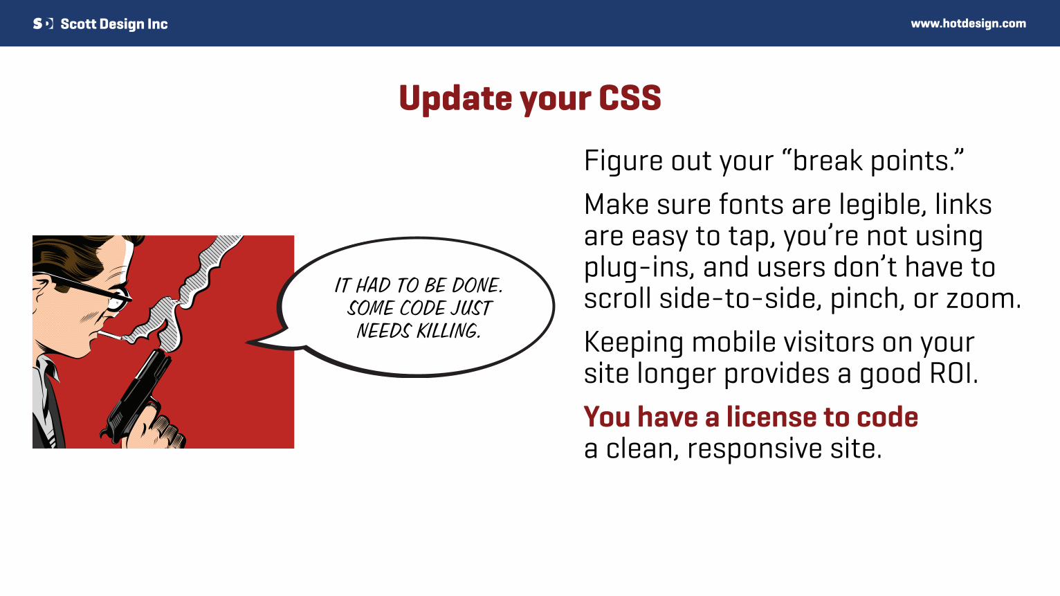
Update your CSS
Figure out your “break points.”Make sure fonts are legible, links are easy to tap, you’re not using plug-ins, and users don’t have to scroll side-to-side, pinch, or zoom.Keeping mobile visitors on your site longer provides a good ROI.You have a license to code a clean, responsive site.
IT HAD TO BE DONE. SOME CODE JUSTNEEDS KILLING.
www.hotdesign.com
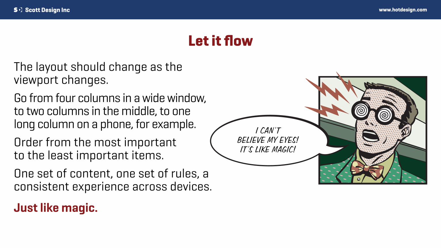
Let it flow
The layout should change as the viewport changes.Go from four columns in a wide window, to two columns in the middle, to one long column on a phone, for example. Order from the most important to the least important items.One set of content, one set of rules, a consistent experience across devices.
Just like magic.
I CAN’T BELIEVE MY EYES!IT’S LIKE MAGIC!

www.hotdesign.com
Search engines love responsive web design
Responsive websites get better search results. • Google ranks responsive sites higher
and even labels them “mobile-friendly.” • Google punishes duplicate content,
like desktop and mobile versions. • All links to a piece of content go to one
page; not split between two pages. • More important than search engines
loving your site, your users will love it.
Go mobile — and have the site that everyone falls in love with.
OH SURE, YOU MAY RANK HIGHER IN SEARCH RESULTS, BUT IN THIRD GRADE,
I GOT MORE VALENTINES THAN ANYONE IN MY CLASS!

www.hotdesign.com
If more emails are read on phones, why are you still designing them for computers?
• The first link in a responsive email gets 30% more clicks than the first link in a non-responsive email.
• Responsive emails get 15% more clicks than non-responsive emails.
• Most email marketers plan to use responsive email design this year.
Don’t let customers break up with you over hard-to-read emails. Your competitor is waiting to pick up the pieces.
SO LONG, PERRY. I’M LEAVING YOU FOR
SOMEONE WHO SENDS ME EMAILS I CAN ACTUALLY
READ ON MY PHONE.

www.hotdesign.com
You are not your audience
Don’t just test on your own computer. • Test on a Windows computer, a Mac, a
laptop, a tablet, and different phones. • Widen and narrow down your browser
and email windows to see how it looks. • Test on browsers, email apps, and
web-based email services. • Test in special browsers, apps, sites,
or devices that your customers use
The hard work pays off: More testing = More happy users.
WHAT I DO CARE ABOUT IS HOW
PATHETIC IT IS ON EVERY MOBILE PHONE
IN THE WORLD!
I DON’T CARE HOW GREAT IT
LOOKS ON YOUR COMPUTER!

www.hotdesign.com
What are you waiting for?
Responsive design is taking off: • The number of responsive top-ranked
websites doubled last year. • 3/4 of organizations rank mobile
as important or critical this year. • 1/3 of small businesses plan on
rebuilding their websites this year.
It’s a great time to carve out a competitive edge… while you still can.
MAYBE IF I JUST SIT HERE AND DO NOTHING THIS HORRIBLE MOBILE
FAD WILL PASS, AND PEOPLE WILL GO BACK TO ONLY USING COMPUTERS.

www.hotdesign.com
Any questions?
If you have questions about going mobile with responsive design, send us an email, call us, or leave a comment on our website.
831-531-7722
The creative agency for innovative companies
HEY, I JUST MET YOU,
AND THIS IS CRAZY,
BUT HERE’S MY NUMBER,
SO CALL ME MAYBE.


