

Package ‘shinydashboard’March 21, 2018
Title Create Dashboards with 'Shiny'
Version 0.7.0
Description Create dashboards with 'Shiny'. This package providesa theme on top of 'Shiny', making it easy to create attractive dashboards.
URL http://rstudio.github.io/shinydashboard/
Depends R (>= 3.0)
License GPL (>= 2) | file LICENSE
Imports utils, shiny (>= 1.0.0), htmltools (>= 0.2.6)
BugReports https://github.com/rstudio/shinydashboard
RoxygenNote 6.0.1.9000
NeedsCompilation no
Author Winston Chang [aut, cre],Barbara Borges Ribeiro [aut],RStudio [cph],Almasaeed Studio [ctb, cph] (AdminLTE theme for Bootstrap),Adobe Systems Incorporated [ctb, cph] (Source Sans Pro font)
Maintainer Winston Chang <[email protected]>
Repository CRAN
Date/Publication 2018-03-21 22:18:53 UTC
R topics documented:box . . . . . . . . . . . . . . . . . . . . . . . . . . . . . . . . . . . . . . . . . . . . . 2dashboardBody . . . . . . . . . . . . . . . . . . . . . . . . . . . . . . . . . . . . . . . 5dashboardHeader . . . . . . . . . . . . . . . . . . . . . . . . . . . . . . . . . . . . . . 6dashboardPage . . . . . . . . . . . . . . . . . . . . . . . . . . . . . . . . . . . . . . . 8dashboardSidebar . . . . . . . . . . . . . . . . . . . . . . . . . . . . . . . . . . . . . . 9dropdownMenu . . . . . . . . . . . . . . . . . . . . . . . . . . . . . . . . . . . . . . . 10dropdownMenuOutput . . . . . . . . . . . . . . . . . . . . . . . . . . . . . . . . . . . 11infoBox . . . . . . . . . . . . . . . . . . . . . . . . . . . . . . . . . . . . . . . . . . . 11menuItemOutput . . . . . . . . . . . . . . . . . . . . . . . . . . . . . . . . . . . . . . 12
1

2 box
menuOutput . . . . . . . . . . . . . . . . . . . . . . . . . . . . . . . . . . . . . . . . . 13messageItem . . . . . . . . . . . . . . . . . . . . . . . . . . . . . . . . . . . . . . . . 13notificationItem . . . . . . . . . . . . . . . . . . . . . . . . . . . . . . . . . . . . . . . 14renderDropdownMenu . . . . . . . . . . . . . . . . . . . . . . . . . . . . . . . . . . . 14renderMenu . . . . . . . . . . . . . . . . . . . . . . . . . . . . . . . . . . . . . . . . . 15renderValueBox . . . . . . . . . . . . . . . . . . . . . . . . . . . . . . . . . . . . . . . 16shinydashboard . . . . . . . . . . . . . . . . . . . . . . . . . . . . . . . . . . . . . . . 18sidebarMenu . . . . . . . . . . . . . . . . . . . . . . . . . . . . . . . . . . . . . . . . 18sidebarMenuOutput . . . . . . . . . . . . . . . . . . . . . . . . . . . . . . . . . . . . . 19sidebarSearchForm . . . . . . . . . . . . . . . . . . . . . . . . . . . . . . . . . . . . . 20sidebarUserPanel . . . . . . . . . . . . . . . . . . . . . . . . . . . . . . . . . . . . . . 21tabBox . . . . . . . . . . . . . . . . . . . . . . . . . . . . . . . . . . . . . . . . . . . . 21tabItem . . . . . . . . . . . . . . . . . . . . . . . . . . . . . . . . . . . . . . . . . . . 23tabItems . . . . . . . . . . . . . . . . . . . . . . . . . . . . . . . . . . . . . . . . . . . 23taskItem . . . . . . . . . . . . . . . . . . . . . . . . . . . . . . . . . . . . . . . . . . . 24updateTabItems . . . . . . . . . . . . . . . . . . . . . . . . . . . . . . . . . . . . . . . 24valueBox . . . . . . . . . . . . . . . . . . . . . . . . . . . . . . . . . . . . . . . . . . 25valueBoxOutput . . . . . . . . . . . . . . . . . . . . . . . . . . . . . . . . . . . . . . . 26
Index 27
box Create a box for the main body of a dashboard
Description
Boxes can be used to hold content in the main body of a dashboard.
Usage
box(..., title = NULL, footer = NULL, status = NULL,solidHeader = FALSE, background = NULL, width = 6, height = NULL,collapsible = FALSE, collapsed = FALSE)
Arguments
... Contents of the box.
title Optional title.
footer Optional footer text.
status The status of the item This determines the item’s background color. Valid sta-tuses are listed in validStatuses.
solidHeader Should the header be shown with a solid color background?
background If NULL (the default), the background of the box will be white. Otherwise, acolor string. Valid colors are listed in validColors.

box 3
width The width of the box, using the Bootstrap grid system. This is used for row-based layouts. The overall width of a region is 12, so the default valueBoxwidth of 4 occupies 1/3 of that width. For column-based layouts, use NULL forthe width; the width is set by the column that contains the box.
height The height of a box, in pixels or other CSS unit. By default the height scalesautomatically with the content.
collapsible If TRUE, display a button in the upper right that allows the user to collapse thebox.
collapsed If TRUE, start collapsed. This must be used with collapsible=TRUE.
See Also
Other boxes: infoBox, tabBox, valueBox
Examples
## Only run this example in interactive R sessionsif (interactive()) {library(shiny)
# A dashboard body with a row of infoBoxes and valueBoxes, and two rows of boxesbody <- dashboardBody(
# infoBoxesfluidRow(infoBox(
"Orders", uiOutput("orderNum2"), "Subtitle", icon = icon("credit-card")),infoBox(
"Approval Rating", "60%", icon = icon("line-chart"), color = "green",fill = TRUE
),infoBox(
"Progress", uiOutput("progress2"), icon = icon("users"), color = "purple")
),
# valueBoxesfluidRow(
valueBox(uiOutput("orderNum"), "New Orders", icon = icon("credit-card"),href = "http://google.com"
),valueBox(
tagList("60", tags$sup(style="font-size: 20px", "%")),"Approval Rating", icon = icon("line-chart"), color = "green"
),valueBox(
htmlOutput("progress"), "Progress", icon = icon("users"), color = "purple")
),
4 box
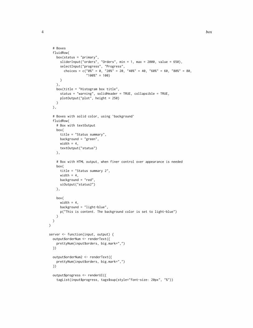
# BoxesfluidRow(
box(status = "primary",sliderInput("orders", "Orders", min = 1, max = 2000, value = 650),selectInput("progress", "Progress",
choices = c("0%" = 0, "20%" = 20, "40%" = 40, "60%" = 60, "80%" = 80,"100%" = 100)
)),box(title = "Histogram box title",
status = "warning", solidHeader = TRUE, collapsible = TRUE,plotOutput("plot", height = 250)
)),
# Boxes with solid color, using `background`fluidRow(
# Box with textOutputbox(
title = "Status summary",background = "green",width = 4,textOutput("status")
),
# Box with HTML output, when finer control over appearance is neededbox(
title = "Status summary 2",width = 4,background = "red",uiOutput("status2")
),
box(width = 4,background = "light-blue",p("This is content. The background color is set to light-blue")
))
)
server <- function(input, output) {output$orderNum <- renderText({
prettyNum(input$orders, big.mark=",")})
output$orderNum2 <- renderText({prettyNum(input$orders, big.mark=",")
})
output$progress <- renderUI({tagList(input$progress, tags$sup(style="font-size: 20px", "%"))

dashboardBody 5
})
output$progress2 <- renderUI({paste0(input$progress, "%")
})
output$status <- renderText({paste0("There are ", input$orders,
" orders, and so the current progress is ", input$progress, "%.")})
output$status2 <- renderUI({iconName <- switch(input$progress,
"100" = "ok","0" = "remove","road"
)p("Current status is: ", icon(iconName, lib = "glyphicon"))
})
output$plot <- renderPlot({hist(rnorm(input$orders))
})}
shinyApp(ui = dashboardPage(
dashboardHeader(),dashboardSidebar(),body
),server = server
)}
dashboardBody The main body of a dashboard page.
Description
The main body typically contains boxes. Another common use pattern is for the main body tocontain tabItems.
Usage
dashboardBody(...)
Arguments
... Items to put in the dashboard body.

6 dashboardHeader
See Also
tabItems, box, valueBox.
dashboardHeader Create a header for a dashboard page
Description
A dashboard header can be left blank, or it can include dropdown menu items on the right side.
Usage
dashboardHeader(..., title = NULL, titleWidth = NULL, disable = FALSE,.list = NULL)
Arguments
... Items to put in the header. Should be dropdownMenus.
title An optional title to show in the header bar.. By default, this will also be used asthe title shown in the browser’s title bar. If you want that to be different fromthe text in the dashboard header bar, set the title in dashboardPage.
titleWidth The width of the title area. This must either be a number which specifies thewidth in pixels, or a string that specifies the width in CSS units.
disable If TRUE, don’t display the header bar.
.list An optional list containing items to put in the header. Same as the ... argu-ments, but in list format. This can be useful when working with programmati-cally generated items.
See Also
dropdownMenu
Examples
## Only run this example in interactive R sessionsif (interactive()) {library(shiny)
# A dashboard header with 3 dropdown menusheader <- dashboardHeader(
title = "Dashboard Demo",
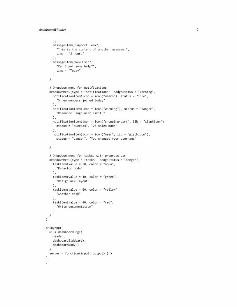
# Dropdown menu for messagesdropdownMenu(type = "messages", badgeStatus = "success",
messageItem("Support Team","This is the content of a message.",time = "5 mins"
dashboardHeader 7
),messageItem("Support Team",
"This is the content of another message.",time = "2 hours"
),messageItem("New User",
"Can I get some help?",time = "Today"
)),
# Dropdown menu for notificationsdropdownMenu(type = "notifications", badgeStatus = "warning",
notificationItem(icon = icon("users"), status = "info","5 new members joined today"
),notificationItem(icon = icon("warning"), status = "danger",
"Resource usage near limit."),notificationItem(icon = icon("shopping-cart", lib = "glyphicon"),
status = "success", "25 sales made"),notificationItem(icon = icon("user", lib = "glyphicon"),
status = "danger", "You changed your username")
),
# Dropdown menu for tasks, with progress bardropdownMenu(type = "tasks", badgeStatus = "danger",
taskItem(value = 20, color = "aqua","Refactor code"
),taskItem(value = 40, color = "green",
"Design new layout"),taskItem(value = 60, color = "yellow",
"Another task"),taskItem(value = 80, color = "red",
"Write documentation")
))
shinyApp(ui = dashboardPage(
header,dashboardSidebar(),dashboardBody()
),server = function(input, output) { }
)}
8 dashboardPage
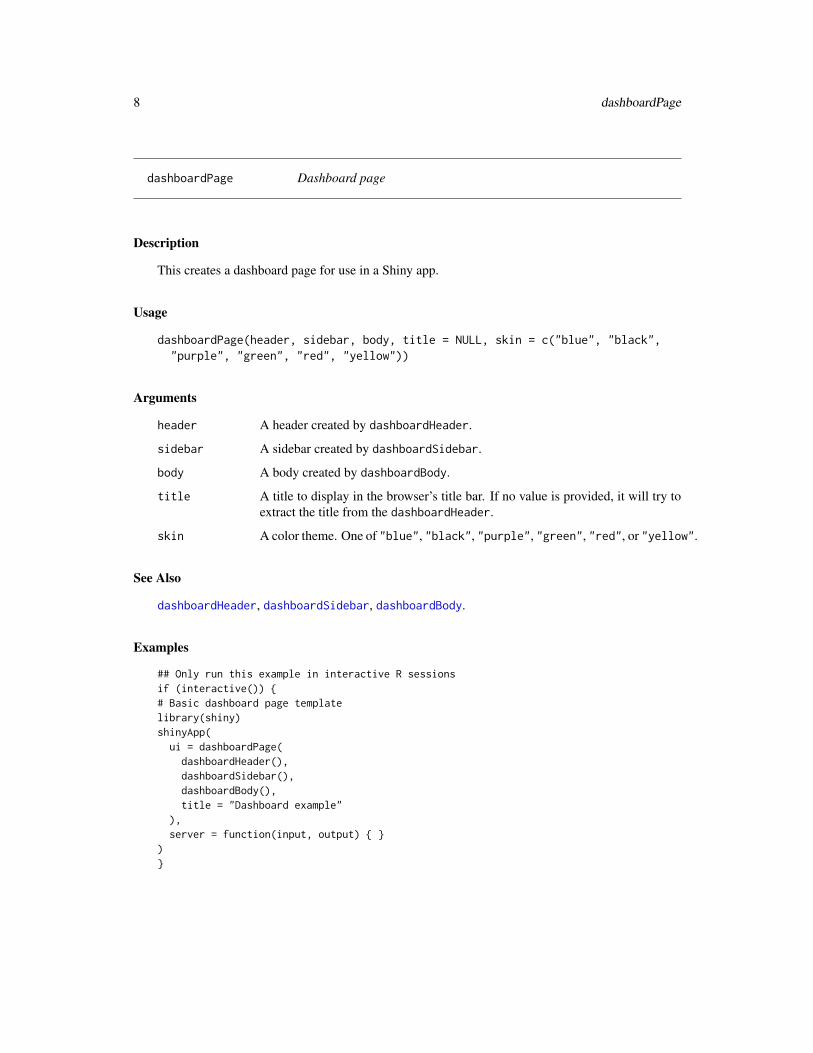
dashboardPage Dashboard page
Description
This creates a dashboard page for use in a Shiny app.
Usage
dashboardPage(header, sidebar, body, title = NULL, skin = c("blue", "black","purple", "green", "red", "yellow"))
Arguments
header A header created by dashboardHeader.
sidebar A sidebar created by dashboardSidebar.
body A body created by dashboardBody.
title A title to display in the browser’s title bar. If no value is provided, it will try toextract the title from the dashboardHeader.
skin A color theme. One of "blue", "black", "purple", "green", "red", or "yellow".
See Also
dashboardHeader, dashboardSidebar, dashboardBody.
Examples
## Only run this example in interactive R sessionsif (interactive()) {# Basic dashboard page templatelibrary(shiny)shinyApp(
ui = dashboardPage(dashboardHeader(),dashboardSidebar(),dashboardBody(),title = "Dashboard example"
),server = function(input, output) { }
)}

dashboardSidebar 9
dashboardSidebar Create a dashboard sidebar.
Description
A dashboard sidebar typically contains a sidebarMenu, although it may also contain a sidebarSearchForm,or other Shiny inputs.
Usage
dashboardSidebar(..., disable = FALSE, width = NULL, collapsed = FALSE)
Arguments
... Items to put in the sidebar.
disable If TRUE, the sidebar will be disabled.
width The width of the sidebar. This must either be a number which specifies the widthin pixels, or a string that specifies the width in CSS units.
collapsed If TRUE, the sidebar will be collapsed on app startup.
See Also
sidebarMenu
Examples
## Only run this example in interactive R sessionsif (interactive()) {header <- dashboardHeader()
sidebar <- dashboardSidebar(sidebarUserPanel("User Name",
subtitle = a(href = "#", icon("circle", class = "text-success"), "Online"),# Image file should be in www/ subdirimage = "userimage.png"
),sidebarSearchForm(label = "Enter a number", "searchText", "searchButton"),sidebarMenu(
# Setting id makes input$tabs give the tabName of currently-selected tabid = "tabs",menuItem("Dashboard", tabName = "dashboard", icon = icon("dashboard")),menuItem("Widgets", icon = icon("th"), tabName = "widgets", badgeLabel = "new",
badgeColor = "green"),menuItem("Charts", icon = icon("bar-chart-o"),
menuSubItem("Sub-item 1", tabName = "subitem1"),menuSubItem("Sub-item 2", tabName = "subitem2")
))

10 dropdownMenu
)
body <- dashboardBody(tabItems(tabItem("dashboard",
div(p("Dashboard tab content"))),tabItem("widgets",
"Widgets tab content"),tabItem("subitem1",
"Sub-item 1 tab content"),tabItem("subitem2",
"Sub-item 2 tab content")
))
shinyApp(ui = dashboardPage(header, sidebar, body),server = function(input, output) { }
)}
dropdownMenu Create a dropdown menu to place in a dashboard header
Description
Create a dropdown menu to place in a dashboard header
Usage
dropdownMenu(..., type = c("messages", "notifications", "tasks"),badgeStatus = "primary", icon = NULL, headerText = NULL, .list = NULL)
Arguments
... Items to put in the menu. Typically, message menus should contain messageItems,notification menus should contain notificationItems, and task menus shouldcontain taskItems.
type The type of menu. Should be one of "messages", "notifications", "tasks".
badgeStatus The status of the badge which displays the number of items in the menu. Thisdetermines the badge’s color. Valid statuses are listed in validStatuses. A valueof NULL means to not display a badge.
icon An icon to display in the header. By default, the icon is automatically selecteddepending on type, but it can be overriden with this argument.

dropdownMenuOutput 11
headerText An optional text argument used for the header of the dropdown menu (this isonly visible when the menu is expanded). If none is provided by the user, thedefault is "You have x messages," where x is the number of items in the menu(if the type is specified to be "notifications" or "tasks," the default text shows"You have x notifications" or "You have x tasks," respectively).
.list An optional list containing items to put in the menu Same as the ... arguments,but in list format. This can be useful when working with programmaticallygenerated items.
See Also
dashboardHeader for example usage.
dropdownMenuOutput Create a dropdown menu output (client side)
Description
This is the UI-side function for creating a dynamic dropdown menu.
Usage
dropdownMenuOutput(outputId)
Arguments
outputId Output variable name.
See Also
renderMenu for the corresponding server-side function and examples, and dropdownMenu for thecorresponding function for generating static menus.
Other menu outputs: menuItemOutput, menuOutput, renderMenu, sidebarMenuOutput
infoBox Create an info box for the main body of a dashboard.
Description
An info box displays a large icon on the left side, and a title, value (usually a number), and anoptional smaller subtitle on the right side. Info boxes are meant to be placed in the main body of adashboard.

12 menuItemOutput
Usage
infoBox(title, value = NULL, subtitle = NULL,icon = shiny::icon("bar-chart"), color = "aqua", width = 4,href = NULL, fill = FALSE)
Arguments
title Title text.value The value to display in the box. Usually a number or short text.subtitle Subtitle text (optional).icon An icon tag, created by icon.color A color for the box. Valid colors are listed in validColors.width The width of the box, using the Bootstrap grid system. This is used for row-
based layouts. The overall width of a region is 12, so the default valueBoxwidth of 4 occupies 1/3 of that width. For column-based layouts, use NULL forthe width; the width is set by the column that contains the box.
href An optional URL to link to.fill If FALSE (the default), use a white background for the content, and the color
argument for the background of the icon. If TRUE, use the color argument forthe background of the content; the icon will use the same color with a slightlydarkened background.
See Also
box for usage examples.Other boxes: box, tabBox, valueBox
menuItemOutput Create a sidebar menu item output (client side)
Description
This is the UI-side function for creating a dynamic sidebar menu item.
Usage
menuItemOutput(outputId)
Arguments
outputId Output variable name.
See Also
renderMenu for the corresponding server-side function and examples, and menuItem for the corre-sponding function for generating static sidebar menus.Other menu outputs: dropdownMenuOutput, menuOutput, renderMenu, sidebarMenuOutput

menuOutput 13
menuOutput Create a dynamic menu output for shinydashboard (client side)
Description
This can be used as a placeholder for dynamically-generated dropdownMenu, notificationItem,messageItem, taskItem sidebarMenu, or menuItem. If called directly, you must make sure tosupply the correct type of tag. It is simpler to use the wrapper functions if present; for example,dropdownMenuOutput and sidebarMenuOutput.
Usage
menuOutput(outputId, tag = tags$li)
Arguments
outputId Output variable name.tag A tag function, like tags$li or tags$ul.
See Also
renderMenu for the corresponding server side function and examples.
Other menu outputs: dropdownMenuOutput, menuItemOutput, renderMenu, sidebarMenuOutput
messageItem Create a message item to place in a dropdown message menu
Description
Create a message item to place in a dropdown message menu
Usage
messageItem(from, message, icon = shiny::icon("user"), time = NULL,href = NULL)
Arguments
from Who the message is from.message Text of the message.icon An icon tag, created by icon.time String representing the time the message was sent. Any string may be used. For
example, it could be a relative date/time like "5 minutes", "today", or "12:30pmyesterday", or an absolute time, like "2014-12-01 13:45". If NULL, no time willbe displayed.
href An optional URL to link to.

14 renderDropdownMenu
See Also
dashboardHeader for example usage.
Other menu items: notificationItem, taskItem
notificationItem Create a notification item to place in a dropdown notification menu
Description
Create a notification item to place in a dropdown notification menu
Usage
notificationItem(text, icon = shiny::icon("warning"), status = "success",href = NULL)
Arguments
text The notification text.icon An icon tag, created by icon.status The status of the item This determines the item’s background color. Valid sta-
tuses are listed in validStatuses.href An optional URL to link to.
See Also
dashboardHeader for example usage.
Other menu items: messageItem, taskItem
renderDropdownMenu Create a dropdown menu output (server side; deprecated)
Description
This is the server-side function for creating a dynamic dropdown menu.
Usage
renderDropdownMenu(expr, env = parent.frame(), quoted = FALSE)
Arguments
expr An expression that returns a Shiny tag object, HTML, or a list of such objects.env The environment in which to evaluate expr.quoted Is expr a quoted expression (with quote())? This is useful if you want to save
an expression in a variable.
renderMenu 15
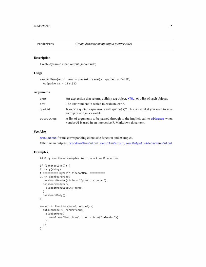
renderMenu Create dynamic menu output (server side)
Description
Create dynamic menu output (server side)
Usage
renderMenu(expr, env = parent.frame(), quoted = FALSE,outputArgs = list())
Arguments
expr An expression that returns a Shiny tag object, HTML, or a list of such objects.
env The environment in which to evaluate expr.
quoted Is expr a quoted expression (with quote())? This is useful if you want to savean expression in a variable.
outputArgs A list of arguments to be passed through to the implicit call to uiOutput whenrenderUI is used in an interactive R Markdown document.
See Also
menuOutput for the corresponding client side function and examples.
Other menu outputs: dropdownMenuOutput, menuItemOutput, menuOutput, sidebarMenuOutput
Examples
## Only run these examples in interactive R sessions
if (interactive()) {library(shiny)# ========== Dynamic sidebarMenu ==========ui <- dashboardPage(
dashboardHeader(title = "Dynamic sidebar"),dashboardSidebar(sidebarMenuOutput("menu")
),dashboardBody()
)
server <- function(input, output) {output$menu <- renderMenu({
sidebarMenu(menuItem("Menu item", icon = icon("calendar"))
)})
}

16 renderValueBox
shinyApp(ui, server)
# ========== Dynamic dropdownMenu ==========# Example message data in a data framemessageData <- data.frame(
from = c("Admininstrator", "New User", "Support"),message = c("Sales are steady this month.","How do I register?","The new server is ready."
),stringsAsFactors = FALSE
)
ui <- dashboardPage(dashboardHeader(
title = "Dynamic menus",dropdownMenuOutput("messageMenu")
),dashboardSidebar(),dashboardBody(
fluidRow(box(
title = "Controls",sliderInput("slider", "Number of observations:", 1, 100, 50)
))
))
server <- function(input, output) {output$messageMenu <- renderMenu({
# Code to generate each of the messageItems here, in a list. messageData# is a data frame with two columns, 'from' and 'message'.# Also add on slider value to the message content, so that messages update.msgs <- apply(messageData, 1, function(row) {
messageItem(from = row[["from"]],message = paste(row[["message"]], input$slider)
)})
dropdownMenu(type = "messages", .list = msgs)})
}
shinyApp(ui, server)}
renderValueBox Create an info or value box output (server side)

renderValueBox 17
Description
This is the server-side function for creating a dynamic valueBox or infoBox.
Usage
renderValueBox(expr, env = parent.frame(), quoted = FALSE)
renderInfoBox(expr, env = parent.frame(), quoted = FALSE)
Arguments
expr An expression that returns a Shiny tag object, HTML, or a list of such objects.
env The environment in which to evaluate expr.
quoted Is expr a quoted expression (with quote())? This is useful if you want to savean expression in a variable.
See Also
valueBoxOutput for the corresponding UI-side function.
Examples
## Only run this example in interactive R sessionsif (interactive()) {library(shiny)
ui <- dashboardPage(dashboardHeader(title = "Dynamic boxes"),dashboardSidebar(),dashboardBody(
fluidRow(box(width = 2, actionButton("count", "Count")),infoBoxOutput("ibox"),valueBoxOutput("vbox")
))
)
server <- function(input, output) {output$ibox <- renderInfoBox({
infoBox("Title",input$count,icon = icon("credit-card")
)})output$vbox <- renderValueBox({
valueBox("Title",input$count,icon = icon("credit-card")

18 sidebarMenu
)})
}
shinyApp(ui, server)}
shinydashboard shinydashboard
Description
shinydashboard
sidebarMenu Create a dashboard sidebar menu and menu items.
Description
A dashboardSidebar can contain a sidebarMenu. A sidebarMenu contains menuItems, and theycan in turn contain menuSubItems.
Usage
sidebarMenu(..., id = NULL, .list = NULL)
menuItem(text, ..., icon = NULL, badgeLabel = NULL, badgeColor = "green",tabName = NULL, href = NULL, newtab = TRUE, selected = NULL,expandedName = as.character(gsub("[[:space:]]", "", text)),startExpanded = FALSE)
menuSubItem(text, tabName = NULL, href = NULL, newtab = TRUE,icon = shiny::icon("angle-double-right"), selected = NULL)
Arguments
... For menu items, this may consist of menuSubItems.
id For sidebarMenu, if id is present, this id will be used for a Shiny input value,and it will report which tab is selected. For example, if id="tabs", then input$tabswill be the tabName of the currently-selected tab. If you want to be able to book-mark and restore the selected tab, an id is required.
.list An optional list containing items to put in the menu Same as the ... arguments,but in list format. This can be useful when working with programmaticallygenerated items.
text Text to show for the menu item.

sidebarMenuOutput 19
icon An icon tag, created by icon. If NULL, don’t display an icon.
badgeLabel A label for an optional badge. Usually a number or a short word like "new".
badgeColor A color for the badge. Valid colors are listed in validColors.
tabName The name of a tab that this menu item will activate. Not compatible with href.
href An link address. Not compatible with tabName.
newtab If href is supplied, should the link open in a new browser tab?
selected If TRUE, this menuItem or menuSubItem will start selected. If no item haveselected=TRUE, then the first menuItem will start selected.
expandedName A unique name given to each menuItem that serves to indicate which one (if any)is currently expanded. (This is only applicable to menuItems that have childrenand it is mostly only useful for bookmarking state.)
startExpanded Should this menuItem be expanded on app startup? (This is only applicable tomenuItems that have children, and only one of these can be expanded at anygiven time).
Details
Menu items (and similarly, sub-items) should have a value for either href or tabName; otherwisethe item would do nothing. If it has a value for href, then the item will simply be a link to thatvalue.
If a menuItem has a non-NULL tabName, then the menuItem will behave like a tab – in other words,clicking on the menuItem will bring a corresponding tabItem to the front, similar to a tabPanel.One important difference between a menuItem and a tabPanel is that, for a menuItem, you mustalso supply a corresponding tabItem with the same value for tabName, whereas for a tabPanel,no tabName is needed. (This is because the structure of a tabPanel is such that the tab name canbe automatically generated.) Sub-items are also able to activate tabItems.
Menu items (but not sub-items) also may have an optional badge. A badge is a colored oval con-taining text.
See Also
dashboardSidebar for example usage. For dynamically-generated sidebar menus, see renderMenuand sidebarMenuOutput.
Other sidebar items: sidebarSearchForm, sidebarUserPanel
sidebarMenuOutput Create a sidebar menu output (client side)
Description
This is the UI-side function for creating a dynamic sidebar menu.
Usage
sidebarMenuOutput(outputId)

20 sidebarSearchForm
Arguments
outputId Output variable name.
See Also
renderMenu for the corresponding server-side function and examples, and sidebarMenu for thecorresponding function for generating static sidebar menus.
Other menu outputs: dropdownMenuOutput, menuItemOutput, menuOutput, renderMenu
sidebarSearchForm Create a search form to place in a sidebar
Description
A search form consists of a text input field and a search button.
Usage
sidebarSearchForm(textId, buttonId, label = "Search...",icon = shiny::icon("search"))
Arguments
textId Shiny input ID for the text input box.
buttonId Shiny input ID for the search button (which functions like an actionButton).
label Text label to display inside the search box.
icon An icon tag, created by icon.
See Also
dashboardSidebar for example usage.
Other sidebar items: sidebarMenu, sidebarUserPanel

sidebarUserPanel 21
sidebarUserPanel A panel displaying user information in a sidebar
Description
A panel displaying user information in a sidebar
Usage
sidebarUserPanel(name, subtitle = NULL, image = NULL)
Arguments
name Name of the user.
subtitle Text or HTML to be shown below the name.
image A filename or URL to use for an image of the person. If it is a local file, theimage should be contained under the www/ subdirectory of the application.
See Also
dashboardSidebar for example usage.
Other sidebar items: sidebarMenu, sidebarSearchForm
tabBox Create a tabbed box
Description
Create a tabbed box
Usage
tabBox(..., id = NULL, selected = NULL, title = NULL, width = 6,height = NULL, side = c("left", "right"))
Arguments
... tabPanel elements to include in the tabset
id If provided, you can use input$id in your server logic to determine which ofthe current tabs is active. The value will correspond to the value argument thatis passed to tabPanel.
selected The value (or, if none was supplied, the title) of the tab that should be selectedby default. If NULL, the first tab will be selected.
title Title for the tabBox.
22 tabBox
width The width of the box, using the Bootstrap grid system. This is used for row-based layouts. The overall width of a region is 12, so the default valueBoxwidth of 4 occupies 1/3 of that width. For column-based layouts, use NULL forthe width; the width is set by the column that contains the box.
height The height of a box, in pixels or other CSS unit. By default the height scalesautomatically with the content.
side Which side of the box the tabs should be on ("left" or "right"). Whenside="right", the order of tabs will be reversed.
See Also
Other boxes: box, infoBox, valueBox
Examples
## Only run this example in interactive R sessionsif (interactive()) {library(shiny)
body <- dashboardBody(fluidRow(tabBox(
title = "First tabBox",# The id lets us use input$tabset1 on the server to find the current tabid = "tabset1", height = "250px",tabPanel("Tab1", "First tab content"),tabPanel("Tab2", "Tab content 2")
),tabBox(
side = "right", height = "250px",selected = "Tab3",tabPanel("Tab1", "Tab content 1"),tabPanel("Tab2", "Tab content 2"),tabPanel("Tab3", "Note that when side=right, the tab order is reversed.")
)),fluidRow(
tabBox(# Title can include an icontitle = tagList(shiny::icon("gear"), "tabBox status"),tabPanel("Tab1",
"Currently selected tab from first box:",verbatimTextOutput("tabset1Selected")
),tabPanel("Tab2", "Tab content 2")
))
)
shinyApp(ui = dashboardPage(dashboardHeader(title = "tabBoxes"), dashboardSidebar(), body),

tabItem 23
server = function(input, output) {# The currently selected tab from the first boxoutput$tabset1Selected <- renderText({
input$tabset1})
})}
tabItem One tab to put inside a tab items container
Description
One tab to put inside a tab items container
Usage
tabItem(tabName = NULL, ...)
Arguments
tabName The name of a tab. This must correspond to the tabName of a menuItem ormenuSubItem.
... Contents of the tab.
See Also
menuItem, menuSubItem, tabItems. See sidebarMenu for a usage example.
tabItems A container for tab items
Description
A container for tab items
Usage
tabItems(...)
Arguments
... Items to put in the container. Each item should be a tabItem.
See Also
menuItem, menuSubItem, tabItem. See sidebarMenu for a usage example.

24 updateTabItems
taskItem Create a task item to place in a dropdown task menu
Description
Create a task item to place in a dropdown task menu
Usage
taskItem(text, value = 0, color = "aqua", href = NULL)
Arguments
text The task text.
value A percent value to use for the bar.
color A color for the bar. Valid colors are listed in validColors.
href An optional URL to link to.
See Also
dashboardHeader for example usage.
Other menu items: messageItem, notificationItem
updateTabItems Change the selected tab on the client
Description
This function controls the active tab of tabItems from the server. It behaves just like updateTabsetPanel.
Usage
updateTabItems(session, inputId, selected = NULL)
Arguments
session The session object passed to function given to shinyServer.
inputId The id of the tabsetPanel, navlistPanel, or navbarPage object.
selected The name of the tab to make active.

valueBox 25
Examples
## Only run this example in interactive R sessionsif (interactive()) {
ui <- dashboardPage(dashboardHeader(title = "Simple tabs"),dashboardSidebar(sidebarMenu(
id = "tabs",menuItem("Dashboard", tabName = "dashboard", icon = icon("dashboard")),menuItem("Widgets", tabName = "widgets", icon = icon("th"))
),actionButton('switchtab', 'Switch tab')
),dashboardBody(
tabItems(tabItem(tabName = "dashboard",
h2("Dashboard tab content")),tabItem(tabName = "widgets",
h2("Widgets tab content"))
))
)
server <- function(input, output, session) {observeEvent(input$switchtab, {
newtab <- switch(input$tabs,"dashboard" = "widgets","widgets" = "dashboard"
)updateTabItems(session, "tabs", newtab)
})}
shinyApp(ui, server)}
valueBox Create a value box for the main body of a dashboard.
Description
A value box displays a value (usually a number) in large text, with a smaller subtitle beneath, and alarge icon on the right side. Value boxes are meant to be placed in the main body of a dashboard.
Usage
valueBox(value, subtitle, icon = NULL, color = "aqua", width = 4,href = NULL)

26 valueBoxOutput
Arguments
value The value to display in the box. Usually a number or short text.
subtitle Subtitle text.
icon An icon tag, created by icon.
color A color for the box. Valid colors are listed in validColors.
width The width of the box, using the Bootstrap grid system. This is used for row-based layouts. The overall width of a region is 12, so the default valueBoxwidth of 4 occupies 1/3 of that width. For column-based layouts, use NULL forthe width; the width is set by the column that contains the box.
href An optional URL to link to.
See Also
box for usage examples.
Other boxes: box, infoBox, tabBox
valueBoxOutput Create an info or value box output (client side)
Description
This is the UI-side function for creating a dynamic valueBox or infoBox.
Usage
valueBoxOutput(outputId, width = 4)
infoBoxOutput(outputId, width = 4)
Arguments
outputId Output variable name.
width The width of the box, using the Bootstrap grid system. This is used for row-based layouts. The overall width of a region is 12, so the default valueBoxwidth of 4 occupies 1/3 of that width. For column-based layouts, use NULL forthe width; the width is set by the column that contains the box.
See Also
renderValueBox for the corresponding server-side function and examples.

Index
actionButton, 20
box, 2, 5, 6, 12, 22, 26
dashboardBody, 5, 8dashboardHeader, 6, 8, 11, 14, 24dashboardPage, 6, 8dashboardSidebar, 8, 9, 19–21dropdownMenu, 6, 10, 11, 13dropdownMenuOutput, 11, 12, 13, 15, 20
HTML, 14, 15, 17
icon, 12–14, 19, 20, 26infoBox, 3, 11, 17, 22, 26infoBoxOutput (valueBoxOutput), 26
menuItem, 12, 13, 23menuItem (sidebarMenu), 18menuItemOutput, 11, 12, 13, 15, 20menuOutput, 11, 12, 13, 15, 20menuSubItem, 18, 23menuSubItem (sidebarMenu), 18messageItem, 10, 13, 13, 14, 24
notificationItem, 10, 13, 14, 14, 24
renderDropdownMenu, 14renderInfoBox (renderValueBox), 17renderMenu, 11–13, 15, 19, 20renderValueBox, 16, 26
shinydashboard, 18shinydashboard-package
(shinydashboard), 18sidebarMenu, 9, 13, 18, 20, 21, 23sidebarMenuOutput, 11–13, 15, 19, 19sidebarSearchForm, 9, 19, 20, 21sidebarUserPanel, 19, 20, 21
tabBox, 3, 12, 21, 26
tabItem, 23, 23tabItems, 5, 6, 23, 23, 24tabPanel, 19, 21taskItem, 10, 13, 14, 24
uiOutput, 15updateTabItems, 24updateTabsetPanel, 24
validColors, 2, 12, 19, 24, 26validStatuses, 2, 10, 14valueBox, 3, 6, 12, 17, 22, 25, 26valueBoxOutput, 17, 26
27


