
Quarter III ARTS
MEDIA-BASED ARTS AND DESIGN IN THE
PHILIPPINES
HAPPY NEZZA B. ARANJUEZ 10-EINSTEIN

The previous quarter provided an overview of the phenomenal capabilities and
possibilities of the electronic or digital media available in today’s technology-driven
world. These have enabled amazingly innovative art forms to evolve far beyond
traditional painting, sculpture, and architecture. As quickly as technology is able to
develop new devices, gadgets, and techniques, modern artists and designers
adapt them to enhance their creative expression.
In this quarter, the modern techniques and trends in photography, film, print
media, digital media, and product and industrial design will be explored. Most
notably the talent, creativity, and quality workmanship of Filipino artists and designers in
all these fields will be recognized and celebrated. Not only have these brought
Philippine artistry to the world’s attention, but they have opened up an entire range of
opportunities for young Filipinos to develop and apply these talents—and earn a
living while doing so.
Technological advances continue to be a major driving force in the directions that
each of these art forms has taken. Among the results have been exciting innovations in
materials manipulation, coloring and embellishment techniques, and creation and
production processes applied to all today’s media—whether physical and tangible, or
virtual in cyber space.
PHOTOGRAPHY
In its early stages during the late 19th century, photography was viewed as a
purely technical process, that of recording visible images by light action on light-
sensitive materials. In fact, its very name—from the Greek“photos” (meaning light)
and“graphos” (meaning writing)—states this process literally.
In comparison to the highly-regarded arts of painting and sculpture, then,
photography was not immediately considered art. But it was not long before the
artistry of 20th century photographers elevated this “light writing” to an aesthetic
form in its own right.
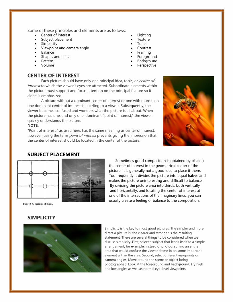
Some of these principles and elements are as follows:∙ Center of interest ∙ Subject placement ∙ Simplicity ∙ Viewpoint and camera angle ∙ Balance ∙ Shapes and lines ∙ Pattern ∙ Volume
∙ Lighting ∙ Texture ∙ Tone ∙ Contrast ∙ Framing ∙ Foreground ∙ Background ∙ Perspective
CENTER OF INTEREST Each picture should have only one principal idea, topic, or center of
interest to which the viewer's eyes are attracted. Subordinate elements within
the picture must support and focus attention on the principal feature so it
alone is emphasized.
A picture without a dominant center of interest or one with more than
one dominant center of interest is puzzling to a viewer. Subsequently, the
viewer becomes confused and wonders what the picture is all about. When
the picture has one, and only one, dominant "point of interest," the viewer
quickly understands the picture.
NOTE:
"Point of interest," as used here, has the same meaning as center of interest;
however, using the term point of interest prevents giving the impression that
the center of interest should be located in the center of the picture.
SUBJECT PLACEMENT Sometimes good composition is obtained by placing
the center of interest in the geometrical center of the
picture; it is generally not a good idea to place it there.
Too frequently it divides the picture into equal halves and
makes the picture uninteresting and difficult to balance.
By dividing the picture area into thirds, both vertically
and horizontally, and locating the center of interest at
one of the intersections of the imaginary lines, you can
usually create a feeling of balance to the composition.
SIMPLICITY
Simplicity is the key to most good pictures. The simpler and more
direct a picture is, the clearer and stronger is the resulting
statement. There are several things to be considered when we
discuss simplicity. First, select a subject that lends itself to a simple
arrangement; for example, instead of photographing an entire
area that would confuse the viewer, frame in on some important
element within the area. Second, select different viewpoints or
camera angles. Move around the scene or object being
photographed. Look at the foreground and background. Try high
and low angles as well as normal eye-level viewpoints.

VIEWPOINT AND CAMERA ANGLE The proper viewpoint or camera angle is an important
factor in good composition. Repositioning your subject within the
viewfinder frame and changing the camera viewpoint or camera
angle are two simple ways of controlling composition.
Photographing from a different viewpoint or camera angle can
often add drama and excitement or even bring out an unusual
aspect of a subject. Most of the subjects you photograph are
three-dimensional and should be photographed from an angle (to
the right or left of and/or from higher or lower than the subject)
that allows the viewer to see more than one side of the subject.
Eye-Level Shots
With the camera held horizontal, eye-level shots are usualIy made at a height of about 5 1/2 feet, the height
from which the average adult sees, and with the camera horizontal. With the camera held at eye level but
pointed up or down, the camera position changes and you have either a low or high camera angle, respectively.
a. Low Viewpoint and Low Camera Angle
A low camera angle is achieved when the camera
angle is located below the point of primary
interest and pointed upward. Low angles tend to
lend strength and dominance to a subject and
dramatize the subject. Low angle shots are used
when dramatic impact is desired. This type of shot
is very useful for separating the subject from the
background, for eliminating unwanted foreground and background, and for
creating the illusion of greater size and speed.
b. High Viewpoint and High Camera Angle
High viewpoints and high camera angles help orient the viewer, because they
show relationships among all elements within the picture area and produce a
psychological effect by minimizing the apparent strength or size of the
subject
BALANCE Balance in photographic composition is a matter of making pictures look harmonious. Each element in
a picture has a certain amount of value in respect to all the other elements. Every tone, mass, shape, tree, rock
figure, building, line, or shadow contributes a certain amount of weight that must be arranged correctly in the
composition to give the impression of balance. The subject placement within the picture area is the factor that
must be carefully considered.
Composition is kept in balance by two different methods: symmetrical, or formal, balance and asymmetrical, or
informal, balance.

a. Symmetrical, or Formal, Balance Symmetrical, or formal, balance in a photograph is
achieved when elements on both sides of the picture
are of equal weight. The idea of formal balance can
be related to a seesaw, When there are two equally
weighted objects on the seesaw and they are
equidistant from the pivot point, or fulcrum, the
board will be in balance.
b. Asymmetrical, or Informal, Balance In asymmetrical balance the imaginary central pivot point is
still presumed to be present; however, instead of mirror images
on each side of the picture area, the subject elements are
notably different in size, shape, weight, tone, and placement.
Balance is established by equalizing the element forces in spite
of their differences. Asymmetrical balance is more difficult to
achieve than symmetrical balance, because of the problem of
establishing relative weight values for dissimilar elements
within the picture area as well as presenting some form of
stability.
SHAPES AND LINES Shapes and lines are important elements in photographic composition. When properly used, shapes and lines
can create a desired effect. As a photographer, you usually have control over
the way shapes and lines are used in your pictures.
Shape Shape is a two-dimensional element basic to picture composition and is
usually the first means by which a viewer identifies an object within the
picture. Form is the three-dimensional equivalent of shape. Even though
shape is only two-dimensional, with the proper application of lighting and
tonal range, you can bring out form and give your subjects a three-
dimensional quality.
Lines
Lines can be effective elements of composition,
because they give structure to your photographs.
Lines can unify composition by directing the viewer's
eyes and attention to the main point of the picture or
lead the eyes from one part of the picture to another.
They can lead the eyes to infinity, divide the picture,
and create patterns. Through linear perspective, lines
can lend a sense of depth to a photograph.

PATTERN Creating your pictures around repeating elements or patterns
provides picture unity and structure. Pattern repetition creates
rhythm that the eyes enjoy following. (When lines, shapes, and
colors within a picture occur in an orderly way (as in wallpaper), they
create patterns that often enhance the attractiveness of
photographs. Pattern, like texture, is found almost everywhere. It
can be used as the primary subject but is most often used as a
subordinate element to enhance composition.
VOLUME
When photographing most subjects, you face the problem of how to
symbolize three-dimensional objects in a two-dimensional picture.
The solution becomes simple when a distinction is made between
the two different ways three-dimensional objects appear: as positive,
or occupied space (volume) or as negative, or unoccupied space.
LIGHTING Lighting is also an important creative element of composition. By
controlling the light and directing it where you want it, you can subdue
objects or distracting elements in the scene to give more emphasis to the
main point of interest.
Light and shadows can be used in composition to create mood, to
draw attention to an area, to modify or distort shape, or to bring out form
and texture in the subject. Shadows are a key to apparent form in
photographs. Without shadows, the subject records without form, curvature,
or texture, appearing flat and lifeless. This does not mean that shadows must
be harsh and black to achieve the effects of form, curvature, and texture. They
may be soft, yet of sufficient density to show the most delicate roundness
and form. Generally, harsh, black shadows are undesirable in a photograph
due to the loss of detail in them.
TEXTURE
Texture helps to emphasize the features and details in
a photograph. By capturing "texture" of objects being
photographed, you can create form.
When people observe a soft, furry object or a smooth,
shining surface, they have a strong urge to touch it. You can
provide much of the pleasure people get from the feel of
touching such objects by rendering texture in your pictures.
Texture can be used to give realism and character to a picture
and may in itself be the subject of a photograph.

TONE Tone is probably the most intangible element of
composition. Tone may consist of shadings from white-
to-gray-to-black, or it may consist of darks against lights
with little or no grays. The use of dark areas against light
areas is a common method of adding the feeling of a
third dimension to a two-dimensional black-and-white
picture. The interaction of light against dark shades in
varying degrees helps to set the mood of a composition.
A picture consisting of dark or somber shades conveys
mystery, intrigue, or sadness. When the tones are mostly
light and airy, the picture portrays lightness, joy, or
airiness.
CONTRAST
When we speak of contrast as it relates to composition, we are referring to both tonal contrast, as in black-and-
white photography, and color contrast as it relates to color photography. In black-and-white photography,
contrast is the difference in subject tones from white-to-gray-to-black or from the lightest tone to the darkest
tone. In color photography different colors create contrast.
a. Tonal Contrast In black-and-white photography, contrast is considered
either high, normal, or low. A high-contrast scene or
photograph consists primarily of white and black with few or
no middle gray tones. Most scenes you photograph have
normal contrast. There will probably be elements within the
scene that are very light or white, some that are very dark or
black, and many tones or colors that reproduce as various
tones of gray.
b. Color Contrast Color contrast is an effective compositional element in color
photography, just as tone is in black-and-white photography. Colors
with opposite characteristics contrast strongly when placed together.
Each color accentuates the qualities of the other and makes the color
images stand out dramatically. Color contrast is enhanced when you
create the contrast of detail against mass.
1. LOW AND HIGH-KEY SCENES When a scene contains mostly dark tones or
colors, it is low key . When the scene contains mostly
light tones, it is high key . Low-key and high-key
pictures convey mood and atmosphere. Low key
often suggests seriousness and mystery and is often
used in horror pictures, such as a dark-granite castle
in a thunderstorm. High key creates a feeling of
delicacy and lightness.
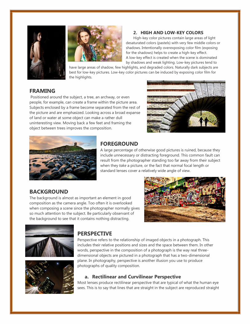
2. HIGH AND LOW-KEY COLORS High-key color pictures contain large areas of light
desaturated colors (pastels) with very few middle colors or
shadows. Intentionally overexposing color film (exposing
for the shadows) helps to create a high-key effect. A low-key effect is created when the scene is dominated
by shadows and weak lighting. Low-key pictures tend to
have large areas of shadow, few highlights, and degraded colors. Naturally dark subjects are
best for low-key pictures. Low-key color pictures can be induced by exposing color film for
the highlights.
FRAMING Positioned around the subject, a tree, an archway, or even
people, for example, can create a frame within the picture area.
Subjects enclosed by a frame become separated from the rest of
the picture and are emphasized. Looking across a broad expanse
of land or water at some object can make a rather dull
uninteresting view. Moving back a few feet and framing the
object between trees improves the composition.
FOREGROUND A large percentage of otherwise good pictures is ruined, because they
include unnecessary or distracting foreground. This common fault can
result from the photographer standing too far away from their subject
when they take a picture, or the fact that normal focal length or
standard lenses cover a relatively wide angle of view.
BACKGROUND The background is almost as important an element in good
composition as the camera angle. Too often it is overlooked
when composing a scene since the photographer normally gives
so much attention to the subject. Be particularly observant of
the background to see that it contains nothing distracting.
PERSPECTIVE Perspective refers to the relationship of imaged objects in a photograph. This
includes their relative positions and sizes and the space between them. In other
words, perspective in the composition of a photograph is the way real three-
dimensional objects are pictured in a photograph that has a two-dimensional
plane. In photography, perspective is another illusion you use to produce
photographs of quality composition.
a. Rectilinear and Curvilinear Perspective Most lenses produce rectilinear perspective that are typical of what the human eye
sees. This is to say that lines that are straight in the subject are reproduced straight

in the pic ture. Most pictures are made with rectilinear lenses. Fisheye lenses and the lenses used on panoramic
cameras produce a false perspective and are called curvilinear perspective.
b. Vanishing Point Perspective In vision, lines that are parallel to each other give the sensation of meeting at
vanishing points. When parallel lines, either horizontal or vertical,
are perpendicular to the lens axis, the vanishing points are assumed to be at
infinity. Other lines, those which are parallel to the lens axis, and all other parallel
lines at all other angles to the lens axis meet at definable vanishing points.
c. Height Perspective The place where the base of an object is located on the ground in a picture
is a clue to its distance from the camera viewpoint; for example, in a
landscape scene, the ground or ground plane rises toward the horizon. The
higher up in the ground area of the picture (up to the horizon) that the base
of an object is located, the further away it seems from the viewpoint and the
greater its height perspective.
d. Overlap Perspective When subjects within the picture are on about the same line of sight, those
objects closer to the camera viewpoint overlap more distant objects and partially
hide them. It is obvious to the viewer that the partially obstructed object is behind
the unobstructed object. This overlap is repeated many times within the picture
and gives the viewer a sense of depth and a perception of the relative distance of
objects.
e. Dwindling Size Perspective For example, you are aware that most adults are about 5 to
6 feet tall; therefore, when two people are shown in a
picture and one appears twice as tall as the other, you
cannot assume that one is in reality taller than the other.
Instead you assume the taller person is closer and the
shorter person farther away from the camera viewpoint.
f. Volume Perspective When a subject is lighted with very diffused light, the three-dimensional form or
volume of the subject is difficult to perceive because of the lack of distinct shadows.
If, on the other hand, subjects are lighted with strong directional light from angles
that cause part of the subject to be fully lighted and other parts to be in shadow, a
visual clue of the subject's form or volume is provided.
g. Atmospheric Perspective For all practical purposes, air is transparent. For most photography, this is
fundamentally true; however, when pictures are made of subjects at great
distances, the air is actually less than fully transparent. This is because air
contains very fine particles of water vapor, dust, smoke, and so on. These
particles scatter light and change its direction.

It is a form of photography that uses cameras containing arrays
of electronic photodetectors to capture images focused by a lens, as opposed to an exposure
on photographic film. The captured images are digitized and stored as a computer file ready for
further digital processing, viewing, digital publishing or printing.
Image Editing Program An image editor or photo editor is a software program used to edit or otherwise manipulate
an image, picture or other graphic. One of the most popular and powerful image editors is Adobe
Photoshop. A free alternative to Photoshop is GIMP.
Image editing encompasses the processes of altering images, whether they are digital
photographes, traditional photochemical photographs, or illustrations. Traditional analog image editing is
known as photo retouching, using tools such as an airbrush to modify photographs, or editing
illustrations with any traditional art medium. Graphic software programs, which can be broadly grouped
into vector graphics editors, raster graphics editors, and 3D modelers, are the primary tools with which a
user may manipulate, enhance, and transform images. Many image editing programs are also used
to render or create computer art from scratch.
1. Photobie
Photobie is image editing software that combines features amateurs can use with advanced tools
professionals will appreciate. Photobie is free for personal use with no Pro upgrade to pay for — all
features are free.
2. Photo! Editor
Photo! Editor is powerful multifunctional software offering a complete set of image editing tools. With
Photo! Editor, you can remove red eye instantly, enhance the color of the image, make funny caricatures,
add astonishing lighting effects, straighten, resample and crop images. The Denoise tool is one of the
world’s best to effectively remove luminance and color noise from digital images made under poor
lighting conditions. You will also appreciate the Make Up tool that offers a complete set of retouching
filters to make the best of your portrait photos.
3. Phantasmagoria
Phantasmagoria is a fun, light-weight image editing application. The main focus is to apply effects to
images, along with the basic editing that might be required after a sub-par shoot. In other words, what
most of us actually need.
4. Image Analyzer
Image Analyzer is an advanced image editing, enhancement and analysis software. The program contains
both most image enhancement features found in conventional image editors plus a number of advanced
features not even available in professional photo suites.

5. Artweaver
Artweaver is a Windows Freeware program to simulate natural brush tools. It is therefore suitable to leave
your creativity free run. Artweaver offers you a clear program window, which can be used without training
immediately.
6. Active Pixels
Active Pixels resembles Photoshop in many aspects, from the way menus and windows are laid out on its
interface to the keyboard shortcuts used for many actions. It also includes similar tools, like the magic
wand, the gradient, the polygonal lasso and others. What’s more, it supports working with layers. Active
Pixels also includes some extra embedded apps, such as a red-eye fixer, a picture browser and a screen
capture tool – although it only grabs full-screen images.
7. Photoscape
Photoscape is the fun and easy photo editing software that enables you to fix and enhance photos.
Photoscape has a very powerful editor for you to perform resizing, brightness and color adjustment, white
balance, backlight correction, frames, balloons, mosaic mode, adding text, drawing pictures, cropping,
filters, red eye removal and blooming.
8. VCW VicMan’s Photo Editor
VCW VicMan’s Photo Editor is a versatile image editor with an intuitive interface and a wide variety of
features. This powerful application is user friendly, offering simple image editing, high productivity and
easy customization.
9. PaintStar
PaintStar is a versatile digital image processing software suitable for such tasks as retouching of
photographs, composing and authoring images, image morphing, screen capture, and displaying image
thumbnail in Windows Explorer context menu. It supports alpha, layer, path ,and the most common
editing techniques.
10. Helicon Filter
Helicon Filter is a complete image editing solution for the digital photographer. Its easy and intuitive
interface, live preview feature, and in context help ensure an easy start for beginners. The program is built
as step by step workflow guiding you through all post processing stages.
11. Evan’s Image Editor
Evan’s Image Editor (EIE) is a free image editor that allows for editing and creation of animated or still
images. It contains several GPU-powered image modifiers that take advantage of modern graphics
hardware, giving you an instant preview of the effect while you adjust parameters.
12. Free Image Editor
Free Image Editor is a bitmap image-editing application that lets you retouch existing photos or create
original graphics. Free Image Editor provides a rich graphics toolset for digital photography, print
production and Web design.
13. Photo Pos Lite
Photo Pos Lite is a free lite version of the award-wining photo editor Photo Pos Pro. Using the Lite version
you can edit, enhance and manipulate your pictures easily. You can edit and optimize your pictures, print
it, resize it, convert it to another format and much more. The editor also includes some great drawing and
painting tools for creating computer graphics. Support of scanners and digital cameras, Various of Image
Enhancing and editing tools and functions, Paint Brush Tool, Shapes Tool, Clone Brush Tool, Rich Text
Tools, Special Effects, Selection Tools, Simple Gradients and more.
14. MAGIX Xtreme Photo Designer
In MAGIX Xtreme Graphic Designer your photos will be edited quickly and precisely. Its comprehensive set
of features gives your less successful shots a helping hand and assists in transforming your photo ideas
into reality. An intelligent Task Wizard explains simple and complex editing steps, resulting in successful
image editing, fast!
10 BASIC TECHNIQUES FOR BASIC PHOTO MANIPULATION
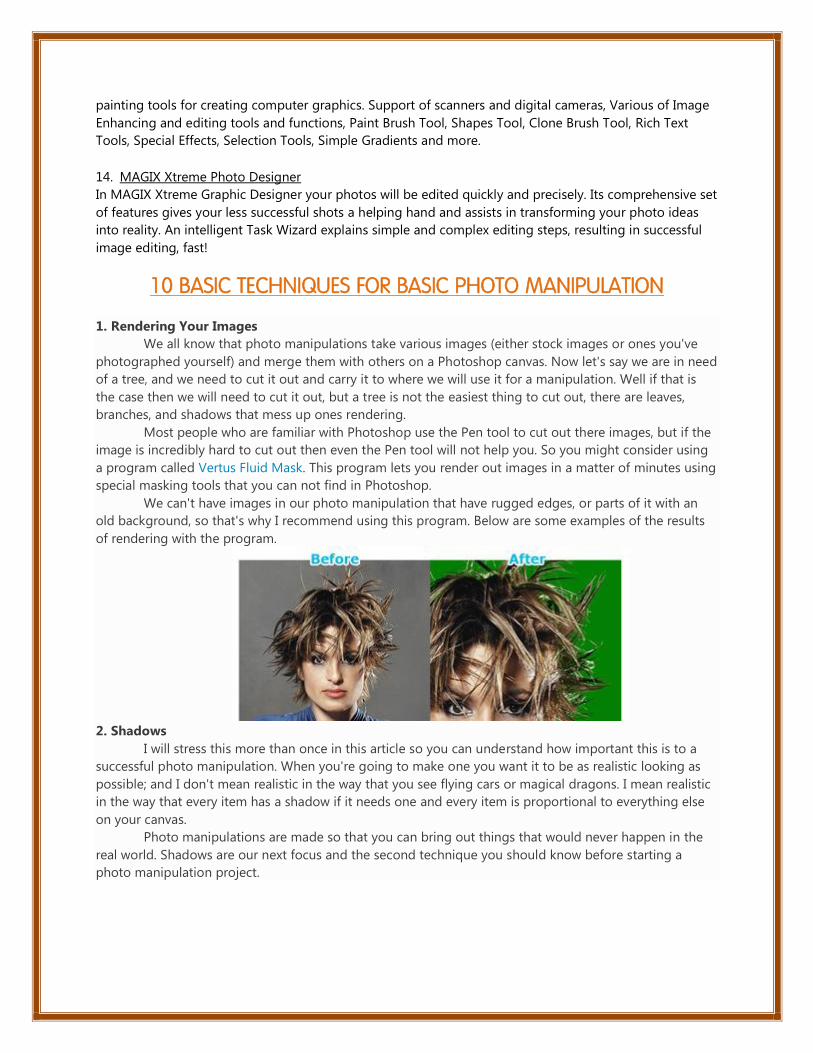
1. Rendering Your Images
We all know that photo manipulations take various images (either stock images or ones you've
photographed yourself) and merge them with others on a Photoshop canvas. Now let's say we are in need
of a tree, and we need to cut it out and carry it to where we will use it for a manipulation. Well if that is
the case then we will need to cut it out, but a tree is not the easiest thing to cut out, there are leaves,
branches, and shadows that mess up ones rendering.
Most people who are familiar with Photoshop use the Pen tool to cut out there images, but if the
image is incredibly hard to cut out then even the Pen tool will not help you. So you might consider using
a program called Vertus Fluid Mask. This program lets you render out images in a matter of minutes using
special masking tools that you can not find in Photoshop.
We can't have images in our photo manipulation that have rugged edges, or parts of it with an
old background, so that's why I recommend using this program. Below are some examples of the results
of rendering with the program.
2. Shadows
I will stress this more than once in this article so you can understand how important this is to a
successful photo manipulation. When you're going to make one you want it to be as realistic looking as
possible; and I don't mean realistic in the way that you see flying cars or magical dragons. I mean realistic
in the way that every item has a shadow if it needs one and every item is proportional to everything else
on your canvas.
Photo manipulations are made so that you can bring out things that would never happen in the
real world. Shadows are our next focus and the second technique you should know before starting a
photo manipulation project.

Below is a piece of art made
for a slashTHREE art pack. It's a great
examples of how shadows can add to
the realism of your photo
manipulation, even when it's a
fantasy scene.
Look carefully at the image
and notice that the airplanes have
shadows under them. The paint
brush, pencil, and the paint bucket all
have shadows under them, which all
add to the realism of the photo
manipulation.
Now making shadows is a
whole other discussion, but a simple
way to make them is to duplicate your original stock that you need the shadow for. Then turn it
completely black. Then add a Gaussian Blur to it. Then you can reduce it in size and put it in the correct
place.
3. Proportion
Now proportion is probably
one of the most important things a
person has to grasp if he wants to do
photo manipulations. You can not have
your dog bigger than your house, or
your horse bigger than your car.
If you're going to make a
design that is extremely farfetched,
than you have to make it look realistic
and proportion makes a huge
difference in how realistic your art
looks. You have to remember where
you want to place your images. Below
is an example of great proportioning.
You can see that there is a castle all the
way in the back of the image and note how small it is.
You have to remember that images that are supposed to be far away have to be smaller than the
ones that are closer to you. Notice how the second castle to the right is proportioned to look big but not
too big because it is near the horses. The mountains are proportioned to be big enough to go in front of
the castle. The trees are correctly proportional to the size of the horses. So remember that every image
you use should be used in proportional harmony.
4. Texture Use
Now textures don't necessarily add to the realism of your art, but they do add a nice kick to blend
all your images together evenly. Blending is a huge part of photo manipulation, so textures are something
you have to carefully pick out.
Textures add to the depth of your art. If you are trying to go for a photo manipulation that is dark
and dirty looking you can use a rough ground surface as a background texture; or if you are looking for

something smoother you can use
paper, or a wall texture. There are
many textures you can consider
using for your art, and a website
that has links to many textures
is Blue Vertigo. They have links to
many sites that distribute free
textures.
Below is a photo
manipulation with a grungy and
dark feel to it. It uses a nice
cracked surface texture. The three
dimensional elements that the
artist's used are about the same
color as the texture, so they blend
beautifully. Remember if you do
not have a background for your photo manipulation, you should use a texture that will match the mood
you are trying to set in your art.
5. Picking Stock Images
Selecting stock images is the first thing you
should do after you already have your idea. You have
to remember that you can not always cut out every
stock you have perfectly, as some stock images are
sometimes just taken at bad angles, or have slight
blurriness, so you wont be able to use them.
Let's look at several examples of stock images that
should be used in your manipulations. Let's also look
at examples of those that should be used. First off a
great place to find good free stock images
is Stock.xchng.
So look below and see image 1, which should not be used because it is too blurry for our
purposes. It is a fine photo for other purposes, but not photo manipulation. This image would be difficult
to work with on top of a colored background or overlaying a texture.
Now if you are looking for a nice junkyard car image, number 2 would be perfect to use because
it is very large and you can clearly see every angle and shape of the car. Plus this image would go perfect
with a nice grungy texture background.
Next look at image 3. This image would be difficult to use. It would be a hassle rendering this
blurry image, and even if you do, the cars are not seen that well. It's difficult to work with a blurry image in
photo manipulations and it's better to pick sharp images.
Finally let's look at image 4. This is a clean image we can easily render and use for any kind of
manipulation.
6. Color Blending
Not every image you use is going to match your background, your texture, or even your other
images. So that is where color blending comes in. Things like Photo Filters and Gradient Maps are used in
Photoshop to either add or take away color in your images. This either gives a certain image that little
boost of color, or takes away that extra
color. This helps the images blend with
one another and most importantly
form a nice coherent work of art.
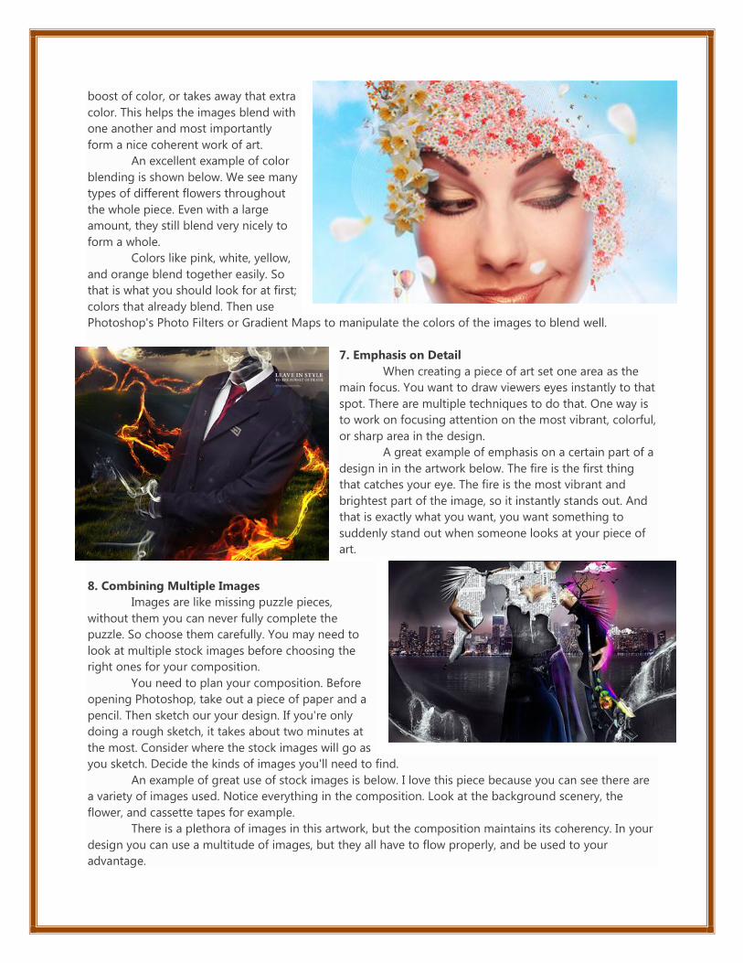
An excellent example of color
blending is shown below. We see many
types of different flowers throughout
the whole piece. Even with a large
amount, they still blend very nicely to
form a whole.
Colors like pink, white, yellow,
and orange blend together easily. So
that is what you should look for at first;
colors that already blend. Then use
Photoshop's Photo Filters or Gradient Maps to manipulate the colors of the images to blend well.
7. Emphasis on Detail
When creating a piece of art set one area as the
main focus. You want to draw viewers eyes instantly to that
spot. There are multiple techniques to do that. One way is
to work on focusing attention on the most vibrant, colorful,
or sharp area in the design.
A great example of emphasis on a certain part of a
design in in the artwork below. The fire is the first thing
that catches your eye. The fire is the most vibrant and
brightest part of the image, so it instantly stands out. And
that is exactly what you want, you want something to
suddenly stand out when someone looks at your piece of
art.
8. Combining Multiple Images
Images are like missing puzzle pieces,
without them you can never fully complete the
puzzle. So choose them carefully. You may need to
look at multiple stock images before choosing the
right ones for your composition.
You need to plan your composition. Before
opening Photoshop, take out a piece of paper and a
pencil. Then sketch our your design. If you're only
doing a rough sketch, it takes about two minutes at
the most. Consider where the stock images will go as
you sketch. Decide the kinds of images you'll need to find.
An example of great use of stock images is below. I love this piece because you can see there are
a variety of images used. Notice everything in the composition. Look at the background scenery, the
flower, and cassette tapes for example.
There is a plethora of images in this artwork, but the composition maintains its coherency. In your
design you can use a multitude of images, but they all have to flow properly, and be used to your
advantage.

9. C4D Uses
Not everyone who uses Photoshop knows what C4D files are. So let me give a quick introduction
to them. C4D's are 4D images made from a program named Cinema 4D.
They are often these abstract works. They can be used to enhance the feel of your work, and give
it an even nicer look. Let's look at how C4D meets an image and blends beautifully.
The example below shows two ships on the verge of sinking. We have a deep and long
background filled with an endless shot of sky and water. The C4D blends great with the boats and gives
off a nice effect by making it look like it's coming from the ocean.
The use of C4D art or 3D renders can improve your photo manipulation. In this case, it gave it a
nice futuristic and abstract effect that is difficult to achieve using normal stock images.
10. Enhancing a Stock Image
Now our last technique shows how to enhance a stock image to your advantage. Stock images
are often plain. It is your job to turn them into something more attractive to the eye. This is where stock
enhancement comes into play.
The example below shows how a simple bonsai tree can be turned into a towering oak. The final
composition has more branches and level and interest. The stock has been transformed.
The designer took an image of a normal bonsai tree and duplicated it, changed sizes,
manipulated its sides, and added more tree stocks. This made it look impressive. Notice the original stock
shown below the cropped image of the composition - a dramatic difference.


