
Port
folio
Jonn
y M
ayes
Online-behance.com/jonnymayesjonnymayes.crevado.co.uk
Telephone-07989154913 / 0161 941 4438
Please take the time to have a look through my
portfolio. If you wish to contact me, do so via the
information below.
2
Jonn
y M
ayes
2
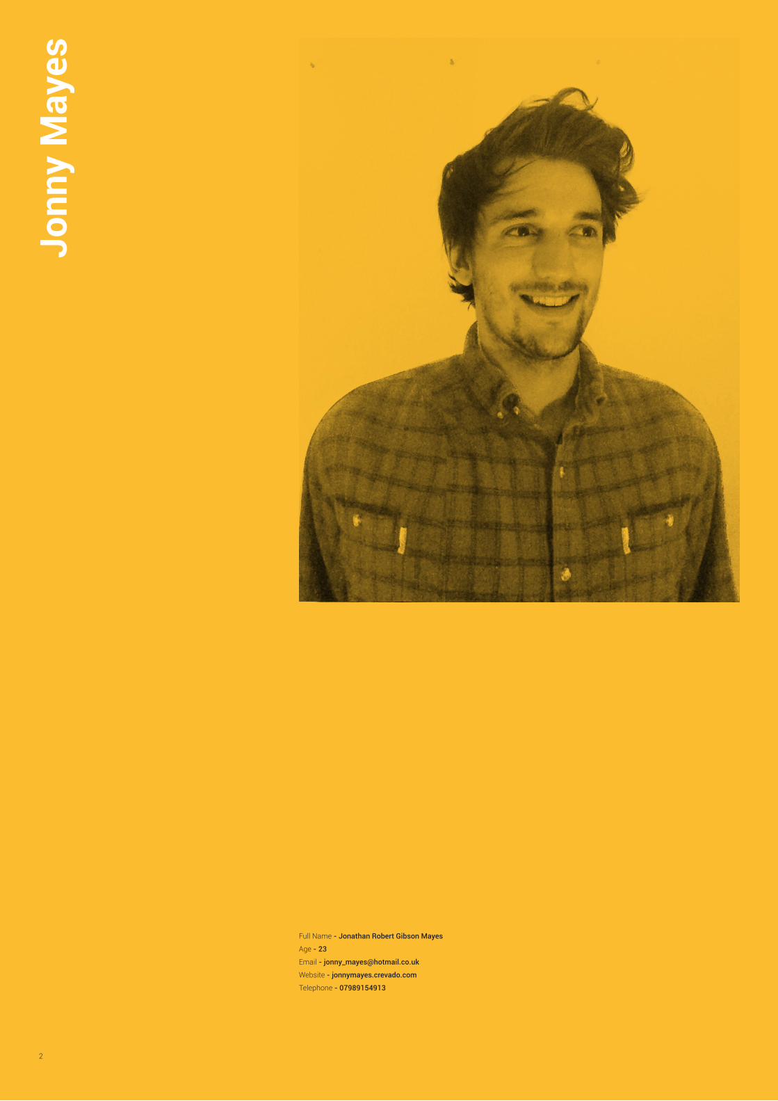
Full Name - Jonathan Robert Gibson Mayes
Age - 23
Email - [email protected]
Website - jonnymayes.crevado.com
Telephone - 07989154913

3
Cont
ents
Clearsilver
Education UK
Gameface
E-Newsletter
Fresh-Pak
Monotype
The Colour of Sound
A branding project I did during my time working for the marketing agency Clearsilver.
A branding project I did as part of a university brief.
A branding project I did as part of a university brief.
An E-Newsletter I did whilst working for the compa-ny Clearsilver.
A branding project I did whilst on placement with the company Clearsilver.
A university project involving hand-rendered typog-raphy.
My independent project i did at university, involving a booklet and several animations.
6-7
10-11
14-15
17
16
8-9
12-13
4
Wor
k
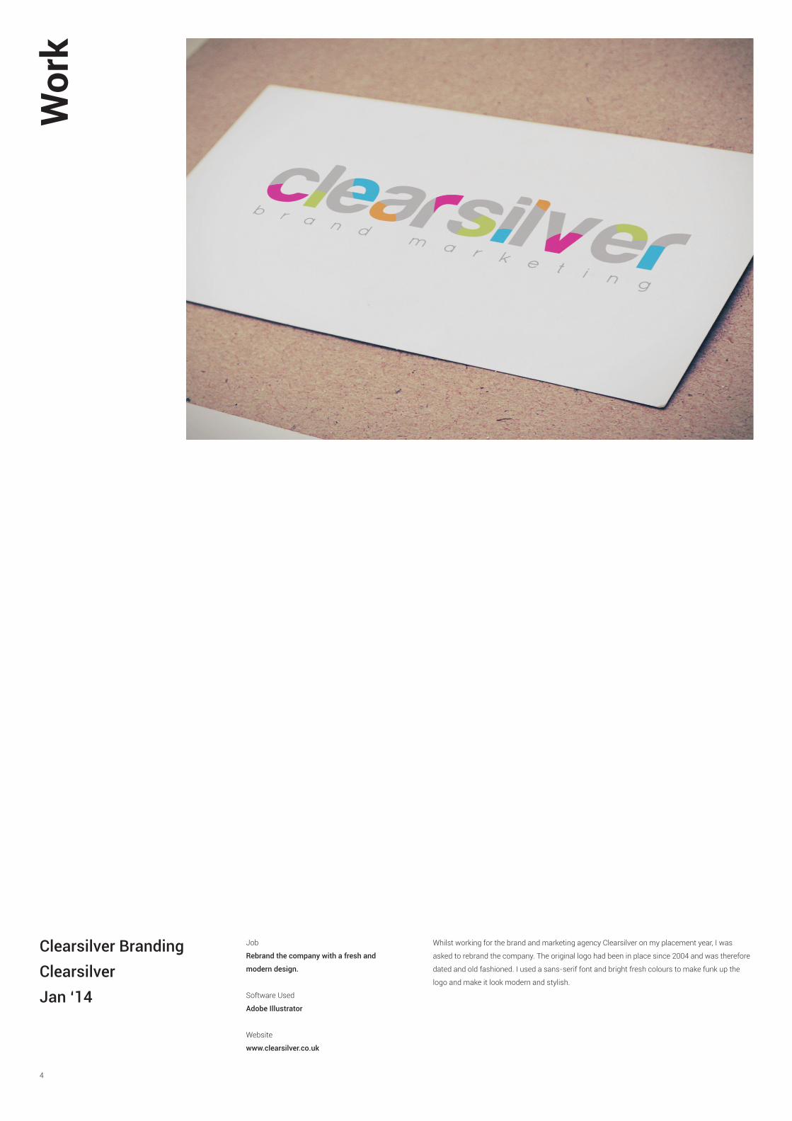
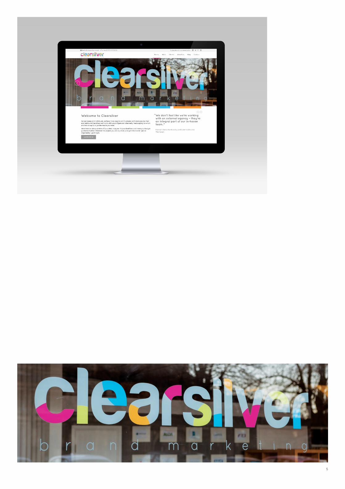
Clearsilver BrandingClearsilverJan ‘14
Job
Rebrand the company with a fresh and
modern design.
Software Used
Adobe Illustrator
Website
www.clearsilver.co.uk
Whilst working for the brand and marketing agency Clearsilver on my placement year, I was
asked to rebrand the company. The original logo had been in place since 2004 and was therefore
dated and old fashioned. I used a sans-serif font and bright fresh colours to make funk up the
logo and make it look modern and stylish.
5

6
Wor
k
MonotypeD&AD March ‘15
Job
Use the power of type to create a new visual
language for film advertising.
Software Used
Adobe Illustrator & Adobe Photoshop
Website
www.clearsilver.co.uk
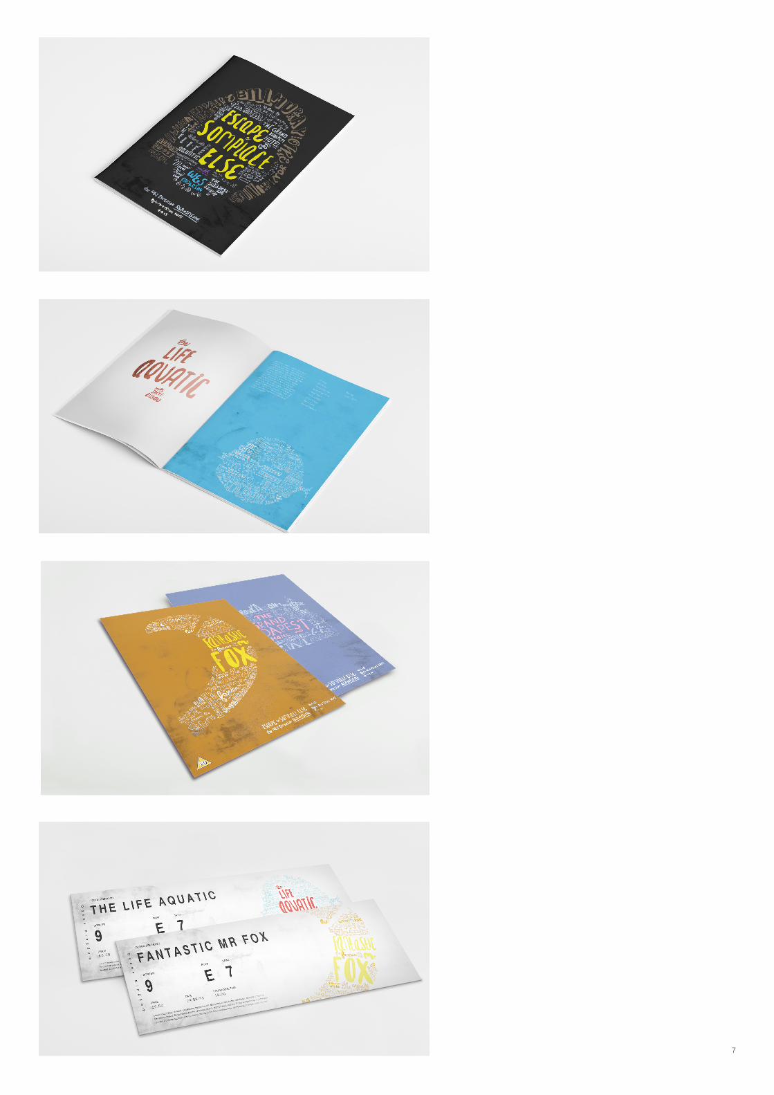
For this brief, I selected the films of Wes Anderson to create 4 typographic led posters advertising
a retrospective filming of The Grand Budapest Hotel, Fantastic Mr Fox, and The Life Aquatic With
Steve Zissou. The beautifully presented pandemonium that takes place in most Wes Anderson
films is represented by the chaotic and disorderedly nature of the typography, with phrases and
quotes from the film interlinking and spiraling around each other. The fonts used were either
used in the film of question, or representative of the said character. All the type was contained
within a shape that is representative of the film, epitomising Andersons’s ability to create his own
unique, and completely original “worlds” in which his stories take place.
7
Jonny Mayes
Project Title
Lorem ipsum dolor sit amet, consectetur adipiscing elit. Integer quis nisl neque. Lorem ipsum dolor sit amet, consectetur adipiscing elit. Vivamus scelerisque nisl ac est venenatis eleifend. Pellentesque pretium eu nulla eget sollicitudin. Curabitur vel tortor maximus, blandit tellus vel, vestibulum lectus. Praesent placerat pulvinar erat. Vestibulum ante ipsum primis in faucibus orci luctus et ultrices posuere cubilia Curae; Pellentesque congue mattis arcu id pellentesque. Quisque tincidunt vitae augue sed pretium. Curabitur imperdiet ullamcorper ipsum. Sed condimentum sapien metus, sit amet fringilla felis pulvinar a. Suspendisse nec orci eget justo semper posuere. Suspendisse eget elit sed leo ornare fringilla. Etiam eu odio sit amet mi consequat bibendum. Integer sed sagittis lorem.
Vestibulum aliquet consequat mattis. Nunc dignissim quam nec tincidunt semper. Sed vel aliquet nunc. Integer a luctus magna. Suspendisse aliquet, mi interdum sollicitudin suscipit, massa mauris dapibus nunc, et aliquet velit neque ultricies arcu. Donec aliquet vel sapien in.
8
Wor
k
Education UKAdvertising Brief March ‘15
Job
Rebrand the company Education UK
Software Used
Adobe Illustrator & Adobe Photoshop
Website
www.educationuk.co.uk
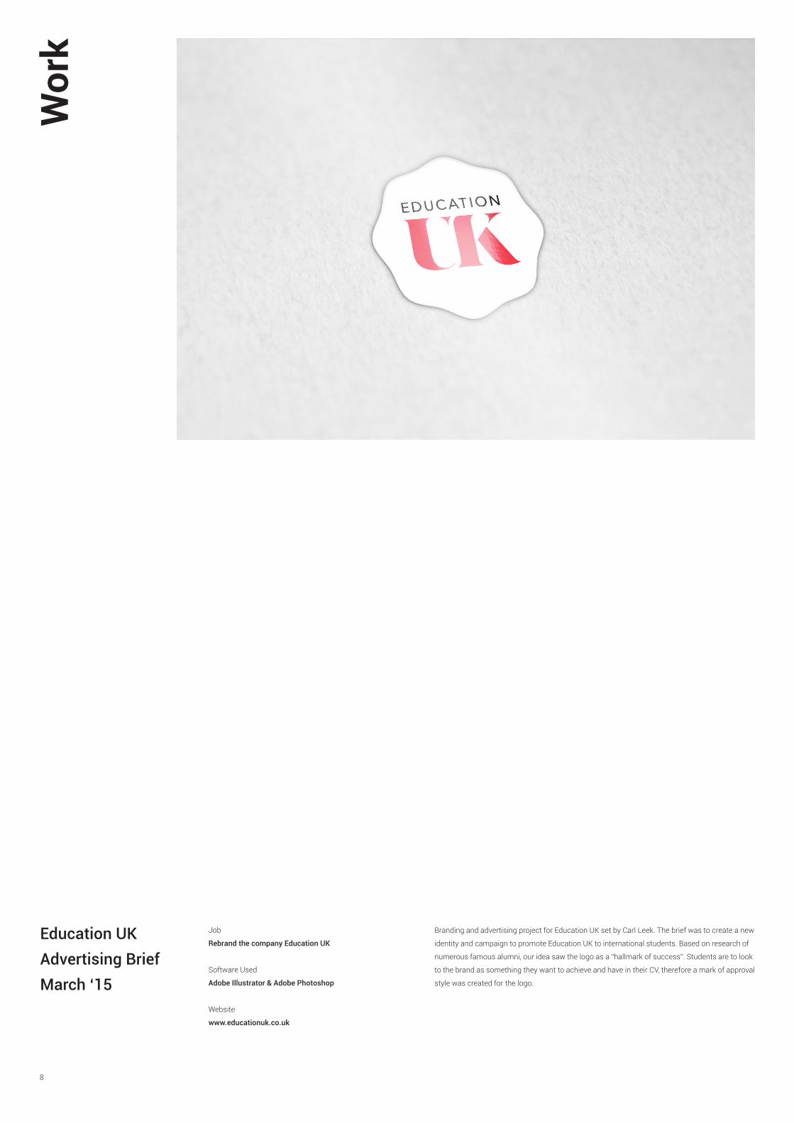
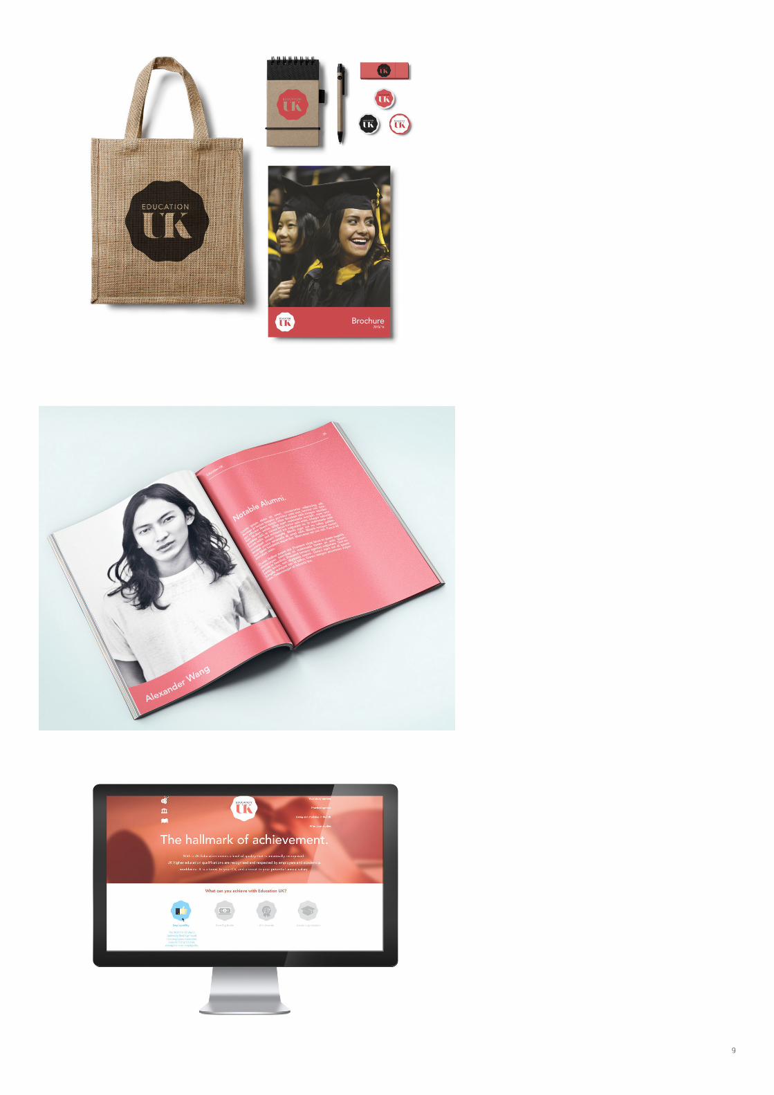
Branding and advertising project for Education UK set by Carl Leek. The brief was to create a new
identity and campaign to promote Education UK to international students. Based on research of
numerous famous alumni, our idea saw the logo as a “hallmark of success”. Students are to look
to the brand as something they want to achieve and have in their CV, therefore a mark of approval
style was created for the logo.
9

10
Wor
k

11
The Colour of Sound is an exhibition of music visualisation exploring alterna-
tive models of music-image relationship in print and video art, investigating
how the boundaries of design can be challenged, both practically and theoret-
ically, by a redefined audio-visual interaction. It involved the use of design for
print, as well as animated gifs.
The Colour of SoundIndependent Project
April ‘15

12
Wor
k
GamefaceBranding BriefNov ‘14
Job
Make a brand for men’s mud mask’s
Software Used
Adobe Illustrator & Adobe Photoshop, Canon SLR
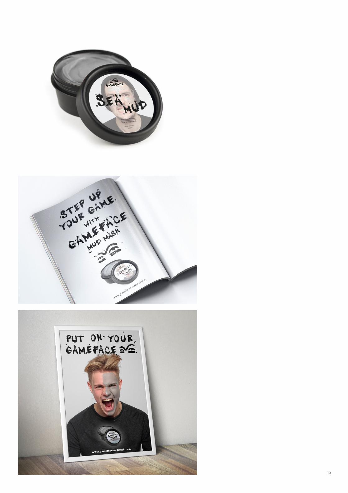
Gameface is a mud mask that offers men an opportunity to look and feel their very best for big
occasions, such as first dates, weddings or job interviews. When a big event is coming up in a
mans life, this mud mask offers them a chance to look their best and perform to the best of their
ability, by putting on their Gameface. The grunge style of the brand ties in with the ‘eye black’,
war paint style logo icon, representing a position of preparation and composure for a big event.
Outcomes for the project included a poster campaign featuring men wearing the paint, as well
as animations playing out different scenarios in which an individual benefits significantly having
worn the mud mask
13

14
Wor
k
Fresh PakBranding BriefFeb ‘14
Job
Rebrand the company Fresh-Pak
Software Used
Adobe Illustrator
15
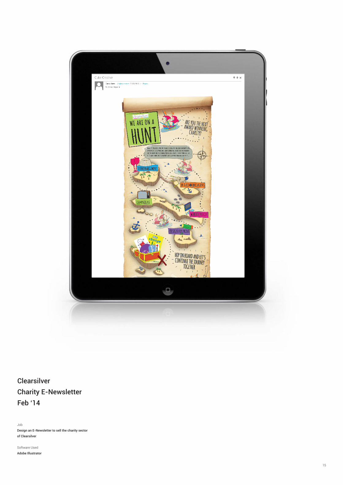
ClearsilverCharity E-NewsletterFeb ‘14
Job
Design an E-Newsletter to sell the charity sector
of Clearsilver
Software Used
Adobe Illustrator

16


