

1. 1
Form Optimization and Analytics
The Big Guide to
A Step by Step Handbook to Improve your Webform and Checkout Conversion Rates

1. 1
1. About Zuko Analytics
2. Why Form Analytics?The Importance of Form Analytics: A Case Study
3. General Principles for Form OptimizationMeasure ImprovementsTrack your ROIBenchmark your performance
‐ Average form conversion by industry ‐ Average conversion by form type
Look at the form through fresh eyesBreak the formOptimize for Mobile as well as DesktopLength doesn’t matter as much as you thinkFocus on the Submit buttonIdentify your problem fieldsUse the data to remedy your problem fieldsTest and refineSegment your analysis
4. Common Issues and High Impact TipsInline ValidationLet error messages work for youGet Passwords RightAccept all valid formatsLeverage the power of social proofMake use of MicrocopyProgress IndicatorsAsk for financial information in the right wayTo Captcha or not to Captcha?Get them to commit - the submit button
5. Best Practice Form DesignClearly identify optional fieldsSize Form Fields AccordinglyAvoid Drop DownsSet HTML types to the appropriate formatBe careful with static defaultsDon’t use CAPS for labelsUse Mobile’s native featuresNo “Nuke” ButtonsUse single column layouts wherever possibleEasy before difficultFinger friendly touch buttonsAccessibility for All
6. In Summary
7. Form Analytics and Optimization Glossary
Con
ten
ts a
nd
Nav
igat
ion

2. 2
About Zuko Analytics
Section 1

3. 3
Formisimo, Zuko’s parent company, was founded in 2014. At the time, it was common for webforms to be so badly designed, users would leave the site before completing them.
Realising there wasn’t an analytics platform to help understand user
behaviour within forms, the founders created a prototype to measure how
users engaged with them. The first prototype was created with two key
principles: it had to be installed within seconds, and it had to reveal data
that would lead to an increase in website conversions.
From here, the Formisimo Analytics platform was born. An easy-to-use
cloud-based package enabling businesses to understand why their visitors
were abandoning their forms.
Zuko, our next generation Form Analytics solution was launched in 2019,
providing even greater insight into when, where and why users abandon
web forms.
Over the years, we’ve tracked millions of sessions across hundreds of
thousands of forms for our clients. We know that paying attention to form
fill behaviour will make a huge difference to the conversion rate of your
site.
To help fulfil our mission and enable businesses to reduce frustration
and friction on their sites, we’ve decided to share the knowledge we’ve
accumulated in this eBook. Hopefully you will be able to pick out some
nuggets of wisdom that will have a real impact on your user experience
and, ultimately, your business’s bottom line.
Alun Lucas
Managing Director, Zuko Analytics
Zuko’s Mission: Make the web less frustrating, one form at a time
Ab
out
Zuko
An
alyt
ics

4. 4
Why Form Analytics?
Section 2

5. 5
As Form Optimization specialists, we are often told that we occupy a very specific niche.
That’s true but it is a very important niche.
Companies spend millions on driving traffic to their website but
considerably less on making sure their site will convert that traffic when
it arrives. The most clued up businesses are becoming wise to this and
conversion rate optimization is now a hot topic. Forms are at the cutting
edge of this. Like it or not, successfully getting users to enter their details into your form or checkout will determine whether your website or eCommerce checkout is a success or failure.
This is where specialist form analytics comes in. By identifying when,
where and why your users are abandoning your web form you can make
informed decisions to alter your site to improve your conversion rate and,
ultimately, positively impact your business’s success.
At Zuko, we see millions of pieces of form data flow through our systems
every day so we know that even the best designed forms can improve their
conversion performance further. Our latest benchmarking study indicated
that a third of users that start a form never successfully complete it. That’s
a lot of room for improvement and, if you’ve never even considered form
optimization before, it’s likely that your form performs a lot worse than
that.
That said, this ebook isn’t about reviewing Form Analytics products. We’re
not going to push Zuko at you (although if you want to give us a trial we’d
love to help). Our goal is to give you a practical guide to immediately
improving the performance of your own form and checkout.
We know that no form is the same, so we start out with guiding principles
that you should follow when undertaking a form optimization. We then
delve into some common issues that cause form abandonment and how
to rectify them. Finally, we share some best practice in achieving strong
form design to make the user experience as frictionless as possible. We
even provide a handy glossary at the end.
Wh
y Fo
rm A
nal
ytic
s?

6. 6
We’ve based our advice on the principles used by our consultants when
they deliver their optimization projects. Therefore we’re confident this
guidance can be employed for pretty much any form with positive results.
Our goal is to make the web less frustrating. We want you to become your
own mini-consultant, able to use our advice to make forms better for users
in your own organisation and beyond.
The Importance of Form Analytics: A Case StudyIf you’re still doubting whether it is worth sparing the resource to improve
your forms, here’s a real life story that shows just how effective form
analytics can be.
One of Zuko’s financial clients (name withheld to protect the guilty!) was
frustrated by lacklustre conversion rates for their application form. By
implementing form analytics over a period of two months they were able
to identify where and when users were abandoning the form and produce
credible hypotheses as to why they were dropping out.
From the data, they were able to pinpoint form amendments that were
likely to reduce friction in the form. Specifically, they implemented these
actions:
• Changed the wording of an error message that seemed to be
causing user confusion
• Added functionality that recognised misspellings of common email
address providers (e.g. converting “gnail.com” to “gmail.com”)
• Reduced the size of the cookie acceptance box on mobile that had
been obscuring parts of the form
• Optimized the touch keyboard defaults for mobile users to make
sure the right keyboard was shown at the right time
• Updated the size of tick boxes that were delivering a clumsy user
experience for both desktop and mobile users
Wh
y Fo
rm A
nal
ytic
s?

7. 7
The results were monitored and the success of the project was confirmed
when it was revealed that:
Wh
y Fo
rm A
nal
ytic
s?
Admittedly, this is a cherry picked example from amongst the best
form analytics implementations we have witnessed, but even the low
to medium impact projects we have seen (for example, when form
performance is high to start with) have shown a significant return on the
time and resource invested in them.
Completion time for the
form dropped by 11%
User corrections users fell by
37%
Form abandonment
fell from 61% to 19%
Overall conversion
doubled from 39% to 81%

8. 8
General Principles for Form Optimization
Section 3

9. 9
For anyone about to start a form optimization project, here’s our advice and general best practice. Following these guidelines will help your optimization be a success and you’ll also be able to prove it to your colleagues (often just as important!).
1. Measure Improvements
This is one we’re very passionate about. To evaluate whether the project
has been a success, you need to measure the right metrics from the
get-go, While you could just apply the tips we share in this ebook and,
you know what, your form would almost certainly get better, without
appropriate tracking, you would never be certain. Rather than making
blind changes and hoping for the best, measurement is key.
So, you need the data, but where do you get it from? We obviously have a
preference ;-), but there are many Conversion Rate Optimisation products
out there that could do the job. In a pinch, if you don’t have any budget
for software, you could use Google Analytics. But keep in mind this only
gives you a topline view. It won’t enable you to dig deeper to identify the
problem areas within your form.
As a minimum, we recommend that your form analytics tool includes:
• The ability to track topline form performance and conversion
over time so you can identify whether any changes you make are
effective
• A breakdown of each field within your form so you can know which
ones are driving abandonment, how long users take on each field
and which ones users end up returning to
• A user flow metric or visualisation - how does the user move through
the form, where do they get stuck and what may be causing them
to abandon?
• Segmentation analysis - more on this later but it’s crucial that you
can segment your data to see whether your conclusions apply to
all users or just to specific groups. You should be checking whether
Gen
eral
Pri
nci
ple
s fo
r Fo
rm O
pti
miz
atio
n

10. 10
your provider can segment by browser, device, traffic source,
product, geography and A/B test variants as a minimum.
2. Track your ROI
In order to get the resources you need to get your optimization project
underway you’re going to need a business case. Fortunately, this shouldn’t
be too tricky. You just need to know your basic metrics on current
conversion rates, plus the average value of a conversion and plug it into the
equation:
Metric Source / Calculation Example (pre Optimization)
Example (post Optimization)
Current Form Conversion Rate
Your analytics provider 52% 65%
Average value of a conversion*
Total value of all conversions / Volume of conversions
$50 $50
Monthly Form Visitor Volume*
Your analytics provider 10,000 10,000
Monthly Conversion value (total)
Monthly volume x conversion rate x average value
$260,000 $325,000
*Assumes this is static for the purposes of illustration (in reality this will change in response to
marketing and external conditions)
In our hypothetical example above, monthly revenues through the form
or checkout increased by 25% due to the optimization project. If you want
to go further you can calculate a return on investment ratio. Divide the
revenue improvement by the amount you spent on the project (likely
a modest amount on your form analytics tool + an allowance for the
time spent by individuals to run the project). Remember, though, that
optimization is the gift that keeps on giving. Once you have made those
adjustments you’ll see a sustained improvement in conversion levels every
month. Be sure to account for that in your revenue increment figure (we
generally recommend basing it on the first year’s uplift for simplicity).
We’re often asked how much you can expect an optimization project to
deliver. Which brings us nicely to our next principle….
Gen
eral
Pri
nci
ple
s fo
r Fo
rm O
pti
miz
atio
n

11. 11
3. Benchmark your performance
We have to be careful on this one. Every form is unique. Each has different
questions, varying length, and particular visual design. Most importantly
they all have disparate audiences who may react differently to varying
form features. Our general advice is therefore to benchmark your form
only against itself. Is it performing better after a change or not?
Having said this, “Is my conversion rate good?” is probably the next
most common question we get asked by clients. We recognise there’s a
dearth in data out there. In acknowledgment of this, we’ve made Zuko’s
aggregated form data available to all through an open source database
You can take the benchmarks shown within it and make your own mind
up on how to use it and whether you use it as a benchmark for your
business.
You’ll also see we’ve given you the topline conversion data for different
industries and form types below. Just remember though: these data
points are averages. There will be many forms performing better or worse
than the metrics we share here.
Gen
eral
Pri
nci
ple
s fo
r Fo
rm O
pti
miz
atio
n
Pro Tip - Don’t get too hung up on these numbers lest
you become vain or bitter. They‘re a rough guide only; each
category contains a broad range of diverse forms. Start
simple - compare your form’s performance this month to
last month’s and take it from there.

12. 12
Average form conversion by industry
View to Completion % =
Proportion of users who view the
form (i.e. arrive at the form page)
who end up completing it.
Starter to Completion % =
Proportion of users who start
to fill in the form that end up
completing it.
Industry View to Completion %
Starter to Completion %
Local Government 85% 97%
Legal Service 72% 73%
Recruitment 64% 74%
Education 60% 75%
Forex Trading 57% 79%
Healthcare 56% 73%
Insurance 53% 94%
Financial Services 47% 60%
Software 47% 61%
Gambling 46% 74%
Utilities 46% 75%
Telecoms 40% 56%
Travel 34% 51%
Property 32% 52%
Data Service 31% 62%
Ecommerce 31% 51%
Misc 31% 53%
Charity 28% 70%
Media 23% 53%
Automotive 10% 18%
Source: Zuko Database
Gen
eral
Pri
nci
ple
s fo
r Fo
rm O
pti
miz
atio
n
Form Purpose View to Completion %
Starter to Completion %
Application 52% 75%
Configuration 49% 60%
Enquiry 49% 68%
Onboarding 44% 68%
Comparison 43% 58%
Registration 41% 63%
Purchase 34% 58%
Contact 9% 38%
Source: Zuko Database
Average conversion by form type
13. 13
4. Look at the form through fresh eyes
Sitting in our marketing bubble, it’s easy to forget that our users don’t
look at things the same way we do. What we see as industry-standard
password instructions, users see as arcane hieroglyphs aimed at confusing
them. What we see as a standard pathway to completion, they see as a
journey fraught with the potential to get things wrong.
Gen
eral
Pri
nci
ple
s fo
r Fo
rm O
pti
miz
atio
n
Pro Tip - When assessing the usability of your form, it’s
essential that you put on a fresh pair of eyes in order to
identify what could be confusing the user. Summon the
inner spirit of your grandmother and try to navigate your
form as if you had no prior knowledge. Better still, get your
grandmother to do it herself. Double better still, get a whole
cohort of your target users to test out your form and help
you develop hypotheses on how to improve.
5. Break the form
Again, with our “Star Marketer” hats on, we have to be careful we don’t
put our own assumptions about how and why users should behave in our
forms into our analysis. Just because we would take the “obvious’ route
through the form to a nice, simple conclusion, doesn’t mean that the
average user will. In fact, the opposite is usually true. You can guarantee if
it’s possible for someone to inadvertently tap on a button you don’t want
them to, or click multiple times on something or press “back” despite you
telling them not to, it will happen. A lot.
When reviewing the usability of your form leave no stone unturned.
Despite that voice at the back of your head saying that no-one in
their right mind would submit a form with no input, you need to do it
and see what happens. Breaking the form is good! If it’s repeatable, it
means customers will be having the same issue. Fixing it will lead to an
improvement in user experience and conversion rates.

14. 14
With that in mind, here’s our general tips for putting your digital hardhat
on and taking a sledgehammer to your form’s UI.
• Submit the form blank (without entering anything). What message
does the user get? Is it clear what they’ve done wrong? Are they told
how to fix it?
• Miss out certain fields and try to submit. What happens? Are all
errors shown clearly? What do the errors show? Are they easy to
understand?
• If your form is a multi-step journey, go forwards and backwards multiple times to see what happens. Is data wiped or kept? Does a
customer have to repeat information they’ve previously entered?
• Leave the form for 20 minutes. Are you timed out? What happens?
How frustrating is this for users? Are they warned about this at any
stage?
• Error messages should be as helpful as possible. Most are not
(see later). Do they describe what went wrong? Do they help a user
to fix it?
• If there is a number field, try to enter letters and symbols, see what happens. Does the form accept it and cause problems at your
back end? Or does it reject the input? If so, how clear is the error
message?
• Similarly, if it is a letter / text field, try to enter numbers to see what happens.
• Try to put spaces and brackets in where possible. Does this
cause issues (e.g. with phone numbers)? What would the customer
expectation be? Would they normally be able to use spaces?
• Deliberately misformat emails, phone numbers, credit card numbers, etc. Enter too few and too many characters to see how
the form handles it.
• Password fields - put too few letters, only letters, basically ignore any best practices and see what the error messages are
(if any).
Gen
eral
Pri
nci
ple
s fo
r Fo
rm O
pti
miz
atio
n

15. 15
• Buttons - do the button explain clearly what they do when you click them? Do they work all the time? Pay special attention to the
navigation buttons. Can you use them to go anywhere in the form
without losing your data? Do inactive buttons look inactive or do
they look like you can click them and get a response?
For each of the points above, always try to channel what a user would think
(your grandmother again!) What would they do in response to something
unclear? Would they abandon? How much would they struggle?
6. Optimize for Mobile as well as Desktop
Most web designers and marketers work primarily on a PC or Mac so their
first instinct is to optimize for the device they are currently using. If not
checked, this impulse can serve you poorly.
A 21” monitor screen will provide a very different user experience than a 5”
phone screen and should almost be treated as a completely different form
when it comes to design and UI.
With over half of all of web traffic now coming from mobile users it’s
imperative you always consider mobile in your user journey.
The positive news is that Zuko’s latest data shows that mobile form
conversion is now approaching that of desktop so the web form
community is getting the message that mobile matters.
Later, we’ll provide some specific design tips to help you get the best out
of the mobile environment but ahead of that, here’s our most important
advice (over and above what you would do for any form):
Gen
eral
Pri
nci
ple
s fo
r Fo
rm O
pti
miz
atio
n
1. Prioritise legibility and responsive design
We’ve lost count of the amount of forms that are just ported
over lock stock from desktop to mobile. Some of those forms are
barely legible on the big screen so how do you think they fare on
a pocket device?

16. 16
Gen
eral
Pri
nci
ple
s fo
r Fo
rm O
pti
miz
atio
n
2. Leverage mobile’s strength
That device in your pocket has more computing power than
the one used to fly astronauts to the moon. More importantly, it
has a number of features that your laptop or desktop PC does
not have and that can be used to expedite the customer’s form
journey. Most prominently, your phone has a camera / scanner
that can be put to good use. We’ve seen hundreds of forms that
have benefitted by allowing users to scan in their details (from
a driving license, QR code, credit card or passport) that can save
time and prevent errors. Make sure you audit your form journey
to see if you can incorporate this function to improve your
conversion rate (see later for more detailed advice).
3. Consider processing and 4G speeds - simplify
Mobile devices have lower processing power than desktop
computers. They also (if using 4G) have slower web connections
than broadband. This means they’re less able to download
bandwidth hungry images and animations so cut them out.
7. Length doesn’t matter as much as you think
It’s long been an axiom for form designers to rip out as many fields as
possible to try and maximise conversion rates. The received wisdom goes
that, every field you add increases friction for the user making it more
likely they’ll abandon.
This isn’t necessarily the case. One recent study indicated that by reducing the number of fields from 9 to 6, conversions for one form actually fell by 14%! Shorter isn’t always better and this is backed up by
Zuko’s real-world data.
17. 17
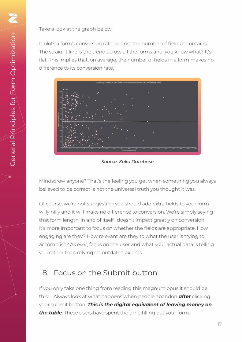
Take a look at the graph below.
It plots a form’s conversion rate against the number of fields it contains.
The straight line is the trend across all the forms and, you know what? It’s
flat. This implies that, on average, the number of fields in a form makes no
difference to its conversion rate.
Mindscrew anyone? That’s the feeling you get when something you always
believed to be correct is not the universal truth you thought it was.
Of course, we’re not suggesting you should add extra fields to your form
willy nilly and it will make no difference to conversion. We’re simply saying
that form length, in and of itself, doesn’t impact greatly on conversion.
It’s more important to focus on whether the fields are appropriate. How
engaging are they? How relevant are they to what the user is trying to
accomplish? As ever, focus on the user and what your actual data is telling
you rather than relying on outdated axioms.
8. Focus on the Submit button
If you only take one thing from reading this magnum opus it should be
this: Always look at what happens when people abandon after clicking
your submit button. This is the digital equivalent of leaving money on the table. These users have spent the time filling out your form.
Source: Zuko DatabaseGen
eral
Pri
nci
ple
s fo
r Fo
rm O
pti
miz
atio
n
18. 18
They have clicked “submit”, suggesting they’re happy to give you their
valuable personal information.
Yet you still don’t make the sale. Why?
Time and time again, across the Zuko database, we see that solving this
issue usually provides the biggest uplift in form performance over any
changes that form owners can make.
To solve this conundrum and find out what causes valuable users to
abandon, once again you need to turn to your form analytics data. By l
monitoring how people move through the form and isolating those users
who abandon after clicking submit, you can dig deeper and see what the
problem is. Look for answers to these questions:
• What error messages did they see after submitting? Are these
potentially misleading or, worse, likely to scare them off altogether?
(financial forms are often guilty of this)
• Which form fields did they return to? By seeing where they went
after submit you can see where your form friction is.
• Did they return multiple times to particular parts of the form in an effort to get things “right”? If they go back more than once to
a field and still can’t get it right there is likely an issue with either the
messaging or the inputs that you accept.
• Did they go elsewhere on your site? Are there distractions on the
form that may tempt them away, even if they are just doing it to try
and work out how to progress?
• How many times did they try before giving up? If users are trying
multiple times to complete your form they must really want what it
delivers. While this is positive (you have created genuine demand),
multiple interactions with the same field do indicate an underlying
issue.
Once you’ve identified what the issue is, you can remedy it. Smooth out
the customer journey and avoid your most enthusiastic users dropping
out unnecessarily in the future.
Gen
eral
Pri
nci
ple
s fo
r Fo
rm O
pti
miz
atio
n

19. 19
9. Identify your problem fields
One of the main advantages of a data driven approach is that it’s easy to
identify which fields your users have problems with. The ones that are
driving abandonment rates higher than they need to be.
How do you identify which fields are causing the issue? There are
various different indicators that, together, give you a good idea of where
improvements can be made. The items in the above section (seeing what
users do after the submit button) give you a great starting point. But also
consider these data points:
Abandonment
What is the raw abandonment rate for each field? I.e. What percentage
of all abandonments happen at each field. This is typically the first metric
to look at but don’t take it as the be-all and end-all. Occasionally this can
be misleading. Just because a form element was the last thing to be interacted with before a user left a form does not mean that it was the crucial factor in abandonment. The most common scenario where
this occurs is if there’s a high abandonment figure against the “submit”
button. In these cases it’s usually the error messages generated by
pressing submit that drive abandonment rather than the button itself.
Field Returns
How many times do users return to the field? If that number is high
then it’s likely users are having trouble completing the field in the format
required. For more advanced analysis, you should isolate the user journey
for people who have to return to this field (using the functionality of
something like Zuko’s Session Explorer). This way, you’ll be able to see
where they are being driven from (is it due to error messages triggered by
the submit button or something else)?
Again, be careful here. A high number isn’t necessarily a bad thing. Some
fields (think personal statements for university applications) will naturally
involve a high degree of returns - although if your basic fields such as
Gen
eral
Pri
nci
ple
s fo
r Fo
rm O
pti
miz
atio
n

20. 20
name, email or phone number have field returns averaging 2 or more you
should definitely be concerned.
Gen
eral
Pri
nci
ple
s fo
r Fo
rm O
pti
miz
atio
n
This example Zuko screenshot shows a field (Gross Income) with a large
difference in returns between abandoned and completed sessions. This is
a clear indicator of friction in this field.
Pro tip - don’t focus on the absolute figure for field
returns. Instead, look at the difference in the stats between
completed sessions and abandoned sessions. A significant
difference between these figures indicates this particular
field is likely contributing to abandonments.
Time Taken
How long are users taking to fill in each field? Generally, the longer the
time taken, the more problematic the field is. However, at the risk of
sounding like a broken record (pre-21st century reference for our younger
readers there), this isn’t an absolute rule. Some fields just take longer
to complete than others (see below for Zuko’s time taken benchmarks
for common fields). It’s the difference in the length of time taken in
abandoned and completed sessions that is important. If users spend
significantly more time on a field in abandoned sessions than they are in
completed sessions, there is a strong likelihood that the field is causing
them issues. If the situation is reversed (users taking longer in completed
sessions), this is an indicator that the user probably isn’t interested in the
field or it looks too daunting to even start it.
21. 21
10. Use the data to remedy your problem fields
If you’ve followed the steps in sections 9 & 10 using your form analytics
data, you should now have a good idea which fields are an issue and need
to be “fixed”.
This should be done through a “test and refine” approach (more on that
later) but first you need to generate hypotheses to test. Use the data to
create your theory on what is causing the user friction.
If you’ve been looking at the form through your users’ eyes and fully
understand what the data is telling you, you should be able to have a good
go at creating these hypotheses. However, as a starter, we’ve included
below some of the more common issues and the remedies that we
frequently see used to fix them.
Abandons
A large volume of abandonment on a field is never a good thing. Potential
reasons and remedies include:
i. The customer is unwilling to provide the information that your field is asking for in order to progress in the form journey.
This may include sensitive or overly personal data that the customer
decides is not worth the risk of providing.
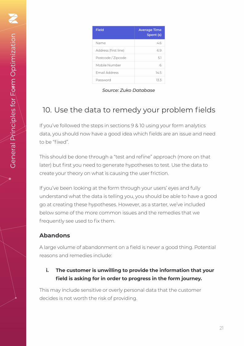
Field Average Time Spent (s)
Name 4.6
Address (first line) 6.9
Postcode / Zipcode 5.1
Mobile Number 6
Email Address 14.5
Password 13.3
Source: Zuko Database
Gen
eral
Pri
nci
ple
s fo
r Fo
rm O
pti
miz
atio
n

22. 22
ii. The field requires data the customer is unable to provide right now.
Commonly, this includes complex information such as Social Security
numbers, credit card info, or tax IDs as well as expiry dates for current
products (e.g. insurance). Your user may not have been aware that they
were going to need this information so didn’t have it to hand and decided
to leave. They may return at a later time but it’s best not to rely on this.
They could just as easily be tempted away by your competitors in the
meantime.
Gen
eral
Pri
nci
ple
s fo
r Fo
rm O
pti
miz
atio
n
iii. The user wants to provide the information required but is unable to, as your form is broken.
This is a big, completely unnecessary bug that should be easily solvable.
If your field is asking for relatively simple information that’s not overly
sensitive yet still has a high level of abandonment, it could be there’s a
breakage.
Potential remedy - remove this field, or explain why
you’re asking for this data with some microcopy or help text.
Potential remedy - make it clear at the start of the form
journey what information will be required. If the relevant
data is available on national databases (such as this one
for UK car owners), then provide a link for your users to
follow. If possible, allow the user to make some submission/
commitment without this info, and then get them to
provide it later on.

23. 23
iv. A field in your form is visibly complex or intimidating. So much so, the user doesn’t want to attempt it.
This may create a large abandonment rate for the preceding field. As an
example, if you ask for simple information such as name, then follow with
a large field asking the user to write 500 words on why they should be
accepted into your exclusive club, you should expect an artificially inflated
abandonment figure for the “Name” field.
Gen
eral
Pri
nci
ple
s fo
r Fo
rm O
pti
miz
atio
n
v. Coupon or voucher code fields are driving users away.
It’s a common phenomena for coupon code fields in ecommerce
checkouts to actually increase, rather than reduce abandonment. The
mere presence of a field gets the user excited about the potential for
reductions so leaves the site to try and find one. In the process they are
tempted away by a better discount from a competitor or, worse still, come
back and rage quit after their hard found coupon code is callously rejected
by your checkout.
Potential remedy - you need to involve your developers
in the solution. However, the easiest way to diagnose the
bug is to open the form yourself and interact with the field
in question. Try out different data formats and run tests
across multiple device and browser types. If you still can’t
work out what’s wrong with the field, try submitting the
entire form. What happens?
Potential remedy - make your complex field less
intimidating. Let the user save and come back easily or
make it clear from the start what’s required so the they are
prepared.
24. 24
Field Returns
For some fields you may expect a large proportion of field returns. For
example, forms that generate quotes for particular products (travel,
insurance, etc) will often see high returns as users go back and “tweak”
fields to check the impact on the final price.
However, there are some fields where users shouldn’t have to keep
returning. If you see high returns for name, address, email, phone number
or password, you know something’s wrong as users generally get them
right the first time around.
In Zuko’s experience, if these fields have high returns it’s usually due to
field validation restrictions. You ask for information, users try to answer, but
your form rejects the way in which they provide it. Occasionally, this will be
because the user makes a genuine mistake but a high number of returns
may indicate one of the following:
• Password - your requirements are too restrictive, or not stated
clearly enough (see later for more advice on this issue).
• Phone number - are you forcing the user to add spaces, brackets,
and international dialing codes? Or are you preventing them from
doing so? Allow users to enter a phone number how they want to,
and do the backend work to reformat this to your requirements.
• Zipcode / Postcode - As with phone number fields, are you
requiring them or blocking them from including certain elements
they would expect (e.g. spaces, letters as well as digits, etc). Make
it as easy for them to submit the information in as many relevant
formats as possible.
Gen
eral
Pri
nci
ple
s fo
r Fo
rm O
pti
miz
atio
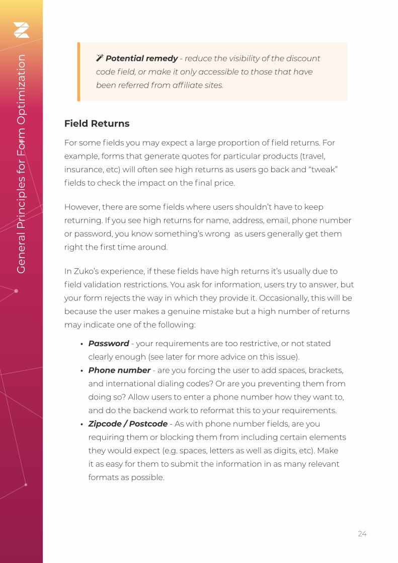
n Potential remedy - reduce the visibility of the discount
code field, or make it only accessible to those that have
been referred from affiliate sites.

25. 25
• Email - do you block some unusual domain names? Some forms
forbid email addresses ending in things like ‘example.business’ or
‘example.company’. You should be accepting these, as they are valid
email addresses.
Time Taken
The time spent in a field tends to be correlated with returns (high returns
tend to drive a higher time spent) so should be looked at in conjunction
with that data. Look at the difference between abandoned and completed
sessions as noted previously.
Gen
eral
Pri
nci
ple
s fo
r Fo
rm O
pti
miz
atio
n
Pro Tip - In addition to looking at the relative data, you
should also pay attention to absolutes. If the data for a
field takes you by surprise in how long users are taking
to complete it (high or low), compared to how long you
expect (ideally based on your pre-testing), there may be
an underlying problem that needs to be fixed. This could
be technical (users can’t submit so are taking longer in the
field) or UI based (are the instructions clear?).
11. Test and refine
Once you’ve identified and fixed the biggest issues with your form, there’s
a tendency to sit back and move onto the next item in your intray. Problem
solved, right?
Wrong. The thing that separates the best performing forms in Zuko’s database versus the merely average, is a willingness to commit to continual improvement. A half percent improvement here, a one
percent decrease in abandonment there, compounds over time to make
significant impacts on your business’s bottom line.
This essentially means testing, either A/B (testing one form variant against
another with one variable changed) or multivariate (testing multiple

26. 26
variable changes at the same time). These techniques show similar
user groups different versions of your form and see what the result is
on behaviour. Is conversion up or down? Which fields were positively or
negatively impacted? By testing a small number of changes at a time you
can build up learnings on what works and what doesn’t.
Gen
eral
Pri
nci
ple
s fo
r Fo
rm O
pti
miz
atio
n
Pro Tip - In order to gain the most from testing, your
form analytics solution should integrate with your A/B
testing tool. This facilitates a deeper dive into the data. Be
sure to check it does before committing to a subscription.
Pro Tip - Trial these changes in your A/B tests to see
whether they make a difference:
• Remove non-essential boxes or move them to later in
the form.
• Change the way you ask for information. Perhaps
“Email” rather than “Work Email”, “Cell Phone” rather
than “Work Phone”.
• Add microcopy to reassure the user what will be done
with their data.
You may want to use a specialist A/B testing tool to get the most out of this
technique. Google Optimize, Optimizely and Convert.com are among the
most popular of these.

27. 27
12. Segment your analysis
We’ve hopefully given you some sound advice that’s already helped you
improve your form conversion. Or even gotten you some internal fame
within the business (maybe even a nice new work chair as a thank you
from the CEO!). To truly level up and become a form optimization ninja you
need to heed this final point.
Segment, segment and segment again.
This is an article of faith for McKinsey consultants (and their competitors)
and is equally important for you too. All the topline data you view about
your form is an aggregate or average. That’s great if you want a general
overview and it will still surface your biggest issues. If you want a proper
deep dive, however, you need to segment your data to find out what’s
going on within different user groups. It’s very common that different
groups make their way through your form in different ways and respond
contrastingly to Calls to Action.
Some of the key segmentations you will want to run are:
• Device - Forms are rendered differently on mobile devices and users
interact differently. You need to segment by device to discover if
your mobile, desktop or tablet users are more likely to abandon at
specific points.
• Browser - Whilst developers try to make the form render
successfully across all browsers, we often see some slip through the
net. You don’t want Firefox (or Safari, or Edge) to have a difficult time
with your form just because of your browser choice. Segmenting by
browser lets you identify, and rectify, this.
• Geography - Do users from different countries behave differently
in-form? Perhaps you should serve them a version adapted to their
location.
• Traffic Source - We have consistently found across our user base
that organic traffic behaves very differently to paid-for traffic (they
tend to convert at much higher rates). By segmenting traffic source
(ideally down to exact referrer) you can determine whether
Gen
eral
Pri
nci
ple
s fo
r Fo
rm O
pti
miz
atio
n

28. 28
a channel is working for you and whether you need to build specific
forms or make some subtle changes for different sources.
• Demographics - Are user’s personal characteristics important
enough for you to track? Pull them through into your analytics
provider so you can segment by them. You can then see clearly how
each of your segments behave.
• Product - Do users select a product on your form? Retrospectively
apply that segmentation to understand the hurdles for each
product group and whether you need to adapt the journey for some
of them to improve conversion.
Gen
eral
Pri
nci
ple
s fo
r Fo
rm O
pti
miz
atio
n

29. 29
Common Issues and High Impact Tips
Section 4

30. 30
We now move on from generalised advice to consider the specifics. As form optimization specialists, we see the same issues and questions come up time and time again. This chapter sheds light on some of the most common problems put to us. We’ll also share our best tips to help you maximise form conversion.
1. Inline Validation
Inline validation is a technology that provides the user with instant
feedback as they enter information into a form. Think of the password
fields that tell you whether you’ve fulfilled the criteria as you type in the
characters.
Com
mon
Issu
es a
nd
Hig
h Im
pac
t Ti
ps
High intensity inline validation
31. 31
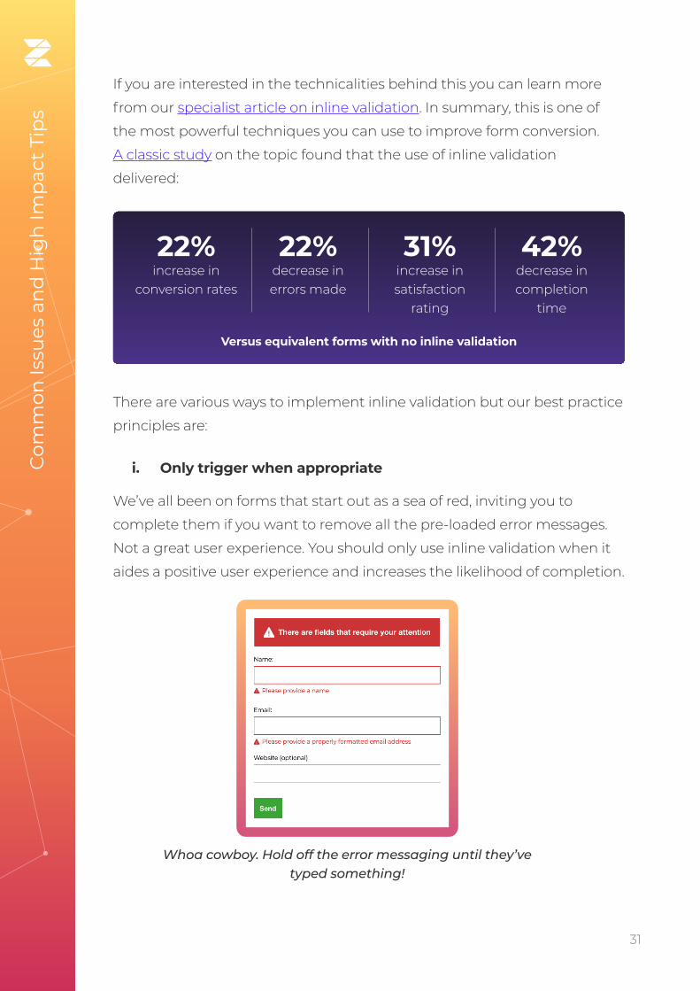
If you are interested in the technicalities behind this you can learn more
from our specialist article on inline validation. In summary, this is one of
the most powerful techniques you can use to improve form conversion.
A classic study on the topic found that the use of inline validation
delivered:
There are various ways to implement inline validation but our best practice
principles are:
i. Only trigger when appropriate
We’ve all been on forms that start out as a sea of red, inviting you to
complete them if you want to remove all the pre-loaded error messages.
Not a great user experience. You should only use inline validation when it
aides a positive user experience and increases the likelihood of completion.
Com
mon
Issu
es a
nd
Hig
h Im
pac
t Ti
ps
22% increase in
conversion rates
22% decrease in errors made
31% increase in satisfaction
rating
42% decrease in completion
time
Versus equivalent forms with no inline validation
Whoa cowboy. Hold off the error messaging until they’ve typed something!

32. 32
Generally, you want to use inline validation in the following scenarios:
• If the data has to be provided in a particular format, or with
particular characters (think password, email address, etc)
• To validate an email address or user name (i.e. confirm whether it is
already registered with your site)
• If a user skips over a required field (i.e. to remind them immediately
that it must be completed before they head on through the rest of
the form)
ii. Validate at the right time
The main benefit of inline validation is that you can provide user feedback
in real time. That doesn’t mean that you can just splurt out all the feedback
continuously if you want to maintain an optimal user experience. There
are many opinions on when it’s best to provide feedback. Our general
advice is to provide feedback once the field has been completed (i.e.
immediately after they move to the next field). This avoids any distractions
while users enter data.
This is backed up by the aforementioned study which found users
completed a form 7 - 10 seconds quicker when validation was shown after
completion rather than during. The only exception we would make to this
is for password fields with significant stipulations (special characters, etc).
Here, it can be beneficial to let the user know when they have fulfilled
the requirements. Even in this case it’s still advisable to allow a short time
lag before validation, so the user is not prematurely annoyed by error
messages.
iii. Position the message optimally
You’d think that it was intuitive to keep the validation message as close
to the field as possible. Not according to some of the forms we have seen.
If the validation message is at the top or bottom of the form, it often gets
missed.
Com
mon
Issu
es a
nd
Hig
h Im
pac
t Ti
ps

33. 33
Typically, you should place the message immediately to the right of the
input field (for a simple tick mechanism) or immediately below (if you
need to impart more information about the nature of the error). There is
a mini-trend to include the message within the error box but avoid this if
you can - this usually doesn’t render well across all devices / browsers and
can look odd or unprofessional.
iv. Keep green on the screen
Once users have successfully completed a field, you’ll want to keep that
green tick (or equivalent) on there. Studies have shown that fading the
success messages causes nervous users to worry the field has since
become invalid.. Slow typists sometimes miss the message altogether as
they focus on their keyboard rather than the screen.
2. Let error messages work for you
Computer says no….
We’ve all had the big red X slap us in the face when we’ve entered a
field incorrectly. It’s not nice - it reminds us of our worst days at school!
Worse still is when the big X appears with no instructions on how to fix
the problem, leaving us to try and work it out ourselves. Usually followed
by rage-quitting. It’s innate - error messages drive us to produce cortisol
which makes us stressed and more likely to abandon our form.
Not Helpful!
We’ve written about error messages in detail previously. The important
thing to remember is that they are not the enemy. Done well, they can
be the user’s friend, gently guiding them to the desired outcome with
minimum pain.
Com
mon
Issu
es a
nd
Hig
h Im
pac
t Ti
ps
34. 34
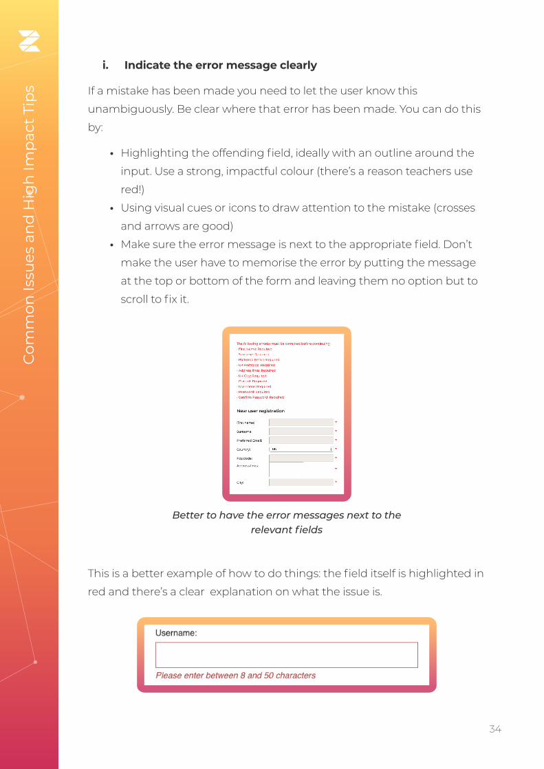
i. Indicate the error message clearly
If a mistake has been made you need to let the user know this
unambiguously. Be clear where that error has been made. You can do this
by:
• Highlighting the offending field, ideally with an outline around the
input. Use a strong, impactful colour (there’s a reason teachers use
red!)
• Using visual cues or icons to draw attention to the mistake (crosses
and arrows are good)
• Make sure the error message is next to the appropriate field. Don’t
make the user have to memorise the error by putting the message
at the top or bottom of the form and leaving them no option but to
scroll to fix it.
This is a better example of how to do things: the field itself is highlighted in
red and there’s a clear explanation on what the issue is.
Com
mon
Issu
es a
nd
Hig
h Im
pac
t Ti
ps
Better to have the error messages next to the relevant fields

35. 35
ii. Be clear and helpful
A good error message should enable a user to quickly understand,
read and fix the issue. Use the language of a good customer support
representative. Give guidance, don’t just state there’s been an error.
Avoid:
• Tech language and jargon - most users are not qualified developers.
• Forcing the user to adapt to your setup - if something is wrong tell
them why so they can fix it. They don’t know what Error356089 is...
Some examples to avoid are below.
What are the rules?
Which value and what is a value state?
Com
mon
Issu
es a
nd
Hig
h Im
pac
t Ti
ps

36. 36
A more helpful example is shown below, giving the user specific advice on
how to solve the error.
WTF?
Com
mon
Issu
es a
nd
Hig
h Im
pac
t Ti
ps

37. 37
iii. Never blame the user
There’s an old maxim; “If you don’t understand what I’m saying, it’s not
your fault for not understanding me, it’s my fault for not explaining things
well enough.” This applies to forms. Never be tempted to imply the user
has caused the error (even if they genuinely have!) as it won’t end well for
you.
iv. Prevention is better than cure
You know what’s better than writing good error messages? Never having
to display those messages in the first place because you’ve done such a
good job with your form.
How do you do that? Our top tips are:
• Inline validation (getting bored of us saying this yet?)
• Make the form labels as clear as possible (e.g. “Delivery Address” Vs
“Current Address”)
• Be more flexible in your data format (more on this later)
• Use microcopy (full section on this later)
• Be clear which fields are optional and which are compulsory
• Use smart defaults. Don’t let users pick dates in the past, choose
a return date before a departure, or select products that their age
prohibits them from purchasing
Com
mon
Issu
es a
nd
Hig
h Im
pac
t Ti
ps
Pro Tip - Use passive language rather than accusatory:
Bad example Good example
• You have entered an
incorrect login or password
• Your login and
password do not match
• You didn’t enter a name • Please enter your name
• Your Zip Code is incorrect • Please enter a valid
Zipcode for your region

38. 38
3. Get Passwords Right
Anyway you look at it, passwords are a pain. Either you make them so
difficult, the user forgets them. Or you make them so simple there’s a risk
they could be easily cracked and your security compromised.
Zuko has done a lot of research on passwords. On average, over 50% of users return to the password field at least once. Even the best performing forms have a figure of 30% returners so the potential for friction and dropouts is immense.
That said, there are ways to make things easier for both the form user and
you.
i. Minimise stipulations
We get the need for strong passwords. No-one wants a user base with
“123456” as the only barrier between a hacker and your back end. However,
overly strict requirements guarantee a horrible user experience as they
return to your site and can’t get back in. You’ll also get the “FFS” factor
when users’ first choice passwords are rejected for want of a special
character. While this rarely causes abandonment in itself, you don’t want a
frustrated customer just before they’re ready to click the submit button.
You don’t have to go too far with this. While you do need some
requirements, even Microsoft has advised against overly complex
passwords.
The UK’s Information Commission Office offers some useful guidelines
that you won’t go too far wrong if you follow:
• You should have a suitable minimum password length
• (Microsoft recommend 8 characters. Any more than 10 is
unnecessary), but there is no need for a maximum length. If the
user wants to go with “SuperCalifragilisticExpialidocious!129” then
let them. We’re assuming that you are using a reputable encryption
algorithm (if you aren’t then please do) to hash your passwords, so as
long as you have an appropriate minimum length, longer passwords
Com
mon
Issu
es a
nd
Hig
h Im
pac
t Ti
ps

39. 39
should not cause a problem. If you must set a maximum length (for
example if the developers added one without thinking and now
you’re stuck with it), then tell users this upfront.
• Special characters should not be compulsory. Password length is
more important than complexity. However, you should let the user
enter them if they want to.
• Blacklist weak passwords. This is how you can block the “Pa$$word”
and “12345”’s from your database. It’s not hard to pick up these lists
commercially and you should update them every year. When you
implement this, make sure you explain to the users why they can’t
use that password if you reject their input for this reason.
ii. Be kind with your error messages
We’ve already covered this off in the previous section so won’t labour the
point here.
iii. Use inline validation
Again, this is a repeat but we’re going to keep banging that drum until
you take notice. An average 22% increase in completions should get you
moving on this.
iv. Don’t use confirm password
Don’t do it. We get that you don’t want users to inadvertently forget
their password. But we know they probably will anyway. Why add extra
frustration at the point of commitment when a forgotten password tool
can help them later?
Com
mon
Issu
es a
nd
Hig
h Im
pac
t Ti
ps

40. 40
We learnt this from bitter experience. We used to have a confirm password
on the Formisimo (our previous product) sign-up page. We removed it.
Conversions went up 33% and we’ve never gone back. We’ve never had
mass password forgetfulness because of it either.
v. Allow unmasking
“If it wasn’t for you meddling conversion rate optimizers, I’d have gotten
away with it”
Unmasking shouldn’t only be for Scooby Doo villains.
If you want the customer to have the best experience, allow them to
unmask the password field. They are less likely to mess up the field if they
can see what they’re typing.
Companies often mask passwords out of a misguided sense of security.
But people don’t complete forms in crowded internet cafes anymore. In
fact, research by Dr Jakob Nielsen suggests that masking actually makes
passwords less safe and users less likely to become customers:
• The more uncertain users feel about typing passwords, the more
likely they are to employ overly simple passwords or copy-paste
passwords from a file on their computer. Both behaviors decrease
security.
Com
mon
Issu
es a
nd
Hig
h Im
pac
t Ti
ps
A masked password (with an option to unmask)
The same password with the mask off

41. 41
• Users make more errors when they can’t see what they’re typing.
They feel less confident. This degradation of the user experience
means people are more likely to give up or never log into your site
at all, leading to lost business. (Or at the very least, cost you more in
support calls).
Rip that mask off Velma...
4. Accept all valid formats
Phone Numbers. Postcodes. Card Numbers.
These should be uncontroversial fields that users fly through with no
problems. People know their own Zipcode, mobile number and can pull
their card out from their purse to enter the number correctly can’t they?
You’d think so but in reality, these fields cause more friction than you’d
expect. Sometimes enough for the user to quit the form altogether and go
to a competitor.
The cause of this trouble is usually down to a mismatch between the
format you want the user to input and the format they expect to enter:
• Should you use the international dialling code (+XX) for your phone
number? Should you drop the 0 from the start?
• What happens if you include a space in your phone number or
postcode?
• Should the date of birth be “DD MM YY”, “YY DD MM” or some other
combination? Do you need to include the first two digits of the year
or not?
• Is there a maximum length for a text field?
• When entering monetary amounts, should you enter the comma or
period (different countries have different conventions for this)?
• Should I add spaces in my credit card number (like it appears on the
card)?
Com
mon
Issu
es a
nd
Hig
h Im
pac
t Ti
ps

42. 42
All of this leads to unnecessary headaches. You may have a backend
system that needs a certain format to be input but that shouldn’t be your
customer’s issue. You need to stop it.
Com
mon
Issu
es a
nd
Hig
h Im
pac
t Ti
ps
Pro Tip - The most successful forms accept inputs in all
valid formats, doing the hard work themselves via a simple
reformat at the backend. This meets the requirements of
your system whilst prioritising the needs of the user.
5. Leverage the power of social proof
While we are data experts at Zuko, we do sometimes like to dip into the
school of psychology. Understanding what makes people tick can be a
valuable tool in nudging them through your form.
The choice to follow the herd is deeply ingrained in all but the most
contrary among us. A classic study by Solomon Asche demonstrated
that people are more likely to conform to the group decision, even if
that decision is “wrong”. When Asch asked the participants why they
conformed, he found that people follow social proof for two reasons:
They want to fit in with the group
They believe the group is better informed than
they are
There are various ways that you can harness this instinct for conformity
to improve your webform / checkout conversion. The most common are
outlined below.

43. 43
Com
mon
Issu
es a
nd
Hig
h Im
pac
t Ti
ps
i. Customer testimonials
While semi-anonymous customer comments can be effective (shoutout
to “JB” from Boston), the more information you can provide about your
champion, the more credible it will be. Name is crucial but if you can get
location (B2C) or company + role (B2B) you’re off to a good start.
The content needs to be detailed enough to be relevant. “Product X
is great”, won’t do much for you. “Product X really met my need for Y
and the support team delivered upon every one of their promises” will
subconsciously put the form user into the happy customer’s shoes and
make them feel more positive about the product they are about to buy
For extra impact, if you can persuade customers to give you a video
testimonial (although don’t put this in the form - too much distraction) so
much the better.
ii. Aggregated review scores
If you have independently verified positive review scores then use
them. Placing them near the end of your checkout, ideally with
glowing customer comments or testimonials will drive sales. A study by
iPerceptions, an analytics provider indicated that 63% of people are more
likely to purchase from a site that has user reviews. There are plenty of sites
out there to help you harvest reviews. Google, Yelp, TrustPilot, G2 and Feefo
are some of the most popular. Select your partner based on whether you
are a B2B or B2C provider and get a feel for how easily they will integrate
with your technology.
iii. Trust Icons + Logos
It’s amazing what the power of brands can do. If you’re a B2B service or
product make sure that your most famous customer logos are front and
centre of the buying experience. As the old saying goes, “No-one ever
got fired for buying IBM”. While that statement needs updating, the
sentiment is still valid. Herd mentality pushes us to follow the biggest and
baddest - why would Coca Cola buy a service that is bad?

44. 44
In both B2B and B2C spheres, don’t be shy about pushing your media
coverage. A set of logos of the media outlets you’ve featured on will add to
your credibility.
Finally, if you’ve got awards, flaunt them!
(caveat here - make sure they are credible too. No-one outside of the
midwest is convinced by that Iowa Chambers of Commerce honourable
mention).
iv. Case Studies
Often the gold standard in B2B social proof. Case studies incorporate
in-depth data driven outcomes for a trusted client. If you can pull one of
those together alongside a positive quote, do so immediately.
v. Customer numbers
We’ve all experienced the prompt on travel sites “21 people booked this
hotel today” while we’re enjoying our browse. This prompt is a less subtle
form of social proof but one that’s effective. You don’t have to go quite this
far if it’s not right for your business. Just stating an impressive number of
customers, will work just as well.
Com
mon
Issu
es a
nd
Hig
h Im
pac
t Ti
ps
Booking.com are serial exploiters of the social proof technique - how many examples can you spot?

45. 45
6. Make use of Microcopy
Microcopy is the small pieces of written content that guide users through
your online form. It cuts friction from the form experience and, done well,
can make a massive difference to your abandonment rates.
The primary categories where you should include microcopy are:
i. Giving users a heads up
It’s always good practice to let users know what to expect and what is
expected of them. Much better than springing it on them after they’ve
invested time in the form.
For example, you could prep them on what documents they will need later
on, like in this from the UK driving license authority:
Com
mon
Issu
es a
nd
Hig
h Im
pac
t Ti
ps
Or a simple prompt to let users know they have the option to set up a full
account later, even if they start as a guest.

46. 46
ii. Being specific on the input needed
What’s the difference between, “Address”, “Current Address”, “Delivery
Address” and’ Residence Address”? If you believe there’s no difference
then you’re probably causing unnecessary confusion on your form. Use
microcopy to be specific about what is necessary.
For instance:
“....Billing address as shown on your credit card statement” to be clear what
exactly is needed.
Recipient name rather than just “Name” to be clear in the case this is a gift
for someone else.
Com
mon
Issu
es a
nd
Hig
h Im
pac
t Ti
ps
iii. Explaining why
A study by the Baymard Institute, indicated that customers grew
suspicious if asked for what they perceive to be unnecessary personal
information (especially phone numbers). Conversely, when forms
explained why they needed the information, users were much more
forgiving.
47. 47
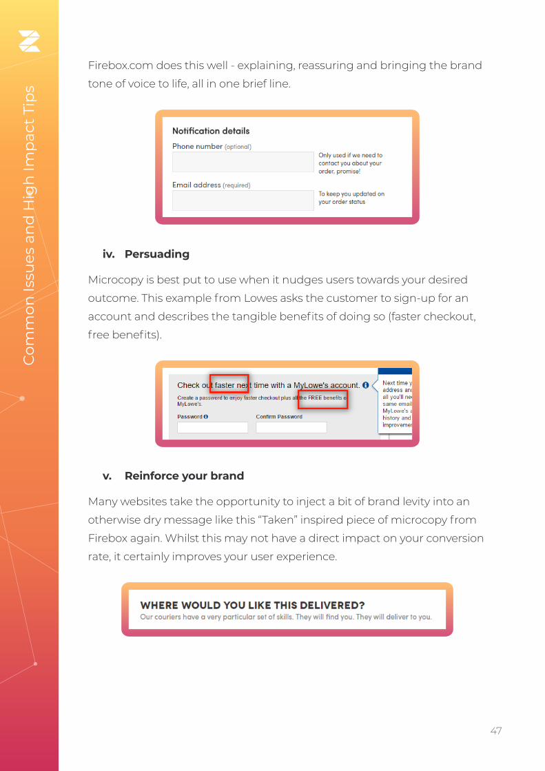
Firebox.com does this well - explaining, reassuring and bringing the brand
tone of voice to life, all in one brief line.
iv. Persuading
Microcopy is best put to use when it nudges users towards your desired
outcome. This example from Lowes asks the customer to sign-up for an
account and describes the tangible benefits of doing so (faster checkout,
free benefits).
Com
mon
Issu
es a
nd
Hig
h Im
pac
t Ti
ps
v. Reinforce your brand
Many websites take the opportunity to inject a bit of brand levity into an
otherwise dry message like this “Taken” inspired piece of microcopy from
Firebox again. Whilst this may not have a direct impact on your conversion
rate, it certainly improves your user experience.
48. 48
vi. Error messages
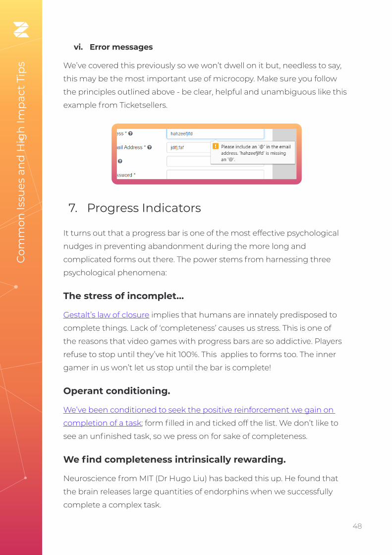
We’ve covered this previously so we won’t dwell on it but, needless to say,
this may be the most important use of microcopy. Make sure you follow
the principles outlined above - be clear, helpful and unambiguous like this
example from Ticketsellers.
7. Progress Indicators
It turns out that a progress bar is one of the most effective psychological
nudges in preventing abandonment during the more long and
complicated forms out there. The power stems from harnessing three
psychological phenomena:
The stress of incomplet…
Gestalt’s law of closure implies that humans are innately predisposed to
complete things. Lack of ‘completeness’ causes us stress. This is one of
the reasons that video games with progress bars are so addictive. Players
refuse to stop until they’ve hit 100%. This applies to forms too. The inner
gamer in us won’t let us stop until the bar is complete!
Operant conditioning.
We’ve been conditioned to seek the positive reinforcement we gain on
completion of a task; form filled in and ticked off the list. We don’t like to
see an unfinished task, so we press on for sake of completeness.
We find completeness intrinsically rewarding.
Neuroscience from MIT (Dr Hugo Liu) has backed this up. He found that
the brain releases large quantities of endorphins when we successfully
complete a complex task.
Com
mon
Issu
es a
nd
Hig
h Im
pac
t Ti
ps

49. 49
While you can consult our blog on progress indicators for an in-depth
overview, our key advice to maximise their impact is:
i. Make them proportional to the journey
We’ve all used those forms with dodgy progress indicators. The ones that
tell you that you’re 80% of the way there but you soon realise you are only
20%. Don’t be that form. That sort of hackery may work momentarily
but will erode the trust of your users in the longer term. Ensure that
whatever type of progress indicator you use (sections, numbered stages or
percentage), it aids a positive experience.
ii. Clearly label each step
Manage user expectations throughout the journey. Each stage should
be labelled clearly. Allow the user to understand exactly what they can
expect and what they are likely to be asked. Generic labels like “Stage 4” or
a naked percentage figure may help manage expectations relating to the
overall length. But they don’t tell the user exactly what’s ahead. Com
mon
Issu
es a
nd
Hig
h Im
pac
t Ti
ps
This example from Halifax bank doesn’t contain section titles or a bar. Their user knows they have 6 stages to go through but
nothing more.
iii. Let the user navigate
One of the advantages of a progress bar with specified stages (instead
of percentages) is that, in addition to setting expectations, it can further
enhance the UI. Allowing the user to click between stages so they can
go back to check or amend inputs, reduces the use of the dreaded back
button. The back button often destroys previously entered data (if you
haven’t coded your form to protect against this, you should), and causes
customer meltdowns before inevitable abandonments.

50. 50
8. Asking for financial information in the right way
Getting someone to share their credit card information is usually the
penultimate stage of their checkout journey. Given the sensitive nature
of this data, any friction or negativity within the process can destroy your
chances of making the sale.
Data from across Zuko’s customer base reveals that between 40-50% of
customers return to credit card number fields at least once. They are one
of the biggest sources of field returns across most forms.
Our advice to minimise friction at this key stage of the process is to:
i. Be clear what payment methods are offered
Have you ever tried to use a Diners Club card? Thought not. Though most
of us have never seen these mythical beasts, they do apparently exist. Their
users are so used to being knocked back (like a 17 year old trying to get
into a nightclub), so they are understandably wary of entering their card
details if they can’t see they will be accepted. Best to make this clear from
the start. Here’s a good, visually clear example of how to do this from the
UK government design system.
Com
mon
Issu
es a
nd
Hig
h Im
pac
t Ti
ps
How using numbers and headings helps manage the process: an example from insurance comparison site GoCompare.

51. 51
ii. Don’t ask for unnecessary information
It’s not 1995 anymore. You no longer need to ask for some of the things we
used to. Specifically, make sure your checkout has purged these elements:
Card types. Get rid of that ugly drop down menu.
Com
mon
Issu
es a
nd
Hig
h Im
pac
t Ti
ps
Your system can determine the type of card from the first digits entered so
you can simply pull all the data from there:
3. travel/entertainment cards (such as American Express and
Diners Club)
4. Visa
5. MasterCard
6. Discover Card
The same holds true for banks and their banking sort codes which
removes the need to ask for the bank name and address fields.
Start Date. This field is redundant and not needed to process any
payments so cut it out with extreme prejudice.
iii. Labelling Fields
We’ve mentioned this earlier so we won’t repeat the specifics but it’s
important you don’t create any confusion in what information you are
asking your user for. The relevant fields related to financial details are:
Card Holder. Always a source of confusion so be careful. You need to make
sure you get the name of the cardholder, not the purchaser (if they are
different). There are a few different options here but we prefer using just
“Name on Card” as the simplest way to make this crystal clear.

52. 52
Security Code. That simple 3 digit code (which, strangely, sits as part of a
bigger 7 digit code) has various different names, depending on the card
company.
• card verification value (CVV2, Visa)
• card verification code (CVC, Mastercard)
• card identification number (CID, Amex, 4 digits)
To avoid potential confusion amongst different card holders we
recommend going broad with this label and using “Security Code” to cover
all possible formats. Although these codes are now firmly established in
the public’s awareness, simple visual explainers such as the one below will
still help.
Com
mon
Issu
es a
nd
Hig
h Im
pac
t Ti
ps
Pro Tip - Be careful with American Express. It has a 4
digit security code so you need to accommodate that.
We’ve seen forms that only accept 3 digits for their security
code, inadvertently excluding a whole class of users from
buying their products.
iv. Avoid dropdowns
There’s more of this in our design section later. But remember, a single
input box is much more user-friendly than a drop down menu.

53. 53
v. Card Number Formats
Users have a tendency to add spaces or dashes between the four digit
blocks on their card (23% of them according to the Baymard Institute)
which does break some forms. We’ve touched on this previously but you
should accept all of those submissions by reformatting at the back end. If
that isn’t possible, you need to ensure your microcopy and error messages
make it clear the user should not input any spaces or dashes.
9. To Captcha or not to Captcha?
Spam generated through your website forms is horrible. It blocks up your
team’s inbox and distracts them from more important tasks at hand. In
the worst case, it can lead to bots swamping your system, leading to severe
operational issues.
This is the background to why Captcha (“Completely Automated Public
Turing test to tell Computers and Humans Apart” for acronym geeks)
was developed to root-out automated bot malignancy and prevent
fake submissions. Any form user will know, however, the friction that
Captcha causes to sign-up processes. How many of us have dropped
out in frustration because we can’t decipher the random blurry letters?
Com
mon
Issu
es a
nd
Hig
h Im
pac
t Ti
ps
Easy to use….
...Whereas this can create UX issues

54. 54
This original study estimated Captchas prevented 3.2% of all genuine
conversions.
So, how do we balance these competing concerns? It’s not easy but,
fortunately, technology has moved on from “enter these letters” - you
should NEVER use those.
Com
mon
Issu
es a
nd
Hig
h Im
pac
t Ti
ps
A big NO to these!
The options a modern webmaster has to prevent spam whilst maintaining
positive conversion levels are:
i. Google No-Captcha (Now branded reCaptcha)
Full disclosure - this is the technology we use on Zuko’s website so we
like it.
It’s the one where you’re asked to click a box to confirm you aren’t a robot.
Google then scans the submitter to confirm and, if there is any doubt, asks
them to select images from a collage based on certain criteria.
Source: Google

55. 55
The latest version of the technology is “Invisible”. It can be bound to the
submit button so the user does not see the tickbox. This produces a
seamless experience for the user but there is a downside. The technology
needs to sit across all of your site (with branding) and tracks user
behaviour; including whether they have a Google account. This inevitably
leads to concerns about data privacy. Many sites (Zuko included) are
currently holding-off installing the latest version until we’re satisfied there
are no issues with privacy protection.
ii. Double opt-in
Rather than an onsite mechanism, double opt-in creates a confirmation
email which is sent to the user. Their registration is only confirmed once
they click on a link within that email.
This will reduce, if not eliminate, spam sign-ups and provide you with a
more engaged audience. There are downsides though. Aside from the
additional engineering required to make this work (hooking into your
system to create a link for the email), it’s likely you will see a reduced
volume of genuine sign-ups compared to using single opt-ins. This is
because users do forget or decline to click your link. Or the email ends
up in spam and is forgotten about. The available studies estimate this
accounts for 20% of all users; a hefty chunk of potential customers.
Generally, we recommend holding back on double opt-ins, unless there’s a
fundamental need such as:
• You are processing extremely sensitive data
• You’ve experienced deliverability issues with your database in the
past (i.e. have been logged as spam)
• You are a potential target for malicious intent
iii. Honeypot method
The whole point of captcha is to distinguish the bots from the humans.
The honeypot method does this in a rather sneaky way. It codes fields into
your form that are invisible to the human on their browser. However, the
bots can see them and eagerly fill them in. Any submissions that include
Com
mon
Issu
es a
nd
Hig
h Im
pac
t Ti
ps

56. 56
an entry to these invisible fields are marked as spam and filed in the trash.
So far, so good then? Well no. The solution isn’t perfect for two reasons.
The first is those pesky autofill browsers. Sometimes a user will click on
autofill and the browser will fill in the invisible fields, causing the genuine
submissions to be rejected. The second is that you inevitably end up in
an arms race against the spambots. The bots are constantly refining their
spamming techniques and have been re-coded to identify and ignore the
honeypot fields so the effectiveness of this technique degrades over time.
That said, it still provides some degree of protection. So if you are dead
against using reCaptcha, it’s better than nothing.
iv. Social sign-up
Social sign-up is where you use an integration with a third party (usually
Social but it can be others - Facebook, Google, LinkedIn, Microsoft & Twitter
being the most common ones) to allow the user to sign up using their
social account rather than the user needing to provide the details directly.
Com
mon
Issu
es a
nd
Hig
h Im
pac
t Ti
ps
A standard Social Sign-Up / Sign-In prompt
This has a number of advantages to the standard form sign up, namely:
• It overcomes the reticence of some users to provide their personal
details. Blue Research report 86% of people are bothered by the
need to set up new accounts on websites and 54% may leave a site
and go to another rather than complete another registration form.
• Customers don’t have to remember a new username and password,
making it more likely they will return successfully.

57. 57
• Integration with social media allows for easier shares and that’s often
important to businesses.
• Verified data. Users tend to share accurate data with their trusted
social network. So assuming the correct permissions are set up, you
should reduce the number of “Mickey Mouse” sign-ups for your site
and get good quality personal data for your CRM instead.
Seems like a no-brainer then? While we’re fans of social sign-ups in the
right circumstances, there are a couple of things you should be wary of:
• Age group variance - Data from LoginRadius’ social platform
showed that only 11% of users aged 50+ opted for social sign-up
(compared to 38% of those aged 18-25). If your product or service is
aimed at an older demographic then social integrations may not be
effective for you.
• B2B Vs B2C - Speero, the CRO experts note that adoption rates
are significantly lower for B2B enterprises than for those in the
B2C market. This is because business users’ are reticent to share
their personal social details in this context. If your customers are
businesses you will be, rightly, less enthusiastic about social sign-
ups.
Com
mon
Issu
es a
nd
Hig
h Im
pac
t Ti
ps
Pro Tip - Social sign-up is a positive for many B2C
businesses but we never recommend it in isolation. Even if
you have great take-up rate for social integrations, always
offer a standard email sign-up too.
10. Getting them to commit - the submit button
You’ve managed to guide your user through the form, successfully
entering their sensitive personal data as they approach the end.The final
hurdle is the submit button. Just one click on that nice, shiny, precious
button before they are yours, all yours….

58. 58
As much as it seems your job is almost done, it’s still surprisingly common
to witness the user still abandoning your form and going elsewhere. In
the General Principles section we talked about how to diagnose why a
user drops out before clicking submit. Here, we discuss how to get them
to commit at the final step and click on the submit button. Fortunately,
there’s a universe of super-smart CRO experts out there who have
published their findings, so there’s plenty of evidence to share on this
topic.
While the submit button is an easy and effective element to A/B test, there
are a few areas of general consensus on where to focus:
i. Labelling
When is a submit button not a submit button?
Counter intuitively; All the time. One thing that the CRO experts are
unified on, is that you should never label your completion button “Submit”
(despite what the developers say). A straight submit does not tell the user
what their action achieves. “Submit” is a technical action rather than a
consumer-led one.
Com
mon
Issu
es a
nd
Hig
h Im
pac
t Ti
ps
Pro Tip - Your label should tell users what the button
does. You can get away with a “Submit Registration”,
“Submit Request” or “Submit Details” but better to be
even clearer with “Create Account”, “Reserve my Seat” or
“Download the Report Now”.
You can also build on this by adding in positivity tailored towards the user’s
experience - “Yes, start my free trial” - which can give a further nudge
towards conversion.

59. 59
ii. Visibility
While this seems obvious, we know many webmasters continue to fall into
the same trap. Your Call to Action should be the most prominent element
on the page. If your user can’t see it they can’t click it.
Your Submit button is just that. A button. It should not be a text link,
an image, or a guessing game. Users have been conditioned to expect
their final step to be a button. Now is not the time to challenge their
conditioning.
The rest of our advice on visibility is not absolute. It will, in the main,
depend on your specific site visuals. However, here are some general
points to consider:
• Colours - While many studies have shown that making your button
red can have a positive effect on click though, there are other
advocates for orange or green. Generally, button colour should
depend on your site design. The main factor is to ensure that it
stands out from the rest of the site and it’s clear what it’s function is.
• Positioning - Again, this is not the time for originality. The button
should be where users expect it to be. 99% of the time this is
immediately after the last piece of data they inputted.
• Sizing - The rule of thumb is to make the button big enough to be
impactful and clear. However, there are instances where increasing
the size of the button has led to a negative impact on clicks so be
mindful.
Overall, much will depend on your own site and your messaging so be sure
to A/B test your submit button visuals, copy and surrounding microcopy to
continually improve performance.
Com
mon
Issu
es a
nd
Hig
h Im
pac
t Ti
ps

60. 60
Best Practice Form Design
Section 5

61. 61
Our final substantive section gives you specific tips on the design / UI of your form. There’s a wealth of advice out there from UX professionals. We’ve collated only the most impactful points on best practice. Rather than going deep into each topic, we’ve opted for a more “quickfire” overview of each tip. By providing you with the essential starting points, you can make your own mind up whether you need to dig deeper.
1. Clearly identify optional fields
Before you include optional fields, be darn sure you need them. Don’t
lengthen the process with information that isn’t necessary.
Assuming there is a good reason to include the field, the key things to
remember are:
• Never only use an asterisk. You may think your asterisk clearly
denotes a “required” field but the user may not see it that way. They
may think it means “optional” or that they should start looking for
explainer text at the bottom. Make it clear with text which fields are
optional.
• Make a decision on which fields to mark based on their relative frequency. If you have ten fields, one of which is optional, you
shouldn’t mark the nine required fields. Simply label the other
field “Optional” and leave it at that. If the scenario was reversed you
should only label the mandatory one.
• Don’t use a negative. “Optional” is a better label than “Not
Required”, which pretty much guarantees the user won’t fill it in.
Bes
t P
ract
ice
Form
Des
ign

62. 62
2. Size Form Fields Accordingly
A field’s input box should be in proportion to the amount of information
required. This acts as a visual constraint and manages the users
expectations on how much text to enter (rather than having to give them
complicated instructions). As an example, a “House Number” input box
should be much shorter than a “Street Address” one.
3. Avoid Drop Downs
Who wants to scroll through a list of 195 countries to find the right one?
Drop down menus are notorious for negatively impacting user experience.
The problem is exacerbated further in mobile where fat finger syndrome
adds another layer of potential mis-taps.
Not a good user experience
The pitfalls of dropdowns are:
• Not all users know how dropdown
fields work
• Dropdowns require a higher
number of minimum interactions to
select a value (tap, scroll, scroll, tap
Vs a single tap)
• Only a small number of options are
visible at any one time on mobile
screens
• If lists are not ordered, finding
the correct value can be time
consuming and tedious
Bes
t P
ract
ice
Form
Des
ign

63. 63
Unless absolutely necessary, we recommend avoiding dropdowns and
instead, trying one of these alternatives:
i. Radio buttons
Let your user pick from the options displayed on screen. It’s a one click
solution compared to the 4+ interactions needed for a dropdown. If your
list of options is so long you think it is unmanageable, consider using an
“Other” button alongside the most popular options.
ii. Slider or increase / decrease buttons
If your field is numeric with a wide range of possible values, these give a
great degree of flexibility whilst keeping the user experience as seamless
as possible.
Slider
Bes
t P
ract
ice
Form
Des
ign
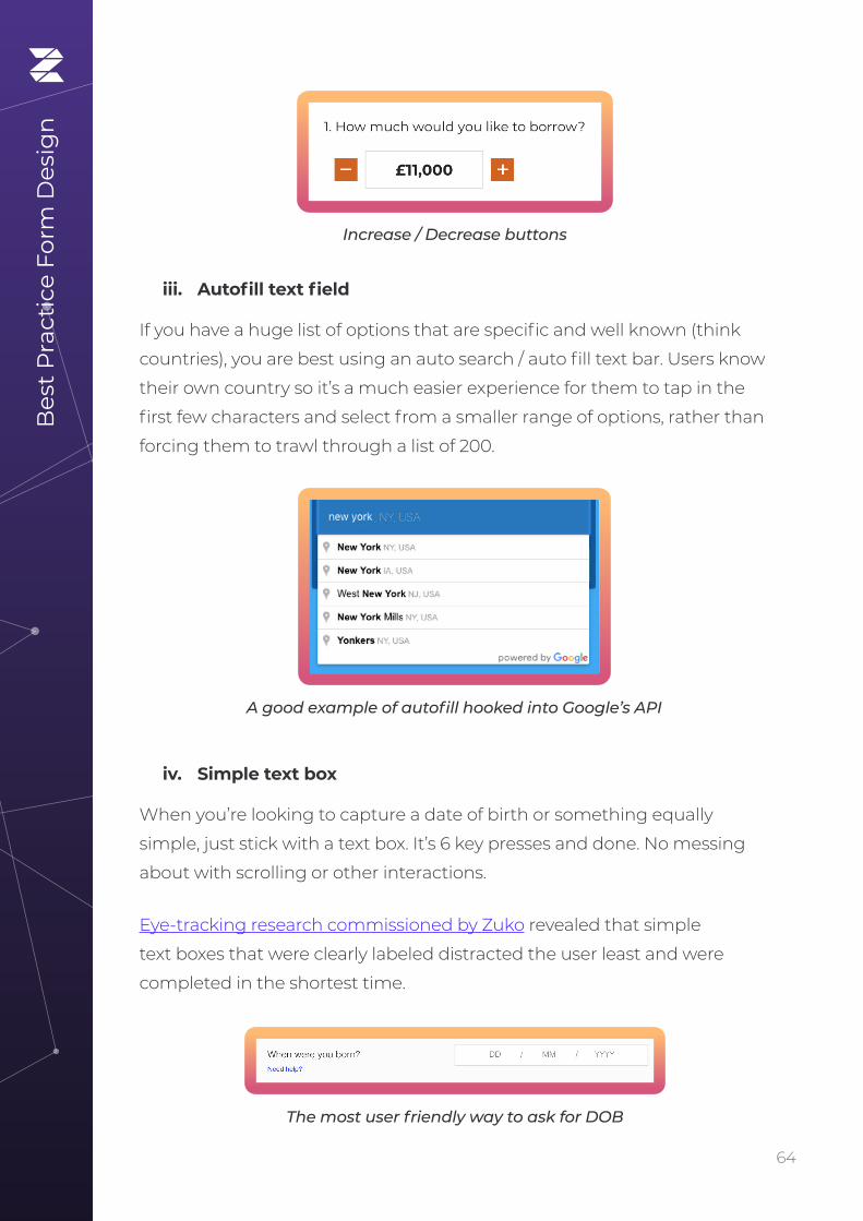
64. 64
iii. Autofill text field
If you have a huge list of options that are specific and well known (think
countries), you are best using an auto search / auto fill text bar. Users know
their own country so it’s a much easier experience for them to tap in the
first few characters and select from a smaller range of options, rather than
forcing them to trawl through a list of 200.
iv. Simple text box
When you’re looking to capture a date of birth or something equally
simple, just stick with a text box. It’s 6 key presses and done. No messing
about with scrolling or other interactions.
Eye-tracking research commissioned by Zuko revealed that simple
text boxes that were clearly labeled distracted the user least and were
completed in the shortest time.
A good example of autofill hooked into Google’s API
Increase / Decrease buttons
Bes
t P
ract
ice
Form
Des
ign
The most user friendly way to ask for DOB

65. 65
4. Set HTML types to the appropriate format
To optimize the mobile experience of your form, you need to make sure
the end device renders the most appropriate keyboard for each field.
To do this, you must set the field to the appropriate input type. The
relevant types you should be using are:
Input Type = Mobile Keyboard Displayed
“text” The normal keyboard
“tel” Numeric: 0 to 9
“email” The device’s normal keyboard plus ‘@’ and ‘.com’
“number” Numbers and symbols
“month” The month and year selector
“datetime” The date and time selector
“date” The date selector
5. Be careful with static defaults
Static defaults are the answers the system pre-selects for all users. The user
must then make an active effort to change this default. This way of doing
things is popular with dropdowns (another reason not to use them). The
danger is that the user sees an answer and hops quickly on it, without
checking it properly. This leads to error messages later in the form and
inaccurate information within your CRM system.
Bes
t P
ract
ice
Form
Des
ign

66. 66
Only use static defaults if the vast majority of your users fall into that
category (think country if you only sell into one geography). We’d only
consider using them if 90% of your users fall into the default.
Pro Tip - If you need to add defaults, it’s much better to
use smart defaults. They suggest an input based on what
you know about the user already. For example, if you know
the user identifies as male, you can set the default Title field
to “Mr”.
6. Don’t use CAPS for labels
We’ve discussed how to make sure your labels are clear and next to
the relevant input box. You should also avoid going into SHOUTY mode.
Studies, such as this one by Miles Tinker show that the use of all capitals
slows down the user from scanning and processing the label. They create
unnecessary delays in form completion.
Bes
t P
ract
ice
Form
Des
ign
7. Use Mobile’s native features
With all the inbuilt functionality that mobile devices have today, it would
be crazy not to take advantage of it to improve user experience. Specific
functions worth exploiting are:

67. 67
i. Camera
The mobile devices camera can be used as a scanner to pick out relevant
information from a document. Rather than forcing a user to manually
input their passport, drivers license or credit card details, why not scan
them and have the form fill them automatically? (Make sure you allow
access to review and edit afterwards though).
ii. Voice
Google reports that 27% of the global online population are using search
on mobile. If you have a form requiring particularly heavy text input, why
not provide a voice option for completion instead? Or make the whole
form interactive so users can complete it while on the move (useful for
takeaway food or ordering a taxi perhaps).
iii. Location Services
If you’re using smart defaults for a location field, you can hook into the
user’s GPS location (assuming it is enabled) to display the most accurate
options.
iv. Biometrics
We’ve discussed the issues around passwords at length. If you have a form
that users need to return to regularly, a biometric login will cut out all
associated problems with forgotten or misspelt passwords.
8. No “Nuke” Buttons
Under no circumstances should you add a reset button that allows the
customer to remove their previous work. You may think it’s a handy little
shortcut in case the user changes their mind on some inputs. But believe
us, the amount of customers who rage quit after pressing it accidentally,
means it’s inclusion will significantly outweigh such perceived benefits.
Bes
t P
ract
ice
Form
Des
ign

68. 68
9. Use single column layout where possible
The CXL Institute found that layouts consisting of a single column were
completed 15.4 seconds faster than multi-column formats.
The multi column layout requires eyes to jag back and forth, disrupting
the experience. Stick with a single column if you can (particularly true for
mobile devices).
Bes
t P
ract
ice
Form
Des
ign
A classic “Empty Basket” nuke button from UK supermarket Tesco
Source: CXL Institute
10. Easy before difficult
Ever been asked to write a 1,000 word essay at the start of a form?
Of course not, that would be a horrible experience. There’s a reason that
forms ask the easy questions first. By easing the user into the form with
simple requests, you make them comfortable and increase the probability
they’ll answer more involved questions later on.

69. 69
Bes
t P
ract
ice
Form
Des
ign
11. Finger friendly touch buttons
The average adult index finger is 16-20mm wide according to the
Massachusetts Institute of Technology. You need to accomodate for that
when designing your mobile form. Specifically:
• Unless your target market is babies, you need to make your buttons
larger than you think. Guidelines often recommend touch targets
roughly 9mm x 9mm but, in reality, they should be larger than that.
• Ensure that your buttons are spaced appropriately or you will get
“fat fingers” tapping the wrong one. Ideally they should be at least
8 density pixels apart.
12. Accessibility for All
This is a bit of a passion of ours at Zuko and is critical for all forms. There are
numerous studies analysing the money left on the table becuase of the
lack of accessibility on websites.
Our recommendations to make your form more accessible are:
• Optimize your form’s tabbing navigation. Users who struggle with
accessibility may use tabs to move through your form. Make sure
that every field in your forms is accessible through tabbing and that
the tab flow is intuitive and comprehensive.
• Label your fields well. As we mentioned earlier, this is important for
any user, especially those who may be visually impaired. It should
be clear which labels apply to which input boxes and they should be
legible enough for all users.
Pro Tip - The psychological principle of consistency
means users want to follow through once they’ve
committed to something. By getting them to commit to
something small upfront, you increase the chances of them
becoming a paying customer.
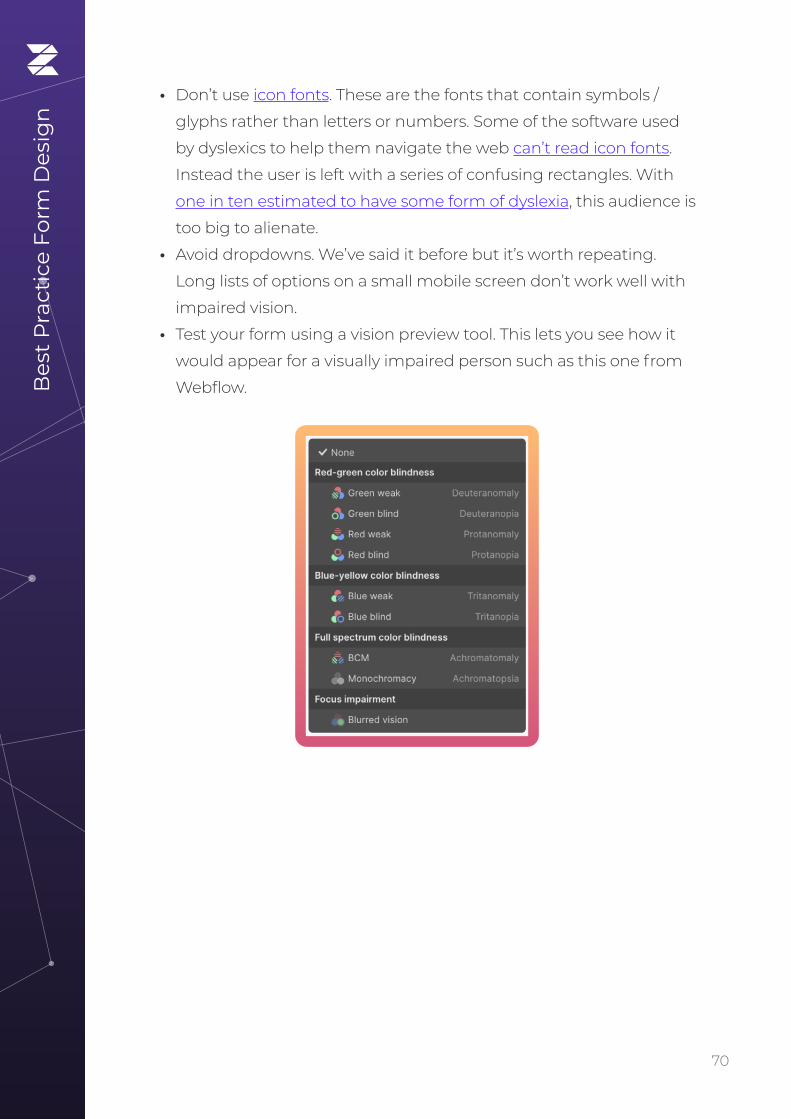
70. 70
• Don’t use icon fonts. These are the fonts that contain symbols /
glyphs rather than letters or numbers. Some of the software used
by dyslexics to help them navigate the web can’t read icon fonts.
Instead the user is left with a series of confusing rectangles. With
one in ten estimated to have some form of dyslexia, this audience is
too big to alienate.
• Avoid dropdowns. We’ve said it before but it’s worth repeating.
Long lists of options on a small mobile screen don’t work well with
impaired vision.
• Test your form using a vision preview tool. This lets you see how it
would appear for a visually impaired person such as this one from
Webflow.Bes
t P
ract
ice
Form
Des
ign

71. 71
In summary
Section 6

72. 72
If you have made it this far in one sitting you have our eternal respect. Form Analytics can be complicated and hopefully this ebook has given you enough tips to get your brain popping. Don’t expect to remember everything and feel free to use it as a reference guide, dipping in and out as you need to. That said, if you retain only 6 things remember these:
1. Measure Everything - Make sure you’re tracking the key form
metrics and benchmark your performance as you go along.
2. Break your Form - Put yourself in the users shoes and interact with
every element, testing how the form reacts.
3. Optimize for Mobile - Your users are viewing your form through a
small screen so make sure it still works well for them.
4. Use Inline Validation - Tell the user about invalid inputs
immediately rather than when they submit.
5. Focus on the Submit button - Find out why users who want to give
you money haven’t been able to.
6. Segment, Segment, Segment - Your most important insights will
come through understanding the dynamics within different user
groups. Understand exactly how and why they behave differently.
We hope that, in some small way, this book will improve the experience
of web users across the world - so please put any nuggets of wisdom into
action today!
If you want additional support with your form analytics and optimization
after this, you know where to find us….
In s
um
mar
y

73. 73
Form Analytics and Optimization Glossary
Appendix

74. 74
AAbandon - When a user starts
to complete a form but does not
ultimately complete it. The exact
criteria will vary by your form
analytics provider (Zuko triggers
an abandonment after 30 minutes
of inactivity).
A/B Testing - The process of testing
two form variants with a single
difference to compare their relative
performance.
Avg. Session Duration - The average session time for
visitors to a form. This includes
both completion and abandoned
sessions.
CCaptcha - A system commonly
employed in forms to distinguish
human input from bot spam.
Completions - When a user
successfully completes a form.
NB: This doesn’t necessarily mean
that they have achieved what they
want, just that they have completed
the form process (think credit
applications - a rejection after
all the data has been submitted
will count as a Completion as
much as an acceptance).
Conversion Rate - The proportion
of users who ultimately take a
desired action on a website / form.
CRO - Abbreviation of “Conversion
Rate Optimization”. The process of
making changes to your site / form
to maximise the proportion of users
taking a desired action.
CTA - Acronym for “Call to Action.
An instruction that attempts to get
the user to take a particular action.
For example, “Click Here to Register”.
CX - Short for “Customer
Experience”. CX is the sum total
of customers’ interactions with a
brand, product or service. Typically
measured in terms of perceptions
and feelings.
DDefault - The answer that the form
automatically assigns to a field
unless the user consciously changes
it.
Also: Static Default - A default
that is always the same regardless
of user; Dynamic / Smart Default
- A default that changes based on
information known about the user.
Form
An
alyt
ics
and
Op
tim
izat
ion
Glo
ssar
y

75. 75
EError Message - The message
displayed to a user when they
submit data that is not acceptable
to the form.
FField - An individual input required
in a web form or checkout (e.g.
“Name”, “Address”, etc).
Field Abandon - A field abandoned
is the last field a user was
interacting with before abandoning
a session.
Field Return - A field return is when
a user exits a field after entering
some data only to return to it at a
later stage in their session. A single
field can have multiple field returns,
and a session can also have many.
Field Time - The amount of time
a user spends interacting with a
particular field in a session.
Form Analytics - The tracking and
metrics of how users interact with
your web form.
HHTML - Hypertext Markup
Language, a standardized coding
language used to build most web
forms.
IInline Validation - A technology
where messages are shown
immediately after the user types
data into form fields
MMasking - A technique where an
input (e.g. password) is obscured on
screen while it is being typed and
submitted.
Microcopy - Small pieces of copy
on a form that guide a user through
the process.
Multivariate Testing - The cousin
of A/B testing, it involves trialing
two different versions of a form with
multiple differences.
Form
An
alyt
ics
and
Op
tim
izat
ion
Glo
ssar
y

76. 76
NNon-Starters - The number of
people who do not start the form
after viewing it. I.e. They visit the
web page containing the form but
do not interact with it.
PProgress Indicator - A visual
representation of how far a user
has got through a form (e.g. bar
or timeline).
RRadio Buttons - A type of field input
that involves the user selecting one
of a set of pre-selected options.
SSegmentation - The breaking
down of a user audience into
smaller, discrete groups for the
purpose of comparative analysis.
Social Proof - A CRO technique
where users are subtly encouraged
to complete a form through sharing
the experiences of other, happy
customers (e.g. testimonials or
reviews).
Submit Button - The final button on
a form where the user can submit all
their inputs to the form’s owner.
Starters - A form Starter is a visitor
who has interacted with any
element within the form.
Starter to Completion Rate - The proportion of users who
successfully complete the form after
starting it.
UUI - Abbreviation of “User Interface”.
The way a user interacts with a
digital product (typically involves the
display rendered to them plus the
possible interactions generated by
the form / site).
User - An individual who is visiting
a website / interacting with a form.
UX - Contraction of “User
Experience”. Encompasses all
aspects of the end-user’s interaction
with the form and website.
VViews - The number of times a
form was viewed by a unique visitor
(includes starters and non-starters).
Form
An
alyt
ics
and
Op
tim
izat
ion
Glo
ssar
y

77. 77
View to Completion Rate - The
percentage of form views that
ultimately end up converting.
View to Starter Rate - The
proportion of users who interact
with the form after viewing it.
Form
An
alyt
ics
and
Op
tim
izat
ion
Glo
ssar
y

78.
[email protected] zuko.io
The Big Guide to Form Optimization and Analytics
©Formisimo Limited. All rights reserved


