
JacobMcMillen
6/23/2017
The Complete 110-Point Ecommerce Optimization ChecklistYou’ve Been Waiting For
conversionsciences.com /blog/ecommerce-conversion-optimization-checklist/
You want to optimize your ecommerce site, but where do you begin? What do you look for? What page elements areworth evaluating?
At Conversion Sciences, we have a checklist that our team goes through when evaluating a new client website, andtoday, we’re going to share that checklist with you. This checklist includes virtually everything you’ll want to consideroptimizing while putting together your own A/B testing campaign.
This is not a list of everything you should test. It’s a list of everything you should consider testing. Optimizing anecommerce site requires strategy and prioritization. It would take an eternity to test every single item on this listusing proper testing procedures.
But if there is anything on your site worth testing, I can tell you with 99% certainty that it’s on this list.
Checklist Navigation
To make navigation easier, we’ve broken our ecommerce optimization checklist into 8 distinct categories. Select thecategory you wish to optimize in order to get started or simply scroll down to start with item #1.
1.
1. Sitewide Optimization
2. Homepage Optimization
3. Category Optimization
4. Product Page Optimization
5. Shopping Cart Optimization
6. Checkout Optimization
7. Dashboard Optimization
8. Thank You Page Optimization
1/17
Sticky Header
Dropdown Menu
“Supernav” Dropdown Menu
Let’s get started!
Section #1: Sitewide Optimization
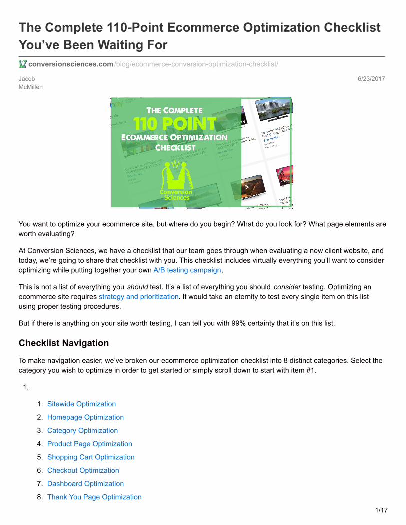
1. Sticky Elements
Sticky elements are items that remain fixed on thescreen as the users scrolls up or down. The mostcommonly stickied page element is the headernavigation bar. Stickied elements tend to attractfocus and distract from other page elements,which means they can work both for and againstyou and should be including in your testing.
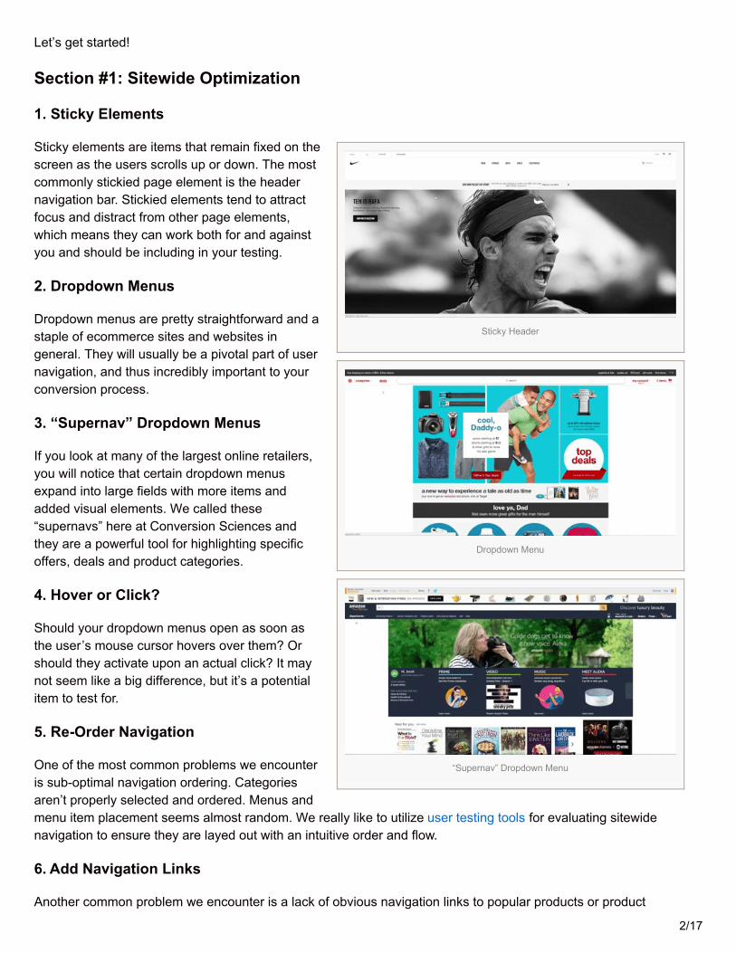
2. Dropdown Menus
Dropdown menus are pretty straightforward and astaple of ecommerce sites and websites ingeneral. They will usually be a pivotal part of usernavigation, and thus incredibly important to yourconversion process.
3. “Supernav” Dropdown Menus
If you look at many of the largest online retailers,you will notice that certain dropdown menusexpand into large fields with more items andadded visual elements. We called these“supernavs” here at Conversion Sciences andthey are a powerful tool for highlighting specificoffers, deals and product categories.
4. Hover or Click?
Should your dropdown menus open as soon asthe user’s mouse cursor hovers over them? Orshould they activate upon an actual click? It maynot seem like a big difference, but it’s a potentialitem to test for.
5. Re-Order Navigation
One of the most common problems we encounteris sub-optimal navigation ordering. Categoriesaren’t properly selected and ordered. Menus andmenu item placement seems almost random. We really like to utilize user testing tools for evaluating sitewidenavigation to ensure they are layed out with an intuitive order and flow.
6. Add Navigation Links
Another common problem we encounter is a lack of obvious navigation links to popular products or product
2/17
Visual Cue
Shopping Cart Dropdown
categories. A lot of times, ecommerce stories will include feature images and headlines somewhere on the frontpage, but forget that they need to be added to the primary menus as well. Redundancy is not a vice, and whendiscussing your bread and butter products, it’s typically a virtue.
7. Change Link Copy
If you determine that all the right links are present, the next step is to look at the copywriting for each link. Is there amore accurate or intuitive way to define that category or other link heading? Are certain categories selling like crazywhen the user enters the website directly via the product page but rarely being clicked on via navigation?
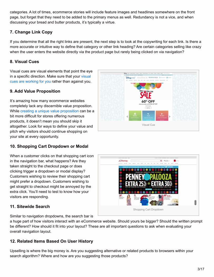
8. Visual Cues
Visual cues are visual elements that point the eyein a specific direction. Make sure that your visualcues are working for you rather than against you.
9. Add Value Proposition
It’s amazing how many ecommerce websitescompletely lack any discernible value proposition.While creating a unique value proposition can be abit more difficult for stores offering numerousproducts, it doesn’t mean you should skip italtogether. Look for ways to define your value andpitch why visitors should continue shopping onyour site at every opportunity.
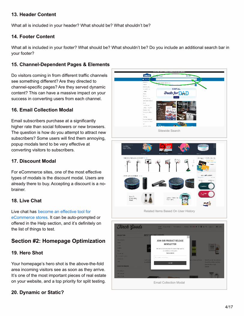
10. Shopping Cart Dropdown or Modal
When a customer clicks on that shopping cart iconin the navigation bar, what happens? Are theytaken straight to the checkout page or doesclicking trigger a dropdown or modal display?Customers wishing to review their shopping cartmight prefer a dropdown. Customers wishing toget straight to checkout might be annoyed by theextra click. You’ll need to test to know how yourvisitors are responding.
11. Sitewide Search
Similar to navigation dropdowns, the search bar isa huge part of how visitors interact with an eCommerce website. Should yours be bigger? Should the written promptbe different? How should it fit into your layout? These are all important questions to ask when evaluating youroverall navigation layout.
12. Related Items Based On User History
Upselling is where the big money is. Are you suggesting alternative or related products to browsers within yoursearch algorithm? Where and how are you suggesting those products?
3/17
Sitewide Search
Related Items Based On User History
Email Collection Modal
13. Header Content
What all is included in your header? What should be? What shouldn’t be?
14. Footer Content
What all is included in your footer? What should be? What shouldn’t be? Do you include an additional search bar inyour footer?
15. Channel-Dependent Pages & Elements
Do visitors coming in from different traffic channelssee something different? Are they directed tochannel-specific pages? Are they served dynamiccontent? This can have a massive impact on yoursuccess in converting users from each channel.
16. Email Collection Modal
Email subscribers purchase at a significantlyhigher rate than social followers or new browsers.The question is how do you attempt to attract newsubscribers? Some users will find them annoying,popup modals tend to be very effective atconverting visitors to subscribers.
17. Discount Modal
For eCommerce sites, one of the most effectivetypes of modals is the discount modal. Users arealready there to buy. Accepting a discount is a no-brainer.
18. Live Chat
Live chat has become an effective tool foreCommerce stores. It can be auto-prompted oroffered in the Help section, and it’s definitely onthe list of things to test.
Section #2: Homepage Optimization
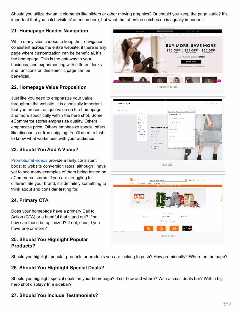
19. Hero Shot
Your homepage’s hero shot is the above-the-foldarea incoming visitors see as soon as they arrive.It’s one of the most important pieces of real estateon your website, and a top priority for split testing.
20. Dynamic or Static?
4/17
Discount Modal
Live Chat
Hero Shot
Should you utilize dynamic elements like sliders or other moving graphics? Or should you keep the page static? It’simportant that you catch visitors’ attention here, but what that attention catches on is equally important.
21. Homepage Header Navigation
While many sites choose to keep their navigationconsistent across the entire website, if there is anypage where customization can be beneficial, it’sthe homepage. This is the gateway to yourbusiness, and experimenting with different looksand functions on this specific page can bebeneficial.
22. Homepage Value Proposition
Just like you need to emphasize your valuethroughout the website, it is especially importantthat you present unique value on the homepage,and more specifically within the hero shot. SomeeCommerce stores emphasize quality. Othersemphasize price. Others emphasize special offerslike discounts or free shipping. You’ll need to testto know what works best with your audience.
23. Should You Add A Video?
Promotional videos provide a fairly consistentboost to website conversion rates, although I haveyet to see many examples of them being tested oneCommerce stores. If you are struggling todifferentiate your brand, it’s definitely something tothink about and consider testing for.
24. Primary CTA
Does your homepage have a primary Call toAction (CTA) or a handful that stand out? If so,how can those be optimized? If not, should youhave one or more?
25. Should You Highlight PopularProducts?
Should you highlight popular products or products you are looking to push? How prominently? Where on the page?
26. Should You Highlight Special Deals?
Should you highlight special deals on your homepage? If so, how and where? With a small deals bar? With a bighero shot display? In a sidebar?
27. Should You Include Testimonials?5/17
Dynamic Hero Shot
Homepage Value Proposition
Homepage Video
Homepage Video
Highlight Popular Product
Should you include customer or influencer testimonials? If so, where? How prominently? In what order on yourpage?
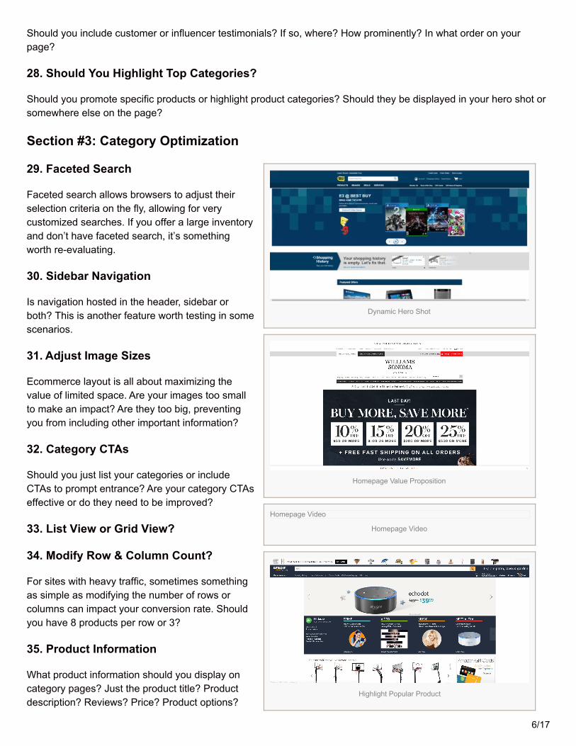
28. Should You Highlight Top Categories?
Should you promote specific products or highlight product categories? Should they be displayed in your hero shot orsomewhere else on the page?
Section #3: Category Optimization
29. Faceted Search
Faceted search allows browsers to adjust theirselection criteria on the fly, allowing for verycustomized searches. If you offer a large inventoryand don’t have faceted search, it’s somethingworth re-evaluating.
30. Sidebar Navigation
Is navigation hosted in the header, sidebar orboth? This is another feature worth testing in somescenarios.
31. Adjust Image Sizes
Ecommerce layout is all about maximizing thevalue of limited space. Are your images too smallto make an impact? Are they too big, preventingyou from including other important information?
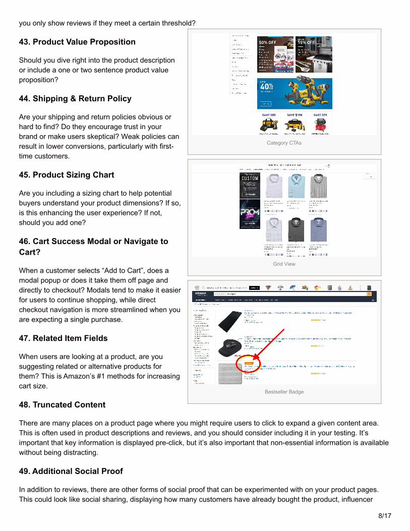
32. Category CTAs
Should you just list your categories or includeCTAs to prompt entrance? Are your category CTAseffective or do they need to be improved?
33. List View or Grid View?
34. Modify Row & Column Count?
For sites with heavy traffic, sometimes somethingas simple as modifying the number of rows orcolumns can impact your conversion rate. Shouldyou have 8 products per row or 3?
35. Product Information
What product information should you display oncategory pages? Just the product title? Productdescription? Reviews? Price? Product options?
6/17
Highlight Special Deals
Homepage Testimonials
Category Spotlight
Faceted Search
36. What Type of Information Should BeFilterable?
There are many different ways to classify andcategorize products. If you don’t offer enoughfilters, you can make searching difficult for users. Ifyou offer too many options, you can createunhealthy friction in the browsing experience.
37. Endless Scroll or Pagination?
Do you break categories with hundreds of optionsinto pages or do you use endless scroll? Mostlarge retailers currently use pagination, but thatdoesn’t mean it’s the right choice for everyeCommerce business.
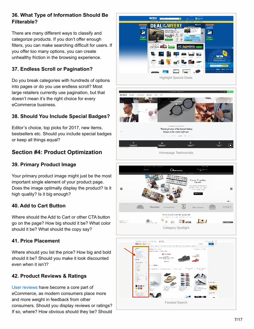
38. Should You Include Special Badges?
Editor’s choice, top picks for 2017, new items,bestsellers etc. Should you include special badgesor keep all things equal?
Section #4: Product Optimization
39. Primary Product Image
Your primary product image might just be the mostimportant single element of your product page.Does the image optimally display the product? Is ithigh quality? Is it big enough?
40. Add to Cart Button
Where should the Add to Cart or other CTA buttongo on the page? How big should it be? What colorshould it be? What should the copy say?
41. Price Placement
Where should you list the price? How big and boldshould it be? Should you make it look discountedeven when it isn’t?
42. Product Reviews & Ratings
User reviews have become a core part ofeCommerce, as modern consumers place moreand more weight in feedback from otherconsumers. Should you display reviews or ratings?If so, where? How obvious should they be? Should
7/17
Category CTAs
Grid View
Bestseller Badge
you only show reviews if they meet a certain threshold?
43. Product Value Proposition
Should you dive right into the product descriptionor include a one or two sentence product valueproposition?
44. Shipping & Return Policy
Are your shipping and return policies obvious orhard to find? Do they encourage trust in yourbrand or make users skeptical? Weak policies canresult in lower conversions, particularly with first-time customers.
45. Product Sizing Chart
Are you including a sizing chart to help potentialbuyers understand your product dimensions? If so,is this enhancing the user experience? If not,should you add one?
46. Cart Success Modal or Navigate toCart?
When a customer selects “Add to Cart”, does amodal popup or does it take them off page anddirectly to checkout? Modals tend to make it easierfor users to continue shopping, while directcheckout navigation is more streamlined when youare expecting a single purchase.
47. Related Item Fields
When users are looking at a product, are yousuggesting related or alternative products forthem? This is Amazon’s #1 methods for increasingcart size.
48. Truncated Content
There are many places on a product page where you might require users to click to expand a given content area.This is often used in product descriptions and reviews, and you should consider including it in your testing. It’simportant that key information is displayed pre-click, but it’s also important that non-essential information is availablewithout being distracting.
49. Additional Social Proof
In addition to reviews, there are other forms of social proof that can be experimented with on your product pages.This could look like social sharing, displaying how many customers have already bought the product, influencer
8/17
Product Page
Product Reviews & Ratings
Cart Success Modal
Related Items
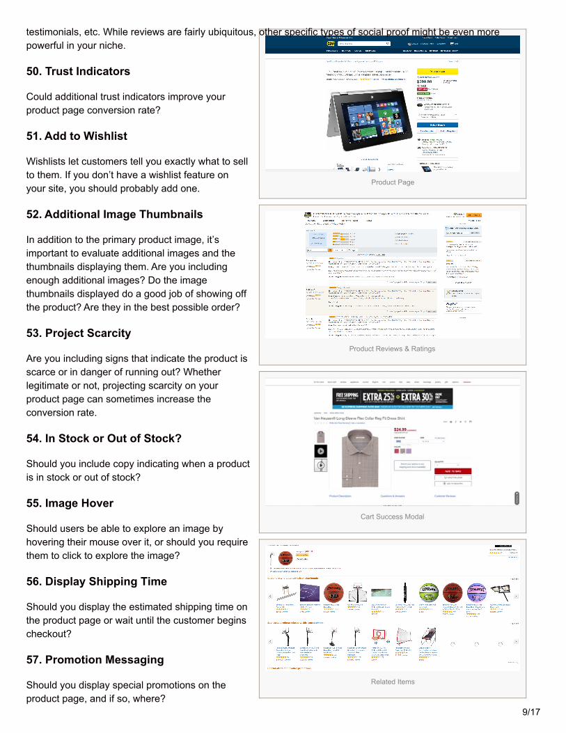
testimonials, etc. While reviews are fairly ubiquitous, other specific types of social proof might be even morepowerful in your niche.
50. Trust Indicators
Could additional trust indicators improve yourproduct page conversion rate?
51. Add to Wishlist
Wishlists let customers tell you exactly what to sellto them. If you don’t have a wishlist feature onyour site, you should probably add one.
52. Additional Image Thumbnails
In addition to the primary product image, it’simportant to evaluate additional images and thethumbnails displaying them. Are you includingenough additional images? Do the imagethumbnails displayed do a good job of showing offthe product? Are they in the best possible order?
53. Project Scarcity
Are you including signs that indicate the product isscarce or in danger of running out? Whetherlegitimate or not, projecting scarcity on yourproduct page can sometimes increase theconversion rate.
54. In Stock or Out of Stock?
Should you include copy indicating when a productis in stock or out of stock?
55. Image Hover
Should users be able to explore an image byhovering their mouse over it, or should you requirethem to click to explore the image?
56. Display Shipping Time
Should you display the estimated shipping time onthe product page or wait until the customer beginscheckout?
57. Promotion Messaging
Should you display special promotions on theproduct page, and if so, where?
9/17
Truncated Content
Trust Indicators
Additional Image Thumbnails
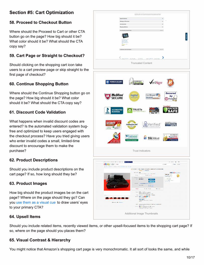
Section #5: Cart Optimization
58. Proceed to Checkout Button
Where should the Proceed to Cart or other CTAbutton go on the page? How big should it be?What color should it be? What should the CTAcopy say?
59. Cart Page or Straight to Checkout?
Should clicking on the shopping cart icon takeusers to a cart preview page or skip straight to thefirst page of checkout?
60. Continue Shopping Button
Where should the Continue Shopping button go onthe page? How big should it be? What colorshould it be? What should the CTA copy say?
61. Discount Code Validation
What happens when invalid discount codes areentered? Is the automated validation system bug-free and optimized to keep users engaged withthe checkout process? Have you tried giving userswho enter invalid codes a small, limited-timediscount to encourage them to make thepurchase?
62. Product Descriptions
Should you include product descriptions on thecart page? If so, how long should they be?
63. Product Images
How big should the product images be on the cartpage? Where on the page should they go? Canyou use them as a visual cue to draw users’ eyesto your primary CTA?
64. Upsell Items
Should you include related items, recently viewed items, or other upsell-focused items to the shopping cart page? Ifso, where on the page should you places them?
65. Visual Contrast & Hierarchy
You might notice that Amazon’s shopping cart page is very monochromatic. It all sort of looks the same, and while
10/17

Image Hover
Proceed to Checkout Button
Discount Code Validation
it’s not necessarily confusing, it doesn’t draw your eyes to anything in particular. Meanwhile Yandy.com’s shoppingcart has contrasting colors with a very distinct visual hierarchy. The eye is clearly drawn to the checkout box in themiddle-right of the page. Which style will work best for you?
66. Payment Options
Are you offering enough payment options? Are you letting your customers know about the options you currentlyprovide? Should you make additional payment options obvious at the beginning of the checkout process likeYandy.com, or should you reveal them moresubtlety when it’s time to process payment?
67. Shipping Time
Should you reveal estimated shipping time on thecart page or attempt to use it here as a sellingpoint? Or should you save it for another point inthe checkout process?
68. Shipping Cost
Should you display the shipping cost (or lackthereof) on the cart page or save it for elsewherein the checkout process?
69. Price Display
How should you display product pricing on the cartpage? Should it be highlighted? Minimalized?Should discounts be displayed next to the originalprice?
70. Project Scarcity
Are you including signs that indicate the product isscarce or in danger of running out? Whetherlegitimate or not, projecting scarcity on yourcart page can sometimes increase the conversionrate.
71. Trust Indicators
Could additional trust indicators improve your cartpage conversion rate?
72. Remove Navigation?
One question you have to ask is where in the checkout process (if anywhere) should navigation options beremoved. Having general navigation options can sometimes be distracting and prompt cart abandonment. Shouldyou remove navigation on the cart page or after users begin the checkout process?
73. Promotion & Coupon Entry
11/17
Upsell Items
Visual Contrast
Price Display
Should you allow users to enter promo codes and coupons on the cart page or wait to provide that option on thepayment processing page or some other page in the checkout process?
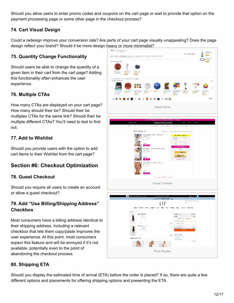
74. Cart Visual Design
Could a redesign improve your conversion rate? Are parts of your cart page visually unappealing? Does the pagedesign reflect your brand? Should it be more design heavy or more minimalist?
75. Quantity Change Functionality
Should users be able to change the quantity of agiven item in their cart from the cart page? Addingthis functionality often enhances the userexperience.
76. Multiple CTAs
How many CTAs are displayed on your cart page?How many should their be? Should their bemultiples CTAs for the same link? Should their bemultiple different CTAs? You’ll need to test to findout.
77. Add to Wishlist
Should you provide users with the option to addcart items to their Wishlist from the cart page?
Section #6: Checkout Optimization
78. Guest Checkout
Should you require all users to create an accountor allow a guest checkout?
79. Add “Use Billing/Shipping Address”Checkbox
Most consumers have a billing address identical totheir shipping address. Including a relevantcheckbox that lets them copy/paste improves theuser experience. At this point, most consumersexpect this feature and will be annoyed if it’s notavailable, potentially even to the point ofabandoning the checkout process.
80. Shipping ETA
Should you display the estimated time of arrival (ETA) before the order is placed? If so, there are quite a fewdifferent options and placements for offering shipping options and presenting the ETA.
12/17
Cart Visual Design
Guest Checkout
Use Billing Address
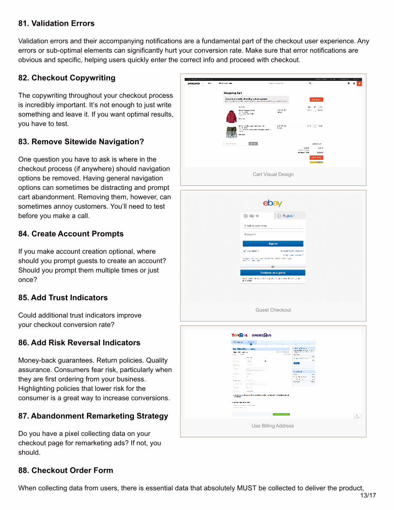
81. Validation Errors
Validation errors and their accompanying notifications are a fundamental part of the checkout user experience. Anyerrors or sub-optimal elements can significantly hurt your conversion rate. Make sure that error notifications areobvious and specific, helping users quickly enter the correct info and proceed with checkout.
82. Checkout Copywriting
The copywriting throughout your checkout processis incredibly important. It’s not enough to just writesomething and leave it. If you want optimal results,you have to test.
83. Remove Sitewide Navigation?
One question you have to ask is where in thecheckout process (if anywhere) should navigationoptions be removed. Having general navigationoptions can sometimes be distracting and promptcart abandonment. Removing them, however, cansometimes annoy customers. You’ll need to testbefore you make a call.
84. Create Account Prompts
If you make account creation optional, whereshould you prompt guests to create an account?Should you prompt them multiple times or justonce?
85. Add Trust Indicators
Could additional trust indicators improveyour checkout conversion rate?
86. Add Risk Reversal Indicators
Money-back guarantees. Return policies. Qualityassurance. Consumers fear risk, particularly whenthey are first ordering from your business.Highlighting policies that lower risk for theconsumer is a great way to increase conversions.
87. Abandonment Remarketing Strategy
Do you have a pixel collecting data on yourcheckout page for remarketing ads? If not, youshould.
88. Checkout Order Form
When collecting data from users, there is essential data that absolutely MUST be collected to deliver the product,13/17
Shipping ETA
Validation Errors
Money-Back Guarantee
and then there is non-essential data that is helpful for segmentation and marketing. The first category is just amatter of optimization. How can you request that info in the best possible way? The second category requires you tofind a balance. How much can you ask for without creating too much friction?
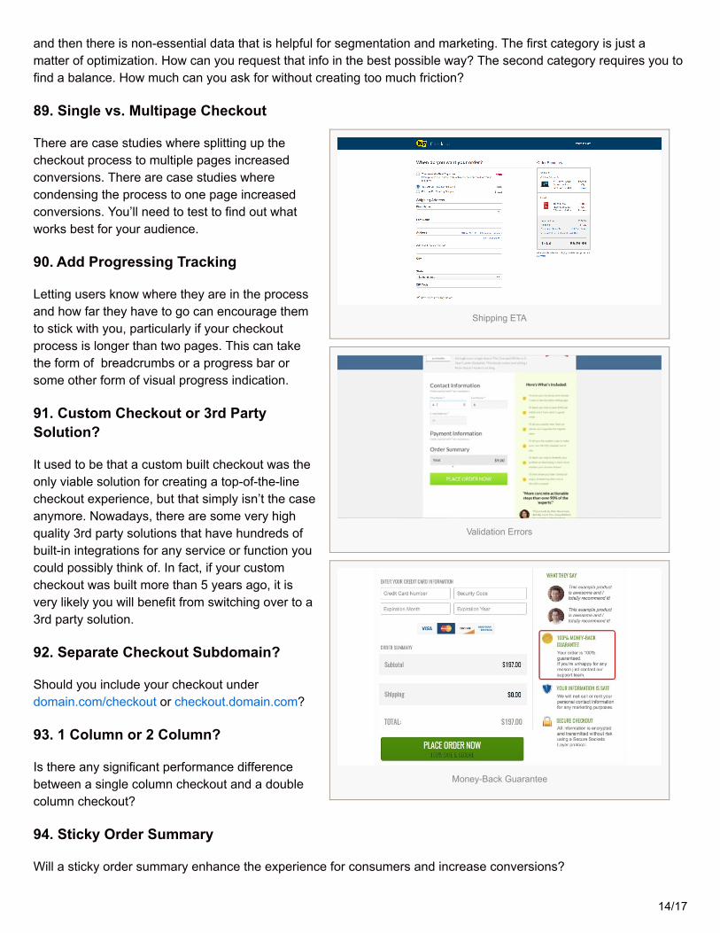
89. Single vs. Multipage Checkout
There are case studies where splitting up thecheckout process to multiple pages increasedconversions. There are case studies wherecondensing the process to one page increasedconversions. You’ll need to test to find out whatworks best for your audience.
90. Add Progressing Tracking
Letting users know where they are in the processand how far they have to go can encourage themto stick with you, particularly if your checkoutprocess is longer than two pages. This can takethe form of breadcrumbs or a progress bar orsome other form of visual progress indication.
91. Custom Checkout or 3rd PartySolution?
It used to be that a custom built checkout was theonly viable solution for creating a top-of-the-linecheckout experience, but that simply isn’t the caseanymore. Nowadays, there are some very highquality 3rd party solutions that have hundreds ofbuilt-in integrations for any service or function youcould possibly think of. In fact, if your customcheckout was built more than 5 years ago, it isvery likely you will benefit from switching over to a3rd party solution.
92. Separate Checkout Subdomain?
Should you include your checkout underdomain.com/checkout or checkout.domain.com?
93. 1 Column or 2 Column?
Is there any significant performance differencebetween a single column checkout and a doublecolumn checkout?
94. Sticky Order Summary
Will a sticky order summary enhance the experience for consumers and increase conversions?
14/17
Progressing Tracking
Single Column Checkout
Order Status Dashboard
95. What To Expect Next
Telling visitors what to expect next at each stage of the checkout process can enhance trust and reduceabandonment. How can you do better at setting expectations throughout your checkout process?
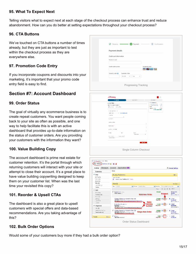
96. CTA Buttons
We’ve touched on CTA buttons a number of timesalready, but they are just as important to testwithin the checkout process as they areeverywhere else.
97. Promotion Code Entry
If you incorporate coupons and discounts into yourmarketing, it’s important that your promo codeentry field is easy to find.
Section #7: Account Dashboard
99. Order Status
The goal of virtually any ecommerce business is tocreate repeat customers. You want people comingback to your site as often as possible, and oneway to help facilitate this is with an activedashboard that provides up-to-date information onthe status of customer orders. Are you providingyour customers with the information they want?
100. Value Building Copy
The account dashboard is prime real estate forcustomer retention. It’s the portal through whichreturning customers will interact with your site orattempt to close their account. It’s a great place tohave value building copywriting designed to keepthem on your customer list. When was the lasttime your revisited this copy?
101. Reorder & Upsell CTAs
The dashboard is also a great place to upsellcustomers with special offers and data-basedrecommendations. Are you taking advantage ofthis?
102. Bulk Order Options
Would some of your customers buy more if they had a bulk order option?
15/17
Dashboard Upsell
Thank You Page Survey
Thank You Page Email Signup
103. Default Subscriptions
For subscription revenue models, are you providing users with a clear path to upgrade or modify their subscription?Are you re-enforcing the value from within the account dashboard or are you trying to retain customers by makingcancellation difficult?
Section #8: Thank You Page
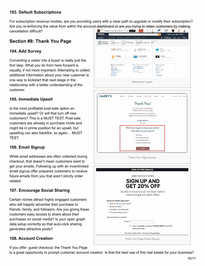
104. Add Survey
Converting a visitor into a buyer is really just thefirst step. What you do from here forward isequally, if not more important. Attempting to collectadditional information about your new customer isone way to kickstart that next stage in therelationship with a better understanding of thecustomer.
105. Immediate Upsell
Is the most profitable post-sale option animmediate upsell? Or will that turn off newcustomers? This is a MUST TEST. Post-salecustomers are already in purchase mode andmight be in prime position for an upsell, butupselling can also backfire, so again… MUSTTEST.
106. Email Signup
While email addresses are often collected duringcheckout, that doesn’t mean customers want toget your emails. Following up with an incentivisedemail signup offer prepares customers to receivefuture emails from you that aren’t strictly orderrelated.
107. Encourage Social Sharing
Certain niches attract highly engaged customerswho will happily advertise their purchase tofriends, family, and followers. Are you giving thesecustomers easy access to share about theirpurchases on social media? Is your open graphdata setup correctly so that auto-click sharinggenerates attractive posts?
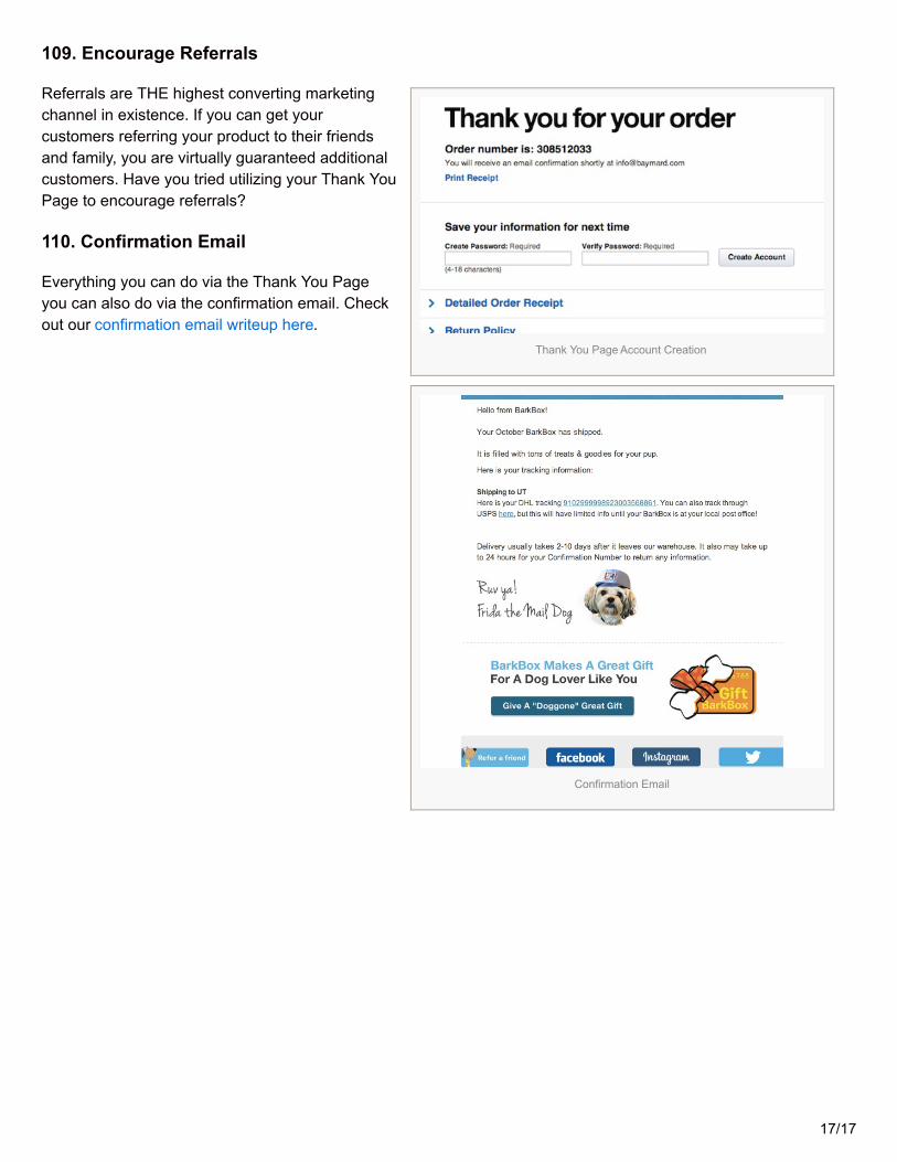
108. Account Creation
If you offer guest checkout, the Thank You Pageis a great opportunity to prompt customer account creation. Is that the best use of this real estate for your business?
16/17
Thank You Page Account Creation
Confirmation Email
109. Encourage Referrals
Referrals are THE highest converting marketingchannel in existence. If you can get yourcustomers referring your product to their friendsand family, you are virtually guaranteed additionalcustomers. Have you tried utilizing your Thank YouPage to encourage referrals?
110. Confirmation Email
Everything you can do via the Thank You Pageyou can also do via the confirmation email. Checkout our confirmation email writeup here.
17/17


