
The Edmonton Manual of Common Clinical Scenarios DES 586 Practicum I PortfolioRobin Good
timeline introduction
21
The Edmonton Manual is a guide for medical
students to apply their pre-clinical knowledge
to useful skills for clerkship and the OSCE
(clinical exams). The authours of this book
are medical students, residents, and staff
physicians at the University of Alberta. It
is designed to focus on patient history and
physical examination to arrive at relevant
differential diagnoses in preparation for
OSCE examinations.
After reading about this practicum, I knew it
would be a perfect fit for me. I took biology
as an option in my first semester and I’ve
always drawn scientific illustrations to help my
studying. Book design and textbook illustration
have always interested me and I would like
to pursue these areas as a designer after
graduation. My design style is very clean, clear
and has it’s own inviting personality that would
fit well with a medical textbook for students.
My experience with photography also allows
me to create my own unique images that
will be tailored for the project. I knew the
Edmonton Manual practicum would be a great
learning experience applied in a practical way.
Practical application of design is something
students don’t get real a taste of until they
are working for a client. This experience
has shown me how I can bring together my
background knowledge and skills into practical
application for the needs of a client. I learned
how to communicate with a committee of
clients and find out what their collective ideas
and opinions were. This group of clients is
connected to a much larger group involving
many participants in the creation of the
Edmonton Manual. Since everyone is assigned
to a different role that needs to be completed
at certain times, each group is assigned a
schedule of meetings and deadlines (see
timeline to the left). This affected my work
as I completed it in a certain order to meet
the deadlines of the other groups. I also had
to create a template or style sheet that was
understandable for the group of authours so
that when the editorial team recieved their
work it would be in the right format, and so
that when I recieved it from the editors, it
would need less changes.
Having more than one client, and clients that
do not know design, is a fairly new experience
for me. I have learned how to explain some
principles of design in a persuading way as
to why things need to look a certain way.
Even if it wasn’t perfectly how I had imagined
it, I still needed to accept the wishes of the
client and accommodate. I learned to ask as
many questions and ask as many times for
suggestions or changes that needed to
be made.
One example of a good learning experience
is the design of the Edmonton Manual logo.
Having chosen an identity and worked on it
with my supervisor, Sue Colberg, I thought
it would be a perfect logo for the client.
However, the clients wanted something
different than what I had proposed and
worked on. Now I know that I need to come up
with a larger variety of logos and refine them
at the beginning and then start to narrow
it down.
Having learned this, I applied it to my book
cover proposal. Providing research on a variety
of covers and coming up with four designs that
vary in style and format. It was easier to go
from here once the client narrowed it down by
selecting one.
Finding out the client’s priorities versus the
priorities ingrained into design students was
the biggest surprise for me as it turned it
completely on it’s head. The illustrations were
the most important part of my work, with
the book design, cover, and logo being less
important. In design, the logo is always the
first step as it carries the most importance to a
brand identity and further design choices. The
perspective of a designer will probably never
match that of a client.
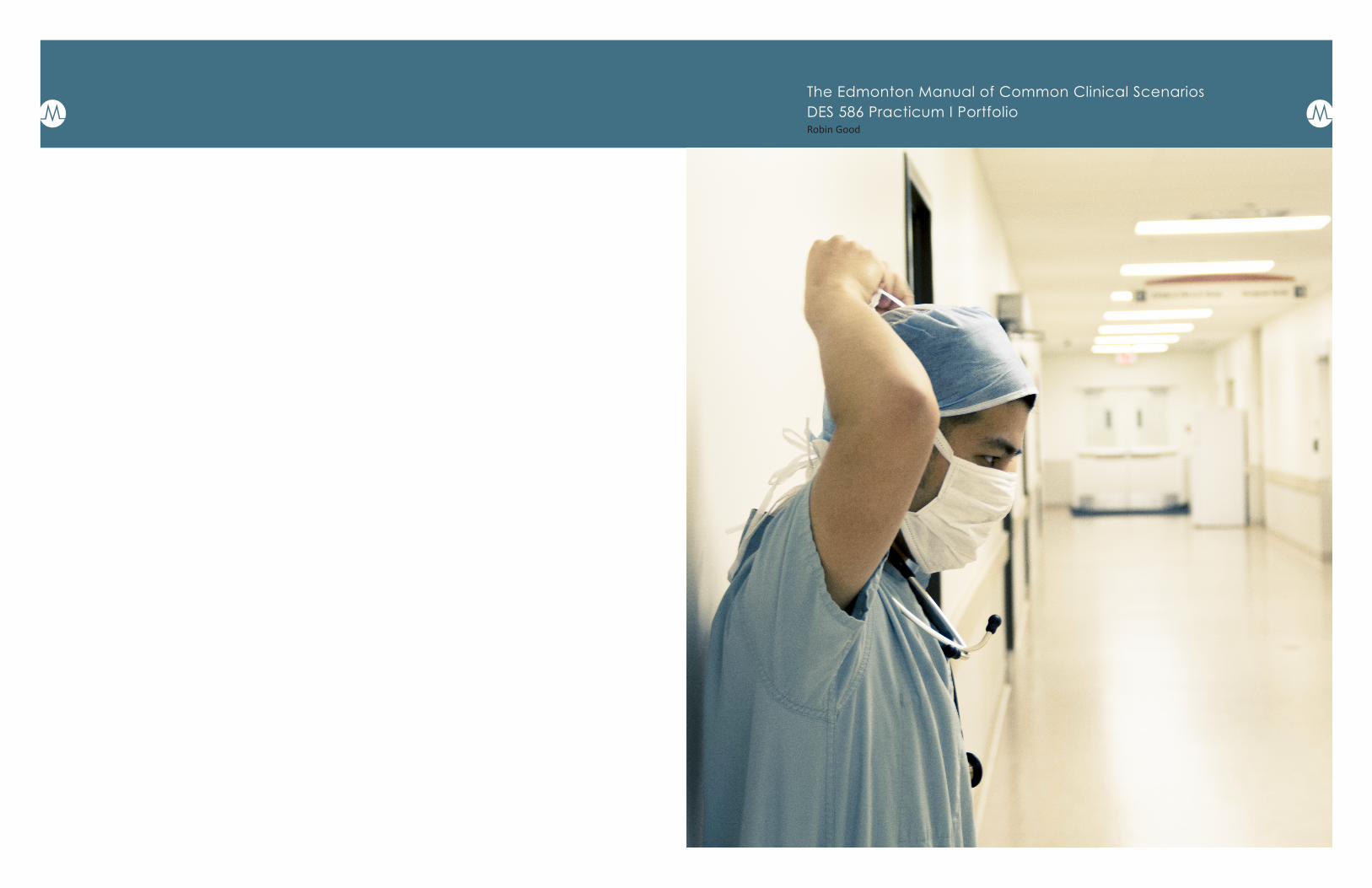
The experience of doing primary research and
photographing the Fort Saskatchewan Hospital
was a very interesting experience as I learned
more about the perspective of my clients and
target audience. All dressed up in scrubs, I got
over my fear of hospitals as I felt like I was part
of the medical community and could get a
better perspective of their daily work life. This
gave me a greater understanding of the kind
of environment the students who purchase
this book will be in and how important that
information is.
My role in this project has been the
identity designer, cover page designer and
photographer, book layout designer and
medical illustrator. I have met with the
editorial team and my supervisor several times
throughout the year and sent many emails.
This portfolio shows how I have made it and
what I have created.
The current Edmonton Manual logo (top right)
does not communicate the study and practice
of medicine. It looks similar to a library or book
store logo because it is simply a book.
I created a book that would relate it to
medicine as well as it’s origins at the University
of Alberta. Combining the University shield
with the medical symbol of the snake and
staff communicated everything about the
Edmonton Manual (next page top left).
However, the editorial team felt that it needed
simplification and sharper edges. I then went
back to my first sketches of the logo and
decided to create something more modern.
The banner still relates to the University but
has sharper lines and adds dynamism when
placed on top of the snake (middle).
The next logo concept was to transform the
letter “M” in Edmonton Manual with an ECG
(bottom). The symbol of an ECG is common
and understood as a part of medicinal practice.
The thin lines created with the type version of
this logo do not have a lot of visual weight, so I
applied it in a circular form, a brand icon.
The logos under consideration are the bottom
three on this page.
logo logo sketches
3 43
Edmonton Manual
65
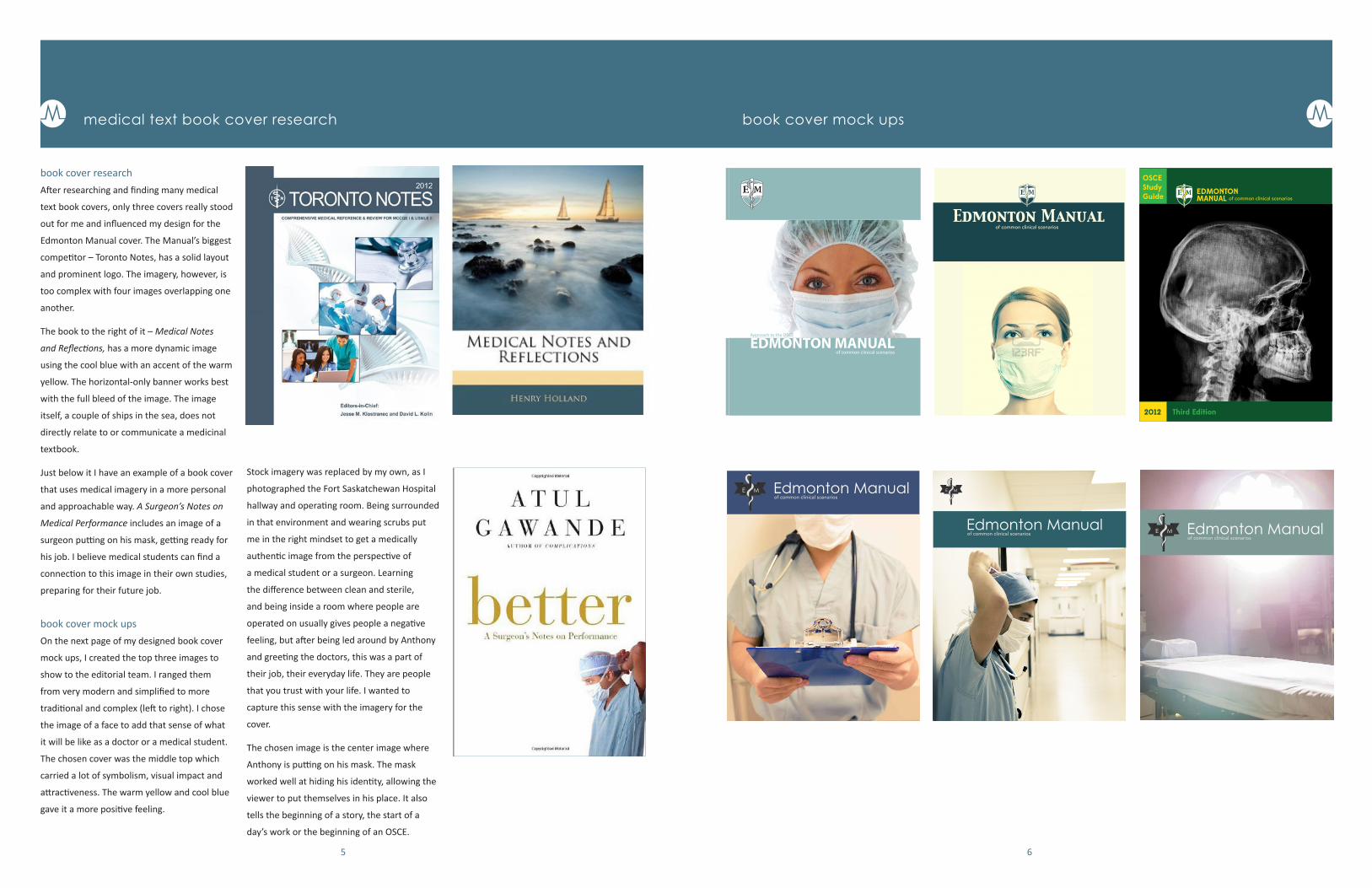
book cover researchAfter researching and finding many medical
text book covers, only three covers really stood
out for me and influenced my design for the
Edmonton Manual cover. The Manual’s biggest
competitor – Toronto Notes, has a solid layout
and prominent logo. The imagery, however, is
too complex with four images overlapping one
another.
The book to the right of it – Medical Notes
and Reflections, has a more dynamic image
using the cool blue with an accent of the warm
yellow. The horizontal-only banner works best
with the full bleed of the image. The image
itself, a couple of ships in the sea, does not
directly relate to or communicate a medicinal
textbook.
Just below it I have an example of a book cover
that uses medical imagery in a more personal
and approachable way. A Surgeon’s Notes on
Medical Performance includes an image of a
surgeon putting on his mask, getting ready for
his job. I believe medical students can find a
connection to this image in their own studies,
preparing for their future job.
book cover mock upsOn the next page of my designed book cover
mock ups, I created the top three images to
show to the editorial team. I ranged them
from very modern and simplified to more
traditional and complex (left to right). I chose
the image of a face to add that sense of what
it will be like as a doctor or a medical student.
The chosen cover was the middle top which
carried a lot of symbolism, visual impact and
attractiveness. The warm yellow and cool blue
gave it a more positive feeling.
medical text book cover research book cover mock ups
Approach to the OSCE
EDMONTON MANUALof common clinical scenarios
Edmonton Manualof common clinical scenarios
Edmonton Manualof common clinical scenarios
Edmonton Manualof common clinical scenarios
Edmonton Manualof common clinical scenarios
EDMONTONMANUAL of common clinical scenarios
2012 Third Edition
OSCEStudyGuide
Stock imagery was replaced by my own, as I
photographed the Fort Saskatchewan Hospital
hallway and operating room. Being surrounded
in that environment and wearing scrubs put
me in the right mindset to get a medically
authentic image from the perspective of
a medical student or a surgeon. Learning
the difference between clean and sterile,
and being inside a room where people are
operated on usually gives people a negative
feeling, but after being led around by Anthony
and greeting the doctors, this was a part of
their job, their everyday life. They are people
that you trust with your life. I wanted to
capture this sense with the imagery for the
cover.
The chosen image is the center image where
Anthony is putting on his mask. The mask
worked well at hiding his identity, allowing the
viewer to put themselves in his place. It also
tells the beginning of a story, the start of a
day’s work or the beginning of an OSCE.
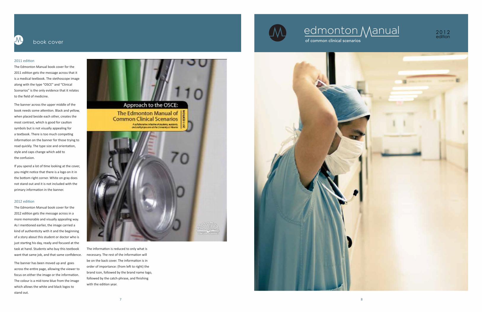
2011 editionThe Edmonton Manual book cover for the
2011 edition gets the message across that it
is a medical textbook. The stethoscope image
along with the type “OSCE” and “Clinical
Scenarios” is the only evidence that it relates
to the field of medicine.
The banner across the upper middle of the
book needs some attention. Black and yellow,
when placed beside each other, creates the
most contrast, which is good for caution
symbols but is not visually appealing for
a textbook. There is too much competing
information on the banner for those trying to
read quickly. The type size and orientation,
style and caps change which add to
the confusion.
If you spend a lot of time looking at the cover,
you might notice that there is a logo on it in
the bottom right corner. White on gray does
not stand out and it is not included with the
primary information in the banner.
2012 editionThe Edmonton Manual book cover for the
2012 edition gets the message across in a
more memorable and visually appealing way.
As I mentioned earlier, the image carried a
kind of authenticity with it and the beginning
of a story about this student or doctor who is
just starting his day, ready and focused at the
task at hand. Students who buy this textbook
want that same job, and that same confidence.
The banner has been moved up and goes
across the entire page, allowing the viewer to
focus on either the image or the information.
The colour is a mid-tone blue from the image
which allows the white and black logos to
stand out.
book cover
87
of common clinical scenarios 2 0 1 2edition
The information is reduced to only what is
necessary. The rest of the information will
be on the back cover. The information is in
order of importance: (from left to right) the
brand icon, followed by the brand name logo,
followed by the catch-phrase, and finishing
with the edition year.
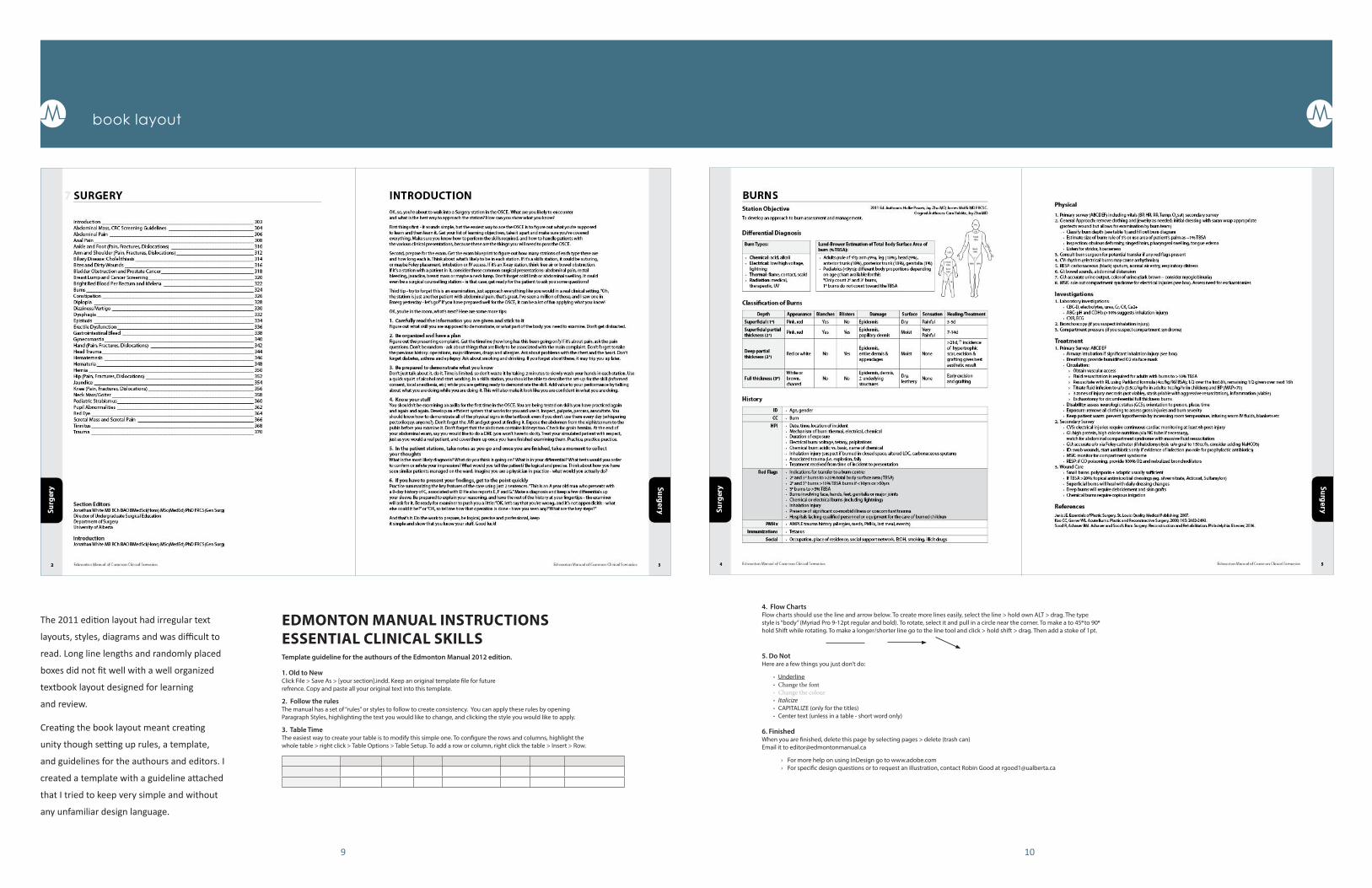
The 2011 edition layout had irregular text
layouts, styles, diagrams and was difficult to
read. Long line lengths and randomly placed
boxes did not fit well with a well organized
textbook layout designed for learning
and review.
Creating the book layout meant creating
unity though setting up rules, a template,
and guidelines for the authours and editors. I
created a template with a guideline attached
that I tried to keep very simple and without
any unfamiliar design language.
book layout
9 10
EDMONTON MANUAL INSTRUCTIONS ESSENTIAL CLINICAL SKILLSTemplate guideline for the authours of the Edmonton Manual 2012 edition.
1. Old to NewClick File > Save As > [your section].indd. Keep an original template � le for future refrence. Copy and paste all your original text into this template.
2. Follow the rulesThe manual has a set of “rules” or styles to follow to create consistency. You can apply these rules by opening Paragraph Styles, highlighting the text you would like to change, and clicking the style you would like to apply.
3. Table TimeThe easiest way to create your table is to modify this simple one. To con� gure the rows and columns, highlight the whole table > right click > Table Options > Table Setup. To add a row or column, right click the table > Insert > Row.
4. Flow ChartsFlow charts should use the line and arrow below. To create more lines easily, select the line > hold own ALT > drag. The type style is “body” (Myriad Pro 9-12pt regular and bold). To rotate, select it and pull in a circle near the corner. To make a to 45o to 90o
hold Shift while rotating. To make a longer/shorter line go to the line tool and click > hold shift > drag. Then add a stoke of 1pt.
5. Do NotHere are a few things you just don’t do:
· Underline · Change the font · Change the colour · Italicize · CAPITALIZE (only for the titles) · Center text (unless in a table - short word only)
6. FinishedWhen you are � nished, delete this page by selecting pages > delete (trash can)Email it to [email protected]
› For more help on using InDesign go to www.adobe.com › For speci� c design questions or to request an illustration, contact Robin Good at [email protected]

The illustrations are a key part of a textbook
in visually conveying important information.
The 2011 edition contained a variety of
different illustrations. Some being taken
from off internet, some with pixeling issues
or isses with legibility and understandability.
By recreating all of these images myself, I
will address these issues and create unity
within the textbook as ach image looks similar
in style. Images are simplifed as much as
possible, but should also be obvious as to what
they are within the context of the book.
There have been several occurances of
misunderstanding or misinterpreting on my
part where I would need further clarification as
to what is happening in an xray or illustration
that was unclear. I believe if I can make it
understandable to myself, not having studied
medicine, then the readers of the Edmonton
Manual will certainly understand it.
Illustrations were made the top priority by the
Edmonton Manual Editors which shows their
great importance for their improvement.
illustrations
11 12


