
UNIT-III Advanced ASP.NET
ASP.NET is a Web application framework developed and marketed by Microsoft to allow
programmers to build dynamic Web sites, Web applications and Web services. ASP.NET is built
on the Common Language Runtime (CLR), allowing programmers to write ASP.NET code using
any supported .NET language.
ASP.NET Web pages, known officially as Web Forms are the main building block for application
development. Web forms are contained in files with an ".aspx" extension; these files typically
contain HTML markup, as well as markup defining server-side Web Controls and User Controls.
With ASP.NET Framework 2.0, Microsoft introduced a new code-behind model which allows
static text to remain on the .aspx page, while dynamic code remains in an .aspx.vb or .aspx.cs or
.aspx.fs file (depending on the programming language used).
ASP.NET and the .NET Framework
ASP.NET is part of the Microsoft .NET Framework. To build ASP.NET pages, you need to take
advantage of the features of .NET Framework, which consists of two parts:
1. The Framework Class Library
2. The Common Language Runtime.
Understanding the Framework Class Library
The .NET Framework contains more than 13,000 classes you can use when building applications.
Framework Class Library was designed to make it easier to perform the most common
programming tasks. Following are just a few examples of the classes in the framework:
File class-Enables you to represent a file on your hard drive. You can use the File class
to check whether a file exists, create a new file, delete a file, and perform many other file-
related tasks.
Graphics class-Enables you to work with different types of images such as GIF, PNG,
BMP, and JPEG. You can use the Graphics class to draw rectangles, arcs, ellipses, and
other elements on an image
Random class-Enables you to generate a random number.
SmtpClient class-Enables you to send email. You can use the SmtpClient class to send
emails that contain attachments and HTML content.
Each class in the Framework can include properties, methods, and events. The properties,
methods, and events exposed by a class are the members of a class.
For example, following is a partial list of the members of the SmtpClient class:
Properties
Host-The name or IP address of your email server
Port-The number of the port to use when sending an email message
Methods
Send-Enables you to send an email message synchronously
SendAsync-Enables you to send an email message asynchronously
Events
SendCompleted-Raised when an asynchronous send operation completes
For example, the SmtpClient class includes two properties named Host and Port, which enable
you to specify the email server and port to use when sending an email message.
The SmtpClient class also includes two methods you can use to send an email:
i) Send()
ii) SendAsync().
The Send method blocks further program execution until the send operation is completed. The
SendAsync() method, on the other hand, sends the email asynchronously. Unlike the Send()
method, the SendAsync() method does not wait to check whether the send operation was
successful.
Finally, the SmtpClient class includes an event named SendCompleted, which is raised when an
asynchronous send operation completes. You can create an event handler for the
SendCompleted event that displays a message when the email has been successfully sent.
Understanding Namespaces
All the classes are defined in single name called namespaces in ASP.NET.
For example
1. All the classes related to working with the file system are located in the System.IO namespace.
2. All the classes for working a Microsoft SQL Server database are located in the
System.Data.SqlClient namespace.
Before you can use a class in a page, you must indicate the namespace associated with the
class. There are multiple ways of doing this.
1. First you can fully qualify a class name with its namespace. For example, because the File
class is contained in the System.IO namespace, you can use the following statement to check
whether a file exists:
System.IO.File.Exists(“SomeFile.txt”)
2. A second option is to import a namespace.
You can add an <$I<%@ Import % directive><%@ Import %> directive to a page to import a
particular namespace.
<%@ Import Namespace=”System.Net.Mail” %>
ASP.NET gives you the most commonly used namespaces for free:
System
System.Collections
System.Collections.Generic
System.Collections.Specialized
System.ComponentModel.DataAnnotations
System.Configuration
System.Data.Entity.Linq
System.Data.Linq
System.Text
System.Text.RegularExpressions
System.Web
System.Web.Caching
System.Web.DynamicData
System.Web.SessionState
System.Web.Security
System.Web.Profile
System.Web.UI
System.Web.UI.WebControls
System.Web.UI.WebControls.WebParts
System.Web.UI.HtmlControls
System.Xml.Linq
Understanding the Common Language Runtime
The second part of the .NET Framework is the Common Language Runtime (CLR). The Common
Language Runtime is responsible for executing your application code.
When you write an application for the .NET Framework with a language such as C# or Visual
Basic .NET, your source code is never compiled directly into machine code. Instead, the C# or
Visual Basic compiler converts your code into a special language named MSIL (Microsoft
Intermediate Language).
MSIL looks very much like an object-oriented assembly language. However, unlike a typical
assembly language, it is not CPU specific. MSIL is a low-level and platform-independent
language.
When your application actually executes, the MSIL code is "just-in-time" compiled into machine
code by the JITTER (the Just-In-Time compiler). Normally, your entire application is not compiled
from MSIL into machine code. Instead, only the methods that are actually called during execution
are compiled.
In reality, the .NET Framework understands only one language: MSIL. However, you can write
applications using languages such as Visual Basic .NET and C# for the .NET Framework
because the .NET Framework includes compilers for these languages that enable you to compile
your code into MSIL.
You can write code for the .NET Framework using any one of dozens of different languages,
including the following:
Ada
Apl
Caml
COBOL
Eiffel
Forth
Fortran
JavaScript
Oberon
PERL
Pascal
PHP
Python
RPG
Scheme
Small Talk
The vast majority of developers building ASP.NET applications write the applications in either C#
or Visual Basic .NET.
Understanding ASP.NET Controls
ASP.NET controls are the heart of the ASP.NET Framework. An ASP.NET control is a .NET class
that executes on the server and renders certain content to the browser.
The ASP.NET Framework contains over 70 controls. These controls can be divided into eight
groups:
Standard Controls—The standard controls enable you to render standard form
elements such as buttons, input fields, and labels.
Validation Controls—The validation controls enable you to validate form data before
you submit the data to the server. For example, you can use a RequiredFieldValidator
control to check whether a user entered a value for a required input field.
Rich Controls—The rich controls enable you to render things such as calendars, file
upload buttons, rotating banner advertisements, and multi-step wizards.
Data Controls—The data controls enable you to work with data such as database data.
For example, you can use these controls to submit new records to a database table or
display a list of database records.
Navigation Controls—The navigation controls enable you to display standard navigation
elements such as menus, tree views, and bread crumb trails.
Login Controls—The login controls enable you to display login, change password, and
registration forms.
HTML Controls—The HTML controls enable you to convert any HTML tag into a server-
side control.
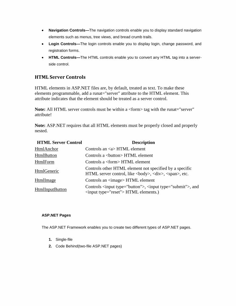
HTML Server Controls
HTML elements in ASP.NET files are, by default, treated as text. To make these
elements programmable, add a runat="server" attribute to the HTML element. This
attribute indicates that the element should be treated as a server control.
Note: All HTML server controls must be within a <form> tag with the runat="server"
attribute!
Note: ASP.NET requires that all HTML elements must be properly closed and properly
nested.
HTML Server Control Description
HtmlAnchor Controls an <a> HTML element
HtmlButton Controls a <button> HTML element
HtmlForm Controls a <form> HTML element
HtmlGeneric
Controls other HTML element not specified by a specific
HTML server control, like <body>, <div>, <span>, etc.
HtmlImage Controls an <image> HTML element
HtmlInputButton
Controls <input type="button">, <input type="submit">, and
<input type="reset"> HTML elements.)
ASP.NET Pages
The ASP.NET Framework enables you to create two different types of ASP.NET pages.
1. Single-file
2. Code Behind(two-file ASP.NET pages)
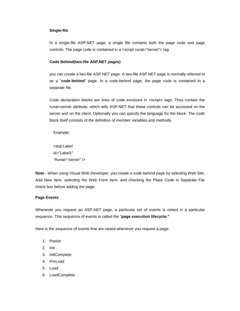
Single-file
In a single-file ASP.NET page, a single file contains both the page code and page
controls. The page code is contained in a <script runat="server"> tag.
Code Behind(two-file ASP.NET pages)
you can create a two-file ASP.NET page. A two-file ASP.NET page is normally referred to
as a "code-behind" page. In a code-behind page, the page code is contained in a
separate file.
Code declaration blocks are lines of code enclosed in <script> tags. They contain the
runat=server attribute, which tells ASP.NET that these controls can be accessed on the
server and on the client. Optionally you can specify the language for the block. The code
block itself consists of the definition of member variables and methods.
Example:
<asp:Label
id="Label1"
Runat="server" />
Note - When using Visual Web Developer, you create a code-behind page by selecting Web Site,
Add New Item, selecting the Web Form Item, and checking the Place Code in Separate File
check box before adding the page.
Page Events
Whenever you request an ASP.NET page, a particular set of events is raised in a particular
sequence. This sequence of events is called the "page execution lifecycle."
Here is the sequence of events that are raised whenever you request a page:
1. PreInit
2. Init
3. InitComplete
4. PreLoad
5. Load
6. LoadComplete
7. PreRender
8. PreRenderComplete
9. SaveStateComplete
10. Unload
Advantages of ASP.NET (Features)
1. Separation of Code from HTML
To make a clean sweep, with ASP.NET you have the ability to completely separate layout
and business logic. This makes it much easier for teams of programmers and designers
to collaborate efficiently. This makes it much easier for teams of programmers and
designers to collaborate efficiently.
2. Support for compiled languages
developer can use VB.NET and access features such as strong typing and object-
oriented programming. Using compiled languages also means that ASP.NET pages do
not suffer the performance penalties associated with interpreted code. ASP.NET pages
are precompiled to byte-code and Just In Time (JIT) compiled when first requested.
Subsequent requests are directed to the fully compiled code, which is cached until the
source changes.
3. Use services provided by the .NET Framework
The .NET Framework provides class libraries that can be used by your application. Some
of the key classes help you with input/output, access to operating system services, data
access, or even debugging. We will go into more detail on some of them in this module.
4. Graphical Development Environment
Visual Studio .NET provides a very rich development environment for Web
developers. You can drag and drop controls and set properties the way you do in Visual
Basic 6. And you have full IntelliSense support, not only for your code, but also for HTML
and XML.
5. State management
To refer to the problems mentioned before, ASP.NET provides solutions for session and
application state management. State information can, for example, be kept in memory or
stored in a database. It can be shared across Web farms, and state information can be
recovered, even if the server fails or the connection breaks down.
6. Update files while the server is running
Components of your application can be updated while the server is online and clients are
connected. The Framework will use the new files as soon as they are copied to the
application. Removed or old files that are still in use are kept in memory until the clients
have finished.
7. XML-Based Configuration Files
Configuration settings in ASP.NET are stored in XML files that you can easily read and
edit. You can also easily copy these to another server, along with the other files that
comprise your application.
ASP.NET Overview
Here some point that gives the quick overview of ASP.NET.
ASP.NET provides services to allow the creation, deployment, and execution of Web
Applications and Web Services
Like ASP, ASP.NET is a server-side technology
Web Applications are built using Web Forms. ASP.NET comes with built-in Web Forms
controls, which are responsible for generating the user interface. They mirror typical
HTML widgets like text boxes or buttons. If these controls do not fit your needs, you are
free to create your own user controls.
Web Forms are designed to make building web-based applications as easy as building
Visual Basic applications
ASP.NET Architecture
ASP.NET is based on the fundamental architecture of .NET Framework. Visual studio provide a
uniform way to combine the various features of this Architecture.
Architecture is explained form bottom to top in the following discussion.
1. At the bottom of the Architecture is Common Language Runtime. NET Framework
common language runtime resides on top of the operating system services. The common
language runtime loads and executes code that targets the runtime. This code is
therefore called managed code. The runtime gives you, for example, the ability for cross-
language integration.
2. .NET Framework provides a rich set of class libraries. These include base classes, like
networking and input/output classes, a data class library for data access, and classes for
use by programming tools, such as debugging services. All of them are brought together
by the Services Framework, which sits on top of the common language runtime.
3. ADO.NET is Microsoft’s ActiveX Data Object (ADO) model for the .NET Framework.
ADO.NET is not simply the migration of the popular ADO model to the managed
environment but a completely new paradigm for data access and manipulation.
ADO.NET is intended specifically for developing web applications. This is evident from its
two major design principles:
1. Disconnected Datasets—In ADO.NET, almost all data manipulation is done
outside the context of an open database connection.
2. Effortless Data Exchange with XML—Datasets can converse in the universal
data format of the Web, namely XML.
4. The 4th layer of the framework consists of the Windows application model and, in
parallel, the Web application model.
The Web application model-in the slide presented as ASP.NET-includes Web Forms and
Web Services.
ASP.NET comes with built-in Web Forms controls, which are responsible for generating
the user interface. They mirror typical HTML widgets like text boxes or buttons. If these
controls do not fit your needs, you are free to create your own user controls.
Web Services brings you a model to bind different applications over the Internet. This
model is based on existing infrastructure and applications and is therefore standard-
based, simple, and adaptable.
Web Services are software solutions delivered via Internet to any device. Today, that
means Web browsers on computers, for the most part, but the device-agnostic design of
.NET will eliminate this limitation.
5. One of the obvious themes of .NET is unification and interoperability between various
programming languages. In order to achieve this; certain rules must be laid and all the
languages must follow these rules. In other words we cannot have languages running
around creating their own extensions and their own fancy new data types. CLS is the
collection of the rules and constraints that every language (that seeks to achieve .NET
compatibility) must follow.
6. The CLR and the .NET Frameworks in general, however, are designed in such a way that
code written in one language can not only seamlessly be used by another language.
Hence ASP.NET can be programmed in any of the .NET compatible.
AdRotator Control
The AdRotator control is used to display a sequence of ad images.The AdRotator is a special
purpose control in ASP.NET that is used to display flashing Banner ads. The control is capable of
displaying ads randomly or sequentially as set by the users. Each time the page is refreshed or
reloaded a new ad can be displayed to the user. We can also assign priorities to the ads in such
a way that certain ads are displayed frequently than others.
AdRotator control is available in ASP.Net to make the task of rotating the advertisement images
in a web form quickly and easily.
AdRotator control are used to create a dynamic ads. The AdRotator Control presents ad images
each time a user enters or refreshes a webpage. When the ads are clicked, it will navigate to a
new Web location. The AdRotator control is used to display a sequence of ad images.The
AdRotator control to work we need an Advertisement file (XML file) and some sample images.
Adding the AdRotator web server control to your web application. First, select the AdRotator and
drag and drop the control to your web form. Map the XML file which contains the details about
each and every ad.
This control uses an XML file to store the ad information. The XML file must begin and end with
an <Advertisements> tag. Inside the <Advertisements> tag there may be several <Ad> tags
which defines each ad.
The predefined elements inside the <Ad> tag are listed below:
Element Description
<ImageUrl> Optional. The path to the image file
<NavigateUrl> Optional. The URL to link to if the user clicks the ad
<AlternateText> Optional. An alternate text for the image
<Keyword> Optional. A category for the ad
<Impressions> Optional. The display rates in percent of the hits
Properties
Property Description
AdvertisementFile Specifies the path to the XML file that contains ad information
AlternateTextField Specifies a data field to be used instead of the Alt text for an ad
ImageUrlField Specifies a data field to be used instead of the ImageURL attribute
for an ad
KeywordFilter Specifies a filter to limit ads after categories
NavigateUrlField Specifies a data field to be used instead of the NavigateUrl
attribute for an ad
runat Specifies that the control is a server control. Must be set to "server"
Target Specifies where to open the URL
Height The height of the ad in pixels. This value overrides the default
height setting for the AdRotator control.
Width The width of the ad in pixels. This value overrides the default width
setting for the AdRotator control.
The advertisement file is an XML file. The following are some of the elements of this XML file.
XML code that has the details about the ads. The file Ads.xml looks like the code below:
<Advertisements>
<Ad>
<ImageUrl>adimages/2.jpg</ImageUrl>
<NavigateUrl>http://cat2.com</NavigateUrl>
<AlternateText>Cat 2</AlternateText>
<Impressions>30</Impressions>
</Ad>
<Ad>
<ImageUrl>adimages/3.jpg</ImageUrl>
<NavigateUrl>http://cat3.com</NavigateUrl>
<AlternateText>Cat 3</AlternateText>
<Impressions>20</Impressions>
</Ad>
Following are the important events of the AdRotator Class:
Events Description
AdCreated It is raised once per round trip to the server after creation of the control, but before the page is rendered
DataBinding Occurs when the server control binds to a data source.
DataBound Occurs after the server control binds to a data source.
Disposed Occurs when a server control is released from memory, which is the last stage of the server control lifecycle when an ASP.NET page is requested
Init Occurs when the server control is initialized, which is the first step in its lifecycle.
Load Occurs when the server control is loaded into the Page object.
Unload Occurs when the server control is unloaded from memory.
MultiView Control:
The MultiView control represents a control that acts as a container for groups of View controls.. It
creates a set of views and one view is visible at a time. Use View control to create views inside
the MutliView control. Add the View controls into a MultiView control.
The main advantage of the multiview control is that we can specify the required view only (i.e
display the required view only) on a single page.Multiview control helps us to create different
views in the same page and display the view as the user clicks the links.
The MultiView control acts as a container for groups of View controls. Each View control in turn
contains child controls such as buttons and text boxes.
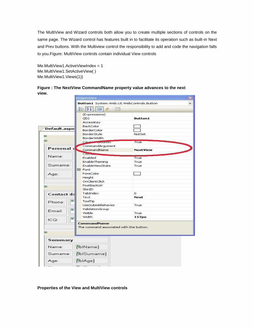
The MultiView and Wizard controls both allow you to create multiple sections of controls on the
same page. The Wizard control has features built in to facilitate its operation such as built-in Next
and Prev buttons. With the Multiview control the responsibility to add and code the navigation falls
to you.Figure: MultiView controls contain individual View controls
Me.MultiView1.ActiveViewIndex = 1
Me.MultiView1.SetActiveView( )
Me.MultiView1.Views(1))
Figure : The NextView CommandName property value advances to the next
view.
Properties of the View and MultiView controls
Both the View and MultiView controls are derived from Control class and inherits all its properties,
methods and events. The most important property of the View control is Visible property of type
Boolean, which sets the visibility of a view.
The MultiView control has the following important properties:
Properties Description
Views Collection of View controls within the MultiView
ActiveViewIndex A zero based index that denotes the active view; if no view is active
then the index is -1.
The CommandName attribute of the Button controls associated with the navigation of the
MultiView control are associated with some related field of the MultiView control.
For example, if a Button control with CommandName value as NextView is associated with the
navigation of the multiview, it automatically navigates to the next view when the button is clicked.
The following table shows the default command names for the above properties:
Properties Description
NextViewCommandName NextView
PreviousViewCommandName PrevView
SwitchViewByIDCommandName SwitchViewByID
SwitchViewByIndexCommandName SwitchViewByIndex
The following are the important methods of the MultiView control:
Methods Description
SetActiveview Sets the active view
GetActiveview Retrieves the active view
Every time a view is changed, the page is posted back to the server and a number of events are
raised. Some important events are:
Events Description
ActiveViewChanged Raised when a view is changed
Activate Raised by the active view
Deactivate Raised by the inactive view
Apart from the above mentioned properties, methods and events, multi view control inherits the
members of the control and object class.
Wizard Control
Wizard control eliminates the need to design forms to execute a step by step process in the
actual business flow. This simplifies the work of developers to design and write the code. The
ASP.NET Wizard control simplifies many of the tasks associated with building a series of forms to
collect user data. The control provides a mechanism that allows you to easily build the desired
wizard as a collection of steps
The control provides a mechanism that allows you to easily build the desired wizard as a
collection of steps, add a new step, or reorder the steps. You don't have to write any
infrastructure whatsoever for navigation or to persist user data between steps.
The Wizard control works much like the MultiView control in that they both contain sections to
place controls in. While the sections in a MultiView control are views, the sections in a Wizard
control are called steps. The Wizard control has features built in to facilitate its operation such as
built-in Next and Prev buttons. With the Multiview control the responsibility to add and code the
navigation falls to you.
These steps are stored in the WizardSteps collection. The primary difference between the two
controls is that the Wizard control can display links to all of the steps in a sidebar on the left-hand
side of the control.
You can add or remove steps from a wizard control by selecting the Add/Remove WizardSteps
option from the smart tag Wizard Tasks menu.
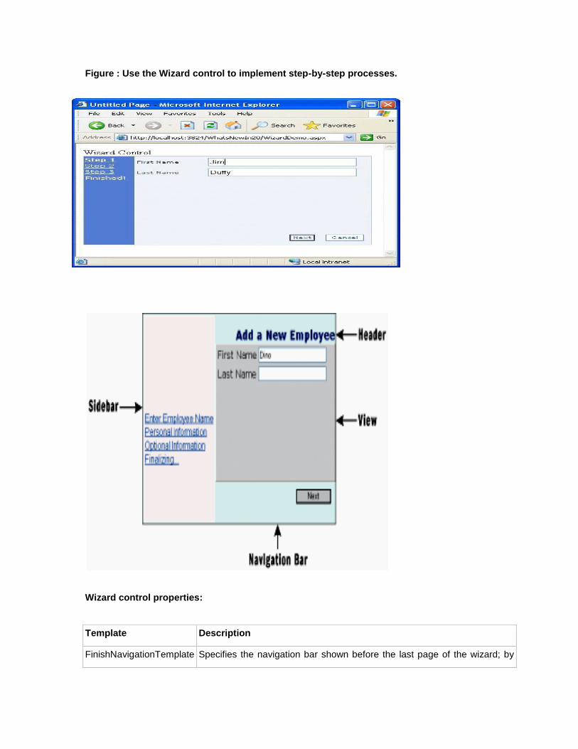
Figure : Use the Wizard control to implement step-by-step processes.
Wizard control properties:
Template Description
FinishNavigationTemplate Specifies the navigation bar shown before the last page of the wizard; by
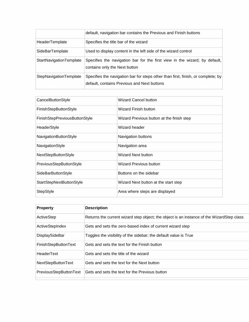
default, navigation bar contains the Previous and Finish buttons
HeaderTemplate Specifies the title bar of the wizard
SideBarTemplate Used to display content in the left side of the wizard control
StartNavigationTemplate Specifies the navigation bar for the first view in the wizard; by default,
contains only the Next button
StepNavigationTemplate Specifies the navigation bar for steps other than first, finish, or complete; by
default, contains Previous and Next buttons
CancelButtonStyle Wizard Cancel button
FinishStepButtonStyle Wizard Finish button
FinishStepPreviousButtonStyle Wizard Previous button at the finish step
HeaderStyle Wizard header
NavigationButtonStyle Navigation buttons
NavigationStyle Navigation area
NextStepButtonStyle Wizard Next button
PreviousStepButtonStyle Wizard Previous button
SideBarButtonStyle Buttons on the sidebar
StartStepNextButtonStyle Wizard Next button at the start step
StepStyle Area where steps are displayed
Property Description
ActiveStep Returns the current wizard step object; the object is an instance of the WizardStep class
ActiveStepIndex Gets and sets the zero-based index of current wizard step
DisplaySideBar Toggles the visibility of the sidebar; the default value is True
FinishStepButtonText Gets and sets the text for the Finish button
HeaderText Gets and sets the title of the wizard
NextStepButtonText Gets and sets the text for the Next button
PreviousStepButtonText Gets and sets the text for the Previous button
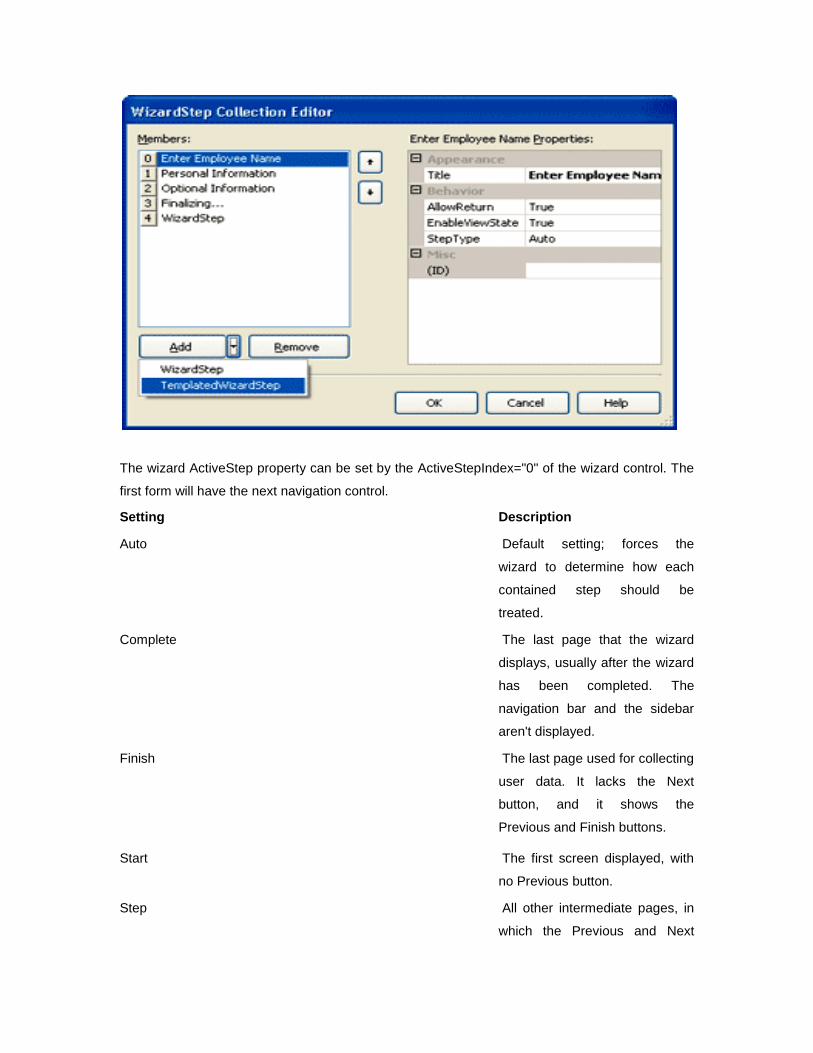
The wizard ActiveStep property can be set by the ActiveStepIndex="0" of the wizard control. The
first form will have the next navigation control.
Setting Description
Auto Default setting; forces the
wizard to determine how each
contained step should be
treated.
Complete The last page that the wizard
displays, usually after the wizard
has been completed. The
navigation bar and the sidebar
aren't displayed.
Finish The last page used for collecting
user data. It lacks the Next
button, and it shows the
Previous and Finish buttons.
Start The first screen displayed, with
no Previous button.
Step All other intermediate pages, in
which the Previous and Next
buttons are displayed.
Wizard Events -
ActiveStepChanged - This event fires when the control go to a new step.
CancelButtonClick - The cancel button is not shown by default, you can add to every step by Wizard.DisplayCancelButtop property. This event fires when Cancel button clicked.
FinishButtonClick - This event fires when FinishButton clicked.
NextButtonClick - This event fires when Next button clicked on any step.
PreviousButtonClick - This event fires when Previous button clicked on any step.
SideBarButtonClick - This event fires when a button in the sidebar area clicked.
ImageMap control
The ASP.NET ImageMap control allows you to create an image that has individual regions that
users can click, which are called hot spots. Each of these hot spots can be a separate hyperlink
or postback event.
ImageMap Elements:
o The ImageMap control consists primarily of two pieces. The first is an image, which can
be a graphic in any standard web graphic format, such as a .gif, .jpg, or .png file.
o The second element is a collection of hotspot controls. Each hotspot control is a different
element. For each hotspot control, you define its shape — a circle, rectangle, or
polygon — and the coordinates that specify the location and size of the hot spot.
Different types of hot spots
There are three different types of hot spots offered by ImageMap control. They are:
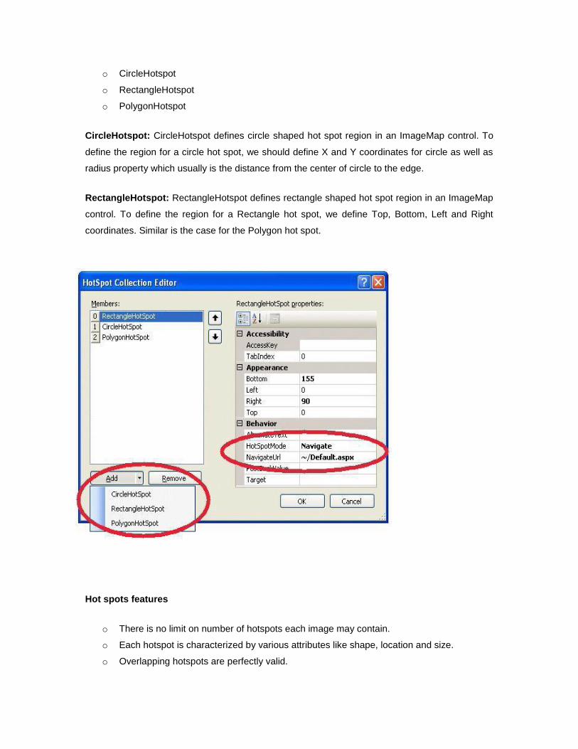
o CircleHotspot
o RectangleHotspot
o PolygonHotspot
CircleHotspot: CircleHotspot defines circle shaped hot spot region in an ImageMap control. To
define the region for a circle hot spot, we should define X and Y coordinates for circle as well as
radius property which usually is the distance from the center of circle to the edge.
RectangleHotspot: RectangleHotspot defines rectangle shaped hot spot region in an ImageMap
control. To define the region for a Rectangle hot spot, we define Top, Bottom, Left and Right
coordinates. Similar is the case for the Polygon hot spot.
Hot spots features
o There is no limit on number of hotspots each image may contain.
o Each hotspot is characterized by various attributes like shape, location and size.
o Overlapping hotspots are perfectly valid.
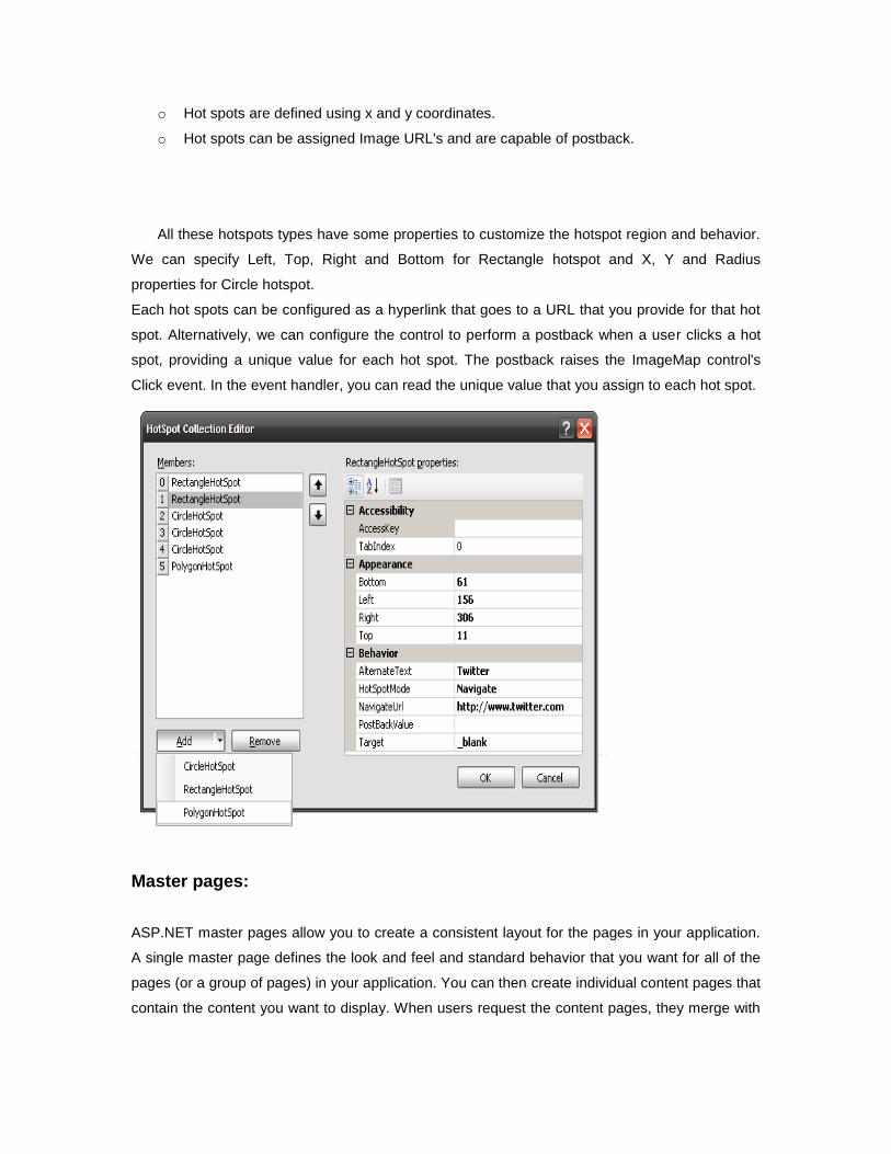
o Hot spots are defined using x and y coordinates.
o Hot spots can be assigned Image URL's and are capable of postback.
All these hotspots types have some properties to customize the hotspot region and behavior.
We can specify Left, Top, Right and Bottom for Rectangle hotspot and X, Y and Radius
properties for Circle hotspot.
Each hot spots can be configured as a hyperlink that goes to a URL that you provide for that hot
spot. Alternatively, we can configure the control to perform a postback when a user clicks a hot
spot, providing a unique value for each hot spot. The postback raises the ImageMap control's
Click event. In the event handler, you can read the unique value that you assign to each hot spot.
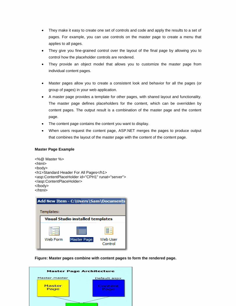
Master pages:
ASP.NET master pages allow you to create a consistent layout for the pages in your application.
A single master page defines the look and feel and standard behavior that you want for all of the
pages (or a group of pages) in your application. You can then create individual content pages that
contain the content you want to display. When users request the content pages, they merge with
the master page to produce output that combines the layout of the master page with the content
from the content page.
Replaceable Content Placeholders
In addition to static text and controls that will appear on all pages, the master page also includes
one or more ContentPlaceHolder controls. These placeholder controls define regions where
replaceable content will appear. In turn, the replaceable content is defined in content pages.
Content Pages
You define the content for the master page's placeholder controls by creating individual content
pages, which are ASP.NET pages (.aspx files and, optionally, code-behind files) that are bound to
a specific master page. The binding is established in the content page's @ Page directive by
including a MasterPageFile attribute that points to the master page to be used.
From the user's perspective, the combined master and content pages are a single, discrete page.
The URL of the page is that of the content page.
From a programming perspective, the two pages act as separate containers for their respective
controls. The content page acts as a container for the master page. However, you can reference
public master-page members from code in the content page.
Note that the master page becomes a part of the content page. In effect, the master page acts in
much the same way a user control acts — as a child of the content page and as a container
within that page. In this case, however, the master page is the container for all of the server
controls that are rendered to the browser.
Advantages of Master pages
Master pages provide functionality that developers have traditionally created by copying existing
code, text, and control elements repeatedly; using framesets; using include files for common
elements; using ASP.NET user controls; and so on.
Advantages of master pages include the following:
They allow you to centralize the common functionality of your pages so that you can
make updates in just one place.
They make it easy to create one set of controls and code and apply the results to a set of
pages. For example, you can use controls on the master page to create a menu that
applies to all pages.
They give you fine-grained control over the layout of the final page by allowing you to
control how the placeholder controls are rendered.
They provide an object model that allows you to customize the master page from
individual content pages.
Master pages allow you to create a consistent look and behavior for all the pages (or
group of pages) in your web application.
A master page provides a template for other pages, with shared layout and functionality.
The master page defines placeholders for the content, which can be overridden by
content pages. The output result is a combination of the master page and the content
page.
The content page contains the content you want to display.
When users request the content page, ASP.NET merges the pages to produce output
that combines the layout of the master page with the content of the content page.
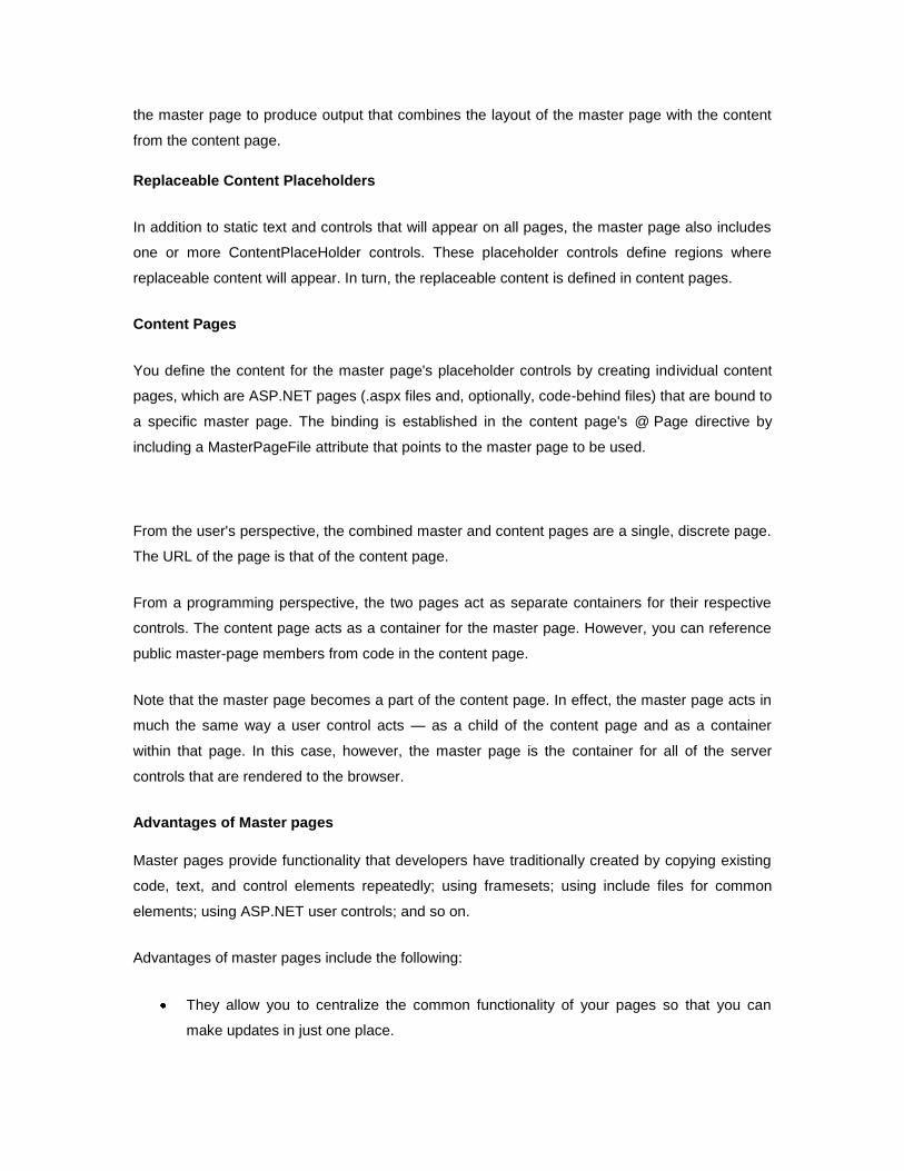
Master Page Example
<%@ Master %> <html> <body> <h1>Standard Header For All Pages</h1> <asp:ContentPlaceHolder id="CPH1" runat="server"> </asp:ContentPlaceHolder> </body> </html>
Figure: Master pages combine with content pages to form the rendered page.
A complete master page contains HTML, optional ASP.NET web controls, optional user controls,
and one or more required ContentPlaceHolder controls. A ContentPlaceHolder control is a
special ASP.NET web container control (<asp:contentplaceholder>) responsible for containing
the controls placed on a content web page. You will find the ContentPlaceHolder control in the
Standard section of the Toolbox. You can place one or more ContentPlaceHolder controls on a
master page. All content on a content form is restricted to one of the ContentPlaceHolder controls
defined on the content page's master page. The master page content on a content page is
grayed out and not editable from within the content page. The only live areas available in the
designer are the ContentPlaceHolder controls defined in the master page.
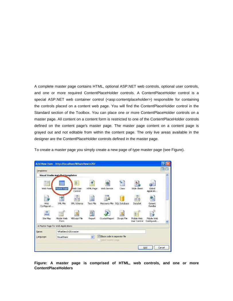
To create a master page you simply create a new page of type master page (see Figure).
Figure: A master page is comprised of HTML, web controls, and one or more
ContentPlaceHolders
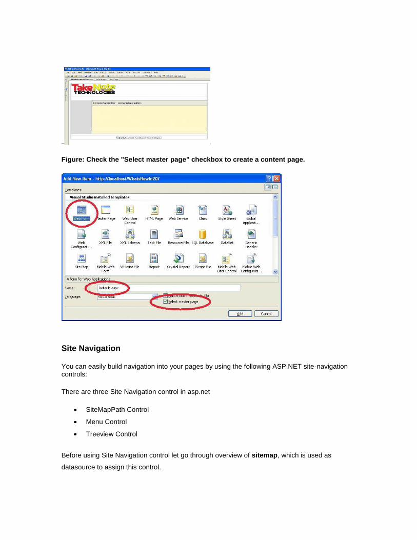
Figure: Check the "Select master page" checkbox to create a content page.
Site Navigation
You can easily build navigation into your pages by using the following ASP.NET site-navigation controls:
There are three Site Navigation control in asp.net
SiteMapPath Control
Menu Control
Treeview Control
Before using Site Navigation control let go through overview of sitemap, which is used as
datasource to assign this control.
SiteMap
SiteMap file is an XML File, which contains details of navigation that is followed by navigation
control.
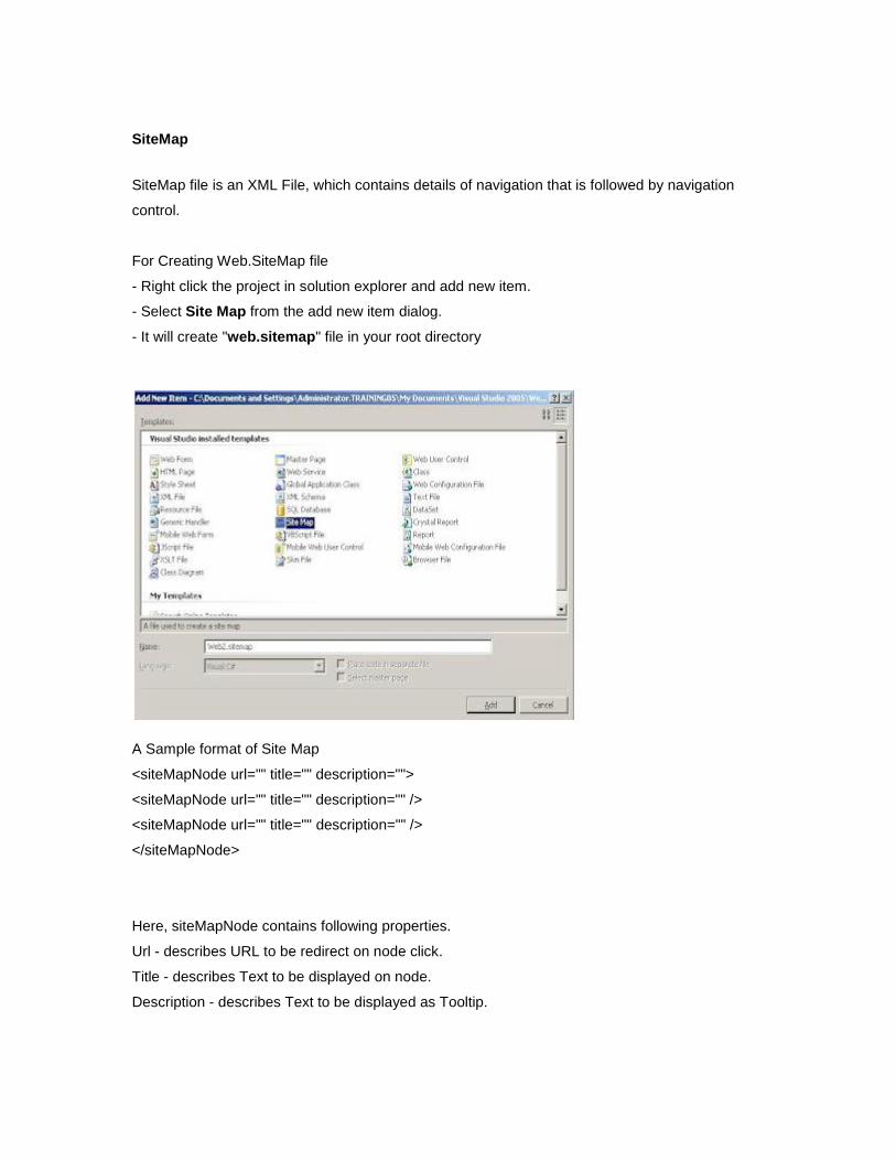
For Creating Web.SiteMap file
- Right click the project in solution explorer and add new item.
- Select Site Map from the add new item dialog.
- It will create "web.sitemap" file in your root directory
A Sample format of Site Map
<siteMapNode url="" title="" description="">
<siteMapNode url="" title="" description="" />
<siteMapNode url="" title="" description="" />
</siteMapNode>
Here, siteMapNode contains following properties.
Url - describes URL to be redirect on node click.
Title - describes Text to be displayed on node.
Description - describes Text to be displayed as Tooltip.
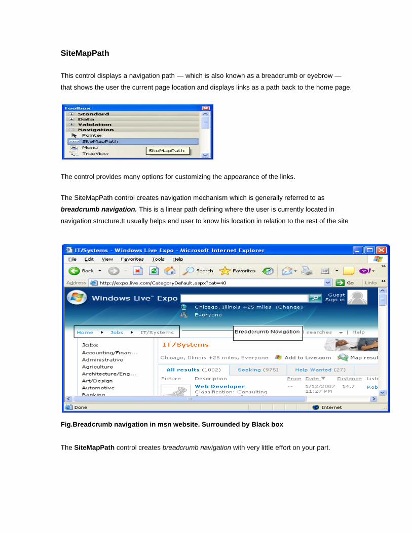
SiteMapPath
This control displays a navigation path — which is also known as a breadcrumb or eyebrow —
that shows the user the current page location and displays links as a path back to the home page.
The control provides many options for customizing the appearance of the links.
The SiteMapPath control creates navigation mechanism which is generally referred to as
breadcrumb navigation. This is a linear path defining where the user is currently located in
navigation structure.It usually helps end user to know his location in relation to the rest of the site
Fig.Breadcrumb navigation in msn website. Surrounded by Black box The SiteMapPath control creates breadcrumb navigation with very little effort on your part.
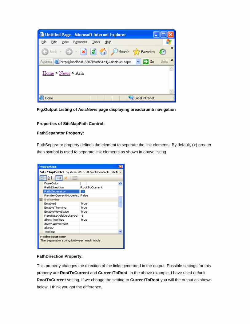
Fig.Output Listing of AsiaNews page displaying breadcrumb navigation Properties of SiteMapPath Control: PathSeparator Property:
PathSeparator property defines the element to separate the link elements. By default, (>) greater
than symbol is used to separate link elements as shown in above listing
PathDirection Property: This property changes the direction of the links generated in the output. Possible settings for this
property are RootToCurrent and CurrentToRoot. In the above example, I have used default
RootToCurrent setting. If we change the setting to CurrentToRoot you will the output as shown
below. I think you got the difference.
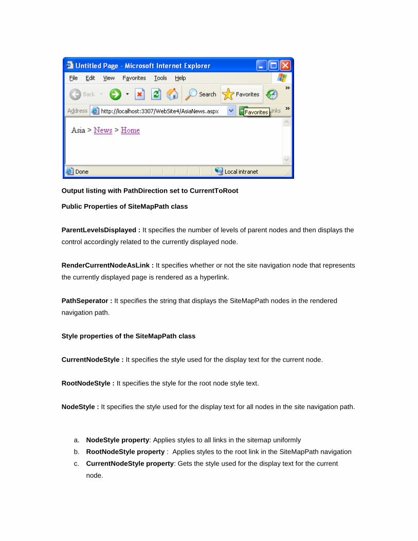
Output listing with PathDirection set to CurrentToRoot Public Properties of SiteMapPath class
ParentLevelsDisplayed : It specifies the number of levels of parent nodes and then displays the
control accordingly related to the currently displayed node.
RenderCurrentNodeAsLink : It specifies whether or not the site navigation node that represents
the currently displayed page is rendered as a hyperlink.
PathSeperator : It specifies the string that displays the SiteMapPath nodes in the rendered
navigation path.
Style properties of the SiteMapPath class
CurrentNodeStyle : It specifies the style used for the display text for the current node.
RootNodeStyle : It specifies the style for the root node style text.
NodeStyle : It specifies the style used for the display text for all nodes in the site navigation path.
a. NodeStyle property: Applies styles to all links in the sitemap uniformly
b. RootNodeStyle property : Applies styles to the root link in the SiteMapPath navigation
c. CurrentNodeStyle property: Gets the style used for the display text for the current
node.
Menu Control: Another important navigation control in ASP.NET 3.5 which allows the end user to navigate
through a large collection of options(links) with very less effort. This is used to display menu in a
web page and used in combination with SiteMapDataSource control for navigating a web site.
You can customize the appearance of menu control through styles, user-defined templates and
themes.
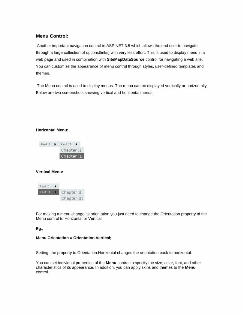
The Menu control is used to display menus. The menu can be displayed vertically or horizontally.
Below are two screenshots showing vertical and horizontal menus:
Horizontal Menu:
Vertical Menu:
For making a menu change its orientation you just need to change the Orientation property of the Menu control to Horizontal or Vertical.
Eg., Menu.Orientation = Orientation.Vertical;
Setting the property to Orientation.Horizontal changes the orientation back to horizontal.
You can set individual properties of the Menu control to specify the size, color, font, and other characteristics of its appearance. In addition, you can apply skins and themes to the Menu control.
Menu control displays two types of menus: a Static menu and Dynamic menu. The static menu
is always displayed in menu control. By default, only menu items at the root levels are displayed.
You can also display additional menu levels by setting StaticDisplayLevels property.
Menu items with a higher level than the value specified by StaticDisplayLevels property are
displayed in dynamic menu. A Dynamic menu appears only when the user positions the mouse
pointer over the parent menu item that contains a Dynamic submenu.
Menu control exposes events such as MenuItemClick, Load,UnLoad,Prerender,DataBound
and certain other events. MenuItemClick event enables you to take some action when end user
clicks one of the available menu items.
When the user clicks a menu item, the Menu control can either navigate to a linked Web page or
simply post back to the server. If the NavigateUrl of a menu item is set, the Menu control
navigates to the linked page; otherwise, it posts the page back to the server for processing. By
default, a linked page is displayed in the same window as menu control.
Features
Multiple menus on a single page are allowed.
Generated code is dramatically small.
Support for scrollable menus.
Support for tooltips.
Support for client-side and server-side events.
Colors, sizes, borders and fonts can all be customized to visually integrate with any
project.
Support for icons, background images, separators, user-defined images for submenu
arrows.
Each menu item, submenu, separator can be customized separately.
Each submenu can be positioned separately.
Drag and drop the menu server control from Navigation Section of Toolbox and similarly drag
and drop the SiteMapDataSource control from Data Section of Toolbox and connect the two by
using Menu control’s DataSourceId property. From this example, you can see that I’m using a
SiteMapDataSource control that automatically works with the application’s web.sitemap file.
DataSourceID property will connect the menu control with SiteMapDataSource control
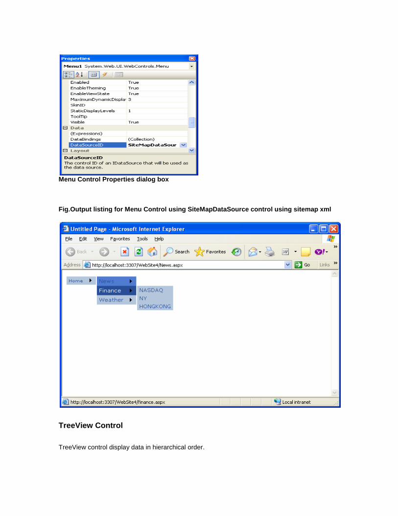
Menu Control Properties dialog box Fig.Output listing for Menu Control using SiteMapDataSource control using sitemap xml
TreeView Control
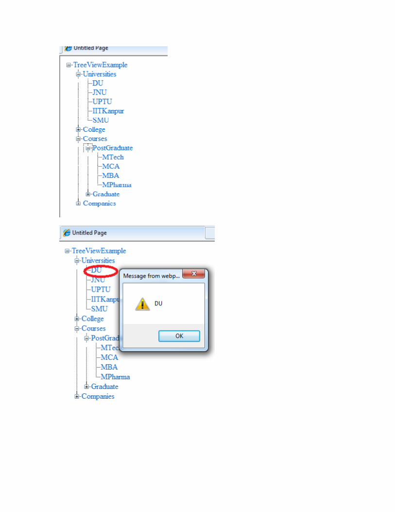
TreeView control display data in hierarchical order.
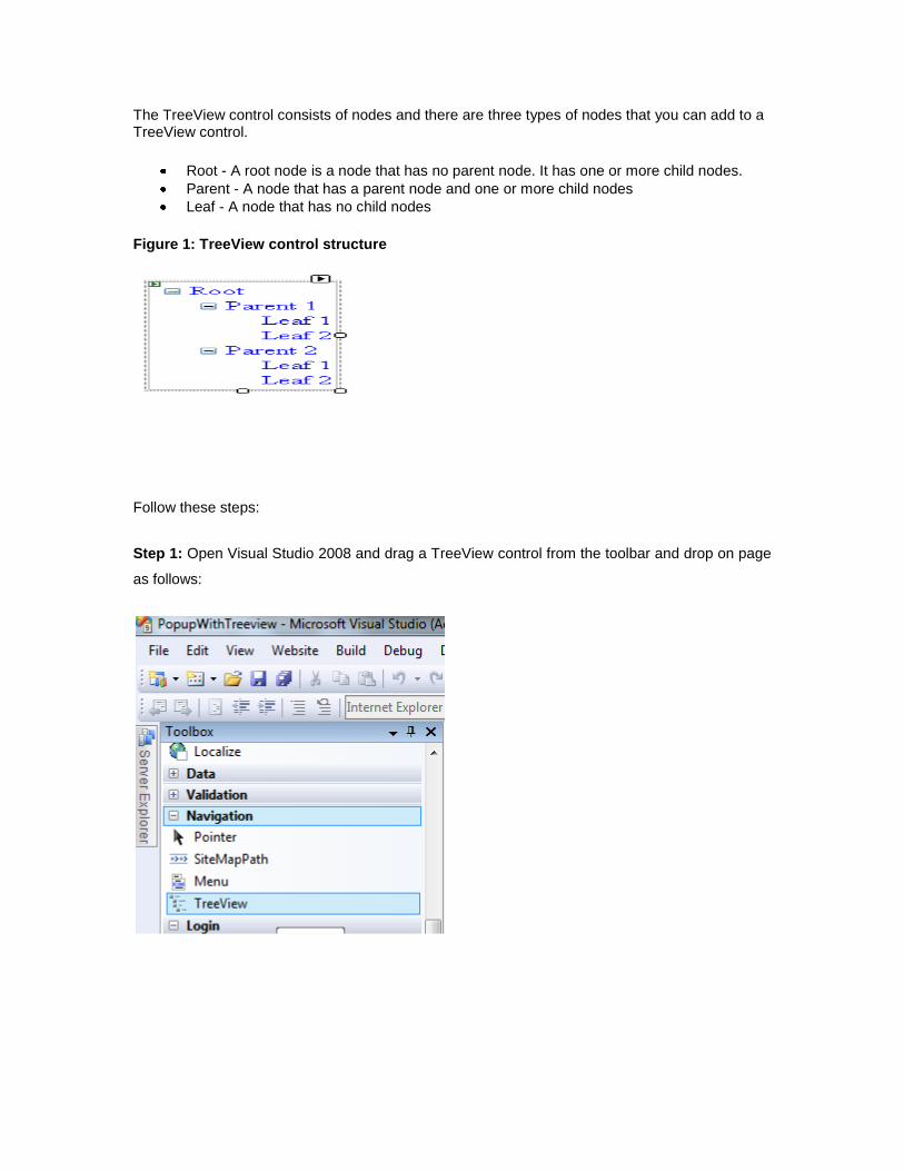
The TreeView control consists of nodes and there are three types of nodes that you can add to a TreeView control.
Root - A root node is a node that has no parent node. It has one or more child nodes.
Parent - A node that has a parent node and one or more child nodes
Leaf - A node that has no child nodes
Figure 1: TreeView control structure
Follow these steps:
Step 1: Open Visual Studio 2008 and drag a TreeView control from the toolbar and drop on page
as follows:
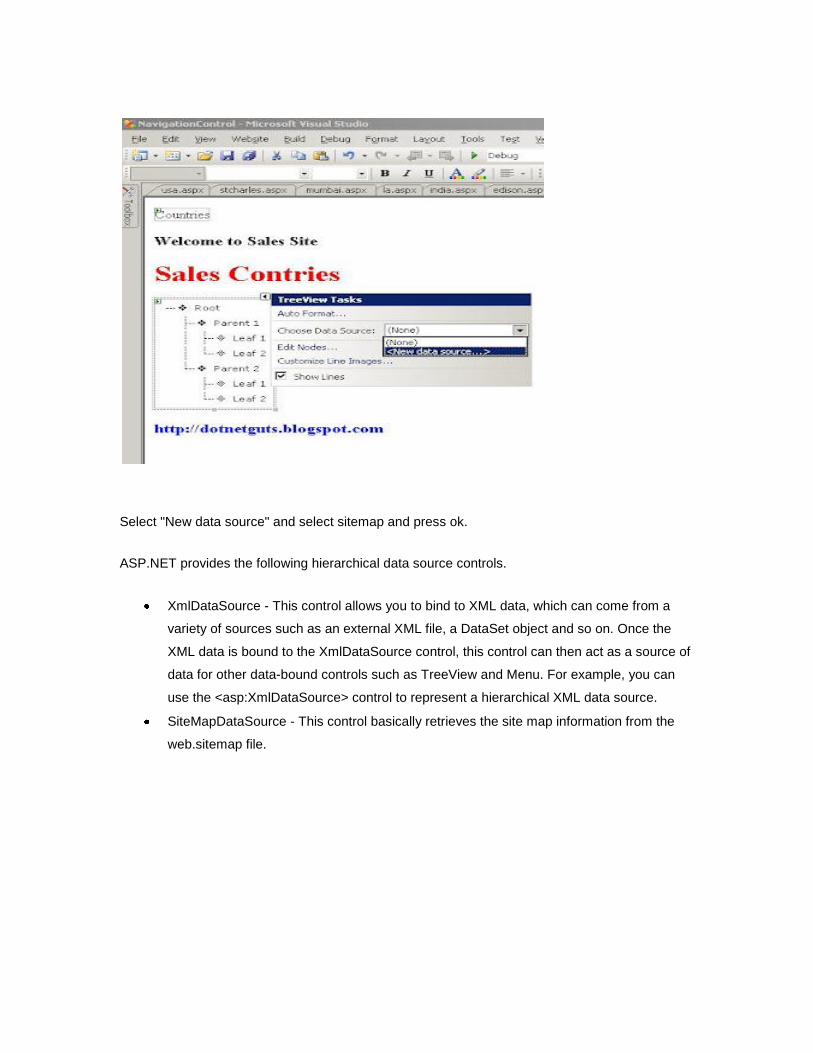
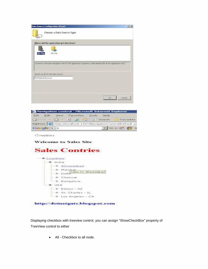
Select "New data source" and select sitemap and press ok.
ASP.NET provides the following hierarchical data source controls.
XmlDataSource - This control allows you to bind to XML data, which can come from a
variety of sources such as an external XML file, a DataSet object and so on. Once the
XML data is bound to the XmlDataSource control, this control can then act as a source of
data for other data-bound controls such as TreeView and Menu. For example, you can
use the <asp:XmlDataSource> control to represent a hierarchical XML data source.
SiteMapDataSource - This control basically retrieves the site map information from the
web.sitemap file.
Displaying checkbox with treeview control, you can assign "ShowCheckBox" property of
TreeView control to either
All - Checkbox to all node.
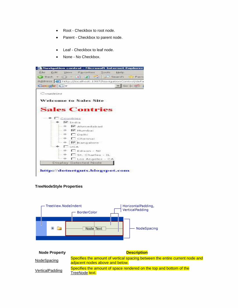
Root - Checkbox to root node.
Parent - Checkbox to parent node.
Leaf - Checkbox to leaf node.
None - No Checkbox.
TreeNodeStyle Properties
Node Property Description
NodeSpacing Specifies the amount of vertical spacing between the entire current node and adjacent nodes above and below.
VerticalPadding Specifies the amount of space rendered on the top and bottom of the TreeNode text.
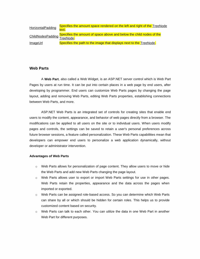
HorizontalPadding Specifies the amount space rendered on the left and right of the TreeNode text.
ChildNodesPadding Specifies the amount of space above and below the child nodes of the TreeNode.
ImageUrl Specifies the path to the image that displays next to the TreeNode.
Web Parts
A Web Part, also called a Web Widget, is an ASP.NET server control which is Web Part
Pages by users at run time. It can be put into certain places in a web page by end users, after
developing by programmer. End users can customize Web Parts pages by changing the page
layout, adding and removing Web Parts, editing Web Parts properties, establishing connections
between Web Parts, and more.
ASP.NET Web Parts is an integrated set of controls for creating sites that enable end
users to modify the content, appearance, and behavior of web pages directly from a browser. The
modifications can be applied to all users on the site or to individual users. When users modify
pages and controls, the settings can be saved to retain a user's personal preferences across
future browser sessions, a feature called personalization. These Web Parts capabilities mean that
developers can empower end users to personalize a web application dynamically, without
developer or administrator intervention.
Advantages of Web Parts
o Web Parts allows for personalization of page content. They allow users to move or hide
the Web Parts and add new Web Parts changing the page layout.
o Web Parts allows user to export or import Web Parts settings for use in other pages.
Web Parts retain the properties, appearance and the data across the pages when
imported or exported.
o Web Parts can be assigned role-based access. So you can determine which Web Parts
can share by all or which should be hidden for certain roles. This helps us to provide
customized content based on security.
o Web Parts can talk to each other. You can utilize the data in one Web Part in another
Web Part for different purposes.
Web Parts Modes
The modular and customizable sites that you can build with the new Portal Framework enable
you to put the web page that is in view into several modes for the end user. Modes are very
powerful in that they enable user to edit Web Parts, delete the Web Parts or customize Web
Parts.
o a) Normal mode: End user cannot edit or move sections of page.
o b) Edit Mode: End user can edit Web Parts on the page including Web Parts title, color
or even setting custom properties.
o c) Design Mode: End user can rearrange the order of the pages Web Parts in a
WebPartZone.
o d) Catalog Mode: End user enjoys the choice to add new Web Parts or add deleted
Web Parts in any WebPartZone on the page.
Building Web Parts
There are two basic ways to create a Web Part. You can treat any standard Microsoft ASP.NET
control as a Web Part or you can build a custom control that derives from the base WebPart
class.
You are not required to modify a control in any way to use it as a Web Part. Standard ASP.NET
controls (such as the Calendar and GridView controls), Web User Controls, and even custom
controls can all be used as Web Parts
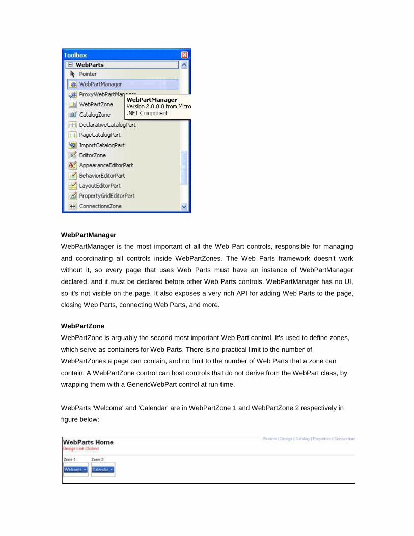
WebPartManager
WebPartManager is the most important of all the Web Part controls, responsible for managing
and coordinating all controls inside WebPartZones. The Web Parts framework doesn't work
without it, so every page that uses Web Parts must have an instance of WebPartManager
declared, and it must be declared before other Web Parts controls. WebPartManager has no UI,
so it's not visible on the page. It also exposes a very rich API for adding Web Parts to the page,
closing Web Parts, connecting Web Parts, and more.
WebPartZone
WebPartZone is arguably the second most important Web Part control. It's used to define zones,
which serve as containers for Web Parts. There is no practical limit to the number of
WebPartZones a page can contain, and no limit to the number of Web Parts that a zone can
contain. A WebPartZone control can host controls that do not derive from the WebPart class, by
wrapping them with a GenericWebPart control at run time.
WebParts 'Welcome' and 'Calendar' are in WebPartZone 1 and WebPartZone 2 respectively in
figure below:
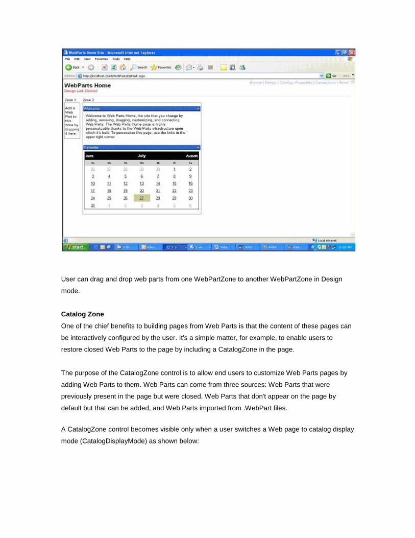
User can drag and drop web parts from one WebPartZone to another WebPartZone in Design
mode.
Catalog Zone
One of the chief benefits to building pages from Web Parts is that the content of these pages can
be interactively configured by the user. It's a simple matter, for example, to enable users to
restore closed Web Parts to the page by including a CatalogZone in the page.
The purpose of the CatalogZone control is to allow end users to customize Web Parts pages by
adding Web Parts to them. Web Parts can come from three sources: Web Parts that were
previously present in the page but were closed, Web Parts that don't appear on the page by
default but that can be added, and Web Parts imported from .WebPart files.
A CatalogZone control becomes visible only when a user switches a Web page to catalog display
mode (CatalogDisplayMode) as shown below:
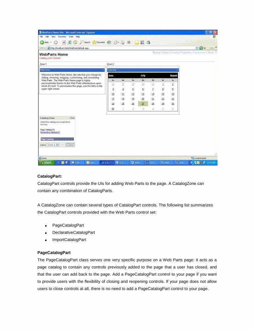
CatalogPart:
CatalogPart controls provide the UIs for adding Web Parts to the page. A CatalogZone can
contain any combination of CatalogParts.
A CatalogZone can contain several types of CatalogPart controls. The following list summarizes
the CatalogPart controls provided with the Web Parts control set:
PageCatalogPart
DeclarativeCatalogPart
ImportCatalogPart
PageCatalogPart
The PageCatalogPart class serves one very specific purpose on a Web Parts page: it acts as a
page catalog to contain any controls previously added to the page that a user has closed, and
that the user can add back to the page. Add a PageCatalogPart control to your page if you want
to provide users with the flexibility of closing and reopening controls. If your page does not allow
users to close controls at all, there is no need to add a PageCatalogPart control to your page.
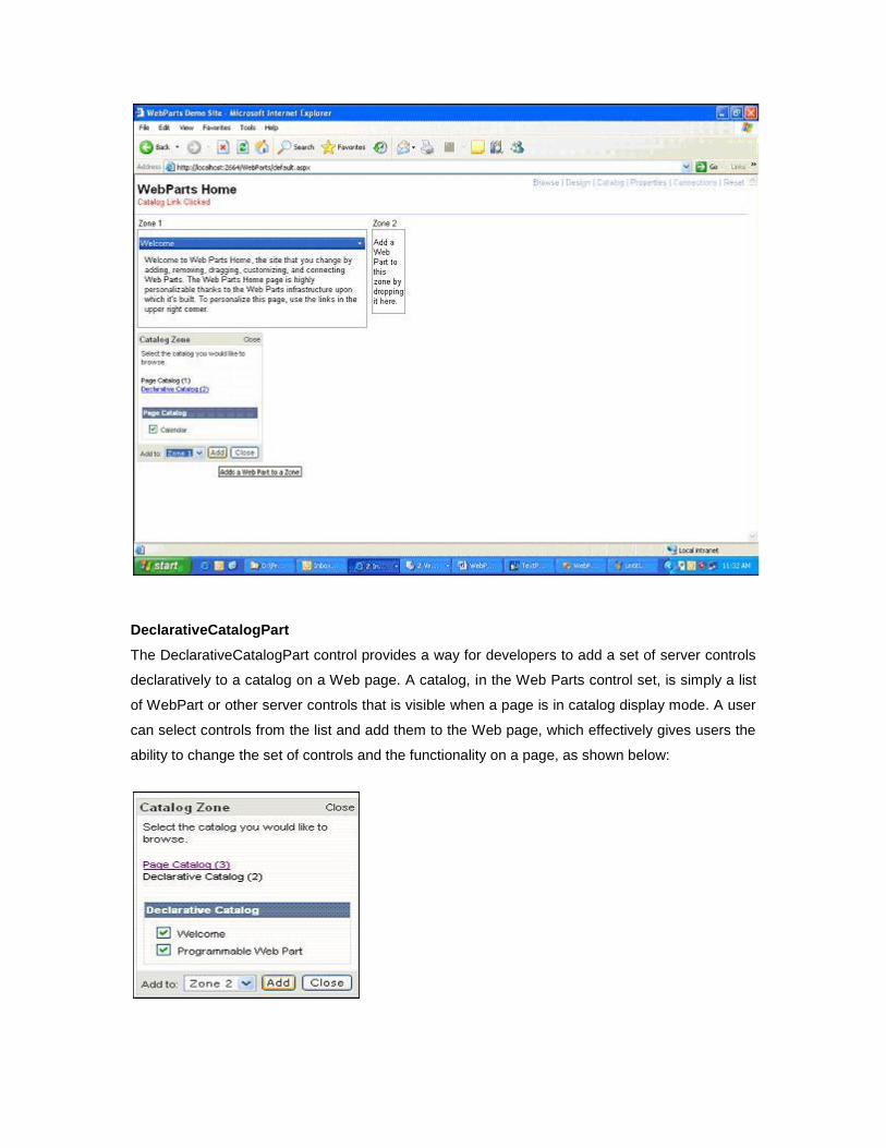
DeclarativeCatalogPart
The DeclarativeCatalogPart control provides a way for developers to add a set of server controls
declaratively to a catalog on a Web page. A catalog, in the Web Parts control set, is simply a list
of WebPart or other server controls that is visible when a page is in catalog display mode. A user
can select controls from the list and add them to the Web page, which effectively gives users the
ability to change the set of controls and the functionality on a page, as shown below:
ImportCatalogPart
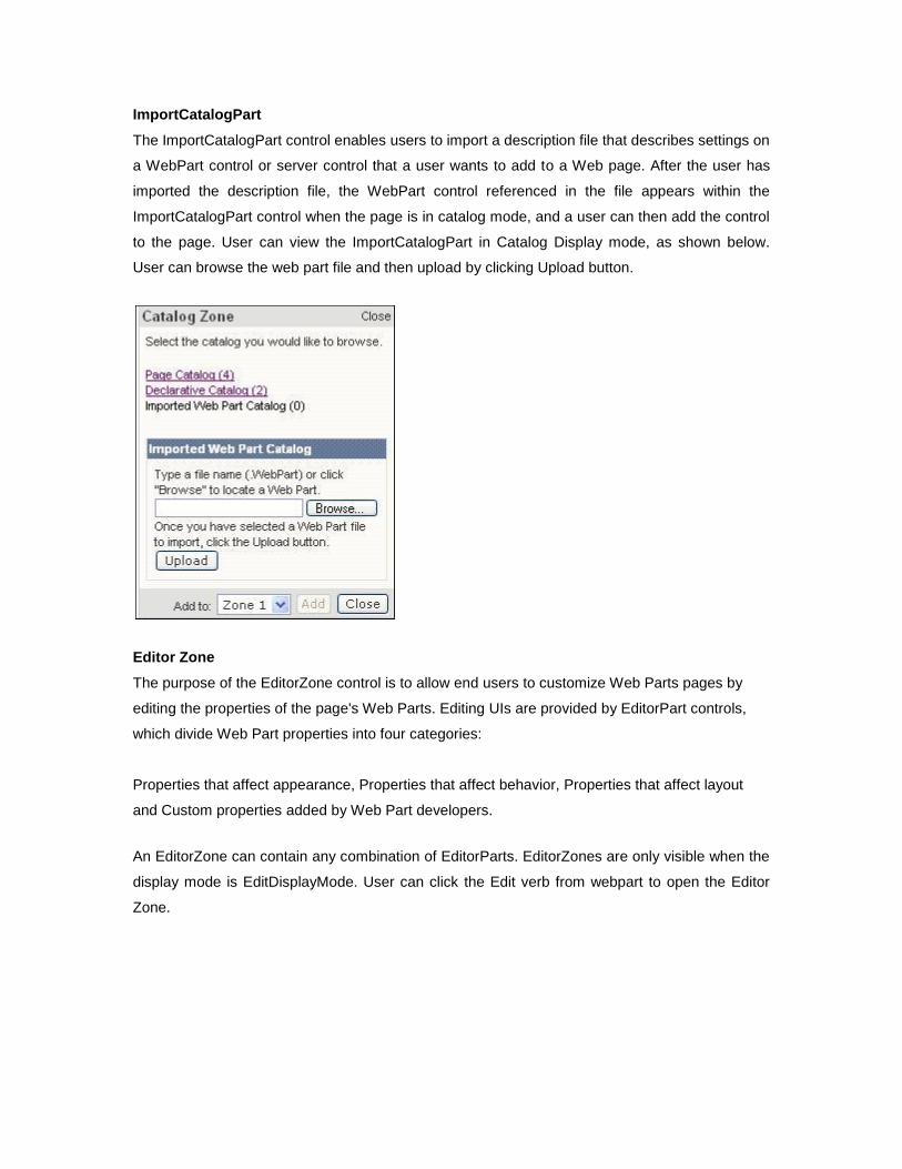
The ImportCatalogPart control enables users to import a description file that describes settings on
a WebPart control or server control that a user wants to add to a Web page. After the user has
imported the description file, the WebPart control referenced in the file appears within the
ImportCatalogPart control when the page is in catalog mode, and a user can then add the control
to the page. User can view the ImportCatalogPart in Catalog Display mode, as shown below.
User can browse the web part file and then upload by clicking Upload button.
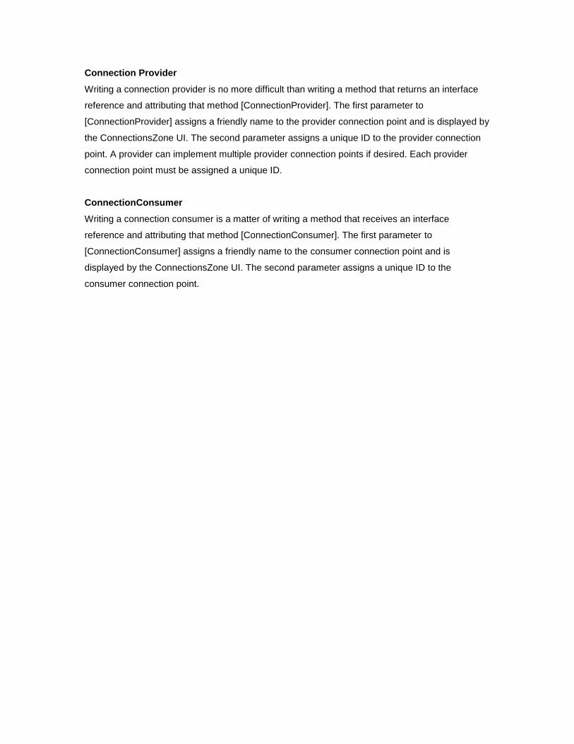
Editor Zone
The purpose of the EditorZone control is to allow end users to customize Web Parts pages by
editing the properties of the page's Web Parts. Editing UIs are provided by EditorPart controls,
which divide Web Part properties into four categories:
Properties that affect appearance, Properties that affect behavior, Properties that affect layout
and Custom properties added by Web Part developers.
An EditorZone can contain any combination of EditorParts. EditorZones are only visible when the
display mode is EditDisplayMode. User can click the Edit verb from webpart to open the Editor
Zone.
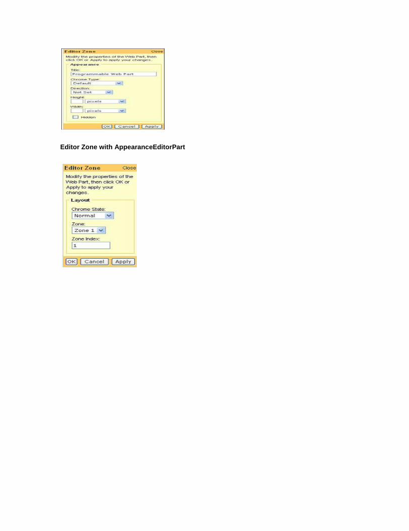
Editor Zone with AppearanceEditorPart
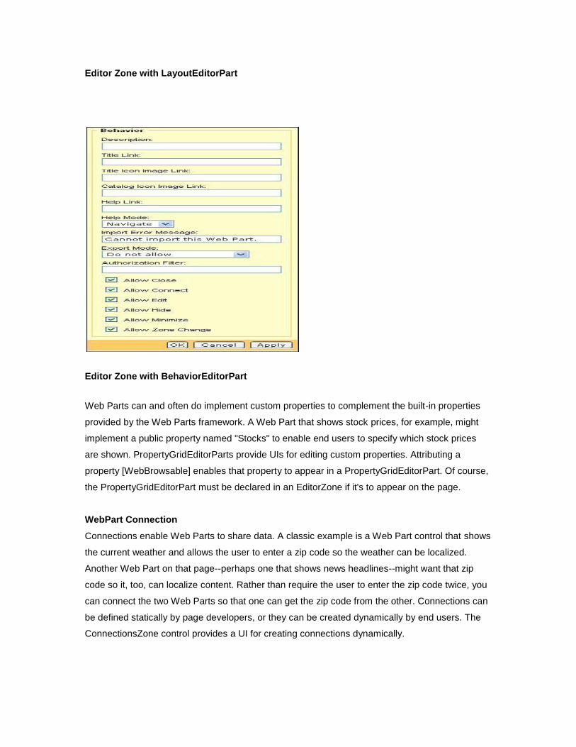
Editor Zone with LayoutEditorPart
Editor Zone with BehaviorEditorPart
Web Parts can and often do implement custom properties to complement the built-in properties
provided by the Web Parts framework. A Web Part that shows stock prices, for example, might
implement a public property named "Stocks" to enable end users to specify which stock prices
are shown. PropertyGridEditorParts provide UIs for editing custom properties. Attributing a
property [WebBrowsable] enables that property to appear in a PropertyGridEditorPart. Of course,
the PropertyGridEditorPart must be declared in an EditorZone if it's to appear on the page.
WebPart Connection
Connections enable Web Parts to share data. A classic example is a Web Part control that shows
the current weather and allows the user to enter a zip code so the weather can be localized.
Another Web Part on that page--perhaps one that shows news headlines--might want that zip
code so it, too, can localize content. Rather than require the user to enter the zip code twice, you
can connect the two Web Parts so that one can get the zip code from the other. Connections can
be defined statically by page developers, or they can be created dynamically by end users. The
ConnectionsZone control provides a UI for creating connections dynamically.
Connection Provider
Writing a connection provider is no more difficult than writing a method that returns an interface
reference and attributing that method [ConnectionProvider]. The first parameter to
[ConnectionProvider] assigns a friendly name to the provider connection point and is displayed by
the ConnectionsZone UI. The second parameter assigns a unique ID to the provider connection
point. A provider can implement multiple provider connection points if desired. Each provider
connection point must be assigned a unique ID.
ConnectionConsumer
Writing a connection consumer is a matter of writing a method that receives an interface
reference and attributing that method [ConnectionConsumer]. The first parameter to
[ConnectionConsumer] assigns a friendly name to the consumer connection point and is
displayed by the ConnectionsZone UI. The second parameter assigns a unique ID to the
consumer connection point.


