Jason Withrow ([email protected])
Overview• The User Interface Design Process• Interface Design Principles• Gestalt Principles of Visual Perception• Learning and Transference• Web-Specific Considerations

Jason Withrow ([email protected])
The User Interface Design Process• For a typical website this process is done
once for the home page layout and again for the sub page layout
• However, this process can be repeated as many times as necessary to develop interfaces that suit the unique requirements of different screens

Jason Withrow ([email protected])
The Steps• Thumbnails --> Wireframes --> Mockups• Start with quick, rough sketches and later
make a more detailed drawing of a page• Guiding principles:
– Start with rough sketches (‘low fidelity’) because it saves time and money
– Start with many options and filter down to a small set of possible interfaces
– Save the ‘high fidelity’ versions for the end of the process

Jason Withrow ([email protected])
Fidelity• The fidelity of any user interface-related
deliverable is based upon how closely the deliverable approximates the final design– Lower fidelity is a worse approximation– Higher fidelity is a better approximation
• There is a tradeoff between fidelity and time/cost to create the interface

Jason Withrow ([email protected])
Balancing Fidelity and Time / CostHigh
LowLow High
Fidelity
Time / Cost
Paper Wireframes
Whiteboard Wireframes
HTML Prototype*
Digital Wireframes
Photoshop Mockups
Thumbnails
* Using HTML Wireframes

Jason Withrow ([email protected])
Step 1: Thumbnails• Thumbnails are small• These sketches quickly create a variety of
possible interfaces• The focus is on layout and placement of
items, not details• Do at least 6, but keep going until you have
exhausted the possibilities• Then decide on the best ones

Jason Withrow ([email protected])
Thumbnail Contents• Without going into any detail, thumbnails
will indicate locations of:– Headers – Navigation Bars – Page Title– Body Text– Images (e.g., photos)– Footer
Jason Withrow ([email protected])
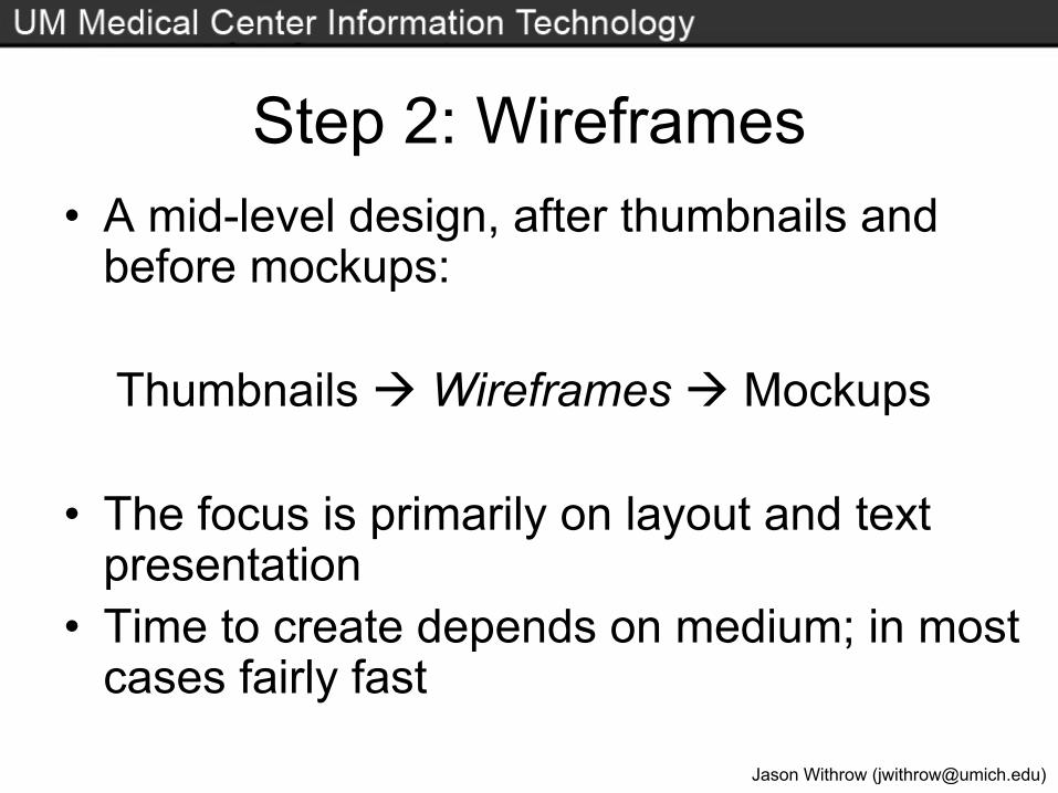
Step 2: Wireframes• A mid-level design, after thumbnails and
before mockups:
Thumbnails Wireframes Mockups
• The focus is primarily on layout and text presentation
• Time to create depends on medium; in most cases fairly fast

Jason Withrow ([email protected])
Wireframes and Colors• Quite literally, a ‘frame of wires’ (a line
drawing) done in black and white– Use of grayscale is also permissible
• Color is not shown in the wireframe because that tends to elicit strong reactions from both clients and users– If it is important that colored regions be
identified, it is fine to annotate the diagram to indicate those regions will be filled with a color
– The same is true of background images (annotate but do not show)
Jason Withrow ([email protected])
Whiteboard Wireframes• All that is needed is a dry-erase marker and
a whiteboard– The fastest media to create/revise wireframes– Not as high fidelity or as precise as other media– Not as easy to move around with as other
media and perhaps not as easily saved for later• Typically a digital camera is used to capture the
works in progress and final version(s)– Very useful for group feedback/discussion

Jason Withrow ([email protected])
Paper Wireframes• Created using a ruler and a pencil or pen
– Fairly fast to create and revise– Works well as a prototype for a usability test– Unfortunately they lose some fidelity because
rounded elements don’t look quite right, lines can be wavy, and text is handwritten (not typed)
– Difficult to share with a client at a distance• Would need to fax, scan as an image, or use a digital
camera and send that as an attachment

Jason Withrow ([email protected])
Paper Wireframe Example
Example from: http://guir.berkeley.edu/projects/fidelity/

Jason Withrow ([email protected])
Digital Wireframes• Can be created using any software with
drawing capabilities– Visio, Photoshop, Illustrator, even Word and
PowerPoint. Use whatever program you know.– Higher precision and higher fidelity than paper
and whiteboard– A slower media to create in, but revisions can
be made fairly rapidly– Appropriate for inclusion in deliverables/reports– Easy to share with clients (e.g., via email)

Jason Withrow ([email protected])
HTML Wireframes• A single HTML wireframe is not that useful,
because the strength of HTML is the ability to interact with the pages and click between various levels
• Thus HTML wireframes are most useful in the context of prototyping, which would involve creating the entire website or a significant portion of it for a user test

Jason Withrow ([email protected])
Choosing the Wireframing Media• Depends on your project and what you want
to accomplish• For communicating a design to a client I
favor digital, which would also work just fine in usability testing
• Every method will identify usability issues• Deciding between paper and HTML
prototypes will be considered later

Jason Withrow ([email protected])
Page Schematics• A page schematic is an annotated wireframe
for every page type– Depending on the section of the website, pages
might display different ‘see also’ boxes on the right-hand side, show ‘recent news’ in another location, etc.
– Each of these is a different page type• For dynamically generated content the
schematic can indicate where data is pulled from for each area of the screen

Jason Withrow ([email protected])
Prototyping• A prototype is an early version of a design
used for testing purposes• Wireframes are often used for prototyping• Although all of the media types identified
earlier can be the prototype format in a user test, the most common formats are paper and HTML

Jason Withrow ([email protected])
Paper Prototyping• Faster to create than HTML but lower
fidelity• Note that lower fidelity is not always a bad
thing; in this case it could actually be an advantage, as users can feel more inclined to make changes
• Another big advantage is that changes can be made rapidly, allowing multiple iterations within a single usability test session

Jason Withrow ([email protected])
Setting up a Paper Prototype• For a paper prototype one needs to prepare
all the menus, dialog boxes, and screens ahead of time
• There also needs to be a test facilitator whoreveals the new screens as the user ‘navigates’, shows the rollover menu pages when the user indicates that they are accessing a navigation button, etc.
• Post-it notes work well for menus and dialog boxes

Jason Withrow ([email protected])
HTML Prototyping• Slower to create than paper prototypes, but
offer higher fidelity• Often derived from digital wireframes• If the design has progressed further, these
can also include colors and images • The primary advantage of working in HTML
is the interactivity; users are accustomed to being able to click between pages

Jason Withrow ([email protected])
HTML Prototyping Drawbacks• Changes cannot be made as rapidly, so
iterations occur more slowly• Does not encourage as collaborative a
process as paper prototyping– Working on these in a group does not flow as
easily as with paper prototypes– Paper prototyping can serve as a team-building
exercise for developers

Jason Withrow ([email protected])
Setting up an HTML Prototype• Templates help reduce the development
time for the prototype• Attempts have also been made to automate
prototype generation using server-side scripting– The template layout is created– Variables are placed in each area of the layout
for navigation and content– Based on a site outline the navigation and
content is automatically generated

Jason Withrow ([email protected])
Step 3: Mockups• Mockups (sometimes called ‘comps’) are
full-color versions of the top 2-3 wireframes, including actual photos, etc.
Round 1. Two to three mockups are created, each unique in how buttons look, what fonts are used, photographs used, etc. These are typically posted online for the client to see. The client gives feedback.

Jason Withrow ([email protected])
Rounds of MockupsRound 2. The mockups are changed (often
one is discarded) and the revised version(s) are posted online. The client suggests more changes.
Round 3. Those changes are made, the revised images are posted, and one mockup is chosen. The client signs off.

Jason Withrow ([email protected])
Cutting the Mockup• Once approved, the final mockup is ‘cut’
into smaller graphics that are pieced together using (X)HTML and CSS.– In some cases CSS background colors are
used for most of the layout and only a few images are needed
• The page built is the template that will go through extensive QA to make sure it works for target browsers at desired resolutions and color depths.

Jason Withrow ([email protected])
• Prototypes– Quickly developed– For testing purposes– Range from very
rough to more refined
– Can be static (paper) or interactive (HTML)
• Mockups– Final versions – Very polished– Done in an imaging
program– Can be tested, but
that isn’t the main purpose
– Once approved these become the site
Differentiating Prototypes/Mockups

Jason Withrow ([email protected])
Interface Design Principles• Consistency• Contrast • Simplicity• Alignment• Repetition
• White space• Focus• Balance• Aesthetics

Jason Withrow ([email protected])
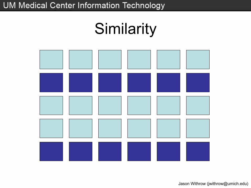
Gestalt Principles• These principles explain how humans
organize information perceptually• There are multiple Gestalt principles• We will focus on two:
– Proximity (items close together are related)– Similarity (items with similar appearance are
related)

Jason Withrow ([email protected])
Gestalt PrinciplesNO PAPER
RECYCLINGHERE
NO PAPER
recyclinghere
Proximity
Similarity

Jason Withrow ([email protected])
Learning and Transference• Through experience with an interface we
become better at using it, to the point where certain actions become automatic
• We begin to assume:– That the scrollbar will work in a certain way– That keyboard shortcuts are universal – That a menu with a given label will have certain
options in it

Jason Withrow ([email protected])
Transferring Knowledge/Behavior• When using a different interface, the
previous assumptions and automatic behavior are still guiding our decisions
• One of two things (or both) can happen:– Positive transference: Knowledge from the
old interface makes using the new one easier– Negative transference: Knowledge from the
old interface interferes with using the new one

Jason Withrow ([email protected])
Exploring Transference• Positive transference
– The two interfaces are using the same set of conventions and commands
– Labeling and layout are consistent
• Negative transference– Different labels are used, or the same labels
are used but they lead to different outcomes– Menus are located in different places

Jason Withrow ([email protected])
Program: PowerPoint
Program: TextPad
Software Menus and Transference

Jason Withrow ([email protected])
Transference and User Experience• Support positive transference
– Adhere to web standards for labeling, navigation, and interface design, unless there is a good reason to deviate
• Minimize negative transference– Resist the urge to ‘reinvent the wheel’ when
doing navigation in Flash or DHTML

Jason Withrow ([email protected])
Web-Specific Considerations• What screen resolutions are you designing
for?– 640 x 480 (approx. 1%)– 800 x 600 (approx. 32%) – 1024 x 768 and higher (approx. 65%)
• Wireless devices have varying resolutions

Jason Withrow ([email protected])
Web Layouts: Best Practices• Avoid horizontal (left to right) scrolling• Try to minimize ‘dead space’• Maintain reasonable line lengths• Keep the most important information ‘in the
fold’ and hopefully in the top left• Attempt to keep the layout for text and
images relatively intact as window size increases/decreases
• Support printing without cropping