127
All Visualizations Documentation
All Visualizations Documentation

All Visualizations Documentation 2
Business Analytics
Copyright and Trademarks Licensed Materials - Property of IBM. © Copyright IBM Corp. 2013 IBM, the IBM logo, and Cognos are trademarks or registered trademarks of International Business Machines Corp., registered in many jurisdictions worldwide. Other product and service names might be trademarks of IBM or other companies. A current list of IBM trademarks is available on the Web at http://www.ibm.com/legal/copytrade.shtml While every attempt has been made to ensure that the information in this document is accurate and complete, some typographical errors or technical inaccuracies may exist. IBM does not accept responsibility for any kind of loss resulting from the use of information contained in this document. The information contained in this document is subject to change without notice. Microsoft, Windows, Windows NT, and the Windows logo are trademarks of Microsoft Corporation in the United States, other countries, or both.
Contents 3
Business Analytics
Contents 1 INTRODUCTION—BOXPLOT ........................................................................... 9
1.1 PURPOSE .............................................................................................................. 9 1.2 APPLICABILITY ....................................................................................................... 9
2 ADDING A BOX PLOT VISUALIZATION TO AN ACTIVE REPORT .................. 10
3 PROCEDURE ................................................................................................. 11
4 INTRODUCTION—HEATMAP ........................................................................ 14
4.1 PURPOSE ............................................................................................................ 14 4.2 APPLICABILITY ..................................................................................................... 14
5 ADDING A HEATMAP VISUALIZATION TO AN ACTIVE REPORT .................. 15
6 PROCEDURE ................................................................................................. 16
7 INTRODUCTION—NETWORK DIAGRAM ...................................................... 18
7.1 PURPOSE ............................................................................................................ 18 7.2 APPLICABILITY ..................................................................................................... 18
8 ADDING A NETWORK DIAGRAM TO AN ACTIVE REPORT ............................ 19
9 PROCEDURE ................................................................................................. 20
10 INTRODUCTION—PACKED BUBBLE ............................................................. 22
10.1 PURPOSE ............................................................................................................ 22 10.2 APPLICABILITY ..................................................................................................... 22
11 ADDING A PACKED BUBBLE VISUALIZATION TO AN ACTIVE REPORT ....... 23
12 PROCEDURE ................................................................................................. 24
13 INTRODUCTION—TREEMAP BY CATEGORY ................................................. 27
13.1 PURPOSE ............................................................................................................ 27 13.2 APPLICABILITY ..................................................................................................... 27
14 ADDING A TREEMAP BY CATEGORY VISUALIZATION TO AN ACTIVE REPORT 28
15 PROCEDURE ................................................................................................. 29
16 INTRODUCTION—TREEMAP BY VALUE ........................................................ 31
16.1 PURPOSE ............................................................................................................ 31 16.2 APPLICABILITY ..................................................................................................... 31
17 ADDING A TREEMAP BY VALUE VISUALIZATION TO AN ACTIVE REPORT .. 32
18 PROCEDURE ................................................................................................. 33
19 INTRODUCTION—WATERFALL .................................................................... 35
Contents 4
Business Analytics
19.1 PURPOSE ............................................................................................................ 35 19.2 APPLICABILITY ..................................................................................................... 35
20 ADDING A WATERFALL VISUALIZATION TO AN ACTIVE REPORT ............... 36
21 PROCEDURE ................................................................................................. 37
22 INTRODUCTION—AREA (SMOOTH) ............................................................. 40
22.1 PURPOSE ............................................................................................................ 40 22.2 APPLICABILITY ..................................................................................................... 40
23 ADDING AN AREA (SMOOTH) VISUALIZATION TO AN ACTIVE REPORT ..... 41
24 PROCEDURE ................................................................................................. 42
25 INTRODUCTION—AREA STACKED (SMOOTH) ............................................. 44
25.1 PURPOSE ............................................................................................................ 44 25.2 APPLICABILITY ..................................................................................................... 44
26 ADDING A STACKED AREA (SMOOTH) VISUALIZATION TO AN ACTIVE REPORT45
27 PROCEDURE ................................................................................................. 46
28 INTRODUCTION—AREA STACKED (STRAIGHT) ........................................... 48
28.1 PURPOSE ............................................................................................................ 48 28.2 APPLICABILITY ..................................................................................................... 48
29 ADDING A STACKED AREA (STRAIGHT) VISUALIZATION TO AN ACTIVE REPORT 49
30 PROCEDURE ................................................................................................. 50
31 INTRODUCTION—AREA (STRAIGHT) .......................................................... 52
31.1 PURPOSE ............................................................................................................ 52 31.2 APPLICABILITY ..................................................................................................... 52
32 ADDING AN AREA (STRAIGHT) VISUALIZATION TO AN ACTIVE REPORT .. 53
33 PROCEDURE ................................................................................................. 54
34 INTRODUCTION—100% STACKED BAR ...................................................... 56
34.1 PURPOSE ............................................................................................................ 56 34.2 APPLICABILITY ..................................................................................................... 56
35 ADDING A 100 PERCENT STACKED BAR VISUALIZATION TO AN ACTIVE REPORT 57
36 PROCEDURE ................................................................................................. 58
37 INTRODUCTION—CLUSTERED BAR ............................................................. 60
37.1 PURPOSE ............................................................................................................ 60 37.2 APPLICABILITY ..................................................................................................... 60
38 ADDING A CLUSTERED BAR VISUALIZATION TO AN ACTIVE REPORT ....... 61
Contents 5
Business Analytics
39 PROCEDURE ................................................................................................. 62
40 INTRODUCTION—STACKED BAR ................................................................. 64
40.1 PURPOSE ............................................................................................................ 64 40.2 APPLICABILITY ..................................................................................................... 64
41 ADDING A STACKED BAR VISUALIZATION TO AN ACTIVE REPORT............ 65
42 PROCEDURE ................................................................................................. 66
43 INTRODUCTION—CLUSTERED COLUMN ...................................................... 68
43.1 PURPOSE ............................................................................................................ 68 43.2 APPLICABILITY ..................................................................................................... 68
44 ADDING A CLUSTERED COLUMN VISUALIZATION TO AN ACTIVE REPORT 69
45 PROCEDURE ................................................................................................. 70
46 INTRODUCTION—100% STACKED COLUMN ............................................... 72
46.1 PURPOSE ............................................................................................................ 72 46.2 APPLICABILITY ..................................................................................................... 72
47 ADDING A 100 PERCENT STACKED COLUMN VISUALIZATION TO AN ACTIVE REPORT 73
48 PROCEDURE ................................................................................................. 74
49 INTRODUCTION—STACKED COLUMN .......................................................... 76
49.1 PURPOSE ............................................................................................................ 76 49.2 APPLICABILITY ..................................................................................................... 76
50 ADDING A STACKED COLUMN VISUALIZATION TO AN ACTIVE REPORT .... 77
51 PROCEDURE ................................................................................................. 78
52 INTRODUCTION—DONUT ............................................................................ 80
52.1 PURPOSE ............................................................................................................ 80 52.2 APPLICABILITY ..................................................................................................... 80
53 ADDING A DONUT VISUALIZATION TO AN ACTIVE REPORT ...................... 81
54 PROCEDURE ................................................................................................. 82
55 INTRODUCTION—GANTT ............................................................................. 84
55.1 PURPOSE ............................................................................................................ 84 55.2 APPLICABILITY ..................................................................................................... 84
56 ADDING A GANTT VISUALIZATION TO AN ACTIVE REPORT ....................... 85
57 PROCEDURE ................................................................................................. 86
58 INTRODUCTION—GAUGE............................................................................. 88
58.1 PURPOSE ............................................................................................................ 88 58.2 APPLICABILITY ..................................................................................................... 88
Contents 6
Business Analytics
59 ADDING A SIMPLE GAUGE VISUALIZATION TO AN ACTIVE REPORT .......... 89
60 PROCEDURE ................................................................................................. 90
61 INTRODUCTION—LINE MARKED (STRAIGHT) ............................................ 92
61.1 PURPOSE ............................................................................................................ 92 61.2 APPLICABILITY ..................................................................................................... 92
62 ADDING A LINE (STRAIGHT) WITH CIRCLE MARKERS VISUALIZATION TO AN ACTIVE REPORT ................................................................................................................... 93
63 PROCEDURE ................................................................................................. 94
64 INTRODUCTION—LINE (SMOOTH) .............................................................. 96
64.1 PURPOSE ............................................................................................................ 96 64.2 APPLICABILITY ..................................................................................................... 96
65 ADDING A LINE (SMOOTH) VISUALIZATION TO AN ACTIVE REPORT ........ 97
66 PROCEDURE ................................................................................................. 98
67 INTRODUCTION—LINE (STRAIGHT) ......................................................... 100
67.1 PURPOSE .......................................................................................................... 100 67.2 APPLICABILITY ................................................................................................... 100
68 ADDING A LINE (STRAIGHT) VISUALIZATION TO AN ACTIVE REPORT .... 101
69 PROCEDURE ............................................................................................... 102
70 INTRODUCTION—BUBBLE ......................................................................... 104
70.1 PURPOSE .......................................................................................................... 104 70.2 APPLICABILITY ................................................................................................... 104
71 ADDING A BUBBLE VISUALIZATION TO AN ACTIVE REPORT ................... 105
72 PROCEDURE ............................................................................................... 106
73 INTRODUCTION—PIE ................................................................................ 108
73.1 PURPOSE .......................................................................................................... 108 73.2 APPLICABILITY ................................................................................................... 108
74 ADDING A PIE VISUALIZATION TO AN ACTIVE REPORT .......................... 109
75 PROCEDURE ............................................................................................... 110
76 INTRODUCTION—RADAR .......................................................................... 112
76.1 PURPOSE .......................................................................................................... 112 76.2 APPLICABILITY ................................................................................................... 112
77 ADDING A RADAR VISUALIZATION TO AN ACTIVE REPORT ..................... 113
78 PROCEDURE ............................................................................................... 114
79 INTRODUCTION—SCATTER ....................................................................... 116
79.1 PURPOSE .......................................................................................................... 116
Contents 7
Business Analytics
79.2 APPLICABILITY ................................................................................................... 116
80 ADDING A SCATTER VISUALIZATION TO AN ACTIVE REPORT .................. 117
81 PROCEDURE ............................................................................................... 118
82 INTRODUCTION—TAG CLOUD ................................................................... 120
82.1 PURPOSE .......................................................................................................... 120 82.2 APPLICABILITY ................................................................................................... 120
83 ADDING A TAG CLOUD VISUALIZATION TO AN ACTIVE REPORT ............. 121
84 PROCEDURE ............................................................................................... 122
85 INTRODUCTION ......................................................................................... 124
85.1 PURPOSE .......................................................................................................... 124 85.2 APPLICABILITY ................................................................................................... 124
86 ADDING A NETWORK WITH BUBBLES VISUALIZATION TO AN ACTIVE REPORT125
87 PROCEDURE ............................................................................................... 126
Box Plot Visualizations 8
Business Analytics
Box Plot Visualizations Product: IBM® Cognos® Active Report
Area of Interest: Reporting

Box Plot Visualizations 9
Business Analytics
1 Introduction—Boxplot
1.1 Purpose This document demonstrates how to add box plot extensible visualizations to active reports in Report Studio.
1.2 Applicability To perform the tasks in this document, you must use IBM Cognos Business Intelligence 10.2.1 with visualizations imported by the administrator and made available to users.
Box Plot Visualizations 10
Business Analytics
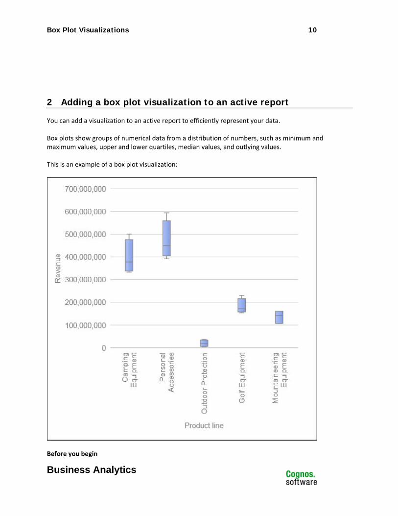
2 Adding a box plot visualization to an active report
You can add a visualization to an active report to efficiently represent your data. Box plots show groups of numerical data from a distribution of numbers, such as minimum and maximum values, upper and lower quartiles, median values, and outlying values. This is an example of a box plot visualization:
Before you begin
Box Plot Visualizations 11
Business Analytics
Your administrator must make the visualizations available in the Visualization Gallery. If you use Microsoft Internet Explorer to view visualizations, you must have Microsoft Silverlight 5 installed on your computer. Firefox or iPad users do not need Silverlight. About this task You add data to a visualization by inserting data items in drop zones. Visualizations will not run until all of the required drop zones contain data items. When all the required drop zones contain data items, additional drop zones appear for extra categories or values. You can use extra categories and extra values to filter data or set variables. Extra items are not visible in the visualization. When working with dimensional data sources, if the visualization does not contain a measure against which to plot data, you must provide one. For example, if you add a single member to the values drop zone, such as '2012', the default measure drop zone appears in which you must insert a measure. Attention: The supported properties for a visualization are determined by the
visualization definition. For this type of visualization, the following Data Container properties are not applicable:
Drill-Through Tooltips Set Variable Values Container Select Application Drill-Through Show Hover
For the Clickable Regions property, the only applicable option is Visualization as a Whole.
3 Procedure
1. Create a new active report or open an existing active report.
2. From the Toolbox tab , drag a Visualization icon to the work area.
Box Plot Visualizations 12
Business Analytics
3. From the Visualization Gallery, select the Box plot icon and click OK.
4. From the Source tab , drag items to the appropriate location in the data container:
a. Under Values, drag a measure to the Values drop zone. b. Under Categories, drag an item to the Categories drop zone. One bar is plotted for each category. c. Under Categories, drag an item to the Series drop zone. All data points in a series are aggregated into a single bar.
5. Add any active controls that you want and run the report.
13
Business Analytics
Heatmap Visualizations Product: IBM® Cognos® Active Report
Area of Interest: Reporting

Heatmap Visualizations 14
Business Analytics
4 Introduction—Heatmap
4.1 Purpose This document demonstrates how to add heatmap extensible visualizations to active reports in Report Studio.
4.2 Applicability To perform the tasks in this document, you must use IBM Cognos Business Intelligence 10.2.1 with visualizations imported by the administrator and made available to users.
Heatmap Visualizations 15
Business Analytics
5 Adding a heatmap visualization to an active report
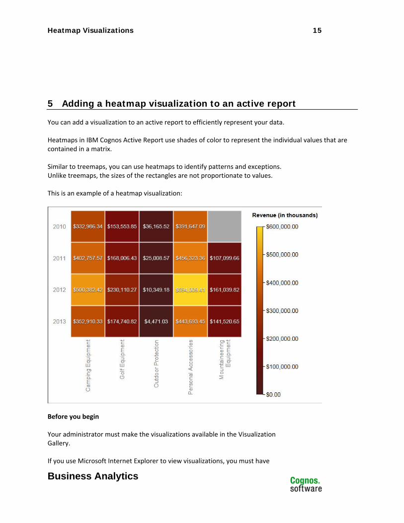
You can add a visualization to an active report to efficiently represent your data. Heatmaps in IBM Cognos Active Report use shades of color to represent the individual values that are contained in a matrix. Similar to treemaps, you can use heatmaps to identify patterns and exceptions. Unlike treemaps, the sizes of the rectangles are not proportionate to values. This is an example of a heatmap visualization:
Before you begin Your administrator must make the visualizations available in the Visualization Gallery. If you use Microsoft Internet Explorer to view visualizations, you must have
Heatmap Visualizations 16
Business Analytics
Microsoft Silverlight 5 installed on your computer. Firefox or iPad users do not need Silverlight. About this task You add data to a visualization by inserting data items in drop zones. Visualizations will not run until all of the required drop zones contain data items. When all the required drop zones contain data items, additional drop zones appear for extra categories or values. You can use extra categories and extra values to filter data or set variables. Extra items are not visible in the visualization. When working with dimensional data sources, if the visualization does not contain a measure against which to plot data, you must provide one. For example, if you add a single member to the values drop zone, such as '2012', the default measure drop zone appears in which you must insert a measure. Attention: The supported properties for a visualization are determined by the
visualization definition.
6 Procedure
6. Create a new active report or open an existing active report.
7. From the Toolbox tab , drag a Visualization icon to the work area. 8. From the Visualization Gallery, select the Heatmap icon and click OK.
9. From the Source tab , drag items to the appropriate location in the data container:
a. Under Values, drag a measure or a single value to define the color shading of the rectangles. b. Under Categories, drag items to the Y Category and X Category. Tip: Ensure that the items in the Y Category and X Category come from different dimensions.
10. Add any active controls that you want and run the report.
Network Diagram Visualizations 17
Business Analytics
Network Diagram Visualizations Product: IBM® Cognos® Active Report
Area of Interest: Reporting

Network Diagram Visualizations 18
Business Analytics
7 Introduction—Network Diagram
7.1 Purpose This document demonstrates how to add network diagram extensible visualizations to active reports in Report Studio.
7.2 Applicability To perform the tasks in this document, you must use IBM Cognos Business Intelligence 10.2.1 with visualizations imported by the administrator and made available to users.
Network Diagram Visualizations 19
Business Analytics
8 Adding a network diagram to an active report
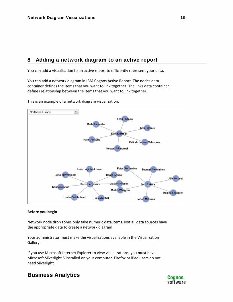
You can add a visualization to an active report to efficiently represent your data. You can add a network diagram in IBM Cognos Active Report. The nodes data container defines the items that you want to link together. The links data container defines relationship between the items that you want to link together. This is an example of a network diagram visualization:
Before you begin Network node drop zones only take numeric data items. Not all data sources have the appropriate data to create a network diagram. Your administrator must make the visualizations available in the Visualization Gallery. If you use Microsoft Internet Explorer to view visualizations, you must have Microsoft Silverlight 5 installed on your computer. Firefox or iPad users do not need Silverlight.
Network Diagram Visualizations 20
Business Analytics
About this task You add data to a visualization by inserting data items in drop zones. Visualizations will not run until all of the required drop zones contain data items. When all the required drop zones contain data items, additional drop zones appear for extra categories or values. You can use extra categories and extra values to filter data or set variables. Extra items are not visible in the visualization. When working with dimensional data sources, if the visualization does not contain a measure against which to plot data, you must provide one. For example, if you add a single member to the values drop zone, such as '2012', the default measure drop zone appears in which you must insert a measure. Attention: The supported properties for a visualization are determined by the
visualization definition.
9 Procedure
11. Create a new active report or open an existing active report.
12. From the Toolbox tab , drag a Visualization icon to the work area. 13. From the Visualization Gallery, select the Network diagram icon and click OK.
14. From the Source tab , drag items to the appropriate location in the data container:
a. In the Nodes1 data container, drag items to Node (Numeric) and Name. The nodes data container defines the items that you want to link together, such as Employees, defined by an employee code. b. In the Links1 data container, drag items to From node (Numeric) and To node (Numeric). The links data container defines relationship between the items that you want to link together, such as Employees and Managers.
15. Add any active controls that you want and run the report.

Packed Bubble Visualizations 21
Business Analytics
Packed Bubble Visualizations Product: IBM® Cognos® Active Report
Area of Interest: Reporting

Packed Bubble Visualizations 22
Business Analytics
10 Introduction—Packed Bubble
10.1 Purpose This document demonstrates how to add packed bubble extensible visualizations to active reports in Report Studio.
10.2 Applicability To perform the tasks in this document, you must use IBM Cognos Business Intelligence 10.2.1 with visualizations imported by the administrator and made available to users.
Packed Bubble Visualizations 23
Business Analytics
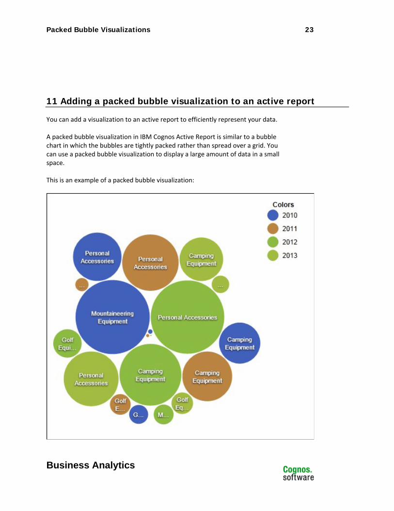
11 Adding a packed bubble visualization to an active report
You can add a visualization to an active report to efficiently represent your data. A packed bubble visualization in IBM Cognos Active Report is similar to a bubble chart in which the bubbles are tightly packed rather than spread over a grid. You can use a packed bubble visualization to display a large amount of data in a small space. This is an example of a packed bubble visualization:
Packed Bubble Visualizations 24
Business Analytics
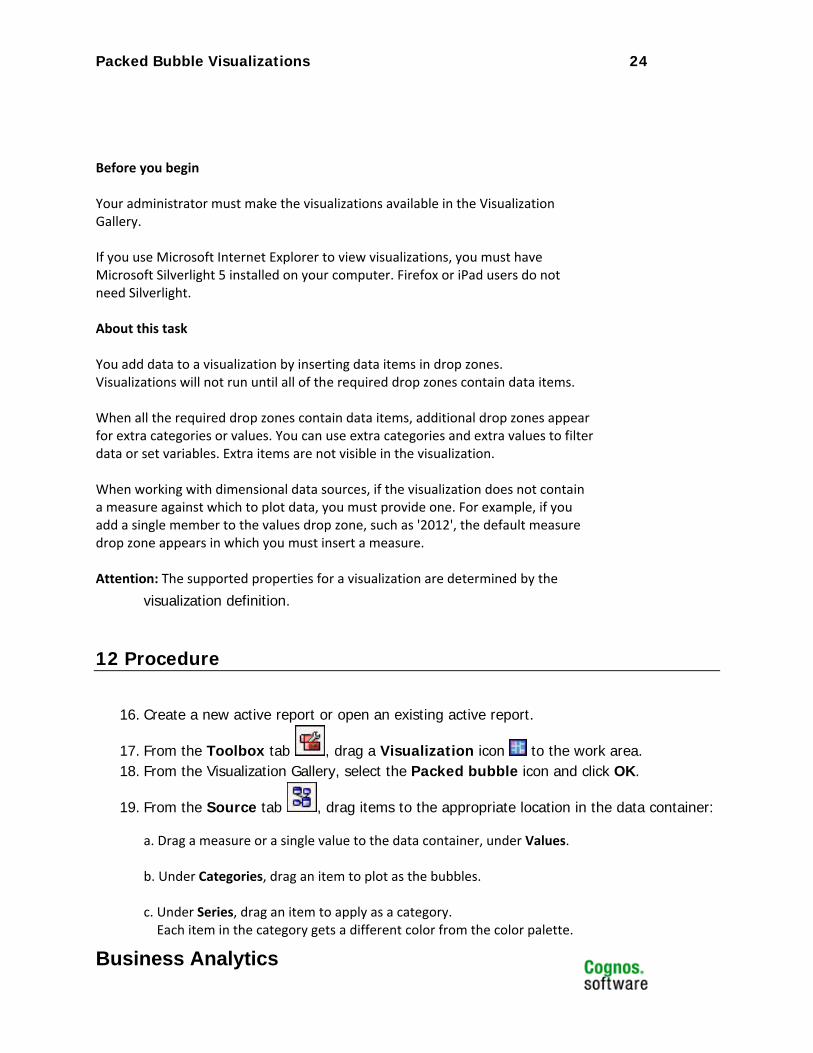
Before you begin Your administrator must make the visualizations available in the Visualization Gallery. If you use Microsoft Internet Explorer to view visualizations, you must have Microsoft Silverlight 5 installed on your computer. Firefox or iPad users do not need Silverlight. About this task You add data to a visualization by inserting data items in drop zones. Visualizations will not run until all of the required drop zones contain data items. When all the required drop zones contain data items, additional drop zones appear for extra categories or values. You can use extra categories and extra values to filter data or set variables. Extra items are not visible in the visualization. When working with dimensional data sources, if the visualization does not contain a measure against which to plot data, you must provide one. For example, if you add a single member to the values drop zone, such as '2012', the default measure drop zone appears in which you must insert a measure. Attention: The supported properties for a visualization are determined by the
visualization definition.
12 Procedure
16. Create a new active report or open an existing active report.
17. From the Toolbox tab , drag a Visualization icon to the work area. 18. From the Visualization Gallery, select the Packed bubble icon and click OK.
19. From the Source tab , drag items to the appropriate location in the data container:
a. Drag a measure or a single value to the data container, under Values. b. Under Categories, drag an item to plot as the bubbles. c. Under Series, drag an item to apply as a category. Each item in the category gets a different color from the color palette.

Packed Bubble Visualizations 25
Business Analytics
20. Add any active controls that you want and run the report.
Treemap by Category Visualizations 26
Business Analytics
Treemap by Category Visualizations Product: IBM® Cognos® Active Report
Area of Interest: Reporting

Treemap by Category Visualizations 27
Business Analytics
13 Introduction—Treemap by Category
13.1 Purpose This document demonstrates how to add treemap by category extensible visualizations to active reports in Report Studio.
13.2 Applicability To perform the tasks in this document, you must use IBM Cognos Business Intelligence 10.2.1 with visualizations imported by the administrator and made available to users.
Treemap by Category Visualizations 28
Business Analytics
14 Adding a treemap by category visualization to an active report
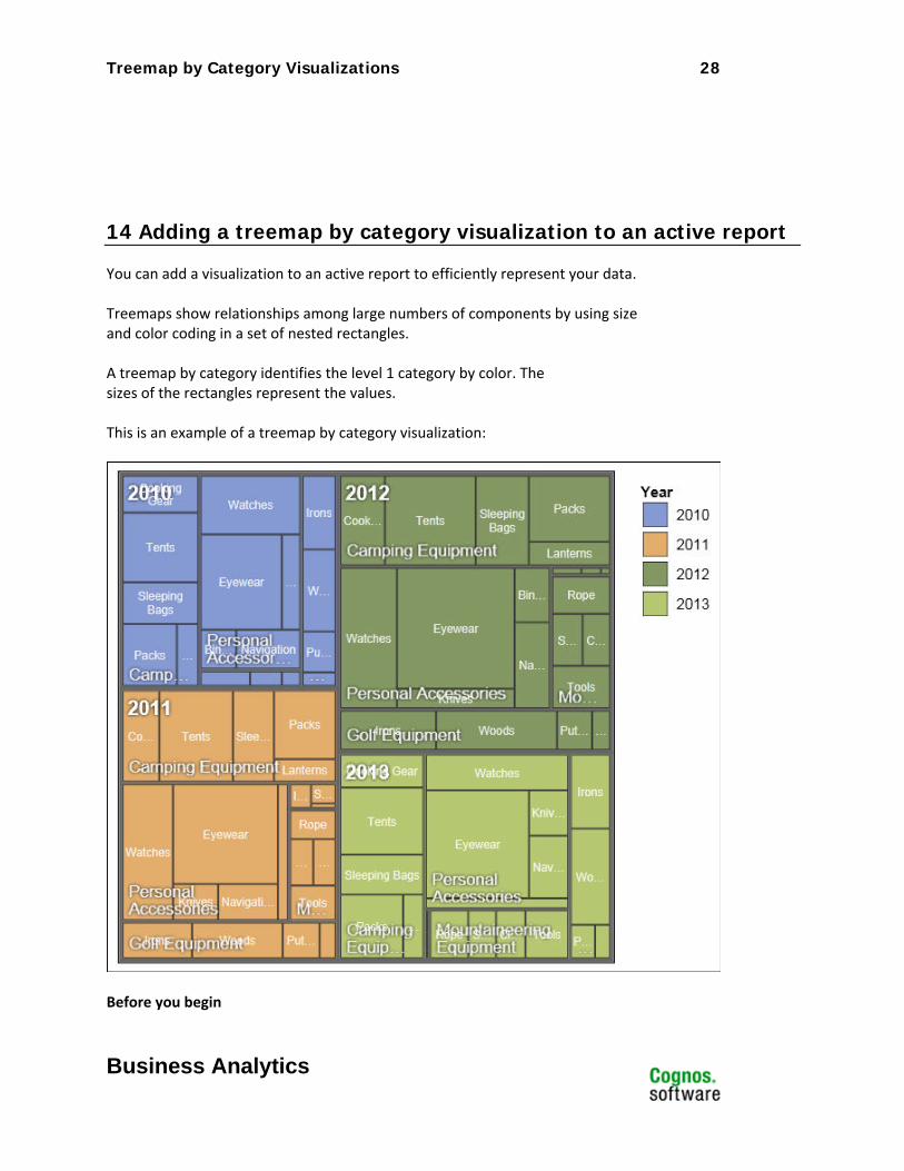
You can add a visualization to an active report to efficiently represent your data. Treemaps show relationships among large numbers of components by using size and color coding in a set of nested rectangles. A treemap by category identifies the level 1 category by color. The sizes of the rectangles represent the values. This is an example of a treemap by category visualization:
Before you begin
Treemap by Category Visualizations 29
Business Analytics
Your administrator must make the visualizations available in the Visualization Gallery. If you use Microsoft Internet Explorer to view visualizations, you must have Microsoft Silverlight 5 installed on your computer. Firefox or iPad users do not need Silverlight. About this task You add data to a visualization by inserting data items in drop zones. Visualizations will not run until all of the required drop zones contain data items. When all the required drop zones contain data items, additional drop zones appear for extra categories or values. You can use extra categories and extra values to filter data or set variables. Extra items are not visible in the visualization. When working with dimensional data sources, if the visualization does not contain a measure against which to plot data, you must provide one. For example, if you add a single member to the values drop zone, such as '2012', the default measure drop zone appears in which you must insert a measure. Attention: The supported properties for a visualization are determined by the
visualization definition.
15 Procedure
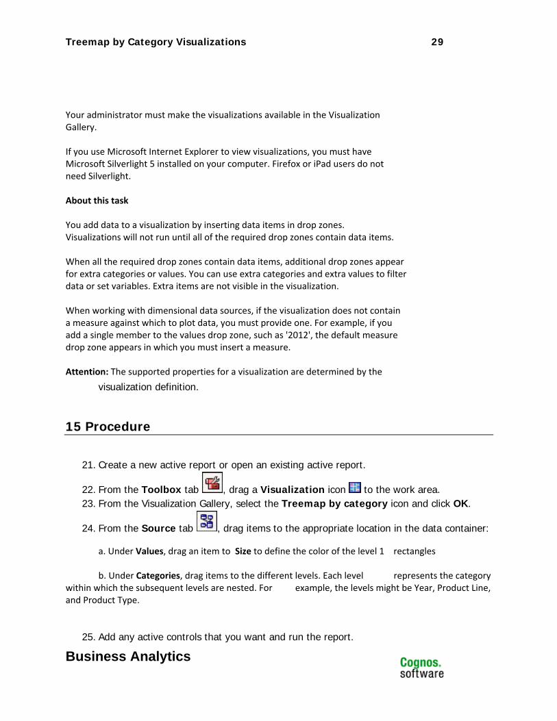
21. Create a new active report or open an existing active report.
22. From the Toolbox tab , drag a Visualization icon to the work area. 23. From the Visualization Gallery, select the Treemap by category icon and click OK.
24. From the Source tab , drag items to the appropriate location in the data container:
a. Under Values, drag an item to Size to define the color of the level 1 rectangles b. Under Categories, drag items to the different levels. Each level represents the category within which the subsequent levels are nested. For example, the levels might be Year, Product Line, and Product Type.
25. Add any active controls that you want and run the report.
Treemap by Value Visualizations 30
Business Analytics
Treemap by Value Visualizations Product: IBM® Cognos® Active Report
Area of Interest: Reporting
Treemap by Value Visualizations 31
Business Analytics
16 Introduction—Treemap by Value
16.1 Purpose This document demonstrates how to add treemap by value extensible visualizations to active reports in Report Studio.
16.2 Applicability To perform the tasks in this document, you must use IBM Cognos Business Intelligence 10.2.1 with visualizations imported by the administrator and made available to users.
Treemap by Value Visualizations 32
Business Analytics
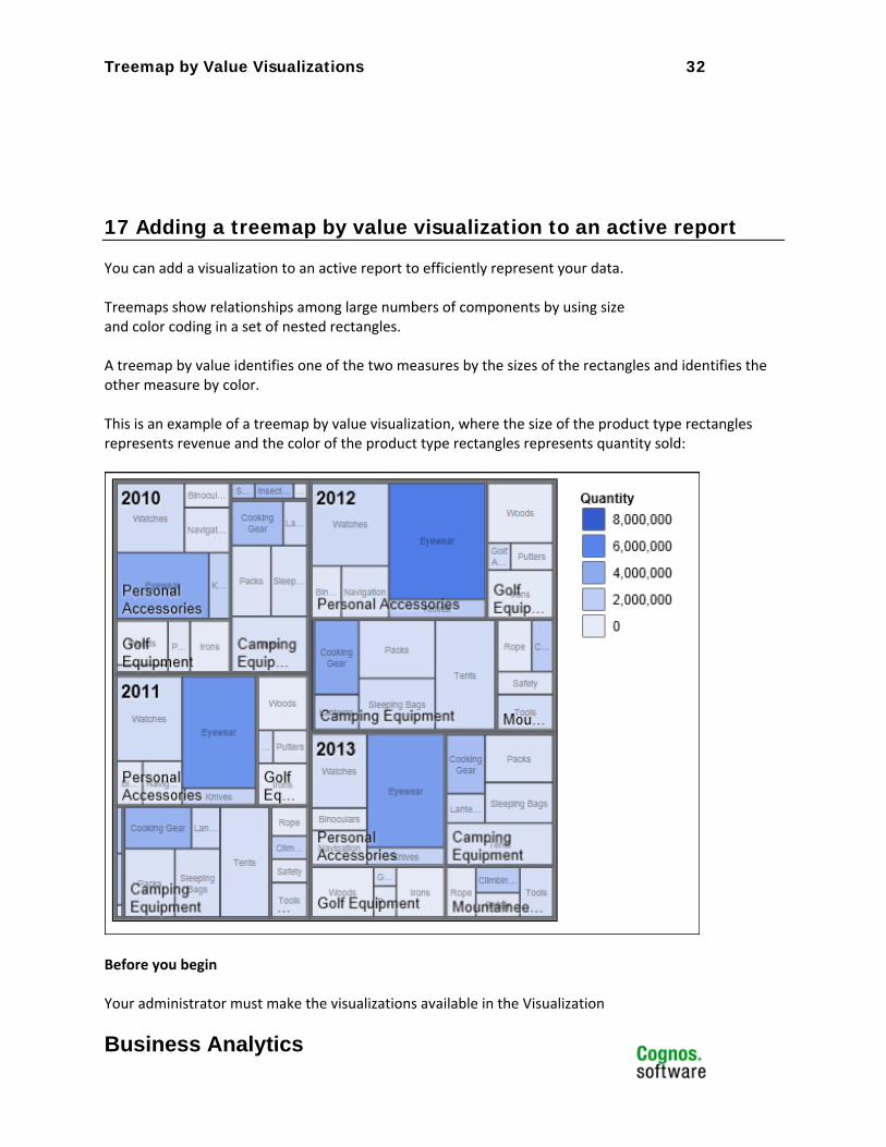
17 Adding a treemap by value visualization to an active report
You can add a visualization to an active report to efficiently represent your data. Treemaps show relationships among large numbers of components by using size and color coding in a set of nested rectangles. A treemap by value identifies one of the two measures by the sizes of the rectangles and identifies the other measure by color. This is an example of a treemap by value visualization, where the size of the product type rectangles represents revenue and the color of the product type rectangles represents quantity sold:
Before you begin Your administrator must make the visualizations available in the Visualization
Treemap by Value Visualizations 33
Business Analytics
Gallery. If you use Microsoft Internet Explorer to view visualizations, you must have Microsoft Silverlight 5 installed on your computer. Firefox or iPad users do not need Silverlight. About this task You add data to a visualization by inserting data items in drop zones. Visualizations will not run until all of the required drop zones contain data items. When all the required drop zones contain data items, additional drop zones appear for extra categories or values. You can use extra categories and extra values to filter data or set variables. Extra items are not visible in the visualization. When working with dimensional data sources, if the visualization does not contain a measure against which to plot data, you must provide one. For example, if you add a single member to the values drop zone, such as '2012', the default measure drop zone appears in which you must insert a measure. Attention: The supported properties for a visualization are determined by the
visualization definition.
18 Procedure
26. Create a new active report or open an existing active report.
27. From the Toolbox tab , drag a Visualization icon to the work area. 28. From the Visualization Gallery, select the Treemap by value icon and click OK.
29. From the Source tab , drag items to the appropriate location in the data container:
a. Under Values, drag items to define the size and color of the rectangles to Size and Color. b. Under Categories, drag items to the different levels. Each level represents the category within which the subsequent levels are nested. For example, the levels might be Year, Product Line, and Product Type.
30. Add any active controls that you want and run the report.
Waterfall Visualizations 34
Business Analytics
Waterfall Visualizations Product: IBM® Cognos® Active Report
Area of Interest: Reporting

Waterfall Visualizations 35
Business Analytics
19 Introduction—Waterfall
19.1 Purpose This document demonstrates how to add waterfall extensible visualizations to active reports in Report Studio.
19.2 Applicability To perform the tasks in this document, you must use IBM Cognos Business Intelligence 10.2.1 with visualizations imported by the administrator and made available to users.
Waterfall Visualizations 36
Business Analytics
20 Adding a waterfall visualization to an active report
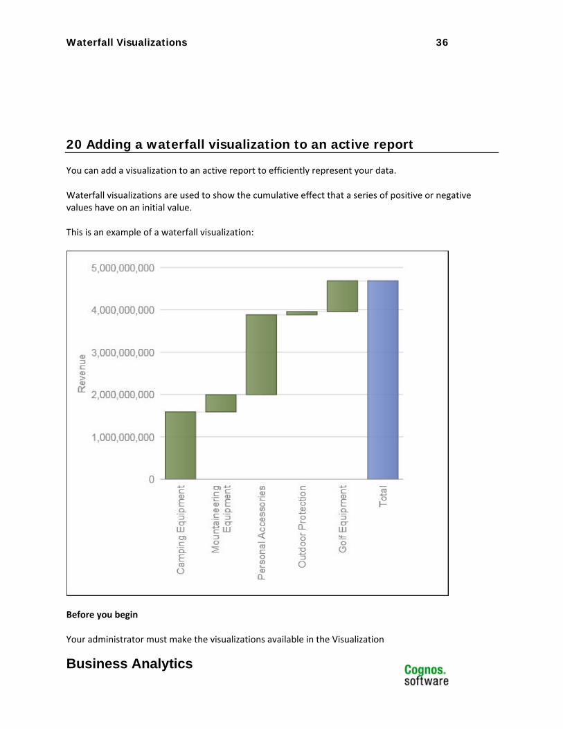
You can add a visualization to an active report to efficiently represent your data. Waterfall visualizations are used to show the cumulative effect that a series of positive or negative values have on an initial value. This is an example of a waterfall visualization:
Before you begin Your administrator must make the visualizations available in the Visualization
Waterfall Visualizations 37
Business Analytics
Gallery. If you use Microsoft Internet Explorer to view visualizations, you must have Microsoft Silverlight 5 installed on your computer. Firefox or iPad users do not need Silverlight. About this task You add data to a visualization by inserting data items in drop zones. Visualizations will not run until all of the required drop zones contain data items. When all the required drop zones contain data items, additional drop zones appear for extra categories or values. You can use extra categories and extra values to filter data or set variables. Extra items are not visible in the visualization. When working with dimensional data sources, if the visualization does not contain a measure against which to plot data, you must provide one. For example, if you add a single member to the values drop zone, such as '2012', the default measure drop zone appears in which you must insert a measure. Attention: The supported properties for a visualization are determined by the visualization definition. For this type of visualization, the following Data Container properties are not applicable:
Drill-Through Tooltips Set Variable Values Container Select Application Drill-Through Show Hover
For the Clickable Regions property, the only applicable option is Visualization as a Whole.
21 Procedure
31. Create a new active report or open an existing active report.
32. From the Toolbox tab , drag a Visualization icon to the work area. 33. From the Visualization Gallery, select the Waterfall chart icon and click OK.
34. From the Source tab , drag items to the appropriate location in the data container:
Waterfall Visualizations 38
Business Analytics
a. Under Values, drag a measure to the Value drop zone. b. Under Categories, drag an item to the Categories drop zone.
35. Add any active controls that you want and run the report.
Area (Smooth) Visualizations 39
Business Analytics
Area (Smooth) Visualizations Product: IBM® Cognos® Active Report
Area of Interest: Reporting
Area (Smooth) Visualizations 40
Business Analytics
22 Introduction—Area (Smooth)
22.1 Purpose This document demonstrates how to add area (smooth) extensible visualizations to active reports in Report Studio.
22.2 Applicability To perform the tasks in this document, you must use IBM Cognos Business Intelligence 10.2.1 with visualizations imported by the administrator and made available to users.
Area (Smooth) Visualizations 41
Business Analytics
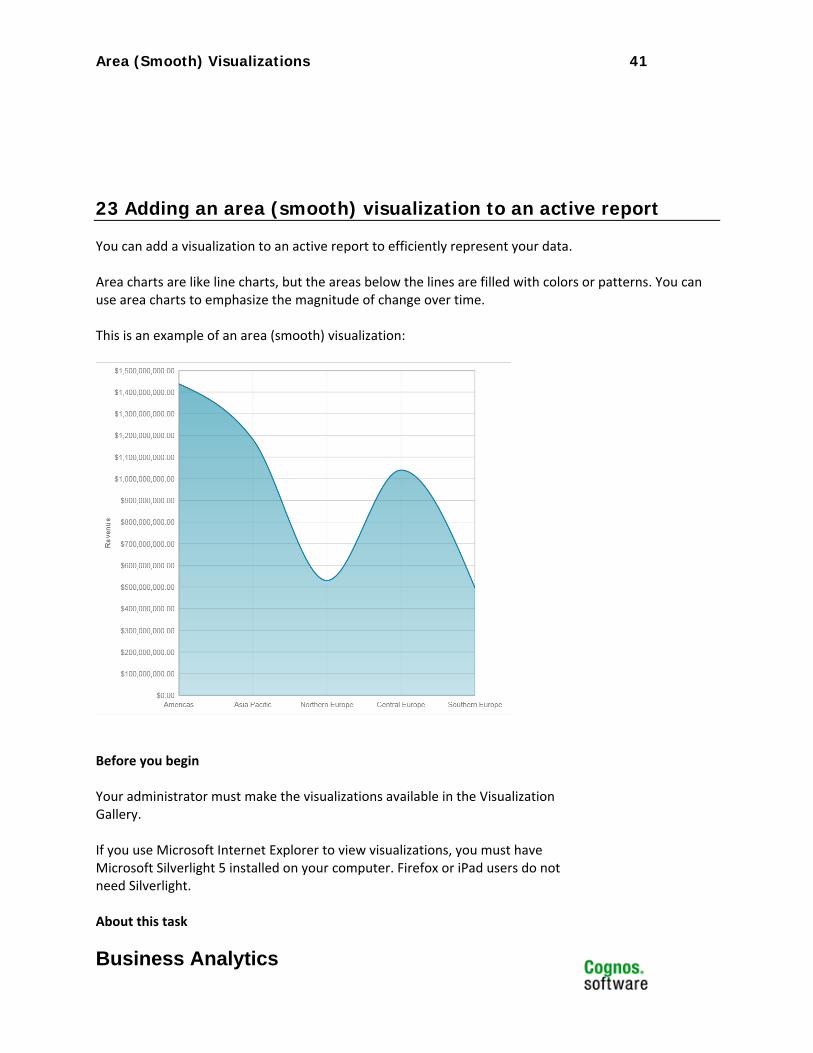
23 Adding an area (smooth) visualization to an active report
You can add a visualization to an active report to efficiently represent your data. Area charts are like line charts, but the areas below the lines are filled with colors or patterns. You can use area charts to emphasize the magnitude of change over time. This is an example of an area (smooth) visualization:
Before you begin Your administrator must make the visualizations available in the Visualization Gallery. If you use Microsoft Internet Explorer to view visualizations, you must have Microsoft Silverlight 5 installed on your computer. Firefox or iPad users do not need Silverlight. About this task
Area (Smooth) Visualizations 42
Business Analytics
You add data to a visualization by inserting data items in drop zones. Visualizations will not run until all of the required drop zones contain data items. When all the required drop zones contain data items, additional drop zones appear for extra categories or values. You can use extra categories and extra values to filter data or set variables. Extra items are not visible in the visualization. When working with dimensional data sources, if the visualization does not contain a measure against which to plot data, you must provide one. For example, if you add a single member to the values drop zone, such as '2012', the default measure drop zone appears in which you must insert a measure. Attention: The supported properties for a visualization are determined by the
visualization definition.
24 Procedure
36. Create a new active report or open an existing active report.
37. From the Toolbox tab , drag a Visualization icon to the work area. 38. From the Visualization Gallery, select the Area (smooth) icon and click OK.
39. From the Source tab , drag items to the appropriate location in the data container:
a. Under Values, drag a measure to the Values drop zone. b. Under Categories, drag an item to the X categories drop zone.
40. Add any active controls that you want and run the report.
Area – Stacked (Smooth) Visualizations 43
Business Analytics
Area – Stacked (Smooth) Visualizations
Product: IBM® Cognos® Active Report
Area of Interest: Reporting

Area – Stacked (Smooth) Visualizations 44
Business Analytics
25 Introduction—Area Stacked (Smooth)
25.1 Purpose This document demonstrates how to add stacked area (smooth) extensible visualizations to active reports in Report Studio.
25.2 Applicability To perform the tasks in this document, you must use IBM Cognos Business Intelligence 10.2.1 with visualizations imported by the administrator and made available to users.
Area – Stacked (Smooth) Visualizations 45
Business Analytics
26 Adding a stacked area (smooth) visualization to an active report
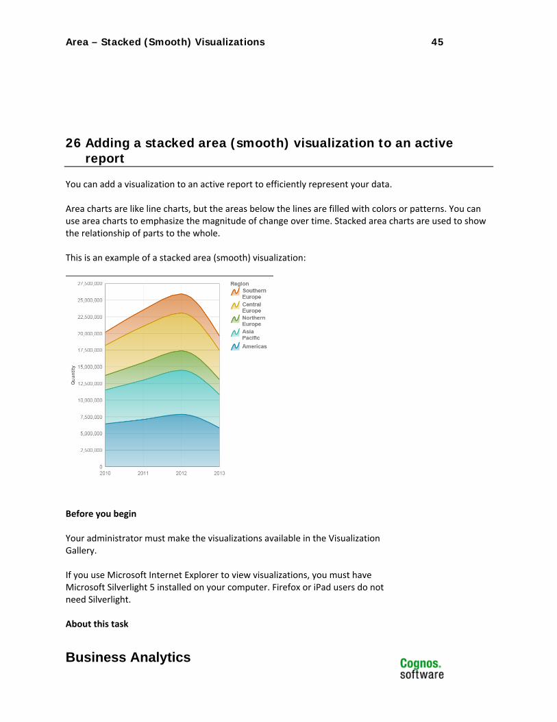
You can add a visualization to an active report to efficiently represent your data. Area charts are like line charts, but the areas below the lines are filled with colors or patterns. You can use area charts to emphasize the magnitude of change over time. Stacked area charts are used to show the relationship of parts to the whole. This is an example of a stacked area (smooth) visualization:
Before you begin Your administrator must make the visualizations available in the Visualization Gallery. If you use Microsoft Internet Explorer to view visualizations, you must have Microsoft Silverlight 5 installed on your computer. Firefox or iPad users do not need Silverlight. About this task
Area – Stacked (Smooth) Visualizations 46
Business Analytics
You add data to a visualization by inserting data items in drop zones. Visualizations will not run until all of the required drop zones contain data items. When all the required drop zones contain data items, additional drop zones appear for extra categories or values. You can use extra categories and extra values to filter data or set variables. Extra items are not visible in the visualization. When working with dimensional data sources, if the visualization does not contain a measure against which to plot data, you must provide one. For example, if you add a single member to the values drop zone, such as '2012', the default measure drop zone appears in which you must insert a measure. Attention: The supported properties for a visualization are determined by the
visualization definition.
27 Procedure
41. Create a new active report or open an existing active report.
42. From the Toolbox tab , drag a Visualization icon to the work area. 43. From the Visualization Gallery, select the Area – Stacked (smooth) icon and click OK.
44. From the Source tab , drag items to the appropriate location in the data container:
a. Under Values, drag a measure to the Values drop zone. b. Under Categories, drag an item to the X categories drop zone. c. Under Categories, drag an item to the Series drop zone.
45. Add any active controls that you want and run the report.
Area – Stacked (Straight) Visualizations 47
Business Analytics
Area – Stacked (Straight) Visualizations
Product: IBM® Cognos® Active Report
Area of Interest: Reporting
Area – Stacked (Straight) Visualizations 48
Business Analytics
28 Introduction—Area Stacked (Straight)
28.1 Purpose This document demonstrates how to add stacked area (straight) extensible visualizations to active reports in Report Studio.
28.2 Applicability To perform the tasks in this document, you must use IBM Cognos Business Intelligence 10.2.1 with visualizations imported by the administrator and made available to users.
Area – Stacked (Straight) Visualizations 49
Business Analytics
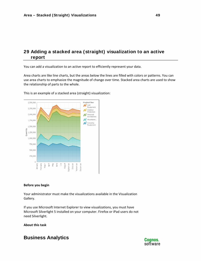
29 Adding a stacked area (straight) visualization to an active report
You can add a visualization to an active report to efficiently represent your data. Area charts are like line charts, but the areas below the lines are filled with colors or patterns. You can use area charts to emphasize the magnitude of change over time. Stacked area charts are used to show the relationship of parts to the whole. This is an example of a stacked area (straight) visualization:
Before you begin Your administrator must make the visualizations available in the Visualization Gallery. If you use Microsoft Internet Explorer to view visualizations, you must have Microsoft Silverlight 5 installed on your computer. Firefox or iPad users do not need Silverlight. About this task
Area – Stacked (Straight) Visualizations 50
Business Analytics
You add data to a visualization by inserting data items in drop zones. Visualizations will not run until all of the required drop zones contain data items. When all the required drop zones contain data items, additional drop zones appear for extra categories or values. You can use extra categories and extra values to filter data or set variables. Extra items are not visible in the visualization. When working with dimensional data sources, if the visualization does not contain a measure against which to plot data, you must provide one. For example, if you add a single member to the values drop zone, such as '2012', the default measure drop zone appears in which you must insert a measure. Attention: The supported properties for a visualization are determined by the
visualization definition.
30 Procedure
46. Create a new active report or open an existing active report.
47. From the Toolbox tab , drag a Visualization icon to the work area. 48. From the Visualization Gallery, select the Area – Stacked (smooth) icon and click OK.
49. From the Source tab , drag items to the appropriate location in the data container:
a. Under Values, drag a measure to the Values drop zone. b. Under Categories, drag an item to the X categories drop zone. c. Under Categories, drag an item to the Series drop zone.
50. Add any active controls that you want and run the report.
Area (Straight) Visualizations 51
Business Analytics
Area (Straight) Visualizations Product: IBM® Cognos® Active Report
Area of Interest: Reporting

Area (Straight) Visualizations 52
Business Analytics
31 Introduction—Area (Straight)
31.1 Purpose This document demonstrates how to add area (straight) extensible visualizations to active reports in Report Studio.
31.2 Applicability To perform the tasks in this document, you must use IBM Cognos Business Intelligence 10.2.1 with visualizations imported by the administrator and made available to users.
Area (Straight) Visualizations 53
Business Analytics
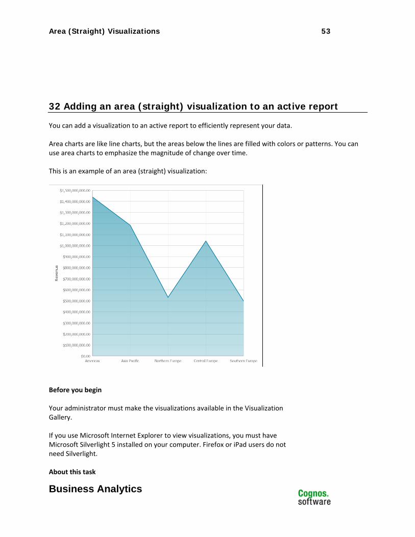
32 Adding an area (straight) visualization to an active report
You can add a visualization to an active report to efficiently represent your data. Area charts are like line charts, but the areas below the lines are filled with colors or patterns. You can use area charts to emphasize the magnitude of change over time. This is an example of an area (straight) visualization:
Before you begin Your administrator must make the visualizations available in the Visualization Gallery. If you use Microsoft Internet Explorer to view visualizations, you must have Microsoft Silverlight 5 installed on your computer. Firefox or iPad users do not need Silverlight. About this task
100% Stacked Bar Visualizations 54
Business Analytics
You add data to a visualization by inserting data items in drop zones. Visualizations will not run until all of the required drop zones contain data items. When all the required drop zones contain data items, additional drop zones appear for extra categories or values. You can use extra categories and extra values to filter data or set variables. Extra items are not visible in the visualization. When working with dimensional data sources, if the visualization does not contain a measure against which to plot data, you must provide one. For example, if you add a single member to the values drop zone, such as '2012', the default measure drop zone appears in which you must insert a measure. Attention: The supported properties for a visualization are determined by the
visualization definition.
33 Procedure
51. Create a new active report or open an existing active report.
52. From the Toolbox tab , drag a Visualization icon to the work area. 53. From the Visualization Gallery, select the Area (straight) icon and click OK.
54. From the Source tab , drag items to the appropriate location in the data container:
a. Under Values, drag a measure to the Values drop zone. b. Under Categories, drag an item to the X categories drop zone.
55. Add any active controls that you want and run the report.
100% Stacked Bar Visualizations 55
Business Analytics
100% Stacked Bar Visualizations Product: IBM® Cognos® Active Report
Area of Interest: Reporting

100% Stacked Bar Visualizations 56
Business Analytics
34 Introduction—100% Stacked Bar
34.1 Purpose This document demonstrates how to add 100 percent stacked bar extensible visualizations to active reports in Report Studio.
34.2 Applicability To perform the tasks in this document, you must use IBM Cognos Business Intelligence 10.2.1 with visualizations imported by the administrator and made available to users.
100% Stacked Bar Visualizations 57
Business Analytics
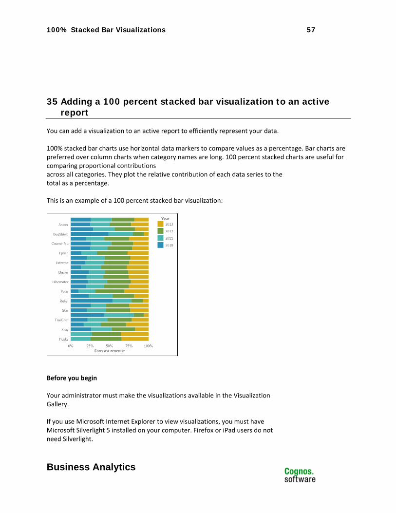
35 Adding a 100 percent stacked bar visualization to an active report
You can add a visualization to an active report to efficiently represent your data. 100% stacked bar charts use horizontal data markers to compare values as a percentage. Bar charts are preferred over column charts when category names are long. 100 percent stacked charts are useful for comparing proportional contributions across all categories. They plot the relative contribution of each data series to the total as a percentage. This is an example of a 100 percent stacked bar visualization:
Before you begin Your administrator must make the visualizations available in the Visualization Gallery. If you use Microsoft Internet Explorer to view visualizations, you must have Microsoft Silverlight 5 installed on your computer. Firefox or iPad users do not need Silverlight.
100% Stacked Bar Visualizations 58
Business Analytics
About this task You add data to a visualization by inserting data items in drop zones. Visualizations will not run until all of the required drop zones contain data items. When all the required drop zones contain data items, additional drop zones appear for extra categories or values. You can use extra categories and extra values to filter data or set variables. Extra items are not visible in the visualization. When working with dimensional data sources, if the visualization does not contain a measure against which to plot data, you must provide one. For example, if you add a single member to the values drop zone, such as '2012', the default measure drop zone appears in which you must insert a measure. Attention: The supported properties for a visualization are determined by the
visualization definition.
36 Procedure
56. Create a new active report or open an existing active report.
57. From the Toolbox tab , drag a Visualization icon to the work area. 58. From the Visualization Gallery, select the Bar – 100 Percent Stacked icon and click
OK.
59. From the Source tab , drag items to the appropriate location in the data container:
a. Under Values, drag a measure to the Size drop zone. b. Under Categories, drag an item to the Y categories drop zone. c. Under Categories, drag an item to the Series drop zone.
60. Add any active controls that you want and run the report.
Clustered Bar Visualizations 59
Business Analytics
Clustered Bar Visualizations Product: IBM® Cognos® Active Report
Area of Interest: Reporting

Clustered Bar Visualizations 60
Business Analytics
37 Introduction—Clustered Bar
37.1 Purpose This document demonstrates how to add clustered bar extensible visualizations to active reports in Report Studio.
37.2 Applicability To perform the tasks in this document, you must use IBM Cognos Business Intelligence 10.2.1 with visualizations imported by the administrator and made available to users.
Clustered Bar Visualizations 61
Business Analytics
38 Adding a clustered bar visualization to an active report
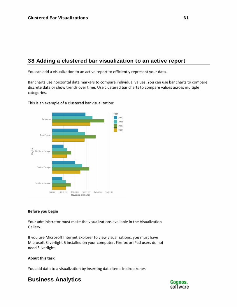
You can add a visualization to an active report to efficiently represent your data. Bar charts use horizontal data markers to compare individual values. You can use bar charts to compare discrete data or show trends over time. Use clustered bar charts to compare values across multiple categories. This is an example of a clustered bar visualization:
Before you begin Your administrator must make the visualizations available in the Visualization Gallery. If you use Microsoft Internet Explorer to view visualizations, you must have Microsoft Silverlight 5 installed on your computer. Firefox or iPad users do not need Silverlight. About this task You add data to a visualization by inserting data items in drop zones.
Stacked Bar Visualizations 62
Business Analytics
Visualizations will not run until all of the required drop zones contain data items. When all the required drop zones contain data items, additional drop zones appear for extra categories or values. You can use extra categories and extra values to filter data or set variables. Extra items are not visible in the visualization. When working with dimensional data sources, if the visualization does not contain a measure against which to plot data, you must provide one. For example, if you add a single member to the values drop zone, such as '2012', the default measure drop zone appears in which you must insert a measure. Attention: The supported properties for a visualization are determined by the
visualization definition.
39 Procedure
61. Create a new active report or open an existing active report.
62. From the Toolbox tab , drag a Visualization icon to the work area. 63. From the Visualization Gallery, select the Bar – Clustered icon and click OK.
64. From the Source tab , drag items to the appropriate location in the data container:
a. Under Values, drag a measure to the Size drop zone. b. Under Categories, drag an item to the Categories drop zone. c. Under Categories, drag an item to the Series drop zone.
65. Add any active controls that you want and run the report.
Stacked Bar Visualizations 63
Business Analytics
Stacked Bar Visualizations Product: IBM® Cognos® Active Report
Area of Interest: Reporting

Stacked Bar Visualizations 64
Business Analytics
40 Introduction—Stacked Bar
40.1 Purpose This document demonstrates how to add stacked bar extensible visualizations to active reports in Report Studio.
40.2 Applicability To perform the tasks in this document, you must use IBM Cognos Business Intelligence 10.2.1 with visualizations imported by the administrator and made available to users.
Stacked Bar Visualizations 65
Business Analytics
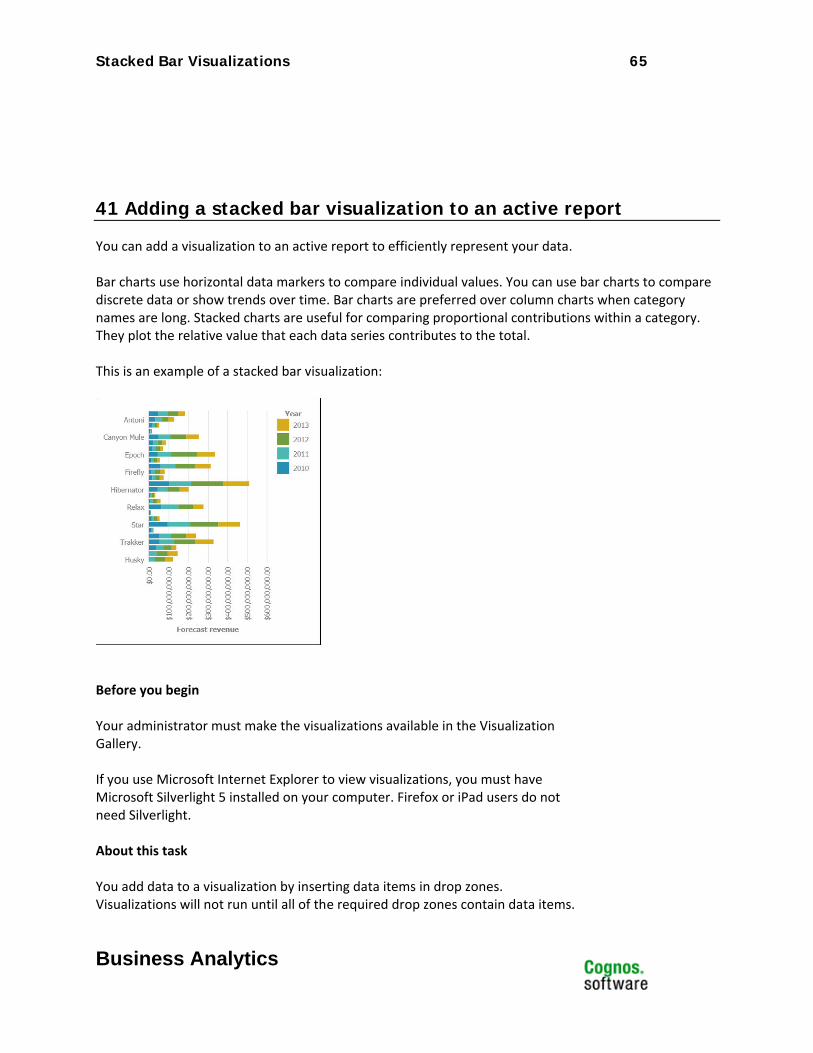
41 Adding a stacked bar visualization to an active report
You can add a visualization to an active report to efficiently represent your data. Bar charts use horizontal data markers to compare individual values. You can use bar charts to compare discrete data or show trends over time. Bar charts are preferred over column charts when category names are long. Stacked charts are useful for comparing proportional contributions within a category. They plot the relative value that each data series contributes to the total. This is an example of a stacked bar visualization:
Before you begin Your administrator must make the visualizations available in the Visualization Gallery. If you use Microsoft Internet Explorer to view visualizations, you must have Microsoft Silverlight 5 installed on your computer. Firefox or iPad users do not need Silverlight. About this task You add data to a visualization by inserting data items in drop zones. Visualizations will not run until all of the required drop zones contain data items.

Clustered Column Visualizations 66
Business Analytics
When all the required drop zones contain data items, additional drop zones appear for extra categories or values. You can use extra categories and extra values to filter data or set variables. Extra items are not visible in the visualization. When working with dimensional data sources, if the visualization does not contain a measure against which to plot data, you must provide one. For example, if you add a single member to the values drop zone, such as '2012', the default measure drop zone appears in which you must insert a measure. Attention: The supported properties for a visualization are determined by the
visualization definition.
42 Procedure
66. Create a new active report or open an existing active report.
67. From the Toolbox tab , drag a Visualization icon to the work area. 68. From the Visualization Gallery, select the Bar – Stacked icon and click OK.
69. From the Source tab , drag items to the appropriate location in the data container:
a. Under Values, drag a measure to the Size drop zone. b. Under Categories, drag an item to the Y categories drop zone. c. Under Categories, drag an item to the Series drop zone.
70. Add any active controls that you want and run the report.

Clustered Column Visualizations 67
Business Analytics
Clustered Column Visualizations Product: IBM® Cognos® Active Report
Area of Interest: Reporting

Clustered Column Visualizations 68
Business Analytics
43 Introduction—Clustered Column
43.1 Purpose This document demonstrates how to add clustered column extensible visualizations to active reports in Report Studio.
43.2 Applicability To perform the tasks in this document, you must use IBM Cognos Business Intelligence 10.2.1 with visualizations imported by the administrator and made available to users.
Clustered Column Visualizations 69
Business Analytics
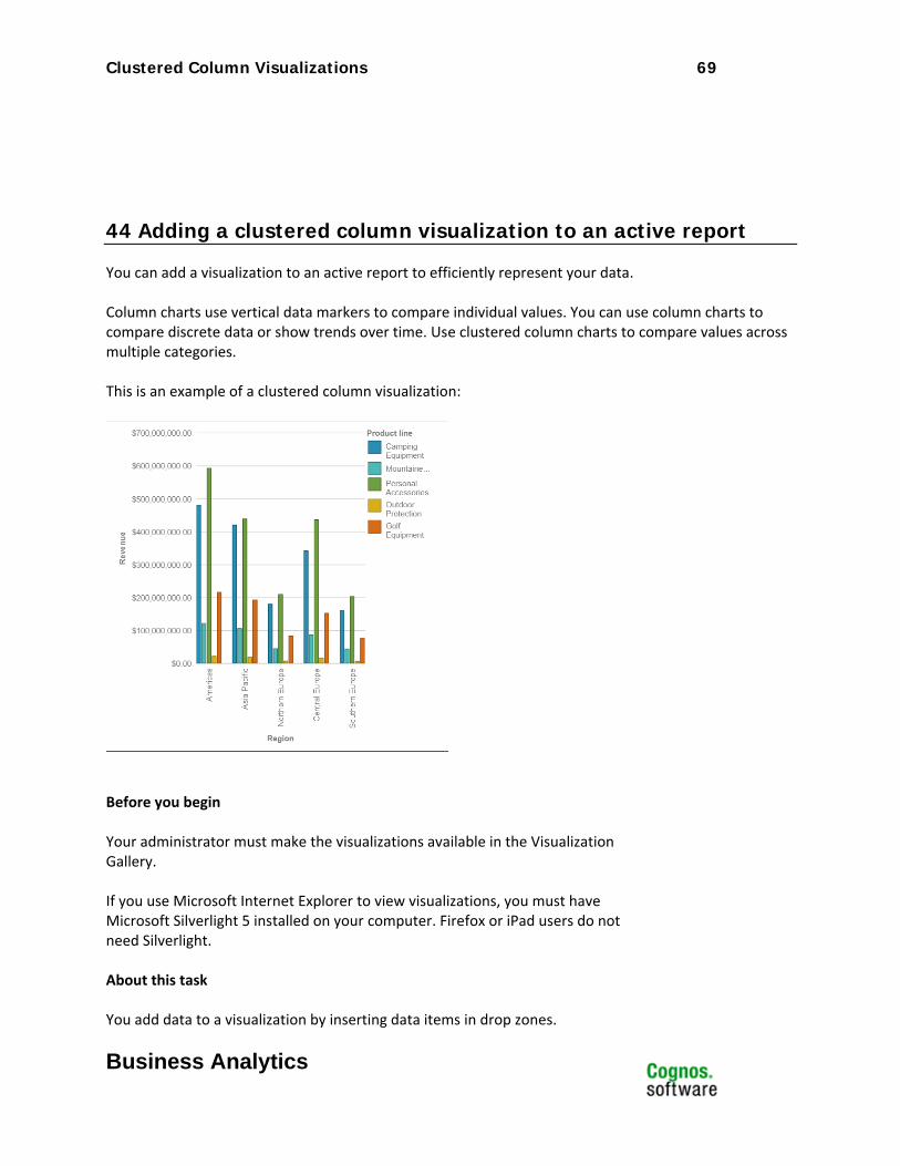
44 Adding a clustered column visualization to an active report
You can add a visualization to an active report to efficiently represent your data. Column charts use vertical data markers to compare individual values. You can use column charts to compare discrete data or show trends over time. Use clustered column charts to compare values across multiple categories. This is an example of a clustered column visualization:
Before you begin Your administrator must make the visualizations available in the Visualization Gallery. If you use Microsoft Internet Explorer to view visualizations, you must have Microsoft Silverlight 5 installed on your computer. Firefox or iPad users do not need Silverlight. About this task You add data to a visualization by inserting data items in drop zones.
Clustered Column Visualizations 70
Business Analytics
Visualizations will not run until all of the required drop zones contain data items. When all the required drop zones contain data items, additional drop zones appear for extra categories or values. You can use extra categories and extra values to filter data or set variables. Extra items are not visible in the visualization. When working with dimensional data sources, if the visualization does not contain a measure against which to plot data, you must provide one. For example, if you add a single member to the values drop zone, such as '2012', the default measure drop zone appears in which you must insert a measure. Attention: The supported properties for a visualization are determined by the
visualization definition.
45 Procedure
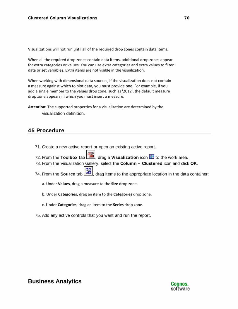
71. Create a new active report or open an existing active report.
72. From the Toolbox tab , drag a Visualization icon to the work area. 73. From the Visualization Gallery, select the Column – Clustered icon and click OK.
74. From the Source tab , drag items to the appropriate location in the data container:
a. Under Values, drag a measure to the Size drop zone. b. Under Categories, drag an item to the Categories drop zone. c. Under Categories, drag an item to the Series drop zone.
75. Add any active controls that you want and run the report.
100 Percent Stacked Column Visualizations 71
Business Analytics
100 Percent Stacked Column Visualizations
Product: IBM® Cognos® Active Report
Area of Interest: Reporting
100 Percent Stacked Column Visualizations 72
Business Analytics
46 Introduction—100% Stacked Column
46.1 Purpose This document demonstrates how to add 100 percent stacked column extensible visualizations to active reports in Report Studio.
46.2 Applicability To perform the tasks in this document, you must use IBM Cognos Business Intelligence 10.2.1 with visualizations imported by the administrator and made available to users.
100 Percent Stacked Column Visualizations 73
Business Analytics
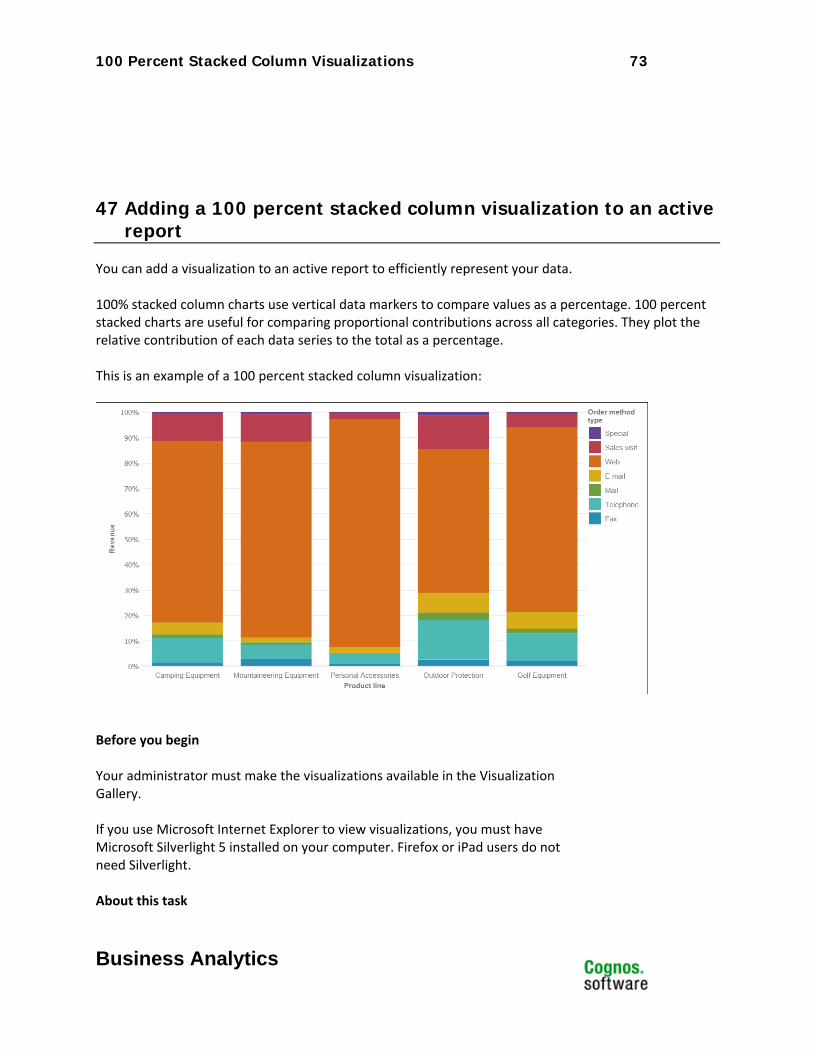
47 Adding a 100 percent stacked column visualization to an active report
You can add a visualization to an active report to efficiently represent your data. 100% stacked column charts use vertical data markers to compare values as a percentage. 100 percent stacked charts are useful for comparing proportional contributions across all categories. They plot the relative contribution of each data series to the total as a percentage. This is an example of a 100 percent stacked column visualization:
Before you begin Your administrator must make the visualizations available in the Visualization Gallery. If you use Microsoft Internet Explorer to view visualizations, you must have Microsoft Silverlight 5 installed on your computer. Firefox or iPad users do not need Silverlight. About this task
100 Percent Stacked Column Visualizations 74
Business Analytics
You add data to a visualization by inserting data items in drop zones. Visualizations will not run until all of the required drop zones contain data items. When all the required drop zones contain data items, additional drop zones appear for extra categories or values. You can use extra categories and extra values to filter data or set variables. Extra items are not visible in the visualization. When working with dimensional data sources, if the visualization does not contain a measure against which to plot data, you must provide one. For example, if you add a single member to the values drop zone, such as '2012', the default measure drop zone appears in which you must insert a measure. Attention: The supported properties for a visualization are determined by the
visualization definition.
48 Procedure
76. Create a new active report or open an existing active report.
77. From the Toolbox tab , drag a Visualization icon to the work area. 78. From the Visualization Gallery, select the Column – Stacked icon and click OK.
79. From the Source tab , drag items to the appropriate location in the data container:
a. Under Values, drag a measure to the Size drop zone. b. Under Categories, drag an item to the X categories drop zone. c. Under Categories, drag an item to the Series drop zone.
80. Add any active controls that you want and run the report.
Stacked Column Visualizations 75
Business Analytics
Stacked Column Visualizations Product: IBM® Cognos® Active Report
Area of Interest: Reporting

Stacked Column Visualizations 76
Business Analytics
49 Introduction—Stacked Column
49.1 Purpose This document demonstrates how to add stacked column extensible visualizations to active reports in Report Studio.
49.2 Applicability To perform the tasks in this document, you must use IBM Cognos Business Intelligence 10.2.1 with visualizations imported by the administrator and made available to users.
Stacked Column Visualizations 77
Business Analytics
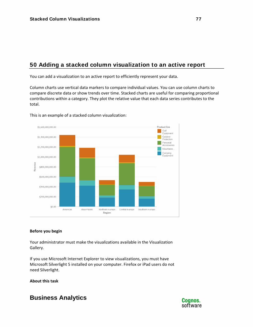
50 Adding a stacked column visualization to an active report
You can add a visualization to an active report to efficiently represent your data. Column charts use vertical data markers to compare individual values. You can use column charts to compare discrete data or show trends over time. Stacked charts are useful for comparing proportional contributions within a category. They plot the relative value that each data series contributes to the total. This is an example of a stacked column visualization:
Before you begin Your administrator must make the visualizations available in the Visualization Gallery. If you use Microsoft Internet Explorer to view visualizations, you must have Microsoft Silverlight 5 installed on your computer. Firefox or iPad users do not need Silverlight. About this task
Stacked Column Visualizations 78
Business Analytics
You add data to a visualization by inserting data items in drop zones. Visualizations will not run until all of the required drop zones contain data items. When all the required drop zones contain data items, additional drop zones appear for extra categories or values. You can use extra categories and extra values to filter data or set variables. Extra items are not visible in the visualization. When working with dimensional data sources, if the visualization does not contain a measure against which to plot data, you must provide one. For example, if you add a single member to the values drop zone, such as '2012', the default measure drop zone appears in which you must insert a measure. Attention: The supported properties for a visualization are determined by the
visualization definition.
51 Procedure
81. Create a new active report or open an existing active report.
82. From the Toolbox tab , drag a Visualization icon to the work area. 83. From the Visualization Gallery, select the Column – Stacked icon and click OK.
84. From the Source tab , drag items to the appropriate location in the data container:
a. Under Values, drag a measure to the Size drop zone. b. Under Categories, drag an item to the X categories drop zone. c. Under Categories, drag an item to the Series drop zone.
85. Add any active controls that you want and run the report.
Donut Visualizations 79
Business Analytics
Donut Visualizations Product: IBM® Cognos® Active Report
Area of Interest: Reporting

Donut Visualizations 80
Business Analytics
52 Introduction—Donut
52.1 Purpose This document demonstrates how to add donut extensible visualizations to active reports in Report Studio.
52.2 Applicability To perform the tasks in this document, you must use IBM Cognos Business Intelligence 10.2.1 with visualizations imported by the administrator and made available to users.
Donut Visualizations 81
Business Analytics
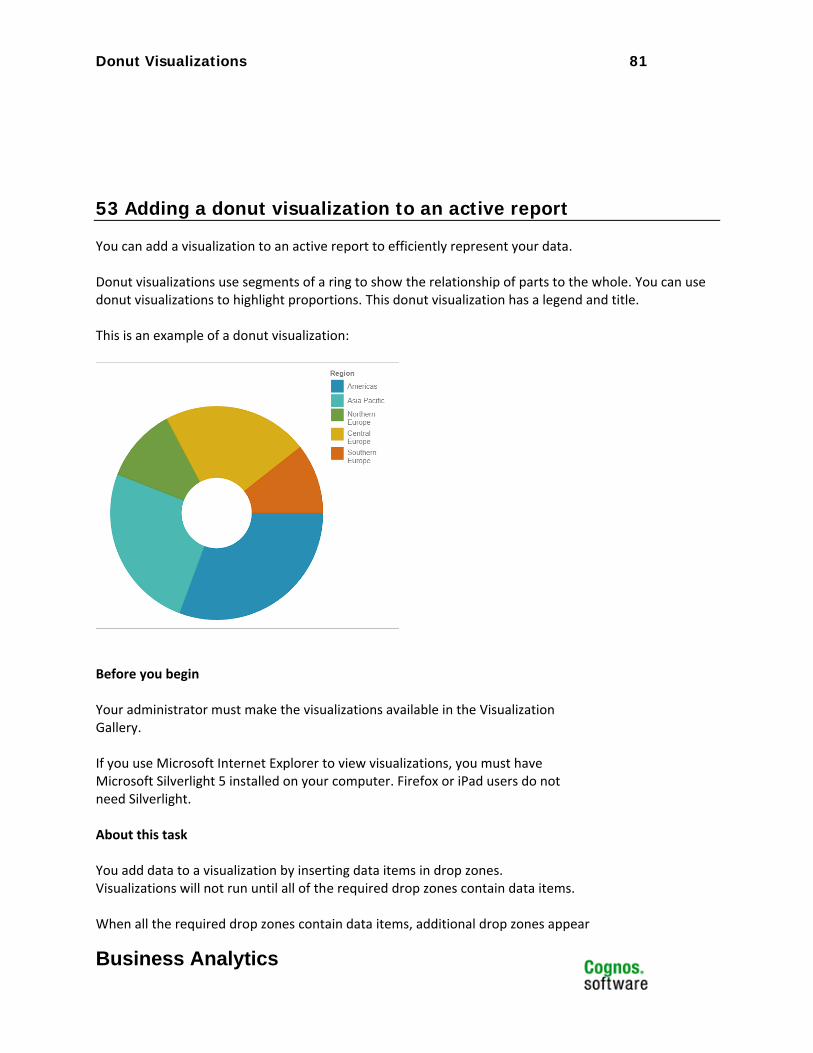
53 Adding a donut visualization to an active report
You can add a visualization to an active report to efficiently represent your data. Donut visualizations use segments of a ring to show the relationship of parts to the whole. You can use donut visualizations to highlight proportions. This donut visualization has a legend and title. This is an example of a donut visualization:
Before you begin Your administrator must make the visualizations available in the Visualization Gallery. If you use Microsoft Internet Explorer to view visualizations, you must have Microsoft Silverlight 5 installed on your computer. Firefox or iPad users do not need Silverlight. About this task You add data to a visualization by inserting data items in drop zones. Visualizations will not run until all of the required drop zones contain data items. When all the required drop zones contain data items, additional drop zones appear
Donut Visualizations 82
Business Analytics
for extra categories or values. You can use extra categories and extra values to filter data or set variables. Extra items are not visible in the visualization. When working with dimensional data sources, if the visualization does not contain a measure against which to plot data, you must provide one. For example, if you add a single member to the values drop zone, such as '2012', the default measure drop zone appears in which you must insert a measure. Attention: The supported properties for a visualization are determined by the
visualization definition.
54 Procedure
86. Create a new active report or open an existing active report.
87. From the Toolbox tab , drag a Visualization icon to the work area. 88. From the Visualization Gallery, select the Donut icon and click OK.
89. From the Source tab , drag items to the appropriate location in the data container:
a. Under Values, drag a measure to the Size drop zone to define the size of each segment. b. Under Categories, drag an item to the Series drop zone to define the number of segments in the donut.
90. Add any active controls that you want and run the report.

Gantt Visualizations 83
Business Analytics
Gantt Visualizations Product: IBM® Cognos® Active Report
Area of Interest: Reporting

Gantt Visualizations 84
Business Analytics
55 Introduction—Gantt
55.1 Purpose This document demonstrates how to add Gantt extensible visualizations to active reports in Report Studio.
55.2 Applicability To perform the tasks in this document, you must use IBM Cognos Business Intelligence 10.2.1 with visualizations imported by the administrator and made available to users.
Gantt Visualizations 85
Business Analytics
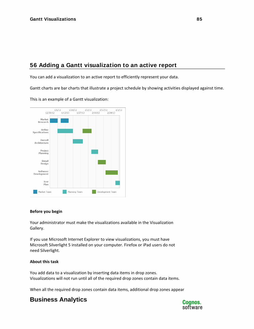
56 Adding a Gantt visualization to an active report
You can add a visualization to an active report to efficiently represent your data. Gantt charts are bar charts that illustrate a project schedule by showing activities displayed against time. This is an example of a Gantt visualization:
Before you begin Your administrator must make the visualizations available in the Visualization Gallery. If you use Microsoft Internet Explorer to view visualizations, you must have Microsoft Silverlight 5 installed on your computer. Firefox or iPad users do not need Silverlight. About this task You add data to a visualization by inserting data items in drop zones. Visualizations will not run until all of the required drop zones contain data items. When all the required drop zones contain data items, additional drop zones appear
Simple Gauge Visualizations 86
Business Analytics
for extra categories or values. You can use extra categories and extra values to filter data or set variables. Extra items are not visible in the visualization. When working with dimensional data sources, if the visualization does not contain a measure against which to plot data, you must provide one. For example, if you add a single member to the values drop zone, such as '2012', the default measure drop zone appears in which you must insert a measure. Attention: The supported properties for a visualization are determined by the
visualization definition.
57 Procedure
91. Create a new active report or open an existing active report.
92. From the Toolbox tab , drag a Visualization icon to the work area. 93. From the Visualization Gallery, select the Gantt icon and click OK.
94. From the Source tab , drag items to the appropriate location in the data container:
a. Under Values, drag a measure to the Start date drop zone. b. Under Values, drag a measure to the End date drop zone. c. Under Categories, drag an item to the Categories drop zone. d. Under Categories, drag an item to the Series drop zone.
95. Add any active controls that you want and run the report.

Simple Gauge Visualizations 87
Business Analytics
Simple Gauge Visualizations Product: IBM® Cognos® Active Report
Area of Interest: Reporting

Simple Gauge Visualizations 88
Business Analytics
58 Introduction—Gauge
58.1 Purpose This document demonstrates how to add simple gauge extensible visualizations to active reports in Report Studio.
58.2 Applicability To perform the tasks in this document, you must use IBM Cognos Business Intelligence 10.2.1 with visualizations imported by the administrator and made available to users.
Simple Gauge Visualizations 89
Business Analytics
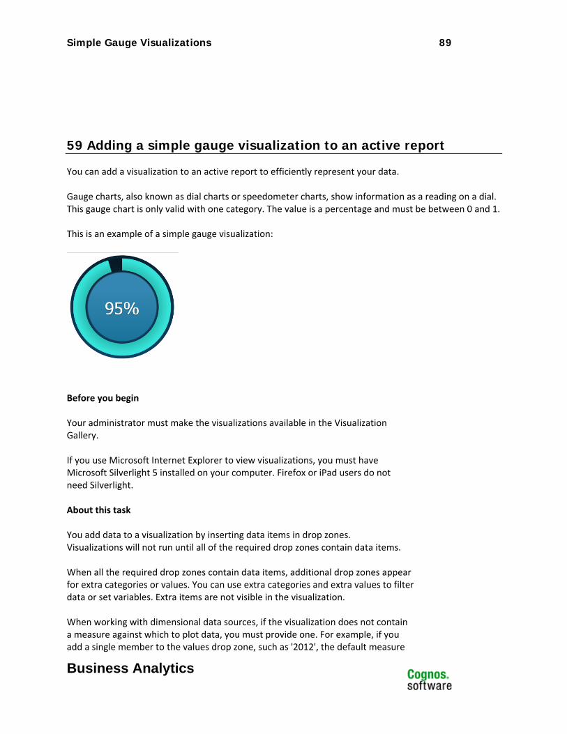
59 Adding a simple gauge visualization to an active report
You can add a visualization to an active report to efficiently represent your data. Gauge charts, also known as dial charts or speedometer charts, show information as a reading on a dial. This gauge chart is only valid with one category. The value is a percentage and must be between 0 and 1. This is an example of a simple gauge visualization:
Before you begin Your administrator must make the visualizations available in the Visualization Gallery. If you use Microsoft Internet Explorer to view visualizations, you must have Microsoft Silverlight 5 installed on your computer. Firefox or iPad users do not need Silverlight. About this task You add data to a visualization by inserting data items in drop zones. Visualizations will not run until all of the required drop zones contain data items. When all the required drop zones contain data items, additional drop zones appear for extra categories or values. You can use extra categories and extra values to filter data or set variables. Extra items are not visible in the visualization. When working with dimensional data sources, if the visualization does not contain a measure against which to plot data, you must provide one. For example, if you add a single member to the values drop zone, such as '2012', the default measure
Line – Marked (Straight) Visualizations 90
Business Analytics
drop zone appears in which you must insert a measure. Attention: The supported properties for a visualization are determined by the
visualization definition.
60 Procedure
96. Create a new active report or open an existing active report.
97. From the Toolbox tab , drag a Visualization icon to the work area. 98. From the Visualization Gallery, select the Radar icon and click OK.
99. From the Source tab , drag items to the appropriate location in the data container:
a. Under Values, drag an item to the Size drop zone. The item must be a value between 0 and 1. For example, the item can be a calculation that gives a result between 0 and 1.
b. Under Categories, drag an item to the Category drop zone.
100. Click the data item that you inserted in the Size drop zone. 101. In the Properties pane, double-click the Value Range property. 102. Click the Specified radio button, type 0 in the Minimum box, 1 in the
Maximum box, and then click OK. 103. Add any active controls that you want and run the report.

Line – Marked (Straight) Visualizations 91
Business Analytics
Line – Marked (Straight) Visualizations
Product: IBM® Cognos® Active Report
Area of Interest: Reporting

Line – Marked (Straight) Visualizations 92
Business Analytics
61 Introduction—Line Marked (Straight)
61.1 Purpose This document demonstrates how to add line (straight) with circle markers extensible visualizations to active reports in Report Studio.
61.2 Applicability To perform the tasks in this document, you must use IBM Cognos Business Intelligence 10.2.1 with visualizations imported by the administrator and made available to users.
Line – Marked (Straight) Visualizations 93
Business Analytics
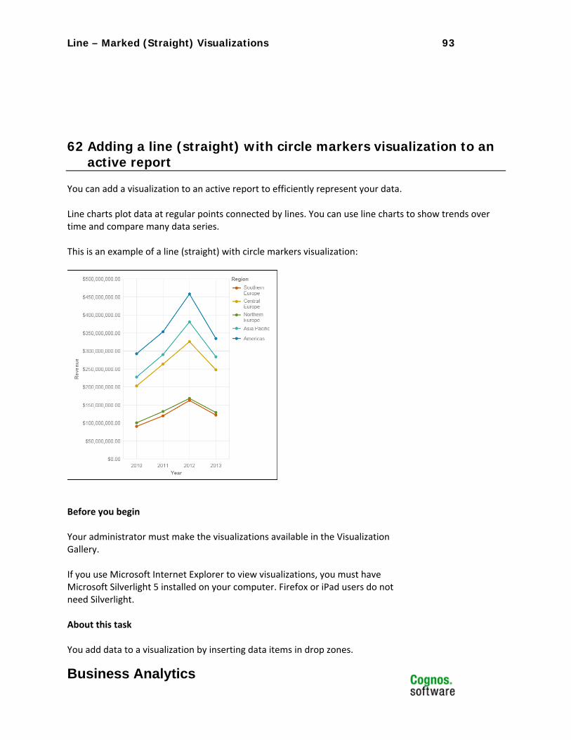
62 Adding a line (straight) with circle markers visualization to an active report
You can add a visualization to an active report to efficiently represent your data. Line charts plot data at regular points connected by lines. You can use line charts to show trends over time and compare many data series. This is an example of a line (straight) with circle markers visualization:
Before you begin Your administrator must make the visualizations available in the Visualization Gallery. If you use Microsoft Internet Explorer to view visualizations, you must have Microsoft Silverlight 5 installed on your computer. Firefox or iPad users do not need Silverlight. About this task You add data to a visualization by inserting data items in drop zones.
Line – Marked (Straight) Visualizations 94
Business Analytics
Visualizations will not run until all of the required drop zones contain data items. When all the required drop zones contain data items, additional drop zones appear for extra categories or values. You can use extra categories and extra values to filter data or set variables. Extra items are not visible in the visualization. When working with dimensional data sources, if the visualization does not contain a measure against which to plot data, you must provide one. For example, if you add a single member to the values drop zone, such as '2012', the default measure drop zone appears in which you must insert a measure. Attention: The supported properties for a visualization are determined by the
visualization definition.
63 Procedure
104. Create a new active report or open an existing active report.
105. From the Toolbox tab , drag a Visualization icon to the work area. 106. From the Visualization Gallery, select the Line – Marked (straight) icon and
click OK.
107. From the Source tab , drag items to the appropriate location in the data container:
a. Under Values, drag a measure to the Values drop zone. b. Under Categories, drag an item to the Categories drop zone. c. Under Categories, drag an item to the Series drop zone.
108. Add any active controls that you want and run the report.
Line (Smooth) Visualizations 95
Business Analytics
Line (Smooth) Visualizations Product: IBM® Cognos® Active Report
Area of Interest: Reporting

Line (Smooth) Visualizations 96
Business Analytics
64 Introduction—Line (Smooth)
64.1 Purpose This document demonstrates how to add line (smooth) extensible visualizations to active reports in Report Studio.
64.2 Applicability To perform the tasks in this document, you must use IBM Cognos Business Intelligence 10.2.1 with visualizations imported by the administrator and made available to users.
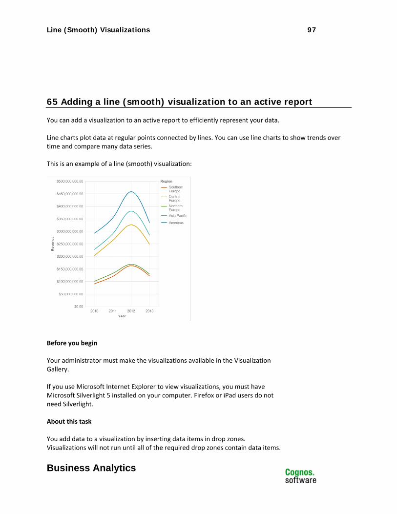
Line (Smooth) Visualizations 97
Business Analytics
65 Adding a line (smooth) visualization to an active report
You can add a visualization to an active report to efficiently represent your data. Line charts plot data at regular points connected by lines. You can use line charts to show trends over time and compare many data series. This is an example of a line (smooth) visualization:
Before you begin Your administrator must make the visualizations available in the Visualization Gallery. If you use Microsoft Internet Explorer to view visualizations, you must have Microsoft Silverlight 5 installed on your computer. Firefox or iPad users do not need Silverlight. About this task You add data to a visualization by inserting data items in drop zones. Visualizations will not run until all of the required drop zones contain data items.
Line (Straight) Visualizations 98
Business Analytics
When all the required drop zones contain data items, additional drop zones appear for extra categories or values. You can use extra categories and extra values to filter data or set variables. Extra items are not visible in the visualization. When working with dimensional data sources, if the visualization does not contain a measure against which to plot data, you must provide one. For example, if you add a single member to the values drop zone, such as '2012', the default measure drop zone appears in which you must insert a measure. Attention: The supported properties for a visualization are determined by the
visualization definition.
66 Procedure
109. Create a new active report or open an existing active report.
110. From the Toolbox tab , drag a Visualization icon to the work area. 111. From the Visualization Gallery, select the Line (smooth) icon and click OK.
112. From the Source tab , drag items to the appropriate location in the data container:
a. Under Values, drag a measure to the Values drop zone. b. Under Categories, drag an item to the Categories drop zone. c. Under Categories, drag an item to the Series drop zone.
113. Add any active controls that you want and run the report.
Line (Straight) Visualizations 99
Business Analytics
Line (Straight) Visualizations Product: IBM® Cognos® Active Report
Area of Interest: Reporting

Line (Straight) Visualizations 100
Business Analytics
67 Introduction—Line (Straight)
67.1 Purpose This document demonstrates how to add line (straight) extensible visualizations to active reports in Report Studio.
67.2 Applicability To perform the tasks in this document, you must use IBM Cognos Business Intelligence 10.2.1 with visualizations imported by the administrator and made available to users.

Line (Straight) Visualizations 101
Business Analytics
68 Adding a line (straight) visualization to an active report
You can add a visualization to an active report to efficiently represent your data. Line charts plot data at regular points connected by lines. You can use line charts to show trends over time and compare many data series. This is an example of a line (straight) visualization:
Before you begin Your administrator must make the visualizations available in the Visualization Gallery. If you use Microsoft Internet Explorer to view visualizations, you must have Microsoft Silverlight 5 installed on your computer. Firefox or iPad users do not need Silverlight. About this task You add data to a visualization by inserting data items in drop zones. Visualizations will not run until all of the required drop zones contain data items.
Line (Straight) Visualizations 102
Business Analytics
When all the required drop zones contain data items, additional drop zones appear for extra categories or values. You can use extra categories and extra values to filter data or set variables. Extra items are not visible in the visualization. When working with dimensional data sources, if the visualization does not contain a measure against which to plot data, you must provide one. For example, if you add a single member to the values drop zone, such as '2012', the default measure drop zone appears in which you must insert a measure. Attention: The supported properties for a visualization are determined by the
visualization definition.
69 Procedure
114. Create a new active report or open an existing active report.
115. From the Toolbox tab , drag a Visualization icon to the work area. 116. From the Visualization Gallery, select the Line (straight) icon and click OK.
117. From the Source tab , drag items to the appropriate location in the data container:
a. Under Values, drag a measure to the Values drop zone. b. Under Categories, drag an item to the Categories drop zone. c. Under Categories, drag an item to the Series drop zone.
118. Add any active controls that you want and run the report.
Bubble Visualizations 103
Business Analytics
Bubble Visualizations Product: IBM® Cognos® Active Report
Area of Interest: Reporting

Bubble Visualizations 104
Business Analytics
70 Introduction—Bubble
70.1 Purpose This document demonstrates how to add bubble extensible visualizations to active reports in Report Studio.
70.2 Applicability To perform the tasks in this document, you must use IBM Cognos Business Intelligence 10.2.1 with visualizations imported by the administrator and made available to users.
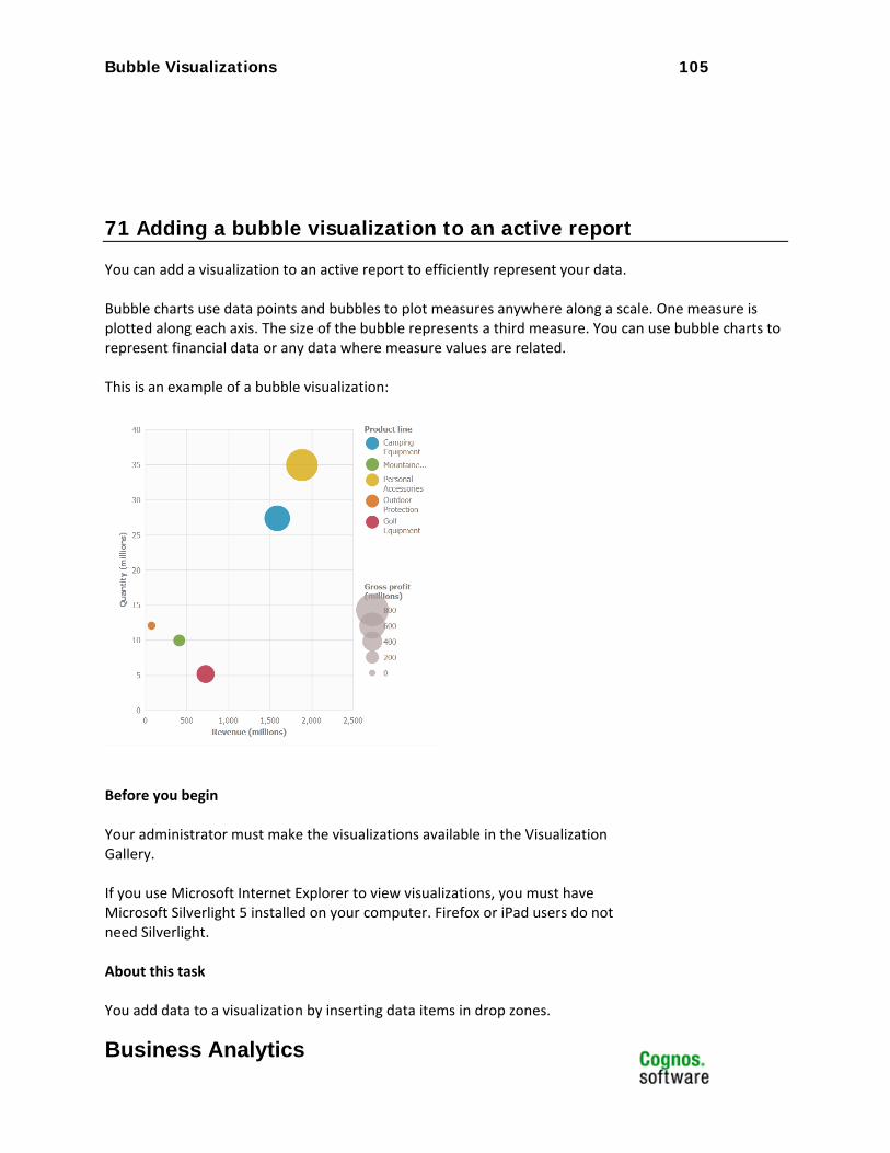
Bubble Visualizations 105
Business Analytics
71 Adding a bubble visualization to an active report
You can add a visualization to an active report to efficiently represent your data. Bubble charts use data points and bubbles to plot measures anywhere along a scale. One measure is plotted along each axis. The size of the bubble represents a third measure. You can use bubble charts to represent financial data or any data where measure values are related. This is an example of a bubble visualization:
Before you begin Your administrator must make the visualizations available in the Visualization Gallery. If you use Microsoft Internet Explorer to view visualizations, you must have Microsoft Silverlight 5 installed on your computer. Firefox or iPad users do not need Silverlight. About this task You add data to a visualization by inserting data items in drop zones.
Bubble Visualizations 106
Business Analytics
Visualizations will not run until all of the required drop zones contain data items. When all the required drop zones contain data items, additional drop zones appear for extra categories or values. You can use extra categories and extra values to filter data or set variables. Extra items are not visible in the visualization. When working with dimensional data sources, if the visualization does not contain a measure against which to plot data, you must provide one. For example, if you add a single member to the values drop zone, such as '2012', the default measure drop zone appears in which you must insert a measure. Attention: The supported properties for a visualization are determined by the
visualization definition.
72 Procedure
119. Create a new active report or open an existing active report.
120. From the Toolbox tab , drag a Visualization icon to the work area. 121. From the Visualization Gallery, select the Bubble icon and click OK.
122. From the Source tab , drag items to the appropriate location in the data container:
a. Under Values, drag a measure to the X-axis drop zone. b. Under Values, drag an item to the Y-axis drop zone. c. Under Values, drag an item to the Size drop zone to define the size of each bubble. d. Under Categories, drag an item to the Color drop zone to define the color of the bubbles.
123. Add any active controls that you want and run the report.
Pie Visualizations 107
Business Analytics
Pie Visualizations Product: IBM® Cognos® Active Report
Area of Interest: Reporting

Pie Visualizations 108
Business Analytics
73 Introduction—Pie
73.1 Purpose This document demonstrates how to add pie extensible visualizations to active reports in Report Studio.
73.2 Applicability To perform the tasks in this document, you must use IBM Cognos Business Intelligence 10.2.1 with visualizations imported by the administrator and made available to users.
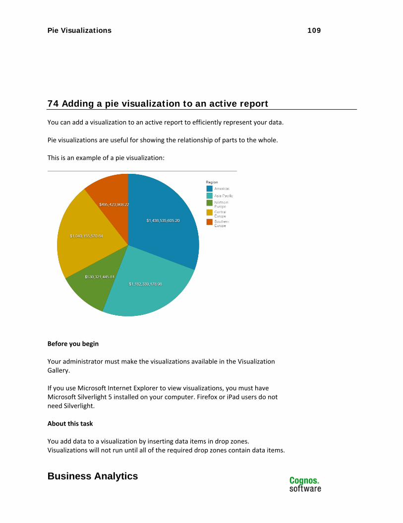
Pie Visualizations 109
Business Analytics
74 Adding a pie visualization to an active report
You can add a visualization to an active report to efficiently represent your data. Pie visualizations are useful for showing the relationship of parts to the whole. This is an example of a pie visualization:
Before you begin Your administrator must make the visualizations available in the Visualization Gallery. If you use Microsoft Internet Explorer to view visualizations, you must have Microsoft Silverlight 5 installed on your computer. Firefox or iPad users do not need Silverlight. About this task You add data to a visualization by inserting data items in drop zones. Visualizations will not run until all of the required drop zones contain data items.
Radar Visualizations 110
Business Analytics
When all the required drop zones contain data items, additional drop zones appear for extra categories or values. You can use extra categories and extra values to filter data or set variables. Extra items are not visible in the visualization. When working with dimensional data sources, if the visualization does not contain a measure against which to plot data, you must provide one. For example, if you add a single member to the values drop zone, such as '2012', the default measure drop zone appears in which you must insert a measure. Attention: The supported properties for a visualization are determined by the
visualization definition.
75 Procedure
124. Create a new active report or open an existing active report.
125. From the Toolbox tab , drag a Visualization icon to the work area. 126. From the Visualization Gallery, select the Pie icon and click OK.
127. From the Source tab , drag items to the appropriate location in the data container:
a. Under Values, drag an item to the Size drop zone to define the size of each segment. b. Under Categories, drag an item to the Series drop zone to define the number of slices in the pie.
128. Add any active controls that you want and run the report.
Radar Visualizations 111
Business Analytics
Radar Visualizations Product: IBM® Cognos® Active Report
Area of Interest: Reporting

Radar Visualizations 112
Business Analytics
76 Introduction—Radar
76.1 Purpose This document demonstrates how to add radar extensible visualizations to active reports in Report Studio.
76.2 Applicability To perform the tasks in this document, you must use IBM Cognos Business Intelligence 10.2.1 with visualizations imported by the administrator and made available to users.
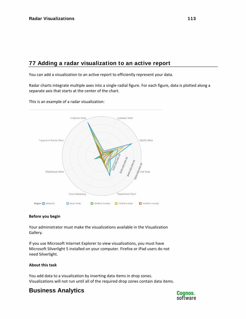
Radar Visualizations 113
Business Analytics
77 Adding a radar visualization to an active report
You can add a visualization to an active report to efficiently represent your data. Radar charts integrate multiple axes into a single radial figure. For each figure, data is plotted along a separate axis that starts at the center of the chart. This is an example of a radar visualization:
Before you begin Your administrator must make the visualizations available in the Visualization Gallery. If you use Microsoft Internet Explorer to view visualizations, you must have Microsoft Silverlight 5 installed on your computer. Firefox or iPad users do not need Silverlight. About this task You add data to a visualization by inserting data items in drop zones. Visualizations will not run until all of the required drop zones contain data items.
Scatter Visualizations 114
Business Analytics
When all the required drop zones contain data items, additional drop zones appear for extra categories or values. You can use extra categories and extra values to filter data or set variables. Extra items are not visible in the visualization. When working with dimensional data sources, if the visualization does not contain a measure against which to plot data, you must provide one. For example, if you add a single member to the values drop zone, such as '2012', the default measure drop zone appears in which you must insert a measure. Attention: The supported properties for a visualization are determined by the
visualization definition.
78 Procedure
129. Create a new active report or open an existing active report.
130. From the Toolbox tab , drag a Visualization icon to the work area. 131. From the Visualization Gallery, select the Radar icon and click OK.
132. From the Source tab , drag items to the appropriate location in the data container:
a. Under Values, drag a measure to the Values drop zone. b. Under Categories, drag an item to the Categories drop zone. c. Under Categories, drag an item to the Spokes drop zone.
133. Add any active controls that you want and run the report.
Scatter Visualizations 115
Business Analytics
Scatter Visualizations Product: IBM® Cognos® Active Report
Area of Interest: Reporting

Scatter Visualizations 116
Business Analytics
79 Introduction—Scatter
79.1 Purpose This document demonstrates how to add scatter extensible visualizations to active reports in Report Studio.
79.2 Applicability To perform the tasks in this document, you must use IBM Cognos Business Intelligence 10.2.1 with visualizations imported by the administrator and made available to users.
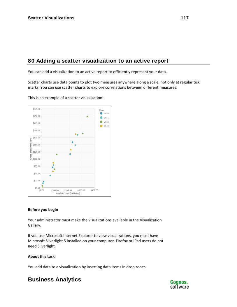
Scatter Visualizations 117
Business Analytics
80 Adding a scatter visualization to an active report
You can add a visualization to an active report to efficiently represent your data. Scatter charts use data points to plot two measures anywhere along a scale, not only at regular tick marks. You can use scatter charts to explore correlations between different measures. This is an example of a scatter visualization:
Before you begin Your administrator must make the visualizations available in the Visualization Gallery. If you use Microsoft Internet Explorer to view visualizations, you must have Microsoft Silverlight 5 installed on your computer. Firefox or iPad users do not need Silverlight. About this task You add data to a visualization by inserting data items in drop zones.
Scatter Visualizations 118
Business Analytics
Visualizations will not run until all of the required drop zones contain data items. When all the required drop zones contain data items, additional drop zones appear for extra categories or values. You can use extra categories and extra values to filter data or set variables. Extra items are not visible in the visualization. When working with dimensional data sources, if the visualization does not contain a measure against which to plot data, you must provide one. For example, if you add a single member to the values drop zone, such as '2012', the default measure drop zone appears in which you must insert a measure. Attention: The supported properties for a visualization are determined by the
visualization definition.
81 Procedure
134. Create a new active report or open an existing active report.
135. From the Toolbox tab , drag a Visualization icon to the work area. 136. From the Visualization Gallery, select the Scatter icon and click OK.
137. From the Source tab , drag items to the appropriate location in the data container:
a. Under Values, drag a measure to the X-axis drop zone. b. Under Values, drag a measure to the Y-axis drop zone. c. Under Categories, drag an item to the Categories drop zone. d. Under Categories, drag an item to the Series drop zone.
138. Add any active controls that you want and run the report.
Tag Cloud Visualizations 119
Business Analytics
Tag Cloud Visualizations Product: IBM® Cognos® Active Report
Area of Interest: Reporting

Tag Cloud Visualizations 120
Business Analytics
82 Introduction—Tag Cloud
82.1 Purpose This document demonstrates how to add tag cloud extensible visualizations to active reports in Report Studio.
82.2 Applicability To perform the tasks in this document, you must use IBM Cognos Business Intelligence 10.2.1 with visualizations imported by the administrator and made available to users.
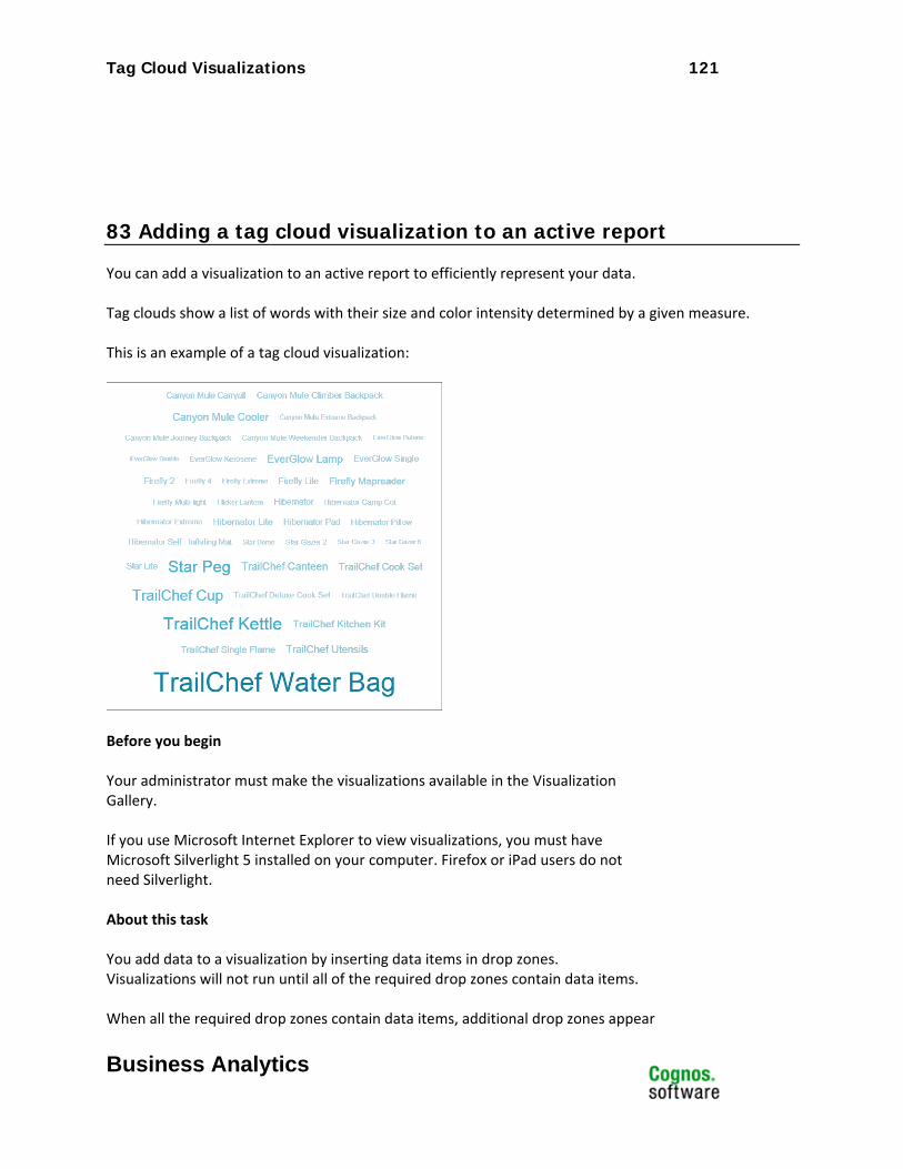
Tag Cloud Visualizations 121
Business Analytics
83 Adding a tag cloud visualization to an active report
You can add a visualization to an active report to efficiently represent your data. Tag clouds show a list of words with their size and color intensity determined by a given measure. This is an example of a tag cloud visualization:
Before you begin Your administrator must make the visualizations available in the Visualization Gallery. If you use Microsoft Internet Explorer to view visualizations, you must have Microsoft Silverlight 5 installed on your computer. Firefox or iPad users do not need Silverlight. About this task You add data to a visualization by inserting data items in drop zones. Visualizations will not run until all of the required drop zones contain data items. When all the required drop zones contain data items, additional drop zones appear
Tag Cloud Visualizations 122
Business Analytics
for extra categories or values. You can use extra categories and extra values to filter data or set variables. Extra items are not visible in the visualization. When working with dimensional data sources, if the visualization does not contain a measure against which to plot data, you must provide one. For example, if you add a single member to the values drop zone, such as '2012', the default measure drop zone appears in which you must insert a measure. Attention: The supported properties for a visualization are determined by the
visualization definition.
84 Procedure
139. Create a new active report or open an existing active report.
140. From the Toolbox tab , drag a Visualization icon to the work area. 141. From the Visualization Gallery, select the Tag cloud icon and click OK.
142. From the Source tab , drag items to the appropriate location in the data container:
a. Under Values, drag a measure to the Size drop zone. b. Under Categories, drag an item to the Categories drop zone.
143. Add any active controls that you want and run the report.

Network with Bubbles Visualizations 123
Business Analytics
Network with Bubbles Visualizations Product: IBM® Cognos® Active Report
Area of Interest: Reporting

Network with Bubbles Visualizations 124
Business Analytics
85 Introduction
85.1 Purpose This document demonstrates how to add network with bubbles extensible visualizations to active reports in Report Studio.
85.2 Applicability To perform the tasks in this document, you must use IBM Cognos Business Intelligence 10.2.1 with visualizations imported by the administrator and made available to users.
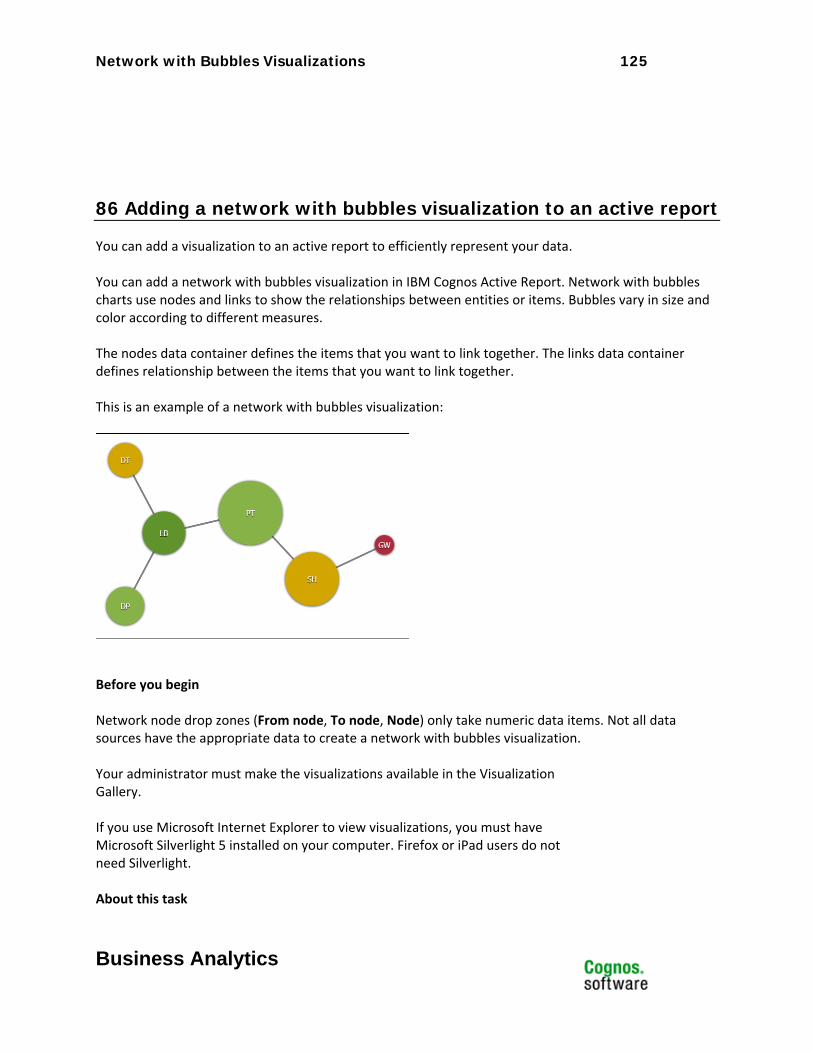
Network with Bubbles Visualizations 125
Business Analytics
86 Adding a network with bubbles visualization to an active report
You can add a visualization to an active report to efficiently represent your data. You can add a network with bubbles visualization in IBM Cognos Active Report. Network with bubbles charts use nodes and links to show the relationships between entities or items. Bubbles vary in size and color according to different measures. The nodes data container defines the items that you want to link together. The links data container defines relationship between the items that you want to link together. This is an example of a network with bubbles visualization:
Before you begin Network node drop zones (From node, To node, Node) only take numeric data items. Not all data sources have the appropriate data to create a network with bubbles visualization. Your administrator must make the visualizations available in the Visualization Gallery. If you use Microsoft Internet Explorer to view visualizations, you must have Microsoft Silverlight 5 installed on your computer. Firefox or iPad users do not need Silverlight. About this task
Network with Bubbles Visualizations 126
Business Analytics
You add data to a visualization by inserting data items in drop zones. Visualizations will not run until all of the required drop zones contain data items. When all the required drop zones contain data items, additional drop zones appear for extra categories or values. You can use extra categories and extra values to filter data or set variables. Extra items are not visible in the visualization. When working with dimensional data sources, if the visualization does not contain a measure against which to plot data, you must provide one. For example, if you add a single member to the values drop zone, such as '2012', the default measure drop zone appears in which you must insert a measure. Attention: The supported properties for a visualization are determined by the
visualization definition.
87 Procedure
144. Create a new active report or open an existing active report.
145. From the Toolbox tab , drag a Visualization icon to the work area. 146. From the Visualization Gallery, select the Network with Bubbles icon and click
OK.
147. From the Source tab , drag items to the appropriate location in the data container:
a. In the links data1 data container, drag items to From node and To node. The links data container defines the relationship between the items that you want to link together, such as Employees and Manager.
b. In the Node data1 data container, drag measures to the Node value1 and Node value2 drop zones.
The nodes data container defines the items that you want to link together, such as Employees, defined by an employee code. Node value1 is the measure that determines the size of the bubbles, and Node value2 is the measure that determines the color of the bubbles.
c. In the Node data1 data container, drag items to the Node and Name drop zones. Node is the numeric field that uniquely identifies the nodes to plot, and Name is the label that appears in each node.

Network with Bubbles Visualizations 127
Business Analytics
148. Add any active controls that you want and run the report.


