32
AMANDA KEENAN Graphic Designer
| Date post: | 28-Mar-2016 |
| Category: |
Documents |
| Upload: | amanda-keenan |
| View: | 223 times |
| Download: | 2 times |

AMANDA KEENANGraphic Designer

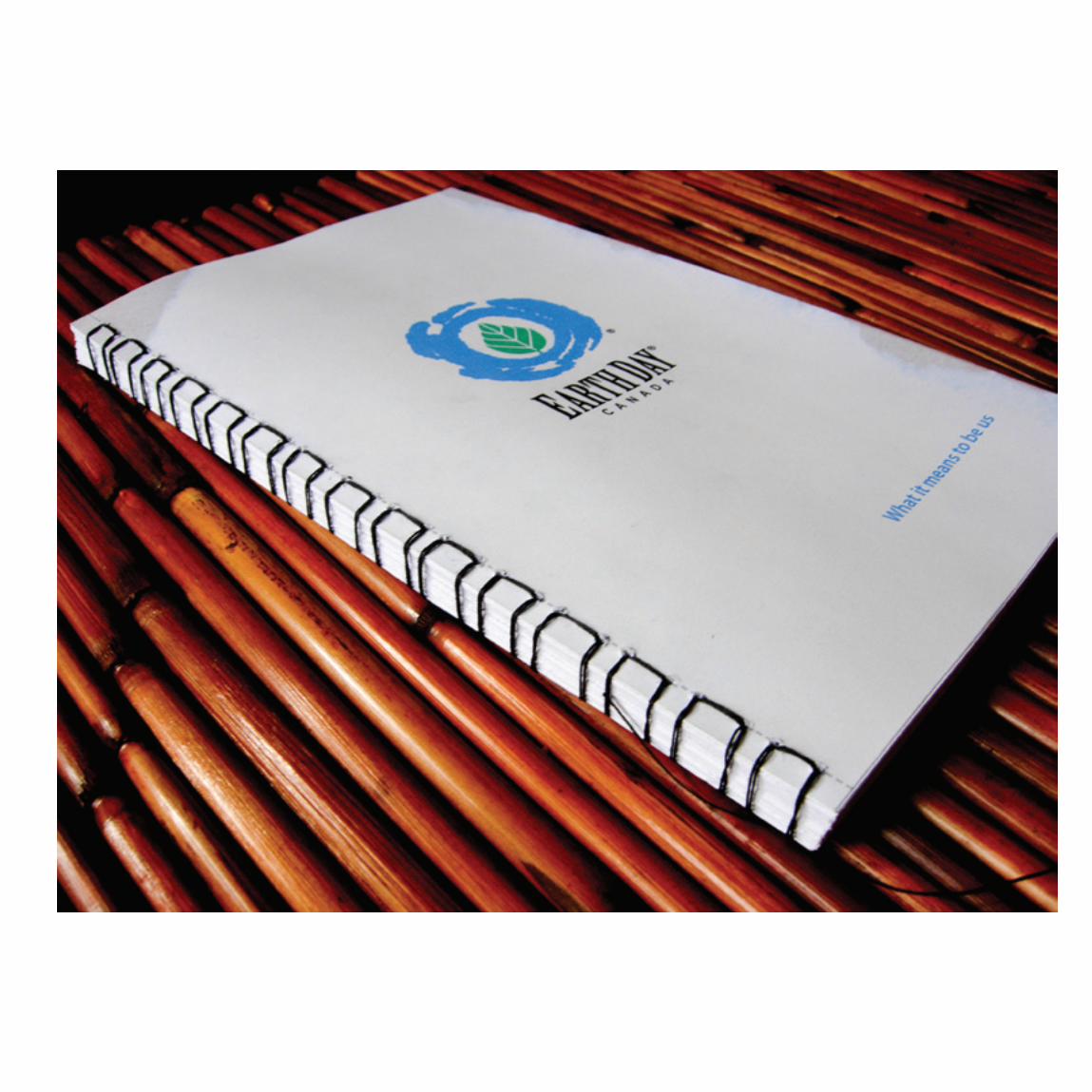
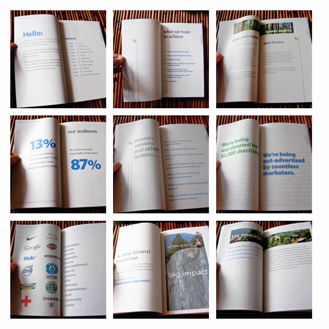
I designed this brand manual for Earth Day Canada while working at Polar Unlimited in Burlington. The brief was to provide a brand standards manual for the current logo, and also to develop a new brand essence – that one small action can make a big impact. Even though the manual was mostly used as a PDF, I show it here printed and bound the way I imagine it would be executed, which would be environmentally sustainable, without the uses of toxic adhesives and printed on 100% recycled paper.

This is a poster I designed while working in the Marketing & Communications Department as a student graphic designer at OCAD. It is for an guest speaker event that was taking place at the University. Natalie Jeremijenko is an experimental designer, and after doing some research about her work, I came across one of her many amazing experiments – She grew trees upside down! That was my inspiration in this design.
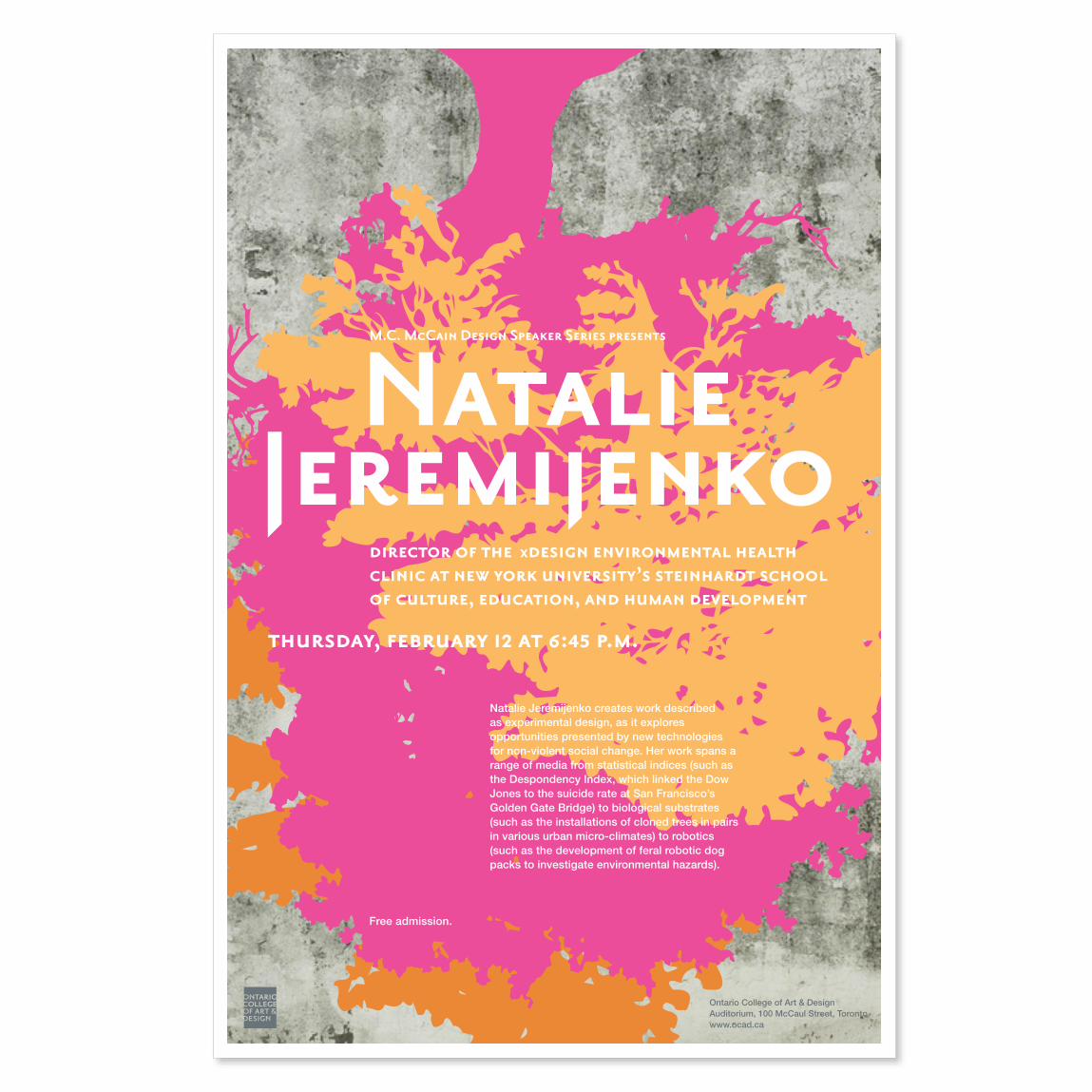
Natalie Jeremijenko
M.C. McCain Design Speaker Series presents
thursday, february 12 at 6:45 p.m.
director of the xdesign environmental health clinic at new york university’s steinhardt school of culture, education, and human development
Natalie Jeremijenko creates work described as experimental design, as it explores opportunities presented by new technologies for non-violent social change. Her work spans a range of media from statistical indices (such as the Despondency Index, which linked the Dow Jones to the suicide rate at San Francisco’s Golden Gate Bridge) to biological substrates (such as the installations of cloned trees in pairs in various urban micro-climates) to robotics (such as the development of feral robotic dog packs to investigate environmental hazards).
Free admission.
Ontario College of Art & DesignAuditorium, 100 McCaul Street, Torontowww.ocad.ca
This poster was done for an Illustrative Activism class I took at OCAD. The Planet in Focus film festival takes place annually in Toronto, and the director of marketing provided the initial brief and was also there in the final critique of the assignment. As part of the brief, the poster needed to incorporate 3 messages: the idea of focusing, the planet/environment, and something that would represent film. I incorporated all three with the simple image of an eye to represent focus. Within the eye, I incorporated the film real (as the iris) and the globe in the pupil.


I designed this double-sided type specimen poster for a typography class at OCAD. On one side you have an expressive poster that shows off the typography, while on the other, a more reserved and technical aspects of the typography. My approach in this assignment was to compare typography to types of personalities someone could be attracted to.

You are completely my
My type:
FF Extra-BlackArcherClarendon LTBuffet Script
A B C D E F G H I J K L M N O P Q R S T U V W X Y Z1 2 3 4 5 6 7 8 9 0 ! @ # $ % ^ & * ( ) \ | + - = ? ; ' : " [ ]
endoflikei've never felt this way before. i think of you and want to know you more. you are completely my type
TYPEFACE: FF EXTRA–BLACK
[ FONT: FF EXTRA-BLACK ]
Designed by Paul H. Neville, 1995Published by FontFont
This extra fat typeface is ideal in large point sizes, but not limited to. It has a unique quality to it, which is best used as a display type, with a serious edge.For the serious type.
TYPEFACE: ARCHER
Hey Buttercup!A B C D E F G H I J K L M N O P Q R S T U V W X Y Za b c d e f g h i j k l m n o p q r s t u v w x y z1 2 3 4 5 6 7 8 9 0 ! @ # $ % & * ( ) \ | + - = ? < > ; ' :
My type of love is sharing the popcorn, and the dishes, giving up the remote, and dessert before dinner – and you're completely it!
TYPEFACE: BUFFET SCRIPT
[ FONT: BUFFET SCRIPT ]
©2009 Amanda Keenan
Most uppercase and lowercase letters have many alternatives to choose from to suit your specific needs.
[ FONT: BUFFET SCRIPT ]
ff fi fl z z zH H H
Designed by Alejandro Paul, 2006, based on a 1940's designDistributed by Veer
Buffet Script is based on the hand lettering from one of the greatest sign lettering artists of all time; Alf Becker. The typeface is whimsical and filled with uniqueness – designed with a fully stocked library of alternative characters, ligatures, swashes. This is the complete package.For the playful and sentimental type.
SOULMATEA B C D E F G H I J K L M N O P Q R S T U V W X Y Za b c d e f g h i j k l m n o p q r s t u v w x y z1 2 3 4 5 6 7 8 9 0 ! @ # $ % ^ & * ( ) \ | + - = ? < > ; ' :
“As the saying goes, type is a beautiful group of letters, not a group of beautiful letters.” — Matthew Carter
TYPEFACE: CLARENDON LT
[ FONT: CLARENDON LT ABOVE: BOLD, BELOW: ROMAN ]
[ FONT: CLARENDON LT STD ROMAN ]
Designer: Hermann Eidenbenz, 1953Distributed by Linotype.
Clarendon is one of the first successful slab-serif typefaces to be used in England during the early part of the 20th century. Known for it's incredible legibilty as a display typeface, it is also highly legible at small point sizes. It is the perfect face if you want to leave an impression. For the public-displays-of-affection type.
a a aLIGHT ROMAN BOLD
Ma très chèreA B C D E F G H I J K L M N O P Q R S T U V W X Y Za b c d e f g h i j k l m n o p q r s t u v w x y z1 2 3 4 5 6 7 8 9 0 ! @ # $ % ^ & * ( ) \ | + - = ? < > ; ' :
Moi, je veux te dire que je ne te quitterai jamais. Et puis, si tu es triste, je pourrais toujours te donner un peu d'alcool pour te rechauffer le couer.
[ FONT: ARCHER LIGHT ]
[ FONT: ARCHER BOLD ]
ff fl fi fj fk ffj ffb
1 2 3 4 5 6 7 8HAIRLINE THIN EXTRA LIGHT LIGHT BOOK MEDIUM SEMI BOLD BOLD
Designed and Published by Hoefler & Frere-Jones, 2008.
The Archer family was originally commissioned for Martha Stewart Living magazine, and in recent years has been put out into circulation, making head ways in it's modern approach of the traditional slab-serif. For the romantic type.

This is a bus shelter advertisement that I designed while working as a student designer in the Marketing and Communications department at OCAD.

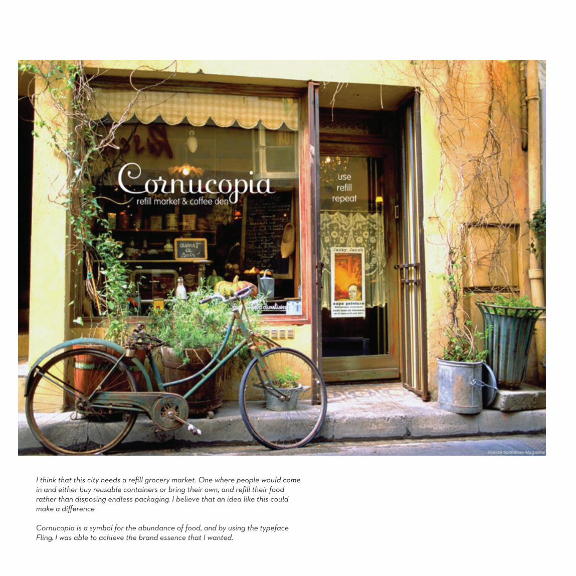
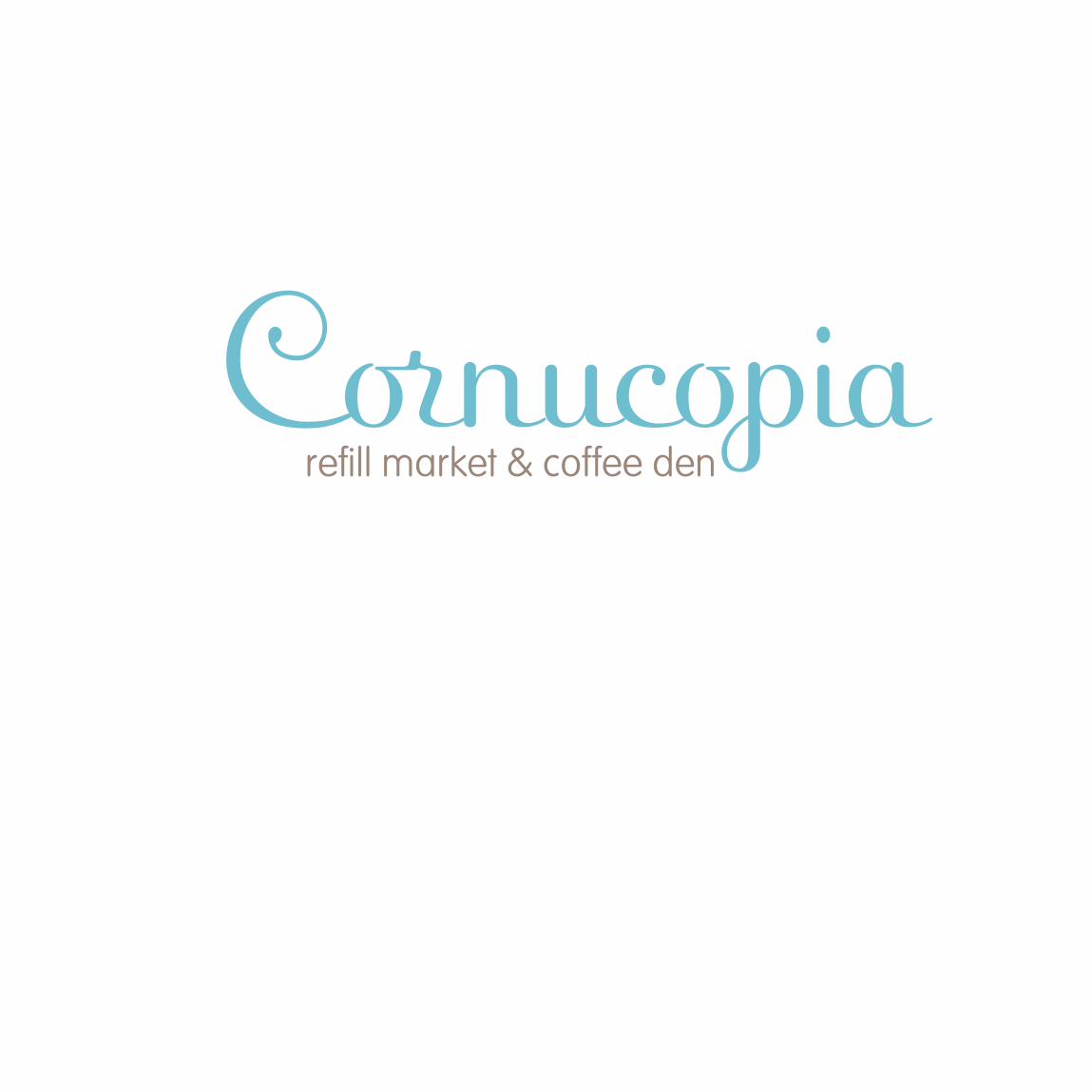
I think that this city needs a refill grocery market. One where people would come in and either buy reusable containers or bring their own, and refill their food rather than disposing endless packaging. I believe that an idea like this could make a difference
Cornucopia is a symbol for the abundance of food, and by using the typeface Fling, I was able to achieve the brand essence that I wanted.
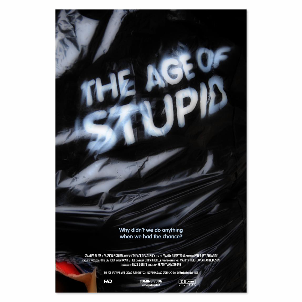
This is a film poster for an incredible documentary; The Age of Stupid. The film is based in 2055, in a post apocalyptic world in the global archives. It looks back using actual footage from the past few years – asking the question; why didn’t we do anything when had the chance. My approach with this poster was to take the idea of how we consume and throw away at an incredible rate, creating massive amounts of garbage which contribute to global warming and ultimately the destruction of our ecosystem, which is what the film expresses.
The way I accomplished the typography was I spray painted some garbage bags outside my apartment building and photographed them.
SPANNER FILMS / PASSION PICTURES prESEntS“THE AGE OF STUPID”a film by FRANNY ARMSTRONG Starring PETE POSTLETHWAITE ExEcutivE producEr JOHN BATTSEK Editor DAVID G HILL compoSEr CHRIS BRIERLEY animation dirEctorS MARTYN PICK & JONATHAN HODGSON
producEd by LIZZIE GILLETT dirEctEd by FRANNY ARMSTRONG
THE AGE OF STUPID WAS CROWD-FUNDED BY 228 INDIVIDUALS AND GROUPS © One-Off Productions Ltd, 2008
COMING SOONwww.ageofstupid.net
Why didn’t we do anything when we had the chance?

The phenomenon of synesthesia is when senses literally collide due to cross wiring in the brain. Someone who has synesthesia will see colours when eating food or will taste flavours when seeing objects. It’s quite amazing, and as a project for my core design class in 3rd year, I had the opportunity to do further research into this rare gift/disorder. (I’d like to consider it a gift).
The brief was to design a black and white poster that was 30”w × 45”h, for an exhibit at the (fictional) science and technology museum in Toronto.
My approach to this assignment was an illustrative one – I attempted to create the visual movement, and chaos within the brain, while merging in the 3 main senses that synesthesia affects; sound, taste and sight.

Synesthesia is a clash of the senses – sight may mingle with sound or taste with touch. Experience the brain phenomenon!
July 22 to August 4 2010
The Toronto Museum of Science and Industry 770 Don Mills Road, Toronto, Ontario
www.tmsi.ca

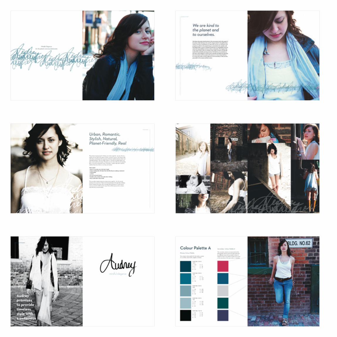
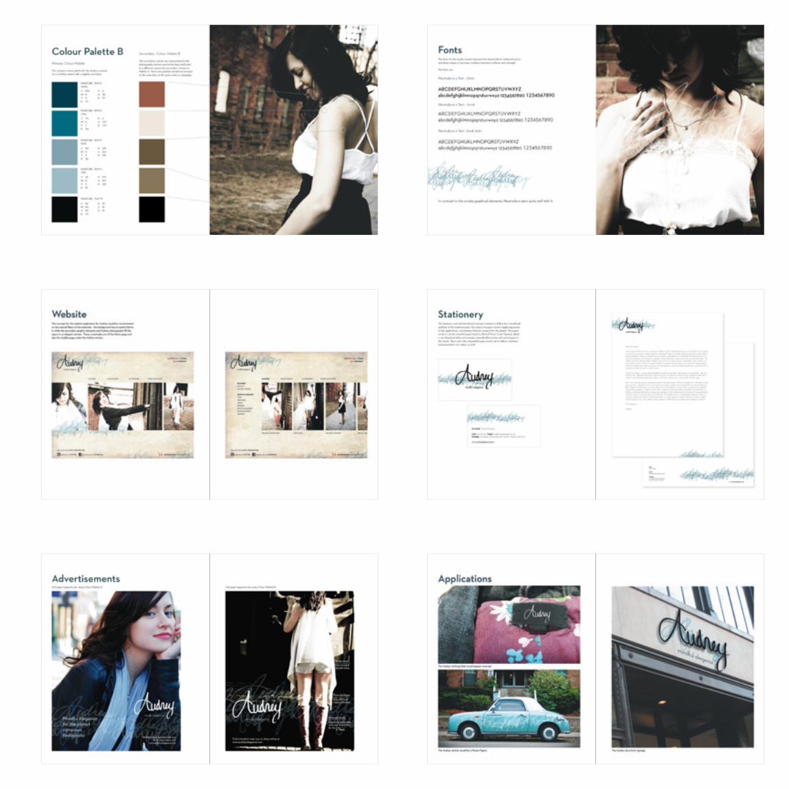
Audrey is an environmentally sustainable brand that uses organic and fair trade materials. My thought process behind this brand lead to the decision that the best way to represent a fashion company was through a signature-esque logo. This would make it completely unique, much like the women wearing Audrey will want to feel. Applications included a website, advertisements, store signage, a vehicle and a clothing label. All the photography is also my own. I decided that the best way to capture the image world that I imaged for Audrey was to pick out the outfits, choose the backdrop and take the photos. The follow pages show some of the brand book spreads.

Mindful Elegance for the planet conscious fashionista To find a store location near you
or to shop online visit www.audreyelegance.com

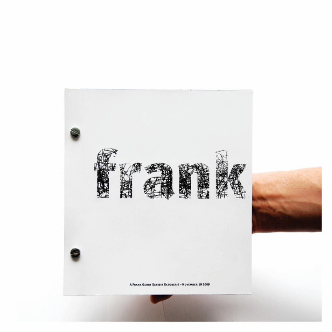
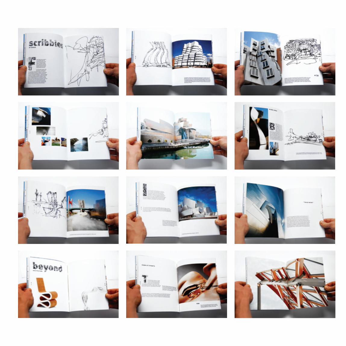
This is a book design for a (fictional) Frank Gehry exhibit. I was inspired by Gehry’s amazing sketches, which lead to using the typeface Meta in conjunction with his dynamic sketches. The cover is slightly debossed, which provides a tactile feel to the cover.

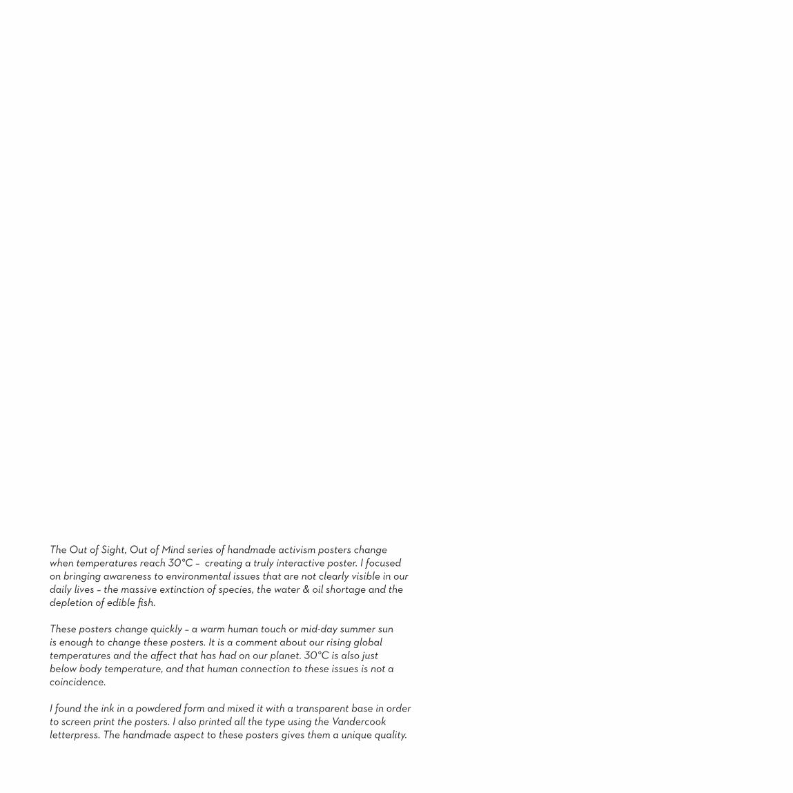
The Out of Sight, Out of Mind series of handmade activism posters change when temperatures reach 30°C – creating a truly interactive poster. I focused on bringing awareness to environmental issues that are not clearly visible in our daily lives – the massive extinction of species, the water & oil shortage and the depletion of edible fish.
These posters change quickly – a warm human touch or mid-day summer sun is enough to change these posters. It is a comment about our rising global temperatures and the affect that has had on our planet. 30°C is also just below body temperature, and that human connection to these issues is not a coincidence.
I found the ink in a powdered form and mixed it with a transparent base in order to screen print the posters. I also printed all the type using the Vandercook letterpress. The handmade aspect to these posters gives them a unique quality.
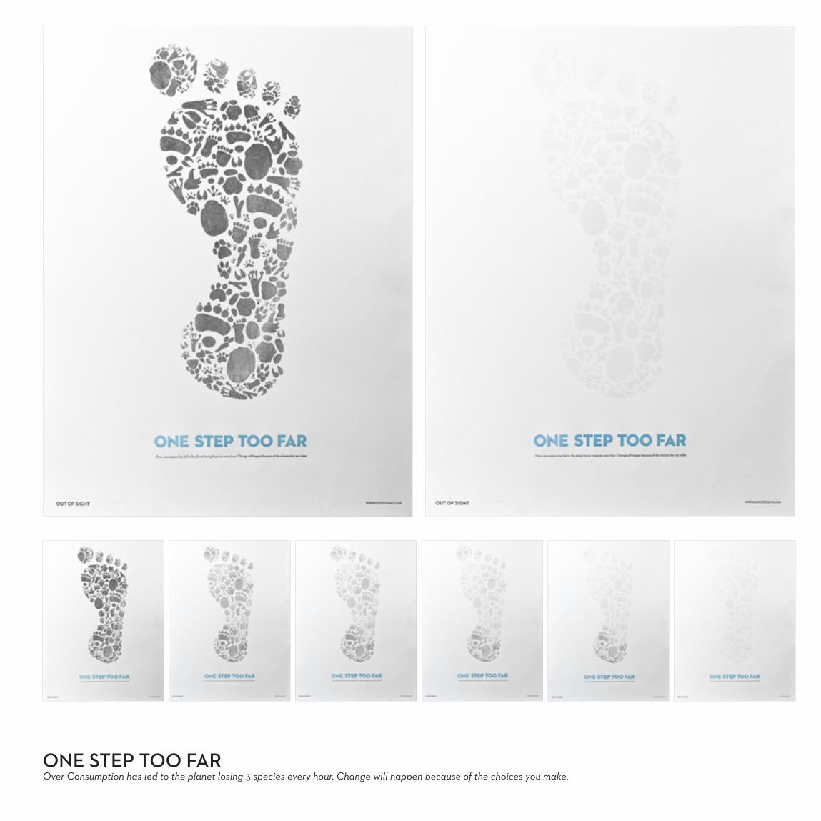
ONE STEP TOO FAROver Consumption has led to the planet losing 3 species every hour. Change will happen because of the choices you make.

DOWN TO THE LAST DROPOver population and consumption has lead to massive water shortages – similar to what we have seen with oil. Change will happen because of the choices that you make
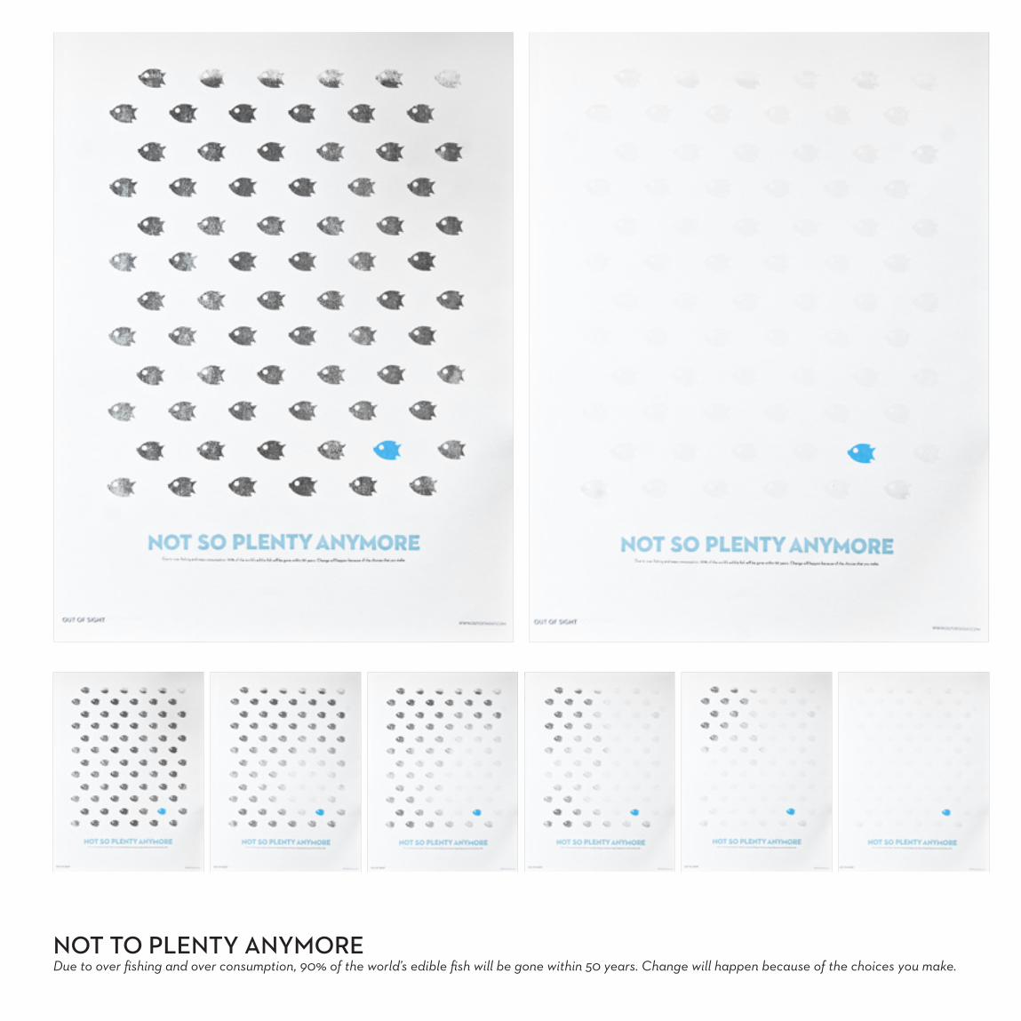
NOT TO PLENTY ANYMOREDue to over fishing and over consumption, 90% of the world’s edible fish will be gone within 50 years. Change will happen because of the choices you make.
THANKS FOR LOOKING
I appreciate the time you took looking at my portfolio.
call: 416 278 2834 e-mail: [email protected]: www. amandakeenan.com
Thanks!
Amanda Keenan


