NOVEMBER 2008 | VOL. 51 | NO. 11 | COMMUNICATIONS OF THE ACM 75 DOI:10.1145/1400214.1400234 Polaris: A System for Query, Analysis, and Visualization of Multidimensional Databases By Chris Stolte, Diane Tang, and Pat Hanrahan Abstract During the last decade, multidimensional databases have become common in the business and scientific worlds. Analysis places significant demands on the interfaces to these databases. It must be possible for analysts to easily and incrementally change both the data and their views of it as they cycle between hypothesis and experimentation. In this paper, we address these demands by presenting the Polaris formalism, a visual query language for precisely describing a wide range of table-based graphical presenta- tions of data. This language compiles into both the queries and drawing commands necessary to generate the visualiza- tion, enabling us to design systems that closely integrate analysis and visualization. Using the Polaris formalism, we have built an interactive interface for exploring multidimen- sional databases that analysts can use to rapidly and incre- mentally build an expressive range of views of their data as they engage in a cycle of visual analysis. 1. INTRODUCTION Nowadays, structured databases are widely used. Corpora- tions store every sales transaction in large data warehouses. International research projects such as the Human Genome Project and Digital Sky Survey are generating massive scien- tific databases. Organizations such as the United Nations are making a wide range of global indicators on issues rang- ing from carbon emission to the adoption of technology publicly available via the Internet. Unfortunately, our ability to collect and store data has rapidly exceeded our ability to analyze it. A major challenge in computer science is how to extract meaning from data: to discover structure, find patterns, and derive causal rela- tionships. An analytical session cycles between hypothesis, experiment, and discovery. Often the path of exploration is unpredictable, and thus analysts need to be able to rapidly change both what data they are viewing and how they are viewing that data. This exploratory analysis process places significant demands on the human–computer interfaces to these databases. Few good tools exist. In this paper, we present a formal approach to build- ing visualization systems that addresses these demands. The first contribution is the Polaris formalism, a declara- tive visual query language that specifies a wide range of 2D graphic displays. The three key components of the formal- ism are (1) a table algebra that captures the structure of tables and spatial encodings, (2) a graphic taxonomy that results in an intuitive specification of graphic types, and (3) a system for effective visual encoding. This language allows for easily changing between different graphic displays as well as adding or removing data. The second main contribution is the combination of this visual query language with the underlying database queries needed. This allows us to combine both visualization as well as the underlying data transformations to support the exploratory process. The final contribution is the Polaris interface that allows users to incrementally construct a visual specification by drag- ging fields onto “shelves” (see Figure 1). Each intermediate specification is valid and corresponds to a graphical data dis- play, giving the user quick visual feedback to support this anal- ysis. This interface is built on top of the visual query language that specifies both the data and graphical transformations needed, thus combining statistical analysis and visualization. Polaris enables visual analysis by allowing an analyst to answer a question by composing a picture of what they want to see. It has been 6 years since this work was originally published. In that time, the technology has been commercialized by Tableau Software as Tableau Desktop and is currently in use by thousands of companies and tens of thousands of users. As a result, we have gained considerable experience that has validated the effectiveness of the visual query language and interface and resulted in extensions and revisions to both. 2. OVERVIEW Polaris has been designed to support the interactive explora- tion of large multidimensional relational databases or data cubes. Relational databases organize data into tables where each row in a table corresponds to a basic entity or fact and each column represents a property of that entity. 18 We refer to a row in a relational table as a tuple or record, and a col- umn as a field. A single database will contain many hetero- geneous but interrelated tables. The authors dedicate this article to the memory of Jim Gray, whose pioneering work inspired this research. A previous version of this paper was published in IEEE’s Transactions on Visualization and Computer Graphics, vol 8, issue 1 (Jan. 2002), pp. 52–65.
Transcript
NovEmbER 2008 | vol. 51 | No. 11 | communications of the acm 75
Doi:10.1145/1400214.1400234
Polaris: A System for Query, Analysis, and Visualization of Multidimensional DatabasesBy Chris Stolte, Diane Tang, and Pat Hanrahan
abstractDuring the last decade, multidimensional databases have become common in the business and scientific worlds. Analysis places significant demands on the interfaces to these databases. It must be possible for analysts to easily and incrementally change both the data and their views of it as they cycle between hypothesis and experimentation.
In this paper, we address these demands by presenting the Polaris formalism, a visual query language for precisely describing a wide range of table-based graphical presenta-tions of data. This language compiles into both the queries and drawing commands necessary to generate the visualiza-tion, enabling us to design systems that closely integrate analysis and visualization. Using the Polaris formalism, we have built an interactive interface for exploring multidimen-sional databases that analysts can use to rapidly and incre-mentally build an expressive range of views of their data as they engage in a cycle of visual analysis.
1. intRoDuctionNowadays, structured databases are widely used. Corpora-tions store every sales transaction in large data warehouses. International research projects such as the Human Genome Project and Digital Sky Survey are generating massive scien-tific databases. Organizations such as the United Nations are making a wide range of global indicators on issues rang-ing from carbon emission to the adoption of technology publicly available via the Internet.
Unfortunately, our ability to collect and store data has rapidly exceeded our ability to analyze it. A major challenge in computer science is how to extract meaning from data: to discover structure, find patterns, and derive causal rela-tionships. An analytical session cycles between hypothesis, experiment, and discovery. Often the path of exploration is unpredictable, and thus analysts need to be able to rapidly change both what data they are viewing and how they are viewing that data. This exploratory analysis process places significant demands on the human–computer interfaces to these databases. Few good tools exist.
In this paper, we present a formal approach to build-ing visualization systems that addresses these demands.
The first contribution is the Polaris formalism, a declara-tive visual query language that specifies a wide range of 2D graphic displays. The three key components of the formal-ism are (1) a table algebra that captures the structure of tables and spatial encodings, (2) a graphic taxonomy that results in an intuitive specification of graphic types, and (3) a system for effective visual encoding. This language allows for easily changing between different graphic displays as well as adding or removing data.
The second main contribution is the combination of this visual query language with the underlying database queries needed. This allows us to combine both visualization as well as the underlying data transformations to support the exploratory process.
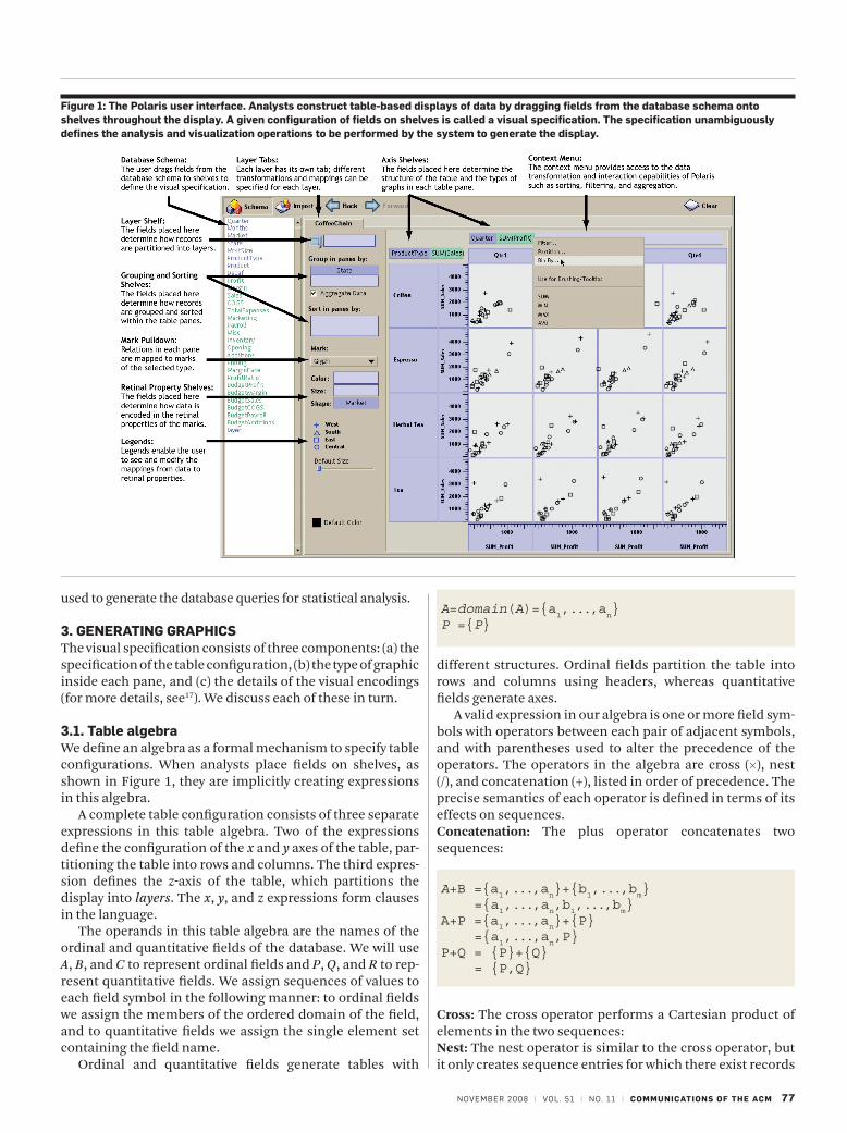
The final contribution is the Polaris interface that allows users to incrementally construct a visual specification by drag-ging fields onto “shelves” (see Figure 1). Each intermediate specification is valid and corresponds to a graphical data dis-play, giving the user quick visual feedback to support this anal-ysis. This interface is built on top of the visual query language that specifies both the data and graphical transformations needed, thus combining statistical analysis and visualization. Polaris enables visual analysis by allowing an analyst to answer a question by composing a picture of what they want to see.
It has been 6 years since this work was originally published. In that time, the technology has been commercialized by Tableau Software as Tableau Desktop and is currently in use by thousands of companies and tens of thousands of users. As a result, we have gained considerable experience that has validated the effectiveness of the visual query language and interface and resulted in extensions and revisions to both.
2. oVeRVieWPolaris has been designed to support the interactive explora-tion of large multidimensional relational databases or data cubes. Relational databases organize data into tables where each row in a table corresponds to a basic entity or fact and each column represents a property of that entity.18 We refer to a row in a relational table as a tuple or record, and a col-umn as a field. A single database will contain many hetero-geneous but interrelated tables.
The authors dedicate this article to the memory of Jim Gray, whose pioneering work inspired this research.
A previous version of this paper was published in IEEE’s Transactions on Visualization and Computer Graphics, vol 8, issue 1 (Jan. 2002), pp. 52–65.
research highlights
76 communications of the acm | NovEmbER 2008 | vol. 51 | No. 11
We can classify fields in a database as nominal, ordi-nal, quantitative, or interval.4,16 This classification is the field’s scale. Polaris reduces this categorization to ordinal and quantitative by treating intervals as quanti-tative and assigning an ordering to the nominal fields to treat them as ordinal. A field’s scale affects its visual representation. Quantitative fields are continuous, and are shown as axes or smoothly varying values. Ordinal scales are represented discretely, as headers or different classes.
The fields within a relational table can also be parti-tioned into two types: dimensions and measures. This classification is the field’s role. Dimensions and mea-sures are similar to independent and dependent vari-ables in traditional analysis. For example, a product name or type would be a dimension while the product price or size would be a measure. The field’s role deter-mines how the query is generated. Measures are com-puted using an aggregation function and dimensions form the groups to be aggregated.
Polaris originally treated ordinal fields as dimensions and quantitative fields as measures. With experience, however, we have found that a field’s scale and role are orthogonal, and may change depending on the question. For example, when asking the question “What is the average age of people purchasing a product?” the field Age is acting as a measure. However, when asking the question “What is the average amount spent classified by customer age?” then Age is act-ing as a dimension. The current implementation of Tableau uses simple heuristics based on a field’s data type and domain cardinality to determine a field’s default role and scale, but allows both to be easily changed.
To effectively support the analysis process in large multi-dimensional databases, an analysis tool must meet several demands:
• Exploratoryinterface: Analysts must be able to rapidly and incrementally change what data they are viewing and how they are viewing that data as they explore hypotheses.
• Multiple display types: Analysis consists of different tasks such as discovering correlations between vari-ables, finding patterns, and locating outliers. An analy-sis tool must be able to generate displays suited to these disparate tasks.
• Data-dense displays: The databases typically contain a large number of records and dimensions. Analysts need to be able to create visualizations that will simultaneously display many dimensions of large subsets of the data.
Polaris addresses these demands by providing an inter-face for rapidly and incrementally generating table-based displays. In Polaris, a table consists of a number of rows, columns, and layers. Each table axis may contain multiple nested dimensions. Each table entry, or pane, contains a set of records that are visually encoded as a set of marks to cre-ate a graphic.
Several characteristics of tables make them particularly effective for displaying multidimensional data:
• Multivariate: The table structure can encode multiple dimensions, enabling the display of high-dimensional data.
• Comparative: Tables generate small-multiple displays of information, which are easily compared to expose patterns and trends across dimensions.20
• Familiar: Table-based displays have an extensive his-tory. Statisticians are accustomed to using tabular dis-plays of graphs, such as scatterplot matrices and Trellis displays, for analysis.2,7,20
Figure 1 shows the Polaris user interface. In this example, the analyst has constructed a matrix of scatterplots show-ing sales versus profit for different product types in different quarters. The primary interaction technique is to drag-and-drop fields from the database schema onto shelves through-out the display. We call a given configuration of fields on shelves a visual specification. The visual specification is converted into the language using simple operations. The specification determines the analysis and visualization operations to be performed by the system, defining:
• The mapping of data sources to layers. Multiple data sources may be combined in a single Polaris visualization. Each data source maps to a separate layer or set of layers.
• The number of rows, columns, and layers in the table and their relative orders (left to right as well as back to front). The database dimensions assigned to rows are specified by the fields on the y shelf, columns by fields on the x shelf, and layers by fields on the layer (z) shelf. Multiple fields may be dragged onto each shelf to show categorical relationships.
• The selection of records from the database and the par-titioning of records into different layers and panes.
• The grouping of data within a pane and the computa-tion of statistical properties, aggregates, and other derived fields. Records may also be sorted into a given drawing order.
• The type of graphic displayed in each table pane. Each graphic consists of a set of marks, one mark per record in that pane.
• The mapping of data fields to retinal properties of the marks in the graphics. The mappings used for any given visualization are shown in a set of automatically gener-ated legends.
Analysts can interact with the resulting visualizations in sev-eral ways. Each mark represents a tuple, so selecting a single mark in a graphic by clicking on it pops up a detail window that displays user-specified field values for the tuples cor-responding to that mark. The tuples represented by a set of marks can be cut and pasted into a spreadsheet by selecting the marks representing the tuples. Analysts can draw rubber bands around a set of marks to brush or highlight related records, either within a single table or between multiple Polaris displays.
In Section 3, we describe how the visual specification is used to generate graphics. In Section 4, we describe the supported data transformations and how the visual specifications are
NovEmbER 2008 | vol. 51 | No. 11 | communications of the acm 77
used to generate the database queries for statistical analysis.
3. GeneRatinG GRaPhicsThe visual specification consists of three components: (a) the specification of the table configuration, (b) the type of graphic inside each pane, and (c) the details of the visual encodings (for more details, see17). We discuss each of these in turn.
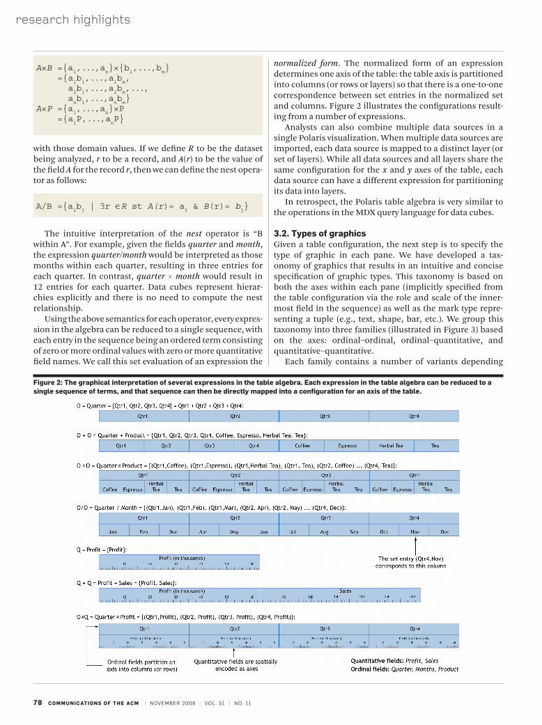
3.1. table algebraWe define an algebra as a formal mechanism to specify table configurations. When analysts place fields on shelves, as shown in Figure 1, they are implicitly creating expressions in this algebra.
A complete table configuration consists of three separate expressions in this table algebra. Two of the expressions define the configuration of the x and y axes of the table, par-titioning the table into rows and columns. The third expres-sion defines the z-axis of the table, which partitions the display into layers. The x, y, and z expressions form clauses in the language.
The operands in this table algebra are the names of the ordinal and quantitative fields of the database. We will use A, B, and C to represent ordinal fields and P, Q, and R to rep-resent quantitative fields. We assign sequences of values to each field symbol in the following manner: to ordinal fields we assign the members of the ordered domain of the field, and to quantitative fields we assign the single element set containing the field name.
Ordinal and quantitative fields generate tables with
different structures. Ordinal fields partition the table into rows and columns using headers, whereas quantitative fields generate axes.
A valid expression in our algebra is one or more field sym-bols with operators between each pair of adjacent symbols, and with parentheses used to alter the precedence of the operators. The operators in the algebra are cross (×), nest (/), and concatenation (+), listed in order of precedence. The precise semantics of each operator is defined in terms of its effects on sequences.concatenation: The plus operator concatenates two sequences:
cross: The cross operator performs a Cartesian product of elements in the two sequences:nest: The nest operator is similar to the cross operator, but it only creates sequence entries for which there exist records
A=domain(A)={a1,...,a
n}
P ={P}
A+B ={a1,...,a
n}+{b
1,...,b
m}
={a1,...,a
n,b
1,...,b
m}
A+P ={a1,...,a
n}+{P}
={a1,...,a
n,P}
P+Q = {P}+{Q} = {P,Q}
figure 1: the Polaris user interface. analysts construct table-based displays of data by dragging fields from the database schema onto shelves throughout the display. a given configuration of fields on shelves is called a visual specification. the specification unambiguously defines the analysis and visualization operations to be performed by the system to generate the display.
research highlights
78 communications of the acm | NovEmbER 2008 | vol. 51 | No. 11
with those domain values. If we define R to be the dataset being analyzed, r to be a record, and A(r) to be the value of the field A for the record r, then we can define the nest opera-tor as follows:
A/B ={aibj | ∃r ∈R st A(r)= a
i & B(r)= b
j}
The intuitive interpretation of the nest operator is “B within A”. For example, given the fields quarter and month, the expression quarter/month would be interpreted as those months within each quarter, resulting in three entries for each quarter. In contrast, quarter × month would result in 12 entries for each quarter. Data cubes represent hierar-chies explicitly and there is no need to compute the nest relationship.
Using the above semantics for each operator, every expres-sion in the algebra can be reduced to a single sequence, with each entry in the sequence being an ordered term consisting of zero or more ordinal values with zero or more quanti tative field names. We call this set evaluation of an expression the
normalized form. The normalized form of an expression determines one axis of the table: the table axis is partitioned into columns (or rows or layers) so that there is a one-to-one correspondence between set entries in the normalized set and columns. Figure 2 illustrates the configurations result-ing from a number of expressions.
Analysts can also combine multiple data sources in a single Polaris visualization. When multiple data sources are imported, each data source is mapped to a distinct layer (or set of layers). While all data sources and all layers share the same configuration for the x and y axes of the table, each data source can have a different expression for partitioning its data into layers.
In retrospect, the Polaris table algebra is very similar to the operations in the MDX query language for data cubes.
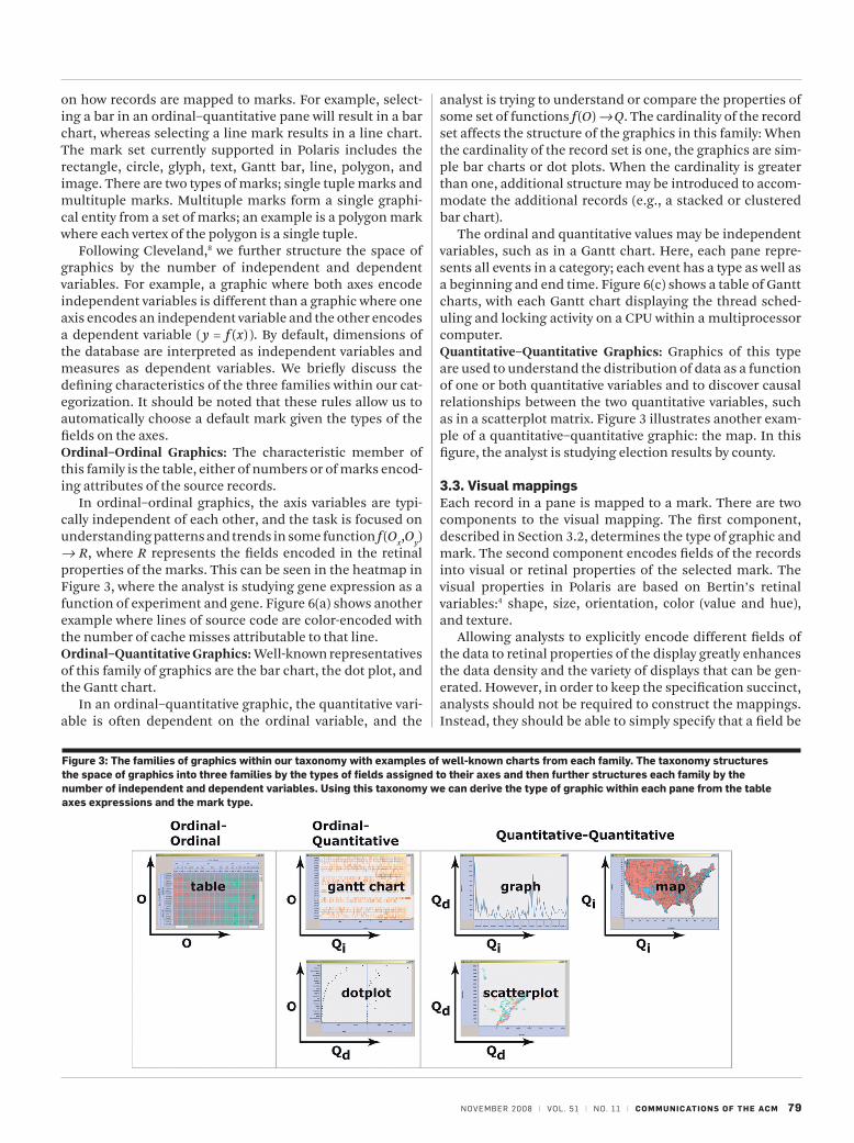
3.2. types of graphicsGiven a table configuration, the next step is to specify the type of graphic in each pane. We have developed a tax-onomy of graphics that results in an intuitive and concise specification of graphic types. This taxonomy is based on both the axes within each pane (implicitly specified from the table configuration via the role and scale of the inner-most field in the sequence) as well as the mark type repre-senting a tuple (e.g., text, shape, bar, etc.). We group this taxonomy into three families (illustrated in Figure 3) based on the axes: ordinal–ordinal, ordinal–quantitative, and quantitative–quantitative.
Each family contains a number of variants depending
A×B ={a1,...,a
n}×{b
1,...,b
m}
={a1b1,...,a
1bm,
a2b1,...,a
2bm,...,
anb1,...,a
nbm}
A×P ={a1,...,a
n}×P
={a1P,...,a
nP}
figure 2: the graphical interpretation of several expressions in the table algebra. each expression in the table algebra can be reduced to a single sequence of terms, and that sequence can then be directly mapped into a configuration for an axis of the table.
NovEmbER 2008 | vol. 51 | No. 11 | communications of the acm 79
on how records are mapped to marks. For example, select-ing a bar in an ordinal–quantitative pane will result in a bar chart, whereas selecting a line mark results in a line chart. The mark set currently supported in Polaris includes the rectangle, circle, glyph, text, Gantt bar, line, polygon, and image. There are two types of marks; single tuple marks and multituple marks. Multituple marks form a single graphi-cal entity from a set of marks; an example is a polygon mark where each vertex of the polygon is a single tuple.
Following Cleveland,8 we further structure the space of graphics by the number of independent and dependent variables. For example, a graphic where both axes encode independent variables is different than a graphic where one axis encodes an independent variable and the other encodes a dependent variable ( y = f (x) ). By default, dimensions of the database are interpreted as independent variables and measures as dependent variables. We briefly discuss the defining characteristics of the three families within our cat-egorization. It should be noted that these rules allow us to automatically choose a default mark given the types of the fields on the axes.ordinal–ordinal graphics: The characteristic member of this family is the table, either of numbers or of marks encod-ing attributes of the source records.
In ordinal–ordinal graphics, the axis variables are typi-cally independent of each other, and the task is focused on understanding patterns and trends in some function f (Ox,Oy) Æ R, where R represents the fields encoded in the retinal properties of the marks. This can be seen in the heatmap in Figure 3, where the analyst is studying gene expression as a function of experiment and gene. Figure 6(a) shows another example where lines of source code are color-encoded with the number of cache misses attributable to that line.ordinal–Quantitative graphics: Well-known representatives of this family of graphics are the bar chart, the dot plot, and the Gantt chart.
In an ordinal–quantitative graphic, the quantitative vari-able is often dependent on the ordinal variable, and the
analyst is trying to understand or compare the properties of some set of functions f (O) Æ Q. The cardinality of the record set affects the structure of the graphics in this family: When the cardinality of the record set is one, the graphics are sim-ple bar charts or dot plots. When the cardinality is greater than one, additional structure may be introduced to accom-modate the additional records (e.g., a stacked or clustered bar chart).
The ordinal and quantitative values may be independent variables, such as in a Gantt chart. Here, each pane repre-sents all events in a category; each event has a type as well as a beginning and end time. Figure 6(c) shows a table of Gantt charts, with each Gantt chart displaying the thread sched-uling and locking activity on a CPU within a multiprocessor computer.Quantitative–Quantitative graphics: Graphics of this type are used to understand the distribution of data as a function of one or both quantitative variables and to discover causal relationships between the two quantitative variables, such as in a scatterplot matrix. Figure 3 illustrates another exam-ple of a quantitative–quantitative graphic: the map. In this figure, the analyst is studying election results by county.
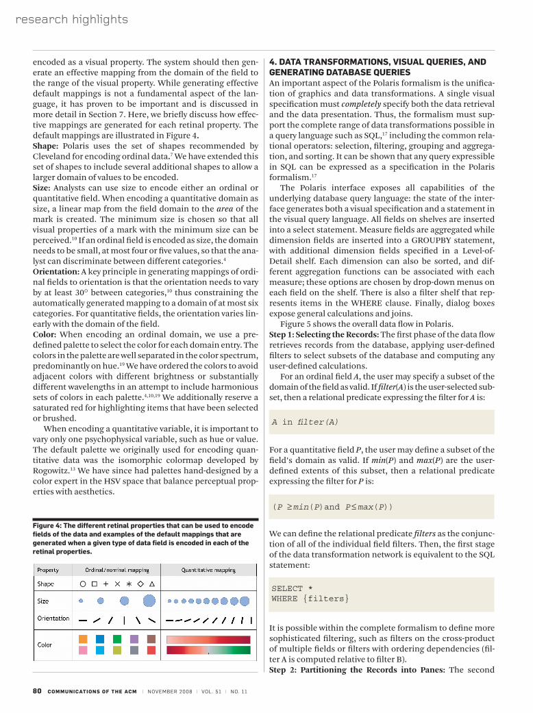
3.3. Visual mappingsEach record in a pane is mapped to a mark. There are two components to the visual mapping. The first component, described in Section 3.2, determines the type of graphic and mark. The second component encodes fields of the records into visual or retinal properties of the selected mark. The visual properties in Polaris are based on Bertin’s retinal variables:4 shape, size, orientation, color (value and hue), and texture.
Allowing analysts to explicitly encode different fields of the data to retinal properties of the display greatly enhances the data density and the variety of displays that can be gen-erated. However, in order to keep the specification succinct, analysts should not be required to construct the mappings. Instead, they should be able to simply specify that a field be
figure 3: the families of graphics within our taxonomy with examples of well-known charts from each family. the taxonomy structures the space of graphics into three families by the types of fields assigned to their axes and then further structures each family by the number of independent and dependent variables. using this taxonomy we can derive the type of graphic within each pane from the table axes expressions and the mark type.
research highlights
80 communications of the acm | NovEmbER 2008 | vol. 51 | No. 11
encoded as a visual property. The system should then gen-erate an effective mapping from the domain of the field to the range of the visual property. While generating effective default mappings is not a fundamental aspect of the lan-guage, it has proven to be important and is discussed in more detail in Section 7. Here, we briefly discuss how effec-tive mappings are generated for each retinal property. The default mappings are illustrated in Figure 4.shape: Polaris uses the set of shapes recommended by Cleveland for encoding ordinal data.7 We have extended this set of shapes to include several additional shapes to allow a larger domain of values to be encoded.size: Analysts can use size to encode either an ordinal or quantitative field. When encoding a quantitative domain as size, a linear map from the field domain to the area of the mark is created. The minimum size is chosen so that all visual properties of a mark with the minimum size can be perceived.10 If an ordinal field is encoded as size, the domain needs to be small, at most four or five values, so that the ana-lyst can discriminate between different categories.4
orientation: A key principle in generating mappings of ordi-nal fields to orientation is that the orientation needs to vary by at least 30° between categories,10 thus constraining the automatically generated mapping to a domain of at most six categories. For quantitative fields, the orientation varies lin-early with the domain of the field.color: When encoding an ordinal domain, we use a pre-defined palette to select the color for each domain entry. The colors in the palette are well separated in the color spectrum, predominantly on hue.19 We have ordered the colors to avoid adjacent colors with different brightness or substantially different wavelengths in an attempt to include harmonious sets of colors in each palette.4,10,19 We additionally reserve a saturated red for highlighting items that have been selected or brushed.
When encoding a quantitative variable, it is important to vary only one psychophysical variable, such as hue or value. The default palette we originally used for encoding quan-titative data was the isomorphic colormap developed by Rogowitz.13 We have since had palettes hand-designed by a color expert in the HSV space that balance perceptual prop-erties with aesthetics.
4. Data tRansfoRmations, VisuaL QueRies, anD GeneRatinG DataBase QueRiesAn important aspect of the Polaris formalism is the unifica-tion of graphics and data transformations. A single visual specification must completely specify both the data retrieval and the data presentation. Thus, the formalism must sup-port the complete range of data transformations possible in a query language such as SQL,17 including the common rela-tional operators: selection, filtering, grouping and aggrega-tion, and sorting. It can be shown that any query expressible in SQL can be expressed as a specification in the Polaris formalism.17
The Polaris interface exposes all capabilities of the underlying database query language: the state of the inter-face generates both a visual specification and a statement in the visual query language. All fields on shelves are inserted into a select statement. Measure fields are aggregated while dimension fields are inserted into a GROUPBY statement, with additional dimension fields specified in a Level-of-Detail shelf. Each dimension can also be sorted, and dif-ferent aggregation functions can be associated with each measure; these options are chosen by drop-down menus on each field on the shelf. There is also a filter shelf that rep-resents items in the WHERE clause. Finally, dialog boxes expose general calculations and joins.
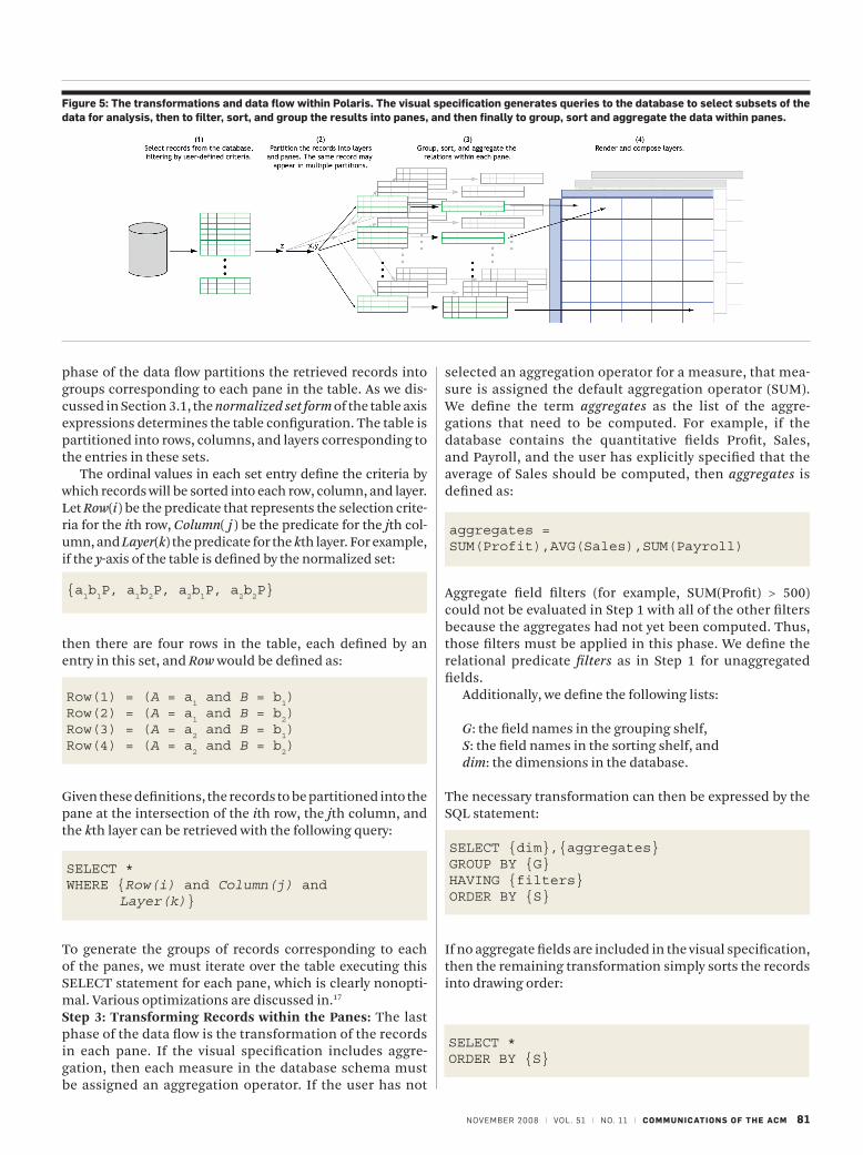
Figure 5 shows the overall data flow in Polaris.step 1: selecting the records: The first phase of the data flow retrieves records from the database, applying user-defined filters to select subsets of the database and computing any user-defined calculations.
For an ordinal field A, the user may specify a subset of the domain of the field as valid. If filter(A) is the user-selected sub-set, then a relational predicate expressing the filter for A is:
For a quantitative field P, the user may define a subset of the field’s domain as valid. If min(P) and max(P) are the user-defined extents of this subset, then a relational predicate expressing the filter for P is:
We can define the relational predicate filters as the conjunc-tion of all of the individual field filters. Then, the first stage of the data transformation network is equivalent to the SQL statement:
It is possible within the complete formalism to define more sophisticated filtering, such as filters on the cross-product of multiple fields or filters with ordering dependencies (fil-ter A is computed relative to filter B).step 2: Partitioning the records into Panes: The second
A in filter(A)
figure 4: the different retinal properties that can be used to encode fields of the data and examples of the default mappings that are generated when a given type of data field is encoded in each of the retinal properties.
(P ≥ min(P)and P ≤ max(P))
SELECT *WHERE {filters}
NovEmbER 2008 | vol. 51 | No. 11 | communications of the acm 81
figure 5: the transformations and data flow within Polaris. the visual specification generates queries to the database to select subsets of the data for analysis, then to filter, sort, and group the results into panes, and then finally to group, sort and aggregate the data within panes.
phase of the data flow partitions the retrieved records into groups corresponding to each pane in the table. As we dis-cussed in Section 3.1, the normalized set form of the table axis expressions determines the table configuration. The table is partitioned into rows, columns, and layers corresponding to the entries in these sets.
The ordinal values in each set entry define the criteria by which records will be sorted into each row, column, and layer. Let Row(i) be the predicate that represents the selection crite-ria for the ith row, Column( j ) be the predicate for the jth col-umn, and Layer(k) the predicate for the kth layer. For example, if the y-axis of the table is defined by the normalized set:
then there are four rows in the table, each defined by an entry in this set, and Row would be defined as:
Given these definitions, the records to be partitioned into the pane at the intersection of the ith row, the jth column, and the kth layer can be retrieved with the following query:
To generate the groups of records corresponding to each of the panes, we must iterate over the table executing this SELECT statement for each pane, which is clearly nonopti-mal. Various optimizations are discussed in.17
step 3: transforming records within the Panes: The last phase of the data flow is the transformation of the records in each pane. If the visual specification includes aggre-gation, then each measure in the database schema must be assigned an aggregation operator. If the user has not
selected an aggregation operator for a measure, that mea-sure is assigned the default aggregation operator (SUM). We define the term aggregates as the list of the aggre-gations that need to be computed. For example, if the database contains the quantitative fields Profit, Sales, and Payroll, and the user has explicitly specified that the average of Sales should be computed, then aggregates is defined as:
Aggregate field filters (for example, SUM(Profit) > 500) could not be evaluated in Step 1 with all of the other filters because the aggregates had not yet been computed. Thus, those filters must be applied in this phase. We define the relational predicate filters as in Step 1 for unaggregated fields.
Additionally, we define the following lists:
G: the field names in the grouping shelf,S: the field names in the sorting shelf, anddim: the dimensions in the database.
The necessary transformation can then be expressed by the SQL statement:
If no aggregate fields are included in the visual specification, then the remaining transformation simply sorts the records into drawing order:
{a1b1P, a
1b2P, a
2b1P, a
2b2P}
Row(1) = (A = a1 and B = b
1)
Row(2) = (A = a1 and B = b
2)
Row(3) = (A = a2 and B = b
1)
Row(4) = (A = a2 and B = b
2)
SELECT *WHERE {Row(i) and Column(j) and Layer(k)}
aggregates = SUM(Profit),AVG(Sales),SUM(Payroll)
SELECT {dim},{aggregates}GROUP BY {G}HAVING {filters}ORDER BY {S}
SELECT *ORDER BY {S}
research highlights
82 communications of the acm | NovEmbER 2008 | vol. 51 | No. 11
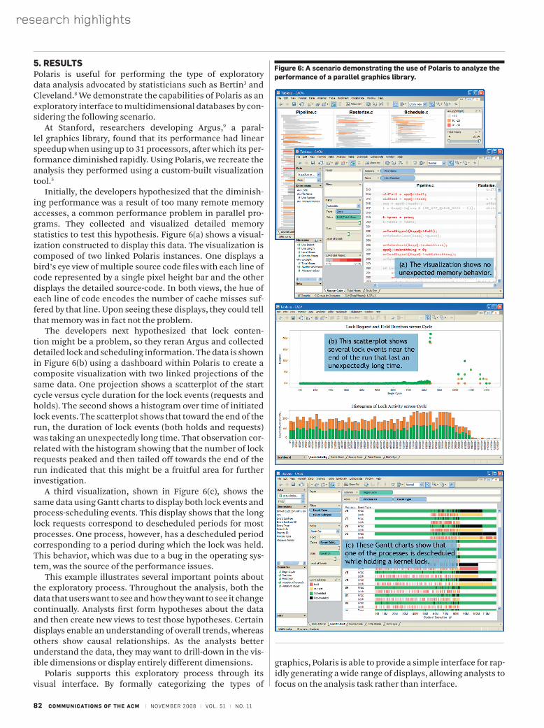
5. ResuLtsPolaris is useful for performing the type of exploratory data analysis advocated by statisticians such as Bertin3 and Cleveland.8 We demonstrate the capabilities of Polaris as an exploratory interface to multidimensional databases by con-sidering the following scenario.
At Stanford, researchers developing Argus,9 a paral-lel graphics library, found that its performance had linear speedup when using up to 31 processors, after which its per-formance diminished rapidly. Using Polaris, we recreate the analysis they performed using a custom-built visualization tool.5
Initially, the developers hypothesized that the diminish-ing performance was a result of too many remote memory accesses, a common performance problem in parallel pro-grams. They collected and visualized detailed memory statistics to test this hypothesis. Figure 6(a) shows a visual-ization constructed to display this data. The visualization is composed of two linked Polaris instances. One displays a bird’s eye view of multiple source code files with each line of code represented by a single pixel height bar and the other displays the detailed source-code. In both views, the hue of each line of code encodes the number of cache misses suf-fered by that line. Upon seeing these displays, they could tell that memory was in fact not the problem.
The developers next hypothesized that lock conten-tion might be a problem, so they reran Argus and collected detailed lock and scheduling information. The data is shown in Figure 6(b) using a dashboard within Polaris to create a composite visualization with two linked projections of the same data. One projection shows a scatterplot of the start cycle versus cycle duration for the lock events (requests and holds). The second shows a histogram over time of initiated lock events. The scatterplot shows that toward the end of the run, the duration of lock events (both holds and requests) was taking an unexpectedly long time. That observation cor-related with the histogram showing that the number of lock requests peaked and then tailed off towards the end of the run indicated that this might be a fruitful area for further investigation.
A third visualization, shown in Figure 6(c), shows the same data using Gantt charts to display both lock events and process-scheduling events. This display shows that the long lock requests correspond to descheduled periods for most processes. One process, however, has a descheduled period corresponding to a period during which the lock was held. This behavior, which was due to a bug in the operating sys-tem, was the source of the performance issues.
This example illustrates several important points about the exploratory process. Throughout the analysis, both the data that users want to see and how they want to see it change continually. Analysts first form hypotheses about the data and then create new views to test those hypotheses. Certain displays enable an understanding of overall trends, whereas others show causal relationships. As the analysts better understand the data, they may want to drill-down in the vis-ible dimensions or display entirely different dimensions.
Polaris supports this exploratory process through its visual interface. By formally categorizing the types of
graphics, Polaris is able to provide a simple interface for rap-idly generating a wide range of displays, allowing analysts to focus on the analysis task rather than interface.
figure 6: a scenario demonstrating the use of Polaris to analyze the performance of a parallel graphics library.
NovEmbER 2008 | vol. 51 | No. 11 | communications of the acm 83
6. eXPeRienceIn the 6 years since this work was originally published, we have gained considerable experience with the formalism and the interface. In that time, the technology has been com-mercialized and extended by Tableau Software as Tableau Desktop and is used by thousands of companies and tens of thousands of users. The system has also been adapted to the web, so it is possible to perform analysis within a browser. The uses are diverse, ranging from disease research in the jungles of Central America to marketing analysis in Fortune 50 companies to usability analysis by video game designers, and the data sizes range from small spreadsheets to billions of rows of data. The many types of users indicate the ubiq-uity of data and the demand for new tools. This experience has emphasized three points to us: (1) the importance of a formal approach, (2) the importance of an architecture that leverages database technology rather than replaces it, and (3) the importance of building effective defaults into the graphical interface.
One question early on was: “do we need a formalism?” Most visualization systems have predefined types of charts and use wizards to help the user construct graphs. Having a language allows us to generate an unlimited number of different types of graphics. Restricting the set of views to a small set limits the power of visualization; this would be like building into a query language a small set of predefined queries. Experience has shown that this flexibility makes it possible to incrementally build new views, which is key to smoothly supporting the analysis process. Both of these aspects of Polaris are enabled by the formal nature of the algebra, where every addition or deletion leads to a new alge-braic statement.
The formalism also enables us to unify the specifica-tion of the visualization with the database query: users can change the query used to fetch the data and their view of it simultaneously. In subsequent work, we have proved that the language is complete; that is, it is possible to generate any statement in the relational algebra. A major problem with many visual interfaces is that they restrict the types of queries that can be formed.
This unification of visualization and database queries is also a key architectural decision that makes it possible to use our system as a front-end to large parallel database serv-ers. This makes it easy to access important data in existing data sources, to leverage high performance database tech-nology (e.g., database appliances, massively parallel com-putation, column stores), and to avoid data replication and application-specific data silos. Why move a terabyte of data if you don’t have to?
One potential issue with a compositional language is that it creates a large space of possible visualizations. While many are effective and aesthetically pleasing, many are not. Thus, choosing default graphics is an important part of any production system and allows for additional succinctness in the language. However, the issue is not just with choosing default graphics. Generating effective visual mappings (e.g., color, shape) by default is not a fundamental aspect of the language, but is equally important. Effective defaults enable users to focus on their task and questions rather than the
details of color or shape selection, especially since many users are not trained as graphic designers or psychologists.
7. ReLateD WoRKThe related work to Polaris can be divided into two catego-ries: formal graphical specifications and database explora-tion tools.
7.1. formal graphical specificationsWe have built on the work of several researchers’ insights into the formal properties of graphic communication, such as Bertin’s Semiology of Graphics,4 Cleveland’s experimen-tal results on the perception of data,7,8 Wilkinson’s formal-ism for statistical graphics,22 and Mackinlay’s APT system.12 However, the Polaris formalism is innovative in several ways. One key aspect of our approach is that all specifications can be compiled directly into queries. Existing formalisms do not consider the generation of queries to be related to the presentation of information. Another innovation is the use of an algebra to describe table-based displays. Tables are particularly effective for displaying multidimensional data, as multiple dimensions of the data can be explicitly encoded in the structure of the table. Finally, our formalism is the basis for several interactive tools for analyzing and explor-ing large data warehouses and this usage has affected the development of the formalism.
7.2. Database exploration toolsThe second area of related work is visual query and data-base exploration tools. Academic projects such as Visage,14 DEVise,11 and Tioga-21 have focused on developing visualiza-tion environments that support interactive database explo-ration through visual queries. Users construct queries and visualizations through their interactions with the visualiza-tion system interface. These systems have flexible mecha-nisms for mapping query results to graphs, and support mapping database records to retinal properties. However, none of these systems is based on an expressive formal lan-guage for graphics nor do they leverage table-based organi-zations of their visualizations.
Finally, existing systems, such as XmdvTool,21 Spotfire,15 and XGobi6 have taken the approach of providing a set of predefined visualizations, such as scatterplots and parallel coordinates. These views are augmented with interaction techniques, such as brushing and zooming, which can be used to refine the queries. We feel that this approach is much more limiting than providing the user with a set of building blocks that can be used to interactively construct and refine a wide range of displays to suit any analysis task.
8. concLusionsWe have presented Polaris, a visual query language for data-bases and a graphical interface for authoring queries in the language. The Polaris formalism uses succinct visual specifi-cations to describe a wide range of table-based visualizations of multidimensional information. Visual specifications can be compiled into both the queries and the drawing com-mands necessary to generate the displays, thus unifying anal-ysis and visualization into a single visual query language.
84 communications of the acm | NovEmbER 2008 | vol. 51 | No. 11
research highlights
Using the Polaris formalism, we have built the Polaris interface. The Polaris interface directly supports the cycle of analysis. Analysts can incrementally create sophisticated visualizations using simple drag-and-drop operations to construct a visual specification. This interface has been commercialized and extended by Tableau Software and is now in use by tens of thousands of users in thousands of companies.
acknowledgmentsThe authors especially thank Robert Bosch for his contribu-tion to the design and implementation of Polaris, his review of manuscript drafts, and for many useful discussions. The authors also thank Maneesh Agrawala for his insightful reviews and discussions on early drafts of this paper. This work was supported by the Department of Energy through the ASCI Level 1 Alliance with Stanford University.
1. aiken, a., Chen, J., stonebraker, m., and Woodruff, a. tioga-2: a direct manipulation database visualization environment. Proceeding of the 12th International Conference on Data Engineering, february 1996, pp. 208–217.
2. becker, r., Cleveland, W. s., and douglas martin, r. trellis graphics displays: a multi-dimensional data visualization tool for data mining. 3rd Annual Conference on Knowledge
Discovery in Databases, august 1997. 3. bertin, J. Graphics and Graphic
Information Processing. Walter de Gruyter, berlin, 1980.
4. bertin, J. Semiology of Graphics. the university of Wisconsin press, madison, Wi, 1983. translated by W. J. berg.
5. bosch, r., stolte, C., stoll, G., rosenblum, m., and hanrahan, p. performance analysis and visualization of parallel systems
using simos and rivet: a case study. Proceedings of the Sixth Annual Symposium on High-Performance Computer Architecture, January 2000, pp. 360–371.
6. buja, a., Cook, d., and swayne, d. f. interactive high-dimensional data visualization. Journal of Computational and Graphical Statistics, 5(1):78–99, 1996.
7. Cleveland, W. s. The Elements of Graphing Data. Wadsworth advanced books and software, pacific Grove, Ca, 1985.
8. Cleveland, W. s. Visualizing Data. hobart press, new Jersey, 1993.
9. igehy, h., stoll, G., and hanrahan, p. the design of a parallel graphics interface. Proceedings of SIGGRAPH, 1998, pp. 141–150.
10. Kosslyn, s. m. Elements of Graph Design. W.h. freeman and Co., new york, ny, 1994.
11. livny, m., ramakrishnan, r., beyer, K., Chen, G., donjerkovic, d., lawande, s., myllymaki, J., and Wenger, K. devise: integrated querying and visual exploration of large datasets. Proceeding of ACM SIGMOD, may, 1997.
12. mackinlay, J. d. automating the design of graphical presentations of relational information. ACM Transaction of Graphics, april 1986, pp. 110–141.
13. rogowitz, b. and treinish, l. how not to lie with visualization. Computers in Physics, may/June 1996, pp. 268–274.
14. roth, s. f., lucas, p., senn, J. a., Gomberg, C. C., burks, m. b., stroffolino, p. J., Kolojejchick, J., and dunmire, C. visage: a user interface environment for exploring information. Proceeding of Information Visualization, october 1996, pp. 3–12.
15. spotfire inc. [online] available: http://www.spotfire.com, cited september 2001.
16. stevens, s. s. on the theory of scales of measurement. Science, 103:677–680.
17. stolte, C. Query, analysis, and visualization of multidimensional databases. phd dissertation, stanford university, June 2003.
18. thomsen, e. OLAP Solutions: Building Multidimensional Information Systems. Wiley Computer publishing, new york, 1997.
19. travis, d. Effective Color Displays: Theory and Practice. academic press, london, 1991.
20. tufte, e. r. The Visual Display of Quantitative Information. Graphics press, box 430, Cheshire, Ct, 1983.
21. Ward, m. xmdvtool: integrating multiple methods for visualizing multivariate data. Proceedings of Visualization, october 1994, pp. 326–331.
22. Wilkinson, l. The Grammar of Graphics. springer, new york, ny, 1999.
References
Chris Stolte is founder and vice president of tableau software, seattle, Wa. Diane Tang is a software researcher at Google, inc., mountain view, Ca. Pat Hanrahan is Canon usa professor in the school of engineering at stanford university, stanford, Ca.
� ACM Professional Members can enjoy the convenience of making a single payment for theirentire tenure as an ACM Member, and also be protected from future price increases bytaking advantage of ACM's Lifetime Membership option.
� ACM Lifetime Membership dues may be tax deductible under certain circumstances, sobecoming a Lifetime Member can have additional advantages if you act before the end of2008. (Please consult with your tax advisor.)
� Lifetime Members receive a certificate of recognition suitable for framing, and enjoy all ofthe benefits of ACM Professional Membership.