73
Analyzing Quantitative Data- using SPSS 16 Week 9 Andre Samuel Andre Samuel

Analyzing Quantitative Data-using SPSS 16
Week 9Andre SamuelAndre Samuel

A Simple Example- GymA Simple Example Gym
• Purpose of Questionnaire-Purpose of Questionnaire– to determine the participants involvement in
adult fitnessadult fitness– Reasons for going to the gym– Kinds of activities adults participate in– Kinds of activities adults participate in– to determine if Involvement is associated with
attitudinal loyaltyattitudinal loyalty– Issues related to gender and age

Using SPSSUsing SPSS• Step 1- use coded Questionnaire to
D fi V i bl i V i bl ViDefine Variables using Variable Viewer. Each question is a Variable.
• Step 2- Input data into Data Viewer. Each l t d ti i icompleted questionnaire is a case.
• Step 3- Analyze data using Analyze Menuand Graphs Menu

SPSS Data ViewerSPSS Data Viewer
Each Column represents a Variable
Each Row represents a pCase

Step 1- Defining VariablesStep 1 Defining Variables
Click on the Variable View tab at theClick on the Variable View tab at the bottom of the Data Viewer

• For each variable (question) enter aFor each variable (question) enter a Name, Label, Values and Measure
• Enter variable in a new row• Enter variable in a new row

Enter NameEnter Name
• For each variable enter a nameFor each variable enter a nameClick on the first cell in the Name columnT th Q1 G dType the name e.g. Q1 or GenderThe name must not be longer than 8 characters and cannot contain spaces

Enter LabelEnter Label
• You can give each variable a moreYou can give each variable a more detailed name, known as a LabelClick on the first cell under the LabelClick on the first cell under the Label columnT i th l b l t tType in the label you want to use e.g. reasons for visiting gym

Enter ValuesEnter Values• This procedure generally applies to variables
th t t i t l lthat are not interval or scaleClick on the Values column relating to the variablevariable Click on the button with the 3 dots on itThe Value Label dialog box will appearThe Value Label dialog box will appearClick on the box next to value, enter 1Click on the box next to Label, enter MaleClick on the box next to Label, enter MaleClick on AddRepeat for each value (response option)p ( p p )Click OK when complete

Value Label Dialog BoxValue Label Dialog BoxEnter Value and Labeland Label
Click Add to save
tentry and add another Click when
completecomplete

Enter MeasuresEnter MeasuresAre there more than two categories?
YES NO Dichotomous
Can the categories be rank ordered?
N i lYES NO Nominal
Are the distances between categories equal?
YES NO Ordinal
Interval/Scale

Gym Questionnaire MeasuresGym Questionnaire MeasuresQuestion Number
Type of MeasureNumber1 Dichotomous/Nominal
2 Interval/Scale
3 Nominal3 Nominal
4 Ordinal
5 Ordinal
6 Ordinal
7 Nominal
8 Dichotomous/Nominal
9 Nominal
10 Interval/Scale
11 Interval/Scale
12 Interval/Scale

• For each variable use drop down list and choose appropriate type
• Repeat for all variablesp

Step 2- Input DataStep 2 Input DataClick on the Data View tab to the bottom
Click on the Value label button to switch b L b l d V lbetween Label and ValueEnter the responses for each questionE h t fill d t ti iEach row represents a filled out questionnaire

Step 3- Analyze DataStep 3 Analyze Data
• Frequency Tables-Frequency Tables– provides the number of people and the
percentage belonging to each categories forpercentage belonging to each categories for the variable in question
– Can be used for all types of variablesCan be used for all types of variables– An example can be derived for Q3- Reason
for visiting the Gymg y

Click on Analyze MenuC c o a y e e uClick on Descriptive StatisticsClick on FrequenciesClick on FrequenciesThe Frequencies Dialog box opensChoose variable from list on left hand, click on the arrow to send into Variable boxClick OKFrequency Table will be displayed on Output ViewerOutput Viewer

1. Choose Variable from list
2. Click on arrow to send to variable box
3 Click OK3. Click OK to complete

• Measures of Central Tendency-– Used to calculate Mean, Median, Mode,
Standard Deviation– An example, Q2- Age

Click on Analyze MenuClick on Descriptive StatisticsClick on ExploreClick on ExploreThe Explore Dialog box opensCh i bl f li t l ft h dChoose variable from list on left hand, click on the arrow to send into Dependent Li tListClick OK

1. Choose Variable
2. Click on Arrow to send to Dependent Li tList
3. Click OK

• Diagrams-g– Used to display quantitative data– Easy to interpret and understandy p– Bar chart and Pie charts use Ordinal and
Nominal variables– An Example can be a Bar Chart to display Q6-
Frequency of Visit

Click on Graphs MenupClick on Chart BuilderMake sure Gallery tab is selectedMake sure Gallery tab is selectedClick on Bar from list on left hand sideChoose format you want and drag andChoose format you want and drag and drop it onto the area aboveChoose variable from list on left sideChoose variable from list on left side-Visit FrequencyDrag and drop onto X axisDrag and drop onto X axisClick OK

1. Make sure Gallery tab is yselected
2 Select2. Select Bar
3. Select format drag and dropdrop

4 Choose4. Choose Variable-Visit Frequency
5 Drag and5. Drag and Drop onto X Axis
6. Click OK

• Another Example could be a Pie Chart for Q7- AccompanimentFrom List Click on Pie/PolarChoose format you want and drag and drop it onto the area abovedrop it onto the area aboveChoose variable from list on left side-AccompanimentAccompanimentDrag and drop onto Slice ByClick OK

3. Choose Variable and drag and drop onto Slice bySlice by
2. Select format and drag and drop
1. Choose Pie/Polar
drop
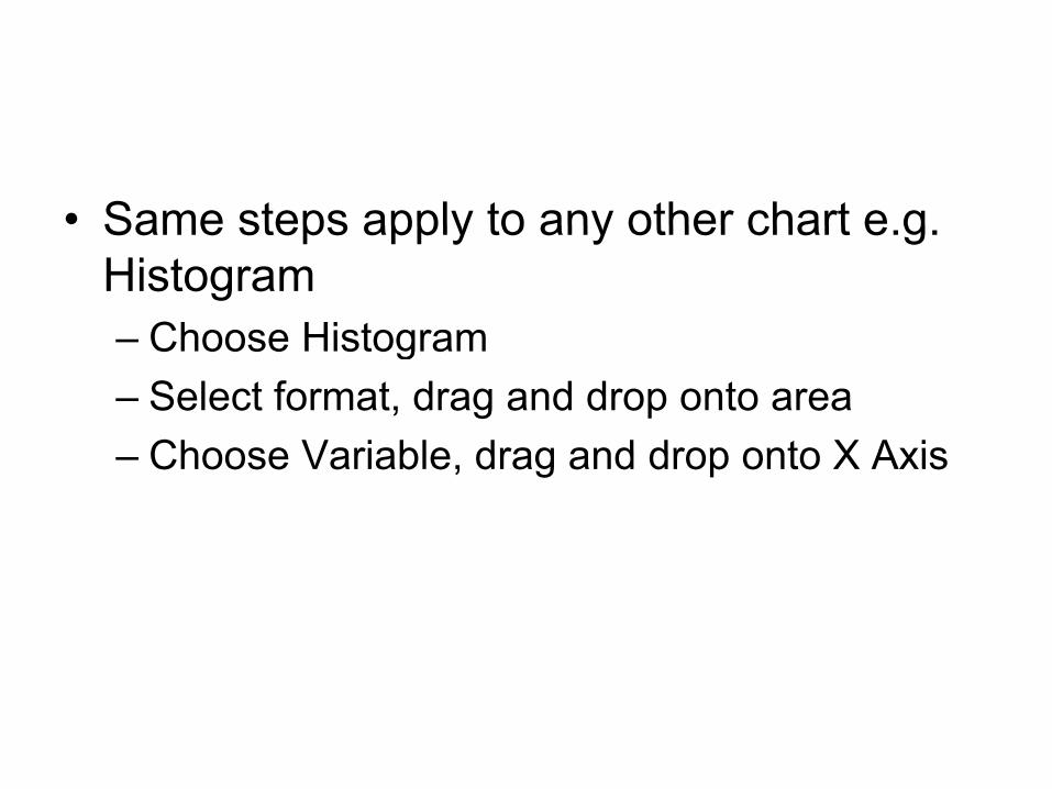
• Same steps apply to any other chart e gSame steps apply to any other chart e.g. Histogram
Choose Histogram– Choose Histogram– Select format, drag and drop onto area
Choose Variable drag and drop onto X Axis– Choose Variable, drag and drop onto X Axis

• Cross Tabulation-– Allows two variables to be simultaneously
analyzed so that relationships can be examined
– Normal for Cross tab tables to include percentages
– The percentages can be shown either by row lor column
– An example, gender and reasons for visiting, t d t i if th i i ti Whto determine if there is any association. Why do Men visit or Why do Women visit?

• Click on Analyze MenuClick on Analyze Menu• Click on Descriptive Statistics
Click on CrosstabsClick on Crosstabs…Choose Variable for Row from list on left side use arrow to selectside, use arrow to selectChoose Variable for Column, use arrow to selectselectClick on Cell button on rightIn the Percentage section Check theIn the Percentage section Check the boxes for Row or Column or both

1. Choose Variable for Row
2. Click on Arrow to select
3 Ch3. Choose Variable for Column
4 Cli k4. Click on Arrow to select
5. Click on Cells B ttButton

6. Check appropriate optionoption
• Click on Continue• Click OK to generate cross tabulation

• Pearson’s r-Pearson s r– Is a method for examining relationships
between interval/scale variablesbetween interval/scale variables– The coefficient lie between -1 (perfect
negative relationship) and 1 (perfect positivenegative relationship) and 1 (perfect positiverelationship), where 0 (no relationship)
– An example, we can find out if there is any p , yrelationship between
• Age and Cardio minutes• Age and Weight minutes
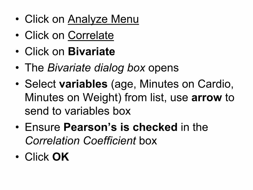
• Click on Analyze Menu• Click on Correlate• Click on BivariateClick on Bivariate• The Bivariate dialog box opens
S l t i bl ( Mi t C di• Select variables (age, Minutes on Cardio, Minutes on Weight) from list, use arrow to
d t i bl bsend to variables box• Ensure Pearson’s is checked in the
Correlation Coefficient box• Click OK

1. Select variables from list
2. Use arrow to send to Variable boxVariable box
3. Make sure3. Make sure Pearson is checked
4. Click OK

• Coefficient of DeterminationCoefficient of Determination– Express how much of the variation in one
variable is due to the other variablevariable is due to the other variable– COD = r2
– COD as a percentage = r2 X 100– COD as a percentage = r X 100– Using the example of Min on Cardio and Age
COD % = 1 2%– COD % = 1.2%– This means that just 1.2% of the variation of
Mins on Cardio is accounted for by AgeMins on Cardio is accounted for by Age

• Spearman’s-Spearman s– Is designed for use of pairs of ordinal
variables– But also used when one variable is ordinal
and the other interval/scale– Same as Pearson’s, i.e. coefficient lie
between -1 and 1An Example to find out if there is any– An Example, to find out if there is any relationship between visit frequency and Minutes on other activities

• Click on Analyze Menuy• Click on Correlate• Click on Bivariate• Click on Bivariate• The Bivariate dialog box opens• Select variables (Visit frequency, Minutes
on other activities) from list, use arrow to send to variables box
• Ensure Spearman is checked in the Correlation Coefficient box
• Click OKC c O

1. Select variables
2. Use arrow to send to Variable boxbox
3. Ensure S iSpearman is checked
4 Click OK4. Click OK

• Scatterplots-Scatterplots– Used to plot the relationship between two
variablesvariables– One variable on the X axis and the other on
the Y Axisthe Y Axis– Best fit line is added to show correlation– An example for Minutes on cardio and AgeAn example, for Minutes on cardio and Age

Click on Graphs MenuClick on Chart BuilderMake sure Gallery tab is selectedClick on Scatter/Dot from list on left hand sideChoose format you want and drag and drop it onto the area aboveChoose variable from list on left side- Age, Drag and drop onto X axisChoose variable from list on left side- Minutes
C di D d d t Y ion Cardio, Drag and drop onto Y axisClick OK
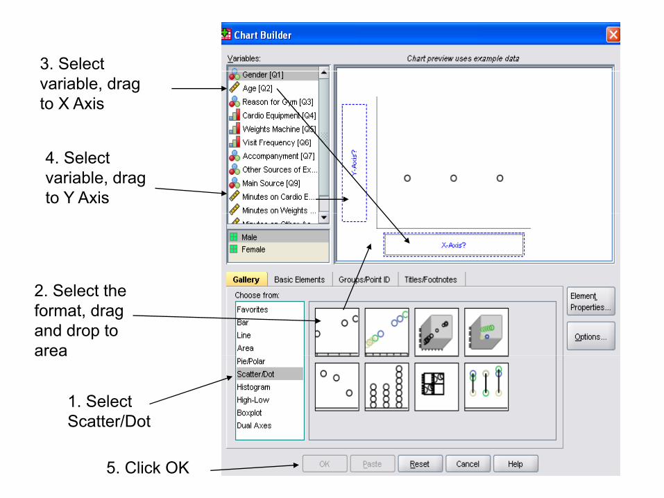
3. Select variable, drag to X Axis
4. Select variable, drag to Y Axis
2 S l h2. Select the format, drag and drop to area
1. Select Scatter/Dot
area
Scatter/Dot
5. Click OK

• Hypothesis Testingy g– A hypothesis is a claim or statement about a
property of a population– A hypothesis test is a standard procedure for
testing a claim– Usually have a Null Hypothesis: H0
– Alternative Hypothesis: H1
– General Rule:• If absolute value of the Test Statistic exceeds the
Critical Values then Reject H0
• Otherwise, fail to reject H0

• Hypothesis Testing for a Correlation yp g– Use a Student t Distribution– Test Statistic = (r- µr) / Sr
’ ff– r is Pearson’s correlation coefficient– µr is the claimed value of the mean– S is the claimed value of the Standard DeviationSr is the claimed value of the Standard Deviation
– H0 : p=0 (there is no linear correlation)– H1 : p≠0 (there is a linear correlation)
So If H is Rejected conclude that there is a– So, If H0 is Rejected, conclude that there is a significant relationship between the two variables
– if you fail to Reject H0 , then there is not sufficient id t l d th t th i l ti hievidence to conclude that there is a relationship

Click on Analyze MenuClick on Analyze Menu• Click on Compare Means• Click on Paired-Samples T Test
Choose variable from list on left side-Age, use arrow to send to variables boxChoose variable from list on left side-Choose variable from list on left sideMinutes on Cardio, use arrow to send to variables boxvariables boxClick OK
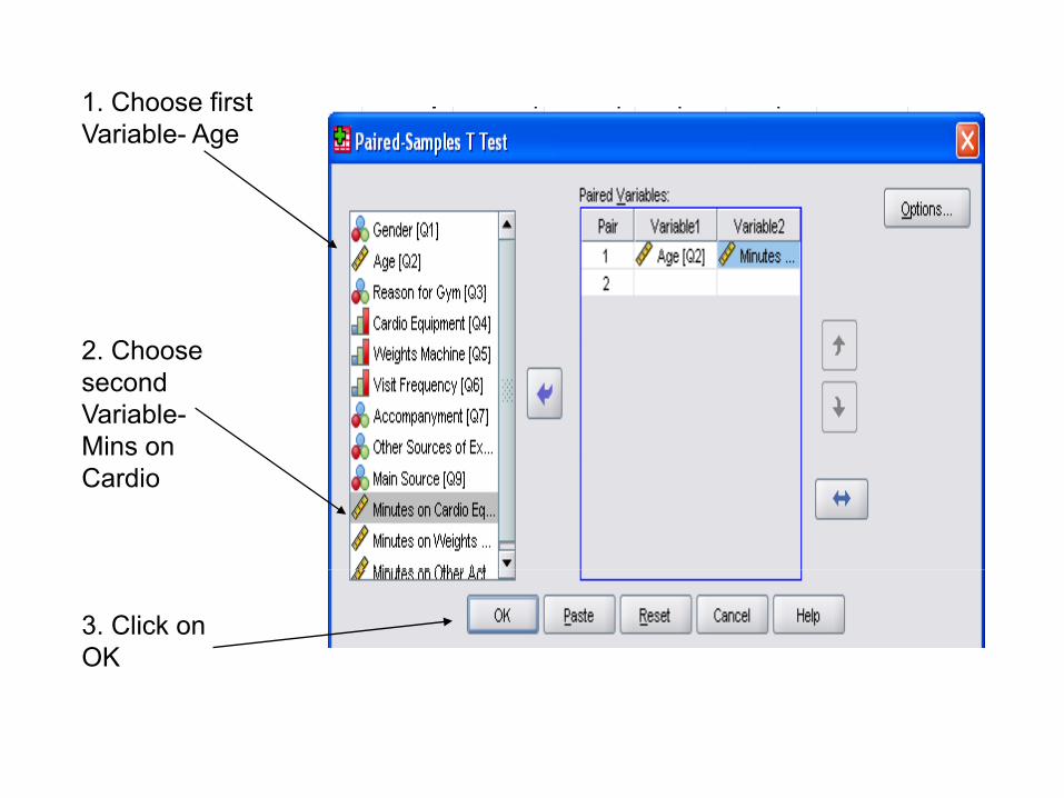
1. Choose first Variable- Age
2 Ch2. Choose second Variable-Mins on Cardio
3. Click on OK

• Using a Significance level of 5% two-Using a Significance level of 5%, twotailed, The Critical Value = 1.662
• t = 4 840• t = 4.840• Since t > Critical Value we Reject H0
• conclude that there is a significant correlation between Age and Min on Cardio

More functions of SPSS and Analyzing Qualitative Data

Multivariate AnalysisMultivariate Analysis
• This entails simultaneous analysis of threeThis entails simultaneous analysis of three or more variables
• There are three contexts:• There are three contexts:– Could the relationship be Spurious?
C ld th b i t i i bl ?– Could there be an intervening variable?– Could a third variable moderate the
l ti hi ?relationship?

Could the relationship be SpuriousCould the relationship be Spurious• Spurious relationship exists when there
appears to be a relationship between twoappears to be a relationship between two variables, but the relationship is not real
• That is it is being produced because eachThat is, it is being produced because each variable is itself related to a third variable
• For exampleFor example, – lets say we found a relationship between Visit
Frequency and minutes on cardio q yequipment
– We might ask could the relationship be an t f t fartefact of age

– The older one is, the more likely you are to i it th dvisit the gym, and
– The older you get the more likely you are to spend more time on cardio equipmentspend more time on cardio equipment
Age
Visit Frequency
Minutes on C diFrequency Cardio

Could there be an intervening i bl ?variable?
• Let us say that we do not find theLet us say that we do not find the relationship to be spurious
• We might ask why there is a relationshipWe might ask why there is a relationship between two variables?
• In other words is there a more complexIn other words is there a more complex relationship between the two variables?
• For exampleFor example– What if we explore the relationship between
Visit Frequency and Total Fitness?– We might find that there is a relationship

– That is, the more you visit the gym the more y gylikely you would be fit
– But, we might want to further explore this relationship
– We could speculate that the older you get visit frequency will be higher is associated, which in turn leads to enhanced fitness
Visit Frequency
Age Total Fitness

Could a third variable moderate the l i hi ?relationship?
• We might ask- does the relationshipWe might ask does the relationship between two variables hold for men but not for women?not for women?
• If it does then the relationship is said to be moderated by Gendermoderated by Gender
• For example– Whether the relationship between Age and
whether visitors have other sources of exercise is moderated by genderexercise is moderated by gender

• This would imply, if we find a pattern s ou d p y, e d a pa erelating to age to other sources of exercise, that pattern will vary by gender, p y y g
Table 1

Table 2

• Table 1 Suggest that the age group 31- 40 gg g gare less likely to have other sources of exercise than the 30 and under and 41 and over age groups
• Table 2 which breaks the relationshipTable 2 which breaks the relationship down by gender, suggests that the pattern for males and females is somewhatfor males and females is somewhat different– Among males the pattern is very pronouncedAmong males the pattern is very pronounced– But for females the likelihood of having other
sources of exercise decline with gendersou ces o e e c se dec e ge de

Using SPSS to generate a Cross T b l i i h h i blTabulation with three variables
• Click on Analyze MenuClick on Analyze Menu• Click on Descriptive Statistics• Click on Crosstabs• Click on Crosstabs• Choose other sources of exercise add to
rows use arrowrows use arrow• Choose agegp3 (recoded variable) add to
columns use arrowcolumns use arrow• Choose gender add to box below Layer 1
of 1 use arrowof 1 use arrow


• Click on cells button• Check the observed option in the Count box• Check the observed option in the Count box• Check column option in the Percentage box
Cli k ti t b ll di l ill l• Click continue crosstab:cell display will close• Then click OK in the

Recoding VariablesRecoding Variables
• Using Age as the exampleUsing Age as the exampleClick on Transform MenuCli k R d i t Diff t V i blClick on Recode into Different VariablesChoose age from variable listUse arrow to send to Input VariableType the agegp in the Output VariableType the agegp in the Output Variable NameClick on change buttonClick on change button

Original Recoded (new) gname of variable
( )name of variable
Change Button
Old and New Values Button
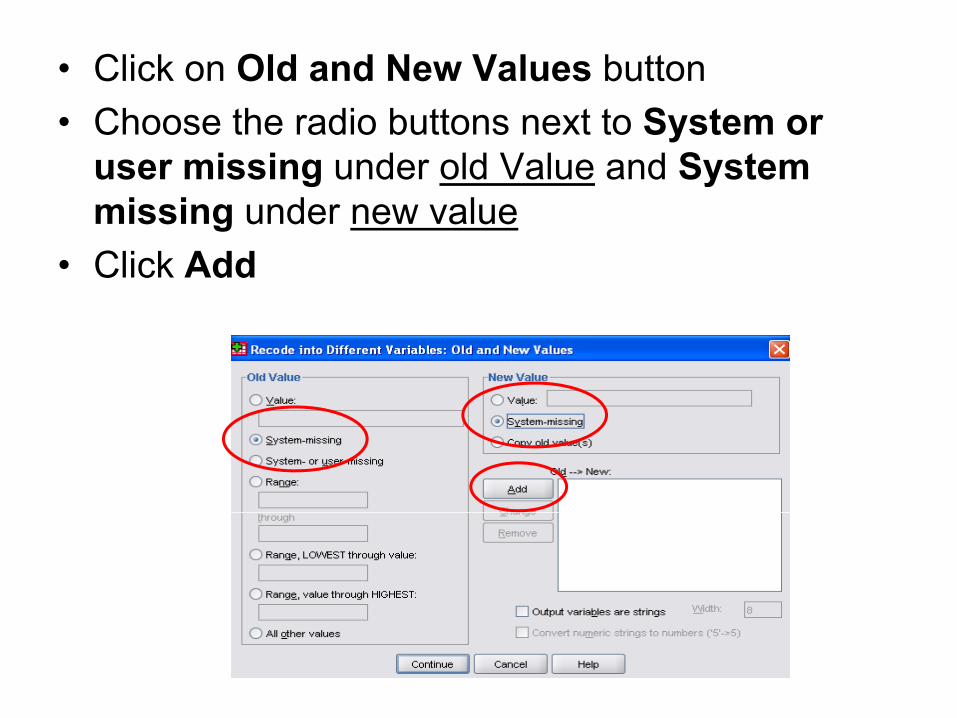
• Click on Old and New Values button• Choose the radio buttons next to System or
user missing under old Value and System missing under new valuemissing under new value
• Click Add

• Next, under Old Value choose the radio button by Range LOWEST throughbutton by Range, LOWEST through value, enter 20 in the box by valueU d N V l t 1i th l b• Under New Value type 1in the value box
• Click Add

• Next, under Old Value Choose the radio button Range, type 21 in first box and 30 in box after throughtype 21 in first box and 30 in box after through
• In New value section type 2 as the value• Click Add• Repeat for 31 to 40 value 3 and 41 to 50 value 4

• Lastly, under old value choose radio b tt R l th h HIGHESTbutton Range, value through HIGHEST, type 51 in the boxU d N l t 5 i th l b• Under New value type 5 in the value box
• Click Add

Computing a New VariableComputing a New Variable
• We can calculate the Total Minutes spentWe can calculate the Total Minutes spent in the gym by summing three variables: minutes on cardio minutes on weightsminutes on cardio, minutes on weights and minutes on other
• Click on Transform Menu• Click on Transform Menu• Click on Compute Variable• Under target variable type TotalMinutes
(no space)

• Choose first variable Minutes on Cardiofrom list use arrow to send to numericalfrom list use arrow to send to numerical expression box. Click on + in calculator
• Choose second variable Minutes on• Choose second variable Minutes on Weights from list use arrow to send to numerical expression box Click on + innumerical expression box. Click on + in calculator
• Choose third variable Minutes on OtherChoose third variable Minutes on Other from list use arrow to send to numerical expression box. Click on + in calculatorp
• Click OK

Type new Variable
Numerical expression
name
ChChoose variables

Chi Square TestChi Square Test
• The Chi-Squared test is applied to contingency q pp g ytables (crosstab)
• It allows us to establish how confident we can be that there is a relationship between twothat there is a relationship between two variables in the population
• The Chi-Squared value means nothing on its own
• Only meaningful when interpreted in relation to its associated level of statistical significance e.g. ts assoc ated e e o stat st ca s g ca ce e g5%.
• This means there is a 5 in 100 chance that there might be a relationship when there is none in themight be a relationship when there is none in the population

• We also have to setup a Null HypothesisWe also have to setup a Null Hypothesis. This stipulates that two variables are not related in the populationrelated in the population
• Lastly, we have determine the Critical Value which is determined by the degreesValue, which is determined by the degrees of freedom and significance levelD f F d ( f l• Degrees of Freedom= (no of columns-1)(no of rows-1)
• Need to use Chi-Squared Distribution tables to look up Critical Value

Example• Suppose we wanted to confirm or prove
that is no relationship between genderp gand Reason for Gym
• Significance level 5% (0 05) meaning 95%Significance level 5% (0.05) meaning 95% confidence level that there is no relationshiprelationship
• Null Hypothesis Ho: there is no relationship• Degrees of freedom = (2 1)(4 1)=3• Degrees of freedom = (2 -1)(4 – 1)=3• Critical Value = 7.815• From SPSS Chi-Squared value= 22.726

Chi-Squared Value
Pearson CoefficientCoefficient confirming that there is a relationship. Negative in nature

• So we can reject H : there is no relationshipSo we can reject Ho: there is no relationship since the Chi-Squared value is greater than the Critical Value
• And conclude that there is a relationship between Gender and Reason for gym at the 5% gysignificance level
• Also Pearson’s Correlation confirms that there is a relationship


