25
Magazine Planning Real Estate magazine planning.
| Date post: | 22-Aug-2015 |
| Category: |
Education |
| Upload: | akiasmedia |
| View: | 70 times |
| Download: | 2 times |

Magazine Planning Real Estate magazine planning.

Introduction• The second main task at this stage was to
creatively plan front cover, content page and double spread article for a Property magazine. Using preliminary task and research into existing property magazine institution as well as design codes and conventions, I had to produce initial drafts which are supported with a range of visual stimulus.
• The follow up task was to produce a detailed project treatment with an outline of a magazine pitch. Which analytically justifies design needs and wants as well as my creative intentions.

Inspiration
Property magazine that I intend to design and make is, directly influenced by existing magazines such as examples displayed above. In order to follow magazine publishing design codes and conventions, and in order to appeal to potential target audience in my own magazine designs I will incorporate visual and written specifications as outlined in my analytical research.

Analysis of my inspirationThis masthead
inspired me because it is very bold and
clear. It takes up the whole upper part of
the magazine making it very eye catchy since it is
very big. The color scheme of this cover is pretty shady and dark. The overall is very simple, classy and professional.
The white background blends well with the main image that mostly consists of grey
shades.
This strapline is very good, first of all because it says
exactly what customers need to see on a cover, it represents luxury and seriousness. It
is in grey so it perfectly matches the overall cover.
Main image is very inspiring to me
because it is very classy and exactly what a cover photo should be. It is the
view from a penthouse that looks over Dubai and the
famous tallest building in the world
Burj Khalifa
The main cover line is very short and simple, but interesting enough to attract customers. It is very fit to the main
image because it shortly explains what a thrill that view offers to the
owner of the apartment.

2nd Analysis Main image in this case is very inspiring to me because I love the font. The font is sans-serif and it is plain but very visible and noticeable. Since the background is blue, the masthead is white so people can notice it and read it without struggling. I love the ‘Maui now’ in between of letters E and A because it first of all notifies the customer that this issue is about Maui (Hawaii) properties, second of all it looks very cool and unusual.
This tells the customer that it is free. So it definitely attracts more customers.
The main image is very eye catchy since it represents a gorgeous breath taking house with the pop of vivid colors that might attract the customer at the beginning. I love that the main image is displayed all over the cover and then the heading goes over it. The image was taken at evening so the lights are on and it gives the best look of the house possible. It looks even more luxurious and breath taking. Main and sub cover line-s
are placed also on the main cover image. The main
cover line is in yellow so it is obviously something that magazine editors want the customers to notice. The
other lines are in white so it can be visible since the background is darker.

Draft font styles
Real Estate
Real EstateReal
Estate
Real Estate Real
EstateReal Estate

Final Font Styles
T-imes new roman: Text
B-odoni MT Poster Compressed: Heading
Chaparral Pro Light: SubheadingCentury Gothic- Content page

Color SchemeThe black is for the Heading , text and the numbers marking the pages. Cover lines too.
This color can be used as a background.
The grey is for Quotations.
Cover lines

Possible magazine names
Possible Magazine Names
Property
Today
Luxury Property A listings
Real Estate
Luxurious Housing
BELGRADE LUX PROPERTY
BELGRADE REAL ESTATE
Luxury Residences
Magazine name• I have chosen ‘A LISTINGS’ name because it is very
unique, I thought of it and I did thorough research and then realized there is no magazine existing that carries this name. In my opinion this name gives out a serious and modern luxurious feeling.
• I am doing it in font called ‘Blade Runner Movie’ because I liked the powerful look it gives out and it is very unique.
• The name is easy to read and easy to remember.’ A’ stands for high achievement and luxury in this case because in my magazine only ‘A’ properties will be listed.

Cover Draft
Su
MASTHEAD
MAIN IMAGE
Price/date
Sub Headings Topic
s
The Masthead- has to be eye catchy, readable and short. This is Bodoni MT poster font. I is on the top because the first thing the customer looks is up for the masthead. It is in black because it is bold and serious. Sub headings and topic lines- exist in every front cover. It is placed under the main heading and it serves as an info about what else is in the magazine to read about. The font I’ve chosen is Chaparral pro, it is a serif font very elegant and classy just the right fit for a magazine like this. This is the initial layout so the color changes due to the background (main image) , now I’ve used red to emphasize the simplicity and subtleness.Main image- has to be very interesting and figuratively speaking breath taking in case of real estate magazine, if the property on the cover delights the customer they will buy the magazine. In property magazine case, the main image should be very modern because it is the present time and people love modern things.Price and Date- is positioned in the down left corner, it is the place where people usually look for the price and issue no. it should be visible but not too markedly.
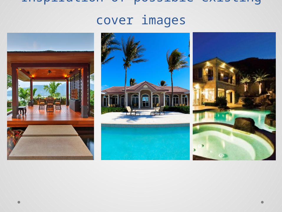
Inspiration of possible existing cover
images

Content page draftContent
Page
IMAGE
IMAGE
IMAGE
Contents- are lines that help the reader when they open the magazine to find their way through it, it lists all the topic issued and numbers of pages with each article. It is in Bodoni MT font in black and red to add a bit of color so it doesn’t look to plane and effortless.
The title content page- is positioned in the upper right corner, because that is where the title contents is usually, and the customer looks there out of habit immediately.
Content lines
The background- is lighter grey so it distinguishes a bit from double spreads and cover. Also it is a great color to make the mix of black and red pop.
The images- are there to mark few main topics in that issue and it attracts people to read it and go over it. Many people look at the contents before buying the magazine, so when they see images, it attracts them.

Articles included in my magazine
Other articles featured:1. Real Estate Agent giving Advice 2. Belgrade Properties3. $4 million Apartment In a Luxurious
neighborhood + owner’s interview.4. Ancient Luxury properties5. Price ranges
Draft text 1• Belgrade, Serbia has a new record for the most expensive home
sale ever: the 2000m2 House and 1 hectare of backyard, has closed for $15 million.
• Belgrade property records show the sale closed on December 23 and that the buyer is anonymous, the buyer’s name remains a mystery. The sale hit property records late Friday and was first reported by the Novosti Dnevne Novine.
• Prior to this sale, the record for the most expensive home sold in Belgrade was the $12 million that Ivana Kovacevic, daughter of Serbian fertilizer tycoon Vladimir Kovacevic, paid for the Penthouse in Hypo Alpe Adria building.
• The new, record-setting house at Maglajska st. has 4 floors, offering breathtaking views of the nature. Maglajska st. is a streen located in Dedinje which is a luxurious part of the town. Dedinje is a oasis for rich people. The House is named AVE, so AVE property is sold for 15 million dollars and the previous house in that neighbored too, got sold for 10 million dollars. The owner of the house decided to turn it into his company’s headquarters.

Interview with the owner of a €4 million
apartment1.Q: Mrs. Svetlana, we were wondering did you Also participate in decorating your flawless luxury Apartment? ANSWER: Absolutely yes. It is my oasis and it was very important for me to participate and make sure everything is as I want it to be, plus I love interior design so it was a fun experience for me.2. Q: What was the most and least enjoyed part in designing your home?ANSWER: Well, the thing I enjoyed the most was definitely picking colors, patterns and designing the pieces for the interior, most of the things were custom made and very few bought. The thing I least enjoyed was waiting, in that kind of business you wait a lot and that was driving me crazy. (smiles)3.Q: When you say waiting, what were you waiting for the most?ANSWER: Waiting for lot of stuff, repairers, pieces, architects etc. It is constant waiting.4.Q: Now, we are interested in your color choice, a lot of people go with white, grey and black combination these days, but you went with a warmer color scheme, why is that?ANSWER: Honestly, because I am decorating my home and not cemetery (smiles). People completely misunderstood ‘MODERN’ these days, modern can be even with antiquities, it just depends on how you use it. That combination that you mentioned in your question is terrible to me.5.Q: For what room or piece in your home, you could say it is your favorite ?ANSWER: That is a very hard question. Probably my favorite room would be my living room or my bedroom because I spend most of my time in those two rooms when I am home. And a favorite piece would be maybe my fireplace. My fireplace was custom made for me in shimmering black with precious stones in red color.

Sequel of the interview6.Q: Wow, that must of cost a lot, what would be your most expensive piece in your apartment?ANSWER: Hmmm, it would probably be my two black precious crystal chandeliers. Those were custom made too and I was waiting for them for a long time.7.Q: Your living room is all in glass and has a direct entry to you amazing huge terrace, what is your favorite part of that amazing terrace?ANSWER: Oh I forgot about the terrace! That is my and my daughters absolute favorite part of our apartment during spring and summer. It is gorgeous with sun, sunsets or chilly mornings/evenings to sit/lay and enjoy alone or in a company.
8.Q: Now, we are familiar with the fact that you have two pets in this very expensive home? A dog and a cat right?ANSWER: (smiles) Yes that is right. You know what, we are family, our life without our animals would not be complete, pets bring joy and peace when needed. The building has a big backyard so my dog spends a lot of time outside during the day playing with toys, but both of my pets sleep in the house.9.Q: Your apartment is one of the most expensive apartments sold in Belgrade recently, what other things about that certain property attracted you enough to pay 4 million €?ANSWER: First of all the location. It is located in Senjak which was my first choice since it is very peaceful, nature and also everything I need, from salons to restaurants etc. Second, parking lot was also very important for me, and I got it here, 2 spaces. Backyard was a must too, because even though I am buying an apartment I did not want to live in all concrete everything as Jay Z would say(smiles).10.Q: Could you say that this apartment is your best investment?ANSWER: Yes, I could definitely say that. I think I will be staying in this place for many upcoming years.

Draft of a double spread article
Belgrade’s desired
IMAGEIMAGE IMAGE
Luxury properties are
no strangers to Belgrade, Serbia. In the past five years the real estate market has been booming in Serbia especially Belgrade, where more and more luxury properties are being built and sold. Recently one certain apartment has been sold and it got the media’s attention.
A 4 million € apartment now owned by Mrs. Svjetlana Cirovic, is one of the most expensive apartments ever sold in Belgrade. It is located in the most luxurious part of the town called Senjak. Not only that it is surrounded by nature but it also has everything a person could wish for, gyms, restaurants, cafes, salons, markets etc.
It is on the second floor of a three floor private building owned by friends and family actually. Mrs. Svjetlana’s neighbors are her friends and family. The apartment is 200sqm + four terraces, two of which are huge. The three bedroom, two bathroom apartment has many special things about it, such as central air conditioning or many custom made pieces like the fire place that is made of precious stones. The statement chandeliers are another luxurious pieces that the apartment has. The building is in a peaceful street. It has two major backyards, one with grass and another one of concrete for parking spaces. Every apartment in the building gets two parking spaces, a modern basement, 24/7 security guards and surveillance.
There is a gate that needs to be entered in order to enter the property. The gate is controlled through a remote that only the tenants have and from their homes with a special button on their intercoms. It is very private and secure. Interview and more photos on the next page.
Text by Alexandra Cirovic
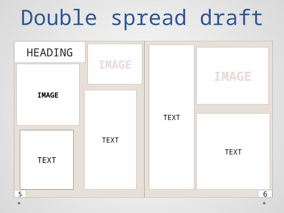
Double spread draft
HEADING
IMAGE
TEXT
IMAGEIMAGE
5 6
TEXT
TEXT
TEXT

Inspiration of possible existing double spread
images
PITCHING
The design of the magazine
• My magazine is a real estate magazine so the design of it must be very classy and subtle. The design of my magazine will have the layout conventions that are required for a magazine. I will place my masthead at the top of the page so it is in direct eye line of the reader. This is a key element as the masthead is the first thing that the reader will look at and read. Also if a masthead is plain and simple and uses no colors at all then it is likely to be less interesting to the reader as they will want a masthead the is bold and stands out from the rest of the magazines that will be on the shelf. My masthead color is not very catchy but the font is very readable and serious enough to attract serious businessman that would be interested in real estates. For my magazine I decided to use ‘A LISTINGS’ name because there is no existing magazine with this name. I decided that It would be a name that would stick into people’s minds and is also a eye-catchy title. Underneath the masthead I will have my main picture that will advertise the main story that will be in the magazine. The main image will take up most of the cover page as there will be a lot of white space to fill and also if it is all squashed together it will make it hard for the reader to see what the picture is and it will make the reader think that not enough thought and care has gone into the layout of the cover page. On my cover page I will also include subheadings which are little extra bits of information as to what the magazine will included, they can also be used to promote or advertise something in the magazine. Another required convention that I need to include on my cover page is a Main headline which is a piece of text that links to the main image and it will tell the reader what the main story will be about and it will also inform the reader why that house or penthouse is trending that week. The topic my magazine is about as already known is real estate, which says that the magazine is a bit more serious that is why I have chosen simple colors and fonts to make it look classy. For double spread there will be a story about an luxurious 4 million € apartment located in the most luxurious part of the city. Also there will be an interview of the owner provided.

Magazine House Style• Front Page- on the front page I will be using very subtle colors
with the pop of red so it is not too plain and so it can catch the customers attention. The fonts will be readable but with some elegant Script too.
• Content Page- On the content page I will be using, white and some grey. It is important that the magazine has one color scheme used in he whole issue, so as the front cover of this particular issue is serious, with a bit of red, so will the content be too. Real estate is the kind of magazine that needs to be serious because it attracts older financially stable people, that are the main target audience.
• Double Spread- for double spread I will use Beige, Grey and Black. There will be text and two images of the real estate that the text is about. The Heading will be bold and bigger than any other text and in Sans Serif font while the text is in serif Times New Roman.

Target Audience • The target audience for my magazine are people
between 30-50. Real estate magazines are about very expensive because they promote extremely expensive (most of the times) properties, and a 24-5 year old person that is still in University or a beginner at his/hers career does not really fit in with the financially stable person profile. People from 30 to 50 rich or not already have stable careers and our target audience are very rich 30 to 50 people.

This masthead is very simple and subtle but it is understandable because it is luxurious real estates so it cannot be kitschy. The lion is in my opinion connected to the question “who’s who” because the real estate business is made of serious successful businessmen, and maybe the magazine referred lions to those businessmen. This heading is very plain and effortless. I love the mix
of the black, grey and red because it is nice combination and noticeable enough for the customer. It says Canadian Real Estate so it tells the customer that the properties in the magazine are located in Canada, so someone that is not interested in Canadian property knows not to buy it, or someone that is very interested in Canadian real estate market is definitely going to buy it.
This one unlike the one above is everything but plain. The red background is the key of attracting the customer because it is very eye catchy. The name is very straight forward and tells the customer what it is about immediately. Under ‘Property’ it says The Property Magazine but it is not visible because it is very faded which is not a good idea. This Masthead is not a regular masthead
definitely. The background is blue which is good because men (most of the customers) are attracted to blue and find it very serious but still catchy. The heading is ‘International Property Luxury collection’ , the first two words are in Serif font but very bold and serious while the last two words are serif too but very elegant and in italics. This is a very plane masthead but yet it
is attractive because it gives out a serious impression. San Serif font in white placed on a blue background, perfect combination.


![Magazine planning [repaired]](https://static.documents.pub/doc/80x56/58edb0151a28ab2f7c8b4601/magazine-planning-repaired.jpg)
