27
Better Portal Team Alpha's
| Date post: | 31-Dec-2015 |
| Category: |
Documents |
| Upload: | amice-elaine-fields |
| View: | 213 times |
| Download: | 0 times |

Better Portal Team Alpha's

General idea...
* User friendly - affordances!
* Clean, Not cluttered - white space is important!
* Efficient - get the info I need, and do what I do need to do!
* Easy Navigation - no unnecessary clicking and reloading
* Pretty - readable fonts, nice color scheme, etc

Easier login * really busy login page* 2 login buttons, why?

Easier login...* login page should be presentable, straightforward

Connect: Blackboard & BC Email
* one login to rule them all !!

Eliminate Websims
- all the features that Websims currently has would be directly integrated into the Webportal

Easy Navigation:
• Better default tab names! • More user tab customization! • Instant information on each tab and
each option! • Real time page display customization!
• Alert user before he/she is logged out!

Better tab names!
• Tab names should be intuitive• User should not have to ask what options
are available under each tab.
more intuitive tab names : My Info | Student Transactions | Academic Tools |
Financial Tools | Campus Services | Events & Orgs.

User tab customization!
• Current portal allows user to add and remove tabs
• Should give the user the ability create fully customized tabs that are used most frequently
• Users will also be able to make one tab with all the options he/she needs.

User tab customization!

Instant information on each tab and option!• If a user idles his mouse over a tab or
option small yellow box will pop with text that tells the user what it is for.
• Even with better default tab names it is useful to be able to have more information on a tab or option instantly and hassle free.

Instant information on each tab and option!
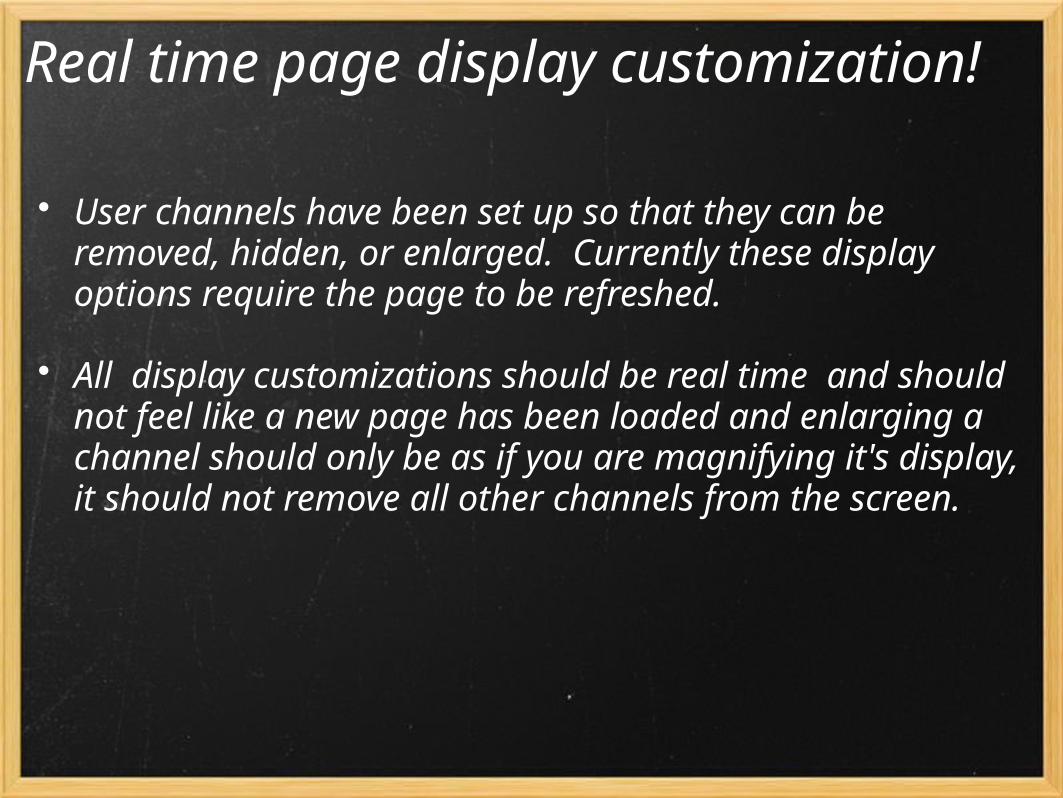
Real time page display customization!• User channels have been set up so that they can be
removed, hidden, or enlarged. Currently these display options require the page to be refreshed.
• All display customizations should be real time and should not feel like a new page has been loaded and enlarging a channel should only be as if you are magnifying it's display, it should not remove all other channels from the screen.

Real time page display customization!

Alert user before being logged out!• if users remain idle on the portal for too long they
are automatically logged out.
• A message should pop alerting the user if he/she wishes to stay logged on. The message should have a counter before the user is automatically logged out.

Simpler Registration Form
• Display a registration tab on the top toolbar on the personal page.
• When a student selects the registration tab, a new page is displayed with registration options and details.
• The student will be able to view the current schedule, transcript, and grades; add or drop classes; and pay the bill.

Registration Menu
• Student is able to select the desired action from the menu.
• To begin registration, the first action is to select the term.

Registration Menu (cont.)
• Then after clicking "Register/Add/Drop Classes," the Add/Drop form will be displayed.

Registration Menu (cont.)
• To search for courses, click on "Class Search", select the course subject from the drop-down menu, then in the Course Number box, enter the four-digit course number (e.g. 3140). (To see all open courses/sections in a subject area, select the subject only and leave the rest of the options blank.)

Registration Menu (cont.)
• After the search results are displayed, select the desired courses (by clicking the checkbox next to a course) and then click "Register/Add to Worksheet" button at the bottom.
• To finalize all the changes, click "Complete Your Registration" link at the bottom of the page.

Academic Calendar
• Upcoming Events• Class schedule • Important Academic dates ( conversion
dates etc)
Academic calendar should be a sub menu and a huge part of the registration system. It will provide the following information to the student during and after registration:

And this current college public calendar will include all features mentioned above that it might not already have.

Visuals:Design and Color Scheme
• Visuals play an important supporting role to the Brooklyn College portal siteo The portal site colors should coordinate with
Brooklyn College's official colors.o Images which coordinate with the site and
associated with the college o Fonts that are easy to read and style appropriateo Attractive portal page layout which displays the
content in a logical, uncluttered, simple manner

Design and Color Scheme ...
• Create a portal page color scheme according to Brooklyn College's colors: burgundy , yellow, and white.o Burgundy background for borderso White/gray/black texto Neutral color foreground with red text for alerts &
important messageso Light gray or light burgundy shades for tab/section
dividers.o Light/Dark foreground for each separate section
and the drop menu

Example:

Brooklyn College school Logo instead of....

Fonts and Languages
• Standard fonts making content legible to all• Also a real-time translation menu that is accessible
to the user to translate the page for students whose second language is English (possibly the top 3 languages amongst the student population)


