51
Brand Design Guidelines

Brand DesignGuidelines
5 | World Taekwondo Brand Guidelines
Chapter 01.
Introduction

6 | World Taekwondo Brand Guidelines
1. Introduction
The World Taekwondo Federation has undergone a period of rebranding, with the organization renamed as World Taekwondo (WT). This name change was accompanied by an entirely new brand design concept to boost its image and enhance its exposure.
The organization’s new logo, becomes a springboard for its rebranding, and is anticipated to change the overall look and feel of WT.
This redesigned and revived logo is expected to reflect a global modern outreach as well as the organization’s contemporary outlook.
World Taekwondo (WT) is the International Federation (IF) governing the sport of Taekwondo and is a member of the Association of Summer Olympic International Federations (ASOIF) and International Paralympic Committee (IPC).
See our website for more information: /www.worldtaekwondo.org.
15 | World Taekwondo Brand Guidelines
Chapter 03.
Brand Identity Basic Systems
16 | World Taekwondo Brand Guidelines
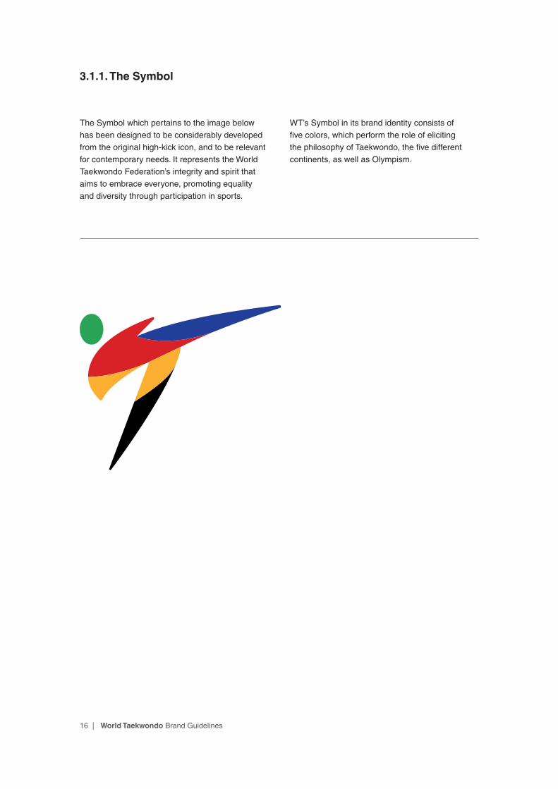
3.1.1. The Symbol
The Symbol which pertains to the image below has been designed to be considerably developed from the original high-kick icon, and to be relevant for contemporary needs. It represents the World Taekwondo Federation’s integrity and spirit that aims to embrace everyone, promoting equality and diversity through participation in sports.
WT’s Symbol in its brand identity consists of five colors, which perform the role of eliciting the philosophy of Taekwondo, the five different continents, as well as Olympism.

17 | World Taekwondo Brand Guidelines
3.1.2. The Symbol: Isolation area and size minimization
Isolation Area: In order to give the WT logo enough room and to ensure legibility, adequate space should be given around it. This space refers to a clear white area that surrounds the logo into which no other graphic elements may be used.
For all the variations of the brand logo, ample space is constructed by measuring the height of the Symbol(x) plus an additional 25% of this measurement all around the logo.
The brand logo may be enlarged or reduced in size, yet should appear no smaller than 10mm height, or 28px height in digital applications. Always ensure that the logo avoids distortion that may affect its proportion.
x
25% x
25% x
25% x
10mm 28px
18 | World Taekwondo Brand Guidelines
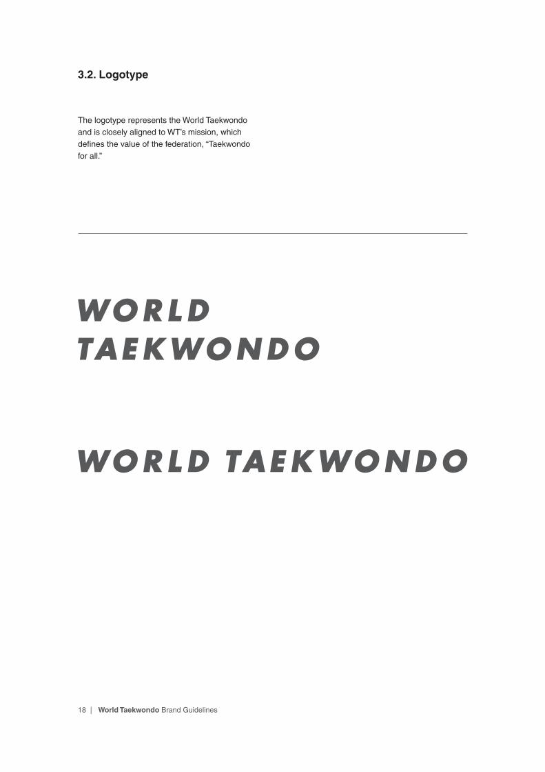
3.2. Logotype
The logotype represents the World Taekwondo and is closely aligned to WT’s mission, which defines the value of the federation, “Taekwondo for all.”

19 | World Taekwondo Brand Guidelines
3.3. Colors
WT’s symbol, and in extension, its brand identity consists of five colors. These are Green, Yellow, Red, Blue and Black. These colors were carefully selected to evoke the philosophy of Taekwondo which includes the following: courtesy, integrity, perseverance, self-control, an indomitable spirit, as well as Olympism. These colors are critical factors in delivering World Taekwondo’s image.
For consistency, always use the color palette provided in this guide for all materials.The color palette of the logotype is based on a grey color scale (C0-M0-Y0-K80). When the logo appears on a black background, the black color of the Symbol needs to be changed into the alternative color scale (C0-M0-Y0-K60).
GREEN
C80 M10 Y90 K0R41 G164 B87Pantone 354 C#28A456
GREY
C0 M0 Y0 K80R88 G89 B91Pantone Cool Gray 11 C#58585B
YELLOW
C0 M34 Y90 K0R252 G177 B51Pantone 143 C#FBB133
RED
C10 M100 Y100 K0R218 G33 B40Pantone 185 C#DA2028
BLUE
C100 M90 Y0 K0R33 G64 B154Pantone Blue 072 C#213F99
BLACK
C100 M100 Y100 K100R0 G0 B0Pantone Black C#000000
Symbol Color
Logotype Color
Light GREY
C0 M0 Y0 K60R128 G130 B133Pantone Cool Gray 8 C#808284
Sub Color

20 | World Taekwondo Brand Guidelines
3.4. Typeface
The World Taekwondo Primary logo(p.22) uses Futura Bold Oblique typeface as shown below. And The World Taekwondo Circular logo(p.34) uses Futura Bold typeface as shown below. Only designated typefaces, boldness, and proportions should be used in all materials. Regardless of scale, use upper case letters for all communications. The main text is left-aligned at all times.
Typeface plays a critical role in building the overall look of WT’s brand. Recognizing this is a critical part in maintaining quality and complying with all rules that are supplied.
Futura Bold Oblique
ABCEDFGHIJKLMNOPQRSTUVWXYZ
abcdefghiijklmnopqrstuvwxyz
21 | World Taekwondo Brand Guidelines
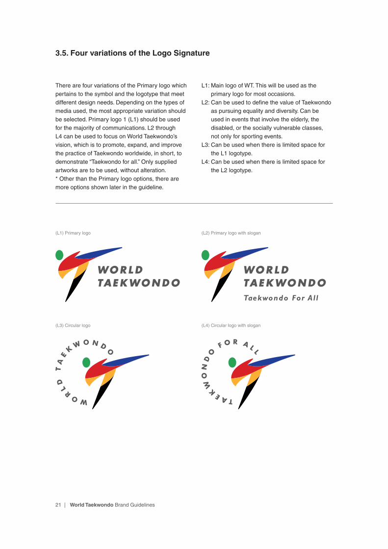
3.5. Four variations of the Logo Signature
There are four variations of the Primary logo which pertains to the symbol and the logotype that meet different design needs. Depending on the types of media used, the most appropriate variation should be selected. Primary logo 1 (L1) should be used for the majority of communications. L2 through L4 can be used to focus on World Taekwondo’s vision, which is to promote, expand, and improve the practice of Taekwondo worldwide, in short, to demonstrate “Taekwondo for all.” Only supplied artworks are to be used, without alteration. * Other than the Primary logo options, there are more options shown later in the guideline.
L1: Main logo of WT. This will be used as the primary logo for most occasions.
L2: Can be used to define the value of Taekwondo as pursuing equality and diversity. Can be used in events that involve the elderly, the disabled, or the socially vulnerable classes, not only for sporting events.
L3: Can be used when there is limited space for the L1 logotype.
L4: Can be used when there is limited space for the L2 logotype.
(L1) Primary logo
(L3) Circular logo
(L2) Primary logo with slogan
(L4) Circular logo with slogan

22 | World Taekwondo Brand Guidelines
3.6.1. The Primary Logo Signature(L1): Structure
The World Taekwondo brand identity consists of two basic elements: The Symbol and the Wordmark. By including the internationally renowned Taekwondo high-kick, the Symbol delivers WT’s integrity, energy, and spirit in a contemporary way. The Wordmark represents the World Taekwondo Federation. These two elements are carefully positioned in relation to one another to create a feeling of harmony and excellence.
WT uses two major logo structures, the Primary and the Circular. The Primary signature is as
shown below. As the name suggests, use of the Primary design with its designated colors is the preferred choice and is used in most media/printing materials. In certain circumstances, when space is limited, the Circular signature may be used. The color of the Symbol should appear consistently and accurately as it is chosen to communicate the spirit of the WT brand, which stands for is dynamism, perseverance, respect, and unity. Only designated colors should be used in order to maintain the quality of the WT brand.
Symbol
Wordmark
23 | World Taekwondo Brand Guidelines
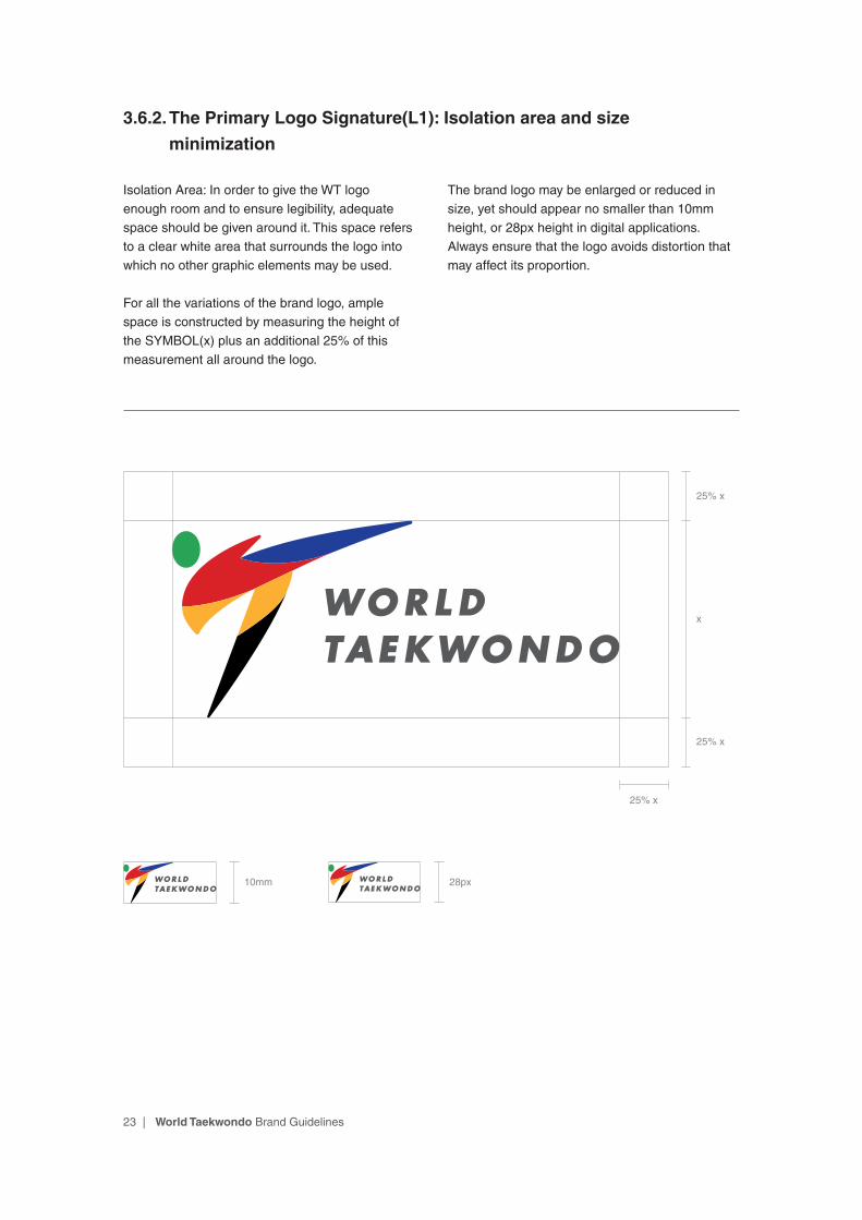
3.6.2. The Primary Logo Signature(L1): Isolation area and size
minimization
Isolation Area: In order to give the WT logo enough room and to ensure legibility, adequate space should be given around it. This space refers to a clear white area that surrounds the logo into which no other graphic elements may be used.
For all the variations of the brand logo, ample space is constructed by measuring the height of the SYMBOL(x) plus an additional 25% of this measurement all around the logo.
The brand logo may be enlarged or reduced in size, yet should appear no smaller than 10mm height, or 28px height in digital applications. Always ensure that the logo avoids distortion that may affect its proportion.
x
25% x
25% x
10mm 28px
25% x
24 | World Taekwondo Brand Guidelines
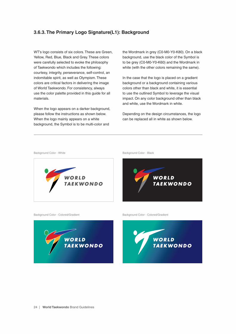
3.6.3. The Primary Logo Signature(L1): Background
WT’s logo consists of six colors. These are Green, Yellow, Red, Blue, Black and Grey. These colors were carefully selected to evoke the philosophy of Taekwondo which includes the following: courtesy, integrity, perseverance, self-control, an indomitable spirit, as well as Olympism. These colors are critical factors in delivering the image of World Taekwondo. For consistency, always use the color palette provided in this guide for all materials.
When the logo appears on a darker background, please follow the instructions as shown below. When the logo mainly appears on a white background, the Symbol is to be multi-color and
the Wordmark in grey (C0-M0-Y0-K80). On a black background, use the black color of the Symbol is to be grey (C0-M0-Y0-K60) and the Wordmark in white (with the other colors remaining the same).
In the case that the logo is placed on a gradient background or a background containing various colors other than black and white, it is essential to use the outlined Symbol to leverage the visual impact. On any color background other than black and white, use the Wordmark in white.
Depending on the design circumstances, the logo can be replaced all in white as shown below.
Background Color - White Background Color - Black
Background Color - Colored/Gradient Background Color - Colored/Gradient
25 | World Taekwondo Brand Guidelines
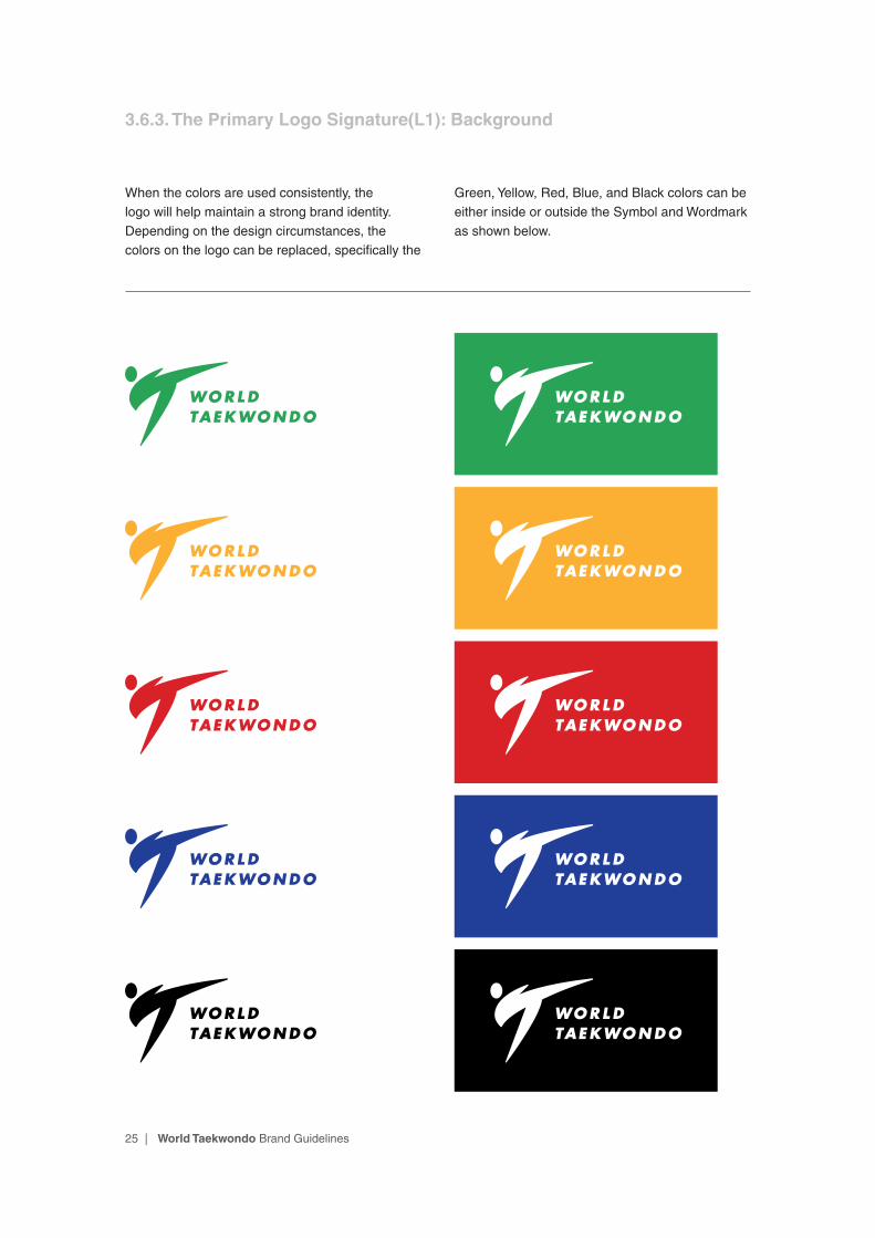
When the colors are used consistently, the logo will help maintain a strong brand identity. Depending on the design circumstances, the colors on the logo can be replaced, specifically the
Green, Yellow, Red, Blue, and Black colors can be either inside or outside the Symbol and Wordmark as shown below.
3.6.3. The Primary Logo Signature(L1): Background

26 | World Taekwondo Brand Guidelines
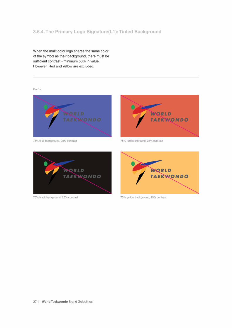
3.6.4. The Primary Logo Signature(L1): Tinted Background
Dos
0% background, 100% contrast 75% green background, 25% contrast
25% green background, 75% contrast 25% red background, 75% contrast
50% green background, 50% contrast 50% yellow background, 50% contrast
Don'ts
When the mulit-color logo shares the same color as their background, there must be sufficient contrast - minimum 50% in value.However, Red and Yellow are excluded.
27 | World Taekwondo Brand Guidelines
3.6.4. The Primary Logo Signature(L1): Tinted Background
Don'ts
When the mulit-color logo shares the same color of the symbol as their background, there must be sufficient contrast - minimum 50% in value.However, Red and Yellow are excluded.
75% blue background, 25% contrast 75% red background, 25% contrast
75% black background, 25% contrast 75% yellow background, 25% contrast
28 | World Taekwondo Brand Guidelines
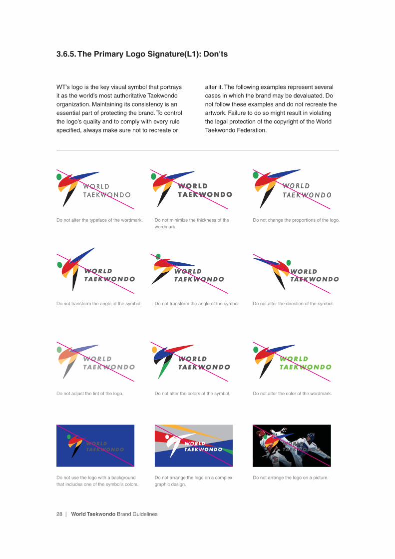
3.6.5. The Primary Logo Signature(L1): Don'ts
WT’s logo is the key visual symbol that portrays it as the world’s most authoritative Taekwondo organization. Maintaining its consistency is an essential part of protecting the brand. To control the logo’s quality and to comply with every rule specified, always make sure not to recreate or
alter it. The following examples represent several cases in which the brand may be devaluated. Do not follow these examples and do not recreate the artwork. Failure to do so might result in violating the legal protection of the copyright of the World Taekwondo Federation.
Do not alter the typeface of the wordmark.
Do not transform the angle of the symbol.
Do not adjust the tint of the logo.
Do not use the logo with a background that includes one of the symbol’s colors.
Do not minimize the thickness of the wordmark.
Do not transform the angle of the symbol.
Do not alter the colors of the symbol.
Do not change the proportions of the logo.
Do not alter the direction of the symbol.
Do not alter the color of the wordmark.
Do not arrange the logo on a complex graphic design.
Do not arrange the logo on a picture.

29 | World Taekwondo Brand Guidelines
3.6.5. The Primary Logo Signature(L1): Don'ts
WT’s logo is the key visual symbol that portrays it as the world’s most authoritative Taekwondo organization. Maintaining its consistency is an essential part of protecting the brand. To control the logo’s quality and to comply with every rule specified, always make sure not to recreate or
alter it. The following examples represent several cases in which the brand may be devaluated. Do not follow these examples and do not recreate the artwork. Failure to do so might result in violating the legal protection of the copyright of the World Taekwondo Federation.
Do not use the outlined wordmark.Do not use the logo with a background that is less than 40% contrast between the logo color and the background.
Do not alter the color of the wordmark.
Do not change the position of the symbol.
Do not change the position of the symbol.
Do not alter the colors of the symbol.
Do not change the position of the symbol.
Do not change the position of the symbol.
Do not alter the colors of the logo.
Do not change the symbol into a line.
Do not change the position of the symbol.
Do not alter the colors of the symbol.

30 | World Taekwondo Brand Guidelines
3.7.1. The Primary Logo Signature (L2): Structure
The World Taekwondo brand identity consists of two basic elements: The Symbol and the Wordmark. By including the internationally renowned Taekwondo high-kick, the Symbol delivers WT’s integrity, energy, and spirit in a contemporary way. The Wordmark represents the World Taekwondo Federation. These two elements are carefully positioned in relation to one another to create a feeling of harmony and excellence.
The Primary Logo Signature with slogan(L2) can be used to define the value of Taekwondo as pursuing equality and diversity. Can be used in events that involve the elderly, the disabled, or the socially vulnerable classes, not only for sporting events.
Symbol
Wordmark
Slogan
31 | World Taekwondo Brand Guidelines
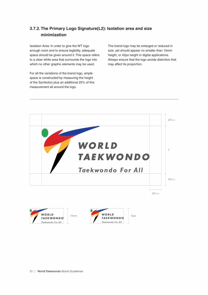
3.7.2. The Primary Logo Signature (L2): Isolation area and size
minimization
Isolation Area: In order to give the WT logo enough room and to ensure legibility, adequate space should be given around it. This space refers to a clear white area that surrounds the logo into which no other graphic elements may be used.
For all the variations of the brand logo, ample space is constructed by measuring the height of the Symbol(x) plus an additional 25% of this measurement all around the logo.
The brand logo may be enlarged or reduced in size, yet should appear no smaller than 15mm height, or 42px height in digital applications. Always ensure that the logo avoids distortion that may affect its proportion.
x
25% x
25% x
15mm 42px
25% x

32 | World Taekwondo Brand Guidelines
3.7.3. The Primary Logo Signature (L2): Background
WT’s logo consists of six colors. These are Green, Yellow, Red, Blue, Black and Grey. These colors were carefully selected to evoke the philosophy of Taekwondo which includes the following: courtesy, integrity, perseverance, self-control, an indomitable spirit, as well as Olympism. These colors are critical factors in delivering the image of World Taekwondo. For consistency, always use the color palette provided in this guide for all materials.
When the logo appears on a darker background, please follow the instructions as shown below. When the logo mainly appears on a white background, the Symbol is to be multi-color and
the Wordmark in grey (C0-M0-Y0-K80). On a black background, use the black color of the Symbol is to be grey (C0-M0-Y0-K60) and the Wordmark in white (with the other colors remaining the same).
In the case that the logo is placed on a gradient background or a background containing various colors other than black and white, it is essential to use the outlined Symbol to leverage the visual impact. On any color background other than black and white, use the Wordmark in white.
Depending on the design circumstances, the logo can be replaced all in white as shown below.
Background Color - White Background Color - Black
Background Color - Colored/Gradient Background Color - Colored/Gradient

33 | World Taekwondo Brand Guidelines
When the colors are used consistently, the logo will help maintain a strong brand identity. Depending on the design circumstances, the colors on the logo can be replaced, specifically the
Green, Yellow, Red, Blue, and Black colors can be either inside or outside the Symbol and Wordmark as shown below.
3.7.3. The Primary Logo Signature (L2): Background
34 | World Taekwondo Brand Guidelines
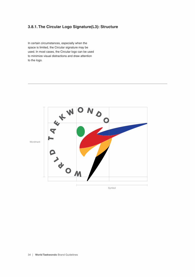
3.8.1. The Circular Logo Signature(L3): Structure
In certain circumstances, especially when the space is limited, the Circular signature may be used. In most cases, the Circular logo can be used to minimize visual distractions and draw attention to the logo.
Symbol
Wordmark

35 | World Taekwondo Brand Guidelines
3.8.2. The Circular Logo Signature(L3): Isolation area and size
minimization
Isolation Area: In order to give the WT logo enough room and to ensure legibility, adequate space should be given around it. This space refers to a clear white area that surrounds the logo into which no other graphic elements may be used.
For all the variations of the brand logo, ample space is constructed by measuring the height of the Symbol(x) plus an additional 25% of this measurement all around the logo.
The brand logo may be enlarged or reduced in size, yet should appear no smaller than 15mm height, or 42px height in digital applications. Always ensure that the logo avoids distortion that may affect its proportion.
15mm 42px
x
25% x
25% x
25% x
36 | World Taekwondo Brand Guidelines
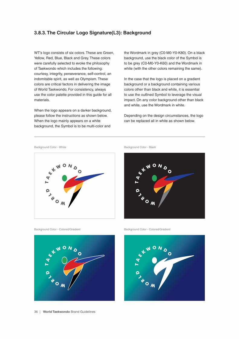
3.8.3. The Circular Logo Signature(L3): Background
WT’s logo consists of six colors. These are Green, Yellow, Red, Blue, Black and Grey. These colors were carefully selected to evoke the philosophy of Taekwondo which includes the following: courtesy, integrity, perseverance, self-control, an indomitable spirit, as well as Olympism. These colors are critical factors in delivering the image of World Taekwondo. For consistency, always use the color palette provided in this guide for all materials.
When the logo appears on a darker background, please follow the instructions as shown below. When the logo mainly appears on a white background, the Symbol is to be multi-color and
the Wordmark in grey (C0-M0-Y0-K80). On a black background, use the black color of the Symbol is to be grey (C0-M0-Y0-K60) and the Wordmark in white (with the other colors remaining the same).
In the case that the logo is placed on a gradient background or a background containing various colors other than black and white, it is essential to use the outlined Symbol to leverage the visual impact. On any color background other than black and white, use the Wordmark in white.
Depending on the design circumstances, the logo can be replaced all in white as shown below.
Background Color - White Background Color - Black
Background Color - Colored/Gradient Background Color - Colored/Gradient
37 | World Taekwondo Brand Guidelines
3.8.3. The Circular Logo Signature(L3): Background
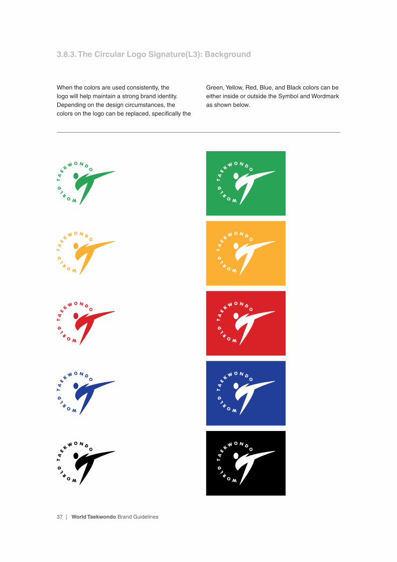
When the colors are used consistently, the logo will help maintain a strong brand identity. Depending on the design circumstances, the colors on the logo can be replaced, specifically the
Green, Yellow, Red, Blue, and Black colors can be either inside or outside the Symbol and Wordmark as shown below.
38 | World Taekwondo Brand Guidelines
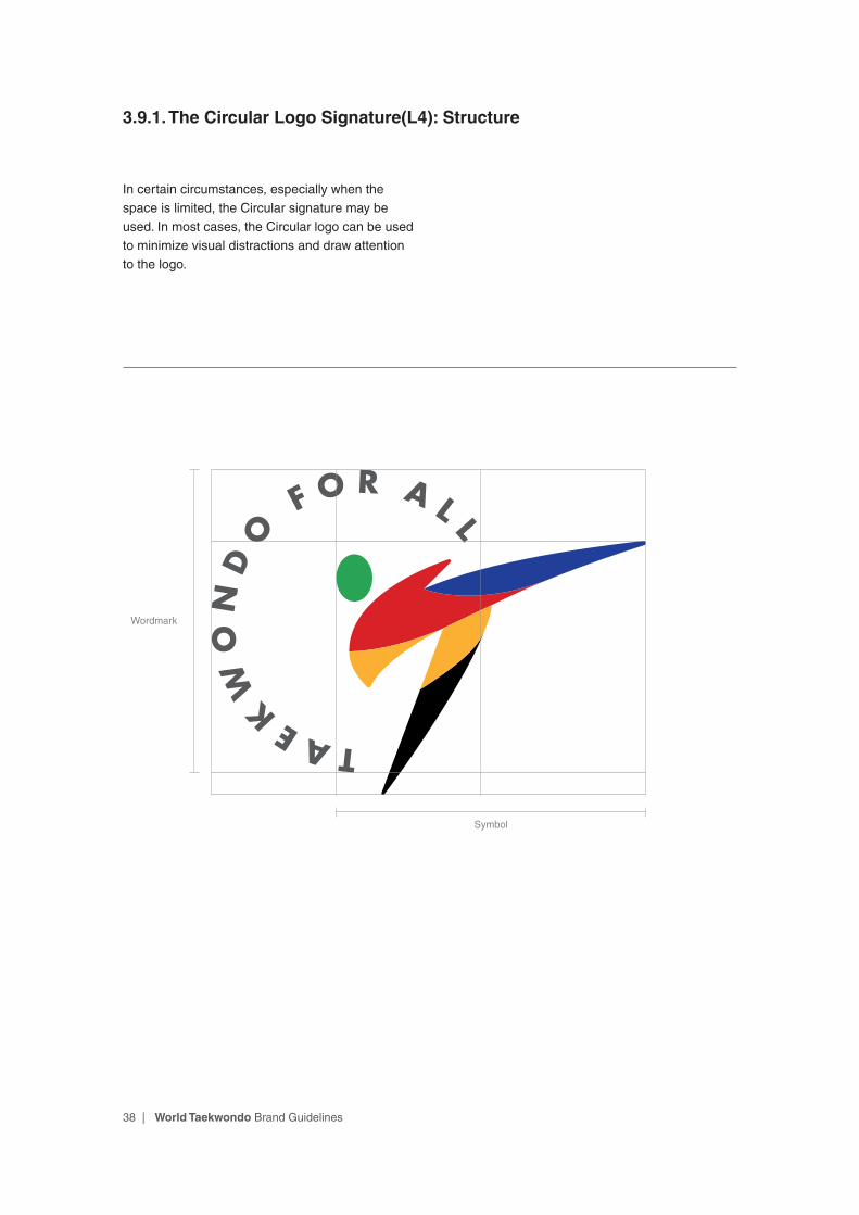
3.9.1. The Circular Logo Signature(L4): Structure
In certain circumstances, especially when the space is limited, the Circular signature may be used. In most cases, the Circular logo can be used to minimize visual distractions and draw attention to the logo.
Symbol
Wordmark
39 | World Taekwondo Brand Guidelines
3.9.2. The Circular Logo Signature(L4): Isolation area and size
minimization
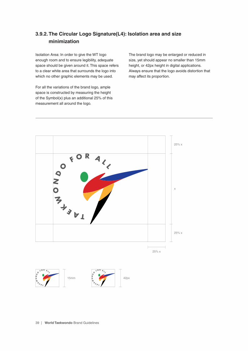
Isolation Area: In order to give the WT logo enough room and to ensure legibility, adequate space should be given around it. This space refers to a clear white area that surrounds the logo into which no other graphic elements may be used.
For all the variations of the brand logo, ample space is constructed by measuring the height of the Symbol(x) plus an additional 25% of this measurement all around the logo.
The brand logo may be enlarged or reduced in size, yet should appear no smaller than 15mm height, or 42px height in digital applications. Always ensure that the logo avoids distortion that may affect its proportion.
15mm 42px
x
25% x
25% x
25% x

40 | World Taekwondo Brand Guidelines
3.9.3. The Circular Logo Signature(L4): Background
WT’s logo consists of six colors. These are Green, Yellow, Red, Blue, Black and Grey. These colors were carefully selected to evoke the philosophy of Taekwondo which includes the following: courtesy, integrity, perseverance, self-control, an indomitable spirit, as well as Olympism. These colors are critical factors in delivering the image of World Taekwondo. For consistency, always use the color palette provided in this guide for all materials.
When the logo appears on a darker background, please follow the instructions as shown below. When the logo mainly appears on a white background, the Symbol is to be multi-color and
the Wordmark in grey (C0-M0-Y0-K80). On a black background, use the black color of the Symbol is to be grey (C0-M0-Y0-K60) and the Wordmark in white (with the other colors remaining the same).
In the case that the logo is placed on a gradient background or a background containing various colors other than black and white, it is essential to use the outlined Symbol to leverage the visual impact. On any color background other than black and white, use the Wordmark in white.
Depending on the design circumstances, the logo can be replaced all in white as shown below.
Background Color - White Background Color - Black
Background Color - Colored/Gradient Background Color - Colored/Gradient

41 | World Taekwondo Brand Guidelines
When the colors are used consistently, the logo will help maintain a strong brand identity. Depending on the design circumstances, the colors on the logo can be replaced, specifically the
Green, Yellow, Red, Blue, and Black colors can be either inside or outside the Symbol and Wordmark as shown below.
3.9.3. The Circular Logo Signature(L4): Background

57 | World Taekwondo Brand Guidelines
3.12.1. The Promotional Symbol
The Promotional Symbol has been developed in an outlined form from the primary symbol and is to be used specifically for promotional purposes only.

58 | World Taekwondo Brand Guidelines
x
25% x
25% x
25% x
10mm 28px
3.12.2. The Promotional Symbol: Isolation area and size minimization
Isolation Area: In order to give the WT logo enough room and to ensure legibility, adequate space should be given around it. This space refers to a clear white area that surrounds the logo into which no other graphic elements may be used.
For all the variations of the brand logo, ample space is constructed by measuring the height of the Symbol(x) plus an additional 25% of this measurement all around the logo.
The brand logo may be enlarged or reduced in size, yet should appear no smaller than 10mm height, or 28px height in digital applications. Always ensure that the logo avoids distortion that may affect its proportion.
59 | World Taekwondo Brand Guidelines
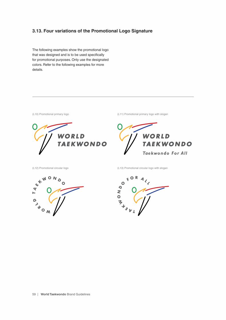
3.13. Four variations of the Promotional Logo Signature
The following examples show the promotional logo that was designed and is to be used specifically for promotional purposes. Only use the designated colors. Refer to the following examples for more details.
(L10) Promotional primary logo
(L12) Promotional circular logo
(L11) Promotional primary logo with slogan
(L13) Promotional circular logo with slogan

60 | World Taekwondo Brand Guidelines
3.14.1. The Promotional Primary Logo Signature(L10): Structure
The World Taekwondo brand identity consists of two basic elements: The Symbol and the Wordmark. By including the internationally renowned Taekwondo high-kick, the Symbol delivers WT’s integrity, energy, and spirit in a contemporary way. The Wordmark represents the World Taekwondo Federation. These two elements are carefully positioned in relation to one another to create a feeling of harmony and excellence.
WT uses two major logo structures, the Primary and the Circular. The Primary signature is as
shown below. As the name suggests, use of the Primary design with its designated colors is the preferred choice and is used in most media/printing materials. In certain circumstances, when space is limited, the Circular signature may be used. The color of the Symbol should appear consistently and accurately as it is chosen to communicate the spirit of the WT brand, which stands for is dynamism, perseverance, respect, and unity. Only designated colors should be used in order to maintain the quality of the WT brand.
Symbol
Wordmark
61 | World Taekwondo Brand Guidelines
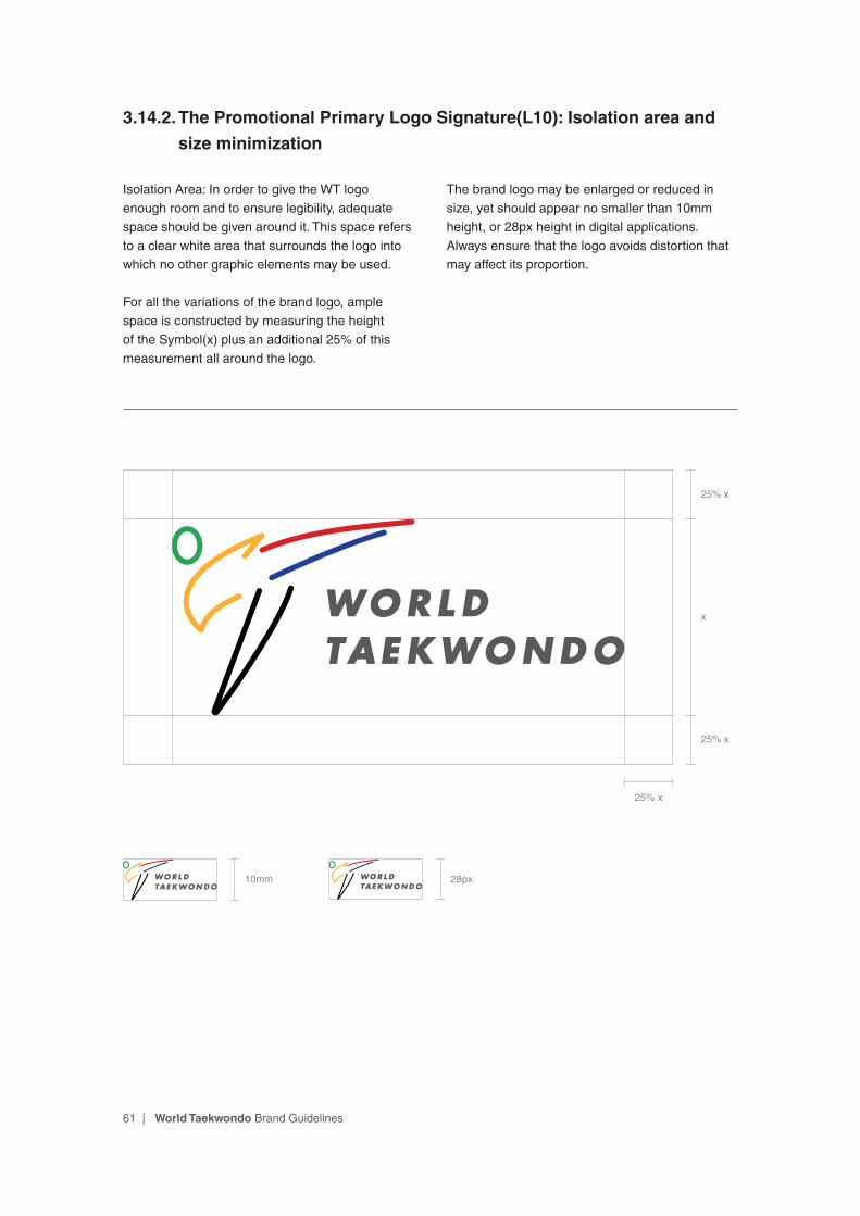
3.14.2. The Promotional Primary Logo Signature(L10): Isolation area and
size minimization
Isolation Area: In order to give the WT logo enough room and to ensure legibility, adequate space should be given around it. This space refers to a clear white area that surrounds the logo into which no other graphic elements may be used.
For all the variations of the brand logo, ample space is constructed by measuring the height of the Symbol(x) plus an additional 25% of this measurement all around the logo.
The brand logo may be enlarged or reduced in size, yet should appear no smaller than 10mm height, or 28px height in digital applications. Always ensure that the logo avoids distortion that may affect its proportion.
x
25% x
25% x
10mm 28px
25% x
62 | World Taekwondo Brand Guidelines
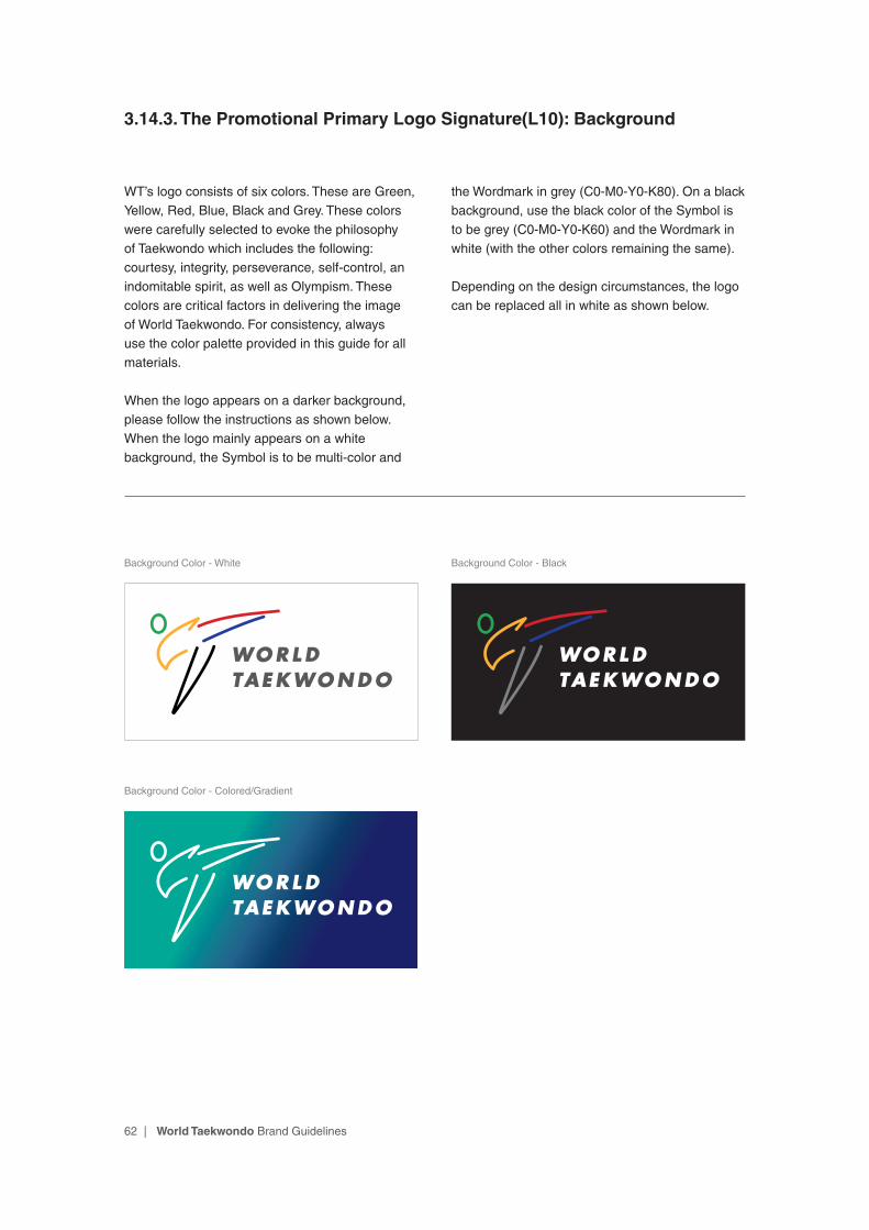
3.14.3. The Promotional Primary Logo Signature(L10): Background
WT’s logo consists of six colors. These are Green, Yellow, Red, Blue, Black and Grey. These colors were carefully selected to evoke the philosophy of Taekwondo which includes the following: courtesy, integrity, perseverance, self-control, an indomitable spirit, as well as Olympism. These colors are critical factors in delivering the image of World Taekwondo. For consistency, always use the color palette provided in this guide for all materials.
When the logo appears on a darker background, please follow the instructions as shown below. When the logo mainly appears on a white background, the Symbol is to be multi-color and
the Wordmark in grey (C0-M0-Y0-K80). On a black background, use the black color of the Symbol is to be grey (C0-M0-Y0-K60) and the Wordmark in white (with the other colors remaining the same).
Depending on the design circumstances, the logo can be replaced all in white as shown below.
Background Color - White Background Color - Black
Background Color - Colored/Gradient
63 | World Taekwondo Brand Guidelines
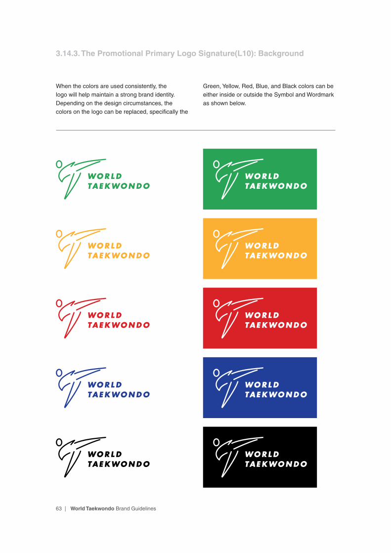
When the colors are used consistently, the logo will help maintain a strong brand identity. Depending on the design circumstances, the colors on the logo can be replaced, specifically the
Green, Yellow, Red, Blue, and Black colors can be either inside or outside the Symbol and Wordmark as shown below.
3.14.3. The Promotional Primary Logo Signature(L10): Background
64 | World Taekwondo Brand Guidelines
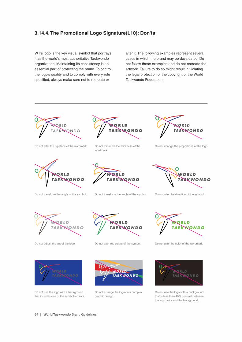
3.14.4. The Promotional Logo Signature(L10): Don'ts
WT’s logo is the key visual symbol that portrays it as the world’s most authoritative Taekwondo organization. Maintaining its consistency is an essential part of protecting the brand. To control the logo’s quality and to comply with every rule specified, always make sure not to recreate or
alter it. The following examples represent several cases in which the brand may be devaluated. Do not follow these examples and do not recreate the artwork. Failure to do so might result in violating the legal protection of the copyright of the World Taekwondo Federation.
Do not alter the typeface of the wordmark.
Do not transform the angle of the symbol.
Do not adjust the tint of the logo.
Do not minimize the thickness of the wordmark.
Do not transform the angle of the symbol.
Do not alter the colors of the symbol.
Do not change the proportions of the logo.
Do not alter the direction of the symbol.
Do not alter the color of the wordmark.
W O R L DTA E K W O N D O
WORLDTAEKWONDO
W O R L DTA E K W O N D O
Do not use the logo with a background that includes one of the symbol’s colors.
Do not arrange the logo on a complex graphic design.
Do not use the logo with a background that is less than 40% contrast between the logo color and the background.

65 | World Taekwondo Brand Guidelines
Symbol
Wordmark
Slogan
3.15.1. The Promotional Primary Logo Signature(L11): Structure
The World Taekwondo brand identity consists of two basic elements: The Symbol and the Wordmark. By including the internationally renowned Taekwondo high-kick, the Symbol delivers WT’s integrity, energy, and spirit in a contemporary way. The Wordmark represents the World Taekwondo Federation. These two elements are carefully positioned in relation to one another to create a feeling of harmony and excellence.
The Promotional Primary Logo Signature with slogan(L6) can be used to define the value of Taekwondo as pursuing equality and diversity. It can be used in events that involve the elderly, the disabled, or the socially vulnerable classes, not only for sporting events.
66 | World Taekwondo Brand Guidelines
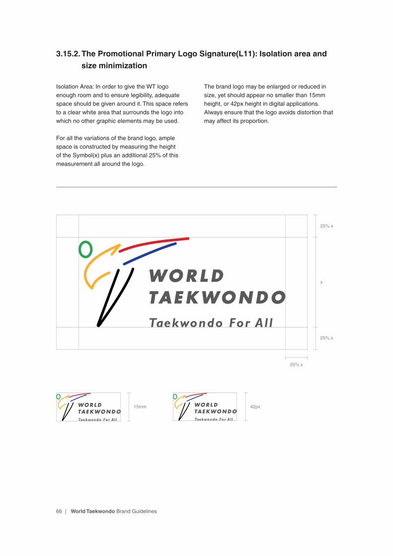
3.15.2. The Promotional Primary Logo Signature(L11): Isolation area and
size minimization
Isolation Area: In order to give the WT logo enough room and to ensure legibility, adequate space should be given around it. This space refers to a clear white area that surrounds the logo into which no other graphic elements may be used.
For all the variations of the brand logo, ample space is constructed by measuring the height of the Symbol(x) plus an additional 25% of this measurement all around the logo.
The brand logo may be enlarged or reduced in size, yet should appear no smaller than 15mm height, or 42px height in digital applications. Always ensure that the logo avoids distortion that may affect its proportion.
x
25% x
25% x
25% x
15mm 42px
67 | World Taekwondo Brand Guidelines
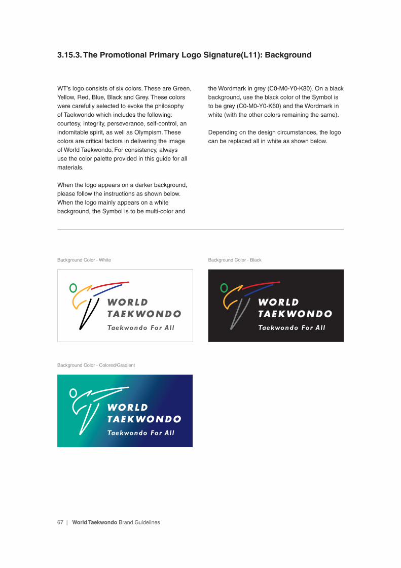
3.15.3. The Promotional Primary Logo Signature(L11): Background
WT’s logo consists of six colors. These are Green, Yellow, Red, Blue, Black and Grey. These colors were carefully selected to evoke the philosophy of Taekwondo which includes the following: courtesy, integrity, perseverance, self-control, an indomitable spirit, as well as Olympism. These colors are critical factors in delivering the image of World Taekwondo. For consistency, always use the color palette provided in this guide for all materials.
When the logo appears on a darker background, please follow the instructions as shown below. When the logo mainly appears on a white background, the Symbol is to be multi-color and
the Wordmark in grey (C0-M0-Y0-K80). On a black background, use the black color of the Symbol is to be grey (C0-M0-Y0-K60) and the Wordmark in white (with the other colors remaining the same).
Depending on the design circumstances, the logo can be replaced all in white as shown below.
Background Color - White Background Color - Black
Background Color - Colored/Gradient
68 | World Taekwondo Brand Guidelines
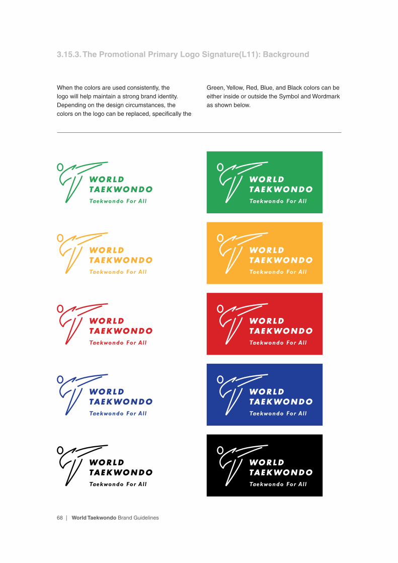
When the colors are used consistently, the logo will help maintain a strong brand identity. Depending on the design circumstances, the colors on the logo can be replaced, specifically the
Green, Yellow, Red, Blue, and Black colors can be either inside or outside the Symbol and Wordmark as shown below.
3.15.3. The Promotional Primary Logo Signature(L11): Background

69 | World Taekwondo Brand Guidelines
Symbol
Wordmark
3.16.1. The Promotional Circular Logo Signature(L12): Structure
In certain circumstances, especially when the space is limited, the Circular signature may be used. In most cases, the Circular logo can be used to minimize visual distractions and draw attention to the logo.
70 | World Taekwondo Brand Guidelines
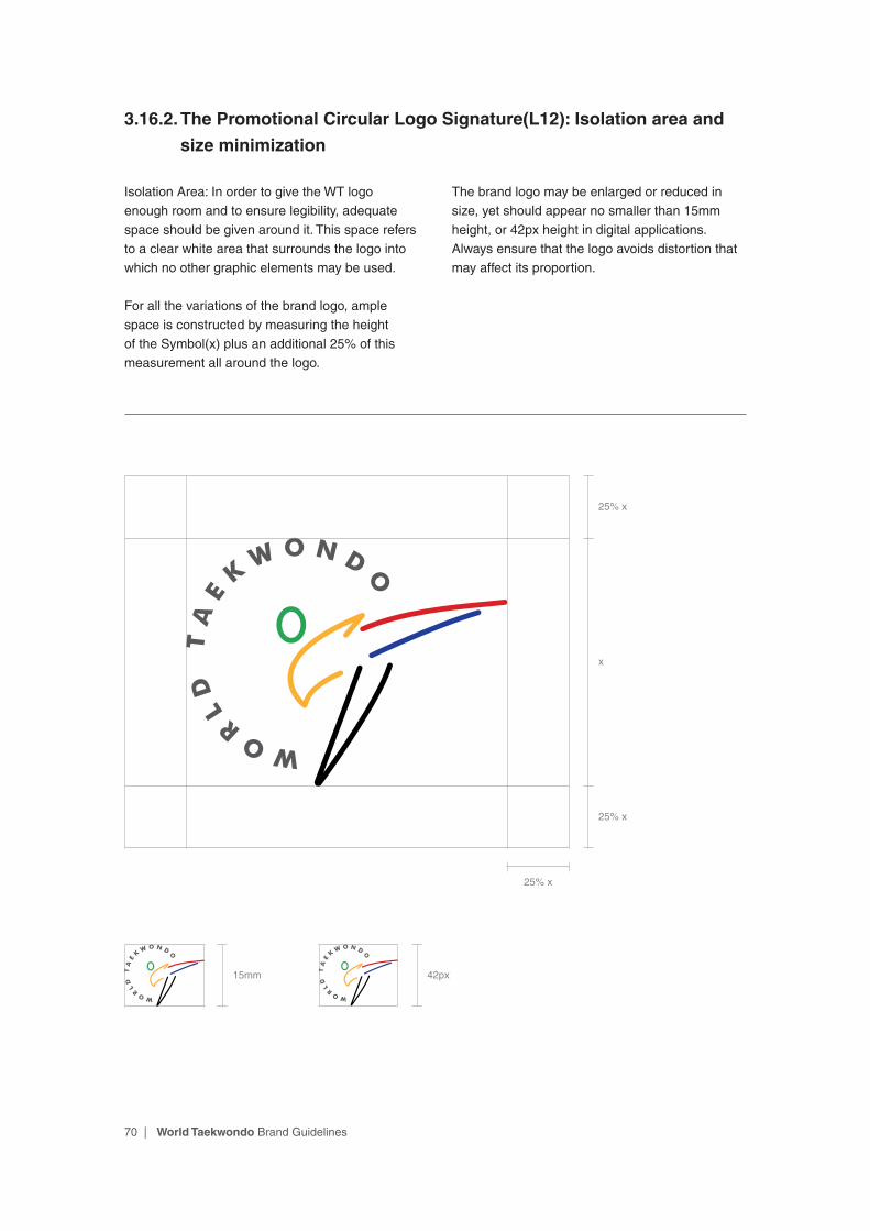
3.16.2. The Promotional Circular Logo Signature(L12): Isolation area and
size minimization
Isolation Area: In order to give the WT logo enough room and to ensure legibility, adequate space should be given around it. This space refers to a clear white area that surrounds the logo into which no other graphic elements may be used.
For all the variations of the brand logo, ample space is constructed by measuring the height of the Symbol(x) plus an additional 25% of this measurement all around the logo.
The brand logo may be enlarged or reduced in size, yet should appear no smaller than 15mm height, or 42px height in digital applications. Always ensure that the logo avoids distortion that may affect its proportion.
15mm 42px
x
25% x
25% x
25% x
71 | World Taekwondo Brand Guidelines
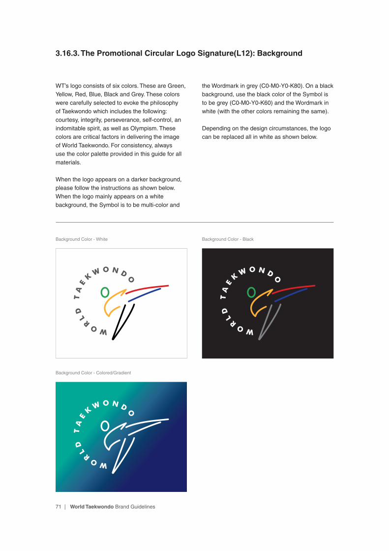
3.16.3. The Promotional Circular Logo Signature(L12): Background
WT’s logo consists of six colors. These are Green, Yellow, Red, Blue, Black and Grey. These colors were carefully selected to evoke the philosophy of Taekwondo which includes the following: courtesy, integrity, perseverance, self-control, an indomitable spirit, as well as Olympism. These colors are critical factors in delivering the image of World Taekwondo. For consistency, always use the color palette provided in this guide for all materials.
When the logo appears on a darker background, please follow the instructions as shown below. When the logo mainly appears on a white background, the Symbol is to be multi-color and
the Wordmark in grey (C0-M0-Y0-K80). On a black background, use the black color of the Symbol is to be grey (C0-M0-Y0-K60) and the Wordmark in white (with the other colors remaining the same).
Depending on the design circumstances, the logo can be replaced all in white as shown below.
Background Color - White Background Color - Black
Background Color - Colored/Gradient
72 | World Taekwondo Brand Guidelines
3.16.3. The Promotional Circular Logo Signature(L12): Background
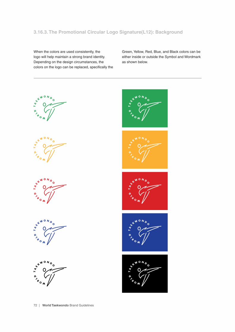
When the colors are used consistently, the logo will help maintain a strong brand identity. Depending on the design circumstances, the colors on the logo can be replaced, specifically the
Green, Yellow, Red, Blue, and Black colors can be either inside or outside the Symbol and Wordmark as shown below.

73 | World Taekwondo Brand Guidelines
Symbol
Wordmark
3.17.1. The Promotional Circular Logo Signature(L13): Structure
In certain circumstances, especially when the space is limited, the Circular signature may be used. In most cases, the Circular logo can be used to minimize visual distractions and draw attention to the logo.
74 | World Taekwondo Brand Guidelines
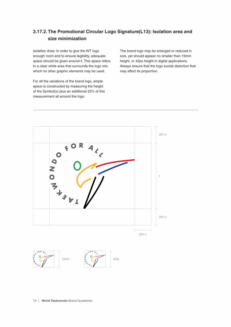
3.17.2. The Promotional Circular Logo Signature(L13): Isolation area and
size minimization
Isolation Area: In order to give the WT logo enough room and to ensure legibility, adequate space should be given around it. This space refers to a clear white area that surrounds the logo into which no other graphic elements may be used.
For all the variations of the brand logo, ample space is constructed by measuring the height of the Symbol(x) plus an additional 25% of this measurement all around the logo.
The brand logo may be enlarged or reduced in size, yet should appear no smaller than 15mm height, or 42px height in digital applications. Always ensure that the logo avoids distortion that may affect its proportion.
15mm 42px
x
25% x
25% x
25% x

75 | World Taekwondo Brand Guidelines
3.17.3. The Promotional Circular Logo Signature(L13): Background
WT’s logo consists of six colors. These are Green, Yellow, Red, Blue, Black and Grey. These colors were carefully selected to evoke the philosophy of Taekwondo which includes the following: courtesy, integrity, perseverance, self-control, an indomitable spirit, as well as Olympism. These colors are critical factors in delivering the image of World Taekwondo. For consistency, always use the color palette provided in this guide for all materials.
When the logo appears on a darker background, please follow the instructions as shown below. When the logo mainly appears on a white background, the Symbol is to be multi-color and
the Wordmark in grey (C0-M0-Y0-K80). On a black background, use the black color of the Symbol is to be grey (C0-M0-Y0-K60) and the Wordmark in white (with the other colors remaining the same).
Depending on the design circumstances, the logo can be replaced all in white as shown below.
Background Color - White Background Color - Black
Background Color - Colored/Gradient

76 | World Taekwondo Brand Guidelines
When the colors are used consistently, the logo will help maintain a strong brand identity. Depending on the design circumstances, the colors on the logo can be replaced, specifically the
Green, Yellow, Red, Blue, and Black colors can be either inside or outside the Symbol and Wordmark as shown below.
3.17.3. The Promotional Circular Logo Signature(L13): Background
77 | World Taekwondo Brand Guidelines
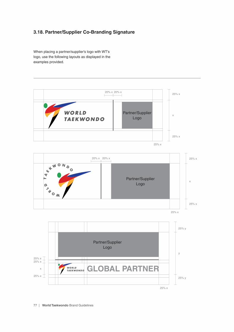
3.18. Partner/Supplier Co-Branding Signature
When placing a partner/supplier’s logo with WT’s logo, use the following layouts as displayed in the examples provided.
Partner/Supplier Logo
GLOBAL PARTNER25% y
25% x
25% y
x
25% x25% x
25% x
y
Partner/Supplier Logo
25% x20% x 20% x
25% x
25% x
x
Partner/Supplier Logo
25% x
25% x20% x 20% x
25% x
x


