12
The Practice of Statistics, 5th Edition Starnes, Tabor, Yates, Moore Bedford Freeman Worth Publishers CHAPTER 3 Describing Relationships 3.1 Scatterplots and Correlation
The Practice of Statistics, 5th Edition Starnes, Tabor, Yates, Moore
Bedford Freeman Worth Publishers
CHAPTER 3Describing Relationships3.1Scatterplots and Correlation
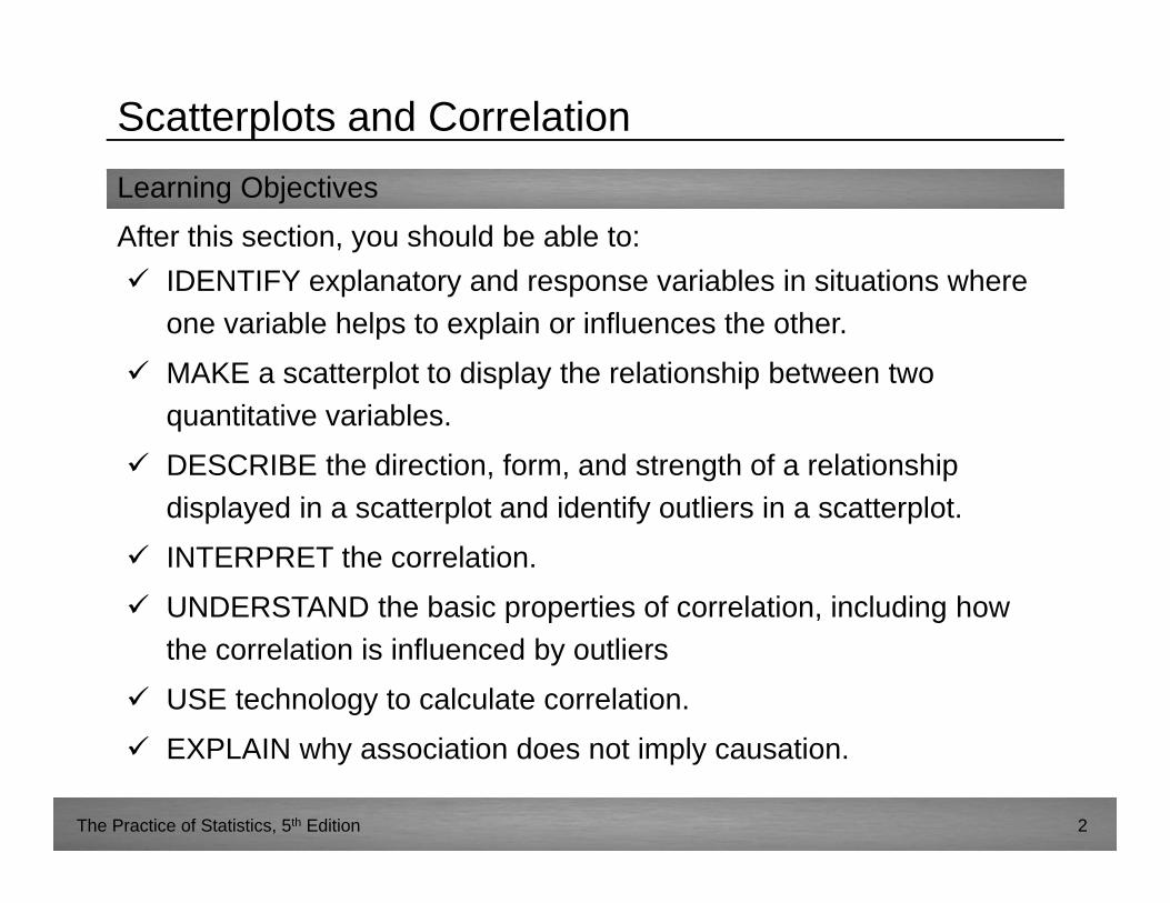
Learning ObjectivesAfter this section, you should be able to:
The Practice of Statistics, 5th Edition 2
IDENTIFY explanatory and response variables in situations where one variable helps to explain or influences the other.
MAKE a scatterplot to display the relationship between two quantitative variables.
DESCRIBE the direction, form, and strength of a relationship displayed in a scatterplot and identify outliers in a scatterplot.
INTERPRET the correlation.
UNDERSTAND the basic properties of correlation, including how the correlation is influenced by outliers
USE technology to calculate correlation.
EXPLAIN why association does not imply causation.
Scatterplots and Correlation
The Practice of Statistics, 5th Edition 3
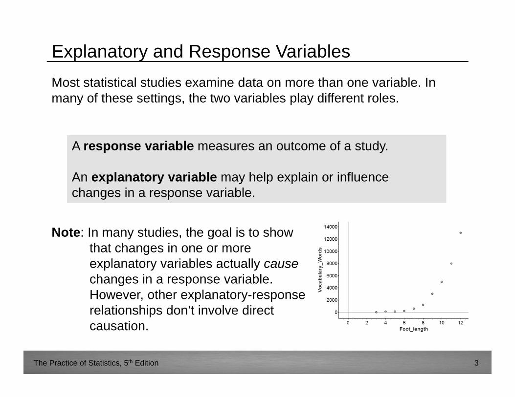
Explanatory and Response VariablesMost statistical studies examine data on more than one variable. In many of these settings, the two variables play different roles.
A response variable measures an outcome of a study.
An explanatory variable may help explain or influence changes in a response variable.
A response variable measures an outcome of a study.
An explanatory variable may help explain or influence changes in a response variable.
Note: In many studies, the goal is to show that changes in one or more explanatory variables actually causechanges in a response variable. However, other explanatory-response relationships don’t involve direct causation.
The Practice of Statistics, 5th Edition 4
Explanatory and Response VariablesExample 1: Freshman college students are given a questionnaire to assess their level of homesickness. Students also indicate on the survey how far their college is from home.
Which is the explanatory variable? Which is the response?Distance from home Level of homesickness
The Practice of Statistics, 5th Edition 5
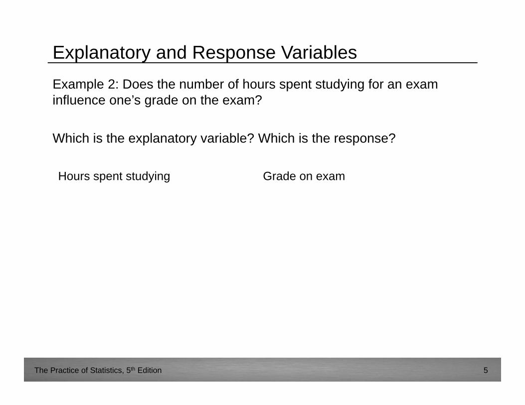
Explanatory and Response VariablesExample 2: Does the number of hours spent studying for an exam influence one’s grade on the exam?
Which is the explanatory variable? Which is the response?
Hours spent studying Grade on exam
The Practice of Statistics, 5th Edition 6
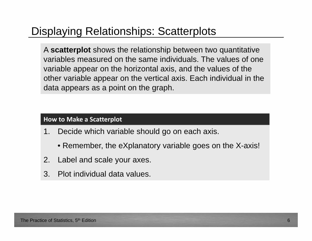
Displaying Relationships: ScatterplotsA scatterplot shows the relationship between two quantitative variables measured on the same individuals. The values of one variable appear on the horizontal axis, and the values of the other variable appear on the vertical axis. Each individual in the data appears as a point on the graph.
A scatterplot shows the relationship between two quantitative variables measured on the same individuals. The values of one variable appear on the horizontal axis, and the values of the other variable appear on the vertical axis. Each individual in the data appears as a point on the graph.
1. Decide which variable should go on each axis.
• Remember, the eXplanatory variable goes on the X-axis!
2. Label and scale your axes.
3. Plot individual data values.
How to Make a Scatterplot
The Practice of Statistics, 5th Edition 7
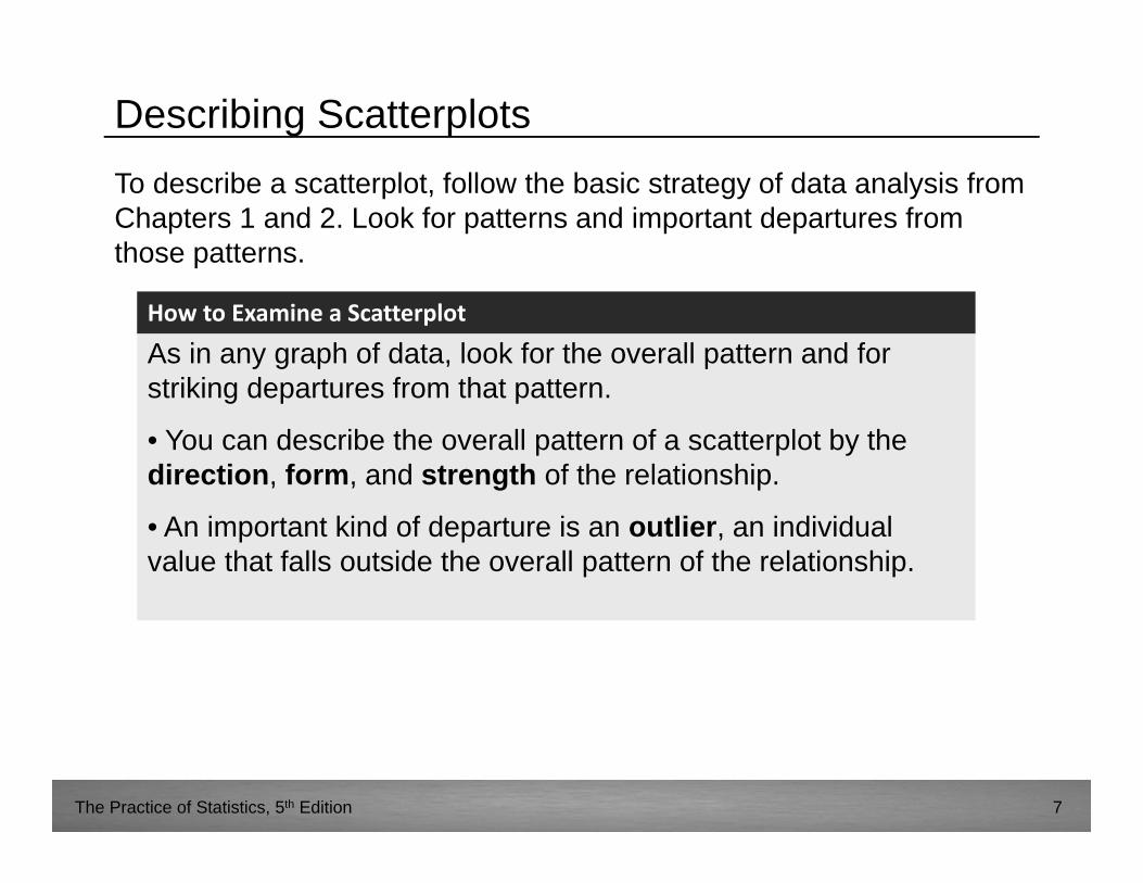
Describing ScatterplotsTo describe a scatterplot, follow the basic strategy of data analysis from Chapters 1 and 2. Look for patterns and important departures from those patterns.
As in any graph of data, look for the overall pattern and for striking departures from that pattern.
• You can describe the overall pattern of a scatterplot by the direction, form, and strength of the relationship.
• An important kind of departure is an outlier, an individual value that falls outside the overall pattern of the relationship.
How to Examine a Scatterplot
The Practice of Statistics, 5th Edition 8
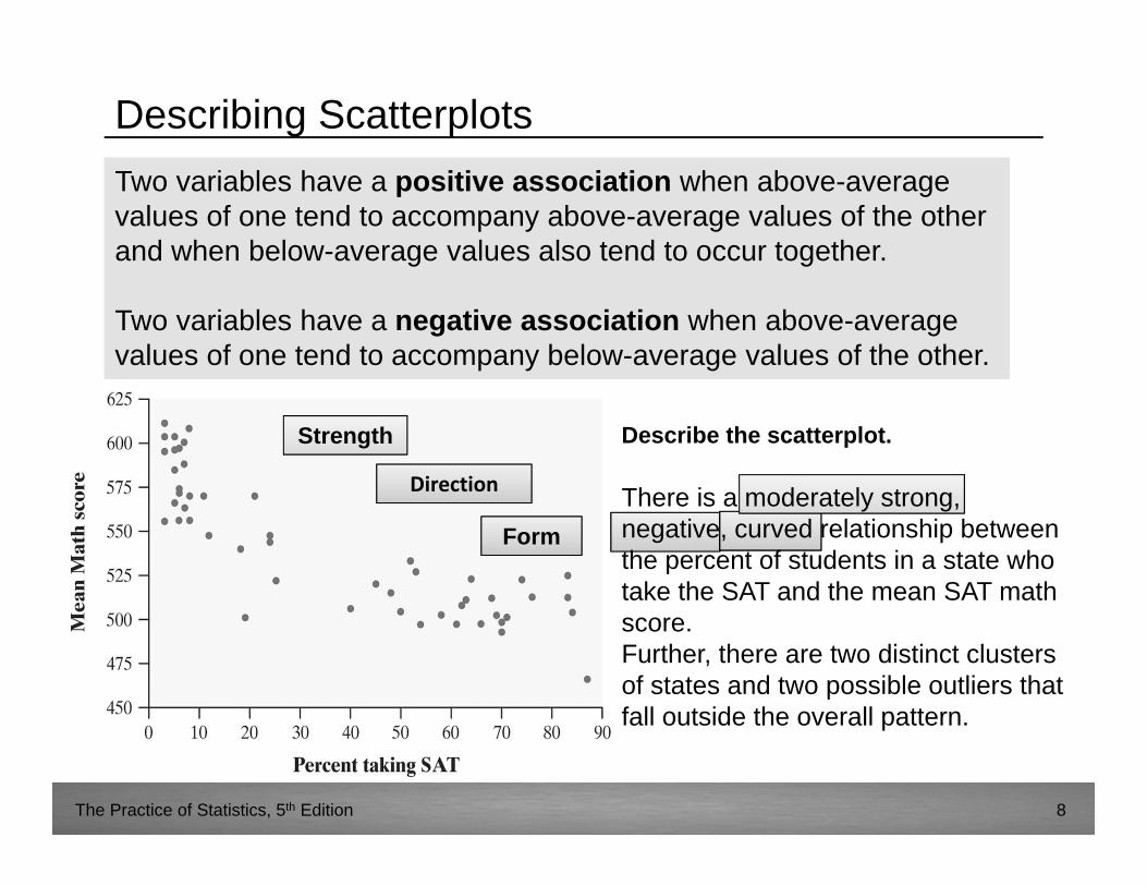
Describing ScatterplotsTwo variables have a positive association when above-average values of one tend to accompany above-average values of the other and when below-average values also tend to occur together.
Two variables have a negative association when above-average values of one tend to accompany below-average values of the other.
Two variables have a positive association when above-average values of one tend to accompany above-average values of the other and when below-average values also tend to occur together.
Two variables have a negative association when above-average values of one tend to accompany below-average values of the other.
Describe the scatterplot.
Direction
Form
Strength
There is a moderately strong, negative, curved relationship between the percent of students in a state who take the SAT and the mean SAT math score.Further, there are two distinct clusters of states and two possible outliers that fall outside the overall pattern.
The Practice of Statistics, 5th Edition 9
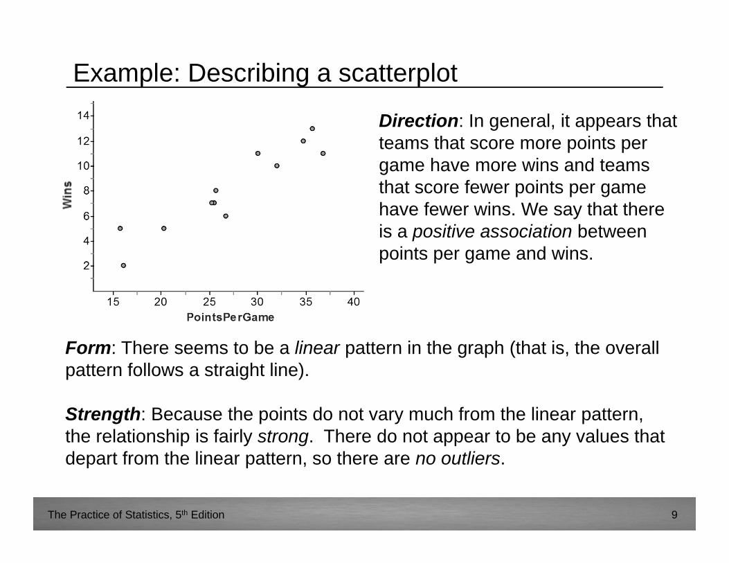
Example: Describing a scatterplot
Form: There seems to be a linear pattern in the graph (that is, the overall pattern follows a straight line).
Strength: Because the points do not vary much from the linear pattern, the relationship is fairly strong. There do not appear to be any values that depart from the linear pattern, so there are no outliers.
Direction: In general, it appears that teams that score more points per game have more wins and teams that score fewer points per game have fewer wins. We say that there is a positive association between points per game and wins.
The Practice of Statistics, 5th Edition 10
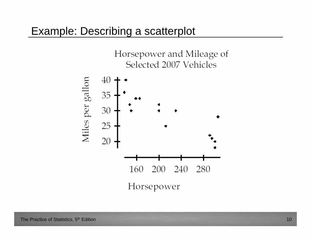
Example: Describing a scatterplot
The Practice of Statistics, 5th Edition 11
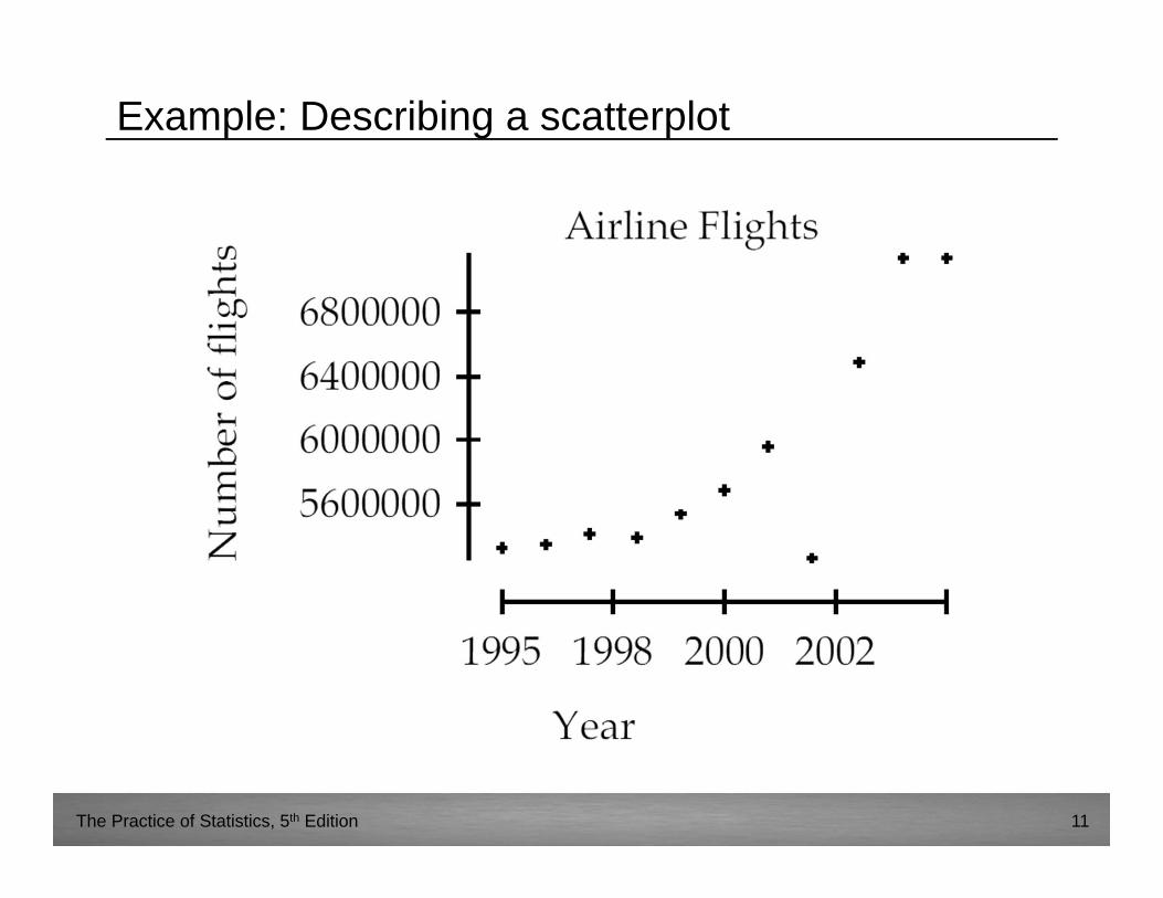
Example: Describing a scatterplot
The Practice of Statistics, 5th Edition 12
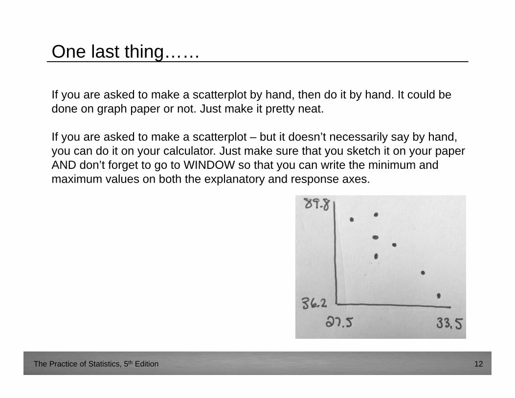
One last thing……
If you are asked to make a scatterplot by hand, then do it by hand. It could be done on graph paper or not. Just make it pretty neat.
If you are asked to make a scatterplot – but it doesn’t necessarily say by hand, you can do it on your calculator. Just make sure that you sketch it on your paper AND don’t forget to go to WINDOW so that you can write the minimum and maximum values on both the explanatory and response axes.


