18
Chapter 3: Describing Relationships Section 3-1: Scatterplots
Chapter 3: Describing Relationships
Section 3-1: Scatterplots

1
Chapter 1 Test Scores
2 Ch. 1 Test Scores vs. Student GPA
explanatory
response
Response = blue Explanatory = green
___________
__________
_________
__________________
Depends on your intentions. What do you want to predict?
??

1) Explanatory: number of cans of beer Response: blood alcohol level 2) Explanatory: amount of debt AND income Response: stress caused by college debt

We want to think about two questions: 1) What does the data suggest? Is there a relationship between GPA & ACT? 2) Could we use one variable to predict the other? Does a high GPA imply a high ACT Score?

graph (Use a calculator to make scatterplot)
pattern deviations
numerical summaries (tomorrow)
These are the same steps as the 1-variable data from Ch. 2

scatterplot quantitative
point
𝑥
𝑦
GRAPHING SCATTERPLOTS: 1) Decide which variable should go on each axis. 2) Label and scale your axes. 3) Plot individual data values.
Scatterplots are the only choice for displaying the relationship between 2 quantitative variables!
Graph the scatterplot for the GPA and ACT scores by hand first and then use a calculator.

direction form strength
Direction
positively Hours studied vs test grade
negatively
Temperature vs hot chocolate sales Form
linear curved
clusters Strength
line
outliers
When describing the relationship in a scatterplot, just remember: DOFS + context

Let’s describe the relationship between GPA and ACT scores. Remember DOFS + context.
There is a moderately strong positive linear relationship between GPA and ACT scores, with no obvious outliers.
use a different symbol
use 2 different symbols
For example, use X for men and O for women.

1) The relationship is positive. The longer the duration of the eruption, the longer the wait between eruptions. One reason for this may be that if the geyser erupted for longer, it expended more energy and it will take longer to build up the energy needed to erupt again.
2) The form is roughly linear with two clusters. The clusters indicate that in general there are two types of eruptions: one shorter, the other somewhat longer.
3) The relationship is fairly strong. Two points define a line, and in this case we could think of each cluster as a point, so the two clusters seem to define a line.
4) There are a few outliers around the clusters, but not many and not very distant from the main grouping of points.
5) The Starnes family needs to know how long the last eruption lasted in order to predict how long until the next one.

direction form strength
strength
What do you notice?

strength direction LINEAR quantitative
𝑟 𝑥, 𝑦
𝑥 , 𝑦 𝑠𝑥, 𝑠𝑦
𝑛
1
𝑛 − 1
𝑥𝑖 − 𝑥
𝑠𝑥
𝑦𝑖 − 𝑦
𝑠𝑦
This is the GPA & ACT scores data 𝑥𝑖 − 𝑥
𝑠𝑥
𝑦𝑖 − 𝑦
𝑠𝑦
𝑥𝑖 − 𝑥
𝑠𝑥
𝑦𝑖 − 𝑦
𝑠𝑦
−1
0.25
−0.75
1.5
0.75
−0.75
−1.04
0.62
−0.41
1.45
0.41
−1.04
1.04
0.155
0.3075
2.175
0.3075
0.78
Do these formulas look familiar?
𝑛 = 6
𝑥 = 3.4 𝑠𝑥 = 0.4
𝑦 = 24 𝑠𝑦 = 4.82
________ 4.765
Also called the “correlation coefficient”
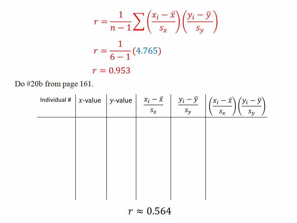
𝑟 =1
𝑛 − 1
𝑥𝑖 − 𝑥
𝑠𝑥
𝑦𝑖 − 𝑦
𝑠𝑦
𝑟 =1
6 − 1(4.765)
𝑟 = 0.953
Individual # 𝑥-value 𝑦-value 𝑥𝑖 − 𝑥
𝑠𝑥
𝑦𝑖 − 𝑦
𝑠𝑦
𝑥𝑖 − 𝑥
𝑠𝑥
𝑦𝑖 − 𝑦
𝑠𝑦
𝑟 ≈ 0.564

Guess what!! Of course we can find 𝑟 with the calculator!
1) Create two lists.
2) Turn DiagnosticOn [mode STAT DIAGNOSTIC ON]
3) STAT CALC 4:LinReg(ax+b) OR 8:LinReg(a+bx)
4) Input Xlist and Ylist Calculate
5) Look for r =
6) Calculator: 𝑟 = 0.955 By Hand: 𝑟 = 0.953

1
𝑛 − 1
𝑥𝑖 − 𝑥
𝑠𝑥
𝑦𝑖 − 𝑦
𝑠𝑦
positive
negative
As one variable increases, the other increase OR As one variable decreases, the other decreases
As one variable increases, the other decreases OR As one variable decreases, the other increases
no linear relationship
weak (+) linear relationship
weak (-) linear relationship
fairly strong (+) linear relationship
very strong (+) linear relationship
very strong (-) linear relationship


explanatory response
nothing
Correlation coefficient 𝑟 is unitless since formula is standardizing 𝑥 and 𝑦
does not
LINEAR
vulnerable to outliers
L1 L2
1 1
2 4
3 9
4 16
5 25
Use your calculator to plot the scatter plot for this data. Describe the relationship.
Nonlinear relationship because it’s curved data. The relationship is 𝑦 = 𝑥2. ALWAYS plot the data on your calculator to see the relationship.

1) Estimates of r will vary. (a) The correlation is about 0.9. There is a strong, positive linear relationship between the number of boats registered in Florida and the number of manatees killed. (b) The correlation is about 0.5. There is a moderate, positive linear relationship between the number of named storms predicted and the actual number of named storms. (c) The correlation is about 0.3. There is a weak, positive linear relationship between the healing rate of the two front limbs of the newts. (d) The correlation is about −0.1. There is a weak, negative linear relationship between last year’s percent return and this year’s percent return in the stock market. 2) The correlation would decrease. This point has the effect of strengthening the observed linear relationship that we see.
Remember DOFS!!

Correlation Coefficient Guessing Game: http://www.rossmanchance.com/applets/GuessCorrelation.html


