7
Production Task- Research into Codes and Conventions of CONTENTS PAGE Harry Gupta
| Date post: | 13-Aug-2015 |
| Category: |
Social Media |
| Upload: | harry-gupta |
| View: | 26 times |
| Download: | 0 times |

Production Task-Research into
Codes and Conventions of
CONTENTS PAGE
Harry Gupta

Incorporating the magazine logo into the background works in promoting the brand identity, helping to tie all the elements on the page together. It fills a large gap in the page, without being overwhelming .
The model is pictured topless, displaying all of his tattoos, some of which representing Christianity. He is wearing his cap backwards- displaying rebellion and controversy and ‘bling’ pieces of jewelry including some gold caps on his teeth (the models trade mark) all of these elements promote youth and rebellion as the model doesn't’t look particularly old. In adition he wears a smaller head, around his neck- displaying hard rock possibly.
The layout of the word ‘Contents’ is unusual and displays the uniqueness of Vibe magazine- displaying that they are different form other selling music magazines, promoting the fact that you should buy their magazine due to their quirkiness.
The layout of the columns, informing you (the reader) of why youre at the contents section of the magazine- to uncover information of what is in the magazine. It is positioned on the left hand side of the page, and draws the attention to the model- which is unusual, due to the purpose of the contents page being about the contents of the music magazine- not the model who is usual the main focal point of the front cover.
The color scheme could be suggestive and connote passion and lust being a sensual romantic red/deep heavy burgundy. His gaze- squint towards the audience develops an uncomfortable feeling as it displays anger.

VIBE Codes and Conventions• The masthead is a blended color- similar to the background which emphasizes the model in full focus and
creates a sensual feel due to the color mix of burgundy and dark red. The colors both connote romance and danger- possibly signifying the models distressed position. The danger is multiplied when the combination of heavy chains, black skin and gold teeth and placed together; surrendering to the typically held stereotype of a black American thug’.
• The models intimidating stare into the readers eyes, creates a personal direct address (uses and grat) and creates a violence in the models position. This is a useful tip for when I create my music magazine. He is shown displaying two tattoos on his chest, one reading “God Bless All” and the other regarding something to do with justice. This represents him as a religious man, which leads the reader to raise the hermeneutic question of why he is so angry, and tugging on the chains
• The layout of the magazine is fairly straight forward, it is a quirky design as you have the model as the focal point, where usually the contents itself is the center point. Vibe has positioned the column to the left hand side and has the word contents in big bold white text contrasting with the red background dispersed into separate lines.
• The sub cover lines of ‘fashion’ are bold, italics and in a contradictory font.• I will uses most of these conventions and find them very useful to learn and will take all of this new
information on board whilst making my music magazine. I will keep the house style consistant and the models in keeping with the design layout of the page.
• They have also used the big ‘V’ to fill up empty space on the page which I find would be very beneficial for them. I intend on using this technique.

Headline of mag is ‘Q’ and is headlined along with the contents part- directing attention to that part- the title. There is a higher significance of these letters as they're in bold white text against black and red borders (bold striking colors) the red underneath the ‘Q’ continues the house style of the magazine throughout the contents page.
The column displaying most of the information on the contents page has been displayed on the left hand side much like the VIBE magazine. It continues the house style of red, black and white and bold large red number points.
The main image dominates the page, much like the VIBE magazine. The model Adele (famous singer and songwriter- keeping the theme of the music magazine) and she is connecting with the audience in an intense stare. This creates a personal bond with the reader. Uses and grat.
Subtle make up to the face and pale skin complexion, represents purity- an ideal role model for younger children encouraging parents to buy the magazine.
Cover line other than the obvious ‘Contents’ text is the purpose behind the image of Adele. It marks the number 78 and Adele- indicating the page number and the information.
Q has included at the bottom right hand corner a review section. The layout is very simple and neat using rectangular boxes to fit a header inside with the logo ‘Q’ in bold white and against the striking red again to separate itself from the rest of the page. It also continues the house style.
Q Codes and Conventions
• Q has a very distinctive masthead, with the Q logo cornered off in a red box separating itself from the rest of the black page. It draws attention to the mast head as well as they placed next to it ‘Contents’ which applies purpose for the whole page- giving it a title.
• They have used a prominent figure in the music industry to be a model for the contents page. This will increase the target audience for the magazine as it will appeal to the Adele fans.
• The focal point of the page is Adele, and she is seen staring at the reader which imposes a hermeneutic question on it’s own and creates a personal connection with the audience (uses and grat) I intend on using this technique when I create my contents page in my music magazine.
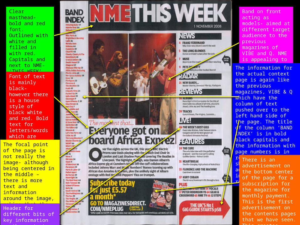
Clear masthead- bold and red font. Outlined with white and filled in with red. Capitals and next to NME- ‘THIS WEEK’ signifying the importance of the page.
Band on front acting as models- aimed at different target audience to the previous magazines of VIBE and Q. NME is appealing to an older audience.
Font of text is mainly black- however there is a house style of black white and red. Bold text for letters/words which are seen to be more important that the others.
The information for the actual context page is again like the previous magazines, VIBE & Q which have the column of text pushed over to the left hand side of the page. The title of the column ‘BAND INDEX’ is in bold black capitals and the information with page numbers is in red text. It is shown that the additional important information is in red.
The focal point of the page is not really the image- although being centered in the middle – there is more text and information around the image, making that the focal point of the page.
There is an advertisement on the bottom center of the page for a subscription for the magazine for monthly payment. This is the first advertisement on the contents pages that we have seen. This creates realism for the reader and indicates a personal connection (uses and grat)
Header for different bits of key information on the contents page.

NME Codes and Conventions• The masthead used is clear, to the point and gives a definite idea of when this magazine was
published ‘This Week, 1st November 2006’. They have separated the mast head from the rest of the text, by keeping the font color red and bold with an outline of white- to emphasize the letters. Next to it is ‘THIS WEEK’ in bold capital white letters. This is all contrasted against a black rectangular board.
• NME unlike the other music magazines haven’t used a singular model (who would usually be looking directly at the reader). The idea of having a band all looking either at their instruments or towards the ground, creates a sense of impersonality. This could easily distance the readers view of the magazine and not entice them to read more. This could also be due to there being an overwhelming amount of text on the page, in contrast to the magazine’s that we saw on the previous slides where the image was the dominating feature. I don’t think that I will use this technique- I think that I intend on using a larger image to fill up the empty space.
• NME have decided to advertise their subscription for their magazine at the bottom of the page of the magazine. This is a good idea as it is sectioned off in a large box- drawing the audience’s focus towards that. There is an unusual burst of yellow text which disturbs the house style, but focus’ the attention of the reader to the important text of “Subscribe today for just £5.57 a month* GO TO”.
• I think that the conventions that I will use from this magazine, would be that they have separated their masthead logo away from the whole page. In addition to this I liked the fact that they have added in an advertisement at the bottom of the page, it creates a sense of realism and that would really connect with the audience and persuade them to subscribe.


