45
Corporate identity and design guidelines Revised edition 2018 Enter

Corporate identity and design guidelines
Revised edition 2018
Enter

North Yorkshire County Council Corporate identity and design guidelines
2 Introduction
IntroductionThese guidelines are intended to be used by designers and staff commissioning communications for North Yorkshire County Council (NYCC). Divided into seven tabbed sections, this interactive PDF document is designed to be easier to use than traditional corporate identity manuals, and works best when used on-screen, which means that you don’t need to print out a copy.
To navigate through the different sections of the guidance, just click on the tab to take you to the relevant section.
The aim is to help bring communications produced by all NYCC directorates into one family of easily recognisable, customer friendly, consistent and professional products. While these guidelines place some restrictions on the use of colour, layout and typographic style, we hope that they will not be seen as restrictive but as a useful guide to aid the production of NYCC communications.
We recommend that anyone who has a responsibility for producing communications takes time to read through and understand the brand guidance.
ChecklistTo help you check your communications against the brand guidance, we’ve also prepared this handy checklist.
Brand guidance checklist
• Has the correct NYCC logo been used?
• Is the logo positioned correctly, at the correct size and in the right proportions?
• Has the correct logo colour been used?
• Are any partnership logos used correctly?
• Have the correct fonts been used and at the correct size?
• Have the correct directorate colours been used?
• Are any graphic devices used correctly?
• Do you have permission for the images used? and is there consent in place for identifiable people in the images?
• Has the content been proof read and checked against plain English guidance?
• If you’re producing a leaflet, do you have a leaflet code? (The Document Management Centre (DMC) can provide you with a code, this means that future requests for the item are easier to track.)
• Has the accessibility statement been included?
• Does your message communicate diversity in a positive and dignified manner, avoiding stereotypes and meeting our commitment to equalities?
Logo and partnerships Colours Fonts Graphic devices Templates Signage and advertising Photography

North Yorkshire County Council Corporate identity and design guidelines
3 Introduction
The Document Management Centre (DMC)The DMC provides a design, print and reprographic service to NYCC.
The DMC is also able to offer a variety of binding, finishing and folding options, and can outsource work where necessary using preferred suppliers included in the print services framework contract.
The print services framework contract has been put in place to provide a full range of printing services at competitive prices for the whole of the County Council. Anyone looking to source printed material should contact the DMC.
For more information you can contact the DMC by sending an email to [email protected]
Plain EnglishAll communications produced by NYCC should be clear, consistent and easy to understand. Our plain English guidance will help you write content for your communications that is customer friendly and free from jargon. To access the NYCC plain English guidance click here.
Accessible communicationNYCC is committed to making our communications accessible to all members of the public; for more information about accessible communication click here.
Extra helpIf you need more information about any of the elements contained within these guidelines, you can contact the design team on 01609 533232 or by sending an email to [email protected]
Logo and partnerships Colours Fonts Graphic devices Templates Signage and advertising Photography

North Yorkshire County Council Corporate identity and design guidelines
4 Introduction
Artwork and printable filesDesign and artwork which is created internally by directorates, or supplied by an agency must be the approved design with no amends necessary. All printable files to be supplied as a high resolution PDF.
Quick check list for PDF files:
• Images to be 300dpi
• Images and document colours to be CMYK
• Minimum of 3mm bleed on all edges
• Crop marks
• Saved as single pages
Images and resolution
Non-vector images, Photoshop files and bitmaps should be supplied at a minimum of 300dpi. If supplied lower than 300dpi there is a risk the print will be of a low quality.
Colour
Unless specified all files should be created and saved in CMYK, using CMYK references or Pantone references. Spot colours and rich blacks need to be specified to avoid printing errors.
Bleed and crops
3mm bleed needs to be added on all sides. Text and logos should be within the margins set out in the guidelines. If a border has been added to a piece of artwork then please ensure that 3mm of the border bleeds from the edge where trimming will occur. Crop marks also need to be added to the file.
Exporting the PDF in a high resolution format will ensure all images and colours are at their best quality. This will retain the correct resolution of bitmap images, vectors and type. Save as single pages and not as spreads, this will help with pagination during print.
Logo and partnerships Colours Fonts Graphic devices Templates Signage and advertising Photography
North Yorkshire County Council Corporate identity and design guidelinesNorth Yorkshire County Council Corporate identity and design guidelines
5 Logo and partnerships
Logo and partnerships
Index
Logo and partnerships Colours Fonts Graphic devices Templates Signage and advertising

North Yorkshire County Council Corporate identity and design guidelines
6 Logo and partnerships
The master logo and colour optionsThe NYCC logo is the principal method by which the County Council is identified and the symbol by which we are known. It is vital that we always present this symbol in a consistent and professional manner and that everything associated with it reinforces the values of our organisation.
The master logo should always appear in one of the colourways shown to the right. The colourway used will depend on how many colours the job is being printed in and whether the logo will appear over an image or background colour.
NYCC logo full colour.
NYCC logo white.
NYCC logo black.
NYCC logo single colour.

North Yorkshire County Council Corporate identity and design guidelines
7 Logo and partnerships
Logo positioning and sizingThe logo should be aligned to the top left margin of the page (see figure 1). The margins are determined by taking a space equal to the outer ‘rose’ section of the graphic from the County Council logo.
A space the size of the ‘inner rose’ section must also be left around the logo (see figure 2), this creates breathing space for the logo and maintains a clear and concise identity. This should also be taken into account when positioning an image behind the logo. The logo should never be extended or condensed.
The depth of the logo, from the top of the ‘n’ to the bottom of the ‘y’ is calculated at 8% of the longest length of the item being produced.
The table below shows how this is calculated for various page sizes.
Page size Depth of logo Margin
A3 (420x297mm) 34mm 20mm
A4 (297x210mm) 24mm 14mm
A5 (210x148mm) 17mm 10mm
1/3 A4 (99x210mm) 17mm 10mm
Figure 1.
Figure 2.
The logo should never be shown at a depth of less than 8mm.
Breathing space
Safe areaS
afe
area
Saf
e ar
ea
Safe area
Breathing space
Bre
athi
ng s
pace
Bre
athi
ng s
pace

North Yorkshire County Council Corporate identity and design guidelines
8 Logo and partnerships
Secondary logo positioning and sizingWhen NYCC is the lead partner the logo and margins should follow the same position and sizing as figure 1. The partner organisation logos should go to the right of the NYCC logo at the same depth (see figure 3). When the 8% rule does not fit, due to the size/shape of the partner logos, you can reduce the logos in size until they ‘best fit’ the layout.
When NYCC is not the lead partner and our logo is being used on materials produced by a partner organisation the NYCC logo should be used at the bottom-right of the item being produced (see figure 4). In this instance the depth is 8% of the shortest length of the item being produced. The table below shows how this is calculated in this case.
Page size Depth of logo
A3 (420x297mm) 24mm
A4 (297x210mm) 17mm
A5 (210x148mm) 12mm
1/3 A4 (99x210mm) 8mm
Depth of partner logo to equal and balance the NYCC. Please consider any guidance the partner logo may have.
Figure 3.
Figure 4.
The logo should never be shown at a depth of less than 8mm.

North Yorkshire County Council Corporate identity and design guidelines
9 Logo and partnerships
Saf
e ar
ea
Saf
e ar
ea
Breathing space
Breathing space
Safe area
Safe area
In partnership logoThere may be a scenario where a supplier to NYCC would like to use the logo to show a partnership between themselves and NYCC. The words ‘In partnership with’ can be used together with the NYCC logo while retaining the rules of breathing space. See figure 5.
Figure 5.

North Yorkshire County Council Corporate identity and design guidelines
10 Logo and partnerships
Do and don’tThe logo must appear uncluttered, clearly legible and coordinate with the design. The correct brand colour, and proportions of the logo are to remain unchanged and intact.
Examples of what to do and what not to do are shown to the right.
Artwork files for the NYCC logo in a number of different formats can be downloaded here.
Any other wording Or font combination

North Yorkshire County Council Corporate identity and design guidelines
11
North Yorkshire County Council Corporate identity and design guidelines
Colours
Logo and partnerships Colours Fonts Graphic devices Templates Signage and advertising
Colours Index

North Yorkshire County Council Corporate identity and design guidelines
12 Colours
Corporate coloursOur corporate colours are the blue and green that make up the NYCC logo. These brand colours should be used if a project covers the Council as a whole, or if a project involves two or more directorates.
In addition to the two corporate colours there are four others which are specific to directorates.
The directorate colours should be used at 100% for key graphic devices such as headers, footers and address panels, and also for text. However, tints can be used within illustrations (tables and graphs, etc.) and to highlight blocks of text.
The names of the directorates are:
• Business and Environmental Services (BES)
• Central Services (CS)
• Children and Young People’s Service (CYPS)
• Health and Adult Services (HAS)
Spot: Pantone 294c CMYK: 100/69/7/30 RGB: 0/67/123 80
% ti
nt
20%
tint
40%
tint
60%
tint
80%
tint
20%
tint
40%
tint
60%
tintSpot: Pantone 347c
CMYK: 100/0/86/3 RGB: 0/161/96
Corporate colours.
Directorate colours.
Internal and accent colours.
Finance/pension
Spot: Pantone 199c CMYK: 0/100/62/0 RGB: 237/23/79
CYPS
Spot: Pantone 306c CMYK: 75/0/7/0 RGB: 0/186/228
CS
Spot: Pantone 294c CMYK: 100/69/7/30 RGB: 0/67/123
HAS
Spot: Pantone 512c CMYK: 50/100/15/10 RGB: 135/33/117
BES
Spot: Pantone 347c CMYK: 100/0/86/3 RGB: 0/161/96
Internal/accent
Spot: Pantone 144c CMYK: 0/60/100/0 RGB: 245/130/32
Logo and partnerships Colours Fonts Graphic devices Templates Signage and advertising Photography

North Yorkshire County Council Corporate identity and design guidelinesNorth Yorkshire County Council Corporate identity and design guidelines
Fonts and typography
13
Logo and partnerships Colours Fonts Graphic devices Templates Signage and advertising
IndexFonts and typography

North Yorkshire County Council Corporate identity and design guidelines
14 Fonts and typography
FontsFonts have a dramatic effect on the overall look and feel of publications and sticking to one or the other of the font families (shown right), plays a big part in having a consistent brand.
Our corporate font is Helvetica and should be used whenever possible. Helvetica offers a wide range of weights and so can be used to create a more diverse look to publications. Helvetica Light, Roman, Medium and Bold are the most commonly used within the NYCC portfolio.
When Helvetica is not available Arial can be used. This is commonly found on most computers and can be used in regular, bold and black weights.
See right for the full range of available weights for use within the NYCC brand.
Helvetica font familyHelvetica Thin
Helvetica Thin Italic
Helvetica Light
Helvetica Light Italic
Helvetica Roman
Helvetica Roman Italic
Helvetica Medium
Helvetica Medium Italic
Helvetica Bold
Helvetica Bold Italic
Helvetica Heavy
Helvetica Heavy Italic
Helvetica Black
Helvetica Black Italic
Arial font familyArial Regular
Arial Italic
Arial BoldArial Bold ItalicArial Black
Logo and partnerships Colours Fonts Graphic devices Templates Signage and advertising Photography

North Yorkshire County Council Corporate identity and design guidelines
15 Fonts and typography
Font size and usageWhen using typography, legibility and visual appeal should be considered at all times. For ease of reading, we recommend body copy is 12pt, however if space does not allow this, a minimum of 10pt can be used. Text should never go below 10pt unless the format dictates this, for example a business card.
Consideration should also be given to legibility when laying text over images or blocks of colour; make sure it’s large enough and that the colour stands out. Also bear in mind that some colour combinations can cause contrast issues for some people. Click here for more information about accessible communication.
The table to the right shows examples of fonts and point size for use on various document sizes. This should be referred to as a guide, and text can be altered to ‘best fit’ individual documents.
Media size A4 A5 DL leaflet (1/3 A4)
Main headlineHelvetica light 40pt on 40pt leading
Helvetica light 28pt on 28pt leading
Helvetica light 28pt on 28pt leading
Sub headlineHelvetica bold 13pt on 14.5pt leading
Helvetica bold 13pt on 14.5pt leading
Helvetica bold 13pt on 14.5pt leading
Body copyHelvetica light 12pt on 16-14pt leading
Helvetica light 12-10pt on 16-14pt leading
Helvetica light 12-10pt on 16-14pt leading
Pull quoteHelvetica medium 18pt on 24pt leading
Helvetica medium 16pt on 20pt leading
Helvetica medium 16pt on 20pt leading
CaptionHelvetica light 10pt on 14pt leading
Helvetica light 10-8pt on 14-12pt leading
Helvetica light 10-8pt on 14-12pt leading
FootnoteHelvetica light 8pt on 12pt leading
Helvetica light 8pt on 12pt leading
Helvetica light 8pt on 12pt leading
Logo and partnerships Colours Fonts Graphic devices Templates Signage and advertising Photography

North Yorkshire County Council Corporate identity and design guidelines
16 Fonts and typography
Lorem ipsum dolor sit amet, consectetur adipiscing elit. Praesent nec condimentum sem, at euismod neque. Phasellus a sapien quis libero rutrum semper vel sit amet nunc. Cras vel ultrices velit. Curabitur convallis consectetur sem. Maecenas non congue elit, ut consequat velit. Amet magna feugiat, eget egestas metus condimentum. Donec convallis scelerisque posuere.
Pellentesque eu scelerisque metus. Mauris viverra dapibus tortor id gravida. Etiam cursus turpis nec dolor pharetra sodales efficitur a velit.Sed tincidunt metus ut enim posuere, a eleifend leo ullamcorper. Pellentesque fermentum sit amet sapien vel tincidunt. Cras facilisis laoreet massa vitae vulputate. Aenean eleifend dapibus enim. Mauris id libero sed eros placerat facilisis non in felis.
TypographyThe way we present content in council leaflets, documents and publications is important in making sure the information is clear and easy to understand.
Copy should always have balanced line lengths with an even edge and no hyphenation (see figure 6a). Uneven line rag and spacing can cause confusion due to line hopping (see figure 6b).
Justified copy should not be used as this forces space between the words and characters. Figure 7 shows these areas known as ‘Rivers’, this can also make reading difficult for some people.
Other typographic pitfalls to be careful of are ‘Widows’ which are single lines on their own and ‘Orphans’, these are single word lines. This is poor design practice and creates a disjointed layout shown in figure 8.
Figure 6a.
Lorem ipsum dolor sit amet, consectetur adipiscing elit. Praesent nec condimentum sem, at euismod neque. Phasellus a sapien quis libero rutrum semper vel sit amet nunc. Cras vel ultrices velit.Curabitur convallis consectetur sem.Maecenas non congue elit, ut consequat velit. Amet magna feugiat, eget egestas metus condimentum.Donec convallis scelerisque posuere.
Pellentesque eu scelerisque metus. Mauris viverra dapibustortor id gravida. Etiam cursus turpis nec dolorpharetra sodales efficitur a velit.Sed tincidunt metus ut enim posuere, a eleifend leo ullamcorper.Pellentesque fermentum sit amet sapien vel tincidunt.
Figure 6b.
Lorem ipsum dolor sit amet, consectetur adipiscing elit. Praesent nec condimentum sem, at euismod. a sapien quis libero rutrum semper vel sit amet nunc. Cras ultrices velit. Curabitur convallis consectetur sem. Maecenas non congue elit, ut consequat velit. amet magna feugiat, eget egestas metus condimentum. Donec convallis scelerisque posuere.
Pellentesque eu scelerisque metus. viverra dapibus tortor id gravida. Etiam cursus turpis nec dolor sodales efficitur a velit.Sed tincidunt metus ut enim. sit sapien vel tincidunt. Cras facilisis laoreet vitae vulputate. Aenean eleifend dapibus enim. Mauris id libero sed eros placerat facilisis non in felis.
Figure 7.
Lorem ipsum dolor sit amet, consectetur adipiscing elit. Praesent nec condimentum sem, at euismod neque. Phasellus a sapien quis libero rutrum nunc.
Cras vel ultrices velit. Curabitur convallis consectetur sem maecenas velisim setter ipsum
metus condim entum.
Pellentesque eu scelerisque metus. Mauris viverra dapibus tortor id gravida. Etiam cursus turpis nec dolor pharetra sodales efficitur a velit.Facilisis laoreet massa vitae vulputate sapien quis libero turpis nec dolor pharetra.
Figure 8.
Orphan. Widow.
Logo and partnerships Colours Fonts Graphic devices Templates Signage and advertising Photography

North Yorkshire County Council Corporate identity and design guidelinesNorth Yorkshire County Council Corporate identity and design guidelines
Graphic devices
17
Logo and partnerships Colours Fonts Graphic devices Templates Signage and advertising
Graphic devices Index

North Yorkshire County Council Corporate identity and design guidelines
18 Graphic devices
Graphic devicesA number of graphic devices are available to complement the design of NYCC documents and to reinforce the brand. Some of these devices are compulsory and are pre-set within the design templates and others are optional. Each should be given careful consideration and when collectively applied, they will give NYCC a consistent and engaging appearance.
Standard graphic devices include:
• headers; and
• address panel.
Also in this section you will find guidance on the suggested look and feel of other graphic devices such as:
• illustrations;
• tables; and
• graphs.600
Smartphones
issued
Modern council
Property, technology and organisational development in 2015/16
2,500
rolled out
Tablets and laptops
Wi-fi
upgraded
in buildings
across the
county
Training in
2015/16
24,691
mandatory online
learning courses
completed
981,511
views on
Learning Zone
4,986
views on Ashridge
- learning materials
for managers
21,237
continual
professional
development
training and
learning activities
undertaken by staff
70,943
training and learning
sessions provided
Engaged with 1,800 colleagues across the council
923
classroom
training events
delivered to
11,378
staff
Logo and partnerships Colours Fonts Graphic devices Templates Signage and advertising Photography

North Yorkshire County Council Corporate identity and design guidelines
19 Graphic devices
Front cover headerThere are four variations for cover design and header layout (shown right) which are dependant on the information available in the document.
There are variations on the header using the ‘block’ and ‘secondary block’ device which are used to hold the heading and sub heading information. These devices ensure type legibility and brand consistency, and where possible should be used but are optional.
The header area must always contain the NYCC logo if nothing else.
Central Services
A4 CS document heading using 40pt - 40pt leading.
A4 CYPS document heading using 40pt - 40pt leading.
Example of a cover sub heading using 18pt - 24pt leading.
Central Services
Central Services
A4 CS document heading using 40pt - 40pt leading.
Example of a cover sub heading using 18pt - 24pt leading.
A4 CYPS document heading using 40pt - 40pt leadingand no subheading or image.
Central Services
NYCC Corporate cover for Central Services with main heading in the ‘block’ device, and space for image.
NYCC Corporate cover for Central Services with main heading and full cover available for an image.
NYCC Corporate cover for Central Services with main heading in the ‘block’ device, sub head in the ‘secondary block’ device and space for image. The secondary block is created by using an opacity of the main heading block over an image or colour. See figure 9.
NYCC Corporate cover for Central Services with main heading, sub heading in the ‘secondary block’ device leaving the full cover available for an image.
Logo and partnerships Colours Fonts Graphic devices Templates Signage and advertising Photography

North Yorkshire County Council Corporate identity and design guidelines
20 Graphic devices
Front cover completeFigure 9 shows how the graphic devices work together to create a complete A4 document front cover. Further examples of how the front cover can be designed using the different header devices can be seen on page 24.
Figure 9.
A4 HAS document heading using 40pt - 40pt leading.
Example of a cover sub heading using 18pt - 24pt leading.
14mm Margin is dictated by the rose*
14mm*
14mm*
14mm*
7mm Half the margin^
7mm^
14m
m*
Sub heading area Using a multiply opacity effect as an overlay helps create the space available for the sub heading. The height of the image in the document and the area available for the subheading is governed by the initial size of the logo and accompanying measurements.
14m
m*
Logo and partnerships Colours Fonts Graphic devices Templates Signage and advertising Photography

North Yorkshire County Council Corporate identity and design guidelines
21 Graphic devices
Address panelIt is important to present the address and contact details in a clear and concise manner so customers can easily access key information. It also gives us the opportunity to make people aware that information is available in alternative formats or languages. Address panels should go on all external NYCC publications, with the exception of posters where contact information should be included in the poster design. In this case all relevant contact details should be within the poster text.
Address panels for A4 (see figure 10), A5 and DL publications are available in the document templates. And whilst the preferred colour option is the corporate blue, directorate colours, black and white versions can also be used.
The contact details supplied within the address panels are that of the customer service centre. If a publication requires specific contact details, you are permitted to substitute the generic contact details supplied.
The address panel should be positioned on the back page of a publication; between the left and right margins; and sit on the bottom margin of the page. See figure 11.
##### mm/yy
Figure 10.
Figure 11.
Below the address panel on the templates is an area which is available for an internal job number and date. This can be used by external agencies, and a number obtained from the DMC at County Hall.
The back page is flexible and can be populated with, colour, image, or subject based content.
Contact us
W: www.northyorks.gov.uk E: [email protected] T: 01609 780 780 (Monday to Friday 8.00am - 5.30pm closed weekends and bank holidays) North Yorkshire County Council, County Hall, Northallerton, North Yorkshire, DL7 8AD
You can request this information in another language or format at www.northyorks.gov.uk/accessibility
Logo and partnerships Colours Fonts Graphic devices Templates Signage and advertising Photography

North Yorkshire County Council Corporate identity and design guidelines
22 Graphic devices
Other graphicsOther graphic devices such as tables, graphs, fact boxes and illustrations should also reflect the brand style and colours. Graphs and charts should be kept simple and make use of tints.
Icons can be used to illustrate or draw attention to statistics, quotes, questions or pointing people towards a point of contact.
Infographics can also be used to help add variety and interest to a layout, although it’s important not to make a page too busy or confusing.
0
50
100
150
200
250
One
Two
Thre
e
Four
24
44
52
63
25 22
36
35
18
25
18
4623
35
27
46
52 4
C
B
A
D
E0
100
200
300
400
500
600
One
Two
Thre
e
A
B
C
488
382362
68
134156
556516 518
368
286
284
• One• Two• Three
Stacked bar chart.
Pie chart.
Linear icons for infographics and emphasising statistics.
Table.
Bar chart.
Lorem ipsum 1 2
Test cell 1 100 1000
Test cell 2 200 2000
Test cell 3 300 3000
Test cell 4 400 4000
Test cell 5 500 5000
Test cell 6 600 6000
Bespoke graphics
There are occasions when bespoke graphics and charts are needed to achieve a desired effect to meet the needs of the client and the brief.
Logo and partnerships Colours Fonts Graphic devices Templates Signage and advertising Photography

North Yorkshire County Council Corporate identity and design guidelines
23
North Yorkshire County Council Corporate identity and design guidelines
Layout and templates
Logo and partnerships Colours Fonts Graphic devices Templates Signage and advertising Photography
Layout and templates Index

North Yorkshire County Council Corporate identity and design guidelines
24 Layout and templates
Front coverThe examples on the right show various A4 front covers, and how the graphic devices work together. A guide to the layout and use of the graphic devices can be seen on page 19 and 20.
A4 CS document heading using 40pt - 40pt leading.
Example of a cover sub heading using 18pt - 24pt leading.
A4 CS document heading using 40pt - 40pt leading.
A4 CS document heading using 40pt - 40pt leading.
Example of a cover sub heading using 18pt - 24pt leading.
A4 CS document heading using 40pt - 40pt leadingand no subheading or image.
A4 CS document heading using 40pt - 40pt leadingand no subheading or image.
These examples are for Central Services. The remaining directorates will follow the same layout while using their own colours and graphics.
Logo and partnerships Colours Fonts Graphic devices Templates Signage and advertising Photography

North Yorkshire County Council Corporate identity and design guidelines
25 Layout and templates
Layout spreadIt’s important that the layout of a document follows the guidelines included in this toolkit to make sure that County Council publications are clear and easy to read.
When creating a document it’s also important to consider headings and how the sections of content are positioned. This is achieved by using the font guidance set out on page 15. An example of this can be seen in figure 9, along with a two column structure which is best suited for an A4 and A5 document.
When creating a new document the following number of columns can be used as a guide which will help in creating a bespoke design while being recognised as being an NYCC branded piece of work.
Title and headingsSub heading
Body copy like this in 12pt - 16pt leading. 11pt - 14.5pt leading can also be used.
A sapien quis libero rutrum semper vel sit amet nunc. Cras vel ultrices velit. Curabitur convallis consectetur sem in ullamcorper. Maecenas non congue elit, ut consequat velit. Quisque convallis felis sit amet magna feugiat, eget egestas metus condimentum. Donec convallis scelerisque posuere.
Pellentesque eu scelerisque metus. Mauris viverra dapibus tortor id gravida. Etiam cursus turpis nec dolor pharetra sodales efficitur a velit. Sed tincidunt metus ut enim posuere, a eleifend leo ullamcorper. Pellentesque fermentum sit amet sapien vel tincidunt.
Sub heading
Body copy like this. Phasellus a sapien quis libero rutrum semper vel sit amet nunc. Cras vel ultrices velit. Curabitur convallis consectetur sem in ullamcorper. Maecenas non congue elit, ut consequat velit. Quisque convallis felis sit amet magna feugiat, eget egestas metus condimentum. Donec convallis scelerisque posuere. Pellentesque eu scelerisque metus. Mauris viverra dapibus tortor id gravida. Etiam cursus turpis nec dolor pharetra sodales efficitur a velit. Sed tincidunt metus ut enim posueres.
Sub heading
• Bullets like this.
• Curabitur convallis consectetur sem in ullamcorper. Maecenas non congue elit, ut consequat velit. Quisque convallis felis sit amet magna feugiat, eget egestas metus condimentum.
• Donec convallis scelerisque posuere. Pellentesque eu scelerisque metus. Mauris viverra dapibus tortor id gravida. Etiam cursus turpis nec dolor pharetra sodales efficitur a velit.
• Sed tincidunt metus ut enim posuere, a eleifend leo ullamcorper. Pellentesque fermentum sit amet sapien vel tincidunt. Cras facilisis laoreet massa vitae vulputate. Aenean eleifend dapibus enim. Mauris id libero sed eros placerat facilisis non in felis.
Body copy like this. Phasellus a sapien quis libero rutrum semper vel sit amet nunc. Cras vel ultrices velit. Curabitur convallis consectetur sem in ullamcorper. Maecenas non congue elit, ut consequat velit. Quisque convallis felis sit amet magna feugiat, eget egestas metus condimentum.
Donec convallis scelerisque posuere. Pellentesque eu scelerisque metus. Mauris viverra dapibus tortor id gravida. Etiam cursus turpis nec dolor pharetra sodales efficitur a velit. Sed tincidunt metus ut enim posuere, a eleifend leo ullamcorper. Pellentesque fermentum sit amet sapien vel tincidunt.
Quote and pullout text Quote and pullout text Quote and pullout text Quote and pullout text Quote and pullout text Quote and pullout text Quote and pullout text Quote and pullout text Quote and pullout text Quote and pullout text Quote and pullout text Quote and pullout text Quote and pullout text Quote and pullout text
6Document reference, or can be left blank
Heading and or sub heading
5 Section title or can be left blank
North Yorkshire County Council
Page size Columns Gutter width
A3 (420x297mm) 8 8mm
A4 (297x210mm) 8 6mm
A5 (210x148mm) 6 4mm
1/3 A4 (99x210mm) 4 4mm
Logo and partnerships Colours Fonts Graphic devices Templates Signage and advertising Photography

North Yorkshire County Council Corporate identity and design guidelines
26 Layout and templates
Design templatesThe principles of designing a front cover, inside spreads, back cover or poster are the same regardless of size or format.
Design templates are provided in a variety of formats and include:
A4 booklet (portrait);
A4 poster (portrait);
A5 booklet;
DL leaflet (1/3 A4); and
Banner template.
These are available as Adobe InDesign files for each directorate.
Each template comes pre-formatted with logos and graphic devices. Character and paragraph styles are also pre-formatted and include key styles such as body copy, titles, quotes, etc.
Word, PowerPoint and PDF templatesWord and PowerPoint templates are accessible to all internal staff through their Microsoft programmes. PDF templates are accessible to internal staff via the intranet. Please use the templates provided to ensure brand consistency. Templates include:
Letterheads;
Internal report/document (for all directorates);
PowerPoint;
Compliment slip; and
Business card.
NYCC logoA full suite of the NYCC logo which includes PC jpeg versions can be downloaded here.
Logo and partnerships Colours Fonts Graphic devices Templates Signage and advertising Photography

North Yorkshire County Council Corporate identity and design guidelines
27
North Yorkshire County Council Corporate identity and design guidelines
Promotional material
Logo and partnerships Colours Fonts Graphic devices Templates Signage and advertising Photography
Promotional material Index

North Yorkshire County Council Corporate identity and design guidelines
28 Promotional material
SignageThe key points to remember when planning or commissioning new signage are:
• standard and permanent signage should feature white text on a blue background. The blue should be the closest match to Pantone 294. The logo should always appear as white reversed out of blue;
• the logo should appear at the top of the sign, aligned left to margins determined by the ‘rose’ which can be found on page 7. If the signage is for a school or NYCC is not the lead partner (secondary identity) the NYCC logo should be used at the bottom-right of the sign, the layout for this can be found on page 8;
• all type should be in Helvetica or Arial and should be of a legible font size.
• body text should be left aligned and should not exceed the external margins set by the logo. Careful consideration should be given to the point size of the text used. Bear in mind where the sign is to be positioned, i.e. Does it need to be legible from a moving vehicle? Signs should use a large point size with the minimum number of words for clarity;
• where a metal plaque, for example silver or brass finish, is produced, the full colour logo should be used with text in black or blue lettering as appropriate.
The following pages demonstrate examples of signage that have been produced following these guidelines.
Logo and partnerships Colours Fonts Graphic devices Templates Signage and advertising Photography

North Yorkshire County Council Corporate identity and design guidelines
29 Promotional material
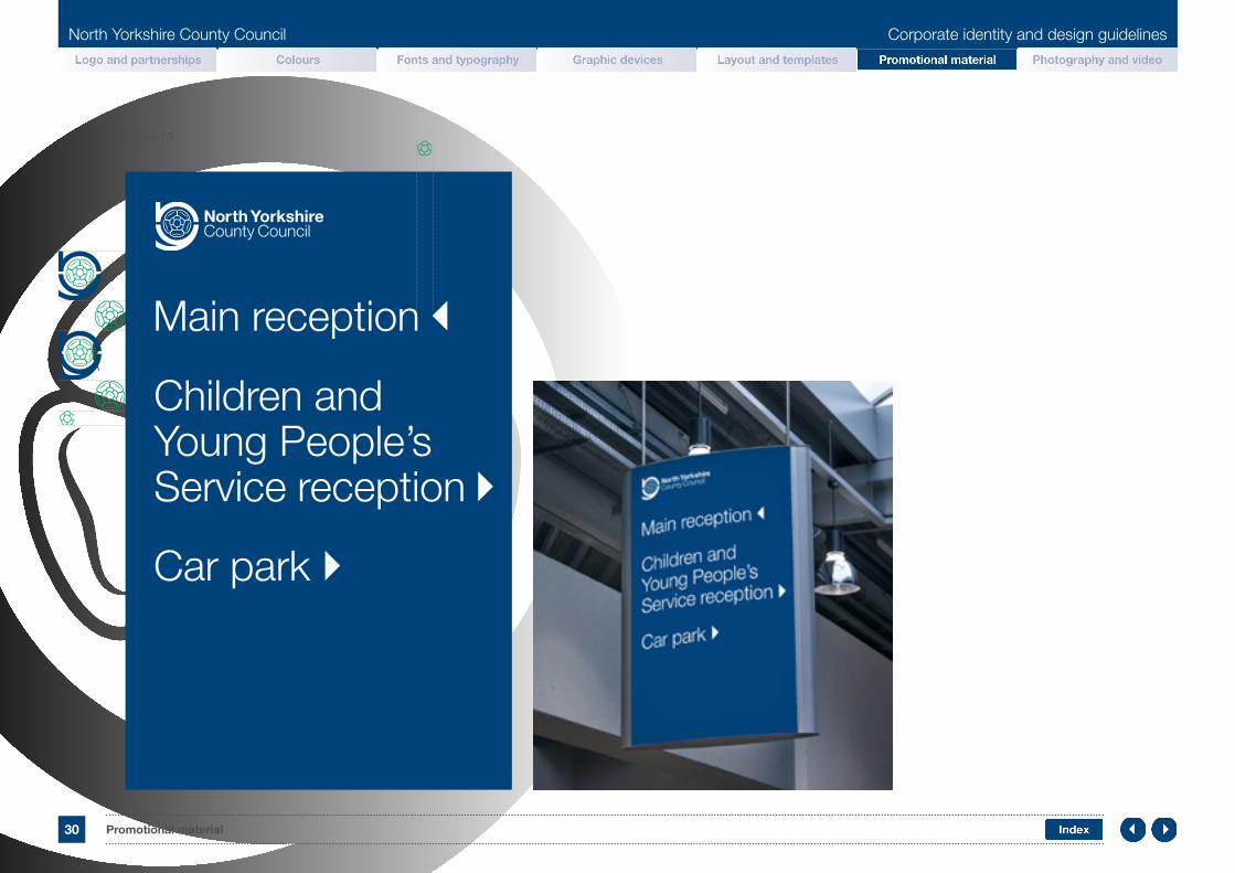
Signage layout optionsSignage layout is dependant on the size of the sign and its content. The logo can help determine how to lay out a sign clearly. Figure 12 shows a sign displaying general information; figure 13 shows a sign with directions.
There are occasions when the font size needs to be amended to accommodate the amount of copy required on signage. In this instance care should be taken to follow the brand guidance as closely as possible to limit errors.
Name or contentGeneral or full signage copy depending on the amount of information required
Figure 12.
The logo is central to creating a consistent layout for the sign by standardising the font size and the spacing. To calculate the size of the logo view page page 7.
Logo and partnerships Colours Fonts Graphic devices Templates Signage and advertising Photography
North Yorkshire County Council Corporate identity and design guidelines
30 Promotional material
Figure 13.
Main reception
Children and Young People’s Service reception
Car park
Logo and partnerships Colours Fonts Graphic devices Templates Signage and advertising Photography

North Yorkshire County Council Corporate identity and design guidelines
31 Promotional material
Space for schoolname on two linesGeneral or full signage copy depending on the amount of information required
Figure 14.
The logo is central to creating a consistent layout for the sign by standardising the font size and the spacing.
A blue or white background can be used when creating a sign.
Signage for schoolsWhen designing for schools the NYCC logo should be placed bottom right (see figure 14). The school name and/or logo can then be placed towards the top of the sign. If further details are to be added please adjust the type accordingly (See figure 15).
General or full signage copy depending on the amount of information required
School logo
Lorem ipsum dolor sit amet, consectetur adipiscing elit. Mauris sit amet neque et dui fermentum maximus ut sed elit. Nulla aliquam ornare ligula, at vehicula tortor porta.
Figure 15.
Logo and partnerships Colours Fonts Graphic devices Templates Signage and advertising Photography

North Yorkshire County Council Corporate identity and design guidelines
32 Promotional material
BannersBanners come in many formats, one of the most commonly used style of banners is the cartridge pull-up/pop-up banners. The logo can help determine how to lay out a banner clearly. Figure 16 shows the banner template, while figure 17 is an example of how the template can be used to create a bespoke layout to meet a client’s needs, while remaining noticeably NYCC.
Figure 16. Figure 17.
Logo and partnerships Colours Fonts Graphic devices Templates Signage and advertising Photography

North Yorkshire County Council Corporate identity and design guidelines
33 Promotional material
LetterheadThere is one letterhead template which can be used for all directorates. There are also blank and logo only versions which can be used with existing and already printed letterheads. They can all be accessed by internal staff though Microsoft Word as a Word document, and are pre-formatted to be used with the council’s window envelopes.
Letterhead template example.
Logo and partnerships Colours Fonts Graphic devices Templates Signage and advertising Photography
<Text>
Sender Name Address 1 Address 2 Address 3 POST TOWN POSTCODE Tel: 01609 «number» Fax: 01609 «number» Email: «name»@northyorks.gov.uk Web: www.northyorks.gov.uk
Name Address 1 Address 2 Address 3 POST TOWN POSTCODE
Your ref: «ref» Our ref: «ref» Contact: «name» Date: «ref»
North Yorkshire County Council Corporate identity and design guidelines
34 Promotional material
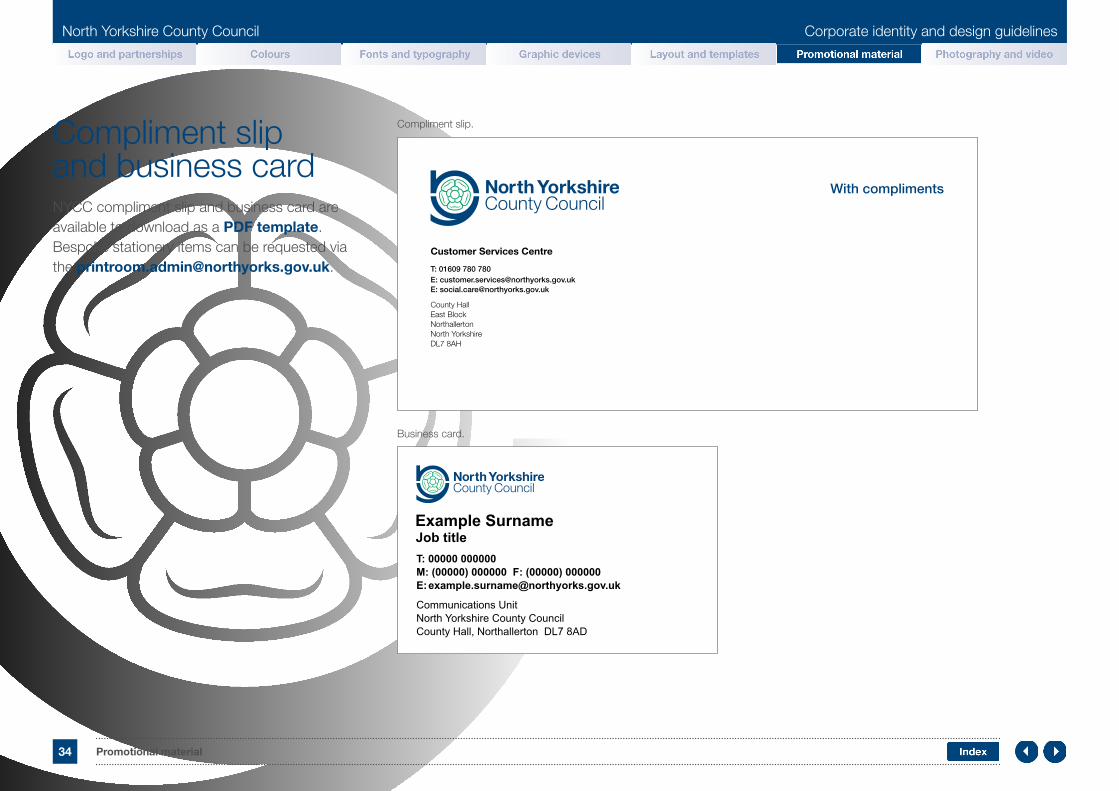
Compliment slip and business cardNYCC compliment slip and business card are available to download as a PDF template. Bespoke stationery items can be requested via the [email protected].
Compliment slip.
Business card.
Logo and partnerships Colours Fonts Graphic devices Templates Signage and advertising Photography

North Yorkshire County Council Corporate identity and design guidelines
35 Promotional material
DigitalA digital toolkit is available for internal and external clients to help mirror NYCC’s website. This will create a consistent look and feel for online communications.
h1 Heading #pt #em (R0 - G67 - B123 | 2px corner radius on boxes)
H3 footer heading
h5 link in the footer
h5 link in the footer
h5 link in the footer
h5 link in the footer
h5 link in the footer
h5 link in the footer
h5 link in the footer
H3 footer heading
h5 link in the footer
h5 link in the footer
h5 link in the footer
h5 link in the footer
h5 link in the footer
h5 link in the footer
h5 link in the footer
H3 Social media icons
Search bar variant Search bar variant
Promo area one one lineLimit content to an average of twenty four words to this promo area, rasa cactus ipsum dolor sit louv, crasa luctus psum promo sit.
NYCC site
h1 Heading #pt #emh2 Section/subheading #pt #emh3 #pt #em, ipsum dolor sit louv, crasa luctus h3 bold cactus ipsum dolor sit louv.
h4 #pt #em, ipsum dolor sit louv, crasa luctus h4 bold cactus ipsum dolor sit louv.h5 #pt #em, ipsum dolor sit louv, crasa luctus psum promo h5 bold cactus ipsum dolor sit louv.
h5 (bold) link #pt #emh2 Section/subheading #pt #em (R62 - G61 - B64 | 2px corner radius on boxes)
h3 bold Section and link box
h4 link to other page
h4 link to other page
h4 link to other page
More
h3 bold Section and link box
h4 link to other page
h4 link to other page
h4 link to other page
More
h3 bold Section and link box
h4 link to other page
h4 link to other page
h4 link to other page
More
RGB: R0 - G67 - B123
RGB: R0 - G161 - B96
RGB: R0 - G188 - B228
RGB: R62 G61 B64
RGB: R135 G136 B138
RGB: R191 G192 B192
Search bar full width
Header image - full width - faded left and bottom - max depth 400px
Toolkit.
NYCC website.
Logo and partnerships Colours Fonts Graphic devices Templates Signage and advertising Photography
North Yorkshire County Council Corporate identity and design guidelines
36 Promotional material
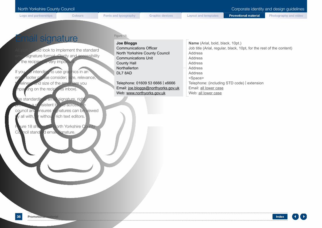
Email signatureAll staff should look to implement the standard email signature format. Clarity and accessibility for the recipient is very important.
If you are intending to use graphics in an email footer please consider; size, relevance, timeliness and size of the email (are you impacting on the recipients inbox).
The standardised email signature, right, provides a consistent brand across the council and ensures signatures can be viewed by all with, or without, rich text editors.
Figure 18 shows the North Yorkshire County Council standard email signature.
Figure 18.
Joe BloggsCommunications OfficerNorth Yorkshire County CouncilCommunications UnitCounty HallNorthallertonDL7 8AD
Telephone: 01609 53 6666 | x6666Email: [email protected]: www.northyorks.gov.uk
Name (Arial, bold, black, 10pt.)Job title (Arial, regular, black, 10pt, for the rest of the content) AddressAddress AddressAddressAddress<Space>Telephone: (including STD code) | extensionEmail: all lower caseWeb: all lower case
Logo and partnerships Colours Fonts Graphic devices Templates Signage and advertising Photography

North Yorkshire County Council Corporate identity and design guidelines
37 Promotional material
Vehicle liveryDesigning for vehicle livery varies depending on the type of vehicle and the message required.
When the NYCC logo is applied please consider the colour of the vehicle. A contrasting logo and content should always be applied to maintain clear visibility of the brand. Contact information should be applied if possible, generally this is the website address.
Figure 19 shows how simple the livery is. Figure 20 shows a slightly different placement of the council’s website address.
Peugeot Boxer - HARROGATE
Figure 19.
Figure 20.
Logo and partnerships Colours Fonts Graphic devices Templates Signage and advertising Photography

North Yorkshire County Council Corporate identity and design guidelines
38 Promotional material
ClothingThe type of clothing and suppliers specification may dictate logo and copy placement on a garment.
When the NYCC logo is applied to an item of clothing please consider the colour of the garment. A contrasting logo and content should always be used to maintain clear visibility of the brand. See Figure 21.
Figure 22 shows how a the NYCC logo and a service area can be applied to an item of clothing. The service area should only be used in conjunction with the NYCC logo in specific cases such as clothing. Other requests for the service area to site alongside the logo must be requested through the communications unit.
Breathing space for the logo should always be maintained and the font used for the service area must be the same as the ‘County Council’ part of the NYCC logo.
Figure 21.
Figure 22.
Breathing space
Breathing space
Service area font must be in the same font, weight and colour as the ‘County Council’ type part of the NYCC logo.
Logo and partnerships Colours Fonts Graphic devices Templates Signage and advertising Photography

North Yorkshire County Council Corporate identity and design guidelines
39
North Yorkshire County Council Corporate identity and design guidelines
Photography
Logo and partnerships Colours Fonts Graphic devices Templates Signage and advertising Photography
Photography Index

North Yorkshire County Council Corporate identity and design guidelines
40 Photography
PhotographyPhotography can be used to help bring a campaign or document to life. To commission photography please contact the communications unit.
There are core rules to remember when selecting an image for external communications which will help guarantee an image fit for the brand. When commissioning images they should be set in North Yorkshire.
Images should have a natural appearance, environment, light, and surroundings; depicting real life scenarios and characters. The subject should reflect the context with which it is to live.
The design team have a library of images (both commissioned and some stock) from which they can help you to select the right image for your document, site or presentation. Contact them for advice on this at [email protected]
Examples of photography that follow NYCC brand guidelines.
Attribution
Please attribute sources such as Google maps or other image files if the supplier specifically asks you to do so.
Logo and partnerships Colours Fonts Graphic devices Templates Signage and advertising Photography

North Yorkshire County Council Corporate identity and design guidelines
41 Photography
A. Finance good example.
E. Teaching good example.
C. Landscape good example.
B. Finance poor example.
F. Teaching poor example.
D. Landscape poor example.
Photography examplesFinanceA. Good. Content which is suited to the
subject matter, stylised, and of UK origin.
B. Poor. Incorrect currency and lacking context due to cropping.
LandscapeC. Good. Regional and specific to North Yorkshire.
D. Poor. No relation to North Yorkshire or the UK.
TeachingE. Good. Real life, natural scenario, perfectly
illustrating teaching in the correct environment.
F. Poor. Unrealistic pose with a comical undertone, not relevant to teaching in North Yorkshire.
Logo and partnerships Colours Fonts Graphic devices Templates Signage and advertising Photography

North Yorkshire County Council Corporate identity and design guidelines
42 Photography
Reflecting the changing face of the council, focused on performance and stremlining in today challenging arena while maintaining an exceptionally high standard of work.
A. Good resolution.
E. Good use of cropping.
C. Correct ratio.
B. Poor resolution.
F. Poorly cropped image.
D. Incorrect ratio.
Photography do and don’tExamples to help illustrate the correct and incorrect usage of an image once chosen.
ResolutionA. Good. Image at the original resolution
to remain clear, crisp and sharp.
B. Poor. Image blown up beyond original resolution.
RatioC. Good. Aspect ratio maintained.
D. Poor. Aspect ratio incorrect causing distortion.
PlacementE. Good. Image fits the available area,
and is correctly cropped.
F. Poor. Incorrect cropping causing the image to lose context.
Logo and partnerships Colours Fonts Graphic devices Templates Signage and advertising Photography

North Yorkshire County Council Corporate identity and design guidelines
43 Photography
The logo is central to creating a consistent layout for the slide by standardising the font size and the spacing. To calculate the size of the logo view page page 7.
Helvetica medium 40pt sub heading - 54pt leading.
Helvetica light 90pt heading - 90pt leading.
Video slides and captionsA standard slide should be used at the start of any video and used for section breaks throughout. The slide layout is dependent on the size of the video being producedand which determines the size of the logo. Figure 23 shows a 1920x1080 video slide displaying general information.
Depending on the size and ratio of the video the copy can be scaled proportionately.
Figure 23.
Helvetica medium 30pt job description or caption - 54pt leading.
Helvetica light 90pt name or caption.
Logo and partnerships Colours Fonts Graphic devices Templates Signage and advertising Photography
Caption at the bottom of the video over an opaque banner in the main corporate blue. Spacing of the copy and its distance from the bottom is dictated by the logo.

44 Index
North Yorkshire County Council Corporate identity and design guidelines
IndexAA4 booklet
A4 poster
A5 booklet
Accessible communication
Address panel
Arial
Artwork
BBanner
Bar chart
Bleed and crops
Business and Environmental Services (BES)
Business card
CCentral Services (CS)
Checklist
Children and Young People’s Service (CYPS)
Clothing
Colour
Columns
Communications unit
Compliment slip
DDigital
DL leaflet
Document Management Centre (DMC)
EEmail signature
FFonts
Font size
Front cover
GGraphic devices
Gutter width
HHeader
Health and Adult Services (HAS)
Helvetica
IIndex
Infographics
Internal report
Images
LLayout
Letterheads
Logo
Logo do and don’t
MMargin
PPartnership
PDF exporting
Photography
Photography do and don’t
Photography examples
Pie chart
Plain English
Powerpoint
RResolution
SSignage
TTable
Templates
Typography
VVehicle livery Video
WWebsite
Word
Logo and partnerships Colours Fonts Graphic devices Templates Signage and advertising Photography

Contact us
W: www.northyorks.gov.uk E: [email protected] T: 01609 780 780 (Monday to Friday 8.00am - 5.30pm closed weekends and bank holidays) North Yorkshire County Council, County Hall, Northallerton, North Yorkshire, DL7 8AD
You can request this information in another language or format at www.northyorks.gov.uk/accessibility
64118 05/18


