16
COS 125 DAY 12
| Date post: | 28-Dec-2015 |
| Category: |
Documents |
| Upload: | raymond-glenn |
| View: | 227 times |
| Download: | 0 times |
COS 125
DAY 12
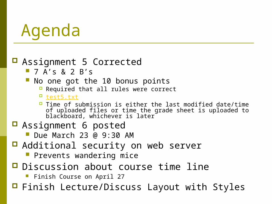
Agenda
Assignment 5 Corrected 7 A’s & 2 B’s No one got the 10 bonus points
Required that all rules were correct test5.txt Time of submission is either the last modified date/time of
uploaded files or time the grade sheet is uploaded to blackboard, whichever is later
Assignment 6 posted Due March 23 @ 9:30 AM
Additional security on web server Prevents wandering mice
Discussion about course time line Finish Course on April 27
Finish Lecture/Discuss Layout with Styles
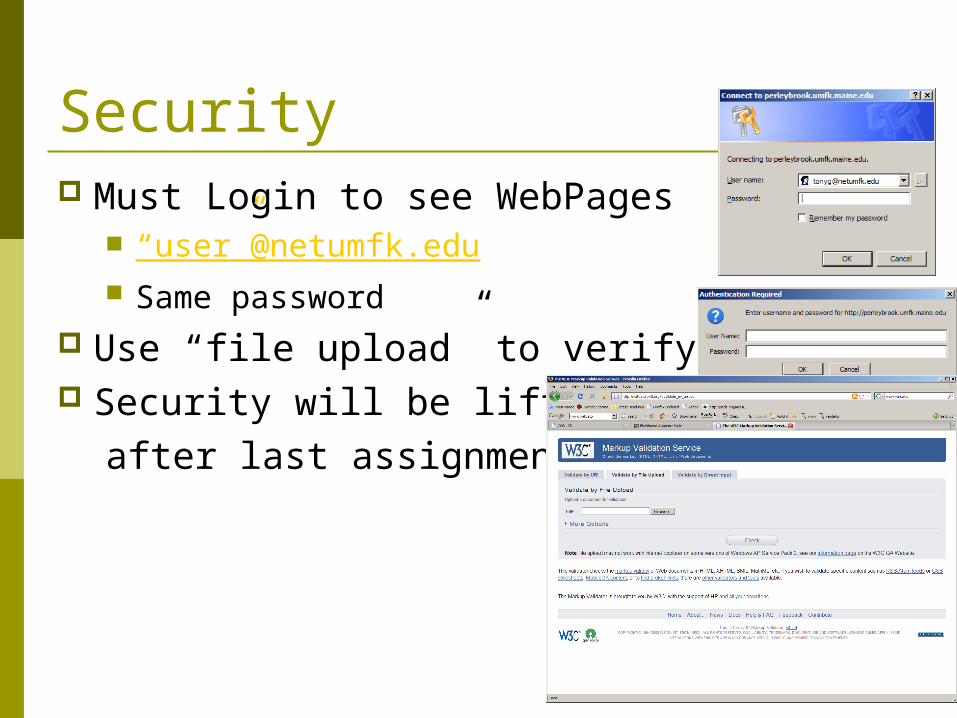
Security Must Login to see WebPages
“user”@netumfk.edu Same password
Use “file upload” to verify pages Security will be lifted
after last assignment
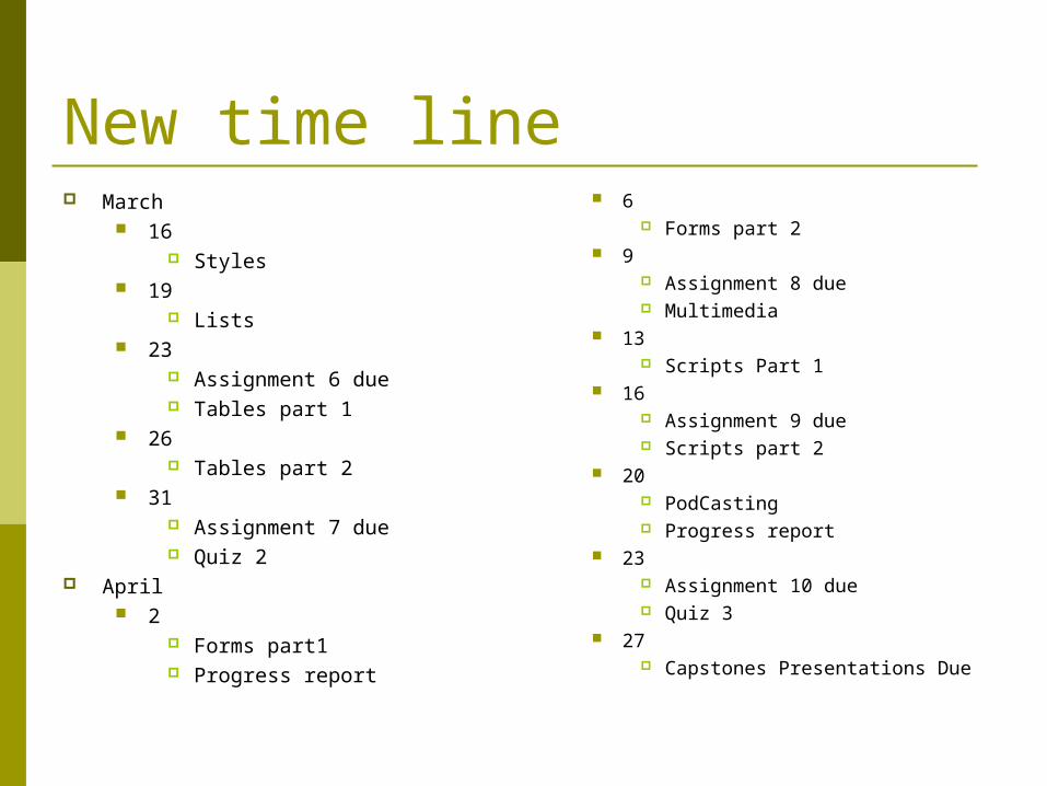
New time line March
16 Styles
19 Lists
23 Assignment 6 due Tables part 1
26 Tables part 2
31 Assignment 7 due Quiz 2
April 2
Forms part1 Progress report
6 Forms part 2
9 Assignment 8 due Multimedia
13 Scripts Part 1
16 Assignment 9 due Scripts part 2
20 PodCasting Progress report
23 Assignment 10 due Quiz 3
27 Capstones Presentations Due
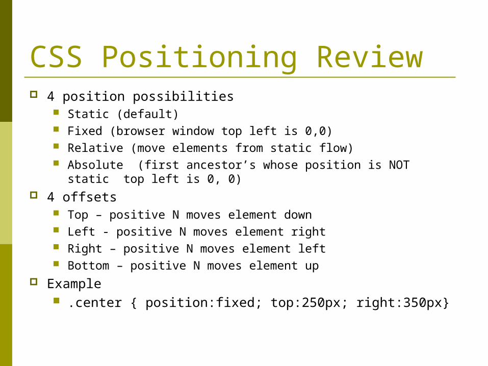
CSS Positioning Review 4 position possibilities
Static (default) Fixed (browser window top left is 0,0) Relative (move elements from static flow) Absolute (first ancestor’s whose position is NOT static top left
is 0, 0) 4 offsets
Top – positive N moves element down Left - positive N moves element right Right – positive N moves element left Bottom – positive N moves element up
Example .center { position:fixed; top:250px; right:350px}
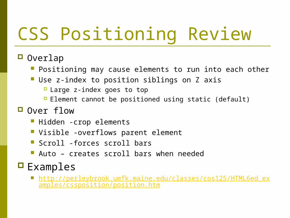
CSS Positioning Review Overlap
Positioning may cause elements to run into each other Use z-index to position siblings on Z axis
Large z-index goes to top Element cannot be positioned using static (default)
Over flow Hidden -crop elements Visible -overflows parent element Scroll -forces scroll bars Auto – creates scroll bars when needed
Examples http://perleybrook.umfk.maine.edu/classes/cos125/HTML6ed_exa
mples/cssposition/position.htm
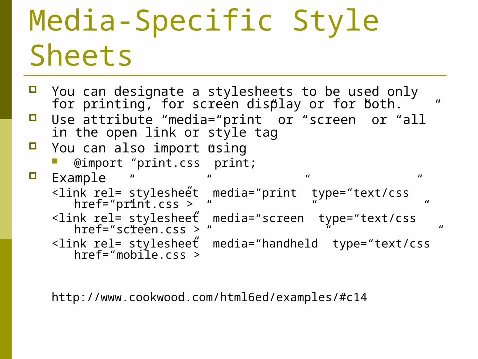
Media-Specific Style Sheets You can designate a stylesheets to be used only for
printing, for screen display or for both. Use attribute “media=“print” or “screen” or “all” in the
open link or style tag You can also import using
@import “print.css” print; Example
<link rel=”stylesheet” media=“print” type=“text/css” href=“print.css”>
<link rel=”stylesheet” media=“screen” type=“text/css” href=“screen.css”>
<link rel=”stylesheet” media=“handheld” type=“text/css” href=“mobile.css”>
http://www.cookwood.com/html6ed/examples/#c14
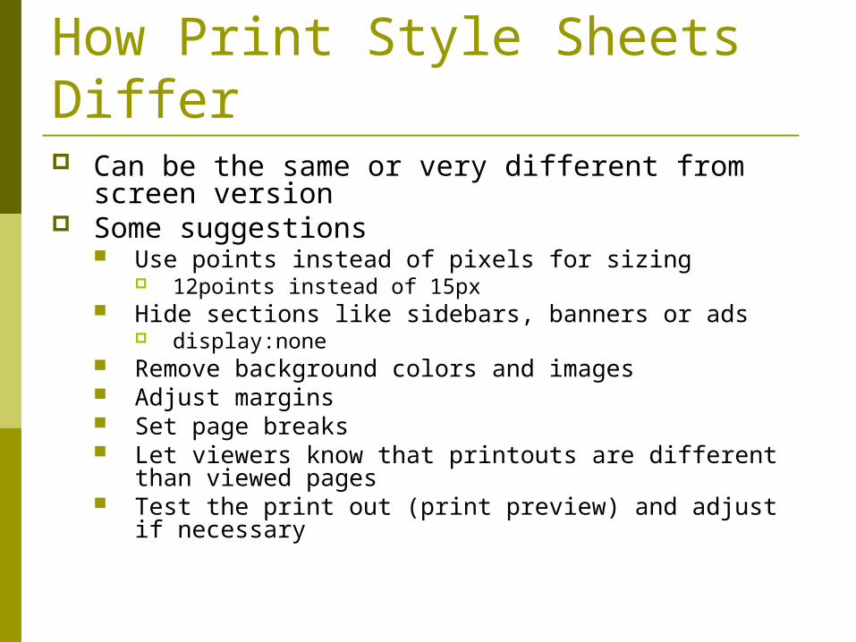
How Print Style Sheets Differ Can be the same or very different from screen
version Some suggestions
Use points instead of pixels for sizing 12points instead of 15px
Hide sections like sidebars, banners or ads display:none
Remove background colors and images Adjust margins Set page breaks Let viewers know that printouts are different than
viewed pages Test the print out (print preview) and adjust if
necessary
Controlling Page Breaks WebPages can be very long Use CSS to control where the contents are printed relative
to printer page Where page breaks occur
Page-break-before:values Page-break-after:values Page-break-inside:values Values are “auto” “always” or “avoid”
Examples p{page-break-inside:avoid} h1,h2,h3{page-break-before:always}
Printing link URLs If You want to see the URL of your hyperlink
when you print a web page Define a print style sheet and add the
following a {text-decoration:none; color:black);
Remove text color and underline a:after {content:”(“ attr(href) “)”; font-
style:italic;} http://www.cookwood.com/html6ed/examples/printing/
printurl.html http://www.cookwood.com/html6ed/examples/printing/
printurl.css
Widows and Orphans Orphan is a term used to describe a single word or short
phrase appearing at the bottom of a paragraph or column. A widow is a single word or short phrase appearing alone
at the top of column. To modify using css
Selector{orphans:n} Selector{widows:n} N is minimum number of lines to appear at the top (widow) or
bottom (orphan) of a page p{orphans:4;widows:4}
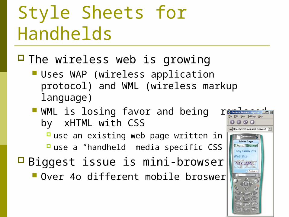
Style Sheets for Handhelds The wireless web is growing
Uses WAP (wireless application protocol) and WML (wireless markup language)
WML is losing favor and being replaced by xHTML with CSS
use an existing web page written in xHTML use a “handheld” media specific CSS
Biggest issue is mini-browser wars Over 4o different mobile broswers
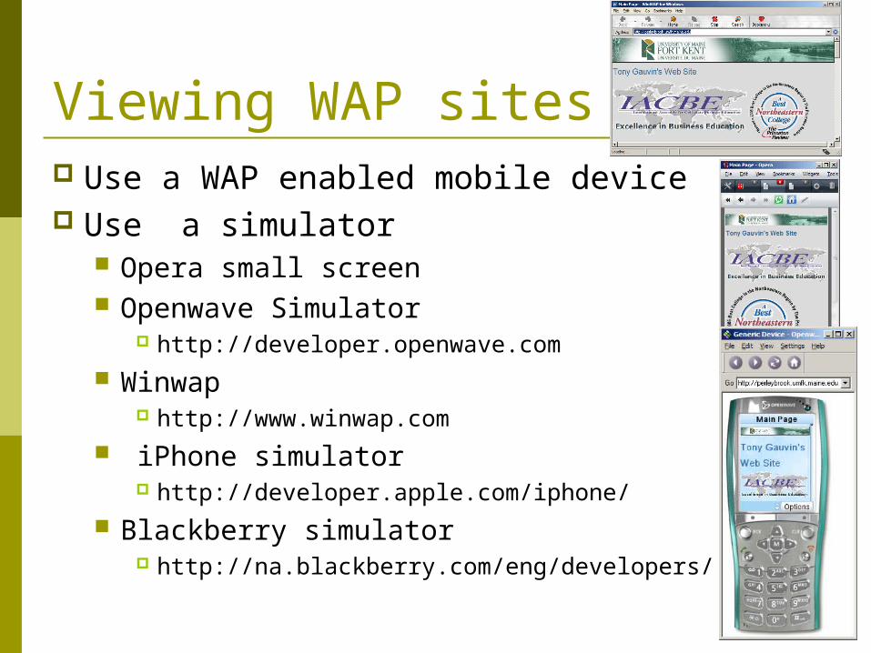
Viewing WAP sites Use a WAP enabled mobile device Use a simulator
Opera small screen Openwave Simulator
http://developer.openwave.com Winwap
http://www.winwap.com iPhone simulator
http://developer.apple.com/iphone/ Blackberry simulator
http://na.blackberry.com/eng/developers/
Mobile web browsing limitations Pay by the Byte Little to no images Use Proxy servers and Wap gateways Small & narrow screens No pointing device (mouse) Limited # of fonts Some ignore all CSS
Some ignore some CSS Some ignore CSS backgrounds
Creating Style Sheets for Handheld <link rel=“stylesheet’ type=“text/css” href =“url.css” media=
“handheld” /> Add to the existing external style sheet link media=“screen”
Default for media attribute is “all” whichs mean to always apply style sheet
Hide unnecessary elements {display:none}
Use image Headers Add extra links to help navigate page Adjust for small screen
Adjust margins and padding Add borders Reduce text size Center content Remove image borders Use alt attribute for images
Tips for Assignment #6 For assignment #6 I gave you a xHTML page with
lots of text and various elements You cannot modify the xHTML page other than
associating with different style sheets You will have create several different style sheets
to format this page Style sheets will be IAW formatting rules I give you in
the assignment You will have to produce a menu that shows the
same pages formatted with each different style sheet Ex Umfk1.htm with style1.css


