Creating a Patch Management Dashboard with IT Analytics Hands-On Lab Description This lab provides a hands-on overview of the IT Analytics Solution. Students will learn how to browse cubes and configure Pivot Tables and Charts using a number of common usage scenarios. In addition, students will learn advanced report creation by using the Report Builder to create and publish their own SQL Server Reporting Services report. At the end of this lab, you should be able to Understand the features and benefits of IT Analytics and be able to create your own reports and dashboards. Understand the basics of an OLAP cube and how to browse them for data mining. Configure reports and charts using Pivot Tables and Pivot Charts. Configure a Key Performance Indicator. Create and publish a SQL Server Reporting Services chart using Report Builder. Notes A brief presentation will introduce this lab session and discuss key concepts. The lab will be directed and provide you with step-by-step walkthroughs of key features. Feel free to follow the lab using the instructions on the following pages. You can optionally perform this lab at your own pace. Be sure to ask your instructor any questions you may have. Thank you for coming to our lab session.
Transcript
Creating a Patch Management Dashboard with IT Analytics Hands-On Lab
Description This lab provides a hands-on overview of the IT Analytics Solution. Students will learn how to browse cubes and configure Pivot Tables and Charts using a number of common usage scenarios. In addition, students will learn advanced report creation by using the Report Builder to create and publish their own SQL Server Reporting Services report.
At the end of this lab, you should be able to
Understand the features and benefits of IT Analytics and be able to create your own reports and dashboards.
Understand the basics of an OLAP cube and how to browse them for data mining.
Configure reports and charts using Pivot Tables and Pivot Charts.
Configure a Key Performance Indicator.
Create and publish a SQL Server Reporting Services chart using Report Builder.
Notes A brief presentation will introduce this lab session and discuss key concepts.
The lab will be directed and provide you with step-by-step walkthroughs of key features.
Feel free to follow the lab using the instructions on the following pages. You can optionally perform this lab at your own pace.
Be sure to ask your instructor any questions you may have.
Thank you for coming to our lab session.
2 of 58
Introduction to IT Analytics
What is IT Analytics™ Solution?
o Leverages Business Intelligence to offer:
Advanced ad-hoc data-mining
Analyze Trends and historical information
Graphical dashboards and powerful reporting
o Expands upon traditional reporting
o Designed to facilitate analysis of information
o Leverages OLAP cubes to provide multi-dimensional data exploration
o Built on Standard Technologies (SQL Server Analysis and Reporting Services)
What it enables you to do?
o Continuously improve your IT Operations
o Answers existing scalability issues
o Resources & time savings
Who is it intended for?
o New and existing Symantec Management Platform (SMP) clients
Optimize your Altiris investment
Drill through your Symantec CMDB to mine the right information at the right time
Make it easy for users to understand your complex environment
Identify trends and opportunities faster
Accelerate the decision making process
Make fully informed decisions about your organization‟s performance.
Continuously measure & continuously improve
3 of 58
Configure Pivot Tables and Pivot Charts
Exercise 1: Configure a PivotTable report
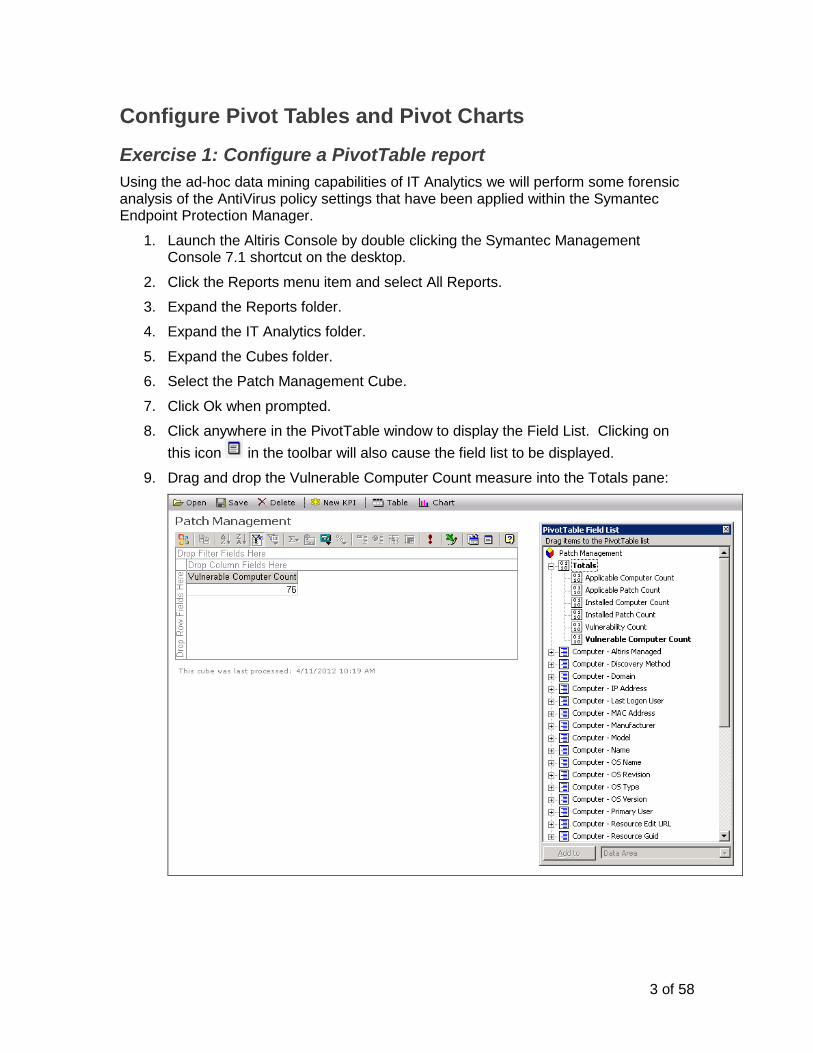
Using the ad-hoc data mining capabilities of IT Analytics we will perform some forensic analysis of the AntiVirus policy settings that have been applied within the Symantec Endpoint Protection Manager.
1. Launch the Altiris Console by double clicking the Symantec Management Console 7.1 shortcut on the desktop.
2. Click the Reports menu item and select All Reports.
3. Expand the Reports folder.
4. Expand the IT Analytics folder.
5. Expand the Cubes folder.
6. Select the Patch Management Cube.
7. Click Ok when prompted.
8. Click anywhere in the PivotTable window to display the Field List. Clicking on
this icon in the toolbar will also cause the field list to be displayed.
9. Drag and drop the Vulnerable Computer Count measure into the Totals pane:
4 of 58
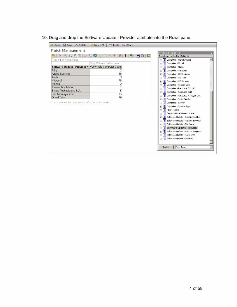
10. Drag and drop the Software Update - Provider attribute into the Rows pane:
5 of 58
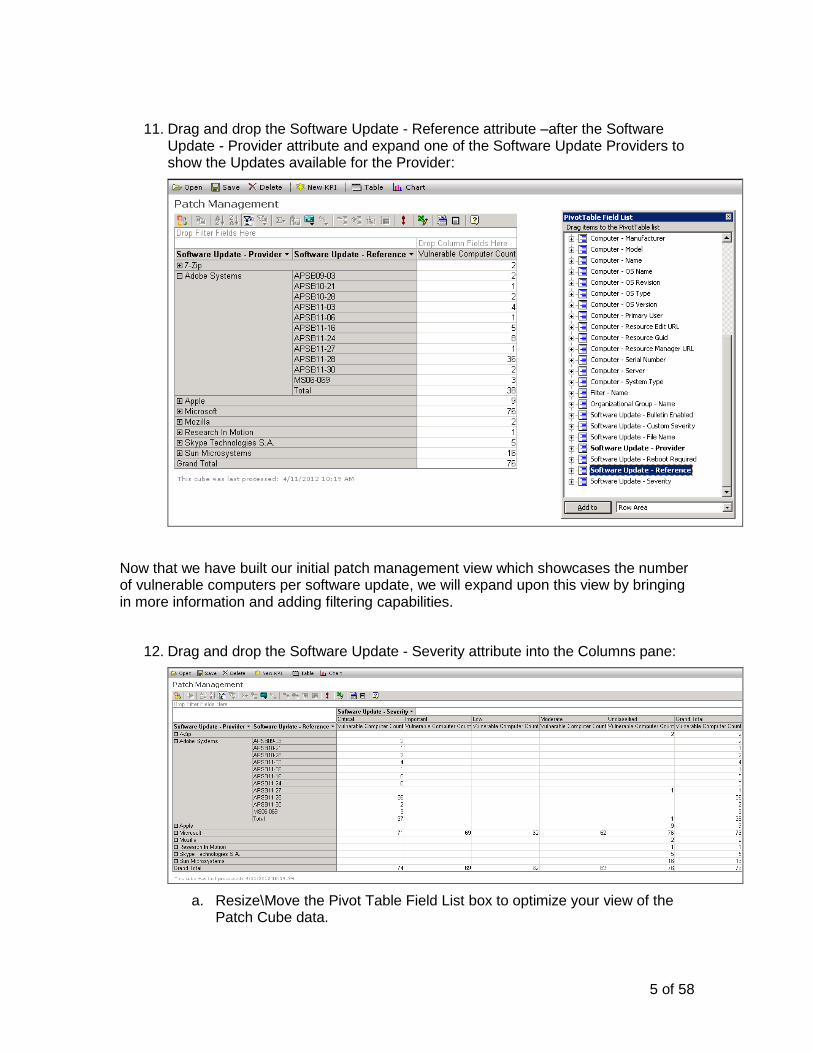
11. Drag and drop the Software Update - Reference attribute –after the Software Update - Provider attribute and expand one of the Software Update Providers to show the Updates available for the Provider:
Now that we have built our initial patch management view which showcases the number of vulnerable computers per software update, we will expand upon this view by bringing in more information and adding filtering capabilities.
12. Drag and drop the Software Update - Severity attribute into the Columns pane:
a. Resize\Move the Pivot Table Field List box to optimize your view of the Patch Cube data.
6 of 58
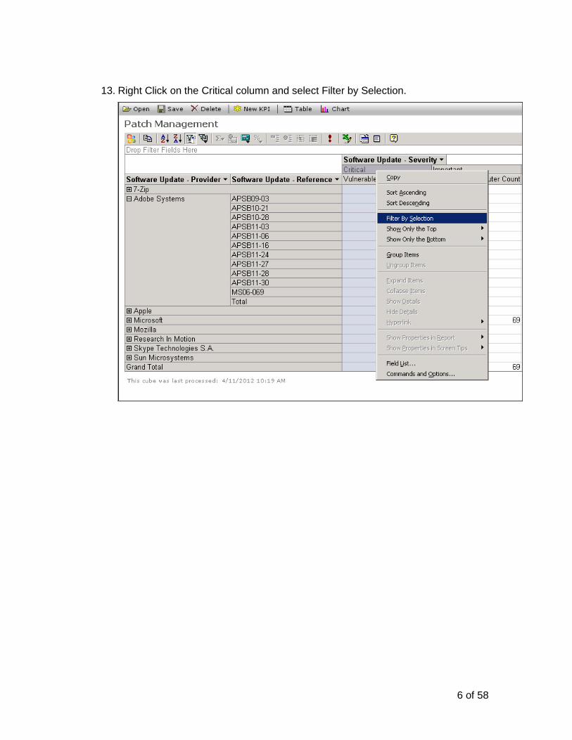
13. Right Click on the Critical column and select Filter by Selection.
7 of 58
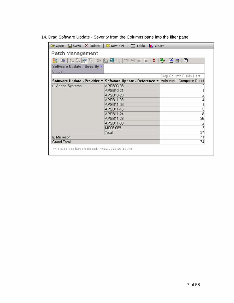
14. Drag Software Update - Severity from the Columns pane into the filter pane.
8 of 58
15. Drag the Computer – OS Name attribute from the field list directly into the Filter pane.
9 of 58
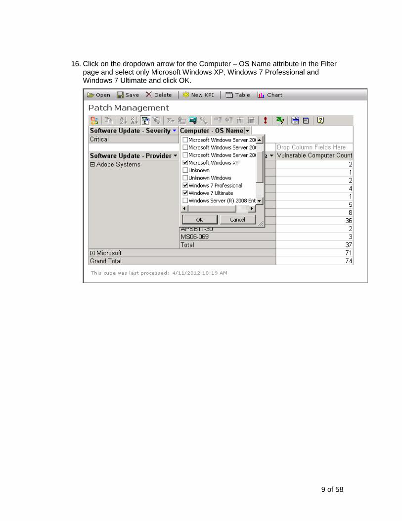
16. Click on the dropdown arrow for the Computer – OS Name attribute in the Filter page and select only Microsoft Windows XP, Windows 7 Professional and Windows 7 Ultimate and click OK.
10 of 58
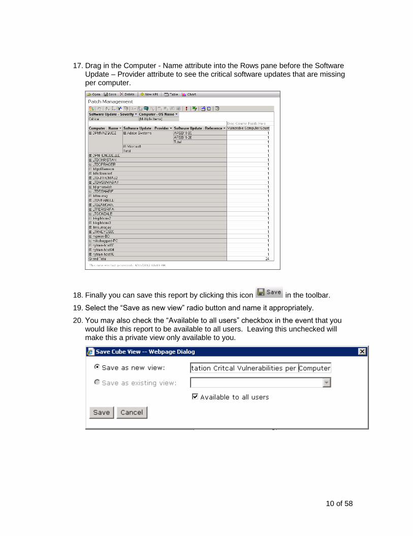
17. Drag in the Computer - Name attribute into the Rows pane before the Software Update – Provider attribute to see the critical software updates that are missing per computer.
18. Finally you can save this report by clicking this icon in the toolbar.
19. Select the “Save as new view” radio button and name it appropriately.
20. You may also check the “Available to all users” checkbox in the event that you would like this report to be available to all users. Leaving this unchecked will make this a private view only available to you.
11 of 58
21. Refresh the SMP Console and navigate back to the Patch Management Cube (Reports > IT Analytics > Cubes). This will bring you back to the initial Patch Management screen.
22. To open the view you just saved click this icon in the toolbar and select the report you just created in the dropdown list. Note that the report is loaded exactly as you left it.
12 of 58
Exercise 2: Configure a Pivot Chart report
Using the Patch Management Cube we will create a Chart that will allow us to see the Installed versus Vulnerable counts of Adobe Patches on Windows Servers.
1. Launch the Altiris Console by double clicking the Symantec Management Console 7.1 shortcut on the desktop.
2. Click the Reports menu item and select All Reports.
3. Expand the Reports folder.
4. Expand the IT Analytics folder.
5. Expand the Cubes folder.
6. Select the Patch Management Cube.
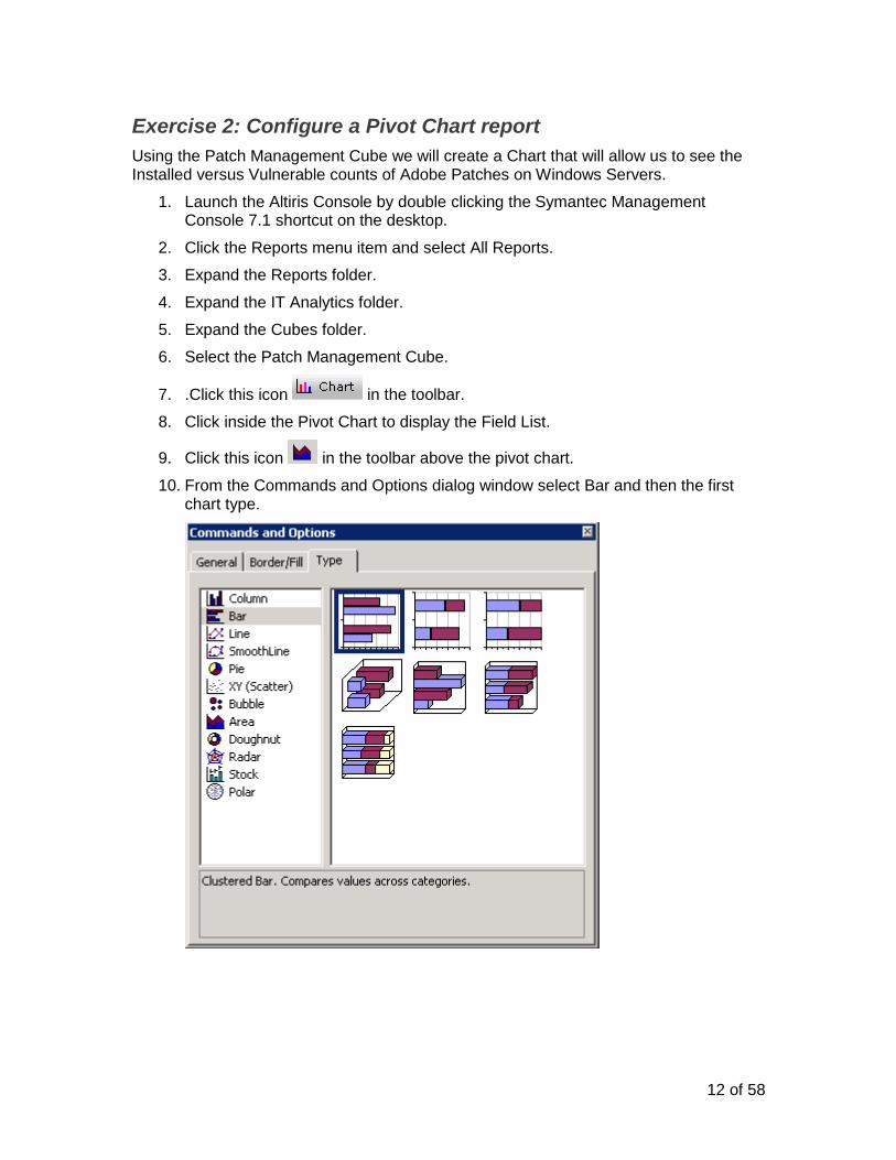
7. .Click this icon in the toolbar.
8. Click inside the Pivot Chart to display the Field List.
9. Click this icon in the toolbar above the pivot chart.
10. From the Commands and Options dialog window select Bar and then the first chart type.
13 of 58
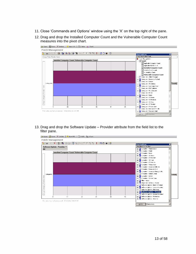
11. Close „Commands and Options‟ window using the „X‟ on the top right of the pane.
12. Drag and drop the Installed Computer Count and the Vulnerable Computer Count measures into the pivot chart.
13. Drag and drop the Software Update – Provider attribute from the field list to the filter pane.
14 of 58
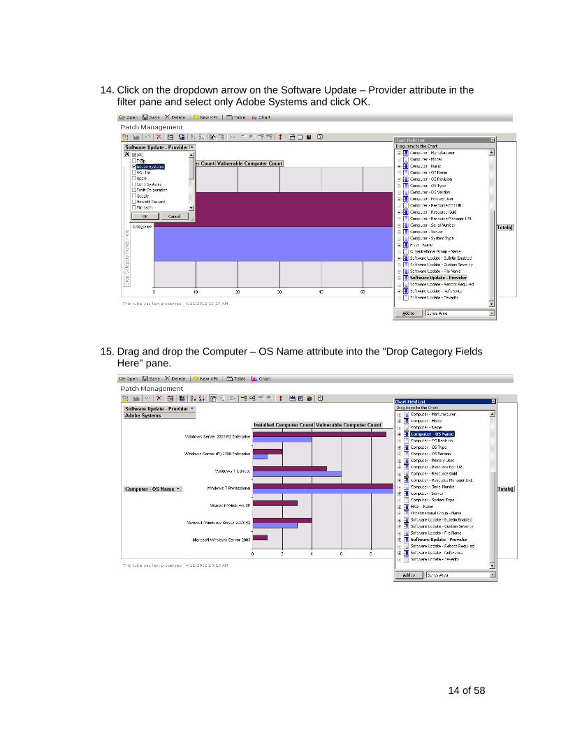
14. Click on the dropdown arrow on the Software Update – Provider attribute in the filter pane and select only Adobe Systems and click OK.
15. Drag and drop the Computer – OS Name attribute into the "Drop Category Fields Here" pane.
15 of 58
16. Click the dropdown arrow on the Computer – OS Name attribute in the category fields pane and select only Windows Server operating systems (i.e. Windows Server 2003, Windows Server 2008 R2 Enterprise, etc.) and click OK.
17. Drag and drop the Software Update - Reference attribute directly below the Computer – OS Name attribute in the category fields pane.
16 of 58
18. Right click on the Computer – OS Name attribute and select Expand.
19. You should now see all of the patch references expanded for each of the server operating systems.
17 of 58
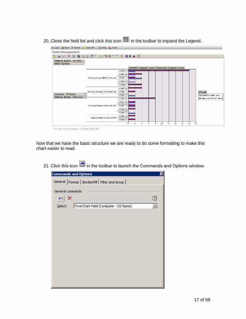
20. Close the field list and click this icon in the toolbar to expand the Legend.
Now that we have the basic structure we are ready to do some formatting to make this chart easier to read.
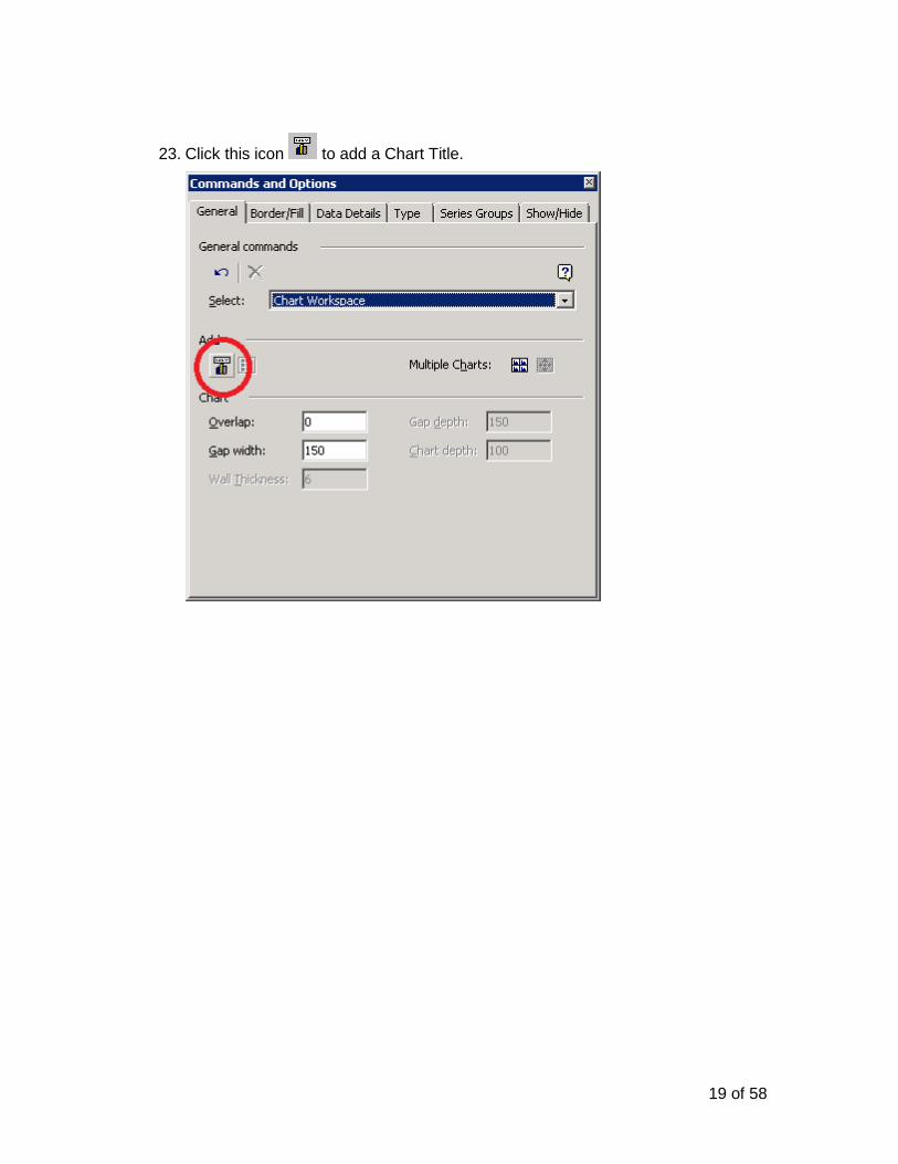
21. Click this icon in the toolbar to launch the Commands and Options window.
18 of 58
22. In the Commands and Options window select the Chart Workspace value from the dropdown list.
19 of 58
23. Click this icon to add a Chart Title.
20 of 58
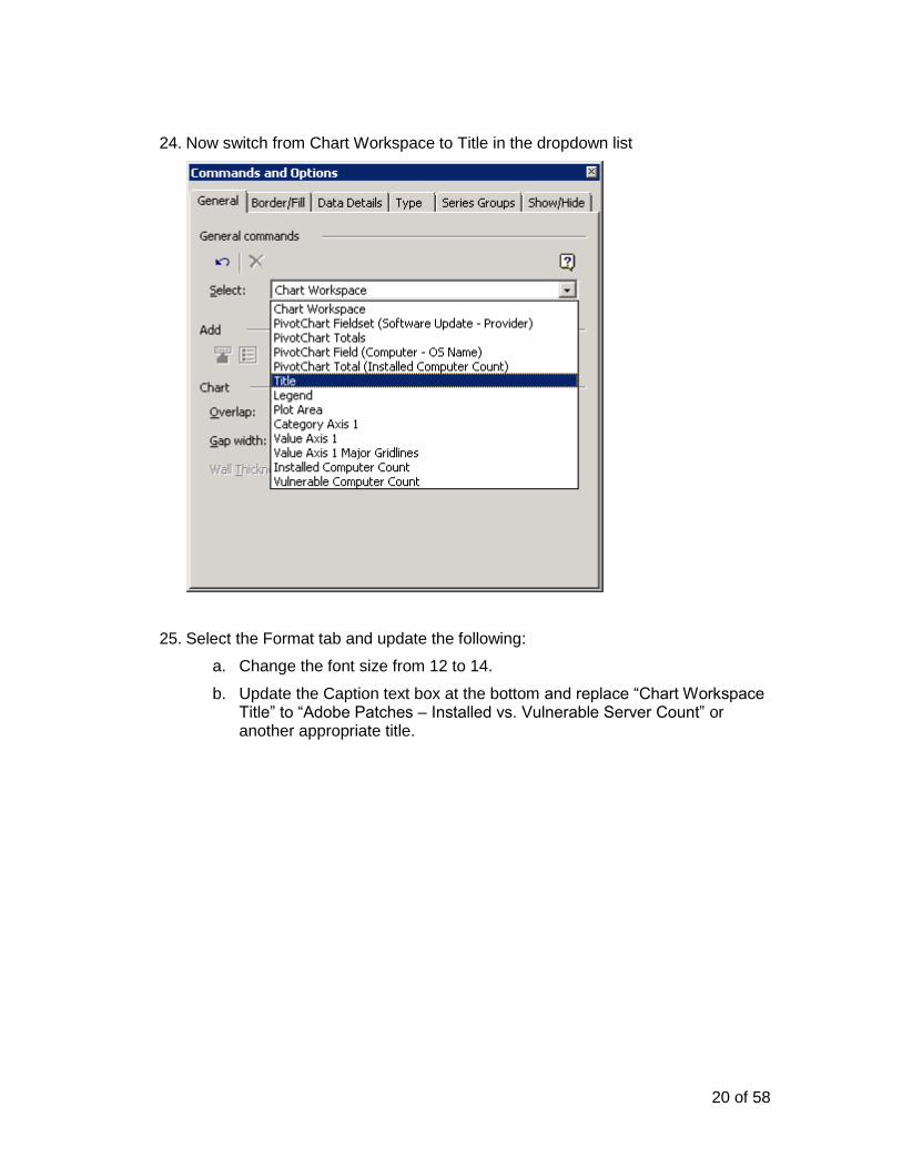
24. Now switch from Chart Workspace to Title in the dropdown list
25. Select the Format tab and update the following:
a. Change the font size from 12 to 14.
b. Update the Caption text box at the bottom and replace “Chart Workspace Title” to “Adobe Patches – Installed vs. Vulnerable Server Count” or another appropriate title.
21 of 58
26. Click the General tab and switch from Title to Legend from the dropdown list.
27. Click the Format tab and change the Position from Right to Bottom.
22 of 58
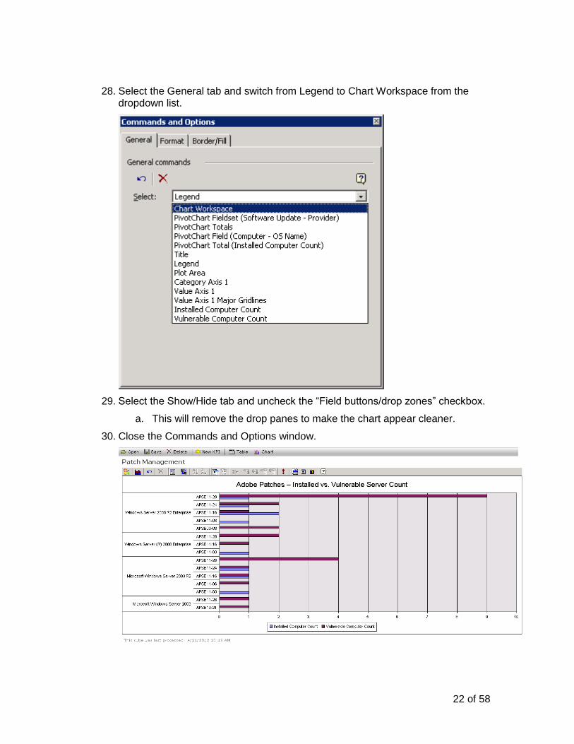
28. Select the General tab and switch from Legend to Chart Workspace from the dropdown list.
29. Select the Show/Hide tab and uncheck the “Field buttons/drop zones” checkbox.
a. This will remove the drop panes to make the chart appear cleaner.
30. Close the Commands and Options window.
23 of 58
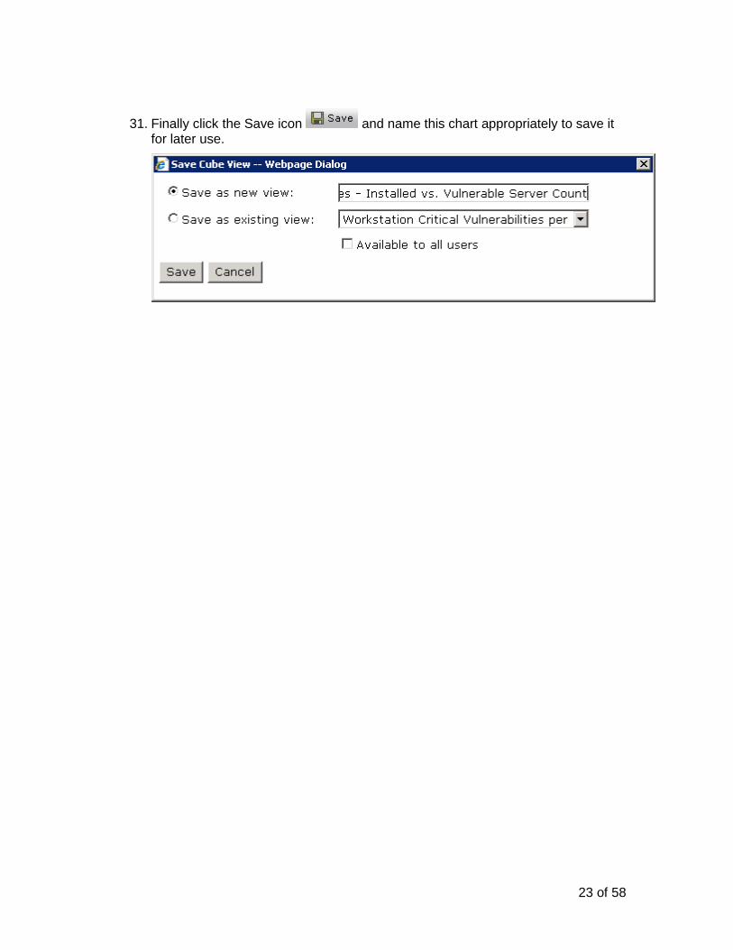
31. Finally click the Save icon and name this chart appropriately to save it for later use.
24 of 58
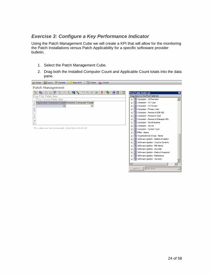
Exercise 3: Configure a Key Performance Indicator
Using the Patch Management Cube we will create a KPI that will allow for the monitoring the Patch Installations versus Patch Applicability for a specific softoware provider bulletin.
1. Select the Patch Management Cube.
2. Drag both the Installed Computer Count and Applicable Count totals into the data pane.
25 of 58
3. Drag and drop the Software Update - Provider attribute into the rows pane.
4. Drag and drop the Software Update - Severity attribute into the filters pane.
26 of 58
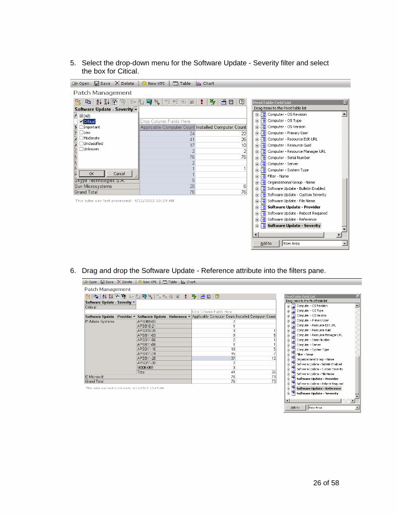
5. Select the drop-down menu for the Software Update - Severity filter and select the box for Citical.
6. Drag and drop the Software Update - Reference attribute into the filters pane.
27 of 58
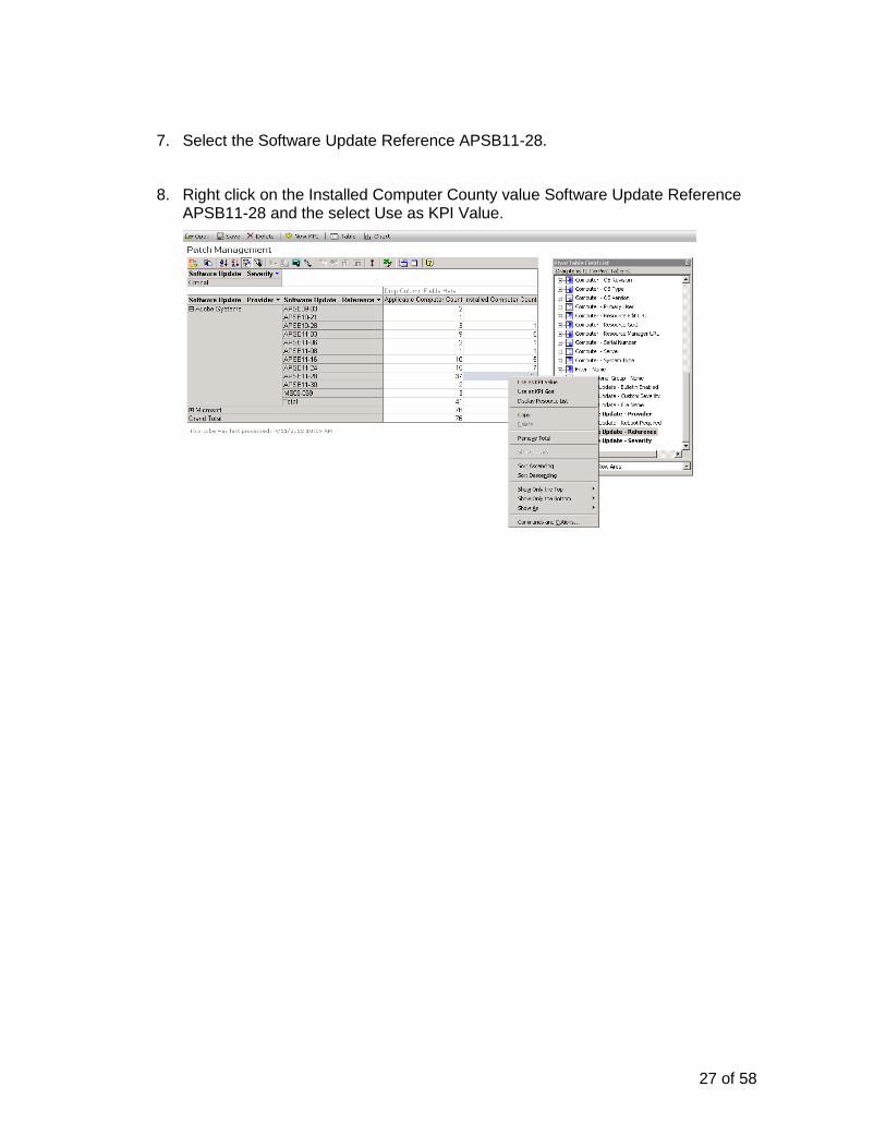
7. Select the Software Update Reference APSB11-28.
8. Right click on the Installed Computer County value Software Update Reference APSB11-28 and the select Use as KPI Value.
28 of 58
9. In the "New Key Performance Indicator pane change the Goal radio button from None to Dynamic. This will allow us to choose another cube value as our Goal to compare our KPI against.
29 of 58
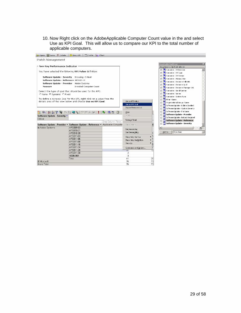
10. Now Right click on the AdobeApplicable Computer Count value in the and select Use as KPI Goal. This will allow us to compare our KPI to the total number of applicable computers.
30 of 58
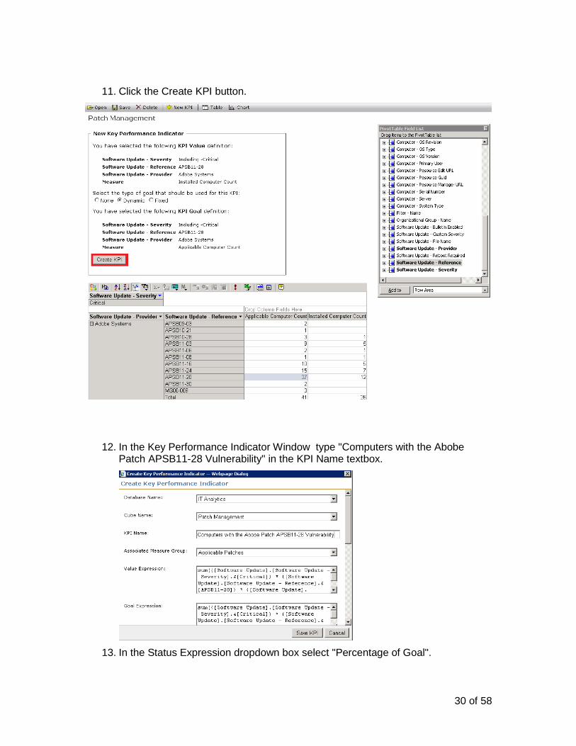
11. Click the Create KPI button.
12. In the Key Performance Indicator Window type "Computers with the Abobe Patch APSB11-28 Vulnerability" in the KPI Name textbox.
13. In the Status Expression dropdown box select "Percentage of Goal".
31 of 58
14. In the Status Graphic dropdown box select "Cylinder"
15. Click the Save KPI button.
16. When the screen refreshes click the "Close" button.
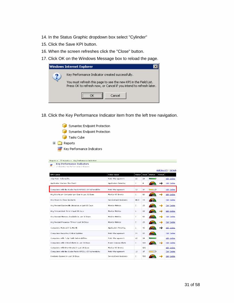
17. Click OK on the Windows Message box to reload the page.
18. Click the Key Performance Indicator item from the left tree navigation.
32 of 58
Advanced Reporting
This section will dive into advanced report creation using Report Builder to create and publish a SQL Server Reporting Services report.
What is Report Builder
Report Builder is a component of SQL Server Reporting Services that allows ad-hoc reporting functionality enabling end users to build their own reports and charts. Users can then publish these reports into Reporting Services where they can be accessed and viewed.
Exercise 4: Create and publish a report using Report Builder
In this exercise we will create a pie chart that displays the trend of Software Updates.
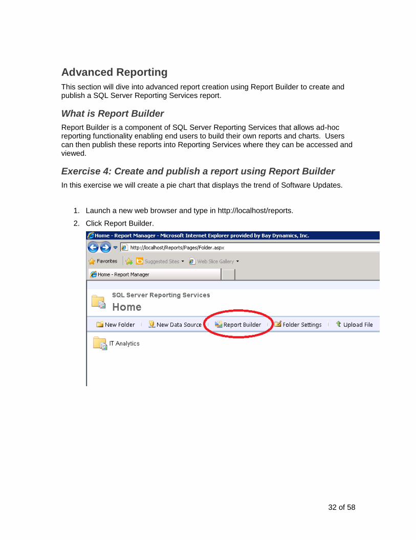
1. Launch a new web browser and type in http://localhost/reports.
2. Click Report Builder.
33 of 58
3. When Microsoft Report Building loads, click on the report body and in the Properties pane, expand Size and set the Width to 11in and Height to 8.5in.
4. Click on the text “Click to add title” and type in Software Update Dashboard.
34 of 58
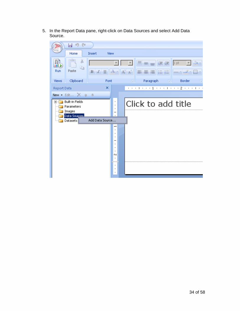
5. In the Report Data pane, right-click on Data Sources and select Add Data Source.
35 of 58
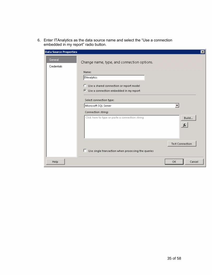
6. Enter ITAnalytics as the data source name and select the “Use a connection embedded in my report” radio button.
36 of 58
7. Click on the dropdown for “Select connection type” and select Microsoft SQL Server Analysis Services.
8. Click the build button in the Data Source Properties window.
37 of 58
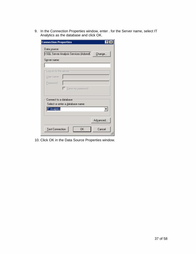
9. In the Connection Properties window, enter . for the Server name, select IT Analytics as the database and click OK.
10. Click OK in the Data Source Properties window.
38 of 58
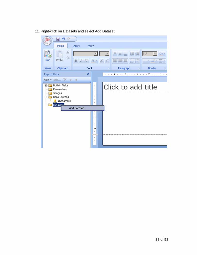
11. Right-click on Datasets and select Add Dataset.
39 of 58
12. In the Dataset Properties window, select the “Use a dataset embedded in my report” radio button, click on the dropdown for Data source and select ITAnalytics.
13. Click the Query Designer button in the Dataset Properties window.
40 of 58
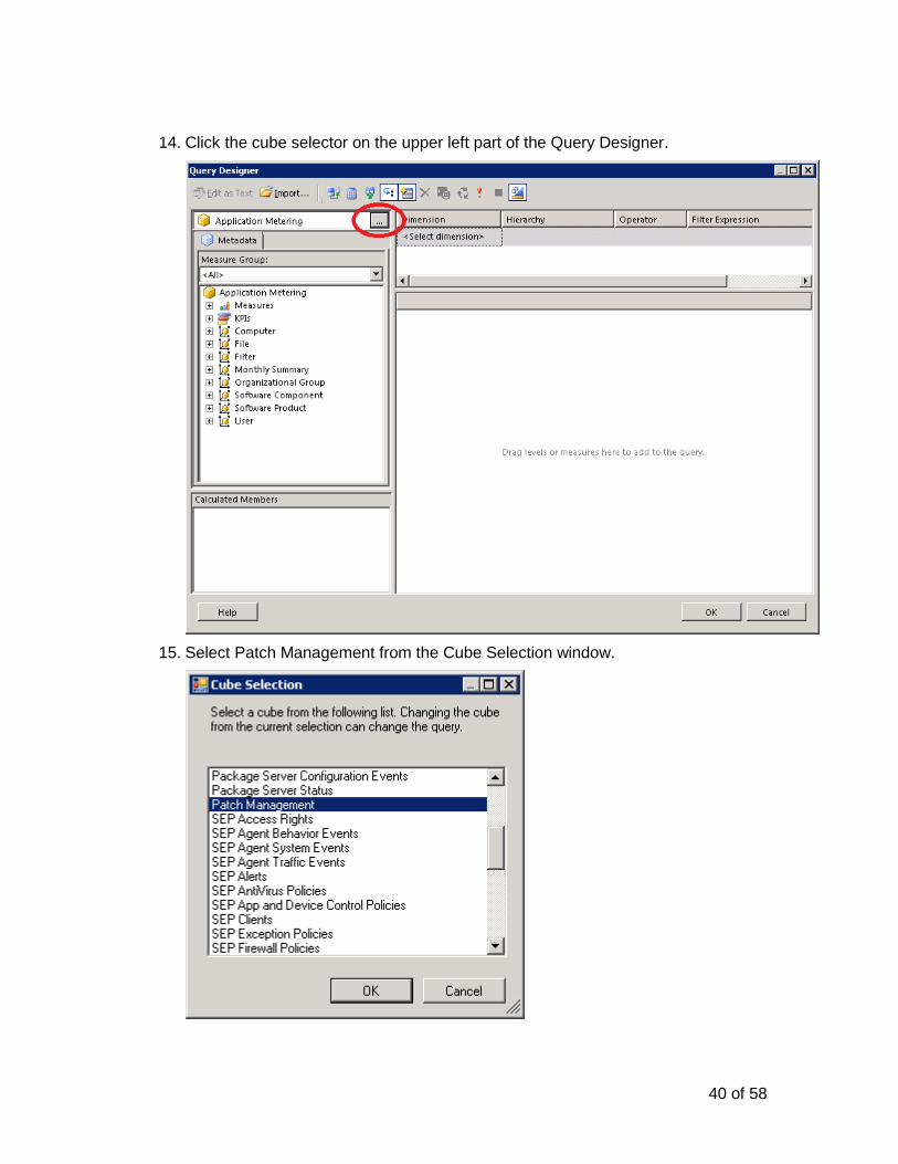
14. Click the cube selector on the upper left part of the Query Designer.
15. Select Patch Management from the Cube Selection window.
41 of 58
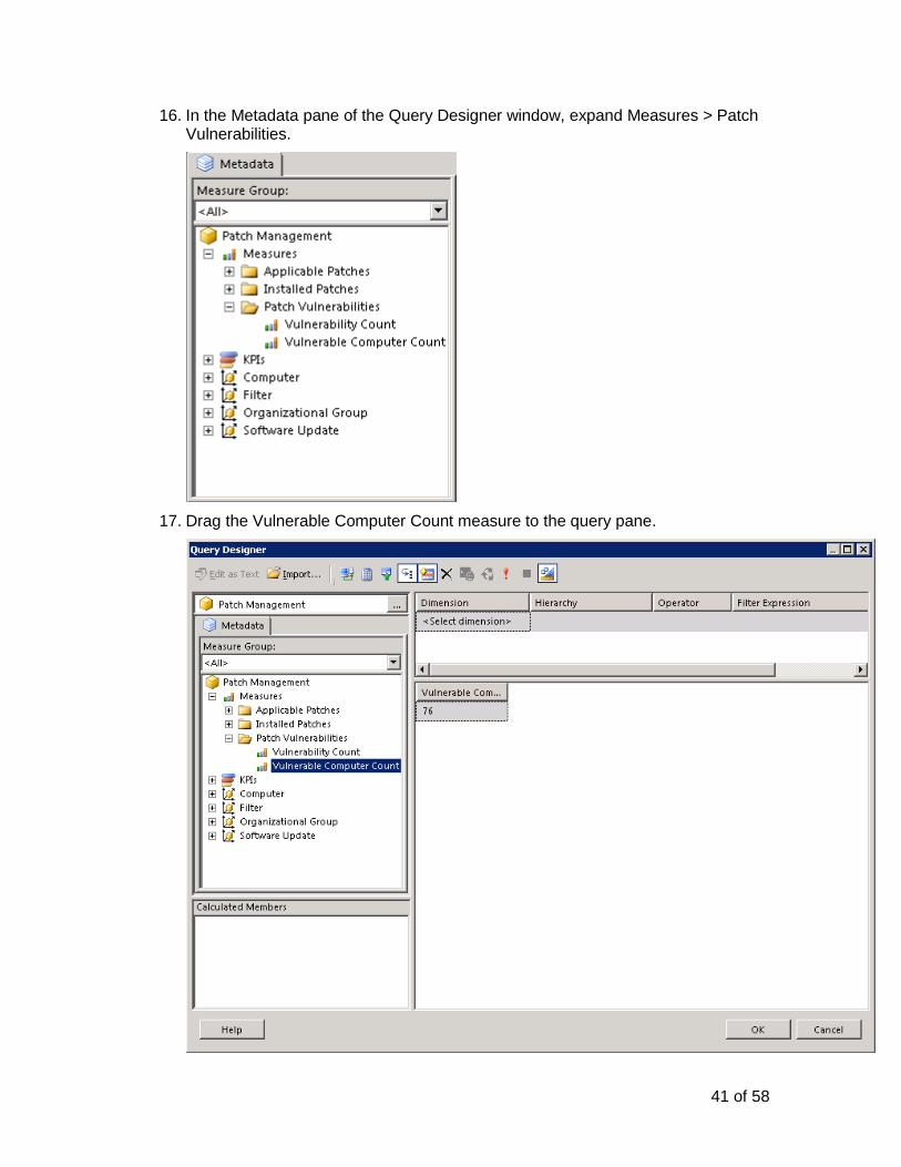
16. In the Metadata pane of the Query Designer window, expand Measures > Patch Vulnerabilities.
17. Drag the Vulnerable Computer Count measure to the query pane.
42 of 58
18. Drag and drop the Software Update – Severity attribute to the query pane.
19. Click OK in the Query Designer window and the Dataset Properties window to go back to the main report builder.
43 of 58
20. Click on Insert in the report builder menu and select Chart and Chart Wizard.
21. In the New Chart window, select DataSet1 and click Next.
44 of 58
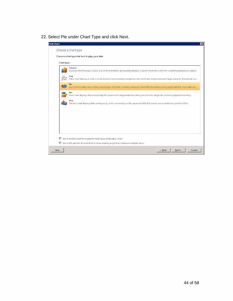
22. Select Pie under Chart Type and click Next.
45 of 58
23. From Available fields, drag Software_Update___Severity to the Series pane and Vulnerable_Computer_Count to the Values pane and click Next.
46 of 58
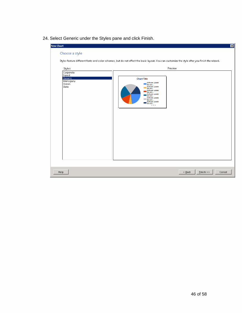
24. Select Generic under the Styles pane and click Finish.
47 of 58
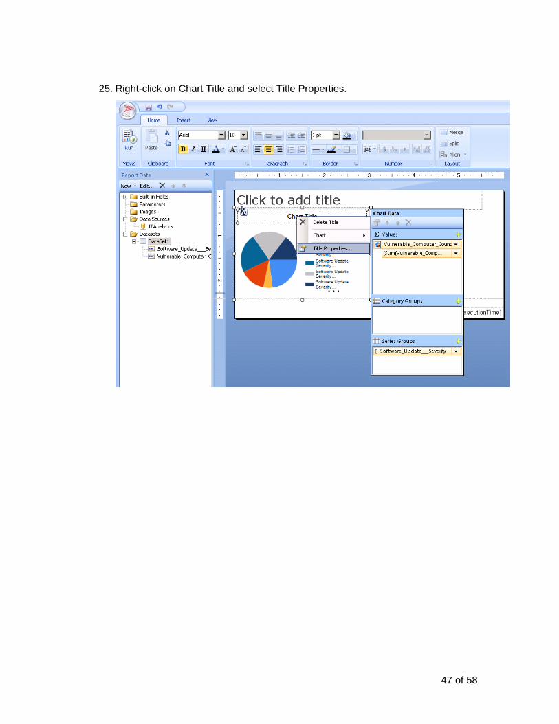
25. Right-click on Chart Title and select Title Properties.
48 of 58
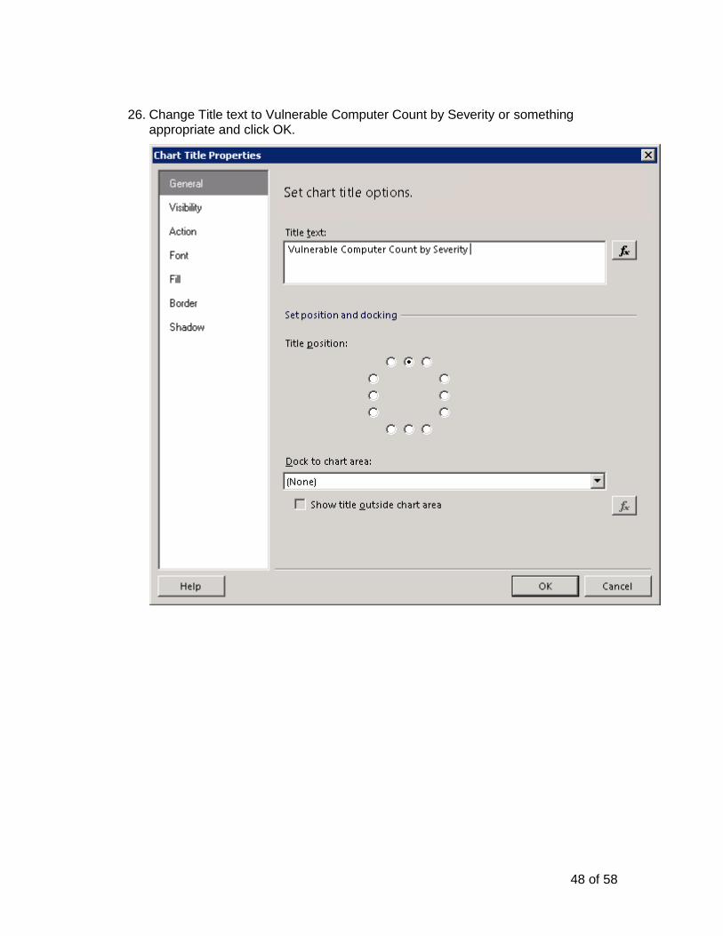
26. Change Title text to Vulnerable Computer Count by Severity or something appropriate and click OK.
49 of 58
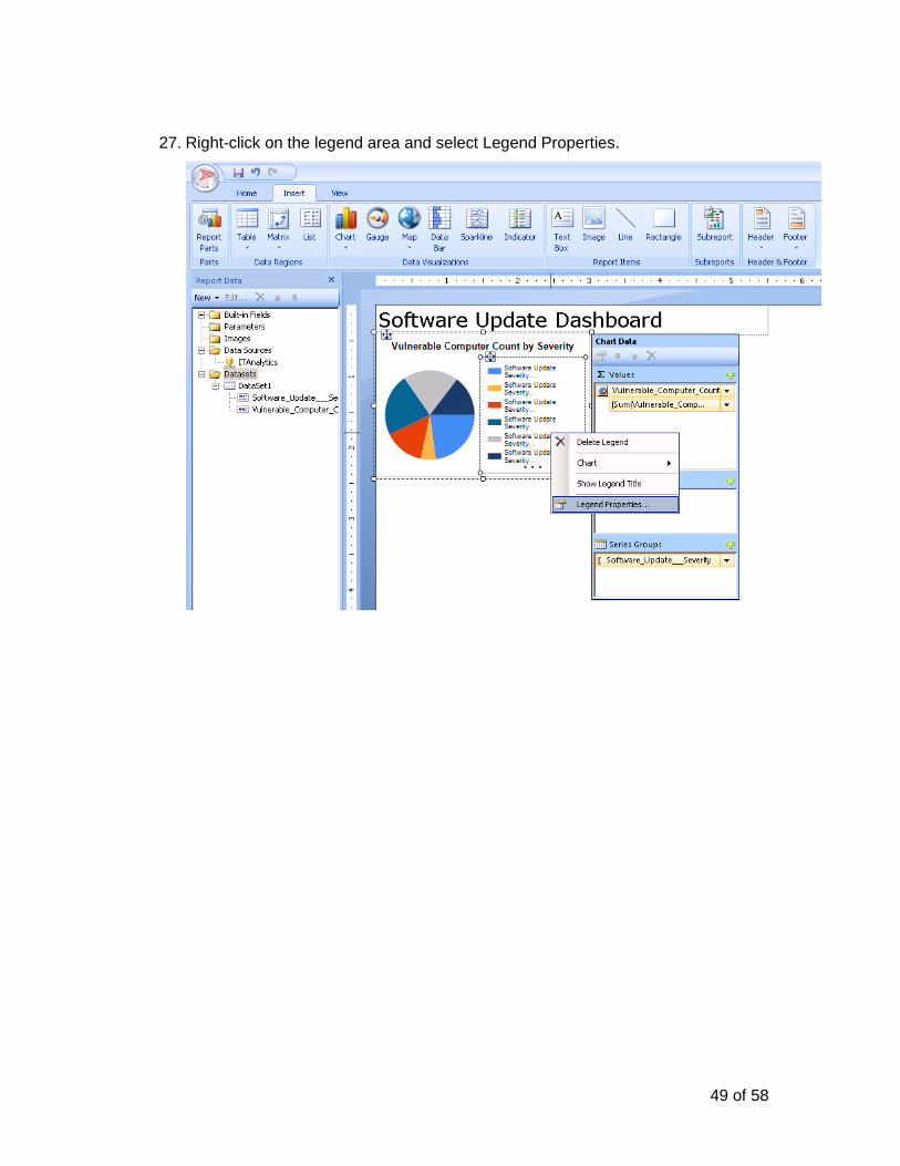
27. Right-click on the legend area and select Legend Properties.
50 of 58
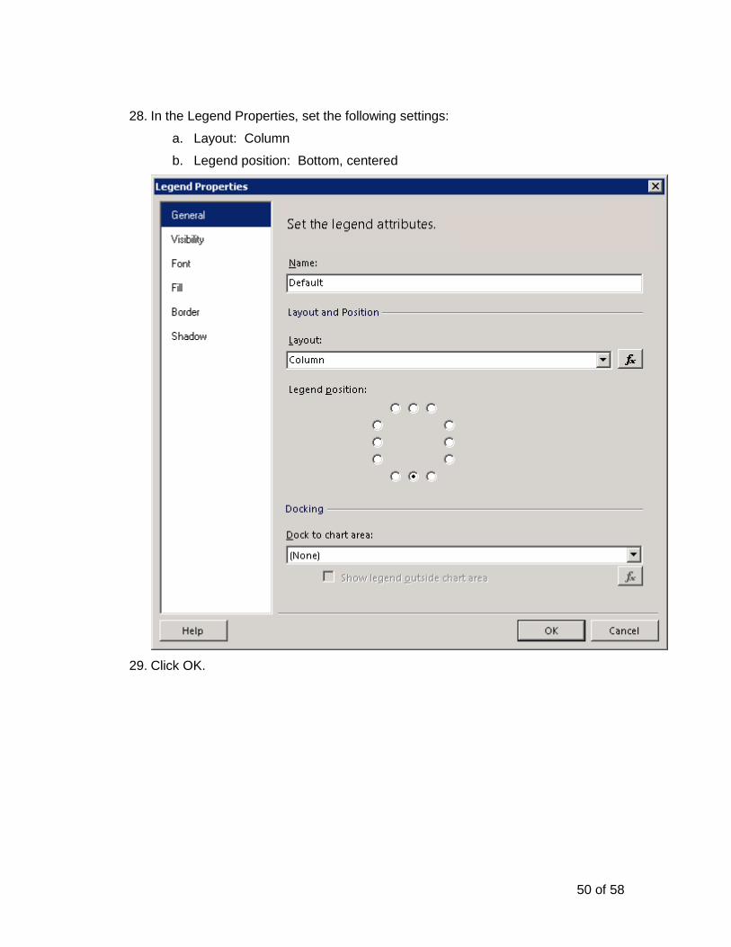
28. In the Legend Properties, set the following settings:
a. Layout: Column
b. Legend position: Bottom, centered
29. Click OK.
51 of 58
30. Select the chart and in the Properties pane, expand size and set Width to 5in and Height to 3in.
31. Preview the report by clicking the Run Report button in the toolbar and make any other adjustments.
52 of 58
32. After selecting the Run Report button you will be presented with a preview of your report with realtime data.
33. Select the Design button on the toolbar to return to the Design view.
53 of 58
34. Click the icon in the Report Builder toolbar to save this report to Reporting Services IT Analytics folder and name it “Software Update Dashboard”.
35. To link this report into the Altiris Console Open the Altiris Console from the shortcut on your desktop then navigate to the Reports > IT Analytics > Dashboards folder.
54 of 58
36. Right-click on the Dashboards folder and select New>IT Analytics Report.
37. In the Report Type dropdown box, select Dashboard.
55 of 58
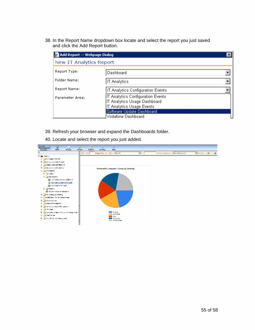
38. In the Report Name dropdown box locate and select the report you just saved and click the Add Report button.
39. Refresh your browser and expand the Dashboards folder.
40. Locate and select the report you just added.
56 of 58
Exercise 5: Optional
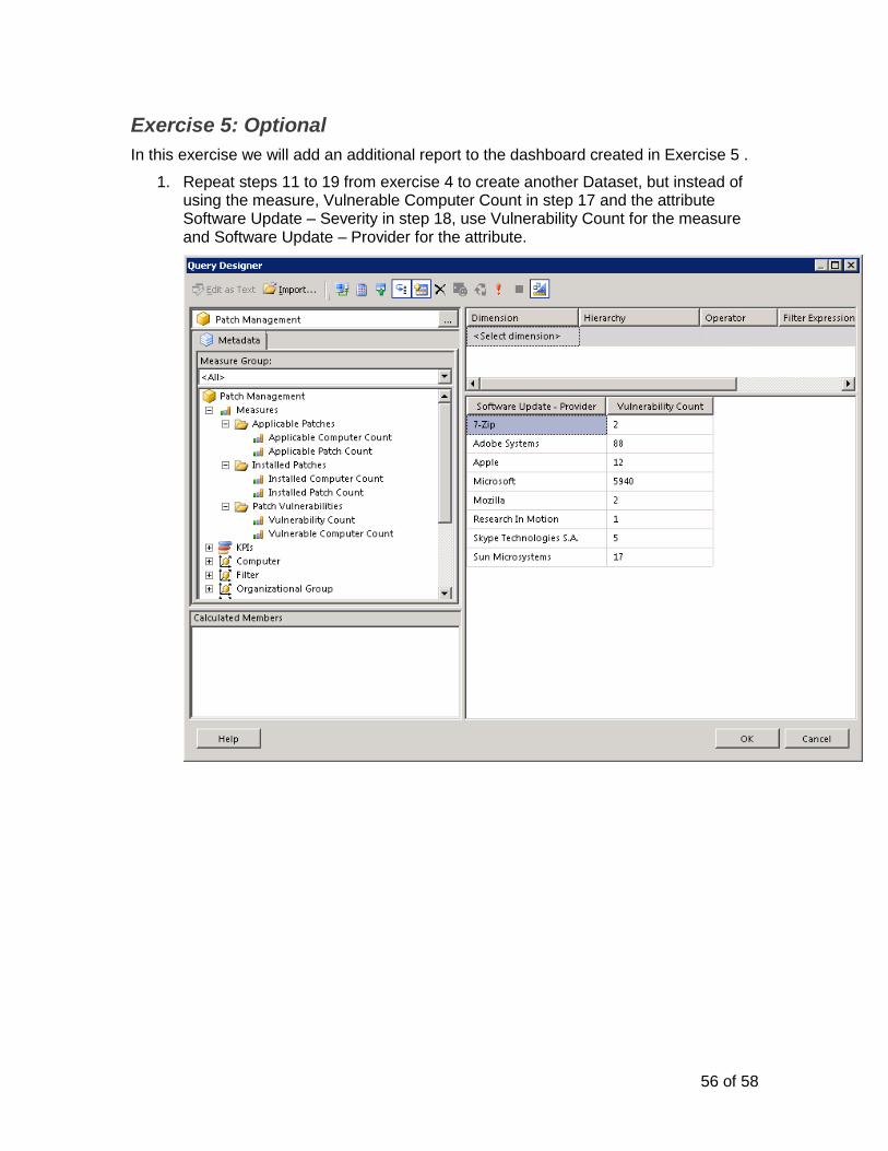
In this exercise we will add an additional report to the dashboard created in Exercise 5 .
1. Repeat steps 11 to 19 from exercise 4 to create another Dataset, but instead of using the measure, Vulnerable Computer Count in step 17 and the attribute Software Update – Severity in step 18, use Vulnerability Count for the measure and Software Update – Provider for the attribute.
57 of 58
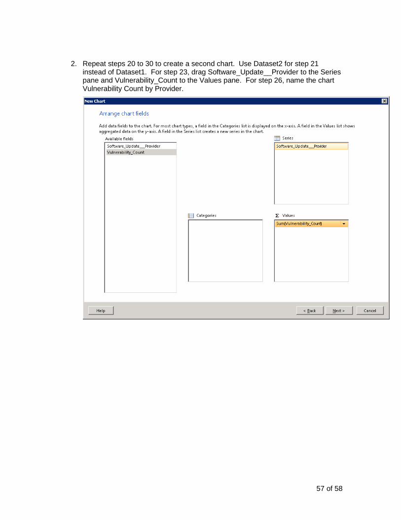
2. Repeat steps 20 to 30 to create a second chart. Use Dataset2 for step 21 instead of Dataset1. For step 23, drag Software_Update__Provider to the Series pane and Vulnerability_Count to the Values pane. For step 26, name the chart Vulnerability Count by Provider.
58 of 58
3. Move the newly inserted chart to the right of the Vulnerable Computer Count by
Severity chart by dragging the chart using the icon on the upper left corner of the chart.
Click the icon in the Report Builder toolbar to save this report.
4. Open the Altiris Console from the shortcut on your desktop then navigate to the Reports > IT Analytics > Dashboards folder.