25
CSS Layout

CSS Layout

we used to hack html to force layout
transparent gif
frame layout
html table layout

CSS Positioning

the FLOW
block elements (flow top to bottom) inline elements (flow left to right)
Static Positioning
text flows left to right

OUT of the FLOW
top, left width, height
independent layers
NOT RESPONSIVE
Absolute Positioning(0, 0)
width
heigh
t
top
left
overlap(z-index)

still in the FLOW
top, left
OFFSET elements
z-index
Relative Positioning

OUT of the FLOW
glued to background
also z-index
Fixed Positioningfixed

z-indexinteger
sets layer order
overrides default order
z-index: 10;
-10
10
93


GO with the FLOW (static positioning)
By default already RESPONSIVE
until we mess it up with multi-column layout…
STILL the best positioning for responsive design

static add widths floats flexbox
css grids

Floats
was industry standard method for handling multi-column layout
kind of a css “hack”
will be replaced by flexbox and css grids

Floats are for images
text wraps around image
float: left
floated object is in the”flow” the rest of the block is up for grabs


float: left; float: right;
two column layout
(width) (width)

float: left;
three column layout
float: left; float: left;
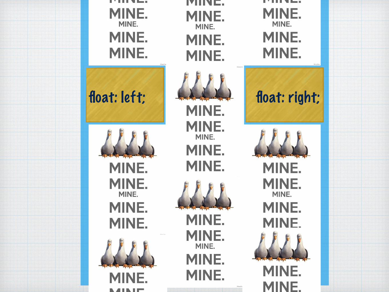
float: left; float: right;

float: left; float: right;
clearfix
.clearfix:after { display: table; content: " "; clear: both; }
.left {float: left;}
.right {float: right;}
<parent class=“clearfix”> <child class=“left”>…</child> <child class=“right”>…</child> </parent>

float onfloat property
float left and right for 2 columns
float all left for 3+ columns
widths
clearfix

box-sizing: content-box;
contentpadding
border
margin
300px+5px +5px
+5px
+5px
+2px
2px
2px
2px
how browsersrender the box model(default)
content + padding + border = width
width = 314px

box-sizing: border-box;
contentpadding
border
margin
286px+5px +5px
+5px
+5px
+2px
2px
2px
2px
IE oops = good
width includes padding and border
width = 300px
won’t break layout 300px

css reset*, *:before, *:after { margin: 0; padding: 0; box-sizing: border-box; }

Flexbox
css box positioning designed for responsive
browser support - finally! (can i use)

flexbox codeadd flex to parent element
how it should handle spaces between
which direction it should flex (flow)
give children widths! (px or %)
main { display: flex; justify-content: space-around; flex-flow: row; }
main section { width: 45%; background: white; border: solid 1px black; }


