Page 1
The University of AkronIdeaExchange@UAkron
Honors Research Projects The Dr. Gary B. and Pamela S. Williams HonorsCollege
Spring 2018
Decision Trees: Predicting Future Losses forInsurance DataAmanda [email protected]
Please take a moment to share how this work helps you through this survey. Your feedback will beimportant as we plan further development of our repository.Follow this and additional works at: http://ideaexchange.uakron.edu/honors_research_projects
Part of the Applied Statistics Commons
This Honors Research Project is brought to you for free and open access by The Dr. Gary B. and Pamela S. WilliamsHonors College at IdeaExchange@UAkron, the institutional repository of The University of Akron in Akron, Ohio,USA. It has been accepted for inclusion in Honors Research Projects by an authorized administrator ofIdeaExchange@UAkron. For more information, please contact [email protected] , [email protected] .
Recommended CitationLahrmann, Amanda, "Decision Trees: Predicting Future Losses for Insurance Data" (2018). Honors ResearchProjects. 660.http://ideaexchange.uakron.edu/honors_research_projects/660
Page 2
1
Decision Trees:
Predicting Future Losses for Insurance Data
By
Amanda Lahrmann
Senior Honors Project
Sponsored by: Mark Fridline
Major: Statistics
April 28th, 2018
Page 3
2
Table of Contents
Introduction ……………………………………………………………………………………… 3
Preliminary Statistics…………………………………………………………………………….. 5
Decision Trees…………………………………………………………………………………… 9
CHAID Decision Tree …………………………………………………..……………... 13
CART Decision Tree …………………………………………………………………... 19
Model Comparison…………………………………………………………………………….... 25
Conclusion……………………………………………………………………………………… 26
Acknowledgments ……………………………………………………………………………… 27
References ……………………………………………………………………………………… 28
Page 4
3
I. Introduction
Big data is a term that has come to the spotlight for companies within recent years. Data
analysis and business intelligence have become prominent sectors of companies and
agencies. But what is big data? How has it impacted large companies and agencies? Why must
it be embraced?
Before the age of the internet, groups dedicated to analyzing company data were sparse.
By the end of 2012 more than 90 percent of the Fortune 500 had begun at least some big data
initiatives (Mulcahy, 2017). The importance of analyzing large quantities of company data has
proven useful in saving money and conducting better business over time. SAS, a technology
company built on the use of predictive analytics, states: “Predictive analytics is the use of data,
statistical algorithms and machine learning techniques to identify the likelihood of future
outcomes based on historical data. The goal is to go beyond knowing what has happened to
providing a best assessment of what will happen in the future.” (SAS Institute Inc., 2018).
Utilizing the tools created for handling big data is essential to beginning to understand what data
is showing, greatly impacting the decisions made moving forward.
What specific tools are used by data analysts to display what is happening within the
data? Along with basic graphs and charts, many analysts utilize a tool known as a decision tree.
Put simply, a decision tree can be used to visually and explicitly represent decisions and decision
making (Gupta, 2017). These trees are made up of parent and child nodes, which split off from
each other to demonstrate how specific variables change the outcome of the data. This tool is the
main focus of this paper, and is utilized to demonstrate the big data set that has been collected for
analyzing.
Page 5
4
The program used for this project is called SPSS. This tool is one of many used in
companies to help draw up decision tree models to display data in an easy to navigate form. In
this program, the decision trees are modeled by utilizing a feature that provides a few algorithmic
options. These algorithms are known as CHAID and CART. Both algorithms result in some
form of a decision tree displaying how variables impact the outcome.
The best way to approach utilizing a big data set is to establish a question to answer. For
this data set, the question that must be answered is “What variables cause a loss to occur?” To
answer this question, first, we must understand what is meant by a “loss”, and take a look at what
kind of data we are working with. The data for this project is live, or active, insurance data from
National Interstate Insurance. National Interstate Insurance deals with niche market insurance,
where they mainly insure passenger transportation companies, truck transportation companies,
move and storage companies, and commercial business vehicles (National Interstate Insurance,
2018). Between limos, tour buses, school buses, and transit vehicles, they have a wide range of
policies to insure companies and small businesses. A loss in insurance is when a claim is made
on a policy. A claim can be everything from a vehicle being involved in a highway collision to
sliding off the road during icy winters. When a claim is made, National Interstate assesses the
damage and pays a portion of the claim for it to be settled. When a claim is made and a loss
occurs, it is noted on the policy.
This project focuses on the “loss incurred” variable, which shows if a loss of any sum is
present on a policy. National Interstate Insurance offered this “live” data set for this project as a
way to get a head start on statistical analysis. This data set has only been analyzed for this project
presently, and will be visited by data analysts in the future for further assessment. National
Interstate Insurance will be able to view this project and gain insight into the data before utilizing
Page 6
5
it in their prediction analytics, helping their current data analysts gain a different perspective on
the data set.
II. Preliminary Statistical Analysis
The first step in data analysis involves cleaning the data set and analyzing what the data
is saying from a surface level. Cleaning the data, simply put, means to find and fix incorrectly
recorded data values. Cleaning the data also includes figuring out the best way to deal with
missing variables. For this data set, all of the data was complete with no missing variables. The
biggest task for cleaning the data was dichotomizing the “loss incurred” variable. Dichotomizing
is the practice of categorizing the data from one variable into two options: yes and no. Since we
want to find out which variables influence the risk of a policy experiencing a loss, a separate
column stating yes or no suffices for categorizing if a policy has a loss occur.
The original data set contained over 150,000 policies. After running preliminary
statistics and viewing the frequencies of losses in the data, it showed that only 5% of the policies
had experienced a loss. Since this is difficult for constructing a decision tree, the data was split
into separate files; one containing all policies that had a loss, while the other contained all
policies that did not have a loss. Using a randomizing algorithm in the program, 9,378 policies
were randomly selected from the file containing no losses. These 9,378 no loss policies were
then merged with the 9,378 loss policies to create a working data set. This data set has a 50%
chance of randomly selecting a policy with a loss, which makes the data set easier to review.
Risk, sensitivity, and specificity, all concepts discussed later in the project, are not easily
interpreted when the data only has a 95/5 percent split in loss outcome. Constructing a merged
Page 7
6
data set with a 50/50 percent split in loss outcomes helps make reviewing the effectiveness of the
model easier.
Following are the notable charts and graphs collected from the preliminary analysis of the
data set, looking at several potential predictor variables or factors.
The above bar chart shows the regions of the United States that the policies are located.
The count of how many policies are in each region is shown. Around 1,000 policies are in the
Mountain and South regions of the United States, while most policies are located in the
Northeast or the Midwest. For the data, this means that the chance of a policy experiencing a
loss can be high.
Page 8
7
The above table is a cross tabulation of the policy regions that are featured in the previous
bar chart. As stated previously, there are around 1,000 policies in the Mountain and South
regions, which is significantly less than regions such as the Midwest or Northeast that have over
5,700 policies. The region with the highest percentage of losses is the South. With the
percentage of losses in the South at 63.2%, there is reason to believe that having a policy in the
South can have a large impact on risk of a loss occurrence. This could be due to the risk of
tropical weather conditions, such as the hurricane in Texas. The region with the lowest
percentage of losses is the Mountain region.
Page 9
8
The above graph displays the count of the categorized ages of vehicles. Most of the
vehicles in the data set are 0-5 years old or 6-15 years old. The category with the highest number
of losses is the 0-5 years category. The 15+ years category had a higher rate of no losses than
losses occurring.
The above chart is a cross tabulation of the categorized age of vehicle variable. The
category with the most number of losses is the 0-5 year category with 4,716 losses. Out of the
1,379 vehicles that are 15 years or older, only 37.9% of them had a loss occur. This result is not
what is to be expected, given that older vehicles should be more prone to having a loss than a
younger vehicle.
Page 10
9
The above bar chart shows the type of vehicles in the policies and if a loss occurred
within that category or not. The categories are charter, limo, PPSV, school, and transit vehicles.
A PPSV vehicle is a private passenger service vehicle. It is typically the insureds or his/her
employee’s private vehicle that can be used for business or commercial purposes. Of these
categories of vehicles, transit vehicles had the highest percent of losses while PPSV has the
smallest percent of losses.
The above table is a cross tabulation of the bar chart above for the types of transportation
vehicles. The category with the highest number of losses is transit, as observed from the bar
chart, at 4,026 losses. This shows 54.8% of the policies with a transit labeled vehicle have had a
loss occur. The lowest number of losses is in the PPSV category, at 102 losses, or 24% of the
PPSV labeled vehicles. This may indicate that PPSV labeled vehicles may be less likely to have
a loss occur. Transit is the largest category, with 7,350 vehicles, representing about 37.7% of the
total data.
III. Decision Trees
There are multiple algorithms that are used in the program SPSS. This project will be
utilizing CHAID and CART. These algorithms have their own individual rules for creating a
Page 11
10
decision tree, giving the user a variety of ways to build models out of data. By analyzing these
two algorithms, the most applicable tree, based on criteria that is set out before the analysis
begins, can be selected to be used for future predictions and reference for similar data sets.
The first algorithm used is the CHAID algorithm. CHAID stands for Chi-squared
Automatic Interaction Detection (IBM, 2010). At each step, CHAID chooses the independent, or
predictor, variable that has the strongest interaction with the dependent, or response, variable.
Categories of each predictor are merged if they are not significantly different with respect to the
dependent variable (IBM, 2010). This test shows how the data grouped based upon how they
relate to each other, and does so by originally showing the breakdown of data in a root node, then
branching off based on what predictor variables are chosen to help further classify the data.
CHAID uses the following algorithm when analyzing a data set’s predictors (IBM, 2010):
1. Perform cross-tabulation of the predictor variable with the binary target variable. If the
predictor variable has only 2 categories, go to step 5.
2. Merge potential and allowed pair of categories for predictors.
3. For the pair having the largest p-value, check if its p-value is larger than a user specified
alpha level (α merge)
a. If p-value > α merge then the pair is merged into a single category
b. If p-value ≤ α merge then the pair is not merged into a single category
4. Any category having too few observations (as compared to the user-specified minimum
segment size) is merged with most similar other category.
5. The adjusted P value for the merged categories using a Bonferroni adjustment is utilized
to control for Type I error rate.
Page 12
11
The second algorithm used is known as CRT or CART. CART stands for Classification
and Regression Tree. The CART algorithm is different from CHAID in a few ways. CART
splits the data into segments that are as homogeneous as possible, with respect to the dependent
variable. A terminal node in which all cases have the same value for the dependent variable is a
homogeneous, “pure" node (IBM, 2010). The answer is binary, either success or failure. The
tree that is grown is a binary tree, where each parent node will split into only two child nodes.
The predictors can be continuous, ordinal, nominal, or discrete. The CART algorithm does not
make assumptions about underlying data. The tree that is built from CART summarizes large
multivariate datasets. This tree is smaller in terms of branches, but has more levels than the tree
that CHAID produces.
The CART tree is easier to read, so non-statisticians can effectively gain new information
and draw conclusions without needing a deep understanding of the program. The CART tree is
good for discovering possible interactions between the predictor variables. Any missing values
can easily be dealt with by using surrogate variables, which CHAID does not utilize. Each child
node can be treated as a parent node, until it can no longer be split.
CART uses the following algorithm to grow a tree:
1. At each parent node, search all the possible splits for each predictor
2. Choose the best split using the smallest impurity criterion among all possible predictors
3. Split
4. Let each side of the child node be the parent node and go back to #1
5. Continue until no more splits occur
Page 13
12
CART has stopping rules similar to CHAID, in addition to its own unique rules. CART
utilizes the Gini Impurity function and node purity to asses if a node should be split. The Gini
Impurity function measures how often a randomly chosen case will be incorrectly predicted. The
Gini Impurity function is shown below (IBM, 2010):
The idea of perfect purity is a node that contains members of one class, while least purity
is a node that contains and equal proportion of the two classes (IBM, 2010). In the case that a
node has perfect purity, it will stop splitting. If all of the cases in the node have identical values
for each predictor, the node will not split. If the best split is smaller than what the use specifies
as minimum improvement, the node will stop splitting. The tree will stop splitting if it reaches
its user specified limit, similar to CHAID. This number is a default of 5, but can be stopped
earlier if specified. If the node size is less than the specified value, the node will not split. If the
split of the node results in a child node with a size less than the specified minimum child node
size, the node will stop and will not split.
In addition to the Gini Impurity function, CART utilizes the Goodness of Split
Improvement measure. The Goodness of Split Improvement function is shown below (IBM,
2010):
This step helps decrease impurity from the parent node to the child node by choosing the
variable split that maximizes the change in impurity (IBM, 2010). This step helps increase the
probability that the model will predict better overall.
Page 14
13
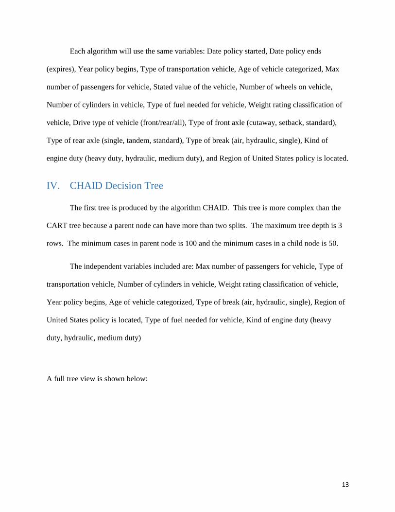
Each algorithm will use the same variables: Date policy started, Date policy ends
(expires), Year policy begins, Type of transportation vehicle, Age of vehicle categorized, Max
number of passengers for vehicle, Stated value of the vehicle, Number of wheels on vehicle,
Number of cylinders in vehicle, Type of fuel needed for vehicle, Weight rating classification of
vehicle, Drive type of vehicle (front/rear/all), Type of front axle (cutaway, setback, standard),
Type of rear axle (single, tandem, standard), Type of break (air, hydraulic, single), Kind of
engine duty (heavy duty, hydraulic, medium duty), and Region of United States policy is located.
IV. CHAID Decision Tree
The first tree is produced by the algorithm CHAID. This tree is more complex than the
CART tree because a parent node can have more than two splits. The maximum tree depth is 3
rows. The minimum cases in parent node is 100 and the minimum cases in a child node is 50.
The independent variables included are: Max number of passengers for vehicle, Type of
transportation vehicle, Number of cylinders in vehicle, Weight rating classification of vehicle,
Year policy begins, Age of vehicle categorized, Type of break (air, hydraulic, single), Region of
United States policy is located, Type of fuel needed for vehicle, Kind of engine duty (heavy
duty, hydraulic, medium duty)
A full tree view is shown below:
Page 15
14
This is the first row of the CHAID tree. Node 0 is the highest level for the data, which
demonstrates how the data is split based on if a loss occurred or if a loss did not occur. At this
level, 50.2% of the data policies did not experience a loss while 49.8% of the data policies
experienced a loss. The next level down splits into six child nodes. These nodes are split based
on the variable that has the highest amount of influence on the data. In this case, that variable is
the maximum number of passengers for a vehicle. The data splits into these different nodes:
vehicles that have 5 passengers or less, vehicles with 5 to 7 passengers, vehicles with 7 to 24
passengers, vehicles with 24 to 53 passengers, vehicles with 53 to 57 passengers, and vehicles
with more than 57 passengers. Node 5 is the most notable of this row. What node 5 tells us is
policies that have vehicles with a max number of passengers between 53 and 57 have a 68.3%
probability of experiencing a loss.
Page 16
15
Above displays the three child nodes that have split from node 1. The second important
variable in this branch, if a vehicle has 5 or less for their max number of passengers, is what type
of transportation vehicle. Node 9 has the most notable outcome of these two variables. If a
policy vehicle has 5 or less passengers and is a PPSV, the probability of a loss occurring is only
22.8%. For node 8, if the policy vehicle has 5 or less passengers and is a limo, the probability of
a loss occurring is only 37.3%. These nodes show us that the probability of a loss occurring is
still there for these kinds of vehicles, but the chances are lower.
Page 17
16
Above shows the branches growing from Node 3. Similar to Node 1, the second variable
used to split the data is the type of transportation vehicle. After that, the tree uses the variable
age of vehicle categorization to further classify the data. For example, in Node 31, if a policy
vehicle has a maximum number of passengers between 7 and 24, is classified as a school or
charter vehicle, and is 15 years or older, the probability that the policy will experience a loss is
10.2%. This is very low in comparison to other categories, which could mean that any policy
that meets these requirements can be charged less for insurance since they are less likely to have
a loss occur. For Node 29, if a policy vehicle has a maximum number of passengers between 7
and 24, is a transit vehicle, and is 0-5 years old, the probability of experiencing a loss is 60.9%.
Page 18
17
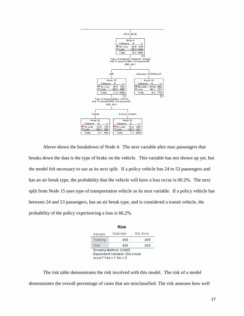
Above shows the breakdown of Node 4. The next variable after max passengers that
breaks down the data is the type of brake on the vehicle. This variable has not shown up yet, but
the model felt necessary to use as its next split. If a policy vehicle has 24 to 53 passengers and
has an air break type, the probability that the vehicle will have a loss occur is 60.2%. The next
split from Node 15 uses type of transportation vehicle as its next variable. If a policy vehicle has
between 24 and 53 passengers, has an air break type, and is considered a transit vehicle, the
probability of the policy experiencing a loss is 66.2%.
The risk table demonstrates the risk involved with this model. The risk of a model
demonstrates the overall percentage of cases that are misclassified. The risk assesses how well
Page 19
18
the model fits the training data set that the model was built upon, as well as test data set aside for
evaluation. If the estimate is too high for the risk of a model for the training data as compared to
the test data, the model could be over fitted to the data set. Although the model may be able to
predict the outcome correctly for that data set, using the model for a new but similar data set
could run the risk of not predicting the correct outcome. Risk is important to assess so that if the
model is considered to be put to use for another set of similar data, the predictions are ideal for
helping make decisions moving forward. For the CHAID model, the risk for the training set,
what the model was built upon, is only .400. When applied to the test set, the risk estimate only
increases to .406. The risk of overfitting the data is low, so the model is useful for future data
sets.
This is the classification table. This table demonstrates how the model holds up with
different sets of data. If a model is fitted to predict one set of data perfectly, it will most likely
not do well in predicting for different data sets. In this case, the model is showing what its
specificity and sensitivity is. Sensitivity, as explained before, is the ability of a model to predict
a positive result and be correct in its prediction, while specificity is the model’s ability to predict
Page 20
19
a negative result and be correct in its prediction. The sensitivity of this project is how well the
model predicted there would be a loss and a loss did occur. The sensitivity of the training model
is 52.5%, while the sensitivity for the test model is 52.3%. The specificity of this model is how
well the model predicted there would not be a loss and a loss did not occur. The specificity of
this model is 67.4% for the training set. When applied to a different data set, the specificity of
the model is 66.6%. The difference in training and testing is minimal, helping show that the
training model was not over fitting the data.
V. CART Decision Tree
The second tree is produced by the algorithm CART. This algorithm differs from
CHAID in a few ways. The depth of the tree is 5 rows instead of 3, and every split that occurs is
only split into two, versus multiple splits. The minimum number of cases in every parent node is
100 and the minimum number of cases in every child node is 50.
The independent variables included are: Type of transportation vehicle, Max number of
passengers for vehicle, Weight rating classification of vehicle, Region of United States policy is
located, Type of front axle (cutaway, setback, standard), Drive type of vehicle (front/rear/all),
Type of rear axle (single, tandem, standard), Stated value of the vehicle, Type of fuel needed for
vehicle, Type of break (air, hydraulic, single), Number of wheels on vehicle, Kind of engine duty
(heavy duty, hydraulic, medium duty), Number of cylinders in vehicle, Age of vehicle
categorized, Year policy begins.
A full view of the tree is displayed below:
Page 21
20
Above is the root node for the training model for the data set. Of all the policy data in the
set, 50.2% of policies did not have a loss occur while 49.8% of policies did have a loss occur.
The model chose the first variable to split the data to be the type of transportation vehicle. The
two splits that the model created were either Transit and Charter or School, Limo, and PPSV.
For example, in node 2, if a policy vehicle was labeled as school, limo, or PPSV, the probability
that a loss will occur is 41.0%, while the probability that a loss will not occur is 59.0%. If the
Page 22
21
vehicle on the policy was labeled Transit or Charter, the probability that the policy will have a
loss occur is 55.3%.
Above are the next few branches from node 1. The second variable used by the model is
the stated value of the vehicle, which splits into two categories: less than or equal to $27,607.50
or higher than $27,607.50. The next important variable is the drive type of the vehicle. The split
for this variable is if the car either has rear wheel drive versus all other drive types. Node 8 for
the model is showing that if a policy vehicle is a transit or charter, is valued at less than
$27,607.50, and has a vehicle drive type of front wheel drive, all-wheel drive, or an unknown
drive type, the probability of the policy experiencing a loss is 39.6%, while the probability of the
policy not having a loss occur is 60.4%.
Page 23
22
Above shows the other side of the split from node 1, where the data splits into where the
stated value of the vehicle is more than $27,607.50. The next variable split from node 4 is the
maximum number of passengers for the vehicle. The node splits into a max number of
passengers being equal to or less than 49.5 or a max number of passengers being more than 49.5.
Node 10 shows that if a policy vehicle is a Transit or Charter, has a stated value of more than
$27,607.50, and has a maximum number of passengers being more than 49.5, the probability that
the policy will have a loss occur is 68.2%. Node 10 terminates and no longer splits. Node 19
and Node 20 derive from node 9, which splits with the variable type of transportation vehicle.
This variable is repeated, and may seem off that the model repeated this variable, but the model
found it important to split this data even further by reusing the same variable. For interpretation
of node 19, if a policy vehicle is transit, has a stated value of more than $27,607.50, and has a
Page 24
23
maximum number of passengers of less than or equal to 49.5, the probability that the policy will
experience a loss is 61.1%.
Above shows node 2, demonstrating the other split from the root node. The next variable split
from node 2 is region of the United States. From this split are two categories: Midwest, West,
Southeast, Mountain combined versus Northeast and South. If the policy vehicle is labeled
School, Limo, or PPSV and the region of the United States the policy is located is the Midwest,
West, Southeast, or Mountain, the probability of the policy having a loss occur is 31.6%.
Page 25
24
Expanding from Node 5, the next variable used to split the data further is the weight
classification of the vehicle. The two splits are a weight rating larger than 26,001 or a weight
rating of 0 – 10,000, Unknown, and Other. The split from node 12 uses the variable age of
vehicle categorized, which is split into 0-15 years old or more than 15 years old. If a policy
vehicle is labeled School, Limo, or PPSV, is located in the Midwest, West, Southeast, or
Mountain region of the United States, has a weight classification rating of 0-10,000, Unknown,
or Other, and has a vehicle age of more than 15 years, the probability of the policy experiencing
a loss is 7.2%.
Displayed above is the risk table for the CART model. This risk is very similar to the
CHAID model, but slightly less. The standard error for both are the same, but the estimate of
risk for both the training and the testing models are less than CHAID. The training set has a risk
of .388, while the test set only increases to .395. The risk of overfitting the data is low for the
CART model.
Page 26
25
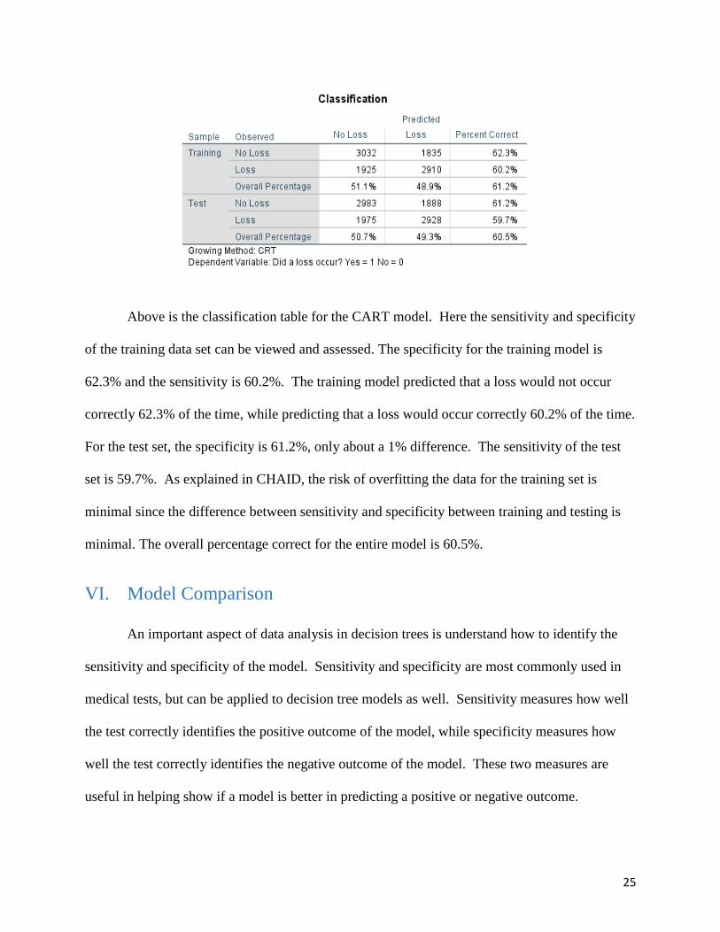
Above is the classification table for the CART model. Here the sensitivity and specificity
of the training data set can be viewed and assessed. The specificity for the training model is
62.3% and the sensitivity is 60.2%. The training model predicted that a loss would not occur
correctly 62.3% of the time, while predicting that a loss would occur correctly 60.2% of the time.
For the test set, the specificity is 61.2%, only about a 1% difference. The sensitivity of the test
set is 59.7%. As explained in CHAID, the risk of overfitting the data for the training set is
minimal since the difference between sensitivity and specificity between training and testing is
minimal. The overall percentage correct for the entire model is 60.5%.
VI. Model Comparison
An important aspect of data analysis in decision trees is understand how to identify the
sensitivity and specificity of the model. Sensitivity and specificity are most commonly used in
medical tests, but can be applied to decision tree models as well. Sensitivity measures how well
the test correctly identifies the positive outcome of the model, while specificity measures how
well the test correctly identifies the negative outcome of the model. These two measures are
useful in helping show if a model is better in predicting a positive or negative outcome.
Page 27
26
Assessing each model’s risk, sensitivity, specificity, and overall percentage correct helps
in deciding which model would be best to use for future predictions. The specificity was much
higher for CHAID than in CART, but the sensitivity was much lower than CART’s sensitivity.
The overall percentage was marginal in difference between CHAID and CART, with risk being
similar between both models.
Model Risk Sensitivity Specificity Overall
CHAID .406 52.3% 66.6% 59.4%
CART .395 59.7% 61.2% 60.5%
VII. Conclusion
The main goal to consider is how well the model will predict both a loss occurring or not
occurring. Knowing how much to charge a policy is important if the policy is a higher risk for a
loss, but avoiding over-charging of lower risk customers so they renew their policies is
important. Although the specificity is not as high as CHAID, CART had a much higher
sensitivity and slightly higher overall percentage correct. With this in mind, the best model to
use for future predictions is the CART model.
Page 28
27
VIII. Acknowledgments
Much appreciation to Dr. Mark Fridline for sponsoring this project. Much appreciation
to Dr. Richard Einsporn, and Dr. Nao Mimoto for being readers of this project. Additionally,
many thanks to National Interstate Insurance for the opportunity to work with them and learn
about the methods involved in insurance analytics. This project was not possible without them
providing the data.
Page 29
28
IX. References
Gupta, P. (2017, May 17). Decision Trees in Machine Learning. Retrieved from Towards Data
Science: https://towardsdatascience.com/decision-trees-in-machine-learning-
641b9c4e8052
IBM. (2010). IBM SPSS Decision Trees 19. SPSS Inc.
Mulcahy, M. (2017, February 22). Big Data – Are You In Control? Retrieved from Waterford
Technologies: https://www.waterfordtechnologies.com/big-data-interesting-facts/
National Interstate Insurance. (2018). About Us. Retrieved from National Interstate Insurance:
https://www.nationalinterstate.com/AboutUs
Salford Systems. (2018). Using Surrogates to Improve Datasets with Missing Values. Retrieved
from Salford Systems: https://www.salford-systems.com/resources/webinars-
tutorials/tips-and-tricks/using-surrogates-to-improve-datasets-with-missing-values
SAS Institute Inc. (2018). Predictive Analytics: What it is and Why it Matters. Retrieved from
SAS: https://www.sas.com/en_us/insights/analytics/predictive-analytics.html