Digipack research I have looked at a few different digipacks I had at home that are in the pop genre. I have found that they are all quite similar with their photos and what they have put on the pages of the booklet. They all have thank you pages and the lyrics of the songs which I will incorporate into my section of the digipack. By Bonnie Massey
Transcript
Digipack research
I have looked at a few different digipacks I had at home that are in the pop genre. I have found that they are all quite similar with their photos
and what they have put on the pages of the booklet. They all have thank you pages and the lyrics of the songs which I will incorporate into
my section of the digipack.
By Bonnie Massey
The Saturdays
Large band name which stands
out.
Plain background to make the band members more
noticeable.
Serious facial expressions show
the girls are independent.
None of the girls are shown more than others they
are all equally shown suggesting they are all one group – no lead
singers.
All the girls have the same
costume showing they are all equal and all one group.
They all have individual colours showing they have different personalities but the
dresses are all the same showing they are still one band.
Each page in side the digipack has a photo
of one member of the group.
There is also a page of writing where each girl says
thank you to people who helped with the album.
There is also each girls signature making fans
feel more in touch with the band.
Ashley Tisdale
Artists name stands out making it
obvious who it is.
Facial expression shows she’s
independent and serious.
Costume is fashionable but not colourful like most costumes in the pop genre showing she is challenging the stereo type of pop artists.
Album name is clear and looks
handwritten suggesting the
album is her own music and feelings.
Bright colours in the background and
different panels of colour shows the
album has a variety of music.
Bright colours fit the pop genre.
The pages throughout the booklet have very feminine colours. The lyrics are also displayed for each song on
the page.
Her costume and hair challenges stereotypes
as it would be more associated with indie
artists.
The track list is simple with feminine colours
but the font challenges the pop genre as its
block writing.
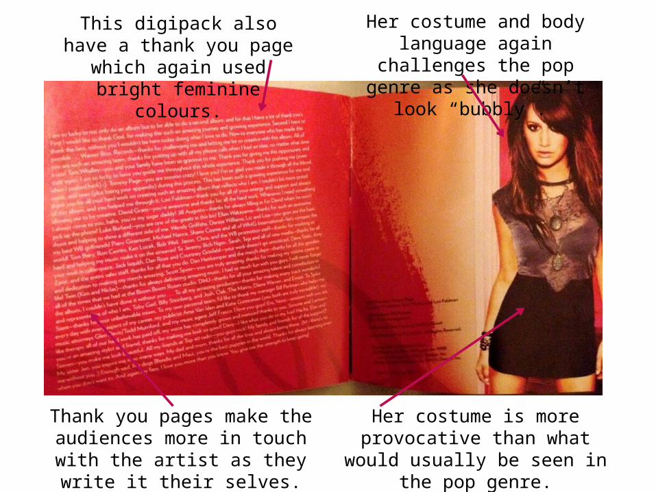
This digipack also have a thank you page which again used
bright feminine colours.
Her costume and body language again challenges the pop genre as she doesn’t look “bubbly”.
Her costume is more provocative than what would usually be seen in
the pop genre.
Thank you pages make the audiences more in touch with the artist as they
write it their selves.
The Sugababes
Plain background so the members of
the group stand out.
The band name stands out a lot
against the black dresses.
Their costume is all pretty much the same making them all fit in together and no one stands out more than the
other. This shows they are equal – no lead singers.
Facial expressions make them seem just like ordinary
girls and quite innocent – how
people in pop are represented.
The colours used challenge the
conventions of the pop genre as they
are very dark subtle colours –
vibrant colours are usually used.
Colours indicate that their music is
slow pop music rather than
upbeat.
Photos of each member of the group on their own on each page of
the digipack.
Their facial expressions are still very innocent and simple. Shows it isn’t all about their image, just
about the music.
Their costume is still simple further showing that their look
isn’t the most important as they use subtle and classy
colours.
There are the lyrics to each song throughout the booklet so the fans can get to know
their music better.
A page of thank you’s which makes the fans able to read personal
messages from the artist. Still uses the subtle colours challenging the
pop genre.
Track list on the back of the cover is simple with an
ordinary font and still using the dark colours.
Miley Cyrus
Facial expression fits the
conventions of pop well as she shown to be very happy
and upbeat.
Body language shows her to be
very carefree and happy – fitting
conventions of pop.
Plain background makes the artist stand out from the rest of the
album.
Artist and album name doesn’t
stand out much indicating that she wants to be known
but recognised more by her looks.
Stars fit the pop genre will as they are seen to very feminine and indicates that she will become a big
pop star.
The lyrics of each song are displayed on the pages throughout the digipack so the fans will know the artists song
better.
Subtle colours are used throughout the digipack but the red starts really
contrast and stand out fitting conventions of pop as being a vibrant
and bold genre.
There is a thank you page which carries on the vibrant red theme throughout
the digipack. Her facial expression is still shown to be happy and innocent.
Track list on the back carries on the red theme and is simple with standard fonts and the bold red
fits the conventions of pop.
Gwen Stefani
Editing in the photo gives it a watery
affect – fits in with the fun side of pop.
Very bright colours used fitting in with
the pop genre making it clear what
type of music she produces.
Challenges the conventions of pop with her body language as she is giving quite a lot of attitude
rather than looking innocent.
Her name stands out but is in a
small section in the corner making
it insignificant.
Solo artist but has other people in the
cover suggesting other people feature on tracks and its not
all about her.
Lyrics of the songs are displayed on each page in the booklet with very
bright and bold colours all around it fitting in with pop.
Like the other digipacks there is a thank you page which uses bold colours again further supporting pop. The font also supports this