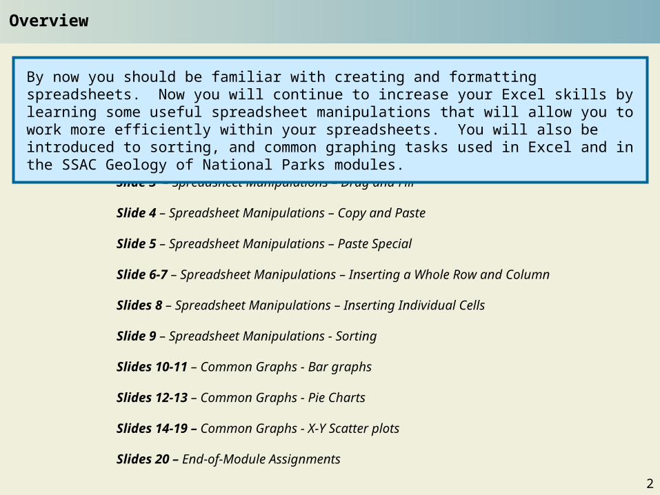
By now you should be familiar with creating and formatting spreadsheets. Now you will continue to increase your Excel skills by learning some useful spreadsheet manipulations that will allow you to work more efficiently within your spreadsheets. You will also be introduced to sorting, and common graphing tasks used in Excel and in the SSAC Geology of National Parks modules.
2
Note: You cannot just type “1” in the first cell and then auto-fill the rest of the cells. You must type “1” and then “2”. Why?
You already saw one example of the “drag and fill” shortcut feature on Slide 10 of the Part I module of this tutorial series. To review, Microsoft Excel is programmed to recognize patterns in numbers, letters, dates, and equations in contiguous cells. Hence for spreadsheets with consecutive data entries and/or equations, one can simply select the initial cell, click on the small box in the lower right corner of the highlighted cell, and drag the highlight down to the desired last cell.
Below is a spreadsheet with the names of selected national parks. We want to number the parks in Column A without typing 1, 2, 3, 4, etc. Because the numbers are consecutive, you may type “1” in the first cell and “2” in the second cell, then have Excel automatically fill in the rest of the numbers. Although dragging and filling cells is more common vertically down a column, it may also be done horizontally across a row.
Spreadsheet Manipulations – Drag and Fill
3
Click on the Excel worksheet to the right and save immediately to your computer. Complete the spreadsheets at each of the tabs starting with “Slides 3-8.” Yellow cells contain given values, and orange cells contain formulas. The spreadsheet at the “EOM Answers” tab is for your answers to the end-of-module questions on the last slide.
Spreadsheet Warm Up 2 Student
The “copy” and “paste” commands can also be very useful in Excel, particularly when pasting data and equations into non-adjacent cells in the spreadsheet, or onto new spreadsheets. Say for instance you take the same ten national parks and want to make a new spreadsheet with new park-visitation data. Rather than re-create the spreadsheet from scratch, you can copy the one you have and paste it into another spreadsheet within the same workbook, or into a different workbook.
Spreadsheet Manipulations – Copy and Paste
To do this:1.Highlight the necessary cells in the original spreadsheet, right click on the highlighted cells and choose “Copy” (alternatively, you may choose “Copy” from the Edit menu or press and hold Ctrl then “C”).
2. Navigate to the new spreadsheet, select the cell where you would like the newly pasted spreadsheet to begin, right click and choose “Paste” (alternatively, you can choose “Paste” from the Edit menu or press Ctrl “V”).
When copy/pasting, you may encounter times when the values in the cell will turn from numbers to #######. This just means that your cell is not wide enough for the number to be displayed. Simply increase the column width. One way to do this is to place your mouse on the lines dividing the columns at the very top of the spreadsheet ( i.e.; between Column “A” and Column “B”) . Your cursor will turn into a black cross with arrows on the end of it. Click and drag over the cell boundary until your number fits.
4
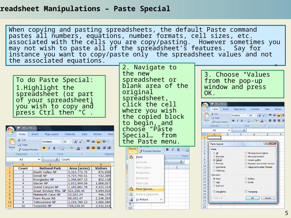
When copying and pasting spreadsheets, the default Paste command pastes all numbers, equations, number formats, cell sizes, etc. associated with the cells you are copy/pasting. However sometimes you may not wish to paste all of the spreadsheet’s features. Say for instance you want to copy/paste only the spreadsheet values and not the associated equations.
Spreadsheet Manipulations – Paste Special
To do Paste Special:1.Highlight the spreadsheet (or part of your spreadsheet) you wish to copy and press Ctrl then “C”.
2. Navigate to the new spreadsheet or blank area of the original spreadsheet, click the cell where you wish the copied block to begin, and choose “Paste Special…” from the Paste menu.
3. Choose “Values” from the pop-up window and press OK.
5
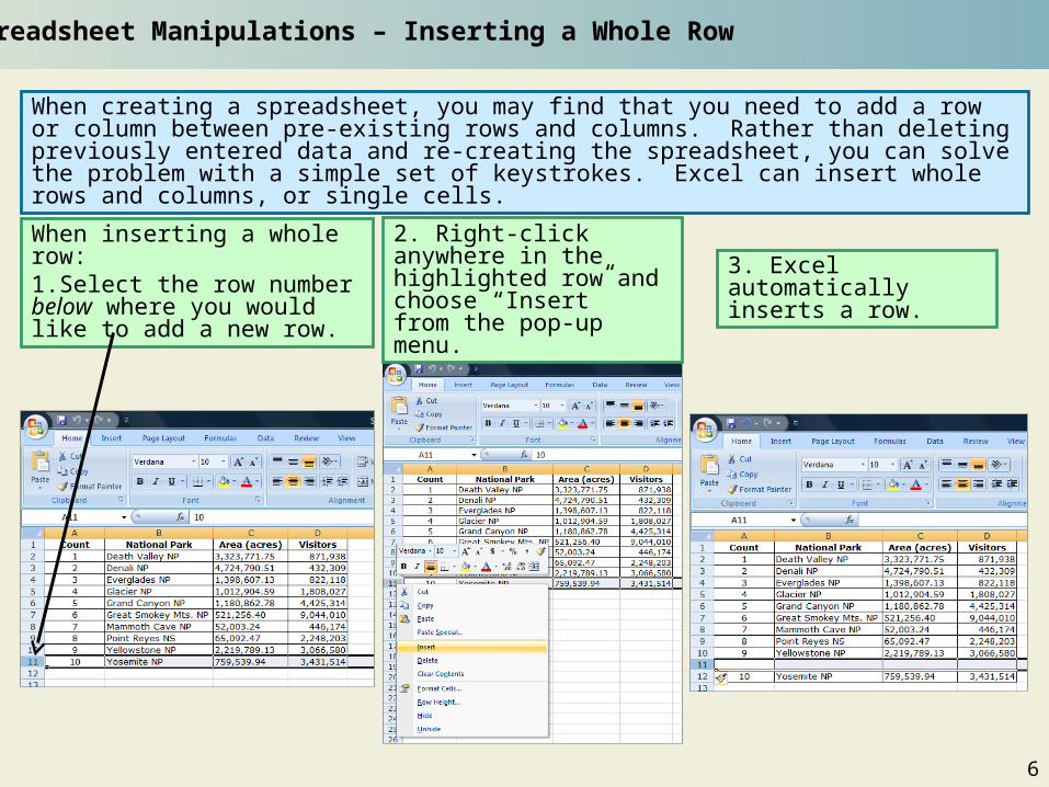
When creating a spreadsheet, you may find that you need to add a row or column between pre-existing rows and columns. Rather than deleting previously entered data and re-creating the spreadsheet, you can solve the problem with a simple set of keystrokes. Excel can insert whole rows and columns, or single cells.
Spreadsheet Manipulations – Inserting a Whole Row
When inserting a whole row:1.Select the row number below where you would like to add a new row.
3. Excel automatically inserts a row.
2. Right-click anywhere in the highlighted row and choose “Insert” from the pop-up menu.
6
Spreadsheet Manipulations – Inserting a Whole Column
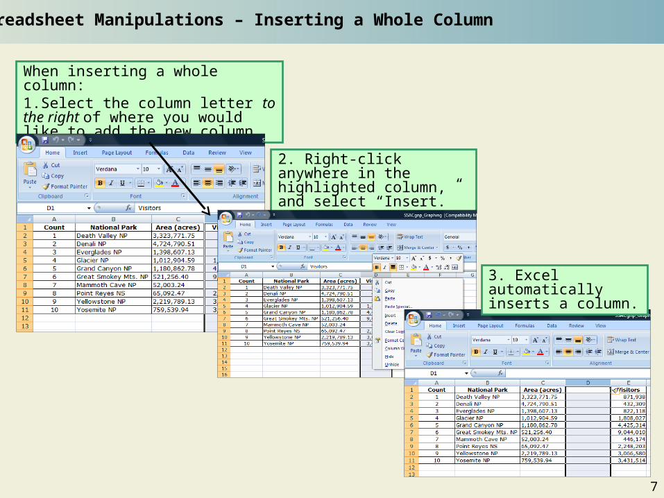
When inserting a whole column:1.Select the column letter to the right of where you would like to add the new column
2. Right-click anywhere in the highlighted column, and select “Insert.”
3. Excel automatically inserts a column.
7
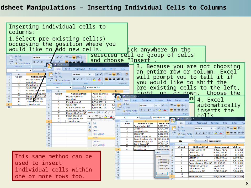
Spreadsheet Manipulations – Inserting Individual Cells to Columns
2. Right-click anywhere in the selected cell or group of cells and choose “Insert”.
Inserting individual cells to columns:1.Select pre-existing cell(s) occupying the position where you would like to add new cells.
3. Because you are not choosing an entire row or column, Excel will prompt you to tell it if you would like to shift the pre-existing cells to the left, right, up, or down. Choose the correct option and press OK.
4. Excel automatically inserts the cells.
This same method can be used to insert individual cells within one or more rows too.
8
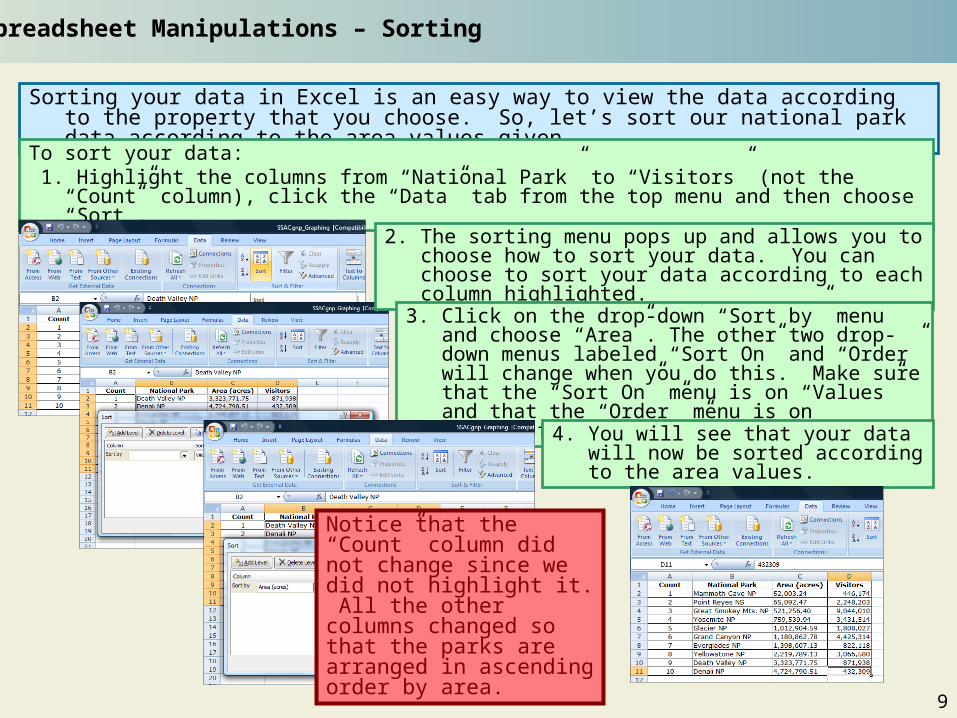
Sorting your data in Excel is an easy way to view the data according to the property that you choose. So, let’s sort our national park data according to the area values given.
Spreadsheet Manipulations – Sorting
To sort your data: 1. Highlight the columns from “National Park” to “Visitors” (not the “Count” column), click the “Data”
tab from the top menu and then choose “Sort”.
2. The sorting menu pops up and allows you to choose how to sort your data. You can choose to sort your data according to each column highlighted.
3. Click on the drop-down “Sort by” menu and choose “Area”. The other two drop-down menus labeled “Sort On” and “Order” will change when you do this. Make sure that the “Sort On” menu is on “Values” and that the “Order” menu is on “Smallest to Largest”.
4. You will see that your data will now be sorted according to the area values.
Notice that the “Count” column did not change since we did not highlight it. All the other columns changed so that the parks are arranged in ascending order by area.
9
Bar graphs are an effective way of visualizing data that are organized by categories. “Bar graph” is a rather generic term. What we call “bar graphs,” Excel calls “column graphs” (because the bars stand vertically). For Excel, the bars of their “bar graphs” lie horizontally. We would say that such a graph is a bar graph laid on its side.
A bar (column) graph would be one way to show how the area (acres) varies from park to park. In such a graph, the x-axis names the parks (categories) and the y-axis scales the areas. There is one bar for each category, and its length is proportional to the numerical variable, the park area. How can you draw such a graph?
Common Graphs – Bar Graphs
To create a bar graph:1. Highlight the dataset to be included in the graph and click on the chart icon that you want to graph under the “Insert” menu:
2. In general, when you click on the icon for the type of graph you want, you are given many specific options. Hover the mouse over the images and Excel will name the graph and describe what it shows. We will choose “Clustered Column” in the “2-D Column” group.
10
4. When you click on the “Clustered Column” option, a first draft of your graph will be created. If you would like to change the placement of the title, legend, or the labels of the x- and y-axes, you can use the “Chart Tools” menu; to change the text of one of them, just double click on it and make the change.
Common Graphs – Bar Graphs, cont’d
5. You can save your graph in the current spreadsheet or choose to save it in a new sheet. You can do this by right clicking on the graph and selecting “Move Chart.” If you choose for your graph to appear in the spreadsheet, you may move it about your spreadsheet or resize it by clicking and dragging it.
11
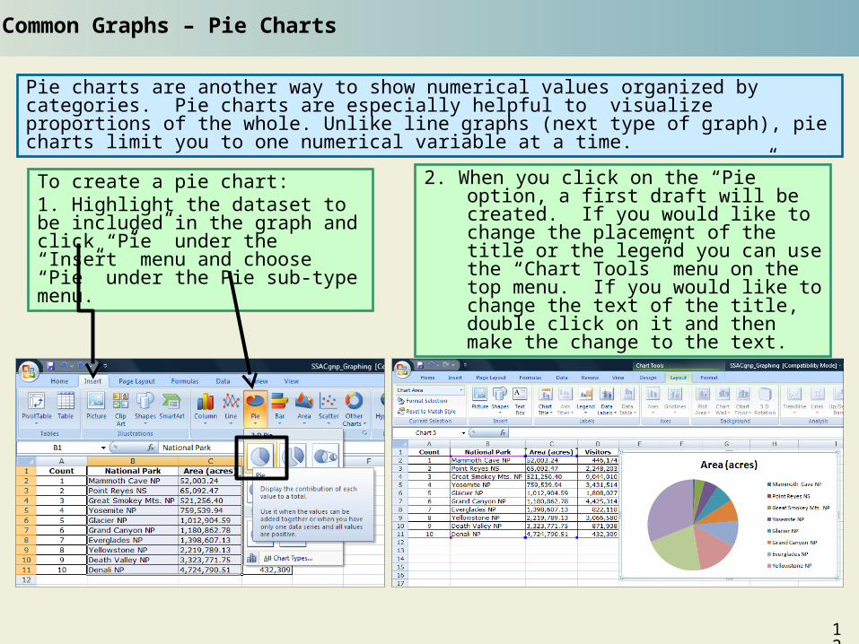
Pie charts are another way to show numerical values organized by categories. Pie charts are especially helpful to visualize proportions of the whole. Unlike line graphs (next type of graph), pie charts limit you to one numerical variable at a time.
To create a pie chart:1. Highlight the dataset to be included in the graph and click “Pie” under the “Insert” menu and choose “Pie” under the Pie sub-type menu.
2. When you click on the “Pie” option, a first draft will be created. If you would like to change the placement of the title or the legend you can use the “Chart Tools” menu on the top menu. If you would like to change the text of the title, double click on it and then make the change to the text.
Common Graphs – Pie Charts
12
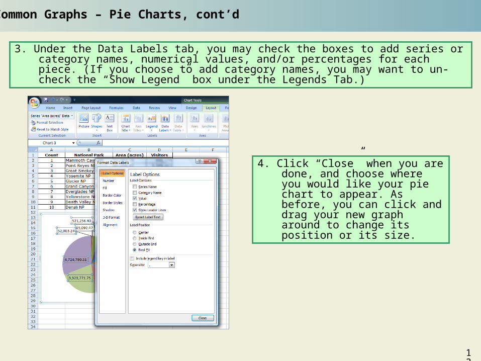
3. Under the Data Labels tab, you may check the boxes to add series or category names, numerical values, and/or percentages for each piece. (If you choose to add category names, you may want to un-check the “Show Legend” box under the Legends Tab.)
Common Graphs – Pie Charts, cont’d
4. Click “Close” when you are done, and choose where you would like your pie chart to appear. As before, you can click and drag your new graph around to change its position or its size.
13
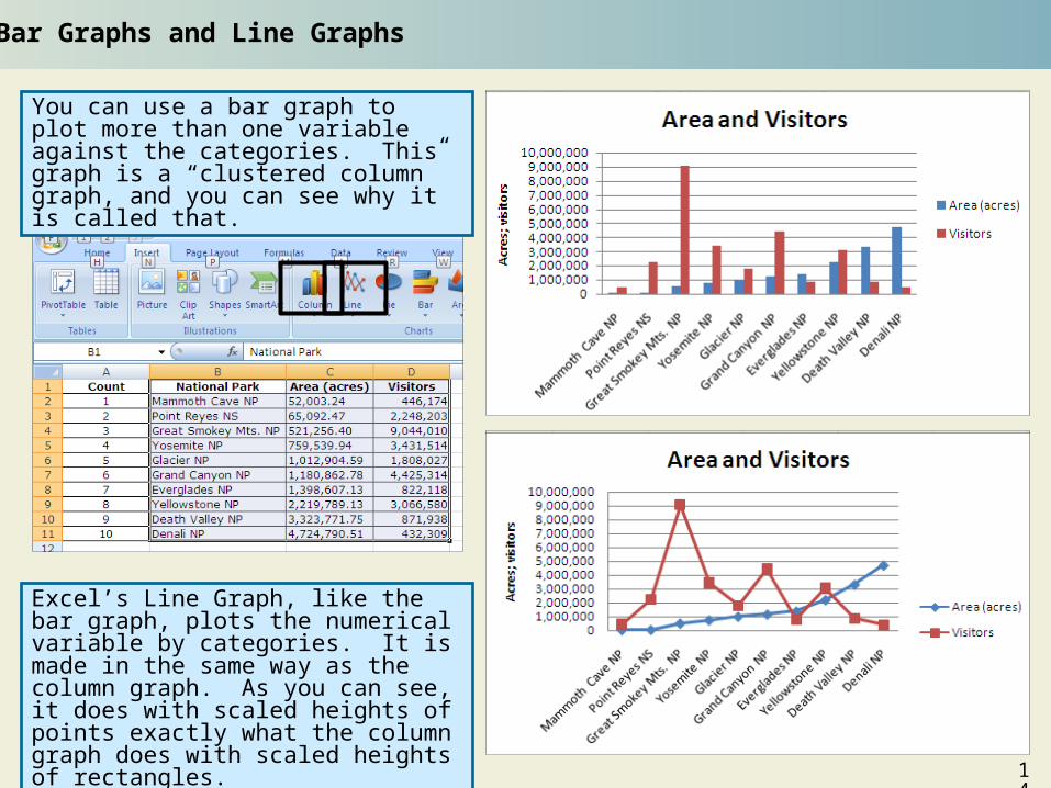
Bar Graphs and Line Graphs
You can use a bar graph to plot more than one variable against the categories. This graph is a “clustered column” graph, and you can see why it is called that.
Excel’s Line Graph, like the bar graph, plots the numerical variable by categories. It is made in the same way as the column graph. As you can see, it does with scaled heights of points exactly what the column graph does with scaled heights of rectangles.
14
X-Y scatter plots are a good way to search for a relationship between two numerical variables, such as a trend over time. This type of graph is by far the one most commonly used in SSAC modules.
Common Graphs - X-Y Scatter Plots vs. Line Graphs
X-Y scatter plot
Line Graph
If you want to plot one numerical variable (visitors) against another numerical variable (area), highlight those two columns, select “Scatter,” and decide whether you want to connect the points (usually you do not).
Novices sometimes confuse scatter plots with line graphs. You can see the difference between the two if you highlight the same two columns and select line graph. Excel treats the two numerical variables as y-variables and plots them against categories, one for each row (numbered one through ten in this case).
15
Common Graphs - X-Y Scatter Plots, cont’d
To create an X-Y Scatter Plot:1. Highlight the dataset to be included in the graph and click on the chart icon that you want to graph under the “Insert” menu. For this example, we want “Scatter with only Markers”.
2. When you click on the “Scattered with only Markers” option, a graph will be created. If you would like to change the placement of the title, legend, or x and y axes labels you can use the “Chart Tools” menu, and to change the text of the, just double-click on it.
16
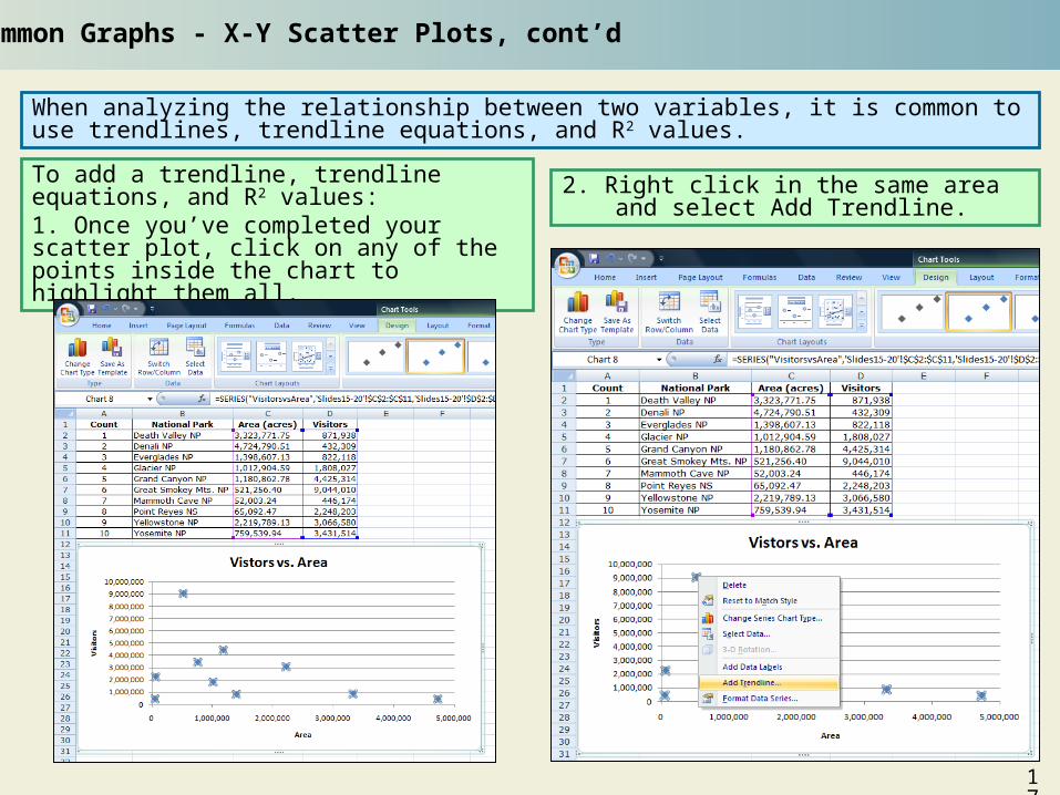
When analyzing the relationship between two variables, it is common to use trendlines, trendline equations, and R2 values.
Common Graphs - X-Y Scatter Plots, cont’d
To add a trendline, trendline equations, and R2 values:1. Once you’ve completed your scatter plot, click on any of the points inside the chart to highlight them all.
2. Right click in the same area and select Add Trendline.
17
Common Graphs - X-Y Scatter Plots, cont’d
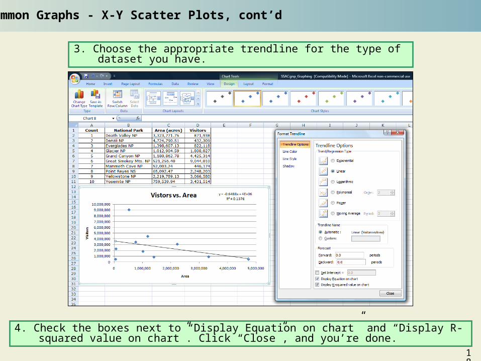
3. Choose the appropriate trendline for the type of dataset you have.
4. Check the boxes next to “Display Equation on chart” and “Display R-squared value on chart”. Click “Close”, and you’re done.
18
Common Graphs - X-Y Scatter Plots, cont’d
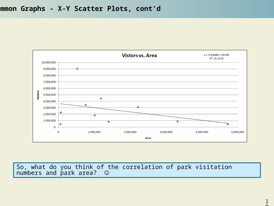
So, what do you think of the correlation of park visitation numbers and park area?
19
End-of-Module Assignments
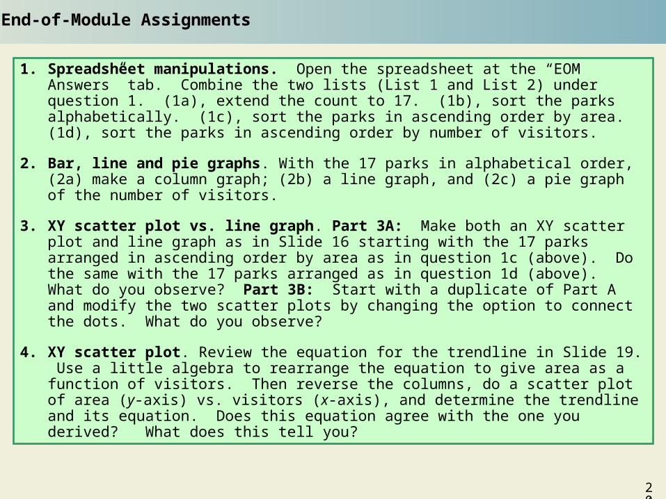
1. Spreadsheet manipulations. Open the spreadsheet at the “EOM Answers” tab. Combine the two lists (List 1 and List 2) under question 1. (1a), extend the count to 17. (1b), sort the parks alphabetically. (1c), sort the parks in ascending order by area. (1d), sort the parks in ascending order by number of visitors.
2. Bar, line and pie graphs. With the 17 parks in alphabetical order, (2a) make a column graph; (2b) a line graph, and (2c) a pie graph of the number of visitors.
3. XY scatter plot vs. line graph. Part 3A: Make both an XY scatter plot and line graph as in Slide 16 starting with the 17 parks arranged in ascending order by area as in question 1c (above). Do the same with the 17 parks arranged as in question 1d (above). What do you observe? Part 3B: Start with a duplicate of Part A and modify the two scatter plots by changing the option to connect the dots. What do you observe?
4. XY scatter plot. Review the equation for the trendline in Slide 19. Use a little algebra to rearrange the equation to give area as a function of visitors. Then reverse the columns, do a scatter plot of area (y-axis) vs. visitors (x-axis), and determine the trendline and its equation. Does this equation agree with the one you derived? What does this tell you?