Dynamic Queries and Brushing on Choropleth Maps Gunjan Dang, Chris North*, Ben Shneiderman Human-Computer Interaction Lab & Department of Computer Science ryniversity of Maryland, College Park MD 20742 {gunjan, north, ben} @cs.umd.edu www. cs. umd.edu/hcil i Abstraict Users who must combine dcmographic, economic or other data in a geographic context are ofren hampered by the integration of tabular and nwp representations. Static, paper-based solutions limit the amount of data that can be placed on a single map or table. By providing an effective user interface, we believe that researchers, journalists, teachers, and students can explore complex data sets more rapidly and effectively. This paper presents Dynamaps, a generalized map-based informalion-visualization tool for dynamic queries and brushing on choropleth maps. Users can use color-coding to show a variable on each geographic region, and then filler out areas that do not meet the desired criteria. In addition, a scatterplot view and a details-on-demand window support overviews and specific fact-finding. Keywords: choropleth maps, dynamic queries, sliders, brushing and linking, information visualization *Current address: Virginia Tech, Blacksburg, VA 24061 Department of Computer Science, 1 Introduction Organizations that publish increasingly large quantities of data face a major challenge in representing that data in a usable and helpful form. For example, the US. Census Bureau has the mandate to collect enormous amounts of data, and to disseminate this information to the public for the public good. It is necessary that this data be represented in a way that enables citizens to gain insight about the nation, to discover, decide, and explain. The Census summary data is primarily represented in terms of geographic regions. Each region has a large number of attribute values foi various demographic, economic, and geographic statistics. For example, there is I 0-7695-1195-3/01 $10.00 0 2001 IEEIC data for each of the 3148 counties within the USA, such as population, area, per capita income, median rent, median property value, total sales, and distributions of ethnic groups, age groups, business sectors, etc. This data is extremely useful for many users, tasks, and applications. Examples include: a senior citizen looking for a place to settle after she retires, a business considering relocation, lawmakers deciding on a new policy, and an elementary school student learning more about the country. Typically, the user interfaces for such data dissemination systems force users to sift through vast detailed data or limit users to retrieve only a single data value at time. More advanced systems demand that the user possess the required skill set to formulate queries and presume the users’ familiarity with the structure of the database and other details. New user interfaces are needed that enable users to gain an overview of data available, discover exceptions or patterns and trends across regions, zoom in on relevant areas of interest, and quickly access desired details on demand. In the case of the census and other CIS (Geographic Information Systems) applications, it is critically important that users be able to relate the statistical data in the context of the geography. The Census Bureau reports that they receive two general types of queries from patrons: (a) specific questions, such as “what is the population of my county?” and (b) open-ended questions, such as “where is a nice place to live?” Census data dissemination systems are minimally capable of answering the former type, but are completely unprepared to support the latter. This wide range of tasks for CIS data is the motivating factor for the creation of Dynamaps, a generalized map- based information-visualization tool built for the Census Bureau. 757
Transcript
Dynamic Queries and Brushing on Choropleth Maps
Gunjan Dang, Chris North*, Ben Shneiderman Human-Computer Interaction Lab &
Department of Computer Science ryniversity of Maryland, College Park MD 20742
Users who must combine dcmographic, economic or other data in a geographic context are ofren hampered by the integration of tabular and n w p representations. Static, paper-based solutions limit the amount of data that can be placed on a single map or table. By providing an effective user interface, we believe that researchers, journalists, teachers, and students can explore complex data sets more rapidly and effectively. This paper presents Dynamaps, a generalized map-based informalion-visualization tool for dynamic queries and brushing on choropleth maps. Users can use color-coding to show a variable on each geographic region, and then filler out areas that do not meet the desired criteria. In addition, a scatterplot view and a details-on-demand window support overviews and specific fact-finding.
Keywords: choropleth maps, dynamic queries, sliders, brushing and linking, information visualization
*Current address: Virginia Tech, Blacksburg, VA 24061
Department of Computer Science,
1 Introduction
Organizations that publish increasingly large quantities of data face a major challenge in representing that data in a usable and helpful form. For example, the U S . Census Bureau has the mandate to collect enormous amounts of data, and to disseminate this information to the public for the public good. It is necessary that this data be represented in a way that enables citizens to gain insight about the nation, to discover, decide, and explain.
The Census summary data is primarily represented in terms of geographic regions. Each region has a large number of attribute values foi various demographic, economic, and geographic statistics. For example, there is
I
0-7695-1195-3/01 $10.00 0 2001 IEEIC
data for each of the 3148 counties within the USA, such as population, area, per capita income, median rent, median property value, total sales, and distributions of ethnic groups, age groups, business sectors, etc.
This data is extremely useful for many users, tasks, and applications. Examples include: a senior citizen looking for a place to settle after she retires, a business considering relocation, lawmakers deciding on a new policy, and an elementary school student learning more about the country.
Typically, the user interfaces for such data dissemination systems force users to sift through vast detailed data or limit users to retrieve only a single data value at time. More advanced systems demand that the user possess the required skill set to formulate queries and presume the users’ familiarity with the structure of the database and other details.
New user interfaces are needed that enable users to gain an overview of data available, discover exceptions or patterns and trends across regions, zoom in on relevant areas of interest, and quickly access desired details on demand. In the case of the census and other CIS (Geographic Information Systems) applications, it is critically important that users be able to relate the statistical data in the context of the geography.
The Census Bureau reports that they receive two general types of queries from patrons: (a) specific questions, such as “what is the population of my county?” and (b) open-ended questions, such as “where is a nice place to live?” Census data dissemination systems are minimally capable of answering the former type, but are completely unprepared to support the latter.
This wide range of tasks for CIS data is the motivating factor for the creation of Dynamaps, a generalized map- based information-visualization tool built for the Census Bureau.
Figure 2: Dynamic Queries on a Health Statistics Map [Pla93]
2 Related Work
2.1 Dynamic Queries
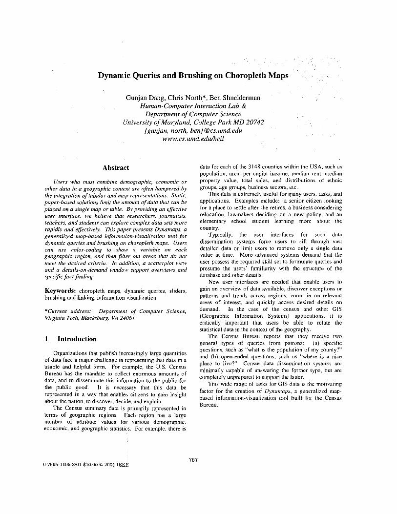
The inception of the dynamic query method started with the development the Dynamic HomeFinder [WS92] (see Figure 1). This tool consisted of a map of Washington DC, with homes displayed as dots on the map. Sliders were used to represent the query graphically, where each double-box slider represented the possible range of values for an attribute. Dragging a slider was equivalent to entering attribute values for a query, and updated the display in real time. The results of the query were displayed as the filtering out (or in) of dots representing houses. A real-time visual display of both the query formulation and results facilitated rapid exploration.
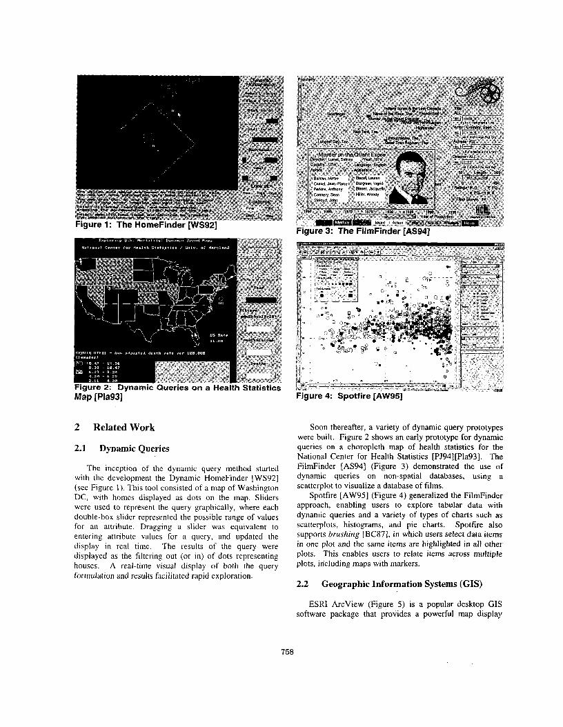
Soon thereafter, a variety of dynamic query prototypes were built. Figure 2 shows an early prototype for dynamic queries on a choropleth map of health statistics for the National Center for Health Statistics [PJ94][Pla93]. The FilmFinder [AS941 (Figure 3) demonstrated the use of dynamic queries on non-spatial databases, using a scatterplot to visualize a database of films.
Spotfire [AW95] (Figure 4) generalized the FilmFinder approach, enabling users to explore tabular data with dynamic queries and a variety of types of charts such as scatterplots, histograms, and pie charts. Spotfire also supports brushing [BC87], in which users select data items in one plot and the same items are highlighted in all other plots. This enables users to relate items across multiple plots, including maps with markers.
2.2 Geographic Information Systems (GIs)
ESRI ArcView (Figure 5) is a popular desktop CIS software package that provides a powerful map display
758
engine and spatial analysis functions. One type of map ArcView can display is choropleth maps. Unfortunately, the user interface for interactive: data exploration is limited. The Census Bureau web site (www.census.gov) also presents a number of data access tools, such as the American Fact Finder (Figure 6), which enables web users to view choropleth maps of selected attributes. The American Fact Finder uses the Arcview display engine.
Other work on data exploration in GIS includes [Mon89], [MK97], [SMC96], [AA99]. These prototypes and systems explore a variety of approaches for brushing with maps and dynamic queries.
Figure 5: ESRI ArcView shlows a choropleth map.
J
Figure 6: American Fact Finder on the Census Bureau web site generates choropleth maps.
3 Dynamaps
Dynamaps is a generalized map-based information- visualization tool, designed for map-related Census summary data that builds on these systems. It makes several contributions:
Dynamic queries on choropleth maps as well as other types of geography. This enables a powerful
exploration capability for both specific and open- ended questions. Uniform-distribution sliders as well as standard sliders for dynamic queries. The new uniform-distribution sliders improve slider interaction for some census data, which is often overly non-uniformly distributed. Brushing across choropleth maps and scatterplots. Users execute a form of 2-dimensional dynamic query by selecting regions in a scatterplot to highlight the corresponding geographic elements in the map. Also, this enables reverse queries by selecting regions in the map to highlight the corresponding elements in the
Use of industry-standard commercial tool, ESRI ArcView components, for map display. This enables the use of standard data formats and files, and takes advantage of extensive existing GIS functionality in the ESRI software. In this sense, Dynamaps adds a powerful new information-visualization user interface to this existing commercial software. Algorithm for performing rapid dynamic queries with a commercial GIS display engine (ESRI) that was not originally designed for such dynamic interactivity. Generalized, distributable, GIS viewer tool with flexibility to load and display arbitrary geography and data types. Databases can be loaded with many attributes. Once a map is loaded, data with an appropriate join attribute can also be loaded and explored. Hence, Dynamaps could become the Adobe Acrobat viewer of GIS.
plot.
User Interface
4.1 Map
When using Dynamaps, users first load a geographic data file into the tool to display the map (Dynamaps displays US states and counties by default). Then, users can quickly display the map as a choropleth by simply selecting a data attribute from the drop-down list to color the map accordingly.(see Figure 7). Map elements can be colored by any of the available attributes loaded in the data file. The color legend at top shows the minimum and maximum values.
For example, consider a situation in which a senior citizen, about to retire, is looking for a suitable location to move to. One of her primary concerns might be the cost of rent. She colors the Dynamap by the ‘Median Rent’ attribute (Figure 7) and notices that California and the northeast are clearly the high rent areas that she might choose to avoid. The darker regions indicate a low value of median rent and the lighter regions have higher values.
Dynamaps users can also zoom and pan the map to observe data patterns in smaller or denser regions (see Figure 8).
759 ‘I
I Figure 7: Dynamaps showing the US states colored by 'Median Rent' value. The west coast and east coast are most expensive.
Figure 8: Dynamaps showing the US counties colored by 'Median Rent', and zoomed in on the northeast. The Washington DC to Boston corridor is most expensive.
4.2 Dynamic Queries
When a data file is loaded, the attributes related to each of the elements of the map also appear on the right in the form of adjustable dynamic-query sliders. Each slider represents the range of values (minimum to maximum) for its attribute. Adjusting sliders enables the formulation of a query and map elements are then filtered (in or out) accordingly (Figure 9). The real advantage lies in the .presence of multiple sliders; the ' user can formulate conjunctive queries by adjusting more than one slider and view the results on the map. Map elements that have been filtered out by the query are colored dark gray. Elements that are not filtered remain colored according to the chosen
choropleth attribute. As users drag the sliders, the map animates to give immediate feedback in real time.
For example, in addition to rent considerations, our senior citizen might also want to live where there are more people of her age group. By adjusting the slider for the attribute 'percent of population over age 65', she filters out states with low values for this attribute to reveal that Florida and central US are good candidates. However, she finds that if she also insists on low levels of unemployment, then the central states are the best match (Figure 9). Now that she has narrowed her search, she can select a state of interest to view its attribute values in the detail view on lower right. Selecting multiple states shows their attribute values in a tabular form to facilitate comparison.
Each dynamic query slider can filter items according to one of two possible distributions of the items. In standard slider mode, the items are distributed along the slider like a histogram, ordered and located according to the corresponding attribute value. This enables users to quickly select desired value ranges for the attribute and view items meeting that criteria on the map. However, this approach is problematic when items are not uniformly distributed on the attribute. For example, California has a much higher population than all the other states. As a result, selecting among the, low population states is difficult with a standard dynamic query slider because they are all tightly packed at the low end of the slider. Hence, Dynamaps' dynamic query sliders have an additional uniform-distribution mode. In this mode, items are uniformly distributed along the slider according to rank order for the attribute. This enables users to quickly select ranges of items by rank (e .g . the 5 least-populated states).
I - - - ..
fo; high 'Percent Over Age 65' and low 'Unemployment' using dynamic query sliders. Six states in the central US remain.
760
4.3 Scatterplot
Dynamaps displays a scatterplot of the map elements at the bottom of the screen. It plots a two-dimensional graph of the elements according to attributes selected from the drop-down menus on ,each axis as shown in Figure 10. Users can pick any two attributes to plot the elements by. All 4 sub-windows are tightly coupled: The dynamic query sliders filter both the map and the scatterplot. Selecting items in either the map or the scatterplot causes the corresponding items to be highlighted in the other (“brushing”), and also displays lthe items’ attribute values in the detail view.
The scatterplot and the brushing capability enable more open-ended exploration of the data. Users can discover patterns, trends, outliers, and relationships from both a statistical and geographical perspective. For example, Figure 10 shows the US states plotted by ‘Per Capital Income’ (x axis) and ‘Percent of Population with College Degrees’ (y axis). Clearly there is a positive relationship between education and income. Selecting the highly educated and high-income states in the scatterplot reveals in the map that they are all located in the northeast (light color highlights in Figure 10). The outlier at the bottom center of the scatterplot is Nevada. These are forms of 2- dimensional dynamic queries that are not as obvious with the 1 -dimensional sliders and sometimes not possible with sliders. Likewise, brushing idso enables geographic dynamic queries. For example, selecting the southern states on the map reveals that they are all at the lower end of both scales in the scatterplot.
4.4 Geography and Data
In addition to handling polygonal geographic regions as, in choropleth maps, Dynamaps also has the ability to handle map elements of different types, such as lines or points on a map, with the same dynamic query and brushing capabilities. For example, Figure 1 1 shows a map of US Highways. Exploring the ‘length’ attribute with Dynamaps reveals that the longer highways are in the Central and Western parts of the country. In Figure 12, Dynamaps displays data about the US state capital cities in the form of points on a map. The ‘Load Geography’ menu option allows users to load other map layers for visualization. The ‘Load Geography Background’ menu option supports the display of background layers. For example, the map of US highways and cities displays a background of the US states. Dynamaps uses geography data files in the standard ESRI Shape file format.
7gure 11 : Dynamaps displaying highway data.
Figure 10: Brushing between scatterplot and map reveals that high lincome and highly educated states are in the northeast.
IC L.41”\ u I I m
r m I I (3 2 r I l E8(
Figure 12: Dynamaps displaying state capital cities.
761
The ‘Load Data Table’ menu option allows users to load additional data attributes from a data table and join them to the currently loaded geography. This enables the use of many easily obtainable data tables from the Census Bureau or other sources without the need to reformat the data files into the more difficult geography format. Data table files can be in Microsoft Access database or dBase format.
5 Algorithms
Dynamaps is implemented on the PC/Windows platform. The map portion of the Dynamaps display uses ESRI MapObjects. The use of ESRI components is important because of its advanced GIS functionality, powerful display engine, industry standard file format, and continued ESRI-supported upgrade path. It is not our intention to attempt to compete with ESRI, but to build on and enhance ESRI’s work.
A major challenge in developing Dynamaps was to extend the MapObjects components, which focus primarily on static presentation of map data, to efficiently support dynamic query interaction. We believe that this is an important general problem, as software engineering continues to evolve more towards component-based approaches. Many valuable software components simply are not designed with dynamic interaction in mind. User interface designers must then retrofit these components to build forward-looking systems using more advanced information visualization principles. Dynamic Queries on Mapobjects is just one example of many, and we believe that our solution will be a helpful guide to other designers.
As query sliders are dragged, the display must update in real time. Previous work on dynamic query algorithms focused on linear and spatial data structures to efficiently compute the query result set [TBS97]. Dynamaps uses Mapobject’s database query functionality for such computation. In Dynamaps, the challenge is in the display of the result set. Since the objects being displayed are filled complex polygons, the bottleneck is in drawing the result set rather than computing it.
First, Dynamaps generates the SQL query string based on the current positions of the sliders, and then submits this query to the database engine. The SQL query contains a ‘WHERE’ statement with a minimum and maximum clause for each attribute that has been constrained by the user with a slider. To optimize construction of the SQL query while users drag a slider, Dynamaps first generates the SQL for all attributes except the slider currently being manipulated. Then, as the user manipulates the slider, only the updated clause for that slider needs to be inserted into the query string.
After submitting the SQL query to the database engine, the results must be updated on the display. To draw the results, we tried several algorithms each one improving
upon the previous. The first algorithm simply drew the result set on a blank background. This approach was unacceptable because it completely eliminated the filtered items from display. Remaining items were out of context and disorienting for the user.
The second algorithm used two duplicate geographic layers. The background layer colored all the map items gray (as if filtered out). The foreground layer used the choropleth coloring. The SQL query was applied to the foreground layer only and then both layers were redrawn, background first then foreground. Actually the background only needed to be redrawn if the user had tightened the query (moved a slider box inwards) and filtered some items out. Unfortunately this resulted in a flashy display since MapObjects does not support double buffering, and slow performance because many elements are drawn twice (background + foreground).
The third algorithm eliminated the problematic overlap between background and foreground. The two map layers were used as a positive query and a negative query. The positive query layer represents the unfiltered (colored) map items, and the negative query represents the filtering (gray) items. Together, both layers combine to display all elements of the map. The SQL query is applied to the positive layer, and the complement of the SQL query applied to the negative layer. When users tighten the query (move sliders inwards) only the negative query layer needed to be re-queried and redrawn. When the query is loosened (sliders moved outwards) only the positive query layer is re-queried and redrawn. This algorithm led to a significant improvement (two-fold) in performance and aesthetics, but still lagged for larger maps.
The fourth algorithm attempts to query and redraw only those items that change state since the last update. As a slider thumb is dragged, at each incremental slider event received, a differential query computes the difference between the previous and current states. If the user’s query is tightened, the SQL query retrieves all items that were just filtered out, by simply querying items with attribute value between the current and previous values of the slider thumb. This query is then applied to the foreground layer and drawn in gray. If loosened, the SQL query retrieves all items that were just filtered in, by querying items with attribute value between the current and previous values of the slider thumb but also meet current constrains of all other sliders. This query is then applied to the foreground and drawn in choropleth color. However, whenever the entire map must be refreshed, as in panning and zooming or resizing, Dynamaps must revert to the third algorithm. This fourth algorithm performs very well because it only needs to draw a few items on the map at each interaction increment. The update is real-time with approximately IO00 items (e.g. counties of the east coast; this measurement is taken on a Pentium 450 Mhz PC). At this point, the bottleneck now shifts to the database query
762
performance. Implementing custom ’data structures (as in [TBS97]) would enable further speed up.
Highlighting selected map items is done with a third layer that is’on top of all others and is drawn in translucent bright yellow.
6 Limitations and Future Work
Continued work on Dynamaps is underway. Future work Includes:
Automatically loading more detailed geography when users zoom in. For example, zooming onto a US state might automatically load. and display the counties of that state. One approach to accomplish this is to
,integrate Dynamaps into the Census Bureau’s meta- data database. Enabling simultaneous display and exploration of multiple geography layers. For example, users could load states, counties, and cities, and perform dynamic queries and brushing on each. This introduces a new problem of overlapping map elements. Our current display ,algorithms are optiimized for non-overlapping elements, as is typically the case in choropleth maps. Displaying histograms of the data on each dynamic query slider similar to the Attribute Explorer [STD95] and Visage [RLS96]. This would enable users to see additional patterns, and also help users understand the difference between uniform-distribution sliders and standard sliders. Integrating dynamic query data structures to improve database query performance. A very useful project would be to construct a generalized dynamic query toolkit that enables many different data viewing components, such as ArcView, to be easily plugged into a dynamic query environment. Enable multiple views and flexibility in choice of views. Users could display any number of sub- windows as needed. For example, in Figure 13 a user is comparing spatially distant geographic locations, east coast and west coast. Figure 14 demonstrates the use of overview and detail. Selecting a state (Texas) in the overview map shows 1:he counties of that state in the detail map. These examples were prototyped using the Snap-Together Visualization system [NSOO]. Usability studies and task performance data are needed to evaluate and improve the user interface design.
Conclusion
Dynamaps is a generalized map-based information- visualization tool for dynamic queries and brushing on choropleth maps and other GI!; data. It supports both specific directed-search tasks as well as open-ended
exploration tasks. It enables users to relate statistical and geographic data. Users can gain an overview, discover trends and outliers, zoom in on areas of interest, and access details on demand. It demonstrates the use of commercial GIS components in an advanced visualization user interface and algorithms to accomplish this efficiently. It also contributes the notion of uniform-distribution sliders for dynamic queries.
Dynamaps is an example of an application that was prototyped using the Snap-Together Visualizatiop [NSOO] technology to demonstrate the potential for the US Census Bureau. Dynamaps has created a wave of enthusiasm at the Bureau, and development is in progress to make Dynamaps the canonical viewer for census data. The Bureau hopes to distribute Dynamaps on their data CD- ROM products, and hopes to develop a web-based version in the future for convenient citizen access to census data. The Dynamaps information web page is at h ttp:Nwww.cs.umd.eddhcillcensus/.
Figure 13: Comparing distant geographies
Figure 14: Overview and detail. Overview (left) shows US states. Detail (right) shows counties of the state selected in the overview.
8 Acknowledgements
This research is partially supported by the US Census Bureau. Thanks to Kent Marquis, David Desjardins, Rob Creecy, Tommy Wright, Sam Highsmith, Mark Wallace, Kathy Padget, and Tom Petkunas at the Census Bureau for their assistance and support. Thanks also to Danny Krouk at ESRI.
9 References
[AS941
[AW95]
[AA991
[BC87]
[MK97]
[Mont391
[Pla93]
Ahlberg, C., Shneiderman, B., Visual Information Seeking: Tight coupling of dynamic query filters with starfield displays, Proc. ACM CHI ’94 Conference, 313-317, (1994).
Ahlberg, C., Wistrand, E., IVEE: An Information Visualization and Exploration Environment, Proc. IEEE Information Visualization ’95,66-73, (1995).
Andrienko, G.. Andrienko, N., Interactive maps for visual data exploration, In11 Journal of Geographical Information Science, 13(4), 355-374, ( I 999).
Becker, R., Cleveland, W., Brushing scatterplots, Technoinerrics, 29(2), 127-142, (1987).
MacEachren, A., Kraak, M., Exploratory cartographic visualization: advancing the agenda, Computers and Geosciences, 23, 335-344, (1997).
Monmonier, M., Geographic brushing: Enhancing exploratory analysis of the scatterplot matrix, Geographical Analysis, 21(1), 81-84, (1989).
Plaisant, C., Facilitating data exploration: Dynamic Queries on a health statistics map, Proc. ofthe Annual
[PJ94]
[NSOO]
[RLS96]
[STD95]
[SMC96]
[TBS97 J
[WS92]
Meeting of the American Staristical Association - Government Statistics Section, 18-23, (Aug. 1993).
Plaisant, C., Jain, V., Dynamaps: Dynamic queries on a health statistics atlas, Video in CHI ’94 Video Program, ACM CHI ‘94 Conference Companion, 439- 440, (1994).
North, C., Shneiderman, B., Snap-Together Visualization: A user interface for coordinating visualizations via relational schemata”, Proc. Advanced Visual Interfaces 2000, 128-135, (May 2000).
Roth, S., Lucas, P., Senn, J., Gomberg, C., Burks, M., Stroffolino, P., Kolojejchick, J., Dunmire, C., Visage: a user interface environment for exploring information, Proc. Informarion Visualization, IEEE, 3-12, (October 1996).
Spence, R., Tweedie, L., Dawkes, H., Su, H., Visualisation for Functional Design, Proceedings Inforinarion Visualization ‘95.4-1 0, (1 995).
Symanzik, J., Majure, J., Cook, D., Dynamic graphics in a GIs: a biderectional link between ArcView 2.0 and Xgobi. Computing Science and Statistics, 27. 299-303, ( 1 996).
Tanin, E., Beigel, R. and Shneiderman, B., Design and evaluation of incremental data structures and algorithms for dynamic query interfaces, Proc. IEEE Symposium on Infonnation Visualizarion, 8 1-86, ( I 997).
Williamson, C.. Shneiderman, B., The dynamic HomeFinder: Evaluating dynamic queries in a real- estate information exploration system, Proc. ACM SlGlR ‘92, 338-346, ( 1 992).