Eindhoven University of Technology MASTER Visualizing business process performance Bego, S.C.H. Award date: 2011 Link to publication Disclaimer This document contains a student thesis (bachelor's or master's), as authored by a student at Eindhoven University of Technology. Student theses are made available in the TU/e repository upon obtaining the required degree. The grade received is not published on the document as presented in the repository. The required complexity or quality of research of student theses may vary by program, and the required minimum study period may vary in duration. General rights Copyright and moral rights for the publications made accessible in the public portal are retained by the authors and/or other copyright owners and it is a condition of accessing publications that users recognise and abide by the legal requirements associated with these rights. • Users may download and print one copy of any publication from the public portal for the purpose of private study or research. • You may not further distribute the material or use it for any profit-making activity or commercial gain
Transcript
Eindhoven University of Technology
MASTER
Visualizing business process performance
Bego, S.C.H.
Award date:2011
Link to publication
DisclaimerThis document contains a student thesis (bachelor's or master's), as authored by a student at Eindhoven University of Technology. Studenttheses are made available in the TU/e repository upon obtaining the required degree. The grade received is not published on the documentas presented in the repository. The required complexity or quality of research of student theses may vary by program, and the requiredminimum study period may vary in duration.
General rightsCopyright and moral rights for the publications made accessible in the public portal are retained by the authors and/or other copyright ownersand it is a condition of accessing publications that users recognise and abide by the legal requirements associated with these rights.
• Users may download and print one copy of any publication from the public portal for the purpose of private study or research. • You may not further distribute the material or use it for any profit-making activity or commercial gain
Visualizing BusinessProcess Performance
S.C.H. Bego
April 2011
Department of Mathematics and Computer Science
Eindhoven University of Technology (TU/e)
Visualizing Business Process Performance
S.C.H. Bego
Supervisor TU/e: dr. M.A. Westenberg
Supervisor Axxerion: ir. M. Waardenburg
Examination Committee: dr. ir. B.F. van Dongen
Eindhoven, April 12, 2011
Abstract
The main goal of business process performance analysis has always been to analyze the per-formance of business processes in order to improve them. Studies on the topic have beenfocused mostly on obtaining the appropriate information from a process, while somewhatneglecting the way in which to provide it to the end-user. In this case proper visualizationof the information can help to identify problems in the process or how and where to improve it.
In this thesis a visualization approach is investigated to provide process performance infor-mation to the user in an intuitive and interactive manner. Existing solutions to the problemare researched to identify strengths and weaknesses. Given the outcomes of this research anapproach is proposed to visualize the process performance information. The approach uses aMultiple Coordinated Views design, combining two stand-alone views to one interactive visu-alization. The views consist of a workflow view, displaying the process itself while mappinginformation onto it, and an organizational, resource view, displaying the resources that playa role in the process as well as relations between these resources. To evaluate the proposedapproach, a prototype has been implemented in the Axxerion software and tested using sam-ple and real-life data. Evaluation of the prototype and a feedback session with consultantsworking in the domain indicate that the approach provides an interactive and intuitive wayto dynamically inspect the performance of business processes.
1
Preface
This master thesis is the result of my graduation project which concludes my ComputerScience and Engineering study at Eindhoven University of Technology. The project wascarried out at the Visualization Group, Mathematics and Computer Science Department ofEindhoven University of Technology and externally in collaboration with the Axxerion B.V.company.
I enjoyed working on the project, since the problem covers the courses I selected during mymaster phase. I liked having to think a bit more practical for a solution, while still maintain-ing a theoretical and academical look at the problem. Throughout the project I found out Ilearned more in all those years studying than I had imagined beforehand.
I would like to take this opportunity to thank several people for supporting me throughoutmy graduation project. First of all I would like to thank my supervisor Michel Westenbergfor guiding me through the project. The brainstorm sessions we had resulted in interestingideas and his feedbacks and support have helped me throughout the entire project. Secondly Iwould like to thank my (external) supervisor Martin Waardenburg for his support and adviceabout the Axxerion software, but also the Axxerion B.V. company as a whole for providingthe opportunity to work on such an interesting problem. I would also like to thank the rest ofthe employees working at the Axxerion B.V. company for their cooperation during the projectand providing a pleasant stay. Furthermore I would like to thank Boudewijn van Dongen asone of the members of the examination committee.
I would also like to thank my girlfriend, parents, family and friends for their support through-out this project, but also for their support beyond this project.
to right, shifting from a low-level to a high-level view. . . . . . . . . . . . . . 394.10 Edge between Ps and Pe has control points {Ps, P2, Pe}. Edge between Ps and
4.11 Glyphs used to show direction of edges. . . . . . . . . . . . . . . . . . . . . . 404.12 The glyph shape is found using the weight ratios w12 and w21. . . . . . . . . 414.13 The standard graph and complement graph of five nodes. . . . . . . . . . . . 424.14 The contact labels are filled according to the work ratio values. . . . . . . . . 42
5
LIST OF FIGURES Visualizing Business Process Performance
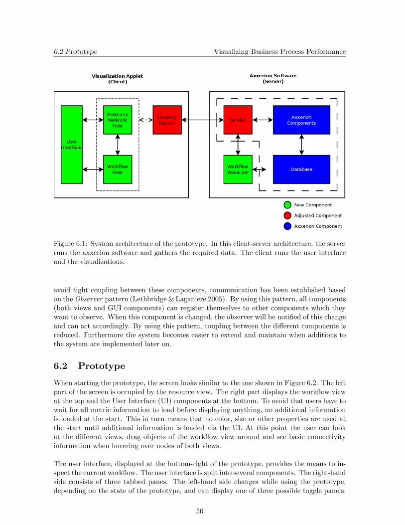
6.1 System architecture of the prototype. In this client-server architecture, theserver runs the axxerion software and gathers the required data. The clientruns the user interface and the visualizations. . . . . . . . . . . . . . . . . . . 50
In the current business world, many companies rely on information systems to manage theirwork and processes. These systems can provide various benefits to the company and em-ployees working with them, like for example handling reservations, the financial departmentor the generation of reports. Since companies need to be competitive, having performanceinformation about their processes can provide them with an edge. This so-called businessprocess performance analysis is an important subject for management for quite some time.This thesis covers the work done for the graduation project of the Computer Science andEngineering master program conducted at the Eindhoven University of Technology (TU/e)and at the Axxerion B.V. company.
1.1 Context
Business process performance analysis has been a topic of interest for many years now, themain goal always being to analyze the performance of a business process in order to improveit. Two earlier approaches to the topic are Total Quality Management (TQM) and BusinessProcess Re-engineering (BPR) (Lee & Asllani 1997). TQM and BPR, developed in the early80’s and 90’s respectively, approach the problem from different sides, where TQM uses anadaptive and BPR uses a proactive approach. Nowadays the main focus lies on BusinessProcess Management (Jeston & Nelis 2006), which is backed up by a study done in 2009 byRoberts & Andy (2009).
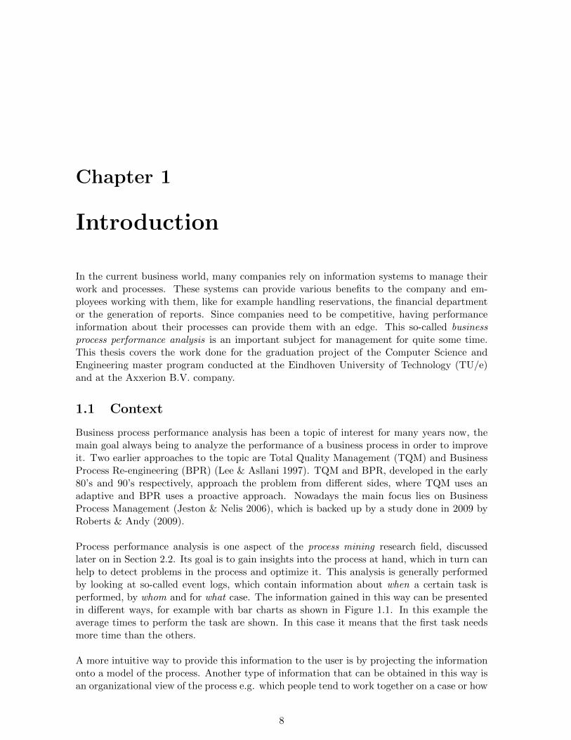
Process performance analysis is one aspect of the process mining research field, discussedlater on in Section 2.2. Its goal is to gain insights into the process at hand, which in turn canhelp to detect problems in the process and optimize it. This analysis is generally performedby looking at so-called event logs, which contain information about when a certain task isperformed, by whom and for what case. The information gained in this way can be presentedin different ways, for example with bar charts as shown in Figure 1.1. In this example theaverage times to perform the task are shown. In this case it means that the first task needsmore time than the others.
A more intuitive way to provide this information to the user is by projecting the informationonto a model of the process. Another type of information that can be obtained in this way isan organizational view of the process e.g. which people tend to work together on a case or how
8
1.1 Context Visualizing Business Process Performance
Figure 1.1: Example of a bar chart, showing the average throughput times for three tasks inminutes.
many times does person A hand over his work to person B. This organizational informationcan for example be viewed as a graph, a social network.
This process performance analysis is performed on process models that describe the behaviorof the process in a structured and abstract manner. These process models can be modeledin different ways, although most of the approaches are based on the definition of Petri nets(Murata 1989). A common way of modeling processes is the workflow definition, which isalso used in this thesis. The process models can be obtained by looking at the event logs orcan be constructed by hand. The first option is another aspect of process mining and involvesmining the event logs and finding patterns of tasks being performed. The latter option needsa thorough understanding of the process at hand. This makes it a more laborious solution.
Most of the time however researchers have looked at process performance analysis from aprocess mining instead of a visualization point of view, resulting in visualizations that arenot always intuitive. Several of these solutions are discussed in Section 2.3.
The project was performed at the Axxerion B.V. company1. This company develops andmaintains a web-based, software as a service (SaaS), information system based on workflowtechnology. The problem discussed in this thesis is the effective visualization of processperformance information using a given process model, where the main goal is to provide anintuitive visualization that is easy to grasp and to work with. To test the solutions a prototypeis implemented in the Axxerion software.
1.2 Problem Description Visualizing Business Process Performance
1.2 Problem Description
The Axxerion system uses process models based on workflows to guide the business processes.When tasks are executed, metadata about these tasks are generated and saved. This meta-data contains information like the point of time the task was executed and by whom. Theusers of the Axxerion software are also interested in getting better insights into their processesin order to improve and optimize them. Therefore process performance analysis should beperformed using the available event logs. The information found in this way should then beprovided to the user in an intuitive, effective manner.
Much work has already been done on this subject. Most work however has been concernedwith actually getting the relevant information out of the event logs, while less focus has beenon presenting this information. In this thesis however the focus of research is on how tovisualize the generated information in such a way that it is easy to grasp and understand byusers.
1.3 Research Objective
The problem description given before leads to the following research objective:
Calculate relevant performance information and organizational information from both a givenprocess model and event log and develop an approach to provide this information to the userin an intuitive and interactive manner.
The projected information should provide useful insights into the process to the user. Thismeans the visualization should be easy to understand i.e. a user should not have to inspectthe visualization thoroughly and tune many parameters to get the needed information out ofit.
1.4 Research Scope
Since this thesis’ goal is to come up with an effective visualization, its focus is less on theprocess mining part. This means that process mining is only performed to get some neededperformance information for the visualization out of the event logs. Furthermore one of therequirements is that the information is to be mapped onto a given process model, limitingother solutions.
1.5 Methodology
To get to the solutions and conclusions presented in this thesis, the following steps were taken:
• Conduct a literature study on performance analysis and process mining.
• Compare available existing approaches, looking at pros and cons.
• Develop a solution to the problem, divided in several sub problems.
• Implement the solution as a prototype in the Axxerion software.
10
1.6 Outline Visualizing Business Process Performance
• Test and evaluate the prototype.
• Draw conclusions and provide opportunities for future work.
The evaluation indicates that the approach discussed in this paper provides an intuitive andinteractive way to inspect the performance of business processes. It contributes to the processperformance analysis research field by providing an overview + detail approach, using multipleconnected views in one visualization, allowing users to dynamically inspect the available data.
1.6 Outline
The rest of this thesis is structured as follows: First some preliminary concepts regardingprocess performance analysis are provided in Chapter 2, along with related work to the prob-lem at hand. Then a more thorough problem analysis is provided in Chapter 3, resulting inrequirements on the solution. In Chapter 4 the visualization approach is presented in detail,including decisions made. The performance metrics calculated are provided in Chapter 5.Next the implemented prototype is described in Chapter 6, which also describes the integra-tion in the Axxerion software. The evaluation of the proposed solution is given in Chapter 7.In Chapter 8 the final conclusions of this thesis are provided, together with opportunities forfuture work.
11
Chapter 2
Background
This chapter is concerned with the concepts and terminology used throughout the rest of thethesis. Furthermore related work found in the literature is discussed. First the concepts ofprocess performance analysis are described in Section 2.1. Section 2.2 provides an introductionto the process mining research field. Next some related work is covered in Section 2.3 whichprovides some solutions found in research and commercial tools.
2.1 Process Performance Analysis
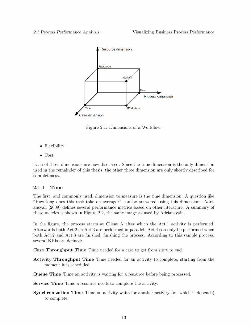
Process performance analysis is concerned with the assessment of processes. Most of thetimes processes are case-driven. A case can be a patient in a hospital needing help or a cus-tomer order that needs to be delivered. The kind of processes related to such cases are calledworkflows. Tasks in a process are executed by resources e.g. a nurse or doctor in a hospital.The process, cases and resources can be seen as three dimensions depending on each other,as described by van der Aalst (1997). The correlation between the dimensions is shown inFigure 2.1. A process thus consists of several tasks which have to be performed in a certainorder. Cases flow through this process, creating work-items for a case-task combination. Anactivity is then the execution of such a work-item by a resource e.g. a secretary receiving aphone call or a machine constructing a part of a car.
Now that the notion of a process is defined, it is time to take a look at performance analysis.According to Petrovich (1998) it is about asking ”How well are my processes performingand what must I do to improve them?”. In order to answer this question, the performanceof the process has to be measured, which is done in terms of performance metrics. Themetrics that are highly relevant to the process at hand are called Key Performance Indicators(KPIs). In turn this means that not all information that can be calculated from event logs isautomatically a KPI. An overview of several performance measurement systems, each havingdifferent performance metrics, is given by Jansen-Vullers et al. (2007). Covering all of thesesystems is beyond the scope of this thesis. However, in order to talk about performancemeasures later on, one of the systems is covered which is highly applicable to this work,namely the Devil’s Quadrangle. This system defines four dimensions which can be measured:
• Time
• Quality
12
2.1 Process Performance Analysis Visualizing Business Process Performance
Figure 2.1: Dimensions of a Workflow.
• Flexibility
• Cost
Each of these dimensions are now discussed. Since the time dimension is the only dimensionused in the remainder of this thesis, the other three dimension are only shortly described forcompleteness.
2.1.1 Time
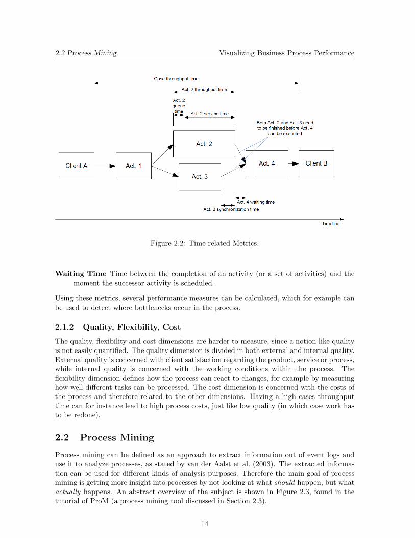
The first, and commonly used, dimension to measure is the time dimension. A question like”How long does this task take on average?” can be answered using this dimension. Adri-ansyah (2009) defines several performance metrics based on other literature. A summary ofthese metrics is shown in Figure 2.2, the same image as used by Adriansyah.
In the figure, the process starts at Client A after which the Act.1 activity is performed.Afterwards both Act.2 en Act.3 are performed in parallel. Act.4 can only be performed whenboth Act.2 and Act.3 are finished, finishing the process. According to this sample process,several KPIs are defined:
Case Throughput Time Time needed for a case to get from start to end.
Activity Throughput Time Time needed for an activity to complete, starting from themoment it is scheduled.
Queue Time Time an activity is waiting for a resource before being processed.
Service Time Time a resource needs to complete the activity.
Synchronization Time Time an activity waits for another activity (on which it depends)to complete.
13
2.2 Process Mining Visualizing Business Process Performance
Figure 2.2: Time-related Metrics.
Waiting Time Time between the completion of an activity (or a set of activities) and themoment the successor activity is scheduled.
Using these metrics, several performance measures can be calculated, which for example canbe used to detect where bottlenecks occur in the process.
2.1.2 Quality, Flexibility, Cost
The quality, flexibility and cost dimensions are harder to measure, since a notion like qualityis not easily quantified. The quality dimension is divided in both external and internal quality.External quality is concerned with client satisfaction regarding the product, service or process,while internal quality is concerned with the working conditions within the process. Theflexibility dimension defines how the process can react to changes, for example by measuringhow well different tasks can be processed. The cost dimension is concerned with the costs ofthe process and therefore related to the other dimensions. Having a high cases throughputtime can for instance lead to high process costs, just like low quality (in which case work hasto be redone).
2.2 Process Mining
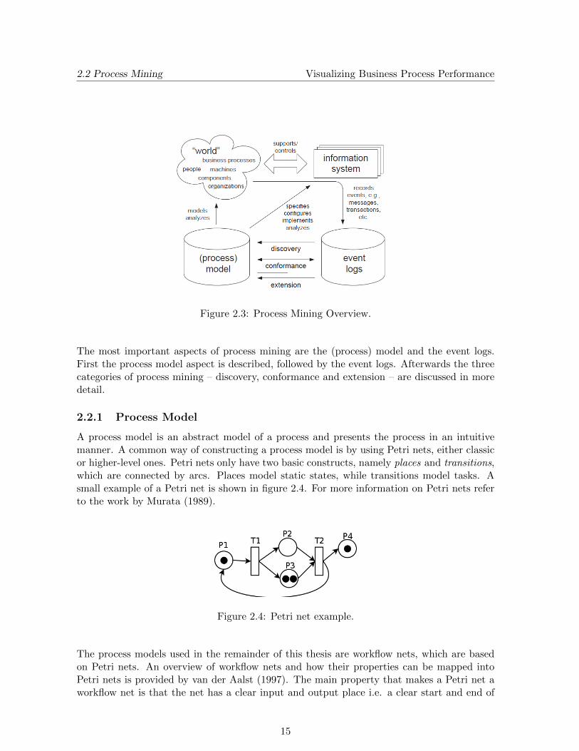
Process mining can be defined as an approach to extract information out of event logs anduse it to analyze processes, as stated by van der Aalst et al. (2003). The extracted informa-tion can be used for different kinds of analysis purposes. Therefore the main goal of processmining is getting more insight into processes by not looking at what should happen, but whatactually happens. An abstract overview of the subject is shown in Figure 2.3, found in thetutorial of ProM (a process mining tool discussed in Section 2.3).
14
2.2 Process Mining Visualizing Business Process Performance
Figure 2.3: Process Mining Overview.
The most important aspects of process mining are the (process) model and the event logs.First the process model aspect is described, followed by the event logs. Afterwards the threecategories of process mining – discovery, conformance and extension – are discussed in moredetail.
2.2.1 Process Model
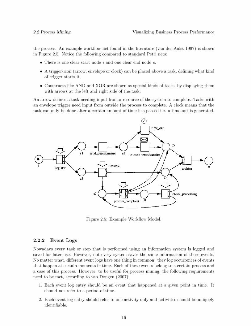
A process model is an abstract model of a process and presents the process in an intuitivemanner. A common way of constructing a process model is by using Petri nets, either classicor higher-level ones. Petri nets only have two basic constructs, namely places and transitions,which are connected by arcs. Places model static states, while transitions model tasks. Asmall example of a Petri net is shown in figure 2.4. For more information on Petri nets referto the work by Murata (1989).
Figure 2.4: Petri net example.
The process models used in the remainder of this thesis are workflow nets, which are basedon Petri nets. An overview of workflow nets and how their properties can be mapped intoPetri nets is provided by van der Aalst (1997). The main property that makes a Petri net aworkflow net is that the net has a clear input and output place i.e. a clear start and end of
15
2.2 Process Mining Visualizing Business Process Performance
the process. An example workflow net found in the literature (van der Aalst 1997) is shownin Figure 2.5. Notice the following compared to standard Petri nets:
• There is one clear start node i and one clear end node o.
• A trigger-icon (arrow, envelope or clock) can be placed above a task, defining what kindof trigger starts it.
• Constructs like AND and XOR are shown as special kinds of tasks, by displaying themwith arrows at the left and right side of the task.
An arrow defines a task needing input from a resource of the system to complete. Tasks withan envelope trigger need input from outside the process to complete. A clock means that thetask can only be done after a certain amount of time has passed i.e. a time-out is generated.
Figure 2.5: Example Workflow Model.
2.2.2 Event Logs
Nowadays every task or step that is performed using an information system is logged andsaved for later use. However, not every system saves the same information of these events.No matter what, different event logs have one thing in common: they log occurrences of eventsthat happen at certain moments in time. Each of these events belong to a certain process anda case of this process. However, to be useful for process mining, the following requirementsneed to be met, according to van Dongen (2007):
1. Each event log entry should be an event that happened at a given point in time. Itshould not refer to a period of time.
2. Each event log entry should refer to one activity only and activities should be uniquelyidentifiable.
16
2.3 Related Work Visualizing Business Process Performance
3. Each event log entry should contain a description of the event type.
4. Each event log entry should refer to a specific case of the process.
5. Each event log entry should belong to a specific process.
6. The events within each case are ordered.
2.2.3 Process Mining Categories
The process mining research area can roughly be divided into three categories, where eachcategory has a different goal. The first category is discovery, where the goal is to extract theprocess model from the event logs. In this case there is no process model to start workingfrom and the event logs are created by an independent information system. A survey of issuesand approaches to this particular issue is provided by van der Aalst et al. (2003). The secondcategory is conformance and is for example treated by van der Aalst et al. (2005). The goalof this approach is to test how much a model ”fits” the corresponding event logs. In this casethe process model and event logs are created separate from each other. The last categoryextension has the goal to enrich the original process model with extra information, which ismined from the corresponding event logs. In this case the event logs are created by executingthe process model. This thesis is mainly focused on the extension aspect of process mining,as the goal is to visualize relevant information out of the event logs onto process models.
2.3 Related Work
In the last couple of years much research has been done on process mining. However, mostof this work has been focused on getting the needed information out of the event logs. Vi-sualizing this information in a proper manner has been of less interest. Even though thevisualization aspect has not been covered, several solutions to common problems regarding(extension) process mining have been developed in both the scientific and business world.
Before looking at several ways to visualize data, special attention is given to the ProcessMining tool (ProM) developed at the Eindhoven University of Technology. The official ProMwebsite1 states that ProM is a generic open-source framework for implementing process min-ing tools in a standard environment. The framework is written in the Java programminglanguage and uses a standard format – Mining XML (XML) – as input event logs. The ben-efit of ProM is that plug-ins can be developed and added to ProM quite easy, since severalprocess modeling languages and mining/analysis plug-ins are already supported. At this mo-ment the newest version is ProM 6.0, released on 09-09-2010.
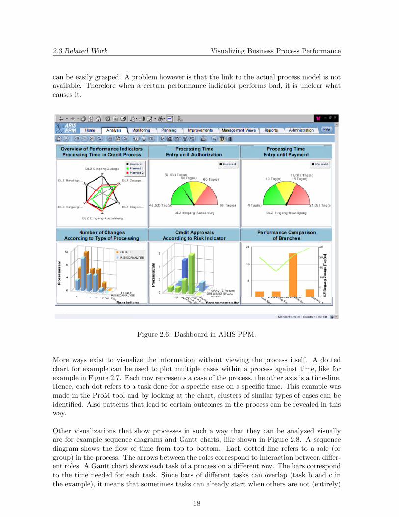
A first way to show information to the user is via a dashboard view, visualizing the informa-tion in bar charts, tables and other types of standard visualizations. This has for examplebeen done in the ARIS PPM (Scheer & Schneider 2006) and in MetaStorm BPM (MetastormBusiness Process Management 2009). Figure 2.6 shows an example of a dashboard in ARISPPM. The figure shows several performance indicators to the user, each in their own window.Since people are used to working with these kind of visualizations, the important information
2.3 Related Work Visualizing Business Process Performance
can be easily grasped. A problem however is that the link to the actual process model is notavailable. Therefore when a certain performance indicator performs bad, it is unclear whatcauses it.
Figure 2.6: Dashboard in ARIS PPM.
More ways exist to visualize the information without viewing the process itself. A dottedchart for example can be used to plot multiple cases within a process against time, like forexample in Figure 2.7. Each row represents a case of the process, the other axis is a time-line.Hence, each dot refers to a task done for a specific case on a specific time. This example wasmade in the ProM tool and by looking at the chart, clusters of similar types of cases can beidentified. Also patterns that lead to certain outcomes in the process can be revealed in thisway.
Other visualizations that show processes in such a way that they can be analyzed visuallyare for example sequence diagrams and Gantt charts, like shown in Figure 2.8. A sequencediagram shows the flow of time from top to bottom. Each dotted line refers to a role (orgroup) in the process. The arrows between the roles correspond to interaction between differ-ent roles. A Gantt chart shows each task of a process on a different row. The bars correspondto the time needed for each task. Since bars of different tasks can overlap (task b and c inthe example), it means that sometimes tasks can already start when others are not (entirely)
18
2.3 Related Work Visualizing Business Process Performance
Figure 2.7: Dotted chart in ProM.
finished yet.
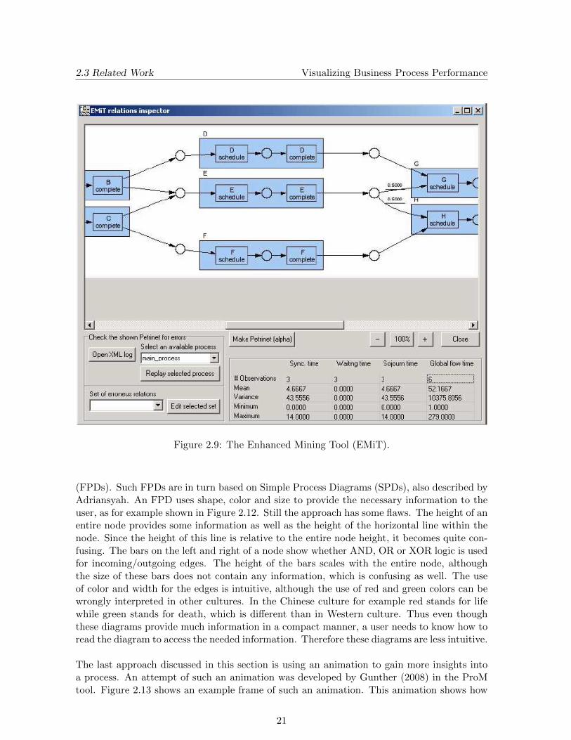
Since processes are generally described by models like the workflow model discussed before,the performance information can also be mapped onto this model. This way the link to theoriginal process model is kept intact while still providing the necessary information. In thelast years, research has been done to provide efficient solutions to this particular problem.One tool that uses the original process model to project performance indicators is the EMiTtool – Enhanced Mining Tool – developed by van Dongen (2004). The EMiT tool uses eventlogs structured as XML files and first produces a process model out of these events. Thisis the discovery part of process mining. Afterwards extension of the model is provided bycalculating several performance indicators. This information can then be acquired from themodel by selecting the appropriate nodes, shown in Figure 2.9. In this particular case in-formation is provided about waiting times. A major drawback of this solution is that theinformation cannot be seen immediately, since the user has to inspect the nodes in order toget the information.
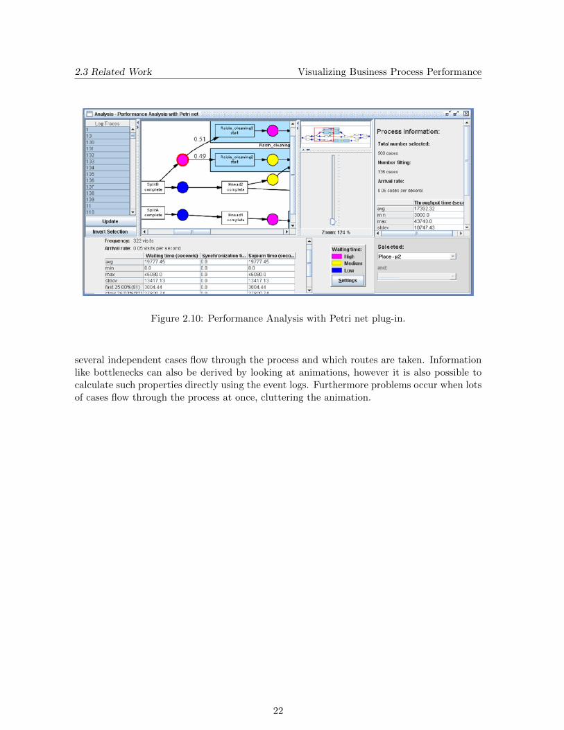
A few years later Hornix (2007) developed the Performance Analysis with Petri net plug-infor the ProM framework that projects the relevant performance information on the petri netat hand. Instead of just providing the information as numbers, Hornix used color to visual-ize aspects like waiting times. Figure 2.10 shows a screenshot of this plug-in. The waitingtime is color coded where purple stands for a high waiting time and blue stands for a lowwaiting time. The rest of the information however is still shown in tables. Even though thevisualization has been improved compared to the work by van Dongen, it is still not perfect.
19
2.3 Related Work Visualizing Business Process Performance
(a) Sequence diagram
(b) Gantt chart
Figure 2.8: Example diagrams.
In this particular example, the used colors for example are improper. Furthermore tables donot provide the information in an intuitive way.
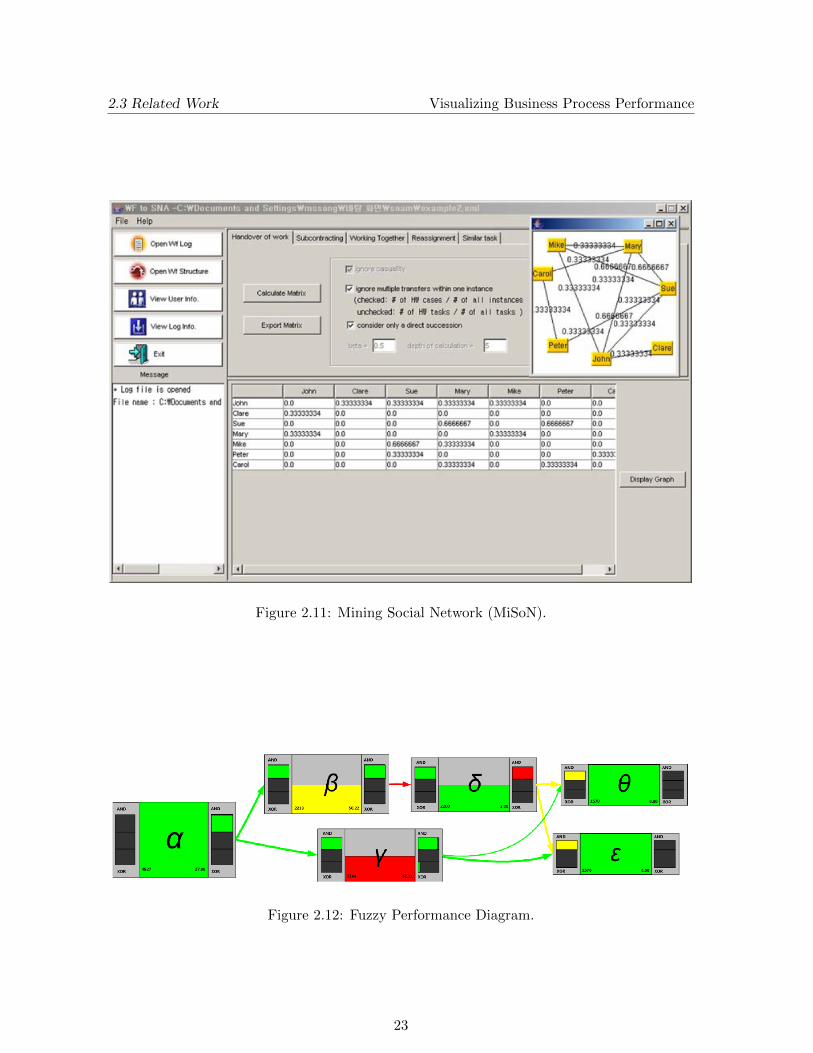
The event logs discussed before also include information about the performer of the activity,besides the task and case information. Using this information about performers, it is for ex-ample possible to find out which persons in a company tend to work together or that personA sends his work to person B most of the times instead of to person C. Such patterns canindicate that persons within a process have a better relation than others. Using the eventlogs, this information can be used to build a social network of the resources in a process. Thisnetwork can then be shown as a matrix or as a graph, in which case it is called a sociogram.The discovery of these social networks is described by van der Aalst et al. (2005). They alsodefine several metrics which can be used and show their results in the MiSoN tool. A screen-shot of this tool is shown in Figure 2.11. The social network is shown in the top-right corner,based on the information table shown in the lower part of the screen. An edge between tworesources is only drawn when the corresponding entry of the table has a value greater than 0.The network created by the MiSoN tool can become cluttered easily, due to the labels placedon edges. Furthermore the information will be harder to understand when more and moreedges get added, resulting in a ”spaghetti-like” graph.
A quite new approach to visualize performance indicators is provided by Adriansyah (2009)and Piessens (2010). The main idea of both is that they do not project the information ontothe initial process model, but on another type of model, namely Fuzzy Performance Diagrams
20
2.3 Related Work Visualizing Business Process Performance
Figure 2.9: The Enhanced Mining Tool (EMiT).
(FPDs). Such FPDs are in turn based on Simple Process Diagrams (SPDs), also described byAdriansyah. An FPD uses shape, color and size to provide the necessary information to theuser, as for example shown in Figure 2.12. Still the approach has some flaws. The height of anentire node provides some information as well as the height of the horizontal line within thenode. Since the height of this line is relative to the entire node height, it becomes quite con-fusing. The bars on the left and right of a node show whether AND, OR or XOR logic is usedfor incoming/outgoing edges. The height of the bars scales with the entire node, althoughthe size of these bars does not contain any information, which is confusing as well. The useof color and width for the edges is intuitive, although the use of red and green colors can bewrongly interpreted in other cultures. In the Chinese culture for example red stands for lifewhile green stands for death, which is different than in Western culture. Thus even thoughthese diagrams provide much information in a compact manner, a user needs to know how toread the diagram to access the needed information. Therefore these diagrams are less intuitive.
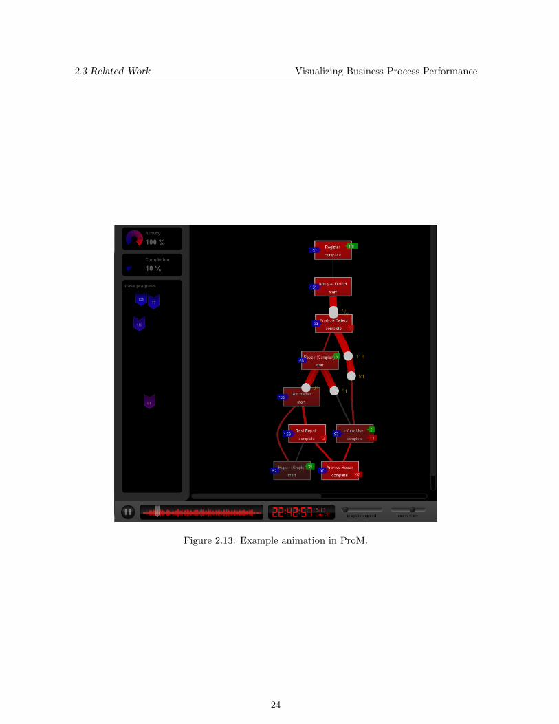
The last approach discussed in this section is using an animation to gain more insights intoa process. An attempt of such an animation was developed by Gunther (2008) in the ProMtool. Figure 2.13 shows an example frame of such an animation. This animation shows how
21
2.3 Related Work Visualizing Business Process Performance
Figure 2.10: Performance Analysis with Petri net plug-in.
several independent cases flow through the process and which routes are taken. Informationlike bottlenecks can also be derived by looking at animations, however it is also possible tocalculate such properties directly using the event logs. Furthermore problems occur when lotsof cases flow through the process at once, cluttering the animation.
22
2.3 Related Work Visualizing Business Process Performance
Figure 2.11: Mining Social Network (MiSoN).
Figure 2.12: Fuzzy Performance Diagram.
23
2.3 Related Work Visualizing Business Process Performance
Figure 2.13: Example animation in ProM.
24
Chapter 3
Problem Analysis
This chapter contains an elaboration on the research description as proposed in Section 1.3,which was written as follows:
Calculate relevant performance information and organizational information from both a givenprocess model and event log and develop an approach to provide this information to the userin an intuitive and interactive manner.
The context of this problem is the Axxerion software (called Axxerion from now on), whichis a web-based information system. Since the software is developed using the Software as aService paradigm, users can access and use Axxerion using their own default web browserinstead of having to install any extra software on their machines. Axxerion also takes care ofthe underlying hardware to store all relevant data, relieving customers of the burden to buyand maintain their own servers. Another advantage of Axxerion is that it consists of severalmodules e.g. finance module, asset module, etc. This modular approach means that when asingle customer buys the package, the software can be tailored to the customer’s demands.
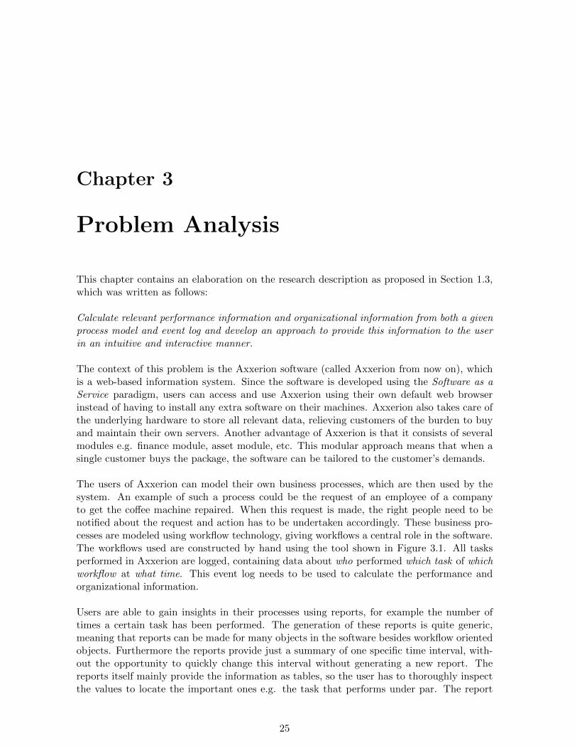
The users of Axxerion can model their own business processes, which are then used by thesystem. An example of such a process could be the request of an employee of a companyto get the coffee machine repaired. When this request is made, the right people need to benotified about the request and action has to be undertaken accordingly. These business pro-cesses are modeled using workflow technology, giving workflows a central role in the software.The workflows used are constructed by hand using the tool shown in Figure 3.1. All tasksperformed in Axxerion are logged, containing data about who performed which task of whichworkflow at what time. This event log needs to be used to calculate the performance andorganizational information.
Users are able to gain insights in their processes using reports, for example the number oftimes a certain task has been performed. The generation of these reports is quite generic,meaning that reports can be made for many objects in the software besides workflow orientedobjects. Furthermore the reports provide just a summary of one specific time interval, with-out the opportunity to quickly change this interval without generating a new report. Thereports itself mainly provide the information as tables, so the user has to thoroughly inspectthe values to locate the important ones e.g. the task that performs under par. The report
25
3.1 Requirements Visualizing Business Process Performance
Figure 3.1: Current workflow tool, with buttons on top to edit the workflow.
values can also be drawn as charts, like a bar chart or pie chart. Even though these kind ofvisualizations are better than the standard reports, they still lack the control to dynamicallyinspect a certain time interval.
Although users can view some performance information using these reports, there is a needto gain more insights into the processes. Hence, the research description as mentioned beforewas introduced. Since both performance and organizational information should be availableto the user, the solution should contain both workflow information as well as resource infor-mation. Since users of Axxerion are already familiar with the current workflow model, it isrequired that the workflow information is mapped on a model based on the current graphicalrepresentation. Furthermore the workflow information should allow users to inspect differentperformance aspects of the workflow. The resource information should contain some hier-archy, showing groups the users belong to, as well as show relations between the resources.Since the information is likely to change over time, users should be able to inspect differenttime intervals dynamically during run-time.
Based on these constraints an approach is proposed to visualize performance and organiza-tional information in an intuitive and interactive manner. To test whether this proposedsolution is effective, a prototype is implemented. This prototype is developed as Java appletwithin the Axxerion software, communicating with the Axxerion server to access the neededdata.
3.1 Requirements
From the problem analysis, we can derive a number of requirements. These will also be usedto measure whether the project is successful or not and whether the goal is achieved:
1. The solution calculates relevant performance and organizational information from botha given process model and event log and provides this information to the user.
26
3.1 Requirements Visualizing Business Process Performance
2. The solution contains both information about the workflow model at hand as well asthe resources playing a role in the workflow.
3. The solution allows users to inspect the information in different time intervals in aninteractive and timely manner.
4. The solution is presented as a prototype that runs within the Axxerion software.
5. The prototype runs in a Java applet and communicates with the Axxerion server toaccess the needed data.
6. The workflow information shows the performance information mapped on a workflowmodel.
7. The workflow information visualization is based on the current workflow model visu-alization of Axxerion, so a user of the software does not have to learn a new modelsyntax.
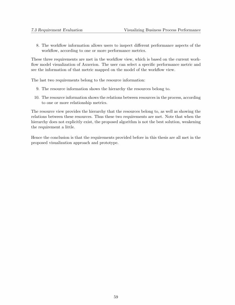
8. The workflow information allows users to inspect different performance aspects of theworkflow, according to one or more performance metrics.
9. The resource information shows the hierarchy the resources belong to.
10. The resource information shows the relations between resources in the process, accordingto one or more relationship metrics.
27
Chapter 4
Visualization Approach
In this chapter the approach taken to tackle the problem is described. The visualizationapproach provides two major views that capture the essence of a workflow model:
Workflow View Shows the performance information mapped on a workflow model.
Resource View Shows the resource information, containing hierarchy and relations betweenresources.
These views are not entirely independent of each other, since the proposed approach also vi-sualizes connections between the two views. This principle is known as Multiple CoordinatedViews (Wang Baldonado et al. 2000). To allow users to inspect the information in differenttime intervals in an interactive and timely manner, the approach provides the tools for dy-namic querying. This means that after the user has selected the data range to inspect, he isable to dynamically change the time interval within this data range and immediately see thechanges projected on the visualization. To be able to inspect the data range, the data needsto be loaded and preprocessed. Since this can be time-consuming when a large amount ofdata is available, the user should be allowed to choose which data range to load and visualize.Hence, the following three time intervals are specified:
Data Range The entire time interval for which data is available.
Visualization Range The entire time interval in which the user is interested, which is asubset of the data range. Data values are only calculated and shown for event log entrieswithin this visualization range.
Inspection Range The current time interval the user is inspecting, which is a subset of thevisualization range.
Choices are made within both workflow and resource views to accommodate for these dynamicqueries. By allowing dynamic queries, the user can first have a look at the entire visualiza-tion range (inspection range equal to visualization range) and continue in more detail wheninteresting data values are found. This approach is called the Overview + Detail paradigm(Zhu & Chen 2005). Each part of the visualization approach is now covered in detail.
28
4.1 Workflow View Visualizing Business Process Performance
4.1 Workflow View
This section explains the details about the Workflow View, which provides a view of theprocess under inspection. The workflow view shows the tasks to be performed for each caseentering the process. A major constraint on this view is that it should be based on the currentworkflow application present in Axxerion, of which an example process is shown in Figure 4.1.
Figure 4.1: Example process in Axxerion.
To avoid that users already using Axxerion should learn a new model syntax, the workflowview uses the same icons and layout as the current visualization. Also new users that havesome knowledge about workflows will have no problems grasping the syntax of the model,since it is based on the workflow definition provided by van der Aalst (1997). Places of theworkflow are visualized as circles, where the starting place of the workflow is annotated by anarrow inside the circle. Tasks are visualized as squares, extended with some extras dependingon the type of task. Tasks with an AND/OR in- or output are drawn with arrows at theleft- or right-hand side respectively. Tasks are furthermore decorated with icons, illustratingwhether the task needs a resource to be executed (arrow icon) or is executed automatically(lightning icon) and whether the task is on a timeout (bell icon). Places and tasks are con-nected by arrow-headed lines.
The real issue is how to map the performance metrics about the model unto it in such a way,that important characteristics of the model are clear to the user right away i.e. the user doesnot have to look at the model thoroughly to get qualitative information about it. This canbe done in several ways, for example by using different shapes. However, different shapes arealready used for denoting places, tasks and decorator icons, making it an invalid option formapping data. The following two properties are used to map data on:
• Size
• Color
Both properties can be applied to both places and tasks, depending on the metrics availablefor each node type. Besides these properties two more visualization methods are added,
29
4.1 Workflow View Visualizing Business Process Performance
which are the Block View and the Calendar View. These two views complement the standardworkflow view in such a way that an overview+detail solution is created.
4.1.1 Size
According to Ware (2004) size is a strong perceptual cue to group items by, making it anefficient property to map data on as well. To avoid getting items that are too small or too big,bounds on the minimum and maximum size are set. The values to map are then converted tothe size property using a linear scale, while respecting these minimum and maximum sizes.The advantage of using size is that a user will immediately be able to identify items that arebigger or smaller than others, without further inspection of the model. Although size is idealto notice differences between different items of the model, obtaining quantitative informationabout the data is quite hard this way.
The sizes are not updated when the inspection interval is changed, but are only computedonce when the visualization range is set. This provides the user with an overview at all times,independent of the inspection range.
4.1.2 Color
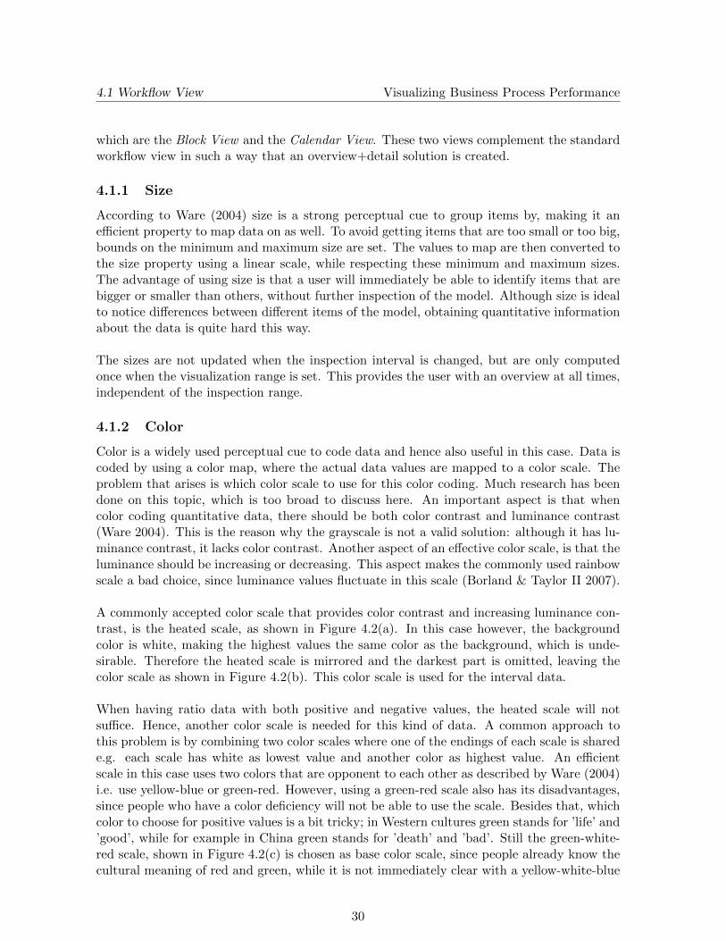
Color is a widely used perceptual cue to code data and hence also useful in this case. Data iscoded by using a color map, where the actual data values are mapped to a color scale. Theproblem that arises is which color scale to use for this color coding. Much research has beendone on this topic, which is too broad to discuss here. An important aspect is that whencolor coding quantitative data, there should be both color contrast and luminance contrast(Ware 2004). This is the reason why the grayscale is not a valid solution: although it has lu-minance contrast, it lacks color contrast. Another aspect of an effective color scale, is that theluminance should be increasing or decreasing. This aspect makes the commonly used rainbowscale a bad choice, since luminance values fluctuate in this scale (Borland & Taylor II 2007).
A commonly accepted color scale that provides color contrast and increasing luminance con-trast, is the heated scale, as shown in Figure 4.2(a). In this case however, the backgroundcolor is white, making the highest values the same color as the background, which is unde-sirable. Therefore the heated scale is mirrored and the darkest part is omitted, leaving thecolor scale as shown in Figure 4.2(b). This color scale is used for the interval data.
When having ratio data with both positive and negative values, the heated scale will notsuffice. Hence, another color scale is needed for this kind of data. A common approach tothis problem is by combining two color scales where one of the endings of each scale is sharede.g. each scale has white as lowest value and another color as highest value. An efficientscale in this case uses two colors that are opponent to each other as described by Ware (2004)i.e. use yellow-blue or green-red. However, using a green-red scale also has its disadvantages,since people who have a color deficiency will not be able to use the scale. Besides that, whichcolor to choose for positive values is a bit tricky; in Western cultures green stands for ’life’ and’good’, while for example in China green stands for ’death’ and ’bad’. Still the green-white-red scale, shown in Figure 4.2(c) is chosen as base color scale, since people already know thecultural meaning of red and green, while it is not immediately clear with a yellow-white-blue
30
4.1 Workflow View Visualizing Business Process Performance
Figure 4.2: Color scales for interval and ratio data.
scale which color is positive and which one is negative. There should still be an option toswitch to the yellow-white-blue color scale, shown in Figure 4.2(d), if users should want toswitch to this scale.
Unlike size, the color of the nodes of the workflow view changes with the inspection interval,providing the average value of the selected metric to the user. When the inspection interval ischanged, the change to the average value is immediately reflected on the nodes of the processmodel. Hence, the user is able to search through different time intervals and identify intervalsof interest.
4.1.3 Block View
To provide the user with a more detailed view of the tasks of the process, the block viewmethod is used. When this particular view is chosen, the standard uniform coloring of tasksis omitted. Instead of visualizing the inspection range, the block view visualizes the entirevisualization range, by dividing it in several blocks. Since the visualization range is likely tocover multiple years, the available space in the task square is divided in rows and columns.Each row corresponds to an entire year, each column corresponds to a month. Hence, eachblock of the view visualizes a single month of the visualization range. The color scale used forthese blocks is the same as in the previous section, so that the use of color stays consistent.Figure 4.3 shows an example of the block view of six months on the right, where the fourthmonth shows a data value which differs a lot from the other months. When looking at theaverage value over these six months on the left, the values are ”flattened”. The block viewhowever shows the outlier directly.
Figure 4.3: Average value shown on the left, block view on the right.
31
4.1 Workflow View Visualizing Business Process Performance
An interesting situation occurs when the visualization range contains parts of years, for ex-ample when the range starts on May of the first year and ends on August of the second year.In such a case there are months without data values to use, in this example the January-Apriland September-December intervals of the first and second year respectively. In this case it iswanted that the months having data in both years are shown in the same column below eachother, such that possible patterns only occurring in specific months can be traced. Thereforethe months lying outside the visualization range are colored gray, since gray is never used tocolor data values. The example of two years mentioned is then visualized (with fictional datavalues) as shown in Figure 4.4.
Figure 4.4: Block view of 2 years.
4.1.4 Calendar View
When a user working with the visualization finds a task with a particular interesting datavalue, another option is available to look at that task with even more detail. Unlike the blockview that gives a monthly view of the data, the calendar view provides a daily view of thedata. The calendar view is based on the work done by Van Wijk & Van Selow (1999). Intheir paper, they first merge days with similar values/patterns into clusters, after which eachcluster is assigned a specific color. All days of a single year are then visualized as a calendarlike in Figure 4.5.
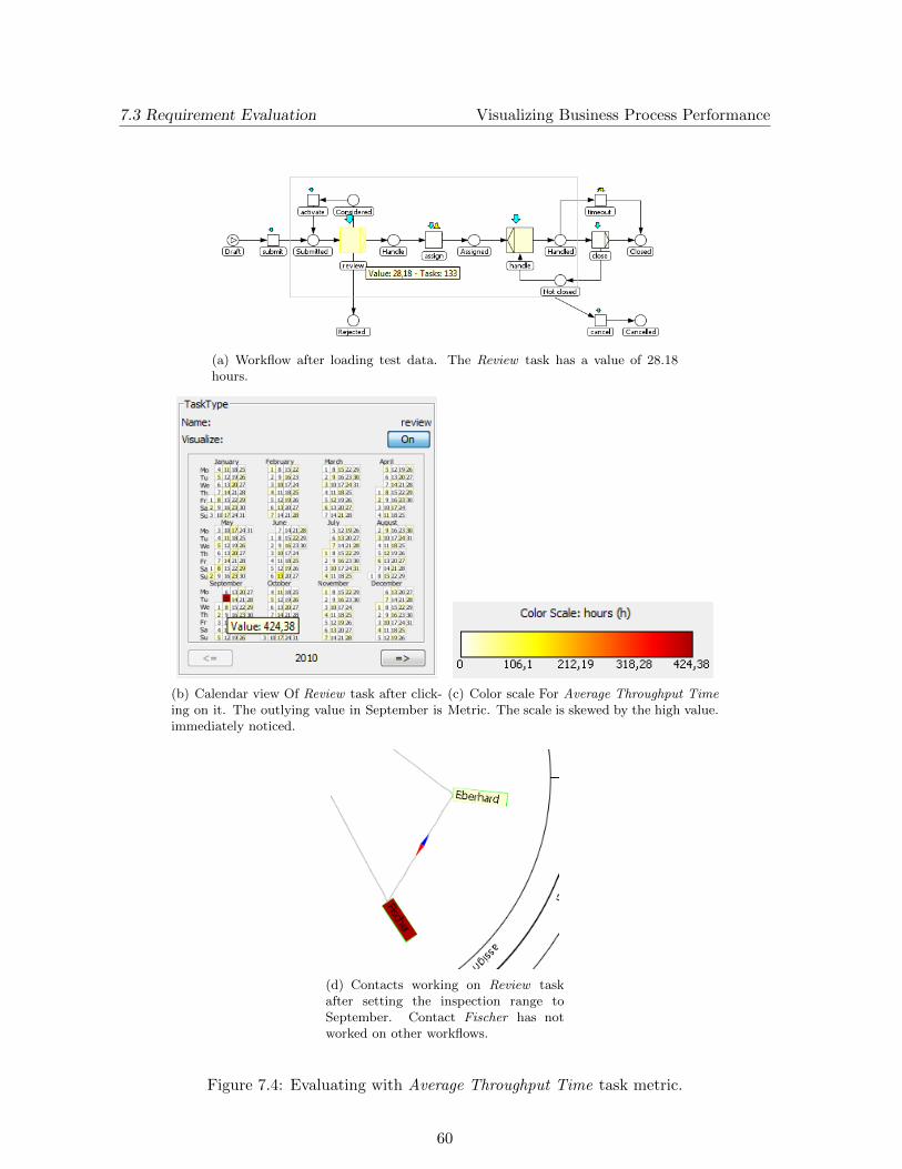
This example shows whether the performed tasks on each day are on average ended before orafter the due date i.e. the tasks have been completed before or after the deadline. The reddays correspond to days where tasks are completed after the due date, green days correspondto days where tasks are completed early. The figure shows clearly that during most of thetimes the task is completed on time, except for May 6th, which is colored red and thereforenoticed immediately.
So when a user wants to inspect a task, he can focus the task and a separate calendar view willbe shown for that task, showing the data values for that task on each day for the visualizationrange. For consistency and to prevent confusion by the user, the same color scale as before isused for this visualization. Since the visualization range can contain multiple years, the useris able to choose which year to inspect. Just like the block view, the calendar view can havedays lying outside the visualization range, without data values to use. If this occurs, the days
32
4.2 Resource View Visualizing Business Process Performance
Figure 4.5: Example Calendar View.
outside the visualization range are colored gray, again assuming that gray is not used to colordata values.
4.2 Resource View
The details about the Resource View are described in this section. The resource view shows allresources, called contacts from now on, playing a role in the current workflow and providesways to inspect the relations between different contacts. This makes the resource view aso-called social network of the contacts of the process under inspection. The resource viewcomponent consists of three parts. The first part visualizes the contacts and the hierarchythey belong to. The second part draws the relationships between the contacts in such a waythat insights can be gained from the visualization. The last part shows information aboutthe individual contacts.
4.2.1 Contact Hierarchy
The requirement of this part of the resource view is concerned with visualizing the hierarchy inthe current workflow by grouping contacts together in hierarchy groups. This can be realizedby looking at the groups defined in the process or by grouping contacts that perform the sametasks of the process. The contacts belonging to the hierarchy groups should also be drawn,clearly showing the group they belong to. The contacts drawn as nodes and the relationshipsdrawn as edges, results in the visualization of a graph. Several algorithms to draw graphsare described by Di Battista et al. (1998). Since one of the requirements is that the contact-group structure is clear, the relationship edges between the contacts are omitted at first,
33
4.2 Resource View Visualizing Business Process Performance
transforming the problem into a ”simple” tree drawing problem. Some layout solutions arenow discussed in more detail:
• Tree Layout
• Balloon Layout
• Treemap Layout
• Radial Layout
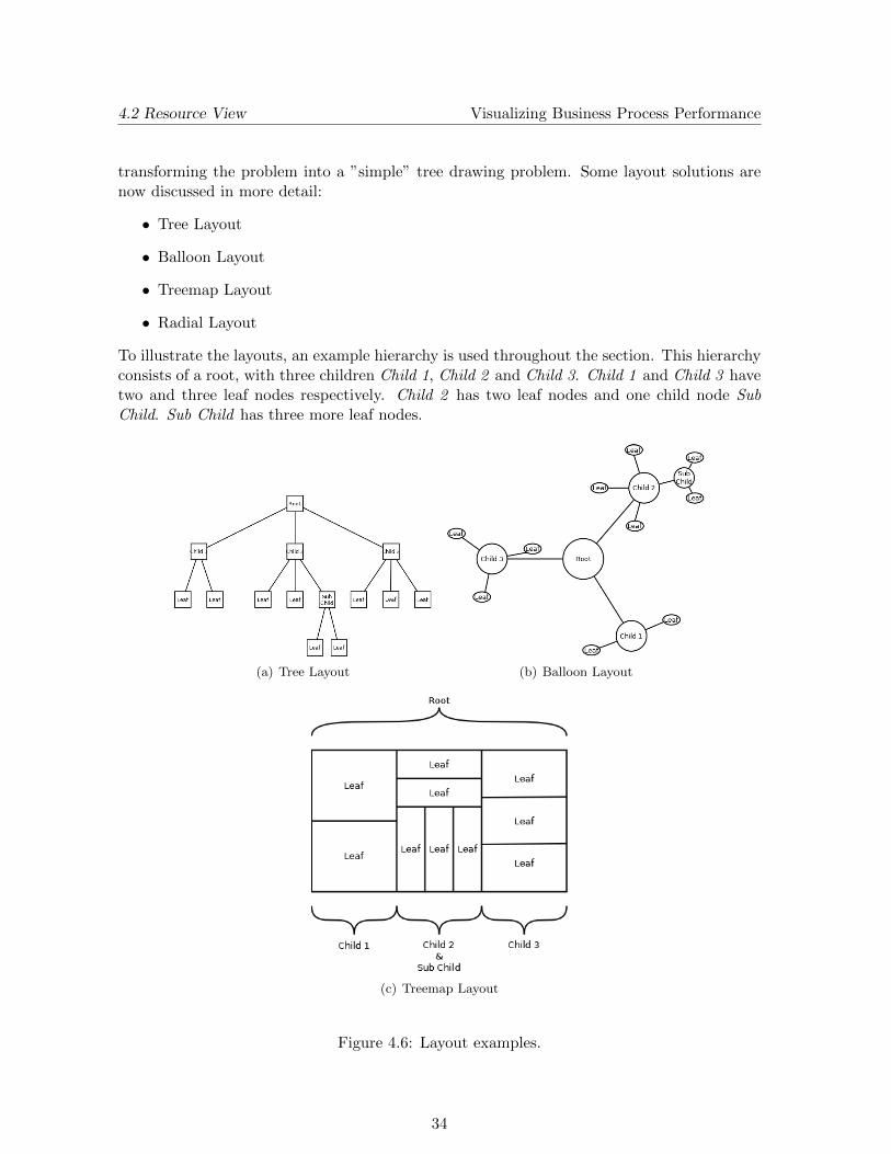
To illustrate the layouts, an example hierarchy is used throughout the section. This hierarchyconsists of a root, with three children Child 1, Child 2 and Child 3. Child 1 and Child 3 havetwo and three leaf nodes respectively. Child 2 has two leaf nodes and one child node SubChild. Sub Child has three more leaf nodes.
(a) Tree Layout (b) Balloon Layout
(c) Treemap Layout
Figure 4.6: Layout examples.
34
4.2 Resource View Visualizing Business Process Performance
Tree Layout A standard tree layout is a common way to draw trees. This layout placesthe root of the tree at the top. Each layer is then drawn below the previous layer, whereeach node of the same layer is drawn at the same height. Edges are thus drawn from top tobottom, resulting in a tree-like drawing as the example shown in Figure 4.6(a).
An advantage of this layout algorithm is that it is straightforward to implement. Furthermoremost people have seen such a conventional tree before, so they know how to read them. Amajor disadvantage is the area this layout needs. Furthermore the display will clutter toomuch when drawing the relationship edges between the users. Since space on a computerscreen is quite limited, this layout algorithm is not desirable.
Balloon Layout The balloon layout is best described by viewing at an example, like theone given in Figure 4.6(b). The root node is placed at the center of the drawing. Its childrenare then placed in a circle around the parent, with the root node in the center. The childrenof these children are in-turn drawn in a circle around their parent node, etc. At each layerof the tree, the radius of the circles is decreased, creating balloon-like structures throughoutthe drawing. An advantage of this layout algorithm is that the limited space is used moreeffectively than when using the conventional tree layout described before. A disadvantage isthat when adding the relationship edges later on, edges between user groups may clutter thescreen, resulting in a visual unpleasant scenario.
Treemap Layout The treemap layout, designed by Johnson & Shneiderman (1991), usesa different approach than the layouts discussed before. The main difference is that the hier-archy edges are not explicitly drawn, but are implied by the layout itself. The entire drawingarea is used as the root of the layout. This plane is then split into n subareas, with n beingthe number of children of the root. Each subarea is sequentially divided in new subareas, onearea for each child. This process is repeated until a layout is created like the example shownin Figure 4.6(c). An advantage of the treemap layout is that the entire available area is usedto layout the tree, making it very efficient on space. Reading such a layout and gathering theneeded information however is not as efficient, since the ”edges” between the nodes are notalways clear.
To improve the treemap layout, the cushion treemap was created by Van Wijk & Van deWetering (2002). The cushion treemap emphasizes the relations between sibling nodes bydrawing them with a shading technique, resulting in a cushion-like object connecting thesesiblings. By using this technique, the layout is more readable, although it is still not aseffective to read as the standard tree layout.
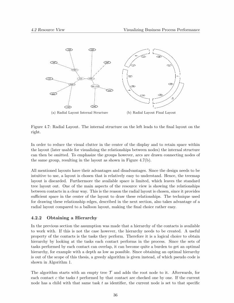
Radial Layout The radial layout places the root node in the center. Just like in the normaltree layout, each layer is drawn ”below” the previous layer. The difference is however thatthese children are placed on concentric circles instead of a single row. For each layer of thetree an extra circle is used to place the nodes on. Furthermore every subtree is assigned a partof the entire circle, i.e. a wedge, and each subtree remains entirely in its wedge. To guaranteethat the leaf nodes are all placed on the same concentric circle, the leaves are ”pushed” to theouter circle. An example of the structure of such a radial layout is shown in Figure 4.7(a).
35
4.2 Resource View Visualizing Business Process Performance
(a) Radial Layout Internal Structure (b) Radial Layout Final Layout
Figure 4.7: Radial Layout. The internal structure on the left leads to the final layout on theright.
In order to reduce the visual clutter in the center of the display and to retain space withinthe layout (later usable for visualizing the relationships between nodes) the internal structurecan then be omitted. To emphasize the groups however, arcs are drawn connecting nodes ofthe same group, resulting in the layout as shown in Figure 4.7(b).
All mentioned layouts have their advantages and disadvantages. Since the design needs to beintuitive to use, a layout is chosen that is relatively easy to understand. Hence, the treemaplayout is discarded. Furthermore the available space is limited, which leaves the standardtree layout out. One of the main aspects of the resource view is showing the relationshipsbetween contacts in a clear way. This is the reason the radial layout is chosen, since it providessufficient space in the center of the layout to draw these relationships. The technique usedfor drawing these relationship edges, described in the next section, also takes advantage of aradial layout compared to a balloon layout, making the final choice rather easy.
4.2.2 Obtaining a Hierarchy
In the previous section the assumption was made that a hierarchy of the contacts is availableto work with. If this is not the case however, the hierarchy needs to be created. A usefulproperty of the contacts is the tasks they perform. Therefore it is a logical choice to obtainhierarchy by looking at the tasks each contact performs in the process. Since the sets oftasks performed by each contact can overlap, it can become quite a burden to get an optimalhierarchy, for example with a depth as low as possible. Since obtaining an optimal hierarchyis out of the scope of this thesis, a greedy algorithm is given instead, of which pseudo code isshown in Algorithm 1.
The algorithm starts with an empty tree T and adds the root node to it. Afterwards, foreach contact c the tasks t performed by that contact are checked one by one. If the currentnode has a child with that same task t as identifier, the current node is set to that specific
36
4.2 Resource View Visualizing Business Process Performance
Data: Tree T , Contacts CResult: T with hierarchy based on tasksbegin
rootNode = T .addNode(”root”);foreach contact c ∈ C do
currentNode = rootNode;foreach task t ∈ c.tasks do
if t ∈ currentNode.children(t) thencurrentNode = childNode(t);
elsenewNode = T .addNode(t);newNode.parent = currentNode;currentNode = newNode;
end
end
end
end
Algorithm 1: Greedy Hierarchy Algorithm
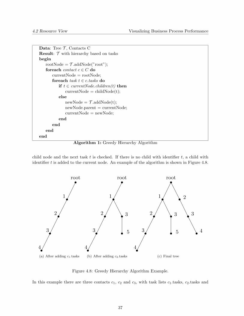
child node and the next task t is checked. If there is no child with identifier t, a child withidentifier t is added to the current node. An example of the algorithm is shown in Figure 4.8.
root
1
2
3
4
(a) After adding c1.tasks
root
1
2
3
4
3
5
(b) After adding c2.tasks
root
1
2
3
4
3
5
2
3
4
(c) Final tree
Figure 4.8: Greedy Hierarchy Algorithm Example.
In this example there are three contacts c1, c2 and c3, with task lists c1.tasks, c2.tasks and
37
4.2 Resource View Visualizing Business Process Performance
After c1.tasks has been processed, the tree will look like Figure 4.8(a). Processing c2.tasksresults in a tree like in Figure 4.8(b). Since c3.tasks starts with a different task, it will createan entire new branch in T , resulting in a tree like in Figure 4.8(c). The example also showsthe weakness of this algorithm, since it assumes that the first task in the list is the mostimportant one. Contacts are immediately split according to this, although c1 and c3 have therest of the tasks in common.
Even though this algorithm has a major flaw, it suffices for the task at hand, since thevisualization approach only assumes there is a hierarchy. How this hierarchy is achieved isnot so relevant. The greedy algorithm presented can for example be improved easily by sortingthe task lists on importance of tasks, so that the most important tasks are at the front of thelist.
4.2.3 Relations
The previous section was concerned with the layout of the contacts. Now we will have a look atthe way to effectively visualize the relationships between these contacts. These relationshipscan be different things, for example the number of times two contacts work on the same case.The most common way to visualize these relationships is by using edges between the nodes.If the number of edges is large, this can result in ”spaghetti-like” layouts where informationis lost due to the visual clutter. A solution to this problem was given by Holten (2006),who introduced the hierarchical edge bundling technique. The edges of the graph can havea certain direction or can be bi-directional. Furthermore the weight of the relation can bedifferent for each edge. This will be encoded by a glyph that is added to the edge, providinginformation about that specific edge. In addition to an overview which shows all edges, theuser can focus on one contact. In this case only the edges where this contact is either thestart or end node are shown to the user. This results in a visualization where first an overviewis shown and detail for a single contact is available on demand. Another interesting methodadded to the relations is the opportunity to show the complement graph of the current. Thiscomplement graph only contains an edge between two contacts, when the standard graphdoes not contain an edge.
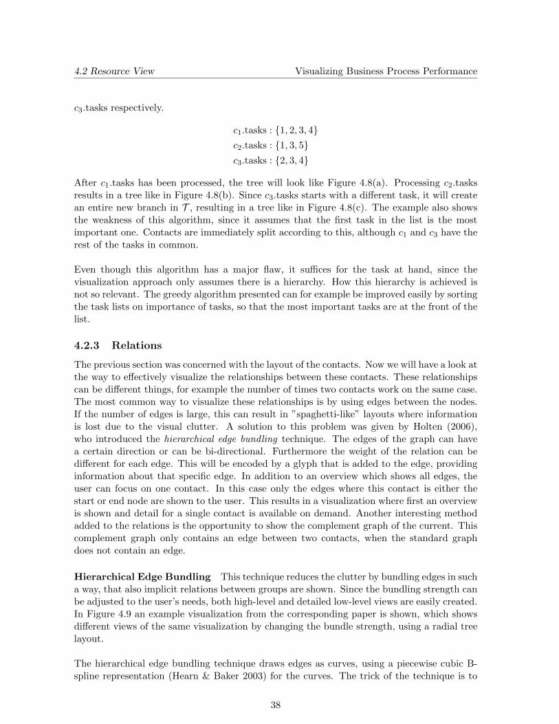
Hierarchical Edge Bundling This technique reduces the clutter by bundling edges in sucha way, that also implicit relations between groups are shown. Since the bundling strength canbe adjusted to the user’s needs, both high-level and detailed low-level views are easily created.In Figure 4.9 an example visualization from the corresponding paper is shown, which showsdifferent views of the same visualization by changing the bundle strength, using a radial treelayout.
The hierarchical edge bundling technique draws edges as curves, using a piecewise cubic B-spline representation (Hearn & Baker 2003) for the curves. The trick of the technique is to
38
4.2 Resource View Visualizing Business Process Performance
Figure 4.9: Hierarchical edge bundling example. The bundle strength increases from left toright, shifting from a low-level to a high-level view.
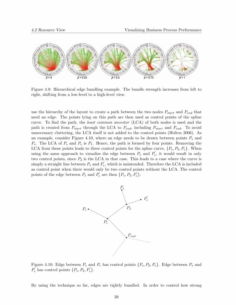
use the hierarchy of the layout to create a path between the two nodes Pstart and Pend thatneed an edge. The points lying on this path are then used as control points of the splinecurve. To find the path, the least common ancestor (LCA) of both nodes is used and thepath is created from Pstart through the LCA to Pend, including Pstart and Pend. To avoidunnecessary cluttering, the LCA itself is not added to the control points (Holten 2006). Asan example, consider Figure 4.10, where an edge needs to be drawn between points Ps andPe. The LCA of Ps and Pe is P1. Hence, the path is formed by four points. Removing theLCA from these points leads to three control points for the spline curve, {Ps, P2, Pe}. Whenusing the same approach to visualize the edge between Ps and P
′e, it would result in only
two control points, since P2 is the LCA in that case. This leads to a case where the curve issimply a straight line between Ps and P
′e, which is unintended. Therefore the LCA is included
as control point when there would only be two control points without the LCA. The controlpoints of the edge between Ps and P
′e are then {Ps, P2, P
′e}.
Proot
P1
P2Pe
Ps
P′e
Figure 4.10: Edge between Ps and Pe has control points {Ps, P2, Pe}. Edge between Ps andP
′e has control points {Ps, P2, P
′e}.
By using the technique so far, edges are tightly bundled. In order to control how strong
39
4.2 Resource View Visualizing Business Process Performance
the edges are bundled, the bundle strength parameter β is introduced, with β ∈ [0, 1]. Thisparameter is used to straighten the edge by adjusting every point Pi to straightened controlpoints P
′i using the following formula:
P′i = β · Pi + (1− β)(P0 +
i
N − 1(PN−1 − P0))
with
N : number of control points,
i : control point index, i ∈ {0, . . . , N − 1},β : bundling strength, β ∈ [0, 1].
The entire edge bundling technique results in a visualization of the relations in such a way,that information about the relations can be shown in a structured way. Furthermore theadjustable bundling strength provides the means to change from a detailed low-level view toa high-level view by increasing the β parameter.
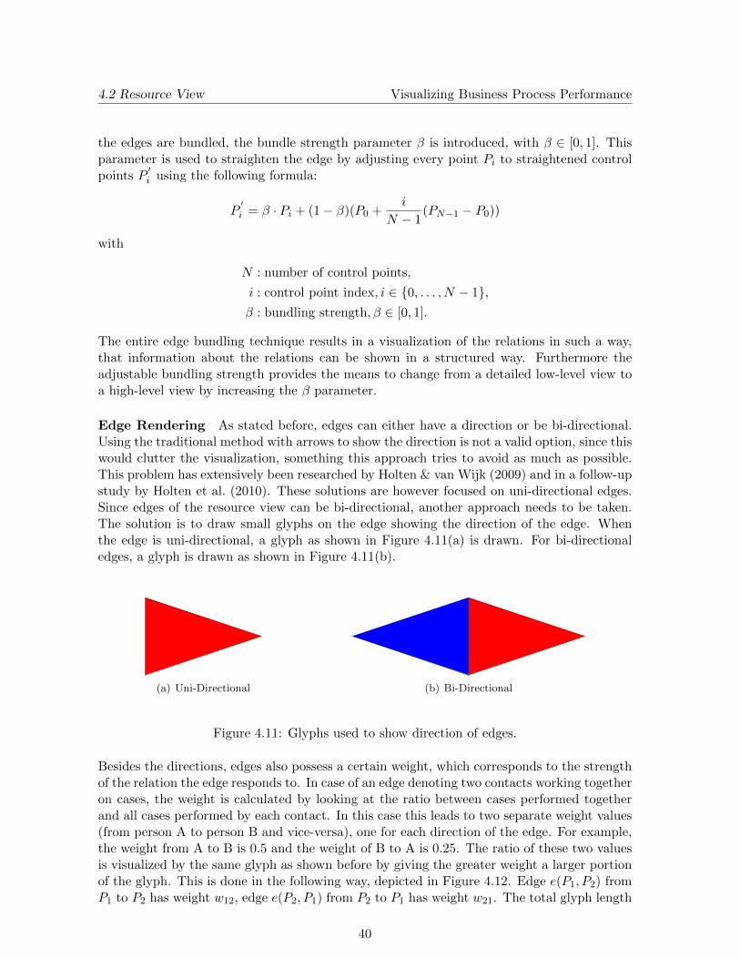
Edge Rendering As stated before, edges can either have a direction or be bi-directional.Using the traditional method with arrows to show the direction is not a valid option, since thiswould clutter the visualization, something this approach tries to avoid as much as possible.This problem has extensively been researched by Holten & van Wijk (2009) and in a follow-upstudy by Holten et al. (2010). These solutions are however focused on uni-directional edges.Since edges of the resource view can be bi-directional, another approach needs to be taken.The solution is to draw small glyphs on the edge showing the direction of the edge. Whenthe edge is uni-directional, a glyph as shown in Figure 4.11(a) is drawn. For bi-directionaledges, a glyph is drawn as shown in Figure 4.11(b).
(a) Uni-Directional (b) Bi-Directional
Figure 4.11: Glyphs used to show direction of edges.
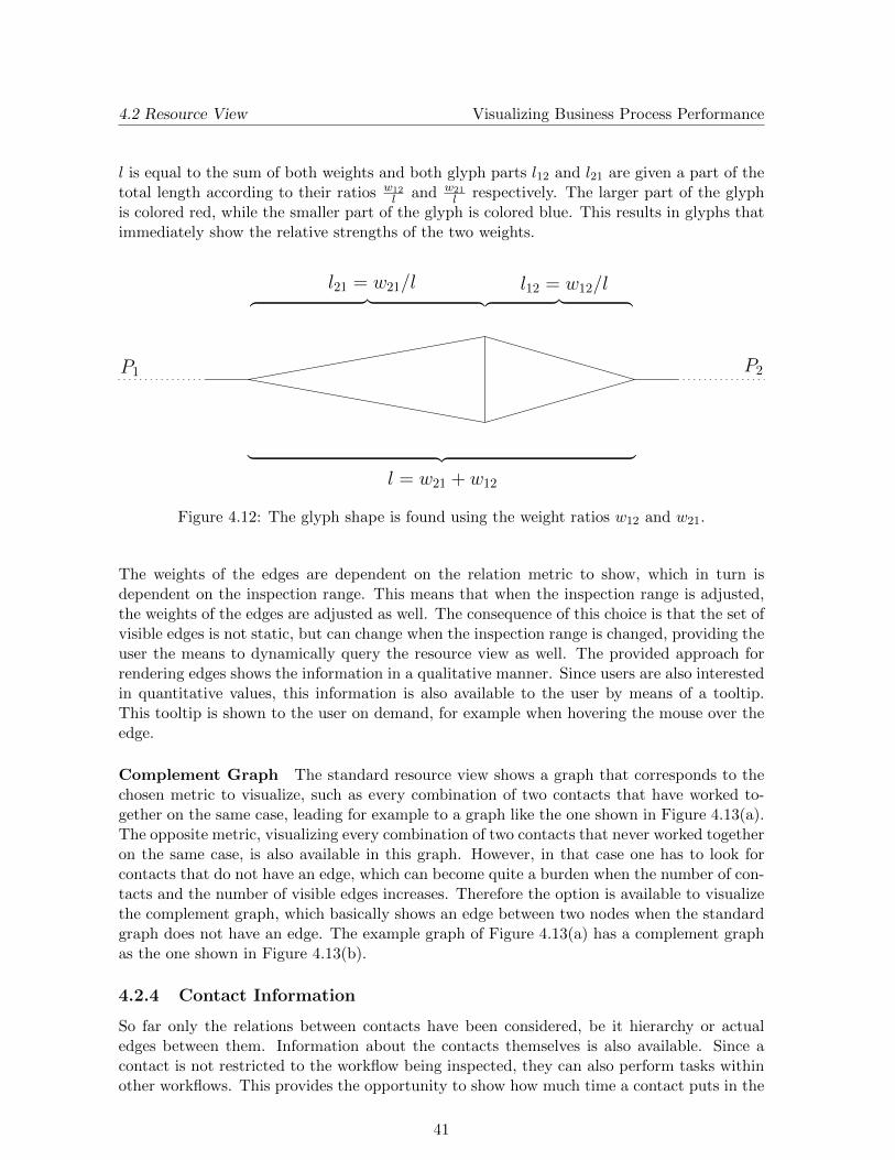
Besides the directions, edges also possess a certain weight, which corresponds to the strengthof the relation the edge responds to. In case of an edge denoting two contacts working togetheron cases, the weight is calculated by looking at the ratio between cases performed togetherand all cases performed by each contact. In this case this leads to two separate weight values(from person A to person B and vice-versa), one for each direction of the edge. For example,the weight from A to B is 0.5 and the weight of B to A is 0.25. The ratio of these two valuesis visualized by the same glyph as shown before by giving the greater weight a larger portionof the glyph. This is done in the following way, depicted in Figure 4.12. Edge e(P1, P2) fromP1 to P2 has weight w12, edge e(P2, P1) from P2 to P1 has weight w21. The total glyph length
40
4.2 Resource View Visualizing Business Process Performance
l is equal to the sum of both weights and both glyph parts l12 and l21 are given a part of thetotal length according to their ratios w12
l and w21l respectively. The larger part of the glyph
is colored red, while the smaller part of the glyph is colored blue. This results in glyphs thatimmediately show the relative strengths of the two weights.
P1 P2
︷ ︸︸ ︷
︸ ︷︷ ︸
︷ ︸︸ ︷
l = w21 + w12
l21 = w21/l l12 = w12/l
Figure 4.12: The glyph shape is found using the weight ratios w12 and w21.
The weights of the edges are dependent on the relation metric to show, which in turn isdependent on the inspection range. This means that when the inspection range is adjusted,the weights of the edges are adjusted as well. The consequence of this choice is that the set ofvisible edges is not static, but can change when the inspection range is changed, providing theuser the means to dynamically query the resource view as well. The provided approach forrendering edges shows the information in a qualitative manner. Since users are also interestedin quantitative values, this information is also available to the user by means of a tooltip.This tooltip is shown to the user on demand, for example when hovering the mouse over theedge.
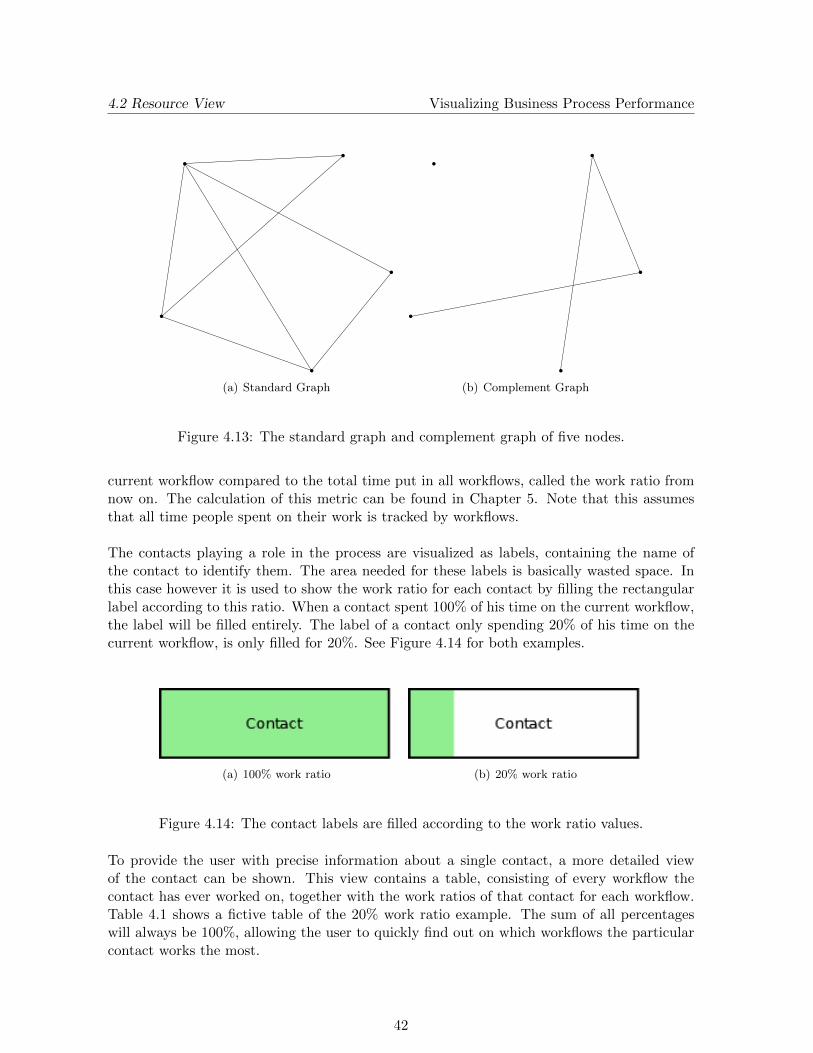
Complement Graph The standard resource view shows a graph that corresponds to thechosen metric to visualize, such as every combination of two contacts that have worked to-gether on the same case, leading for example to a graph like the one shown in Figure 4.13(a).The opposite metric, visualizing every combination of two contacts that never worked togetheron the same case, is also available in this graph. However, in that case one has to look forcontacts that do not have an edge, which can become quite a burden when the number of con-tacts and the number of visible edges increases. Therefore the option is available to visualizethe complement graph, which basically shows an edge between two nodes when the standardgraph does not have an edge. The example graph of Figure 4.13(a) has a complement graphas the one shown in Figure 4.13(b).
4.2.4 Contact Information
So far only the relations between contacts have been considered, be it hierarchy or actualedges between them. Information about the contacts themselves is also available. Since acontact is not restricted to the workflow being inspected, they can also perform tasks withinother workflows. This provides the opportunity to show how much time a contact puts in the
41
4.2 Resource View Visualizing Business Process Performance
(a) Standard Graph (b) Complement Graph
Figure 4.13: The standard graph and complement graph of five nodes.
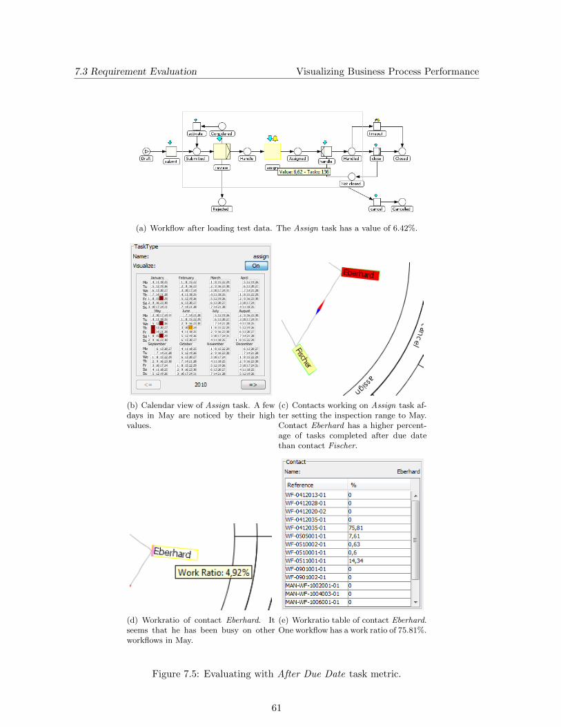
current workflow compared to the total time put in all workflows, called the work ratio fromnow on. The calculation of this metric can be found in Chapter 5. Note that this assumesthat all time people spent on their work is tracked by workflows.
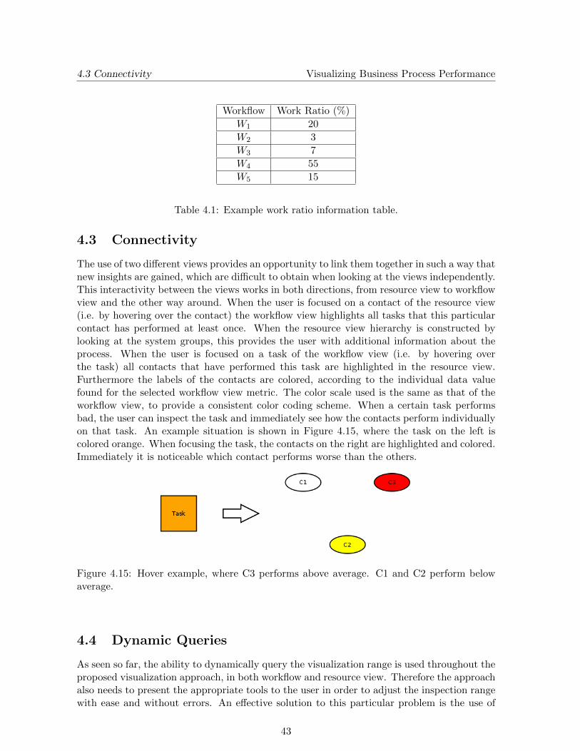
The contacts playing a role in the process are visualized as labels, containing the name ofthe contact to identify them. The area needed for these labels is basically wasted space. Inthis case however it is used to show the work ratio for each contact by filling the rectangularlabel according to this ratio. When a contact spent 100% of his time on the current workflow,the label will be filled entirely. The label of a contact only spending 20% of his time on thecurrent workflow, is only filled for 20%. See Figure 4.14 for both examples.
(a) 100% work ratio (b) 20% work ratio
Figure 4.14: The contact labels are filled according to the work ratio values.
To provide the user with precise information about a single contact, a more detailed viewof the contact can be shown. This view contains a table, consisting of every workflow thecontact has ever worked on, together with the work ratios of that contact for each workflow.Table 4.1 shows a fictive table of the 20% work ratio example. The sum of all percentageswill always be 100%, allowing the user to quickly find out on which workflows the particularcontact works the most.
42
4.3 Connectivity Visualizing Business Process Performance
Workflow Work Ratio (%)
W1 20
W2 3
W3 7
W4 55
W5 15
Table 4.1: Example work ratio information table.
4.3 Connectivity
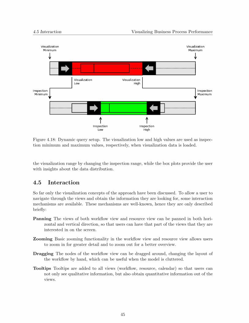
The use of two different views provides an opportunity to link them together in such a way thatnew insights are gained, which are difficult to obtain when looking at the views independently.This interactivity between the views works in both directions, from resource view to workflowview and the other way around. When the user is focused on a contact of the resource view(i.e. by hovering over the contact) the workflow view highlights all tasks that this particularcontact has performed at least once. When the resource view hierarchy is constructed bylooking at the system groups, this provides the user with additional information about theprocess. When the user is focused on a task of the workflow view (i.e. by hovering overthe task) all contacts that have performed this task are highlighted in the resource view.Furthermore the labels of the contacts are colored, according to the individual data valuefound for the selected workflow view metric. The color scale used is the same as that of theworkflow view, to provide a consistent color coding scheme. When a certain task performsbad, the user can inspect the task and immediately see how the contacts perform individuallyon that task. An example situation is shown in Figure 4.15, where the task on the left iscolored orange. When focusing the task, the contacts on the right are highlighted and colored.Immediately it is noticeable which contact performs worse than the others.
Figure 4.15: Hover example, where C3 performs above average. C1 and C2 perform belowaverage.
4.4 Dynamic Queries
As seen so far, the ability to dynamically query the visualization range is used throughout theproposed visualization approach, in both workflow and resource view. Therefore the approachalso needs to present the appropriate tools to the user in order to adjust the inspection rangewith ease and without errors. An effective solution to this particular problem is the use of
43
4.4 Dynamic Queries Visualizing Business Process Performance
a range slider, of which an example is shown in Figure 4.16. A range slider has a minimumand maximum value that are fixed and a low and high value that can be adjusted. The lowand high value specify the range selected. The user can control the thumbs to adjust the lowand high values independently, but is also able to slide the selected range in its entirety, forexample to slide through a series of 2-month intervals.
Figure 4.16: A range slider.
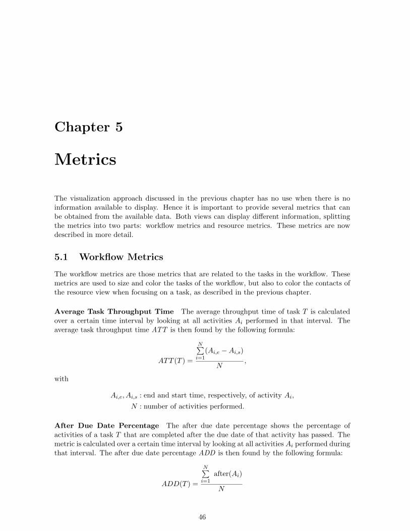
When using such a range slider, the user effectively selects a subset of the entire availablerange. Since the research problem identifies three ranges – where the inspection range is asubset of the visualization range and the visualization range is a subset of the data range – tworange sliders are used to select the appropriate ranges. The first slider, called the visualiza-tion range slider, is used to select the needed visualization range from the data range. Whenthe visualization range is chosen, the inspection range slider is used to select the inspectionrange. The decision to have two separate sliders is made because when the visualization rangeis chosen, data needs to be loaded and preprocessed. Since this can take some time and sinceit is possible the user is not interested in the entire data range, the user should be allowed toselect the actual visualization range before the preprocessing step starts.
Figure 4.17: Box plot showing five interesting values.
Since processes can change over time and thus also the number of cases performed per timeinterval, it is safe to assume that cases are not uniformly distributed over time. Thereforeinformation about this case distribution should be given to the user. Since this informationis relevant when using the range sliders, it is visualized inside the range sliders as box plots.Box plots, or box-and-whisker plots, were first described by Tukey (1977) and are commonlyused for visualizing distribution information in an effective way. They are easy to draw andunderstand, but still provide the information that is needed. The box plot values are cal-culated according to the minimum and maximum range values of the corresponding rangeslider. The information provided by the box plots is shown in Figure 4.17.
Both range sliders display a box plot, resulting in a setup like shown in Figure 4.18. As soonas the correct range of the visualization range slider is set, the data is preprocessed and theinspection range slider is initialized. At this point the user can dynamically search through
44
4.5 Interaction Visualizing Business Process Performance
Figure 4.18: Dynamic query setup. The visualization low and high values are used as inspec-tion minimum and maximum values, respectively, when visualization data is loaded.
the visualization range by changing the inspection range, while the box plots provide the userwith insights about the data distribution.
4.5 Interaction
So far only the visualization concepts of the approach have been discussed. To allow a user tonavigate through the views and obtain the information they are looking for, some interactionmechanisms are available. These mechanisms are well-known, hence they are only describedbriefly:
Panning The views of both workflow view and resource view can be panned in both hori-zontal and vertical direction, so that users can have that part of the views that they areinterested in on the screen.
Zooming Basic zooming functionality in the workflow view and resource view allows usersto zoom in for greater detail and to zoom out for a better overview.
Dragging The nodes of the workflow view can be dragged around, changing the layout ofthe workflow by hand, which can be useful when the model is cluttered.
Tooltips Tooltips are added to all views (workflow, resource, calendar) so that users cannot only see qualitative information, but also obtain quantitative information out of theviews.
45
Chapter 5
Metrics
The visualization approach discussed in the previous chapter has no use when there is noinformation available to display. Hence it is important to provide several metrics that canbe obtained from the available data. Both views can display different information, splittingthe metrics into two parts: workflow metrics and resource metrics. These metrics are nowdescribed in more detail.
5.1 Workflow Metrics
The workflow metrics are those metrics that are related to the tasks in the workflow. Thesemetrics are used to size and color the tasks of the workflow, but also to color the contacts ofthe resource view when focusing on a task, as described in the previous chapter.
Average Task Throughput Time The average throughput time of task T is calculatedover a certain time interval by looking at all activities Ai performed in that interval. Theaverage task throughput time ATT is then found by the following formula:
ATT (T ) =
N∑i=1
(Ai,e −Ai,s)
N,
with
Ai,e, Ai,s : end and start time, respectively, of activity Ai,
N : number of activities performed.
After Due Date Percentage The after due date percentage shows the percentage ofactivities of a task T that are completed after the due date of that activity has passed. Themetric is calculated over a certain time interval by looking at all activities Ai performed duringthat interval. The after due date percentage ADD is then found by the following formula:
ADD(T ) =
N∑i=1
after(Ai)
N
46
5.2 Resource Metrics Visualizing Business Process Performance
where
after(Ai) =
{1 if Ai,e > Ai,d
0 otherwise
with
Ai,e, Ai,d : end and due time, respectively, of activity Ai,
N : number of activities performed.
Deviating from Due Date This metric also looks at the due time of activities of a taskT and looks how much the actual end times of activities deviate from the due times. It iscalculated over a certain time interval by looking at all activities Ai performed during thatinterval. Deviating from due date DDD is then found by the following formula:
DDD(T ) =
N∑i=1
(Ai,e−Ai,s
Ai,d−Ai,s)
N
with
Ai,s, Ai,e, Ai,d : start, end and due time, respectively, of activity Ai,
N : number of activities performed.
The results found with this formula lie in the range (0.0 . . . 1.0) when activities are endedbefore the due date and in the range (1.0 . . .∞) when activities are ended after the due date.To provide a better scale for these results, a logarithmic scale is used by taking the log2 fromthe outcome. By doing so, the results found with this formula lie in the range (−∞ . . . 0)when activities are ended before the due date and in the range (0 . . .∞) when activities areended after the due date.
Average Case Throughput Time The average case throughput time is similar to theaverage task throughput time described before, besides it is calculated on case level instead ofactivity level. The throughput time found in this way therefore adheres to the entire workflowinstead of one specific task. It is calculated over a certain time interval by looking at all casesCi performed during that interval. The average case throughput time ACT of a workflow Wis found by the following formula:
ACT (W ) =
N∑i=1
(Ci,e − Ci,s)
N,
with
Ci,e, Ci,s : end and start time, respectively, of case Ci,
N : number of cases performed.
5.2 Resource Metrics
The resource metrics consist of metrics for both the edges and the individual contacts ofthe resource view. An overview of some metrics concerned with social networks, is given byvan der Aalst et al. (2005).
47
5.2 Resource Metrics Visualizing Business Process Performance
Joint Cases The joint cases metric calculates whether two contacts ca and cb work togetheron the same case. The weight of the relation is dependent on the number of cases on whichthey work together and on the total number of cases each contact has worked. The joint casesmetric JC is found by the following formula:
JC(ca, cb) =
M∑i=1
joint(ca, cb, Ci)
M
where
joint(ca, cb, Ci) =
{1 if (∃A1,A2 : A1,C = A2,C = Ci : A1,c = ca ∧A2,c = cb)0 otherwise
with
Ai,c : contact that performed activity Ai,
Ai,C : case that activity Ai belongs to,
M : number of cases performed by ca.
The consequence of this is that the joint case metric is different for JC(ci, cj) and JC(cj , ci),since the number of cases M can be different for both contacts.
Work Ratio The work ratio metric looks at the time spent on activities by a contact ca inone workflow, compared to time spent on activities in all workflows. To calculate the workratio WR, the following formula is used:
WR(c) =
N∑i=1
(Ai,e −Ai,s)
W∑i=1
(A′i,e −A
′i,s)
with
Ai : activity of the current workflow,
Ai,e, Ai,s : end and start time, respectively, of activity Ai,
N : number of activities performed by c in current workflow,
A′i : activity of all workflows,
A′i,e, A
′i,s : end and start time, respectively, of activity A
′i,
M : number of activities performed by c in all workflows.
48
Chapter 6
Prototype Design
To test and evaluate the visualization approach discussed in the previous chapter, a prototypewas designed and implemented in the Axxerion software. This prototype consists of animplementation of the two proposed views, as well as a user interface to control these views.The prototype was implemented in the Java programming language. The prefuse 1 toolkit,which provides a visualization framework for the Java programming language, was used tocreate the visualizations. First a look at the architecture of the prototype is discussed, followedby a description of the Graphical User Interface (GUI).
6.1 Architecture
In this section the relevant architecture of Axxerion is described as well as the basic architec-ture of the prototype. Since Axxerion is web based, the database containing the event logs isstored at server-side. The visualization part is run at client-side as a Java applet, resulting ina client-server architecture (Lethbridge & Laganiere 2005), as shown in Figure 6.1. The bluecomponents are the components from the Axxerion software which are left unchanged, whilethe red components are components from the Axxerion software where changes have beenmade. The green components are newly developed components, implemented from scratch.
Server The major server-side component of interest to this work is the Workflow Visualizer.This component is called by the servlet, providing the query to be calculated by the server. Allmetrics described in Chapter 5 are calculated by this component. Furthermore it provides theworkflow definition, containing the places, tasks, etc. of the process, and the resource networkdefinition, containing the contacts and hierarchy. The functionality of this component can beeasily extended by implementing new queries.
Client The architecture of the client applet is also shown in the figure. The communicationto the server is performed by the Drawing Reader component, which is also the componentthat stores the visualization data. The main visualizations are provided by the WorkflowView and Resource View components, which provide the workflow view and resource viewrespectively. The user interface to display and control these views is stored in the mainapplet class Drawing Applet. Since the different components have to communicate and to
1www.prefuse.org
49
6.2 Prototype Visualizing Business Process Performance
Figure 6.1: System architecture of the prototype. In this client-server architecture, the serverruns the axxerion software and gathers the required data. The client runs the user interfaceand the visualizations.
avoid tight coupling between these components, communication has been established basedon the Observer pattern (Lethbridge & Laganiere 2005). By using this pattern, all components(both views and GUI components) can register themselves to other components which theywant to observe. When this component is changed, the observer will be notified of this changeand can act accordingly. By using this pattern, coupling between the different components isreduced. Furthermore the system becomes easier to extend and maintain when additions tothe system are implemented later on.
6.2 Prototype
When starting the prototype, the screen looks similar to the one shown in Figure 6.2. The leftpart of the screen is occupied by the resource view. The right part displays the workflow viewat the top and the User Interface (UI) components at the bottom. To avoid that users have towait for all metric information to load before displaying anything, no additional informationis loaded at the start. This in turn means that no color, size or other properties are used atthe start until additional information is loaded via the UI. At this point the user can lookat the different views, drag objects of the workflow view around and see basic connectivityinformation when hovering over nodes of both views.
The user interface, displayed at the bottom-right of the prototype, provides the means to in-spect the current workflow. The user interface is split into several components. The right-handside consists of three tabbed panes. The left-hand side changes while using the prototype,depending on the state of the prototype, and can display one of three possible toggle panels.
50
6.2 Prototype Visualizing Business Process Performance
Figure 6.2: Prototype at start-up.
Most UI components are disabled until data has been loaded using the Load tab. After thatthe display will look somewhat like Figure 6.3.
6.2.1 Tabbed Panes
Three tabbed panes provide the necessary control of the prototype in a space-efficient way,leaving sufficient space available for the main views. These tabbed panes – Inspect, Load andSettings – are shown together in Figure 6.4.
The Inspect Tab, shown in Figure 6.4(a), contains all components a user needs to accessquickly when inspecting the process. The color scale legend at the top presents the currentcolor scale used. The inspection range slider provides the user the option to adjust the in-spection range, which will impact both workflow and resource views on the rest of the screen.The Inspect Tab also provides a slider to adjust the bundle strength of the edges of the re-source view and two toggle buttons: Block View and Complement Graph. The block viewbutton enables/disables the block view of the workflow view, the complement graph buttonenables/disables showing the complement graph in the resource view.
The Load Tab, shown in Figure 6.4(b), contains components to load data and select metrics.The visualization range slider is used to adjust the visualization range. When the load databutton is pressed, the visualization range selected is loaded. Furthermore the user can selectwhich metrics he wants to inspect for tasks and contact relations. The change of metric willimmediately change the visualization. When new metrics are added later on, they can beadded to the combo box, making the UI easily extended.
The Settings Tab, shown in Figure 6.4(c), contains components to change the settings of
51
6.2 Prototype Visualizing Business Process Performance
Figure 6.3: Prototype after data loading is complete.
(a) Inspect Tab (b) Load Tab (c) Settings Tab
Figure 6.4: Tabbed panes of the prototype.
the prototype. Three toggle buttons are used to select whether colorblind mode is on/offand whether to show/hide the contact groups and contact relations. Furthermore the defaultlocation of the main views can be switched, so that the workflow view is shown on the left andthe resource view is shown on the top-right. Besides these toggle buttons, the tab contains abutton to reset the layout of the workflow view to the default layout. This function is usefulwhen the workflow view has been changed a lot by dragging nodes around.
52
6.2 Prototype Visualizing Business Process Performance
6.2.2 Toggle Panels
The space on the left-side of the UI is reserved for the toggle panels – General, Task andContact – which are shown to the user depending on whether the user has selected a task orcontact or not. All three toggle panels are shown in Figure 6.5
(a) General Panel (b) Task Panel (c) Contact Panel
Figure 6.5: Tabbed panes of the prototype.
The General Panel, shown in Figure 6.5(a), is used to show general information about theprocess when no task or contact is selected. The panel shows basic workflow information,like the name and reference. Furthermore it provides information about the workflow cases:the number of cases, but also the average, minimum and maximum (case) throughput times.Besides the information, the panel is used to display a progress bar when loading data, pro-viding some feedback to the user during the loading time.
The Task Panel, shown in Figure 6.5(b), is provided to the user when a task is selected onthe workflow view by clicking on it. It contains the name of the task and a toggle buttonto enable/disable whether the task has to be visualized. If this is disabled, both color andsize are not used to draw the task anymore. To highlight disabled tasks, they are drawnwith red lines, so a user can identify them quickly. The main component of the panel is thecalendar view as described before. By using the buttons below the calendar, the user canswitch between years to gain an in-depth view of the selected task.
The Contact Panel, shown in Figure 6.5(c), is provided to the user when a contact is selectedin the resource view by clicking on it. Besides the name of the selected contact, the panelshows a table with every workflow the contact has ever worked on, as described during thevisualization approach.
53
Chapter 7
Evaluation
The implemented prototype as discussed in the previous chapter is used to evaluate howthe proposed solution performs. In order to do so, a workflow, called Issue, was chosenwith appropriate data that is representative for the general case. The approach is testedby using the prototype and evaluating whether the information is available in an intuitivemanner. Furthermore it is evaluated whether the approach allows users to inspect the datainteractively. Finally it is checked whether the requirements mentioned in Section 3.1 aremet.
7.1 Test Data
The workflow used to evaluate the proposed solution is the Issue workflow, which is shownin Figure 7.1.
Figure 7.1: The Issue Workflow.
The process described by this workflow is the following. A request is submitted by a contactby Submit, after which it is reviewed by Review. At this point three things can happen:
• The request is being rejected. Nothing is done with the request and the case is closed
54
7.2 Prototype Testing Visualizing Business Process Performance
Cases Completed 130
Tasks Completed 540
Contacts 6
Table 7.1: Characteristics of Sample Data.
at Rejected.
• The request is being considered. At this point the request is looked upon after which itis activated by Activate and once more submitted for review by Review.
• The request is being handled. The request is then assigned by Assign to a contact tohandle it.
After the request is handled by Handle, once again three things can happen:
• The request is not closed by Close. This can happen when the issue of the request isnot fixed, meaning the request needs to be handled once more.
• The request is closed by Close. The issue has been fixed and the case is closed at Closed.
• A timeout occurs by Timeout. Now the request and the case are closed at Closed.
Furthermore the opportunity exists to cancel the request by Cancel during the entire timebetween submission and closing of the request. In this case the case is closed at Cancelled.
Besides the workflow definition sample data is used for evaluating the prototype. The char-acteristics of this data are summed up in Table 7.1.
7.2 Prototype Testing
To test the approach, the prototype first is used with the data set described above. Afterstartup, the screen looks like shown in Figure 7.2, showing the workflow in the top-rightcorner and displaying the resource view on the left, containing six contacts. Since the sampledata set is created for the year 2010, the visualization range is set to 2010 (Figure 7.3). Thetask metric is set to Average Throughput Time.
The general information immediately provides some information about the cases that flowthrough the workflow. Looking at the workflow view, the size of tasks clearly shows whichtasks are the most interesting ones i.e. the ones having the highest throughput time. One ofthose tasks is Review, which takes on average 28.18 hours to complete, which is found in thetooltip when hovering over it (Figure 7.4(a)). To get a more detailed view, the block view ischosen at first. Since there are no months in which the throughput time really peaks, thereis no block that seems important right away. Hence, the task is clicked to have a look atthe calendar view. Most days of the year have around the same color, mostly lying between25-40 hours. However, there is one outlying day with a value of 424 hours in September(Figure 7.4(b)). Since the color scale (Figure 7.4(c)) is set up in such a way that the highestvalues are colored bright red, this outlying day skews the color scaling. To find out some more
55
7.2 Prototype Testing Visualizing Business Process Performance
Figure 7.2: Overview of the test case.
Figure 7.3: Visualization Range is set to 2010.
about this interesting value, the inspection range is set to September. Immediately the aver-age color value of Review has changed, since the average throughput time of the task is higherduring that month. Hovering over the task, reveals that two contacts are responsible for thetask and that Fischer has an extremely high throughput time in September (Figure 7.4(d)).The work ratio of Fischer during that month is 100%, meaning he has not worked on otherworkflows.
This case clearly shows a weakness of the average throughput time metric. For example con-sider the case where a task takes on average 10 hours and has one outlying value of 11 hours.Since the maximum value of the color scale is set to 424 hours, the difference of 1 hour isnot noticeable. It could be the case however that this 1 hour difference is far more significantthan the huge outlying value of the Review task.
Both After Due Date Percentage and Deviating Due Date metrics do not have this partic-ular problem, since they provide ratio data instead. Hence, the After Due Date Percentage
56
7.2 Prototype Testing Visualizing Business Process Performance
metric is chosen. The interesting tasks are again visible immediately by their size and nowa look is taken at the Assign task. Over the entire visualization range, Assign has a valueof 6.42% (Figure 7.5(a)). Using the block view, one month clearly jumps out of the picture,somewhere around April-June. Looking at the calendar view, it is noticed that a few daysin May have high values (Figure 7.5(b)). Setting the inspection range to May and hoveringover Assign shows that Eberhard and Fischer have performed tasks, where Eberhard has thehighest percentage of tasks completed after due date, which is around 75% (Figure 7.5(c)).Since Eberhard only has a work ratio of 4.92% during May (Figure 7.5(d)), it seems thathe has been too busy with other workflows. Clicking on his label, reveals that he has beenworking on many different workflows during the entire year (Figure 7.5(e)). One workfloweven has a work ratio of 75.81%. This can for example mean that Eberhard has too manytasks to do or that there is a problem in another workflow, taking too much time.
This case shows the strength of the approach when using a ratio scale. Not only is a problemspotted in one of the tasks, by inspecting the data also possible causes of the problem arefound. Having to gather such information out of the event logs would take huge amounts oftime or could even be impossible to manage properly.
One particular issue needs some extra attention, which is the scalability of the approach.Although the Issue workflow is useful to test the effectiveness of the prototype, there are alsoprocess involving far more tasks and contacts. When increasing the number of tasks/placesin the workflow, the size of the workflow increases. By using the zooming options available,the entire workflow can stay visible on the screen. When the number of nodes increases evenfurther and further, details like the size and color of tasks are harder and harder to grasp. Inthis case zooming in on the workflow and using the panning options is an outcome. Whenincreasing the number of contacts, the number of labels in the resource view increases as well.Since all labels are drawn on the edge of a circle, there is plenty of room to start with. If thenumber of contacts increases even further, the radius of the radial layout can be increased.The down-side of this approach is that a bigger circle means that labels become harder to read.This problem can once again be solved by panning and zooming, although the overview of theentire resource network is lost then. Luckily in the Axxerion context the majority of work-flows are relatively small and the number of contacts relevant to a workflow is not large either.
To also get some feedback from the users that eventually would use the system, two con-sultants affiliated with Axxerion have been asked to work with the prototype and give theiropinion on the visualization tool during a feedback session. First of all they were enthusiasticabout the opportunities such a visualization tool can provide in addition to the standard re-ports that are already available in Axxerion. Especially the possibility to dynamically inspectthe data range instead of the static view of standard charts like bar charts and pie charts wasappreciated. The number of options the user has available turned out to be quite overwhelm-ing at start, but with a small introduction to the visualization this was solved quickly. Oneissue that arose during the session is about the block view. Although it is a useful methodto detect patterns during a year and throughout multiple years, it can be difficult to decidethe exact month when a block of interest is found. Using the calendar view at this point canprovide some help, although this provides day-based values instead of the month-based valuesof the block view.
57
7.3 Requirement Evaluation Visualizing Business Process Performance
Since the consultants also look at the approach from a practical view point, lots of commentswere about issues specific to the Axxerion software, like the exact data values from thedatabase that were used and how to integrate the tool in the rest of the software using filtering.Although these issues are specific to Axxerion, the session also led to some opportunities foradditions and future work. First of all the work ratio used in the resource view did not proveto be very useful in this particular case, since the way the start date and end date are storedin the system does not correspond to the way they are used. A task with a difference betweenstart date and end date of 10 hours does not immediately imply for example that the contacthas been busy working on that task for 10 hours. It could also mean that he waited 8 hoursand finished it in 2 hours. Since this problem can occur quite often, they were more interestedin the number of tasks a contact had performed. The largest addition however would be tohave the opportunity to not only look at the due dates of individual tasks, but also at thedue dates of sets of tasks. In this case it does not matter when one task of the set is too late,as long as in the end the entire set of tasks is on time. Working with these sets results in amore complex case of the problem.
7.3 Requirement Evaluation
The last thing to evaluate is whether the requirements Section 3.1 are fulfilled. First a lookis taken at the first five requirements:
1. The solution calculates relevant performance and organizational information from botha given process model and event log and provides this information to the user.
2. The solution contains both information about the workflow model at hand as well asthe resources playing a role in the workflow.
3. The solution allows users to inspect the information in different time intervals in aninteractive and timely manner.
4. The solution is presented as a prototype that runs within the Axxerion software.
5. The prototype runs in a Java applet and communicates with the Axxerion server toaccess the needed data.
The approach discussed in this thesis calculates both performance and organizational infor-mation and displays this in the visualization. The suggested approach also allows users toinspect this information in different time intervals in an interactive and timely manner. Aprototype is developed as a Java applet running within Axxerion, communicating with theserver to access the data. Hence, requirements 1-5 are met.
The following three requirements belong to the workflow information:
6. The workflow information shows the performance information mapped on a workflowmodel.
7. The workflow information visualization is based on the current workflow model visu-alization of Axxerion, so a user of the software does not have to learn a new modelsyntax.
58
7.3 Requirement Evaluation Visualizing Business Process Performance
8. The workflow information allows users to inspect different performance aspects of theworkflow, according to one or more performance metrics.
These three requirements are met in the workflow view, which is based on the current work-flow model visualization of Axxerion. The user can select a specific performance metric andsee the information of that metric mapped on the model of the workflow view.
The last two requirements belong to the resource information:
9. The resource information shows the hierarchy the resources belong to.
10. The resource information shows the relations between resources in the process, accordingto one or more relationship metrics.
The resource view provides the hierarchy that the resources belong to, as well as showing therelations between these resources. Thus these two requirements are met. Note that when thehierarchy does not explicitly exist, the proposed algorithm is not the best solution, weakeningthe requirement a little.
Hence the conclusion is that the requirements provided before in this thesis are all met in theproposed visualization approach and prototype.
59
7.3 Requirement Evaluation Visualizing Business Process Performance
(a) Workflow after loading test data. The Review task has a value of 28.18hours.
(b) Calendar view Of Review task after click-ing on it. The outlying value in September isimmediately noticed.
(c) Color scale For Average Throughput TimeMetric. The scale is skewed by the high value.
(d) Contacts working on Review taskafter setting the inspection range toSeptember. Contact Fischer has notworked on other workflows.
Figure 7.4: Evaluating with Average Throughput Time task metric.
60
7.3 Requirement Evaluation Visualizing Business Process Performance
(a) Workflow after loading test data. The Assign task has a value of 6.42%.
(b) Calendar view of Assign task. A fewdays in May are noticed by their highvalues.
(c) Contacts working on Assign task af-ter setting the inspection range to May.Contact Eberhard has a higher percent-age of tasks completed after due datethan contact Fischer.
(d) Workratio of contact Eberhard. Itseems that he has been busy on otherworkflows in May.
(e) Workratio table of contact Eberhard.One workflow has a work ratio of 75.81%.
Figure 7.5: Evaluating with After Due Date task metric.
61
Chapter 8
Conclusion
In this thesis an approach was developed to visualize process performance information in anintuitive and interactive manner. This visualization is based on both a given workflow processand associated event logs, containing data about the process. First a closer look was given toalready available solutions to tackle the problem, covering advantages and disadvantages ofsaid solutions. Based on the context of the problem – the Axxerion software – and the relatedwork, a thorough problem analysis led to an approach based on the multiple coordinatedviews principle. The presented approach contributes to the process performance visualizationarea in the following ways:
• The use of the overview + detail paradigm shows the performance information in ahigh-level view, allowing users to get a detailed low-level view on demand.
• Multiple views provide both a view of the workflow process and a view of the resourcenetwork. The approach connects the views in such a way that problems occurring theworkflow model can be traced to problems in the resource network.
• By allowing dynamic queries, interactive visualization can be performed on the availabledata. Traditional visualizations like the reports in the Axxerion software work withstatic visualizations, which makes it difficult for users to inspect the data for possibleproblems in the process.
The visualization is basically split into two main views – workflow view and resource view– where each view provides a different approach to the same data. Using the overview +detail paradigm the approach provides an overview of the information to start with, withmore detailed information on demand.
The first view is a workflow view, based on the current workflow model of Axxerion. Sincea constraint was that the view should be based on the current workflow model, the view issimilar to this model. Information is mapped onto the model to provide the necessary infor-mation to the user using size and color. The block view approach provides a more detailedview of tasks, dividing the available area into blocks, where each block represents a month.For an even more detailed view, a calendar view is used where information is viewed on adaily level.
The second view is a resource view, showing a social network of the organization of the processat hand. By visualizing this network with a radial tree layout, enough space is maintained
62
Visualizing Business Process Performance
for drawing the relations between contacts in the center. Since these relations can clutterthe display, the hierarchical edge bundling technique is adopted. Global contact informationis provided using the labels of the contacts, while more detailed information of a contact isprovided in the form of a table.
The ability to dynamically query the data is provided by the use of range sliders, an intu-itive user interface component to rapidly adjust data ranges. These sliders are enhanced byboxplots, displaying the distribution of the data. By using two range sliders, the user is ableto select the data range he is interested in before the preprocessing step starts. Especiallywhen dealing with large amounts of data, this pre-selection can save time by omitting datathe user is not interested in.
To evaluate the approach, a prototype was implemented in the Axxerion software, which wasused on a test data set. The evaluation has proven that the approach provides an effectivesolution to the problem, since it allows users to dynamically query the available data and lo-cate problems occurring in their processes. It has also shown that the choice of metric greatlyinfluences the effectiveness. Data like average throughput times can for instance be skeweredto high outlying values, although lower values could be the more interesting ones. Ratio datalike the after due date percentage does not have this problem. Furthermore potential users ofthe visualization have provided their feedback on the approach. The feedback indicates thatthe proposed approach opens up opportunities to dynamically inspect the performance ofworkflows. Most issues found during a feedback session were about specific Axxerion details,while the visualization methods used were understood quite fast.
Improvements can be made on several points. First of all the block view could be improvedsome more to provide users with the exact months when needed. At this moment it is notalways easy to see in which month an interesting value occurred. The calendar view pro-vides a better view, but is based on days instead of months. A possible solution wouldenhance the calendar view, by visualizing the aggregate value of each month (the values seenin the block view) as well. One such solution would color the labels of the months with theirrespective aggregate value or draw a small bar between the label and the actual days below it.
Secondly the hierarchy algorithm discussed in Section 4.2.2 can be improved, which wouldprovide better hierarchy groups to start with. Furthermore more attention could be given tothe performance metrics. Even though the metrics described in Chapter 5 already provideuseful information, more sophisticated metrics can probably be used, while maintaining thesame visualization techniques. One problem occurs with the Average Throughput Time met-ric when the data contains one outlying value, which influences the color scale. A solution tothis problem allows users to clamp the color scale at specific minimum and maximum values,preventing outlying values to influence the scaling too much.
An addition to the current approach allows users to drill down to the specific tasks/casesthat perform bad. Furthermore some sort of filtering could be added, so that users have theopportunity to select which contacts, tasks, cases, etc. are relevant to visualize. A final ad-dition would involve the places in the visualization as well, for example to visualize potentialbottle necks in the process.
63
Visualizing Business Process Performance
The proposed solution of this thesis focuses on one workflow process at a time, providinglittle information on how this workflow relates to others. Since an entire business process willmost likely consist of several workflows, properties of one workflow may affect other workflowsas well. Future work on the subject could be focused on the influences between workflows,providing more global information, for example by creating a resource-workflow matrix, con-taining information about how a resource of the system performs on each workflow. TheAxxerion B.V. company is positive about the outcome of this thesis and sees the potential ofsuch a visualization tool. As a result of this work, they are planning to extend the prototypeand integrate it in their software.
64
Bibliography
Adriansyah, A. (2009), Performance analysis of business processes from event logs and givenprocess models, Master’s thesis, Eindhoven University of Technology.
Borland, D. & Taylor II, R. (2007), ‘Rainbow color map (still) considered harmful’, IEEEComputer Graphics and Applications pp. 14–17.
Di Battista, G., Eades, P., Tamassia, R. & Tollis, I. (1998), Graph drawing: algorithms forthe visualization of graphs, Prentice Hall PTR Upper Saddle River, NJ, USA.
Gunther, C. (2008), Process Mining in Flexible Environments, PhD thesis, Eindhoven Uni-versity of Technology.
Hearn, D. & Baker, M. (2003), Computer Graphics with OpenGL, 3rd edn, Prentice Hall.
Holten, D. (2006), ‘Hierarchical edge bundles: Visualization of adjacency relations in hierar-chical data’, IEEE Transactions on Visualization and Computer Graphics pp. 741–748.
Holten, D., Isenberg, P., Fekete, J. & van Wijk, J. (2010), Performance Evaluation of Tapered,Curved, and Animated Directed-Edge Representations in Node-Link Graphs, TechnicalReport DH/PI/JDF/JvW/415, LaQuSo Laboratory for Quality Software, EindhovenUniversity of Technology.
Holten, D. & van Wijk, J. (2009), A user study on visualizing directed edges in graphs,in ‘Proceedings of the 27th international conference on Human factors in computingsystems’, ACM, pp. 2299–2308.
Hornix, P. (2007), Performance analysis of business processes through process mining, Mas-ter’s thesis, Eindhoven University of Technology.
Jansen-Vullers, M., Loosschilder, M., Kleingeld, P. & Reijers, H. (2007), Performance mea-sures to evaluate the impact of best practices, in ‘Proceedings of Workshops and DoctoralConsortium of the 19th International Conference of Advanced Information Systems En-gineering’, pp. 359 – 368.
Jeston, J. & Nelis, J. (2006), Business process management: practical guidelines to successfulimplementations, Butterworth-Heinemann.
Johnson, B. & Shneiderman, B. (1991), Tree-maps: A space-filling approach to the visual-ization of hierarchical information structures, in ‘Proceedings of the 2nd conference onVisualization’91’, IEEE Computer Society Press, pp. 284–291.
65
BIBLIOGRAPHY Visualizing Business Process Performance
Lee, S. & Asllani, A. (1997), ‘TQM and BPR: symbiosis and a new approach for integration’,Management Decision 35(6), 409–416.
Lethbridge, T. & Laganiere, R. (2005), Object-oriented software engineering, 2nd edn,McGraw-Hill Higher Education.
Metastorm Business Process Management (2009). http://www.metastorm.com/products/
Murata, T. (1989), ‘Petri nets: Properties, analysis and applications’, Proceedings of the IEEE77(4), 541 –580.
Petrovich, M. (1998), Performance analysis for process improvement.http://www.mvpprograms.com/docs/PPAtext.pdf.
Piessens, D. (2010), Performance analysis of business process models with advanced con-structs. 21st Australian Conference on Information Systems.
Roberts, J. & Andy, R. (2009), ‘Executive summary: Improving business pro-cesses’. http://www.gartner.com/resources/168000/168003/executive_summary_
improving__168003.pdf.
Scheer, A.-W. & Schneider, K. (2006), Aris architecture of integrated information systems,in P. Bernus, K. Mertins & G. Schmidt, eds, ‘Handbook on Architectures of InformationSystems’, International Handbooks on Information Systems, Springer Berlin Heidelberg,pp. 605–623.
Tukey, J. (1977), Exploratory data analysis, 1st edn, Reading, Mass: Assidon-Wesley Pub-lishing Co.
van der Aalst, W. (1997), Exploring the process dimension of workflow management, Technicalreport, Eindhoven University of Technology.
Van der Aalst, W. (1998), ‘The application of Petri nets to workflow management’, Journalof Circuits Systems and Computers 8, 21–66.
Van der Aalst, W. (2005), ‘Business alignment: using process mining as a tool for Deltaanalysis and conformance testing’, Requirements Engineering Journal 10(3), 198–211.
van der Aalst, W. M. P., Van Dongen, B. F., Herbst, J., Maruster, L., Schimm, G. & Weijters,A. J. M. M. (2003), ‘Workflow mining: a survey of issues and approaches’, Data andKnowledge Engineering 47(2), 237–267.
van der Aalst, W., Reijers, H. & Song, M. (2005), ‘Discovering social networks from eventlogs’, Computer Supported Cooperative Work (CSCW) 14(6), 549–593.
van Dongen, B. (2007), Process Mining and Verification, PhD thesis, Eindhoven Universityof Technology.
van Dongen, B., de Medeiros, A., Verbeek, H., Weijters, A. & van der Aalst, W. (2005), Theprom framework: A new era in process mining tool support, in G. Ciardo & P. Daron-deau, eds, ‘Applications and Theory of Petri Nets 2005’, Vol. 3536 of Lecture Notes inComputer Science, Springer Berlin / Heidelberg, pp. 444–454.
BIBLIOGRAPHY Visualizing Business Process Performance
van Dongen, B. F. (2004), Emit: A process mining tool, in ‘Application and Theory ofPetri Nets 2004, volume 3099 of Lecture Notes in Computer Science’, Springer-Verlag,pp. 454–463.
Van Wijk, J. & Van de Wetering, H. (2002), Cushion treemaps: Visualization of hierarchicalinformation, in ‘Information Visualization, 1999.(Info Vis’ 99) Proceedings. 1999 IEEESymposium on’, IEEE, pp. 73–78.
Van Wijk, J. & Van Selow, E. (1999), Cluster and calendar based visualization of time seriesdata, in ‘infovis’, Published by the IEEE Computer Society, p. 4.
Wang Baldonado, M., Woodruff, A. & Kuchinsky, A. (2000), Guidelines for using multipleviews in information visualization, in ‘Proceedings of the working conference on Ad-vanced visual interfaces’, ACM, pp. 110–119.
Ware, C. (2004), Information visualization: perception for design, Morgan Kaufmann.
Zhu, B. & Chen, H. (2005), ‘Information visualization’, Annual review of information scienceand technology 39(1), 139–177.