201
PLEASE SEE ANALYST CERTIFICATION(S) AND IMPORTANT DISCLOSURES ON THE LAST PAGE.

PLEASE SEE ANALYST CERTIFICATION(S) AND IMPORTANT DISCLOSURES ON THE LAST PAGE.

“If you would be wealthy,think of saving as well as getting”Benjamin Franklin
“Save a little money at the end of each month and at theend of the year you’ll be surprised at how little you have”Ernest Haskins
“It is a mistake to try to look too far ahead. The chainof destiny can only be grasped one link at a time”Winston Churchill
"The art of being wise is the artof knowing what to overlook"William James
“Facts are stubborn things, but statistics are more pliable”Mark Twain
"If you can find a path with no obstacles,it probably doesn't lead anywhere"Frank A Clark
“Nothing in life is to be feared, it is only to be understood.”Marie Curie

Barclays | Equity Gilt Study: 2015
24 February 2015 1
Equity Gilt Study: 60th edition This year marks the 60th anniversary of the Equity Gilt Study. The publication was initially intended to provide consistent data and analysis on long-term asset returns in the UK and the US. The UK data go back to 1899, while the US data – provided by the Centre for Research in Security Prices at the University of Chicago – begin in 1925. Over the years, the Equity Gilt Study has evolved also to provide in-depth analysis of medium- and long-term economic and market issues across regions and asset classes. This year’s edition is richer than ever, building on themes we have addressed in the past, such as demographics and long-term dynamics in interest rates and returns on emerging markets assets, as well as introducing new themes, such as the impact and future of oil prices and the rise of India.
Chapter 1 argues that the world is on the cusp of a demographic inflection point that stands to reverse the strong secular factors that have kept asset prices well-supported – and real interest rates correspondingly low – for the past 30 years. Since the early 1980s, demographic trends have put upward pressure on saving rates (and, by extension, asset prices), as rising old-age dependency ratios have been more than offset by a growing share of mature, high-saving workers. However, the demographic boost to saving has peaked and will turn markedly less supportive.
Chapter 2 constructs a model to assess the sustainability of lower oil prices and their effects on the global economy and markets. The medium-term drivers of the model suggest that lower oil prices are likely to persist, as will relatively lower bond yields. Demand growth is slowing, driven by energy efficiency and lower aggregate growth globally. Moreover, oil should remain a well supplied market, with US tight oil keeping OPEC in check.
Chapter 3 looks at the evolution of EM economies since the start of the boom years in the early 2000s. It argues that the external backdrop for emerging markets has grown tougher since 2011 and will likely remain so over the next few years. However, looking at EM in the context of a global portfolio, the gap between EM and DM risk premia is significant, suggesting that allocations to EM assets make sense even if asset returns are likely to be much lower than in the boom years.
Chapter 4 looks at the trends in global potential growth in the wake of severe recessions and financial crises. It shows that potential growth in developed economies has fallen by 1.5pp since 1999. The effects of the recession accounted for about two-thirds of the decline, with the remaining one-third pre-dating the global recession. Policymakers’ efforts to stem the tide have been effective, but are unlikely fully to reverse the slowing in trend output growth before the end of the decade.
Chapter 5 considers the broader implications of regulatory changes intended to make future financial crises less likely. Although the actions taken to date have materially improved the safety of the banking system, they have also reduced the size of the repurchase agreement market and made fixed income markets less liquid. The reduction in the supply of short-dated safe assets has resulted in a transfer of fire-sale risk from traditional sources of liquidity to less traditional ones, exposing end-investors to run risk.
Chapter 6 looks at the remarkable turnaround in India’s economy and argues that the takeoff is buoyed by multiple structural and cyclical tailwinds. Finally, Chapter 7 considers the benefits of FX hedging in international multi-asset portfolios.
We sincerely hope that you find the data and the essays interesting, as well as useful inputs to your investment decisions.
Larry Kantor Jim McCormick Head of Research, Barclays Head of Asset Allocation, Barclays

Barclays | Equity Gilt Study: 2015
24 February 2015 2
CONTENTS
Chapter 1 Population dynamics and the (soon-to-be-disappearing) global ‘savings glut’ 4 The world is on the cusp of a demographic inflection point. Demographic pressure on saving has peaked and is turning markedly less supportive of saving in every country or region that we examine except India, Brazil and Mexico (individually and collectively too small to offset developments in China and the advanced economies). This includes China, which has developed an important role in the global saving and investment balance. Demographics are thus likely to generate a strong secular headwind for asset prices in the coming decades, as they have generated tailwinds in the past two decades.
Chapter 2 Adjusting to a world of lower oil 26 The magnitude and speed of the collapse in oil have roiled markets; only the selloffs in 1997-98, 1986 and 2008 were larger than the recent one. In order to assess the sustainability of lower oil prices and their effects on the global economy and markets, we construct a model to explain real WTI oil prices based on the global demand-supply balance for crude, global IP, OPEC market share and real US power prices. The medium-term drivers in our model suggest that lower oil prices are likely to persist. Demand growth is slowing, driven by energy efficiency and lower aggregate growth globally. Moreover, oil should remain a well supplied market, with US tight oil keeping OPEC in check.
Chapter 3 EM is still an attractive asset class 60 The external backdrop for EM economies has grown tougher since 2011 and will likely remain so over the next few years. On the domestic front, progress on structural reforms has been disappointing. But EM economies have evolved since the start of the boom years in the early 2000s, with many of their macroeconomic and financial vulnerabilities now reduced. When we look at EM in the context of a global portfolio, the gap between EM and DM risk premia is significant. Thus, we think allocations to EM assets make sense even if asset returns are likely to be much lower than in the boom years.
Chapter 4 The great destruction 84 Severe recessions intertwined with financial crises have historically been associated with lost output and slower potential growth. In applying a uniform framework across seven developed economies that account for nearly half of world output, we estimate that potential growth in these economies has fallen by 1.5pp since 1999 and, in turn, has reduced global potential growth by 0.7pp. Our finding that slower growth in developed economies could slow global growth by 0.7pp is of similar magnitude to the effect of a slowing China on global growth. Slower potential growth in developed economies and a decelerating Chinese economy have reduced global potential growth by 1.5pp – a significant deceleration.
Chapter 5 The decline in financial market liquidity 107 Banking regulation has intensified since the financial and sovereign crises in a global effort to improve the safety and stability of the financial system. New regulations have materially improved the stability of the financial system. However, in an effort to reduce the risk of future fire-sales financed by short-term debt, they have also reduced the supply of safe, short-term, liquid assets such as repurchase agreements, causing them to trade at lower yields (and, by extension, higher prices). The reduction in the supply of short-dated safe assets has caused them to trade at lower yields and resulted in a transfer of fire-sale risk from traditional sources of liquidity to less traditional ones, exposing end-investors to run risk.

Barclays | Equity Gilt Study: 2015
24 February 2015 3
Chapter 6 India: A step change 123 India is enjoying multiple cyclical and structural tailwinds: the government under Prime Minister Modi is pursuing an aggressive reform agenda to spur growth and employment; India’s central bank is enjoying a fresh credibility boost; and the country’s twin deficits are improving fast. Meanwhile, India remains among the biggest beneficiaries of lower commodity prices, with inflation softening materially. We expect India’s economy to post average real growth of 7-8% annually in the coming decade – very strong for an economy exceeding USD 2trn and with a 3% share of global GDP. Against a backdrop of generally subdued global growth, including in China, we think India could emerge as the world’s fastest-growing economy in the years ahead.
Chapter 7 FX risk in a multi-asset portfolio 143 After falling to historically low levels between mid-2012 and mid-2014, cross-asset volatility has risen recently. We think a trend rise in volatility may be forthcoming in a highly asynchronous global economic recovery, with elevated macroeconomic uncertainty related to demographic and structural changes across major economies. An increase in foreign exchange market volatility has the potential to erode returns and raise portfolio-level volatility in international multi-asset portfolios. We construct a standard equities/bonds international portfolio and find that higher risk-adjusted returns are achieved, both ex ante and ex post, through FX hedging of the bond portfolio.
Chapter 8 UK asset returns since 1899 152 UK equities had a lacklustre year and underperformed other developed market indices in 2014. UK nominal total returns were just 1.2%, compared to 2.6% for the German DAX and 10.5% for US equities. The underperformance occurred despite a reasonable growth backdrop. The UK was one of the few economies where the consensus growth forecast was revised higher last year. Fixed income and credit had a very strong performance in 2014 as a result of the deflationary fears fuelled by the oil price decline. Nominal and inflation-linked gilts posted their best returns since the Euro sovereign debt crisis in 2011.
Chapter 9 US asset returns since 1925 157 US equity returns in 2014 outperformed both developed and emerging markets by a wide margin as domestic growth remained robust. Despite periodic drags from global growth concerns and deflationary fears, the upward momentum was maintained throughout the year. Fixed income markets followed the trends in the UK: nominal bonds were the best performing asset of 2014, producing a 23% real total return, in sharp contrast to the -13% of the previous year, when investors first digested the prospect of monetary policy normalisation by the Fed.
Chapter 10 Barclays Indices 161 We calculate three indices showing: 1) changes in the capital value of each asset class; 2) changes to income from these investments; and 3) a combined measure of the overall return, on the assumption that all income is reinvested.
Chapter 11 Total investment returns 186 Our final chapter presents a series of tables showing the performance of equity and fixed-interest investments over any period since December 1899.

Barclays | Equity Gilt Study: 2015
24 February 2015 4
CHAPTER 1
Population dynamics and the (soon-to-be-disappearing) global ‘savings glut’ • Transitory, loosely-speaking ‘cyclical’ factors are almost certainly contributing to
the existing very low interest rate environment. But world interest rates have been fluctuating around a strongly declining trend for more than 30 years. It is a question of no minor significance whether asset markets will remain so well-supported – and real interest rates correspondingly depressed – in the decades ahead. Bond markets are pricing historically low real interest rates for the foreseeable future. But we think that a key secular driver of world asset markets has peaked and will be fading strongly in the years to come.
• While other forces have also been at work, we believe (and present some evidence) that demographic pressure on world saving has been an important secular driver of upward pressure on asset prices – and downward pressure on interest rates – in recent decades. Since the early 1980s, demographic trends have put upward pressure on saving rates (and, by extension, asset prices) in every systemically important region of the world except Japan, as rising old-age dependency ratios have been more than offset by a growing share of mature, high-saving workers.
• In the past 20 years, the country with the largest such shift was China, with Korea a fairly close second. This suggests that demographic pressures have been a major driver of the boom in emerging Asian, and specifically of Chinese savings.
• However, the world is on the cusp of a demographic inflection point. Demographic pressure on saving has peaked and is turning markedly less supportive of saving in every country or region that we examine except India, Brazil and Mexico (individually and collectively too small to offset developments in China and the advanced economies). This includes China, which has grown into an immensely important part of the global saving and investment balance. Demographics are thus likely to generate a strong secular headwind for asset prices in the coming decades, as they have generated tailwinds in the past two decades.
Michael Gavin
+1 212 412 5915
FIGURE 1 Real interest rates have been trending down since the early 1980s.
FIGURE 2 Demographic support for saving has recently been growing since the 1980s, but is on the cusp of a profound reversal
Note: Short term interest rate deflated by forward 12-mo rate of CPI inflation. Source: Barclays Research
Note: As we explain below, we use the difference between population share of mature workers (40-64) and the elderly (65+) as an indicator of demographic support for saving. The world average is weighted by 2014 GDP. Source: Barclays Research
-20%
-15%
-10%
-5%
0%
5%
10%
1960 1966 1973 1980 1987 1993 2000 2007 2014
US UK DE JP
0.00
0.05
0.10
0.15
0.20
0.25
0.30
0.35
0.40
1950 1960 1970 1980 1990 2000 2010 2020 2030
Projected Mature Elderly Difference

Barclays | Equity Gilt Study: 2015
24 February 2015 5
Markets embraced ‘secular stagnation’ in 2014 Were it not for the historic collapse in the price of oil that began in mid-2014, the year would likely be remembered as the one in which financial markets began to price something like secular stagnation into global financial markets. In light of the cyclical headwinds that became apparent in Europe, Japan, and China during the first half of 2014, it is not surprising that the short end of many yield curves priced lower interest rates. Certainly, the 2014 rally in global bond markets has been validated by the dovish monetary policy actions of recent months, including the launch of full-blown quantitative easing by the ECB, the establishment of negative deposit rates in the euro area, Switzerland, Sweden and Denmark, and more conventional forms of easing in China, India, and many smaller economies.
What we find more striking about the 2014 bond market rally is the degree to which it extended to the long end of real interest rate curves. In the US, the 5y5y forward TIPS rate has fallen from nearly 2% at end-2013 (itself low by historical standards) to less than 0.4% in January 2015 (Figure 3). The collapse in the UK 5y5y real rate is even more extreme, leaving it at an unprecedented negative 0.7% from around 1% a year earlier and much higher in previous years.
Moreover, the collapse in forward rates has not been limited to the 5-year point. Inflation-linked swap markets are now pricing strongly negative real rates beyond 10 years in the euro area and the UK. 10-year forward real rates are positive for the US and Japan, but at historically abnormally low levels (Figure 4).
These abnormally low forward rates likely reflect, in part, negative term-risk premia, as bond duration in the US, UK, ‘core’ Europe and Japan has established itself as a negative-beta, safe-haven asset class. But it seems unlikely that the term premium is sufficiently negative to generate an implied rate forecast anywhere near historically normal real interest rates. One interpretation of current bond market pricing is that participants are expressing the view that real interest rates are likely to be abnormally low for a very long time – much longer than it takes for transitory or, loosely-speaking, ‘cyclical’ developments to play out. In this article, we take issue with this view.
Growth and real rates – sifting cyclical from secular In our view, the most plausible catalysts of the 2014 bond market rally were downward revisions to growth expectations on a weather-related hitch in the US recovery, the adverse
Although overshadowed by the oil price collapse, the 2014 bond market rally seems to have marked a fundamental rethink about the outlook for asset markets
FIGURE 3 Forward real interest rates plummeted in 2014
FIGURE 4 10-year forward rates suggest low real rates ‘forever’
Note: 5y5y forward real interest rates computed from inflation-linked bond market. Click here to view an interactive Barclays Live Chart Source: Bloomberg, Barclays Research
Note: 10-year forward real interest rates from inflation–linked swap market. Source: Barclays Research
Bond markets are pricing unusually low real interest rates into the very distant future
-2%
-1%
0%
1%
2%
3%
4%
5%
Dec-96 Dec-99 Dec-02 Dec-05 Dec-08 Dec-11 Dec-14
US5x5 UK5x5
-1.5%
-1.0%
-0.5%
0.0%
0.5%
1.0%
US Euro area UK Japan

Barclays | Equity Gilt Study: 2015
24 February 2015 6
economic response to April’s tax hike in Japan, a fading of the weak recovery that had seemed to be in place in Europe, and growing evidence that Chinese demand was decelerating faster than expected. Weak inflationary pressures likely contributed to the rally, but should probably be viewed more as a reflection of the weak cyclical context than as an independent driver.
However, although growth disappointed, the bottom did not fall out of the world economy in 2014. From end-2013 to the present, for example, Barclays’ forecasts of 2014 and 2015 world GDP growth have fallen by 0.3pp; it would surprise us if consensus forecasts fell much further. This raises the question: Why would so modest a deceleration, which likely reflects cyclical developments, at least in part, have affected investors’ assessment of the long-run outlook enough to generate such a strong bond-market response? A reasonable answer, in our view, is that the coincidence of sluggish output growth with robust labor market recoveries (in the US and UK) or stable labor markets (as in Japan and China) led investors to buy into the view that sluggish output growth in the recent economic recovery reflected a weak ‘secular’ outlook, attributable to some combination of demographic and productivity-related factors. For what it’s worth, we have a lot of sympathy with the view that trend growth has slowed significantly in most systemically important economies, a view that is laid out in convincing detail in Gapen (2015).
If a downgrade of market participants’ assessment of the secular outlook for growth was indeed a market theme in 2014, the relevant question would seem to be what sort of downgrade seems plausible and how large the impact on asset prices might be in the long run. We think this is not quite the right question, and are not going to address it here.
It is true that some basic economic theory provides reason to believe that the economic growth rate and the real interest rate are positively related, although the strength of the theoretical relationship is sensitive, in particular, to assumptions about how savings are determined. But the same theories suggest that, even if we abstract from ‘cyclical’ and focus on ‘secular’ drivers of interest rates, as we wish to do here, interest rates and asset prices are also influenced by many other factors.
Experience suggests that these other factors loom large in practice and, as a result, that the empirical relationship between economic growth and real interest rates is not strong. In two recent analyses of US economic history, for example, Bosworth (2014) found a weak link between economic growth and real interest rates, while Hansen and Seshadri (2013) found a negative long-run relationship.1 We suspect that the intuitive presumption of a strong link between trend growth and the real interest rate is at least partly due to a failure to distinguish completely between ‘cyclical’, mainly demand-related, fluctuations in the rate of growth and ‘secular’ variations, which are longer-lasting and driven predominantly by the economy’s capacity to supply output. A boom in demand will naturally elicit a rise in the rate of interest; it is far less clear that rapid trend growth in supply capacity has the same implication.
International comparisons also provide weak evidence, at best, that variations in trend growth are a powerful driver of the equilibrium real interest rate. Interest rates have (for example) been consistently high in Brazil, and low in China and Korea, even though trend growth has been substantially higher in China and Korea. The key difference, in our view, is that in Brazil, domestic saving is very low compared with underlying investment demand; in China and Korea, the opposite is true.
Thus, we think a more promising approach to understanding the outlook for real interest rates (and asset prices more broadly) is to focus on the drivers of world saving and investment. (Of course, the trend rate of growth can be introduced into this framework as one driver of saving, investment, and asset prices.) This is conventional; for example, the IMF recently adopted a broadly similar framework.2 Our analysis differs from the IMF’s in its more concentrated focus
1 Barry Bosworth “Interest Rates and Economic Growth: Are They Related?”, 2014, Brookings Institution, and Bruce Hansen and Ananth Seshadri “Uncovering the Relationship Between Real Interest Rates and Economic Growth, 2013, University of Michigan”. 2 “Perspectives on Global Real Interest Rates”, in IMF World Economic Outlook, April 2014.
Disappointment in 2014 global growth may have been a catalyst for the bond market rally…
But we do not think that a slowdown in trend growth provides a fully convincing explanation for low real interest rates.

Barclays | Equity Gilt Study: 2015
24 February 2015 7
on the systemically significant economies of the world and on what we think is a particularly powerful driver of the recent and prospective savings/investment balance: the evolution of population structures globally. We think this more sharply focused discussion is warranted by the powerful and, we suspect, still under-appreciated, influence that population dynamics have had and may have on financial markets in the decades ahead.
This is not, of course, to suggest that demographic trends are the only relevant drivers of interest rates and asset prices. In the immediate future, the weak cyclical backdrop associated with the rebalancing in China, de-leveraging and reflation in the euro area, and still incomplete recovery from the 2008-09 financial collapse, will continue to exert a powerful influence over monetary policy and real interest rates around the world. Some longer lasting, more ‘secular’ drivers also point toward low interest rates, at least on high-quality, liquid, ‘safe haven’ assets. Indeed, we have addressed some of these drivers in recent editions of the Equity Gilt Study. (On the so-called ‘safe asset shortage’, see for example Gavin, Ghezzi, Brown and Gregory (2012) and Gapen (2013).)
But during the past 30 years, powerful demographic trends have combined with these other drivers, providing steadily increasing support for asset markets and downward pressure on interest rates. The reversal of this demographic support for saving and, by extension, asset markets is at hand. Although it will be slow-acting, we believe that the ebbing demographic tide will transform the investment landscape as powerfully as the ‘global savings glut’ shaped the landscape of recent decades.
Global saving and investment: The 21st century landscape We set the stage with a quick review of global saving and investment. In the past 20 years, the economic and financial landscape has been transformed by the rise of emerging Asia, and, above all, China, as a systemically important part of the world economy. Nowhere is this more evident than in calculations of global saving and investment. The magnitude of the transformation has not lost its capacity to startle and deserves some attention.
International comparisons of production and demand are complicated by index-number problems created by changes in relative prices (in this case, changes in real exchange rates and in the relative price of investment goods). In Figure 5, we construct a measure of real investment that is as closely tied to the rate of physical capital formation as we can make it.3 This measure of real investment has risen from roughly 22% of world real GDP in 1995 to
3We begin with real investment as published by the national statistical office, for example, bn 2005 JPY for Japan. We then transform this series into 2014 local-currency prices using the deflator for investment spending (except in China, where this is not published and we use the GDP deflator). This is a level adjustment only, and leaves growth rates unchanged. We then transform 2014 local currency data into USD using the 2014 USD exchange rate.
For 30 years, an increasingly supportive demographic context has combined with other drivers to deliver ever-lower real interest rates.
But demographic support for asset markets has peaked, and demographics will turn decisively less supportive in coming decades.
Real investment has trended higher, driven predominantly by China
FIGURE 5 Real investment has risen faster than real GDP in the past two decades, led by China
Note: Real investment as share of world real GDP. Source: Barclays Research
0.00
0.05
0.10
0.15
0.20
0.25
1995 2000 2005 2010
China Other emerging US Euro area, Japan, UK
Barclays | Equity Gilt Study: 2015
24 February 2015 8
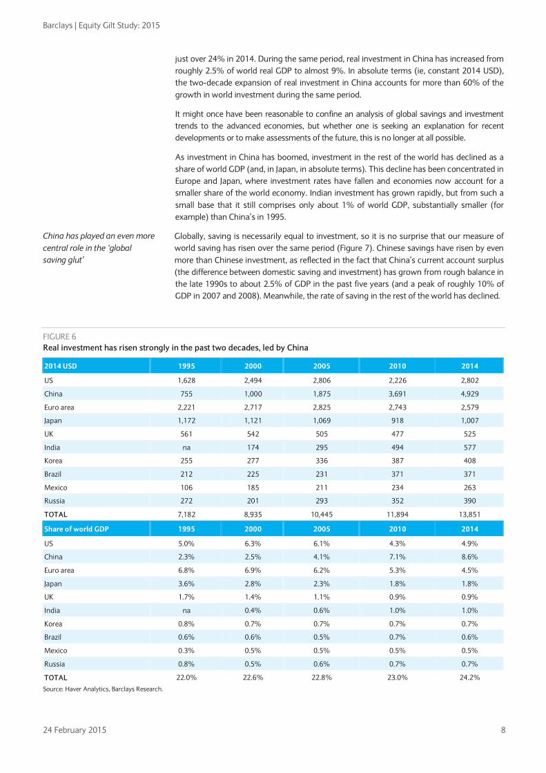
just over 24% in 2014. During the same period, real investment in China has increased from roughly 2.5% of world real GDP to almost 9%. In absolute terms (ie, constant 2014 USD), the two-decade expansion of real investment in China accounts for more than 60% of the growth in world investment during the same period.
It might once have been reasonable to confine an analysis of global savings and investment trends to the advanced economies, but whether one is seeking an explanation for recent developments or to make assessments of the future, this is no longer at all possible.
As investment in China has boomed, investment in the rest of the world has declined as a share of world GDP (and, in Japan, in absolute terms). This decline has been concentrated in Europe and Japan, where investment rates have fallen and economies now account for a smaller share of the world economy. Indian investment has grown rapidly, but from such a small base that it still comprises only about 1% of world GDP, substantially smaller (for example) than China’s in 1995.
Globally, saving is necessarily equal to investment, so it is no surprise that our measure of world saving has risen over the same period (Figure 7). Chinese savings have risen by even more than Chinese investment, as reflected in the fact that China’s current account surplus (the difference between domestic saving and investment) has grown from rough balance in the late 1990s to about 2.5% of GDP in the past five years (and a peak of roughly 10% of GDP in 2007 and 2008). Meanwhile, the rate of saving in the rest of the world has declined.
FIGURE 6 Real investment has risen strongly in the past two decades, led by China
2014 USD 1995 2000 2005 2010 2014
US 1,628 2,494 2,806 2,226 2,802
China 755 1,000 1,875 3,691 4,929
Euro area 2,221 2,717 2,825 2,743 2,579
Japan 1,172 1,121 1,069 918 1,007
UK 561 542 505 477 525
India na 174 295 494 577
Korea 255 277 336 387 408
Brazil 212 225 231 371 371
Mexico 106 185 211 234 263
Russia 272 201 293 352 390
TOTAL 7,182 8,935 10,445 11,894 13,851
Share of world GDP 1995 2000 2005 2010 2014
US 5.0% 6.3% 6.1% 4.3% 4.9%
China 2.3% 2.5% 4.1% 7.1% 8.6%
Euro area 6.8% 6.9% 6.2% 5.3% 4.5%
Japan 3.6% 2.8% 2.3% 1.8% 1.8%
UK 1.7% 1.4% 1.1% 0.9% 0.9%
India na 0.4% 0.6% 1.0% 1.0%
Korea 0.8% 0.7% 0.7% 0.7% 0.7%
Brazil 0.6% 0.6% 0.5% 0.7% 0.6%
Mexico 0.3% 0.5% 0.5% 0.5% 0.5%
Russia 0.8% 0.5% 0.6% 0.7% 0.7%
TOTAL 22.0% 22.6% 22.8% 23.0% 24.2%
Source: Haver Analytics, Barclays Research.
China has played an even more central role in the ‘global saving glut’

Barclays | Equity Gilt Study: 2015
24 February 2015 9
FIGURE 7 China’s contribution to global saving has been even more significant
Note: Ratio of regional saving to regional GDP. In all cases the rate of national saving is measured as the rate of investment plus the current account surplus. Source: Barclays Research
Demographics and saving – Concepts and measurement There is much that conventional models of national saving do not fully explain. But one prediction of basic ‘life-cycle’ theories of consumption is generally borne out by the data. This is that individual saving rates tend to be hump-shaped, rising from a fairly low level in young adulthood to a peak in late adulthood, then declining after retirement. This pattern creates a presumption that national savings rates may be correlated with the national age structure.
To explore this idea, we need to quantify the demographic structure of a population. The age composition of a population is a distribution, not a number, and for purposes of discussion or statistical analysis the distribution needs to be condensed into a reasonably compact set of numbers. This involves compromises and arguably a degree of over-simplification. Here is how we approached the problem:
The interplay between the high saving of mature workers and the lower saving of the elderly population is the central theme of this article, so we start with measures of the share of mature (presumably high-saving) workers and elderly (presumably lower-saving) people. It is conventional to identify ‘the elderly’ with the share of the population aged 65 and older. We adopt this conventional measure, which seems sensible and allows us to compare our results with the many other studies that include the ratio in their analysis. But we should bear in mind that the measure may be culture-bound (since not every society has a conventional retirement age of about 65) and obscures potentially important variations of saving rates within the population that we categorize as ‘elderly’.4
We identify ‘mature workers’ as those aged 40-64, roughly corresponding to the second half of a typical individual’s working life. This division is equally arbitrary and also obscures likely differences in saving behaviour within the categories ‘young worker’ and ‘mature worker’. Thus, these ratios should be viewed as indicators of broad trends in population dynamics, not precise measures that capture every relevant detail of the demographic structure.
Having simplified a complex reality by focusing on these two ratios, it will be useful in much of the ensuing discussion (eg, in most of the graphical analysis that follows) to simplify it even further with a single number that summarizes the overall effect of the two interacting demographic terms. We do this as follows:
4 For example, Poterba, Venti and Wise (2011) find that retired households tend not to draw down their housing or other assets to support consumption in the early years of retirement, and seem to do so in response to health-related shocks later in retirement.
0.00
0.10
0.20
0.30
0.40
0.50
0.60
1995 2000 2005 2010
World China Ex-China
The hump-shaped behaviour of saving over the life cycle suggests that the national rate of saving should be correlated with age structure.
We expect that mature workers save a lot, and the elderly population saves less.

Barclays | Equity Gilt Study: 2015
24 February 2015 10
The underlying idea is that the saving rate of economy ‘i’ in period ‘t’ is something like:
𝑆𝑖𝑡 = 𝑎 + 𝑏 𝑀𝑖𝑡 − 𝑐 𝐸𝑖𝑡 + 𝑜𝑡ℎ𝑒𝑟 𝑑𝑟𝑖𝑣𝑒𝑟𝑠𝑖𝑡
Here 𝑀𝑖𝑡 is the share of mature workers and 𝐸𝑖𝑡 is the share of the elderly in the population.
This bivariate approach is fine for statistical analysis of the sort that we report in the appendix. One obvious way to estimate the overall effect of the population structure on saving propensities would be to estimate the parameters ‘b’ and ‘c’ (or use estimates from existing studies, if available) and compute a synthetic measure: 𝐷𝑖𝑡 = 𝑏� 𝑀𝑖𝑡 − �̂� 𝐸𝑖𝑡 . The problem with this is that the proposed measure of demographic pressure is too dependent on a necessarily incomplete and fallible empirical study.
If the coefficient ‘b’ is not much different from ‘c’, then the difference between the share of mature workers and of the elderly is a natural measure of overall demographic pressure on saving: 𝐷𝑖𝑡 = (𝑀𝑖𝑡 − 𝐸𝑖𝑡). There is no theoretical reason to believe that this should be the case, but in our statistical analysis we find that it is a very reasonable approximation. So, in what follows, we take a two-track approach. In the scatter charts with which we illustrate relationships and in order to structure the subsequent discussion of historical and prospective trends, we use the difference between the shares of mature workers and of the elderly as a measure of overall demographic pressure on saving. In the more formal statistical work that is reported in the appendix, we analyze the separate influences of the two ratios.
Demographics and saving – How strong is the link? There are many studies of the determinants of national saving and some of these introduce demographic factors as a potential driver. (A number of these studies are discussed in the appendix to this chapter. The old-age dependency ratio is included far more often than a measure of high-saving, mature workers.) But there is no consensus on the strength of the link between age structure and saving. Thus, we begin with a look at 10 systemically important economies that comprise the lion’s share of global output, saving, and investment.
The economies that we included in our analysis are the US, the euro area, China, Japan, the UK, India, Korea, Brazil, Mexico, and Russia. We generally split our 20-year sample (1995-2014) into four five-year subsamples to smooth out some high-frequency fluctuations and, perhaps, measurement errors, that may contaminate annual data. Not all of the countries provide complete estimates of the income side of the national income accounts, so we have estimated national saving as the sum of domestic investment and the current account balance.
In Figure 8, we plot for each of these four periods and 10 economies the rate of saving against our measure of demographic pressure on saving. There is clearly much about national saving that is not explained by this measure of demographic pressure, but there is also a strong, positive relationship, as the simple theory would suggest.
In fact, the size of the simple co-movement between demographics and saving illustrated by Figure 7 is suspiciously large.5 This turns out to be caused by a very strong correlation between demography and saving across our 10 economies. (Figure 9) We view the magnitude of this cross-economy co-movement with some skepticism. The long-run cross-country correlation is driven largely by China and Korea (the highest-saving observations in the upper right portion of Figure 9), where savings have likely been high during the past 20 years for other reasons in addition to demographics. With such a small number of economies in the analysis, the possibility of at least partly spurious, or accidental, correlation is strong.
5 In theory, the slope of the trend line should be something like the difference between the saving rates of mature workers and of the elderly.
For graphical analysis, we use the difference between the shares of mature workers and of the elderly in the total population.
Existing studies have focused on the old-age dependency ratio, and generally find that an increase in this ratio is associated with lower saving.
With no strong empirical consensus on the strength of the link between age structure and saving, we examine 10 systemically significant regions

Barclays | Equity Gilt Study: 2015
24 February 2015 11
FIGURE 8 Demographic pressures are correlated with national saving rates
FIGURE 9 20-year averages show an exaggerated (and likely spurious) co-movement
Note: We split the 1995-2014 period into four 5-year sub-periods and show the national saving rate and a measure of demographic pressure on saving for each sub-period in each of the 10 regions. Source: Barclays Research
Note: Averages for 1995-2014 . For reasons of data availability, the Russian data refer to 2005-14. Source: Barclays Research
One way to reduce this problem is to subtract the long-run average from all data from each of the five-year sub-periods. This removes persistent cross-country differences from the analysis, which is then driven by variation over time within each economy.6
Figure 10 illustrates that the co-movement between demographics and saving remains strong after removing these economy-specific ‘fixed effects’ from the data. (For readers interested in a more formal quantitative analysis, the statistical results that correspond to this illustrative chart are given in columns 2 and 3 of Figure 28 in the appendix.) The numerical analysis suggests that a one percentage point increase in our measure of demographic pressure is associated with an increase in national saving of about 0.7pp. This is plausible, in light of the theory, and broadly consistent with our reading of the evidence from other studies. The multipliers are larger if we estimate the effects of mature workers and elderly people separately, and the negative impact of a rising share of elderly appears somewhat larger than the positive impact of mature workers. But the difference between the constrained and the unconstrained estimates is not statistically significant, nor does it alter the qualitative discussion of the outlook, below.
If demographic pressures affect national saving, they should also affect the current account. Figure 11 shows that the current account has in fact been positively correlated with our measure of demographic pressure on saving (see also columns 4 and 5 of Figure 28 in the appendix). The evidence is a little more tenuous here, which is not surprising given the importance of shocks to the terms of trade, economic policy, and other sources of high-frequency fluctuations, as well as the fact that the current account depends not only on developments at home, but also in key trading partners. Still, the positive association between demographic pressure and the current account is congruent with the view that demographic pressures exert upward pressure on saving.
We have so far focused on the level of the saving rate, either in absolute terms or relative to the economy’s long run (1995-2014) average. As a test of robustness, we can also explore whether changes in demographic factors explain changes in the national or regional saving rate. This is relevant for the forward-looking discussion that follows because we are ultimately interested in understanding potential changes in saving behaviour that may be implied by forecast changes in demographic structure in the coming 10 or 20 years. In
6 In the statistical work described in the appendix, we do this with a fixed-effects estimator. In the scatter plot in Figure 10 we subtract the country-specific 1995-2014 averages for saving and demographic pressure from each observation.
0.00
0.10
0.20
0.30
0.40
0.50
0.60
0.12 0.14 0.16 0.18 0.2 0.22 0.24 0.26
S/GDP
Demographic pressure (Middle-old)
y = 2.5663x - 0.2199R² = 0.3983
0.10
0.15
0.20
0.25
0.30
0.35
0.40
0.45
0.50
0.14 0.16 0.18 0.20 0.22 0.24
S/GDP
Average (middle-old) 1995-2014
We find a strong co-movement between age structure and saving, although other drivers are also important
The idea that population structure mainly influences saving is supported by the correlation between age structure and the current account balance.

Barclays | Equity Gilt Study: 2015
24 February 2015 12
Figure 12, we show the relationship between the change from 1995 to 2014 in our measure of demographic pressure and the change in national saving over the same period.
One drawback of viewing the data this way is that we are left with only nine observations,7 which makes the correlation potentially sensitive to outliers. But for what it is worth, the resulting correlation is consistent in magnitude with the previous, arguably more robust analysis.8 It also highlights that demographic pressures go a long way toward explaining the change in saving in the country with the largest decline (Japan, in the lower left of Figure 12) and the one with the largest increase (China, in the upper right).9
FIGURE 12 Long-term changes in demographic structure have been correlated with changes in national saving rates
Source: Barclays Research
It probably comes as no surprise to most readers that Japan has been the most demographically challenged of the major economies during the past two decades. We have the impression that the exceptionally strong demographic backdrop in China has figured
7 We have no measure of saving for Russia in the early years of our sample, so Russia is not included in Figure 12. 8 The co-movement in Figure 12 suggests that a 1pp increase in our measure of demographic pressure would be associated with a 0.73pp increase in savings demand, similar to the results of the preceding analysis. 9 We note that the observed relationship is not driven by these two observations, which remains broadly similar if the China and Japan are excluded from the sample. However, as observations are dropped from an already small sample, the uncertainty surrounded the estimated co-movement naturally rises. In any event, while it is reassuring that the co-movement is not overly sensitive to their inclusion, we no strong reason to exclude China and Japan from the sample.
-0.15
-0.10
-0.05
0.00
0.05
0.10
-0.12 -0.08 -0.04 0.00 0.04 0.08 0.12
Change in national saving -
1995 - 2014
Change in demographic pressure - 1995-2014
FIGURE 10 Co-movement of saving and demographics is also strong after removing economy-specific ‘fixed effects’
FIGURE 11 Demographic pressure on saving is also associated with a current account surplus
Source: Barclays Research Source: Barclays Research
Demographic forces help explain the large decline in Japanese saving and the boom in Chinese saving of the past 20 years.
-0.08
-0.06
-0.04
-0.02
0.00
0.02
0.04
0.06
-0.06 -0.04 -0.02 0 0.02 0.04 0.06
-0.06
-0.04
-0.02
0.00
0.02
0.04
0.06
0.08
0.10
0.12 0.14 0.16 0.18 0.2 0.22 0.24 0.26
CAS/GDP
Demographic pressure (middle-old)

Barclays | Equity Gilt Study: 2015
24 February 2015 13
less prominently in academic and market analyses of China’s recent history. In our view, prospective demographic developments in China are likely to have a profound effect on global savings and world asset markets, as we discuss below.
The outlook: A disappearing ‘global savings glut’? Our data seem to be consistent with the idea that savings tend to be positively correlated with a demographic structure concentrated in mature workers, and negatively correlated with a high proportion of the elderly. We take a closer look at recent historical and prospective developments in the world as a whole and within the systemically most important countries and regions. The discussion highlights the role of population trends in the development of a global ‘savings glut’ in recent decades, and suggests that demographic pressures on saving (and, by extension, on asset markets) have peaked and are in the process of a potentially momentous reversal.
Rise and fall of emerging Asia’s ‘savings glut’ The special role of China in the global saving and investment landscape suggests that we should place it at the forefront of our discussion. Figure 13 shows historical estimates and projections of the demographic factors that we have been emphasizing. For comparison, Figure 14 shows the same demographic variables for the ‘world’ excluding China, where each country is weighted by 2014 USD GDP.
Both China and the rest of the world experienced strong upward demographic pressure on saving after the early 1980s. But the Chinese experience stands out for the magnitude of the swing, which, at more than 10pp, is more than twice the change experienced by the rest of the world. The demographic swing in China is also more recent than in the rest of the world, dating from the early 1990s, compared with the early 1980s elsewhere.
To put this swing in a rough quantitative context, we can attach the multiplier of about 0.7 suggested by the statistical work summarized above to the roughly 10pp increase in the measure of demographic pressure from 1995 to 2014, which suggests that roughly 7pp of the 10pp swing in the measured rate of Chinese saving may plausibly be attributed to the marked shift in the demographic context.
This suggests a perspective on the post-2000 investment boom in China that emphasizes a demographically induced surge in saving as the primary driver of the episode, rather than policy distortions or other drivers of investment demand. A saving-driven interpretation is supported by the contemporaneous surge in the current account surplus.
Demographic pressure on saving has peaked and are in the early stage of a profound reversal
The boom in Chinese saving of the past 20 years was associated with a surge in demographic pressure
FIGURE 13 Demographic pressures help explain the Chinese saving boom, but are poised to fade in the decades to come
FIGURE 14 The rest of the world also experienced upward demographic pressure on saving since 1980, though smaller than China’s
Source: Barclays Research Note: Average for US, Euro area, Japan, UK, India, Korea, Brazil, Mexico, and
Russia, weighted by 2014 USD GDP. Source: Barclays Research
0.00
0.05
0.10
0.15
0.20
0.25
0.30
0.35
0.40
1950 1960 1970 1980 1990 2000 2010 2020 2030
Projected Mature Elderly Difference
0.00
0.05
0.10
0.15
0.20
0.25
0.30
0.35
0.40
1950 1960 1970 1980 1990 2000 2010 2020 2030
Projected Mature Elderly Difference

Barclays | Equity Gilt Study: 2015
24 February 2015 14
Looking ahead, China’s pro-saving demographic evolution is set to reverse, starting about now, because of a projected acceleration in the share of the elderly population, combined with a sharp deceleration of growth in the share of the mature workforce.
The rest of the world is in the midst of a similar, but more complete, reversal of the demographic trend of the past two decades. Whereas China’s demographics in the next two decades are projected to remain more saving-supportive than in the 1980s and early 1990s, in the rest of the world the demographic structure is projected to shift to a substantially more saving-unfriendly composition than at any time in its post-war history. What this suggests to us is that China is likely to remain a net supplier of world savings in the years to come, but in a world where savings overall are becoming ever scarcer.
Although much smaller and systemically less significant than China, the other countries of emerging Asia that we consider here provide an interesting contrast. Korea is one of the fastest-aging societies in the world, and its age structure is projected to turn very rapidly from one of the most pro-saving in the world, to one of the least. Like China, upward demographic pressure on saving has been building rapidly in recent decades, although the surge has been less abrupt, dating from the 1970s rather than the 1990s (Figure 15). By 2035, however, the share of the elderly population is projected to rise from a moderate level by international standards to a level even higher than Japan’s, and only marginally below that of the other demographic pioneer, Germany. At the same time, the share of the population in the high-saving middle-age years is projected to decline sharply. Our summary measure of demographic pressure on saving is thus projected to drop from one of the highest in our sample of 10 economies (essentially tied with China in 2015) to one of the lowest (essentially tied with the UK and US, and only marginally more savings-friendly than Japan, by 2035).
This provides a useful context for Korea’s very large recent current account surpluses, suggesting that they may be associated with demographic pressures created by a rapidly aging population that is saving to provide for its imminent retirement.10 If so, upward pressure on saving and the current account balance is likely to plummet in the years ahead as the generation now saving for its retirement enters its lower-saving elderly stage of life.
India provides a stark contrast and, of the countries that we discuss here, is the only exception to the global demographic norm. As in the rest of the world, the share of India’s elderly population is rising (from a very low level – Figure 16). But a relatively high birth rate ensures that a large cohort of children and young people will be entering their high-saving mature working years for decades to come. The net result is that India’s demographic structure – uniquely among the 10 economies that we discuss – will become gradually more savings-friendly. In fact, by 2035, India’s demographic structure is projected to be more saving-friendly than any other region in our sample, including China. This suggests that India may be transformed into a net supplier of global savings in the decades to come, and that the current account deficits of the past may be replaced by structural surpluses.
However, from the perspective of the global ‘savings glut’ and world asset markets, India’s savings-friendly demographic backdrop is unlikely to provide a major offset to the unfavourable demographic trends in most of the world. In 2014, Indian investment comprised roughly 1% of world GDP (and Indian saving even less), compared with China’s 2.5% in 1995 and nearly 9% in 2014. Therefore, it is likely to be a long time before India’s saving is large enough to provide a meaningful offset to developments in China and the advanced economies.
10 Korea’s trading partners have been aging rapidly as well. Our point is that the associated demographic pressure on saving has been larger in Korea than in any other large economy, save China.
Demographic support for Chinese saving is beginning to fade…
… but not as fast as in the rest of the world.
Korean demographic trends help explain the large current account surpluses of recent years, and point toward a very sharp reversal in coming years.
India is the only country of the 10 we examine where demographic support for saving is projected to rise significantly in coming decades.

Barclays | Equity Gilt Study: 2015
24 February 2015 15
FIGURE 15 Korean demographics are poised for a very sharp reversal
FIGURE 16 India is a rare exception to the global demographic norm
Source: Barclays Research Source: Barclays Research
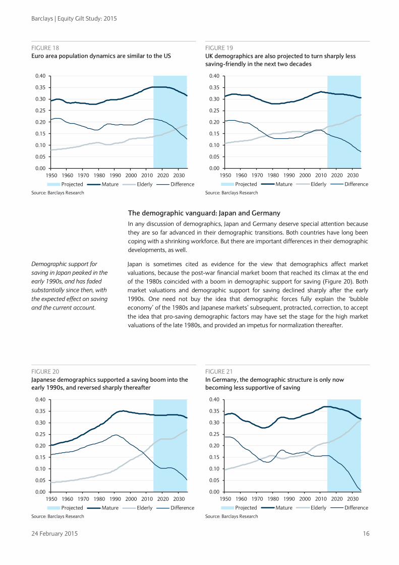
A declining demographic mainstream: the US, UK and euro area Emerging Asia looms very large in the 21st century saving/investment balance. But the US, UK, and the euro area still comprise the majority of the world’s output, saving, and investment. What happens in these economies still matters, and will continue to matter for decades.
Their demographic patterns are broadly similar. In all three advanced-economy regions, the share of the elderly is projected to rise more rapidly, while that of the mature workforce has either started to fall (US, UK) or is projected to do so soon (euro area).
FIGURE 17 US demographics have only recently turned less savings-friendly
Source: Barclays Research
As a result, after a 25-year surge in demographic support for saving, population structures are becoming strongly less saving-friendly in all three areas. Within two decades, the age structure is projected to become markedly less savings-friendly than it was in 1980.
With saving rates as low as they are in the US and UK, it is not easy to imagine a large, sustained decline from current levels. Then again, we have limited experience with demographic structures like the ones that face the advanced economies, and it may be that we will simply have to adjust our idea of what’s normal.
0.00
0.05
0.10
0.15
0.20
0.25
0.30
0.35
0.40
1950 1960 1970 1980 1990 2000 2010 2020 2030
Projected Mature Elderly Difference
0.00
0.05
0.10
0.15
0.20
0.25
0.30
0.35
0.40
1950 1960 1970 1980 1990 2000 2010 2020 2030
Projected Mature Elderly Difference
0.00
0.05
0.10
0.15
0.20
0.25
0.30
0.35
0.40
1950 1960 1970 1980 1990 2000 2010 2020 2030
Projected Mature Elderly Difference
Demographic support for saving is also projected to decline sharply in the US, UK, and euro area.
Barclays | Equity Gilt Study: 2015
24 February 2015 16
FIGURE 18 Euro area population dynamics are similar to the US
FIGURE 19 UK demographics are also projected to turn sharply less saving-friendly in the next two decades
Source: Barclays Research Source: Barclays Research
The demographic vanguard: Japan and Germany In any discussion of demographics, Japan and Germany deserve special attention because they are so far advanced in their demographic transitions. Both countries have long been coping with a shrinking workforce. But there are important differences in their demographic developments, as well.
Japan is sometimes cited as evidence for the view that demographics affect market valuations, because the post-war financial market boom that reached its climax at the end of the 1980s coincided with a boom in demographic support for saving (Figure 20). Both market valuations and demographic support for saving declined sharply after the early 1990s. One need not buy the idea that demographic forces fully explain the ‘bubble economy’ of the 1980s and Japanese markets’ subsequent, protracted, correction, to accept the idea that pro-saving demographic factors may have set the stage for the high market valuations of the late 1980s, and provided an impetus for normalization thereafter.
0.00
0.05
0.10
0.15
0.20
0.25
0.30
0.35
0.40
1950 1960 1970 1980 1990 2000 2010 2020 2030
Projected Mature Elderly Difference
0.00
0.05
0.10
0.15
0.20
0.25
0.30
0.35
0.40
1950 1960 1970 1980 1990 2000 2010 2020 2030
Projected Mature Elderly Difference
FIGURE 20 Japanese demographics supported a saving boom into the early 1990s, and reversed sharply thereafter
FIGURE 21 In Germany, the demographic structure is only now becoming less supportive of saving
Source: Barclays Research Source: Barclays Research
Demographic support for saving in Japan peaked in the early 1990s, and has faded substantially since then, with the expected effect on saving and the current account.
0.00
0.05
0.10
0.15
0.20
0.25
0.30
0.35
0.40
1950 1960 1970 1980 1990 2000 2010 2020 2030
Projected Mature Elderly Difference
0.00
0.05
0.10
0.15
0.20
0.25
0.30
0.35
0.40
1950 1960 1970 1980 1990 2000 2010 2020 2030
Projected Mature Elderly Difference

Barclays | Equity Gilt Study: 2015
24 February 2015 17
From a macroeconomic perspective, we think it is no coincidence that Japanese saving rates have fallen sharply (from roughly 30% of GDP in the mid-1990s to about 22% now), as has the Japanese current account surplus, as demographic support for saving has receded.
Germany fits less neatly into the paradigm that we have been discussing in this note. The demographic factors that we have highlighted explain neither the increase in the German rate of national saving since the early 2000s, nor the (even larger) decline in the rate of investment. Our measure of demographic pressure on saving has become marginally less saving-friendly during this period (Figure 21). Germany thus illustrates that factors other than demographics do drive saving, and that, when changes in the demographic driver are relatively small, other factors will predominate. Whether German savings can remain resilient to the very sharp decline in demographic support projected for the coming 20 years is an interesting question with non-negligible implications for the European and world economy.
The global outlook In the coming 20 years, our proposed summary indicator of global demographic support for saving is projected to decline by about 8 pp. Our statistical results suggest that this could be associated with a decline in desired saving (at any given interest rate, which is to say a leftward shift of the saving supply schedule) of nearly 6 pp of world GDP, or about 25% of world saving. Of course, we are unlikely to see world saving and investment fall by the full 25%. The effect of this leftward shift of the saving supply schedule on actual saving/investment and the real interest rate will depend upon the slopes of the investment demand and the saving supply curves, among other things. With no strong view on the magnitude of these slopes, we are not in a position to provide an estimate of the impact on asset prices and interest rates. Suffice it to say that this would be a very large shock to the balance between saving and investment if it were half the size. It compares, for example, with an increase of about 5 pp in demographic pressure during the 1980-2015 period of strong secular support for asset markets, and downward pressure on interest rates, which reflected an increase of nearly 12 pp in China and about 3.5 pp in the rest of the world.
Demographics and asset prices We have suggested that demographic factors have been a key driver of the global ‘savings glut’ of the past 20 years. Intuition and economic theory suggest that a demographically induced bulge in saving should be associated with an increase in asset prices (and a corresponding decline in the real interest rate).11 When society’s need to save is high, the price of saving vehicles will be bid up and the expected returns to saving will be depressed. It is tempting to explore whether the demographic factors that have been shown to be associated with high world saving are also associated with high asset prices. In this section, we succumb to this temptation and consider a measure of the real interest rate and equity valuations.
Real interest rates and demography With highly integrated capital markets, and over the extended periods that concern us here, real interest rates and other asset prices should be equalized to a very substantial degree. We are therefore led to focus on a measure of the world interest rate as the appropriate object of analysis. Figure 22 shows a measure of the real short-term interest rate in the US, UK, Germany and Japan. There are occasionally very sharp divergences among them, but longer-term trends appear highly correlated. (There is also almost certainly a large element of measurement error related to the high and volatile inflation rates of the 1970s and early 1980s.) In what follows, our measure of the ‘world interest rate’ is the simple average of the real interest rates depicted in Figure 22.
11 One fully articulated theoretical model of a demographic ‘cycle’ is in Geanakoplos, Magill, and Quinzii (2004), which also provides evidence that US stock valuations have been positively correlated with the ratio of high-saving mature workers. Poterba (2004) also documents that real US interest rates tend to be depressed when the share of the population aged 40-64 is high, while a high share of the elderly is associated with a rise in real interest rates, although he characterizes the correlation as weak. Bond (2009) also suggested that demographic trends would put upward pressure on real interest rates and downward pressure on equity valuations in the US and the UK.
Germany’s rise in saving (and decline of investment) since 2000 is not explained by the demographic drivers that we identify, which have been broadly stable for the past 30 years.
The projected decline in demographic support for saving is very large
Do demographic drivers affect asset prices as their impact on saving suggests?
Integrated capital markets direct our analysis to the world interest rate; cross-national differences in interest rates are very unlikely to be caused by the ‘secular’ forces that concern us.

Barclays | Equity Gilt Study: 2015
24 February 2015 18
By the same token, asset prices in the financially integrated regions of the world should be influenced by global demographic developments, rather than national. This means that there is little to be learned from cross-country variations in real interest rates and demographics, or other national economic drivers. We have little choice but to evaluate the historical co-movement of the world real interest rate and global demographic trends. With only a few decades of postwar experience available for study, the available history provides us with quite limited variation in the slow-moving demographic driver; we must therefore interpret historical co-movements with some caution.
Figure 23 shows how our measure of the real interest rate and global demographic pressure on saving have evolved since 1950, and highlights the fact that history provides us with only one long, slow, instance of deterioration in demographic pressure on saving (1950-early 1980s) followed by a long, slow increase in demographic pressure on saving, which is only very recently beginning to reverse. This reinforces the case for a cautious interpretation of the statistical correlations.
Caveats aside, the fact is that the historical co-movement has been strong. This is more clearly seen in Figure 24, which plots annual versions of the demographic data and real interest rates shown in Figure 23 against one another. There is a lot of noise around the
FIGURE 22 A measure of the short-term real interest rate
FIGURE 23 Long-term trends in world interest rates and demography
Source: Barclays Research Note: Demographic pressure is on the right axis, with scale inverted.
Source: Barclays Research
There is a strong historical co-movement between the global age structure and the real interest rate.
FIGURE 24 The real interest rate has been negatively correlated with demographic pressure on saving (annual data)
FIGURE 25 Real interest rate and saving (smoothed data)
Source: Barclays Research Source: Barclays Research
-20%
-15%
-10%
-5%
0%
5%
10%
1960 1966 1973 1980 1987 1993 2000 2007 2014
US UK DE JP
0.14
0.15
0.16
0.17
0.18
0.19
0.20
0.21
0.22-10%
-8%
-6%
-4%
-2%
0%
2%
4%
6%
8%
1960 1970 1980 1990 2000 2010
Average real interest rate Demographic pressure
-6%
-4%
-2%
0%
2%
4%
6%
8%
14% 16% 18% 20% 22%
Real rate
Demographic pressure on saving
-3%
-2%
-1%
0%
1%
2%
3%
4%
5%
0.140 0.160 0.180 0.200 0.220
Real rate
Demographic pressure on saving

Barclays | Equity Gilt Study: 2015
24 February 2015 19
trend line, reflecting other short-term drivers of real interest rates and almost certainly a lot of measurement error in the high-inflation era, but the relationship is statistically and economically significant; the demographic pressures that we have found to promote saving have also been associated with lower real interest rates.
For what it is worth, the statistical evidence presented in the appendix (Figure 29) suggests that a 1pp point increase in the share of mature workers has been associated with a 0.75pp decline in the world real interest rate. A 1pp increase in the share of the elderly has been associated with a 1.15pp increase in the real interest rate. (The estimated impact of shift in the age structure and the real interest rate is considerably smaller if the separate effects are constrained to be equal and opposite in sign, as is implicitly done in Figure 24.)
Annual data are contaminated by short-term fluctuations that have nothing to do with secular trends and by potentially large errors in the measurement of expected inflation. In Figure 25 we have tried to reduce these problems by sorting the data on demography, then averaging over groups of five annual observations apiece. ‘Smoothed’ in this way, history suggests a negative relationship between the real interest rate and age structure that is quantitatively similar to but less ‘noisy’ than the one in Figure 24. The relationship does not seem to be driven by a single outlier or cluster of outliers; if anything, the outlier seems to be attributable to the monetary disorder of the late 1970s, when demographics were unfavourable yet our measure of the world real interest rate was very low. We think it makes more sense to view this outlier as the result of monetary policy mistakes and measurement error than as a counter-example to the generally negative co-movement between of demographic pressure and the real interest rate. Eliminating this observation would considerably strengthen the observed historical co-movement between real interest rates and age structure.
Demographics and equity valuations The same theory that suggests that demographic pressure on savings should reduce the real interest rate also suggests that it should support equity valuations. This is because increased demand for saving vehicles should push all asset prices up (and expected returns down), with the additional possibility that an aging population may shift its asset allocation in the direction of less volatile, ‘safe haven’ fixed-income assets, resulting in a higher equity risk premium.12 Here, we focus on the US cyclically adjusted PE (CAPE) ratio as one plausible and easily computed valuation metric. Partly to minimize (although, as we shall see, not eliminate) problems created by the exaggerated level of equity valuations in the late 1990s bubble, we analyze the cyclically-adjusted earnings ratio, which is simply the inverse of the CAPE.
Figures 26 and 27 illustrate that, as a purely statistical matter, equity valuations have been rather strongly correlated with our measure of global demographic pressure on saving. (The corresponding statistical analysis is given in Figure 29 of the appendix.) A literal reading of Figure 27 suggests that this relationship could be non-linear; indeed, a nonlinear relationship does a much better job of ‘explaining’ the data. However, we suspect that conclusions like this would be pushing the analysis beyond what the data can support. In this analysis we rely entirely on a relatively brief (in demographic time) time series of information, during which two events dominate the valuation experience: the monetary disorder of the late 1970s and its subsequent correction (when equity valuations were exceptionally low and demographic support for saving happened to be rather weak), and the equity market bubble of the late 1990s and early 2000s (when demographic support for saving happened to be strong).
This does not mean that demographic pressures have not contributed to equity valuations in recent decades, but they were clearly not the only influences at work. Although it fits neatly with our view that demography has exerted a powerfully supportive influence on the investment climate in recent decades, we would not take the observed historical co-movement between age composition and equity valuations as a strong guide to the future until the impacts of these other factors been more convincingly controlled for than we have been able to do here.
12 See, for example, Gapen (2013).
The historical correlation between equity valuation and demographic structure is also strong, although we do not consider the historical experience useful for forecasting purposes.
Although the historical co-movement of demography and asset prices likely offers a weak guide for forecasting, it is reassuring that the historical experience is consistent with the saving approach.

Barclays | Equity Gilt Study: 2015
24 February 2015 20
Despite these limitations of the analysis, it remains noteworthy that, in the post-war period, asset prices seem generally to have had the association with demographic trends that would be expected if demographic pressure on saving were a key secular driver of asset markets.
Conclusions Demographics are not the only drivers of world savings, investment, and asset prices, but they seem to us to be among the most powerful. Moreover, we are living through a demographic inflection point with potentially profound implications for asset markets – implications that have been overshadowed by the existing demographic structure and the weak cyclical context, both of which have contributed to abnormally low real interest rates. We think it is a mistake for market participants to extrapolate current circumstances into the distant future to the extent that they seem to have done.
Demographic fundamentals have become highly supportive of world savings, and by extension asset prices, since 1980, particularly in the past 20 years. This is because the impact of a steady rise in the share of the elderly has been more than offset by a rise in the share of mature workers who save a lot. This has been a global phenomenon, with Japan the only significant exception, and has been particularly powerful in China, bedrock of the ‘global savings glut’.
But demographic support for global saving is peaking, and it will be getting steadily and substantially less supportive in the decades ahead. When this happened to Japan in the early 1990s, the Japanese saving rate fell, as expected, although asset prices in Japan and globally continued to be supported by a surge in saving in the rest of the world. It seems likely to us that, as demographic support for savings recedes in the US, Europe, UK, China, and Korea, the global ‘savings glut’ will similarly be reversed. Although the demographic tide will ebb gradually, the impact on financial markets could be very large. Our statistical analysis suggests that the decline in demographic support for saving could shift the global saving supply schedule back by almost 3% of global GDP (more than 15% of world saving) in 10 years, and nearly 6% of world GDP (roughly 25% of world saving) in 20 years. This would be a substantial dislocation of the balance between world saving and investment if it were half the size.
The fading of the ‘global savings glut’ seems very likely to put upward pressure on interest rates and downward pressure on asset prices around the world. Although we think that they should not be taken as strong guides to the impact of future, our statistical analysis of the historical co-movement between demographic pressures and asset prices corroborates this view, which seems quite inconsistent with market pricing of very low or negative 5-year and even 10-year forward interest rates.
FIGURE 26 US equity valuations have been correlated with global demographic pressures on saving
FIGURE 27 Strong co-movement between equity valuations and demographic pressure on saving
Note: Demographic pressure is on the right axis, with scale inverted. Source: Barclays Research
Source: Barclays Research
0.14
0.15
0.16
0.17
0.18
0.19
0.2
0.21
0.220%
2%
4%
6%
8%
10%
12%
14%
1960 1970 1980 1990 2000 2010
1/US CAPE Demographic pressure
0%
2%
4%
6%
8%
10%
12%
14%
14% 16% 18% 20% 22%
1/US CAPE
Demographic factor

Barclays | Equity Gilt Study: 2015
24 February 2015 21
Appendix This appendix discusses the underlying conceptual framework, and numerical results of the statistical analysis that is illustrated graphically in charts, above. We also provide some background on related studies. The literature is enormous, and we cannot possibly provide a comprehensive survey in the space available. We have attempted to put our discussion within the context of existing studies that we consider representative.
A framework: Saving, investment and global imbalances The underlying framework of analysis is simple and conventional, and requires no extended discussion. People invest to build a stock of capital for profitable production. Investment is generally thought to be a decreasing function of the real interest rate, reflecting the fact that higher real interest rates raise the opportunity cost of investment, and that higher rates of investment lower the marginal productivity of capital.
People save for many reasons, eg, to finance retirement; to self-insure against the possibility of an adverse shock to labor income, or of a potentially expensive medical event; or to leave a bequest. The supply of saving is generally taken to be positively related to the real interest rate, although theory admits the possibility of a negative relationship.13The real interest rate is the price that equates desired saving with desired investment. Although we emphasize identifiable ‘shocks’ to the supply of saving, the underlying theory relies upon the interaction of investment and saving.
At the global level (or, in an economy that neither lends nor borrows from the rest of the world) savings are necessarily equal to investment. Therefore, if we find a consistent co-movement between some fundamental driver (such as, in our case, demographic structure) and world savings, it will show an identical co-movement with world investment. The only way to tell whether the fundamental driver is shifting the saving or investment curve is to observe the impact on the real interest rate. This is certainly possible, and we take a look at co-movement between demographic trends and asset prices in the body of this article. But there are limitations of this analysis. The real interest rate is not easy to measure, especially in the years of volatile inflation before inflation-linked bonds existed. Furthermore, because major financial markets are well integrated, national interest rates are tightly linked, meaning that there is not much to be learned from cross-country variation in asset prices and demography, and there is only one historical record to rely upon.
We can learn more from economy-specific movements in the fundamental driver of saving and investment, if there is enough independent variation across countries in the underlying (demographic) driver. In the limiting case of a financially integrated economy that is too small to affect the world interest rate, a country-specific increase in saving will leave the world (and therefore the domestic) interest rate unchanged. Domestic saving would increase pari passu with the shift in the savings curve, investment (which, in this simple theory depends upon the rate of interest) would be unchanged, and the current account surplus would increase one-for-one with the increase in saving.
This is very helpful because it means that, as long as we split the world economy into reasonably small units of analysis, we can learn from cross-country experience about the co-movement between national demographic factors and national saving propensities. Partly for this reason, we consider the observed co-movement between savings and demography to be stronger evidence on the impact of demography than the direct link between world demographic factors and asset valuations.
13 The most recent and comprehensive analysis of global saving of which we are aware (Grigoli et al, 2014) finds a modest positive relationship between the rate of saving and the real interest rate. Many empirical studies have found no relationship between real interest rates and saving. For our purposes, the sensitivity of saving to the interest rate is not important, unless saving is so negatively related to the interest rate that the saving function is negatively sloped and flatter than the investment function. This leads to paradoxical results that seem implausible to us, so we leave it aside.
Barclays | Equity Gilt Study: 2015
24 February 2015 22
The theory also offers some guidance on the question whether countries like Brazil, India, and China should be considered part of ‘the world’ for purposes of this analysis. Those countries maintain sizeable barriers to and regulation of portfolio capital flows, which prevent full equalization of expected returns on otherwise similar financial securities, as we would expect among the advanced financial markets. However, all of these countries experience large fluctuations in their current account balances. If a ‘shock’ to saving or investment in one of them affects their own current account, the current account of the rest of the world must of necessity be affected equally and in the opposite direction. This will require an adjustment of the world interest rate (and, in the background, real exchange rates), even if there is no direct arbitrage between national financial markets.
The role of demographics There is a large theoretical and empirical literature on the age composition of the population and saving, and on asset prices. It is grounded in two main ideas. The first is that savings tend to rise as workers enter their mature working years, and (eventually) decline after workers pass their peak earning years and retire. This pattern follows from the permanent-income (PIH)/life-cycle hypothesis of saving, but can be viewed as an empirical phenomenon, not dependent on the precise validity of the PIH or necessarily undermined by the fact that specific versions of the PIH do not completely explain saving behaviour at the aggregate or the individual level. The second idea is that when savings increase, asset prices rise and the prospective return to saving vehicles (which we call ‘the real interest rate’ in this note) falls.
Cross-country empirical studies of saving very often include the old-age dependency ratio (conventionally defined as the share of the population aged 65 or older) as a potential driver of national saving. They generally find that an increase in the share of the elderly population significantly reduces national saving.14 A typical finding from these studies is that a one-percentage point increase in the old-age dependency ratio lowers the national rate of saving by 0.5-0.75pp. The impact of mature, high-saving workers is less consistently explored and when it is, it is measured in different ways that are difficult to compare across studies. For example, Callen, Batini and Spatafori (2004) found that national savings are negatively correlated with the old-age dependency ratio and positively correlated with the share of the working age population, but they did not distinguish between mature and younger workers. The absence of a stylized result is one of the reasons we explored the statistical relationship between saving and demography in our sample of systemically significant economies, despite the existence of so many previous studies.
There is also existing literature on the impact of demographic change on asset prices. In the early 2000s, a number of theoretical studies appeared, including Abel (2002) and Geanakoplos, Magill and Quinzii (2004). Among other things, these studies addressed the intuitively plausible objection that the age structure of a population, being forecastable, should not affect asset returns as it evolves, but should instead be priced into markets far in advance. Geanakoplos et al also argued that their measure of demographic pressure on saving (the ratio of mature workers to young workers) bore a strong positive relationship to US equity valuations in 1945-2002, and to a measure of the real interest rate after 1965 (but not before). In a purely empirical analysis of US data, Poterba (2004) found evidence that the real return on Treasury bills and bonds is positively related to the share of the elderly in the population, and negatively related to the share of middle-aged (40-64 years old) workers, in line with the simple theory, although he characterized the correlation as weak. He found stronger correlations between equity valuations (specifically, the price-dividend ratio) and demographic variables, with the share of the population in the 40-64 bracket being associated with a substantial rise in equity valuations. In the 2009 edition of this Study, Tim Bond found a strong correlation between US and UK Treasury yields and demographic factors akin to those that we discuss here, and on the basis of national demographic trends, predicted a strong rise in US and UK bond yields.
14 For recent examples of this type of analysis, see Grigoli et al (2014) and Furceri et al (2014). Grigoli et al provide a summary of 16 previous panel studies of national saving behavior.

Barclays | Equity Gilt Study: 2015
24 February 2015 23
Statistical results All statistical results reported here are based upon a sample of data that includes the US, China, the euro area, Japan, the UK, India, Korea, Brazil, Mexico and Russia. We compiled data for 1995-2014, and computed five-year averages of the data to reduce the influence of high-frequency ‘cyclical’ influences and measurement error. Data for 2014 were estimated using the four quarters through 2014:Q3 in every case except China, where we used Barclays estimates. Savings were estimated as the sum of the broadest available definition of investment and the current account surplus. Saving, investment, and the current account were all normalized by GDP. Missing data for Russia in 1995-2005 reduced our sample from 40 to 38 data points.
FIGURE 28 Co-movement of national saving and current account balances with national demographic indicators
(1) (2) (3) (4) (5)
Dependent variable Saving Saving Saving CAS CAS
Middle (40-64) 1.90 0.684
0.41
(4.40) (3.03)
(2.75)
Old (65+) -2.57 -0.962
-0.33
(-4.65) (-2.17)
(-1.73)
Middle - Old
0.6681
0.41375
(2.99)
(2.92)
Number of observations 38 38 38 38 38
Adjusted R2 0.356 0.951 0.931 0.153 0.169
Fixed effects No Yes Yes No No Note: t-statistics are in parentheses. Source: Barclays Research
Column 1 of Figure 28 shows the simple relationship between the demographic variables that we emphasize and the rate of saving. (This is numerical analogue of the scatter plot in Figure 8, except that the impact of mature worker and the elderly are not constrained to be equal and opposite in sign, as they implicitly are in the scatter plot.) The estimated coefficients are statistically significant at standard significance levels, and the signs are in line with the theory. As we discuss in the text, the coefficients are larger than seem plausible, in light of the theory. We think that this arises from unobserved country-specific influences on saving that happen to be correlated with the demographic variables, biasing the estimated coefficients.
To mitigate this problem, we introduce country fixed effects in column 2 and 3. These fixed effects explain much of the variation in national saving rates, but the coefficients on the demographic variables remain statistically significant and of the correct sign. In these regressions, the values of the coefficients seem more plausible in light of the theory. Column 3 is the numerical analogue of the scatter plot in Figure 10.
In columns 4 and 5 we explore the relationship between demographic variables and the current account. The coefficients are of the expected sign and statistically significant, although the demographic variables explain less of the variation in the current account than of the domestic saving rate.
In our exploration of the observed historical co-movement between demography and asset prices, we had first to compute a world real interest rate. For each of the US, UK, Germany and Japan, we used the money market or T bill rate as reported by the IMF International Financial Statistics. As our measure of expected inflation, we used the actual 12-month forward rate of inflation. This almost certainly led to important measurement error, particularly in the late 1970s when inflation accelerated rapidly and likely included a strong unexpected component. The world real interest rate was defined as the simple average of

Barclays | Equity Gilt Study: 2015
24 February 2015 24
the four national rates. Data are annual, and the statistical analysis includes the years 1960-2014. We note that the world demographic variables are constructed using 2014 GDP weights. This grossly over-emphasizes the role of China for most of the period in question, and it may be possible to improve the results by constructing an index whose weights vary over time in line with the shifting roles of regional economies. This would, however, not address the more basic limitations of the limited information in the time series that we discuss in the text.
FIGURE 29 Co-movement of the real interest rate and equity valuations with world demographic indicators
(1) (2)
(3) (4)
Dependent variable Real interest rate
Cyclically adjusted earning yield
Middle (40-64) -0.750
-1.167
(-2.53)
(-3.38)
Old (65+) 1.147
1.423
(2.28)
(2.52)
Middle - Old
-0.491
-1.000
(-2.07)
(-3.79)
Number of observations 55 55
55 55
Adj R2 0.1342 0.118
0.402 0.401 Note: t-statistics are based upon Whitney-West heteroskedasticity and autocorrelation consistent standard errors. The cyclically adjusted earnings yield is the inverse of the Shiller US (SPX) CAPE. Source: Barclays Research
The historical co-movement between demographic variables and the real interest rate points to very large effects. To illustrate, if we apply the coefficients in column 1 to the changes in age structure projected for the coming 10 and 20 years, the equation would imply an increase in the real interest rate (relative to 2014) of nearly 4.5% in 10 years and 9% in 20 years.
We think there are good reasons not to take these estimates as reliable guides to the impact of future demographic change on the real interest rate, as we discuss in the text. The calculation serves to illustrate, however, that the historical co-movement between real interest rates and age structure is not only statistically, but economically very significant. The results do not, in our view, provide a convincing forecasting framework. But they do corroborate the implication of the results on saving propensities that demographic forces comprise a slow-moving but potentially very powerful influence on asset markets.
The numerical analysis of equity valuations points in the same direction, and comes with the same limitations.

Barclays | Equity Gilt Study: 2015
24 February 2015 25
References Abel, Andrew B. (2004) “The effects of a baby boom on stock prices and capital accumulation in the presence of social security”, NBER working paper no 9210.
Bond, Tim (2009) “The lost decade”, in Barclays Research Equity Gilt Study, 2009.
Bosworth, Barry (2014) “Interest rates and economic growth: Are they related?”, Brookings Institution.
Callen, Tim, Nicoletta Batini and Nicola Spatafora (2004) “How will demographic change affect the global economy?”, in IMF World Economic Outlook, September 2004.
Furceri, Davide and Andrea Pecatori (2014) “Perspectives on Global Real Interest Rates”, in IMF World Economic Outlook, April 2014.
Gapen, Michael (2013) “Demand for safe havens to remain robust”, in Barclays Research Equity Gilt Study, 2013.
Gapen, Michael (2015) “The Great Destruction”, in Barclays Research Equity Gilt Study, 2015.
Gavin, Michael, Piero Ghezzi, Sebastian Brown and Alanna Gregory (2012) “The equity risk premium: “Cheap equities or expensive bonds?” in Barclays Research Equity Gilt Study, 2012.
Geanakoplos, John, Michael Magill and Martine Quinzii (2004) “Demography and the long-run predictability of the stock market”, Cowles Foundation working paper no. 1099.
Grigoli, Francesco, Alexander Herman and Klaus Schmidt-Hebbel (2014) “World Saving”, IMF working paper no WP/14/204.
Hansen, Bruce E. and Ananth Seshadri (2013) “Uncovering the relationship between real interest rates and economic growth”, University of Michigan.
Modigliani, Franco and Shi Larry Cao (2004) “The Chinese saving puzzle and the life-cycle hypothesis”, Journal of Economic Literature.
Poterba, James (2004) “The impact of population aging on financial markets”, NBER working paper no. 10851.
Poterba, James, Steven Venti and David Wise (2011) “The composition and draw-down of wealth in retirement”, NBER working paper no. 17536.
Terrones, Marco and Roberto Cardarelli (2005) “Global imbalances: A saving and investment perspective”, in IMF World Economic Outlook, September 2005.
Barclays | Equity Gilt Study: 2015
24 February 2015 26
CHAPTER 2
Adjusting to a world of lower oil • The magnitude and speed of the collapse in oil has roiled markets; only the selloffs
in 1997-98 (61%), 1986 (67%) and 2008 (73%) were larger than the recent one (60%). In order to assess the sustainability of lower oil prices and their effects on the global economy and markets, we construct a model to explain real WTI oil prices based on the global demand-supply balance for oil, global IP, OPEC market share and real US power prices. The model explains 89% of oil price moves since 1991, including the boom, and, importantly, the collapse since June; oil prices fell more than the drivers implied but recovered some losses recently. The US dollar and speculative positioning provide additional explanatory power.
• The medium-term drivers in our model suggest that lower oil prices are likely to persist. Demand growth is slowing, driven by energy efficiency and lower aggregate growth globally. Moreover, oil should remain a well supplied market, with US tight oil keeping OPEC in check.
• Inflation expectations and, thus, bond yields have reset lower in response to the collapse in oil. Our findings suggest that emerging market inflation will be affected more than developed market inflation. Headline inflation volatility should be lower, all else equal, with lower energy weights in CPI on sustained lower oil. Importantly, the fall in bond yields (US 10y) that is typical in oil selloffs tends to be fairly sticky, with yields settling 15% below the higher levels prior to the oil selloff.
• Global growth should get a 0.1pp boost for every 10% drop in oil prices based on our model, or 0.4-0.5pp in 2015 if oil prices stay in the current range. As the growth benefits tend to manifest with a 2-3 quarter lag, the market also prices the benefits with a lag; the S&P 500 rallies 12% on average the year after oil troughs.
• The fall in Brent is a $1.5-2.0trn annualized redistribution from oil producers to oil consumers and is equivalent to more than 2% of global GDP. Sector beneficiaries of lower oil, such as consumer discretionary, should continue to outperform, particularly since both earnings forecasts and relative valuations do not reflect the upside. Asia disproportionately benefits as it is the largest net importer of oil and equity valuations are still in line with the rest of EM.
• Current accounts and terms of trade will be profoundly affected by sustained lower oil. A narrower US petroleum deficit should ease the impact of oil price moves on the dollar. The currencies of oil exporters have largely adjusted, but we think Asian currencies that benefit from the terms of trade shock have further to run (eg INR, KRW).
• Financial stress often follows periods of oil weakness. However, key differences in country fundamentals and market dynamics suggest the risks to financial stability are lower this time. That said, risk premiums for energy-related assets should remain elevated in an environment of sustained lower oil.
From boom to bust: Understanding how we got here The impact of lower oil on the global economy and asset prices depends on how low oil prices are likely to stay and for how long. To better understand the potential path of oil prices and using oil data going back to 1985, we set out a macro model for explaining oil prices based on four key fundamental drivers. This helps to put past moves into perspective and provides a framework for oil prices in the medium term. We also overlay the dollar and speculative positioning to improve the model.
Keith Parker
+ 1 212 526 5387
Tal Shapsa
+1 212 526 9982 [email protected]

Barclays | Equity Gilt Study: 2015
24 February 2015 27
• First and foremost, crude stock changes drive oil prices: when demand is greater than supply, oil prices rise (and vice versa).
• Second, the global business cycle explains much of the movement in oil prices not explained by stock changes. When global industrial production (IP) is growing above trend, oil prices rise even faster as supply tends to lag.
• Third, OPEC is an important driver of oil prices. A higher OPEC share of crude supply has coincided with higher oil prices.
• Fourth, power prices help to explain oil spikes when oil is burned to meet unanticipated, peak power demand. Moreover, we believe power prices also capture the potential long-term threat to oil from energy substitutes such that investment responds when oil prices go well above the alternative cost of energy like we saw this past cycle.
• Finally, the US dollar and speculative oil positions affect oil prices on a shorter horizon.
Coming out of the EM crises of the late 1990s and the US recession of 2001, the global economy embarked on a synchronized and unparalleled growth cycle fueled by credit. Against a backdrop of surging aggregate and energy demand, oil supply growth lagged notably after years of underinvestment amid weak oil prices. In particular, OPEC supply failed to react to much higher prices, sowing the seeds of the structural trends that are now in place, including energy efficiency, US tight oil supply growth, and oil substitution.
Demand-supply balance explains 67% of oil price moves since 1986 Academic literature on oil markets is extensive, and measures of oil inventory are seemingly among the more robust and often-mentioned variables.1 In line with the literature, we find that crude stock changes explain 67% of the movement in real oil prices since 1986 (Figure 3). Using IEA data, we scale stock changes (supply-demand) by demand and create an index for the balance over time. After the 1986 plunge in oil prices following Saudi Arabia’s decision to expand production, demand exceeded supply in 1987 and 1988. As competitive dynamics eventually took hold, oil markets were fairly balanced and oil prices remained range-bound until the Asian crisis of 1997, when supply started exceeding demand.
1 Ye, Zyren, Shore (2002). “Forecasting Crude Oil Spot Price Using OECD Petroleum Inventory Levels.” International Advances in Economic Research.
FIGURE 1 The recent oil selloff was near historical extremes
FIGURE 2 A few oil selloffs have been longer
Source: Haver, Barclays Research Source: Haver, Barclays Research
-90%
-80%
-70%
-60%
-50%
-40%
-30%
-20%
-10%
0%
Dec
-08
Mar
-86
Dec
-98
Rece
nt
Feb-
91
Nov
-01
Oct
-88
Dec
-93
Jul-8
6
Jun-
90
Jan-
07
Oct
-11
Apr
-00
Jun-
12
Peak to trough % decline
0
100
200
300
400
500
600
700
800
Dec
-98
Oct
-88
Dec
-93
Nov
-01
Rece
nt
Jun-
90
Dec
-08
Jan-
07
Oct
-11
Feb-
91
Mar
-86
Jun-
12
Jul-8
6
Apr
-00
Number of days b/w peak and trough

Barclays | Equity Gilt Study: 2015
24 February 2015 28
FIGURE 3 Demand-supply imbalances explain the majority of oil price moves
Source: IEA, Haver, Barclays Research
From the 1999 OPEC decision to adhere to a quota until 2011, demand considerably outstripped supply and real oil prices more than doubled. Even though OPEC producers have the vast majority of the world’s recoverable reserves, OPEC supply rose from 34mb/d in 2004 to 36mb/d in 2013, a CAGR of just 0.5%.
US crude production began to surge in 2012, rising by an extraordinary 3mb/d in about two years to more than 9mb/d in 2014. It took about two years for US supply to get back to 1985 levels, the point at which Saudi Arabia abandoned the quota. Middle East disruptions offset much of the supply growth until 2014, when Libya came on line, demand weakened, and OPEC decided not to cut its production. At 2mb/d y-o-y, non-OPEC supply grew at a record level and at three times the rate of demand growth in 2014. Accordingly, the fall in oil prices has been notable since mid-2014, but larger than recent supply-demand imbalances would have suggested.
Growth relative to trend is a key driver of oil prices A Fed paper in 20112 highlighted the significance of global industrial production (de-trended) in explaining crude prices. Global IP that is growing faster than trend means that oil demand is likely growing faster than trend, which has a big impact on prices because supply tends to adjust more slowly. In our analysis, we also find that global IP in log terms and de-trended explains much of the residual from the demand-supply balance variable mentioned above (Figure 4); the trend growth rate from 1991 to 2013 is 2.8%. The coefficient for global IP is highly significant and sizeable in a joint regression. From 2002 to 2008, global IP grew at an above-trend rate for more than six straight years in a synchronized global recovery and, accordingly, oil prices surged. Since the world has recovered from the financial crisis, global IP has grown at essentially trend rates and oil prices have remained relatively flat. Structural factors suggest that potential growth may be lower, as we highlight in Chapter 4, “The great destruction”.
2 Alquist, Killian, Vigfusson (2011). “Forecasting the Price of Oil.” Board of Governors of the Federal Reserve System, International Finance Discussion Papers, Number 1022.
2.00
2.50
3.00
3.50
4.002.00
2.05
2.10
2.15
2.20
2.25
2.30
2.35
2.40D
ec-8
5
Mar
-87
Jun-
88
Sep-
89
Dec
-90
Mar
-92
Jun-
93
Sep-
94
Dec
-95
Mar
- 97
Jun-
98
Sep-
99
Dec
-00
Mar
-02
Jun-
03
Sep-
04
Dec
-05
Mar
-07
Jun-
08
Sep-
09
Dec
-10
Mar
-12
Jun-
13
Sep-
14
Stock Chg (ln, inv, lhs) Real WTI (ln, rhs)
The recent fall in oil prices has been larger than supply-demand imbalances would have suggested
From 2002 to 2008, oil prices surged as global IP grew at an above-trend rate in a synchronized global recovery

Barclays | Equity Gilt Study: 2015
24 February 2015 29
FIGURE 4 The global business cycle is a key driver of oil prices
Source: Netherlands Bureau for Economic Policy and Analysis, Haver, Barclays Research
OPEC share of supply is a key variable; US tight oil was a game changer The role of OPEC is discussed at length in the literature. We use OPEC’s share of supply to capture its power. The higher OPEC’s market share, the higher the price of crude (Figure 5). OPEC market share grew from about 36% in 2002 to about 42% in 2008 and was again near that level at the end of 2012, before US production began to surge. This rise in OPEC pricing power magnified the boom in oil prices. With the boom in US tight oil, OPEC’s share has now fallen to about 39.5%, its lowest level since 2004, which, all else equal, points to a lower price for crude. That said, a concerted rise in Saudi and OPEC production, as occurred after 1986, significantly pushed out the supply curve, with the new supply added at the lowest cost point on the curve. We view OPEC’s current desire to maintain and regain share as reflective of the competitive balance provided by US tight oil supply. This is different from 1986, when Saudi production needed to return toward normal levels after years of cutting supply unsuccessfully.
FIGURE 5 Oil prices have moved with OPEC market share
Source: IEA, Haver, Barclays Research
Power prices capture peak power demand for crude, and oil substitutes Oil is often burned during peak power demand (cold winters, hot summers, etc). As a result, it is important to capture marginal and often unanticipated demand for oil, although the two tend to move contemporaneously. We use real power prices from US CPI data (ie, energy services divided by CPI). Additionally, the longer-term path for power is seemingly converging
1.50
2.00
2.50
3.00
3.50
4.00
4.50
-0.10
-0.06
-0.02
0.02
0.06
0.10
Mar
-91
Mar
-92
Mar
-93
Mar
-94
Mar
-95
Mar
-96
Mar
-97
Mar
-98
Mar
-99
Mar
-00
Mar
-01
Mar
-02
Mar
-03
Mar
-04
Mar
-05
Mar
-06
Mar
-07
Mar
-08
Mar
-09
Mar
-10
Mar
-11
Mar
-12
Mar
-13
Mar
-14
Mar
-15
Mar
-16
IP vs Trend (lhs) Real WTI (ln, rhs)
Lower growth potential?
1.50
2.00
2.50
3.00
3.50
4.00
4.50
0.28
0.32
0.36
0.40
0.44
Dec
-85
Mar
-87
Jun-
88
Sep-
89
Dec
-90
Mar
-92
Jun -
93
Sep-
94
Dec
-95
Mar
-97
Jun-
98
Sep-
99
Dec
-00
Mar
-02
Jun-
03
Sep-
04
Dec
-05
Mar
-07
Jun-
08
Sep-
09
Dec
-10
Mar
-12
Jun-
13
Sep-
14
OPEC share (lhs) Real WTI (ln, rhs)
We view OPEC’s current desire to maintain and regain share as reflective of the competitive balance provided by US tight oil supply

Barclays | Equity Gilt Study: 2015
24 February 2015 30
around a grid that draws from multiple energy sources. Crude as a source for power is likely to continue to decline (even in Saudi Arabia), as other sources become cheaper. The ultimate threat to crude and gasoline is the electrification of cars (or fuel cells), which is far off but still worth including in a macro framework for oil prices, in our view.
The oil price rise that began in 1999 coincided with the rise in real power prices as demand for energy in aggregate soared (Figure 6). Big spikes in oil (eg, 2000 and 2005-07) coincided with surges in power prices driven by large demand-supply imbalances. Overall, since natural gas production began to take off in 2007, real power prices have continued to decline as natural gas prices have fallen.
FIGURE 6 Power prices capture peak oil demand as well as potential threats to oil
Source: BLS, Haver, Barclays Research
The dollar and speculative positioning are likely exacerbating oil price moves A number of researchers find that speculative CFTC positioning in oil is a significant factor in explaining oil price movements 3 as it often captures the price premia associated with geopolitical risk and price shocks from supply disruptions. We find similar results using net non-commercial CFTC futures for WTI, scaled by open interest; oil prices and speculative positioning often move together (Figure 7). Speculative positions in WTI futures reached a record 21% of open interest at the June 2014 peak. The covering of oil longs exacerbated the selloff.
FIGURE 7 CFTC speculative oil positioning exacerbates price moves
Source: CFTC, Haver, Barclays Research
3 Antonio Merino and Alvaro Ortiz, “Explaining the so-called ‘price premium’ in oil markets”, 2005, OPEC Review.
2.00
2.50
3.00
3.50
4.00
4.50
4.25
4.30
4.35
4.40
4.45
4.50
4.55
4.60D
ec-8
5M
ar-8
7Ju
n-88
Sep-
89D
ec-9
0M
ar-9
2Ju
n -93
Sep-
94D
ec-9
5M
ar-9
7Ju
n-98
Sep-
99D
ec-0
0M
ar-0
2Ju
n-03
Sep-
04D
ec-0
5M
ar-0
7Ju
n-08
Sep-
09D
ec-1
0M
ar-1
2Ju
n-13
Sep-
14D
ec-1
5
Real Power (ln, lhs) Real WTI (ln, rhs)
?
2.00
2.50
3.00
3.50
4.00
4.50
-10%
-5%
0%
5%
10%
15%
20%
25%
Sep-
95
Jul-9
6
May
-97
Mar
-98
Jan-
99
Nov
-99
Sep-
00
Jul-0
1
May
-02
Mar
-03
Jan-
04
Nov
-04
Sep-
05
Jul-0
6
May
-07
Mar
-08
Jan-
09
Nov
-09
Sep-
10
Jul-1
1
May
-12
Mar
-13
Jan-
14
Nov
-14
Sep-
15
CFTC net long % (lhs) Real WTI (ln, rhs)
The ultimate threat to oil is the electrification of cars, which is far off but still worth including in a macro framework for oil prices

Barclays | Equity Gilt Study: 2015
24 February 2015 31
The literature on the relationship between the trade-weighted US dollar and oil prices essentially shows that the dollar has less long-term power in terms of predicting and explaining oil price moves45. However, over short-term horizons, there is a more robust relationship between the dollar and oil6. As the goal of our model is to have a medium-term framework for oil prices, the coefficients on the level of the US dollar become less significant when the fundamental drivers are included. However, including q-o-q log changes in the trade-weighted dollar into our fundamental model captures the essence of the short-term impact of dollar moves on the price of oil.
A macro model of oil prices: The recent collapse in the context of the drivers Based on our findings we construct a model to explain real WTI oil prices (in log terms) over longer horizons based on the global demand-supply balance for crude, global IP (de-trended), real US power prices and OPEC market share (Figure 8). The r-square of the model is 89% using quarterly data available since 1991. Including CFTC speculative positioning with data available since 1995, as well as the dollar, improves the fit slightly. The model does a good job explaining all of the major turns in real oil prices in the last 20 years.
FIGURE 8 Table of select variables
Source: Barclays Research
FIGURE 9 Fundamental variables do a good job of explaining oil price moves
FIGURE 10 The recent plunge looks to have been exacerbated by the dollar and spec positioning
Source: Haver, Barclays Research Source: Haver, Barclays Research
4 Galbraith, Dufour, Zhang (2014). “Exchange rates and commodity prices: measuring causality at multiple horizons.” CIRANO working paper 2013-s39. Submitted to Journal of Empirical Finance. 5 Christian Grisse (2010). “What Drives the Oil-Dollar Correlation?” Federal Reserve Bank of New York Working Paper. 6 Ferraro, Rogoff, Rossi (2011). “Can Oil Prices Forecast Exchange Rates?” Federal Reserve Bank of Philadelphia. Working Paper No. 11-34.
Univariate Joint (since 1991)
Coeff T-stat Coeff T-stat Coeff T-stat
Stock change -6.0 -13.7 -4.7 -14.0 -4.3 -15.0
Global IP 2.8 1.5 4.5 6.3 3.2 5.1
Real power 5.4 10.3 2.3 6.8 2.3 7.1
OPEC share 22.1 7.1 6.4 4.0 7.5 3.6
USD qoq -1.0 -1.7
CFTC spec yoy 0.9 2.3
R-square 0.89
Joint (since 1996)
0.94
2.0
2.5
3.0
3.5
4.0
Mar
-91
Aug
-92
Jan-
94
Jun-
95
Nov
-96
Apr
-98
Sep-
99
Feb-
01
Jul-0
2
Dec
-03
May
-05
Oct
-06
Mar
-08
Aug
-09
Jan-
11
Jun-
12
Nov
-13
Real WTI (ln) Fitted
+0.61+ 4.7*ln Stk Chg + 4.5*IP dev + 2.3*ln Real Power + 6.4*OPEC share
Ln Real WTI =
2.0
2.5
3.0
3.5
4.0
Mar
-91
Aug
-92
Jan-
94
Jun-
95
Nov
-96
Apr
-98
Sep-
99
Feb-
01
Jul-0
2
Dec
-03
May
-05
Oct
-06
Mar
-08
Aug
-09
Jan-
11
Jun-
12
Nov
-13
Real WTI (ln) Fitted
-0.38+ 4.3*ln Stk Chg + 3.2*IP dev + 2.3*ln Real Power + 7.5*OPEC share -1.0*USD qoq+0.9*CFTC spec yoy
Ln Real WTI =
The r-square of the model is 89% since 1991; the fit improves to 94% after including the dollar and spec positions

Barclays | Equity Gilt Study: 2015
24 February 2015 32
Fundamentals explain roughly 35pp of the selloff; the dollar and speculative positioning another 10pp (Figures 9-10). Based on Barclays’ commodities analysts’ estimates in the Blue Drum, the stock build since Q2 2014 has been nearly 5% of demand, which would imply a 23% decline in oil prices since June. Global IP has been volatile but at fairly flat levels through October. An extrapolation of the 1pt decline in the global manufacturing PMI would point to a 1pp slowing in global IP in Q4, which in turn would point to a 4% decline in oil prices. Real US power prices ticked higher in December after a cold November, but the collapse in natural gas since late December suggests power and heating demand had fallen as US winter temperatures have been warmer. The decline in natural gas explains part of the last leg down in oil based on our model, though gas production may have played a bigger part. The fall in OPEC share due to rising US supply in 2014 contributed just 2% to the oil price fall, though the signalling impact was much greater. Including the surge in the dollar and the covering of net speculative positions would account for a further 10pp of the decline. Our oil strategists see fundamental drivers leading oil even lower before a recovery to $60 in 2016 (see Blue Drum, 28 January 2015). They assume that OPEC will maintain its position, that non-OPEC supply growth will stay firmly positive, and that oil consumption will be slow to respond to lower prices. Brent prices are forecast to average $44/b in 2015. During 2015, lower prices should have only a muted effect on the demand response and not be sufficient to balance the market on their own given various obstacles preventing the full feed-through in end-user pricing. Even non-OPEC supplies ex-US will likely grow, riding the momentum from several years of sustained $100/b oil before the crash. After averaging very low levels during 2015, we expect prices to rebound to $60 in 2016. Low prices will likely curb non-OPEC supply growth to just 0.3 mb/d as demand grows 1.3 mb/d in 2016.
A return to cheap oil? Drivers of oil are now headwinds From a medium-term perspective, the model drivers suggest flat to lower real oil prices. Slowing demand growth driven by structural factors and slow-to-adjust supply suggest a market that will be in balance, with the risks tilted toward net stock builds. The trend in global IP growth is likely lower and the risk of a synchronized recovery is low given economic divergence, so global growth points to flat to slightly lower real oil prices. OPEC share remaining at current levels suggests flat real oil prices; however, OPEC’s desire to regain share is logical given the structural headwinds to oil, and, if successful, would help support prices based on our model. Power prices globally are expected to rise as emission costs rise, but technological advances provide a check that points to flat to lower real prices. Finally, covering of speculative long positioning at 10% of open interest would be a 9% drag on oil in the near term while typical dollar returns in an up-cycle would constitute a 6-7% annual headwind.
FIGURE 11 DM oil demand has been flat to down; signs of EM demand slowing
FIGURE 12 Headwind from vehicle fuel efficiency will be considerable
Source: IEA, Barclays Research Source: ICCT
10.010.110.210.310.410.510.610.710.810.9
Dec
-86
Sep-
88
Jun-
90
Mar
-92
Dec
-93
Sep-
95
Jun-
97
Mar
-99
Dec
-00
Sep-
02
Jun-
04
Mar
-06
Dec
-07
Sep-
09
Jun-
11
Mar
-13
Dec
-14
Oil demand rolling 4Q average
OECD (ln) Non - OECD (ln)
25
35
45
55
65
75
85
2000 2004 2008 2012 2016 2020 2024
MPG, normalised to US CAFE test cycle
EU enacted EU proposed US enactedChina enacted China proposed Japan enacted
EU 2021: 60.6
US 2025: 56.2
China 2020: 50.1
Japan 2020: 55.1
EU 2025: 72.5-82.3
Oil prices fell a little further than our model would have predicted, but have recovered some losses recently

Barclays | Equity Gilt Study: 2015
24 February 2015 33
Oil demand growth forecast to slow notably In the November 2014 World Energy Outlook, the IEA forecast crude oil demand to grow from 90mb/d in 2013 to 104mb/d in 2040, a CAGR of 0.5%. That compares to average annual demand growth of 1.0% since 2007 and 1.7% prior to 2007. Growth globally is projected to be underpinned by transport and petrochemical demand. EM demand growth outside of China is expected to continue its recent robust trend as Chinese growth plateaus and developed market growth flattens or falls amid rising fuel efficiency. A number of other longer-term structural trends are affecting demand, including: lower energy intensity of GDP, urbanization, lower population growth, aging, availability of public transportation, competition from alternative energy sources, removal of subsidies and lower elasticity of demand. We discuss how challenging demographic trends will continue to affect markets in Chapter 1, “Population dynamics and the (soon-to-be-disappearing) global ‘savings glut’”; the slowing of population growth and aging will also weigh on the demand for oil, in our view.
Global growth potential is lower. Slower potential growth in developed economies and a decelerating Chinese economy have reduced global potential growth by 1.5pp – a significant deceleration (see Chapter 4, “The great destruction”). Therefore, a return to above-trend growth is unlikely and a lower trend rate is probable. From a cyclical perspective, global IP is near trend levels (using the trend in place since the early 1990s). This reflects developed market production, which is still below potential, and emerging market output, which is slowing. As a result, the likelihood of a strong cyclical rebound like 2009 and the early 2000s is low. Given that potential growth rates have fallen and growth is so asynchronous, we see weaker global IP growth pointing to flat to slightly lower real oil prices in the medium term.
Rising fuel efficiency will be a 4% headwind for DM and China. Our auto analysts believe that globally tightening fuel economy and emissions standards have forced automakers to focus on Powertrain engineering to design more fuel efficient vehicles and that stringent European standards mean that electrification is here to stay (see Future Powertrain: Premium pain?, 3 July 2014). In the US, CAFE7 standards for passenger cars were basically the same from 1985 to 2010, at 27.5 mpg. Now, standards in the US as well as in Europe and China are forecast to rise at a 4+% CAGR until 2025 (Figure 12). The average age of the US vehicle fleet is 11 years. CAFE standards are set to go from 35 to 56.2 to 2025; this is a 4.4% annual headwind to oil gasoline demand on the simple assumption that the entire fleet turns over in 11 years. The adoption of more efficient standards by EM countries as they become more affordable could also weigh on the trajectory of demand growth, though, as older cars find their way into EM markets anyway, the efficiency standards should have a lagged impact.
Fossil fuel subsidies of $550bn8 globally are being reduced. As oil prices have fallen, governments in China, India and Indonesia have used the opportunity to reduce fuel subsidies. As a result, lower oil prices are not fully flowing through to the consumer, which should in turn lower the demand response. In the Middle East, nearly 2 mb/d of oil are used to generate electricity when renewable energy would be competitive absent subsidies, according to the IEA. In Saudi Arabia, fuel subsidies discourage shifts to more fuel efficient cars and usage patterns. We also find that Middle East demand is well above the trend that was in place prior to 2004, likely reflecting positive spillovers from the oil boom.
US shale transformed oil into a well supplied market Elevated oil prices led to significant capital investment, innovation and an eventual US supply response. The application of horizontal drilling and other technologies unleashed a new source of supply relatively quickly. In about two years, US crude production moved from about 5.5mb/d, where it had floundered for 15 years, to more than 9mb/d, a level last reached in 1986, when OPEC last capitulated (Figure 14). In turn, US tight oil production growth forced a response from OPEC.
7 Corporate Average Fuel Economy. 8 International Energy Agency
Slower potential growth in developed economies and a decelerating Chinese economy have reduced global potential growth by 1.5pp
Fuel efficiency standards in the US, Europe and China are forecast to rise at a 4+% CAGR until 2025

Barclays | Equity Gilt Study: 2015
24 February 2015 34
US tight oil is quicker to adjust, reducing the likelihood of persistent undersupply. The marginal source of supply is essentially US tight oil, which has much lower lead times. Therefore, the likelihood of persistent periods of undersupply (eg, 1999-2011) should be greatly reduced. In the near term, supply growth has once again been slow to adjust to shifting demand growth, but the market has moved from broadly undersupplied with little excess capacity to one with greater excess capacity.
US tight oil supply costs have plummeted – resilient supply ahead (see Re-examining the cost of oil production, 9 January 2015). Our E&P analysts believe that US supply costs have fallen sharply and that lower supply costs will enable US producers to continue growing volumes despite a sharp pullback in CAPEX. Reduced capex will slow the growth rate, but not materially, as producers can earn 6-9% at $60/bbl and perhaps lower. After the 1986 collapse in oil, non-OPEC supply stayed relatively flat at around 44mb/d up until 1991 and was fairly resilient, while Saudi Arabia was raising production by 5mb/d. On the other hand, planned Middle East investment growth, despite falling prices means that oil supply is unlikely to collapse in response to lower oil prices in the medium term, as some worry. The IEA expects supply growth to come from the US, Canada and Brazil prior to 2020, with Middle East production growing about 10mb/d from 2020 to 2040.
Geopolitical risks remain a concern. Only last summer, investors feared that ISIS could disrupt Iraqi oil, driving oil futures higher. Disruptions are still a big risk, but the build-up of inventories should provide a buffer. Additionally, sanctions against Iran have removed a significant amount of crude from the overall market that could eventually return.
OPEC share is being held in check: A move to competitive market dynamics After enduring five years of pain in the early 1980s, it took just five months for Saudi Arabia to arrive at the decision not to cut production in November 2014. In 1980-85, Saudi production fell by about 75%, yet oil prices still fell by around 35%, leading to a massive revenue decline, to the benefit of others. The 1986 episode marked the shift toward a more perfectly competitive market and away from a market supported by a cartel; oil prices did not settle above the 1985 peak of roughly $30/b until 2000. Demand and supply remained fairly well balanced until the late 1990s. The OPEC quota of 1999 marked the beginning of a period in which supply continually lagged demand. The current environment, given OPEC’s very loud and clear response, is one in which OPEC supply will not be constrained, market share will be maintained or even grow, and the market will drive price dynamics. Our oil strategists believe Saudi Arabia is poised to emerge as one of the most flexible suppliers of petroleum products, giving it a chance to regain share in an increasingly competitive market (see Saudi Arabia: From swing producer to flexible petroleum supplier, 19 February 2015).
The likelihood of another period of persistent undersupply is much lower…
…while US supply should be resilient to low oil prices
FIGURE 13 Non-OPEC supply has surged while OPEC supply has lagged
FIGURE 14 US crude production rose 3mb/d in 2 years
Source: IEA, Barclays Research Source: EIA, Haver, Barclays Research
40
44
48
52
56
14
19
24
29
34
39
Mar
-86
Dec
-87
Sep-
89Ju
n-91
Mar
-93
Dec
-94
Sep-
96Ju
n-98
Mar
-00
Dec
-01
Sep-
03Ju
n-05
Mar
-07
Dec
-08
Sep-
10Ju
n-12
Mar
-14
Oil supply (mb/d)
OPEC (lhs) Non-OPEC (rhs)
OPEC annualized rate since 2004 = 0.54%
4,000
5,000
6,000
7,000
8,000
9,000
Jan-
83
Jan-
85
Jan-
87
Jan-
89
Jan-
91
Jan-
93
Jan-
95
Jan-
97
Jan-
99
Jan -
01
Jan-
03
Jan-
05
Jan-
07
Jan-
09
Jan-
11
Jan-
13
Jan-
15
US crude oil production (mb/d)
OPECabandoned quota
OPEC 1999 quota marks shift
OPEC decides not to cut production
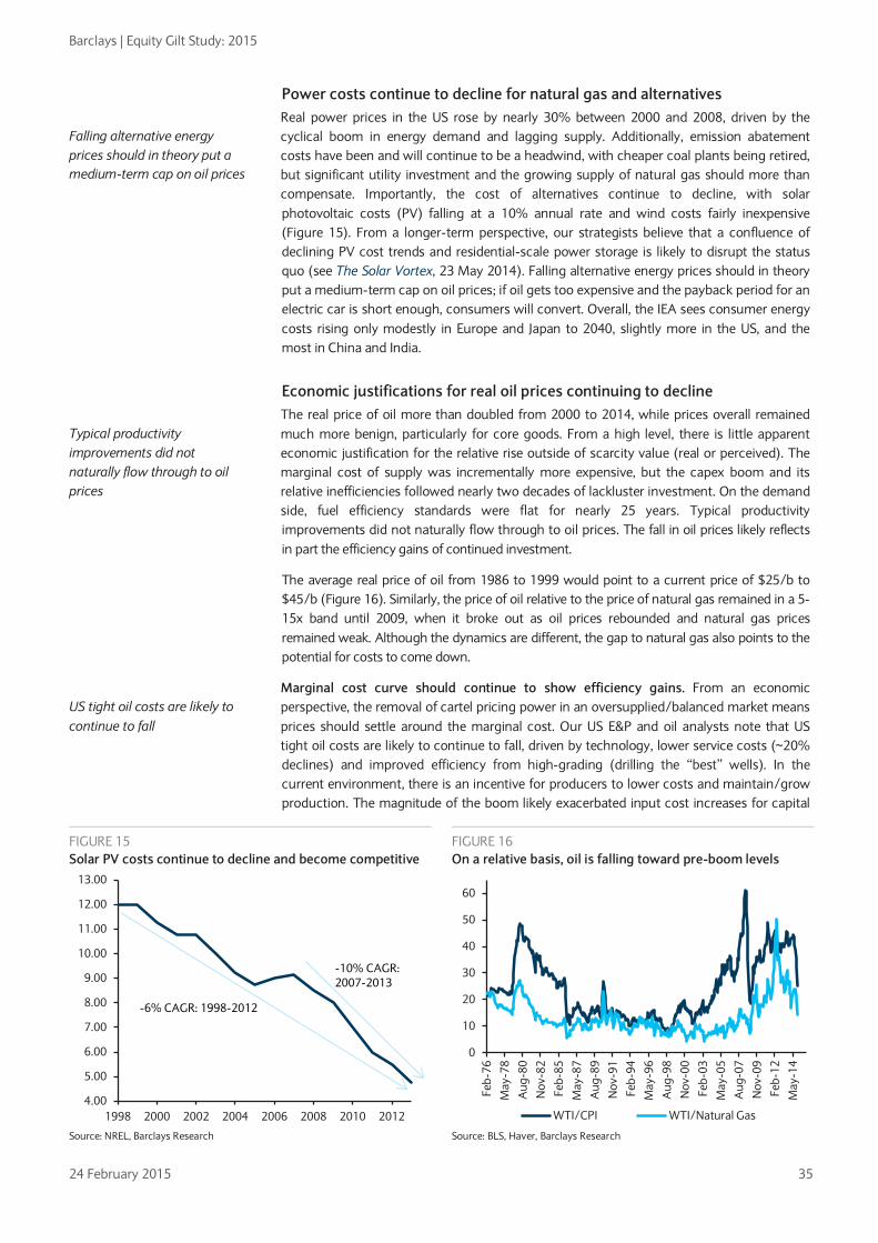
Barclays | Equity Gilt Study: 2015
24 February 2015 35
Power costs continue to decline for natural gas and alternatives Real power prices in the US rose by nearly 30% between 2000 and 2008, driven by the cyclical boom in energy demand and lagging supply. Additionally, emission abatement costs have been and will continue to be a headwind, with cheaper coal plants being retired, but significant utility investment and the growing supply of natural gas should more than compensate. Importantly, the cost of alternatives continue to decline, with solar photovoltaic costs (PV) falling at a 10% annual rate and wind costs fairly inexpensive (Figure 15). From a longer-term perspective, our strategists believe that a confluence of declining PV cost trends and residential-scale power storage is likely to disrupt the status quo (see The Solar Vortex, 23 May 2014). Falling alternative energy prices should in theory put a medium-term cap on oil prices; if oil gets too expensive and the payback period for an electric car is short enough, consumers will convert. Overall, the IEA sees consumer energy costs rising only modestly in Europe and Japan to 2040, slightly more in the US, and the most in China and India.
Economic justifications for real oil prices continuing to decline The real price of oil more than doubled from 2000 to 2014, while prices overall remained much more benign, particularly for core goods. From a high level, there is little apparent economic justification for the relative rise outside of scarcity value (real or perceived). The marginal cost of supply was incrementally more expensive, but the capex boom and its relative inefficiencies followed nearly two decades of lackluster investment. On the demand side, fuel efficiency standards were flat for nearly 25 years. Typical productivity improvements did not naturally flow through to oil prices. The fall in oil prices likely reflects in part the efficiency gains of continued investment.
The average real price of oil from 1986 to 1999 would point to a current price of $25/b to $45/b (Figure 16). Similarly, the price of oil relative to the price of natural gas remained in a 5-15x band until 2009, when it broke out as oil prices rebounded and natural gas prices remained weak. Although the dynamics are different, the gap to natural gas also points to the potential for costs to come down.
Marginal cost curve should continue to show efficiency gains. From an economic perspective, the removal of cartel pricing power in an oversupplied/balanced market means prices should settle around the marginal cost. Our US E&P and oil analysts note that US tight oil costs are likely to continue to fall, driven by technology, lower service costs (~20% declines) and improved efficiency from high-grading (drilling the “best” wells). In the current environment, there is an incentive for producers to lower costs and maintain/grow production. The magnitude of the boom likely exacerbated input cost increases for capital
Falling alternative energy prices should in theory put a medium-term cap on oil prices
FIGURE 15 Solar PV costs continue to decline and become competitive
FIGURE 16 On a relative basis, oil is falling toward pre-boom levels
Source: NREL, Barclays Research Source: BLS, Haver, Barclays Research
Typical productivity improvements did not naturally flow through to oil prices
US tight oil costs are likely to continue to fall
4.00
5.00
6.00
7.00
8.00
9.00
10.00
11.00
12.00
13.00
1998 2000 2002 2004 2006 2008 2010 2012
-10% CAGR: 2007-2013
-6% CAGR: 1998-2012
0
10
20
30
40
50
60
Feb-
76M
ay-7
8A
ug-8
0N
ov-8
2Fe
b-85
May
-87
Aug
-89
Nov
-91
Feb-
94M
ay-9
6A
ug-9
8N
ov-0
0Fe
b-03
May
-05
Aug
-07
Nov
-09
Feb-
12M
ay-1
4
WTI/CPI WTI/Natural Gas

Barclays | Equity Gilt Study: 2015
24 February 2015 36
(rig rates, etc) and labor (energy wages costs in the US have risen much faster than the national average). We see scope for oil supply costs to decline as the industry restructures to persistently lower prices.
Oil prices should be less volatile after settling near a new equilibrium Inventories are back at very high levels, providing a cushion. Global inventories of crude and product have risen notably in recent months. Saudi inventories are near their peaks and US petrol inventory is back near peak levels of 95-100 days of average demand. We find that oil price volatility is inversely related to the level of total crude and product inventory. High crude and product inventories should mean lower oil price volatility, all else equal, because unanticipated demand can more easily be met by inventory (Figure 17).
After bouncing off the trough, oil prices have stayed fairly flat in past episodes. Performance of oil is highly varied in the 13 episodes in which oil has sold off by more than 30%. But in 10 of the episodes, oil prices two years after the trough were basically the same as prices one year after the trough (Figure 18). The flat trajectory likely reflects a more balanced demand-supply backdrop after the corrections.
Inflation effect of lower oil: Lower bond yields tend to persist The fall in oil prices has an immediate impact on inflation. It is logical then that the collapse in oil prices has been quickly priced into inflation expectations and thus bond yields. We estimate the inflation effects from lower oil and find that emerging markets should feel a greater impact than developed markets. Sustained lower oil prices mean that energy weights in CPI will be lower and thus headline inflation vol should be lower, all else equal. Importantly, the fall in bond yields that is typical in oil selloffs tends to be fairly sticky, with yields settling 15% below higher levels prior to the oil selloff.
Inflation effects of the decline in oil are greater in emerging markets The effect of a sharp decline in oil prices on domestic inflation varies greatly across countries and derives predominantly from the direct effect of oil prices on headline CPI (weight of energy in CPI), and the indirect effect, which is estimated by the long-term pass-through of a change in oil price to the CPI via other prices. The direct weight of energy in CPI averaged 10.4% in EM versus 8.9% in advanced economies. Since overall inflation in EM is considerably higher than in advanced economies, the contribution of energy to EM inflation is proportionately higher. In terms of the indirect effect, we found that the aggregate EM long-term pass-through from oil onto inflation is 0.051 versus 0.045 in
FIGURE 17 Oil prices should be less volatile if inventories stay high
FIGURE 18 After bouncing off a trough, oil prices have had a flat trajectory
Source: EIA, Haver, Barclays Research Source: Haver, Barclays Research
The oil price drop was quickly priced into lower inflation expectations and bond yields
EM should feel a greater inflation impact from lower oil than DM
0.1
0.3
0.5
0.7
0.9
1.165
70
75
80
85
90
95
100
105
110
Feb-
91
Feb-
93
Feb-
95
Feb-
97
Feb-
99
Feb-
01
Feb-
03
Feb-
05
Feb-
07
Feb-
09
Feb-
11
Feb-
13
Feb-
15
US petrol inv (avg days, inv lhs) Oil vol (ann, rhs)
020406080
100120140160180
Jul-8
6
Jan-
07
Dec
-98
Oct
-88
Jun-
12
Jun -
90
Apr
-00
Dec
-93
Oct
-11
Nov
-01
Mar
-86
Dec
-08
Feb-
91
WTI price normalized to peak
trough +12 month trough + 24 month
Median = 83.45

Barclays | Equity Gilt Study: 2015
24 February 2015 37
advanced economies (see: ‘The crude reality’, 8 April 2011). Unsurprisingly, in places where energy prices are heavily regulated, eg, India and the euro area, the long-term pass-through coefficients are lower (Figure 19).
It should be noted that the pass-through coefficients presented here might be slightly overstated because the importance of oil for the global economy has in fact been declining9. In addition, the loosening of real wage rigidities implies a more muted response from inflation and output, which means that the long-term pass-throughs are lower today relative to earlier in the sample. Nevertheless, the overstatement would be mostly consistent. We therefore expect a higher impact from lower energy prices on EM inflation relative to DM inflation, on an aggregate basis.
There is less of an offset from EM currency depreciation in this oil selloff. In the 1980s and 1990s, oil price falls coincided with large EM currency declines vs the dollar (Figure 20). EM currency depreciation through the recent fall in oil was notable, but considerably less than in past episodes and also relative to advanced currencies. Thus, the overall inflation response in EM countries should be greater relative to history as well as versus many other developed markets.
The fall in rates that is typical in oil selloffs tends to be fairly sticky The US 10y Treasury yield declined in 11 of the 13 episodes in which oil has sold off by more than 30%. We find that the recent decrease in bond yields aligns with this pattern (Figure 21). The larger-than-implied decline in 10y yields in 2011 was likely affected by the Fed’s calendar date guidance. On the other hand, the slight rise in yields in 1988 and 1990 was likely due to core inflation running above 4%.
Falling inflation expectations have fueled most of the decline in nominal yields. As our inflation strategist has stated (see Oil slick, December 11, 2014), the link between oil and front-end inflation breakevens is clear, given the pass-through of gasoline to CPI; however, the flattening of the inflation curve and the fall in longer duration breakevens have been marked. Indeed, the correlation between daily oil price changes to daily changes in US 10y inflation breakevens has risen to exceed 60% in the past three months (30% for German breakevens). Since the June peak in oil, 10y inflation breakevens for the US and Germany fell by about 75bp from peak to trough (Figure 22). Until early this year, the decrease in nominal bond yields was essentially in line with the fall in inflation expectations as real yields in the 10y sector stayed
9 See: Olivier J. Blanchard and Jordi Gali, “The macroeconomic effects of oil shocks: Why are the 2000s so different from the 1970s?”, 2007, NBER working paper No. 13368.
FIGURE 19 Energy pass-through effects vary notably
FIGURE 20 EM currency depreciation has been much lower this time
Source: Haver, CEIC, Barclays Research
Source: Haver, Barclays Research
There is less of an offset from EM currency depreciation in this oil selloff
The decrease in nominal bond yields was essentially in line with the fall in inflation expectations until early 2015
0
0.02
0.04
0.06
0.08
0.1
0.12
0.14
0.16
0.18
0.2
0
2
4
6
8
10
12
14
16
18
20
Hun
gary
Slov
akia
Pola
ndIn
dia
Cze
chTu
rkey
Mal
aysi
aTh
aila
ndRu
ssia
S. A
fric
aKo
rea
Chi
naBr
azil
Mex
ico
Chi
lePh
ilipp
ines
Isra
elC
olom
bia
Sing
apor
eIn
done
sia
Peru
Euro
zon
eU
SA UK
Japa
n
energy weight in CPI
Long term pass-through
-80
-60
-40
-20
0
20
40
60
80
-30
-20
-10
0
10
20
30
40
50
75 77 79 81 84 86 88 90 93 95 97 99 02 04 06 08 11 13
vs. DM vs. EM WTI (rhs)
12m % change
12m $ change
Nomminal trade-weighted US$

Barclays | Equity Gilt Study: 2015
24 February 2015 38
relatively flat; ECB QE likely helped drive the recent decline in real yields as oil and inflation expectations stopped falling. Clearly, central bank policy is also a key driver.
A lower energy weight in CPI should mean less inflation volatility, all else equal. The fall in energy prices has led to a fall in the weight of energy in the CPI from over 10% in 2011-13 to probably less than 8% now; the weight of energy commodities has also fallen, by about 2pp. Since 1986, the volatility in monthly energy prices has been more than 9x that of the headline CPI index. Therefore, a lower weight of energy should logically lead to lower headline inflation volatility (Figure 23). Indeed, the correlation between the energy weight in CPI and the two-year volatility of the headline index is 57%. Additionally, as noted above, higher oil and oil product inventories could eventually lead to lower volatility in oil prices, all else equal. So the combination of a lower energy weight and potentially lower oil volatility points to lower energy inflation vol and thus lower overall inflation vol in the medium term.
US 10y has had a flattish trajectory after past oil troughs, but is Fed-dependent. Although oil has tended to bounce after hitting a trough, the US 10y yield one and two years after an oil trough has actually been flat, using the median move of the episodes. On average, the US 10y yield settles about 15% below the higher levels prior to the oil selloff and remains in a lower range for two years (Figure 24); this implies a range around 2.2% for the US 10y.
FIGURE 21 The fall in bond yields is in line with past oil selloffs
FIGURE 22 Breakevens have fallen globally since June as oil has fallen
Source: Bloomberg, Barclays Research Click here to view an interactive Barclays Live Chart
Source: Bloomberg, Barclays Research
The correlation between the energy weight in CPI and the two-year volatility of headline inflation is 57%
FIGURE 23 Headline inflation volatility has historically tracked the energy weight in CPI
FIGURE 24 The fall in the US 10y yield that is typical in oil selloffs tends to be fairly sticky
Source: Bloomberg, Barclays Research Source: Bloomberg, Barclays Research
-50%
-40%
-30%
-20%
-10%
0%
10%
-80% -70% -60% -50% -40% -30% -20%
Change in US 10y rate
Oil selloffs from peak to trough
US 10y in oil selloffs
2011 0.50.70.91.11.31.51.71.92.12.32.5
20
40
60
80
100
120
140
160
Dec
-13
Jan-
14
Feb-
14
Mar
-14
Apr
-14
May
-14
Jun-
14
Jul-1
4
Aug
-14
Sep-
14
Oct
-14
Nov
-14
Dec
-14
Jan-
15
Infl BEBrent
Brent oil (lhs) US 10y infl BE Ger 10y infl BE
0
0.005
0.01
0.015
0.02
0.025
0.03
6
7
8
9
10
11
12
13
Dec
-86
Oct
-88
Aug
-90
Jun-
92
Apr
-94
Feb-
96
Dec
-97
Oct
-99
Aug
-01
Jun-
03
Apr
-05
Feb-
07
Dec
-08
Oct
-10
Aug
-12
Jun-
14
StdevWt
Energy weight in CPI (lhs) CPI stdev (rolling 2yr, rhs)
CPI vol rose as the weight of energy increased
70
75
80
85
90
95
100
105
-7 -5 -3 -1 1 3 5 7 9 11 13 15 17 19 21 23
10y rate performance around oil selloffs
Average Current
Barclays | Equity Gilt Study: 2015
24 February 2015 39
The rise in the 10y after 1986, 1993, and 1998 coincided with subsequent Fed hikes as growth and inflation recovered, while the increase after 2012 stemmed from the taper communication. The bounce in bond yields after 2008 was from extreme levels. During the other eight episodes, US 10y yields were flat to lower a year after oil troughed.
Positive growth effects of lower oil come with a lag A sustained decline in oil prices would be equivalent to a $1.5-2.0trn annualized redistribution from oil producers to consumers, or more than 2.0% of global GDP. A decline in oil prices means that consumers experience an increase in real disposable income while producers benefit from lower input costs. The oil price decline is therefore positive for the overwhelming majority of the global economy since most countries are net importers of oil (~90% of world GDP). Additionally, a number of buffers, including FX reserves, corporate margins and retained earnings, reduce the negative impact to the real economy from the energy fallout. Overall, as we will demonstrate, the net effect on the global economy is positive.
The positive impact from lower oil on consumption and growth tends to manifest with a 2-3 quarter lag. Similarly, the market tends to price the benefits into growth assets with a lag; the S&P 500 rallies 12% on average the year after oil troughs. The sector beneficiaries of lower oil, such as consumer stocks, should continue to outperform amid sustained lower oil, particularly since relative valuations do not reflect the upside. Across regions, Asia disproportionately benefits since it is the largest net importer of oil; thus, an equity valuation that is in line with the rest of EM suggests the upside is not fully priced.
Assessing the effect of lower oil on consumption and global growth To assess the impact of oil price moves on global growth under different price scenarios, we use the framework developed in Easy money is not easy for all EM, (23 November 2010) and The Crude Reality (8 April 2011). The main channel via which oil can affect global growth is consumption, which generally accounts for 60% of GDP. In particular, we model annual real consumption growth as a function of annual real GDP growth, the level of the policy rate, and the annual change in oil prices – all variables in the coincident period and with one lag (using quarterly data). This allows us to isolate the effect of oil prices on consumption, controlling for overall activity. We ran this exercise for both oil exporters and oil importers. The resulting long-term coefficient has the expected negative sign for oil importers (ie, an increase in oil price has a negative effect on consumption, and vice versa). It is also negative for oil exporters, but much less so. This makes sense given the contrasting wealth effects arising from such price shocks in each group. At the global level, every 10% decline in oil prices is a 0.1pp boost to GDP (within one year of the price shock).
We use the coefficients from this exercise10 to simulate the global growth effect under different price scenarios. In a scenario where prices reach a floor of $40/b and remain there for the next two years, as Figure 26 shows, we estimate an incremental positive effect on global GDP of up to 0.5pp in 2015 that gradually weakens to 0.2pp by end of 2016. If prices stabilize at a level of ~$60/b by Q3 2015, the effect on global growth would reach 0.4pp in 2015 and -0.03pp in 2016 (since by then the bounce back up in price would translate to a negative real income effect on consumers). In the event that prices rise back up to $80/b, the effect on global GDP is expected to reach 0.3pp in 2015 and -0.2pp by end 2016. Our findings, based on broad sensitivities, are consistent with IMF and World Bank estimates as well as Barclays economists’ forecasts of a modest boost to global growth from lower oil.
10 That would still be valid today, given that it included 26 years of data.
The recent price decline is net positive for the global economy
The benefits to growth and consumption come with a lag, in line with market pricing
According to our model, every 10% decline in oil prices boosts global GDP by 0.1pp
If oil prices remain in the $40-60 range, we estimate the positive effect on global GDP to be 0.4-0.5pp in 2015

Barclays | Equity Gilt Study: 2015
24 February 2015 40
FIGURE 25 Energy exports are highly concentrated
FIGURE 26 Global GDP growth impact (YoY) based on oil price scenarios
Source: UN Comtrade, Haver, Barclays Research Source: Barclays Research calculations
Impact of lower oil prices on consumption could be lighter than expected The major role of supply in the current oil decline would point to a potentially larger boost to growth, but a few factors point to a smaller impact. Low consumer confidence, as in the euro area, lessens the positive impact. The freeing up of disposable income may be saved instead of spent, and the impact on inflation may exacerbate deflation risks more than it boosts real income (see Euro Themes: Assessing the impact of lower oil prices and the euro on growth, inflation and ECB policy, 17 October 2014). Additionally, fuel subsidies are being normalized. Governments have used the opportunity of the recent price decline to gradually normalize prices, which means consumers are not feeling the full benefits directly (Figure 27). However, as an offset, consumers will probably still enjoy the benefits of improved fiscal balances. Finally, the zero bound limits the policy response, which is typical after oil selloffs. Interest rates that are near or below zero narrow the ability of monetary policy to respond to a disinflationary shock11. However, BoJ and ECB QE have showed signs of affecting inflation expectations.
11 See: Olivier Blanchard and Rabah Arezki, “Seven questions about the recent oil price slump”, December 2014, IMF Direct blog.
-15%
-5%
5%
15%
25%
35%
45%
Sing
apor
eU
krai
neTh
aila
ndKo
rea
Taiw
anS.
Afr
ica
Hun
gary
Turk
eyIn
dia
Chi
leJa
pan
Isra
elG
erm
any
Pola
ndC
hina
USA
Indo
nesi
aBr
azil
Mex
ico
Mal
aysi
aR
ussi
aN
iger
iaV
enez
uela
Iraq
Saud
i Ara
bia
Net energy exports (% GDP)
-0.4-0.3-0.2-0.10.00.10.20.30.40.50.6
Mar-14 Sep-14 Mar-15 Sep-15 Mar-16 Sep-16
80 60 40
Effect on global growth of the continuation of the oil price shock under different assumptions for the oil USD/bbl price
pp
Low consumer confidence and normalizing oil subsidies could limit the positive effect on consumption
FIGURE 27 Fuel subsidies and taxes limit the pass-through effect
FIGURE 28 The zero bound limits the central bank policy response
Source: National agencies, Barclays Research
Source: Haver, OECD, Barclays Research
20%
40%
60%
80%
100%
120%
140%
Jan-14 Mar-14 May-14 Jul-14 Sep-14 Nov-14 Jan-15
Brent USEU JapanKorea AustraliaChina IndiaBrazil MexicoPoland PhilippinesSouth Africa TurkeyIndonesia
Brent oil price versus local retail gasoline prices
-2.5
0.0
2.5
5.0
7.5
10.0
12.5
0
20
40
60
80
100
120
140
85 87 89 91 93 95 97 99 01 03 05 07 09 11 13 15Oil prices (lhs)US Central Bank policy rate (EOP, %, rhs)CPI (% y/y, rhs)
% y/y

Barclays | Equity Gilt Study: 2015
24 February 2015 41
Asia is the biggest beneficiary of lower oil, followed by the US Asia-Pacific countries consume more than a third of global oil output, led by China, Japan and India (Figure 29). Asia’s largest exporting economies are big importers of energy inputs and, as such, their external balances are very sensitive to oil prices. Among the heaviest importers of oil are India, Thailand, Taiwan and Korea (see: Asia Themes: It’s ‘oil’ good for Asia, 2 December 2014).
• We expect China’s current account surplus to rise to $356bn this year as result of lower oil. However, low energy prices and additional factors are driving inflation substantially lower, creating the conditions for PBOC intervention, which we expected in H1 (see Lower oil ignites fresh structural reforms, 5 December, 2014).
• In Japan, sensitivity to oil prices has risen since the 2011 earthquake as the economy has become more dependent on oil. As a result, we now estimate that a 10% decline in oil prices would lead to an initial 0.1pp positive GDP shock in Japan, with greater impact in the second and third years after the decline (see: Sizing up recent shocks to the global economy, 24 October 2014).
• In India, the most direct beneficiary of lower oil is the current account, which is now expected to post a small surplus of 0.1% GDP in FY 15-16 (from a previous forecast of a 1.5% deficit). Growth is also expected to improve on increased fiscal revenues from reduced subsidies and indirect taxes; however, the pass-through will likely take longer (see: Lower oil- a boon for India, 29 January 2015).
In the US, we estimate 0.2pp additional GDP growth for every 10% fall in oil prices, more than offsetting the expected drag from a stronger dollar. This is because of the high propensity to consume, which means a rapid transmission mechanism from lower energy prices to stronger real consumer spending (see Consumer windfall ahead, 17 October 2014). As the world’s biggest oil consumer, the US should benefit notably from the fall in oil prices.
In the euro area, the impact of lower oil should be negligible, though still positive. The transmission mechanism works much less effectively, largely because of high energy taxes, which account for up to 80% of the retail price of oil in a number of member states (see Euro Themes: Assessing the impact of lower oil prices and the euro on growth, inflation and ECB policy, 17 October 2014).
With more than a third of global oil consumption, Asian countries benefit the most
FIGURE 29 Asia-Pacific consumes more than one-third of global oil output
FIGURE 30 Asia-Pacific is by far the largest net importer of oil
Source: BP Statistical Review of World Energy 2014, Barclays Research Source: BP Statistical Review of World Energy 2014, Barclays Research
Asia Pacific33%
North America
26%
Europe & Eurasia
20%
S. & Cent. America
8%
Middle East9%
Africa4%
-2.5-2.0-1.5-1.0-0.50.00.51.01.52.02.5
Asia Pacific
North America
Europe & Eurasia
S. & Cent. America
Africa Middle East
Mn barrels per day

Barclays | Equity Gilt Study: 2015
24 February 2015 42
Global trade could rise notably on the back of lower fuel costs Previous research12 found that the elasticity of trade with respect to the freight cost factor was -313, suggesting that the pass-through of lower oil could substantially boost global trade. UNCTAD calculated the elasticity of transport costs with respect to fuel prices and came up with a rule of thumb of 0.4. Assuming that the effect of a change in oil prices on trade is only via the freight channel, the elasticity of trade with respect to fuel costs rises to 0.4*(-3)= -1.2. Although overall trade costs have fallen in recent years, the drop has not been significant enough to dismiss them. One main reason is the dominance of the fuel component in the overall costs. As such, a large enough drop in oil prices, if sustained, could mean a significant reduction in transportation costs, which in turn should boost trade volumes.
Equities have rallied after oil troughs, reflecting lagged impacts on growth From the June peak in oil to the recent trough, the S&P 500 rose 2%. The flattish performance is in line with the mixed performance of equities during past oil selloffs. Of the 14 episodes in which oil fell by more than 30% (including the current one), the S&P 500 was down by more than 20% four times, was flat four times, and up by more than 10% six times. The disparate performance likely reflects different demand and supply shocks in each case.
The S&P 500 has rallied by an average of 12% in the year after an oil trough (median 21%). The effect of lower oil on economic growth has been lagged by 2-3 quarters following the initial price shock (see Oil and growth – mind the lag and keep the faith, January 22, 2015). The positive effect on growth also tends to get priced into equities with a lag. After oil troughs, the S&P 500 has rallied by an average 12% over the next year (Figure 32). The only time equities were lower was when the tech bubble burst (2000, 2001). Adjusting for negative and positive outliers, the median S&P return in the year after a trough is a strong 21%. Performance in the second year is still positive, on average (7%), but more mixed, suggesting that the positive effects are priced in relatively quickly before other factors take over.
12 See: http://economics.ouls.ox.ac.uk/14816/1/paper488.pdf 13 The rationale behind such a large number is the very wide definition of ‘costs’, which includes infrastructure of transit, trade facilitations, policies and logistics, technology, distance and geography (eg, landlocked countries were found to trade 30-60% less than coastal countries with otherwise similar characteristics).
Fuel is still a dominant factor in trade costs; thus lower prices should boost volumes
FIGURE 31 Past oil price declines came with slower global growth and a lagged growth rebound
FIGURE 32 Equities have rallied notably after oil troughs
Source: Haver Analytics, OECD, Barclays Research
Source: Haver, Barclays Research
-0.4
-0.2
0.0
0.2
0.4
0.6
0.8
1.0
1.2
-7 -6 -5 -4 -3 -2 -1 0 1 2 3 4 5 6 7 8
OECD GDP growth (saar, q/q) in quarters before and after the five episodes of sharp oil price decline since 1985
Non-consecutive episodes of six-months during which the oil prices dropped by more than 30 %
(1986, 1990/91, 1997/98, 2001, 2008)
%
90
95
100
105
110
115
120
-8 -6 -4 -2 0 2 4 6 8 10 12 14 16 18 20 22 24
S&P 500 performance around oil selloffs
Average Current

Barclays | Equity Gilt Study: 2015
24 February 2015 43
Sector beneficiaries of lower oil have further to run Equity sector and industry relative performance has been 73% correlated to oil betas for the US and Europe since the June peak in oil (see Investor Intel: Cross-asset effects of lower oil, 4 February 2015). Beneficiaries of lower oil are significantly outperforming and we find that the outperformance tends to persist. Our equity strategist points out that the world’s 50 largest consumer discretionary and transportation stocks have seen no improvement in earnings or share prices since July, yet they benefit significantly from lower oil (see Crude Calculations, January 29, 2015). Importantly, valuations do not reflect the potential upside of higher consumption, either, particularly the consumer discretionary sector.
Healthcare, consumer and industrials have outperformed after oil troughs. Using Fama-French data, we analyze how sectors have performed during and after selloffs. Consumer non-durables, retail and healthcare have outperformed by more than 5% during oil selloffs; consumer non-durables’ flattish performance has lagged the typical pattern (Figure 34). Consumer durables and manufacturing have underperformed the market since June, when relative performance was historically in line. After oil bottoms, healthcare, chemicals, manufacturing and consumer non-durables and durables have historically outperformed the market (Figure 35). Retail, banks and tech have typically performed in line with the market after oil troughs, while utilities and telecoms have underperformed.
Valuations of sector beneficiaries are not pricing the upside, particularly consumer discretionary. Historically, the relative valuation of the consumer discretionary sector has inversely tracked oil prices, with yoy declines in oil typically coinciding with a rise in the relative forward P/E multiple. However, current consumer discretionary relative multiples are near historical lows, while the fall in oil points to a relative valuation that is about 20% higher (Figure 36). Similarly, we find that staples, healthcare and materials multiples inversely track oil prices; their relative valuations are in line with or below historical averages, suggesting the upside potential from lower oil is also not fully priced.
Earnings forecasts and relative valuations do not reflect the upside potential for sector beneficiaries
FIGURE 33 S&P 500 sector and industry performance have been closely correlated to respective oil betas
Source: Factset, Barclays Research
-25-20-15-10-50510152025
-0.25-0.20-0.15-0.10-0.050.000.050.100.150.200.25
Ener
gy
Mat
eria
ls
Util
ities
Tele
com
Info
Tec
h
Indu
stria
ls
Stap
les
Dis
cret
iona
ry
Fina
ncia
ls
Hea
lth C
are
Ener
gy
Mat
eria
ls
Util
ities
Tech
Har
dwar
e
Tele
com
Med
ia
Sem
i's
Food
Bev
,Tob
acco
Cap
ital G
oods
Soft
war
e
Com
m &
Pro
f Ser
v
Aut
os &
Com
p
Div
ers
Fina
ncia
ls
Hou
seho
ld
Stap
les
Reta
il
Tran
spor
tatio
n
Con
s D
urab
le
Con
sum
er S
ervi
ces
Real
Est
ate
Phar
ma
Insu
ranc
e
HC
Equ
ip
Bank
s
Reta
iling
S&P 500 sector perf vs oil betas
Oil beta (lhs) Perf since 6/30/14 (rhs)
Some consumer industries have lagged
Beneficiaries outperforming
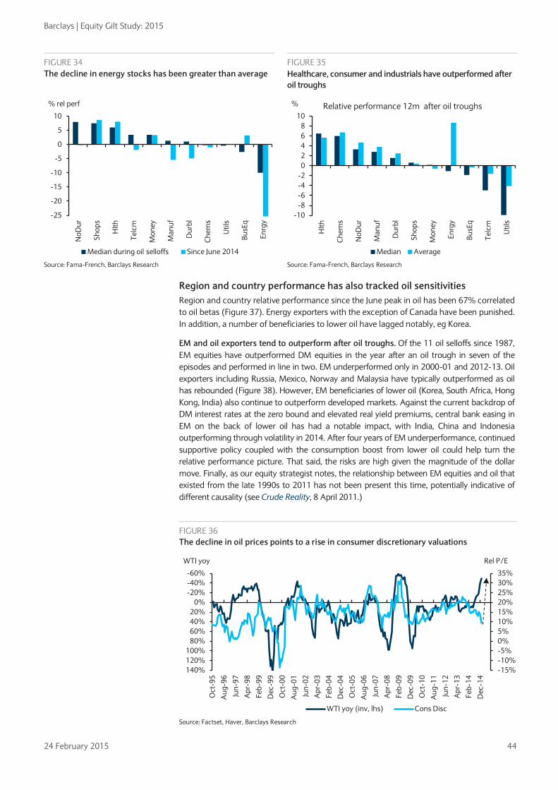
Barclays | Equity Gilt Study: 2015
24 February 2015 44
FIGURE 34 The decline in energy stocks has been greater than average
FIGURE 35 Healthcare, consumer and industrials have outperformed after oil troughs
Source: Fama-French, Barclays Research Source: Fama-French, Barclays Research
Region and country performance has also tracked oil sensitivities Region and country relative performance since the June peak in oil has been 67% correlated to oil betas (Figure 37). Energy exporters with the exception of Canada have been punished. In addition, a number of beneficiaries to lower oil have lagged notably, eg Korea.
EM and oil exporters tend to outperform after oil troughs. Of the 11 oil selloffs since 1987, EM equities have outperformed DM equities in the year after an oil trough in seven of the episodes and performed in line in two. EM underperformed only in 2000-01 and 2012-13. Oil exporters including Russia, Mexico, Norway and Malaysia have typically outperformed as oil has rebounded (Figure 38). However, EM beneficiaries of lower oil (Korea, South Africa, Hong Kong, India) also continue to outperform developed markets. Against the current backdrop of DM interest rates at the zero bound and elevated real yield premiums, central bank easing in EM on the back of lower oil has had a notable impact, with India, China and Indonesia outperforming through volatility in 2014. After four years of EM underperformance, continued supportive policy coupled with the consumption boost from lower oil could help turn the relative performance picture. That said, the risks are high given the magnitude of the dollar move. Finally, as our equity strategist notes, the relationship between EM equities and oil that existed from the late 1990s to 2011 has not been present this time, potentially indicative of different causality (see Crude Reality, 8 April 2011.)
-25
-20
-15
-10
-5
0
5
10
NoD
ur
Shop
s
Hlth
Telc
m
Mon
ey
Man
uf
Dur
bl
Che
ms
Util
s
BusE
q
Enrg
y
% rel perf
Median during oil selloffs Since June 2014
-10-8-6-4-202468
10
Hlth
Che
ms
NoD
ur
Man
uf
Dur
bl
Shop
s
Mon
ey
Enrg
y
BusE
q
Telc
m
Util
s
% Relative performance 12m after oil troughs
Median Average
FIGURE 36 The decline in oil prices points to a rise in consumer discretionary valuations
Source: Factset, Haver, Barclays Research
-15%-10%-5%0%5%10%15%20%25%30%35%-60%
-40%-20%
0%20%40%60%80%
100%120%140%
Oct
-95
Aug
-96
Jun-
97
Apr
-98
Feb-
99
Dec
-99
Oct
-00
Aug
-01
Jun-
02
Apr
-03
Feb-
04
Dec
-04
Oct
-05
Aug
-06
Jun-
07
Apr
-08
Feb-
09
Dec
-09
Oct
-10
Aug
-11
Jun-
12
Apr
-13
Feb-
14
Dec
-14
Rel P/EWTI yoy
WTI yoy (inv, lhs) Cons Disc

Barclays | Equity Gilt Study: 2015
24 February 2015 45
Asian equities have further to run amid lower oil. Of the main global regions, Asia ex Japan has the largest (negative) sensitivity to oil prices, such that lower oil should lead to outperformance. Asian equities have held up relatively well in the selloff, but in-line performance since June versus outperformance by many other beneficiaries of lower oil suggests Asian equities have further to run. Indeed, the relative performance of Asia ex Japan versus EM has inversely tracked oil prices and the recent collapse in oil points to further outperformance (Figure 39). From an economic perspective, as noted above, Asia should disproportionately benefit from sustained lower oil prices. Additionally, lower fuel prices could lead to a pickup in demand for Asian goods if world trade rises. P/E valuations for Asia that are essentially in line with EM overall suggest that the relative benefits are not fully priced, particularly given that Asia has traded at a premium to the rest of DM historically. Finally, as discussed later, many Asian currencies have not priced in the positive terms of trade shock from lower oil, so currency could also be a tailwind.
FIGURE 37 Country performance has tracked sensitivities to oil
Source: Bloomberg, Barclays Research
FIGURE 38 On average, EM and oil exporting countries have outperformed after oil troughs
FIGURE 39 Asian equities should outperform EM amid lower oil
Source: MSCI, Factset, Barclays Research Source: MSCI, Haver, Barclays Research
-20
-10
0
10
20
30
-0.20-0.15-0.10-0.050.000.050.100.150.200.25
EM E
MEA
EM L
atin
Am
eric
aEM
(Em
ergi
ng …
AC
Wor
ldTh
e W
orld
Inde
xEA
FEA
C A
sia
ex JP
Russ
iaN
orw
ayC
anad
aBr
azil
Col
ombi
aSo
uth
Afr
ica
Pola
ndTh
aila
ndU
nite
d Ki
ngdo
mH
ong
Kong
AC
Eur
ope
Indi
aG
erm
any
Fran
ceU
SASi
ngap
ore
Indo
nesi
aTa
iwan
Euro
pe e
x U
KTu
rkey
Aus
tral
iaEM
UM
alay
sia
Japa
nSw
itzer
land
Swed
enN
ethe
rland
sC
hina
Italy
Chi
leM
exic
oKo
rea
All
Chi
naSp
ain
Country performance vs oil betas
Oil beta (lhs) Perf since 6/30/14 (rhs)
Some beneficiaries have lagged
-10
-5
0
5
10
15
20
25
30
Russ
iaKo
rea
Braz
ilSo
uth
Afr
ica
Mex
ico
Nor
way
Hon
g Ko
ngSi
ngap
ore
Taiw
anA
sia
ex JP
Indi
aM
alay
sia
Aus
tral
iaSw
eden
Fran
ceC
anad
aU
SSw
itzer
land
Uni
ted
King
dom
Spai
nG
erm
any
Indo
nesi
aIta
lyJa
pan
% Rel perf 12m after oil trough 0
10
20
30
40
50
60
700.30
0.35
0.40
0.45
0.50
0.55
0.60
0.65
0.70
0.75
0.80
Jan-
99
Feb-
00
Mar
-01
Apr
-02
May
-…
Jun-
04
Jul-0
5
Aug
-06
Sep-
07
Oct
-08
Nov
-09
Dec
-10
Jan-
12
Feb-
13
Mar
-14
Apr
-15
MSCI Asia ex Japan/ MSCI EM (lhs)Real oil price (inv, rhs)
The collapse in oil points to further outperformance for Asia ex Japan

Barclays | Equity Gilt Study: 2015
24 February 2015 46
Terms of trade shock is a tailwind for FX beneficiaries The magnitude of the oil and commodity boom from the early 2000s to the peak in 2011 was extraordinary and led to a massive build-up in trade imbalances. Oil was essentially the last commodity standing, and the collapse since June shocked markets. Sustained lower oil prices are likely to have a profound effect on current accounts and currencies for some time. Thus, we assess the sensitivity of countries’ external balances to a fall in oil prices. The decline in oil is largely attributable to US tight oil supply; the resultant narrowing of the US petroleum deficit should reduce the impact of oil price moves on the dollar. Finally, while currencies of oil exporters have largely adjusted, the currencies that benefit from the oil terms of trade shock have further to run, in our view.
Assessing the effect of lower oil prices on current accounts Oil exporters depend much more on energy exports than importers are affected by them, so the shock to exporters’ trade balances will be felt more acutely. Oil accounts for 64% of Gulf region exports, 70% of Russian exports, and 94% of Venezuelan exports. In contrast, petroleum products account for only 10% of total US imports and 16% in China. To quantify the effect of oil price declines of different magnitudes on countries’ external balances, we estimate the change in the value of the 2013 trade balance that would arise from a decline in the average price of oil as it stood in 2013 ($108/b) to $40/b, $60/b and $80/b. This simple analysis assumes perfect inelasticity of trade, which slightly overstates the response, and should therefore be used to gauge mainly short-term effects.
The results are shown in Figure 40. As the largest energy importer in the region (in % GDP terms), Singapore stands out with a net 2% increase in its trade balance as a result of a $20 oil price decline. However, given its already large surplus, the increment is relatively marginal. Another notable beneficiary is India, which enjoys a nearly 20% improvement in its trade deficit (1.5% increase from a deficit of 8.1% in 2013) from each $20 price drop. On the other side of the chart, the most significant negative impact would be incurred by Saudi Arabia, which should take a hit of roughly 8%, a 30% reduction in its trade surplus. Russia would experience a shock similar in magnitude (a 2.6% decline from a 9% surplus), but is left with a much smaller cushion from external balances. Oil exporters Canada and Mexico would experience a relatively muted reduction in trade balance of only 0.7% and 0.8%, respectively, but those come off a deficit of 0.9% in 2013 for both, so not marginal.
FIGURE 40 Current account impacts of changes in oil prices
Source: BP, Haver, Barclays Research
-10%-8%-6%-4%-2%0%2%4%6%8%10%
-35%
-25%
-15%
-5%
5%
15%
25%
35%
Indi
a
Uni
ted
King
dom
Uni
ted
Stat
es
Japa
n
Can
ada
Mex
ico
Braz
il
Chi
na
Russ
ia
Iran
Nig
eria
Sing
apor
e
Saud
i Ara
bia
UA
E
2013806040$20 change in oil price
Sustained lower oil price may have a strong effect on current accounts and currencies
Oil exporters are much more dependent on oil than net importers;
A $20 oil price drop improves India’s trade balance by 1.5%, and worsens Saudi’s by 8%

Barclays | Equity Gilt Study: 2015
24 February 2015 47
The dollar’s sensitivity to oil prices should be lower The beta of the trade-weighted US dollar to oil prices has historically tracked the US petroleum trade balance (Figure 41). In the early 2000s, as the US began importing more petroleum products on net and oil prices began to rise, the petroleum deficit burgeoned. The beta of the US dollar to oil prices became much more negative, with higher oil coinciding with a lower dollar. Since US crude production began to surge in 2012, the petroleum deficit has continued to narrow. The collapse in crude oil prices will further narrow the deficit. Accordingly, the beta of the dollar to oil price moves has become much less negative, even turning briefly positive in 2014. As noted earlier, however, causality between the dollar and oil runs both ways.
FIGURE 41 The beta of the dollar to oil has tracked US net petroleum imports
Click here to view an interactive Chart of the beta of Oil vs USD REER Source: Bloomberg, Haver, Barclays Research
FX and oil: Losers largely priced, winners have further to run Oil prices matter for FX because they drive the terms of trade. A rise in oil prices would improve an exporting country’s terms of trade and worsen those of an oil importer. In our view, the beneficial shifts from lower oil and commodity prices have yet to be priced into many importing currencies (eg, Asia FX). Markets seem concerned about disinflationary stories and may be underestimating the medium-term positives of lower oil and commodity prices.
Oil has been a primary driver of terms of trade shifts and thus currency movements. Figure 42 shows the moves in our measure of terms of trade, which is calculated as the ratio of each country’s commodities export and import price indices. A number of oil producing countries enjoyed extremely large increases in their terms of trade (RUB and NOK) as did those producing base metals (AUD, IDR and CLP) and precious metals (ZAR). Terms of trade movements explain about 20% of the cross-sectional variation in real exchange rates since 2002-11, when oil/commodity prices increased. This makes sense given that terms of trade is a key driver of a currency’s medium-term value. Indeed, our behavioral equilibrium of exchange rates (BEER) model includes terms of trade as one of four drivers of a currency’s value alongside relative productivity, a country’s net foreign asset position and the relative level of government spending (for details, see Currency valuation from a macro perspective, 14 June 2011). Only about a third of the terms of trade shifts of 2002-11 have been unwound, implying that real exchange rates are unlikely to revert to 2002 levels given that fair values have changed. This raises the question: how have currencies evolved relative to fair value?
-45-40-35-30-25-20-15-10-505
-0.25
-0.20
-0.15
-0.10
-0.05
0.00
0.05
Feb-
89
Feb-
91
Feb-
93
Feb-
95
Feb-
97
Feb-
99
Feb-
01
Feb-
03
Feb-
05
Feb-
07
Feb-
09
Feb-
11
Feb-
13
Feb-
15
$bnBeta
Beta of USD to oil (12m, lhs) Trade Balance: Petroleum (Bil.$)
USD beta to oil fell as oil deficit grew
The narrowing of the US petroleum deficit has coincided with a less negative relationship between the dollar and oil
Only about a third of the terms of trade shifts of 2002-11 have been unwound, implying that exchange rates are unlikely to revert to 2002 levels given that fair values have changed

Barclays | Equity Gilt Study: 2015
24 February 2015 48
FIGURE 42 Only about 1/3 of the 2002-11 commodity boom terms-of-trade impact has been unwound
Source: Barclays Research
Countries where terms of trade improved as a result of the commodity price run-up largely went from being cheap in 2002 to expensive in 2011 and cheapened recently (and vice versa). Figures 43 and 44 show how the gap between the currency level and its BEER fair value has changed for the countries that were the big winners and losers from the terms of trade shifts (we look at the top and bottom seven countries). By and large, the terms of trade winners went from cheap to expensive in 2011 and have erased some of this richness more recently. The NOK is a notable exception that can be ascribed to the offshore petroleum fund that prevents oil revenues from coming onshore unless the government is running a non-oil fiscal deficit. For the terms of trade losers, the opposite pattern holds. Effective exchange rates for a basket of terms of trade winners and losers do not suggest significant misvaluations at present, despite large currency movements. The REER and BEER of a GDP-weighted basket of commodity exporting countries have cheapened recently, but it is not particularly cheap. Nor are commodity importers at particularly rich levels.
Oil exporting currencies have adjusted notably, oil importing currencies have not. We believe currencies are sensitive to oil prices via three major channels: 1) the effect on external balances; 2) the effect on economic growth; and 3) the effect on monetary policy. Figure 45 summarizes the exposures of different currencies through these channels (see Global FX Quarterly: Oil matters, November 20 2014 for details). Baskets of the top and bottom seven currencies based on this oil sensitivity score are shown in Figures 46 and 47.
-30
-20
-10
0
10
20
30
40
50
60
RUB
NO
KZA
RC
LPA
UD
IDR
BRL
CA
DN
ZDM
YRM
XN
DKK IL
SSE
KH
KD GBP
PLN
CZK
SGD
EUR
HU
FC
HF
CN
YRO
NTH
BPH
PU
SD TRY
KRW JPY
INR
% terms of trade change
2002-2011 2011-Now
FIGURE 43 Terms of trade winners - % misvaluation vs BEER fair value
FIGURE 44 Terms of trade losers - % misvaluation vs BEER fair value
Source: Barclays Research Source: Barclays Research
-30
-20
-10
0
10
20
30
40
50
RUB NOK ZAR CLP AUD IDR BRL
2002 mid 2011 today
% gap between real effective FX rate and Barclays BEER model
-40
-30
-20
-10
0
10
20
30
40
TRY JPY INR USD KRW ILS THB
2002 mid 2011 today
% gap between real effective FX rate and Barclays BEER model

Barclays | Equity Gilt Study: 2015
24 February 2015 49
The results are striking: whereas currencies of oil exporting countries have adjusted lower and their overvaluations have declined, currencies of oil importing currencies have not yet done so.
Among oil-exporting countries, currency movements since the end of Q3 2014 have been largely consistent with the deterioration in their terms of trade fundamentals stemming from oil/commodity price declines (Figure 48). The depreciation has been especially sharp for the RUB but also for CAD, MXN, MYR and DKK on a relative basis. We find it interesting that the terms of trade boost among oil-importing countries has so far been largely ignored (most notably Asia FX, including INR, KRW, etc). The market seems to have settled the debate over whether lower oil/commodities intensify disinflationary forces or support growth through consumption in favor of the former. In our view, the terms of trade boosts are likely to yield faster growth, rising inflation, tighter monetary policy and stronger currencies on a relative basis in the medium-term.
FIGURE 45 Currency rankings based on an oil sensitivity score
Source: Barclays Research
FIGURE 46 GDP-weighted misalignment between REER and Barclays BEER model
FIGURE 47 GDP-weighted misalignment between REER and its 10y average
Source: Barclays Research Source: Barclays Research
-15
-10
-5
0
5
10
15
NO
KC
AD
MYR
RUB
MX
NRO
ND
KKA
RSC
OP
AU
DC
HF
CLP
USD ID
RBR
LC
NY
GBP SE
KN
ZD EUR
HU
FC
ZKZA
RIL
SPL
NH
KD INR
TWD
TRY
PHP
JPY
THB
KRW
SGD
Oil sensitivity score
Score vs.USD
-15
-10
-5
0
5
10
15
20
01 03 05 07 09 11 13Oil winners Oil losers
GDP-weighted misalignment between real effective FX rate and Barclays BEER model
-15
-10
-5
0
5
10
15
20
25
01 03 05 07 09 11 13
Oil winners Oil losers
GDP-weighted misalignment between real effective FX rate and 10y REER ave
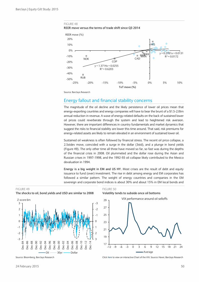
Barclays | Equity Gilt Study: 2015
24 February 2015 50
FIGURE 48 REER move versus the terms of trade shift since Q3 2014
Source: Barclays Research
Energy fallout and financial stability concerns The magnitude of the oil decline and the likely persistence of lower oil prices mean that energy-exporting countries and energy companies will have to bear the brunt of a $1.5-2.0trn annual reduction in revenue. A wave of energy-related defaults on the back of sustained lower oil prices could reverberate through the system and lead to heightened risk aversion. However, there are important differences in country fundamentals and market dynamics that suggest the risks to financial stability are lower this time around. That said, risk premiums for energy-related assets are likely to remain elevated in an environment of sustained lower oil.
Sustained oil weakness is often followed by financial stress. The recent oil price collapse, a 2.5stdev move, coincided with a surge in the dollar (3std), and a plunge in bond yields (Figure 49). The only other time all three have moved so far, so fast was during the depths of the financial crisis in 2008. Oil plummeted and the dollar rose during the Asian and Russian crises in 1997-1998, and the 1992-93 oil collapse likely contributed to the Mexico devaluation in 1994.
Energy is a big weight in EM and US HY. Most crises are the result of debt and equity issuance to fund (over) investment. The rise in debt among energy and EM corporates has followed a similar pattern. The weight of energy countries and companies in the EM sovereign and corporate bond indices is about 30% and about 15% in EM local bonds and
CADNOK
ARS
COP
DKKMYRMXN
RUB
y = 0.2781x + 0.0131R² = 0.0172
y = 1.3714x + 0.0255R² = 0.6203
-50%
-40%
-30%
-20%
-10%
0%
10%
20%
-25% -20% -15% -10% -5% 0% 5% 10%
REER move (%)
ToT move (%)
FIGURE 49 The shocks to oil, bond yields and USD are similar to 2008
FIGURE 50 Volatility tends to subside once oil bottoms
Source: Bloomberg, Barclays Research Click here to view an interactive Chart of the VIX. Source: Haver, Barclays Research
-3
-2
-1
0
1
2
3-3
-2
-1
0
1
2
3
Dec
-84
Dec
-86
Dec
-88
Dec
-90
Dec
-92
Dec
-94
Dec
-96
Dec
-98
Dec
-00
Dec
-02
Dec
-04
Dec
-06
Dec
-08
Dec
-10
Dec
-12
Dec
-14
Z-score 6m
Oil 30yr Dollar
17
19
21
23
25
27
29
-12 -9 -6 -3 0 3 6 9 12 15 18 21 24
VIX performance around oil selloffs
Average

Barclays | Equity Gilt Study: 2015
24 February 2015 51
US HY, posing notable default risk, and thus spillover risk, to investors (Figure 51). The energy weight in global equities is much smaller, 7%, with Russia having the largest exposure by far (Figure 52).
Volatility tends to subside after oil finds a bottom, however. Using the average of the VIX around past oil selloffs, we find that volatility tends to peak in the weeks right around the trough in oil, but returns to normal levels once oil bottoms (Figure 50).
Oil-exporting countries are the clear losers from a decline in oil prices Apart from the real activity implications, a large shock to these energy-dependent countries can pose financial stability risks. However, a closer look suggests the risks are lower than in the past.
• Russia is the biggest sufferer, with the ruble taking the largest hit. The RUB selloff is causing large inflationary pressures, though Russia has the ability to at least partially offset the negative growth effect via imports, which tend to contract more than consumption. Nevertheless, there is a high risk of financial instability and over- depreciation because of the spiral effect on business confidence, productivity growth and investment growth (see Russia quarterly: Problems accumulate, 5 December 2014). Russia’s “Big Four” companies, Gazprom, Rosneft, Lukoil and Novatek essentially have cash/short term debt ratios in excess of 100%; this, coupled with their low-cost position and the flexible Russian oil taxation system, suggests that a default on their hard currency debt in coming months is unlikely (see Russia Big 4 Credit & Equity Cashflows: Surviving the “Time of Troubles”, 15 December 2014).
• Venezuela, with 94% of exports from oil, is highly exposed, but default risk is priced. The hard currency regime means that the oil price decline is hardly offset by devaluation, and ongoing wild fiscal spending is expected to continue, maintaining a deep deficit of roughly 16% of GDP. (The Emerging Markets Quarterly: Content with carry, concerned with commodities, 5 December 2014).
• Middle Eastern oil producers have accumulated significant FX reserves. The IMF estimates a $98 oil price is needed to balance Saudi Arabia’s budget, and above $65 to maintain a CA surplus. However, with FX reserves covering more than 900% of Saudi’s external debt, a net asset position of over 100% of GDP and among the world’s lowest levels of public debt (less than 3% of GDP), the kingdom has ample fiscal space and plenty of policy tools to accommodate the lower oil price (see The end of OPEC’s golden age? 24 November 2014).
FIGURE 51 The weight of energy is highest in EM hard currency debt
FIGURE 52 The weight of energy in equity indices
Source: iShares, Bloomberg, Barclays Research Source: MSCI, Barclays Research
Russia stands out as having taken the largest hit from the oil shock so far
0%
5%
10%
15%
20%
25%
30%
35%EM
Sov
EM C
orp
EM L
ocal
Sov
US
HY
Cor
p
US
IG C
orp
S&P
500
Euro
Sto
xx 6
00*
Euro
IG C
orp
US
HY
Loan
s
Russ
ell 2
000*
Euro
HY
Cor
p
Share of energy-related credit in the respective
indices
0%5%
10%15%20%25%30%35%40%45%50%
Russ
iaIta
lyIn
dia
UK
EMBr
azil
US
Chi
naD
M
Wor
ld e
x U
SFr
ance SA
Euro
peSp
ain
Taiw
anS
Kore
aJa
pan
Ger
man
yH
K
Energy share in equity index

Barclays | Equity Gilt Study: 2015
24 February 2015 52
• Mexico has also been hurt by the oil price drop, but concerns look to be overstated. The opening of the economy to international trade has intensified the links to the US, and in turn reduced reliance on oil and gas, which now account for only 7.3% of GDP. In the past 10-15 years, oil and gas production has shrunk by nearly 25% in real terms and the exposure of government revenues to oil prices has declined by 60% (see Oil price collapse; for Mexico’s economy, concern looks overstated, 21 January 2015).
• The primary loser in Asia is oil-exporting Malaysia, which is expected to take a 0.5% CA hit for every USD10 drop in oil prices. However, lower fuel subsidy spending should clear some fiscal policy space.
EM country fundamentals are in better shape, reducing spillover risks As noted in Chapter 3, “Why EM is still an attractive asset class”, the economic performance of EM improved markedly in the early 2000s. This is attributable to a combination of macro stability post EM crises and a benign external environment. Inflation fell to single digits as central bank independence and inflation-targeting started playing a bigger role. Governments took action to ensure debt sustainability and enhance their external buffers. As a result, government debt and fiscal deficits fell and external vulnerability indicators improved notably. For a detailed discussion of the changes in the macroeconomic and financial landscape and the resulting resilience to negative shocks see Navigating the new EM landscape: Where to find the best returns, Equity Gilt Study 2011. That said, the external backdrop for EM economies has grown tougher since 2011 and will likely remain so over the next few years, while progress on structural reforms has been disappointing.
Market dynamics are also different, providing buffers to the oil shock • Financial markets are more flexible, with fewer currency pegs. Many past crises
stemmed in part from currency pegs that did not allow adjustment to occur through exchange rates. The 50% decline in the Russian ruble since June has meant that the resultant increase in import prices will lead the adjustment, while FX reserves were not exhausted to defend an overvalued currency. Importantly, Russian equities held up reasonably well in local currency terms. The currencies of other oil exporters, including Colombia, Mexico, Canada and Norway, have also depreciated considerably.
• FX reserves provide a sizeable cushion for the terms of trade shock from lower oil. The reserves of major oil exporters mushroomed when oil was rising, to almost $1.5trn (Saudi Arabia, $718bn; Russia, $316bn; UAE, $315bn; and Qatar, $106bn).
• Maturity profile in HY and much of EM provides some breathing room, for now. A number of US E&P companies will find it difficult to keep operating even at the current level of oil prices, raising the potential for defaults. However, most HY energy companies have some breathing room until 2018-19, when debt maturities will start to be significant (Figure 53). Within EM, LatAM and EMEA debt maturities should provide some time to ride out lower oil prospects and the start of Fed hikes, but less so for Asia.
• The Fed is not hiking (yet) and other central banks are easing. The recent oil selloff has led to considerable central bank easing, while the Fed has stayed the course. This contrasts with the Mexican peso devaluation in 1994 and the crises in Brazil and Argentina in 1999-2001, when the Fed was hiking. Additionally, the Asian and Russian crises were set against a backdrop of high US real yields, which is certainly not the case currently. However, the prospect of sustained lower oil and Fed hikes starting this year could put further external pressure on at-risk countries and companies.
• Investor liquidity remains a buffer, but market liquidity remains a concern. Liquidity ratios dropped below 4% prior to the euro crisis in 2010, the financial crisis in 2007 and the bursting of the tech bubble in 2000. Current post-QE cash ratios have remained above 5%, despite cash yielding essentially zero (Figure 54). Cash levels for bonds and asset allocation funds are elevated, while equity fund cash holdings are average. Importantly, US HY bond funds have raised their cash holdings to 5.6% from a low level

Barclays | Equity Gilt Study: 2015
24 February 2015 53
in June (4.5%), a scenario that has historically pre-dated volatility in HY (eg, 2007, 2000 and 1998). That said, redemption cycles, such as the one during the taper tantrum, show that markets are much less liquid after a financial crisis in a world of smaller dealer balance sheets.
Slower FX reserve accumulation removes a key source of bond demand
(This is excerpted from GMD Focus , 6 February 2015) With the decline in oil and the rise in the dollar, one important source of global fixed income demand – central bank reserve managers – is set to fade from the fixed income markets in the months ahead (Figures 55-56). Already, growth in central bank FX reserves has slowed markedly. From an average net increase of around $750bn per year since 2002, FX reserve growth has slowed to just half that pace in the past four quarters. Indeed, total FX reserves actually fell in Q3 2014 – only the third fall since 2002 (the other two quarterly declines were during the financial crisis of 2008-9.) Admittedly, part of the recent decline in FX reserves simply reflects the translation of non-USD holdings reported in the now-stronger US dollar. But there are reasons to think the weakness in FX reserves is also fundamental, and will prove more lasting. As such, it should come as no surprise that Russia has seen its largest decline in FX reserves in recent months. To be sure, Russia’s problems extend beyond a weak oil price, but even Saudi Arabia posted a rare decline in FX reserves toward the end of 2014.
FIGURE 55 FX reserve growth and oil price changes
FIGURE 56 FX reserve growth and US dollar index changes
Source: Bloomberg, Barclays Research Source: Bloomberg, Barclays Research
0
0.1
0.2
0.3
0.4
0.5
0.6
0.7
-80-60-40-20
020406080
100120
01 03 05 07 09 11 13
Oil prices (lhs) FX reserves in SDRs (rhs)
%y/y SDR trillion, 4-qtr change
0
0.1
0.2
0.3
0.4
0.5
0.6
0.7-20
-15
-10
-5
0
5
10
15
20
2501 03 05 07 09 11 13
US dollar index (lhs) FX reserves in SDRs (rhs)
%y/y (inverted) SDR trillion, 4-qtr change
FIGURE 53 Debt maturities are not significant for another few years
FIGURE 54 Investor liquidity is higher than other pre-crisis periods
Source: Barclays US HY Index Source: ICI, Haver, Barclays Research
0
5,000
10,000
15,000
20,000
25,000
30,000
35,000
40,000
45,000
2016
2017
2018
2019
2020
2021
2022
2023
2024
2035
2037
2038
Energy HY maturity profile
3
4
5
6
7
8
9
Jan-
92
May
-93
Sep-
94
Jan-
96
May
-97
Sep-
98
Jan-
00
May
-01
Sep-
02
Jan-
04
May
-05
Sep-
06
Jan-
08
May
-09
Sep-
10
Jan-
12
May
-13
Sep-
14
% Cash holdings of equity and bond MFs
Liquid assets % of total AUM
Russia default
Tech bubble
Financial crisis
Euro crisis
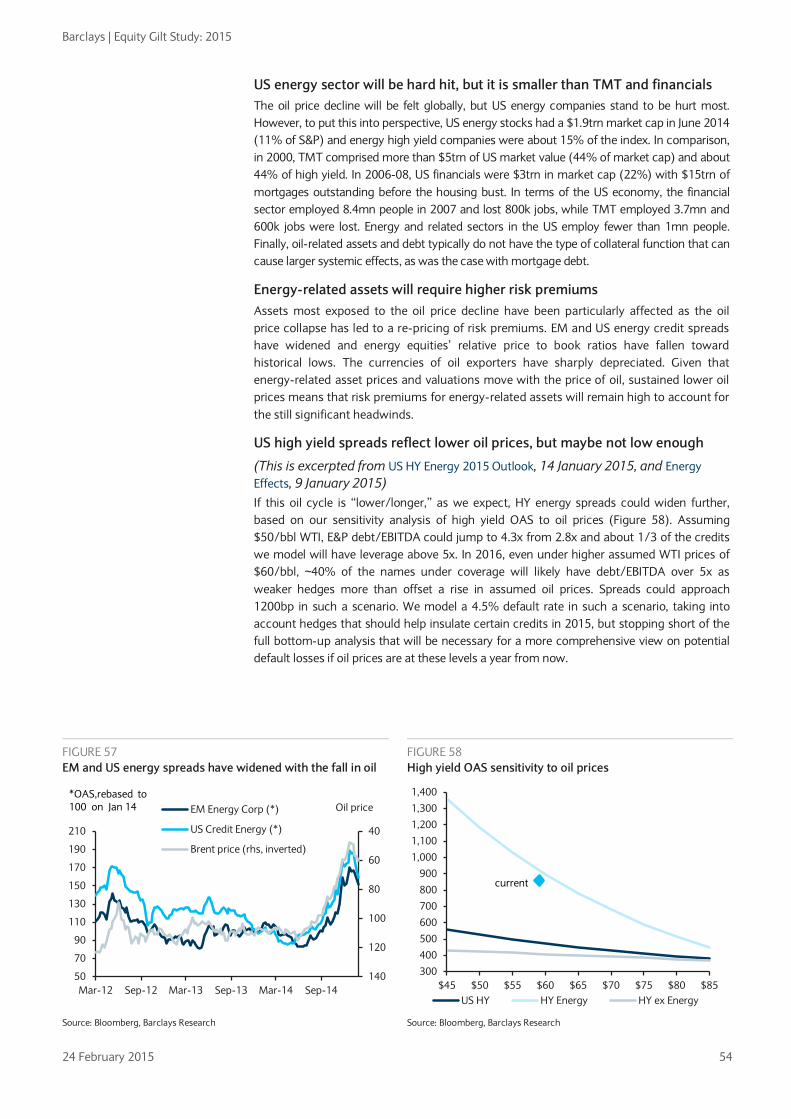
Barclays | Equity Gilt Study: 2015
24 February 2015 54
US energy sector will be hard hit, but it is smaller than TMT and financials The oil price decline will be felt globally, but US energy companies stand to be hurt most. However, to put this into perspective, US energy stocks had a $1.9trn market cap in June 2014 (11% of S&P) and energy high yield companies were about 15% of the index. In comparison, in 2000, TMT comprised more than $5trn of US market value (44% of market cap) and about 44% of high yield. In 2006-08, US financials were $3trn in market cap (22%) with $15trn of mortgages outstanding before the housing bust. In terms of the US economy, the financial sector employed 8.4mn people in 2007 and lost 800k jobs, while TMT employed 3.7mn and 600k jobs were lost. Energy and related sectors in the US employ fewer than 1mn people. Finally, oil-related assets and debt typically do not have the type of collateral function that can cause larger systemic effects, as was the case with mortgage debt.
Energy-related assets will require higher risk premiums Assets most exposed to the oil price decline have been particularly affected as the oil price collapse has led to a re-pricing of risk premiums. EM and US energy credit spreads have widened and energy equities’ relative price to book ratios have fallen toward historical lows. The currencies of oil exporters have sharply depreciated. Given that energy-related asset prices and valuations move with the price of oil, sustained lower oil prices means that risk premiums for energy-related assets will remain high to account for the still significant headwinds.
US high yield spreads reflect lower oil prices, but maybe not low enough
(This is excerpted from US HY Energy 2015 Outlook, 14 January 2015, and Energy Effects, 9 January 2015) If this oil cycle is “lower/longer,” as we expect, HY energy spreads could widen further, based on our sensitivity analysis of high yield OAS to oil prices (Figure 58). Assuming $50/bbl WTI, E&P debt/EBITDA could jump to 4.3x from 2.8x and about 1/3 of the credits we model will have leverage above 5x. In 2016, even under higher assumed WTI prices of $60/bbl, ~40% of the names under coverage will likely have debt/EBITDA over 5x as weaker hedges more than offset a rise in assumed oil prices. Spreads could approach 1200bp in such a scenario. We model a 4.5% default rate in such a scenario, taking into account hedges that should help insulate certain credits in 2015, but stopping short of the full bottom-up analysis that will be necessary for a more comprehensive view on potential default losses if oil prices are at these levels a year from now.
FIGURE 57 EM and US energy spreads have widened with the fall in oil
FIGURE 58 High yield OAS sensitivity to oil prices
Source: Bloomberg, Barclays Research Source: Bloomberg, Barclays Research
40
60
80
100
120
14050
70
90
110
130
150
170
190
210
Mar-12 Sep-12 Mar-13 Sep-13 Mar-14 Sep-14
EM Energy Corp (*)
US Credit Energy (*)
Brent price (rhs, inverted)
Oil price*OAS,rebased to 100 on Jan 14
300
400
500
600
700
800
900
1,000
1,100
1,200
1,300
1,400
$45 $50 $55 $60 $65 $70 $75 $80 $85US HY HY Energy HY ex Energy
current

Barclays | Equity Gilt Study: 2015
24 February 2015 55
Energy equity discount reflects sizeable headwinds Since June 2014, the S&P 500 energy sector has underperformed by 23% while global energy underperformed by 27%. Using Fama-French industry data going back to the 1980s, to capture more episodes, we find that energy stocks have underperformed the market by 13% on average during oil selloffs. The 1986 episode is probably most similar to the current one and energy stocks underperformed by 29% as oil fell by 67%. The significant underperformance of the energy sector likely reflects the re-pricing of medium-term prospects, particularly the decision by Saudi Arabia not to cut production. The removal of cartel support for higher prices and the implicit competitive stance by OPEC amid an environment of weakening demand helped drive the larger underperformance.
Beta of energy sector earnings to oil prices is greater than 1x. Our US equity strategists have estimated that energy sector revenue and operating cash flows have a beta to oil prices of roughly 1x (see Lower oil prices – a net positive, 6 November 2014). The impact on earnings should be larger because of non-variable expenses such as depreciation offset by some expense relief by negotiating lower costs with the oil service companies, but the latter represent 15% of energy sector earnings. We estimate the energy sector’s net income beta to oil is near 1.5x.
Slower oil demand growth is also a headwind. Oil demand growth is expected to slow further in the medium term, suggesting that the downward trend in the share of energy in real GDP should continue. In addition to flat to lower real oil prices, the lower real growth profile should weigh on the relative performance of energy stocks (Figure 59). Using a joint regression, the beta of relative energy sector performance to real oil prices is 1.1x, in line with our US strategist’s findings, while the beta to relative energy GDP is 0.33. The average difference between energy and GDP growth has been 2% since 1990. A similar differential and a beta of 0.33 imply a 0.67% headwind to relative energy sector performance in the medium term, which is not insignificant in a lower-return environment.
Energy valuations near the lows reflect medium-term headwinds. Energy sector EPS will likely be volatile for some time, so price to book ratios are a good valuation metric. The S&P 500 energy sector is trading near 25-year lows at 1.7x price to book (Figure 60). As important, on a relative basis, energy is trading at a 40% discount to the S&P 500. The fall in oil means that asset writedowns remain a real risk. Using 1986 as a comparison, the energy sectors traded at around 1.0x book through the worst of the selloff until oil prices started to recover in late 1986; the valuation discount at the oil trough was 46%. To put the relative P/B in perspective, S&P financials have traded at a persistent 50% discount since the crisis.
FIGURE 59 Lower energy demand growth should also be a headwind
FIGURE 60 Energy P/B valuations near the lows
Source: Haver, Barclays Research Source: Bloomberg, Barclays Research
0
0.1
0.2
0.3
0.4
0.5
0.6
1.4%
1.6%
1.8%
2.0%
2.2%
2.4%
2.6%
2.8%
3.0%
Mar
-90
Oct
-91
May
-93
Dec
-94
Jul-9
6Fe
b-98
Sep-
99A
pr-0
1N
ov-0
2Ju
n-04
Jan-
06A
ug-0
7M
ar-0
9O
ct-1
0M
ay-1
2D
ec-1
3
Rel priceGDP %
Energy share of real US GDP Energy vs S&P 500
0.5
0.6
0.7
0.8
0.9
1.0
1.1
1.2
1.3
1.4
1.9
2.4
2.9
3.4
3.9
Feb-
90
Feb-
92
Feb-
94
Feb-
96
Feb-
98
Feb-
00
Feb-
02
Feb-
04
Feb-
06
Feb-
08
Feb-
10
Feb-
12
Feb-
14
RelativeP/B S&P 500 Energy P/B (lhs)S&P 500 Energy P/B vs S&P 500 (rhs)

Barclays | Equity Gilt Study: 2015
24 February 2015 56
EM risk premiums are also likely to remain elevated, particularly for corporate debt As we discuss in Chapter 3, “EM is still an attractive asset class”, EM risk premia are again moving toward levels more consistent with the early boom stages, especially in local currency debt. Our analysis suggests that investors have so far been compensated for the risks they have taken. Given the significance of energy in many EM countries and indices, sustained lower oil poses some still-significant risks, particularly for EM corporate debt given large issuance and the 30% weight in the index. Although EM debt dynamics are highly influenced by idiosyncratic issues, such as the Russia sanctions and Petrobras scandal, the link between many EM sovereigns and related EM corporate complicates investing in EM (see The Emerging Markets Quarterly: Content with carry, concerned with commodities, 5 December 2014). EM oil producers are lower cost than US HY companies and are more comparable to DM IG producers (in ratings, until recently, and certainly in terms of leverage). However, the effect of oil on macro dynamics, including fiscal strength and therefore sovereign spreads, is a reason to expect a larger spread discount in EM than DM given equal fundamental exposure to weaker oil.

Barclays | Equity Gilt Study: 2015
24 February 2015 57
Bibliography
External Research Forecasting Crude Oil Spot Price Using OECD Petroleum Inventory Levels. Ye, Zyren, Shore, International Advances in Economic Research, 2002
Explaining the so-called ‘price premium’ in oil markets, Merino, Ortiz, OPEC Review, 2005
Exchange rates and commodity prices: measuring causality at multiple horizons. Galbraith, Dufour, Zhang. CIRANO working paper 2013-s39. Submitted to Journal of Empirical Finance, 2014.
What Drives the Oil-Dollar Correlation?, Christian Grisse Federal Reserve Bank of New York Working Paper, 2010
Can Oil Prices Forecast Exchange Rates?, Ferraro, Rogoff, Rossi, Federal Reserve Bank of Philadelphia. Working Paper No. 11-34, 2011
Forecasting the Price of Oil, Alquist, Killian, Vigfusson, Board of Governors of the Federal Reserve System, International Finance Discussion Papers, Number 1022, 2011
The macroeconomic effects of oil shocks: Why are the 2000s so different from the 1970s?, Olivier J. Blanchard and Jordi Gali, NBER working paper No. 13368, 2007
Seven question about the recent oil price slump, Olivier Blanchard and Rabah Arezki, IMF Direct blog, December 2014
Transportation costs and international trade, Alberto Behar and Anthony J. Venables, Handbook of Transport Economics, 2010
Barclays Research Economics Oil and growth – mind the lag and keep the faith, Christian Keller, 22 January 2015
Easy money is not easy for all EM, Piero Ghezzi, 23 November 2010
The Crude Reality, Tal Shapsa, 8 April 2011
Consumer windfall ahead, Dean Maki, 17 October 2014
Euro Themes: Assessing the impact of lower oil prices and the euro on growth, inflation and ECB policy, Thomas Harjes, Aroop Chatterjee, 17 October 2014
Sizing up recent shocks to the global economy, Apolline Menut, 24 October 2014
Asia Themes: It’s ‘oil’ good for Asia, David Fernandez, 2 December 2014
Lower oil ignites fresh structural reforms, David Fernandez, 5 December, 2014
New Oil Forecasts, Macro Implications, David Fernandez, 28 January 2015
Lower oil- a boon for India, Siddhartha Sanyal, 29 January 2015
Commodities The Blue Drum: Everybody Hurts, Michael Cohen, 28 January 2015
Saudi Arabia: From swing producer to flexible petroleum supplier, Miswin Mahesh, 19 February 2015
The end of OPEC’s golden age? Michael Cohen, Alia Moubayed, 24 November 2014
Middle East Geopolitics – The ISIS threat: a new era of MENA risk, Alia Moubayed, 17 September 2014
Credit US HY Energy 2015 Outlook, Gary Stromberg, 14 January 2015
HY E&P Cost Structures and Sensitivities to Lower Oil Prices, Gary Stromberg, 17 October 2014
OPEC’s Black Friday: Implications for High Yield Energy Companies, Gary Stromberg, 1 December 2014

Barclays | Equity Gilt Study: 2015
24 February 2015 58
E&P: Some More Stress Testing – Looking at $50/bbl, Harry Mateer, 15 December 2014
Asking the Right Questions: E&P Spreads Are Pricing in Lower Oil; Remain Overweight, Harry Mateer, 18 December 2014
Credit Strategy Energy Effects, Bradley Rogoff, 9 January 2015
The Solar Vortex, Ryan Preclaw, 23 May 2014
The Low Oil-Price Playbook, Ryan Preclaw, 16 January 2015
There Will Be Oil: A Look at Past Oil Moves and Impact on E&P Spreads, Ryan Preclaw, 17 October 2014
Asia Credit Strategy – Oil price drop: Positive macro, mixed micro, Krishna Hegde, 2 December 2014
Asia Credit Alpha: Oil Bounce Based Ideas, Krishna Hegde, 6 February 2015
Cross Asset Investor Intel: Cross-asset effects of lower oil, Keith Parker, 4 February 2015
Navigating the new EM landscape: Where to find the best returns, Equity Gilt Study, Michael Gavin, 20 February 2011
Future Powertrain: Premium pain?, Kristina Church, Brian A. Johnson, Paul Hwang, 3 July 2014
Emerging Markets The Emerging Markets Quarterly: Content with carry, concerned with commodities, Christian Keller, 5 December 2014
Russia quarterly: Problems accumulate, Eldar Vakhitov, Durukal Gun, Andreas Kolbe, 5 December 2014
Russia Big 4 Credit & Equity Cashflows: Surviving the “Time of Troubles”, Matthew Thomas, 15 December 2014
Mexico: Oil Price Collapse – for Mexico’s economy, concern looks overstated, Marco Oviedo, 21 January 2015
Commodities and LatAm Corporates: Here is the Fall, Aziz Sunderji, 16 October 2014
GCC Corporates: Assessing the fundamental impact of lower oil prices, Bayina Bashtaeva, 28 January 2015
South African macroeconomic forecast: Adjusting for lower expected oil prices, Peter Worthington, 2 February 2015
Equities Re-examining the cost of oil production, Thomas R. Driscoll, 9 January 2015
Energy: Downgrading the Majors due to Unattractive Valuation, Paul Y. Cheng, 14 January 2015
Global Energy - Positioning for a Low Oil Price Environment, Paul Y. Cheng, 14 January 2015
Lower oil prices – a net positive, Jonathan Glionna, 6 November 2014
Crude Calculations, Ian Scott, 29 January 2015
Foreign Exchange FX Mid-Quarter Update: Oil tests monetary policy limits, Jose Wynne, 2 February 2015
Global FX Quarterly: Oil matters, Jose Wynne, 20 November 2014
Currency valuation from a macro perspective, Aroop Chatterjee, 14 June 2011
Oil “Low For Longer” Transforms Asia Outlook, David Fernandez, 4 February 2015
Rates Oil slick, Michael Pond, 11 December, 2014

Barclays | Equity Gilt Study: 2015
24 February 2015 59
Appendix: Heat map of sensitivities to oil price changes EM data from The Emerging Markets Quarterly: Content with carry, concerned with commodities
Source: EIA, Haver, IEA, National statistics office, Barclays Research
Kuwait 53 57 -4.7 -9 33 38.9 21.1 - - 92 4.9 54
Saudi Arabia 46 43 -3.9 -32 64 14.8 5.3 - - 90 8.3 98
Oman 41 43 -3.5 -3 82 8.1 -1.3 - - 86 - 99
Iraq 40 37 -3.3 -8 94 1.6 -8.2 - - 98 6.0 111
Qatar 36 62 -3.0 -7 56 26.4 17.2 - - 56 3.1 55
Venezuela 30 30 -2.7 -6 77 6.6 1.5 5.0 - - 10.2 600
UAE 25 51 -2.1 -9 64 12.3 6.8 - - 64 5.6 79
Bahrain 20 15 -1.8 -1 67 9.1 2.3 - - 88 7.8 125
Nigeria 13 15 -1.2 -6 77 3.5 -1.6 8.5 - 66 1.0 113
Russia 14 17 -1.5 -26 72 3.6 6.7 9.0 6.4 51 2.2 95
Colombia 8 7 -0.6 -3 - -4.3 -5.0 6.8 6.6 - 0.0 -
Malaysia 7 7 -0.5 -2 48 5.0 3.0 12.1 5.5 25 1.5 -
Ghana 1 1 -0.1 0 204 -9.6 -7.8 - - 8 0.3 -
Mexico 1 1 -0.1 -1 - -1.7 -1.9 8.9 - 32 0.8 -
Argentina 0 -1 0.0 0 - 0.9 0.9 9.9 - 1 4.1 -
Peru 0 -1 0.0 0 - -5.0 -4.6 5.7 3.2 - - -
Kenya 0 0 0.6 0 - -7.3 -7.5 3.7 - - - -
Egypt 0 0 0.0 0 - -1.2 -2.3 - - - 6.6 -
Brazil -1 -1 0.1 2 - -3.9 -3.2 8.9 6.1 1 - -
Indonesia -2 1 0.1 1 - -2.8 -1.9 6.0 13.2 21 2.4 -
China -2 -3 0.2 23 - 3.3 3.6 - 2.1 - 0.2 -
Hungary -3 -6 0.4 0 - 3.7 3.8 17.6 0.3 3 - -
Israel -3 -4 0.3 1 - 2.9 2.9 7.2 3.1 0 - -
Turkey -3 -6 0.5 4 - -5.4 -4.3 13.6 17.3 - - -
Poland -4 -3 0.3 2 - -1.2 -0.7 17.8 8.4 3 - -
Philippines -4 -5 0.3 1 - 4.4 5.4 8.9 12.7 - - -
Chile -5 -5 0.5 1 - -1.6 -2.1 10.5 7.1 - - -
S. Africa -5 -4 0.6 2 - -5.4 -4.1 4.2 5.5 - - -
India -5 -6 0.4 9 - -1.3 -1.2 9.5 - - 1.0 -
Ukraine -5 -10 0.7 1 - -3.0 -2.4 9.4 - - 5.8 -
Morocco -8 -10 0.6 1 - -4.8 -4.5 - - - 3.8 -
Singapore -8 -8 1.4 4 - 19.4 19.2 2.4 2.0 - - -
Korea -9 -10 0.8 10 - 5.7 6.2 10.0 2.3 - - -
Taiwan -9 -11 0.7 4 - 12.0 12.6 6.7 - - - -
Thailand -10 -10 0.9 3 - 3.0 4.4 11.4 4.2 - 0.7 -
Zambia - - 0.4 0 - -0.8 2.6 - - - - -
US -2 -2 0.2 28 - -2.3 -2.3 9.0 3.1 - - -
Euro Area -3 - 0.3 33 - 2.2 2.0 10.8 1.4 - - -
UK -1 -1 0.1 3 - -5.0 -5.1 8.0 3.4 - - -
Japan -3 -5 0.3 14 - 0.2 0.9 7.7 3.6 - - -
Switzerland -2 -2 0.2 1 - 10.1 9.8 6.4 8.0 - - -
Norway 13 19 -1.1 -6 - - - 7.8 2.0 - - -
Canada 5 4 -0.4 -8 - -2.4 -2.3 8.6 7.4 - - -
C/A change in % of GDP from $/b 10 oil price
change
C/A change in USD bn from
$/b 10 oil price change
Heat map of EM vulnerability to energy price changes
Economic activity External accounts Inflation Fiscal accounts
Energysubsidies
(% of GDP)
Fiscal Break-Even oil price
($/b)
EM net oil exporters (darker colour = greater vulnerability from lower oil price )
EM net oil importers (darker colour = greater benefit from lower oil price )
DM net oil importers (darker colour = greater benefit from lower oil price )
DM net oil exporters (darker colour = greater vulnerability from lower oil price )
C/A Break-Even oil price
($/b)
C/A forecast(% GDP)
2014
C/A forecast(% GDP)
2015% of energy in
CPI basket
Long term oil pass through coefficients
g revenues
(% of government
revenues)
Net exports of oil
(% GDP)
Net exports of energy (%
GDP)

Barclays | Equity Gilt Study: 2015
24 February 2015 60
CHAPTER 3
EM is still an attractive asset class • The external backdrop for EM economies has grown tougher since 2011 and will likely
remain so over the next few years. On the domestic front, progress on structural reforms has been disappointing. But EM economies have evolved since the start of the boom years in the early 2000s, with many of their macroeconomic and financial vulnerabilities now reduced.
• EM risk premia are again moving toward levels more consistent with the early boom stages, especially in local currency debt. Our analysis suggests that investors have so far been compensated for the risks they have taken. However, because of the negative backdrop, annualized returns in the down period have been far smaller than annualized gains in the boom.
• When we look at EM in the context of a global portfolio, the gap between EM and DM risk premia is significant. Thus, we think allocations to EM assets make sense even if asset returns are likely to be much lower than in the boom years.
A changing landscape EM economies have gone through a remarkable economic transformation over the past two decades as the crisis-plagued 1990s led to a boom in 2002-11. Three key factors drove that transformation, in our view. First, China emerged as a global manufacturing power and a major source of demand for commodities. Second, EM countries reduced their dependence on external debt finance and the associated currency mismatches. This was reinforced by a secular downtrend in term interest rates in the developed world, notably the US. Third, most EM economies achieved macro stability through fiscal responsibility, lower inflation, more flexible exchange rates and the build-up of external buffers.
These factors reinforced each other, producing a virtuous cycle that led to strong macroeconomic outcomes and high asset returns. However, the boom years were followed by a ‘landing’ phase that began in 2011 with the reversal of the favourable external backdrop: a slowdown in China, lower commodity prices and a stronger US dollar. As these positive factors recede, the likelihood of much needed structural reforms to boost potential growth will likely fall. In that context, the environment for EM asset returns over the next few years is likely to be a lot more challenging, even if some of the macroeconomic improvements (notably lower inflation, the shift toward exchange rate flexibility, and more stable sovereign external debt) are proving to be long-lasting.
The EM investment landscape must be considered in the context of a new reality: a more challenging external backdrop and the need for structural reform to boost growth. First, we discuss the bust, boom and landing cycles of the past two decades. Second, we assess the key challenges of the changing external environment. Third, we highlight the main domestic challenges and remaining vulnerabilities. Finally, we review how EM risk premia have evolved and where investment opportunities look most attractive given these new challenges.
Our assessment is that EM is much more resilient than it was 15-20 years ago, though still vulnerable to various external macro headwinds. Activity and earnings growth are likely to remain challenging and so are equity returns. Local bonds have better prospects as real yields remain high and growth and inflation prospects subdued. However, there remains plenty of scope for differentiation. In equities, we favour countries that benefit from macro/structural reforms, lower oil prices and a stronger US economy, notably EM Asia. High carry and undervalued currencies also make some bond and FX markets attractive.
Guillermo Felices
+44 (0)20 3555 2533
Krishna Goradia
+65 6308 3211
Jim McCormick
+44 (0)20 7773 7699
The EM investment landscape has changed dramatically over the past two decades
After the 2002-10 boom, the environment for EM assets has become more challenging
EM asset returns have fallen but there are still attractive opportunities, especially in fixed income and currencies
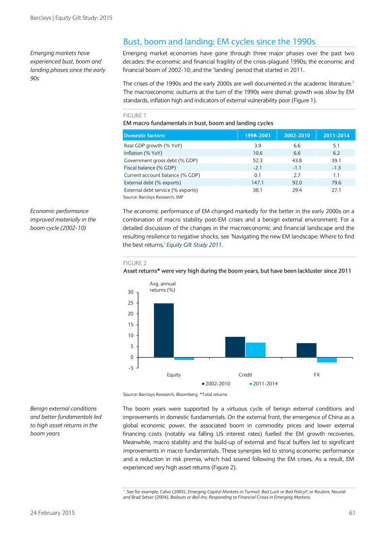
Barclays | Equity Gilt Study: 2015
24 February 2015 61
Bust, boom and landing: EM cycles since the 1990s Emerging market economies have gone through three major phases over the past two decades: the economic and financial fragility of the crisis-plagued 1990s; the economic and financial boom of 2002-10; and the ‘landing’ period that started in 2011.
The crises of the 1990s and the early 2000s are well documented in the academic literature.1 The macroeconomic outturns at the turn of the 1990s were dismal: growth was slow by EM standards, inflation high and indicators of external vulnerability poor (Figure 1).
FIGURE 1 EM macro fundamentals in bust, boom and landing cycles
Domestic factors: 1998-2001 2002-2010 2011-2014
Real GDP growth (% YoY) 3.9 6.6 5.1 Inflation (% YoY) 10.6 6.6 6.2 Government gross debt (% GDP) 52.3 43.8 39.1 Fiscal balance (% GDP) -2.1 -1.1 -1.3 Current account balance (% GDP) 0.1 2.7 1.1 External debt (% exports) 147.1 92.0 79.6 External debt service (% exports) 38.1 29.4 27.1 Source: Barclays Research, IMF
The economic performance of EM changed markedly for the better in the early 2000s on a combination of macro stability post-EM crises and a benign external environment. For a detailed discussion of the changes in the macroeconomic and financial landscape and the resulting resilience to negative shocks, see ‘Navigating the new EM landscape: Where to find the best returns,’ Equity Gilt Study 2011.
FIGURE 2 Asset returns* were very high during the boom years, but have been lackluster since 2011
Source: Barclays Research, Bloomberg. *Total returns
The boom years were supported by a virtuous cycle of benign external conditions and improvements in domestic fundamentals. On the external front, the emergence of China as a global economic power, the associated boom in commodity prices and lower external financing costs (notably via falling US interest rates) fuelled the EM growth recoveries. Meanwhile, macro stability and the build-up of external and fiscal buffers led to significant improvements in macro fundamentals. These synergies led to strong economic performance and a reduction in risk premia, which had soared following the EM crises. As a result, EM experienced very high asset returns (Figure 2).
1 See for example, Calvo (2005), Emerging Capital Markets in Turmoil: Bad Luck or Bad Policy?; or Roubini, Nouriel and Brad Setser (2004), Bailouts or Bail-Ins: Responding to Financial Crises in Emerging Markets.
-5
0
5
10
15
20
25
30
Equity Credit FX
Avg. annual returns (%)
2002-2010 2011-2014
Emerging markets have experienced bust, boom and landing phases since the early 90s
Economic performance improved materially in the boom cycle (2002-10)
Benign external conditions and better fundamentals led to high asset returns in the boom years

Barclays | Equity Gilt Study: 2015
24 February 2015 62
However, in 2011, the benign external environment began to reverse. At the same time, little was achieved in terms of institutional progress and structural reforms beyond the post crises adjustments, and EM asset returns have been uninspiring apart from EM sovereign credit. As a result, economic growth and asset returns deteriorated markedly.
External headwinds led to EM emergency landing EM economies are heavily influenced by the external macroeconomic environment. According to the IMF, about half the variance in EM economic growth rates in 2000-12 can be explained by external factors, including China and developed market growth, low core interest rates and the commodities boom. Furthermore, global factors remain important drivers of macroeconomic outcomes even in the aftermath of the EM crises.2 Although external factors were very supportive of EM economies and their asset returns in the first decade of the millennium, they started to reverse in 2011. We identify the key external factors that have driven these changes, construct an indicator of external supportiveness and discuss how it may evolve and affect EM asset returns in the next few years.
Changes in the external environment In our view, the following factors are the key external headwinds faced by EM since 2011:
• slower growth in China
• slower growth in the euro area
• sharply lower commodity prices, particularly oil
• prospect of higher US yields
• stronger US dollar
Slower GDP growth in China and euro area China’s GDP growth slowed to c.8% in 2011-14 after recording average annual growth of c.11% during the boom years of 2002-10. One of the main reasons for this was the rebalancing of public investment and exports into private consumption. In addition, euro area growth has been low, relative to historical norms, since early 2011. Average GDP growth since Q1 2011 has been c.0.3% y/y, well below an average of close to 1.7% in 1999-2010, a period that included the global financial crisis (Figure 3).
2 Indeed, Felices and Wieladek (2012) find that the link between external factors and fundamentals remains tight even though macro fundamentals have improved materially.
The benign external environment began to reverse in 2011 and asset returns fell as a result
Five external factors have become less supportive since 2011: slower growth in China and the euro area, weaker commodity prices, US yields edging higher and a stronger US dollar
FIGURE 3 Slower China and euro area GDP growth since 2011
Source: Haver Analytics, Barclays Research
-8
-6
-4
-2
0
2
4
6
4
6
8
10
12
14
16
18
96 97 98 99 00 01 02 03 04 05 06 07 08 09 10 11 12 13 14
%y/y% y/y Boom Years China Euro area (RHS)
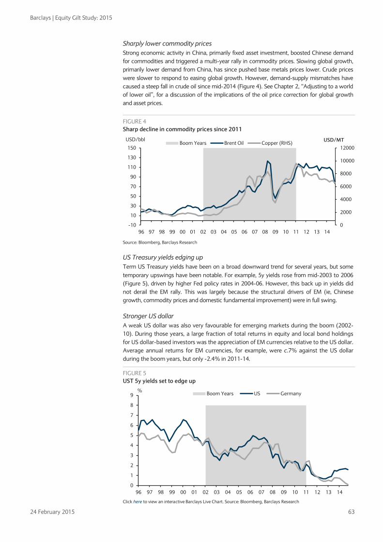
Barclays | Equity Gilt Study: 2015
24 February 2015 63
Sharply lower commodity prices Strong economic activity in China, primarily fixed asset investment, boosted Chinese demand for commodities and triggered a multi-year rally in commodity prices. Slowing global growth, primarily lower demand from China, has since pushed base metals prices lower. Crude prices were slower to respond to easing global growth. However, demand-supply mismatches have caused a steep fall in crude oil since mid-2014 (Figure 4). See Chapter 2, “Adjusting to a world of lower oil”, for a discussion of the implications of the oil price correction for global growth and asset prices.
FIGURE 4 Sharp decline in commodity prices since 2011
Source: Bloomberg, Barclays Research
US Treasury yields edging up Term US Treasury yields have been on a broad downward trend for several years, but some temporary upswings have been notable. For example, 5y yields rose from mid-2003 to 2006 (Figure 5), driven by higher Fed policy rates in 2004-06. However, this back up in yields did not derail the EM rally. This was largely because the structural drivers of EM (ie, Chinese growth, commodity prices and domestic fundamental improvement) were in full swing.
Stronger US dollar A weak US dollar was also very favourable for emerging markets during the boom (2002-10). During those years, a large fraction of total returns in equity and local bond holdings for US dollar-based investors was the appreciation of EM currencies relative to the US dollar. Average annual returns for EM currencies, for example, were c.7% against the US dollar during the boom years, but only -2.4% in 2011-14.
0
2000
4000
6000
8000
10000
12000
-10
10
30
50
70
90
110
130
150
96 97 98 99 00 01 02 03 04 05 06 07 08 09 10 11 12 13 14
USD/MTUSD/bblBoom Years Brent Oil Copper (RHS)
FIGURE 5 UST 5y yields set to edge up
Click here to view an interactive Barclays Live Chart. Source: Bloomberg, Barclays Research
0
1
2
3
4
5
6
7
8
9
96 97 98 99 00 01 02 03 04 05 06 07 08 09 10 11 12 13 14
% Boom Years US Germany

Barclays | Equity Gilt Study: 2015
24 February 2015 64
A measure of external supportiveness We combine the five key external headwinds (slower China growth, euro area growth, weaker commodity prices, higher US yields and a stronger USD) to form a measure of external supportiveness. The measure is an average of the Z-scores (standard deviation away from the mean) of each of the external factors. UST yields and the USD are included in the indicator with a negative sign to reflect their negative effect on EM economies. In the Appendix, we present the exposure of various EM economies to the five external measures discussed above as well as an aggregate ranking of EM countries to those factors.
Figure 7 shows our measure of external supportiveness. Three observations stand out. First, the measure shows very clearly the transitions from bust, boom and landing since the mid-1990s. Second, the global financial crisis was a major negative for the asset class but the external backdrop improved rapidly, largely because of China’s huge counter-cyclical effort, easier US monetary policy and a weaker USD. Third, these phases clearly mirror the pattern of the asset class in the boom and landing phases (Figure 2).
FIGURE 6 The US dollar is on the rise (USD vs broad basket of currencies including EM)
Click here to view an interactive Barclays Live Chart. Source: Bloomberg, Barclays Research
We combine the five external headwinds to form a measure of external supportiveness for EM
FIGURE 7 A measure of external supportiveness (Higher = more supportive of EM)
Source: Haver Analytics, Bloomberg, Barclays Research. Note: We combine the five key external headwinds (slower China growth, slower euro area growth, weaker commodity prices, higher US yields and a stronger USD) to form a measure of external supportiveness. The measure is an average of the Z-scores (standard deviation away from the mean) of each of the external factors.
Our external supportiveness measure captures the transition from bust, boom and landing since the mid-90s
80
90
100
110
120
130
140
150
96 97 98 99 00 01 02 03 04 05 06 07 08 09 10 11 12 13 14
Index
-1.2
-0.8
-0.4
0.0
0.4
0.8
1.2
96 97 98 99 00 01 02 03 04 05 06 07 08 09 10 11 12 13 14
Z ScoreBoom Years Measure of external supportiveness
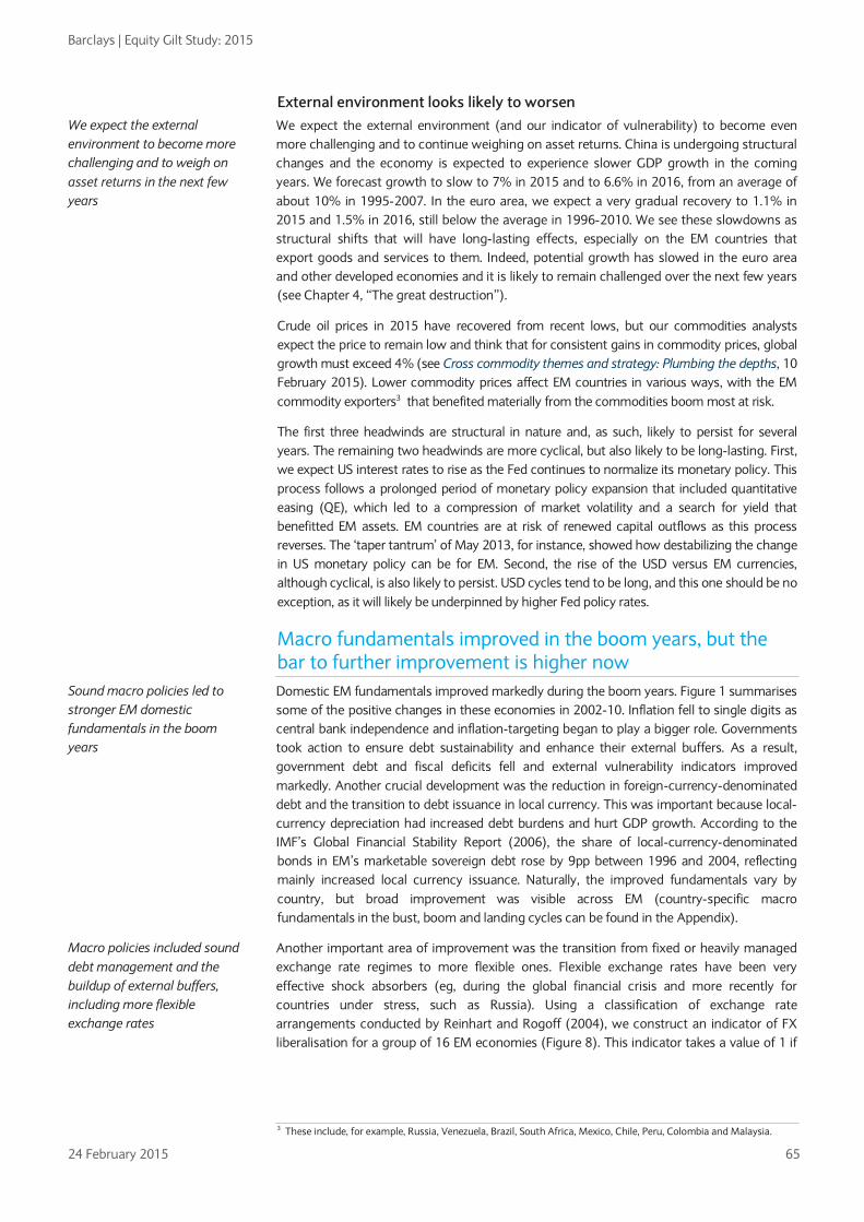
Barclays | Equity Gilt Study: 2015
24 February 2015 65
External environment looks likely to worsen We expect the external environment (and our indicator of vulnerability) to become even more challenging and to continue weighing on asset returns. China is undergoing structural changes and the economy is expected to experience slower GDP growth in the coming years. We forecast growth to slow to 7% in 2015 and to 6.6% in 2016, from an average of about 10% in 1995-2007. In the euro area, we expect a very gradual recovery to 1.1% in 2015 and 1.5% in 2016, still below the average in 1996-2010. We see these slowdowns as structural shifts that will have long-lasting effects, especially on the EM countries that export goods and services to them. Indeed, potential growth has slowed in the euro area and other developed economies and it is likely to remain challenged over the next few years (see Chapter 4, “The great destruction”).
Crude oil prices in 2015 have recovered from recent lows, but our commodities analysts expect the price to remain low and think that for consistent gains in commodity prices, global growth must exceed 4% (see Cross commodity themes and strategy: Plumbing the depths, 10 February 2015). Lower commodity prices affect EM countries in various ways, with the EM commodity exporters3 that benefited materially from the commodities boom most at risk.
The first three headwinds are structural in nature and, as such, likely to persist for several years. The remaining two headwinds are more cyclical, but also likely to be long-lasting. First, we expect US interest rates to rise as the Fed continues to normalize its monetary policy. This process follows a prolonged period of monetary policy expansion that included quantitative easing (QE), which led to a compression of market volatility and a search for yield that benefitted EM assets. EM countries are at risk of renewed capital outflows as this process reverses. The ‘taper tantrum’ of May 2013, for instance, showed how destabilizing the change in US monetary policy can be for EM. Second, the rise of the USD versus EM currencies, although cyclical, is also likely to persist. USD cycles tend to be long, and this one should be no exception, as it will likely be underpinned by higher Fed policy rates.
Macro fundamentals improved in the boom years, but the bar to further improvement is higher now Domestic EM fundamentals improved markedly during the boom years. Figure 1 summarises some of the positive changes in these economies in 2002-10. Inflation fell to single digits as central bank independence and inflation-targeting began to play a bigger role. Governments took action to ensure debt sustainability and enhance their external buffers. As a result, government debt and fiscal deficits fell and external vulnerability indicators improved markedly. Another crucial development was the reduction in foreign-currency-denominated debt and the transition to debt issuance in local currency. This was important because local-currency depreciation had increased debt burdens and hurt GDP growth. According to the IMF’s Global Financial Stability Report (2006), the share of local-currency-denominated bonds in EM’s marketable sovereign debt rose by 9pp between 1996 and 2004, reflecting mainly increased local currency issuance. Naturally, the improved fundamentals vary by country, but broad improvement was visible across EM (country-specific macro fundamentals in the bust, boom and landing cycles can be found in the Appendix).
Another important area of improvement was the transition from fixed or heavily managed exchange rate regimes to more flexible ones. Flexible exchange rates have been very effective shock absorbers (eg, during the global financial crisis and more recently for countries under stress, such as Russia). Using a classification of exchange rate arrangements conducted by Reinhart and Rogoff (2004), we construct an indicator of FX liberalisation for a group of 16 EM economies (Figure 8). This indicator takes a value of 1 if
3 These include, for example, Russia, Venezuela, Brazil, South Africa, Mexico, Chile, Peru, Colombia and Malaysia.
We expect the external environment to become more challenging and to weigh on asset returns in the next few years
Sound macro policies led to stronger EM domestic fundamentals in the boom years
Macro policies included sound debt management and the buildup of external buffers, including more flexible exchange rates
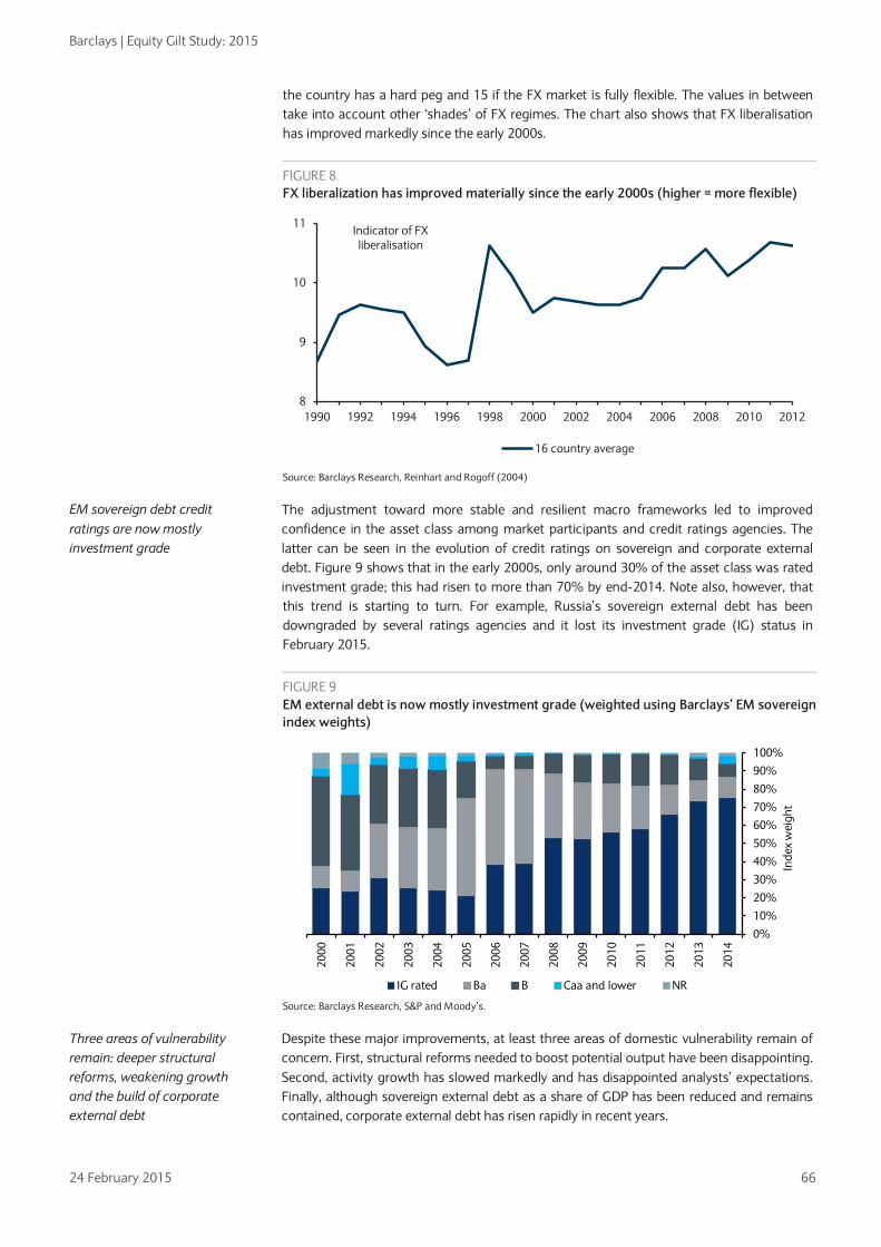
Barclays | Equity Gilt Study: 2015
24 February 2015 66
the country has a hard peg and 15 if the FX market is fully flexible. The values in between take into account other ‘shades’ of FX regimes. The chart also shows that FX liberalisation has improved markedly since the early 2000s.
FIGURE 8 FX liberalization has improved materially since the early 2000s (higher = more flexible)
Source: Barclays Research, Reinhart and Rogoff (2004)
The adjustment toward more stable and resilient macro frameworks led to improved confidence in the asset class among market participants and credit ratings agencies. The latter can be seen in the evolution of credit ratings on sovereign and corporate external debt. Figure 9 shows that in the early 2000s, only around 30% of the asset class was rated investment grade; this had risen to more than 70% by end-2014. Note also, however, that this trend is starting to turn. For example, Russia’s sovereign external debt has been downgraded by several ratings agencies and it lost its investment grade (IG) status in February 2015.
FIGURE 9 EM external debt is now mostly investment grade (weighted using Barclays’ EM sovereign index weights)
Source: Barclays Research, S&P and Moody’s.
Despite these major improvements, at least three areas of domestic vulnerability remain of concern. First, structural reforms needed to boost potential output have been disappointing. Second, activity growth has slowed markedly and has disappointed analysts’ expectations. Finally, although sovereign external debt as a share of GDP has been reduced and remains contained, corporate external debt has risen rapidly in recent years.
8
9
10
11
1990 1992 1994 1996 1998 2000 2002 2004 2006 2008 2010 2012
Indicator of FX liberalisation
16 country average
0%
10%
20%
30%
40%
50%
60%
70%
80%
90%
100%
2014
2013
2012
2011
2010
2009
2008
2007
2006
2005
2004
2003
2002
2001
2000
Inde
x w
eigh
t
IG rated Ba B Caa and lower NR
EM sovereign debt credit ratings are now mostly investment grade
Three areas of vulnerability remain: deeper structural reforms, weakening growth and the build of corporate external debt

Barclays | Equity Gilt Study: 2015
24 February 2015 67
Progress on structural reforms and institutions/governance has been slow EM macro stability has largely been achieved, but progress on governance/institutional development and structural reform has been slow. This is partly because the effectiveness of structural reforms is perhaps greatest when there is plenty of room to reduce macroeconomic distortions. For example, structural reforms in several emerging markets after the financial crises of the 1990s had a big impact on macro outcomes, partly because the distortions were large in the first place: inflation was high, some prices were managed, and exchange rates and capital accounts were controlled. But underlying political constraints on reforms also matter. Acemoglu et al (2004) argue that structural reforms have a better chance of being effective in economies where there is enough political room for reforms to be adopted. Such room exists in many EM economies, but only a few (eg, India and Mexico) are making progress.
We gauge the recent institutional/governance developments in EM by studying the World Bank’s Governance Indicators. This dataset includes governance metrics for six categories, including rule of law, voice and accountability, government effectiveness, regulatory quality, political stability and control of corruption. When we aggregate these metrics (weighted by GDP) we find that EM governance has hardly improved since 1998 (considering that the scale goes from -2.5 to 2.5), whereas credit ratings have clearly improved (Figure 10). Furthermore, the gap between EM and developed markets (DM) remains wide (Figure 11). The inclusion of China improves the EM picture slightly as some progress has been made there, but it does not change the main message that governance and institutional progress has been slow.
Individual countries give a similar picture. Figure 12 considers Z-scores for ratings and governance metrics for 1998-2013. With the exception of Venezuela and Poland, ratings have improved more than governance. This suggests to us that ratings are mainly capturing macroeconomic developments and not necessarily institutional or reform progress.
FIGURE 10 Ratings have improved more than governance (rating and governance indicators weighted by GDP)
FIGURE 11 EM governance remains poorer than in DM (governance indicators weighted by GDP)
Source: Barclays Research, S&P, Moody’s and World Bank *Numerical score: lower = higher credit rating. Countries include: Brazil, Chile, Colombia, Indonesia, Malaysia, Mexico, Peru, Poland, Russia, South Africa, Turkey, Philippines, Argentina, Venezuela.
Source: Barclays Research, S&P, Moody’s and World Bank. DM countries include: Australia, Canada, France, Germany, Italy, Japan, Netherlands, Norway, Spain, Swede, Switzerland, United Kingdom, and United States. EM countries include: Brazil, Chile, Colombia, Indonesia, Malaysia, Mexico, Peru, Poland, Russia, South Africa, Turkey, Philippines, Argentina, Venezuela
Progress on structural reforms and governance has been slow
Sovereign ratings have improved more than governance metrics in most EMs
8
9
10
11
12
13
14
15-0.28
-0.26
-0.24
-0.22
-0.20
-0.18
-0.16
-0.14
-0.12
-0.10
1998
1999
2000
2001
2002
2003
2004
2005
2006
2007
2008
2009
2010
2011
2012
2013
EM governance ex-China (lhs)
EM ratings ex-China
-0.5
0.0
0.5
1.0
1.5
1996
1997
1998
1999
2000
2001
2002
2003
2004
2005
2006
2007
2008
2009
2010
2011
2012
2013
index (-2.5 min, 2.5
max)
DM governance
EM governance
EM governance ex-China (lhs)

Barclays | Equity Gilt Study: 2015
24 February 2015 68
FIGURE 12 No clear improvement in governance metrics of EMs: Z-score of ratings and governance (as of 2013)
Source: Barclays Research, S&P, Moody’s and World Bank. Z-scores calculated using a sample from 1998-2003.
Growth has been a major disappointment in the past few years The lack of progress on structural reforms means that potential output in EM economies is likely to be constrained. This makes GDP growth more vulnerable to external headwinds, especially in those countries that depend heavily on external demand and commodity exports. The so-called BRICs, once the flagship of the EM boom, have slowed significantly. In Brazil, GDP growth has slowed from close to 8% to almost 0% in just five years (Figure 13). Such outturns have consistently surprised the consensus to the downside (Figure 14). Disappointing growth has been the main driver of lower asset returns, especially in equity markets, where returns are tightly linked to expectations of earnings growth, which in turn depend on prospects for activity growth.
-2.5-2.0-1.5-1.0-0.50.00.51.01.52.02.5
VEN
ARG ZA
F
MYS
POL
RUS
MEX
CH
N
BRA
IDN
CH
L
PHL
PER
CO
L
TUR
z-scores
Governance (z-score) Ratings (z-score)
Activity growth has been a major disappointment since 2011
FIGURE 13 GDP growth has slowed rapidly in the BRICs*
FIGURE 14 BRICs* growth has surprised the consensus to the downside in recent years (GDP growth – year-ahead-forecast)
Source: Barclays Research and Bloomberg. BRICs are Brazil, Russia, India and China.
Source: Barclays Research and Bloomberg. BRICs are Brazil, Russia, India and China.
0
2
4
6
8
10
12
Brazil India Russia China
Real GDP growth YoY 2010 2011 2012 2013 2014
-4
-3
-2
-1
0
1
2
3
Brazil India Russia China
ppt2010 2011 2012 2013 2014

Barclays | Equity Gilt Study: 2015
24 February 2015 69
EM external debt: From sovereign to corporate vulnerability As part of the fundamental improvement during the boom years, EM sovereigns managed to reduce foreign currency external debt, thereby limiting the damaging effect of currency depreciations on sovereign balance sheet and growth (Figure 15). However, corporate debt has risen from 18.5% of GDP in 2003 to 24.7% in the year to Q3 2014. In contrast to the more cautious sovereign debt management, the corporate sector continued to issue in foreign currency (mainly USD), partly because of the improved sovereign fundamentals and the associated fall in country risk premia, and partly because of the stable, and later falling, cost of finance in hard currency as a result of the sharp drop in interest rates in the developed world.
FIGURE 15 EM corporate external debt* has been rising faster than government external debt since mid-2000s
*Corporate external debt is total external debt minus government and central bank debt. It therefore includes the debt of deposit-taking corporations. Source: World Bank – Quarterly external debt data, Barclays Research
The charts below show that the governments of Hungary, Poland, Mexico, Malaysia, and South Africa have large external debt (more than 15% of GDP). Note, however, that not all that debt is in foreign currency. Indeed, a large fraction of South Africa’s external debt is in local currency. The corporate sectors of Hungary, Chile, Czech Republic, Malaysia and Poland have much larger external debt outstanding (more than 40% of GDP). Hungary’s corporate sector is the most indebted even though, as a percentage of GDP, its external debt has fallen to 90%, from 107% at end-2008. By contrast, corporate sector external borrowing as a percentage of GDP in the Czech Republic, Chile and Turkey has risen by more than 10pp since 2008. Note, however, that these data include not only bond issuance but also loans that international banks may have extended to EM corporates and financial institutions.
The corporate sector in EM economies is increasingly borrowing by issuing offshore debt securities. EM corporations borrow abroad via offshore affiliates and repatriate the proceeds. Some authors have mentioned that this sort of corporate borrowing is partly responsible for the massive expansion in EM corporate issuance in international bond markets in the past few years. This has probably increased foreign exchange risk exposure in EM. This expansion also means that indicators of vulnerability that are based only on international bank credit expansion do not fully capture financial system risks.4
The increase in EM corporates’ foreign exchange risk is not necessarily a big negative, however. A stronger USD environment is likely to weigh on companies that earn revenues in local currency but incur costs in USD. By contrast, companies earning revenues in USD but incurring costs in local currency are likely to be less risky. This is the case with many exporters, which usually issue debt in the currency of their export receipts (see Emerging Markets Weekly: Don’t drop your guard, 15 January 2015). Other risks from the external environment include rising USD interest rates and higher rate volatility.
In sum, EM corporate external debt has soared in recent years and, unlike sovereign debt, has risen materially relative to GDP since the mid-2000s. The build-up of corporate debt varies by country, with CEEMEA looking most exposed. A rise in the USD and higher US interest rates are important risks that need to be monitored, especially given that markets do not appear to have discriminated by the size of corporate debt in recent episodes of risk aversion (Figure 16). Overall, given the existing buffers at the sovereign level, we see the risk of corporate stress as a pocket of vulnerability rather as a source of systemic risk of EM.
4 See ‘The global long-term interest rate, financial risks and policy choices in EMEs’, Philip Turner, BIS working paper 441 and BIS Quarterly Review, December 2014 - Non-financial corporations from emerging market economies and capital flows.
0
5
10
15
20
25
30
35
1998 1999 2000 2001 2002 2003 2004 2005 2006 2007 2008 2009 2010 2011 2012 2013 2014
% GDP
Corporate external debt Sovereign external debt

Barclays | Equity Gilt Study: 2015
24 February 2015 70
FIGURE 16 EM corporate debt* is generally higher than sovereign external debt (% GDP – Q3 2014)
FIGURE 17 EM corporate and sovereign (OAS) external debt spreads have converged since mid-2011
Source: World Bank- Quarterly external debt statistics, Haver, Barclays Research *Corporate external debt is total external debt minus government and central bank debt. It therefore includes debt by deposit taking corporations.
Click here to view an interactive Barclays Live Chart. Source: Barclays Research, Bloomberg
Decent risk reward in EM, especially vs developed markets The combination of external challenges and more resilient domestic fundamentals suggests that we have entered a new regime for EM asset prices in the ‘landing’ phase that began in 2011. We assess the prospects for asset returns and risk premia in the main EM sub-asset classes: equities, local bonds, sovereign credit and FX. We also assess the prospects of these asset classes relative to developed markets.5
EM equities
Vulnerable to external factors EM market equities clearly capture the transitions from bust to boom and landing cycles in the past two decades. In fact, their path is notably similar to our measure of external supportiveness (Figure 18). The external drivers we identified supported EM GDP and earnings growth in the boom years, so the close relationship between the measure and EM equities is not entirely surprising. Similarly, when those drivers became less supportive starting in 2011, EM equities fell. Given our view that the external environment will become even more challenging, there seems to be room for some downside risk to EM equities.
However, looking at EM equities by region, it is apparent that the resilience of the overall index has been driven by EM Asia. LatAm has already priced in the more challenging backdrop (Figure 19). That is not surprising given that the region benefited hugely from China's growth and demand for a wide range of commodities, including bulk commodities (iron ore), crude oil, base metals and agricultural products.
CEEMEA equities have also priced in the bad news (Figure 20). Despite the region being a net commodity importer, it has a large exposure to the euro area via trade and financial links. So perhaps the region has been penalised more for its dependence and links with the euro area and the negative effects of the ongoing crisis.
5 Our analysis includes a group of 16 EM economies (Brazil, China, India, Mexico, Poland, Russia, South Africa, Turkey, Korea, Indonesia, Malaysia, Thailand, Hungary, Colombia, the Philippines, Chile) and a group of 11 DM (US, Canada, Japan, UK, Germany, France, Italy, Spain, Netherlands, Sweden, Norway).
0102030405060708090
Hun
gary
Chi
le
Cze
ch R
epub
lic
Mal
aysi
a
Pola
nd
Turk
ey
Russ
ia
Thai
land
Sout
h A
fric
a
Kore
a
Braz
il
Peru
Indi
a
Indo
nesi
a
Col
ombi
a
Mex
ico
Arg
entin
a
Phili
ppin
es
% GDP Corporate sector (includes deposit taking corporates)
General government
-2
0
2
4
6
8
10
12
14
16
18
03 04 05 06 07 08 09 10 11 12 13 14
% Corp.- Sov. Diff
Sovereign
Corporate
EM equities have been resilient to the less benign external conditions
But the resilience masks regional differences: LatAm and CEEMEA equities have priced the tougher external environment

Barclays | Equity Gilt Study: 2015
24 February 2015 71
FIGURE 18 EM equities: Overall resilience masks regional differences
FIGURE 19 LatAm seems to have priced in the more challenging backdrop already
Source: Barclays, Bloomberg and MSCI Source: Barclays, Bloomberg and MSCI
The gap between the EM Asia equity index and our measure of external supportiveness widened further in 2014 (Figure 21) as equities markets in the two regional heavyweights – China and India – rallied strongly. Chinese equities had posted a weak H1 14 but surged in H2 14, despite monthly economic indicators indicating easing domestic demand. Poor economic data fuelled investor expectations that the PBoC would ease policy. Favourable terms of trade as a result of lower oil prices, as well as increased retail participation and the beginning of a Shanghai-Hong Kong cross-trading link, boosted Chinese equities in H2 15. Structural reform progress under the Xi-Li government, expectations of further benchmark rate and reserve requirement ratio (RRR) cuts and low valuations of large-cap stocks fuelled another c.30% rally in Chinese equities between November 20 and end-December 2014, pushing the SHCOMP index up c.50% in 2014.
In India, expectations of a Narendra Modi-led government began to spur investor interest in Indian equities at the start of 2014. A landslide win for the BJP pushed Indian equities to touch record highs in May 2014. More important, the steep drop in oil prices turned key macroeconomic indicators favourable last year, further boosting investor interest in India. Lower oil prices resulted in easing inflation, shrank the current account deficit and prompted the government to undertake fiscal consolidation measures. Moreover, GDP growth improved
0
200
400
600
800
1,000
1,200
1,400
-1.4
-1.0
-0.6
-0.2
0.2
0.6
1.0
1.4
96 98 00 02 04 06 08 10 12 14
IndexZ Score Boom YearsMeasure of external supportivenessEM equity (RHS)
-500
500
1,500
2,500
3,500
4,500
5,500
-1.4
-1.0
-0.6
-0.2
0.2
0.6
1.0
1.4
96 98 00 02 04 06 08 10 12 14
IndexZ ScoreBoom YearsMeasure of external supportivenessLatAm equity
EM Asian equities have been more resilient largely because of the recent strong performance of China and India
FIGURE 20 CEEMEA also seems to have priced in the bad news
FIGURE 21 EM Asia shows some structural resilience
Source: Barclays, Bloomberg and MSCI Source: Barclays, Bloomberg and MSCI
0
100
200
300
400
500
-1.4
-1.0
-0.6
-0.2
0.2
0.6
1.0
1.4
96 98 00 02 04 06 08 10 12 14
IndexZ ScoreBoom YearsMeasure of external supportivenessCEEMEA equity
0
100
200
300
400
500
600
-1.4
-1.0
-0.6
-0.2
0.2
0.6
1.0
1.4
96 98 00 02 04 06 08 10 12 14
IndexZ ScoreBoom YearsMeasure of external supportivenessEM Asia equity

Barclays | Equity Gilt Study: 2015
24 February 2015 72
and earnings growth accelerated. All these factors, combined with a better policy environment, resulted in a significant rise in fund flows into India, boosting Indian equities by c.30% in 2014. See Chapter 6, “India: A step change” for a thorough discussion of the positive economic changes that India has recently experienced as well as its bright prospects.
Ongoing and expected structural changes in China and India should help equity markets in these countries to continue to attract investor attention. China still has significant control over its capital account, but gradual liberalisation has been pushed forward in recent years. Further opening of China’s capital account will be appealing to investors (see Macro Daily Focus: What causes divergent performance of onshore and offshore China-related stocks? 20 January 2015). In India, a sustained decline in inflation and inflation expectations, improved consumer spending and increased capacity utilisation are likely to work in favour of equities.
EM Asia’s resilience could also stem from the fact that most Asian economies export a sizable fraction of their GDP to the US. Moreover, falling commodity prices (notably oil prices) have been a positive terms of trade shock for EM Asia as it is the main oil importer and consumer within EM. Lower inflation gives central banks more scope to keep policy accommodative.
EM equity risk premia We also explore the evolution of EM earnings yields, the ratio of corporate earnings over prices (the inverse of the price/earnings ratio). A higher earnings yield means EM equities are more attractive from a valuation point of view. But it also suggests higher risks, as the earnings yield is a measure of the compensation demanded by investors for holding EM equities.6
Figure 22 shows that EM earnings yields were higher than in DM in the early 2000s. This gap closed as EM equities outperformed DM into and after the global financial crisis of 2008-09. In 2011, both metrics started drifting apart, with EM equities underperforming DM, in line with a tougher external environment. The ‘taper tantrum’ of 2013 opened that gap further and there has since been a gradual fall in the EM earnings yield. Note also that the recent acceleration in the fall of the EM earnings yield has been mainly because of the rally in Chinese equities. Figure 23 shows that the fall is more gradual and the gap to DM still wide when China is excluded. Overall, this suggests that EM equities offer more attractive earnings yields, but we also know that this is for good reason, as the external environment has been a lot tougher for EM since mid-2011.
FIGURE 22 EM vs DM equity earnings yields (%) - gap closing largely because of recent rally in China
FIGURE 23 EM ex-China vs DM equity earnings yields (%) - gap remains wide when China is excluded
Note: GDP-weighted; Source: Barclays, Bloomberg, Haver Analytics Note: GDP-weighted; Source: Barclays, Bloomberg, Haver Analytics
6 Note that a common measure of the equity ‘risk premium’ is the earnings yield minus real ‘risk free’ rates. We do not use this metric in this article. Note, however, that the difference between earnings yields and real bond yields is currently roughly the same for EM and DM.
-2
0
2
4
6
8
10
12
14
03 04 05 06 07 08 09 10 11 12 13 14
(%) EM-DM diff.DMEM
-2
0
2
4
6
8
10
12
14
16
03 04 05 06 07 08 09 10 11 12 13 14
(%)EM ex-China - DM diff.DMEM ex-China
EM Asia’s resilience could also reflect the benefits of lower oil prices and sizable exports to the US
EM earnings yields have fallen since the 'taper tantrum', but they remain higher than in developed markets
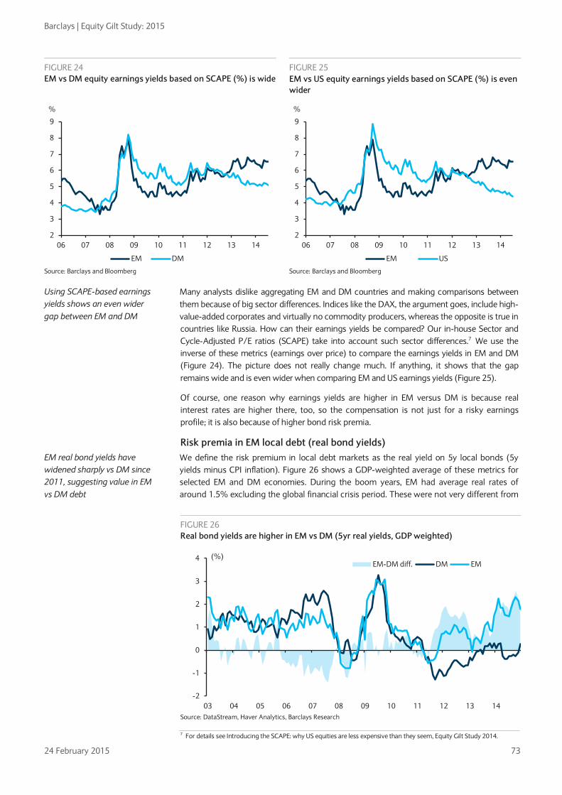
Barclays | Equity Gilt Study: 2015
24 February 2015 73
Many analysts dislike aggregating EM and DM countries and making comparisons between them because of big sector differences. Indices like the DAX, the argument goes, include high-value-added corporates and virtually no commodity producers, whereas the opposite is true in countries like Russia. How can their earnings yields be compared? Our in-house Sector and Cycle-Adjusted P/E ratios (SCAPE) take into account such sector differences.7 We use the inverse of these metrics (earnings over price) to compare the earnings yields in EM and DM (Figure 24). The picture does not really change much. If anything, it shows that the gap remains wide and is even wider when comparing EM and US earnings yields (Figure 25).
Of course, one reason why earnings yields are higher in EM versus DM is because real interest rates are higher there, too, so the compensation is not just for a risky earnings profile; it is also because of higher bond risk premia.
Risk premia in EM local debt (real bond yields) We define the risk premium in local debt markets as the real yield on 5y local bonds (5y yields minus CPI inflation). Figure 26 shows a GDP-weighted average of these metrics for selected EM and DM economies. During the boom years, EM had average real rates of around 1.5% excluding the global financial crisis period. These were not very different from
7 For details see Introducing the SCAPE: why US equities are less expensive than they seem, Equity Gilt Study 2014.
FIGURE 24 EM vs DM equity earnings yields based on SCAPE (%) is wide
FIGURE 25 EM vs US equity earnings yields based on SCAPE (%) is even wider
Source: Barclays and Bloomberg Source: Barclays and Bloomberg
Using SCAPE-based earnings yields shows an even wider gap between EM and DM
FIGURE 26 Real bond yields are higher in EM vs DM (5yr real yields, GDP weighted)
Source: DataStream, Haver Analytics, Barclays Research
EM real bond yields have widened sharply vs DM since 2011, suggesting value in EM vs DM debt
2
3
4
5
6
7
8
9
06 07 08 09 10 11 12 13 14
%
EM DM
2
3
4
5
6
7
8
9
06 07 08 09 10 11 12 13 14
%
EM US
-2
-1
0
1
2
3
4
03 04 05 06 07 08 09 10 11 12 13 14
(%)EM-DM diff. DM EM

Barclays | Equity Gilt Study: 2015
24 February 2015 74
those of DM in that period. However, this pattern changed significantly in the period from 2011 to 2014. DM real yields went deeply negative, while EM real yields initially fell but then rose to about 2% in 2014.
From an asset allocation point of view, this difference is hard to ignore. The universe of positive real yields is becoming scarcer as central banks in the developed world continue to hold policy rates close to zero, with some even venturing into negative policy rates. This contrasts with policy rates in EM, where the zero bound is further away. Indeed, real policy rates in EM are close to 3%, the highest since 2007 (Figure 27). The rise in real policy rates since 2011 has more to do with falling inflation than higher nominal policy rates: while EM policy rates remained broadly stable, inflation has gradually fallen since 2011. Looking ahead, the growth environment is likely to remain challenging and external conditions to deteriorate further, while inflation is likely to remain subdued given the fall in energy prices. In this context, local bonds in EM are an interesting proposition. Cyclical headwinds are likely to keep central banks in check even as US yields start turning higher. In addition, carry is still generally high and in some countries (eg, India and Brazil) it should compensate for weaker currencies.
FIGURE 27 Real bond yields in EM reflect high real EM policy rates (GDP-weighted)
Source: Haver Analytics, Barclays Research
High real yields in EM are hard to ignore when those in DM are close to zero
FIGURE 28 Real bond yields 5y minus CDS spreads – plenty of potential left in some EMs after stripping out credit risk
Source: Haver Analytics, DataStream, Bloomberg, Barclays Research
-2
-1
0
1
2
3
4
05 06 07 08 09 10 11 12 13 14
%EM Real Policy Rate EM 5yr Real Bond Yield
-6-5-4-3-2-101234
Braz
il
Hun
gary
Pola
nd
Spai
n
Kore
a
US
Thai
land U
K
Col
ombi
a
Mal
aysi
a
Net
herla
nds
Phili
ppin
es
Swed
en
Ger
man
y
Sout
h A
fric
a
Italy
Fran
ce
Mex
ico
Nor
way
Chi
le
Indo
nesi
a
Turk
ey
Japa
n
Russ
ia
bp

Barclays | Equity Gilt Study: 2015
24 February 2015 75
As EM real yields embed credit risk premia on local bonds, it is helpful to gauge the risk premium left in bonds after stripping out such credit risk. Although these risk premia are difficult to measure, metrics of credit risk on external debt, including CDS, can be used as proxies. On our calculations, these premia are high in such countries as Brazil, Hungary and Poland (Figure 28).
Sovereign credit spreads Sovereign external debt is perhaps the asset class within EM that received most attention during the boom years, largely because issuance had been extensive during and after the EM sovereign crises as most sovereigns had to access international financial market via foreign-currency-denominated debt. We study credit risk on sovereign external (USD-denominated) debt via sovereign CDS spreads.
Figure 29 shows the GDP-weighted average of these spreads since 2003 for our groups of EM ex China and DM economies.8 The first observation is that EM ex-China CDS spreads reached a low in 2007, before the global financial crisis. The second is that these spreads have moved broadly sideways but above the 2007 tights since 2011. We attribute this to the role that risk appetite and global macro volatility play in EM credit risk. Figure 30 shows that risk appetite, proxied by the VIX, has a high correlation with EM credit risk. Global risk appetite has strengthened recently but has not returned to pre-2008-09 levels. However, it has remained strong enough to contain the rise of EM credit risk in the face of a tougher external backdrop since 2011.
Other external factors have also influenced EM credit spreads recently. For example, in Figure 30, the large spike in mid-2011 coincides with the slowdown in Chinese activity and the widening in 2013 stemming with the taper tantrum. At the same time, at the country level, the domestic fundamentals discussed earlier also play a big role. We study the importance of external and domestic influences in the Box below.
8 We exclude China as the sovereign has very little external debt. Indeed, China’s weight in our sovereign external debt index is close to zero.
EM CDS spreads have widened recently vs DM, reflecting the tougher external environment
FIGURE 29 EM vs DM CDS spreads*: Higher EM spreads mainly reflect tougher external environment
FIGURE 30 EM CDS spreads* and VIX: External drivers matter
Source: Barclays Research, Bloomberg, IMF. *GDP-weighted. DM data since 2009
Source: Barclays Research, Bloomberg and IMF. *GDP-weighted.
But domestic fundamentals also play an important role for CDS spreads
0
100
200
300
400
500
600
700
03 04 05 06 07 08 09 10 11 12 13 14
DM
EM ex-China
bp
0
10
20
30
40
50
60
70
0
100
200
300
400
500
600
700
03 04 05 06 07 08 09 10 11 12 13 14
EM ex China (lhs) VIX (rhs)bp

Barclays | Equity Gilt Study: 2015
24 February 2015 76
Determinants of EM sovereign credit spreads: The role of domestic and external factors We gauge the importance of external and domestic factors for EM sovereign credit by estimating a model of EM CDS spreads. In particular, we estimate the model using a dynamic panel of 16 EM countries, with monthly data since 2000. The panel is unbalanced as data are sometimes unavailable for several EM countries before the mid-2000s. We estimate 5y CDS spreads as a function of sovereign credit ratings (the average of Moody’s and S&P and a measure of domestic macro fundamentals), the World Bank’s governance indicators (a proxy for institutional progress), China activity growth (the National Bureau of Statistics of China leading index), commodity prices (the y/y % change in the CRB index) and the VIX (a proxy for risk aversion/macro volatility). The model also incorporates fixed effects (country dummies) to control for country-specific characteristics that may not be captured by the other domestic variables considered.
FIGURE 31 OLS fixed-effects regressions of CDS sovereign spreads on domestic and external factors
Coefficient T-Stat Coefficient T-Stat
Constant 1772.2 7.5 1594.1 6.4
Sovereign credit ratings 77.9 30.3 71.3 24.1
VIX 6.6 15.8 6.9 15.9
China leading index of activity -23.7 -10.2 -21.6 -8.8
Commodity prices -0.9 -5.5 -0.8 -5.0
WB governance indicators
-327.5 -7.5
Adjusted R-squared 0.69
0.67
Cross-sections included 16
16
Total panel (unbalanced) observations 2417
2225 Source: Barclays Research. *Statistically significant at less than 1%. When standard errors are corrected for
autocorrelation, the coefficients remain statistically significant at the 1% level, with the exception of the governance indicator, which is significant at the 15% level.
The key results of the model are as follows:
• All the estimated coefficients of the variables considered are statistically significant and their signs are the ones we expected. Countries with better sovereign credit ratings (lower numerical rating) tend to have tighter spreads. In particular, a one-notch credit upgrade (coded as a decline of 1 in the ‘sovereign credit variable’) is worth a 70-80bp spread compression, depending on the specification. Countries with better governance/institutions (higher World Bank governance indicators) also tend to have tighter spreads: a ‘typical’ (1 std dev) improvement tightens spreads by 25bp. This is important because it suggests that institutional progress matters even after considering the improvement in macro fundamentals captured by ratings and other country-specific factors captured by the country dummies. The country fixed effects explain 23% of the CDS spreads variation. See Figure 31 for details of the model estimates.
• On the external front, a ‘typical’ (one standard deviation) rise in the China leading indicator is worth a spread compression of 38-41bp depending on the specification. A 10% rise in commodity prices tightens spreads by 8-9bp, while a ‘typical’ rise in the VIX widens spreads by 56-59bp, also depending on the model specification on Figure 31.These results, combined with our view that Chinese growth will continue to slow, macro volatility will likely rise, commodity prices will not surge, EM macro fundamentals will not improve materially and institutional reform will remain challenging, mean that a sustained compression of spreads based on these factors is unlikely. Country differences may present interesting opportunities rather than directional views for the asset class as a whole. For example, countries that are directly linked to Chinese demand for commodities like Peru and Chile may remain challenged, while those with prospects of deeper reform, like Mexico or Indonesia, are in a better position.
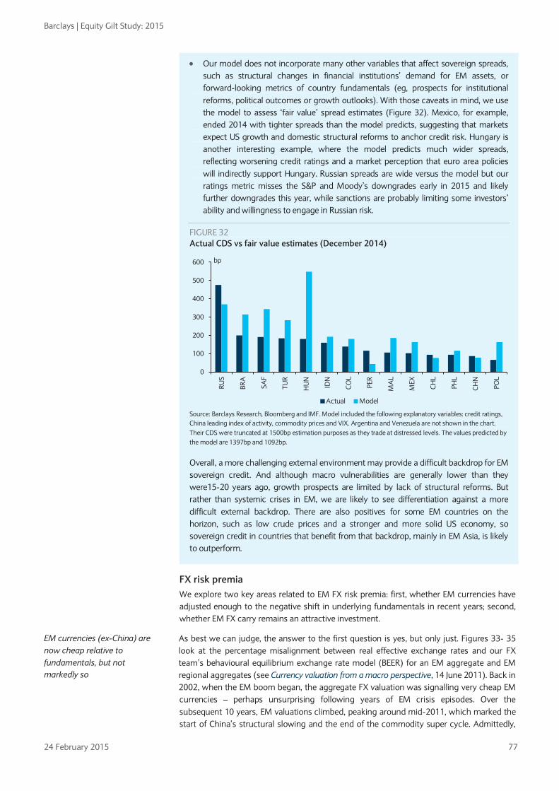
Barclays | Equity Gilt Study: 2015
24 February 2015 77
• Our model does not incorporate many other variables that affect sovereign spreads, such as structural changes in financial institutions’ demand for EM assets, or forward-looking metrics of country fundamentals (eg, prospects for institutional reforms, political outcomes or growth outlooks). With those caveats in mind, we use the model to assess ‘fair value’ spread estimates (Figure 32). Mexico, for example, ended 2014 with tighter spreads than the model predicts, suggesting that markets expect US growth and domestic structural reforms to anchor credit risk. Hungary is another interesting example, where the model predicts much wider spreads, reflecting worsening credit ratings and a market perception that euro area policies will indirectly support Hungary. Russian spreads are wide versus the model but our ratings metric misses the S&P and Moody’s downgrades early in 2015 and likely further downgrades this year, while sanctions are probably limiting some investors’ ability and willingness to engage in Russian risk.
FIGURE 32 Actual CDS vs fair value estimates (December 2014)
Source: Barclays Research, Bloomberg and IMF. Model included the following explanatory variables: credit ratings, China leading index of activity, commodity prices and VIX. Argentina and Venezuela are not shown in the chart. Their CDS were truncated at 1500bp estimation purposes as they trade at distressed levels. The values predicted by the model are 1397bp and 1092bp.
Overall, a more challenging external environment may provide a difficult backdrop for EM sovereign credit. And although macro vulnerabilities are generally lower than they were15-20 years ago, growth prospects are limited by lack of structural reforms. But rather than systemic crises in EM, we are likely to see differentiation against a more difficult external backdrop. There are also positives for some EM countries on the horizon, such as low crude prices and a stronger and more solid US economy, so sovereign credit in countries that benefit from that backdrop, mainly in EM Asia, is likely to outperform.
FX risk premia We explore two key areas related to EM FX risk premia: first, whether EM currencies have adjusted enough to the negative shift in underlying fundamentals in recent years; second, whether EM FX carry remains an attractive investment.
As best we can judge, the answer to the first question is yes, but only just. Figures 33- 35 look at the percentage misalignment between real effective exchange rates and our FX team’s behavioural equilibrium exchange rate model (BEER) for an EM aggregate and EM regional aggregates (see Currency valuation from a macro perspective, 14 June 2011). Back in 2002, when the EM boom began, the aggregate FX valuation was signalling very cheap EM currencies – perhaps unsurprising following years of EM crisis episodes. Over the subsequent 10 years, EM valuations climbed, peaking around mid-2011, which marked the start of China’s structural slowing and the end of the commodity super cycle. Admittedly,
0
100
200
300
400
500
600
RUS
BRA
SAF
TUR
HU
N
IDN
CO
L
PER
MA
L
MEX
CH
L
PHL
CH
N
POL
bp
Actual Model
EM currencies (ex-China) are now cheap relative to fundamentals, but not markedly so
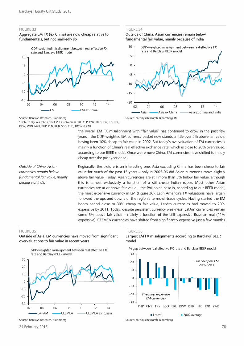
Barclays | Equity Gilt Study: 2015
24 February 2015 78
the overall EM FX misalignment with “fair value” has continued to grow in the past few years – the GDP-weighted EM currency basket now stands a little over 5% above fair value, having been 10% cheap to fair value in 2002. But today’s overvaluation of EM currencies is mainly a function of China’s real effective exchange rate, which is close to 20% overvalued, according to our BEER model. Once we remove China, EM currencies have shifted to mildly cheap over the past year or so.
Regionally, the picture is an interesting one. Asia excluding China has been cheap to fair value for much of the past 15 years – only in 2005-06 did Asian currencies move slightly above fair value. Today, Asian currencies are still more than 5% below fair value, although this is almost exclusively a function of a still-cheap Indian rupee. Most other Asian currencies are at or above fair value – the Philippine peso is, according to our BEER model, the most expensive currency in EM (Figure 36). Latin America’s FX valuations have largely followed the ups and downs of the region’s terms-of-trade cycles. Having started the EM boom period close to 30% cheap to fair value, LatAm currencies had moved to 20% expensive by 2011. Today, despite persistent currency weakness, LatAm currencies remain some 5% above fair value – mainly a function of the still expensive Brazilian real (11% expensive). CEEMEA currencies have shifted from significantly expensive just a few months
FIGURE 33 Aggregate EM FX (ex China) are now cheap relative to fundamentals, but not markedly so
FIGURE 34 Outside of China, Asian currencies remain below fundamental fair value, mainly because of India
Source: Barclays Research, Bloomberg *Note: in Figures 33-35, the EM FX universe is BRL, CLP, CNY, HKD, IDR, ILS, INR, KRW, MXN, MYR, PHP, PLN, RUB, SGD, THB, TRY and ZAR
Source: Barclays Research, Bloomberg, IMF
FIGURE 35 Outside of Asia, EM currencies have moved from significant overvaluations to fair value in recent years
FIGURE 36 Largest EM FX misalignments according to Barclays’ BEER model
Source: Barclays Research, Bloomberg Source: Barclays Research, Bloomberg
Outside of China, Asian currencies remain below fundamental fair value, mainly because of India
-15
-10
-5
0
5
10
02 04 06 08 10 12 14
EM EM ex China
GDP-weighted misalignment between real effective FX rate and Barclays BEER model
-20
-15
-10
-5
0
5
10
02 04 06 08 10 12 14
Asia Asia ex China Asia ex China and India
GDP-weighted misalignment between real effective FX rate and Barclays BEER model
-30
-20
-10
0
10
20
30
02 04 06 08 10 12 14
LATAM CEEMEA CEEMEA ex Russia
GDP-weighted misalignment between real effective FX rate and Barclays BEER model
-30
-20
-10
0
10
20
30
PHP CNY TRY SGD BRL KRW RUB INR IDR ZAR
Latest 2002 average
% gap between real effective FX rate and Barclays BEER model
Five cheapest EM currencies
Five most expensive EM currencies

Barclays | Equity Gilt Study: 2015
24 February 2015 79
ago, to near fair value today – almost exclusively a function of the Russian rouble closing its near-40% gap to fair value. According to the BEER model, the rouble is now below fair value for the first time in more than 10 years. Elsewhere, the Turkish lira is one of the more expensive EM currencies, while the South African rand is the cheapest.
Another way of thinking about EM currencies is to ask whether they have been a good investment choice, irrespective of fundamental valuations. In other words, do EM currency risk premia compensate investors for the risk they are taking? Here, we would say the evidence is compelling. One simple exercise is to track the performance of the five high-yielding EM currencies (TRY, INR, IDR, ZAR and BRL) that have received significant attention in recent years because of a mix of a deteriorating global backdrop and poor domestic fundamentals. Figures 37 and 38 look at the average BEER misalignments and the total returns of holding an equally weighted basket of these currencies, with and without carry.
On a fundamental basis, this basket of five EM currencies began the EM-boom period some 15-20% undervalued and by the middle of 2011, the start of the “landing” period, were 10% expensive. Since then, valuations have dropped and these five high-yielding EM currencies are now, on average, mildly cheap, though neither notably nor universally so. During this almost 15-year period, this basket of high-yield EM currencies has dropped by around 30% against the US dollar. Still, once the carry is added back into the basket (risk premia), the returns of holding these high-yielding EM currencies have been more than 150%, or around 7.5% per annum. Indeed, despite a sense of crisis in EM currencies in the past few years, total returns in the basket are down just 13% from the peak and virtually flat from May 2013, when then-Fed Chairman Ben Bernanke delivered his famous “tapering” speech. Net-net, it would seem that in the universe of higher-yielding EM currencies, investors have been broadly well rewarded for being long.
A last measure of the investment attractiveness of EM currencies is the ratio of implied FX carry to implied volatility. Figure 39 looks at this ratio of an equal-weighted basket of TRY, INR, BRL and ZAR (IDR was excluded because of data unavailability). On a carry-to-volatility basis, it is clear that the pre-Lehman-crisis period was a near-perfect environment for EM FX carry. Following a period of persistent crises, EM FX carry was high and a supportive global and EM backdrop kept implied volatility low for much of the time. Still, despite a sharp pick-up in EM FX volatility in the past few years, rising carry has more than kept up with this volatility increase. By now, the high-yield EM carry-to-volatility ratio is nearing levels more consistent with the early “boom” cycle for emerging markets.
Positive carry has been a big support for EM currency returns
FIGURE 37 EM’s vulnerable 5 * have moved from expensive to modestly cheap in the last few years
FIGURE 38 Returns in high-yield EM FX * from mid 2011 to present
Source: Barclays Research, Bloomberg * EM basket is equal weights of BRL, IDR, INR, TRY and ZAR
Source: Barclays Research, Bloomberg * EM basket is equal weights of BRL, IDR, INR, TRY and ZAR vs USD
Carry in high-yielding EM currencies relative to volatility has picked up in recent years, making them an attractive investment
-20
-15
-10
-5
0
5
10
15
02 04 06 08 10 12 14
GDP-weighted misalignment between real effective FX rate and Barclays BEER model
30
40
50
60
70
80
90
100
110
120
01 03 05 07 09 11 13 15
excluding carry including carry
index, 30-Jun 2011 = 100
mid 2011 peak

Barclays | Equity Gilt Study: 2015
24 February 2015 80
FIGURE 39 Average high-yield EM FX carry-to-volatility ratio *
Source: Barclays Research, Bloomberg. * index is 12m implied FX carry / 3m implied FX volatility for TRY, BRL, INR and ZAR
References Barclays “Navigating the new EM landscape: Where to find the best returns,” Equity Gilt Study 2011.
“Introducing the SCAPE: Why US equities are less expensive than they seem,” Equity Gilt Study 2014.
Macro Daily Focus: What causes divergent performance of onshore and offshore China-related stocks?, 21 January 2015.
Cross commodity themes and strategy: Plumbing the depths, 10 February 2015.
Emerging Markets Weekly: Don’t drop your guard, 15 January 2015.
Currency valuation from a macro perspective, 14 June 2011.
Other Avdjiev, Stefan, Michael Chui and Hyun Song Shin (2014), Non-financial corporations from emerging market economies and capital flows, BIS Quarterly Review, December 2014.
Calvo, Guillermo (2005), Emerging Capital Markets in Turmoil: Bad Luck or Bad Policy? Cambridge, MA: MIT Press, 2005.
Felices and Wieladek (2012), Are emerging market indicators of vulnerability to financial crises decoupling from global factors? Journal of Banking & Finance, 2012, vol. 36, issue 2, pages 321-331.
IMF Global Financial Stability Report, April 2006, Chapter 3: Structural changes in emerging sovereign debt and implications for financial stability.
IMF World Economic Outlook, April 2014, Chapter 4: On the receiving end? External conditions and emerging market growth before, during and after the global financial crisis.
Reinhart, Carmen and Kenneth Rogoff (2004), The Modern History Of Exchange Rate Arrangements: A Reinterpretation, The Quarterly Journal Of Economics; Vol. Cxix February 2004 Issue 1.
Roubini, Nouriel and Brad Setser (2004), Bailouts or Bail-Ins: Responding to Financial Crises in Emerging Markets, Institute for International Economics, 2004.Turner, Philip (2014), The global long-term interest rate, financial risks and policy choices in EMEs, BIS working paper 441.
0.0
0.2
0.4
0.6
0.8
1.0
1.2
1.4
03 04 05 06 07 08 09 10 11 12 13 14
implied FX carry / implied 3-month volatility

Barclays | Equity Gilt Study: 2015
24 February 2015 81
Appendix A ranking of EM vulnerability to external headwinds
We build a ranking of EM vulnerability to external headwinds by combining the rankings of vulnerability to the five external drivers discussed in this chapter Figures 40-44. We do this by ranking each measure from 1 (most resilient) to 16 (most vulnerable). Figure 45 shows the average of the five rankings. Not surprisingly, the most vulnerable countries are commodity exporters exposed to weaker Chinese and euro area growth, such as Malaysia and Russia. The most resilient are those that are relatively insulated from China and European growth and benefit from carry and expected FX resilience, such as Mexico and India. For more details see Macro Daily Focus: A ranking of EM vulnerability to a more challenging external environment, 9 January 2015.
FIGURE 40 EM vulnerability to China growth slowdown (exports to China over GDP, higher = more vulnerable)
FIGURE 41 EM vulnerability to euro area growth slowdown (exports to euro area over GDP, higher = more vulnerable)
Source: Haver Analytics, Barclays Research Source: Haver Analytics, Barclays Research
FIGURE 42 EM vulnerability to lower commodity prices (net commodity exports over GDP, higher = more vulnerable)
FIGURE 43 EM vulnerability to higher US rates (correlation of EM assets* and US rates vol, higher = more vulnerable)
Source: Barclays Research, Haver Analytics, Source: Bloomberg, Barclays Research. EM assets include CDS, FX and equities.
02468
1012141618
Pola
nd
Turk
ey
Mex
ico
Indi
a
Hun
gary
Col
ombi
a
Russ
ia
Braz
il
Indo
nesi
a
Sout
h A
fric
a
Phili
ppin
es
Thai
land
Chi
le
Mal
aysi
a
Kore
a
Taiw
an
%
0
10
20
30
40
50
60
Mex
ico
Braz
il
Indo
nesi
a
Indi
a
Phili
ppin
es
Col
ombi
a
Kore
a
Taiw
an
Sout
h A
fric
a
Chi
le
Thai
land
Mal
aysi
a
Turk
ey
Russ
ia
Pola
nd
Hun
gary
%
-15
-10
-5
0
5
10
15
20
Kore
a
Phili
ppin
es
Indi
a
Thai
land
Hun
gary
Turk
ey
Pola
nd
Taiw
an
Mex
ico
Sout
h A
fric
a
Braz
il
Indo
nesi
a
Chi
le
Mal
aysi
a
Col
ombi
a
Russ
ia
%
10
15
20
25
30
Thai
land
Chi
le
Russ
ia
Taiw
an
Indi
a
Pola
nd
Hun
gary
Col
ombi
a
Braz
il
Sout
h A
fric
a
Indo
nesi
a
Mal
aysi
a
Kore
a
Mex
ico
Phili
ppin
es
Turk
ey
%

Barclays | Equity Gilt Study: 2015
24 February 2015 82
FIGURE 44 EM vulnerability to stronger USD (12m EM FX appreciation vs USD + 5y bond yields, lower = more vulnerable)
FIGURE 45 Ranking of EM vulnerability (higher = more vulnerable)
Source: Bloomberg, Barclays Research Source: Haver Analytics, Bloomberg, Barclays Research
-15
-10
-5
0
5
10
15
Mex
ico
Braz
il
Indi
a
Col
ombi
a
Indo
nesi
a
Sout
h A
fric
a
Turk
ey
Mal
aysi
a
Taiw
an
Phili
ppin
es
Thai
land
Chi
le
Russ
ia
Kore
a
Pola
nd
Hun
gary
%
0
2
4
6
8
10
12
14
Indi
a
Mex
ico
Braz
il
Thai
land
Col
ombi
a
Indo
nesi
a
Phili
ppin
es
Pola
nd
Turk
ey
Sout
h A
fric
a
Taiw
an
Hun
gary
Kore
a
Chi
le
Russ
ia
Mal
aysi
a
Higher = more
vulnerable

Barclays | Equity Gilt Study: 2015
24 February 2015 83
EM macroeconomic and governance indicators
FIGURE 46 EM macroeconomic indicators in bust, boom and landing cycles
Real GDP growth
(% YoY) Average inflation (% YoY) Current account balance
(% GDP) General government net lending/borrowing (% GDP)
1998-2001
2002-2010
2011-2014
1998-2001
2002-2010
2011- 2014
1998-2001
2002-2010
2011-2014
1998- 2001
2002- 2010
2011- 2014
Argentina -1.2 5.0 2.7 -0.6 10.9 10.1 -2.8 2.7 -0.6 -3.3 -3.1 -3.3 Brazil 1.5 3.9 1.6 5.5 6.7 6.1 -4.1 -0.2 -2.9 -4.7 -3.4 -3.1 Chile 2.6 4.2 4.3 4.0 3.2 3.1 -1.8 1.3 -2.5 -0.7 2.2 -0.1 China 8.0 10.7 8.0 -0.3 2.3 3.2 2.0 5.6 2.0 -2.2 -1.4 -0.3 Colombia 0.2 4.4 5.0 11.7 5.3 2.9 -1.0 -1.8 -3.3 -3.8 -1.7 -1.1 Czech Republic 2.2 3.5 0.6 5.3 2.3 1.8 -3.5 -3.6 -1.5 -4.4 -3.9 -2.5 Hungary 3.8 1.8 1.0 10.8 5.2 2.9 -7.4 -5.9 1.7 -3.7 -6.4 -0.8 India 5.9 7.8 5.5 6.2 6.5 9.2 -0.5 -0.9 -3.2 -8.3 -8.2 -7.4 Indonesia -1.1 5.4 5.9 23.5 8.3 5.4 4.4 1.9 -2.3 -1.8 -0.6 -1.7 Korea 4.6 4.4 3.2 3.7 3.1 2.3 4.4 1.8 4.4 2.3 1.4 1.1 Malaysia 2.0 5.1 5.4 2.8 2.3 2.5 11.5 13.4 6.4 -3.8 -4.0 -3.9 Mexico 3.0 2.1 2.9 12.1 4.5 3.8 -2.7 -1.2 -1.6 -4.3 -2.3 -3.8 Peru 1.7 6.0 5.4 4.1 2.4 3.3 -3.6 -0.5 -3.7 -2.1 0.2 1.2 Philippines 2.5 5.0 6.0 6.9 4.6 3.8 -1.6 2.6 3.0 -2.7 -1.9 -0.4 Poland 3.7 4.2 2.8 8.7 2.5 2.2 -5.2 -4.3 -2.9 -3.7 -5.0 -4.1 Russia 4.0 4.9 2.3 38.9 11.6 6.9 10.4 7.5 3.2 -1.3 2.8 -0.1 South Africa 2.4 3.6 2.3 5.8 6.1 5.7 -0.5 -3.6 -4.8 -1.4 -1.4 -4.4 Taiwan 3.4 4.5 2.8 0.8 1.1 1.4 3.3 8.1 10.8 -4.6 -3.8 -3.4 Thailand 0.2 4.6 2.6 2.9 2.7 2.8 8.7 2.7 1.1 -4.7 -0.4 -1.3 Turkey 0.2 5.1 4.5 64.7 14.5 8.0 -0.3 -4.0 -7.4 n.a. -5.0 -1.4 Venezuela 0.4 3.5 2.0 22.0 23.2 38.0 2.3 10.1 6.1 -1.0 -2.4 -14.3 Source: Barclays Research, IMF.
EM macroeconomic indicators in bust, boom and landing cycles (continued)
General government gross debt (% GDP)
Gross external debt (% GDP) Credit ratings WB governance
1998- 2001
2002- 2010
2011- 2014
1998-2001
2002-2010
2011- 2014
1998-2001
2002-2010
2011-2014
1998-2001
2002-2010
2011-2014
Argentina 37.8 75.6 40.9 42.8 60.0 22.7 13.7 17.3 17.2 0.0 -0.3 -0.3 Brazil 68.7 69.0 66.2 37.4 25.4 19.1 14.0 12.3 9.3 0.0 0.0 0.0 Chile 13.3 8.1 12.4 46.9 41.3 43.5 7.3 6.3 4.2 1.1 1.2 1.2 China 37.2 34.9 38.5 13.5 11.1 9.4 7.8 6.3 4.0 -0.5 -0.5 -0.5 Colombia 35.0 38.2 34.4 35.5 26.3 22.9 11.2 11.6 9.8 -0.6 -0.5 -0.3 Czech Republic 18.0 30.1 44.5 35.0 38.0 52.5 7.4 6.0 4.6 0.6 0.9 0.9 Hungary 57.3 67.0 80.1 61.5 113.9 152.5 8.3 7.1 11.1 0.9 0.9 0.7 India 72.6 77.4 63.8 21.5 17.6 20.7 11.8 10.6 10.0 -0.2 -0.3 -0.3 Indonesia 87.6 43.6 25.2 109.2 43.3 27.9 16.8 14.2 10.7 -0.8 -0.7 -0.4 Korea 16.5 26.3 33.3 28.7 25.9 33.0 9.7 6.5 4.9 0.5 0.7 0.8 Malaysia 37.7 45.2 56.2 51.3 48.3 60.9 9.0 7.3 7.0 0.3 0.4 0.3 Mexico 43.3 41.4 45.2 26.4 21.1 30.9 11.3 8.7 8.3 -0.1 -0.1 -0.1 Peru 44.0 36.7 20.9 56.5 38.1 27.5 12.5 11.9 9.0 -0.3 -0.3 -0.2 Philippines 55.6 53.8 39.3 73.4 50.7 24.7 11.0 12.7 11.0 -0.2 -0.5 -0.4 Poland 38.2 47.5 54.6 37.2 51.7 69.3 8.9 6.9 6.5 0.7 0.6 0.8 Russia 68.8 17.6 13.5 79.0 35.8 31.7 16.9 9.7 8.7 -0.8 -0.7 -0.7 South Africa 43.4 32.9 43.5 19.2 24.7 35.5 10.2 8.3 8.2 0.4 0.3 0.2 Taiwan 26.4 34.5 40.5 11.5 21.3 28.3 3.1 3.9 4.0 0.8 0.9 1.0 Thailand 55.5 45.3 45.2 74.0 33.8 34.5 10.3 8.4 8.0 0.3 -0.1 -0.3 Turkey 77.9 52.1 36.3 44.5 42.6 43.1 14.5 13.4 11.2 -0.3 -0.1 -0.1 Venezuela 31.8 40.2 46.9 40.4 30.1 31.1 14.6 14.8 15.1 -0.6 -1.1 -1.3 Source: Barclays Research, IMF, World Bank, Moody’s and S&P. Note: Credit rating numbers above reflect average rating by Moody’s and S&P. Credit ratings by Moody and S&P have been converted into a numerical scale. AAA by S&P and Aaa by Moody's is the highest rating. BBB- And Baa3 = lowest investment grade rating.

Barclays | Equity Gilt Study: 2015
24 February 2015 84
CHAPTER 4
The great destruction • Severe recessions intertwined with financial crises have historically been associated
with lost output and slower potential growth. More than five years after the end of the global recession, we feel enough time has passed to assess the extent of the destruction of output in developed economies.
• In applying a uniform framework across seven developed economies that account for nearly half of world output, we estimate that potential growth in these economies has fallen by 1.5pp since 1999 and, in turn, has reduced global potential growth by 0.7pp.
• Our finding that slower growth in developed economies could slow global growth by 0.7pp is of similar magnitude to the effect of a slowing China on global growth. Slower potential growth in developed economies and a decelerating Chinese economy have reduced global potential growth by 1.5pp – a significant deceleration.
• We estimate that the effects of the recession accounted for about two-thirds of the 1.5pp decline in potential growth in developed economies, with the remaining one-third pre-dating the global recession. Policymakers’ efforts to stem the tide have been effective, but we doubt policy can fully reverse the slowing in trend output growth before the end of the decade.
Financial crises destroy output Economic downturns that coincide with severe financial crises destroy output and lower potential growth. In this chapter, we examine the experience of seven large developed economies that comprise nearly half of world GDP based on purchasing power weights – France, Germany, Italy, Japan, Spain, the UK, and the US – to estimate the damage to output and trend growth from the recent recession. The recession hit when many of these countries were already experiencing a deceleration in trend growth related to demographic factors and the fading of the effects of the technology revolution. The slowing of population growth and rising dependency ratios across much of the economically advanced world was a subject we took up in last year’s Equity Gilt Study (see “Economic implications of demographic change”, Equity Gilt Study 2014, 13 February 2014). We also take up the importance of demographic trends in boosting saving rates and asset prices in Chapter 1 of this year’s Equity Gilt Study,
Michael Gapen
+1 212 526 8536 [email protected]
FIGURE 1 Peak-to-trough decline in real GDP
FIGURE 2 Trough-to-peak rise in the unemployment rate
Source: BEA, INSEE, ISTAT, OECD, ONS, StBA, Haver Analytics, Barclays Research
Source: BLS, INE, INSEE, ISTAT, OECD, ONS, Haver Analytics, Barclays Research
The 2008-09 global recession was severe from a historical perspective
-12
-10
-8
-6
-4
-2
0
Italy
Japa
n
Spai
n
Ger
man
y
UK
US
Fran
ce
%
Real GDP, peak-to-trough decline
02468
101214161820
Spai
n
Italy US
Fran
ce UK
Japa
n
Ger
man
y
%
Unemployment rate, trough-to-peak rise

Barclays | Equity Gilt Study: 2015
24 February 2015 85
“Population dynamics and the (soon-to-be-disappearing) global ‘savings glut’”. As a result of inflection points in demographics and the passage of the technology boom, trend growth in the developed world is likely to have slowed significantly from the robust rates of growth achieved in the 1990s. Active monetary and fiscal policies may be able to mitigate or reverse some of the negative effect on trend growth, but not all. We believe potential growth in the developed world has entered a new phase. In our view, the Great Destruction of output following the recession left potential growth permanently slower.
After applying a common methodology to each country to estimate the rate of potential output growth, we find that trend growth in these seven developed economies fell by 1.5pp per year in 2000-2014, with about two-thirds of the decline occurring after 2007. Given the relative weight of each economy in world output, the slowing in developed economy growth reduced potential global growth by 0.7pp annually. We find this deceleration significant, given that real global growth averaged 3.7% annually between 1990 and 2007.
The destruction of output and slowing of potential growth in the developed world comes just as growth outside the developed world is also slowing. We do not find this surprising, given the extent of globalization and linkages among developed and emerging economies. We expect potential GDP growth in China to slow from about 9-10% in the 1990s to about 6.0% in the coming 5-10 years as it transitions from investment-led to consumption-led growth.1 If realized, this would lower the growth rate of potential global GDP by another 0.6-0.7pp, given China’s burgeoning share of world output.
Taken together, and assuming policy cannot significantly reverse the effects of the global recession, slower potential growth in developed economies and a decelerating Chinese economy could reduce global potential growth by 1.5pp annually. Growth in emerging market economies outside of China are also slowing in part because of the rebalancing of the global economy following the recession and financial crisis, which helped to narrow the current account deficit in the US. For our view on how this will impact risk premia and asset returns in emerging markets, see Chapter 3, “EM is still an attractive asset class”. Outside of India, where the growth outlook appears more promising, we see the bulk of the evidence as pointing to a significant deceleration in potential growth. Much that once was, now appears lost.
History repeats itself History suggests that economies face deeper recessions and weaker recoveries after financial crises and credit booms. The evidence also indicates that the severity of the downturn is proportional to the size of the boom, validating the adage “the bigger they are, the harder they fall.” Examining 18 episodes of severe financial crises, Carmen Reinhart and Kenneth Rogoff find that real GDP per capita declines by an average of 9.3%, with output reaching its trough an average of 1.9 years after the prior peak.2 In these cases, unemployment rose by an average of 7%, with unemployment peaking 4.8 years after the crisis, while real home and equity prices declined by an average of 35.5% and 55.9%, respectively.
The global recession of 2008-09 is on a par with these examples. Based on the experience of seven developed market economies, Figure 1 shows that the peak-to-trough decline in real GDP ranged between 4.1% and 9.9%, with an average decline of 7.1%. The associated rise in unemployment has been more varied, ranging from very mild episodes in Germany and Japan, to the staggering 18.3% rise in unemployment in Spain (Figure 2).
1 See “China: Beyond the miracle – The complete series,” 1 March 2013. 2 Carmen M. Reinhart and Kenneth S. Rogoff, This time is different: Eight centuries of financial folly, Princeton NJ: Princeton University Press, 2009.The statistics cited herein are from eighteen post-war financial crises, including five severe cases (Spain, 1977; Norway, 1987; Finland, 1991; Sweden, 1991; and Japan, 1991) along with other examples from East Asia and Latin America.
Potential growth in developed economies was already slowing in advance of the recession

Barclays | Equity Gilt Study: 2015
24 February 2015 86
The duration of the decline in real output varied substantially, with Germany and Japan experiencing relatively short four-quarter declines in output, while the downturns in Italy and Spain have lasted much longer. The duration of the declines in Italy and Spain is open to debate. In Italy, real output peaked in Q1 2008 and fell for seven quarters through the end of 2009, before rising for six consecutive quarters thereafter. However, beginning in Q3 2011, real output has fallen steadily and, 27 quarters since 2008 Q1, output in Italy has yet to stage a convincing turnaround. Spain posted a similar double dip, with output falling for six quarters before staging a brief rebound, only to fall further in 2011-12. More recently, Spain has achieved five consecutive quarters of positive growth through 2014 Q3.
There are several channels through which potential output is lost following severe economic downturns. The most common include:
• Contractions in finance, insurance, real estate, and construction. Recessions associated with deep financial crises often cause permanent contractions in finance, insurance, and real estate. The booms in many developed economies – particularly the US, UK, and Spain – were also fuelled by housing bubbles that led to severe contractions in construction and housing-related sectors. The tighter regulatory environment likely means that potential output in these sectors is permanently lost.
• Slower capital accumulation and distortions to the efficient allocation of capital. Weak profitability reduced the ability of firms to self finance in an environment of tighter credit standards. Sluggish economic growth and heightened uncertainty stemming from the severity of the downturn also weighed on business sentiment and suppressed capital accumulation. Finally, tighter credit conditions and a reluctance to lend reflect increased risk aversion. We find features of this in each of the developed economies investigated.
• A skills gap in labor markets leading to structural unemployment. Contractions focused in certain sectors, like finance and construction, while job growth occurs in other sectors lead to a skills gap and a misallocation of labor resources. Long and deep recessions may also depress participation and raise the long-term unemployment rate. Hysteresis then leads to structural unemployment and fewer potential hours. Finally, dual labor market structures often mean the downturn is felt disproportionately by one segment of the labor force. We find evidence of this in the US and UK, but most prominently in Europe and Japan.
Applying a business cycle framework to assess trend growth To estimate the degree of slowing in potential developed economy output, we apply a business cycle framework to seven economies – France, Germany, Italy, Japan, Spain, the UK, and the US – and break down observed output data into its cyclical and trend components. We then identify potential growth as the trend component and the difference between actual and trend, or the output gap, as the cyclical component.
Potential output and the output gap are key variables in the setting of monetary and fiscal policy and serve as anchors to economic models. However, they are also unobservable. The framework we apply in this chapter constructs estimates of these key variables using a generalized multivariate unobserved components framework; inputs on working hours, output, employment, population, and participation are used in a comprehensive framework to generate a decomposition of potential output growth into its component parts.3,4 The
3 For the US, our approach follows Charles Fleischman and John M. Roberts, 2011, “From many series, one cycle: Improved estimates of the business cycle from a multivariate unobserved components model,” Finance and Economics Discussion Series 2011-46. The US framework includes nine variables: real gross domestic product, real gross domestic income, real nonfarm business output, real nonfarm business income, nonfarm business employment, the work week, labor force participation rate, the employment rate, and core CPI inflation. For the remaining countries, a scaled down model and six variables are used: real gross domestic product, real gross domestic income (if available), employment, working hours, output per hour, employment, participation, and inflation. Variables in both models are detrended by population growth. See the appendix for further details. 4 See Jun Ma and Mark Wohar, “An unobserved components model that yields business and medium-run cycles,” Journal of Money, Credit, and Banking, 45(7), October 2013, for further discussion on the benefits of the unobserved components model.
Germany and Japan experienced relatively short four-quarter declines in output, while the downturns in Italy and Spain have lasted much longer
We apply a common framework across seven developed economies to estimate potential growth and its components

Barclays | Equity Gilt Study: 2015
24 February 2015 87
models are estimated using quarterly data from 1963 Q1-Q1 2014 for the US, 1975 Q1-Q1 2014 for the UK, 1975 Q1-Q1 2014 for France, 1973 Q1-Q1 2014 for Germany, 1993 Q1-Q1 2014 for Italy, 1996 Q1-Q1 2014 for Spain, and 1981 Q1-Q1 2014 for Japan.
We see several advantages to using a multivariate approach. Although it is more difficult to implement, academic research has shown that multivariate analysis improves the accuracy of cycle estimates and using a single system means the framework uniformly accounts for trade-offs between alternative signals.5 Applying the framework across countries also ensures that trade-offs between competing signals are treated in similar fashion. Our common framework, detailed in the appendix to this chapter, makes several important assumptions. First, we assume that each measure of economic activity and labor markets can be represented as the sum of cyclical and trend components. Second, we assume that the cyclical component is common across all the inputs, with the understanding that a wider set of data should enable estimation of the trend with improved accuracy. Third, the cyclical component is allowed to have both contemporaneous and lagged effects to account for variables that may lag the cycle, yet still inform its estimation. Fourth, while each variable has a common cyclical component, we permit each variable to have its own unique trend. Finally, we allow cyclical deviations in output to affect inflation, creating a natural rate interpretation.
The benefit of the generalized unobserved components model is that it allows for dynamics in both cyclical and trend components. Many traditional frameworks assume a smooth trend and view recessions as “temporary” events that only inform the cycle. In other words, volatility in the data is restricted to inform the estimate of the cycle, but not necessarily the trend. Our methodology allows for cycles in both permanent (trend) and transitory (cycle) components. Academic research has shown that this generalized framework is more appropriate for capturing both short-term and medium-term cycles, where the latter may be more suitable when dealing with movements in technology, research and development, and efficiency of resource utilization.6 Our preference is to let the data speak for themselves about whether volatility is related to transitory outcomes or structural phenomenon.
Slower rates of potential growth in developed economies We organize the results of the common business cycle framework across countries around two themes; the movement in trend variables that comprise potential growth and the estimates of the cycle. The presentation follows the traditional exposition of potential growth; namely that the growth in output depends on the growth rate of factor inputs – labor and capital – and the efficiency with which these are combined to produce output. We impose the structural relationship that
Potential output = Hours worked * Productivity per hour,
where the trend in hours worked comprises trend employment and the trend work week according to
Hours worked = Employment * Work week.
We assume that trend employment is made up of
Employment = Employment rate * participation rate
where the employment rate is assumed to be one minus the unemployment rate. The trend employment rate is therefore a transformation of the non-accelerating inflation rate of unemployment (NAIRU). Potential output and employment are scaled by population since this is a common trend in both variables.
5 Arabinda Basistha and Richard Startz, 2008, “Measuring the NAIRU with reduced uncertainty: A multiple-indicator common-cycle approach,” Review of Economics and Statistics, 90, 805-11. Also see James H. Stock and Mark W. Watson, 1989, “New indices of coincident and leading economic indicators,” NBER Macroeconomics Annual 1989, Oliver Blanchard and Stanley Fischer, eds., 351-394. 6 See Diego Comin and Mark Gertler, “Medium-Term Business Cycles,” American Economic Review, 96, 523-551.
Our methodology allows for cycles in both permanent (trend) and transitory (cycle) components

Barclays | Equity Gilt Study: 2015
24 February 2015 88
Figure 5 presents the results of the estimation across each economy related to the estimation of the trend. Where possible, we present the results in decade-averages to smooth through the variability in annual estimates. As the figure shows, potential growth has decelerated in recent years in five of the seven economies in our sample, with Japan and Germany the exceptions to the deceleration trend.
US: An ageing population and productivity slowdown Beginning with the US, trend growth is estimated at 3.0-3.4% for the three decades ending in 1999, with the decades of the 1970s and 1980s buoyed by trend growth in both hours and productivity. In the 10 years ending in 2009, however, potential growth began to slow as the trend labor input slowed. This slowing was initially offset by faster productivity growth, which we attribute to the technology revolution that began in the US in the mid-1990s and supported faster rates of productivity growth (Figure 3).
We estimate that trend growth in output in the US began to slow in 2001, falling from 2.5% to 1.5% by 2009, as the benefits of technological progress began to fade and the workforce aged. Our US economics team has written frequently about US demographic trends and their contribution to slower potential growth.7 In our view, the decline in labor force participation since its peak in the early 2000s mainly reflects the ageing of the baby boomers. While labor force participation among the 55+ age cohort has risen during this time period, it nonetheless is half of the participation rate for the prime working age population (those aged 25-54). Therefore, the ageing of the population naturally reduces aggregate labor force participation despite the upward trend in participation among older people, leading to a structural decline in potential growth. The model estimates that the participation rate dropped 2.5pp from 2007 to 2013, accounting for around three-quarters of the 3.2pp decline in the actual participation rate (Figure 4) during the same period. This is consistent with the view that most of the decline in the participation rate is structural and unlikely to be reversed.
In addition to the above, the US has been in a gradual transition from a goods-oriented economy to a services economy, the latter of which is associated with more part-time employment and a shorter average work week.8 Altogether, we estimate that these factors caused US potential GDP growth to slow to 2.5% in the 10 years ending 2009 and 1.2% in the post-recession period from 2010 through Q1 2014.
7 See Beyond the cycle: Weaker growth, higher unemployment, 15 December 2010 and Dispelling an urban legend: US labor force participation will not stop the unemployment rate decline, 1 March 2012 8 Employment in the goods sector in the US was nearly 40% of total private employment in 1965. The share has fallen to around 15% in recent years, leaving the remainder (85%) in services. Since average weekly hours in the service sector averages about 33 hours, compared to 41 hours for the goods sector, the relative shift into services has caused average weekly hours for the overall US private sector to decline from 39 in 1965 to 34 today. See “U-6 unemployment may not reach normal,” 11 July 2014.
US potential GDP growth slowed to 2.5% in the 10 years ending 2009 and 1.2% in the post-recession period
FIGURE 3 Trend growth in US output per hour
FIGURE 4 Trend US labor force participation
Source: Barclays Research
Source: Barclays Research
The ageing of the population naturally reduces aggregate labor force participation, leading to a structural decline in potential growth
0.5
1.0
1.5
2.0
2.5
3.0
70 74 78 82 86 90 94 98 02 06 10 14
% y/y
US: Output per hour trend growth
5859606162636465666768
70 74 78 82 86 90 94 98 02 06 10 14
%
US: Trend labor force participation rate

Barclays | Equity Gilt Study: 2015
24 February 2015 89
FIGURE 5 Potential growth and its trend components
United States (% saar) 1970-79 1980-89 1990-99 2000-09 2010-Q1 2014
Potential output 3.4 3.1 3.0 2.5 1.2
Total hours 2.2 1.4 1.1 0.8 0.2
Population 2.0 1.2 0.1 1.3 1.0
LFPR 0.6 0.4 0.1 -0.2 -0.8
Employment rate 0.0 0.0 0.0 -0.1 -0.1
Non-farm work week -0.5 -0.3 -0.1 -0.2 0.1
Non-farm productivity 1.6 1.8 1.8 2.3 1.1
GDO to NFBO -0.4 -0.2 -0.3 -0.3 -0.3
NFB employment to total employment 0.1 0.1 0.5 -0.2 0.2
United Kingdom (% saar) 1972-79 1980-89 1990-99 2000-09 2010-Q1 2014
Potential output 1.8 2.7 2.3 1.8 1.6
Total hours -0.8 0.0 0.1 0.1 1.5
Population 0.1 0.1 0.3 0.6 0.7
LFPR -0.1 0.2 -0.2 0.0 0.1
Employment rate -0.4 -0.1 0.2 -0.2 0.3
Average working hours -0.4 -0.3 -0.2 -0.3 0.3
Productivity 2.6 2.7 2.2 1.7 0.1
Germany (% saar) 1972-79 1980-89 1994-99* 2000-09 2010-Q1 2014
Potential output 2.3 1.7 1.2 1.1 1.2
Total hours -0.8 -0.1 -0.1 -0.2 0.3
Population 0.0 0.1 0.2 0.0 0.1
LFPR 0.3 1.1 0.5 0.4 0.3
Employment rate -0.1 -0.4 0.1 0.1 0.4
Average working hours -1.0 -0.9 -0.8 -0.6 -0.5
Productivity 3.1 1.8 1.3 1.2 1.0
France (% saar) 1980-89 1990-99 2000-09 2010-Q1 2014
Potential output 2.7 2.1 1.3 0.9
Total hours -1.0 -0.5 0.3 0.1
Population 0.5 0.4 0.6 0.5
LFPR -0.4 0.0 0.1 -0.1
Employment rate -0.3 -0.1 0.0 -0.2
Average working hours -0.8 -0.8 -0.4 -0.1
Productivity 3.7 2.6 1.0 0.8
Italy (% saar) 1994-1999 2000-2009 2010-Q1 2014
Potential output 2.0 0.4 -0.7
Total hours 1.1 1.1 -0.3
Population 0.0 0.4 0.5
LFPR 1.1 0.5 0.3
Employment rate -0.1 0.2 -1.2
Average working hours 0.1 0.1 0.1
Productivity 0.8 -0.7 -0.5
Spain (% saar) 1996-1999 2000-2009 2010-Q1 2014
Potential output 4.1 2.2 -0.3
Total hours 4.5 1.9 -2.4
Population 0.4 1.4 0.6
LFPR 1.6 1.1 -1.0
Employment rate 2.3 -0.5 -1.7
Average working hours 0.2 -0.1 -0.3
Productivity -0.4 0.2 2.1

Barclays | Equity Gilt Study: 2015
24 February 2015 90
FIGURE 5, CONTD. Potential growth and its trend components (continued)
Japan (% saar) 1981-1989 1990-1999 2000-2009 2010-Q1 2014
Potential output 3.8 1.3 0.2 0.4
Total hours 0.2 -0.9 -0.9 -0.5
Population 0.6 0.3 0.1 -0.1
LFPR 0.0 -0.1 -0.5 -0.1
Employment rate 0.0 -0.3 0.0 0.3
Average working hours -0.3 -0.7 -0.5 -0.7
Productivity 3.5 2.2 1.2 0.9 Note: The reunification of West and East Germany in the early 1990s is omitted since the event creates an “artificial recession” in model estimates. The population surge boosts potential GDP growth via a stronger labor contribution. The business cycle framework accounts for this by estimating a positive output gap prior to reunification and a negative output gap immediately afterward. In terms of the effect on the trend, the reunification pushes trend output per hour down discretely in 1991 and the series resumes its trend growth thereafter. We omit the 1990-93 model estimates for this reason. Source: Barclays Research
UK: A “productivity puzzle” In the UK, the slowing in the rate of trend output is clearly related to a slowdown in trend productivity growth. We find that productivity growth in terms of output per hour grew between 2.2% and 2.7% per year in the three decades ending 1999. We then estimate that productivity growth fell steadily from 2.6% in 2002, down to zero by 2008, and has stayed near this level through Q1 2014 (Figure 6). This fall in labor productivity growth, or the “productivity puzzle,” has been heavily investigated and several factors put forward to explain the slowdown. A report from the Bank of England points to labor hoarding during the early stages of the recession, reduced investment in physical and tangible capital, and misallocation of resources in low to high productivity sectors.9 A higher cost of capital would encourage firms to substitute less expensive labor for capital, but this explanation is often discounted because aggressive monetary policy kept the cost of capital low for a portion of the post-recession period and modest rates of investment have meant the aggregate stock of capital has not fallen enough (as a share of GDP) to fully account for the productivity slowdown.
Broad-based capital mismatch is cited as a more likely explanatory factor. As discussed by Ben Broadbent, external member of the Monetary Policy Committee, data from the UK Office of National Statistics show that the dispersion of output and relative prices across sectors widened markedly following the recession.10 A reallocation of capital and labor would reduce the dispersion across sectors, but this process takes time and, in the interim,
9 See “The UK productivity puzzle” by Alina Barnett, Sandra Batten, Adrian Chiu, Jeremy Franklin, and Maria Sebastia-Barriel of the Bank of England’s Monetary Analysis Directorate, Bank of England Quarterly Bulletin, 2014 Q2. 10 See “Productivity and the allocation of resources,” Ben Broadbent, External Member of the Monetary Policy Committee, Bank of England, 12 September 2012.
Productivity has slowed markedly in the UK… …broad-based capital mismatch is cited as the most likely explanatory factor
FIGURE 6 Trend growth in UK output per hour has slowed sharply…
FIGURE 7 …amid modest growth and a surge in trend employment
Source: Barclays Research
Source: Barclays Research
-0.5
0.0
0.5
1.0
1.5
2.0
2.5
3.0
3.5
4.0
72 75 78 81 84 87 90 93 96 99 02 05 08 11 14
UK: Output per hour trend growth
% y/y
-2.5
-2.0
-1.5
-1.0
-0.5
0.0
0.5
1.0
1.5
2.0
72 75 78 81 84 87 90 93 96 99 02 05 08 11 14
UK: Employment trend growth
% y/y

Barclays | Equity Gilt Study: 2015
24 February 2015 91
productivity growth stalls. The financial sector is often cited as one that is likely to have persistently slower productivity growth following the recession. A tighter regulatory environment and higher capital requirements have raised the cost of capital and necessitated more spending to cover infrastructure, system, and regulatory requirements. The new regulatory environment will likely mean trend productivity growth in the financial services sector will be persistently lower relative to pre-2008 levels. Research from the Bank of England estimates that slower financial sector productivity growth could account for about half (eg, 1pp) of the decline in trend productivity.
The other piece of the “productivity puzzle,” in terms of estimating the net effect on trend potential growth, is the contribution from labor. The trend growth of hours worked in the UK has provided an important offset to the slowing in trend productivity. Growth in the labor force, due to a steady trend participation rate and growing population, along with a rapid boost in trend employment following the recession (Figure 7), has provided important support for trend output growth. In addition, trend growth in average working hours has turned positive for the first time since the mid-1970s. Together, these have caused trend hours to rise to 1.5% in the post-crisis period. However, growth in trend hours has not been enough to fully offset the sharp slowing in productivity, and trend output growth fell to 1.8% between 2000 and 2009 and to 1.6% in the post-recession period from 2010 to Q 2014.
Germany: A decade after labor market reforms The model results for Germany clearly show the effects of reunification in the early 1990s: data prior to 1990 are from West Germany and post-reunification data include both East and West Germany. The surge in population from reunification leads to an “artificial recession.” The burst in potential labor contribution boosts trend growth and the business cycle framework accounts for this by estimating a positive output gap prior to reunification and a negative output gap immediately afterward. In terms of the effect on the trend, reunification pushes trend output per hour down discretely in 1991 and then the series resumes its trend growth thereafter. We suggest interpreting the “artificial recession” and the results for 1990-93 with caution. We exclude these years from the data and focus our attention on the remaining sample period.
Like other countries in our developed economy sample, output per hour in Germany has slowed in recent years, but we find that trend productivity growth did not decelerate as sharply in Germany as it did in the US and UK in 2001 and 2002, respectively. Productivity growth was estimated at 1.8% annually in 1980-89, 1.2% per year from 2000-09, and 1.0% from 2010-14 Q1.11 Output per hour slowly accelerated from just under 1.0% per year in the
11 Our estimates of the decomposition of potential growth closely match those of the Council of Economic Experts. See Peter Bofinger, Lars Feld, Christoph Schmidt, Isabel Schnabel, and Volker Wieland,”Mehr Vertrauen in Marktprozesse,” Jahresgutachten 2014-2015.
UK potential growth has been supported by a surge in trend hours worked
FIGURE 8 German labor market reforms boosted trend employment…
FIGURE 9 …with consistent employment rate growth since 2005
Source: Barclays Research
Source: Barclays Research
In Germany, the timing of the productivity slowdown matches that of the US and UK, but the amplitude of the peak to trough decline has been more muted
88
90
92
94
96
98
93 96 99 02 05 08 11 14
Germany: Employment rate trend
%
-3.0-2.5-2.0-1.5-1.0-0.50.00.51.01.52.02.5
72 75 78 81 84 87 90 93 96 99 02 05 08 11 14
% y/y
Germany: Employment trend growth

Barclays | Equity Gilt Study: 2015
24 February 2015 92
early 1990s to 1.4% per year in 2000. Thereafter, trend productivity growth slowed and reached 0.9% y/y in recent years. Overall, the timing of the productivity slowdown matches that of the US and UK, but the amplitude of the peak to trough decline has been more muted.
As in the UK, however, the deceleration in productivity has been matched by a rise in trend employment growth (Figure 8). The trend employment rate (eg, one minus the long-run unemployment rate) has trended steadily higher since 2005 and now stands at a multi-decade high. Except for a brief period during 2009, likely an effect of the global recession, year-on-year growth in trend employment has remained in positive territory for the past decade (Figure 9). In addition, and in contrast to many of its developed economy peers, Germany’s trend labor force participation has been on a steady upward path (Figure 10), rising by just over 2pp since end-2001. Together, faster growth in trend employment and participation added about 0.6pp to potential growth in Germany over the past decade.
In our view, the model results likely reflect the Hartz reforms to the German labor market enacted between 2002 and 2005. In response to a steadily rising unemployment rate over several decades, Germany implemented a series of wide-ranging reforms to improve the efficiency of labor markets with the aim of lowering unemployment, reducing the duration of unemployment, and curbing unemployment benefits as part of an overhaul of the benefit system. The Hartz reforms are generally credited with boosting employment and participation rates, particularly among women, while leading to a reduction in long-term unemployment. Our model estimates confirm these findings. As Figures 8 and 10 show, the acceleration in the growth rates of trend employment and participation occurred after Hartz reforms were implemented. We find that, on net, long-term unemployment (NAIRU) fell by 2pp by end-2013, in line with estimates from other sources (Figure 11).12
Labor market reform that boosted trend employment and participation, however, was unable to cause potential GDP growth to accelerate because average working hours in Germany have been on a steady decline. We find that trend working hours subtracted 0.6pp and 0.5pp from potential growth in 2000-09 and 2010-Q1 2014, respectively. This, together with a gradual slowdown in productivity, left potential GDP growth largely unchanged.
12 See Tom Krebs and Martin Scheffel, “Macroeconomic Evaluation of Labor Market Reform in Germany,” IMF Working Paper 13/42, February 2013. The authors find that long-term (non-cyclical) unemployment was reduced by 1.4pp due to the Hartz IV reforms. Our results indicate that long-term unemployment initially rose in Germany after reforms were implemented, but then fell after 2005. On net, we find NAIRU fell by about 2pp relative to late 1990s levels.
Extensive labor market reform boosted trend employment and participation in Germany…
FIGURE 10 German labor market reforms boosted trend participation…
FIGURE 11 …with a surge in participation between 2002 and 2005
Source: Barclays Research
Source: Barclays Research
…but a slowing in trend working hours meant trend growth was largely unchanged
48
49
50
51
52
53
54
55
90 93 96 99 02 05 08 11 14
Germany: Trend labor force participation rate
% of total population
4
6
8
10
12
93 96 99 02 05 08 11 14
Germany: NAIRU
%

Barclays | Equity Gilt Study: 2015
24 February 2015 93
France: Productivity slowing amid inflexible labor markets The recession appeared to accentuate a trend slowing in productivity growth in France. Potential GDP growth slowed from 2.7% in 1980-89 to 2.1% in 1990-99, with the estimated rate of productivity growth falling from 3.7% to 2.6% (Figure 12). From there, potential growth slowed modestly, to 1.9% per year between 2000 and 2007, before falling below 1.0% during and after the recession. We estimate the current rate of productivity growth at just 0.8%. The gradual shift from higher productivity manufacturing to lower productivity services over time is likely a large explanatory factor behind the slowdown in productivity before the recession. Since 1980, the share of services employment to total employment (including agriculture, forestry and fishing) has risen from 69% to 86% through Q3 2014. In contrast, the share of manufacturing employment has fallen from 22% in 1981 to just under 10% currently.
Following the recession, a likely contributing factor to soft productivity growth in France has been lackluster business investment. Since 2010, gross fixed capital formation in France, which includes public, private (financial companies and nonfinancial corporations), and household entities, has grown by only 1.2% per year on average and contributed less than 0.1pp to real GDP growth. In level terms, gross fixed capital formation still stands nearly 10% below the pre-recession peak in Q4 2007. Standard economic theory suggests the behavior of business investment is influenced by long-run factors like potential GDP growth and short-run cyclical economic factors, including the rate of growth in economic activity, credit conditions, and uncertainty.13 The sluggish domestic economic recovery and heightened uncertainty stemming from the episodic concerns about sovereign debt sustainability in Europe are likely to have weighed on business sentiment, as have poor corporate profitability. As Figure 13 shows, corporate profitability in France has declined steadily following the recession, reducing the ability of the nonfinancial corporate sector to engage in internally financed investment. Declining corporate profitability has also been a feature of Italy’s economy in the past decade, whereas trends in corporate profitability in Germany and Spain have been more favorable.
13 See France: IMF Selected Issues, IMF Country Report No. 14/183, July 2014 for discussion of business investment in France. Also, see Eugenio Pinto and Stacey Tevlin, “Perspectives on the recent weakness in investment,” FEDS Notes, May 21, 2014 for an analysis of accelerator and long-run growth models applied to US investment
We estimate the current rate of productivity growth in France at just under 1.0%
FIGURE 12 France: Trend productivity growth
FIGURE 13 Weak corporate profitability has constrained investment in France and Italy
Source: Barclays Research
Source: INE, INSEE, ISTAT, StBa, Haver Analytics
A likely contributor to soft productivity growth in France has been lackluster business investment
-3.0-2.0-1.00.01.02.03.04.05.06.07.0
75 78 81 84 87 90 93 96 99 02 05 08 11 14
%, y/y
France: Output per hour trend growth
80
90
100
110
120
130
140
99 00 01 02 03 04 05 06 07 08 09 10 11 12 13
1999 = 100
France Spain Italy Germany
Nonfinancial corporate profitsas a share of value added

Barclays | Equity Gilt Study: 2015
24 February 2015 94
FIGURE 14 France: year-on-year growth in trend average working hours
FIGURE 15 France: Modest rise in NAIRU following the recent recession
Source: Barclays Research Source: Barclays Research
Weak productivity growth, however, is not the sole factor behind France’s slowing in trend GDP growth. Since 1980, average working hours have been on a downward trend (Figure 14), dragging potential growth 0.8pp lower in the two decades ending 1999, and somewhat less since then. The downtrend in average working hours may also be related to the structural shift away from goods production and toward services, where part-time employment and shorter-work weeks are more prevalent. We also find that a modest increase in structural unemployment has occurred, with NAIRU rising from an average of 8.4% in 2006-07 to 10.5% now. This rise in structural employment and decline in trend working hours has, on average, offset population growth and meant that total hours have been approximately neutral in terms of contribution to GDP potential. However, we find the rise in structural unemployment in France has been much more modest than in either Spain or Italy, as discussed further below.
France also has a fairly high tax wedge, or the difference between before-tax and after-tax wages. A high tax wedge translates into high labor costs for employers and low net take-home pay for employees. High tax wedges are generally associated with higher structural rates of unemployment, lower hours worked, and lower productivity. 14 According to OECD estimates, the tax burden in France has risen from 49.6% in 2000 to 50.1% in 2005, well above the 37.3% average for OECD countries and higher than the European average of 42.1% as of 2005.15 The European average, however has drifted modestly lower in recent years.
Our estimates of potential GDP and its components in France are similar to those found elsewhere, including in two recent IMF studies that find potential output grew at an average rate of more than 2% during the 1980s and 1990s, but decelerated to around 1.7-1.8% in the 2000s before the crisis.16 During and after the crisis, IMF staff found that potential output fell to below 1%. Across both exercises, Fund staff use a variety of methodologies, including statistical filters, production function approaches, and a multivariate approach similar to the one used in this analysis. The authors conclude that a multivariate approach provides more robust estimates than the remaining approaches, although none of the approaches is fully robust to data revisions and uncertainty about the true level of potential output should be an accepted fact of life for policymakers and investors.
14 Hong Ding, “Can tax wedge affect labor productivity? A TSLS fixed model on OECD panel data,” International Journal of Applied Econometrics and Quantitative Studies, Vol. 5-1, 2008. 15 See Tax wedges on earning vary sharply in OECD countries, OECD. The tax burden is measured as income tax plus employee and employer contributions, less cash benefits, as a % of labor costs. Data is for single persons without children at 100% of average earnings. 16 See France: Selected Issues, IMF Country Report No. 11/212, July 2011 and France: Selected Issues, IMF Country Report No.13/252, August 2013.
-3.0
-2.5
-2.0
-1.5
-1.0
-0.5
0.0
0.5
1.0
1.5
75 78 81 84 87 90 93 96 99 02 05 08 11 14
%, y/y
France: Average working hours trend growth
0
3
6
9
12
76 80 84 88 92 96 00 04 08 12
France: NAIRU
%
A high labor tax wedge in France remains a constraining factor on growth

Barclays | Equity Gilt Study: 2015
24 February 2015 95
Spain and Italy: Labor market rigidities and weak productivity Because of data restrictions on the historical capabilities of our estimation procedure, we report only the results for Italy and Spain since the 1990s and, as a result, combine the analysis into one section. As is well documented, substantial immigration, in part related to the housing boom and demand for construction labor, boosted the labor force participation rate, employment, and total hours. Employment in the construction and real estate sectors as a share of total employment rose from 8.7% in 1995 to 12.2% by 2007 (Figure 16) and the annual pace of employment growth in these sectors was several times larger than in remaining sectors (Figure 17). As a result, we estimate that potential GDP grew rapidly, exceeding 4.0% in the second half of the 1990s and 3.3% in 2000-07. Nearly all the boost to potential came in the form of the labor contribution, as we find total hours added 4.5pp and 3.6pp to potential growth, respectively, during the same periods.
Underneath, however, was an economy that experienced weak productivity growth. We estimate that productivity growth was actually negative between 1996 and 2007, subtracting between 0.3-0.4pp from potential growth (Figure 18). Our results are similar to findings by the IMF, OECD, and Eurostat that suggest trend productivity growth weakened considerably from 2-3% in the 1970s and 1980s to 0.0-0.5% in the past two decades. Some analysts argue that the housing boom itself is partly responsible for the weak productivity performance, while
FIGURE 16 Housing-related employment surged in Spain before 2007…
FIGURE 17 …boosting trend employment and total hours
Source: INE, Haver Analytics Source: INE, Haver Analytics
FIGURE 18 Productivity growth initially rebounded following the crisis…
FIGURE 19 …and structural unemployment in Spain has trended higher
Source: Barclays Research Source: Barclays Research
456789
1011121314
1995 1997 1999 2001 2003 2005 2007 2009 2011 2013
%
Construction/real estate employment (% of total emp.)
Spain: Construction and real estate employment
-25
-20
-15
-10
-5
0
5
10
15
1995 1997 1999 2001 2003 2005 2007 2009 2011
% y/y
Construction/real estate Remaining sectors
Spain: Construction and real estate employment growth
-2.0
-1.0
0.0
1.0
2.0
3.0
4.0
95 98 01 04 07 10 13
% y/y
Spain: Output per hour trend growth
0
5
10
15
20
25
30
96 99 02 05 08 11 14
Spain: NAIRU
%

Barclays | Equity Gilt Study: 2015
24 February 2015 96
others argue that sectors outside of housing exhibited poor productivity and Spain’s rigid dual labor market limited flexibility and kept inefficiencies high.17
Following the recession, we find that potential growth has fallen to -0.3%, modestly below IMF and OECD estimates and in line with estimates from the European Commission.18 Population growth has slowed in recent years and is likely to be a feature of the Spanish economy in the years ahead, as the working age population is projected to decline. In addition, we find that NAIRU has risen substantially and, together with demographic trends, mean labor force participation and trend total hours are major constraints on potential GDP. We find that NAIRU increased sharply from just under 10% in 2008 to more than 25% currently (Figure 19). Only recently has the rise in trend structural unemployment begun to moderate. The shedding of employment, in our view, is the main reason trend productivity exhibited a medium-term bounce in 2007-13. As Figure 18 shows, productivity growth rose to 3.5% in 2010 before falling back to 0.7% in 2013.
In contrast to the more dramatic turn of events in Spain and elsewhere that reflect more of a boom-bust phenomenon, Italy shows the signs of an economy limited by structural rigidities and inefficiencies. We find that potential growth in the second half of the 1990s was a modest 2.0%, with half coming from a trend increase in labor force participation and half from productivity gains. Post-recession, we find a fairly sharp reduction in both productivity growth and hours, with productivity growth negative, on average, since the beginning of the last decade. This result is similar to estimates of trend growth in total factor productivity from the OCED, which shows productivity in Italy declining by 0.4% per year in 2001-10.19
Labor force participation has trended steadily higher throughout the sample period, rising from nearly 56% of the total population to around 63% in 2013, although most of this increase took place prior to the recession (Figure 20). Previous labor market reforms – the Treu reform in 1997 and the Biagi reform in 2003 – provided for non-standard work arrangements and part-time employment. Data indicate that these reforms were most helpful in boosting participation among workers in the 15-24 age group and among women. According to data from Eurostat, youth employment increased from 25% 1997 to a high of 27.6% in 2004, while employment among women rose from 36.5% in 1999 to a high of 47.2% in 2008. Although the reforms boosted participation, they also tended to reduce
17 See López-García, P., Puente, S. and A. L. Gómez, 2007, “Firm Productivity Dynamics in Spain,” Documento de trabajo No. 0739 (Madrid: Bank of Spain). 18 See Spain: Selected Issues, IMF Country Report No. 14/193, July 2014. 19 See Italy: Selected Issues, IMF Country Report No. 12/168, July 2012.
Following the recession, we find that potential growth in Spain has fallen to -0.3%
Italy shows the signs of an economy limited by structural rigidities and inefficiencies
FIGURE 20 Labor market reforms in Italy helped boost participation, particularly among youth and women…
FIGURE 21 …but attachment was low and the downturn sent structural unemployment higher
Source: Barclays Research
Source: Barclays Research
5455565758596061626364
94 96 98 00 02 04 06 08 10 12 14
Italy: Trend labor force participation rate
%
5
6
7
8
9
10
11
12
13
14
94 96 98 00 02 04 06 08 10 12 14
Italy: NAIRU
%

Barclays | Equity Gilt Study: 2015
24 February 2015 97
FIGURE 22 An ageing population sent participation rates lower in Japan…
FIGURE 23 …and a shift to part-time employment reduced average working hours
Source: Barclays Research Source: Barclays Research
average weekly hours because of the increase in temporary and part-time employment. As in Spain, Italian labor markets exhibit a dual structure, with the core of the labor market more rigid and inflexible and the margins – youth and female employment in Italy – more susceptible in downturns. As a result, we find that structural unemployment moved sharply higher beginning in 2007, more than doubling from 6.0% to 12.7% at present.
Japan: Shaking off the effects of the recession Japan’s economic performance has been widely studied and our findings correspond with others, including official sources.20 We find that potential growth slowed significantly from nearly 4.0% in the 1980s to around 1.0-1.5% heading into the recession. In 1990-99, the slowdown in potential growth came mainly from a reduction in trend hours driven by softer participation (Figure 22) and a trend decline in average working hours (Figure 23). Demographics in Japan are a clear factor in the slowing of potential GDP as the labor force participation rate began to turn sharply lower in the mid-1990s, similar to the behavior of the labor force participation rate in the US after 2000. We find that the trend participation rate fell
20 See “Measuring potential growth in Japan: Some practical caveats,” Bank of Japan Review, February 2010. For further decomposition of labor markets and the effect of demographics on potential growth in Japan, see “The new estimates of output gap and potential growth rate,” Bank of Japan Research Review, May 2006. Our findings are also similar to results presented by Ms. Sayuri Shirai, “Japan’s economic activity, prices, and monetary policy – relationships between the output gap, prices, and wages,” Okinawa, May 29, 2014.
58
59
60
61
62
63
64
65
81 84 87 90 93 96 99 02 05 08 11 14Japan: Trend labor force participation rate
%
94
95
96
97
98
99
100
101
102
81 84 87 90 93 96 99 02 05 08 11 14Japan: Average working hours trend
1981=100
FIGURE 24 The recession led to a modest slowing in trend productivity growth in Japan
FIGURE 25 The trend employment rate in Japan has bounced back to pre-crisis levels
Source: Barclays Research
Source: Barclays Research
Demographics in Japan are a clear factor in the slowing in potential GDP
0.0
0.5
1.0
1.5
2.0
2.5
3.0
3.5
4.0
4.5
81 84 87 90 93 96 99 02 05 08 11 14
% y/y
Japan: Output per hour trend growth
92
93
94
95
96
97
98
99
81 84 87 90 93 96 99 02 05 08 11 14Japan: Employment rate trend
%

Barclays | Equity Gilt Study: 2015
24 February 2015 98
from 63.5% in the mid-1990s to 60.5% heading into the recession, roughly in line with official Bank of Japan estimates. At the same time, Japan underwent a shift toward part-time employment, as have most developed countries in recent decades. We view demographics, the transition to a more service-based economy, and a decelerating trend in average weekly hours as explaining most of the fall in potential growth heading into the recession.
Following the recession, potential GDP growth slowed further as productivity growth fell to below 1.0%. Like many of the countries in our developed market sample, capital accumulation slowed during the recession and trend employment and participation declined for a relatively brief period between 2007 and 2009. Since then, however, we find that the trend employment rate has rebounded to pre-crisis levels (Figure 25) and, in the process, reversed the rise in NAIRU. We also find that the trend participation rate has ticked higher since late 2012. Our multivariate framework estimates structural unemployment at only 4.0%, down from a peak of 5.8% in 2009. Altogether, while we estimate that potential growth has averaged only 0.4% between 2010 and Q1 2014, there is evidence in recent years that the Japanese economy is shaking off some of the adverse effects of the recession on employment and hours, and we do not find evidence that the recession has severely affected trend productivity growth.
The growth slowdown: How large and how permanent? The results in the previous section tell a clear story. First, potential growth in many developed economies was already slowing before the recession as workforces aged, the boost to productivity from the technology revolution faded, economies slowly transitioned away from manufacturing toward less-productive services as competitiveness worsened, and trends toward part-time work and more flexible working arrangements weighed on hours. Second, the recession has had a notable effect on potential growth in some developed economies by damaging construction and finance-related activities, distorting the efficient allocation of capital, suppressing rates of capital accumulation, and boosting structural unemployment, among other factors.
The accounting: A significant drag on global growth The seven developed economies in our sample comprise 43% of world GDP based on purchasing power parity (PPP) weights from the IMF. Using the changes in our estimates of potential growth between 1990-99 and 2010-Q1 2014 in Figure 5, we find that potential growth in these developed economies fell by 1.5pp. Given their PPP weights, the slowing in developed economy growth subtracts about 0.7pp from potential global output growth.21 This amount of slowing is significant given IMF estimates that real global growth has averaged 3.7% annually from 1990 to 2007.
To put this number further into perspective, our finding that slower growth in developed economies could slow global growth by 0.7pp is of similar magnitude to the effect that a slowing China has on global growth. China, which accounts for 18.6% of world GDP on a PPP basis, is expected to see its potential GDP growth slow from about 9-10% in the 1990s to about 6.0% in the coming 5-10-year period as the country transitions from its previous investment-led growth strategy to a consumption-led economy. If realized, the slowing in China’s potential growth would lower the growth rate of potential global GDP by 0.6-0.7pp. The developed economies in our sample plus China account for nearly 62% of world GDP on a PPP-adjusted basis; slower potential growth in developed economies and a decelerating Chinese economy constitute a significant drag on global growth. Taken together, the two forces may slow potential global growth by 1.5pp.
21 This implies that potential growth across the countries in our sample slowed by about 1.5pp. The five-year centered moving average IMF purchasing power parity adjusted weights in 2014 were: US: 22.3%, Japan: 6.1%, Germany: 4.2%, UK: 3.2%, France: 3.0%, Italy: 2.4%, and Spain: 1.8%. To estimate the effect on global potential, we multiply these weights by the 1990-99 estimate for potential growth in each economy less the 2010-14 period. We then sum across countries to yield the full estimate.
Our finding that slower growth in developed economies could slow global growth by 0.7pp is of similar magnitude to the effect that a slowing China has on global growth

Barclays | Equity Gilt Study: 2015
24 February 2015 99
We compute the change in our estimate of potential growth between 1990-99 and Q4 2007 to form an estimate for the fraction of the slowdown attributable to the recession. Taking Q4 2007 as the cut-off date, we estimate that the pre-recession slowing in potential developed economy output was about 0.5pp, or one-third of the total decline over the full sample period. This represents about a 0.2pp drag on global growth based on relative PPP weights. Consequently, about two-thirds of the decline in developed market potential output growth came after the onset of the recession. Although it is difficult to fully isolate the effect of the recession on trend growth from the slowing already in place prior to the recession, we present these results as a useful starting point.
Our accounting of the slowdown in developed economy growth is somewhat mechanical since it uses the change in our estimates of potential growth and weights these changes based on the relative size of each economy. The new lower trend growth in hours and productivity, however, may not be permanent. Just as actual growth deviates from potential growth, creating a business cycle, economic shocks and reforms to the structure of the economy may also affect the trend itself. Therefore, any forward-looking assessment of developed economy growth prospects must also account for the efforts of policymakers to reverse any negative effects of the recession.
To combat the effects of the downturn, policymakers must respond along two lines: implementation of robust countercyclical monetary and fiscal policy and structural reforms to improve the efficient reallocation of capital and labor. Countercyclical policy is needed to prevent cyclical disturbances from becoming more long-lasting (eg, hysteresis from long-term unemployment to structural unemployment), while also giving structural reforms time to take effect. Here we briefly examine some of the policy actions that have been undertaken and that may mitigate the slowing in potential developed economy growth, with the understanding that a comprehensive account is beyond the scope of this paper.22
Countercyclical policies work when the underlying economy is dynamic All the countries in our developed economy sample implemented countercyclical policies, although these were mainly implemented through conventional and unconventional easing of monetary policy.23 Advanced economy central banks responded to the crisis by lowering target interest rates to zero (or below), providing abundant liquidity to traditional and non-traditional counterparties at various maturities, and initiating asset purchase programs in an
22 In addition, structural reforms intended to boost long-run potential growth often make near-term outcomes worse. The example of Germany following labor market reforms of 2002-05 illustrates how labor market outcomes initially deteriorated before later improving. Any full assessment of structural reforms must include the netting of short-term losses against long-term improvement. 23 For a more complete listing of the policy response by global central banks to the recession, see “Global themes: A quantum shift in central bank communication,” 12 September 2013.
Approximately two-thirds of the slowdown in potential growth occurred after 2007
The destruction of output need not be permanent
FIGURE 26 US output gap
FIGURE 27 UK output gap
Source: Barclays Research
Source: Barclays Research
The monetary policy response was unprecedented
-8
-6
-4
-2
0
2
4
6
67 70 73 76 79 82 85 88 91 94 97 00 03 06 09 12
US output gap 90 percent confidence interval
% of potential output
-4
-3
-2
-1
0
1
2
3
4
75 78 81 84 87 90 93 96 99 02 05 08 11 14
UK output gap +/- 2RMSE
% of potential GDP

Barclays | Equity Gilt Study: 2015
24 February 2015 100
effort to lower interest rate term premia on safe assets and risk premiums on risky assets. Following the ECB’s most recent announcement in late January that it would launch outright QE that included government bonds, every central bank in our sample has now engaged all three of these policy tools to a significant degree. In addition, the extensive use of unconventional policy tools required central banks to enhance their communication efforts to achieve greater transmission of monetary policy into the real economy.
Expansionary fiscal policy was used to a much lesser degree, particularly in Europe, where the rules of monetary union prohibit significant swings in the budget balance and fears over debt sustainability were more pronounced. Fiscal policy in the UK was countercyclical during 2008-09, but policy reversed course sharply in 2010 on concerns about deficits and the sustainability of government debt.24 Expansionary fiscal policy was used early on in the recovery in the US, but the size of the effort was relatively modest and ultimately reversed through sequestration and the expiration of some upper income tax rate cuts. In Japan, the “first arrow” of Abenomics consisted of a large fiscal stimulus bill, which policymakers described as part of an offensive strategy to boost growth. That said, the policy framework also used an increase in the consumption tax as part of a defensive strategy to preserve the medium-term sustainability of the budget. Altogether, countercyclical policies in advanced economics were generally small and front-loaded, and were either reversed or offset by other actions in later years. In our view, the lack of coordination between fiscal and monetary policy has limited the ability of policy to mitigate the effects of the recession on potential output.
Whether countercyclical policies are effective at facilitating the reallocation of labor and capital across different sectors of the economy, improving the efficiency of matching available jobs and properly skilled workers. and limiting the rise in structural unemployment depends, in part, on how responsive the underlying economy is to the incentives created by accommodative policies. In the context of our analysis, economies that are more dynamic and flexible will be better able to absorb shocks and, as a result, will likely exhibit greater cyclical amplitudes and stable trends. In other words, recessions and shocks cause the economy to deviate from potential in the short run, but the rate of potential growth is generally undisturbed over the long run. In contrast, economic shocks will be transmitted to trend variables more quickly in economies that are less dynamic and inflexible. These economies will have smaller business cycles and more volatile trend variables.
24 The fiscal tightening in the UK was later paused due to concerns that it was choking off the recovery.
Accommodative fiscal policies were more modest in scope and ultimately reversed
Economic shocks will be transmitted to trend variables more quickly in economies that are less dynamic and inflexible
FIGURE 28 Germany ouput gap
FIGURE 29 France output gap
Source: Barclays Research Source: Barclays Research
-6.0
-4.0
-2.0
0.0
2.0
4.0
6.0
93 96 99 02 05 08 11 14
Germany output gap +/- 2RMSE
% of potential GDP
-1.6
-1.2
-0.8
-0.4
0.0
0.4
0.8
1.2
1.6
77 80 83 86 89 92 95 98 01 04 07 10 13
France output gap +/- 2RMSE
% of potential GDP

Barclays | Equity Gilt Study: 2015
24 February 2015 101
FIGURE 30 Spain output gap
FIGURE 31 Italy output gap
Source: Barclays Research Source: Barclays Research
In Figures 27-31, we present the estimates of the output gaps for six of the seven developed economies in our sample. We find that the amplitude of the business cycle in the US, UK, and Germany is larger than in France, Spain, and Italy, including in the most recent recession.25 One interpretation of these results is that the recession was characterized by large reductions in aggregate demand and smaller reductions in productive potential in the US, UK, and Germany. When applied to the other three economies, the model estimates could be interpreted as suggesting either the large cyclical shortfall in aggregate demand was quickly transmitted to trend variables and lower potential output, or the shock itself was a supply-side disturbance that could be immune to countercyclical policies.
The results have significant implications for the ability of policy to mitigate a recession-related decline in potential GDP. Conventional countercyclical monetary and fiscal policies are likely to be more effective in the US, UK, and Germany if they are successful in quickly reversing the decline in aggregate demand. Dynamic economies with more flexible labor and product markets are likely to be more responsive to activist policies. This argument has been made explicitly by the Federal Reserve to justify its aggressive policy stance as a way to limit the amount of supply side-damage that occurred initially following the downturn, and potentially to help reverse a portion of the damage at a later stage.26 That the output gaps in these three economies have closed suggests policy has had success in reversing the shortfall in aggregate demand and ameliorating some of the damage done to long-term productive potential.
Structural reform is needed when factor markets are inflexible In the remaining economies, including Japan, where the model estimates indicate a more rapid transmission of the economic downturn into trend variables, the results validate the emphasis on appropriate structural reforms to complement countercyclical policy. If successful, these policies would reduce structural unemployment, raise participation rates to boost the size of the labor force, increase hours, encourage capital accumulation, rebalance capital and labor to more efficient uses, and boost productivity. Significant reform agendas are already under way in several countries, including:
25 Our findings for the size of the output gap in the US, UK, and Germany are similar to those of the Federal Reserve, IMF, and OECD. However, the European Commission, IMF, OECD, ECB, our Barclays European economics research team, and others find wider output gaps in France, Italy, and particularly Spain, where other studies find output gaps as large as 6% during the boom and -4% thereafter (see Borio, C., P. Disyatat, and M. Juselius, “Rethinking potential output: Embedded information about the financial cycle, BIS Working Papers No. 404, 2013. The differences may be methodological in that traditional HP filters, bandpass filters, and other similar techniques used to estimate potential growth often assume a smooth trend, whereas the multivariate approach we apply in this chapter does not. We offer interpretations for what our findings could imply without seeking to validate one estimation approach over another. 26 See “Aggregate supply in the United States: Recent developments and implications for the conduct of monetary policy,” David Reifschneider, William Wascher, and David Wilcox, Finance and Economics Discussion Series 2013-77, 2013.
-1.0
-0.8
-0.6
-0.4
-0.2
0.0
0.2
0.4
0.6
0.8
96 99 02 05 08 11 14
Spain output gap +/- 2RMSE
% of potential GDP
-0.6
-0.4
-0.2
0.0
0.2
0.4
0.6
0.8
96 99 02 05 08 11 14
Italy output gap +/- 2RMSE
% of potential GDP
Structural reform is essential to mitigate any damage done to long-term productive potential

Barclays | Equity Gilt Study: 2015
24 February 2015 102
• Spain. A series of structural reforms has been implemented with the goal of strengthening the financial system, increasing the efficiency of public services, improving competitiveness, and lowering regulatory barriers, among others.27 A highly fragmented labor market remains an issue, as does low productivity.
• Italy. Reforms to liberalize product markets and improve competitiveness began in 2011 and 2012 in energy, transportation, professional services, and public services.28 Current reform proposals are aimed at making labor markets more flexible. As in Spain, a dual labor market structure remains an obstacle.
• France. In 2013, France passed a labor reform law intended to improve mobility, allow for more flexibility to adjust pay and hours in response to changes in the business cycle, and streamline the dismissal procedure. In addition, pension reform is anticipated to raise labor force participation rates over the long run. If realized, it would help offset a less favorable demographic environment where growth in the labor force is expected to slow to 0.2% per year between 2021-2030.
• Japan. Reforms comprise the tri-arrow policies of aggressive monetary easing (1st arrow), expansionary fiscal policies (2nd arrow), and structural reforms (3rd arrow), with the last including efforts at electricity sector reform, governance and investment reforms at the Government Pension Investment Fund, coordinated wage setting, and other changes to increase participation and reduce fragmentation in labor markets.
Efforts on the structural reform front are bearing fruit, particularly in Spain, where real output grew for five consecutive quarters through Q3 2014 and the unemployment rate has fallen 2.5% from its peak. Despite this progress, the legacy of the recession persists, with the unemployment rate at 23.7% and approximately 3.5m persons (15% of the labor force) unemployed for over a year. Even under a decidedly optimistic scenario of productivity growing at twice its pre-crisis rate and NAIRU falling to 14% by 2019, the IMF finds that the unemployment rate would still be 16.0%.29 Turning to Italy, IMF staff estimate that a simultaneous implementation of product and labor market reforms would lift potential growth by about 0.8-9pp annually relative to baseline assumptions, recovering about half of our estimate of the decline in Italy’s potential growth since 1994-1999. Finally, IMF staff estimate that potential growth in France could rise by 0.7pp if appropriate structural reforms are enacted.
In Japan, the first and second arrows have supported economic activity and inflation, but progress on the third arrow has been slower. IMF staff estimate that potential growth is likely to remain below 1.0% through 2017. Against our estimate of potential output growth of 0.4pp per year between 2010 and Q1 2014, IMF estimates imply that full adoption of third arrow policies may improve trend growth by 0.5-0.6pp on a 5-10-year horizon.
In sum, the amount of policy accommodation and structural reforms implemented to counter the effects of the recession are unprecedented in both size and scope. We believe these policies were effective in limiting the initial declines in economic activity and distortions to capital and labor. As a result, our 1.5pp estimate of the decline in potential developed economy growth and 0.7pp decline in global growth already capture some of the effectiveness of policy in ameliorating the destruction of output from the recession; a true counterfactual is not available. Reversing more of the decline in trend growth remains a possibility, but estimates from official sources suggest that it is unlikely to be fully reversed and further progress toward this end is dependent on structural reforms, many of which are contentious. Even if successful – and history suggests these efforts often fall short – their benefit will be realized only gradually over time. As a result, we retain our view that potential growth in developed economies has slowed substantially.
27 See Spain: Article IV Consultation, IMF Country Report No. 14/192, July 2014. 28 See Italy: Selected Issues, IMF Country Report No. 12/168, July 2012. 29 See Spain: Selected Issues, IMF Country Report No. 14/193, July 2014.
Although structural reforms hold much promise… … we do not see them as fully reversing the growth slowdown…
…and view potential growth in the developed world as slowing substantially in the years ahead

Barclays | Equity Gilt Study: 2015
24 February 2015 103
Appendix: Business cycle framework Potential output and the output gap are key variables in the setting of monetary and fiscal policy and serve as anchors to economic models. However, they are unobservable and statistical methods are needed to break down movements in observable variables into trend growth and the business cycle. The framework applied in this analysis constructs estimates of potential output and the output gap using a multivariate approach; inputs on working hours, output, employment, unemployment, and the labor force are used in a multivariate framework to generate a decomposition of potential output growth into its components.30
There are several advantages to a multivariate approach. Academic research has shown that it improves the accuracy of cycle estimates and using a single system means the framework uniformly accounts for trade-offs between alternative signals.31 Each measure of economic activity and labor markets is represented as the sum of cyclical and trend components, with an idiosyncratic residual. The cyclical component (cyc) is assumed to be common across all the inputs with contemporaneous and lagged effects, while each variable is permitted to have its own unique trend. In addition, the data availability in the US allows for the use of both product- and income-side measures to improve the accuracy of trend and cycle estimates. For non-US countries, a smaller set of data is used.
The US multivariate framework The US framework includes the following variables: real gross domestic product (GDP), real gross domestic income (GDI), real nonfarm business output (NFBP), real nonfarm business income (NFBI), nonfarm business employment (ENFB), the work week (WW), the labor force participation rate (LR), the employment rate (ER), and core CPI inflation (CPI). The use of variables from both the product side and income side should improve our ability to estimate the common cycle. All variables are in log terms and the civilian working-age population is subtracted from real gross domestic product, real gross domestic income, real nonfarm business output, real nonfarm business income, and nonfarm business employment.
The GDP, GDI, NFBP, and NFBI equations are given by
𝐺𝐷𝑃𝑡 = 𝐺𝐷𝑂𝑡∗ + 𝑐𝑦𝑐𝑡 + 𝑢𝑖𝑡
𝐺𝐷𝐼𝑡 = 𝐺𝐷𝑂𝑡∗ + 𝑐𝑦𝑐𝑡 + 𝑢2𝑡
𝑁𝐹𝐵𝑃𝑡 = 𝑁𝐹𝐵𝑂𝑡∗ + 𝛾10𝑐𝑦𝑐𝑡 + 𝑢3𝑡
𝑁𝐹𝐵𝐼𝑡 = 𝑁𝐹𝐵𝑂𝑡∗ + 𝛾10𝑐𝑦𝑐𝑡 + 𝑢4𝑡
where GDO* represents the common trend component of GDP and GDI (eg. potential output) and NFBO* the common trend between NFBP and NFBI.32,33 The framework assumes the residuals are measurement errors which can be decomposed into a sum of a common component and idiosyncratic components.
30 Our approach follows Charles Fleischman and John M. Roberts, 2011, “From many series, one cycle: Improved estimates of the business cycle from a multivariate unobserved components model,” Finance and Economics Discussion Series 2011-46; and Jun Ma and Mark Wohar, “An unobserved components model that yields business and medium run cycles,” August 2012. 31 Arabinda Basistha and Richard Startz, 2008, “Measuring the NAIRU with reduced uncertainty: A multiple-indicator common-cycle approach,” Review of Economics and Statistics, 90, 805-11. Also see James H. Stock and Mark W. Watson, 1989, “New indices of coincident and leading economic indicators,” NBER Macroeconomics Annual 1989, Oliver Blanchard and Stanley Fischer, eds., 351-394. 32 The cycle is assumed to be a stationary AR(2) process equal to 𝑐𝑦𝑐𝑡 = 𝜌1𝑐𝑦𝑐𝑡−1 + 𝜌2𝑐𝑦𝑐𝑡−2 + 𝜔𝑡.Typically 𝜌1 > 0 and 𝜌2 < 0 which implies the cycle is hump-shaped in response to a shock. The sum of the coefficients is assumed to be close to 1, but less than 1, meaning the business cycle is persistent. 33 Since NFBO is not the same as GDO (since it exclude the farm and public sectors), 𝛾=1 cannot be assumed for a contemporaneous, normalized cycle. We estimate 𝛾 = 𝛾10 and assume it is the same across both variables with the prior that nonfarm business output likely has larger amplitude than GDO since the latter includes the public sector.

Barclays | Equity Gilt Study: 2015
24 February 2015 104
Potential output and nonfarm business output can be further broken down into 𝐺𝐷𝑂𝑡∗ = 𝑁𝐹𝐵𝑂𝑡∗ +𝑂𝑆𝑅𝑡∗
𝑁𝐹𝐵𝑂𝑡∗ = 𝐻𝑁𝐹𝐵𝑡∗ +𝑂𝑃𝐻𝑡∗
𝐻𝑁𝐹𝐵𝑡∗ = 𝐸𝑁𝐹𝐵𝑡∗ +𝑊𝑊𝑡∗
𝐸𝑁𝐹𝐵𝑡∗ = 𝐸𝐶𝑃𝑆𝑡∗ + 𝐸𝑆𝑅𝑡∗
𝐸𝐶𝑃𝑆𝑡∗ = 𝐸𝑅𝑡∗ + 𝐿𝑃𝑡∗
where OSR* is the output sector ratio between gross domestic output and nonfarm business output, HNFB* is the trend of total working hours, OPH* is the trend of output per hour or productivity, ENFB* is the trend in total employment, WW* is the trend of average working hours, ER* is the employment rate, and LP* is the labor force participation rate. ECPS* is the trend in employment from the current population survey and ESR* is the employment sector ratio between total employment and the current population survey.
The observed data on employment, the work week, the employment rate, and participation are broken down into the sum of a trend and cyclical components
𝐸𝑁𝐹𝐵𝑡 = 𝐸𝑁𝐹𝐵𝑡∗ + 𝛾20𝑐𝑦𝑐𝑡 + 𝛾21𝑐𝑦𝑐𝑡−1 + 𝛾22𝑐𝑦𝑐𝑡−2 + 𝑢5𝑡
𝑊𝑊𝑡 = 𝑊𝑊𝑡∗ + 𝛾30𝑐𝑦𝑐𝑡 + 𝛾31𝑐𝑦𝑐𝑡−1 + 𝛾32𝑐𝑦𝑐𝑡−2 + 𝑢6𝑡
𝐸𝑅𝑡 = 𝐸𝑅𝑡∗ + 𝛼𝐸𝐸𝐵𝑡 + 𝛾40𝑐𝑦𝑐𝑡 + 𝛾41𝑐𝑦𝑐𝑡−1 + 𝛾42𝑐𝑦𝑐𝑡−2 + 𝑢7𝑡
𝐿𝑃𝑡 = 𝐿𝑃𝑡∗ − 𝛼𝐸𝐸𝐵𝑡 + 𝛾50𝑐𝑦𝑐𝑡 + 𝛾51𝑐𝑦𝑐𝑡−1 + 𝛾52𝑐𝑦𝑐𝑡−2 + 𝑢8𝑡
where the framework allows for some deviation between shocks to output and the response of employment hours and labor force participation. The rationale for this specification would include adjustment costs; whereby firms find it costly to adjust the factors of production so that changes in labor market activity may lag changes in output.34 The introduction of state emergency and extended benefits (EEB) following the rise in long-term unemployment during the crisis is allowed to influence employment and participation, but not the cycle.35
Finally, the Phillips curve is given by
𝐷𝐶𝑃𝐼𝑋𝑡 = 𝐴(𝐿)𝐷𝐶𝑃𝐼𝑋𝑡−1 + 𝛽11(𝐿)𝑑𝑟𝑝𝑒𝑡−1 + 𝛽12(𝐿)𝑑85𝑡𝑑𝑟𝑝𝑒𝑡−1 + 𝛽2(𝐿)𝑑𝑟𝑝𝑖𝑡
+𝜃(𝐸𝑅𝑡 − [𝐸𝑅𝑡∗ + 𝛼𝐸𝐸𝐵𝑡 + 𝑢1𝑡]) + 𝑢9𝑡
where DCPIX is core CPI inflation, drpe is the relative change in consumer energy prices, drpi is the change in the relative price of imports, d85 is a dummy from 1985 to the present to account for rising share of the import ratio in consumer spending, and (L) represents lagged values.36 The inflation equation also assumes that cyclical deviations in output from its trend affect inflation and the employment rate gap is adjusted to account for extended and emergency unemployment benefits.
34 As referenced in Fleischman and Roberts (2011), previous research suggests the unemployment rate, and therefore the employment rate, should be a lagged indicator of the business cycle whereas employment is considered a contemporaneous variable. These results could be imposed as explicit model assumptions, but we choose to let the data show whether this is the case. 35 Like Fleischman and Roberts (2011), we measure EEB as the ratio of total quarterly payments of federal and state emergency and extended benefits programs to the four-quarter moving average of total private wages and salaries. 36 We use ten lags of core CPI and six lags on the relative price of energy. We constrain the sum of the coefficients on lagged inflation to be equal to one and, in doing so, impose a unit root process to pin down the trend inflation rate.
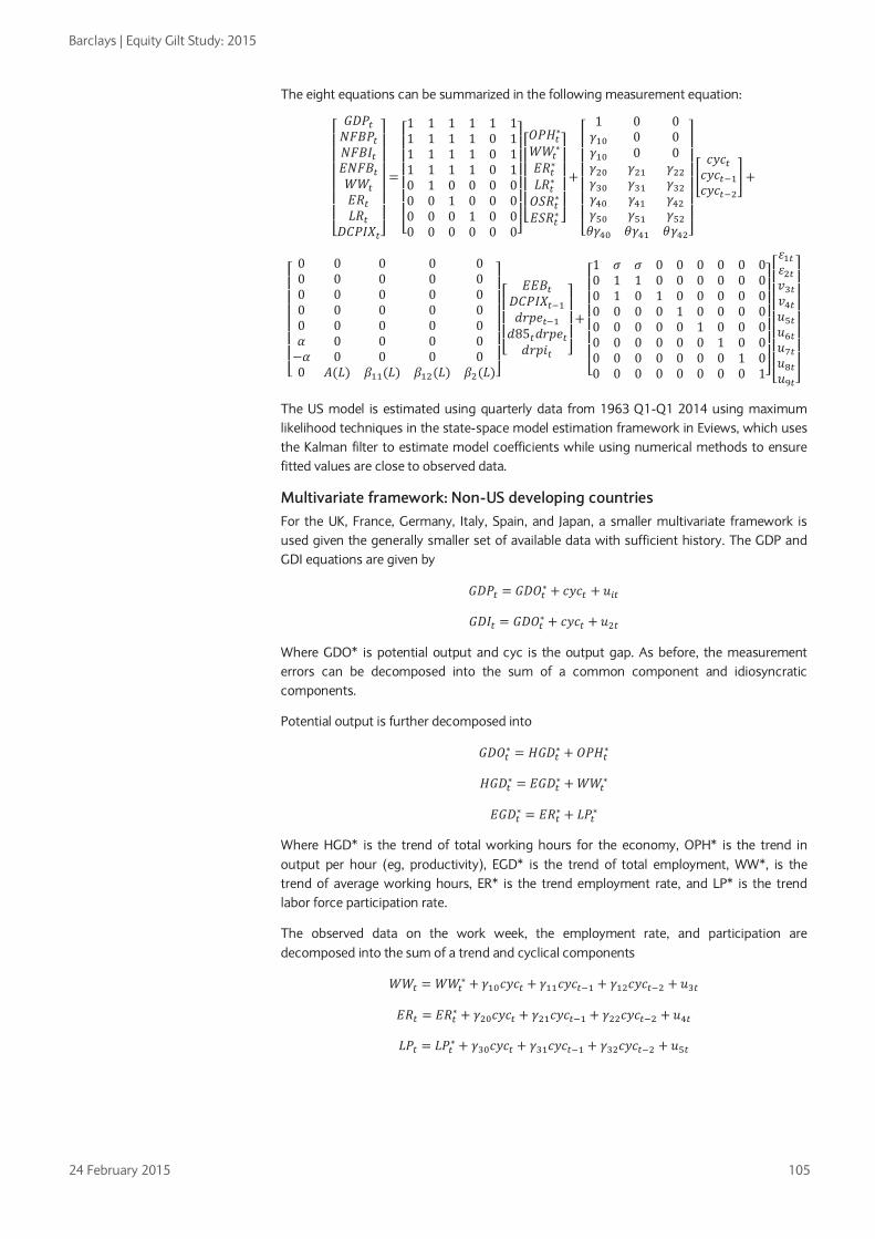
Barclays | Equity Gilt Study: 2015
24 February 2015 105
The eight equations can be summarized in the following measurement equation:
⎣⎢⎢⎢⎢⎢⎢⎡𝐺𝐷𝑃𝑡𝑁𝐹𝐵𝑃𝑡𝑁𝐹𝐵𝐼𝑡𝐸𝑁𝐹𝐵𝑡𝑊𝑊𝑡𝐸𝑅𝑡𝐿𝑅𝑡
𝐷𝐶𝑃𝐼𝑋𝑡⎦⎥⎥⎥⎥⎥⎥⎤
=
⎣⎢⎢⎢⎢⎢⎢⎡1 1 1 1 1 11 1 1 1 0 11 1 1 1 0 11 1 1 1 0 10 1 0 0 0 00 0 1 0 0 00 0 0 1 0 00 0 0 0 0 0⎦
⎥⎥⎥⎥⎥⎥⎤
⎣⎢⎢⎢⎢⎡𝑂𝑃𝐻𝑡∗𝑊𝑊𝑡
∗
𝐸𝑅𝑡∗𝐿𝑅𝑡∗𝑂𝑆𝑅𝑡∗𝐸𝑆𝑅𝑡∗ ⎦
⎥⎥⎥⎥⎤
+
⎣⎢⎢⎢⎢⎢⎢⎡
1 0 0𝛾10 0 0𝛾10 0 0𝛾20 𝛾21 𝛾22𝛾30 𝛾31 𝛾32𝛾40 𝛾41 𝛾42𝛾50 𝛾51 𝛾52𝜃𝛾40 𝜃𝛾41 𝜃𝛾42⎦
⎥⎥⎥⎥⎥⎥⎤
�𝑐𝑦𝑐𝑡𝑐𝑦𝑐𝑡−1𝑐𝑦𝑐𝑡−2
�+
⎣⎢⎢⎢⎢⎢⎢⎡
0 0 0 0 00 0 0 0 00 0 0 0 00 0 0 0 00 0 0 0 0𝛼 0 0 0 0−𝛼 0 0 0 00 𝐴(𝐿) 𝛽11(𝐿) 𝛽12(𝐿) 𝛽2(𝐿)⎦
⎥⎥⎥⎥⎥⎥⎤
⎣⎢⎢⎢⎡
𝐸𝐸𝐵𝑡𝐷𝐶𝑃𝐼𝑋𝑡−1𝑑𝑟𝑝𝑒𝑡−1𝑑85𝑡𝑑𝑟𝑝𝑒𝑡𝑑𝑟𝑝𝑖𝑡 ⎦
⎥⎥⎥⎤
+
⎣⎢⎢⎢⎢⎢⎢⎡1 𝜎 𝜎 0 0 0 0 0 00 1 1 0 0 0 0 0 00 1 0 1 0 0 0 0 00 0 0 0 1 0 0 0 00 0 0 0 0 1 0 0 00 0 0 0 0 0 1 0 00 0 0 0 0 0 0 1 00 0 0 0 0 0 0 0 1⎦
⎥⎥⎥⎥⎥⎥⎤
⎣⎢⎢⎢⎢⎢⎢⎢⎡𝜀1𝑡𝜀2𝑡𝑣3𝑡𝑣4𝑡𝑢5𝑡𝑢6𝑡𝑢7𝑡𝑢8𝑡𝑢9𝑡⎦
⎥⎥⎥⎥⎥⎥⎥⎤
The US model is estimated using quarterly data from 1963 Q1-Q1 2014 using maximum likelihood techniques in the state-space model estimation framework in Eviews, which uses the Kalman filter to estimate model coefficients while using numerical methods to ensure fitted values are close to observed data.
Multivariate framework: Non-US developing countries For the UK, France, Germany, Italy, Spain, and Japan, a smaller multivariate framework is used given the generally smaller set of available data with sufficient history. The GDP and GDI equations are given by
𝐺𝐷𝑃𝑡 = 𝐺𝐷𝑂𝑡∗ + 𝑐𝑦𝑐𝑡 + 𝑢𝑖𝑡
𝐺𝐷𝐼𝑡 = 𝐺𝐷𝑂𝑡∗ + 𝑐𝑦𝑐𝑡 + 𝑢2𝑡
Where GDO* is potential output and cyc is the output gap. As before, the measurement errors can be decomposed into the sum of a common component and idiosyncratic components.
Potential output is further decomposed into
𝐺𝐷𝑂𝑡∗ = 𝐻𝐺𝐷𝑡∗ + 𝑂𝑃𝐻𝑡∗
𝐻𝐺𝐷𝑡∗ = 𝐸𝐺𝐷𝑡∗ + 𝑊𝑊𝑡∗
𝐸𝐺𝐷𝑡∗ = 𝐸𝑅𝑡∗ + 𝐿𝑃𝑡∗
Where HGD* is the trend of total working hours for the economy, OPH* is the trend in output per hour (eg, productivity), EGD* is the trend of total employment, WW*, is the trend of average working hours, ER* is the trend employment rate, and LP* is the trend labor force participation rate.
The observed data on the work week, the employment rate, and participation are decomposed into the sum of a trend and cyclical components
𝑊𝑊𝑡 = 𝑊𝑊𝑡∗ + 𝛾10𝑐𝑦𝑐𝑡 + 𝛾11𝑐𝑦𝑐𝑡−1 + 𝛾12𝑐𝑦𝑐𝑡−2 + 𝑢3𝑡
𝐸𝑅𝑡 = 𝐸𝑅𝑡∗ + 𝛾20𝑐𝑦𝑐𝑡 + 𝛾21𝑐𝑦𝑐𝑡−1 + 𝛾22𝑐𝑦𝑐𝑡−2 + 𝑢4𝑡
𝐿𝑃𝑡 = 𝐿𝑃𝑡∗ + 𝛾30𝑐𝑦𝑐𝑡 + 𝛾31𝑐𝑦𝑐𝑡−1 + 𝛾32𝑐𝑦𝑐𝑡−2 + 𝑢5𝑡

Barclays | Equity Gilt Study: 2015
24 February 2015 106
and the cycle is assumed to be a stationary auto-regressive process.37 Finally, the Phillips curve is for non-US developed economies is given by
𝐷𝐶𝑃𝐼𝑋𝑡 = 𝐴(𝐿)𝐷𝐶𝑃𝐼𝑋𝑡−1 + 𝜃(𝛾20𝑐𝑦𝑐𝑡 + 𝛾21𝑐𝑦𝑐𝑡−1 + 𝛾22𝑐𝑦𝑐𝑡−2) + 𝑢6𝑡
which has a similar interpretation to the US specification in that it is assumed that cyclical deviations in output are allowed to affect inflation, creating a natural rate interpretation.
The six equations can be represented in the following measurement equation
⎣⎢⎢⎢⎢⎡𝐺𝐷𝑃𝑡𝐺𝐷𝐼𝑡𝑊𝑊𝑡𝐸𝑅𝑡𝐿𝑃𝑡
𝐷𝐶𝑃𝐼𝑋𝑡⎦⎥⎥⎥⎥⎤
+
⎣⎢⎢⎢⎢⎡1 1 1 1 1 0 0 1 01 1 1 1 1 0 0 0 10 1 0 0 𝛾10 𝛾11 𝛾12 0 00 0 1 0 𝛾20 𝛾21 𝛾22 0 00 0 0 1 𝛾20 𝛾31 𝛾32 0 00 0 0 0 𝜃𝛾20 𝜃𝛾21 𝜃𝛾22 0 0⎦
⎥⎥⎥⎥⎤
+
⎣⎢⎢⎢⎢⎡
00000
𝐴(𝐿)⎦⎥⎥⎥⎥⎤
𝐷𝐶𝑃𝐼𝑋𝑡−1 +
⎣⎢⎢⎢⎢⎡𝜀1𝑡𝜀1𝑡𝑢3𝑡𝑢4𝑡𝑢5𝑡𝑢6𝑡⎦
⎥⎥⎥⎥⎤
The models are estimated using quarterly data for the UK (1975 Q1-Q1 2014), France (1975 Q1-Q1 2014), Germany (1973 Q1–Q1 2014), Italy (1993 Q1-Q1 2014), Spain (1996 Q1-Q1 2014), and Japan (1981 Q1-Q1 2014), using maximum likelihood techniques in the state-space model estimation framework in Eviews.
37 The cycle is assumed to be a stationary AR(2) process equal to 𝑐𝑦𝑐𝑡 = 𝜌1𝑐𝑦𝑐𝑡−1 + 𝜌2𝑐𝑦𝑐𝑡−2 + 𝜔𝑡.Typically 𝜌1 > 0 and 𝜌2 < 0 which implies the cycle is hump-shaped in response to a shock. The sum of the coefficients is assumed to be close to 1, but less than 1, meaning the business cycle is persistent.

Barclays | Equity Gilt Study: 2015
24 February 2015 107
CHAPTER 5
The decline in financial market liquidity • Banking regulation has intensified since the financial and sovereign crises in a global
effort to improve the safety and stability of the financial system. Regulators have forced banks to change their capital structures and their business models to enhance the safety of the banking system and make future financial crises less likely.
• These new regulations have materially improved the stability of the financial system. However, in an effort to reduce the risk of future fire-sales financed by short-term debt, they have also reduced the supply of safe, short-term, liquid assets such as repurchase agreements, causing them to trade at lower yields (and, by extension, higher prices).
• The reduction in the supply of short-dated safe assets and associated fall in the liquidity of fixed income markets has created incentives for investors to look to non-traditional sources of liquidity, such as ETFs and mutual funds. In turn, this may result in a transfer of fire-sale risk into assets such as leveraged loans and investment grade and high yield bonds, as liquidity in the underlying investments of these funds deteriorates, exposing end-investors to run risk.
A changing landscape Before the crisis that erupted in 2007, many banks operated with too little equity and were overly reliant on short-term wholesale financing, such as “repo”, or repurchase agreements, to fund illiquid investments. When the crisis began, these banks did not have the capacity to absorb losses, given their limited capital base. Regulators have addressed this by forcing all banks to significantly increase their capital ratios, which are now higher than at any time since World War II. Excessive reliance on short-term financing exposed some banks to destabilizing runs when investors pulled their financing as the crisis began to mount, contributing to failures. More important from a systemic point of view, this precipitated the fire-sale of assets financed by short-term debt, driving down the prices of specific assets. This contributed to system-wide funding issues, even for banks with relatively strong balance sheets. To reduce the risk of future fire-sales, several of the new initiatives have targeted repo and other short-term liabilities, resulting in a more than 50% reduction in repo balances relative to their peak. In particular, the Volcker Rule was introduced to address illiquid and riskier investments that had burgeoned in the banking sector before the crisis.
Whether these steps will be sufficient to curb future crises remains an open question. But it is clear that the new regulatory environment has materially improved the stability of the system. The best evidence of the effect of new regulations on banks probably comes from the credit market, where the spreads of bonds issued by the largest banks have narrowed significantly and, in many cases, are now tighter than industrial spreads. In other words, bond investors believe bank safety has improved so much that they are once again willing to accept low spreads for bank risk1.
Less well understood are the broader effects of improved stability on investors and the economy. Last year, we wrote that decreased bank lending was one potential implication (see The cost of evolving bank regulation, 13 February 2014). This year, we focus on the implications of two separate, but related, changes in financial markets.
1 This argument is bolstered by the fact that banks arguably benefited from implicit government support (ie, bail-outs in the event of a disruption) pre-crisis, causing their credit spreads to be artificially low. Subsequent changes to regulation have likely reduced or eliminated the extent to which banks will benefit from bail-outs in any future crisis, which would bias bank spreads wider absent the improvements in credit quality that we cite.
Jeffrey Meli
+1 212 412 2127
Brian Monteleone
+1 212 412 5184
Eric Gross
+1 212 412 7997
Conor Pigott
+1 212 412 3441
Joseph Abate
+1 212 412 7459
The best evidence of the effect of new regulations probably comes from the credit market, where the spreads of bonds issued by the largest banks have narrowed significantly

Barclays | Equity Gilt Study: 2015
24 February 2015 108
• The reduced size of the repo market. This large, but relatively esoteric, part of the financial market is used by hedge funds and banks to finance securities and by money market funds to invest cash.
• The fall in liquidity in fixed income markets, demonstrated by a decrease in turnover and an increase in bid-offer spreads. This is related to the changes in repo, which is an important financing tool for banks’ market-making operations, but is also driven by other changes that have made banks less willing to warehouse risk on behalf of investors.
These changes have important consequences for financial market participants, including hedge funds and insurance companies, which are having a harder time financing securities and positioning their portfolios and are paying higher transaction costs. Retail investors are also paying higher transaction costs in their mutual funds, and there is evidence that poor liquidity is affecting the behavior of active managers. However, these seem like relatively small prices to pay for a material decrease in the likelihood and magnitude of future financial crises.
We believe there are two broader implications that are more likely to be disruptive, particularly once (if) interest rates begin rising. First, the decline in repo has reduced the supply of safe, short-term assets. Relatively few assets fit this description: Treasury bills, bank deposits, and repo. The reduction in repo is happening as Treasury bill supply is shrinking and banks are less willing recipients of deposits, given lackluster loan demand. As overall supply of such assets declines, we believe investor demand for them is relatively inelastic and a function of financial wealth, which has been rising. We expect excess demand for short-dated safe assets to cause them to trade at lower yields (ie, higher prices), even as and when interest rates begin to normalize. This applies to deposit rates, which we believe will lag any rate hikes, such as we expect in the US later this year, as investors remain willing to accept low interest rates to maintain a base of liquid assets. Similarly, money market funds may need to accept lower rates to remain invested.
Second, reducing the supply of these safe, short-dated assets creates incentives for investors to look to non-traditional sources of liquidity. Migration to seemingly liquid alternatives has happened before: in the pre-crisis period, safe short-dated assets were in limited supply (relative to financial wealth) because of the tremendous run-up in equity prices. The result was a massive spike in CP, repo on structured assets such as ABS and CDOs, and auction rate securities, all of which purported to offer the daily liquidity investors were seeking. But this liquidity dried up once the crisis began.
For various reasons, the same alternatives will not be chosen this time around: the changes in regulations, investors’ collective experiences with those investments, and the simple fact that many of them no longer exist. However, there have been increased flows in other vehicles that offer daily liquidity, such as ETFs and mutual funds. The desire for liquidity may also be limiting demand for closed-end fixed income funds, which would seem a natural response to the decline in fixed income liquidity.
The inflows into ETFs and mutual funds are happening just as liquidity in the underlying investments that these funds purchase is deteriorating. This has raised new concerns about “retail runs” and fire-sale risks in such assets as leveraged loans and investment grade and high yield bonds, where either liquidity has dropped most severely and/or where the funds offering daily liquidity have grown the most. Ironically, these new fire-sale risks have arisen in part because the risks of a repo-driven fire-sale have fallen. The well intentioned and arguably successful efforts to make the banking system more robust and less susceptible to runs have transferred fire-sale risk out of the banking system and into the hands of end-investors.
Repo 101 A repurchase transaction (repo) is effectively a collateralized short-term (often overnight) loan. For example, an investor looking to borrow money pledges a security (eg, a Treasury) as collateral, and receives cash. The next day, the investor pays back the cash plus interest,
The decline in repo has reduced the supply of safe, short-term assets…
…creating incentives for investors to look to non-traditional sources of liquidity

Barclays | Equity Gilt Study: 2015
24 February 2015 109
and receives his or her collateral back in return. A “reverse repo” is the same transaction but viewed through the lens of the lender.
Repurchase transactions have several important aspects. First, although much of the repo market is overnight, “term” repo, which can be measured in weeks or even months, is also possible. The structure is the same, but the collateral is not returned (and the loan paid off) until the end of the term. The second aspect is the interest rate of the transaction, which depends on the term and the specific collateral involved. For various reasons, some collateral may be specifically desirable to lenders and thus command lower interest rates. The final key dimension is the “haircut” – which defines just how much cash the borrower gets for the collateral. This is quoted in terms of a percentage of market value. Higher-quality collateral, such as Treasuries or agency debt, typically requires the lowest haircuts, eg, 2%. This means that it is possible to borrow $98 for every $100 of Treasuries that the borrower pledges as collateral. Lower-quality collateral (eg, corporate bonds) typically requires higher haircuts.
Banks engage in repo transactions for two related reasons. First, repos match cash-rich investors (such as money market funds) with investors (such as hedge funds) who own securities but need financing. This is done via a “matched book” – banks engage in reverse repo transactions with hedge funds, lending them money collateralized by securities. Banks then borrow from money market funds via repo transactions, collateralized by the same securities. The banks effectively act as middlemen, with the cash flowing from the money funds to the hedge funds, and the collateral moving in the opposite direction. The second reason banks engage in repo is to finance their own portfolio of securities, essentially playing the role of the hedge funds in the matched book example above.
Anatomy of a repo run Although the repo market is large (measured in trillions of dollars; more on this below), it also seems, at first, fairly innocuous. Short-dated, collateralized loans sound safe, particularly relative to equities or the highly structured assets that featured so prominently in the credit crisis. In fact, these are safe investments for lenders. The short-term nature of the transaction means that if any concerns arise, the lender need not sell or unwind the transaction – it is closed out the next day, in the case of overnight repo. In case of default, the lender can sell the collateral and recoup his or her money. It is precisely the safety of repo that makes it an attractive investment for money market funds. They invest in safe, highly liquid short-term assets because their end-investors use these funds as cash substitutes.
However, the same features that make reverse repo a safe asset for money funds make repo a risky liability for leveraged investors and banks. At the slightest hint of trouble with either the collateral or the borrower, the funding can be withdrawn, which is as simple as not renewing an expiring contract. For example, if the collateral is downgraded, it may become harder to borrow against. Similarly, if the borrower (eg, hedge fund or bank) deteriorates in some way such that money funds or other lenders question its credit quality, borrowers may have a harder time securing funds regardless of the quality of their collateral. Essentially, borrowers reliant on repo need to continually roll over their financing, and are exposed to the risk of a run as a result, similar in concept to a deposit run.
This presents two concerns for regulators. First, banks finance significant securities portfolios via repo, and thus there is risk that an individual bank would need to liquidate assets in response to being locked out of the repo market – a pre-default fire-sale. This is problematic because the highest-quality assets are the easiest to sell – Treasuries, agencies, etc. A bank that was overly reliant on repo financing of lower quality securities and faced a repo run could be forced to sell assets quickly to raise liquidity, potentially driving down their market valuations and leading to asset write-downs that would impair capital, and increase the bank’s risk of default or downgrade. It might also need to sell assets or draw down on its cash holdings to meet increases in haircuts on the collateral it is pledging.
The same features that make reverse repo a safe asset for money funds make repo a risky liability for leveraged investors and banks

Barclays | Equity Gilt Study: 2015
24 February 2015 110
Such a run could affect multiple (or even all) banks at once if bank credit quality deteriorated across the board, or if the entire repo market experienced a disruption. This could be caused by a systemic shock leading to a crisis of confidence in the broader financial system. In this scenario, with multiple borrowers trying to liquidate assets, the market could experience a fire-sale – the prices of certain assets could plummet because of a large number of forced sellers trying to liquidate at once. This could be exacerbated by money market funds, which are often legally prohibited from owning the types of collateral underpinning their repo trades and would be forced to sell quickly if their counterparty defaulted and the fund took possession of the collateral. The solvency of an individual bank could deteriorate much faster in this scenario because it would be forced to sell assets at a loss, thereby eroding its capital. In fact, solvency concerns could spread through the financial system.
Academic studies have described this phenomenon as a “funding and liquidity spiral”. 2 Asset price shocks in a particular market create funding problems for cash borrowers who pledged the same or similar collateral. Borrowers reduce their positions by selling some of their holdings, while their ability to borrow against their remaining assets shrinks as haircuts increase and the value of these holdings falls in response to selling pressure. This exacerbates the funding problems and forces more de-leveraging and asset fire-sales – the process becomes self-reinforcing.
Lessons from the credit crisis Concerns about repo runs are not merely theoretical. Lehman Brothers’ failure in September 2008 serves as a real world case study. Lehman’s repo book accounted for 34% of total liabilities at 2Q08, a cursory measure of the firm’s dependence on short-term funding. During normal times, this was an effective strategy for leveraging returns, but as the firm’s crisis reached a climax, repo funding providers suddenly fled. Between September 9, 2008, and September 15, 2008 (the day of its bankruptcy filing), the number of tri-party counterparties providing Lehman Brothers with cash in exchange for securities fell from 63 to 16. Given that Lehman Brothers had used repo to fund a material volume of lower-quality, non-governmental securities – the prices of which had fallen sharply – the firm was left with assets it could no longer fund in overnight markets or sell without destroying capital, eventually contributing to the firm’s bankruptcy filing.
Although the Lehman experience is an important, cautionary tale, it also delineates where the true “run risk” lies within the repo market. Interestingly, the financial crisis did not cause a waterfall of repo runs across the rest of the system. Instead, the deterioration in repo markets was more focused.
• Higher-quality assets were still funded at modest haircuts: Repo haircuts did rise during the crisis across many asset classes; however, this was generally concentrated in funding for lower-quality ABS structures.3 Treasuries, agencies, and even investment grade corporate bonds showed modest – if any – increases in margin requirements over this period. For example, a Federal Reserve staff report indicated that U.S. Treasuries and agencies continued to be funded in the repo market throughout this period at haircuts of only 3% or less (ie, 97% loan to value).
• Evaporation of repo funding was concentrated in lower-quality issuers: Evidence from the same Federal Reserve study suggests that the repo funding flight was highly idiosyncratic to Lehman Brothers. Certain investors chose to cease providing Lehman with repo funding but nonetheless continued to fund other financial market participants.
2 See “Market Liquidity and Funding Liquidity”, M. Brunnermeier and L. Pedersen, National Bureau of Economic Research working paper, December 2008. 3 See “Repo Runs: Evidence from the Tri-Party Market”, A. Copeland, A. Martin, and M. Walker, Federal Reserve Bank of New York, July 2011.
Concerns about repo runs are not theoretical. The failure of Lehman Brothers serves as a real world case study

Barclays | Equity Gilt Study: 2015
24 February 2015 111
Overall, this suggests to us that repo is less flight-prone than might be imagined. Funding terms were not markedly increased and were not in themselves the transmission mechanism for forced sales. Furthermore, the markets for higher-quality assets that typically serve as repo collateral were able to absorb the liquidation of Lehman’s large Treasury and agencies books, which had been funded by repo. This can be naturally linked to the strong performance of these safe haven assets during times of turbulence, minimizing the risk of needing to take a loss as positions are closed.
However, we must be careful not to draw too much comfort from the experience of the crisis, given the unprecedented intervention in markets by the Federal Reserve and other central banks, which may have helped stem further contagion. The core issues around funding long-term, price-sensitive assets remain – entities using short-term funding (such as repo) need to mark their assets to market and obtain new funding every day. A temporary price decline has the potential to wipe out a firm’s margin and force it to sell its assets. This could in turn push asset prices lower, forcing other participants to sell and perpetuating the cycle. We believe that it is this risk – of a waterfall of forced sellers destabilizing the broader system – that regulators are attempting to address via repo-targeted reform.
Regulators have responded with significant changes Global standards for bank balance sheet size were fairly lax prior to the financial crisis. Basel I and II capital standards were largely based on risk-weighted assets, as opposed to total assets. This facilitated inflated balance sheets and more active proprietary risk taking in trading businesses. Regulators have made a series of changes to the bank regulatory framework to address perceived balance sheet structure and business model risks. These include:
• Volcker Rule • The introduction of leverage ratios • SIFI buffers • Haircuts
Volcker Rule Banks’ trading operations historically served two main purposes: 1) providing liquidity to market participants wanting to buy or sell securities in exchange for a bid-ask spread; and 2) using the bank’s balance sheet to generate profit from price movements. Bank regulators grew concerned that proprietary trading positions created undue risks on banks’ balance sheets. In response, the Dodd-Frank Act created the Volcker Rule, which prohibits proprietary trading. Among other things, the rule limits banks’ ability to take trading positions – capped at demonstrated market demand. In a market where demand from clients, customers or counterparties is expected to diminish, this limits a bank’s ability to intermediate the market. Notably, regulators chose to exempt Treasury and municipal securities from these restrictions.
Leverage ratios Pre-crisis, the most important (and binding) regulatory capital ratios banks needed to meet were based on risk-weighted assets. Safe assets, such as repo, were assigned low risk weights, and thus banks were required to allocate very limited capital to those types of positions. As a result, there were few practical limitations on the size of bank balance sheets, which expand as banks increase the size of their matched-book repo positions.
This has changed in both the US and Europe. Regulators in the US have adopted a 5% supplementary leverage ratio for the holding companies of the systemically important US banks. 4 This represents a materially stricter requirement than the old US standard, as it raises the hurdle from 4% and expands the scope to capture some off-balance sheet assets. This rule
4 Technically, the proposed higher supplementary leverage ratio requirement would apply to all banks in the US with at least $700bn in assets and/or $10trn in assets under custody, which at present captures the eight US G-SIBs: Bank of America, Bank of New York, Citigroup, Goldman Sachs, JPMorgan, Morgan Stanley, State Street, and Wells Fargo.

Barclays | Equity Gilt Study: 2015
24 February 2015 112
complements existing risk-weighted capital measures by ensuring that even low-risk assets and certain off-balance-sheet exposures are backed by material equity capital if exposures are large enough (see Leverage ratio: An attack on repo?).
Prior to the crisis, European banks were not subject to any restrictions on balance sheet. Thus, they naturally gravitated toward lower risk-weighted assets (eg, repo). This has now changed for two reasons. First, European regulators have adopted a 3% leverage ratio and several are moving toward an even higher standard. Second, new regulations on US subsidiaries of foreign banks will push these banks to manage the balance sheets of their US operations more conservatively. Previously, foreign banks’ US intermediate holding companies were not required to meet US capital standards independently. However, beginning in July 2015, Section 165 of the Dodd-Frank Act will require foreign-domiciled banks to roll up all their US broker/dealers and bank branches into a single intermediate holding company (IHC). The IHC will then need to meet risk-based capital requirements, maintain minimum liquidity buffers, and meet the minimum leverage ratio. The challenge of establishing an IHC is particularly acute for foreign banks that mainly conduct broker-dealer business in the US, with limited lending capabilities, because their balance sheets would be naturally skewed toward lower risk-weight business (Figure 1). Based on recent data, these institutions will be under similar pressure as their US peers to reduce size and/or increase equity.
FIGURE 1 Foreign banks account for a significant share of US broker-dealer activity Assets of US broker-dealers ($bn)
Note: Data as of YE 2013. Source: Company reports, Barclays Research
SIFI buffer for short-term wholesale funding reliance In December 2014, the Federal Reserve released its notice of proposed rulemaking (NPR) outlining the US implementation of additional capital buffers at systemically important banks. This highly anticipated release outlined the rules for determining how much more Tier 1 common capital the largest banks will hold above the Basel III minimums.
Most elements of the rule were taken directly from the Basel/Financial Stability Board guidelines; however, the Fed also shifted critical elements. In one key change, the Federal Reserve decided to vary capital requirements based on the amount of short-term wholesale funding used by a given bank. Although we do not believe this change in itself generates higher capital requirements versus the FSB rules (based on current balance sheets), it does establish a link, for the first time, between capital requirements and wholesale funding structure. For a more detailed discussion of the proposal, see We're Gonna Need a Bigger Buffer: Fed Proposes SIFI Capital Surcharge, 11 December 2014.
050
100150200250300350400450500
GSJPM
MSBAC
BACRCS
CDB
UBSRBS
BNPNomura
HSBCMizuho
RY
U.S. Banks, Securities Financing Assets Foreign Banks, Securities Financing AssetsU.S. Banks, Other Assets Foreign Banks, Other Assets
Before the crisis, European banks were not subject to any restrictions on balance sheet; thus, they naturally gravitated toward lower risk-weighted assets – this has now changed

Barclays | Equity Gilt Study: 2015
24 February 2015 113
Haircuts up next Though somewhat less certain, we expect further rulemaking to address haircuts for repo transactions. These would likely be designed to cap leverage within the repo market to levels appropriate for the quality of the underlying collateral, see Squeezing the leverage out, October 24, 2014. Federal Reserve Governor Daniel Tarullo has repeatedly expressed a desire to add regulation along these lines over the past year. Most recently, in a speech at an Office of Financial Research conference (excerpted below), he highlighted his intention that such rules also apply outside the traditional banking sector to mitigate the risk of non-banks building up repo leverage as banks pull back.
Federal Reserve Governor Daniel Tarullo, January 30, 2015 “I have on past occasions described at some length my concerns with short-term wholesale funding – especially, though not exclusively, funding associated with assets thought to be cash equivalents….One policy response that the Federal Reserve has advocated and that has now been proposed by the Financial Stability Board (FSB), is for minimum margins to be required for certain forms of securities financing transactions (SFTs) that involve extensions of credit to parties that are not prudentially regulated financial institutions. This system of margins is intended to serve the macroprudential aim of moderating the build-up of leverage in the use of these securities in less regulated parts of the financial system and to mitigate the risk of pro-cyclical margin calls by preventing their decline to unsustainable levels during credit booms.”
These changes have reduced repo volumes and liquidity The repo market has shrunk Repo balances have fallen from a peak of more than $5trn pre-crisis to about $2.5trn currently. We believe this market will decline by an additional ~20%, or roughly $500bn. The total amount of outstanding repo has contracted twice since 2008 (Figure 2). During the first episode (March 2008–December 2009), total repo outstanding shrank by almost 47%, driven by asset price fears and bank and investor deleveraging. Although repo against corporate bonds accounted for less than 10% of overall collateral pledged in March 2008, this market had the biggest reduction in activity, with volumes plunging by more than 63% during the financial crisis. We interpret this decline as a response to the use of non-traditional collateral.
The second repo contraction, which occurred between November 2012 and February 2014, has been focused on higher quality collateral, and in our view has been a result of new regulations. In this episode, overall repo volume fell by 22%, led by agency MBS collateral, which plunged by 43% – more than it fell during the financial crisis.
This is clearly visible in the repo balances of the large US banks, which have declined by 28% over the past four years (Figure 3). Notably, the only US global systemically important bank (G-SIB) to grow its repo balances over the past few years has been Wells Fargo, which we estimate has a significant surplus to its required supplementary leverage ratio requirement. That is because Wells Fargo predominantly focuses on traditional banking businesses of taking deposits and making loans (higher RWA), with lower exposure to repo and trading (lower RWA).

Barclays | Equity Gilt Study: 2015
24 February 2015 114
FIGURE 2 Aggregate repo volumes have contracted sharply from pre-crisis levels Repo outstanding ($trn)
FIGURE 3 Most large US banks have responded to SLR requirements by reducing repo balances Repo borrowings ($bn)
Source: Federal Reserve, Barclays Research Source: Company reports, Barclays Research
Although the pace of the reaction to new rules has varied, all bank management teams that face balance sheet size pressure have taken steps to reduce their low RWA exposures. Most recently, Goldman Sachs CFO Harvey Schwartz highlighted the company’s focus on reducing its balance sheet in response to increased regulatory clarity.
Goldman Sachs CFO Harvey Schwartz, July 15, 2014 “Over the past few months, we have received greater clarity on the role of the balance sheet across a variety of regulatory requirements, most notably the Comprehensive Capital Analysis and Review (CCAR) and the supplementary leverage ratio. During the quarter, we undertook a comprehensive analysis of our balance sheet. We began the process by examining the return on asset characteristics associated with different businesses. Through that analysis, we identified opportunities to reduce balance sheet with a de minimis impact to our client franchise and earnings potential. As you would expect, the quarterly reduction largely impacted lower return asset activities within our matchbook and other secured financing transactions.”
Liquidity in fixed income markets has contracted The decline in liquidity in fixed income markets is another consequence of the changes in bank regulation for financial markets. For illustrative purposes, we focus on the US credit market, for which we have accurate volume and transaction cost data, but we believe the results shown below are indicative of how trading patterns have evolved generally.
Beginning with volume data (from the TRACE reporting system, which captures all corporate bond trades in the US), we compute turnover metrics for both the US investment grade and high yield bond markets. Turnover has clearly been on a declining trend – in both markets, it is at or close to the lowest levels on record (high yield experienced a small bounce in late 2014 as a result of the volatility of energy credits). In high yield, turnover has steadily made its way down from 177% in 2005 to 98% in 2014 (Figure 5). Notwithstanding a genuine spike in investment grade corporate turnover in 2009, as the market recovered from the credit crisis, volumes in that market have also failed to keep pace with growth in par outstanding, and turnover is down from 101% to 66% over the same period (Figure 4).
0
1
2
3
4
5
2001 2003 2005 2007 2009 2011 2013
$trn
0
50
100
150
200
250
300
350
BAC C GS JPM MS WFC
$bn 3Q10 3Q14-26%
-8%
-37%
-35%
-44%
+51

Barclays | Equity Gilt Study: 2015
24 February 2015 115
FIGURE 4 Volume, market size, and turnover in high grade credit
FIGURE 5 Volume, market size, and turnover in high yield credit
Source: MarketAxess, Barclays Research Source: MarketAxess, Barclays Research
Transaction costs have risen at the same time. Figure 6 contains pre- and post-crisis transaction costs in the IG and HY markets, estimated using our Liquidity Cost Score (LCS) methodology5. Transaction costs have increased in both markets. Although the change in HY is notable, at more than 20%, the change in IG is more marked. We think this is the result of the substantial strength of pre-crisis liquidity in that market. Note that the change in LCS is more severe than that in bid-offer – this is driven by an increase in the average duration of the IG market over the past several years. The same average bid-offer spread corresponds to a higher transaction cost for a longer-duration bond.
FIGURE 6 Transaction costs, today versus the pre-crisis period
1/31/2007 1/31/2015 Change
LCS (%) Bid-Offer LCS Bid-Offer LCS Bid-Offer
US Credit Corporate 0.531 8.5 bp 0.951 13.2 bp +79% +55%
US High Yield Corporate 1.276 1.28 pts 1.550 1.56 pts +21% +21%
Source: Barclays Research
The changes in the drivers of volumes and turnover at the individual bond level provide further evidence of the decline in liquidity. In Figure 7, we present regressions of turnover in high yield bonds against size, age, and volatility in 2006 and 2014. In 2006, the two main determinants of turnover were the age of a bond and its volatility. We interpret the relevance of age as a halo effect around new issue – bonds tend to trade in meaningful size in the months immediately after issuance. Turnover increases with volatility because price changes force investors to re-evaluate their holdings in a particular bond. Corporate actions, earnings, upgrades and downgrades are all possible sources of volatility that could lead credit investors to reposition their portfolios.
By 2014, a few things had changed. First, the coefficients on age and volatility were both sharply lower. The “new issue effect” was much reduced, and it took much more volatility to drive the same level of turnover. More interesting, size became a much more important determinant of turnover. This suggests to us that investors “pooled” liquidity in the largest bonds, which became proxy trading vehicles for the market. This is exactly the type of reaction we would expect from investors struggling to position portfolios in a lower-liquidity environment – the little liquidity that does exist is concentrated in a smaller number of issues, rather than dispersed across the market.
5 Liquidity Cost Scores for US Credit Bonds, October 2009.
60%
65%
70%
75%
80%
85%
90%
95%
100%
105%
0
1,000
2,000
3,000
4,000
5,000
6,000
2005
2006
2007
2008
2009
2010
2011
2012
2013
2014
$bn
Volume Amount Turnover
80%
100%
120%
140%
160%
180%
200%
0
200
400
600
800
1,000
1,200
1,400
1,600
2005
2006
2007
2008
2009
2010
2011
2012
2013
2014
$bn
Volume Amount Turnover
Changes in the drivers of volumes and turnover at the individual bond level provide further evidence of the decline in liquidity
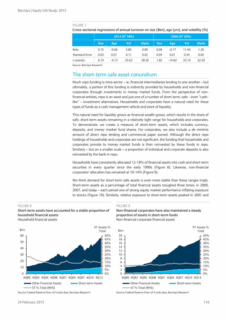
Barclays | Equity Gilt Study: 2015
24 February 2015 116
FIGURE 7 Cross-sectional regressions of annual turnover on size ($bn), age (yrs), and volatility (%)
2014 (R2 18%) 2006 (R2 20%)
Size Age Vol Alpha Size Age Vol Alpha
Beta 0.15 -0.06 3.80 0.89 0.08 -0.17 11.40 1.20
Standard Error 0.03 0.01 0.11 0.02 0.04 0.01 0.34 0.04
t-statistic 6.10 -9.13 35.62 38.36 1.82 -14.82 33.16 32.30
Source: Barclays Research
The short-term safe asset conundrum Much repo funding is intra-sector – ie, financial intermediaries lending to one another – but ultimately, a portion of this funding is indirectly provided by households and non-financial corporates through investments in money market funds. From the perspective of non-financial entities, repo is an asset and just one of a number of short-term, safe – even “cash-like” – investment alternatives. Households and corporates have a natural need for these types of funds as a cash management vehicle and store of liquidity.
This natural need for liquidity grows as financial wealth grows, which results in the share of safe, short-term assets remaining in a relatively tight range for households and corporates. To demonstrate, we create a measure of short-term assets, which includes currency, deposits, and money market fund shares. For corporates, we also include a de minimis amount of direct repo lending and commercial paper owned. Although the direct repo holdings of households and corporates are not significant, the funding that households and corporates provide to money market funds is then reinvested by these funds in repo. Similarly – but on a smaller scale – a proportion of individual and corporate deposits is also reinvested by the bank in repo.
Households have consistently allocated 12-18% of financial assets into cash and short-term securities in every quarter since the early 1990s (Figure 8). Likewise, non-financial corporates’ allocation has remained at 10-14% (Figure 9).
We think demand for short-term safe assets is even more stable than these ranges imply. Short-term assets as a percentage of total financial assets troughed three times: in 2000, 2007, and today – each period one of strong equity market performance inflating exposure to stocks (Figure 10). Similarly, relative exposure to short-term assets peaked in 2001 and
FIGURE 8 Short-term assets have accounted for a stable proportion of household financial assets Household financial assets
FIGURE 9 Non-financial corporates have also maintained a steady proportion of assets in short-term funds Non-financial corporate financial assets
Source: Federal Reserve Flow-of-Funds data, Barclays Research Source: Federal Reserve Flow-of-Funds data, Barclays Research
0%5%10%15%20%25%30%35%40%45%50%
0
10
20
30
40
50
60
4Q89 4Q92 4Q95 4Q98 4Q01 4Q04 4Q07 4Q10 4Q13
ST Assets % Total$trn
Other Financial Assets Short-term AssetsST % Total (RHS)
0%5%10%15%20%25%30%35%40%45%50%
02468
101214161820
4Q89 4Q92 4Q95 4Q98 4Q01 4Q04 4Q07 4Q10 4Q13
ST Assets % Total$trn
Other Financial Assets Short-term AssetsST % Total (RHS)

Barclays | Equity Gilt Study: 2015
24 February 2015 117
2008, when sharp equity market declines reduced the value of stocks. In fact, absolute holdings of short-term assets have increased in 19 of the past 20 years, by an average of 6.2%. In other words, the pace of growth in short-term assets has steadily tracked the long-term growth rate of household and corporate accounts. Indeed, Gorton et al report that their “safe asset” share of all US assets has remained steady at around 33% since 1952.6
FIGURE 10 Following periods of strong equities performance, household exposure to equities peaks and short-term assets reach a local low as a percentage of total assets US Household Exposure to Equities and Short-term Assets
Source: Federal Reserve, Bloomberg
How will the demand for safe, short-term assets be met? Faced with the prospect of shrinking bank-provided repo, what alternatives are available to investors seeking short-duration liquid assets? A survey of similar low-risk, short-term options suggests investors may struggle to deploy their growing allocation to this category. The main low-risk alternatives – Treasury bills, bank deposits, and the Federal Reserve’s new reverse repo program (RRP) – all have their limitations.
Bills insufficient and declining Short-dated Treasury debt is probably the closest substitute for repo – and probably the most plentiful alternative – with $1.5trn in bills and $1.5trn in coupon Treasuries under 400 days to maturity outstanding. Moreover, given the limitations on what some investors can own, short-dated Treasury debt is one of the easiest substitutes. In fact, when repo balances contracted during the financial crisis, there was a marked increase in money market funds’ Treasury bill holdings, supported by the increased bill supply in 2008 (Figure 11).
However, as the budget deficit shrinks and the Treasury moves to lengthen the average maturity of the outstanding debt, it has steadily trimmed bill issuance. Since peaking in 2009, the outstanding bill supply has contracted by more than 20% (>$500bn) (Figure 12). Demand is so strong that at bill auctions – of any maturity – bids exceed the offering amount fourfold. And given the buy-and-hold nature of the investor base, once the paper is purchased into a portfolio it almost never returns to the market. Thus, even though $1.5trn in absolute terms is larger than the aggregate debt outstanding of some G7 countries, the Treasury bill market – even supplementing the supply with coupons out to 13 months – is probably too small to absorb demand diverted from the private sector repo market.
6 See “The Safe-Asset Share”, G. Gorton, S. Lewellen, A. Metrick, NBER working paper, January 2012.
10%
12%
14%
16%
18%
20%
22%
24%
0%
5%
10%
15%
20%
25%
30%
Dec-89 Dec-94 Dec-99 Dec-04 Dec-09Equity Exposure % Total Assets Short-Term Assets % Total Assets (RHS)
Treasury bills, bank deposits, and the Federal Reserve’s new reverse repo program (RRP) all have their limitations as short-duration liquid assets

Barclays | Equity Gilt Study: 2015
24 February 2015 118
FIGURE 11 Upon the contraction of the repo market in 2008, MMFs redeployed capital into Treasury bills
FIGURE 12 However, bill volume has since declined and is unlikely to be able to absorb incremental demand from declining repo
Source: Federal Reserve, SIFMA, Barclays Research Source: Federal Reserve Flow of Funds, Barclays Research
Deposits are a natural alternative, but rates could lag if demand increases out of step with lending opportunities Deposits are clearly a safe, liquid asset and are one of the main areas where households and corporates deploy short-term funds. Uninsured bank deposits (above the $250k insurance maximum) do represent incremental credit risk versus government obligations; however, money market funds already deploy roughly 20% of their holdings into wholesale bank deposits, suggesting that deposits form a reasonable investment avenue for these entities.
However, we do not see much demand from banks for this incremental funding. Banks are already awash in deposits, as demonstrated by an average loan-to-deposit ratio of roughly 70%. Although banks will continue to take deposits, away from pockets of demand for retail deposits driven by the new Liquidity Coverage Rule (LCR), we believe banks’ interest in further inflating their balance sheets is limited. Their appetite is constrained both by the new SLR rule and limited lending opportunities. Thus, if money market funds boost the supply of deposits to banks, banks in turn may be less inclined to raise the interest paid on deposits.
0.0
0.5
1.0
1.5
2.0
0%
5%
10%
15%
20%
25%
30%
35%
40%
2005 2006 2007 2008 2009 2010 2011
$trn% of Total MMF
Holdings
MMF Repo Holdings MMF Treasury HoldingsTotal Tsy Bills Out. (RHS)
1.0
1.1
1.2
1.3
1.4
1.5
1.6
1.7
1.8
1.9
2.0
2008 2009 2010 2011 2012 2013 2014
$trn Treasury Bills Outstanding
-22%
FIGURE 13 Deposits already form the core of households’ safe, short-term assets and a material share of money market holdings, suggesting they are a likely alternative investment avenue Mix of household financial assets (% of total)
Source: Federal Reserve, Barclays Research
Deposits13%
Other Short-term2%
Other Assets85%

Barclays | Equity Gilt Study: 2015
24 February 2015 119
Federal Reserve’s RRP capped, limiting capacity to absorb incremental demand The Fed’s reverse repo program (RRP) is a close substitute for shrinking private sector repo and is available to a wider range of counterparties, including large money market funds and the GSEs. For these investors, Treasury repo from the Fed supplements what is available to them from the private sector. Since program testing began in September 2013, average daily balances in the RRP have been roughly $125bn (and considerably higher at quarter-ends, when bank and dealer balance sheet scarcity increases and few private sector repo assets are available for money market funds to invest in). This has largely offset the decline in private sector repo volume in recent years (Figure 14). In turn, mutual fund repo holdings have remained relatively stable in aggregate (actually increasing as a % of total holdings) as they have redeployed funds into the RRP.
FIGURE 14 Fed RRP has offset much of the fall in private-sector repo volume, helping MMFs keep total repo holdings fairly constant
Source: Federal Reserve Flow of Funds, Barclays Research
However, the Fed’s stated concerns about the program have led it to put a hard cap of $300bn on the RRP; thus, we expect its capacity to replace shrinking private sector collateral supply to be limited. The Fed’s concern stems from its discomfort with directly funding money market funds and the fact that even with the $300bn cap, its market presence in the repo market is nearly as large as the top three dealers combined. Moreover, it worries about the potential for the program to dis-intermediate bank funding during a financial crisis. Notably, in the January FOMC minutes, most participants accepted that the Fed might have to temporarily increase the cap on the overnight RRP program to strengthen its control over the fed funds rate. Officials are concerned, however, that the market might attach more significance and permanence to the RRP program if the size was increased so it is far from certain the Fed will provide money funds with extra repo.
Limited supply of alternatives could inhibit higher short-term rates In aggregate, we expect demand for safe, short-term assets to grow steadily. However, the supply of these assets from the avenues listed above will likely be constrained. When we factor in an expected decline in repo, we project an increased imbalance between supply and demand. This imbalance – more investors looking to deploy cash in the short end than safe borrowers needing that cash – should lower the relevant interest rates paid. For example, the available data suggest that bank deposits have historically had a 60-80% beta to short-term interest rate changes. We expect deposits to exhibit a lower beta once the Federal Reserve begins hiking rates, as funds that short-term investors previously allocated to repo assets flow into bank deposits. Through this indirect mechanism, forced declines in repo volumes could keep the interest earned by deposits or government-focused money market funds closer to the zero bound, even as other rates rise. In fact, it is exactly the concern about substantial demand for short-dated assets that is leading the Fed to
0.0
0.5
1.0
1.5
2.0
2.5
3.0
4Q11 2Q12 4Q12 2Q13 4Q13 2Q14
$trn
US Banks Repo Fed RRP MMF Repo Holdings
The RRP is a close substitute for shrinking private sector repo
We expect deposits to exhibit a lower beta to short-term rates once the Fed begins hiking rates

Barclays | Equity Gilt Study: 2015
24 February 2015 120
question whether the RRP program may need to be increased. Otherwise, the actual front-end rates used in the economy may not track Fed funds as closely, limiting Fed’s control of interest rates.
Private-sector alternatives add incremental risk Where investment avenues backed by the government, both directly (Federal Reserve RRP, Treasuries) and indirectly (government collateral repo, FDIC), are less available, we expect private sector alternatives to become more prominent. However, their degree of substitutability with repo is lower and could introduce new risks.
FIGURE 15 When short-term assets are scarce, non-traditional alternatives step in to fill the void Y/Y change in deposits and other short-term assets (LHS) and difference from median short-term asset holdings % total assets (RHS)
Note: Short-term assets and deposit assets for all entities. Median short-term asset rate represents aggregate of household and non-financial corporate data. Source: Federal Reserve Flow-of-Funds data, Barclays Research
History suggests less standard alternatives are likely to rise The Federal Reserve’s Flow of Funds data suggest that growth in less traditional cash-like products may be particularly responsive to a shortfall in traditional safe, short-term investment opportunities. Deposits have generally grown steadily over the past two decades, with relatively limited responsiveness to economic conditions. On the other hand, other short-term assets, such as CP vehicles and money market funds, have had a more volatile growth pattern, responding to the relative demand for incremental safe assets in any given period. Figure 15 suggests that when households and corporates have a low percentage of total assets in short-term investments, the growth rate of short-term alternatives picks up sharply. In other words, when there is a shortage of traditional short-term safe assets, alternative assets have historically stepped in to fill the void.
The last trough of short-term assets as a percentage of total financial assets coincided with a large rise in the use of what were deemed to be near-safe short-term asset substitutes. CP and ABCP balances surged as investors stretched to find additional safe assets and pick up incremental yield and banks sought cheaper sources of funding (Figure 16). When market sentiment turned in 2008, these non-traditional sources of liquidity proved to be less liquid and stable than expected. The decline in bank commercial paper has not reversed due to increased regulation and lower ratings at banks, while more esoteric products such as auction rate securities and asset backed-CP proved to bear much higher liquidity and credit risk than expected and are thus unlikely to return any time soon.
-3%
-2%
-1%
0%
1%
2%
3%
-30%
-20%
-10%
0%
10%
20%
30%
4Q90 4Q92 4Q94 4Q96 4Q98 4Q00 4Q02 4Q04 4Q06 4Q08 4Q10 4Q12
Difference from Median ST Assets % Total Assets (RHS)y/y % Change in Deposits (LHS)y/y % Change in Other Short-term Assets (LHS)

Barclays | Equity Gilt Study: 2015
24 February 2015 121
FIGURE 16 Holdings of cash-like substitutes grew dramatically pre-crisis and have shrunk since Commercial paper and bankers acceptances outstanding ($trn)
Source: Federal Reserve Flow of Funds, Barclays Research
Investors now appear to be seeking liquidity in mutual funds and ETFs Evidence suggests that investors have settled on fixed income mutual funds and ETFs as stores of liquidity. These funds offer daily liquidity such that investors can, in principle, redeem their money as quickly as in a money market fund. The influx into these types of funds has been heavy. Since 2009, taxable bond funds have received a massive $1.2trn in inflows, excluding the effect of significant market appreciation. Investment grade corporate funds have been the biggest beneficiaries (+$588bn), followed by flexible funds that can typically roam freely across the credit spectrum (+$311bn) and high yield funds (+$70bn), according to Lipper data (Figure 17).
Similarly, ETFs are growing rapidly in fixed income. For example, although virtually non-existent before the crisis, credit ETFs have grown to account for c.2.5% of the investment grade corporate debt market and nearly 3% of the high yield corporate market (Figure 18).
Despite their passive nature and management fees, ETFs appear to be gaining traction not only for retail end users and hedge funds, but also among institutional investors. In effect, ETFs are being used not only by end investors looking for instruments with daily liquidity, but also by mutual funds seeking to mitigate the differences between the liquidity their investors
0.0
0.5
1.0
1.5
2.0
2.5
4Q89 4Q91 4Q93 4Q95 4Q97 4Q99 4Q01 4Q03 4Q05 4Q07 4Q09 4Q11 4Q13
$trn
FIGURE 17 Cumulative retail flows by fixed income asset class ($bn)
FIGURE 18 ETFs have gained a significant foothold in the management of fixed income assets
Source: Lipper Source: Lipper, Barclays Research
0
200
400
600
800
1,000
1,200
1,400
Jan-09 Mar-10 May-11 Jul-12 Sep-13 Nov-14
IG Balanced Flexible HY Other
0.0%
0.5%
1.0%
1.5%
2.0%
2.5%
3.0%
3.5%
Jan-06 Jun-07 Nov-08 Apr-10 Sep-11 Feb-13 Jul-14

Barclays | Equity Gilt Study: 2015
24 February 2015 122
expect versus the (poor) liquidity available in the underlying bonds. ETFs function as a trading vehicle, aided by their increasing liquidity, such that portfolio managers can meet daily inflows and redemptions without actually needing to trade bonds7.
Similarly, portfolio managers have increased their trading in other related products. For example, investors are increasingly using the ultra-liquid CDX indices to satisfy their daily liquidity needs. In the high yield market, where the on-the-run CDX index trades nearly as much as all TRACE bonds combined, the correlation between large fund flow events and positioning data shows that portfolio managers use the derivatives index as a source of liquidity in periods of high fund flow volatility (Figure 19).
However, these alternative sources of liquidity come at a cost, even if such cost is not immediately apparent in bid-offer prices. With CDX, the price of liquidity comes in the form of basis risk, which can be very significant in times of market stress (Figure 20). This risk comes as a result of mismatches in rates exposure (CDX has virtually none) and differing credit exposure, among other potential mismatches. With the ETFs, the costs include non-trivial management fees and a market that can dislocate significantly from its underlying asset value. Holding more cash to fund potential liquidity events is an alternative whose risks are better understood, but the consequent performance drag can make this the least appealing option to managers.
The increased use of these tools to manage the disparity between the provision of daily liquidity to end-investors and poor liquidity in the underlying fixed income assets is itself evidence of the tension that the influx into mutual funds has caused. Fund managers have found that they need to use these tools already, in relatively calm markets. In the event of a market disruption, these tools may no longer be effective – if outflows exceed the extent to which fund managers have built in flexibility to meet them, they would have no choice but to turn to the underlying markets to meet their liquidity needs. This could become self-perpetuating if the corresponding price declines in the underlying led to further outflows.
Thus, regulations aimed at bolstering stability at the core of the financial system, combined with a growing demand for liquidity, may eventually lead to increased instability and fire-sale risk in the periphery (eg, the secondary markets for investment grade, high yield, leveraged loans, and emerging markets). The fragile new equilibrium comes not only from the reduced tradability of these asset classes, but also from deep liquidity mismatches between the assets themselves and the instruments being used to manage daily liquidity needs.
7 Institutional Investors Turning to Fixed-Income ETFs in Evolving Bond Market, Greenwich Associates, 2014.
Investors are increasingly using the ultra-liquid CDX indices to satisfy their daily liquidity needs
FIGURE 19 Changes in investor positioning in HYCDX (OTR) are consistent with liquidity needs ($mn)
FIGURE 20 Basis between the HYCDX index and the Barclays US High Yield Very Liquid Index (bp)
Source: DTCC, EPFR, Barclays Research Source: Barclays Research
-1,000
-750
-500
-250
0
250
500
750
1,000
Retail Fund Flows as % of Assets
Investors trim long CDX exposure to raise cash in outflow periods
Investors increase long CDX exposure to put large inflows to work
-700
-600
-500
-400
-300
-200
-100
0
100
200
Feb-05 Mar-07 Apr-09 May-11 Jun-13

Barclays | Equity Gilt Study: 2015
24 February 2015 123
CHAPTER 6
India: A step change • We expect India’s real GDP to grow at 7-8% annually in the next 5-10 years – very
strong for an economy exceeding USD 2trn and with about a 3% share of global GDP. Against a backdrop of generally subdued global growth, our forecasts imply that India could be the world’s fastest-growing large economy in the years ahead.
• Prime Minister Modi’s government is committed to pursuing an aggressive reform agenda to spur growth and development, along with a focus on boosting employment. The likelihood of a distinctly faster pace of policy reforms remains the key catalyst for the India story, in our view. Importantly, Modi’s political mandate is the strongest in nearly 30 years, which offers him a markedly stronger platform to deliver growth-boosting policies than his predecessors.
• India’s central bank is also enjoying a fresh credibility boost under Governor Rajan. Amid other tailwinds, India’s twin deficits are improving quickly and inflation is softening materially. India is one of the biggest beneficiaries of lower commodity prices, oil in particular, which we believe can remain low over the medium term.
• We expect India to enjoy multi-notch rating upgrades to high BBB by 2017 and we remain positive on INR assets (ie, bonds, equities) over a multi-year horizon.
• Although the macroeconomic backdrop is favourable, the trajectory of India’s economy in the years ahead will depend on the success and pace of implementation of the reform programme, especially absent a tailwind from global growth.
Ready for takeoff, buoyed by multiple tailwinds The recent turnaround in India’s economy has been remarkable. In the wake of concerns about a potential balance-of-payments (BoP) crisis in mid-2013, there has been a sharp turnaround in sentiment and asset prices, reflecting a marked improvement in India’s macroeconomic fundamentals. After years of sub-par economic performance, the Indian economy looks set to gain further strength in the coming years, buoyed by multiple cyclical and structural tailwinds.
First, the mid-2014 general election ushered in a reformist government with the strongest mandate in nearly 30 years. The new government has moved quickly to pursue an ambitious programme of macroeconomic and policy reforms.
Second, the government’s policies, apart from boosting growth and development, seem poised to maintain an explicit focus on generating jobs. India enjoys a strong “demographic dividend,” with a high percentage of the population of working age. Thus, an explicit focus on job creation should help India foster development and materially combat poverty.
Third, the central bank, the Reserve Bank of India (RBI), under Governor Raghuram Rajan, has further strengthened its inflation-fighting commitment recently, which could help India overcome a perennial stumbling block.
Fourth, in the near to medium term, India looks set to be among the biggest beneficiaries of softer commodity prices, which could translate into several macroeconomic pluses: falling inflation, stronger current account balance, potentially even a surplus in some years, a smaller fiscal deficit, lower interest rates, and faster growth.
A strong mandate in favour of a reformist government In the 2014 general election, the Bharatiya Janata Party (BJP), led by Narendra Modi, won a landslide victory, giving India a single-party majority government for the first time in nearly three decades. We think this transition signals a clear break with India’s history of fractured
Economics Siddhartha Sanyal
+91 22 6719 6177
Rahul Bajoria
+65 6308 3511
Asia Credit Strategy Krishna Hegde, CFA
+65 6308 2979
Rates Strategy Rohit Arora
+65 6308 2092
FX Strategy Mitul Kotecha
+65 6308 3093
Dennis Tan
+65 6308 3065
India Equity Strategy Bhuvnesh Singh
+91 22 6719 6314

Barclays | Equity Gilt Study: 2015
24 February 2015 124
electoral mandates, which had weighed on governments’ ability to make decisions and initiate reforms. This issue was in sharp focus with the previous government, which, facing pressure from major corruption allegations and challenging alliance partners, put economic reforms on the back-burner for most of its time in office. We think the 2014 election result has significantly improved India’s ability to take on difficult but necessary policy reforms.
Narendra Modi also emerges as India’s first prime minister to head a government that is right of centre in terms of economic policies. Identifying economic growth as the fastest path to reducing absolute poverty, the government has moved quickly to restore business and consumer confidence. Several key economic sectors were liberalised for foreign direct investment (FDI) in the early days of the government’s tenure. The government is pursuing an ambitious agenda of key fiscal reforms, financial inclusion, boosting the manufacturing sector, and facilitating planned urbanisation. The government has curtailed subsidies on a medium-term basis by deregulating domestic diesel prices; undertaken fiscal reforms; and pursued initiatives to ease labour laws and land acquisition norms to facilitate manufacturing and de-clogging infrastructure bottlenecks. Overall, it has committed to improving the ease of doing business. India currently languishes at 142nd place in the World Bank’s Ease of Doing Business rankings, but Prime Minister Modi has set his sights on reaching the top 50 in the next 3-5 years.
At the same time, more state governments have aligned themselves with the centre, either through political affinity or through federal programmes, which should help in terms of project implementation. The ruling BJP now directly controls eight of India’s 29 states, and has formed alliances with regional parties in another three. These states are systemically important and together contribute nearly half of India’s GDP. With eight state elections scheduled by 2016, the BJP’s political control could strengthen. In sum, the political backdrop, which has long hobbled India’s growth story, is now a clear tailwind, in our view.
Political inertia seems to have disappeared, and further reforms, targeting growth, employment and improving the ease of doing business will likely remain the focus of the government in the coming years. Key fiscal reforms such as the implementation of an integrated goods and service tax (GST) has been delayed for years, largely because of differences between state governments and the centre over revenue sharing, but we expect this initiative to move forward over the next 1-2 years. Furthermore, alongside the opening up of more sectors to larger FDI caps in the coming years, we also expect a number of critical business hurdles to be lowered, especially with regard to land acquisition, labour law reforms and the ease of doing business.
FIGURE 1 Narendra Modi’s BJP won the 2014 election with a landslide…
FIGURE 2 … giving India its first single-party majority gov’t since 1984
Source: Election Commission of India, Barclays Research Source: Election Commission of India, Barclays Research
282
54 44
1537 34
20 11
46
0
50
100
150
200
250
300
350
BJP
ND
A a
llies
INC
UPA
alli
es
AIA
DM
K
TMC
BJD
TRS
Oth
ers
NDA UPA Others
Lok Sabha Seats
0
10
20
30
40
50
60
70
80
90
100
84 89 91 96 98 99 04 09 14
Congress BJP Left parties Others

Barclays | Equity Gilt Study: 2015
24 February 2015 125
Revisiting India’s demographic dividend In the context of India’s long-term growth potential, its demographics are a key positive. With nearly 65% of India’s 1.25bn population under the age of 35, its growth trajectory is defined to a great extent by its population’s consumption and savings potential. The United Nations (UN) projects India’s population to rise to 1.6bn by 2040, an increase of roughly 400m from 2010 levels. More important, the working age population is expected to increase by almost 300m during this period, which could drive a significant rise in consumption and growth.
Furthermore, India’s labour productivity has increased over the past 20 years on better education and capital availability. This higher productivity, coupled with the improving health and education of the Indian labour force, provides a significant opportunity, in our view, in terms of consumption demand and economic size. India’s ‘demographic dividend’ is expected to continue for at least three decades as the median age in India is projected by the UN to remain low by global standards well into the 2040s. Against this backdrop, we think that even if the government’s initiatives to boost growth and job creation are only partially successful, this will go a long way to helping India realise its potential.
FIGURE 3 India is set to remain a young country for decades to come…
FIGURE 4 … fuelling a surge in its labour force
Source: UN, Barclays Research Source: UN, CEIC, Barclays Research
FIGURE 5 Labour productivity has fallen in recent years, but is still far above the long-term average
FIGURE 6 Disposable income has been trending upward since the late 1990s
Source: UN, CEIC, Barclays Research Source: RBI, CEIC, Barclays Research
0
10
20
30
40
50
60
IN BR CN ID KR US
Median age (years)
2000 2015 2040
0
200
400
600
800
1,000
1,200
1,400
1,600
1991 1997 2003 2009 2015 2021 2027 2033 2039Residual labour force (mn people)
2
3
4
5
6
7
8
9
10
0
1
2
3
4
5
6
7
8
9
1982 1986 1990 1994 1998 2002 2006 2010 2014Capital stock per labour (% y/y)
Real GDP (% y/y, 3yrma, RHS)
0
5
10
15
20
25
FY98 FY03 FY08 FY13Per capita personal disposable income (% y/y)

Barclays | Equity Gilt Study: 2015
24 February 2015 126
Central bank puts renewed emphasis on combating inflation Controlling inflation remains one of the key challenges for public policy in India – both for the central bank and the government. Against that backdrop, the RBI, under the leadership of Governor Raguram Rajan, who took charge in 2013, has attempted to reinforce the RBI’s inflation-fighting credentials by moving toward a flexible inflation-targeting regime. Since coming to power in mid-2014, the new government has also put in place several initiatives to curb inflation, such as pro-actively releasing stocks of foodgrains, reining in minimum support prices (MSP) for various agricultural commodities, and curbing the hoarding of essential commodities. These efforts seem to have achieved a degree of success, albeit with the help of a wave of global disinflationary trends. Although it is premature to be confident about longer-term inflation dynamics in India, the clear focus on controlling inflation by both the monetary authority and the government remains a key potential positive for India.
Benefiting from softer commodity prices India is a large net importer of several commodities, including oil and metals, and has thus been a key beneficiary of the recent global trend of softer commodity prices. This trend is set to improve India’s current account and fiscal balances, containing inflation and inflation expectations, helping to ease interest rates, and thereby supporting growth. The recent fall in commodity prices is expected to be sustained over the medium term, allowing India to adopt more constructive policies in the near to medium term (see Chapter 2, “Adjusting to a world of lower oil”).
As a result of these cyclical and structural tailwinds, the backdrop across growth, inflation, current account and fiscal scenarios are lining up favourably for India. Coupled with the size of the economy – above USD 2trn – and well developed asset markets, India’s economy is likely to attract attention and flows from global investors in the coming years.
Growth: Stepping up Despite a slowdown in recent years, India’s growth in the past 10 years has averaged above 7.5% pa, with the size of the economy expanding from ~USD700bn to more than USD2trn. India continues to benefit from a large, young population, a deep savings pool to finance capital investment, and productivity growth. Although infrastructure bottlenecks persist, the government is taking steps to resolve them, setting the stage, we think, for better growth dynamics. We estimate that India can grow at an average of 7-8% pa over the next decade.
We feel that the political transition in 2014 has been the main catalyst for the revival of expectations for the Indian economy. The government looks poised to capitalise on the recent surge in confidence and optimism in the economy and seems committed to combating some of the persistent challenges it faces, including generally entrenched inflation expectations, a sub-optimal fiscal situation, a stagnating agricultural sector, corruption and poor delivery of government services. We think the government is currently prioritising three areas: 1) manufacturing, via the ‘Make in India’ campaign; 2) planned urbanisation; and 3) enhancing the effectiveness and efficiency of government services.
New manufacturing policy: ‘Make in India’ campaign The government has launched the ‘Make in India’ campaign to boost India’s manufacturing sector. We think the potential for a stronger manufacturing sector depends on the policy initiatives that form the campaign: the implementation of a GST, further liberalisation of FDI rules, easing bottlenecks around coal, power and environmental issues, the overhaul of outdated labour laws, and potentially making land acquisition easier. The stated goals of the new manufacturing policy are to boost the share of manufacturing to about 25% of GDP by 2022 (from the current share of about 15%) and create 100m jobs in the next decade.
Planned urbanisation Another key focus area is urbanisation, which has been a strong driver of growth in India since the 1990s. Urban areas now generate nearly two-thirds of India’s GDP – up from c.45% in 1990. The policy focus is to make the country’s urbanisation plans more coherent

Barclays | Equity Gilt Study: 2015
24 February 2015 127
with its industrialisation needs by creating new ‘smart cities’ and dedicated industrial corridors, as well as upgrading existing urban infrastructure. If the government succeeds, we think this would be a major factor supporting industrial growth. Even if past trends are maintained, we estimate that urban India could make up 35% of the country’s population and contribute 70-75% of GDP by 2020. According to Urbanisation in India, a report by the McKinsey Global Institute in 2010, India could have 68 cities with a population of more than 1m by 2030 – up from 42 in 2010.
Enhancing government services The government of Prime Minister Modi has shown a commitment to enhancing the effectiveness and efficiency of government services. The government remains focused on the path of fiscal consolidation but is also emphasising making the delivery of public services faster and better targeted. Whether it is the policy of self attestation of documents, encouraging wider use of Unique Identification Authority of India (UIDAI) identification, direct transfer of government subsidies, focusing on its “Clean India” mission, or strengthening the financial inclusion drive, the government has made concrete progress relatively quickly. Overall, we believe that an uptick in the quality and timeliness of services from government agencies – a significant part of the economy – could increase the value addition in the economy materially, both directly and indirectly.
Savings-income, a virtuous cycle in the making A key positive influence of India’s strong demographics has been its domestic savings rate, which rose from 23% of GDP in FY91 to 37% of GDP in FY08 before moderating to 30% in FY13. Even at about 30% of GDP, this ratio is one of the highest among EMs, and is broadly keeping pace with China’s. This has allowed India’s investment rate to rise significantly, from 25% of GDP in FY91 to 35% in FY13, despite a soft patch during the post-crisis years. From a longer-term perspective, we think that India’s already healthy savings and investment rates can improve in the coming years, buoyed by the government’s efforts to boost growth, employment and financial savings against a backdrop of favourable demographics (see Chapter 1, Population dynamics and the (soon-to-be-disappearing) global ‘savings glut’).
We view this as encouraging, as it points to both savings and investment rates increasing along with the expected growth in per capita GDP, largely because consumption tends to moderate as a percentage of GDP, given the falling marginal propensity to consume at higher incomes. While India’s investment rate and incremental capital output ratio (ICOR) worsened during the post-crisis years, we expect an improvement in the coming years given the clear policy focus on this area. Assuming India’s investment rate and ICOR improve at least toward their longer-term average levels, India should be in a position to sustain annual growth rates of 7-8% in the coming years, in our view.
FIGURE 7 Improvements in productivity and capital formation could help India average 7-8% growth over the next 5-10 years*
Investment rate (GFCF as a % of GDP)
27% 30% 33% 36% 39% 42%
3.50 7.7% 8.6% 9.4% 10.3% 11.1% 12.0%
3.80 7.1% 7.9% 8.7% 9.5% 10.3% 11.1%
ICOR 4.10 6.6% 7.3% 8.0% 8.8% 9.5% 10.2%
4.40 6.1% 6.8% 7.5% 8.2% 8.9% 9.5%
4.70 5.7% 6.4% 7.0% 7.7% 8.3% 8.9%
5.00 5.4% 6.0% 6.6% 7.2% 7.8% 8.4%
Note: *Values indicate real GDP growth rate for a certain combination of incremental capital output ratio (ICOR) and investment rate. Source: Barclays Research

Barclays | Equity Gilt Study: 2015
24 February 2015 128
FIGURE 8 India’s saving improvement is in line with China’s experience post-liberalisation
Take-off years for China, India and Indonesia are defined as 1979, 1991 and 1973, respectively. Source: Haver Analytics, Barclays Research
A number of India’s macro parameters have a degree of resemblance with those of China 1-2 decades back, when China had taken off for a spell of very high growth. For example, India’s per capita GDP crossed the USD1,000 mark in 2007, a milestone that China crossed in 2001. On a purchasing power parity basis (PPP), India’s per capita GDP in 2014 stood at around USD5,700; a similar level was achieved by China in 2006 (China in 2014: about USD13,000). The current differential in per capita income between the two countries remains large given China’s protracted period of high growth and strong currency. However, a steady near-8% growth rate in India in the coming years – if maintained – could help India to narrow this gap in the coming years.
The manufacturing sector and an uptick in exports played a critical role in boosting China’s economy during the high growth years. Recently, this particular area has been a relatively weak point for India. Nevertheless, India’s current export intensity remains similar to that of China at the turn of the century. Indian policymakers are currently emphasising boosting the country’s manufacturing industry with a view to eventually boosting net exports, which could be a critical part of India’s growth strategy in the coming 5-10 years. A somewhat similar pattern can be observed in case of a few other important macro parameters, such as the rate of gross capital formation.
-5
0
5
10
15
20
0 5 10 15 20 25 30 35
Change in savings rate from the year
of takeoff (%)
CN IN ID
Year of takeoff
FIGURE 9 India’s current per capital GDP is close to that of China about a decade back…
FIGURE 10 … while India’s current export intensity is broadly in line with that of China at the turn of the century
Source: IMF, Barclays Research Note: The scatter plot above is based on annual data pertaining to 1970-2012.
Source: UN, World Bank, Barclays Research
0
1,000
2,000
3,000
4,000
5,000
1995
/200
4
1996
/200
5
1997
/200
6
1998
/200
7
1999
/200
8
2000
/200
9
2001
/201
0
2002
/201
1
2003
/201
2
2004
/201
3
2005
/201
4
2006
/201
5
2007
/201
6
2008
/201
7
2009
/201
8
2010
/201
9
GD
P pe
r cap
ita,
USD
Year - China / India
ChinaIndia
0
5
10
15
20
25
30
35
40
45
- 1,000 2,000 3,000 4,000
Expo
rts
% G
DP
GDPper capita (2005 const US$)
China India

Barclays | Equity Gilt Study: 2015
24 February 2015 129
External sector: From fragility to strength The recent turnaround in the Indian economy started with a sharp swing in the external balance in late-2013. India’s current account deficit contracted sharply to 1.7% of GDP in FY 13-14, down from a record high of 4.7% the year before. The recent plunge in international commodity prices is another major tailwind for India’s current account, which we forecast to record a modest surplus of 0.1% of GDP in FY 15-16. Although a current account surplus would likely be temporary, we expect India’s current account to remain broadly healthy, likely averaging about 1% of GDP during the next 3-5 years, below the long-term average of about 1.5% of GDP.
Swings in India’s overall current account balance typically reflect fluctuations in the merchandise trade position. We expect a low commodity imports bill in the coming years to help keep the merchandise trade deficit low. Exports, on the other hand, should improve in the medium term as the government focuses on resolving infrastructure bottlenecks and helping to increase export capacity. India’s export growth performance has been impressive in the past 15 years (CAGR: ~17%); though, admittedly, from a low base. Indeed, among the major emerging markets, India has posted the second-fastest average export growth, trailing only China. During this period, India’s exports have risen by more than 8x in USD terms. The government’s new “Make in India” campaign should also boost India’s export performance.
FIGURE 11 FII inflows remain strong
Source: Bloomberg, Barclays Research
-15
-5
5
15
25
35
45
Jan-05 Apr-06 Jul-07 Oct-08 Jan-10 Apr-11 Jul-12 Oct-13 Jan-15
Net FII (Equity + Debt) inflows, 12m rolling sum (USD bn)
FIGURE 12 Current account balance – eyeing a surplus
FIGURE 13 Current account ex-gold gives a much stronger picture
Source: RBI, CEIC, Barclays Research Source: RBI, CEIC, Barclays Research
-5.5
-3.5
-1.5
0.5
2.5
-100
-80
-60
-40
-20
0
20
FY91 FY95 FY99 FY03 FY07 FY11 FY15FCurrent account balance (USD bn)Current account balance (% of GDP, RHS)
-100
-80
-60
-40
-20
0
20
40
FY04 FY06 FY08 FY10 FY12 FY14 FY16F
Current A/C ex gold (USD bn) Gold imports

Barclays | Equity Gilt Study: 2015
24 February 2015 130
FIGURE 14 Foreign reserves – back on a rising track
Source: RBI, CEIC, Barclays Research
-40
-30
-20
-10
0
10
20
100
150
200
250
300
350
Jan-05 Jan-06 Jan-07 Jan-08 Jan-09 Jan-10 Jan-11 Jan-12 Jan-13 Jan-14 Jan-15
Foreign reserves (USDbn) Forward book (USDbn, RHS)
FIGURE 15 Oil bill accounts for almost two thirds of total trade deficit
FIGURE 16 Fall in crude oil price – a major tailwind for India’s BoP
Source: Haver Analytics, Barclays Research Source: RBI, CEIC, Barclays Research
-250
-200
-150
-100
-50
0
Dec-09 Dec-10 Dec-11 Dec-12 Dec-13 Dec-14
12m rolling sum, USD
bn
OilGoldTrade balance ex oil ex gold
40
50
60
70
80
90
100
110
120
130-10
-9
-8
-7
-6
-5
-4
-3
-2
2008 2010 2012 2014
Oil trade balance (USD,bn, 3mma)Benchmark crude (USD/brl, 3mma, RHS)

Barclays | Equity Gilt Study: 2015
24 February 2015 131
Lower oil price – A multi-pronged positive for India The fall in oil prices is a boon for India. Our commodities team forecasts oil prices to average USD44/bl in 2015, rising to USD60/bl in 2016 (see Chapter 2, “Adjusting to a world of lower oil”). For India, oil prices directly affect its current account, fiscal balances, and inflation. The most direct and immediate beneficiary of lower crude oil prices is the current account. As a result of the current account balance turning positive in FY15-16, foreign reserve accumulation should increase sharply; we now forecast India’s foreign reserves to rise from USD304bn in March 2014 to around USD330bn by March 2015 and to around USD380bn by March 2016.
The energy price plunge should also help ease inflation, which we now expect to stay relatively benign for longer. Given that the pass-through of lower global oil prices into domestic retail prices in India has been less than complete and slower than in several other countries, we see more modest declines in CPI than has been the case elsewhere. Even so, CPI looks set to undershoot the RBI’s January 2016 ‘target’ of 6%, on our estimates, which should lead to further rate cuts. We expect the RBI to cut the repo rate cumulatively by 75bp during 2015 (25bp already delivered). The fall in crude oil prices, coupled with deregulation of domestic fuel pricing, on the other hand, should accelerate fiscal consolidation. The government has used the fall in crude oil to cut subsidies and enhance revenue collection via higher excise duties on petrol and diesel. We estimate that this could create fiscal headroom of over INR1.2trn (USD19bn, or nearly 1% of GDP) in FY15-16, which could either be saved or spent on infrastructure. We expect the government to stick to its fiscal deficit target of 4.1% of GDP in FY14-15, and 3.6% in FY15-16 remains attainable, in our view.
In terms of economic growth, the pass-through from oil is likely to take longer and depend on government spending. Much of the benefit from lower oil has been ‘fiscalised’, either through lower subsidies or higher indirect tax revenues (as discussed above). This will likely have a positive impact on government spending in FY15-16 and should complement investment and private consumption spending and, thereby, boosting growth (we forecast FY15-16 GDP growth at 7.8%). This can potentially have a negative impact on the current account, though it would positively affect the fiscal balance, given strong pro-cyclicality.
Domestic fuel price falls less than international prices, leaving a meaningful buffer in case of a fresh uptick
Decline in fuel subsidies will help cut fiscal deficit and boost capital expenditure
Source: Bloomberg, Barclays Research Source: PPAC, Barclays Equity Research
Liberalising FDI rules remains a key government focus. We expect policy initiatives to keep capital inflows into India strong, resulting in a persistent balance of payments (BoP) surplus. We think India’s economy can sustain FDI levels of USD40-50bn (about 2.0% of GDP), which would play a key role in financing the current account gap. We believe the proposed opening of strategic sectors, including defence, insurance, railways and aviation, to foreign investment signals the government’s willingness to attract more foreign investment to improve India’s industrial capacity and benefit consumers. We expect other policy initiatives to boost foreign inflows, including raising the limits on foreign investment in the domestic debt market, and the potential issuance of (quasi-) government bonds in foreign currencies and/or offshore INR bonds.
40
45
50
55
60
65
70
75
80
Jan-12 Jul-12 Jan-13 Jul-13 Jan-14 Jul-14 Jan-15
Diesel (INR/ltr) Petrol (INR/ltr)
0
200
400
600
800
1,000
1,200
1,400
1,600
1,800
FY05 FY07 FY09 FY11 FY13 FY15E FY17E
Gross under-recoveries (INR bn)

Barclays | Equity Gilt Study: 2015
24 February 2015 132
We expect the overall BoP dynamics to lead to a healthy accumulation of foreign exchange reserves at the Reserve Bank of India (RBI). Moreover, following the 2013 experience of uncertain BoP dynamics and rapid depreciation of the INR, the new leadership of the RBI seems determined to build foreign reserves to defend the currency, if need be. We think the RBI’s forex reserves will likely reach USD450bn by FY 2018-19, even on what we consider to be a conservative assessment. India’s import cover has averaged close to 11 months over the past two decades and around nine months over the past five years, above the IMF’s recommended safe level of six months.
Inflation: Lower for longer Inflation has historically been a key obstacle to sustained higher growth in India. High inflation in the past 6-7 years has largely been the result of public policy, in our view. Reining in inflation remains a key challenge for both the government and the RBI.
Although the longer-term issues of persistent inflation and generally entrenched inflation expectations have not faded, near- to medium-term inflation dynamics look more favourable. Disinflation in 2014 was significant and we expect inflation momentum to remain in check through 2015 and 2016. Core inflation remains manageable, given considerable idle capacity and weak pricing power in the manufacturing sector, and a stable INR. Food inflation in India
FIGURE 17 Inflation continues to surprise to the downside…
FIGURE 18 …on the back of a broad-based softening
Source: GoI, RBI, CEIC, Barclays Research Source: GoI, CEIC, Barclays Research
FIGURE 19 New government manages to drive food inflation lower…
FIGURE 20 …leading to a major drop in inflation expectations recently
Source: GoI, CEIC, Barclays Research Source: RBI, Barclays Research
-2
0
2
4
6
8
10
12
14
16
1999 2001 2004 2006 2009 2011 2014
WPI (% y/y)CPI-combined (% y/y)Repo rate (%)
-2
0
2
4
6
8
10
12
Jan-09 Jan-10 Jan-11 Jan-12 Jan-13 Jan-14 Jan-15
% y/y
Core CPI Core WPI
-5
0
5
10
15
20
25
30
1998 2000 2002 2004 2006 2008 2010 2012 2014
CPI: Food inflation (%, y/y)
NDA (CPI food average: 4.5%)
UPA-I (CPI food average: 7.3%)
UPA-II (CPI food average: 11.5%)
0
3
6
9
12
15
Sep-06 Jun-08 Mar-10 Dec-11 Sep-13
(%, y/y) HH inflation expectation
India: HH Inflation Expectations: Current (%) India: HH Inflation Expectations: 3 Months Ahead (%) India: HH Inflation Expectations: 1 Year Ahead (%)

Barclays | Equity Gilt Study: 2015
24 February 2015 133
tends to be more volatile, but the new government has enjoyed some early success in tackling rising food prices. The ongoing weakness in commodity prices, which seems unlikely to be temporary, is also playing an important role in this context. The recent softening in inflation momentum thus appears quite broad-based. The central bank has also recently flagged downside risks to its early 2016 CPI inflation forecast of 6%. The material softening in inflation momentum triggered the start of rate cuts by the RBI in early 2015. We expect the RBI to cut the repo rate by a cumulative 75bp during H1 2015.
RBI appears keen to move on to an inflation-targeting framework Our expectation of RBI rate cuts remains limited by the RBI’s stated preference for maintaining a positive real (policy) interest rate spread of, say, 150bp or more. The RBI, under its new leadership, feels that a positive real interest rate will be effective in reining in inflation and boosting financial savings in the medium to longer term.
In January 2014, the RBI published a report by a committee (led by Deputy Governor Urjit Patel) on India’s monetary policy framework. It proposed an overhaul of the conduct of monetary policy and management of the financial system in India. Since then, the RBI has appeared keen to implement several of the proposals, including adopting a ‘glide path’ for CPI inflation and a formal inflation-targeting regime (the committee’s main recommendation). This inflation-targeting framework was proposed with the aim of anchoring inflation expectations, which have long been an issue in India. Under the proposed new framework, the RBI would follow a CPI inflation target of 6% by early 2016, and an eventual target of 4%, with a + 2pp band from 2017 onward. The feasibility of formally adopting an inflation-targeting framework would need to be supported by the government. We think clarity on this issue is likely to emerge once the RBI and government reach agreement on restructuring of India’s monetary policy framework, potentially in 2015.
Fiscal health: Consolidation gathers pace India’s fiscal health has weakened materially in the post-crisis years but started recovering in 2012, despite a markedly weak growth backdrop. With fiscal policy now correcting course, we believe public finances are likely to continue improving. The government aims to reduce the fiscal deficit to 3.0% by FY16-17, from the recent peak of 5.7% in FY 11-12. We think the announced path of fiscal consolidation will be sufficient to improve the government’s underlying fiscal position significantly. We think that the present fiscal deficit roadmap is by and large achievable, though it will likely require the government to undertake efforts to increase both tax and non-tax revenue as further cuts in expenditure would be challenging and counter-productive in the longer run.
FIGURE 21 India has delivered significant deregulation of fuel prices since 2010
Note: The horizontal bars in the chart above denote the indicative time period during which (since 2010) fuel price reforms took place. Source: PIB, Barclays Research
Petrol
Diesel
LPG
Kerosene
June 2010 -Government benchmarks
Petrol prices to market level
Sept 2012 -Government reduces fuel subsidies on diesel, and limits consumption of subsidised cooking gas
Jan 2014 -Government rolls back LPG subsidy reforms partially
Jan 2013 - Government starts raising diesel prices periodically
Oct 2014 -Diesel prices deregulated
Sep 2014 -Diesel under-recoveries end

Barclays | Equity Gilt Study: 2015
24 February 2015 134
The recent fall in global commodity prices, particularly oil prices, and the government’s initiatives to gradually rationalise domestic energy prices, will likely be a material benefit for the fiscal balance over the coming years. A materially lower subsidy bill is likely not only to help reduce the fiscal deficit, but also to improve the quality of government expenditure by shifting it toward capital spending.
On the revenue side, the central government’s level of tax collection has been stagnant for the past eight years. Tax cuts introduced to stimulate growth in 2009-11 had a long-lasting impact on the fiscal balance as the government’s reliance on non-tax revenue rose, while ‘fixed’ expenditure (eg, subsidies, interest payments, defence) kept rising along with spending under various welfare schemes between 2008 and 2012. The government is also looking to boost revenues. A key initiative in this regard is the implementation of an integrated GST, potentially from 2016. Apart from broadening the tax base, we think a GST would trigger significant productivity gains, given the move to a single tax platform.
Indian assets on a strong footing A constructive story for the rupee Thanks to the improvement in investor sentiment and strong capital inflows after the elections, the INR was among the best-performing EM currencies in 2014 and has continued its relatively solid performance into 2015. Further out in the medium to longer term, we believe the macroeconomic and political backdrop has turned structurally more favourable for the INR. While there remains the risk that the RBI continues to limit nominal appreciation of the INR to support India’s manufacturing sector and to rebuild FX reserves, we believe INR exchange rate volatility should be much lower compared with previous years. The increased stability of the INR, along with the relatively high carry and undervaluation of the currency, offers a much stronger proposition for owning the rupee from a medium- to long-term perspective, in our view.
Indeed, there are indications that the INR is undervalued based on FX valuation models. Our Behavioural Equilibrium Exchange Rate (BEER) model estimates real effective exchange rates (REERs) that are consistent with a global equilibrium between currencies and wealth, incomes, external assets, and fiscal policies. The INR is about 10% undervalued according to this estimate, suggesting that the currency is currently the cheapest in Asia. Moreover, compared with its 10-year average REER, we estimate that the INR is still about 6% undervalued. Separately the World Bank’s estimate of the PPP-implied USDINR exchange rate stood at 16.76 at end-2013, compared with the spot rate of 61.90 at that time. Interestingly, the INR is currently the third most undervalued currency globally according to The Economist’s Big Mac Index (after the UKH and the RUB). The INR’s cheapness suggests that it may be less susceptible to downside pressure during the upcoming Fed tightening cycle and as the USD strengthens on multi-year basis as we forecast.
FIGURE 22 India’s fiscal deficit on a gradual consolidation path
FIGURE 23 Primary deficit set to be close to zero by FY17
Source: GoI, CEIC, Barclays Research Source: GoI, CEIC, Barclays Research
-3.3
-2.5
-6.0-6.5
-4.8
-5.8
-4.9-4.5
-4.1-3.6
-3.0
-7
-6
-5
-4
-3
-2
-1
0
FY07 FY09 FY11 FY13 FY15F FY17F
Central fiscal balance (% of GDP)
-10
-8
-6
-4
-2
0
2
FY77 FY82 FY87 FY92 FY97 FY02 FY07 FY12 FY17F
Fiscal deficit (% of GDP) Revenue deficit (% of GDP)Primary deficit (% of GDP)

Barclays | Equity Gilt Study: 2015
24 February 2015 135
We believe the undervaluation of the INR is likely associated with two factors. First, the INR was previously under pressure from the widening current account deficit, which in turn was associated with the failure of domestic production capacity to keep up with the rapid growth in domestic demand. Factors such as higher CPI and wage inflation in India relative to trading partners, infrastructure bottlenecks and rigid land and labour laws limited the improvement in competitiveness of the manufacturing and export sectors. Consequently, import growth outpaced export growth during the boom years. Second, the RBI has tended to limit INR appreciation during times of strong capital inflows. According to our estimates, FX reserve accumulation in India’s amounted to around 4% of GDP during 2001-14. Although this is a comparatively slower pace than in other countries in the region, such as Singapore (8.3%) and China (5.8%), over the same period, it was higher than in Malaysia (3.2%) and Indonesia (0.5%).
However, macroeconomic fundamentals in India are improving and should help to lessen the pressure on the INR. Importantly for the rupee, India’s current account deficit should narrow significantly on lower oil prices and an improvement in savings/investments ratio. Lower inflation, as a result of cheaper fuel, should also enable the RBI to cut interest rates further to boost growth and investment. Structurally lower consumer price and wage inflation, along with reforms to regulations on infrastructure development, land acquisition and labour, should also help strengthen the competitiveness of the manufacturing and export sectors. Above all, India is embarking on a higher growth trajectory, which in turn should raise the attraction of and demand for the rupee among foreign investors.
Even if the current account balance eventually weakens on stronger domestic demand, we do not expect India to face difficulties funding the deficit, given the likelihood that the country will continue to attract both short- and long-term inflows as Prime Minister Modi’s government implements its reform agenda. The government also may gradually lift the limits on foreign investors’ investments in local debt, and FDI regulations are being relaxed gradually. Indeed, the prospects of long-term structural investment inflows should reduce the reliance on short-term, “hot money” flows, leaving the currency less susceptible to capital flow gyrations.
Despite improving fundamentals and strong capital inflows, USD buying by the RBI to rebuild FX reserves allowed limited INR appreciation in the recent past. However, we think the healthy increase in FX reserves has strengthened RBI’s capacity to defend the INR in times of market stress and currency weakness. Although we expect a likely continued increase in foreign exchange reserves over coming years to limit INR appreciation as the RBI absorbs dollars, this will in turn provide a higher degree of confidence and stability in the rupee over the long term.
FIGURE 24 The INR is among the most undervalued currencies
Source: Barclays Research
-36% -3
2% -27% -2
3% -19% -16% -1
2% -10% -8
% -6%
-5%
-4%
-3%
-2%
-2%
-2% 0%
2% 3% 5% 6% 6% 7% 8% 9% 12% 14
%
15%
16%
16%
17% 21
%
21% 24
%
-60%
-40%
-20%
0%
20%
40%
ARS JP
Y
NO
K
ZAR
RUB
SEK
CA
D
INR
CO
P
CLP
EUR
DKK
TWD
MX
N
MYR
HKD
KRW
IDR
GBP BR
L
CZK PLN
THB
AU
D ILS
USD
SGD
RON
HU
F
TRY
NZD CH
F
CN
Y
PHP
Percent deviation from BEER (+ overvaluation/- undervaluation)

Barclays | Equity Gilt Study: 2015
24 February 2015 136
Overall, we expect the INR to come under less pressure than in previous years, even though the currency could still depreciate against the USD in a strong-USD environment. Since the 1990s, much of the appreciation of the INR effective exchange rate has occurred in real terms due to relatively faster inflation in India; the INR NEER has been on a downward path. However, we see scope for the currency to appreciate in NEER terms, given the improvement in macro fundamentals, with NEER appreciation helping to play a bigger role in correcting some of its undervaluation over the medium term. We also think the INR will likely remain an attractive proposition to yield-seeking investors in a world of depressed interest rates.
Additionally, India’s currency framework will undergo further structural reforms over the coming years, and this should help to strengthen confidence in the rupee. India is set to continue to gradually move towards capital account convertibility after making the current account convertible in 1994. Currently, a limited amount of capital account transactions are permitted. The RBI has taken more steps in recent years to relax regulations around foreign exchange transactions. However, we expect foreign investors to be allowed increased access to India’s capital markets, especially India’s bond markets where there is a cap on such inflows. Importantly, India is also likely to allow its huge pool of domestic savings to increasingly access foreign markets. However, caution over possible disruptions to the domestic financial sector means that this process will likely continue to be gradual.
Bonds on a secular bull run; overweight duration A sustained decline in inflation, a rise in household financial savings and current account rebalancing should provide a favourable backdrop for a decline in government bond yields, in our view. We expect a secular bull market in bonds over the next 2-3 years and see room for 10y benchmark government bond to return ~25-30% by end-2017. We expect India’s benchmark 10y local-currency government bond yield to fall to ~7.25%, from 7.75% currently, by the end of calendar year 2015, and possibly below 7% in the next couple of years.
Government efforts to tackle food inflation, which had pushed inflation expectations up, will be critical for sustained positive real rates and in driving our expected decline in yields. We expect positive real rates to result in higher financial savings. Given fiscal consolidation, we expect demand/supply dynamics to turn favourable. Key developments over the next three years that should support lower yields:
• Fiscal consolidation, lowering the central government deficit to 3% of GDP.
FIGURE 25 Much of appreciation of the INR since 1990 has occurred in real terms, due to faster inflation In India, not due to nominal appreciation
FIGURE 26 India’s external balance is improving, with capital inflows picking up while the current account deficit is narrowing
Source: Bruegel, Barclays Research (Click here to view the INR REER in Barclays Live)
Source: Haver Analytics, Barclays Research
0
20
40
60
80
100
120
70 75 80 85 90 95 00 05 10 15
REER
NEER
Index (Jan1970 = 100)
-6%
-1%
4%
9%
14%
Q1-03 Q1-05 Q1-07 Q1-09 Q1-11 Q1-13
Current account Net direct investm'tNet portfolio investm't Other investm'tBasic Balance
4-qtr sum, % fo GDP

Barclays | Equity Gilt Study: 2015
24 February 2015 137
• Sustained positive real rates, resulting in a rise in household financial savings to 11% of GDP by FY18 from 7.1% of GDP in FY13. This should boost demand for bonds from insurance companies and pension funds.
• A rise in financial savings, coupled with an increased government focus on small savings, should reduce net state and central government borrowing from the market to 65% of the fiscal deficit in FY18 from ~85% in FY 14.
• Regulators gradually opening up the bond markets to foreign investors.
A paradigm shift in demand/supply dynamics for financial savings • Indian households’ financial savings rate has declined over the past four years as a
result of high inflation (negative real rates) and very high returns on physical assets, including real estate and valuables. Household financial savings have declined from a stable 11-12% of GDP in the 2000s to close to 7% of GDP.
• However, given falling inflation, the government’s renewed focus on small savings and the RBI’s anti-inflation stance, we think positive real rates are here to stay and that the trend in household financial savings is set to reverse (see Chapter 1, “ Population Dynamics and the (soon-to-be-disappearing) global ‘savings glut’”). Moreover, given poor returns on valuables and real estate, the backdrop looks favourable for a rotation from physical savings to financial savings. Finally, a broader choice of financial savings products and a savings boost from wider pension access and revitalization of small savings programs should help speed the process (see Asia Macro Themes: India: A step change for details.)
• In our view, pension funds, insurance and equity/debt instruments are set to attract substantially larger flows given increased product penetration and focus. We expect this flow increase to outpace the issuance of bonds; hence, pension and insurance demand for equities and corporate debt should increase. Although deposits are likely to attract a smaller portion of the expected rapid expansion of the household savings pool, we expect them to still grow in line with nominal GDP. Banks can fund strong credit growth through bond issuance and by reducing their government bond holdings.
FIGURE 27 Household financial savings have declined since 2010…
FIGURE 28 … however, with a sharp rise in real rates, we expect the 2010-13 trend in household financial savings to reverse
Source: RBI, Barclays Research Source: CEIC, Barclays Research
5%
7%
9%
11%
13%
15%
17%
2001 2003 2005 2007 2009 2011 2013
Household Financial Savings % of GDP
Household Physical Savings % of GDP
-8
-6
-4
-2
0
2
4
02 04 06 08 10 12 14 16 18
Real Rate (%)

Barclays | Equity Gilt Study: 2015
24 February 2015 138
FIGURE 29 Higher savings can kick-start virtuous cycle for asset markets
Source: Barclays Research
-3.7% Avg FY12-14 vs. Avg FY01-10
Indian household financial savings have fallen a lot...
From 7.2%of GDP in FY14
…and are now close to their lowest level in over two decades
Small savings could
surge to 10%of HH fin savings by FY18
…led by small savings, which have dropped a lot
RBI’s holding of
12.5% of outstanding bonds can shrink
As fiscal deficit falls, govt bond demand likely to outstrip supply
a rise to 11% in FY18 is possible
With poor returns on alternatives and govt focus, savings to increase…
Retail demand to
rise 4x by FY18
with ample household savings to buy equity/debt issuance
Lower bond yields
Strong domestic bid for equities
LDR is 75%Expect SLR cuts. Banks also likely to sell bonds
Credit growth can be easily funded via deposits/bond issuance by banks
Higher HH Fin Savings
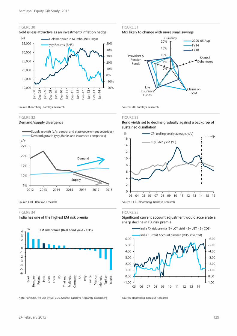
Barclays | Equity Gilt Study: 2015
24 February 2015 139
FIGURE 30 Gold is less attractive as an investment/inflation hedge
FIGURE 31 Mix likely to change with more small savings
Source: Bloomberg, Barclays Research Source: RBI, Barclays Research
FIGURE 32 Demand/supply divergence
FIGURE 33 Bond yields set to decline gradually against a backdrop of sustained disinflation
Source: CEIC, Barclays Research Source: CEIC, Bloomberg, Barclays Research
FIGURE 34 India has one of the highest EM risk premia
FIGURE 35 Significant current account adjustment would accelerate a sharp decline in FX risk premia
Note: For India, we use 5y SBI CDS. Source: Barclays Research, Bloomberg Source: Bloomberg, Barclays Research
-20%
-10%
0%
10%
20%
30%
40%
50%
10,000
15,000
20,000
25,000
30,000
35,000
Jun-
08
Dec
-08
Jun-
09
Dec
-09
Jun-
10
Dec
-10
Jun-
11
Dec
-11
Jun-
12
Dec
-12
Jun-
13
Dec
-13
Jun-
14
INR Gold Bar price in Mumbai INR/10gm
y/y Returns (RHS)
0%
5%
10%
15%
20%Currency
Share & Debentures
Claims on Govt
Life Insurance
Funds
Provident & Pension Funds
2000-05 AvgFY14FY18
7%
12%
17%
22%
27%
2012 2013 2014 2015 2016 2017 2018
y/y
Supply growth (y/y, central and state government securities)Demand growth (y/y, Banks and insurance companies)
Demand
Supply
0
2
4
6
8
10
12
14
16
03 04 05 06 07 08 09 10 11 12 13 14 15 16
% CPI (rolling yearly average, y/y)
10y Gsec yield (%)
-6-5-4-3-2-101234
Braz
il
Hun
gary
Pola
nd
Indi
a
Chi
na
Kore
a
US
Thai
land
Mal
aysi
a
Ger
man
y
SA Italy
Fran
ce
Mex
ico
Indo
nesi
a
Turk
ey
Russ
ia
% EM risk premia (Real bond yield - CDS)
-6.00
-5.00
-4.00
-3.00
-2.00
-1.00
0.00
1.00-1.00
0.00
1.00
2.00
3.00
4.00
5.00
6.00
05 06 07 08 09 10 11 12 13 14
India FX risk premia (5y LCY yield - 5y UST - 5y CDS)
India Current Account balance (RHS, inverted)

Barclays | Equity Gilt Study: 2015
24 February 2015 140
Equities: Indian stock market could have multiple years of growth in the mid to high teens80 • Strength in India’s GDP growth should also be reflected in a higher growth trajectory for
the corporate sector. Even if the sector’s top line moves only in line with nominal GDP growth rates, we would expect top-line growth in the low teens for Indian corporates.
• Looking at the bottom-up estimates of our research analysts, we think sectors including financials, healthcare, consumer, autos and infrastructure could exhibit strong double- digit growth over the next decade. New sectors could also emerge, with e-commerce and alternative energy (largely solar) two areas that we believe could return 20%+ annual growth over the next 10 years.
• On various metrics, including market cap to GDP and market-implied growth rates, we find Indian valuations reasonable. Furthermore, during periods of strong growth, market multiples usually increase. We thus believe that the Indian market could have multiple years of returns in the mid to high teens.
FIGURE 36 Sectoral growth trends in India over the past decade
Note: Listed companies’ sector growth rates are based on an analysis of 640 standalone companies’ financials. Source: Planning Commission, Reserve Bank of India, Prowess, Barclays Research
FIGURE 37 Barclays analysts’ expectations of growth in sectoral market size over the next decade
Now 2025E CAGR
Consumer US$37bn US$160-220bn 14-18%
- Organized Retail (Penetration) 6% 20%
Healthcare US$100bn US$350-380bn 13-15%
- Diagnostics Rs230bn Rs834bn 27%
- Domestic Pharma US$15bn US$55-65bn 14-16%
- Health Insurance Rs192bn Rs464bn 16%
Internet
E-commerce US$13bn US$150bn 28%
Internet Penetration 21% 46%
Financial Services
- Credit growth 16-17%
80 This section summarises the views of our equity analysts published in Asia Themes: India in the next decade, 19 January 2015.
14.9 15.1 14.4 17.1 17.1
13.5 13.2
20.9
13.6
6.0
12.8 15.6
0
5
10
15
20
25
Nom
inal
GD
P
Con
sum
er
Dis
cret
iona
ry
Con
sum
er
Stap
les
Ener
gy
Fina
ncia
ls
Hea
lth C
are
Indu
stria
ls IT
Mat
eria
ls
Tele
com
Util
ities
Tota
l
% 10Yr Listed universe: Sectors

Barclays | Equity Gilt Study: 2015
24 February 2015 141
Now 2025E CAGR
- Credit penetration 55% 71-76% 150-180bp/year
- Retail Mortgage Penetration 7.50% 12-15% 18-22%
- Corporate Lending Penetration 43% 51% 15%
Materials
-Cement 220mt 465mt 7.0%
- Steel 82mt 175mt 6.5%
Infrastructure
- Road Passenger Traffic 7,000BPkm 20,000BPkm 11.0%
- Road Freight Traffic 1,400BTKm 3,400BTKm 8.3%
- Solar Infrastructure 2,800MW 20,000MW 22%
Autos 12-14%
- Cars 2.5mn 11.3mn 15%
- Two-wheelers 14mn 40mn 10%
Oil & Gas
- Oil Demand 3.7mbd 5.4mbd 3-4%
- Natural Gas demand 51bcm 107bcm 7-8% Note: mbd is million barrels per day; bcm: billion cubic metres BPkm: Billion person kilometres, mt: million tones. Source: Reserve Bank of India, Government of India, BP Statistical Review, Barclays Research estimates
FIGURE 38 India’s market capitalization as % of GDP still below historical highs
FIGURE 39 Across major nations, stock market capitalization as % GDP tends to rise in periods of high growth
Source: World Bank, RBI, Barclays Research. Note: We used 10 major stock exchanges and countries to construct the above
chart. The market capitalization as a % GDP and GDP growth rate of each country for the past four years are represented as x times avg over the past decade. “Low” market cap/GDP thus implies a value lower than that country’s last 10 year avg. Source: World Bank, United Nations, Bloomberg, Barclays Research.
India looks set for multi-notch upgrade to high BBB by 2017 We expect India’s sovereign foreign currency ratings to move to high BBB (from current low BBB levels) by 2017. Upgrades are likely to occur against a backdrop of sustained higher growth, relatively stable inflation and continued fiscal consolidation. A sustained decline in crude oil prices provides significant support for these trends.
Addressing asset-quality issues and improving the capitalisation of public sector banks will be pivotal to achieving a two-notch upgrade in three years, and we think the government and regulators are making progress on both fronts.
Key developments that should serve as milestones over the next three years include:
-
5
10
15
20
25
30
020406080
100120140160
Jun-
97
Aug
-98
Oct
-99
Dec
-00
Feb-
02
Apr
-03
Jun-
04
Aug
-05
Oct
-06
Dec
-07
Feb-
09
Apr
-10
Jun-
11
Aug
-12
Oct
-13
Dec
-14
% GDP
Market Capitalization (% GDP)
-4.0
-3.0
-2.0
-1.0
-
1.0
2.0
3.0
4.0
- 0.5 1.0 1.5 2.0
x avg GDP growth
x avg Market Cap/GDPLow High
Low
Hig
h

Barclays | Equity Gilt Study: 2015
24 February 2015 142
• Fiscal consolidation driving the central government deficit toward 3% of GDP. Improved quality of spending through subsidy reforms and progress on implementing a GST to strengthen long-term fiscal health.
• Improvement in the strength and effectiveness of institutions, reflected in better governance indicators, such as ease of doing business, rule of law and control of corruption, thereby improving the business climate
• Banking sector reform is set to increase the capitalisation levels of public-sector banks, in line with Basel III guidelines, improve corporate governance and reduce the level of non-performing assets.
Key risks to our view • Reduced political willingness to push for reforms in the face of any electoral setbacks.
• Domestic social tensions and local security risks that could have a destabilising effect on investment and growth prospects.
FIGURE 40 Key rating factors
Key rating factors
Fiscal and government debt dynamics
Growth dynamics
Institutional effectiveness/ governance
Monetary policy effectiveness/ credibility
Banking system
Rating positive trends needed between now and 2017
Central government fiscal deficit moves towards 3% by FY17
Growth continues to accelerate and reaches near 7% by FY17
Improvement in governance indicators and competitiveness indicators to 2003 levels. General agreement on policy direction with predictability
CPI Inflation settles around the mid-single digit zone by FY17 with lower volatility
Capitalisation levels increase across the system with a buffer to Basel III ratios
Debt/GDP decreases by over 4% in FY17 vs. FY14 levels
Growth is not funded by a surge in credit
Higher degree of perceived independence for the central bank
Stressed assets decrease to 2011 levels
Sensitivity of our rating view to downside risks
Slippage in deficit by 20-30bp or in debt/GDP by 2% can be absorbed
Low 6% growth unlikely to change trajectory
Significant slippage could have an effect on ratings
CPI inflation in the mid-single digit zone would not be a headwind if volatility is limited
Critical to upgrades and any slippage can constrain ratings
Source: Moody’s, S&P, Barclays Research

Barclays | Equity Gilt Study: 2015
24 February 2015 143
CHAPTER 7
FX risk in a multi-asset portfolio • After falling to historically low levels between mid-2012 and mid-2014, cross-asset
volatility has risen recently. We think a trend rise in volatility may be forthcoming in a highly asynchronous global economic recovery with elevated macroeconomic uncertainty related to demographic and structural changes across major economies.
• An increase in foreign exchange market volatility has the potential to erode returns and raise portfolio-level volatility in international multi-asset portfolios.
• We construct a standard 60%/40% (equities/bonds) international portfolio and find that higher Sharpe ratios – ie, risk-adjusted returns – are achieved, both ex ante and ex post, through FX hedging of the bond portfolio.
• Our results appear to be driven mainly by an increase in the negative correlation between bonds and equities, particularly during periods of heightened volatility, when bonds are FX hedged.
• However, by analyzing a set of subsamples, we find that FX hedging can generate superior risk-adjusted portfolio returns during market stress and in “normal” periods.
Whether or not to hedge foreign currency investment exposure is an important decision for international investors. Heightened or rising FX market volatility can erode returns and introduce portfolio volatility. Hedging can reduce this volatility and give portfolio managers and investors a degree of certainty, but there are also costs. In the case of a passive FX hedging strategy (in which the foreign currency component of a portfolio is sold forward on a rolling basis) direct costs include transaction costs or the price of the hedging instrument (eg, FX options premiums), and large, unanticipated cash flows as hedges mature. Indirect costs might be the degree to which the existence of the hedge reduces overall portfolio returns.
We think FX volatility is likely to rise in trend from the low levels of recent years. In this chapter, we examine how high FX volatility affects an international portfolio and whether or not FX hedging helps to improve the risk-adjusted portfolio performance of a balanced international portfolio. We also examine the impact on an international portfolio, hedged and unhedged, of a trend rise in the USD, which we expect in coming years. Specifically, we
Hamish Pepper
+ 44 (0)20 7773 0853
Nikolaos Sgouropoulos
+44 (0)20 3555 1578
nikolaos.sgouropoulos@
barclays.com
FIGURE 1 Financial market volatility has picked up recently…
FIGURE 2 ... particularly in FX markets
Note: IV = Implied Volatility, indexed to 100 in January 2004. Source: Bloomberg, Barclays Research. A version of this chart can be found on Barclays Live, here.
Note: IV = Implied Volatility, indexed to 100 in January 2004. Source: Bloomberg, Barclays Research. A version of this chart can be found on Barclays Live, here.
FX volatility is likely to rise in trend from the low levels of recent years
0
50
100
150
200
250
300
350
400
2004 2006 2008 2010 2012 2014
Equity IV FX IV Swaption IV
Financial crisis
Euro area crisis
50
60
70
80
90
100
110
120
130
140
150
Jan-14 Mar-14 May-14 Jul-14 Sep-14 Nov-14 Jan-15
Equity IV FX IV Swaption IV
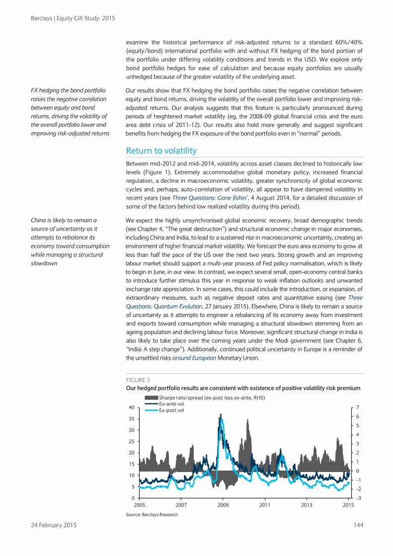
Barclays | Equity Gilt Study: 2015
24 February 2015 144
examine the historical performance of risk-adjusted returns to a standard 60%/40% (equity/bond) international portfolio with and without FX hedging of the bond portion of the portfolio under differing volatility conditions and trends in the USD. We explore only bond portfolio hedges for ease of calculation and because equity portfolios are usually unhedged because of the greater volatility of the underlying asset.
Our results show that FX hedging the bond portfolio raises the negative correlation between equity and bond returns, driving the volatility of the overall portfolio lower and improving risk-adjusted returns. Our analysis suggests that this feature is particularly pronounced during periods of heightened market volatility (eg, the 2008-09 global financial crisis and the euro area debt crisis of 2011-12). Our results also hold more generally and suggest significant benefits from hedging the FX exposure of the bond portfolio even in “normal” periods.
Return to volatility Between mid-2012 and mid-2014, volatility across asset classes declined to historically low levels (Figure 1). Extremely accommodative global monetary policy, increased financial regulation, a decline in macroeconomic volatility, greater synchronicity of global economic cycles and, perhaps, auto-correlation of volatility, all appear to have dampened volatility in recent years (see Three Questions: Gone fishin’, 4 August 2014, for a detailed discussion of some of the factors behind low realized volatility during this period).
We expect the highly unsynchronised global economic recovery, broad demographic trends (see Chapter 4, “The great destruction”) and structural economic change in major economies, including China and India, to lead to a sustained rise in macroeconomic uncertainty, creating an environment of higher financial market volatility. We forecast the euro area economy to grow at less than half the pace of the US over the next two years. Strong growth and an improving labour market should support a multi-year process of Fed policy normalisation, which is likely to begin in June, in our view. In contrast, we expect several small, open-economy central banks to introduce further stimulus this year in response to weak inflation outlooks and unwanted exchange rate appreciation. In some cases, this could include the introduction, or expansion, of extraordinary measures, such as negative deposit rates and quantitative easing (see Three Questions: Quantum Evolution, 27 January 2015). Elsewhere, China is likely to remain a source of uncertainty as it attempts to engineer a rebalancing of its economy away from investment and exports toward consumption while managing a structural slowdown stemming from an ageing population and declining labour force. Moreover, significant structural change in India is also likely to take place over the coming years under the Modi government (see Chapter 6, “India: A step change”). Additionally, continued political uncertainty in Europe is a reminder of the unsettled risks around European Monetary Union.
FX hedging the bond portfolio raises the negative correlation between equity and bond returns, driving the volatility of the overall portfolio lower and improving risk-adjusted returns
FIGURE 3 Our hedged portfolio results are consistent with existence of positive volatility risk premium
Source: Barclays Research
China is likely to remain a source of uncertainty as it attempts to rebalance its economy toward consumption while managing a structural slowdown
-3
-2
-1
0
1
2
3
4
5
6
7
0
5
10
15
20
25
30
35
40
2005 2007 2009 2011 2013 2015
Sharpe ratio spread (ex-post less ex-ante, RHS)Ex-ante volEx-post vol

Barclays | Equity Gilt Study: 2015
24 February 2015 145
One of the most interesting features of the recent pick-up in financial market volatility is that it has been most pronounced in FX markets (Figure 2). One possible explanation is that currencies are the most liquid and accessible assets through which to express a view on market risks or to hedge exposure. Indeed, history suggests that higher FX volatility rarely occurs in isolation and the prospect of higher volatility in other asset classes adds further risk to multi-asset portfolio returns. Furthermore, there is a strong theoretical basis for a relationship between volatility across asset classes. In equities, volatility in FX affects the earnings of companies with international exposure in either their product or supply chains. However, causality can also be argued in the opposite direction as changes in the price of domestic assets, both equities and bonds, will tend to result in changes in demand for local currency by foreign investors. Indeed, statistical analysis over our sample period proves inconclusive in this respect, showing two-way causality between FX volatility and that of bonds and equities.
Data analysis and methodology To examine the impact of rising volatility on portfolio returns, we focus on the response of risk-adjusted returns. We choose to think about risk and reward via the commonly used Sharpe ratio. The Sharpe ratio, also known as the reward-to-variability ratio, is a mathematical construct formally defined by William Sharpe in 1966. It measures a portfolio’s predicted performance as the ratio of its expected rate of return per unit of variability or risk.1 Although it is an imperfect measure of risk-adjusted performance when returns are not normally distributed, we choose to use (a modified version of) the Sharpe ratio because of its tractability and ease in ex ante portfolio choice given a particular risk tolerance and in ex post performance evaluations.
Given a portfolio, the Sharpe ratio is defined as:
𝑆 =𝐸(𝑟𝑝)− 𝑟𝑓
𝜎(𝑟𝑝)
where E(rp) denotes the expected portfolio return, rf is the risk-free rate and σ(rp) is the relevant measure of portfolio volatility. For ex post volatility we use the historical standard deviation of returns; for the ex ante measure we integrate implied volatilities of underlying portfolio components using historical co-variation. Realized volatility represents a statistical measure of variability of the actual return distribution over a specific time horizon. In contrast, implied volatility represents the market’s best estimate of future volatility, given today’s information. It is usually implied from prices of liquidly traded options and will on average be higher than realized volatility. This stylized fact, often referred to as the volatility risk premium, discussed below, ensures sufficient compensation to risk-averse sellers of options for their asymmetric payoffs.
Because we are interested in assessing the impact of FX hedging the bond component of our market portfolio, we use the following modified version of the Sharpe ratio:
𝑆 =𝐸(𝑟𝑝)− 𝑟𝑓 –𝛼ℎ
𝜎(𝑟𝑝)
where h represents the cost of FX hedging and 𝛼 ∈ (0,1) is the share of the bond portfolio that is hedged. We consider three values for 𝛼: 1, 0.5 and 0; ie, full hedging, 50% hedging and no hedging.
In our analysis, we use daily data from 1 January 2004 to 14 January 2015. For the equity component of our portfolio, we use the MSCI ACWI index, which covers approximately 85% of the global investable equity opportunity set and includes 23 developed and 23 emerging
1 See Sharpe, William F. "Mutual Fund Performance," The Journal of Business, Vol. XXXIX, No. 1, Part II, January 1966. A Sharpe ratio is a sufficient measure of risk-adjusted performance if returns are normally distributed, but may not fully describe the risk-return tradeoff if returns are not derived from a distribution fully characterized by its mean and variance.
The recent pick-up in financial market volatility has been most pronounced in FX
We use a modified version of the Sharpe ratio because of its tractability

Barclays | Equity Gilt Study: 2015
24 February 2015 146
market indices.2 Ex ante equity returns are calculated as the inverse of the forward-looking price-to-earnings ratio (inverse P/E, or earnings yield) of the MSCI ACWI index, whereas ex post returns are computed as the rolling annual return. Because MSCI ACWI options are not regularly traded in the market, the ex ante volatility of the MSCI ACWI is approximated by the implied volatility from options on the SPX, SX5e, UKX, NKY, and HIS. To calculate this measure, we first construct a replicating portfolio consisting of fixed weights in those five indices with the aim of minimizing a tracking error against the MXWD ACWI index. Using the estimated weights, we combine the at-the-money-forward volatilities for each index. We use the three-month point on the volatility curve. It should be noted that our weighted volatility measure may somewhat overstate the true underlying volatility because correlation between the five indices is disregarded in our construction.
For the fixed income component of our portfolio, we create a simplified variation of the Barclays Global Aggregate Bond Index using its USD, EUR, JPY and GBP subindices. Our G4 fixed income portfolio represents approximately 92% of the Barclays Global Aggregate Bond Index. Using only four currencies greatly simplifies the calculations, particularly in capturing co-variation between the components, and the high proportion of the Barclays Agg invested in these four currencies suggests that our proxy is a representative measure of a realistic global fixed income portfolio. We use the weighted sum of yield to maturity of each corresponding sub-index as the ex ante return of the bond component of the portfolio and the weighted sum of annual returns as ex post bond returns. For an ex ante measure of volatility, we use G4 3-month into five-year at-the-money normal swaption volatilities, and in contrast to our equity measure we do account for co-variation across currencies as it is important to our analysis of hedging decisions. We chose 3m5y swaptions since our Barclays Global Agg index has roughly a five-year average duration over the sample period.
Using the above and three-month USD LIBOR for the risk-free rate, we calculate ex ante and ex post rolling Sharpe ratios for a fairly typical market portfolio consisting of 60% equities and 40% bonds. Ex ante Sharpe ratios represent the expected excess return of a market portfolio per unit of predicted portfolio standard deviation, ie, the portfolio’s implied volatility. In calculating this, we create a measure of implied portfolio volatility that considers not just the variability of each individual portfolio component, equities, bonds and FX, but also how the three components co-vary. The ex post Sharpe ratio is simply the realized excess return of the 60/40 portfolio divided by the standard deviation of returns.
We assume a passive FX hedging strategy for a USD-based investor: FX forward contracts are sold on a rolling basis in proportion to the foreign currency component of the bond portfolio. Hedging costs, given by ℎ in the formula above, are calculated using 12-month forward exchange rates. In the ex ante case we assume that the “cost” of the hedge reflects the 12-month forward rate relative to current spot. In the ex post calculations, we incorporate the cash flows resulting from rolling maturing contracts. We assume three different passive FX hedging strategies: i) no hedging; ii) 50% hedging; and iii) 100% hedging. We assume the equity component remains unhedged in all cases. International equities often are not hedged due to the greater volatility of the underlying asset relative to currencies. Additionally, FX returns and equity returns on average are positively correlated, in contrast to bond and FX returns. We discuss this point in more detail below. Theoretically, we expect increases in the FX hedging ratio to improve portfolio Sharpe ratios by reducing overall portfolio volatility.
Results Figure 4 presents results for the entire sample. Average portfolio return, volatility and Sharpe ratios are reported for each of the three hedging cases outlined above both in ex ante and ex post terms. One of the more notable features of Figure 4 is the large improvement in ex post risk-adjusted performance relative to ex ante expectations. For all three hedge ratios, the ex post Sharpe ratio is roughly three times the ex ante ratio. The ex
2 See http://www.msci.com/products/indexes/tools/index.html#ACWI
Theoretically, we expect increases in the FX hedging ratio to improve portfolio Sharpe ratios by reducing overall portfolio volatility

Barclays | Equity Gilt Study: 2015
24 February 2015 147
post improvement is apparent in both the numerator (returns) and the denominator (volatility) as Figures 3, 5 and 6 show. This divergence also reflects four widely observed factors: one persistent and three specific to our sample period.
FIGURE 4 Relative portfolio performance: 2004-15
Hedge ratio Performance
measure Ex-ante Ex-post Ex-post less ex-ante
Return 3.73 4.91 1.18
0% Volatility 11.76 9.07 -2.69
Sharpe ratio 0.33 0.93 0.60
Return 3.86 4.97 1.10
50% Volatility 11.52 8.79 -2.73
Sharpe ratio 0.35 0.98 0.63
Return 4.00 5.03 1.03
100% Volatility 11.44 8.49 -2.94
Sharpe ratio 0.37 1.05 0.68 Source: Barclays Research
The persistent factor is the existence of a volatility risk premium that compensates risk-averse sellers of options for bearing asymmetric payoffs. For this reason, there are few natural sellers of volatility, but a wide range of buyers. The asymmetric nature of the risk taken by option sellers is difficult to diversify and operationally intensive to manage. As a result, realized volatility is, on average, lower than implied volatility (see The FX volatility risk premium: Identifying drivers and investigating returns, 16 June 2014 and The Lesser Known Risk Premium - Investing in volatility across asset classes, 19 November 2013).
Three other factors in our sample likely contributed to the ex post improvement in risk- adjusted returns. First, there was a persistent trend rally in fixed income as real interest rates declined almost monotonically through the sample. Second, the negative correlation between bonds and equities was unusually strong and persistent through the sample, particularly in times of market stress, as we discuss below.
Third, US interest rates were generally higher than other G4 interest rates during the period, making hedging into USD via FX forwards profitable, on average, contrary to theoretical expectations. Although accommodative monetary policy in the euro area and Japan may cause this feature to persist in coming years, it is unlikely to be sustained in the long run.
FIGURE 5 Ex-ante portfolio Sharpe ratio for 100% hedging
FIGURE 6 Ex-post portfolio Sharpe ratio for 100% hedging
Source: Barclays Research Source: Barclays Research
Our results show a positive contribution to risk-adjusted returns from FX hedging, a decision most managers can make
0.0
0.1
0.2
0.3
0.4
0.5
0.6
0.7
0.8
0
5
10
15
20
25
30
2004 2006 2008 2010 2012 2014
Sharpe Ratio (RHS) Excess returns Volatility
-3.0
-2.0
-1.0
0.0
1.0
2.0
3.0
4.0
5.0
6.0
-30
-20
-10
0
10
20
30
40
2004 2006 2008 2010 2012 2014
Sharpe Ratio (RHS) Volatility Excess returns

Barclays | Equity Gilt Study: 2015
24 February 2015 148
The size of the ex ante/ex post difference is remarkable, but it has little bearing on the portfolio decisions of most international asset managers. But our results also show a positive contribution to risk-adjusted returns from FX hedging, a decision most international managers can make. As we hypothesized, FX hedging generates higher Sharpe ratios by reducing portfolio volatility, both ex ante and ex post on average. The average ex ante Sharpe ratio increases from 0.33 in the case of no FX-hedging to 0.37 in the case of 100% FX hedging of the foreign bond portfolio. Average ex post increases in Sharpe ratios are more impressive, from 0.93 in the case of no hedging to 1.05 in the case of 100% FX hedging of the foreign bond portfolio. Average ex ante portfolio volatility drops from 11.76% in the case of no FX hedging to 11.44% in the case of 100% FX hedging of the foreign bond portfolio. Average ex post reductions in portfolio volatility fall from 9.07% in the case of no hedging to 8.49% with 100% hedging of the foreign bond portfolio. Additionally, using rolling Sharpe ratios, we are able to obtain empirical distributions3 of both ex ante and ex post Sharpe ratio (Figures 7 and 8). In both distributions there is a clear rightward shift in the distribution for the 100% FX hedged portfolio, and for the ex post distribution a notable skew to higher Sharpe ratios.
A key driver of this result is the way in which a greater degree of FX hedging can boost the negative correlation between equity and bond returns, thereby reducing portfolio volatility as high returns in one offset low returns in the other. This phenomenon is particularly apparent during periods of elevated volatility, as in the 2008-11 global financial crisis. That increased correlation also is noticeable in the period of increasing FX volatility and USD strength since mid-2014. Figure 10 plots rolling conditional correlations of the residuals on equity, bond and FX daily returns4. FX hedging the bond component of the portfolio leads to a pronounced increase in the negative correlation between equity and bond residuals, particularly during periods of heightened market volatility. Because currencies tend to be negatively correlated with local bond returns – higher interest rates lower bond prices but boost the currency – unhedged bond portfolios’ returns become less negatively correlated with equity returns.
A strengthening USD also boosted the negative bond/equity correlation. Between October 2007 and March 2009, the MSCI ACWI index fell by almost 60% in USD terms and had recovered only about half of these losses by end-2011. At the same time, safe-haven demand for the USD was hurting the returns of foreign bond holdings. Indeed, the USD appreciated by about 15% against a weighted basket of EUR, JPY and GBP between March 2008 and March 2009 (Figure 11). Balanced portfolios with foreign bond holdings hedged back into USDs did not suffer a drag on bond returns from USD appreciation, increasing the negative correlation with equity returns and reducing portfolio volatility.
3 To obtain the empirical densities we perform non-parametric kernel estimation using a Gaussian kernel. 4 By conditional correlation we mean the correlation between two variables conditional on fixing the value of another variable. In our example we compute the conditional correlation of equity and bond innovations by fixing the FX innovations and similarly for equity and FX and bond and FX.
FIGURE 7 Empirical ex-ante Sharpe ratio distribution
FIGURE 8 Empirical ex-post Sharpe ratio distribution
Source: Barclays Research
Source: Barclays Research
A greater degree of FX hedging can boost the negative correlation between equity and bond returns, thereby reducing portfolio volatility
0
0.001
0.002
0.003
0.004
0.005
0.006
0.007
-0.15 -0.03 0.09 0.21 0.33 0.45 0.56 0.68 0.80
Ex-ante fitted kernel
No hedging 50% hedging 100% hedging
0.0000
0.0002
0.0004
0.0006
0.0008
0.0010
-2.83 -1.64 -0.46 0.73 1.91 3.10 4.29 5.47 6.66
Ex-post fitted kernel
No hedging 50% hedging 100% hedging

Barclays | Equity Gilt Study: 2015
24 February 2015 149
To establish this more formally we isolate periods of higher market volatility and USD strength in our sample. We use 2008-11 as our high FX volatility environment and periods of material USD Index appreciation (Jan 05-Dec 05; Apr 08-Feb 09; Dec 09-Jun 10; and Jun 14-present) as our strengthening USD environment. Figures 9 and 12 show that in both cases lower portfolio volatility and higher ex ante and ex post Sharpe ratios are achieved as FX hedging is increased:
i) During periods of higher volatility: The average ex ante Sharpe ratio increases from 0.33 in the case of no FX-hedging to 0.34 in the case of 100% FX hedging of the foreign bond portfolio. Average ex post Sharpe ratios increase from 0.38 in the case of no hedging to 0.44 in the case of 100% FX hedging of the foreign bond portfolio. Average ex ante portfolio volatility drops from 15.90% in the case of no FX-hedging to 15.51% in the case of 100% FX hedging of the foreign bond portfolio. Average ex post portfolio volatility falls from 13.22% in the case of no hedging to 12.68% in the case of 100% FX hedging of the foreign bond portfolio.
ii) During periods of a stronger USD: The average ex ante Sharpe ratio increases from 0.33 in the case of no FX-hedging to 0.38 in the case of 100% FX hedging of the foreign bond portfolio. Average ex post Sharpe ratios increase from 0.91 in the case of no hedging to 1.10 in the case of 100% FX hedging of the foreign bond portfolio. Average ex ante portfolio volatility drops from 12.62% in the case of no FX hedging to 12.28% in the case of 100% FX hedging of the foreign bond portfolio. Average ex post portfolio volatility falls from 10.06% in the case of no hedging to 9.42% in the case of 100% FX hedging of the foreign bond portfolio.
FIGURE 9 Relative portfolio performance: Period of high FX volatility*
Hedge ratio Performance measure Ex-ante Ex-post Ex-post less ex-ante
Return 4.86 0.32 -4.54 0% Volatility 15.90 13.22 -2.68
Sharpe ratio 0.33 0.38 0.05 Return 4.86 0.46 -4.40
50% Volatility 15.61 12.95 -2.65 Sharpe ratio 0.34 0.41 0.07 Return 4.85 0.60 -4.25
100% Volatility 15.51 12.68 -2.83 Sharpe ratio 0.34 0.44 0.10 We define this period as 2008-11, inclusive. Source: Barclays Research
FIGURE 10 The negative correlation between equity and bond returns increases with hedging…
FIGURE 11 … and was particularly apparent during the crisis
Source: Barclays Research Source: Bloomberg, Barclays Research
-0.8
-0.6
-0.4
-0.2
0.0
0.2
0.4
2005 2007 2009 2011 2013 2015
Equity vs bondEquity vs bond hedgedBond vs FXEquity vs FX
150
200
250
300
350
400
450
100
110
120
130
140
150
160
2002 2004 2006 2008 2010 2012 2014
Basket FX vs USD MSCI ACWI Index (RHS)

Barclays | Equity Gilt Study: 2015
24 February 2015 150
FIGURE 12 Relative portfolio performance: Periods of USD strength*
Hedge ratio Performance measure Ex-ante Ex-post Ex-post less ex-ante
Return 3.78 3.11 -0.67
0% Volatility 12.62 10.06 -2.56
Sharpe ratio 0.33 0.91 0.58
Return 3.93 3.35 -0.58
50% Volatility 12.36 9.75 -2.62
Sharpe ratio 0.36 0.99 0.64
Return 4.07 3.59 -0.48
100% Volatility 12.28 9.42 -2.86
Sharpe ratio 0.38 1.10 0.71
Note: * We define these periods as: Jan 05-Dec 05; Apr 08-Feb 09; Dec 09–Jun 10; Jun 14-present. Source: Barclays Research
The analysis so far suggests that FX hedging is most beneficial in periods of market stress. To see if this result holds in a more general sense, we examine sub-periods in our sample that exclude higher volatility or a strengthening USD. These results are presented in Figure 13 and indicate that FX hedging is able to lower portfolio volatility and generate superior risk-adjusted returns in “normal” times as well as periods of pronounced market stress. Through these periods we find that the average ex ante Sharpe ratio increases from 0.31 in the case of no FX-hedging to 0.36 in the case of 100% FX hedging of the foreign bond portfolio. Average ex post Sharpe ratios increase from 1.16 in the case of no hedging to 1.30 in the case of 100% FX hedging of the foreign bond portfolio. Average ex ante portfolio volatility drops from 10.09% in the case of no FX hedging to 9.82% in the case of 100% FX hedging of the foreign bond portfolio. Average ex post portfolio volatility falls from 7.24% in the case of no hedging to 6.70% in the case of 100% FX hedging of the foreign bond portfolio.
FIGURE 13 Relative portfolio performance: Periods excluding high FX volatility and USD strength*
Hedge ratio Performance measure Ex-ante Ex-post Ex-post less ex-ante
Return 3.10 7.35 -4.54
0% Volatility 10.09 7.24 -2.68
Sharpe ratio 0.31 1.16 0.05
Return 3.28 7.36 -4.40
50% Volatility 9.89 6.98 -2.65
Sharpe ratio 0.34 1.22 0.07
Return 3.45 7.37 -4.25
100% Volatility 9.82 6.70 -2.83
Sharpe ratio 0.36 1.30 0.10
Note; *We define these periods as follows, Jan 04 – Dec 04, Jan 06 – Dec 07 and Jan 12 – May 14. Source: Barclays Research.
Beyond hedging: FX as an asset We have assumed a direct FX hedging strategy using FX forwards, though using FX options would be similarly direct. Implicit in this approach is the treatment of FX as a medium of exchange, rather than as an asset class. An alternative approach is to implement a dynamic hedging strategy, such as a currency overlay, where FX is treated as an asset and hedging is actively managed relative to a benchmark. For example, an investor may think the USD is likely to depreciate against the JPY and thus reduce the hedge ratio on the JPY-asset proportion of your portfolio. Because active currency management can generate correlations very different from the “natural” correlations shown in our analysis, it has the
FX hedging is able to lower portfolio volatility and generate superior risk-adjusted returns in “normal” times as well as during pronounced market stress

Barclays | Equity Gilt Study: 2015
24 February 2015 151
potential to further dampen (or accentuate) volatility in an international equity and bond portfolio. The implications of active currency management are beyond the scope of this analysis but should be noted.
Our results show a clear benefit to FX hedging of international bond portfolios in a global portfolio. While one should not expect a continuation of the sample-specific factors that boosted the absolute returns in our results (eg, a persistent global bond rally, higher US interest rates), FX hedging of bonds in a balanced international portfolio should persistently raise risk-adjusted returns by increasing the negative correlation between bonds and equities. Furthermore, we show that this effect appears to be amplified during heightened volatility and periods of USD strength, both of which we expect in coming years.

Barclays | Equity Gilt Study: 2015
24 February 2015 152
CHAPTER 8
UK asset returns since 1899 We analyse returns on equities, gilts and cash from end-1899 to end-2014. Index-linked gilt returns are available from 1982, while corporate bonds begin in 1999. To deflate the nominal returns, a cost-of-living index is computed using Bank of England inflation data from 1899 to 1914 and the Retail Price Index, calculated by the Office of National Statistics, thereafter.
FIGURE 1 Real investment returns by asset class (% pa)
Last 2014 10 years 20years 50years 115 years*
Equities -0.4 4.1 4.6 5.7 5.0 Gilts 16.4 3.7 5.1 2.9 1.3 Corporate Bonds 10.7 2.5
Index-Linked 14.0 3.5 4.4
Cash -1.2 -0.7 1.1 1.5 0.8 Note: * Entire sample. Source: Barclays Research
Figure 1 summarises the real investment returns of each asset class over various time horizons. The first column provides the real returns over one year, the second column real annualised returns over 10 years, and so on. UK equities had a lacklustre year and underperformed other developed market indices in 2014. UK nominal total returns were just 1.2%, compared to 2.65% for the German DAX and 10.5% for US equities. The underperformance occurred despite a reasonable growth backdrop. The UK was one of the few economies where the consensus growth forecast was actually revised higher last year; US, European and Global real GDP estimates had all been downgraded over the course of the year. The Scottish Referendum contributed to some temporary underperformance in the FTSE All-Share index, but the key drag came from the disinflationary impact of the commodity price fall and, in particular, the 50% decline in the oil price during the second half of the year. Much of the performance drag on UK equities was driven by exposure to the oil- and mining-related sectors which accounted for more than 20% of the FTSE All-Share market cap. In comparison, the worst-performing sectors in the STOXX Europe 600 included oil and gas, and basic resources, the combined weight of which stood at just 8.5%.
Fixed income and credit had a very strong performance in 2014 as a result of the deflationary fears fuelled by the oil price decline. Nominal and inflation-linked gilts posted their best returns since the Euro sovereign debt crisis in 2011. The long end outperformed in both gilts and treasuries as the curves bull-flattened. Credit returns were the strongest since 2012. Monetary policy divergence was a key theme driving bond markets in 2014. The prospect of QE from the ECB caused European government bonds to outperform the US and the UK in the 10-15 year sector. Cash returns remained weak in the low yield environment.
FIGURE 2 Real investment returns (% pa)
Equities Gilts Index-linked Cash
1904-1914 2.1 -0.1
1.5 1914-24 0.4 -3.1
-1.7
1924-34 9.2 11.7
5.6 1934-44 3.0 -1.4
-2.4
1944-54 5.3 -2.6
-2.8 1954-64 7.1 -2.6
1.4
1964-74 -6.0 -6.3
0.0 1974-84 17.4 5.6
-0.3
1984-94 9.4 5.8
5.5 1994-2004 5.0 6.5 5.3 3.0 2004-2014 4.1 3.7 3.5 -0.7 Source: Barclays Research
Sreekala Kochugovindan
+44 (0)20 7773 2234
sreekala.kochugovindan@
barclays.com

Barclays | Equity Gilt Study: 2015
24 February 2015 153
FIGURE 3 Distribution of real annual equity returns since 1899
FIGURE 4 Distribution of real annual gilt returns since 1899
Source: Barclays Research Source: Barclays Research
FIGURE 5 Distribution of real annual cash returns since 1899
FIGURE 6 Maximum and minimum real returns over various periods
Source: Barclays Research Source: Barclays Research
Figure 2 breaks down real asset returns for consecutive 10-year intervals. Equities have outperformed cash and bonds over the past decade, with an average annualised return of 4.1% since 2004. Cash, on the other hand, has delivered the worst returns since the stagflationary 1970s. Ranking the annual returns and placing them into deciles provides a clearer illustration of their historical significance. The results for 2014 are shown in Figure 7. The equity portfolio is ranked in the seventh best decile since 1899, down from the third decile in 2013, as a result of the poor performance in the second half of the year. Gilts and linkers are ranked in the first and second deciles, a striking jump from the ninth decile in 2013, as deflationary fears appear to have wiped out the memory of the 2013 taper tantrum. Cash remained weak as yields were held near zero.
FIGURE 7 2014 performance ranked by decile (1899-2014)
Decile
Equities 7
Gilts 1
Index-Linked 2
Cash 8
Note: Deciles ranking: 1 signifies the best 10% of the history, 10 the worst 10%. Source: Barclays Research
0
1
2
3
4
5
6
7
8
9
10
-50 -42 -34 -26 -18 -10 -2 6 14 22 30 38 46 540
2
4
6
8
10
12
14
-50 -42 -34 -26 -18 -10 -2 6 14 22 30 38 46 54
0
5
10
15
20
25
30
-50 -42 -34 -26 -18 -10 -2 6 14 22 30 38 46 54 -60% -40% -20% 0% 20% 40% 60% 80% 100%
1 year
5 year
10 year
20 year
23 year
Cash Gilts Equities

Barclays | Equity Gilt Study: 2015
24 February 2015 154
Figures 3-5 illustrate the distribution of returns over the past 115 years, 2014 is highlighted within each distribution. They show that equity returns have the widest dispersion, followed by gilts and then cash. The observed distributions are in accordance with financial theory; from an ex-ante perspective, we would apply the highest risk premium to equities, given their perpetual nature and our uncertainty over future growth in corporate profits and changes in the rate of inflation. For gilts, the uncertainty with respect to inflation remains, but the risk from the perspective of coupon and principal is reduced, given their government guarantee. Over the past 30 years, the dispersion of annual gilt returns has widened significantly; in the 1970s and 1980s, an unexpected increase in the inflation rate led to significant negative real returns, while in the 1990s, an unanticipated fall in inflation, in conjunction with lower government deficits, facilitated above-average real returns. The cash return index has the lowest dispersion. In recent years, the real returns to cash have been relatively stable, with the move toward inflation-targeting by the Bank of England stabilising the short-term real interest rate.
Performance over time Having analysed annual real returns since 1899, we now examine returns over various holding periods. Figure 6 compares annualised returns when the holding period is extended to 5, 10, 20 years, or beyond.
The most striking feature of the chart is the change in the volatility of returns as the investments are held for longer periods. The variance of equity returns falls significantly relative to the other assets as the holding period is extended. When equities are held for as long as 20 years, the minimum return is actually greater than for either gilts or cash. However, as discussed in past issues of this study, we do not believe that this fall in volatility should be interpreted as an indication of mean reversion in the returns. The series used comprises rolling returns; hence, there is an overlap in the data. For example, in the 10-year holding period, nine of the annual returns will be the same in any consecutive period; thus, the observations cannot be considered to be independently drawn.
Figure 8 illustrates the performance of equities against gilts and cash for various holding periods. The first column shows that over a holding period of two years, equities have outperformed cash in 77 of 114 years; thus, the sample-based probability of equity outperformance is 68%. Extending the holding period out to 10 years, this rises to 91%.
FIGURE 8 Equity performance
Number of consecutive years
2 3 4 5 10 18
Outperform cash 77 79 81 83 96 97
Underperform cash 37 34 31 28 10 1
Total number of years 114 113 112 111 106 98
Probability of equity outperformance
68% 70% 72% 75% 91% 99%
Outperform gilts 78 84 84 81 84 85
Underperform gilts 36 29 28 30 22 13
Total number of years 114 113 112 111 106 98
Probability of equity outperformance
68% 74% 75% 73% 79% 87%
Source: Barclays Research

Barclays | Equity Gilt Study: 2015
24 February 2015 155
The importance of reinvestment Figures 9 and 10 show how reinvestment of income affects the performance of the various asset classes. The first table shows £100 invested at the end of 1899 without reinvesting income; the second is with reinvestment. One hundred pounds invested in equities at the end of 1899 would be worth just £184 in real terms without the reinvestment of dividend income, but with reinvestment the portfolio would have grown to £28,261. The effect upon the gilt portfolio is less in absolute terms, but the ratio of the reinvested to non-reinvested portfolio is more than 600 in real terms.
FIGURE 9 Today’s value of £100 invested at the end of 1899 without reinvesting income
Nominal Real
Equities £14,597 £184
Gilts £59 £0.75
Source: Barclays Research
FIGURE 10 Today’s value of £100 invested at the end of 1899, income reinvested gross
Nominal Real
Equities £2,240,727 £28,261
Gilts £36,197 £457
Cash £20,444 £258
Source: Barclays Research
FIGURE 11 Five-year average dividend growth rates
Source: Barclays Research
Turning to the dividend growth ratio, the FTSE All-Share dividend rose just 0.6% in 2014, the slowest pace of growth in four years. Figure 11 shows that the five-year average growth rate had picked up following the steady declines of recent years after corporates began cutting dividends in 2008. In 1997-2001, dividend income had fallen by a cumulative 15% as companies cut dividends on the basis that funds would be put to better use by corporates than by shareholders. In the wake of the dotcom crash, investors actively sought income-yielding stocks as a way to lower risk.
Figures 12 and 13 illustrate the time series of price indices and total return indices for equities, gilts and cash over the entire series. These returns are in nominal terms and are shown with the use of a logarithmic scale.
-5%
0%
5%
10%
15%
20%
1945 1950 1955 1960 1965 1970 1975 1980 1985 1990 1995 2000 2005 2010

Barclays | Equity Gilt Study: 2015
24 February 2015 156
FIGURE 12 Barclays price indices – Nominal terms
FIGURE 13 Barclays total return indices – Nominal terms, gross income reinvested
Source: Barclays Research Source: Barclays Research
FIGURE 14 Today’s value of £100 invested at the end of 1945 without reinvesting income
Nominal Real
Equities £9,148 £261
Gilts £65 £2 Source: Barclays Research
FIGURE 15 Today’s value of £100 invested at the end of 1945, gross income reinvested
Nominal Real
Equities £179,695 £5,118
Gilts £7,773 £221
Cash £6,261 £178
Source: Barclays Research
FIGURE 16 Today’s value of £100 invested at the end of 1990, gross income reinvested
Nominal Real
Equities £750 £379
Gilts £764 £386
Index-Linked Gilts £577 £291
Treasury Bills £300 £151 Source: Barclays Research
1
10
100
1000
10000
100000
1899
1909
1919
1929
1939
1949
1959
1969
1979
1989
1999
2009
Equities Gilts Retail Prices
10
10,000
10,000,000
1899
1909
1919
1929
1939
1949
1959
1969
1979
1989
1999
2009
Equities Gilts T-Bills
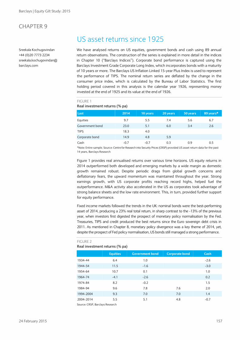
Barclays | Equity Gilt Study: 2015
24 February 2015 157
CHAPTER 9
US asset returns since 1925 We have analysed returns on US equities, government bonds and cash using 89 annual return observations. The construction of the series is explained in more detail in the indices in Chapter 10 (“Barclays Indices”). Corporate bond performance is captured using the Barclays Investment Grade Corporate Long Index, which incorporates bonds with a maturity of 10 years or more. The Barclays US Inflation Linked 15-year Plus Index is used to represent the performance of TIPS. The nominal return series are deflated by the change in the consumer price index, which is calculated by the Bureau of Labor Statistics. The first holding period covered in this analysis is the calendar year 1926, representing money invested at the end of 1925 and its value at the end of 1926.
FIGURE 1 Real investment returns (% pa)
Last 2014 10 years 20 years 50 years 89 years*
Equities 9.7 5.5 7.4 5.6 6.7
Government bond 23.0 5.1 6.0 3.4 2.6
TIPS 18.3 4.0
Corporate bond 14.9 4.8 5.9
Cash -0.7 -0.7 0.3 0.9 0.5 *Note: Entire sample. Source: Centre for Research into Security Prices (CRSP) provided US asset return data for the past 14 years, Barclays Research
Figure 1 provides real annualised returns over various time horizons. US equity returns in 2014 outperformed both developed and emerging markets by a wide margin as domestic growth remained robust. Despite periodic drags from global growth concerns and deflationary fears, the upward momentum was maintained throughout the year. Strong earnings growth, with US corporate profits reaching record highs, helped fuel the outperformance. M&A activity also accelerated in the US as corporates took advantage of strong balance sheets and the low rate environment. This, in turn, provided further support for equity performance.
Fixed income markets followed the trends in the UK: nominal bonds were the best-performing asset of 2014, producing a 23% real total return, in sharp contrast to the -13% of the previous year, when investors first digested the prospect of monetary policy normalisation by the Fed. Treasuries, TIPS and credit produced the best returns since the Euro sovereign debt crisis in 2011. As mentioned in Chapter 8, monetary policy divergence was a key theme of 2014, yet, despite the prospect of Fed policy normalisation, US bonds still managed a strong performance.
FIGURE 2 Real investment returns (% pa)
Equities Government bond Corporate bond Cash
1934-44 6.4 1.0
-2.6
1944-54 11.5 -1.6
-3.0
1954-64 10.7 0.1
1.0
1964-74 -4.1 -2.6
0.2
1974-84 8.2 -0.2
1.5
1984-94 9.6 7.8 7.6 2.0
1994-2004 9.3 7.0 7.0 1.4
2004-2014 5.5 5.1 4.8 -0.7
Source: CRSP, Barclays Research
Sreekala Kochugovindan
+44 (0)20 7773 2234
sreekala.kochugovindan@
barclays.com
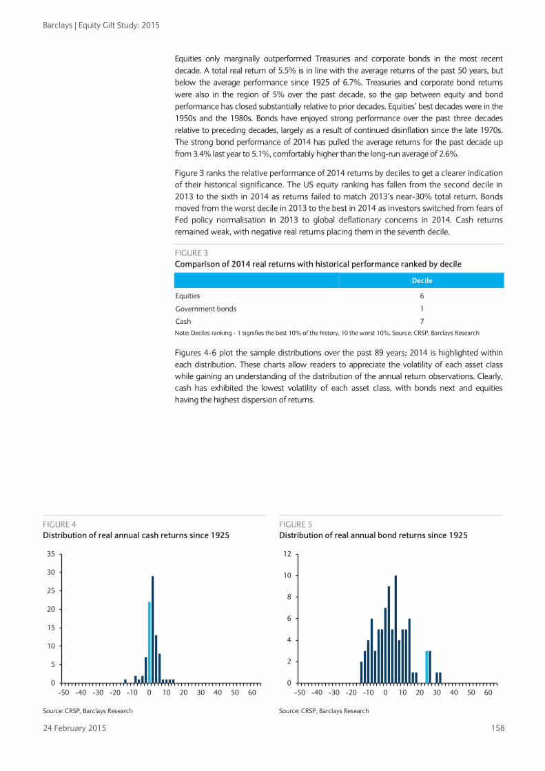
Barclays | Equity Gilt Study: 2015
24 February 2015 158
Equities only marginally outperformed Treasuries and corporate bonds in the most recent decade. A total real return of 5.5% is in line with the average returns of the past 50 years, but below the average performance since 1925 of 6.7%. Treasuries and corporate bond returns were also in the region of 5% over the past decade, so the gap between equity and bond performance has closed substantially relative to prior decades. Equities’ best decades were in the 1950s and the 1980s. Bonds have enjoyed strong performance over the past three decades relative to preceding decades, largely as a result of continued disinflation since the late 1970s. The strong bond performance of 2014 has pulled the average returns for the past decade up from 3.4% last year to 5.1%, comfortably higher than the long-run average of 2.6%.
Figure 3 ranks the relative performance of 2014 returns by deciles to get a clearer indication of their historical significance. The US equity ranking has fallen from the second decile in 2013 to the sixth in 2014 as returns failed to match 2013’s near-30% total return. Bonds moved from the worst decile in 2013 to the best in 2014 as investors switched from fears of Fed policy normalisation in 2013 to global deflationary concerns in 2014. Cash returns remained weak, with negative real returns placing them in the seventh decile.
FIGURE 3 Comparison of 2014 real returns with historical performance ranked by decile
Decile
Equities 6
Government bonds 1
Cash 7
Note: Deciles ranking - 1 signifies the best 10% of the history, 10 the worst 10%. Source: CRSP, Barclays Research
Figures 4-6 plot the sample distributions over the past 89 years; 2014 is highlighted within each distribution. These charts allow readers to appreciate the volatility of each asset class while gaining an understanding of the distribution of the annual return observations. Clearly, cash has exhibited the lowest volatility of each asset class, with bonds next and equities having the highest dispersion of returns.
FIGURE 4 Distribution of real annual cash returns since 1925
FIGURE 5 Distribution of real annual bond returns since 1925
Source: CRSP, Barclays Research Source: CRSP, Barclays Research
0
5
10
15
20
25
30
35
-50 -40 -30 -20 -10 0 10 20 30 40 50 600
2
4
6
8
10
12
-50 -40 -30 -20 -10 0 10 20 30 40 50 60

Barclays | Equity Gilt Study: 2015
24 February 2015 159
FIGURE 6 Distribution of real annual equity returns since 1925
FIGURE 7 Maximum and minimum real returns over different periods
Source: CRSP, Barclays Research Source: CRSP, Barclays Research
Figure 7 shows the extremes of the return distribution for various holding periods. The volatility of equities over very short horizons is clearly demonstrated in the maximum and minimum distributions of one-year returns. As we extend the holding period, the distribution begins to narrow. Over the past 89 years, the worst average annualised 20-year return for equities was 0.9%, while the best was 13%. However, this is not to say that it is impossible to lose money by holding equities over a 20-year period, as the analysis is conducted on an ex-post basis. The figure simply highlights that such an occurrence seems unlikely, given equities’ performance over the past 89 years.
In addition, we would expect the ex-ante equity risk premium to act as a cushion against uncertainty in the long term. Bonds and cash have had negative returns on a 20-year investment horizon, reflecting unexpected inflation surges at various times in the past century.
Figure 8 plots the US equity risk premium and shows that the 10-year annualised excess return of equities over bonds has recovered from the lows of 2008 and remains in positive territory.
FIGURE 8 Equity-risk premium – Excess return of equities relative to bonds (10y annualised)
Source: CRSP, Barclays Research
0
1
2
3
4
5
6
7
-50 -40 -30 -20 -10 0 10 20 30 40 50 60 -50% -30% -10% 10% 30% 50%
1 year
5 year
10 year
20 year
Cash Bonds Equities
-10%
-5%
0%
5%
10%
15%
20%
1935 1948 1961 1974 1987 2000 2013

Barclays | Equity Gilt Study: 2015
24 February 2015 160
The importance of reinvestment Figures 9 and 10 show the importance of reinvestment of income in the form of dividends on equity investments and coupons on government bonds.
FIGURE 11 Value of $100 invested at the end of 1925 without reinvesting income
Nominal Real
Equities $14,328 $1,092
Bonds $140 $11
Source: CRSP, Barclays Research
FIGURE 12 Value of $100 invested at the end of 1925 with income reinvested gross
Nominal Real
Equities $408,413 $31,134
Bonds $13,327 $1,016
Cash $2,043 $156
Source: CRSP, Barclays Research
FIGURE 9 Barclays US price indices in nominal terms
FIGURE 10 Barclays US total return indices in nominal terms with gross income reinvested
Source: CRSP, Barclays Research Source: CRSP, Barclays Research
1
100
10,000
1,000,000
1925
1933
1941
1949
1957
1965
1973
1981
1989
1997
2005
2013
Equities Bonds Consumer Prices
1
1,000
1,000,000
1925
1933
1941
1949
1957
1965
1973
1981
1989
1997
2005
2013
Equity Bonds Cash

Barclays | Equity Gilt Study: 2015
24 February 2015 161
CHAPTER 10
Barclays indices We have calculated three indices showing: 1) changes in the capital value of each asset class; 2) changes to income from these investments; and 3) a combined measure of the overall return, on the assumption that all income is reinvested.
Additional series allow for the effects of inflation. The data for cash include building society deposit rates and Treasury bills. The series on index-linked securities is based at December 1982 and the corporate bond index starts at the end of 1990.
Barclays Equity Index The Barclays Equity Index is designed to give as accurate a measure as possible of the performance of a representative portfolio of equities. Three main types of index can be used. The FT Index, which for years was the most widely used in the UK, is geometric, meaning that the price changes of the 30 shares it comprises are multiplied together to produce the change in the index. We believe that this is a fair basis for indicating short-term market behaviour, but that over long periods it imparts a downward bias. The second type of index uses the Dow formula, in which the prices of a number of shares are added together. This does not have the distorting effect of a geometric index, but the weighting of the various shares is arbitrary and varies with changes in capitalisation.
We think the most accurate and representative indices are arithmetic and weighted by the number of shares in issue by each company. These indices include virtually all of the large quoted companies, and, thus, we believe they accurately reflect the behaviour of an equity market. The Standard & Poor’s Indices are of this type, and they date back to the 1920s. The FT Actuaries Indices, introduced in the 1960s, were the first of this type in the UK. Subsequently, a number of weighted arithmetic international indices, such as those calculated by Morgan Stanley Capital International and Datastream, have been introduced. More recently, the FTSE 100 Index, which uses the same construction but incorporates only the 100 leading shares, has been introduced and, generally, is now used as the main market indicator because it is calculated on a real-time basis throughout the day.
The Barclays Equity Index, which is used in this study, is a weighted arithmetic index, and is available for the period since 1899, with a dividend yield and an income index. The original Barclays Equity Index, used in editions of this study until 1999, was first calculated retrospectively in 1956 and included 30 shares chosen because of their similarities to the FT 30 Index, which covers the 1935 to 1962 period. For the 2000 edition of this study, we compiled a new index for 1899-1935, based on the 30 largest shares by market capitalisation in each year. From 1962, the Barclays Equity Index is based on the FTSE Actuaries All-Share Index because, with its broader coverage, it gives a more accurate picture of market movements. The indices are calculated only annually, at year-end.
The equity returns between 1899 and 1935 are, therefore, calculated from a new Equity Index, consisting of the 30 largest shares by market capitalisation in each year; between 1935 and 1962 they are calculated from the FT 30 Index and from 1962 onward they are derived from the FTSE Actuaries All-Share Index.
Sreekala Kochugovindan
+44 (0)20 7773 2234
sreekala.kochugovindan@
barclays.com

Barclays | Equity Gilt Study: 2015
24 February 2015 162
FIGURE 1 Equity Index constituents
Constituents at December 1899 Constituents at December 1934 Constituents at December 1962
De Beers Consolidated Mines Rio Tinto Ltd Armstrong Whitworth Consolidated Gold Fields London and County Bank
Woolworth Ltd Imperial Chemical Industries Shell Transport & Trading Ltd Courtaulds Ltd Royal Insurance Co
Associated Portland Cement Bass Mitchells & Butlers British Motor Coats Patons Cory (William)
London City & Midland Bank Ltd Lloyds Bank Ltd London & Westminster Bank Ltd Vickers, Sons & Maxim Ltd Imperial Ottoman Bank
Barclay & Company Lloyds Bank Prudential Assurance Co Ltd Westminster Bank Ltd Midland Bank Ltd
Courtaulds Distillers Dunlop EMI Fine Spinners & Doublers
Parrs Bank Ltd Royal Insurance Co Tharsis Sulphur & Copper Ltd Great Northern of Copenhagen Simmer & Jack Propietary Mines Ltd
London & Lancashire Fire Ins. Co North British & Mercantile In. Co Ltd Reckitt & Sons Ltd County of London Electric Supply Co Unilever Ltd
General Electric Guest Keen Hawker Siddeley House of Fraser ICI
North British & Mercantile Insurance Consett Iron Ltd Eastern Extension Australasia * China Ltd Nobel Dynamite Tst Ltd Mysore Gold Mining Ltd
Tate & Lyle Ltd Alliance Assurance Company Boots Pure Drug Co Ltd Pearl Assurance Co Marks & Spencer Ltd
Imperial Tobacco International Stores Leyland Motors London Brick Murex
Exploration Co Alliance Assurance Co Aerated Bread Ltd Howard & Bullough Ltd Sun Insurance Office
Cory (WM.) & Son National Bank Of Egypt Consolidated Gold Fields Of South Africa Bass, Ratcliff & Gretton Ltd GeduldProp Mines Ltd
P&O Steam Navigation Rolls-Royce Swan Hunter Tate & Lyle Tube Investments
New Jagersfontein Mining & Expl Ltd Champion Reef Gold Mining National Telephone Ltd Northern Assurance Phoenix Assurance Co
Sun Insurance Office Bank Of Australasia British South Africa Co Chartered Bank Of India, Australia & China North Eastern Elec Supply Co
Turner & Newall United Steel Vickers WatneyMann Woolworth
Source: Barclays Research
The Equity Index is a weighted arithmetic average. In the Equity Index, the weights of the 30 constituent companies for each year are proportional to their market capitalisation at the beginning of the year. Each year a fund was constructed. The number of shares in the fund for each company was calculated so that its market value at the beginning of the year was equal to the company’s index weighting. The value of the fund was calculated annually at the end of the year.
For 1899-1962, the Equity Income Index is based on the Barclays Equity Fund. The Income Index relates to the dividend income actually received in the 12 months prior to the date of the index. It is calculated by totalling the dividends paid on the shares in the fund. We believe that it is the only published index based on actual income receipts.
From 1963 the Income Index is derived from the yield on the FTSE All-Share Index. Despite a minimal discontinuity in the yield, in our view, this is the most representative method of evaluating equity performance over the period. The dividend yield is quoted net from 1998, with non-taxpayers no longer able to reclaim ACT.

Barclays | Equity Gilt Study: 2015
24 February 2015 163
Barclays Gilt Index The Gilt Index measures the performance of long-dated gilts. From 1899 to 1962 the index is based on the prices of undated British funds. During this period, the undated stocks were a major part of the gilt market, but over the years, the effect of high interest rates on their prices, together with the growing number of conventional long-dated issues, meant that undated stocks became less and less representative of the market as a whole.
Since 1962, the Barclays Gilt Index has been based on a portfolio of long-dated stocks, selected on 1 January each year. The portfolio was chosen to represent as closely as possible a 20-year security on a par yield, and contains a weighted combination of four long-dated stocks with a mean life of 20½ years (so that the average life of the stocks for the year in which they are in the portfolio was 20 years). The combination and weightings of the four stocks are chosen to have the minimum possible deviation from a par yield. Small issues (less than £1bn) are excluded and in any year none of the four stocks has been allocated a weight of more than 40%, or less than 5% of the index.
During the late 1980s, there was a steady contraction in the number of issues that satisfied the criteria for inclusion in the Gilt Index. As a result of the lack of issues of new long-dated stocks and the fall in the remaining life of existing stocks, the universe of eligible stocks narrowed sharply. By the end of 1989, there were four stocks with a life of more than 20 years, and only two of these were over £1bn nominal.
Thus, from the beginning of 1990, the index has been constructed to represent a portfolio of 15-year par yielding gilts.
Barclays Inflation-linked Index The index-linked market has now been established for almost three decades and is capitalised at £477bn (compared with the £1.3trn capitalisation of the conventional market). The index has been constructed to mirror as closely as possible the rules of the conventional gilt index. An average life of 20 years was used up until 1990, and 15 years thereafter. Again, stocks have been chosen to be as close to par as possible, although, of course in this case, par means “indexed par”.
Barclays Corporate Bond Index The UK corporate bond market has expanded markedly since the beginning of 1999. The index and returns are based on the Barclays Sterling Aggregate Corporate Index. Clearly, we are unable to select individual stocks for this index in the way we do for the gilt indices because such a small sample of stocks cannot be representative of the market.
Barclays Building Society Fund In previous editions of this study, we have included indices of the value of £100 invested in a building society at the end of 1945. We originally used the average interest rate on an ordinary share account. In the mid-1980s, many building societies introduced new tiered interest rate accounts, which provided a higher rate of interest while still allowing instant access. In response to this, we have been tracking both types of account, but as time progressed, the old style “ordinary share accounts” became less and less representative and by the mid-1990s had been completely superseded by the new accounts. From 1986, the Barclays Index follows the Halifax Liquid Gold Account (formerly called the Halifax Instant Xtra) as a representative of the newer tiered interest rate-style accounts. The Halifax is no longer a building society, having converted to a bank, so from 1998, we follow the Nationwide Invest Direct Account. This is the closest equivalent account offered by the Nationwide Building Society (which is now the largest remaining building society in the UK); the difference is that it is operated by post. We consider this type of postal account to be more representative of building society returns than the branch operated passbook accounts, which are more in the nature of a cash-based transaction account.

Barclays | Equity Gilt Study: 2015
24 February 2015 164
US asset returns The US indices used in this study were provided by the Center for Research in Security Prices (CRSP) at the Graduate School of Business of the University of Chicago. The value-weighted equity index covers all common stocks trading on the New York, Nasdaq, and Arca Stock Exchanges, excluding ADRs. For the bond index, the CRSP has used software which selects the bond that is closest to a 20-year bond in each month. The same methodology has been employed for the 30-day T-Bill.
Total returns In this study, we have shown the performance of representative investments in UK equities and long gilts, with additional analysis of equivalent US returns in both monetary and real (inflation adjusted) terms. The total returns to the investor, however, also include the income on the investment. This is important throughout the study for comparability between asset classes. For example, when constructing an index for a cash investment such as the UK Treasury Bill Index, the £100 invested at the end of 1899 grew to approximately £104 by the end of the following year. This full amount is reinvested and by the end of 1920 the value of this investment had grown to about £190. In contrast, equity and bond market returns can be split into two components: capital appreciation; and dividend income. The most commonly quoted stock market indices usually include only the capital component of the return. In order to calculate returns on a comparable basis, we need to include the returns obtained by reinvesting this income. This is particularly important in looking at bonds where the scope for capital appreciation is small, so almost all of the return will be from income. In this study, total returns are calculated assuming income is reinvested at the end of the year.
Taxation The total return to an investor depends crucially on the tax regime. The largest long-term investors in the British equity and gilt markets are pension funds and similar institutions that (until the abolition of the advance corporation tax (ACT) credit) have not suffered tax on their income or capital; our main tables therefore make no allowance for tax until 1998, which was the first full year that non-taxpayers were unable to reclaim the ACT credit. This effectively reduced the dividend yield to non-taxpayers, and is reflected in our main tables and gross total return series.
The personal investor must suffer tax. The net return to a building society account is straightforward to compute. However, changes in the tax regime in recent years make the net return to equity and gilt investment less straightforward to calculate on a consistent basis. For example, the change to total return taxation for gilts means that it is inappropriate to calculate a net total return on the basis of taxing income alone. Thus, returns are quoted gross throughout, but for reference we also quote basic tax rates.
Arithmetic and geometric averages Our analysis of past data usually relies on calculations of the geometric mean for each series. Arithmetic averages can provide a misleading picture. For example, suppose equities rose from a base of 100 to 200 over one year and then fell back to 100 over the next year. The return for year one would have been 100% and for year two minus 50%. The arithmetic average return would be 25%, even though equities are actually unchanged in value over the two years.
The geometric average return in this example would be zero. This method of calculation is, therefore, preferable. Over long periods, the geometric average for total returns is the rate at which a sum invested at the beginning of the period will grow to by the end of the period, assuming all income is reinvested. The calculation of geometric averages depends only on the initial and final values for the investment, not particular values at any other point in time.

Barclays | Equity Gilt Study: 2015
24 February 2015 165
For periods of one year, arithmetic and geometric averages will be the same. But over longer periods, the geometric average is always less than the arithmetic average, except when all the individual yearly returns are the same. For the mathematically minded, the geometric return is approximately equal to the arithmetic return minus one-half the variance of the arithmetic return.
Although geometric returns are appropriate to analyse the past, arithmetic returns should be used to provide forecasts. Arithmetic averages provide the better unbiased estimator of returns (for a statistical proof of this see Ian Cooper’s paper Arithmetic vs Geometric Premium: setting discount rates for capital budgeting calculations, IFA Working Paper 174-93, April 1993).
Capital value indices The indices in Figure 2 show the nominal capital value of £100 invested in equities and gilts at the end of 1899. The chart also plots the Barclays Cost of Living Index. Note how the equity index has correlated with increases in the cost of living versus a similar investment in gilts. The index values at the end of 2014 were 14,597 for equities, 59.27 for gilts, and 7929 for the cost of living.
We then show the same capital indices adjusted for the increase in the cost of living since 1899. Figure 3 shows the end-2014 real equity price index at 184 with the real gilt price index at 0.75.
Total return indices The next two charts show the nominal and real value of the equity, gilt and cash funds with gross income received reinvested at the end of each year since 1899. Figure 4 shows that the nominal worth of £100 invested in equities at the end of 1899 was £2,240,727. The same investment in gilts was worth £36,197 and in T-Bills £20,444. When adjusted for inflation, the equity fund is worth £28,261, the gilt £457 and the cash fund £258.
FIGURE 2 Barclays price indices in nominal terms
FIGURE 3 Barclays price indices in real terms
Source: Barclays Research Source: Barclays Research
1
10
100
1,000
10,000
100,000
1899 1913 1927 1941 1955 1969 1983 1997 2011
Equities Gilts Retail prices
0
50
100
150
200
250
300
1899 1913 1927 1941 1955 1969 1983 1997 2011
Equities Gilts
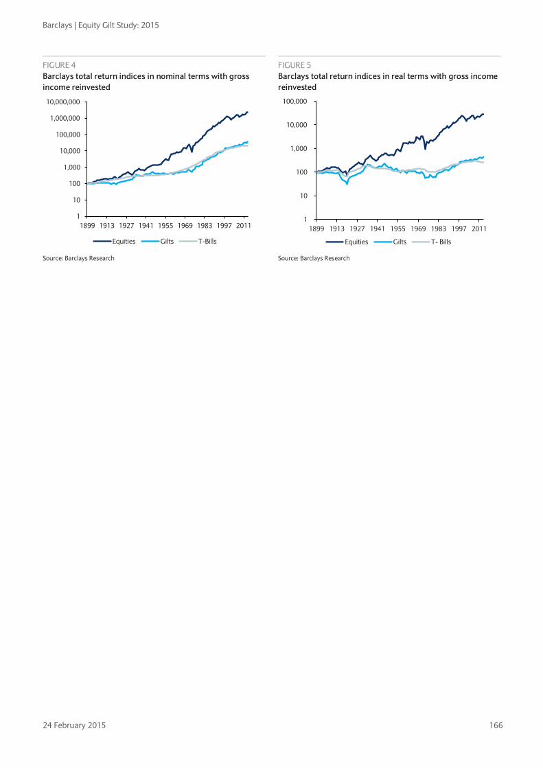
Barclays | Equity Gilt Study: 2015
24 February 2015 166
FIGURE 4 Barclays total return indices in nominal terms with gross income reinvested
FIGURE 5 Barclays total return indices in real terms with gross income reinvested
Source: Barclays Research Source: Barclays Research
1
10
100
1,000
10,000
100,000
1,000,000
10,000,000
1899 1913 1927 1941 1955 1969 1983 1997 2011
Equities Gilts T-Bills
1
10
100
1,000
10,000
100,000
1899 1913 1927 1941 1955 1969 1983 1997 2011
Equities Gilts T- Bills

Barclays | Equity Gilt Study: 2015
24 February 2015 167
FIGURE 6 Barclays UK Cost of Living Index
Change % Change %
Year December
(1899=100) In year 5y average Year December In year 5y average 1900 103.3 3.3 1958 381.8 1.8 3.9 1901 103.3 0.0 1959 381.8 0.0 3.1 1902 106.7 3.2 1960 388.7 1.8 2.3 1903 106.7 0.0 1961 405.7 4.4 2.5 1904 106.7 0.0 1.3 1962 416.5 2.6 2.1 1905 106.7 0.0 0.6 1963 424.2 1.9 2.1 1906 100.0 -6.2 -0.7 1964 444.6 4.8 3.1 1907 110.0 10.0 0.6 1965 464.5 4.5 3.6 1908 113.3 3.0 1.2 1966 481.6 3.7 3.5 1909 113.3 0.0 1.2 1967 493.4 2.5 3.4 1910 113.3 0.0 1.2 1968 522.7 5.9 4.3 1911 116.7 2.9 3.1 1969 547.1 4.7 4.2 1912 120.0 2.9 1.8 1970 590.3 7.9 4.9 1913 120.0 0.0 1.1 1971 643.6 9.0 6.0 1914 120.0 0.0 1.1 1972 692.9 7.7 7.0 1915 148.3 23.6 5.5 1973 766.2 10.6 7.9 1916 175.8 18.5 8.6 1974 912.8 19.1 10.8 1917 212.5 20.9 12.1 1975 1140.0 24.9 14.1 1918 244.7 15.2 15.3 1976 1311.8 15.1 15.3 1919 250.3 2.3 15.8 1977 1471.1 12.1 16.3 1920 299.2 19.6 15.1 1978 1594.4 8.4 15.8 1921 221.4 -26.0 4.7 1979 1869.3 17.2 15.4 1922 200.2 -9.5 -1.2 1980 2151.9 15.1 13.5 1923 196.9 -1.7 -4.3 1981 2411.2 12.0 12.9 1924 201.3 2.3 -4.3 1982 2541.6 5.4 11.6 1925 196.9 -2.2 -8.0 1983 2676.7 5.3 10.9 1926 199.1 1.1 -2.1 1984 2799.3 4.6 8.4 1927 188.0 -5.6 -1.3 1985 2958.5 5.7 6.6 1928 186.9 -0.6 -1.0 1986 3068.6 3.7 4.9 1929 185.8 -0.6 -1.6 1987 3182.0 3.7 4.6 1930 172.4 -7.2 -2.6 1988 3397.6 6.8 4.9 1931 164.6 -4.5 -3.7 1989 3659.5 7.7 5.5 1932 159.1 -3.4 -3.3 1990 4001.4 9.3 6.2 1933 159.1 0.0 -3.2 1991 4180.0 4.5 6.4 1934 160.2 0.7 -2.9 1992 4287.8 2.6 6.1 1935 163.5 2.1 -1.1 1993 4369.3 1.9 5.2 1936 168.0 2.7 0.4 1994 4495.6 2.9 4.2 1937 178.0 6.0 2.3 1995 4640.3 3.2 3.0 1938 173.5 -2.5 1.8 1996 4754.2 2.5 2.6 1939 192.4 10.9 3.7 1997 4926.6 3.6 2.8 1940 216.9 12.7 5.8 1998 5062.1 2.8 3.0 1941 223.6 3.1 5.9 1999 5151.4 1.8 2.8 1942 222.5 -0.5 4.6 2000 5302.3 2.9 2.7 1943 221.4 -0.5 5.0 2001 5339.2 0.7 2.3 1944 223.6 1.0 3.0 2002 5496.3 2.9 2.2 1945 225.8 1.0 0.8 2003 5650.2 2.8 2.2 1946 226.9 0.5 0.3 2004 5847.3 3.5 2.6 1947 234.2 3.2 1.0 2005 5976.6 2.2 2.4 1948 245.7 4.9 2.1 2006 6241.4 4.4 3.2 1949 254.3 3.5 2.6 2007 6493.9 4.0 3.4 1950 262.4 3.2 3.0 2008 6555.5 0.9 3.0 1951 294.0 12.0 5.3 2009 6712.5 2.4 2.8 1952 312.7 6.3 6.0 2010 7032.8 4.8 3.3 1953 316.0 1.1 5.2 2011 7371.5 4.8 3.4 1954 328.5 4.0 5.3 2012 7599.3 3.1 3.2 1955 347.7 5.8 5.8 2013 7802.6 2.7 3.5 1956 358.3 3.0 4.0 2014 7928.8 1.6 3.4 1957 374.9 4.6 3.7
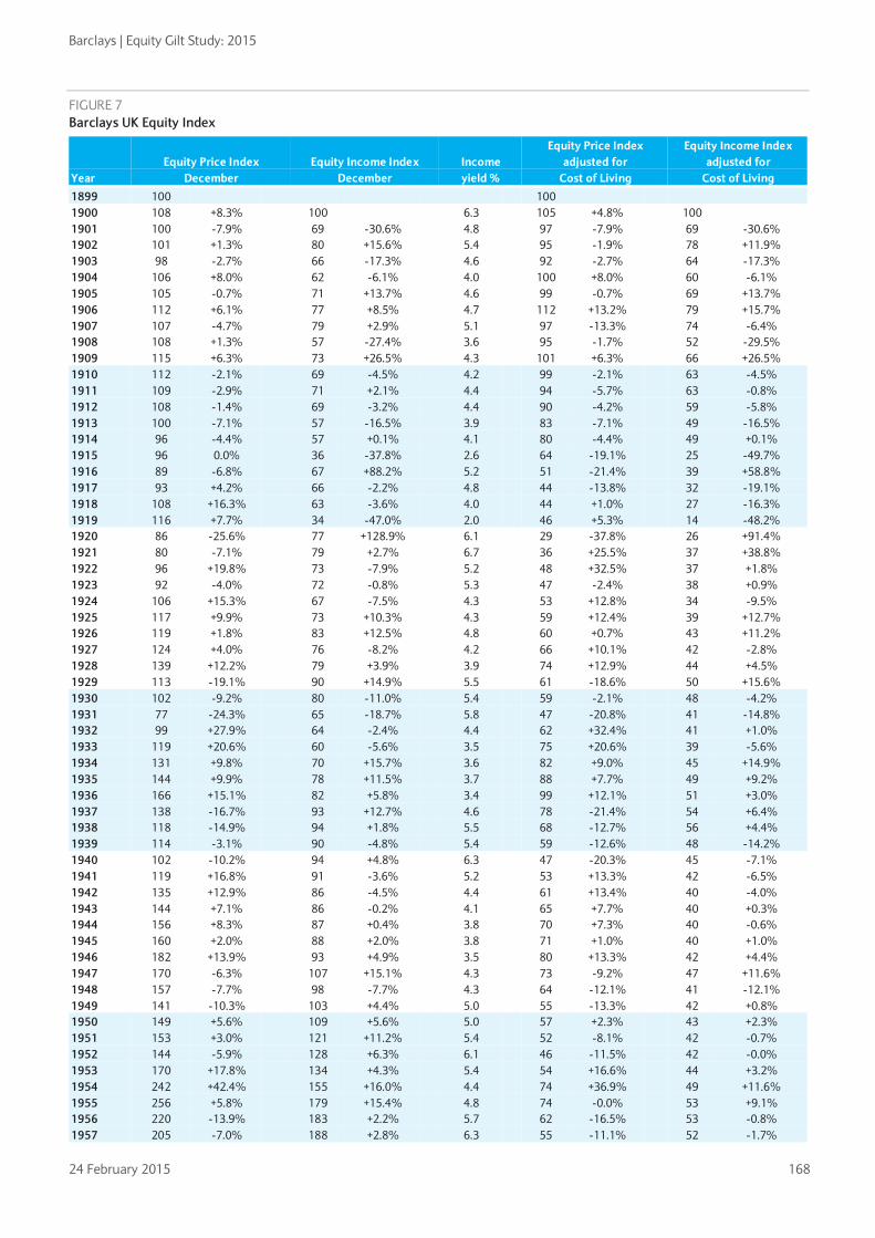
Barclays | Equity Gilt Study: 2015
24 February 2015 168
FIGURE 7 Barclays UK Equity Index
Year Equity Price Index
December Equity Income Index
December Income yield %
Equity Price Index adjusted for
Cost of Living
Equity Income Index adjusted for
Cost of Living 1899 100 100 1900 108 +8.3% 100 6.3 105 +4.8% 100 1901 100 -7.9% 69 -30.6% 4.8 97 -7.9% 69 -30.6% 1902 101 +1.3% 80 +15.6% 5.4 95 -1.9% 78 +11.9% 1903 98 -2.7% 66 -17.3% 4.6 92 -2.7% 64 -17.3% 1904 106 +8.0% 62 -6.1% 4.0 100 +8.0% 60 -6.1% 1905 105 -0.7% 71 +13.7% 4.6 99 -0.7% 69 +13.7% 1906 112 +6.1% 77 +8.5% 4.7 112 +13.2% 79 +15.7% 1907 107 -4.7% 79 +2.9% 5.1 97 -13.3% 74 -6.4% 1908 108 +1.3% 57 -27.4% 3.6 95 -1.7% 52 -29.5% 1909 115 +6.3% 73 +26.5% 4.3 101 +6.3% 66 +26.5% 1910 112 -2.1% 69 -4.5% 4.2 99 -2.1% 63 -4.5% 1911 109 -2.9% 71 +2.1% 4.4 94 -5.7% 63 -0.8% 1912 108 -1.4% 69 -3.2% 4.4 90 -4.2% 59 -5.8% 1913 100 -7.1% 57 -16.5% 3.9 83 -7.1% 49 -16.5% 1914 96 -4.4% 57 +0.1% 4.1 80 -4.4% 49 +0.1% 1915 96 0.0% 36 -37.8% 2.6 64 -19.1% 25 -49.7% 1916 89 -6.8% 67 +88.2% 5.2 51 -21.4% 39 +58.8% 1917 93 +4.2% 66 -2.2% 4.8 44 -13.8% 32 -19.1% 1918 108 +16.3% 63 -3.6% 4.0 44 +1.0% 27 -16.3% 1919 116 +7.7% 34 -47.0% 2.0 46 +5.3% 14 -48.2% 1920 86 -25.6% 77 +128.9% 6.1 29 -37.8% 26 +91.4% 1921 80 -7.1% 79 +2.7% 6.7 36 +25.5% 37 +38.8% 1922 96 +19.8% 73 -7.9% 5.2 48 +32.5% 37 +1.8% 1923 92 -4.0% 72 -0.8% 5.3 47 -2.4% 38 +0.9% 1924 106 +15.3% 67 -7.5% 4.3 53 +12.8% 34 -9.5% 1925 117 +9.9% 73 +10.3% 4.3 59 +12.4% 39 +12.7% 1926 119 +1.8% 83 +12.5% 4.8 60 +0.7% 43 +11.2% 1927 124 +4.0% 76 -8.2% 4.2 66 +10.1% 42 -2.8% 1928 139 +12.2% 79 +3.9% 3.9 74 +12.9% 44 +4.5% 1929 113 -19.1% 90 +14.9% 5.5 61 -18.6% 50 +15.6% 1930 102 -9.2% 80 -11.0% 5.4 59 -2.1% 48 -4.2% 1931 77 -24.3% 65 -18.7% 5.8 47 -20.8% 41 -14.8% 1932 99 +27.9% 64 -2.4% 4.4 62 +32.4% 41 +1.0% 1933 119 +20.6% 60 -5.6% 3.5 75 +20.6% 39 -5.6% 1934 131 +9.8% 70 +15.7% 3.6 82 +9.0% 45 +14.9% 1935 144 +9.9% 78 +11.5% 3.7 88 +7.7% 49 +9.2% 1936 166 +15.1% 82 +5.8% 3.4 99 +12.1% 51 +3.0% 1937 138 -16.7% 93 +12.7% 4.6 78 -21.4% 54 +6.4% 1938 118 -14.9% 94 +1.8% 5.5 68 -12.7% 56 +4.4% 1939 114 -3.1% 90 -4.8% 5.4 59 -12.6% 48 -14.2% 1940 102 -10.2% 94 +4.8% 6.3 47 -20.3% 45 -7.1% 1941 119 +16.8% 91 -3.6% 5.2 53 +13.3% 42 -6.5% 1942 135 +12.9% 86 -4.5% 4.4 61 +13.4% 40 -4.0% 1943 144 +7.1% 86 -0.2% 4.1 65 +7.7% 40 +0.3% 1944 156 +8.3% 87 +0.4% 3.8 70 +7.3% 40 -0.6% 1945 160 +2.0% 88 +2.0% 3.8 71 +1.0% 40 +1.0% 1946 182 +13.9% 93 +4.9% 3.5 80 +13.3% 42 +4.4% 1947 170 -6.3% 107 +15.1% 4.3 73 -9.2% 47 +11.6% 1948 157 -7.7% 98 -7.7% 4.3 64 -12.1% 41 -12.1% 1949 141 -10.3% 103 +4.4% 5.0 55 -13.3% 42 +0.8% 1950 149 +5.6% 109 +5.6% 5.0 57 +2.3% 43 +2.3% 1951 153 +3.0% 121 +11.2% 5.4 52 -8.1% 42 -0.7% 1952 144 -5.9% 128 +6.3% 6.1 46 -11.5% 42 -0.0% 1953 170 +17.8% 134 +4.3% 5.4 54 +16.6% 44 +3.2% 1954 242 +42.4% 155 +16.0% 4.4 74 +36.9% 49 +11.6% 1955 256 +5.8% 179 +15.4% 4.8 74 -0.0% 53 +9.1% 1956 220 -13.9% 183 +2.2% 5.7 62 -16.5% 53 -0.8% 1957 205 -7.0% 188 +2.8% 6.3 55 -11.1% 52 -1.7%

Barclays | Equity Gilt Study: 2015
24 February 2015 169
Year Equity Price Index
December Equity Income Index
December Income yield %
Equity Price Index adjusted for
Cost of Living
Equity Income Index adjusted for
Cost of Living 1958 289 +41.1% 202 +7.5% 4.8 76 +38.5% 55 +5.5% 1959 432 +49.5% 227 +12.1% 3.6 113 +49.5% 61 +12.1% 1960 421 -2.6% 276 +21.7% 4.5 108 -4.4% 73 +19.5% 1961 409 -3.0% 286 +3.5% 4.8 101 -7.0% 73 -0.8% 1962 391 -4.4% 285 -0.4% 5.0 94 -6.9% 71 -3.0% 1963 450 +15.2% 266 -6.5% 4.1 106 +13.1% 65 -8.2% 1964 405 -10.0% 303 +13.7% 5.1 91 -14.2% 70 +8.5% 1965 428 +5.9% 326 +7.7% 5.2 92 +1.3% 73 +3.1% 1966 389 -9.3% 328 +0.5% 5.8 81 -12.5% 70 -3.1% 1967 500 +28.7% 319 -2.5% 4.4 101 +25.6% 67 -4.8% 1968 718 +43.5% 339 +6.1% 3.2 137 +35.4% 67 +0.2% 1969 609 -15.2% 342 +0.8% 3.9 111 -19.0% 65 -3.7% 1970 563 -7.5% 360 +5.5% 4.4 95 -14.3% 63 -2.3% 1971 799 +41.9% 379 +5.1% 3.3 124 +30.2% 61 -3.6% 1972 901 +12.8% 414 +9.3% 3.2 130 +4.8% 62 +1.6% 1973 619 -31.4% 430 +3.9% 4.8 81 -37.9% 58 -6.0% 1974 276 -55.3% 472 +9.6% 11.7 30 -62.5% 53 -8.0% 1975 653 +136.3% 521 +10.4% 5.5 57 +89.2% 47 -11.6% 1976 628 -3.9% 588 +12.8% 6.4 48 -16.5% 46 -2.0% 1977 886 +41.2% 682 +16.1% 5.3 60 +25.9% 48 +3.5% 1978 910 +2.7% 768 +12.6% 5.8 57 -5.3% 50 +3.9% 1979 949 +4.3% 951 +23.8% 6.9 51 -11.0% 53 +5.6% 1980 1206 +27.1% 1073 +12.8% 6.1 56 +10.4% 52 -2.0% 1981 1294 +7.2% 1111 +3.5% 5.9 54 -4.3% 48 -7.6% 1982 1579 +22.1% 1211 +9.0% 5.3 62 +15.8% 49 +3.4% 1983 1944 +23.1% 1309 +8.1% 4.6 73 +16.9% 51 +2.7% 1984 2450 +26.0% 1578 +20.6% 4.4 88 +20.5% 58 +15.3% 1985 2822 +15.2% 1781 +12.8% 4.3 95 +9.0% 62 +6.8% 1986 3452 +22.3% 2033 +14.1% 4.0 112 +17.9% 68 +10.0% 1987 3596 +4.2% 2264 +11.4% 4.3 113 +0.4% 74 +7.4% 1988 3829 +6.5% 2628 +16.1% 4.7 113 -0.3% 80 +8.7% 1989 4978 +30.0% 3076 +17.0% 4.2 136 +20.7% 87 +8.7% 1990 4265 -14.3% 3401 +10.5% 5.5 107 -21.6% 88 +1.1% 1991 4907 +15.1% 3591 +5.6% 5.0 117 +10.1% 89 +1.1% 1992 5635 +14.8% 3573 -0.5% 4.4 131 +11.9% 86 -3.0% 1993 6951 +23.3% 3414 -4.4% 3.4 159 +21.0% 81 -6.2% 1994 6286 -9.6% 3684 +7.9% 4.0 140 -12.1% 85 +4.9% 1995 7450 +18.5% 4127 +12.0% 3.8 161 +14.8% 92 +8.5% 1996 8320 +11.7% 4536 +9.9% 3.7 175 +9.0% 99 +7.3% 1997 9962 +19.7% 4690 +3.4% 3.2 202 +15.5% 98 -0.2% 1998 11048 +10.9% 4026 -14.2% 2.5 218 +7.9% 82 -16.5% 1999 13396 +21.2% 4140 +2.8% 2.1 260 +19.1% 83 +1.0% 2000 12329 -8.0% 4007 -3.2% 2.2 233 -10.6% 78 -5.9% 2001 10428 -15.4% 3998 -0.2% 2.6 195 -16.0% 77 -0.9% 2002 7825 -25.0% 4049 +1.3% 3.6 142 -27.1% 76 -1.6% 2003 9121 +16.6% 4121 +1.8% 3.1 161 +13.4% 75 -1.0% 2004 9961 +9.2% 4428 +7.5% 3.1 170 +5.5% 78 +3.8% 2005 11764 +18.1% 5058 +14.2% 3.0 197 +15.5% 87 +11.8% 2006 13311 +13.2% 5549 +9.7% 2.9 213 +8.3% 92 +5.0% 2007 13580 +2.0% 5978 +7.7% 3.0 209 -1.9% 95 +3.5% 2008 9129 -32.8% 5974 -0.1% 4.5 139 -33.4% 94 -1.0% 2009 11407 +25.0% 5321 -10.9% 3.2 170 +22.0% 82 -13.0% 2010 12655 +10.9% 5331 +0.2% 2.9 180 +5.9% 78 -4.4% 2011 11808 -6.7% 6059 +13.6% 3.5 160 -11.0% 85 +8.4% 2012 12782 +8.2% 6651 +9.8% 3.6 168 +5.0% 90 +6.5% 2013 14915 +16.7% 7131 +7.2% 3.3 191 +13.6% 94 +4.4% 2014 14597 -2.1% 7170 +0.6% 3.4 184 -3.7% 93 -1.0%

Barclays | Equity Gilt Study: 2015
24 February 2015 170
FIGURE 8 Barclays UK Gilt Index
Year Gilt Price Index
December Yield % Gilt Price Index
Adjusted for Cost of Living
1899 100.0 100.0
1900 98.4 -1.6% 2.8 95.2 -4.8%
1901 94.6 -3.8% 2.9 91.5 -3.8%
1902 93.7 -0.9% 3.0 87.8 -4.0%
1903 88.3 -5.8% 2.9 82.8 -5.8%
1904 89.4 +1.2% 2.8 83.8 +1.2%
1905 90.1 +0.8% 2.8 84.4 +0.8%
1906 86.6 -3.8% 2.9 86.6 +2.6%
1907 84.1 -2.9% 3.0 76.5 -11.7%
1908 84.6 +0.6% 3.0 74.7 -2.4%
1909 83.6 -1.3% 3.0 73.7 -1.3%
1910 80.0 -4.3% 3.1 70.6 -4.3%
1911 77.7 -2.8% 3.2 66.6 -5.6%
1912 75.8 -2.4% 3.3 63.2 -5.1%
1913 72.3 -4.7% 3.5 60.2 -4.7%
1914 73.0 +1.0% 3.4 60.9 +1.0%
1915 73.0 0.0 3.4 49.2 -19.1%
1916 55.7 -23.8% 4.5 31.7 -35.7%
1917 54.9 -1.4% 4.6 25.8 -18.4%
1918 59.4 +8.3% 4.2 24.3 -6.0%
1919 51.9 -12.7% 4.8 20.7 -14.6%
1920 45.6 -12.1% 5.5 15.2 -26.5%
1921 50.6 +11.1% 4.9 22.9 +50.2%
1922 56.2 +10.9% 4.4 28.1 +22.6%
1923 56.1 -0.2% 4.5 28.5 +1.5%
1924 57.7 +2.9% 4.3 28.6 +0.6%
1925 55.4 -3.9% 4.5 28.1 -1.7%
1926 54.5 -1.6% 4.6 27.4 -2.7%
1927 55.9 +2.6% 4.5 29.8 +8.7%
1928 56.7 +1.3% 4.4 30.3 +1.9%
1929 53.3 -6.0% 4.7 28.7 -5.4%
1930 57.8 +8.5% 4.3 33.5 +16.9%
1931 55.0 -4.7% 4.5 33.4 -0.2%
1932 74.7 +35.6% 3.3 46.9 +40.4%
1933 74.6 -0.1% 3.3 46.9 -0.1%
1934 92.8 +24.4% 2.7 57.9 +23.5%
1935 87.4 -5.8% 2.9 53.4 -7.8%
1936 85.1 -2.6% 2.9 50.7 -5.2%
1937 74.8 -12.2% 3.3 42.0 -17.1%
1938 70.7 -5.4% 3.5 40.8 -3.0%
1939 68.9 -2.6% 3.6 35.8 -12.2%
1940 77.4 +12.3% 3.2 35.7 -0.3%
1941 83.1 +7.4% 3.0 37.2 +4.2%
1942 82.9 -0.3% 3.0 37.2 +0.2%
1943 80.0 -3.4% 3.1 36.1 -3.0%
1944 82.1 +2.6% 3.0 36.7 +1.6%
1945 91.8 +11.8% 2.7 40.6 +10.7%
1946 99.2 +8.0% 2.5 43.7 +7.5%
1947 82.5 -16.8% 3.0 35.2 -19.4%
1948 80.6 -2.3% 3.1 32.8 -6.9%
1949 70.9 -12.0% 3.5 27.9 -15.0%
1950 71.3 +0.5% 3.5 27.2 -2.6%

Barclays | Equity Gilt Study: 2015
24 February 2015 171
Year Gilt Price Index
December Yield % Gilt Price Index
Adjusted for Cost of Living
1951 61.9 -13.1% 4.0 21.1 -22.4%
1952 59.0 -4.8% 4.2 18.9 -10.5%
1953 64.7 +9.7% 3.9 20.5 +8.5%
1954 66.1 +2.2% 3.8 20.1 -1.7%
1955 56.9 -13.8% 4.4 16.4 -18.6%
1956 52.7 -7.5% 4.7 14.7 -10.2%
1957 46.9 -10.9% 5.3 12.5 -14.9%
1958 52.4 +11.7% 4.8 13.7 +9.6%
1959 50.4 -3.9% 5.0 13.2 -3.9%
1960 44.3 -11.9% 5.6 11.4 -13.5%
1961 38.3 -13.7% 6.5 9.4 -17.3%
1962 45.3 +18.3% 5.4 10.9 +15.3%
1963 44.5 -1.7% 5.5 10.5 -3.5%
1964 41.0 -7.9% 6.1 9.2 -12.1%
1965 40.3 -1.7% 6.2 8.7 -6.0%
1966 39.5 -2.1% 6.4 8.2 -5.5%
1967 37.9 -4.1% 6.9 7.7 -6.4%
1968 34.4 -9.3% 7.6 6.6 -14.4%
1969 31.7 -7.6% 8.5 5.8 -11.7%
1970 30.1 -5.2% 9.3 5.1 -12.2%
1971 35.4 +17.6% 8.3 5.5 +7.8%
1972 31.0 -12.3% 9.6 4.5 -18.5%
1973 25.3 -18.6% 11.9 3.3 -26.4%
1974 18.3 -27.5% 17.0 2.0 -39.2%
1975 21.8 +19.2% 14.8 1.9 -4.6%
1976 21.6 -1.1% 15.0 1.6 -14.0%
1977 28.2 +30.6% 10.9 1.9 +16.4%
1978 24.4 -13.3% 13.2 1.5 -20.0%
1979 22.2 -9.2% 14.7 1.2 -22.6%
1980 23.5 +6.2% 13.9 1.1 -7.8%
1981 20.7 -12.1% 15.8 0.9 -21.6%
1982 28.2 +36.2% 11.1 1.1 +29.2%
1983 29.5 +4.9% 10.5 1.1 -0.4%
1984 28.5 -3.4% 10.6 1.0 -7.7%
1985 28.7 +0.4% 10.5 1.0 -5.0%
1986 28.8 +0.4% 10.5 0.9 -3.2%
1987 30.6 +6.2% 9.5 1.0 +2.4%
1988 30.6 +0.0% 9.3 0.9 -6.3%
1989 29.4 -3.7% 10.0 0.8 -10.6%
1990 28.1 -4.5% 10.6 0.7 -12.7%
1991 30.4 +8.0% 9.8 0.7 +3.4%
1992 33.0 +8.7% 8.7 0.8 +6.0%
1993 39.4 +19.3% 6.4 0.9 +17.1%
1994 32.2 -18.1% 8.6 0.7 -20.4%
1995 35.5 +10.3% 7.6 0.8 +6.8%
1996 35.7 +0.6% 7.6 0.8 -1.8%
1997 40.0 +11.8% 6.3 0.8 +7.9%
1998 47.4 +18.6% 4.4 0.9 +15.4%
1999 43.4 -8.4% 5.3 0.8 -10.0%
2000 45.2 +4.0% 4.7 0.9 +1.0%
2001 43.4 -3.8% 5.0 0.8 -4.5%
2002 45.5 +4.8% 4.4 0.8 +1.8%
2003 44.1 -3.2% 4.7 0.8 -5.8%
2004 45.2 +2.5% 4.5 0.8 -1.0%
2005 47.0 +3.9% 4.1 0.8 +1.7%

Barclays | Equity Gilt Study: 2015
24 February 2015 172
Year Gilt Price Index
December Yield % Gilt Price Index
Adjusted for Cost of Living
2006 44.8 -4.6% 4.7 0.7 -8.6%
2007 45.1 +0.6% 4.5 0.7 -3.3%
2008 48.8 +8.3% 3.4 0.7 +7.3%
2009 46.4 -5.0% 4.2 0.7 -7.3%
2010 48.7 +5.0% 3.6 0.7 +0.3%
2011 57.2 +17.4% 2.4 0.8 +12.0%
2012 57.9 +1.3% 2.2 0.8 -1.7%
2013 51.8 -10.6% 3.3 0.7 -12.9%
2014 59.3 +14.4% 2.1 0.7 +12.6%

Barclays | Equity Gilt Study: 2015
24 February 2015 173
FIGURE 9 Barclays UK Treasury Bill Index
Year Treasury Bill Index
December Treasury Bill Index
adjusted for cost of living
1899 100 100 1900 104 +4.0% 101 +0.6% 1901 107 +2.5% 103 +2.5% 1902 110 +3.0% 103 -0.3% 1903 114 +3.4% 106 +3.4% 1904 117 +2.9% 110 +2.9% 1905 119 +2.2% 112 +2.2% 1906 123 +3.0% 123 +9.9% 1907 128 +3.8% 116 -5.7% 1908 130 +2.2% 115 -0.8% 1909 133 +2.1% 118 +2.1% 1910 137 +3.1% 121 +3.1% 1911 141 +2.8% 121 -0.1% 1912 144 +2.0% 120 -0.8% 1913 148 +3.0% 124 +3.0% 1914 153 +3.0% 127 +3.0% 1915 158 +3.0% 106 -16.6% 1916 162 +3.0% 92 -13.1% 1917 167 +3.0% 79 -14.7% 1918 172 +3.0% 70 -10.5% 1919 179 +3.6% 71 +1.3% 1920 190 +6.5% 64 -11.0% 1921 199 +4.7% 90 +41.5% 1922 204 +2.6% 102 +13.4% 1923 210 +2.7% 107 +4.4% 1924 217 +3.5% 108 +1.2% 1925 226 +4.2% 115 +6.6% 1926 237 +4.6% 119 +3.5% 1927 247 +4.4% 131 +10.5% 1928 257 +4.3% 138 +4.9% 1929 271 +5.4% 146 +6.1% 1930 278 +2.5% 161 +10.5% 1931 289 +3.7% 175 +8.6% 1932 293 +1.5% 184 +5.0% 1933 295 +0.6% 185 +0.6% 1934 297 +0.7% 185 +0.0% 1935 298 +0.5% 182 -1.5% 1936 300 +0.6% 179 -2.1% 1937 302 +0.6% 170 -5.1% 1938 304 +0.6% 175 +3.2% 1939 308 +1.3% 160 -8.6% 1940 311 +1.0% 143 -10.4% 1941 314 +1.0% 140 -2.0% 1942 317 +2.0% 143 +1.5% 1943 320 +1.0% 145 +1.5% 1944 324 +1.0% 145 +0.0% 1945 327 +0.9% 145 -0.1% 1946 328 +0.5% 145 +0.0% 1947 330 +0.5% 141 -2.6% 1948 332 +0.5% 135 -4.2% 1949 333 +0.5% 131 -2.9% 1950 335 +0.5% 128 -2.6% 1951 337 +0.5% 115 -10.3% 1952 344 +2.1% 110 -4.0% 1953 352 +2.4% 111 +1.3% 1954 359 +1.9% 109 -2.0% 1955 371 +3.5% 107 -2.2%

Barclays | Equity Gilt Study: 2015
24 February 2015 174
Year Treasury Bill Index
December Treasury Bill Index
adjusted for cost of living
1956 390 +5.0% 109 +1.9% 1957 409 +5.0% 109 +0.4% 1958 430 +5.1% 113 +3.2% 1959 445 +3.4% 117 +3.4% 1960 467 +5.0% 120 +3.2% 1961 491 +5.1% 121 +0.7% 1962 513 +4.5% 123 +1.8% 1963 533 +3.8% 126 +1.9% 1964 556 +4.4% 125 -0.4% 1965 591 +6.3% 127 +1.7% 1966 627 +6.1% 130 +2.4% 1967 664 +5.9% 135 +3.4% 1968 714 +7.4% 137 +1.4% 1969 770 +7.9% 141 +3.1% 1970 828 +7.5% 140 -0.4% 1971 879 +6.2% 137 -2.6% 1972 927 +5.4% 134 -2.1% 1973 1010 +9.0% 132 -1.4% 1974 1137 +12.6% 125 -5.5% 1975 1259 +10.8% 110 -11.3% 1976 1402 +11.3% 107 -3.2% 1977 1534 +9.4% 104 -2.4% 1978 1658 +8.1% 104 -0.3% 1979 1881 +13.5% 101 -3.2% 1980 2204 +17.2% 102 +1.8% 1981 2507 +13.8% 104 +1.5% 1982 2817 +12.4% 111 +6.6% 1983 3103 +10.1% 116 +4.6% 1984 3399 +9.5% 121 +4.8% 1985 3803 +11.9% 129 +5.8% 1986 4219 +10.9% 137 +7.0% 1987 4624 +9.6% 145 +5.7% 1988 5133 +11.0% 151 +4.0% 1989 5880 +14.6% 161 +6.4% 1990 6812 +15.9% 170 +6.0% 1991 7602 +11.6% 182 +6.8% 1992 8322 +9.5% 194 +6.7% 1993 8810 +5.9% 202 +3.9% 1994 9286 +5.4% 207 +2.4% 1995 9911 +6.7% 214 +3.4% 1996 10522 +6.2% 221 +3.6% 1997 11246 +6.9% 228 +3.1% 1998 12137 +7.9% 240 +5.0% 1999 12805 +5.5% 249 +3.7% 2000 13601 +6.2% 257 +3.2% 2001 14349 +5.5% 269 +4.8% 2002 14939 +4.1% 272 +1.1% 2003 15500 +3.8% 274 +0.9% 2004 16211 +4.6% 277 +1.1% 2005 17022 +5.0% 285 +2.7% 2006 17856 +4.9% 286 +0.4% 2007 18903 +5.9% 291 +1.8% 2008 19891 +5.2% 303 +4.2% 2009 20026 +0.7% 298 -1.7% 2010 20126 +0.5% 286 -4.1% 2011 20228 +0.5% 274 -4.1% 2012 20294 +0.3% 267 -2.7% 2013 20363 +0.3% 261 -2.3% 2014 20444 +0.4% 258 -1.2%

Barclays | Equity Gilt Study: 2015
24 February 2015 175
FIGURE 10 Barclays UK Index-linked Gilt Index
Year Index Linked Gilt
Price Index December Real
yield % Money yield %
Index Linked Gilt Price Index adjusted for Cost of Living
1982 100 2.7 8.3 100
1983 98.1 -1.9% 3.2 8.7 93.2 -6.8%
1984 101.6 +3.6% 3.3 8.1 92.3 -1.0%
1985 98.5 -3.1% 3.9 9.8 84.6 -8.3%
1986 101.4 +3.0% 4.1 7.9 84.0 -0.7%
1987 105.1 +3.6% 4.0 7.9 84.0 -0.1%
1988 116.0 +10.4% 3.8 10.8 86.8 +3.3%
1989 129.1 +11.3% 3.5 11.5 89.7 +3.3%
1990 130.8 +1.3% 4.0 13.8 83.1 -7.4%
1991 133.2 +1.8% 4.5 9.2 81.0 -2.5%
1992 151.1 +13.4% 3.9 6.6 89.6 +10.6%
1993 177.1 +17.2% 2.9 4.9 103.0 +15.0%
1994 158.3 -10.6% 4.0 7.0 89.5 -13.1%
1995 171.1 +8.1% 3.6 6.9 93.7 +4.7%
1996 176.2 +3.0% 3.6 6.1 94.2 +0.5%
1997 193.4 +9.8% 3.1 6.9 99.8 +5.9%
1998 227.4 +17.6% 2.0 4.8 114.2 +14.4%
1999 233.7 +2.8% 2.2 4.0 115.3 +1.0%
2000 235.4 +0.8% 2.3 5.3 112.9 -2.1%
2001 227.7 -3.3% 2.7 3.4 108.4 -4.0%
2002 240.7 +5.7% 2.1 5.1 111.3 +2.7%
2003 251.9 +4.7% 1.7 4.5 113.3 +1.8%
2004 267.6 +6.3% 1.7 5.3 116.3 +2.7%
2005 286.7 +7.1% 1.5 3.8 121.9 +4.8%
2006 287.0 +0.1% 1.6 6.0 116.9 -4.1%
2007 297.9 +3.8% 1.4 5.5 116.6 -0.3%
2008 290.3 -2.5% 1.4 2.3 112.5 -3.5%
2009 302.5 +4.2% 0.8 3.2 114.5 +1.8%
2010 328.3 +8.5% 0.4 5.2 118.6 +3.6%
2011 369.5 +12.5% -0.5 4.2 127.4 +7.4%
2012 363.6 -1.6% -0.5 2.6 121.6 -4.5%
2013 355.7 -2.2% -0.2 2.5 115.9 -4.7%
2014 409.6 +15.2% -0.8 0.8 131.3 +13.3%

Barclays | Equity Gilt Study: 2015
24 February 2015 176
FIGURE 11 Barclays UK Equity, Gilt and Treasury Bill Funds
Year
Equities Gilts Treasury Bills
Value of Fund December £
Adjusted for Cost of Living
Value of Fund December£
Adjusted for Cost of Living
Value of Fund December £
Adjusted for Cost of Living
1945 100 100 100 100 100 100
1946 118 +17.9% 117 +17.3% 111 +10.7% 110 +10.2% 101 +0.5% 100 +0.0%
1947 115 -2.3% 111 -5.3% 95 -14.3% 92 -16.9% 101 +0.5% 97 -2.6%
1948 111 -3.8% 102 -8.3% 96 +0.7% 88 -4.0% 102 +0.5% 93 -4.2%
1949 104 -5.8% 93 -8.9% 87 -8.9% 77 -12.0% 102 +0.5% 91 -2.9%
1950 116 +10.9% 100 +7.4% 91 +4.0% 78 +0.8% 103 +0.5% 88 -2.6%
1951 126 +8.5% 97 -3.1% 82 -9.6% 63 -19.3% 103 +0.5% 79 -10.3%
1952 126 -0.1% 91 -6.1% 81 -0.8% 59 -6.7% 105 +2.1% 76 -4.0%
1953 156 +24.2% 111 +22.9% 93 +14.0% 66 +12.8% 108 +2.4% 77 +1.3%
1954 232 +48.6% 159 +42.9% 98 +6.1% 67 +2.0% 110 +1.9% 75 -2.0%
1955 257 +10.9% 167 +4.8% 88 -10.1% 57 -15.0% 114 +3.5% 74 -2.2%
1956 234 -9.0% 147 -11.7% 85 -3.2% 54 -6.0% 119 +5.0% 75 +1.9%
1957 231 -1.1% 139 -5.5% 80 -6.2% 48 -10.4% 125 +5.0% 75 +0.4%
1958 342 +47.9% 202 +45.2% 94 +17.0% 55 +14.9% 132 +5.1% 78 +3.2%
1959 529 +54.8% 313 +54.8% 95 +0.9% 56 +0.9% 136 +3.4% 81 +3.4%
1960 539 +1.8% 313 -0.1% 88 -7.0% 51 -8.7% 143 +5.0% 83 +3.2%
1961 548 +1.7% 305 -2.5% 81 -8.1% 45 -11.9% 150 +5.1% 84 +0.7%
1962 550 +0.4% 298 -2.2% 101 +24.7% 55 +21.5% 157 +4.5% 85 +1.8%
1963 659 +19.9% 351 +17.7% 105 +3.7% 56 +1.8% 163 +3.8% 87 +1.9%
1964 623 -5.4% 317 -9.8% 102 -2.3% 52 -6.7% 170 +4.4% 87 -0.4%
1965 694 +11.4% 337 +6.6% 107 +4.4% 52 -0.1% 181 +6.3% 88 +1.7%
1966 666 -4.0% 312 -7.4% 111 +4.2% 52 +0.5% 192 +6.1% 90 +2.4%
1967 895 +34.3% 410 +31.1% 114 +2.6% 52 +0.1% 203 +5.9% 93 +3.4%
1968 1326 +48.1% 573 +39.8% 111 -2.4% 48 -7.8% 219 +7.4% 94 +1.4%
1969 1168 -11.9% 482 -15.9% 112 +0.2% 46 -4.2% 236 +7.9% 97 +3.1%
1970 1127 -3.5% 431 -10.5% 116 +3.6% 44 -4.0% 253 +7.5% 97 -0.4%
1971 1652 +46.5% 579 +34.4% 147 +27.3% 52 +16.8% 269 +6.2% 94 -2.6%
1972 1922 +16.4% 626 +8.1% 142 -3.8% 46 -10.7% 284 +5.4% 92 -2.1%
1973 1382 -28.1% 407 -35.0% 129 -8.9% 38 -17.6% 309 +9.0% 91 -1.4%
1974 690 -50.1% 171 -58.1% 109 -15.2% 27 -28.8% 348 +12.6% 86 -5.5%
1975 1719 +149.3% 341 +99.6% 150 +36.8% 30 +9.5% 386 +10.8% 76 -11.3%
1976 1759 +2.3% 303 -11.1% 170 +13.7% 29 -1.1% 429 +11.3% 74 -3.2%
1977 2614 +48.6% 401 +32.5% 247 +44.8% 38 +29.1% 470 +9.4% 72 -2.4%
1978 2839 +8.6% 402 +0.2% 242 -1.8% 34 -9.4% 508 +8.1% 72 -0.3%
1979 3165 +11.5% 382 -4.9% 252 +4.1% 30 -11.2% 576 +13.5% 70 -3.2%
1980 4268 +34.8% 448 +17.1% 305 +20.9% 32 +5.0% 675 +17.2% 71 +1.8%
1981 4846 +13.6% 454 +1.3% 310 +1.8% 29 -9.2% 768 +13.8% 72 +1.5%
1982 6227 +28.5% 553 +21.9% 469 +51.3% 42 +43.6% 863 +12.4% 77 +6.6%
1983 8019 +28.8% 676 +22.3% 544 +15.9% 46 +10.0% 950 +10.1% 80 +4.6%
1984 10552 +31.6% 851 +25.8% 581 +6.8% 47 +2.1% 1041 +9.6% 84 +4.8%
1985 12680 +20.2% 968 +13.7% 644 +11.0% 49 +5.0% 1165 +11.9% 89 +5.8%
1986 16139 +27.3% 1188 +22.7% 715 +11.0% 53 +7.0% 1292 +10.9% 95 +7.0%
1987 17536 +8.7% 1244 +4.8% 831 +16.3% 59 +12.1% 1416 +9.6% 100 +5.7%
1988 19552 +11.5% 1299 +4.4% 909 +9.4% 60 +2.4% 1572 +11.0% 104 +4.0%
1989 26498 +35.5% 1635 +25.8% 963 +5.9% 59 -1.7% 1801 +14.6% 111 +6.4%

Barclays | Equity Gilt Study: 2015
24 February 2015 177
Year
Equities Gilts Treasury Bills
Value of Fund December £
Adjusted for Cost of Living
Value of Fund December£
Adjusted for Cost of Living
Value of Fund December £
Adjusted for Cost of Living
1990 23947 -9.6% 1351 -17.4% 1017 +5.6% 57 -3.4% 2086 +15.9% 118 +6.0%
1991 28936 +20.8% 1563 +15.7% 1209 +18.9% 65 +13.8% 2328 +11.6% 126 +6.8%
1992 34672 +19.8% 1826 +16.8% 1432 +18.4% 75 +15.4% 2549 +9.5% 134 +6.7%
1993 44207 +27.5% 2285 +25.1% 1844 +28.8% 95 +26.4% 2698 +5.9% 139 +3.9%
1994 41590 -5.9% 2089 -8.6% 1635 -11.3% 82 -13.8% 2844 +5.4% 143 +2.4%
1995 51163 +23.0% 2490 +19.2% 1945 +19.0% 95 +15.3% 3035 +6.7% 148 +3.4%
1996 59275 +15.9% 2815 +13.1% 2095 +7.7% 100 +5.1% 3222 +6.2% 153 +3.6%
1997 73263 +23.6% 3358 +19.3% 2503 +19.4% 115 +15.3% 3444 +6.9% 158 +3.1%
1998 83284 +13.7% 3715 +10.6% 3129 +25.0% 140 +21.7% 3717 +7.9% 166 +5.0%
1999 103120 +23.8% 4520 +21.7% 3018 -3.5% 132 -5.2% 3921 +5.5% 172 +3.7%
2000 97023 -5.9% 4132 -8.6% 3296 +9.2% 140 +6.1% 4165 +6.2% 177 +3.2%
2001 84226 -13.2% 3562 -13.8% 3340 +1.3% 141 +0.6% 4394 +5.5% 186 +4.8%
2002 65440 -22.3% 2689 -24.5% 3668 +9.8% 151 +6.7% 4575 +4.1% 188 +1.1%
2003 78643 +20.2% 3143 +16.9% 3725 +1.6% 149 -1.2% 4747 +3.8% 190 +0.9%
2004 88508 +12.5% 3418 +8.8% 3994 +7.2% 154 +3.6% 4964 +4.6% 192 +1.1%
2005 107609 +21.6% 4066 +18.9% 4329 +8.4% 164 +6.0% 5213 +5.0% 197 +2.7%
2006 125243 +16.4% 4531 +11.4% 4323 -0.1% 156 -4.4% 5468 +4.9% 198 +0.4%
2007 131639 +5.1% 4577 +1.0% 4550 +5.2% 158 +1.2% 5789 +5.9% 201 +1.8%
2008 92460 -29.8% 3185 -30.4% 5135 +12.9% 177 +11.8% 6091 +5.2% 210 +4.2%
2009 119238 +29.0% 4011 +25.9% 5087 -1.0% 171 -3.3% 6133 +0.7% 206 -1.7%
2010 136107 +14.1% 4370 +8.9% 5565 +9.4% 179 +4.4% 6163 +0.5% 198 -4.1%
2011 131469 -3.4% 4027 -7.8% 6755 +21.4% 207 +15.8% 6195 +0.5% 190 -4.1%
2012 147384 +12.1% 4379 +8.7% 7078 +4.8% 210 +1.6% 6215 +0.3% 185 -2.7%
2013 177620 +20.5% 5140 +17.4% 6569 -7.2% 190 -9.6% 6236 +0.3% 180 -2.3%
2014 179695 +1.2% 5118 -0.4% 7773 +18.3% 221 +16.4% 6261 +0.4% 178 -1.2%
Note: Original Investment of £100 December 1945, gross income reinvested.

Barclays | Equity Gilt Study: 2015
24 February 2015 178
FIGURE 12 Barclays UK Treasury Bills and Building Society Accounts
Year
Treasury Bills Annual
Return %
Building Society Acc. Annual Rate
of Interest
Basic Rate Income Tax Calendar Year
Average Year
Treasury Bills Annual
Return %
Building Society Acc. Annual rate
of Interest
Basic Rate Income Tax Calendar Year
Average
1946 0.51 6.51 46.25
1947 0.51 6.36 45.00
1948 0.51 6.36 45.00
1949 0.52 6.36 45.00
1950 0.52 6.36 45.00 1990 15.86 12.04 25.00
1951 0.52 4.82 46.88 1991 11.59 9.32 25.00
1952 2.09 4.65 47.50 1992 9.47 9.59 24.68
1953 2.36 4.60 45.62 1993 5.86 4.12 24.50
1954 1.89 4.55 45.00 1994 5.40 3.69 20.00
1955 3.50 4.69 43.12 1995 6.74 3.93 20.00
1956 5.02 5.44 42.50 1996 6.16 2.61 20.00
1957 5.01 6.09 42.50 1997 6.88 3.06 20.00
1958 5.11 6.09 42.50 1998 7.92 7.06 20.00
1959 3.42 5.59 39.69 1999 5.51 5.11 23.00
1960 5.04 5.52 38.75 2000 6.22 5.50 22.00
1961 5.14 5.81 38.75 2001 5.50 4.70 22.00
1962 4.46 6.12 38.75 2002 4.12 3.40 22.00
1963 3.80 5.81 38.75 2003 3.75 3.33 22.00
1964 4.40 5.71 38.75 2004 4.59 4.21 22.00
1965 6.29 6.50 40.62 2005 5.00 3.95 22.00
1966 6.12 6.81 41.25 2006 4.90 4.36 22.00
1967 5.90 7.23 41.25 2007 5.87 4.77 22.00
1968 7.43 7.52 41.25 2008 5.23 0.85 20.00
1969 7.93 8.29 41.25 2009 0.68 0.25 20.00
1970 7.45 8.51 41.25 2010 0.50 0.20 20.00
1971 6.18 8.25 39.38 2011 0.51 0.20 20.00
1972 5.42 8.16 38.75 2012 0.32 0.20 20.00
1973 9.01 9.70 32.19 2013 0.34 0.20 20.00
1974 12.56 11.07 32.25 2014 0.39 0.25 20.00
1975 10.75 11.01 34.50
1976 11.34 10.65 35.00
1977 9.44 10.65 34.25
1978 8.06 9.42 33.25
1979 13.45 12.22 30.75
1980 17.17 15.00 30.00
1981 13.76 12.94 30.00
1982 12.38 12.19 30.00
1983 10.14 9.64 30.00
1984 9.55 9.99 30.00
1985 11.87 10.81 30.00
1986 10.95 10.55 29.26
1987 9.58 9.66 27.50
1988 11.01 8.26 25.50
1989 14.55 10.71 25.00 Note: 1. Annual returns on Treasury bills are based on four consecutive investments in 91-day bills. 2. The building society rate of interest above is gross of tax.

Barclays | Equity Gilt Study: 2015
24 February 2015 179
FIGURE 13 Barclays Index-linked Funds
Index Linked gilts
Value of Fund December £ Adjusted for Cost of Living
1982 100 100
1983 101 +0.8% 96 -4.3%
1984 107 +6.6% 98 +1.9%
1985 107 -0.2% 92 -5.5%
1986 114 +6.1% 94 +2.3%
1987 122 +6.9% 97 +3.1%
1988 138 +13.7% 103 +6.5%
1989 158 +14.5% 110 +6.3%
1990 165 +4.4% 105 -4.5%
1991 174 +5.2% 106 +0.7%
1992 204 +17.1% 121 +14.1%
1993 247 +21.1% 144 +18.9%
1994 227 -7.9% 128 -10.5%
1995 254 +12.0% 139 +8.5%
1996 271 +6.5% 145 +4.0%
1997 307 +13.4% 158 +9.4%
1998 369 +20.3% 186 +17.1%
1999 388 +5.0% 191 +3.2%
2000 400 +3.1% 192 +0.1%
2001 396 -0.9% 189 -1.6%
2002 428 +8.2% 198 +5.1%
2003 457 +6.8% 206 +3.9%
2004 497 +8.6% 216 +4.9%
2005 542 +9.1% 231 +6.7%
2006 554 +2.3% 226 -2.1%
2007 585 +5.5% 229 +1.4%
2008 578 -1.2% 224 -2.1%
2009 610 +5.6% 231 +3.1%
2010 673 +10.3% 243 +5.3%
2011 808 +19.9% 278 +14.4%
2012 834 +3.3% 279 +0.2%
2013 824 -1.3% 268 -3.9%
2014 954 +15.9% 306 +14.0%

Barclays | Equity Gilt Study: 2015
24 February 2015 180
FIGURE 14 Barclays US Equity Index
Year
Equity Price Index December
Equity Income Index December
Income Yield %
Equity Price Index Adjusted for Cost of
Living
Equity Income Index Adjusted for Cost of
Living
1925 100
100
1926 104 +4.3%
100
5.3
105 +5.5%
100
1927 132 +26.6%
119 +19.0%
5.0
137 +29.6%
121.7074 +21.7%
1928 177 +33.7%
132 +11.3%
4.2
185 +35.3%
137.1045 +12.7%
1929 144 -18.2%
98 -26.3%
3.8
150 -18.7%
100.5217 -26.7%
1930 98 -32.1%
80 -17.7%
4.6
109 -27.5%
88.3734 -12.1%
1931 51 -47.7%
54 -32.6%
5.9
63 -42.3%
65.70176 -25.7%
1932 44 -14.1%
55 +1.7%
7.0
60 -4.2%
74.44178 +13.3%
1933 66 +50.9%
53 -4.4%
4.4
90 +49.8%
70.63025 -5.1%
1934 66 -1.0%
50 -5.7%
4.2
88 -2.4%
65.63299 -7.1%
1935 92 +39.6%
71 +42.2%
4.3
119 +35.6%
90.62134 +38.1%
1936 116 +26.7%
95 +34.1%
4.5
149 +24.9%
119.7611 +32.2%
1937 72 -38.1%
69 -27.4%
5.3
90 -39.8%
84.57095 -29.4%
1938 89 +23.0%
70 +1.6%
4.4
113 +26.5%
88.37328 +4.5%
1939 86 -2.9%
75 +7.1%
4.8
110 -2.9%
94.62172 +7.1%
1940 75 -12.8%
79 +5.7%
5.9
95 -13.4%
99.3167 +5.0%
1941 63 -16.1%
81 +1.9%
7.1
73 -23.7%
92.04035 -7.3%
1942 69 +9.1%
87 +8.3%
7.1
73 +0.0%
91.41445 -0.7%
1943 84 +21.6%
80 -8.6%
5.3
86 +18.1%
81.17977 -11.2%
1944 96 +15.5%
90 +12.7%
5.2
97 +12.9%
89.42189 +10.2%
1945 129 +33.5%
98 +9.0%
4.2
127 +30.6%
95.32691 +6.6%
1946 116 -10.2%
86 -12.6%
4.1
96 -24.0%
70.50384 -26.0%
1947 113 -2.3%
115 +34.5%
5.7
87 -10.2%
87.15088 +23.6%
1948 108 -4.1%
125 +8.1%
6.4
81 -6.9%
91.50819 +5.0%
1949 122 +12.1%
156 +25.6%
7.2
92 +14.5%
117.3343 +28.2%
1950 148 +21.7%
194 +24.3%
7.3
106 +14.9%
137.6241 +17.3%
1951 169 +14.3%
178 -8.3%
5.9
114 +7.8%
119.0512 -13.5%
1952 182 +7.4%
182 +2.2%
5.6
122 +6.6%
120.734 +1.4%
1953 173 -5.0%
175 -3.8%
5.7
115 -5.7%
115.3204 -4.5%
1954 247 +43.4%
225 +28.5%
5.1
166 +44.4%
149.2457 +29.4%
1955 298 +20.4%
228 +1.1%
4.3
199 +20.0%
150.3591 +0.7%
1956 311 +4.4%
225 -1.4%
4.0
202 +1.3%
144.0197 -4.2%
1957 267 -14.1%
205 -8.6%
4.3
168 -16.5%
127.8885 -11.2%
1958 372 +39.3%
270 +31.6%
4.0
231 +36.9%
165.3901 +29.3%
1959 406 +9.1%
240 -11.1%
3.3
247 +7.2%
144.5078 -12.6%
1960 397 -2.2%
251 +4.5%
3.5
238 -3.5%
148.9918 +3.1%
1961 490 +23.3%
266 +5.9%
3.0
292 +22.5%
156.7545 +5.2%
1962 425 -13.3%
262 -1.3%
3.4
250 -14.4%
152.7379 -2.6%
1963 497 +17.1%
291 +11.0%
3.3
288 +15.2%
166.7967 +9.2%
1964 561 +12.8%
310 +6.6%
3.1
322 +11.8%
176.0222 +5.5%
1965 623 +11.0%
343 +10.6%
3.1
350 +8.9%
190.9574 +8.5%
1966 550 -11.7%
327 -4.7%
3.3
299 -14.6%
175.8412 -7.9%
1967 686 +24.7%
381 +16.5%
3.1
362 +21.0%
198.7692 +13.0%
1968 761 +10.9%
404 +6.1%
3.0
384 +5.9%
201.3076 +1.3%
1969 658 -13.5%
361 -10.5%
3.1
312 -18.6%
169.5865 -15.8%
1970 636 -3.4%
413 +14.4%
3.6
286 -8.5%
183.7472 +8.4%

Barclays | Equity Gilt Study: 2015
24 February 2015 181
Year
Equity Price Index December
Equity Income Index December
Income Yield %
Equity Price Index Adjusted for Cost of
Living
Equity Income Index Adjusted for Cost of
Living
1971 717 +12.8%
389 -5.9%
3.0
312 +9.2%
167.4684 -8.9%
1972 819 +14.3%
405 +4.0%
2.8
345 +10.5%
168.4823 +0.6%
1973 646 -21.2%
344 -15.0%
3.0
250 -27.5%
131.7533 -21.8%
1974 445 -31.1%
348 +1.1%
4.4
154 -38.6%
118.5986 -10.0%
1975 587 +31.8%
453 +30.3%
4.3
189 +23.3%
144.5524 +21.9%
1976 715 +21.9%
515 +13.7%
4.0
220 +16.3%
156.752 +8.4%
1977 663 -7.3%
553 +7.3%
4.6
191 -13.1%
157.6118 +0.5%
1978 685 +3.3%
629 +13.8%
5.1
181 -5.3%
164.4744 +4.4%
1979 810 +18.3%
764 +21.4%
5.2
189 +4.4%
176.2464 +7.2%
1980 1030 +27.1%
910 +19.2%
4.9
214 +13.0%
186.6452 +5.9%
1981 944 -8.4%
804 -11.7%
4.7
180 -15.9%
151.3247 -18.9%
1982 1078 +14.2%
1059 +31.7%
5.5
198 +10.0%
191.9924 +26.9%
1983 1271 +17.9%
936 -11.6%
4.1
225 +13.6%
163.4811 -14.9%
1984 1257 -1.1%
985 +5.3%
4.4
214 -4.9%
165.5295 +1.3%
1985 1589 +26.5%
1141 +15.8%
4.0
260 +21.8%
184.7011 +11.6%
1986 1777 +11.8%
1096 -3.9%
3.4
288 +10.6%
175.5055 -5.0%
1987 1753 -1.4%
1012 -7.6%
3.2
272 -5.5%
155.2007 -11.6%
1988 1980 +13.0%
1452 +43.5%
4.1
294 +8.2%
213.2228 +37.4%
1989 2456 +24.0%
1594 +9.8%
3.6
349 +18.5%
223.712 +4.9%
1990 2225 -9.4%
1454 -8.8%
3.6
298 -14.6%
192.3235 -14.0%
1991 2885 +29.6%
1640 +12.8%
3.2
374 +25.8%
210.4701 +9.4%
1992 3061 +6.1%
1533 -6.5%
2.8
386 +3.1%
191.1616 -9.2%
1993 3330 +8.8%
1547 +0.9%
2.6
409 +5.9%
187.7915 -1.8%
1994 3221 -3.3%
1502 -2.9%
2.6
385 -5.8%
177.6459 -5.4%
1995 4268 +32.5%
1876 +24.9%
2.4
498 +29.2%
216.3456 +21.8%
1996 5069 +18.8%
1876 +0.0%
2.1
572 +15.0%
209.4134 -3.2%
1997 6498 +28.2%
2011 +7.2%
1.7
721 +26.0%
220.6758 +5.4%
1998 7831 +20.5%
2082 +3.5%
1.5
855 +18.6%
224.8463 +1.9%
1999 9682 +23.6%
2308 +10.9%
1.3
1030 +20.4%
242.7806 +8.0%
2000 8507 -12.1%
1688 -26.9%
1.1
875 -15.0%
171.6951 -29.3%
2001 7448 -12.4%
1779 +5.4%
1.3
754 -13.8%
178.1937 +3.8%
2002 5801 -22.1%
1660 -6.7%
1.6
574 -23.9%
162.4155 -8.9%
2003 7587 +30.8%
2511 +51.3%
1.8
737 +28.4%
241.1224 +48.5%
2004 8409 +10.8%
2970 +18.3%
2.0
791 +7.3%
276.2662 +14.6%
2005 8862 +5.4%
2929 -1.4%
1.8
806 +1.9%
263.4717 -4.6%
2006 10106 +14.0%
3474 +18.6%
1.9
896 +11.2%
304.7062 +15.7%
2007 10638 +5.3%
3674 +5.8%
1.9
907 +1.1%
309.6048 +1.6%
2008 6420 -39.65%
2639 -28.18%
2.3
547 -39.71%
222.1679 -28.24%
2009 8223 +28.08%
3767 +42.76%
2.6
682 +24.69%
308.76 +38.98%
2010 9476 +15.23%
3692 -2.00%
2.2
774 +13.54%
298.1215 -3.45%
2011 9181 -3.11%
3438 -6.88%
2.1
728 -5.89%
269.6247 -9.56%
2012 10368 +12.92%
4719 +37.29%
2.5
808 +10.99%
363.8265 +34.94%
2013 13238 +27.68%
5233 +10.89%
2.2
1017 +25.79%
397.4745 +9.25%
2014
14328 +8.23%
5444 +4.02%
2.1
1092 +7.42%
410.3615 +3.24%

Barclays | Equity Gilt Study: 2015
24 February 2015 182
FIGURE 15 Barclays US Bond Index
Year
Bond Price Index December
Yield %
Bond Price Index adjusted for Cost of Living
1925 100
100
1926 104
+3.9%
3.5
105
+5.1%
1927 110
+5.4%
3.2
113
+7.8%
1928 106
-3.1%
3.4
111
-2.0%
1929 106
-0.2%
3.4
110
-0.8%
1930 107
+1.3%
3.3
119
+8.2%
1931 98
-8.5%
4.1
120
+0.9%
1932 111
+12.9%
3.2
151
+25.8%
1933 107
-3.1%
3.4
146
-3.9%
1934 115
+6.8%
2.9
153
+5.2%
1935 117
+2.1%
2.8
152
-0.8%
1936 122
+4.6%
2.6
157
+3.1%
1937 119
-2.5%
2.7
148
-5.2%
1938 123
+2.8%
2.5
157
+5.8%
1939 127
+3.5%
2.3
163
+3.5%
1940 132
+3.8%
1.9
167
+3.0%
1941 131
-1.0%
2.0
151
-10.0%
1942 131
+0.7%
2.4
139
-7.6%
1943 131
-0.4%
2.5
135
-3.3%
1944 131
+0.3%
2.4
132
-1.9%
1945 142
+8.1%
2.0
140
+5.8%
1946 139
-2.4%
2.1
115
-17.4%
1947 132
-4.9%
2.4
101
-12.6%
1948 133
+0.9%
2.4
99
-2.0%
1949 138
+4.0%
2.1
105
+6.2%
1950 135
-2.3%
2.2
97
-7.8%
1951 127
-6.3%
2.7
86
-11.6%
1952 125
-1.4%
2.8
84
-2.1%
1953 126
+0.9%
2.7
84
+0.2%
1954 131
+4.1%
2.6
88
+4.9%
1955 126
-3.6%
3.0
84
-4.0%
1956 115
-9.1%
3.4
75
-11.7%
1957 120
+4.7%
3.2
76
+1.8%
1958 110
-8.4%
3.8
68
-10.0%
1959 103
-6.4%
4.4
63
-8.0%
1960 112
+9.0%
3.8
68
+7.5%
1961 109
-3.4%
4.0
65
-4.0%
1962 113
+4.0%
3.8
67
+2.6%
1963 108
-4.3%
4.1
63
-5.8%
1964 109 +0.4% 4.1 62 -0.6%
1965 104
-3.9%
4.4
59
-5.7%
1966 104
+0.0%
4.5
57
-3.3%
1967 94
-9.9%
5.2
50
-12.6%
1968 89
-14.9%
5.7
45
-21.1%
1969 79
-11.1%
6.6
37
-16.3%
1970 85
+7.0%
6.2
38
+1.4%

Barclays | Equity Gilt Study: 2015
24 February 2015 183
Year
Bond Price Index December
Yield %
Bond Price Index adjusted for Cost of Living
1971 95
+12.2%
4.5
41
+8.6%
1972 96
+1.3%
4.5
40
-2.1%
1973 88
-8.8%
7.1
34
-16.1%
1974 84
-3.8%
7.7
29
-14.4%
1975 83
-1.7%
7.7
27
-8.0%
1976 91
+9.8%
6.9
28
+4.7%
1977 86
-6.0%
7.5
25
-11.9%
1978 77
-10.3%
8.8
20
-17.7%
1979 69
-10.0%
9.9
16
-20.5%
1980 60
-13.3%
11.6
12
-22.9%
1981 53
-11.5%
13.7
10
-18.7%
1982 65
+23.3%
10.5
12
+18.8%
1983 59
-9.4%
11.6
10
-12.7%
1984 61
+2.5%
11.3
10
-1.4%
1985 72
+18.7%
9.3
12
+14.3%
1986 84
+16.1%
7.6
14
+14.8%
1987 75
-11.0%
8.8
12
-14.8%
1988 74
-0.6%
8.8
11
-4.8%
1989 81
+9.5%
7.9
12
+4.6%
1990 79
-2.8%
8.2
11
-8.4%
1991 86
+9.1%
7.3
11
+5.9%
1992 86
-0.3%
7.3
11
-3.1%
1993 93
+8.8%
6.4
11
+5.9%
1994 80
-14.3%
7.9
10
-16.5%
1995 97
+21.1%
5.9
11
+18.1%
1996 90
-7.0%
6.6
10
-10.0%
1997 97
+7.7%
5.9
11
+5.9%
1998 103
+6.1%
5.3
11
+4.4%
1999 88
-14.5%
6.7
9
-16.8%
2000 100
+13.3%
5.5
10
+9.6%
2001 98
-2.1%
5.7
10
-3.6%
2002
108
+10.5%
4.8
11
+7.9%
2003
105
-2.9%
5.0
10
-4.7%
2004 107 +2.4% 4.8 10 -0.8%
2005 110 +2.2% 4.6 10 -1.2%
2006 105
-4.1%
4.8
9
-6.5%
2007 109
+4.1%
4.5
9
-0.0%
2008 131
+19.8%
3.1
11
+19.7%
2009 107
-17.9%
4.5
9
-20.1%
2010 113
+4.8%
4.1
9
+3.3%
2011 137
+21.7%
2.5
11
+18.2%
2012 138
+0.4%
2.7
11
-1.3%
2013 116
-15.4%
3.7
9
-16.7%
2014
140
+20.2%
2.4
11
+19.3%
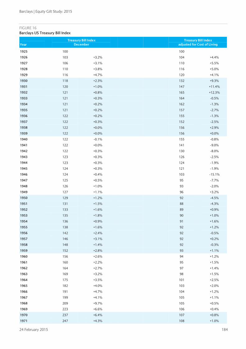
Barclays | Equity Gilt Study: 2015
24 February 2015 184
FIGURE 16 Barclays US Treasury Bill Index
Year
Treasury Bill Index December
Treasury Bill Index adjusted for Cost of Living
1925 100
100
1926 103
+3.2%
104
+4.4%
1927 106
+3.1%
110
+5.5%
1928 110
+3.8%
116
+5.0%
1929 116
+4.7%
120
+4.1%
1930 118
+2.3%
132
+9.3%
1931 120
+1.0%
147
+11.4%
1932 121
+0.8%
165
+12.3%
1933 121
+0.3%
164
-0.5%
1934 121
+0.2%
162
-1.3%
1935 121
+0.2%
157
-2.7%
1936 122
+0.2%
155
-1.3%
1937 122
+0.3%
152
-2.5%
1938 122
+0.0%
156
+2.9%
1939 122
+0.0%
156
+0.0%
1940 122
-0.1%
155
-0.8%
1941 122
+0.0%
141
-9.0%
1942 122
+0.3%
130
-8.0%
1943 123
+0.3%
126
-2.5%
1944 123
+0.3%
124
-1.9%
1945 124
+0.3%
121
-1.9%
1946 124
+0.4%
103
-15.1%
1947 125
+0.5%
95
-7.7%
1948 126
+1.0%
93
-2.0%
1949 127
+1.1%
96
+3.2%
1950 129
+1.2%
92
-4.5%
1951 131
+1.5%
88
-4.3%
1952 133
+1.6%
89
+0.9%
1953 135
+1.8%
90
+1.0%
1954 136
+0.9%
91
+1.6%
1955 138
+1.6%
92
+1.2%
1956 142
+2.4%
92
-0.5%
1957 146
+3.1%
92
+0.2%
1958 148
+1.4%
92
-0.3%
1959 152
+2.8%
93
+1.1%
1960 156
+2.6%
94
+1.2%
1961 160
+2.2%
95
+1.5%
1962 164
+2.7%
97
+1.4%
1963 169
+3.2%
98
+1.5%
1964 175 +3.5% 101 +2.5%
1965 182
+4.0%
103
+2.0%
1966 191
+4.7%
104
+1.2%
1967 199
+4.1%
105
+1.1%
1968 209
+9.7%
105
+0.5%
1969 223
+6.6%
106
+0.4%
1970 237
+6.4%
107
+0.8%
1971 247
+4.3%
108
+1.0%

Barclays | Equity Gilt Study: 2015
24 February 2015 185
Year
Treasury Bill Index December
Treasury Bill Index adjusted for Cost of Living
1972 257
+3.9%
108
+0.5%
1973 275
+7.1%
107
-1.5%
1974 297
+8.1%
103
-3.8%
1975 315
+5.8%
102
-1.0%
1976 331
+5.2%
102
+0.3%
1977 348
+5.2%
100
-1.5%
1978 373
+7.3%
99
-1.6%
1979 413
+10.7%
96
-2.3%
1980 461
+11.5%
96
-0.9%
1981 529
+14.9%
101
+5.4%
1982 586
+10.7%
107
+6.6%
1983 638
+8.8%
113
+4.9%
1984 701
+10.0%
119
+5.8%
1985 755
+7.7%
124
+3.7%
1986 801
+6.1%
130
+4.9%
1987 844
+5.4%
131
+0.9%
1988 897
+6.3%
133
+1.8%
1989 971
+8.2%
138
+3.4%
1990 1046
+7.7%
140
+1.5%
1991 1103
+5.5%
143
+2.4%
1992 1141
+3.4%
144
+0.5%
1993 1174
+2.9%
144
+0.1%
1994 1219
+3.9%
146
+1.2%
1995 1287
+5.5%
150
+2.9%
1996 1353
+5.1%
153
+1.8%
1997 1422
+5.1%
158
+3.3%
1998 1490
+4.8%
163
+3.1%
1999 1558
+4.6%
166
+1.8%
2000 1647
+5.8%
169
+2.3%
2001 1710
+3.8%
173
+2.2%
2002 1738
+1.6%
172
-0.7%
2003 1755
+1.0%
170
-0.8%
2004 1776
+1.2%
167
-2.0%
2005 1829
+3.0%
166
-0.4%
2006 1916
+4.8%
170
+2.2%
2007 2006
+4.7%
171
+0.6%
2008 2036
+1.5%
173
+1.4%
2009 2038
+0.1%
169
-2.6%
2010 2040
+0.1%
167
-1.4%
2011 2041
+0.04%
162
-2.8%
2012 2042
+0.06%
159
-1.7%
2013 2043
+0.03%
157
-1.5%
2014
2043
+0.02%
156
-0.7%

Barclays | Equity Gilt Study: 2015
24 February 2015 186
CHAPTER 11
Total investment returns Our final chapter presents a series of tables showing the performance of equity and fixed-interest investments over any period since December 1899.
The first section reviews the performance of each asset class, taking inflation into account, since December 1960. On each page, we provide two tables illustrating the same information in alternative forms. The first table shows the average annual real rate of return; the second shows the real value of a portfolio at the end of each year, which includes reinvested income. This section provides data on equities and gilts, with dividend income reinvested gross. Finally, we provide figures for Treasury bills and building society shares.
The final pullout section provides the annual real rate of return on UK and US equities and bonds (with reinvestment of income for each year since 1899 for the UK, and since 1925 for the US). There is also a table showing the real capital value of equities for the UK. The sources for all data in this chapter are the Barclays indices, as outlined in Chapter 8.
• Equities – income gross
• Gilts – income gross
• Treasury Bills – income gross
• Building society shares – income gross
• Index-linked gilts
• UK and US real bond returns – income gross
• UK and US real equities returns – income gross
• UK equities – real capital value
Sreekala Kochugovindan
+44 (0)20 7773 2234
sreekala.kochugovindan@
barclays.com
1960-2014
UK: 1899-2014 US: 1925-2014

Barclays | Equity Gilt Study: 2015
24 February 2015 187
Real return on equities - Gross income re-invested Average Annual Real Rate of Return
INVESTMENT FROM END YEAR
INV
ESTM
ENT
TO E
ND
YEA
R
1960 1961 1962 1963 1964 1965 1966 1967 1968 1969 1970 1971 1972 1973 1974 1975 1976 1977 1978 1979 1980 1981 1982 1983 1984 1985 1986 1987 1988 1989 1990 1991 1992 1993 1994 1995 1996 1997 1998 1999 2000 2001 2002 2003 2004 2005 2006 2007 2008 2009 2010 2011 2012 2013
1961 (2.5)
1962 (2.4) (2.2)
1963 3.9 7.3 17.7
1964 0.3 1.3 3.0 (9.8)
1965 1.5 2.6 4.2 (1.9) 6.6
1966 (0.0) 0.5 1.2 (3.8) (0.7) (7.4) The dates along the top are those on which
each portfolio starts. Those down the side are the dates to which the annual rate of return is calculated. Reading the top figure in each column diagonally down the table gives the real rate of return in each year since 1960. The table can be used to see the real rate of return over any period; thus a purchase made at the end of 1960 would have lost 2.5% (allowing for reinvestment of income) in one year but over the first three years (up to the end of 1963) would have given an average annual real return of 3.9%. Each figure on the bottom line of the table shows the real growth up to December 2014 from the year shown below the figure.
1967 3.9 5.0 6.6 3.9 9.0 10.2 31.1
1968 7.8 9.4 11.5 10.3 16.0 19.3 35.4 39.8
1969 4.9 5.9 7.1 5.4 8.8 9.3 15.5 8.5 (15.9)
1970 3.3 3.9 4.7 3.0 5.3 5.0 8.4 1.7 (13.2) (10.5)
1971 5.8 6.6 7.7 6.5 9.0 9.4 13.2 9.1 0.4 9.7 34.4
1972 6.0 6.8 7.7 6.7 8.9 9.2 12.3 8.9 2.3 9.1 20.5 8.1
1973 2.1 2.4 2.9 1.5 2.8 2.4 3.9 (0.1) (6.6) (4.1) (1.9) (16.2) (35.0)
1974 (4.2) (4.4) (4.5) (6.3) (6.0) (7.3) (7.3) (11.8) (18.3) (18.7) (20.7) (33.5) (47.8) (58.1)
1975 0.6 0.8 1.0 (0.2) 0.7 0.1 1.0 (2.3) (7.2) (5.6) (4.6) (12.4) (18.4) (8.6) 99.6
1976 (0.2) (0.0) 0.1 (1.1) (0.4) (1.0) (0.3) (3.3) (7.7) (6.4) (5.7) (12.2) (16.6) (9.4) 33.2 (11.1)
1977 1.5 1.7 2.0 1.0 1.8 1.5 2.3 (0.2) (3.9) (2.3) (1.0) (5.9) (8.5) (0.4) 33.0 8.5 32.5
1978 1.4 1.6 1.9 0.9 1.7 1.4 2.1 (0.2) (3.5) (2.0) (0.9) (5.1) (7.1) (0.3) 23.9 5.7 15.2 0.2
1979 1.1 1.3 1.5 0.5 1.3 0.9 1.6 (0.6) (3.6) (2.3) (1.3) (5.1) (6.8) (1.1) 17.5 2.9 8.1 (2.4) (4.9)
1980 1.8 2.0 2.3 1.4 2.2 1.9 2.6 0.7 (2.0) (0.7) 0.4 (2.8) (4.1) 1.4 17.4 5.6 10.3 3.7 5.5 17.1
1981 1.8 2.0 2.2 1.4 2.1 1.9 2.5 0.7 (1.8) (0.5) 0.5 (2.4) (3.5) 1.4 15.0 4.9 8.4 3.1 4.1 8.9 1.3
1982 2.6 2.9 3.1 2.4 3.2 3.0 3.6 2.0 (0.2) 1.1 2.1 (0.4) (1.2) 3.5 15.8 7.2 10.6 6.6 8.3 13.1 11.1 21.9
1983 3.4 3.7 4.0 3.3 4.1 3.9 4.6 3.2 1.1 2.5 3.5 1.3 0.7 5.2 16.5 9.0 12.2 9.1 11.0 15.3 14.7 22.1 22.3
1984 4.3 4.6 4.9 4.3 5.1 5.0 5.7 4.4 2.5 3.9 5.0 3.0 2.6 6.9 17.4 10.7 13.8 11.3 13.3 17.4 17.4 23.3 24.0 25.8
1985 4.6 4.9 5.3 4.7 5.5 5.4 6.1 4.9 3.1 4.5 5.5 3.7 3.4 7.5 17.1 11.0 13.8 11.6 13.4 16.7 16.7 20.8 20.5 19.6 13.7
1986 5.3 5.6 5.9 5.4 6.2 6.2 6.9 5.8 4.1 5.4 6.5 4.9 4.7 8.6 17.5 12.0 14.6 12.8 14.5 17.6 17.7 21.2 21.0 20.6 18.1 22.7
1987 5.2 5.6 5.9 5.4 6.1 6.1 6.8 5.7 4.2 5.4 6.4 4.9 4.7 8.3 16.5 11.4 13.7 12.0 13.4 15.9 15.7 18.3 17.6 16.5 13.5 13.4 4.8
1988 5.2 5.5 5.8 5.4 6.1 6.0 6.7 5.7 4.2 5.4 6.3 4.9 4.7 8.0 15.6 10.9 12.9 11.3 12.4 14.6 14.2 16.2 15.3 13.9 11.2 10.3 4.6 4.4
1989 5.9 6.2 6.5 6.1 6.8 6.8 7.5 6.5 5.1 6.3 7.3 5.9 5.8 9.1 16.3 11.9 13.9 12.4 13.6 15.6 15.5 17.4 16.7 15.8 13.9 14.0 11.2 14.6 25.8
1990 5.0 5.3 5.5 5.1 5.7 5.7 6.3 5.3 4.0 5.0 5.9 4.6 4.4 7.3 13.8 9.6 11.3 9.8 10.6 12.2 11.7 12.9 11.8 10.4 8.0 6.9 3.3 2.8 2.0 (17.4)
1991 5.3 5.6 5.9 5.5 6.1 6.1 6.7 5.7 4.5 5.5 6.3 5.1 4.9 7.8 13.9 10.0 11.6 10.2 11.0 12.4 12.0 13.2 12.2 11.0 9.1 8.3 5.6 5.9 6.4 (2.2) 15.7
1992 5.7 5.9 6.2 5.9 6.5 6.5 7.0 6.2 5.0 6.0 6.8 5.6 5.5 8.2 14.1 10.4 11.9 10.6 11.4 12.8 12.4 13.5 12.7 11.7 10.0 9.5 7.4 8.0 8.9 3.7 16.2 16.8
1993 6.2 6.5 6.8 6.4 7.1 7.1 7.6 6.8 5.7 6.7 7.5 6.4 6.4 9.0 14.6 11.2 12.6 11.5 12.3 13.6 13.4 14.4 13.8 12.9 11.6 11.3 9.8 10.7 11.9 8.7 19.1 20.9 25.1
1994 5.7 6.0 6.3 5.9 6.5 6.5 7.0 6.2 5.1 6.0 6.8 5.7 5.6 8.1 13.3 10.0 11.3 10.2 10.8 12.0 11.6 12.5 11.7 10.8 9.4 8.9 7.3 7.7 8.2 5.0 11.5 10.1 7.0 (8.6)
1995 6.1 6.4 6.6 6.3 6.9 6.9 7.4 6.7 5.6 6.5 7.3 6.3 6.2 8.6 13.6 10.5 11.7 10.7 11.3 12.4 12.1 12.9 12.3 11.5 10.2 9.9 8.6 9.1 9.7 7.3 13.0 12.3 10.9 4.4 19.2
1996 6.3 6.6 6.8 6.5 7.1 7.1 7.6 6.9 5.9 6.8 7.5 6.5 6.5 8.8 13.6 10.6 11.8 10.8 11.4 12.5 12.2 12.9 12.3 11.6 10.5 10.2 9.0 9.5 10.1 8.1 13.0 12.5 11.4 7.2 16.1 13.1
1997 6.6 6.9 7.2 6.9 7.4 7.4 8.0 7.3 6.3 7.2 7.9 7.0 6.9 9.2 13.8 11.0 12.1 11.2 11.8 12.8 12.6 13.3 12.8 12.1 11.1 10.9 9.9 10.4 11.1 9.4 13.9 13.6 13.0 10.1 17.1 16.1 19.3
1998 6.7 7.0 7.3 7.0 7.5 7.5 8.0 7.4 6.4 7.3 8.0 7.1 7.1 9.2 13.7 10.9 12.1 11.2 11.8 12.7 12.5 13.2 12.6 12.0 11.1 10.9 10.0 10.5 11.1 9.5 13.5 13.2 12.6 10.2 15.5 14.3 14.9 10.6
1999 7.1 7.4 7.6 7.4 7.9 7.9 8.4 7.8 6.9 7.7 8.4 7.6 7.6 9.7 14.0 11.4 12.5 11.6 12.2 13.1 12.9 13.6 13.2 12.6 11.8 11.6 10.8 11.3 12.0 10.7 14.4 14.2 13.8 12.0 16.7 16.1 17.1 16.0 21.7
2000 6.7 6.9 7.2 6.9 7.4 7.4 7.9 7.3 6.4 7.2 7.8 7.0 7.0 9.0 13.0 10.5 11.5 10.7 11.2 12.0 11.8 12.3 11.8 11.2 10.4 10.2 9.3 9.7 10.1 8.8 11.8 11.4 10.7 8.8 12.0 10.7 10.1 7.2 5.5 (8.6)
2001 6.1 6.3 6.6 6.3 6.8 6.8 7.2 6.6 5.7 6.5 7.0 6.2 6.2 8.1 11.9 9.4 10.4 9.5 9.9 10.7 10.4 10.9 10.3 9.7 8.8 8.5 7.6 7.8 8.1 6.7 9.2 8.6 7.7 5.7 7.9 6.2 4.8 1.5 (1.4) (11.2) (13.8)
2002 5.3 5.5 5.7 5.4 5.8 5.8 6.2 5.5 4.7 5.3 5.9 5.1 5.0 6.7 10.3 8.0 8.8 7.9 8.2 8.8 8.5 8.8 8.2 7.5 6.6 6.2 5.2 5.3 5.3 3.9 5.9 5.1 3.9 1.8 3.2 1.1 (0.8) (4.3) (7.8) (15.9) (19.3) (24.5)
2003 5.5 5.7 5.9 5.6 6.1 6.0 6.4 5.8 5.0 5.7 6.2 5.4 5.3 7.0 10.6 8.3 9.1 8.2 8.6 9.2 8.8 9.2 8.6 8.0 7.1 6.8 5.9 6.0 6.1 4.8 6.7 6.0 5.1 3.2 4.6 3.0 1.6 (1.1) (3.3) (8.7) (8.7) (6.1) 16.9
2004 5.6 5.8 6.0 5.7 6.1 6.1 6.5 5.9 5.1 5.8 6.3 5.5 5.4 7.1 10.5 8.3 9.0 8.3 8.6 9.2 8.8 9.2 8.6 8.0 7.2 6.9 6.0 6.1 6.2 5.0 6.9 6.2 5.4 3.7 5.0 3.6 2.5 0.3 (1.4) (5.4) (4.6) (1.4) 12.8 8.8
2005 5.9 6.1 6.3 6.0 6.4 6.4 6.8 6.2 5.4 6.1 6.6 5.9 5.8 7.5 10.8 8.6 9.4 8.6 8.9 9.5 9.2 9.6 9.1 8.5 7.7 7.4 6.7 6.8 6.9 5.9 7.6 7.1 6.4 4.9 6.2 5.0 4.2 2.4 1.3 (1.8) (0.3) 3.4 14.8 13.7 18.9
2006 6.0 6.2 6.4 6.1 6.5 6.5 6.9 6.4 5.6 6.2 6.8 6.1 6.0 7.6 10.8 8.7 9.4 8.7 9.0 9.6 9.3 9.6 9.2 8.6 7.9 7.6 6.9 7.0 7.2 6.2 7.9 7.4 6.7 5.4 6.7 5.6 4.9 3.4 2.5 0.0 1.5 4.9 13.9 13.0 15.1 11.4
2007 5.9 6.1 6.3 6.0 6.4 6.4 6.8 6.2 5.5 6.1 6.6 5.9 5.8 7.4 10.5 8.5 9.2 8.5 8.7 9.3 9.0 9.3 8.8 8.3 7.6 7.3 6.6 6.7 6.9 5.9 7.4 6.9 6.3 5.1 6.2 5.2 4.5 3.1 2.3 0.2 1.5 4.3 11.2 9.9 10.2 6.1 1.0
2008 5.0 5.1 5.3 5.0 5.4 5.4 5.7 5.1 4.4 5.0 5.4 4.7 4.6 6.1 9.0 7.0 7.6 6.9 7.1 7.6 7.3 7.5 7.0 6.4 5.7 5.3 4.6 4.6 4.6 3.6 4.9 4.3 3.5 2.2 3.1 1.9 1.0 (0.5) (1.5) (3.8) (3.2) (1.6) 2.9 0.3 (1.8) (7.8) (16.2) (30.4)
2009 5.3 5.5 5.7 5.4 5.8 5.8 6.1 5.6 4.9 5.4 5.9 5.2 5.1 6.6 9.4 7.5 8.1 7.5 7.7 8.1 7.9 8.1 7.6 7.1 6.4 6.1 5.4 5.5 5.5 4.6 5.9 5.4 4.7 3.6 4.4 3.5 2.8 1.5 0.7 (1.2) (0.3) 1.5 5.9 4.1 3.3 (0.3) (4.0) (6.4) 25.9
2010 5.4 5.6 5.8 5.5 5.9 5.9 6.2 5.7 5.0 5.5 6.0 5.3 5.2 6.6 9.4 7.6 8.2 7.5 7.7 8.2 7.9 8.1 7.7 7.2 6.5 6.2 5.6 5.6 5.7 4.8 6.0 5.6 5.0 3.9 4.7 3.8 3.2 2.0 1.4 (0.3) 0.6 2.3 6.3 4.8 4.2 1.5 (0.9) (1.5) 17.1 8.9
2011 5.1 5.3 5.5 5.2 5.6 5.5 5.8 5.3 4.6 5.2 5.6 5.0 4.9 6.2 8.9 7.1 7.7 7.0 7.2 7.6 7.3 7.5 7.1 6.6 5.9 5.6 5.0 5.0 5.0 4.2 5.3 4.8 4.3 3.2 3.9 3.1 2.4 1.3 0.6 (1.0) (0.2) 1.2 4.6 3.1 2.4 (0.2) (2.3) (3.2) 8.1 0.2 (7.8)
2012 5.2 5.4 5.5 5.3 5.6 5.6 5.9 5.4 4.7 5.3 5.7 5.1 5.0 6.3 8.9 7.1 7.7 7.1 7.3 7.7 7.4 7.6 7.1 6.7 6.0 5.8 5.1 5.2 5.2 4.4 5.5 5.0 4.5 3.5 4.2 3.4 2.8 1.8 1.2 (0.2) 0.5 1.9 5.0 3.8 3.1 1.1 (0.6) (0.9) 8.3 3.0 0.1 8.7
2013 5.4 5.6 5.7 5.5 5.9 5.8 6.1 5.7 5.0 5.5 5.9 5.3 5.3 6.5 9.1 7.4 8.0 7.3 7.6 7.9 7.7 7.9 7.5 7.0 6.4 6.1 5.6 5.6 5.7 4.9 6.0 5.6 5.1 4.1 4.9 4.1 3.6 2.7 2.2 0.9 1.7 3.1 6.1 5.0 4.6 3.0 1.8 2.0 10.0 6.4 5.6 13.0 17.4
2014 5.3 5.5 5.6 5.4 5.7 5.7 6.0 5.5 4.9 5.4 5.8 5.2 5.1 6.4 8.9 7.2 7.7 7.1 7.3 7.7 7.4 7.6 7.2 6.7 6.2 5.9 5.4 5.4 5.4 4.7 5.7 5.3 4.8 3.9 4.6 3.9 3.4 2.5 2.0 0.8 1.5 2.8 5.5 4.5 4.1 2.6 1.5 1.6 8.2 5.0 4.0 8.3 8.1 (0.4)

Barclays | Equity Gilt Study: 2015
24 February 2015 188
Real Value of £100 Invested INVESTMENT FROM END YEAR
INV
ESTM
ENT
TO E
ND
YEA
R
1960 1961 1962 1963 1964 1965 1966 1967 1968 1969 1970 1971 1972 1973 1974 1975 1976 1977 1978 1979 1980 1981 1982 1983 1984 1985 1986 1987 1988 1989 1990 1991 1992 1993 1994 1995 1996 1997 1998 1999 2000 2001 2002 2003 2004 2005 2006 2007 2008 2009 2010 2011 2012 2013
1961 97
1962 95 98
1963 112 115 118
1964 101 104 106 90
1965 108 111 113 96 107
1966 100 102 105 89 99 93
The dates along the top are those on which each portfolio starts. Those down the side are the dates to which the change in real value is calculated. Reading the top figure in each column diagonally down the table gives the growth in each year since 1960. The table can be used to see the real growth over any period; thus an investment of £100 made at the end of 1960 would have fallen to £97 (allowing for reinvestment of income and the effect of inflation) in one year but after three years (up to the end of 1963) would have reached £112 in real terms. Each figure on the bottom line of the table shows the real growth up to December 2014 from the year shown below the figure.
1967 131 134 137 117 129 121 131
1968 183 188 192 163 181 170 183 140
1969 154 158 162 137 152 143 154 118 84
1970 138 141 145 123 136 128 138 105 75 89
1971 185 190 194 165 183 172 185 141 101 120 134
1972 200 205 210 179 198 186 201 153 109 130 145 108
1973 130 134 137 116 129 121 130 99 71 85 94 70 65
1974 55 56 57 49 54 51 55 42 30 35 40 29 27 42
1975 109 112 114 97 108 101 109 83 59 71 79 59 54 84 200
1976 97 99 102 86 96 90 97 74 53 63 70 52 48 74 177 89
1977 128 132 135 114 127 119 128 98 70 83 93 69 64 98 235 118 133
1978 128 132 135 115 127 119 129 98 70 83 93 69 64 99 236 118 133 100
1979 122 125 128 109 121 113 122 93 67 79 89 66 61 94 224 112 126 95 95
1980 143 147 150 128 141 133 143 109 78 93 104 77 71 110 262 132 148 112 111 117
1981 145 149 152 129 143 134 145 111 79 94 105 78 72 111 266 133 150 113 113 119 101
1982 177 181 186 158 175 164 177 135 97 115 128 95 88 136 324 162 183 138 138 145 124 122
1983 216 222 227 193 214 200 217 165 118 140 157 117 108 166 396 199 223 169 168 177 151 149 122
1984 272 279 286 243 269 252 272 208 149 177 197 147 136 209 499 250 281 212 212 223 190 188 154 126
1985 309 317 325 276 306 287 310 236 169 201 224 167 154 238 567 284 320 241 241 253 216 213 175 143 114
1986 380 390 398 339 375 352 380 290 207 246 275 205 190 292 696 349 392 296 295 311 265 262 215 176 140 123
1987 398 408 417 355 393 369 398 304 217 258 289 215 199 305 729 365 411 310 310 325 278 274 225 184 146 129 105
1988 415 426 436 370 411 385 416 317 227 270 301 224 207 319 762 382 429 324 323 340 290 286 235 192 153 134 109 104
1989 523 536 549 466 517 485 523 399 286 339 379 282 261 401 958 480 540 408 407 428 365 360 296 242 192 169 138 131 126
1990 432 443 453 385 427 400 433 330 236 280 313 233 216 332 792 397 446 337 336 353 302 298 244 200 159 140 114 109 104 83
1991 500 513 524 446 494 463 500 382 273 324 363 270 250 384 916 459 516 390 389 409 349 344 283 231 184 162 132 126 120 96 116
1992 584 599 613 521 577 541 584 446 319 379 423 315 291 448 1070 536 603 455 454 478 408 402 330 270 215 189 154 147 141 112 135 117
1993 730 749 766 651 722 677 731 558 399 474 530 394 365 561 1339 671 755 569 568 597 510 503 413 338 268 236 192 184 176 140 169 146 125
1994 668 685 701 596 660 619 669 510 365 434 485 361 333 513 1224 613 690 521 520 546 467 460 378 309 245 216 176 168 161 128 155 134 114 91
1995 796 817 835 710 787 738 797 608 435 517 577 430 397 611 1459 731 822 621 619 651 556 549 450 368 292 257 210 200 192 152 184 159 136 109 119
1996 900 923 944 803 889 834 901 687 492 584 653 486 449 691 1650 827 930 702 700 736 629 620 509 416 331 291 237 226 217 172 208 180 154 123 135 113
1997 1073 1101 1126 957 1061 995 1075 820 586 697 779 579 536 824 1968 986 1109 837 835 878 750 740 607 496 394 347 283 270 258 205 248 215 184 147 161 135 119
1998 1187 1218 1246 1059 1174 1101 1189 907 649 771 862 641 593 912 2177 1091 1227 926 924 972 830 819 672 549 436 384 313 299 286 227 275 238 203 163 178 149 132 111
1999 1445 1482 1516 1289 1428 1340 1447 1104 789 938 1048 780 722 1110 2649 1327 1493 1127 1124 1182 1009 996 817 668 531 467 381 363 348 276 334 289 248 198 216 182 161 135 122
2000 1321 1355 1386 1178 1305 1224 1323 1009 722 858 958 713 660 1014 2422 1213 1365 1030 1028 1081 923 910 747 611 485 427 348 332 318 253 306 264 226 181 198 166 147 123 111 91
2001 1138 1168 1195 1016 1125 1056 1140 870 622 739 826 615 569 874 2088 1046 1177 888 886 932 795 785 644 527 418 368 300 286 274 218 264 228 195 156 171 143 127 106 96 79 86
2002 859 882 902 766 849 797 861 656 470 558 624 464 429 660 1576 790 888 670 669 703 600 592 486 397 316 278 226 216 207 164 199 172 147 118 129 108 95 80 72 59 65 75
2003 1005 1031 1054 896 993 931 1006 767 549 652 729 542 502 771 1842 923 1038 783 782 822 702 693 568 465 369 325 265 253 242 192 233 201 172 138 150 126 112 94 85 70 76 88 117
2004 1092 1121 1147 974 1080 1013 1094 835 597 709 793 590 546 839 2003 1004 1129 852 850 894 763 753 618 505 402 353 288 275 263 209 253 219 187 150 164 137 121 102 92 76 83 96 127 109
2005 1299 1333 1364 1159 1284 1205 1301 993 710 844 943 702 649 998 2383 1194 1343 1013 1011 1063 908 896 735 601 478 420 342 327 313 249 301 260 223 178 195 163 144 121 109 90 98 114 151 129 119
2006 1448 1486 1520 1292 1432 1343 1450 1106 791 940 1051 782 723 1112 2656 1331 1497 1129 1127 1185 1012 998 819 670 532 468 382 364 349 277 335 290 248 198 217 182 161 135 122 100 110 127 169 144 133 111
2007 1463 1501 1536 1305 1446 1356 1465 1118 799 950 1062 790 731 1124 2683 1344 1512 1141 1139 1197 1022 1009 827 677 538 473 385 368 352 280 339 293 251 200 219 184 163 136 123 101 111 129 170 146 134 113 101
2008 1018 1045 1068 908 1006 944 1019 778 556 661 739 550 508 782 1867 935 1052 794 792 833 711 702 576 471 374 329 268 256 245 195 236 204 174 139 152 128 113 95 86 70 77 89 118 101 93 78 70 70
2009 1282 1316 1346 1144 1267 1189 1284 979 700 832 930 692 640 985 2351 1178 1325 1000 998 1049 896 884 725 593 471 414 338 322 309 245 297 257 220 176 192 161 142 119 108 89 97 113 149 128 117 99 89 88 126
2010 1397 1433 1466 1246 1381 1295 1399 1067 763 907 1014 754 698 1073 2561 1283 1444 1089 1087 1143 976 963 790 646 513 452 368 351 336 267 323 280 239 191 209 176 155 130 118 97 106 123 163 139 128 107 96 95 137 109
2011 1287 1321 1351 1148 1272 1193 1289 983 703 836 934 695 643 989 2360 1183 1330 1004 1002 1053 899 887 728 595 473 416 339 324 310 246 298 258 221 176 193 162 143 120 108 89 97 113 150 128 118 99 89 88 126 100 92
2012 1400 1436 1469 1249 1384 1298 1402 1069 765 909 1016 756 699 1075 2567 1286 1447 1091 1089 1145 978 965 792 647 514 453 369 352 337 268 324 280 240 192 210 176 156 130 118 97 106 123 163 139 128 108 97 96 138 109 100 109
2013 1643 1686 1724 1465 1624 1523 1645 1255 898 1067 1192 887 821 1262 3013 1510 1698 1281 1279 1344 1148 1133 929 760 604 531 433 413 396 314 380 329 282 225 246 206 183 153 138 114 124 144 191 164 150 126 113 112 161 128 118 128 117
2014 1636 1678 1717 1459 1617 1517 1638 1250 894 1062 1187 883 817 1256 2999 1503 1690 1275 1273 1338 1143 1128 925 757 601 529 431 411 394 313 379 327 280 224 245 206 182 152 138 113 124 144 190 163 150 126 113 112 161 128 117 127 117 100

Barclays | Equity Gilt Study: 2015
24 February 2015 189
Real return on gilts - Gross income re-invested Average Annual Real Rate of Return
INVESTMENT FROM END YEAR
INV
ESTM
ENT
TO E
ND
YEA
R
1960 1961 1962 1963 1964 1965 1966 1967 1968 1969 1970 1971 1972 1973 1974 1975 1976 1977 1978 1979 1980 1981 1982 1983 1984 1985 1986 1987 1988 1989 1990 1991 1992 1993 1994 1995 1996 1997 1998 1999 2000 2001 2002 2003 2004 2005 2006 2007 2008 2009 2010 2011 2012 2013
1961 (11.9)
1962 3.5 21.5
1963 2.9 11.2 1.8
1964 0.4 4.9 (2.6) (6.7)
1965 0.3 3.6 (1.8) (3.5) (0.1)
1966 0.3 3.0 (1.2) (2.2) 0.2 0.5 The dates along the top are those on which
each portfolio starts. Those down the side are the dates to which the annual rate of return is calculated. Reading the top figure in each column diagonally down the table gives the real rate of return in each year since 1960. The table can be used to see the real rate of return over any period; thus a purchase made at the end of 1960 would have lost 11.9% (allowing for reinvestment of income) in one year but over the first three years (up to the end of 1963) would have given an average annual real return of 2.9%. Each figure on the bottom line of the table shows the real growth up to December 2014 from the year shown below the figure.
1967 0.3 2.5 (0.9) (1.6) 0.2 0.3 0.1
1968 (0.8) 0.9 (2.1) (2.9) (1.9) (2.5) (4.0) (7.8)
1969 (1.1) 0.3 (2.4) (3.1) (2.4) (2.9) (4.0) (6.1) (4.2)
1970 (1.4) (0.2) (2.6) (3.2) (2.6) (3.1) (4.0) (5.4) (4.1) (4.0)
1971 0.1 1.4 (0.6) (0.9) (0.1) (0.1) (0.2) (0.3) 2.4 5.9 16.8
1972 (0.9) 0.2 (1.7) (2.1) (1.5) (1.7) (2.0) (2.4) (1.0) 0.0 2.1 (10.7)
1973 (2.3) (1.4) (3.3) (3.7) (3.4) (3.8) (4.4) (5.1) (4.6) (4.7) (4.9) (14.2) (17.6)
1974 (4.4) (3.8) (5.7) (6.4) (6.3) (7.0) (7.9) (9.0) (9.1) (10.1) (11.6) (19.4) (23.4) (28.8)
1975 (3.6) (2.9) (4.6) (5.1) (5.0) (5.4) (6.1) (6.8) (6.7) (7.1) (7.7) (13.0) (13.7) (11.7) 9.5
1976 (3.4) (2.8) (4.4) (4.8) (4.7) (5.1) (5.6) (6.2) (6.0) (6.3) (6.6) (10.7) (10.7) (8.3) 4.1 (1.1)
1977 (1.8) (1.1) (2.4) (2.7) (2.4) (2.6) (2.9) (3.2) (2.6) (2.4) (2.2) (5.1) (3.9) (0.1) 11.8 13.0 29.1
1978 (2.2) (1.6) (2.9) (3.2) (2.9) (3.1) (3.4) (3.8) (3.3) (3.2) (3.1) (5.7) (4.8) (2.1) 6.1 5.0 8.1 (9.4)
1979 (2.7) (2.2) (3.4) (3.7) (3.5) (3.7) (4.1) (4.4) (4.1) (4.1) (4.1) (6.4) (5.8) (3.6) 2.4 0.7 1.3 (10.3) (11.2)
1980 (2.3) (1.8) (2.9) (3.2) (3.0) (3.2) (3.4) (3.7) (3.4) (3.3) (3.2) (5.2) (4.5) (2.5) 2.8 1.5 2.2 (5.5) (3.4) 5.0
1981 (2.7) (2.2) (3.3) (3.6) (3.4) (3.6) (3.8) (4.1) (3.8) (3.8) (3.8) (5.6) (5.0) (3.3) 1.0 (0.4) (0.2) (6.4) (5.4) (2.3) (9.2)
1982 (0.9) (0.4) (1.4) (1.5) (1.2) (1.3) (1.4) (1.5) (1.0) (0.8) (0.5) (1.9) (1.0) 1.0 5.5 5.0 6.0 1.9 5.0 11.1 14.2 43.6
1983 (0.5) 0.1 (0.8) (1.0) (0.7) (0.7) (0.8) (0.8) (0.3) (0.0) 0.3 (1.0) (0.1) 1.9 6.0 5.6 6.6 3.2 6.0 10.8 12.8 25.7 10.0
1984 (0.4) 0.2 (0.7) (0.8) (0.5) (0.5) (0.6) (0.6) (0.2) 0.1 0.4 (0.8) 0.1 1.9 5.6 5.2 6.0 3.1 5.3 9.0 10.0 17.3 6.0 2.1
1985 (0.2) 0.4 (0.5) (0.6) (0.3) (0.3) (0.3) (0.3) 0.1 0.4 0.7 (0.4) 0.5 2.2 5.6 5.2 5.9 3.3 5.3 8.3 9.0 14.1 5.7 3.6 5.0
1986 0.1 0.6 (0.2) (0.3) 0.1 0.1 0.0 0.0 0.5 0.8 1.1 0.1 0.9 2.5 5.7 5.3 6.0 3.7 5.5 8.1 8.7 12.6 6.0 4.7 6.0 7.0
1987 0.5 1.0 0.3 0.2 0.6 0.6 0.6 0.6 1.1 1.4 1.7 0.8 1.6 3.2 6.2 5.9 6.6 4.5 6.2 8.6 9.1 12.5 7.2 6.5 8.0 9.5 12.1
1988 0.6 1.1 0.4 0.3 0.6 0.7 0.7 0.7 1.1 1.4 1.7 0.9 1.7 3.1 5.9 5.6 6.2 4.3 5.8 7.9 8.3 11.0 6.4 5.7 6.6 7.1 7.2 2.4
1989 0.5 1.0 0.3 0.2 0.5 0.6 0.6 0.6 1.0 1.3 1.6 0.8 1.5 2.8 5.4 5.1 5.6 3.8 5.1 6.9 7.1 9.4 5.2 4.4 4.9 4.8 4.2 0.4 (1.7)
1990 0.4 0.8 0.2 0.1 0.4 0.4 0.4 0.4 0.8 1.0 1.3 0.6 1.2 2.5 4.8 4.5 4.9 3.3 4.4 5.9 6.0 7.9 4.1 3.3 3.4 3.1 2.2 (0.9) (2.5) (3.4)
1991 0.8 1.2 0.6 0.6 0.8 0.9 0.9 0.9 1.3 1.6 1.9 1.2 1.8 3.1 5.3 5.1 5.5 4.0 5.1 6.6 6.7 8.4 5.1 4.5 4.9 4.8 4.4 2.6 2.6 4.8 13.8
1992 1.2 1.7 1.1 1.0 1.3 1.4 1.4 1.5 1.9 2.2 2.5 1.8 2.5 3.7 5.9 5.6 6.1 4.7 5.8 7.2 7.4 9.1 6.1 5.7 6.1 6.3 6.2 5.0 5.7 8.3 14.6 15.4
1993 1.9 2.4 1.8 1.8 2.1 2.2 2.3 2.3 2.8 3.1 3.4 2.8 3.5 4.7 6.8 6.7 7.2 5.9 7.1 8.5 8.8 10.4 7.8 7.6 8.2 8.6 8.9 8.3 9.5 12.5 18.4 20.8 26.4
1994 1.4 1.8 1.3 1.3 1.5 1.6 1.6 1.7 2.1 2.3 2.6 2.0 2.7 3.7 5.7 5.5 5.9 4.7 5.6 6.8 7.0 8.3 5.8 5.4 5.8 5.9 5.7 4.8 5.2 6.7 9.4 7.9 4.4 (13.8)
1995 1.8 2.2 1.7 1.7 2.0 2.0 2.1 2.1 2.5 2.8 3.1 2.6 3.2 4.2 6.1 6.0 6.4 5.2 6.2 7.4 7.5 8.8 6.5 6.2 6.6 6.8 6.7 6.1 6.6 8.1 10.5 9.7 7.9 (0.3) 15.3
1996 1.9 2.3 1.8 1.8 2.1 2.1 2.2 2.2 2.6 2.9 3.2 2.7 3.3 4.3 6.1 5.9 6.3 5.2 6.1 7.2 7.4 8.6 6.4 6.1 6.5 6.6 6.6 6.0 6.4 7.6 9.6 8.8 7.2 1.5 10.1 5.1
1997 2.2 2.6 2.1 2.1 2.4 2.5 2.6 2.7 3.0 3.3 3.6 3.1 3.7 4.7 6.5 6.3 6.7 5.7 6.6 7.7 7.8 9.0 7.0 6.8 7.1 7.3 7.3 6.9 7.4 8.6 10.4 9.8 8.8 4.7 11.8 10.1 15.3
1998 2.7 3.1 2.6 2.7 2.9 3.0 3.1 3.2 3.6 3.9 4.2 3.7 4.3 5.3 7.1 7.0 7.4 6.4 7.3 8.3 8.5 9.7 7.8 7.7 8.1 8.4 8.5 8.1 8.7 10.0 11.7 11.5 10.8 7.9 14.2 13.8 18.4 21.7
1999 2.5 2.9 2.4 2.4 2.7 2.8 2.9 2.9 3.3 3.6 3.8 3.4 4.0 4.9 6.6 6.4 6.8 5.9 6.6 7.6 7.8 8.8 7.0 6.8 7.2 7.3 7.4 7.0 7.4 8.3 9.7 9.2 8.4 5.6 10.0 8.7 9.9 7.4 (5.2)
2000 2.6 3.0 2.5 2.5 2.8 2.9 3.0 3.0 3.4 3.7 3.9 3.5 4.1 5.0 6.5 6.4 6.7 5.9 6.6 7.6 7.7 8.6 7.0 6.8 7.1 7.2 7.3 6.9 7.3 8.1 9.4 8.9 8.1 5.7 9.3 8.2 9.0 7.0 0.3 6.1
2001 2.5 2.9 2.5 2.5 2.7 2.8 2.9 3.0 3.3 3.6 3.8 3.4 3.9 4.8 6.3 6.2 6.5 5.6 6.4 7.2 7.3 8.2 6.6 6.5 6.7 6.8 6.8 6.4 6.8 7.5 8.5 8.0 7.2 5.0 8.1 6.9 7.3 5.3 0.4 3.3 0.6
2002 2.6 3.0 2.6 2.6 2.8 2.9 3.0 3.1 3.4 3.7 3.9 3.5 4.0 4.9 6.3 6.2 6.5 5.7 6.4 7.2 7.3 8.2 6.6 6.5 6.7 6.8 6.8 6.5 6.7 7.4 8.4 7.9 7.2 5.2 7.9 6.9 7.2 5.6 1.9 4.4 3.6 6.7
2003 2.5 2.9 2.5 2.5 2.7 2.8 2.9 3.0 3.3 3.5 3.7 3.4 3.8 4.7 6.1 5.9 6.2 5.4 6.1 6.8 6.9 7.7 6.3 6.1 6.3 6.3 6.3 6.0 6.2 6.8 7.6 7.1 6.4 4.6 6.8 5.8 5.9 4.4 1.3 3.0 2.0 2.7 (1.2)
2004 2.5 2.9 2.5 2.5 2.8 2.8 2.9 3.0 3.3 3.5 3.7 3.4 3.8 4.6 6.0 5.9 6.1 5.3 6.0 6.7 6.8 7.5 6.1 5.9 6.1 6.2 6.2 5.8 6.0 6.6 7.3 6.8 6.1 4.5 6.5 5.6 5.6 4.3 1.7 3.1 2.4 3.0 1.2 3.6
2005 2.6 3.0 2.6 2.6 2.8 2.9 3.0 3.0 3.4 3.6 3.8 3.4 3.9 4.7 6.0 5.9 6.1 5.4 6.0 6.7 6.7 7.5 6.1 6.0 6.1 6.2 6.2 5.8 6.0 6.5 7.2 6.8 6.1 4.6 6.5 5.6 5.7 4.5 2.3 3.6 3.1 3.7 2.8 4.8 6.0
2006 2.5 2.8 2.4 2.4 2.7 2.7 2.8 2.9 3.1 3.4 3.6 3.2 3.7 4.4 5.6 5.5 5.7 5.0 5.6 6.3 6.3 7.0 5.7 5.5 5.6 5.7 5.6 5.3 5.4 5.9 6.5 6.0 5.4 3.9 5.5 4.7 4.6 3.5 1.4 2.4 1.8 2.1 0.9 1.7 0.7 (4.4)
2007 2.4 2.8 2.4 2.4 2.6 2.7 2.7 2.8 3.1 3.3 3.5 3.2 3.6 4.3 5.5 5.4 5.6 4.9 5.4 6.1 6.1 6.7 5.5 5.3 5.4 5.5 5.4 5.1 5.2 5.6 6.1 5.7 5.1 3.7 5.2 4.4 4.3 3.3 1.4 2.3 1.7 1.9 1.0 1.5 0.9 (1.7) 1.2
2008 2.6 3.0 2.6 2.6 2.8 2.9 2.9 3.0 3.3 3.5 3.7 3.4 3.8 4.5 5.7 5.6 5.8 5.1 5.6 6.3 6.3 6.9 5.7 5.5 5.7 5.7 5.7 5.4 5.5 5.9 6.5 6.0 5.5 4.2 5.6 4.9 4.9 4.0 2.4 3.3 2.9 3.3 2.7 3.5 3.5 2.6 6.4 11.8
2009 2.5 2.8 2.5 2.5 2.7 2.7 2.8 2.9 3.1 3.3 3.5 3.2 3.6 4.3 5.4 5.3 5.5 4.8 5.3 5.9 6.0 6.5 5.4 5.2 5.3 5.3 5.3 5.0 5.1 5.4 5.9 5.5 4.9 3.7 5.0 4.3 4.3 3.4 1.9 2.6 2.2 2.4 1.8 2.3 2.1 1.1 3.0 4.0 (3.3)
2010 2.5 2.9 2.5 2.5 2.7 2.8 2.8 2.9 3.2 3.4 3.6 3.2 3.6 4.3 5.4 5.3 5.5 4.8 5.3 5.9 5.9 6.5 5.3 5.2 5.3 5.3 5.2 4.9 5.1 5.4 5.8 5.4 4.9 3.8 5.0 4.3 4.3 3.5 2.1 2.8 2.4 2.6 2.2 2.6 2.5 1.8 3.4 4.1 0.5 4.4
2011 2.8 3.1 2.8 2.8 3.0 3.1 3.1 3.2 3.4 3.6 3.8 3.5 3.9 4.6 5.7 5.5 5.7 5.1 5.6 6.2 6.2 6.8 5.7 5.5 5.7 5.7 5.6 5.4 5.5 5.8 6.3 5.9 5.5 4.4 5.6 5.0 5.0 4.3 3.1 3.8 3.6 3.9 3.6 4.2 4.3 4.0 5.8 6.9 5.4 10.0 15.8
2012 2.8 3.1 2.7 2.7 3.0 3.0 3.1 3.1 3.4 3.6 3.8 3.5 3.9 4.5 5.5 5.4 5.6 5.0 5.5 6.0 6.1 6.6 5.5 5.4 5.5 5.5 5.5 5.2 5.3 5.6 6.1 5.7 5.3 4.3 5.4 4.8 4.8 4.1 3.0 3.6 3.4 3.7 3.4 3.9 4.0 3.7 5.1 5.9 4.4 7.1 8.5 1.6
2013 2.5 2.8 2.5 2.5 2.7 2.7 2.8 2.8 3.1 3.3 3.4 3.1 3.5 4.1 5.1 5.0 5.2 4.6 5.0 5.5 5.6 6.0 5.0 4.9 4.9 4.9 4.9 4.6 4.7 5.0 5.3 5.0 4.5 3.5 4.5 3.9 3.9 3.2 2.1 2.6 2.4 2.5 2.1 2.5 2.4 1.9 2.8 3.1 1.5 2.7 2.1 (4.2) (9.6)
2014 2.7 3.0 2.7 2.7 2.9 3.0 3.1 3.1 3.4 3.5 3.7 3.4 3.8 4.4 5.4 5.3 5.5 4.9 5.3 5.8 5.9 6.3 5.4 5.2 5.3 5.3 5.3 5.0 5.1 5.4 5.8 5.4 5.0 4.1 5.1 4.6 4.5 3.9 2.9 3.5 3.3 3.5 3.3 3.7 3.7 3.4 4.4 4.9 3.8 5.3 5.5 2.3 2.6 16.4
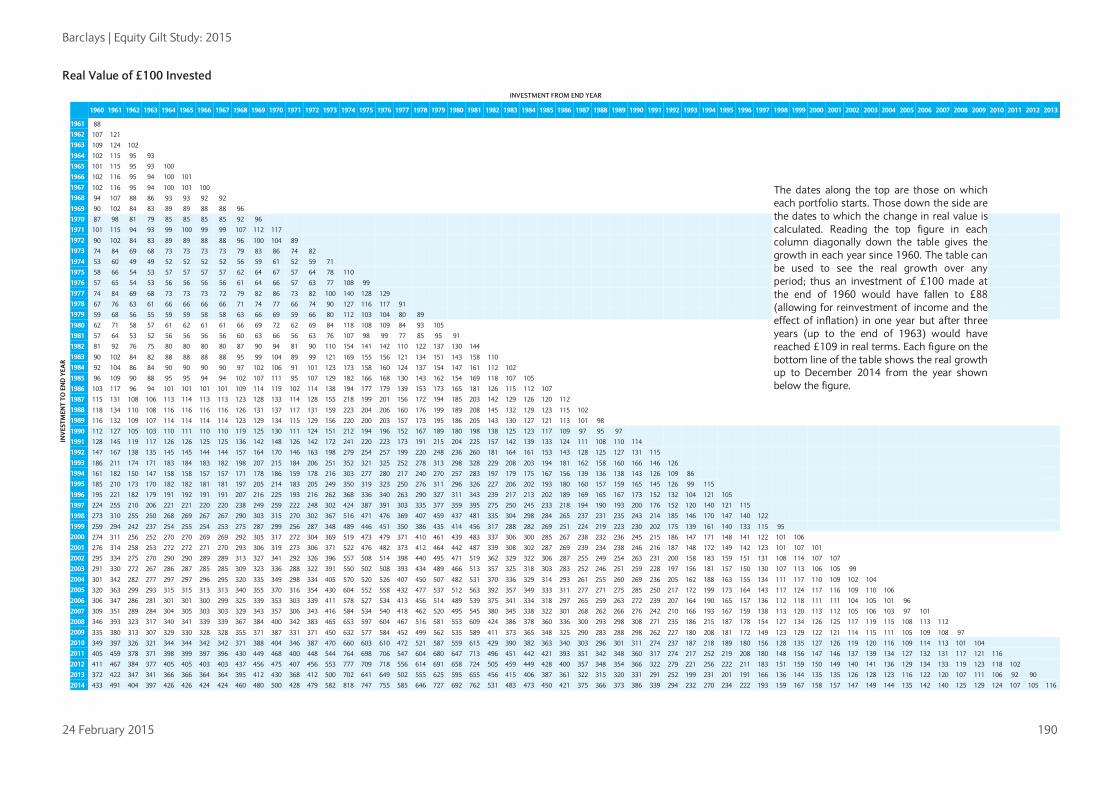
Barclays | Equity Gilt Study: 2015
24 February 2015 190
Real Value of £100 Invested INVESTMENT FROM END YEAR
INV
ESTM
ENT
TO E
ND
YEA
R
1960 1961 1962 1963 1964 1965 1966 1967 1968 1969 1970 1971 1972 1973 1974 1975 1976 1977 1978 1979 1980 1981 1982 1983 1984 1985 1986 1987 1988 1989 1990 1991 1992 1993 1994 1995 1996 1997 1998 1999 2000 2001 2002 2003 2004 2005 2006 2007 2008 2009 2010 2011 2012 2013
1961 88
1962 107 121
1963 109 124 102
1964 102 115 95 93
1965 101 115 95 93 100
1966 102 116 95 94 100 101 The dates along the top are those on which
each portfolio starts. Those down the side are the dates to which the change in real value is calculated. Reading the top figure in each column diagonally down the table gives the growth in each year since 1960. The table can be used to see the real growth over any period; thus an investment of £100 made at the end of 1960 would have fallen to £88 (allowing for reinvestment of income and the effect of inflation) in one year but after three years (up to the end of 1963) would have reached £109 in real terms. Each figure on the bottom line of the table shows the real growth up to December 2014 from the year shown below the figure.
1967 102 116 95 94 100 101 100
1968 94 107 88 86 93 93 92 92
1969 90 102 84 83 89 89 88 88 96
1970 87 98 81 79 85 85 85 85 92 96
1971 101 115 94 93 99 100 99 99 107 112 117
1972 90 102 84 83 89 89 88 88 96 100 104 89
1973 74 84 69 68 73 73 73 73 79 83 86 74 82
1974 53 60 49 49 52 52 52 52 56 59 61 52 59 71
1975 58 66 54 53 57 57 57 57 62 64 67 57 64 78 110
1976 57 65 54 53 56 56 56 56 61 64 66 57 63 77 108 99
1977 74 84 69 68 73 73 73 72 79 82 86 73 82 100 140 128 129
1978 67 76 63 61 66 66 66 66 71 74 77 66 74 90 127 116 117 91
1979 59 68 56 55 59 59 58 58 63 66 69 59 66 80 112 103 104 80 89
1980 62 71 58 57 61 62 61 61 66 69 72 62 69 84 118 108 109 84 93 105
1981 57 64 53 52 56 56 56 56 60 63 66 56 63 76 107 98 99 77 85 95 91
1982 81 92 76 75 80 80 80 80 87 90 94 81 90 110 154 141 142 110 122 137 130 144
1983 90 102 84 82 88 88 88 88 95 99 104 89 99 121 169 155 156 121 134 151 143 158 110
1984 92 104 86 84 90 90 90 90 97 102 106 91 101 123 173 158 160 124 137 154 147 161 112 102
1985 96 109 90 88 95 95 94 94 102 107 111 95 107 129 182 166 168 130 143 162 154 169 118 107 105
1986 103 117 96 94 101 101 101 101 109 114 119 102 114 138 194 177 179 139 153 173 165 181 126 115 112 107
1987 115 131 108 106 113 114 113 113 123 128 133 114 128 155 218 199 201 156 172 194 185 203 142 129 126 120 112
1988 118 134 110 108 116 116 116 116 126 131 137 117 131 159 223 204 206 160 176 199 189 208 145 132 129 123 115 102
1989 116 132 109 107 114 114 114 114 123 129 134 115 129 156 220 200 203 157 173 195 186 205 143 130 127 121 113 101 98
1990 112 127 105 103 110 111 110 110 119 125 130 111 124 151 212 194 196 152 167 189 180 198 138 125 123 117 109 97 95 97
1991 128 145 119 117 126 126 125 125 136 142 148 126 142 172 241 220 223 173 191 215 204 225 157 142 139 133 124 111 108 110 114
1992 147 167 138 135 145 145 144 144 157 164 170 146 163 198 279 254 257 199 220 248 236 260 181 164 161 153 143 128 125 127 131 115
1993 186 211 174 171 183 184 183 182 198 207 215 184 206 251 352 321 325 252 278 313 298 328 229 208 203 194 181 162 158 160 166 146 126
1994 161 182 150 147 158 158 157 157 171 178 186 159 178 216 303 277 280 217 240 270 257 283 197 179 175 167 156 139 136 138 143 126 109 86
1995 185 210 173 170 182 182 181 181 197 205 214 183 205 249 350 319 323 250 276 311 296 326 227 206 202 193 180 160 157 159 165 145 126 99 115
1996 195 221 182 179 191 192 191 191 207 216 225 193 216 262 368 336 340 263 290 327 311 343 239 217 213 202 189 169 165 167 173 152 132 104 121 105
1997 224 255 210 206 221 221 220 220 238 249 259 222 248 302 424 387 391 303 335 377 359 395 275 250 245 233 218 194 190 193 200 176 152 120 140 121 115
1998 273 310 255 250 268 269 267 267 290 303 315 270 302 367 516 471 476 369 407 459 437 481 335 304 298 284 265 237 231 235 243 214 185 146 170 147 140 122
1999 259 294 242 237 254 255 254 253 275 287 299 256 287 348 489 446 451 350 386 435 414 456 317 288 282 269 251 224 219 223 230 202 175 139 161 140 133 115 95
2000 274 311 256 252 270 270 269 269 292 305 317 272 304 369 519 473 479 371 410 461 439 483 337 306 300 285 267 238 232 236 245 215 186 147 171 148 141 122 101 106
2001 276 314 258 253 272 272 271 270 293 306 319 273 306 371 522 476 482 373 412 464 442 487 339 308 302 287 269 239 234 238 246 216 187 148 172 149 142 123 101 107 101
2002 295 334 275 270 290 290 289 289 313 327 341 292 326 396 557 508 514 398 440 495 471 519 362 329 322 306 287 255 249 254 263 231 200 158 183 159 151 131 108 114 107 107
2003 291 330 272 267 286 287 285 285 309 323 336 288 322 391 550 502 508 393 434 489 466 513 357 325 318 303 283 252 246 251 259 228 197 156 181 157 150 130 107 113 106 105 99
2004 301 342 282 277 297 297 296 295 320 335 349 298 334 405 570 520 526 407 450 507 482 531 370 336 329 314 293 261 255 260 269 236 205 162 188 163 155 134 111 117 110 109 102 104
2005 320 363 299 293 315 315 313 313 340 355 370 316 354 430 604 552 558 432 477 537 512 563 392 357 349 333 311 277 271 275 285 250 217 172 199 173 164 143 117 124 117 116 109 110 106
2006 306 347 286 281 301 301 300 299 325 339 353 303 339 411 578 527 534 413 456 514 489 539 375 341 334 318 297 265 259 263 272 239 207 164 190 165 157 136 112 118 111 111 104 105 101 96
2007 309 351 289 284 304 305 303 303 329 343 357 306 343 416 584 534 540 418 462 520 495 545 380 345 338 322 301 268 262 266 276 242 210 166 193 167 159 138 113 120 113 112 105 106 103 97 101
2008 346 393 323 317 340 341 339 339 367 384 400 342 383 465 653 597 604 467 516 581 553 609 424 386 378 360 336 300 293 298 308 271 235 186 215 187 178 154 127 134 126 125 117 119 115 108 113 112
2009 335 380 313 307 329 330 328 328 355 371 387 331 371 450 632 577 584 452 499 562 535 589 411 373 365 348 325 290 283 288 298 262 227 180 208 181 172 149 123 129 122 121 114 115 111 105 109 108 97
2010 349 397 326 321 344 344 342 342 371 388 404 346 387 470 660 603 610 472 521 587 559 615 429 390 382 363 340 303 296 301 311 274 237 187 218 189 180 156 128 135 127 126 119 120 116 109 114 113 101 104
2011 405 459 378 371 398 399 397 396 430 449 468 400 448 544 764 698 706 547 604 680 647 713 496 451 442 421 393 351 342 348 360 317 274 217 252 219 208 180 148 156 147 146 137 139 134 127 132 131 117 121 116
2012 411 467 384 377 405 405 403 403 437 456 475 407 456 553 777 709 718 556 614 691 658 724 505 459 449 428 400 357 348 354 366 322 279 221 256 222 211 183 151 159 150 149 140 141 136 129 134 133 119 123 118 102
2013 372 422 347 341 366 366 364 364 395 412 430 368 412 500 702 641 649 502 555 625 595 655 456 415 406 387 361 322 315 320 331 291 252 199 231 201 191 166 136 144 135 135 126 128 123 116 122 120 107 111 106 92 90
2014 433 491 404 397 426 426 424 424 460 480 500 428 479 582 818 747 755 585 646 727 692 762 531 483 473 450 421 375 366 373 386 339 294 232 270 234 222 193 159 167 158 157 147 149 144 135 142 140 125 129 124 107 105 116
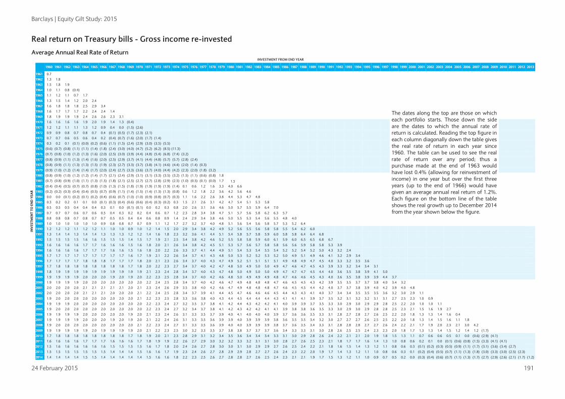
Barclays | Equity Gilt Study: 2015
24 February 2015 191
Real return on Treasury bills - Gross income re-invested Average Annual Real Rate of Return
INVESTMENT FROM END YEAR
INV
ESTM
ENT
TO E
ND
YEA
R
1960 1961 1962 1963 1964 1965 1966 1967 1968 1969 1970 1971 1972 1973 1974 1975 1976 1977 1978 1979 1980 1981 1982 1983 1984 1985 1986 1987 1988 1989 1990 1991 1992 1993 1994 1995 1996 1997 1998 1999 2000 2001 2002 2003 2004 2005 2006 2007 2008 2009 2010 2011 2012 2013
1961 0.7
1962 1.3 1.8
1963 1.5 1.8 1.9
1964 1.0 1.1 0.8 (0.4)
1965 1.1 1.2 1.1 0.7 1.7
1966 1.3 1.5 1.4 1.2 2.0 2.4
The dates along the top are those on which each portfolio starts. Those down the side are the dates to which the annual rate of return is calculated. Reading the top figure in each column diagonally down the table gives the real rate of return in each year since 1960. The table can be used to see the real rate of return over any period; thus a purchase made at the end of 1963 would have lost 0.4% (allowing for reinvestment of income) in one year but over the first three years (up to the end of 1966) would have given an average annual real return of 1.2%. Each figure on the bottom line of the table shows the real growth up to December 2014 from the year shown below the figure.
1967 1.6 1.8 1.8 1.8 2.5 2.9 3.4
1968 1.6 1.7 1.7 1.7 2.2 2.4 2.4 1.4
1969 1.8 1.9 1.9 1.9 2.4 2.6 2.6 2.3 3.1
1970 1.6 1.6 1.6 1.6 1.9 2.0 1.9 1.4 1.3 (0.4)
1971 1.2 1.2 1.1 1.1 1.3 1.2 0.9 0.4 0.0 (1.5) (2.6)
1972 0.9 0.9 0.8 0.7 0.8 0.7 0.4 (0.1) (0.5) (1.7) (2.3) (2.1)
1973 0.7 0.7 0.6 0.5 0.6 0.4 0.2 (0.4) (0.7) (1.6) (2.0) (1.7) (1.4)
1974 0.3 0.2 0.1 (0.1) (0.0) (0.2) (0.6) (1.1) (1.5) (2.4) (2.9) (3.0) (3.5) (5.5)
1975 (0.6) (0.7) (0.8) (1.1) (1.1) (1.4) (1.8) (2.4) (3.0) (4.0) (4.7) (5.2) (6.2) (8.5) (11.3)
1976 (0.7) (0.8) (1.0) (1.2) (1.3) (1.6) (2.0) (2.5) (3.0) (3.9) (4.4) (4.8) (5.4) (6.8) (7.4) (3.2)
1977 (0.8) (0.9) (1.1) (1.3) (1.4) (1.6) (2.0) (2.5) (2.9) (3.7) (4.1) (4.4) (4.8) (5.7) (5.7) (2.8) (2.4)
1978 (0.8) (0.9) (1.1) (1.3) (1.3) (1.5) (1.9) (2.3) (2.7) (3.3) (3.7) (3.8) (4.1) (4.6) (4.4) (2.0) (1.4) (0.3)
1979 (0.9) (1.0) (1.2) (1.4) (1.4) (1.7) (2.0) (2.4) (2.7) (3.3) (3.6) (3.7) (4.0) (4.4) (4.2) (2.3) (2.0) (1.8) (3.2)
1980 (0.8) (0.9) (1.0) (1.2) (1.2) (1.4) (1.7) (2.1) (2.4) (2.9) (3.1) (3.1) (3.3) (3.5) (3.2) (1.5) (1.1) (0.6) (0.8) 1.8
1981 (0.7) (0.8) (0.9) (1.0) (1.1) (1.3) (1.5) (1.8) (2.1) (2.5) (2.7) (2.7) (2.8) (2.9) (2.5) (1.0) (0.5) (0.1) (0.0) 1.7 1.5
1982 (0.4) (0.4) (0.5) (0.7) (0.7) (0.8) (1.0) (1.3) (1.5) (1.8) (1.9) (1.9) (1.9) (1.9) (1.4) 0.1 0.6 1.2 1.6 3.3 4.0 6.6
1983 (0.2) (0.2) (0.3) (0.4) (0.4) (0.5) (0.7) (0.9) (1.1) (1.4) (1.5) (1.4) (1.3) (1.3) (0.8) 0.6 1.2 1.8 2.2 3.6 4.2 5.6 4.6
1984 0.0 0.0 (0.1) (0.2) (0.1) (0.2) (0.4) (0.6) (0.7) (1.0) (1.0) (0.9) (0.8) (0.7) (0.3) 1.1 1.6 2.2 2.6 3.8 4.4 5.3 4.7 4.8
1985 0.3 0.2 0.2 0.1 0.1 0.0 (0.1) (0.3) (0.4) (0.6) (0.6) (0.4) (0.3) (0.2) 0.3 1.5 2.1 2.6 3.1 4.2 4.7 5.4 5.1 5.3 5.8
1986 0.5 0.5 0.5 0.4 0.4 0.4 0.3 0.1 0.0 (0.1) (0.1) 0.0 0.2 0.3 0.8 2.0 2.6 3.1 3.6 4.6 5.0 5.7 5.5 5.9 6.4 7.0
1987 0.7 0.7 0.7 0.6 0.7 0.6 0.5 0.4 0.3 0.2 0.2 0.4 0.6 0.7 1.2 2.3 2.8 3.4 3.8 4.7 5.1 5.7 5.6 5.8 6.2 6.3 5.7
1988 0.8 0.8 0.8 0.7 0.8 0.7 0.7 0.5 0.5 0.4 0.4 0.6 0.8 0.9 1.4 2.4 2.9 3.4 3.8 4.6 5.0 5.5 5.3 5.4 5.6 5.5 4.8 4.0
1989 1.0 1.0 1.0 1.0 1.0 1.0 0.9 0.8 0.8 0.7 0.7 0.9 1.1 1.2 1.7 2.7 3.2 3.7 4.0 4.8 5.1 5.6 5.4 5.6 5.8 5.7 5.3 5.2 6.4
1990 1.2 1.2 1.2 1.1 1.2 1.2 1.1 1.0 1.0 0.9 1.0 1.2 1.4 1.5 2.0 2.9 3.4 3.8 4.2 4.9 5.2 5.6 5.5 5.6 5.8 5.8 5.5 5.4 6.2 6.0
1991 1.3 1.4 1.4 1.3 1.4 1.4 1.3 1.3 1.3 1.2 1.2 1.4 1.6 1.8 2.3 3.2 3.6 4.1 4.4 5.1 5.4 5.8 5.7 5.8 5.9 6.0 5.8 5.8 6.4 6.4 6.8
1992 1.5 1.5 1.5 1.5 1.6 1.6 1.5 1.5 1.5 1.4 1.5 1.7 1.9 2.1 2.5 3.4 3.8 4.2 4.6 5.2 5.5 5.8 5.8 5.9 6.0 6.1 5.9 6.0 6.5 6.5 6.8 6.7
1993 1.6 1.6 1.6 1.6 1.7 1.7 1.6 1.6 1.6 1.5 1.6 1.8 2.0 2.1 2.6 3.4 3.8 4.2 4.5 5.1 5.3 5.7 5.6 5.7 5.8 5.8 5.6 5.6 5.9 5.8 5.8 5.3 3.9
1994 1.6 1.6 1.6 1.6 1.7 1.7 1.7 1.6 1.6 1.5 1.6 1.8 2.0 2.2 2.6 3.3 3.7 4.1 4.4 4.9 5.1 5.4 5.3 5.4 5.5 5.4 5.2 5.2 5.4 5.2 5.0 4.3 3.2 2.4
1995 1.7 1.7 1.7 1.7 1.7 1.7 1.7 1.7 1.7 1.6 1.7 1.9 2.1 2.2 2.6 3.4 3.7 4.1 4.3 4.8 5.0 5.3 5.2 5.2 5.3 5.2 5.0 4.9 5.1 4.9 4.6 4.1 3.2 2.9 3.4
1996 1.7 1.7 1.7 1.7 1.8 1.8 1.8 1.7 1.7 1.7 1.8 2.0 2.1 2.3 2.6 3.4 3.7 4.0 4.3 4.7 4.9 5.2 5.1 5.1 5.1 5.1 4.9 4.8 4.9 4.7 4.5 4.0 3.3 3.2 3.5 3.6
1997 1.7 1.8 1.8 1.8 1.8 1.8 1.8 1.8 1.8 1.7 1.8 2.0 2.2 2.3 2.7 3.4 3.7 4.0 4.2 4.7 4.8 5.0 4.9 5.0 5.0 4.9 4.7 4.6 4.7 4.5 4.3 3.9 3.3 3.2 3.4 3.4 3.1
1998 1.8 1.9 1.9 1.9 1.9 1.9 1.9 1.9 1.9 1.9 1.9 2.1 2.3 2.4 2.8 3.4 3.7 4.0 4.3 4.7 4.8 5.0 4.9 5.0 5.0 4.9 4.7 4.7 4.7 4.5 4.4 4.0 3.6 3.5 3.8 3.9 4.1 5.0
1999 1.9 1.9 1.9 1.9 2.0 2.0 2.0 1.9 2.0 1.9 2.0 2.2 2.3 2.5 2.8 3.4 3.7 4.0 4.2 4.6 4.8 5.0 4.9 4.9 4.9 4.8 4.7 4.6 4.6 4.5 4.3 4.0 3.6 3.5 3.8 3.9 3.9 4.4 3.7
2000 1.9 1.9 1.9 1.9 2.0 2.0 2.0 2.0 2.0 2.0 2.0 2.2 2.4 2.5 2.8 3.4 3.7 4.0 4.2 4.6 4.7 4.9 4.8 4.8 4.8 4.7 4.6 4.5 4.5 4.3 4.2 3.9 3.5 3.5 3.7 3.7 3.8 4.0 3.4 3.2
2001 2.0 2.0 2.0 2.0 2.1 2.1 2.1 2.1 2.1 2.0 2.1 2.3 2.4 2.6 2.9 3.5 3.8 4.0 4.2 4.6 4.7 4.9 4.8 4.8 4.8 4.7 4.6 4.5 4.5 4.4 4.2 4.0 3.7 3.7 3.8 3.9 4.0 4.2 3.9 4.0 4.8
2002 2.0 2.0 2.0 2.0 2.1 2.1 2.1 2.0 2.0 2.0 2.1 2.2 2.4 2.5 2.8 3.4 3.7 3.9 4.1 4.4 4.5 4.7 4.6 4.6 4.6 4.5 4.4 4.3 4.3 4.1 4.0 3.7 3.4 3.4 3.5 3.5 3.5 3.6 3.2 3.0 2.9 1.1
2003 1.9 2.0 2.0 2.0 2.0 2.0 2.0 2.0 2.0 2.0 2.1 2.2 2.3 2.5 2.8 3.3 3.6 3.8 4.0 4.3 4.4 4.5 4.4 4.4 4.4 4.3 4.1 4.1 4.1 3.9 3.7 3.5 3.2 3.1 3.2 3.2 3.1 3.1 2.7 2.5 2.3 1.0 0.9
2004 1.9 1.9 1.9 2.0 2.0 2.0 2.0 2.0 2.0 2.0 2.0 2.2 2.3 2.4 2.7 3.2 3.5 3.7 3.8 4.1 4.2 4.4 4.3 4.2 4.2 4.1 4.0 3.9 3.9 3.7 3.5 3.3 3.0 2.9 3.0 2.9 2.9 2.8 2.5 2.2 2.0 1.0 1.0 1.1
2005 1.9 2.0 2.0 2.0 2.0 2.0 2.0 2.0 2.0 2.0 2.0 2.2 2.3 2.4 2.7 3.2 3.4 3.7 3.8 4.1 4.2 4.3 4.2 4.2 4.1 4.1 3.9 3.8 3.8 3.6 3.5 3.3 3.0 2.9 3.0 2.9 2.8 2.8 2.5 2.3 2.1 1.5 1.6 1.9 2.7
2006 1.9 1.9 1.9 1.9 2.0 2.0 2.0 2.0 2.0 1.9 2.0 2.1 2.3 2.4 2.6 3.1 3.3 3.5 3.7 3.9 4.0 4.1 4.0 4.0 4.0 3.9 3.7 3.6 3.6 3.5 3.3 3.1 2.8 2.7 2.8 2.7 2.6 2.5 2.2 2.0 1.8 1.3 1.3 1.4 1.6 0.4
2007 1.9 1.9 1.9 1.9 2.0 2.0 2.0 1.9 2.0 1.9 2.0 2.1 2.2 2.4 2.6 3.1 3.3 3.5 3.6 3.9 3.9 4.0 3.9 3.9 3.9 3.8 3.6 3.5 3.5 3.4 3.2 3.0 2.7 2.7 2.7 2.6 2.5 2.5 2.2 2.0 1.8 1.3 1.4 1.5 1.6 1.1 1.8
2008 1.9 2.0 2.0 2.0 2.0 2.0 2.0 2.0 2.0 2.0 2.1 2.2 2.3 2.4 2.7 3.1 3.3 3.5 3.6 3.9 4.0 4.0 3.9 3.9 3.9 3.8 3.7 3.6 3.5 3.4 3.3 3.1 2.8 2.8 2.8 2.7 2.7 2.6 2.4 2.2 2.1 1.7 1.9 2.0 2.3 2.1 3.0 4.2
2009 1.9 1.9 1.9 1.9 1.9 2.0 1.9 1.9 1.9 1.9 2.0 2.1 2.2 2.3 2.5 3.0 3.2 3.3 3.5 3.7 3.8 3.8 3.7 3.7 3.7 3.6 3.4 3.3 3.3 3.1 3.0 2.8 2.6 2.5 2.5 2.4 2.3 2.3 2.0 1.8 1.7 1.3 1.3 1.4 1.5 1.2 1.4 1.2 (1.7)
2010 1.7 1.8 1.8 1.8 1.8 1.8 1.8 1.8 1.8 1.7 1.8 1.9 2.0 2.1 2.3 2.8 2.9 3.1 3.2 3.4 3.5 3.6 3.4 3.4 3.4 3.3 3.1 3.0 2.9 2.8 2.6 2.4 2.2 2.1 2.1 2.0 1.9 1.8 1.5 1.3 1.1 0.7 0.6 0.6 0.5 0.1 0.0 (0.6) (2.9) (4.1)
2011 1.6 1.6 1.6 1.6 1.7 1.7 1.7 1.6 1.6 1.6 1.7 1.8 1.9 1.9 2.2 2.6 2.7 2.9 3.0 3.2 3.2 3.3 3.2 3.1 3.1 3.0 2.8 2.7 2.6 2.5 2.3 2.1 1.8 1.7 1.7 1.6 1.4 1.3 1.0 0.8 0.6 0.2 0.1 0.0 (0.1) (0.6) (0.8) (1.5) (3.3) (4.1) (4.1)
2012 1.5 1.6 1.6 1.6 1.6 1.6 1.6 1.5 1.5 1.5 1.5 1.6 1.7 1.8 2.0 2.4 2.6 2.7 2.8 3.0 3.0 3.1 3.0 2.9 2.9 2.7 2.6 2.5 2.4 2.2 2.1 1.8 1.6 1.5 1.4 1.3 1.2 1.1 0.8 0.6 0.3 (0.1) (0.2) (0.3) (0.5) (0.9) (1.1) (1.7) (3.1) (3.6) (3.4) (2.7)
2013 1.5 1.5 1.5 1.5 1.5 1.5 1.5 1.4 1.4 1.4 1.5 1.6 1.6 1.7 1.9 2.3 2.4 2.6 2.7 2.8 2.9 2.9 2.8 2.7 2.7 2.6 2.4 2.3 2.2 2.0 1.9 1.7 1.4 1.3 1.2 1.1 1.0 0.8 0.6 0.3 0.1 (0.2) (0.4) (0.5) (0.7) (1.1) (1.3) (1.8) (3.0) (3.3) (3.0) (2.5) (2.3)
2014 1.4 1.4 1.4 1.4 1.5 1.5 1.4 1.4 1.4 1.4 1.4 1.5 1.6 1.6 1.8 2.2 2.3 2.5 2.6 2.7 2.8 2.8 2.7 2.6 2.5 2.4 2.3 2.1 2.1 1.9 1.7 1.5 1.3 1.2 1.1 1.0 0.9 0.7 0.5 0.2 0.0 (0.3) (0.4) (0.6) (0.7) (1.1) (1.3) (1.7) (2.7) (2.9) (2.6) (2.1) (1.7) (1.2)

Barclays | Equity Gilt Study: 2015
24 February 2015 192
Real Value of £100 Invested INVESTMENT FROM END YEAR
INV
ESTM
ENT
TO E
ND
YEA
R
1960 1961 1962 1963 1964 1965 1966 1967 1968 1969 1970 1971 1972 1973 1974 1975 1976 1977 1978 1979 1980 1981 1982 1983 1984 1985 1986 1987 1988 1989 1990 1991 1992 1993 1994 1995 1996 1997 1998 1999 2000 2001 2002 2003 2004 2005 2006 2007 2008 2009 2010 2011 2012 2013
1961 101
1962 103 102
1963 104 104 102
1964 104 103 102 100
1965 106 105 103 101 102
1966 108 108 106 104 104 102
The dates along the top are those on which each portfolio starts. Those down the side are the dates to which the change in real value is calculated. Reading the top figure in each column diagonally down the table gives the growth in each year since 1960. The table can be used to see the real growth over any period; thus an investment of £100 made at the end of 1978 would have fallen to £97 (allowing for reinvestment of income and the effect of inflation) in one year but after four years (up to the end of 1982) would have reached £107 in real terms. Each figure on the bottom line of the table shows the real growth up to December 2014 from the year shown below the figure.
1967 112 111 109 107 108 106 103
1968 114 113 111 109 109 107 105 101
1969 117 116 114 112 113 111 108 105 103
1970 117 116 114 112 112 110 108 104 103 100
1971 114 113 111 109 109 107 105 101 100 97 97
1972 111 110 109 106 107 105 103 99 98 95 95 98
1973 110 109 107 105 105 104 101 98 97 94 94 97 99
1974 104 103 101 99 100 98 96 92 91 88 89 91 93 94
1975 92 91 90 88 88 87 85 82 81 78 79 81 83 84 89
1976 89 88 87 85 85 84 82 79 78 76 76 78 80 81 86 97
1977 87 86 85 83 83 82 80 77 76 74 74 76 78 79 84 94 98
1978 86 86 84 83 83 82 80 77 76 74 74 76 78 79 83 94 97 100
1979 84 83 82 80 80 79 77 75 74 71 72 74 75 76 81 91 94 96 97
1980 85 85 83 82 82 80 79 76 75 73 73 75 77 78 82 93 96 98 98 102
1981 86 86 84 83 83 82 80 77 76 74 74 76 78 79 83 94 97 100 100 103 102
1982 92 92 90 88 89 87 85 82 81 79 79 81 83 84 89 100 104 106 107 110 108 107
1983 96 96 94 92 93 91 89 86 85 82 83 85 87 88 93 105 108 111 111 115 113 111 105
1984 101 100 99 97 97 95 93 90 89 86 87 89 91 92 98 110 114 116 117 121 119 117 110 105
1985 107 106 104 102 103 101 99 95 94 91 92 94 96 98 103 116 120 123 124 128 126 124 116 111 106
1986 114 114 112 109 110 108 106 102 101 98 98 101 103 104 110 124 129 132 132 137 134 132 124 119 113 107
1987 121 120 118 116 116 114 112 108 106 103 104 106 109 110 117 132 136 139 140 144 142 140 131 125 120 113 106
1988 126 125 123 120 121 119 116 112 111 107 108 111 113 115 121 137 141 145 145 150 148 145 136 130 124 118 110 104
1989 134 133 130 128 128 126 123 119 118 114 115 118 120 122 129 145 150 154 155 160 157 155 145 139 132 125 117 111 106
1990 142 141 138 136 136 134 131 126 125 121 121 125 127 129 137 154 159 163 164 169 166 164 154 147 140 132 124 117 113 106
1991 151 150 148 145 145 143 140 135 133 129 130 133 136 138 146 165 170 174 175 181 178 175 164 157 150 141 132 125 120 113 107
1992 161 160 157 155 155 152 149 144 142 138 138 142 145 147 156 176 182 186 187 193 190 187 175 167 160 151 141 134 128 121 114 107
1993 168 166 164 161 161 158 155 150 148 143 144 148 151 153 162 183 189 193 194 200 197 194 182 174 166 157 147 139 133 125 118 111 104
1994 172 171 168 164 165 162 159 153 151 147 147 151 154 157 166 187 193 198 199 205 202 199 186 178 170 161 150 142 137 129 121 114 106 102
1995 178 176 173 170 171 168 164 159 156 152 152 156 160 162 171 193 200 205 205 212 209 205 193 184 176 166 155 147 141 133 125 117 110 106 103
1996 184 183 180 176 177 174 170 164 162 157 158 162 166 168 178 200 207 212 213 220 216 213 200 191 182 172 161 152 146 138 130 122 114 110 107 104
1997 190 188 185 182 182 179 175 170 167 162 163 167 171 173 183 207 214 219 220 227 223 220 206 197 188 178 166 157 151 142 134 126 118 113 111 107 103
1998 199 198 195 191 192 188 184 178 176 170 171 176 179 182 192 217 224 230 231 238 234 231 216 207 197 187 174 165 159 149 141 132 124 119 116 112 108 105
1999 207 205 202 198 199 195 191 185 182 177 177 182 186 189 200 225 233 238 239 247 243 239 224 214 205 193 181 171 165 155 146 137 128 123 120 116 112 109 104
2000 213 212 208 204 205 202 197 190 188 182 183 188 192 195 206 232 240 246 247 255 250 247 231 221 211 200 187 177 170 160 151 141 132 127 124 120 116 112 107 103
2001 224 222 218 214 215 211 206 200 197 191 192 197 201 204 216 243 251 258 258 267 262 258 242 232 221 209 195 185 178 167 158 148 138 133 130 126 121 118 112 108 105
2002 226 224 221 216 217 214 209 202 199 193 194 199 203 206 218 246 254 261 261 270 265 261 245 234 224 211 198 187 180 169 160 149 140 135 132 127 123 119 113 109 106 101
2003 228 227 223 218 219 216 211 204 201 195 196 201 205 208 220 248 257 263 264 273 268 264 247 237 226 213 200 189 182 171 161 151 141 136 133 128 124 120 114 110 107 102 101
2004 231 229 225 221 222 218 213 206 203 197 198 203 207 210 223 251 259 266 267 276 271 267 250 239 228 216 202 191 184 173 163 152 143 137 134 130 125 121 116 112 108 103 102 101
2005 237 235 231 227 228 224 219 212 209 202 203 209 213 216 229 258 267 273 274 283 278 274 257 246 235 222 207 196 189 177 167 157 147 141 138 133 129 125 119 115 111 106 105 104 103
2006 238 236 232 228 229 225 220 212 210 203 204 210 214 217 230 259 268 274 275 284 279 275 258 247 236 223 208 197 189 178 168 157 147 142 139 134 129 125 119 115 112 106 105 104 103 100
2007 242 240 236 232 233 229 223 216 213 207 208 213 218 221 234 264 272 279 280 289 284 280 263 251 240 226 212 200 193 181 171 160 150 144 141 136 132 128 121 117 113 108 107 106 105 102 102
2008 252 251 246 242 243 238 233 225 222 216 216 222 227 230 244 275 284 291 292 302 296 292 274 262 250 236 221 209 201 189 178 167 156 150 147 142 137 133 127 122 118 113 112 111 109 107 106 104
2009 248 246 242 238 238 234 229 222 218 212 213 218 223 226 240 270 279 286 287 297 291 287 269 257 246 232 217 205 197 186 175 164 154 148 144 140 135 131 124 120 116 111 110 109 108 105 104 102 98
2010 238 236 232 228 229 225 220 213 210 203 204 210 214 217 230 259 268 274 275 284 279 275 258 247 236 223 208 197 189 178 168 157 147 142 139 134 129 125 119 115 112 106 105 104 103 100 100 98 94 96
2011 228 227 223 218 219 216 211 204 201 195 196 201 205 208 220 248 257 263 264 273 268 264 248 237 226 213 200 189 182 171 161 151 141 136 133 128 124 120 114 110 107 102 101 100 99 96 96 94 90 92 96
2012 222 221 217 213 213 210 205 198 196 190 190 196 200 203 214 242 250 256 257 265 261 257 241 230 220 208 194 184 177 166 157 147 138 132 129 125 121 117 111 107 104 99 98 97 96 94 93 92 88 90 93 97
2013 217 215 212 208 209 205 200 194 191 185 186 191 195 198 210 236 244 250 251 259 255 251 235 225 215 203 190 180 173 162 153 144 134 129 126 122 118 114 109 105 102 97 96 95 94 92 91 90 86 87 91 95 98
2014 214 213 209 205 206 203 198 191 189 183 184 189 193 196 207 233 241 247 248 256 252 248 233 222 212 201 188 177 171 160 151 142 133 128 125 121 117 113 108 104 101 96 95 94 93 91 90 89 85 86 90 94 97 99

Barclays | Equity Gilt Study: 2015
24 February 2015 193
Real return on building society account - Gross income re-invested Average Annual Real Rate of Return
INVESTMENT FROM END YEAR
INV
ESTM
ENT
TO E
ND
YEA
R
1960 1961 1962 1963 1964 1965 1966 1967 1968 1969 1970 1971 1972 1973 1974 1975 1976 1977 1978 1979 1980 1981 1982 1983 1984 1985 1986 1987 1988 1989 1990 1991 1992 1993 1994 1995 1996 1997 1998 1999 2000 2001 2002 2003 2004 2005 2006 2007 2008 2009 2010 2011 2012 2013
1961 1.4
1962 2.4 3.4
1963 2.9 3.6 3.9
1964 2.4 2.7 2.4 0.9
1965 2.3 2.5 2.2 1.4 1.9
1966 2.4 2.6 2.4 1.9 2.5 3.0
The dates along the top are those on which each portfolio starts. Those down the side are the dates to which the annual rate of return is calculated. Reading the top figure in each column diagonally down the table gives the real rate of return in each year since 1960. The table can be used to see the real rate of return over any period; thus a purchase made at the end of 1960 would have grown by 1.4% (allowing for reinvestment of income) in one year but over the first three years (up to the end of 1963) would have given an average annual real return of 2.9%. Each figure on the bottom line of the table shows the real growth up to December 2014 from the year shown below the figure.
1967 2.7 3.0 2.9 2.6 3.2 3.8 4.7
1968 2.6 2.7 2.6 2.4 2.8 3.1 3.1 1.5
1969 2.7 2.8 2.8 2.6 2.9 3.2 3.2 2.5 3.5
1970 2.5 2.6 2.5 2.3 2.5 2.6 2.5 1.8 2.0 0.6
1971 2.2 2.2 2.1 1.9 2.0 2.1 1.9 1.2 1.1 (0.1) (0.7)
1972 2.0 2.1 2.0 1.7 1.8 1.8 1.6 1.0 0.9 0.1 (0.1) 0.5
1973 1.8 1.8 1.7 1.5 1.6 1.5 1.3 0.7 0.6 (0.1) (0.3) (0.2) (0.8)
1974 1.2 1.1 1.0 0.7 0.7 0.6 0.2 (0.4) (0.7) (1.5) (2.0) (2.4) (3.8) (6.8)
1975 0.3 0.2 (0.0) (0.3) (0.4) (0.7) (1.1) (1.8) (2.2) (3.2) (3.9) (4.7) (6.3) (9.0) (11.1)
1976 0.0 (0.1) (0.3) (0.6) (0.7) (1.0) (1.4) (2.0) (2.4) (3.3) (3.9) (4.5) (5.7) (7.3) (7.6) (3.8)
1977 (0.0) (0.1) (0.4) (0.7) (0.8) (1.0) (1.4) (1.9) (2.3) (3.0) (3.5) (4.0) (4.8) (5.8) (5.5) (2.6) (1.3)
1978 0.0 (0.1) (0.3) (0.6) (0.7) (0.9) (1.2) (1.7) (2.0) (2.6) (3.0) (3.3) (3.9) (4.5) (3.9) (1.4) (0.2) 1.0
1979 (0.2) (0.3) (0.5) (0.8) (0.9) (1.1) (1.4) (1.9) (2.2) (2.8) (3.1) (3.4) (4.0) (4.5) (4.0) (2.1) (1.6) (1.7) (4.3)
1980 (0.2) (0.3) (0.5) (0.8) (0.9) (1.0) (1.3) (1.8) (2.0) (2.5) (2.8) (3.1) (3.5) (3.9) (3.4) (1.7) (1.2) (1.2) (2.2) (0.1)
1981 (0.2) (0.2) (0.4) (0.7) (0.8) (0.9) (1.2) (1.6) (1.8) (2.2) (2.5) (2.7) (3.0) (3.3) (2.8) (1.3) (0.8) (0.7) (1.2) 0.3 0.8
1982 0.1 0.1 (0.1) (0.3) (0.4) (0.5) (0.7) (1.1) (1.3) (1.6) (1.8) (1.9) (2.1) (2.3) (1.7) (0.3) 0.4 0.7 0.6 2.3 3.6 6.4
1983 0.3 0.2 0.1 (0.1) (0.1) (0.3) (0.4) (0.8) (0.9) (1.2) (1.3) (1.4) (1.6) (1.6) (1.1) 0.3 0.9 1.3 1.3 2.8 3.8 5.3 4.1
1984 0.5 0.5 0.3 0.2 0.1 0.0 (0.1) (0.4) (0.5) (0.8) (0.9) (0.9) (1.0) (1.0) (0.4) 0.8 1.4 1.8 2.0 3.2 4.1 5.2 4.6 5.2
1985 0.7 0.6 0.5 0.4 0.3 0.3 0.1 (0.1) (0.2) (0.5) (0.5) (0.5) (0.6) (0.6) 0.0 1.2 1.8 2.2 2.4 3.5 4.3 5.1 4.7 5.0 4.8
1986 0.9 0.9 0.8 0.6 0.6 0.6 0.4 0.2 0.1 (0.1) (0.1) (0.0) (0.1) (0.0) 0.6 1.7 2.3 2.7 2.9 3.9 4.6 5.4 5.2 5.5 5.7 6.6
1987 1.1 1.0 1.0 0.8 0.8 0.8 0.7 0.5 0.4 0.3 0.2 0.3 0.3 0.4 0.9 2.0 2.6 3.0 3.2 4.2 4.8 5.5 5.3 5.6 5.7 6.2 5.7
1988 1.1 1.1 1.0 0.9 0.9 0.8 0.7 0.5 0.5 0.3 0.3 0.4 0.4 0.4 1.0 2.0 2.5 2.8 3.0 3.9 4.4 4.9 4.6 4.7 4.6 4.5 3.5 1.4
1989 1.1 1.1 1.0 0.9 0.9 0.9 0.8 0.6 0.6 0.4 0.4 0.5 0.5 0.6 1.1 2.0 2.5 2.8 3.0 3.7 4.2 4.6 4.4 4.4 4.3 4.1 3.3 2.1 2.8
1990 1.2 1.2 1.1 1.0 1.0 1.0 0.9 0.7 0.7 0.5 0.5 0.6 0.6 0.7 1.2 2.1 2.5 2.8 2.9 3.6 4.0 4.4 4.1 4.1 4.0 3.8 3.1 2.2 2.6 2.5
1991 1.3 1.3 1.2 1.1 1.1 1.1 1.0 0.9 0.8 0.7 0.7 0.8 0.8 0.9 1.4 2.2 2.6 2.9 3.1 3.7 4.1 4.4 4.2 4.2 4.1 3.9 3.4 2.8 3.3 3.6 4.6
1992 1.5 1.5 1.4 1.3 1.3 1.3 1.2 1.1 1.1 1.0 1.0 1.1 1.1 1.2 1.7 2.5 2.9 3.2 3.3 4.0 4.3 4.6 4.4 4.5 4.4 4.3 4.0 3.6 4.2 4.6 5.7 6.8
1993 1.5 1.5 1.4 1.3 1.4 1.3 1.3 1.1 1.1 1.0 1.0 1.1 1.2 1.3 1.7 2.5 2.9 3.1 3.3 3.8 4.1 4.4 4.2 4.2 4.1 4.1 3.7 3.4 3.8 4.0 4.5 4.5 2.2
1994 1.5 1.5 1.4 1.3 1.3 1.3 1.3 1.1 1.1 1.0 1.0 1.1 1.1 1.2 1.7 2.4 2.7 3.0 3.1 3.6 3.9 4.1 3.9 3.9 3.8 3.7 3.3 3.0 3.3 3.4 3.6 3.2 1.5 0.8
1995 1.4 1.4 1.4 1.3 1.3 1.3 1.2 1.1 1.1 1.0 1.0 1.1 1.1 1.2 1.6 2.3 2.6 2.9 3.0 3.4 3.7 3.9 3.7 3.7 3.5 3.4 3.0 2.7 2.9 2.9 3.0 2.6 1.2 0.7 0.7
1996 1.4 1.4 1.3 1.3 1.3 1.3 1.2 1.1 1.1 1.0 1.0 1.1 1.1 1.2 1.5 2.2 2.5 2.7 2.8 3.2 3.4 3.6 3.4 3.4 3.2 3.1 2.7 2.4 2.5 2.5 2.5 2.1 0.9 0.5 0.4 0.2
1997 1.3 1.3 1.3 1.2 1.2 1.2 1.1 1.0 1.0 0.9 0.9 1.0 1.0 1.1 1.5 2.1 2.4 2.5 2.6 3.0 3.2 3.4 3.2 3.1 2.9 2.8 2.4 2.1 2.2 2.1 2.1 1.7 0.6 0.3 0.1 (0.2) (0.5)
1998 1.4 1.4 1.4 1.3 1.3 1.3 1.2 1.1 1.1 1.0 1.0 1.1 1.1 1.2 1.6 2.2 2.4 2.6 2.7 3.1 3.3 3.4 3.2 3.2 3.0 2.9 2.6 2.3 2.4 2.4 2.3 2.0 1.2 1.0 1.1 1.2 1.8 4.2
1999 1.5 1.5 1.4 1.3 1.4 1.3 1.3 1.2 1.2 1.1 1.1 1.2 1.2 1.3 1.6 2.2 2.5 2.6 2.7 3.1 3.3 3.4 3.2 3.2 3.0 2.9 2.6 2.4 2.5 2.4 2.4 2.2 1.5 1.4 1.5 1.8 2.3 3.7 3.3
2000 1.5 1.5 1.4 1.4 1.4 1.4 1.3 1.2 1.2 1.2 1.2 1.2 1.3 1.3 1.7 2.2 2.5 2.6 2.7 3.1 3.2 3.4 3.2 3.1 3.0 2.9 2.6 2.4 2.5 2.4 2.4 2.2 1.6 1.6 1.7 1.9 2.3 3.3 2.9 2.5
2001 1.6 1.6 1.5 1.4 1.5 1.4 1.4 1.3 1.3 1.2 1.3 1.3 1.4 1.4 1.8 2.3 2.5 2.7 2.8 3.1 3.3 3.4 3.2 3.2 3.1 3.0 2.7 2.5 2.6 2.6 2.6 2.4 1.9 1.9 2.0 2.2 2.7 3.5 3.3 3.2 4.0
2002 1.5 1.5 1.5 1.4 1.4 1.4 1.4 1.3 1.3 1.2 1.2 1.3 1.3 1.4 1.7 2.2 2.5 2.6 2.7 3.0 3.1 3.2 3.1 3.0 2.9 2.8 2.6 2.4 2.4 2.4 2.4 2.2 1.8 1.7 1.8 2.0 2.3 2.9 2.5 2.3 2.2 0.4
2003 1.5 1.5 1.5 1.4 1.4 1.4 1.4 1.3 1.3 1.2 1.2 1.3 1.3 1.4 1.7 2.2 2.4 2.5 2.6 2.9 3.0 3.1 3.0 2.9 2.8 2.7 2.5 2.2 2.3 2.3 2.3 2.1 1.6 1.6 1.7 1.8 2.0 2.5 2.1 1.8 1.6 0.5 0.5
2004 1.5 1.5 1.4 1.4 1.4 1.4 1.3 1.2 1.2 1.2 1.2 1.3 1.3 1.3 1.6 2.1 2.3 2.5 2.5 2.8 2.9 3.0 2.9 2.8 2.7 2.6 2.4 2.2 2.2 2.2 2.1 2.0 1.6 1.5 1.6 1.7 1.9 2.2 1.9 1.6 1.4 0.6 0.6 0.7
2005 1.5 1.5 1.4 1.4 1.4 1.4 1.3 1.3 1.3 1.2 1.2 1.3 1.3 1.4 1.6 2.1 2.3 2.4 2.5 2.8 2.9 3.0 2.8 2.8 2.6 2.5 2.3 2.1 2.2 2.1 2.1 1.9 1.6 1.5 1.6 1.7 1.8 2.2 1.9 1.6 1.5 0.8 1.0 1.2 1.7
2006 1.5 1.5 1.4 1.4 1.4 1.4 1.3 1.2 1.2 1.2 1.2 1.2 1.3 1.3 1.6 2.0 2.2 2.3 2.4 2.6 2.8 2.8 2.7 2.6 2.5 2.4 2.2 2.0 2.1 2.0 2.0 1.8 1.5 1.4 1.4 1.5 1.7 1.9 1.6 1.4 1.2 0.7 0.7 0.8 0.8 (0.1)
2007 1.4 1.4 1.4 1.3 1.3 1.3 1.3 1.2 1.2 1.1 1.2 1.2 1.2 1.3 1.6 2.0 2.2 2.3 2.3 2.6 2.7 2.8 2.6 2.5 2.4 2.3 2.1 1.9 2.0 1.9 1.9 1.7 1.4 1.3 1.4 1.4 1.6 1.8 1.5 1.3 1.1 0.7 0.7 0.8 0.8 0.3 0.7
2008 1.4 1.4 1.4 1.3 1.3 1.3 1.3 1.2 1.2 1.1 1.1 1.2 1.2 1.3 1.5 1.9 2.1 2.2 2.3 2.5 2.6 2.6 2.5 2.4 2.3 2.2 2.0 1.9 1.9 1.8 1.8 1.6 1.3 1.3 1.3 1.3 1.4 1.6 1.4 1.1 1.0 0.6 0.6 0.6 0.6 0.2 0.3 (0.1)
2009 1.3 1.3 1.3 1.2 1.2 1.2 1.2 1.1 1.1 1.0 1.0 1.1 1.1 1.2 1.4 1.8 2.0 2.1 2.1 2.3 2.4 2.5 2.3 2.3 2.1 2.0 1.8 1.7 1.7 1.6 1.6 1.4 1.1 1.0 1.1 1.1 1.2 1.3 1.0 0.8 0.6 0.2 0.2 0.1 0.0 (0.4) (0.5) (1.1) (2.1)
2010 1.2 1.2 1.2 1.1 1.1 1.1 1.1 1.0 1.0 0.9 0.9 0.9 1.0 1.0 1.2 1.6 1.8 1.9 1.9 2.1 2.2 2.2 2.1 2.0 1.9 1.8 1.6 1.4 1.4 1.3 1.3 1.1 0.8 0.7 0.7 0.7 0.7 0.8 0.6 0.3 0.1 (0.3) (0.4) (0.5) (0.7) (1.2) (1.5) (2.2) (3.2) (4.4)
2011 1.1 1.1 1.0 1.0 1.0 1.0 0.9 0.8 0.8 0.8 0.8 0.8 0.8 0.9 1.1 1.4 1.6 1.7 1.7 1.9 2.0 2.0 1.9 1.8 1.6 1.5 1.3 1.1 1.1 1.1 1.0 0.8 0.5 0.4 0.4 0.4 0.4 0.5 0.2 (0.1) (0.3) (0.7) (0.8) (1.0) (1.3) (1.7) (2.1) (2.8) (3.6) (4.4) (4.4)
2012 1.0 1.0 1.0 0.9 0.9 0.9 0.8 0.8 0.7 0.7 0.7 0.7 0.7 0.8 1.0 1.3 1.5 1.5 1.6 1.8 1.8 1.8 1.7 1.6 1.5 1.4 1.2 1.0 1.0 0.9 0.8 0.6 0.3 0.2 0.2 0.2 0.2 0.2 (0.0) (0.3) (0.5) (0.9) (1.0) (1.2) (1.5) (1.9) (2.2) (2.8) (3.4) (3.9) (3.6) (2.8)
2013 1.0 1.0 0.9 0.8 0.8 0.8 0.8 0.7 0.7 0.6 0.6 0.6 0.6 0.7 0.9 1.2 1.4 1.4 1.5 1.6 1.7 1.7 1.6 1.5 1.3 1.2 1.0 0.9 0.8 0.8 0.7 0.5 0.2 0.1 0.1 0.0 0.0 0.1 (0.2) (0.4) (0.7) (1.0) (1.2) (1.3) (1.6) (2.0) (2.2) (2.7) (3.2) (3.5) (3.2) (2.6) (2.4)
2014 0.9 0.9 0.9 0.8 0.8 0.8 0.7 0.6 0.6 0.6 0.6 0.6 0.6 0.6 0.8 1.2 1.3 1.4 1.4 1.5 1.6 1.6 1.5 1.4 1.3 1.1 0.9 0.8 0.7 0.7 0.6 0.4 0.1 0.0 0.0 (0.0) (0.0) (0.0) (0.3) (0.5) (0.7) (1.1) (1.2) (1.3) (1.5) (1.9) (2.1) (2.5) (2.9) (3.1) (2.7) (2.2) (1.9) (1.3)

Barclays | Equity Gilt Study: 2015
24 February 2015 194
Real Value of £100 Invested INVESTMENT FROM END YEAR
INV
ESTM
ENT
TO E
ND
YEA
R
1960 1961 1962 1963 1964 1965 1966 1967 1968 1969 1970 1971 1972 1973 1974 1975 1976 1977 1978 1979 1980 1981 1982 1983 1984 1985 1986 1987 1988 1989 1990 1991 1992 1993 1994 1995 1996 1997 1998 1999 2000 2001 2002 2003 2004 2005 2006 2007 2008 2009 2010 2011 2012 2013
1961 101
1962 105 103
1963 109 107 104
1964 110 108 105 101
1965 112 110 107 103 102
1966 115 114 110 106 105 103 The dates along the top are those on which
each portfolio starts. Those down the side are the dates to which the change in real value is calculated. Reading the top figure in each column diagonally down the table gives the growth in each year since 1960. The table can be used to see the real growth over any period; thus an investment of £100 made at the end of 1960 would have grown to £101 (allowing for reinvestment of income and the effect of inflation) in one year but after three years (up to the end of 1963) would have reached £109 in real terms. Each figure on the bottom line of the table shows the real growth up to December 2014 from the year shown below the figure.
1967 121 119 115 111 110 108 105
1968 123 121 117 113 112 109 106 101
1969 127 125 121 116 115 113 110 105 103
1970 127 126 122 117 116 114 111 106 104 101
1971 127 125 121 116 115 113 110 105 103 100 99
1972 127 125 121 117 116 114 110 105 104 100 100 100
1973 126 124 120 116 115 113 109 105 103 100 99 100 99
1974 118 116 112 108 107 105 102 97 96 93 92 93 92 93
1975 105 103 100 96 95 93 91 87 85 82 82 83 82 83 89
1976 101 99 96 92 92 90 87 83 82 79 79 79 79 80 85 96
1977 99 98 95 91 90 89 86 82 81 78 78 78 78 79 84 95 99
1978 100 99 96 92 91 89 87 83 82 79 79 79 79 79 85 96 100 101
1979 96 95 91 88 87 86 83 79 78 76 75 76 75 76 81 92 95 97 96
1980 96 94 91 88 87 86 83 79 78 76 75 76 75 76 81 92 95 97 96 100
1981 97 95 92 89 88 86 84 80 79 76 76 76 76 76 82 92 96 97 96 101 101
1982 103 101 98 94 94 92 89 85 84 81 81 81 81 81 87 98 102 104 103 107 107 106
1983 107 105 102 98 97 96 93 89 87 84 84 84 84 85 91 102 106 108 107 112 112 111 104
1984 112 111 107 103 102 100 98 93 92 89 88 89 88 89 96 108 112 113 112 117 117 117 109 105
1985 118 116 112 108 107 105 102 98 96 93 92 93 93 93 100 113 117 119 118 123 123 122 115 110 105
1986 126 124 120 115 114 112 109 104 103 99 99 99 99 100 107 120 125 127 126 131 131 130 122 118 112 107
1987 133 131 127 122 121 119 115 110 108 105 104 105 105 105 113 127 132 134 133 139 139 138 129 124 118 113 106
1988 135 133 129 124 123 120 117 112 110 106 106 106 106 107 115 129 134 136 135 141 141 140 131 126 120 114 107 101
1989 138 137 132 127 126 124 120 115 113 109 109 109 109 110 118 132 138 140 138 144 145 144 135 130 123 117 110 104 103
1990 142 140 135 130 129 127 123 118 116 112 111 112 112 112 121 136 141 143 142 148 148 147 138 133 126 120 113 107 105 102
1991 149 146 142 136 135 133 129 123 121 117 116 117 117 118 126 142 148 150 148 155 155 154 145 139 132 126 118 112 110 107 105
1992 159 156 151 146 144 142 138 131 129 125 124 125 125 126 135 152 158 160 158 166 166 164 154 148 141 135 126 119 118 115 112 107
1993 162 160 155 149 148 145 141 134 132 128 127 128 127 128 138 155 161 163 162 169 169 168 158 152 144 137 129 122 120 117 114 109 102
1994 163 161 156 150 149 146 142 135 133 129 128 129 128 129 139 156 163 165 163 170 171 169 159 153 145 139 130 123 121 118 115 110 103 101
1995 164 162 157 151 150 147 143 136 134 130 129 130 129 130 140 157 164 166 164 172 172 170 160 154 146 139 131 124 122 119 116 111 104 101 101
1996 165 162 157 151 150 147 143 136 134 130 129 130 130 131 140 158 164 166 165 172 172 171 160 154 146 140 131 124 122 119 116 111 104 102 101 100
1997 164 162 156 150 149 146 142 136 134 129 129 129 129 130 139 157 163 165 164 171 171 170 160 153 146 139 130 123 122 118 115 110 103 101 100 100 99
1998 171 168 163 157 155 152 148 141 139 135 134 135 134 135 145 163 170 172 170 178 178 177 166 160 152 145 136 128 127 123 120 115 108 105 104 104 104 104
1999 176 174 168 162 161 157 153 146 144 139 138 139 139 140 150 169 175 178 176 184 184 183 172 165 157 150 140 133 131 127 124 119 111 109 108 107 107 108 103
2000 181 178 172 166 165 161 157 150 148 143 142 143 142 143 154 173 180 182 180 189 189 187 176 169 161 153 144 136 134 130 127 122 114 111 111 110 110 110 106 102
2001 188 185 179 173 171 168 163 156 153 148 147 148 148 149 160 180 187 189 188 196 196 195 183 176 167 159 150 141 139 136 132 127 118 116 115 114 114 115 110 107 104
2002 189 186 180 173 172 169 164 156 154 149 148 149 148 150 160 181 188 190 188 197 197 196 184 176 168 160 150 142 140 136 133 127 119 116 116 115 115 115 111 107 104 100
2003 190 187 181 174 173 169 164 157 155 150 149 150 149 150 161 181 189 191 189 198 198 197 185 177 169 161 151 143 141 137 134 128 120 117 116 115 115 116 111 108 105 101 101
2004 191 188 182 175 174 171 166 158 156 151 150 151 150 151 162 183 190 193 191 199 200 198 186 179 170 162 152 144 142 138 135 129 120 118 117 116 116 117 112 108 106 102 101 101
2005 194 192 185 178 177 174 168 161 159 153 152 154 153 154 165 186 193 196 194 203 203 201 189 182 173 165 155 146 144 140 137 131 122 120 119 118 118 119 114 110 108 103 103 102 102
2006 194 191 185 178 177 173 168 161 158 153 152 153 153 154 165 186 193 196 194 203 203 201 189 182 173 165 154 146 144 140 137 131 122 120 119 118 118 119 114 110 107 103 103 102 102 100
2007 195 193 187 180 178 175 170 162 160 154 153 154 154 155 166 187 194 197 195 204 204 203 190 183 174 166 156 147 145 141 138 132 123 121 120 119 119 119 115 111 108 104 104 103 102 101 101
2008 195 193 186 179 178 174 169 162 159 154 153 154 154 155 166 187 194 197 195 204 204 202 190 183 174 166 155 147 145 141 138 132 123 120 120 119 119 119 114 111 108 104 103 103 102 101 101 100
2009 191 189 182 176 174 171 166 158 156 151 150 151 150 152 163 183 190 193 191 200 200 198 186 179 170 162 152 144 142 138 135 129 121 118 117 116 116 117 112 108 106 102 101 101 100 98 98 98 98
2010 183 180 174 168 166 163 159 151 149 144 143 144 144 145 155 175 182 184 183 191 191 189 178 171 163 155 146 138 136 132 129 123 115 113 112 111 111 112 107 104 101 97 97 96 96 94 94 94 94 96
2011 175 172 167 161 159 156 152 145 143 138 137 138 137 139 149 167 174 176 175 182 183 181 170 163 155 148 139 132 130 126 123 118 110 108 107 106 106 107 102 99 97 93 93 92 92 90 90 89 90 91 96
2012 170 168 162 156 155 152 147 141 139 134 133 134 134 135 144 163 169 171 170 177 177 176 165 159 151 144 135 128 126 123 120 114 107 105 104 103 103 104 100 96 94 90 90 90 89 87 88 87 87 89 93 97
2013 166 164 158 152 151 148 144 137 135 131 130 131 130 131 141 159 165 167 166 173 173 172 161 155 147 141 132 125 123 120 117 112 105 102 102 101 101 101 97 94 92 88 88 87 87 85 85 85 85 87 91 95 98
2014 164 161 156 150 149 146 142 136 134 129 128 129 129 130 139 156 163 165 163 171 171 170 159 153 145 139 130 123 121 118 115 110 103 101 100 99 99 100 96 93 91 87 87 86 86 84 84 84 84 86 89 94 96 99

Barclays | Equity Gilt Study: 2015
24 February 2015 195
Real return on index-linked gilts Average Annual Real Rate of Return
GROSS INCOME RE-INVESTED
INV
ESTM
ENT
TO E
ND
YEA
R
1982 1983 1984 1985 1986 1987 1988 1989 1990 1991 1992 1993 1994 1995 1996 1997 1998 1999 2000 2001 2002 2003 2004 2005 2006 2007 2008 2009 2010 2011 2012 2013
1983 (4.3)
1984 (1.2) 1.9
1985 (2.7) (1.9) (5.5)
1986 (1.5) (0.5) (1.7) 2.3
1987 (0.6) 0.4 (0.1) 2.7 3.1
1988 0.6 1.6 1.5 3.9 4.8 6.5
1989 1.4 2.3 2.4 4.5 5.3 6.4 6.3
1990 0.6 1.3 1.2 2.7 2.7 2.6 0.8 (4.5)
1991 0.6 1.3 1.2 2.3 2.3 2.2 0.7 (1.9) 0.7
1992 1.9 2.6 2.7 3.9 4.2 4.4 3.9 3.2 7.2 14.1
1993 3.3 4.1 4.4 5.7 6.2 6.7 6.8 6.9 11.0 16.5 18.9
1994 2.1 2.7 2.8 3.8 3.9 4.1 3.7 3.1 5.2 6.7 3.1 (10.5)
1995 2.6 3.2 3.3 4.2 4.4 4.6 4.3 4.0 5.8 7.1 4.9 (1.5) 8.5
1996 2.7 3.2 3.3 4.2 4.4 4.5 4.3 4.0 5.5 6.5 4.6 0.3 6.2 4.0
1997 3.1 3.7 3.8 4.6 4.8 5.0 4.8 4.7 6.0 7.0 5.6 2.5 7.3 6.7 9.4
1998 3.9 4.5 4.7 5.5 5.8 6.1 6.0 6.0 7.4 8.3 7.4 5.3 9.6 10.0 13.2 17.1
1999 3.9 4.4 4.6 5.4 5.6 5.8 5.7 5.7 6.9 7.7 6.8 4.9 8.3 8.3 9.7 9.9 3.2
2000 3.7 4.2 4.3 5.0 5.2 5.4 5.3 5.2 6.2 6.8 5.9 4.2 6.9 6.6 7.2 6.5 1.6 0.1
2001 3.4 3.8 4.0 4.6 4.7 4.8 4.7 4.6 5.5 5.9 5.1 3.5 5.6 5.2 5.4 4.4 0.5 (0.7) (1.6)
2002 3.5 3.9 4.0 4.6 4.7 4.9 4.7 4.6 5.4 5.9 5.1 3.6 5.6 5.2 5.4 4.6 1.7 1.2 1.7 5.1
2003 3.5 3.9 4.0 4.6 4.7 4.8 4.7 4.6 5.3 5.7 5.0 3.7 5.4 5.0 5.1 4.4 2.1 1.8 2.4 4.5 3.9
2004 3.6 4.0 4.1 4.6 4.7 4.8 4.7 4.6 5.3 5.6 5.0 3.8 5.3 5.0 5.1 4.5 2.6 2.4 3.0 4.6 4.4 4.9
2005 3.7 4.1 4.2 4.7 4.8 4.9 4.8 4.7 5.4 5.7 5.1 4.0 5.5 5.2 5.3 4.8 3.2 3.2 3.8 5.2 5.2 5.8 6.7
2006 3.5 3.8 3.9 4.4 4.5 4.5 4.4 4.3 4.9 5.2 4.6 3.5 4.8 4.5 4.5 4.0 2.5 2.4 2.8 3.7 3.3 3.1 2.2 (2.1)
2007 3.4 3.7 3.8 4.2 4.3 4.4 4.3 4.2 4.7 4.9 4.4 3.4 4.5 4.2 4.3 3.7 2.4 2.3 2.6 3.3 2.9 2.7 2.0 (0.3) 1.4
2008 3.2 3.5 3.5 3.9 4.0 4.1 3.9 3.8 4.3 4.5 3.9 3.0 4.1 3.7 3.7 3.2 1.9 1.8 2.0 2.5 2.1 1.7 0.9 (0.9) (0.4) (2.1)
2009 3.2 3.4 3.5 3.9 4.0 4.0 3.9 3.8 4.2 4.4 3.9 3.0 4.0 3.7 3.7 3.2 2.0 1.9 2.1 2.6 2.2 2.0 1.4 0.1 0.8 0.5 3.1
2010 3.2 3.5 3.6 4.0 4.0 4.1 4.0 3.9 4.3 4.5 4.0 3.2 4.1 3.8 3.8 3.4 2.3 2.2 2.4 2.9 2.6 2.4 2.0 1.1 1.9 2.1 4.2 5.3
2011 3.6 3.9 4.0 4.3 4.4 4.5 4.4 4.3 4.8 5.0 4.5 3.8 4.7 4.4 4.5 4.1 3.2 3.2 3.5 4.0 3.9 3.9 3.7 3.2 4.3 5.0 7.5 9.8 14.4 2012 3.5 3.8 3.8 4.2 4.3 4.3 4.2 4.1 4.5 4.7 4.3 3.6 4.4 4.2 4.2 3.8 3.0 2.9 3.2 3.6 3.5 3.4 3.3 2.8 3.6 4.0 5.6 6.5 7.1 0.2 2013 3.2 3.5 3.5 3.9 3.9 4.0 3.9 3.8 4.2 4.3 3.9 3.2 4.0 3.7 3.7 3.3 2.5 2.4 2.6 3.0 2.8 2.7 2.4 1.9 2.5 2.7 3.7 3.8 3.3 (1.8) (3.9) 2014 3.6 3.8 3.9 4.2 4.3 4.3 4.3 4.2 4.6 4.7 4.3 3.7 4.4 4.2 4.2 3.9 3.2 3.2 3.4 3.8 3.7 3.7 3.5 3.2 3.9 4.2 5.3 5.8 5.9 3.2 4.7 14.0

Barclays | Equity Gilt Study: 2015
24 February 2015 196
Real Value of £100 Invested GROSS INCOME RE-INVESTED
INV
ESTM
ENT
TO E
ND
YEA
R
1982 1983 1984 1985 1986 1987 1988 1989 1990 1991 1992 1993 1994 1995 1996 1997 1998 1999 2000 2001 2002 2003 2004 2005 2006 2007 2008 2009 2010 2011 2012 2013
1983 96
1984 98 102
1985 92 96 94
1986 94 98 97 102
1987 97 102 100 105 103
1988 103 108 106 112 110 106
1989 110 115 113 119 117 113 106
1990 105 110 108 114 111 108 102 95
1991 106 111 108 115 112 109 102 96 101
1992 121 126 124 131 128 124 117 110 115 114
1993 144 150 147 156 152 148 139 130 137 136 119
1994 128 134 132 139 136 132 124 117 122 121 106 89
1995 139 146 143 151 148 143 135 127 133 132 115 97 108
1996 145 151 148 157 154 149 140 132 138 137 120 101 113 104
1997 158 166 162 172 168 163 153 144 151 150 131 110 123 114 109
1998 186 194 190 201 197 191 179 169 177 175 154 129 144 133 128 117
1999 191 200 196 208 203 197 185 174 182 181 158 133 149 137 132 121 103
2000 192 200 196 208 203 197 185 174 182 181 159 133 149 138 132 121 103 100
2001 189 197 193 205 200 194 182 171 179 178 156 131 147 135 130 119 102 99 98
2002 198 207 203 215 210 204 191 180 189 187 164 138 154 142 137 125 107 104 103 105
2003 206 215 211 223 218 212 199 187 196 194 170 143 160 148 142 130 111 108 107 109 104
2004 216 226 221 234 229 222 209 196 206 204 179 150 168 155 149 136 116 113 113 115 109 105
2005 231 241 236 250 244 237 223 210 219 218 191 161 179 165 159 145 124 120 120 122 116 112 107
2006 226 236 231 245 239 232 218 205 215 213 187 157 176 162 156 142 122 118 118 120 114 110 105 98
2007 229 239 235 248 243 236 221 208 218 216 190 160 178 164 158 144 123 120 119 121 116 111 106 99 101
2008 224 234 230 243 238 231 217 204 213 212 186 156 175 161 155 141 121 117 117 119 113 109 104 97 99 98
2009 231 241 237 251 245 238 223 210 220 218 191 161 180 166 160 146 125 121 121 123 117 112 107 100 102 101 103
2010 243 254 249 264 258 250 235 221 232 230 202 170 190 175 168 154 131 127 127 129 123 118 113 106 108 106 109 105
2011 278 291 285 302 295 287 269 253 265 263 231 194 217 200 192 176 150 146 145 148 141 135 129 121 123 122 124 121 114 2012 279 292 286 303 296 287 270 254 266 264 231 194 217 200 193 176 150 146 146 148 141 136 129 121 124 122 124 121 115 100 2013 268 280 275 291 285 276 259 244 255 254 222 187 209 193 185 169 145 140 140 142 135 130 124 116 119 117 120 116 110 96 96 2014 306 320 314 332 324 315 296 278 291 289 253 213 238 220 211 193 165 160 160 162 154 149 142 133 136 134 136 132 126 110 110 114

LAST PAGE
Analyst Certification We, Michael Gavin, Keith Parker, Tal Shapsa, Guillermo Felices, Krishna Goradia, Jim McCormick, Michael Gapen, Joseph Abate, Eric Gross, Jeffrey Meli, Brian Monteleone, Conor Pigott, Hamish Pepper, Nikolaos Sgouropoulos, Sreekala Kochugovindan and Siddhartha Sanyal, hereby certify (1) that the views expressed in this research report accurately reflect our personal views about any or all of the subject securities or issuers referred to in this research report and (2) no part of our compensation was, is or will be directly or indirectly related to the specific recommendations or views expressed in this research report. Each research report excerpted herein was certified under SEC Regulation AC by the analyst primarily responsible for such report as follows: I hereby certify that: 1) the views expressed in this research report accurately reflect my personal views about any or all of the subject securities referred to in this report and; 2) no part of my compensation was, is or will be directly or indirectly related to the specific recommendations or views expressed in this report. Important Disclosures: Barclays Research is a part of the Corporate and Investment Banking division of Barclays Bank PLC and its affiliates (collectively and each individually, "Barclays"). For current important disclosures regarding companies that are the subject of this research report, please send a written request to: Barclays Research Compliance, 745 Seventh Avenue, 14th Floor, New York, NY 10019 or refer to http://publicresearch.barclays.com or call 212-526-1072. Barclays Capital Inc. and/or one of its affiliates does and seeks to do business with companies covered in its research reports. As a result, investors should be aware that Barclays may have a conflict of interest that could affect the objectivity of this report. Barclays Capital Inc. and/or one of its affiliates regularly trades, generally deals as principal and generally provides liquidity (as market maker or otherwise) in the debt securities that are the subject of this research report (and related derivatives thereof). Barclays trading desks may have either a long and/or short position in such securities, other financial instruments and/or derivatives, which may pose a conflict with the interests of investing customers. Where permitted and subject to appropriate information barrier restrictions, Barclays fixed income research analysts regularly interact with its trading desk personnel regarding current market conditions and prices. Barclays fixed income research analysts receive compensation based on various factors including, but not limited to, the quality of their work, the overall performance of the firm (including the profitability of the investment banking department), the profitability and revenues of the Fixed Income, Currencies and Commodities Division and the potential interest of the firm’s investing clients in research with respect to the asset class covered by the analyst. To the extent that any historical pricing information was obtained from Barclays trading desks, the firm makes no representation that it is accurate or complete. All levels, prices and spreads are historical and do not represent current market levels, prices or spreads, some or all of which may have changed since the publication of this document. Barclays produces various types of research including, but not limited to, fundamental analysis, equity-linked analysis, quantitative analysis, and trade ideas. Recommendations contained in one type of research may differ from recommendations contained in other types of research, whether as a result of differing time horizons, methodologies, or otherwise. Unless otherwise indicated, Barclays trade ideas are provided as of the date of this report and are subject to change without notice due to changes in prices. In order to access Barclays Statement regarding Research Dissemination Policies and Procedures, please refer to https://live.barcap.com/publiccp/RSR/nyfipubs/disclaimer/disclaimer-research-dissemination.html. In order to access Barclays Research Conflict Management Policy Statement, please refer to: https://live.barcap.com/publiccp/RSR/nyfipubs/disclaimer/disclaimer-conflict-management.html. The MSCI sourced information is the exclusive property of MSCI Inc. (MSCI). Without prior written permission of MSCI, this information and any other MSCI intellectual property may not be reproduced, redisseminated or used to create any financial products, including any indices. This information is provided on an “as is” basis. The user assumes the entire risk of any use made of this information. MSCI, its affiliates and any third party involved in, or related to, computing or compiling the information hereby expressly disclaim all warranties of originality, accuracy, completeness, merchantability or fitness for a particular purpose with respect to any of this information. Without limiting any of the foregoing, in no event shall MSCI, any of its affiliates or any third party involved in, or related to, computing or compiling the information have any liability for any damages of any kind. MSCI and the MSCI indexes are services marks of MSCI and its affiliates.
Disclaimer: This publication has been prepared by the Corporate and Investment Banking division of Barclays Bank PLC and/or one or more of its affiliates (collectively and each individually, "Barclays"). It has been issued by one or more Barclays legal entities within its Corporate and Investment Banking division as provided below. It is provided to our clients for information purposes only, and Barclays makes no express or implied warranties, and expressly disclaims all warranties of merchantability or fitness for a particular purpose or use with respect to any data included in this publication. Barclays will not treat unauthorized recipients of this report as its clients. Prices shown are indicative and Barclays is not offering to buy or sell or soliciting offers to buy or sell any financial instrument. Without limiting any of the foregoing and to the extent permitted by law, in no event shall Barclays, nor any affiliate, nor any of their respective officers, directors, partners, or employees have any liability for (a) any special, punitive, indirect, or consequential damages; or (b) any lost profits, lost revenue, loss of anticipated savings or loss of opportunity or other financial loss, even if notified of the possibility of such damages, arising from any use of this publication or its contents. Other than disclosures relating to Barclays, the information contained in this publication has been obtained from sources that Barclays Research believes to be reliable, but Barclays does not represent or warrant that it is accurate or complete. Barclays is not responsible for, and makes no warranties whatsoever as to, the content of any third-party web site accessed via a hyperlink in this publication and such information is not incorporated by reference. The views in this publication are those of the author(s) and are subject to change, and Barclays has no obligation to update its opinions or the information in this publication. The analyst recommendations in this publication reflect solely and exclusively those of the author(s), and such opinions were prepared independently of any other interests, including those of Barclays and/or its affiliates. This publication does not constitute personal investment advice or take into account the individual financial circumstances or objectives of the clients who receive it. The securities discussed herein may not be suitable for all investors. Barclays recommends that investors independently evaluate each issuer, security or instrument discussed herein and consult any independent advisors they believe necessary. The value of and income from any investment may fluctuate from day to day as a result of changes in relevant economic markets (including changes in market liquidity). The information herein is not intended to predict actual results, which may differ substantially from those reflected. Past performance is not necessarily indicative of future results. This material has been issued and approved for distribution in the UK and European Economic Area (“EEA”) by Barclays Bank PLC. It is being made available primarily to persons who are investment professionals as that term is defined in Article 19 of the Financial Services and Markets Act 2000 (Financial Promotion) Order 2005. It is directed at, and therefore should only be relied upon by, persons who have professional experience in matters relating to investments. The investments to which it relates are available only to such persons and will be entered into only with such persons. Barclays

LAST PAGE
Bank PLC is authorised by the Prudential Regulation Authority and regulated by the Financial Conduct Authority and the Prudential Regulation Authority and is a member of the London Stock Exchange. The Corporate and Investment Banking division of Barclays undertakes U.S. securities business in the name of its wholly owned subsidiary Barclays Capital Inc., a FINRA and SIPC member. Barclays Capital Inc., a U.S. registered broker/dealer, is distributing this material in the United States and, in connection therewith accepts responsibility for its contents. Any U.S. person wishing to effect a transaction in any security discussed herein should do so only by contacting a representative of Barclays Capital Inc. in the U.S. at 745 Seventh Avenue, New York, New York 10019. Non-U.S. persons should contact and execute transactions through a Barclays Bank PLC branch or affiliate in their home jurisdiction unless local regulations permit otherwise. Barclays Bank PLC, Paris Branch (registered in France under Paris RCS number 381 066 281) is regulated by the Autorité des marchés financiers and the Autorité de contrôle prudentiel. Registered office 34/36 Avenue de Friedland 75008 Paris. This material is distributed in Canada by Barclays Capital Canada Inc., a registered investment dealer and member of IIROC (www.iiroc.ca). Subject to the conditions of this publication as set out above, the Corporate & Investment Banking Division of Absa Bank Limited, an authorised financial services provider (Registration No.: 1986/004794/06. Registered Credit Provider Reg No NCRCP7), is distributing this material in South Africa. Absa Bank Limited is regulated by the South African Reserve Bank. This publication is not, nor is it intended to be, advice as defined and/or contemplated in the (South African) Financial Advisory and Intermediary Services Act, 37 of 2002, or any other financial, investment, trading, tax, legal, accounting, retirement, actuarial or other professional advice or service whatsoever. Any South African person or entity wishing to effect a transaction in any security discussed herein should do so only by contacting a representative of the Corporate & Investment Banking Division of Absa Bank Limited in South Africa, 15 Alice Lane, Sandton, Johannesburg, Gauteng 2196. Absa Bank Limited is a member of the Barclays group. In Japan, foreign exchange research reports are prepared and distributed by Barclays Bank PLC Tokyo Branch. Other research reports are distributed to institutional investors in Japan by Barclays Securities Japan Limited. Barclays Securities Japan Limited is a joint-stock company incorporated in Japan with registered office of 6-10-1 Roppongi, Minato-ku, Tokyo 106-6131, Japan. It is a subsidiary of Barclays Bank PLC and a registered financial instruments firm regulated by the Financial Services Agency of Japan. Registered Number: Kanto Zaimukyokucho (kinsho) No. 143. Barclays Bank PLC, Hong Kong Branch is distributing this material in Hong Kong as an authorised institution regulated by the Hong Kong Monetary Authority. Registered Office: 41/F, Cheung Kong Center, 2 Queen's Road Central, Hong Kong. Information on securities/instruments that trade in Taiwan or written by a Taiwan-based research analyst is distributed by Barclays Capital Securities Taiwan Limited to its clients. The material on securities/instruments not traded in Taiwan is not to be construed as 'recommendation' in Taiwan. Barclays Capital Securities Taiwan Limited does not accept orders from clients to trade in such securities. This material may not be distributed to the public media or used by the public media without prior written consent of Barclays. This material is distributed in South Korea by Barclays Capital Securities Limited, Seoul Branch. All equity research material is distributed in India by Barclays Securities (India) Private Limited (SEBI Registration No: INB/INF 231292732 (NSE), INB/INF 011292738 (BSE) | Corporate Identification Number: U67120MH2006PTC161063 | Registered Office: 208 | Ceejay House | Dr. Annie Besant Road | Shivsagar Estate | Worli | Mumbai - 400 018 | India, Phone: + 91 22 67196363). Other research reports are distributed in India by Barclays Bank PLC, India Branch. Barclays Bank PLC Frankfurt Branch distributes this material in Germany under the supervision of Bundesanstalt für Finanzdienstleistungsaufsicht (BaFin). This material is distributed in Malaysia by Barclays Capital Markets Malaysia Sdn Bhd. This material is distributed in Brazil by Banco Barclays S.A. This material is distributed in Mexico by Barclays Bank Mexico, S.A. Barclays Bank PLC in the Dubai International Financial Centre (Registered No. 0060) is regulated by the Dubai Financial Services Authority (DFSA). Principal place of business in the Dubai International Financial Centre: The Gate Village, Building 4, Level 4, PO Box 506504, Dubai, United Arab Emirates. Barclays Bank PLC-DIFC Branch, may only undertake the financial services activities that fall within the scope of its existing DFSA licence. Related financial products or services are only available to Professional Clients, as defined by the Dubai Financial Services Authority. Barclays Bank PLC in the UAE is regulated by the Central Bank of the UAE and is licensed to conduct business activities as a branch of a commercial bank incorporated outside the UAE in Dubai (Licence No.: 13/1844/2008, Registered Office: Building No. 6, Burj Dubai Business Hub, Sheikh Zayed Road, Dubai City) and Abu Dhabi (Licence No.: 13/952/2008, Registered Office: Al Jazira Towers, Hamdan Street, PO Box 2734, Abu Dhabi). Barclays Bank PLC in the Qatar Financial Centre (Registered No. 00018) is authorised by the Qatar Financial Centre Regulatory Authority (QFCRA). Barclays Bank PLC-QFC Branch may only undertake the regulated activities that fall within the scope of its existing QFCRA licence. Principal place of business in Qatar: Qatar Financial Centre, Office 1002, 10th Floor, QFC Tower, Diplomatic Area, West Bay, PO Box 15891, Doha, Qatar. Related financial products or services are only available to Business Customers as defined by the Qatar Financial Centre Regulatory Authority. This material is distributed in the UAE (including the Dubai International Financial Centre) and Qatar by Barclays Bank PLC. This material is distributed in Saudi Arabia by Barclays Saudi Arabia ('BSA'). It is not the intention of the publication to be used or deemed as recommendation, option or advice for any action(s) that may take place in future. Barclays Saudi Arabia is a Closed Joint Stock Company, (CMA License No. 09141-37). Registered office Al Faisaliah Tower, Level 18, Riyadh 11311, Kingdom of Saudi Arabia. Authorised and regulated by the Capital Market Authority, Commercial Registration Number: 1010283024. This material is distributed in Russia by OOO Barclays Capital, affiliated company of Barclays Bank PLC, registered and regulated in Russia by the FSFM. Broker License #177-11850-100000; Dealer License #177-11855-010000. Registered address in Russia: 125047 Moscow, 1st Tverskaya-Yamskaya str. 21. This material is distributed in Singapore by the Singapore branch of Barclays Bank PLC, a bank licensed in Singapore by the Monetary Authority of Singapore. For matters in connection with this report, recipients in Singapore may contact the Singapore branch of Barclays Bank PLC, whose registered address is One Raffles Quay Level 28, South Tower, Singapore 048583. Barclays Bank PLC, Australia Branch (ARBN 062 449 585, AFSL 246617) is distributing this material in Australia. It is directed at 'wholesale clients' as defined by Australian Corporations Act 2001. IRS Circular 230 Prepared Materials Disclaimer: Barclays does not provide tax advice and nothing contained herein should be construed to be tax advice. Please be advised that any discussion of U.S. tax matters contained herein (including any attachments) (i) is not intended or written to be used, and cannot be used, by you for the purpose of avoiding U.S. tax-related penalties; and (ii) was written to support the promotion or marketing of the transactions or other matters addressed herein. Accordingly, you should seek advice based on your particular circumstances from an independent tax advisor. © Copyright Barclays Bank PLC (2015). All rights reserved. No part of this publication may be reproduced or redistributed in any manner without the prior written permission of Barclays. Barclays Bank PLC is registered in England No. 1026167. Registered office 1 Churchill Place, London, E14 5HP. Additional information regarding this publication will be furnished upon request.


