4
Main Product – Horror teaser trailer Ancillary texts – Film poster and Magazine Front Cover Qu.2 –How effective is the combination of your main products and ancillary texts?
| Date post: | 11-Aug-2015 |
| Category: |
Technology |
| Upload: | ammorg12 |
| View: | 212 times |
| Download: | 0 times |
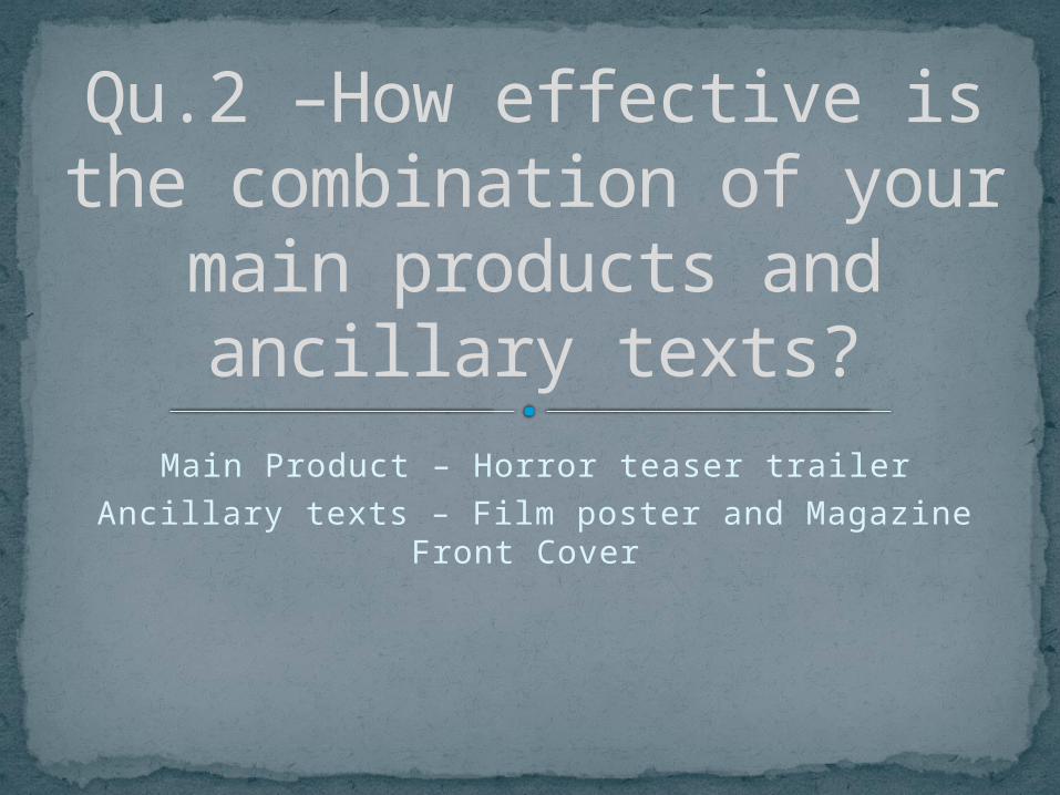
Main Product – Horror teaser trailer
Ancillary texts – Film poster and Magazine Front Cover
Qu.2 –How effective is the combination of your main
products and ancillary texts?
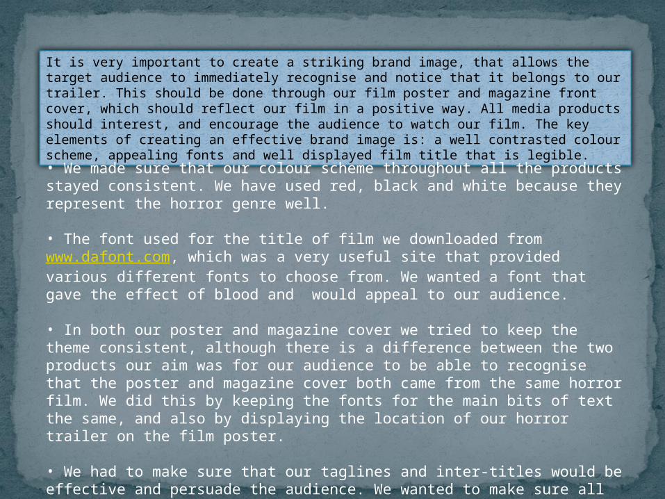
It is very important to create a striking brand image, that allows the target audience to immediately recognise and notice that it belongs to our trailer. This should be done through our film poster and magazine front cover, which should reflect our film in a positive way. All media products should interest, and encourage the audience to watch our film. The key elements of creating an effective brand image is: a well contrasted colour scheme, appealing fonts and well displayed film title that is legible.
• We made sure that our colour scheme throughout all the products stayed consistent. We have used red, black and white because they represent the horror genre well.
• The font used for the title of film we downloaded from www.dafont.com, which was a very useful site that provided various different fonts to choose from. We wanted a font that gave the effect of blood and would appeal to our audience.
• In both our poster and magazine cover we tried to keep the theme consistent, although there is a difference between the two products our aim was for our audience to be able to recognise that the poster and magazine cover both came from the same horror film. We did this by keeping the fonts for the main bits of text the same, and also by displaying the location of our horror trailer on the film poster.
• We had to make sure that our taglines and inter-titles would be effective and persuade the audience. We wanted to make sure all the taglines, had relevance to the narrative of our film.
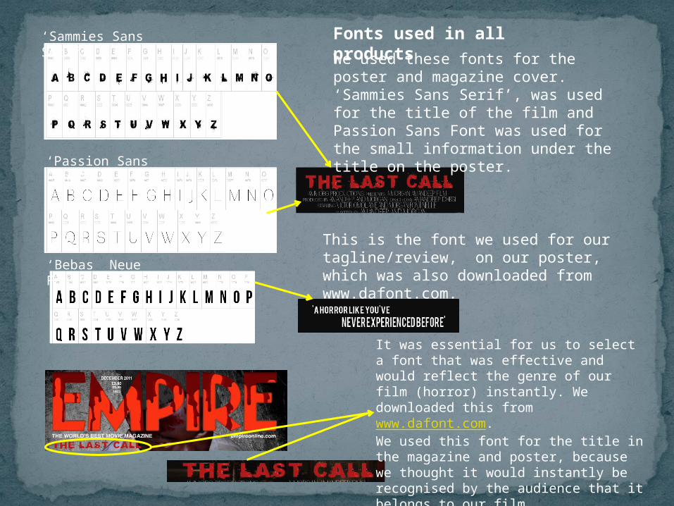
‘Passion Sans Font’
‘Sammies Sans Serif’
‘Bebas Neue Font’
Fonts used in all productsWe used these fonts for the poster and magazine cover. ‘Sammies Sans Serif’, was used for the title of the film and Passion Sans Font was used for the small information under the title on the poster.
It was essential for us to select a font that was effective and would reflect the genre of our film (horror) instantly. We downloaded this from www.dafont.com. We used this font for the title in the magazine and poster, because we thought it would instantly be recognised by the audience that it belongs to our film.
This is the font we used for our tagline/review, on our poster, which was also downloaded from www.dafont.com.
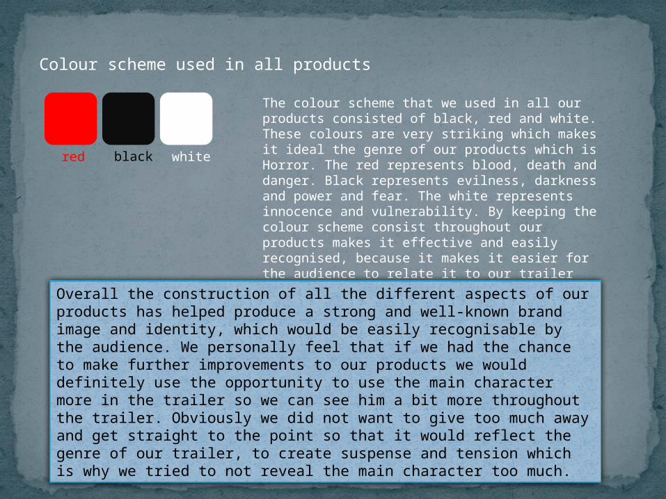
Colour scheme used in all products
The colour scheme that we used in all our products consisted of black, red and white. These colours are very striking which makes it ideal the genre of our products which is Horror. The red represents blood, death and danger. Black represents evilness, darkness and power and fear. The white represents innocence and vulnerability. By keeping the colour scheme consist throughout our products makes it effective and easily recognised, because it makes it easier for the audience to relate it to our trailer and see the connection.
red black white
Overall the construction of all the different aspects of our products has helped produce a strong and well-known brand image and identity, which would be easily recognisable by the audience. We personally feel that if we had the chance to make further improvements to our products we would definitely use the opportunity to use the main character more in the trailer so we can see him a bit more throughout the trailer. Obviously we did not want to give too much away and get straight to the point so that it would reflect the genre of our trailer, to create suspense and tension which is why we tried to not reveal the main character too much.


