36
Freshers’ Survey 2012 Report March 2013 University of Oxford | IT Services |16 Wellington Square | Oxford OX1 2HY | T +44 (0)1865 284877 | W www.it.ox.ac.uk E :[email protected]

Page | 1
Freshers’ Survey 2012 Report
March 2013
University of Oxford | IT Services |16 Wellington Square | Oxford OX1 2HY | T +44 (0)1865 284877 | W www.it.ox.ac.uk

Page | 2
Content
1 Summary ......................................................................................................................................................................................... 2 2 Introduction.................................................................................................................................................................................... 3 3 Demographic Profile of Students ............................................................................................................................................. 3 4 Type of Computer ........................................................................................................................................................................ 3 5 Operating System ......................................................................................................................................................................... 7 6 Assistive Technology ................................................................................................................................................................ 10 7 Anti-Virus Software .................................................................................................................................................................. 10 8 Mobile Phones ............................................................................................................................................................................ 13 9 Mobile Operating System ........................................................................................................................................................ 16 10 Mobile Oxford ............................................................................................................................................................................ 19 11 Podcasting ................................................................................................................................................................................... 20 12 Internet Use ................................................................................................................................................................................ 22 13 Communications ........................................................................................................................................................................ 24 14 Blogs and Twitter ....................................................................................................................................................................... 27 15 Email Provider ............................................................................................................................................................................. 29 16 Email Clients ................................................................................................................................................................................ 29 17 Social Networking ...................................................................................................................................................................... 31 18 Use of VLE in Previous Studies ............................................................................................................................................... 33 19 Information Sources Prior to Arriving in Oxford ................................................................................................................ 33 20 Digital Support for Students’ Learning ................................................................................................................................. 33 21 Relative Importance of Different Digital Technologies .................................................................................................... 35 22 Conclusion ................................................................................................................................................................................... 36
1 Summary
OUCS and now IT Services have run a survey at Freshers Fair since 2004. The aim is to capture the prior experiences, and more recently, wishes of freshers to inform IT Services’ strategy, focus and resources. For example, the IT Learning Programme use the data to help them plan courses. The survey also provides a wealth of data for divisions and others to use as they see fit, for example, to explore the support requirements or students or assess what proportion would own the appropriate technology to access facilities they might provide. This is the 9th annual Freshers’ Survey and gives considerable amount of historical and trend data. Highlights:
92% of freshers brought laptops, the highest percentage seen so far.
In 2012, 10% of undergraduates and 21% of postgraduates brought a tablet computer, up from 4% and 5% respectively in 2011.
This year saw the highest percentage of Mac OS use (32%) and the lowest percentage of Windows OS use (63%) so far.
Unix/Linux systems are most popular with MPLS students. 14% use them regularly.
Around 4% of students use some kind of assistive technology. This is consistent across all student categories and divisions.
The proportion of students with no anti-virus protection is 9%. In some divisions, the percentage of freshers with no protection rises to 12%. Most divisions have seen an increase in the proportion of students who are not protected from viruses.
69% of students brought a smartphone with them, up from just over 50% in 2011.
Smartphone OS is fairly equally split between Android (39%) and iOS (39%) but the percentage of students with access to an iOS phone has increased more than the percentage of students with an Android phone.
Awareness and use of Mobile Oxford is highest in Social Sciences.
Data for internet use over time goes back to 2004 and includes trend data for emailing, banking, research, using virtual worlds, shopping and more.
Postgraduate students are the most enthusiastic category when looking at online activities.
Page | 3
Use of the internet for social networking declined for the third year running but Twitter use has increased.
Reading email on a phone has climbed from 3% in 2010 to almost 50% in 2012.
Facebook is the most popular source if information for UG freshers but PGs prefer to look at college websites.
Wi-fi access everywhere was rated “very” or “fairly” important by the greatest number of freshers. Access to online handouts after lectures came second. Access to online handouts before lectures was third.
2 Introduction
The 2012 Freshers’ Survey was the largest yet with 942 usable responses collected during the 3 days of Freshers’ Fair. Following a major overhaul in 2009 and smaller updates in 2011 and 2012, few questions survive unchanged from the very early days trend, however data has been analysed where possible. 2010 was the first year any attempt had been made to categorise results by division. In 2011, additional questions made this clearer and allowed comparison by student category (undergraduate, postgraduate). For 2012, granularity was further refined by dividing postgraduates into taught postgraduates (TPG) and research postgraduate (RPG)students. This is was important to do as the Thema project had shown that taught postgraduate students have distinctive needs and preferences from both undergraduates and research postgraduates. As the TPG/RPG split was not done in previous years, trend data will use the combined postgraduate result. We greatly appreciate the help and advice from staff working on the DIGE project in clarifying, updating, ordering and presenting the questions in the most effective manner. Questions also continue to be refined in light of changing hardware (e.g. tablet computers, smart phones) and trends (e.g. in social media use) Note: A parallel analysis of the data was carried out by Liz Masterman, lead researcher on the DIGE project. Her additional findings and comments in the light of the DIGE project have been included in this report. Liz’s calculations differ from the data reported here in these respects:
Six additional “rogue” respondents were identified, reducing the total usable responses to 936.
Percentages for visiting students have been computed, for possible interest if this group becomes the focus of attention.
The contents of “Other” free-text responses have been analysed. They are reported in this document where they shed light on the quantitative data.
The percentages computed from these data are unlikely to differ substantially from the data presented here, but are available on request.
3 Demographic Profile of Students
The data reported below was captured from students distributed across divisions and levels of study as follows. All values are percentages:
UG TPG RPG VS Total by division
Humanities 18.38 8.44 1.71 1.92 30.45
MPLS 24.47 2.14 6.30 0.21 33.12
Medical Sciences 5.45 2.03 2.78 0.11 10.36
Social Sciences 6.62 15.71 2.56 1.18 26.07
Total by degree 54.91 28.31 13.35 3.42
4 Type of Computer
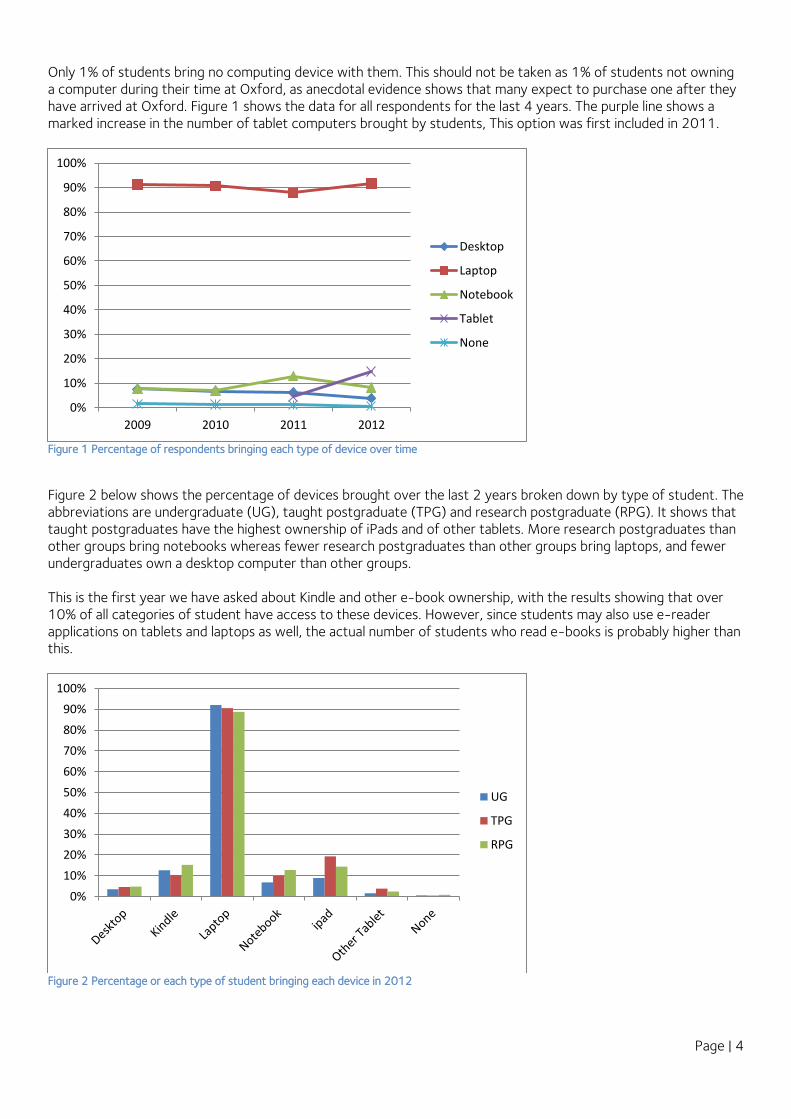
The percentage of people bringing laptops to the University reached its highest ever level (by 1%) in 2012 as it reached 92%. The percentage of students bringing notebooks dropped, perhaps offset by the increase in laptops and the trend for smaller, lighter equipment or due to the rise in tablet use, particularly if notebooks were seen as an “extra” or as a smaller, convenient device for carrying around – a niche that tablets ably fill. Only one person appeared to have a tablet but no other type of computer. All the rest additionally had either a laptop or a notebook/netbook or, in one case, a desktop computer.
Page | 4
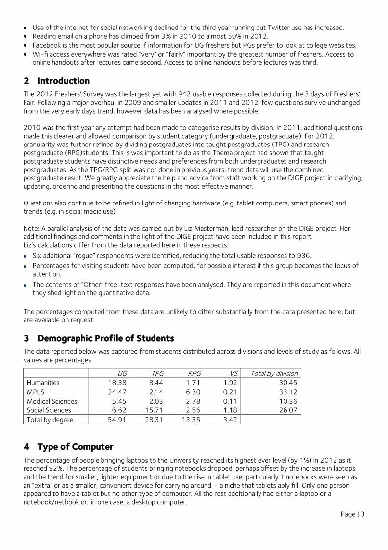
Only 1% of students bring no computing device with them. This should not be taken as 1% of students not owning a computer during their time at Oxford, as anecdotal evidence shows that many expect to purchase one after they have arrived at Oxford. Figure 1 shows the data for all respondents for the last 4 years. The purple line shows a marked increase in the number of tablet computers brought by students, This option was first included in 2011.
Figure 1 Percentage of respondents bringing each type of device over time
Figure 2 below shows the percentage of devices brought over the last 2 years broken down by type of student. The abbreviations are undergraduate (UG), taught postgraduate (TPG) and research postgraduate (RPG). It shows that taught postgraduates have the highest ownership of iPads and of other tablets. More research postgraduates than other groups bring notebooks whereas fewer research postgraduates than other groups bring laptops, and fewer undergraduates own a desktop computer than other groups. This is the first year we have asked about Kindle and other e-book ownership, with the results showing that over 10% of all categories of student have access to these devices. However, since students may also use e-reader applications on tablets and laptops as well, the actual number of students who read e-books is probably higher than this.
Figure 2 Percentage or each type of student bringing each device in 2012
0%
10%
20%
30%
40%
50%
60%
70%
80%
90%
100%
2009 2010 2011 2012
Desktop
Laptop
Notebook
Tablet
None
0%
10%
20%
30%
40%
50%
60%
70%
80%
90%
100%
UG
TPG
RPG

Page | 5
Historical data (Figure 3) mainly duplicates the trends shown in Figure 1 but highlights some interesting details, shown more clearly in Figure 4 which removes the increasing figures for laptops to zoom in on the results for other devices.
Figure 3 Percentage ownership of devices by student category over time
Figure 4 Percentage ownership of devices by student category over time excluding laptops
Here the increase in tablet usage, particularly within the postgraduate community is more marked. From similar figures in 2011 (4% for UG, 5% for PG), figures for tablet ownership has increased to 10% (UG) and 21% (PG). Note: 2011 figures did not discriminate between iPads and other tablets so results have been combined for 2012 to give the comparison1. Analysis was also performed by division with historical data available from 2011.
1 In any case, only about three students owned both an iPad and another tablet, so it is safe to add the two figures together in the 2012 data.
0%
10%
20%
30%
40%
50%
60%
70%
80%
90%
100%
2011 2012
Laptop UG
Laptop PG
Tablet UG
Tablet PG
Notebook UG
Notebook PG
Desktop-UG
Desktop PG
0%
5%
10%
15%
20%
25%
2011 2012
Tablet UG
Tablet PG
Notebook UG
Notebook PG
Desktop-UG
Desktop PG

Page | 6
Figure 5 Percentage ownership of devices by division for 2012
The overview chart for 2012 (Figure 5) shows that students from the Humanities division have lowest desktop ownership but highest laptop and Kindle/e-book reader ownership. Social Science students like ebook readers, notebook computers and tablets. All Medical Science and Social Science students brought a computer of some kind. We revisit the importance to students of reading materials online later in this report.
0%
10%
20%
30%
40%
50%
60%
70%
80%
90%
100%
Humanities
MPLS
MedSci
SocSci
0%
10%
20%
30%
40%
50%
60%
70%
80%
90%
100%
2011 2012
H Desktop
MPLS Desktop
MedS Desktop
SocS Desktop
H Laptop
MPLS Laptop
MedS Laptop
SocS Laptop
H Notebook
MPLS Notebook
MedS Notebook
SocS Notebook
H Tablet
MPLS Tablet
MedS Tablet
SocS Tablet
Page | 7
Figure 6 Percentage ownership of devices by division over time
Figure 6 showing ownership broken down by division over time holds no major surprises. Across the divisions, laptop ownership has increased marginally while notebook and desktop usage has decreased. Also, tablet ownership has increased, particularly in Social Sciences. Further analysis showed that ownership in Social Sciences was highest with taught postgraduates where 34% of taught postgraduates owned a tablet computer. This was made up from 30% owning iPads, 4% other tablets. This level of detail was not pursued with other divisions but provides an example of the kind of data provided by the Freshers’ Survey and which can be extracted on request. In relation to Social Sciences, we should note that students on the taught MPP programme at the Blavatnik School of Government were given an iPad at the start of their studies this year, but it is not clear whether this has had an impact on the data recorded in the survey. The mean number of devices brought by students to Oxford was 1.3, with 5 the maximum number. Adding in smartphone ownership from a subsequent question raises the mean to 2.3 and the maximum to 6.
5 Operating System
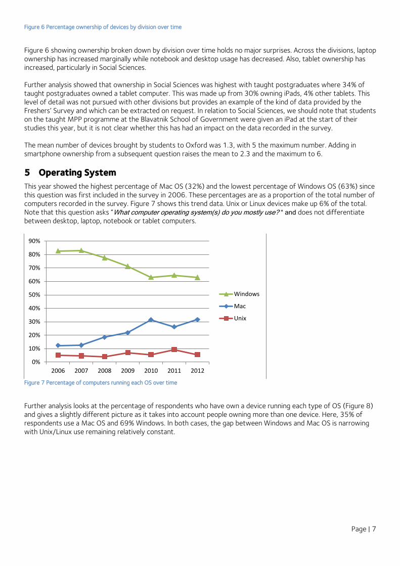
This year showed the highest percentage of Mac OS (32%) and the lowest percentage of Windows OS (63%) since this question was first included in the survey in 2006. These percentages are as a proportion of the total number of computers recorded in the survey. Figure 7 shows this trend data. Unix or Linux devices make up 6% of the total. Note that this question asks “What computer operating system(s) do you mostly use? “ and does not differentiate between desktop, laptop, notebook or tablet computers.
Figure 7 Percentage of computers running each OS over time
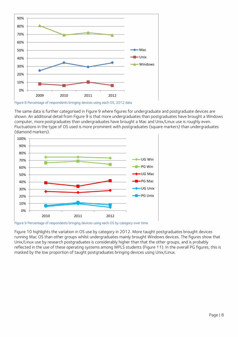
Further analysis looks at the percentage of respondents who have own a device running each type of OS (Figure 8) and gives a slightly different picture as it takes into account people owning more than one device. Here, 35% of respondents use a Mac OS and 69% Windows. In both cases, the gap between Windows and Mac OS is narrowing with Unix/Linux use remaining relatively constant.
0%
10%
20%
30%
40%
50%
60%
70%
80%
90%
2006 2007 2008 2009 2010 2011 2012
Windows
Mac
Unix
Page | 8
Figure 8 Percentage of respondents bringing devices using each OS, 2012 data
The same data is further categorised in Figure 9 where figures for undergraduate and postgraduate devices are shown. An additional detail from Figure 9 is that more undergraduates than postgraduates have brought a Windows computer, more postgraduates than undergraduates have brought a Mac and Unix/Linux use is roughly even. Fluctuations in the type of OS used is more prominent with postgraduates (square markers) than undergraduates (diamond markers).
Figure 9 Percentage of respondents bringing devices using each OS by category over time
Figure 10 highlights the variation in OS use by category in 2012. More taught postgraduates brought devices running Mac OS than other groups whilst undergraduates mainly brought Windows devices. The figures show that Unix/Linux use by research postgraduates is considerably higher than that the other groups, and is probably reflected in the use of these operating systems among MPLS students (Figure 11). In the overall PG figures, this is masked by the low proportion of taught postgraduates bringing devices using Unix/Linux.
0%
10%
20%
30%
40%
50%
60%
70%
80%
90%
2009 2010 2011 2012
Mac
Unix
Windows
0%
10%
20%
30%
40%
50%
60%
70%
80%
90%
100%
2010 2011 2012
UG Win
PG Win
UG Mac
PG Mac
UG Unix
PG Unix

Page | 9
Figure 10 Percentage of respondents by category bringing devices using each OS, 2012 data
A similar breakdown to Figure 10 is shown in Figure 11 with the breakdown being by division rather than student category. A higher proportion of MPLS students than other groups favour Unix/Linux. This also holds for Windows devices.
Figure 11 Percentage of respondents by division bringing devices using each OS 2012
In Figure 12, the divisional data is shown over time. It is interesting to note that use of Windows computers by Social Science students appears to go against the overall trend and to have increased (circle markers). Medical Science students (triangle markers) have moved towards Macs and away from Windows or Unix/Linux while Unix/Linux devices have increased in popularity for MPLS students (square markers) compared to other divisions.
0%
10%
20%
30%
40%
50%
60%
70%
80%
90%
100%
Mac Unix Windows
UG
TPG
RPG
0%
10%
20%
30%
40%
50%
60%
70%
80%
90%
100%
Mac Unix Windows
Humanities
MPLS
MedSci
SocSci

Page | 10
Figure 12 Percentage of respondents by division bringing devices using each OS over time
6 Assistive Technology
This is a new “yes or no” question for 2012 which whether a student used any assistive technology. The results were consistent across student groups and divisions with 3.5% to 5.5% using such technologies. No investigation into the type of assistive technologies used was done.
7 Anti-Virus Software
Many people have more than one computer so may use more than one type of anti-virus software. The first chart, Figure 13, shows the proportion of each type of AV software used in the University.
0%
10%
20%
30%
40%
50%
60%
70%
80%
90%
100%
2011 2012
H windows
MPLS Win
MedSci Win
SocSci Win
H Mac
MPLS Mac
MedSci Mac
SocSci Mac
H Unix
MPLS Unix
MedSci Unix
SocSci Unix

Page | 11
Figure 13 Anti-virus software, 2012 data
There is a fairly even split between AVG, MacAfee, Widows Security, Norton and Sophos. When analysed by student category (Figure 14), the picture is different with research postgraduates favouring Sophos over McAfee, for example. A key figure in all of this is the results for “No protection” – 9% overall, and up to 14% for research postgraduates. It is probably worth noting that 79% of the total number of students without anti-virus protection were Mac users. Indeed, in responses in the “Other” box, it was clear that some people felt they did not need anti-virus protection as they consider their operating systems to be robust enough; e.g.:
“An effectively immune system” “No need for [anti-virus protection for] Ubuntu” “I have a Mac. It dual boots Gentoo. Windows lives in a VM and gets reset to known good after use.”
Figure 14 Anti-virus software choice by student category, 2012 data
Avast, 6%
AVG, 13%
McAfee, 11%
Windows Security, 14%
Norton, 15%
Sophos, 17%
Don't know, 7%
No protection, 9%
Other, 8%
Avast
AVG
McAfee
Windows Security
Norton
Sophos
Don't know
No protection
Other
0%
10%
20%
30%
40%
50%
60%
70%
80%
90%
100%
UG TPG RPG
Other
No protection
Don't know
Sophos
Norton
Windows Security
McAfee
AVG
Avast
Page | 12
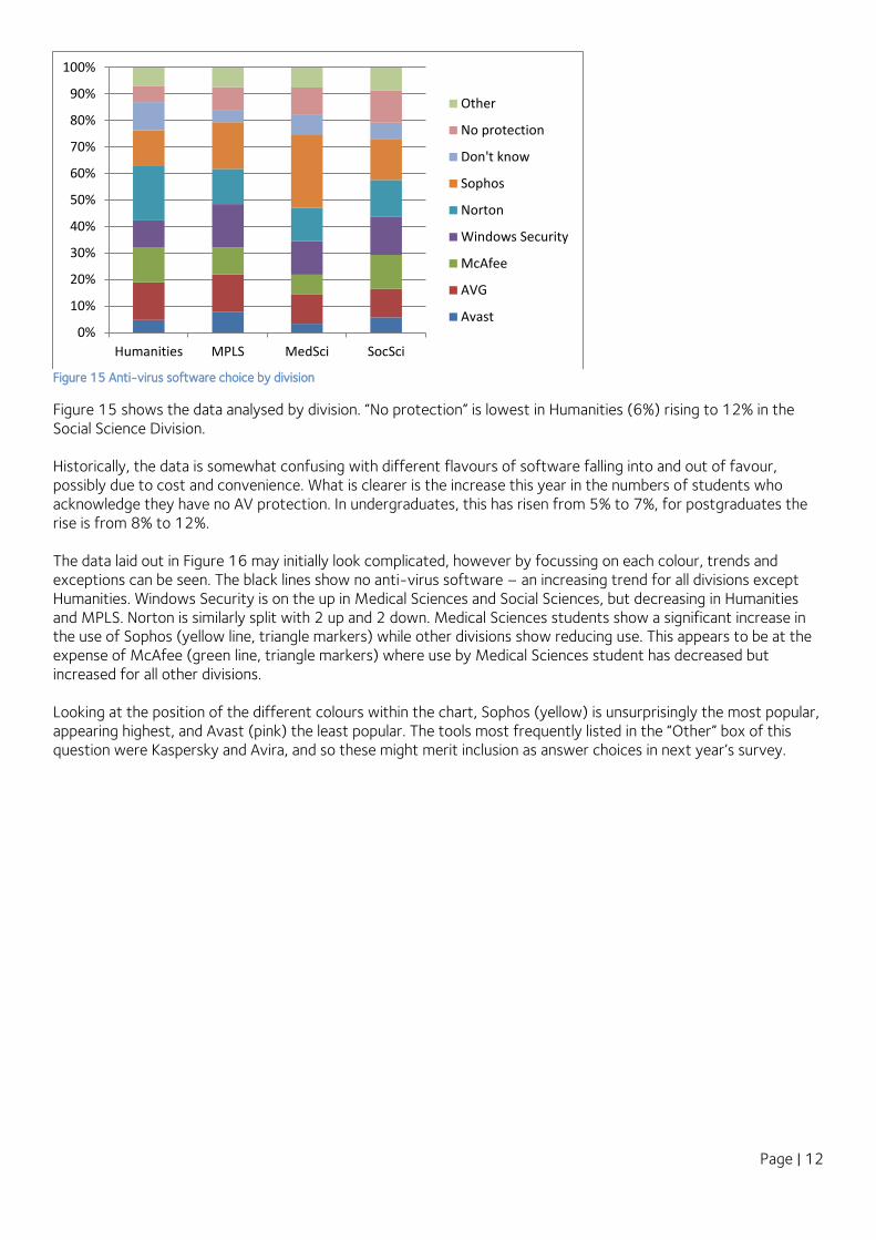
Figure 15 Anti-virus software choice by division
Figure 15 shows the data analysed by division. “No protection” is lowest in Humanities (6%) rising to 12% in the Social Science Division. Historically, the data is somewhat confusing with different flavours of software falling into and out of favour, possibly due to cost and convenience. What is clearer is the increase this year in the numbers of students who acknowledge they have no AV protection. In undergraduates, this has risen from 5% to 7%, for postgraduates the rise is from 8% to 12%. The data laid out in Figure 16 may initially look complicated, however by focussing on each colour, trends and exceptions can be seen. The black lines show no anti-virus software – an increasing trend for all divisions except Humanities. Windows Security is on the up in Medical Sciences and Social Sciences, but decreasing in Humanities and MPLS. Norton is similarly split with 2 up and 2 down. Medical Sciences students show a significant increase in the use of Sophos (yellow line, triangle markers) while other divisions show reducing use. This appears to be at the expense of McAfee (green line, triangle markers) where use by Medical Sciences student has decreased but increased for all other divisions. Looking at the position of the different colours within the chart, Sophos (yellow) is unsurprisingly the most popular, appearing highest, and Avast (pink) the least popular. The tools most frequently listed in the “Other” box of this question were Kaspersky and Avira, and so these might merit inclusion as answer choices in next year’s survey.
0%
10%
20%
30%
40%
50%
60%
70%
80%
90%
100%
Humanities MPLS MedSci SocSci
Other
No protection
Don't know
Sophos
Norton
Windows Security
McAfee
AVG
Avast

Page | 13
Figure 16 Anti-virus software choice by division over time
8 Mobile Phones
The question on mobile phone ownership was simplified this year into three choices – smartphone, other phone and no phone. Figure 17 shows the proportion of phones of each type brought by freshers, with smartphones clearly dominant. A very small proportion of respondents – 3.63% in total –reported having phones of both types.
0%
5%
10%
15%
20%
25%
30%
2011 2012
H-Sophos
MPLS-Sophos
MedS-Sophos
SocS-Sophos
H-Norton
MPLS-Norton
MedS-Norton
SocS-Norton
H-WinS
MPLS-WinS
MedS-WinS
SocS-WinS
H-McAfee
MPLS-McAfee
MedS-McAfee
SocS-McAfee
H-AVG
MPLS-AVG
MedS-AVG
SocS-AVG
H-Avast
MPLS-Avast
MedS-Avast
SocS-Avast
H-none
MPLS-none
MedS-none
SocS-none

Page | 14
Figure 17 Mobile Phones brought by freshers, 2012
Figure 18 shows a different take on the data. Here, the percentage of each student category who brought each type of phone is shown. These percentages would sum to over 100% as one individual could have multiple phones. Over 99% of undergraduate respondents had a mobile phone of some kind, usually a smartphone. Nevertheless, we need to remain aware that mobile phone ownership is still not universal, and therefore the small “unconnected” minority need to be acknowledged and catered for. Otherwise put, it would be unwise to assume that phone ownership is the “default” situation, still less to implement administrative and pedagogic policy on the basis of that assumption.
Figure 18 Mobile phone ownership by student category
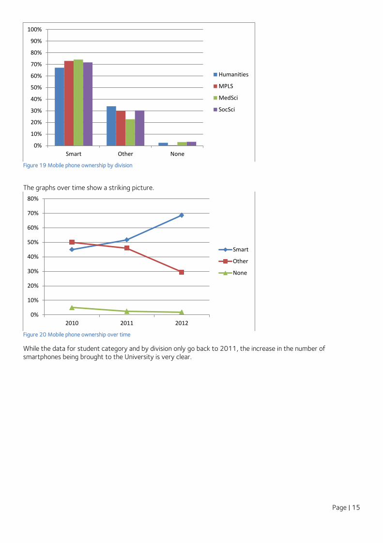
When looking at a similar graph for divisions (Figure 19), all MPLS students brought a phone. Medical Science students were highest for smartphone ownership but the variation is relatively small – 67% in Humanities, 74% in Medical Sciences.
Smart, 69%
Other, 29%
None, 2%
Smart
Other
None
0%
10%
20%
30%
40%
50%
60%
70%
80%
90%
100%
Smart Other None
UG
TPG
RPG
Page | 15
Figure 19 Mobile phone ownership by division
The graphs over time show a striking picture.
Figure 20 Mobile phone ownership over time
While the data for student category and by division only go back to 2011, the increase in the number of smartphones being brought to the University is very clear.
0%
10%
20%
30%
40%
50%
60%
70%
80%
90%
100%
Smart Other None
Humanities
MPLS
MedSci
SocSci
0%
10%
20%
30%
40%
50%
60%
70%
80%
2010 2011 2012
Smart
Other
None

Page | 16
Figure 21 Mobile phone ownership by student category over time Figure 22 Mobile phone ownership by division over time
9 Mobile Operating System
Figure 23 shows the range of mobile phone operating system brought to the University. Android (39%) and iOS (38%) are the most popular.
Figure 23 Percentage of phones running each operating system, 2012 data
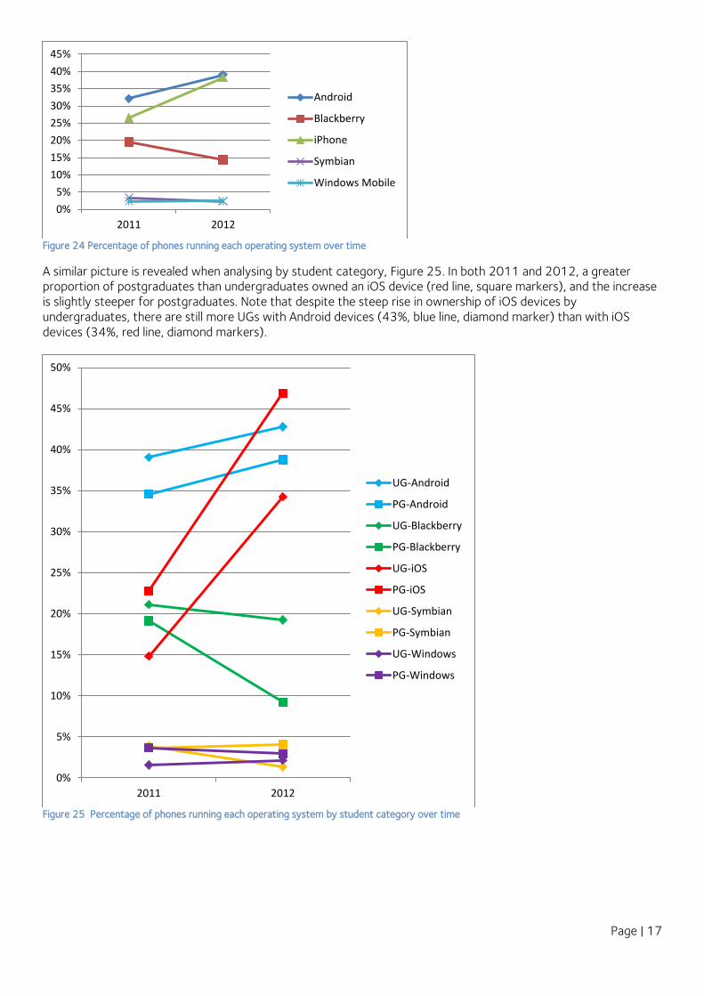
The change over time, shown in Figure 24, shows the rise of iOS and slower increase in Android devices, at the expense of Blackberry.
0%
10%
20%
30%
40%
50%
60%
70%
80%
2011 2012
UG Smart
PG Smart
UG Other
PG Other
UG none
PH none
0%
10%
20%
30%
40%
50%
60%
70%
80%
2011 2012
H-Smart
MPLS-Smart
MedS-Smart
SocS-Smart
H-Other
MPLSL-Other
MedS-Other
SocS-Other
H-None
MPLS-None
MedS-None
SocS-none
Android, 39%
Blackberry, 14%
iOS, 38%
Symbian, 2% Windows, 2%
Unknown or Other, 4%
Android
Blackberry
iOS
Symbian
Windows
Unknown or Other
Page | 17
Figure 24 Percentage of phones running each operating system over time
A similar picture is revealed when analysing by student category, Figure 25. In both 2011 and 2012, a greater proportion of postgraduates than undergraduates owned an iOS device (red line, square markers), and the increase is slightly steeper for postgraduates. Note that despite the steep rise in ownership of iOS devices by undergraduates, there are still more UGs with Android devices (43%, blue line, diamond marker) than with iOS devices (34%, red line, diamond markers).
Figure 25 Percentage of phones running each operating system by student category over time
0%
5%
10%
15%
20%
25%
30%
35%
40%
45%
2011 2012
Android
Blackberry
iPhone
Symbian
Windows Mobile
0%
5%
10%
15%
20%
25%
30%
35%
40%
45%
50%
2011 2012
UG-Android
PG-Android
UG-Blackberry
PG-Blackberry
UG-iOS
PG-iOS
UG-Symbian
PG-Symbian
UG-Windows
PG-Windows

Page | 18
In Figure 26, the data is analysed by division. Android and iOS are still the most popular; however, a greater proportion of students in MPLS have Android phones (50%, blue bar). Humanities also appear to show more of a preference for Blackberries than other divisions (21% compared to 10-14%).
Figure 26 Percentage of phones running each operating system by division
The change over time for divisions is shown in Figure 27. This shows that the preference for Android phones in MPLS division has been sustained over the last 2 years (blue line, square markers). However, Android devices have declined slightly among Humanities students over these 2 years (34% to 31%, blue line, diamond marker), contrary to the general trend.
0%
10%
20%
30%
40%
50%
60%
Humanities MPLS MedSci SocSci
iOS (iPhone)
Android
Blackberry
Symbian
Windows

Page | 19
Figure 27 Percentage of phones running each operating system by division over time
10 Mobile Oxford
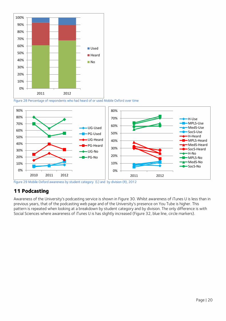
The freshers were asked whether they had heard of Mobile Oxford and used it, whether they had heard of it but not used it, or whether they had not heard of it at all. 68% had never heard of it. This is an increase from 61% in 2011. However, the percentage of people who had used it has increased marginally from 7% to 10%. This pattern was repeated when the data was analysed by student category and by division (Figure 29). In interpreting this data, however, we need to bear in mind that many students have only been in Oxford for a week or so, and so cannot be expected to have tried out every tool or website that has been brought to their attention. So the fact that 30% of students had heard of the service may actually be an encouraging result.
0%
5%
10%
15%
20%
25%
30%
35%
40%
45%
50%
2011% 2012%
H-Android
MPLS-Android
MedS-Android
SocS-Android
H-Blackberry
MPLS-Blackberry
MedS-Blackberry
SocS-Blackberry
H-iOS
MPLS-iOS
MedS-iOS
SocS-iOS
H-Symbian
MPLS-Symbian
MedS-Symbian
SocS-Symbian
H-Windows
MPLS-Windows
MedS-Windows
SocS-Windows
Page | 20
Figure 28 Percentage of respondents who had heard of or used Mobile Oxford over time
Figure 29 Mobile Oxford awareness by student category (L) and by division (R), 2012
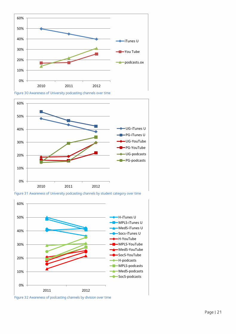
11 Podcasting
Awareness of the University’s podcasting service is shown in Figure 30. Whilst awareness of iTunes U is less than in previous years, that of the podcasting web page and of the University’s presence on You Tube is higher. This pattern is repeated when looking at a breakdown by student category and by division. The only difference is with Social Sciences where awareness of iTunes U is has slightly increased (Figure 32, blue line, circle markers).
0%
10%
20%
30%
40%
50%
60%
70%
80%
90%
100%
2011 2012
Used
Heard
No
0%
10%
20%
30%
40%
50%
60%
70%
80%
90%
2010 2011 2012
UG-Used
PG-Used
UG-Heard
PG-Heard
UG-No
PG-No
0%
10%
20%
30%
40%
50%
60%
70%
80%
2011 2012
H-UseMPLS-UseMedS-UseSocS-UseH-HeardMPLS-HeardMedS-HeardSocS-HeardH-NoMPLS-NoMedS-NoSocS-No
Page | 21
Figure 30 Awareness of University podcasting channels over time
Figure 31 Awareness of University podcasting channels by student category over time
Figure 32 Awareness of podcasting channels by division over time
0%
10%
20%
30%
40%
50%
60%
2010 2011 2012
iTunes U
You Tube
podcasts.ox
0%
10%
20%
30%
40%
50%
60%
2010 2011 2012
UG-iTunes U
PG-iTunes U
UG-YouTube
PG-YouTube
UG-podcasts
PG-podcasts
0%
10%
20%
30%
40%
50%
60%
2011 2012
H-iTunes U
MPLS-iTunes U
MedS-iTunes U
Socs-iTunes U
H-YouTube
MPLS-YouTube
MedS-YouTube
SocS-YouTube
H-podcasts
MPLS-podcasts
MedS-podcasts
SocS-podcasts

Page | 22
The number of students who watched or listened to podcasts before they came has risen very slightly from 27% in 2011 to 31% in 2012. They are accessed most by undergraduates - 35% in 2012, compared with 29% for taught postgraduates and only 19% for research postgraduates. As in 2011, the category of podcast most accessed was “Lectures and talks on particular subjects for my own interest”. Also, more students are accessing general introductions to the University than previously.
It is worth noting that the figures on accessing podcasts may tell us more about comparisons between the three channels than they do about students’ general awareness, since it is not possible to distinguish in the data between respondents who had not heard of any of the channels and non-respondents.
12 Internet Use
A question on uses of the internet has been included in the survey for many years, with a number of additions over time. Emailing is increasing after a dip last year. Learning/studying and research use is also increasing as is chat, downloading files and music, and most other activities with the exception of contributing to a wiki. Listening to music and watching TV online were both included for the first time and 82% and 71% of respondents respectively participate in these. However, the figure for social networking sites is low when compared with Figure 46. This may be because some respondents may not have been aware that a “social networking site” means Facebook, etc.
0%
10%
20%
30%
40%
50%
60%
70%
2011 2012
My interest
Uni Intros
Teacher recom

Page | 23
Figure 33 Internet use over time
0%
10%
20%
30%
40%
50%
60%
70%
80%
90%
100%
2004 2005 2006 2007 2008 2009 2010 2011 2012
Emailing
Learning/studying or research
Listening to music
Social networking
Chat
Banking
Web browsing
Downloading files/music
Watching TV programmes
Shopping
Booking travel and holidays
Sharing photos
Booking entertainment
Playing games
Writing a blog
Writing a microblog
Social bookmarking
Contributing to a wiki
Virtual online worlds
Gambling
Page | 24
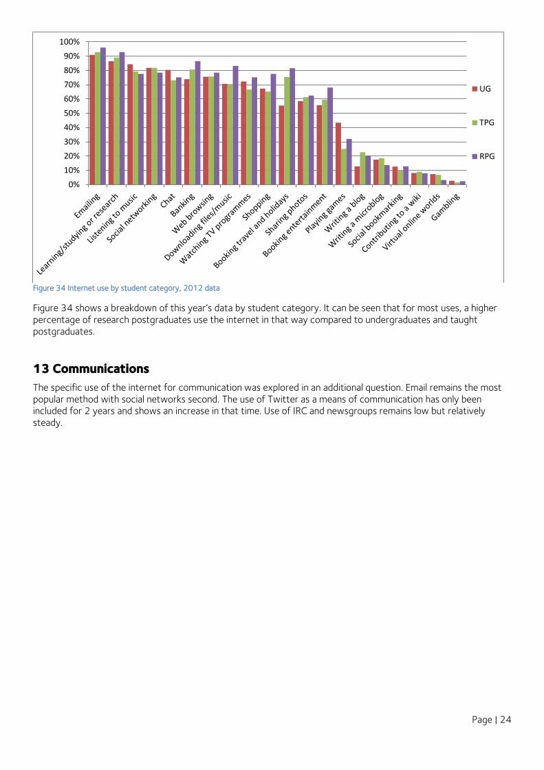
Figure 34 Internet use by student category, 2012 data
Figure 34 shows a breakdown of this year’s data by student category. It can be seen that for most uses, a higher percentage of research postgraduates use the internet in that way compared to undergraduates and taught postgraduates.
13 Communications
The specific use of the internet for communication was explored in an additional question. Email remains the most popular method with social networks second. The use of Twitter as a means of communication has only been included for 2 years and shows an increase in that time. Use of IRC and newsgroups remains low but relatively steady.
0%
10%
20%
30%
40%
50%
60%
70%
80%
90%
100%
UG
TPG
RPG

Page | 25
Figure 35 Percentage of respondents regularly using various communication channels over time
Below (Figure 36), the communications data has been broken down by student category with trends generally following those for all respondents combine. The only real point of note is that postgraduates make more used of mailing lists than undergraduates (pink lines, square and diamond markers respectively).
0%
10%
20%
30%
40%
50%
60%
70%
80%
90%
100%
2008 2009 2010 2011 2012
Social networking sites
Telephony (Skype etc.)
Messengers
Mailing lists
Online discussion forum
Newsgroups
Internet Relay Chat

Page | 26
Figure 36 Percentage of respondents regularly using various communications methods by student category over time
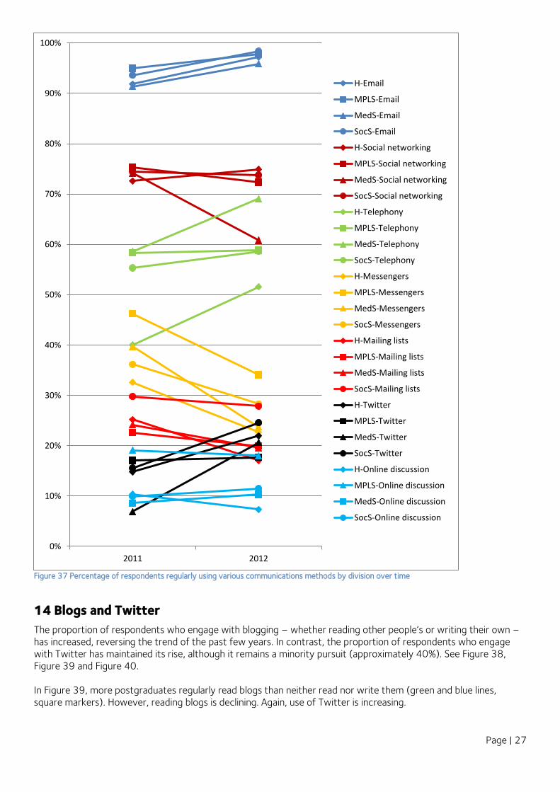
The divisional split in Figure 37 shows a large drop in social networking use by Medical Science students, compared to an increase in use by respondents from other divisions. It also shows that, while increasing, Humanities students show a lower use of telephony (Skype, etc.).Use of newsgroups and IRC are not included on this chart as their use across all divisions is less than 10% and generally declining.
0%
10%
20%
30%
40%
50%
60%
70%
80%
90%
100%
2011 2012
UG-Email
PG-Email
UG-Social networking
PG-Social networking
UG-Telephony
PG-Telephony
UG-Messengers
PG-Messengers
UG-Mailing lists
PG-Mailing lists
UG-Twitter
PG-Twitter
UG-Online discussion
PG-Online discussion
UG-IRC
PG-IRC
UG-Newsgroups
PG-Newsgroups
Page | 27
Figure 37 Percentage of respondents regularly using various communications methods by division over time
14 Blogs and Twitter
The proportion of respondents who engage with blogging – whether reading other people’s or writing their own – has increased, reversing the trend of the past few years. In contrast, the proportion of respondents who engage with Twitter has maintained its rise, although it remains a minority pursuit (approximately 40%). See Figure 38, Figure 39 and Figure 40. In Figure 39, more postgraduates regularly read blogs than neither read nor write them (green and blue lines, square markers). However, reading blogs is declining. Again, use of Twitter is increasing.
0%
10%
20%
30%
40%
50%
60%
70%
80%
90%
100%
2011 2012
H-Email
MPLS-Email
MedS-Email
SocS-Email
H-Social networking
MPLS-Social networking
MedS-Social networking
SocS-Social networking
H-Telephony
MPLS-Telephony
MedS-Telephony
SocS-Telephony
H-Messengers
MPLS-Messengers
MedS-Messengers
SocS-Messengers
H-Mailing lists
MPLS-Mailing lists
MedS-Mailing lists
SocS-Mailing lists
H-Twitter
MPLS-Twitter
MedS-Twitter
SocS-Twitter
H-Online discussion
MPLS-Online discussion
MedS-Online discussion
SocS-Online discussion

Page | 28
Figure 38 Use of blogs (L) and Twitter (R) over time
Figure 39 Use of blogs (L) and Twitter (R) by student category over time
0%
10%
20%
30%
40%
50%
60%
70%
80%
2009 2010 2011 2012
Read
Write
Neither
0%
10%
20%
30%
40%
50%
60%
70%
80%
2009 2010 2011 2012
Read
Write
Neither
0%
10%
20%
30%
40%
50%
60%
2010 2011 2012
UG-Read
PG-Read
UG-Write
PG-Write
UG-Neither
PG-Neither
0%
10%
20%
30%
40%
50%
60%
70%
80%
2010 2011 2012
UG-Read
PG-Read
UG-Write
PG-Write
UG-NeitherPG-Neither
0%
10%
20%
30%
40%
50%
60%
70%
80%
2011 2012
H-Read
MPLS-Read
MedS-Read
SocS-Read
H-Write
MPLS-Write
MedS-Write
SocS-Write
H-Neither
MPLS-Neither
MedS-Neither
SocS-Neither0%
10%
20%
30%
40%
50%
60%
70%
80%
2011 2012
H-Read
MPLS-Read
MedS-Read
SocS-Read
H-Write
MPLS-Write
MedS-Write
SocS-Write
H-Neither
MPLS-Neither
MedS-Neither
SocS-Neither
Figure 40 Use of Blogs (L) and Twitter (R) by division over time

Page | 29
15 Email Provider
Of all the email accounts recorded, 47% of them are provided by Gmail with Hotmail second at 32%. This dominance is not new; Figure 41(R) shows how email provider has changed over the last few years.
There is almost no change over the last 2 years when the data is analysed by student category and by division (no chart shown). Below is a different view of the data than above; here the percentage of students having each kind of account is analysed. E.g. 65% of undergraduates have a Google Mail account, rather than 47% of all accounts recorded are provided by Google Mail. Apart from Hotmail being slightly more common among undergraduates and slightly less common among Social Science students, the picture is relatively stable.
Figure 42 Percentage of students who have access to an account from different providers, 2012 data
Closer analysis of the data showed that, on average, incoming students have 1.6 email accounts (other than their Oxford accounts), with a maximum of 4. Some students were continuing to use their email accounts at their previous institutions, including school.
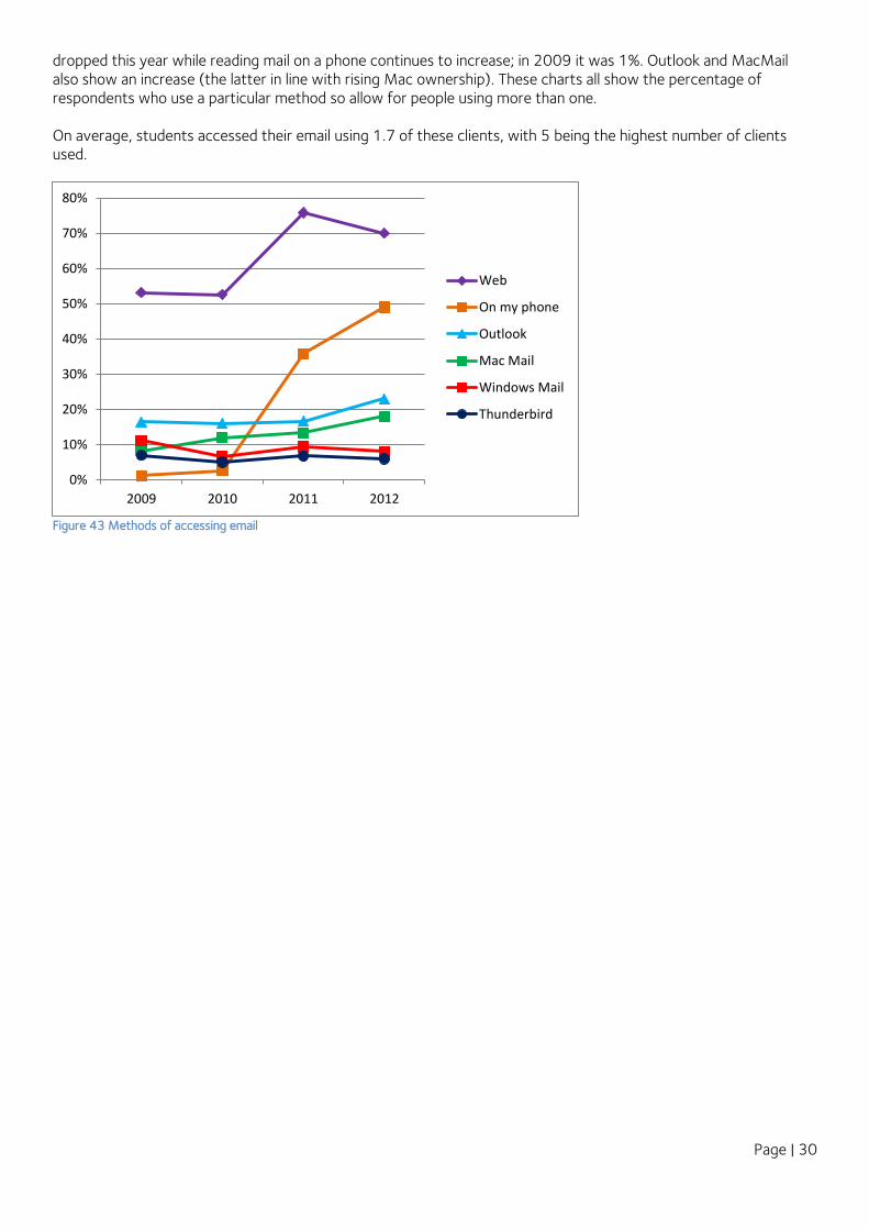
16 Email Clients
The Freshers’ survey has been asking respondents how they read their email for several years. “On the web” has always been popular and is still the most common access method. However, as can be seen in Figure 43, it has
0%
10%
20%
30%
40%
50%
60%
70%
80%
90%
UG TPG RPG
GoogleMailHotmail
YahooMail
0%
10%
20%
30%
40%
50%
60%
70%
80%
90%
Google Mail
Hotmail
Yahoo Mail
AOL
AOL, 2%
Gmail, 47%
Hotmail, 32%
Yahoo, 14%
Other, 4%
AOL
Gmail
0%
5%
10%
15%
20%
25%
30%
35%
40%
45%
50%
2009 2010 2011 2012
Google Mail
Hotmail
Yahoo Mail
Other
AOL
Figure 41 Percentage of accounts for each provider, 2012 data (L) and over time (R)
Page | 30
dropped this year while reading mail on a phone continues to increase; in 2009 it was 1%. Outlook and MacMail also show an increase (the latter in line with rising Mac ownership). These charts all show the percentage of respondents who use a particular method so allow for people using more than one. On average, students accessed their email using 1.7 of these clients, with 5 being the highest number of clients used.
Figure 43 Methods of accessing email
0%
10%
20%
30%
40%
50%
60%
70%
80%
2009 2010 2011 2012
Web
On my phone
Outlook
Mac Mail
Windows Mail
Thunderbird

Page | 31
Figure 44 Method of accessing email by student category (L) and division (R) over time
When looking at the breakdown of email access method by student category or by divisions (), the same trends are seen. Some lines may start at different points, for example members of Medical Sciences accessing mail via phone (R chart, orange line, triangle markers), or have different gradients, but the trends are consistent with the one exception of Thunderbird use in Social Sciences (R chart, dark blue line, circle markers).
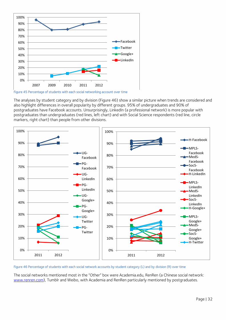
17 Social Networking
The percentage of respondents with Facebook accounts (Figure 45) continues to increase after a drop in 2009. Google+, launched in 2011 and initially used by 18% of the respondents has dropped to 8%, and has yet to gain any kind of purchase. Twitter is continuing its steady increase, although the extent to which it can be classed as a social network in the same way as the others is debatable.
0%
10%
20%
30%
40%
50%
60%
70%
80%
90%
2011 2012
UG-Web
PG-Web
UG-Phone
PG-Phone
UG-Outlook
PG-Outlook
UG-MacMail
PG-MacMail
UG-WinMail
PG-WinMail
UG-Tbird
PG-Tbird
0%
10%
20%
30%
40%
50%
60%
70%
80%
90%
2011 2012
H-Web
MPLS-Web
MedS-Web
SocS-Web
H-Phone
MPLS-PhoneMedS-PhoneSocS-Phone
H-Outlook
MPLS-OutlookMedS-OutlookSocS-OutlookH-MacMail
MPLS-MacMailMedS-MacMailSocS-MacMailH-WinMail
MPLS-WinMailMedS-WinMailSocS-WinMailH-Tbird
MPLS-Tbird
MedS-Tbird
SocS-Tbird
Page | 32
Figure 45 Percentage of students with each social networking account over time
The analyses by student category and by division (Figure 46) show a similar picture when trends are considered and also highlight differences in overall popularity by different groups. 95% of undergraduates and 90% of postgraduates have Facebook accounts. Unsurprisingly, LinkedIn (a professional network) is more popular with postgraduates than undergraduates (red lines, left chart) and with Social Science respondents (red line, circle markers, right chart) than people from other divisions.
Figure 46 Percentage of students with each social network accounts by student category (L) and by division (R) over time
The social networks mentioned most in the “Other” box were Academia.edu, RenRen (a Chinese social network: www.renren.com), Tumblr and Weibo, with Academia and RenRen particularly mentioned by postgraduates.
0%
10%
20%
30%
40%
50%
60%
70%
80%
90%
100%
2007 2009 2010 2011 2012
Google+
0%
10%
20%
30%
40%
50%
60%
70%
80%
90%
100%
2011 2012
UG-Facebook
PG-Facebook
UG-LinkedIn
PG-LinkedIn
UG-Google+
PG-Google+
UG-Twitter
PG-Twitter
0%
10%
20%
30%
40%
50%
60%
70%
80%
90%
100%
2011 2012
H-Facebook
MPLS-FacebookMedS-FacebookSocS-FacebookH-LinkedIn
MPLS-LinkedInMedS-LinkedInSocS-LinkedInH-Google+
MPLS-Google+MedS-Google+SocS-Google+H-Twitter
Page | 33
18 Use of VLE in Previous Studies
Students’ familiarity with a virtual learning environment was first investigated at the request of the DIGE project. This year’s data showed that approximately 53% of undergraduate respondents had used an online learning platform (the term used in the survey question, as we were unsure whether they would be familiar with the abbreviation “VLE”). Taken at face value, it would appear that VLEs are not yet widespread in UK secondary education, and so many students are encountering one for the first time when they come to Oxford. In contrast, 73% of taught postgraduate respondents had used a VLE before, and 67% of research postgraduates (although the previous experience of the latter group is of less interest unless they will be teaching undergraduates).
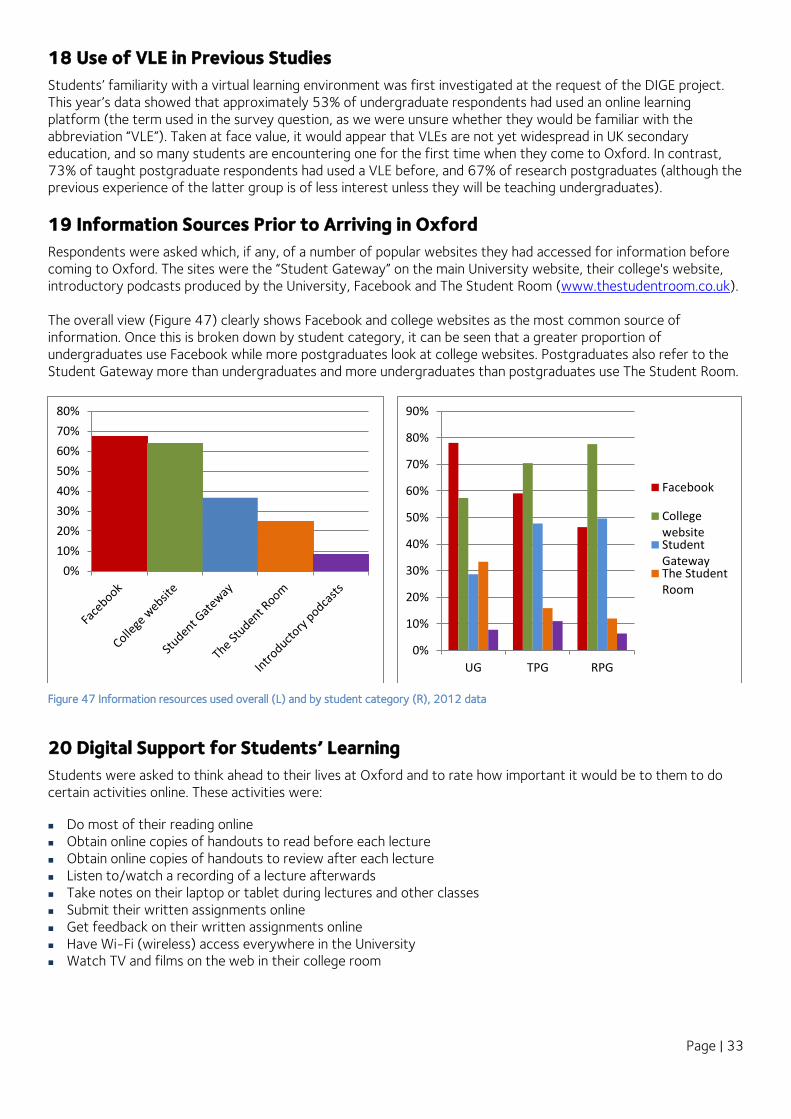
19 Information Sources Prior to Arriving in Oxford
Respondents were asked which, if any, of a number of popular websites they had accessed for information before coming to Oxford. The sites were the “Student Gateway” on the main University website, their college's website, introductory podcasts produced by the University, Facebook and The Student Room (www.thestudentroom.co.uk). The overall view (Figure 47) clearly shows Facebook and college websites as the most common source of information. Once this is broken down by student category, it can be seen that a greater proportion of undergraduates use Facebook while more postgraduates look at college websites. Postgraduates also refer to the Student Gateway more than undergraduates and more undergraduates than postgraduates use The Student Room.
Figure 47 Information resources used overall (L) and by student category (R), 2012 data
20 Digital Support for Students’ Learning
Students were asked to think ahead to their lives at Oxford and to rate how important it would be to them to do certain activities online. These activities were:
Do most of their reading online Obtain online copies of handouts to read before each lecture Obtain online copies of handouts to review after each lecture Listen to/watch a recording of a lecture afterwards Take notes on their laptop or tablet during lectures and other classes Submit their written assignments online Get feedback on their written assignments online Have Wi-Fi (wireless) access everywhere in the University Watch TV and films on the web in their college room
0%
10%
20%
30%
40%
50%
60%
70%
80%
0%
10%
20%
30%
40%
50%
60%
70%
80%
90%
UG TPG RPG
CollegewebsiteStudentGatewayThe StudentRoom

Page | 34
Figure 48 Online activities considered “very”or “fairly” important by survey respondents, 2012 data
Figure 48 shows the percentage of each student group who rated each feature as “very important” or “fairly important”. For all groups, wifi access everywhere was the highest scoring feature, and this is in keeping with one of the key findings (and recommendations) of the DIGE study. Obtaining copies of handouts to review after each lecture was also important to many people, again reflecting data from the DIGE study. Being able to work online – read, submit assignments and receive feedback on those assignments – was rated higher by postgraduates than undergraduates. However, our interest in lecture-related activities lay primarily in the experience of taught students, and so the data from research students is perhaps less meaningful in this respect. In terms of leisure activities, 67% to 74% of respondents felt being able to watch TV on the web in their rooms was very or fairly important.
Figure 49 Online activities considered “very” or “fairly” important, analysed by student category, 2012 data
Figure 49 shows exactly the same data in a different view to more clearly show the top priorities of each group of students and Figure 50 shows the priorities by division. It is interesting to note that a smaller proportion of undergraduates than postgraduates (both groups) consider it important to do most of their reading online. This may reflect the continued prevalence of printed texts in schools. The fact that just over half of students consider it important to be able to replay a recording of a lecture suggests the continuing value of the “live” lecture as a medium for learning.
0%10%20%30%40%50%60%70%80%90%
100%
Wi-Fi accesseverywhere
in theUniversity
Online copiesof handouts
to reviewafter each
lecture
Online copiesof handouts
to readbefore each
lecture
Watch TVand films onthe web in
your collegeroom
Submit yourwritten
assignmentsonline
Do most ofyour reading
online
Listento/watch a
recording ofa lecture
afterwards
Get feedbackon yourwritten
assignmentsonline
Take noteson your
laptop ortablet duringlectures andother classes
UG
TPG
RPG
0%
10%
20%
30%
40%
50%
60%
70%
80%
90%
100%
UG TPG RPG
Wi-Fi access everywhere in the University
Online copies of handouts to review after eachlectureOnline copies of handouts to read before eachlectureWatch TV and films on the web in your collegeroomSubmit your written assignments online
Do most of your reading online
Listen to/watch a recording of a lectureafterwardsGet feedback on your written assignmentsonlineTake notes on your laptop or tablet duringlectures and other classes

Page | 35
Figure 50 Online activities considered “very” or “fairly” important, analysed by division, 2012 data
Since Humanities students are arguably those who read the most texts, it is interesting that they constitute the smallest percentage who consider it important to read those texts online. This may reflect their continuing preference for being able annotate texts directly onto the page, as observed by a Humanities lecturer interviewed by the DIGE project.
21 Relative Importance of Different Digital Technologies
Students were also asked to think ahead to their lives at Oxford and to indicate how important they thought it would be to have each of the following technologies: Desktop computer (for their exclusive use) Desktop computer in a cluster Digital camera (or camera on their phone) E-book reader (e.g. Kindle or a tablet with an e-reading app) iPad or other tablet Laptop MP3 player (or music player on their phone) Notebook or netbook Smartphone The graphs (Figure 51 and Figure 52) are plotted of the technologies which were classified as “Essential” or “Very important”. All student categories (Figure 51) see a laptop as an essential or very important item (unsurprisingly, given the high proportion bringing this device to Oxford). Second for all groups, but by a considerable margin, was a smartphone, very closely followed by a shared desktop. Research postgraduates valued a desktop for their exclusive use more than undergraduates or taught postgraduates, which may reflect the greater use of desktops for using powerful tools in empirical work and data analysis, particularly among students engaged in scientific research.
0%
10%
20%
30%
40%
50%
60%
70%
80%
90%
100%
Humanities MPLS MedSci SocSci
Wi-Fi access everywhere in the University
Online copies of handouts to review after eachlectureOnline copies of handouts to read before eachlectureWatch TV and films on the web in your collegeroomSubmit your written assignments online
Do most of your reading online
Listen to/watch a recording of a lectureafterwardsGet feedback on your written assignments online
Take notes on your laptop or tablet duringlectures and other classes
Page | 36
Figure 51 “Essential” or “very important” technologies, analysed by student category, 2012 data
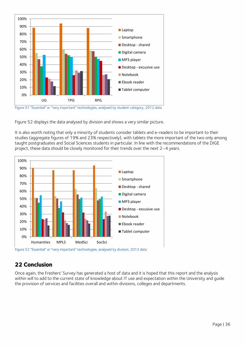
Figure 52 displays the data analysed by division and shows a very similar picture. It is also worth noting that only a minority of students consider tablets and e-readers to be important to their studies (aggregate figures of 19% and 23% respectively), with tablets the more important of the two only among taught postgraduates and Social Sciences students in particular. In line with the recommendations of the DIGE project, these data should be closely monitored for their trends over the next 2–4 years.
Figure 52 “Essential” or “very important” technologies, analysed by division, 2012 data
22 Conclusion
Once again, the Freshers’ Survey has generated a host of data and it is hoped that this report and the analysis within will to add to the current state of knowledge about IT use and expectation within the University and guide the provision of services and facilities overall and within divisions, colleges and departments.
0%
10%
20%
30%
40%
50%
60%
70%
80%
90%
100%
UG TPG RPG
Laptop
Smartphone
Desktop - shared
Digital camera
MP3 player
Desktop - excusive use
Notebook
Ebook reader
Tablet computer
0%
10%
20%
30%
40%
50%
60%
70%
80%
90%
100%
Humanities MPLS MedSci SocSci
Laptop
Smartphone
Desktop - shared
Digital camera
MP3 player
Desktop - excusive use
Notebook
Ebook reader
Tablet computer


