14
Platform Guide Site Dashboard Home Page Overview
| Date post: | 05-Aug-2015 |
| Category: |
Business |
| Upload: | ginzametrics |
| View: | 118 times |
| Download: | 1 times |

Platform Guide
Site Dashboard Home Page Overview

Dashboard Home Page Your dashboard home page is the hub of your site and content analytics. Here you can get information and insights on your marketing and SEO performance across search engines, devices, marketing channels, and keywords.

Dashboard Home Page Charts and tables within GinzaMetrics are often interactive - with hover states, clickable segments, or links included. This allows us to provide granular data in a more user-friendly platform.
Hover State reveals percentages
and totals at a glance
Clickable Charts deliver more granular
data

Dashboard Home Page Your dashboard home page contains the following elements:
- Traffic summary bar - Marketing channel performance chart - All organic visits chart - Tracked organic visits chart - Keyword rank chart - Findability Score vs. competitors chart - Average rank vs. competitors chart - Search engine performance summary - Recommendations summary - Top keyword activity - improved - Top keyword activity - declined - Top keyword activity - competitors

Traffic Summary Bar The traffic summary bar is included to prevent you from having to toggle back and forth between a site analytics platform such as Google Analytics and the GinzaMetrics platform. Here you will get a general traffic overview that includes:
- Visits - This is the total number of visits (including multiple visits from the same visitor) to your content during your selected date range
- Visitors - This is the total number of unique visitors to your content during the date range selected
- New Visits - This represents the number of unique new visits during the date range selected
- % of New Visitors - The percentage of new versus returning visits to your content during the time period selected
- Bounces - The total number of bounced visits (visits in which the person left your site from the entrance page without interacting with the page) during your date range
- Bounce Rate - The percentage of total traffic that bounced during your selected date range
- Pageviews - The total number of pageviews across all visits - Pages per Visit - This represents the average number of pages a user will see on your
site during a single visit - Average session duration - This is the average amount of time a user spends on your
site during a single visit

Marketing Channel Performance Chart This chart aggregates all possible elements driving traffic to your content into a single view. It is perfect for gaining an overview of the contributing factors to your marketing success. Get more detailed information by hovering over bars on the graph to see information on the total number of visits that day, the total for that channel that day, and the percentage of that days traffic driven from that channel.
You can view marketing specific data by channels including:
- Email - Social - Comparison Shopping Engines - Organich - Paid search - Referral - Affiliate - Mobile (Native) - Direct - Retargeting - Other
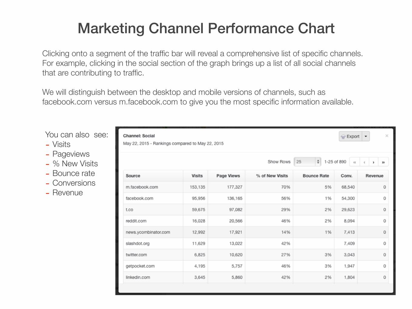
Marketing Channel Performance Chart Clicking onto a segment of the traffic bar will reveal a comprehensive list of specific channels. For example, clicking in the social section of the graph brings up a list of all social channels that are contributing to traffic.
We will distinguish between the desktop and mobile versions of channels, such as facebook.com versus m.facebook.com to give you the most specific information available.
You can also see: - Visits - Pageviews - % New Visits - Bounce rate - Conversions - Revenue

Integrated Search Performance: All Organic Visits & Tracked Organic Visits
All Organic Visits – This chart provides an overview of all unpaid organic visits, sorted by your selected search engines and/or devices. There is also an average rank line to highlight change position change over time. Here you can see how various search sites and devices are contributing to your content’s traffic.
Tracked Organic Visits – This data includes unpaid organic visits for the keywords / topics you are tracking. You will notice changes in tracked organic visits when you add, change, or delete keywords from your account. This is a good way to view the difference between what your known traffic driving topics are versus the total of all traffic to your content.

Keyword Ranking Distribution A daily view of your tracked keywords and topics, visualized by their current ranking position, including:
- Position 1 - Postions 2-3 - Positions 4-10 - Positions 11-30 - Positions 31-50 - Positions 50+

Keyword Ranking Distribution Clicking into a segment of the graph will reveal the keywords in that specific rank, with additional data such as:
- Current rank for selected search engine
- Change in rank over the time period selected
- Total searches - Total visits - Conversions - Revenue

Ranking & Findability Trends Findability Score - Findability Score is a proprietary algorithm that analyzes your visibility across search engines for your tracked keywords. We also calculate this score for your competitors as well in a comparison view. Findability Score is a great way to understand how likely your target audience is to find your content versus your competitor’s content when searching for selected topics and keywords. Use the filters in your dashboard to view Findability Score by various keyword groups. Findability Score can also be seen at the individual keyword level.
Average Rank – This chart shows the average rank of your tracked keywords and topics across search engine selected as compared to your competitors. Use Average Rank to see how you’re appearing across search engines for all target keywords or a selected keyword / topic group.

Search Engine Performance Summary This table provides important position information for your chosen search engines or devices. Information in the chart will show you average position, change over time, total visits, conversions and revenue broken out by search engine. You can select new search engines specifically or by geography in your site settings tab.
- Position – This is your current position (rank) broken out by search engine. You can update your selected search engines in your site settings.
- Change – This column highlights the ranking position change over the time period selected. Positive rank changes are shown in green, while negative changes will be in red. (e.g. A green “7” means you have risen seven places over the time period selected.
- Visits – This is the total amount of traffic coming from the selected search engine.
- Conversions – Conversion data is set up in your analytics provider and will be shown based on your selections. You can set various conversion metrics such as page views, shopping cart fills, checkouts, purchases, etc.
- Revenue – We show you the total amount of revenue by search engine for the keywords you’re tracking versus total revenue.

Search & Content Marketing Recommendations Summary
GinzaMetrics provides search and content marketing recommendations to help ensure your marketing is optimized for findability by your target audience. To make using recommendations simple, we sort them into the following categories:
- Keywords and Content - Page Structure - Crawlability
Each of these categories are given a score that represents how optimized they are currently. You can also see a total number of errors and an image that represents historically whether errors are increasing or decreasing.
Clicking into the error number will lead you to a complete list of all errors for your site, which are then sorted by importance, difficulty, and risk. GinzaMetrics also provides recommendations at the individual content page level in the Insights area of your dashboard.

Keyword & Topic Activity for You and Competitors
One of the most important insights for your marketing efforts is in understanding where audiences are focused in terms of topics and keywords. The Keyword Activity chart highlights the biggest gains and losses for your keywords, which can include things like products, features, campaign messaging, and other things of relevance to your audience.
Large gains for topics and keywords often point to increasing audience interest in an area and can be an opportunity to create content that will be highly trafficked. It can also mean that your current content is highly matched to audience needs and that additional promotion of this content on social, email, and paid marketing options will yield high conversion rates.
Not only is it important to note these changes for your content, but also for competitors. Using the competitor tab, you can view areas where competitors are quickly gaining ground on topics and keywords that you are targeting. This can often signify a new campaign or product focus for your competition that you should track.


