52
graphic design Page layout & typography
| Date post: | 14-Dec-2015 |
| Category: |
Documents |
| Upload: | kaylyn-cruz |
| View: | 222 times |
| Download: | 2 times |
graphic design
Page layout & typography
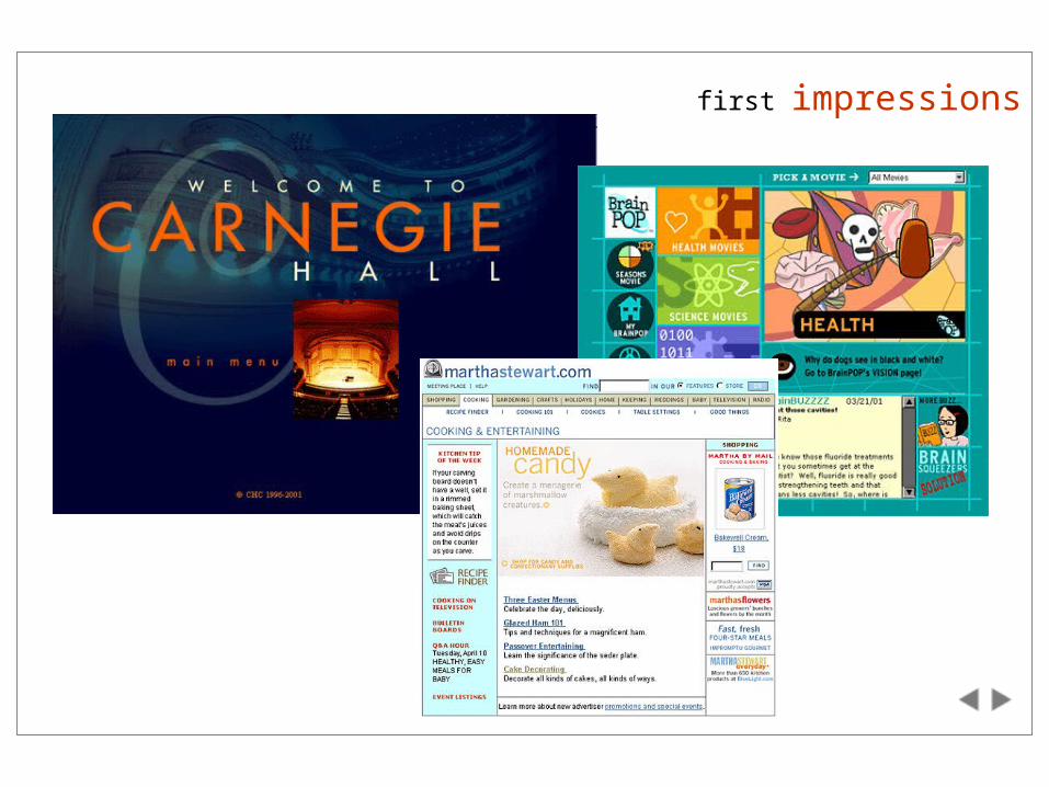
first impressions
lecture goals
To help you better communicate the purpose of your web pages by visually emphasizing the most important features and relationships between informational units
To suggest some design approaches that will simplify maintaining and extending your site
To appreciate some of the more subtle but important qualities of design and typography
Presentation Matters
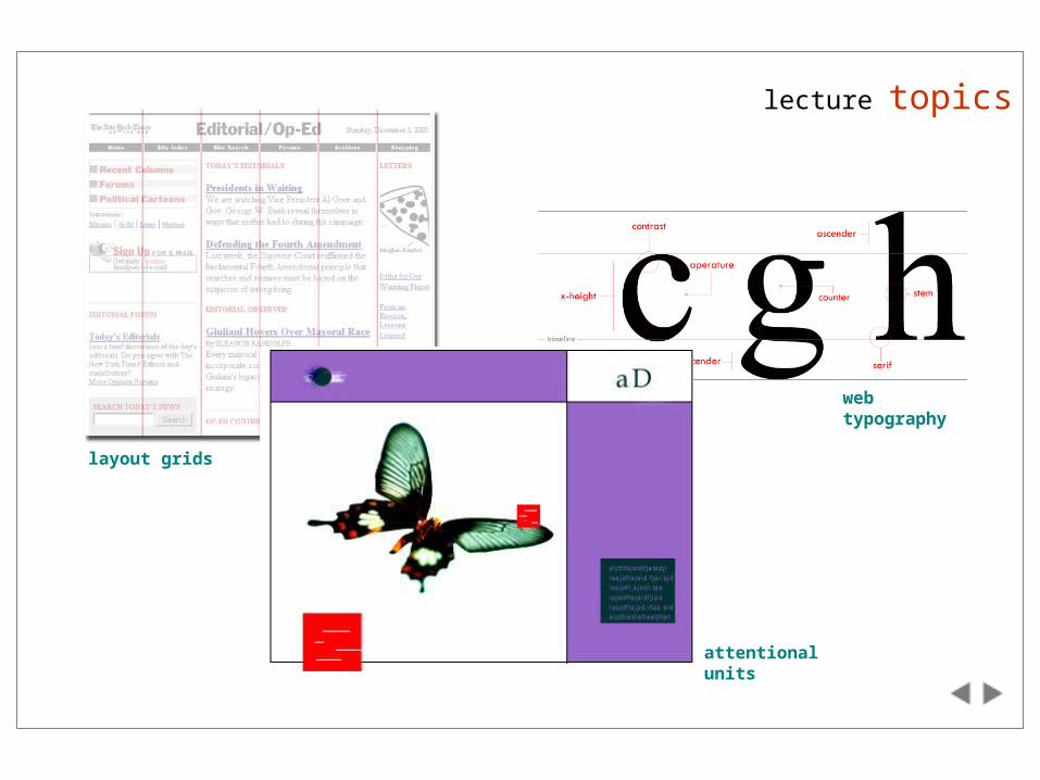
lecture topics
layout grids
web typography
attentional units
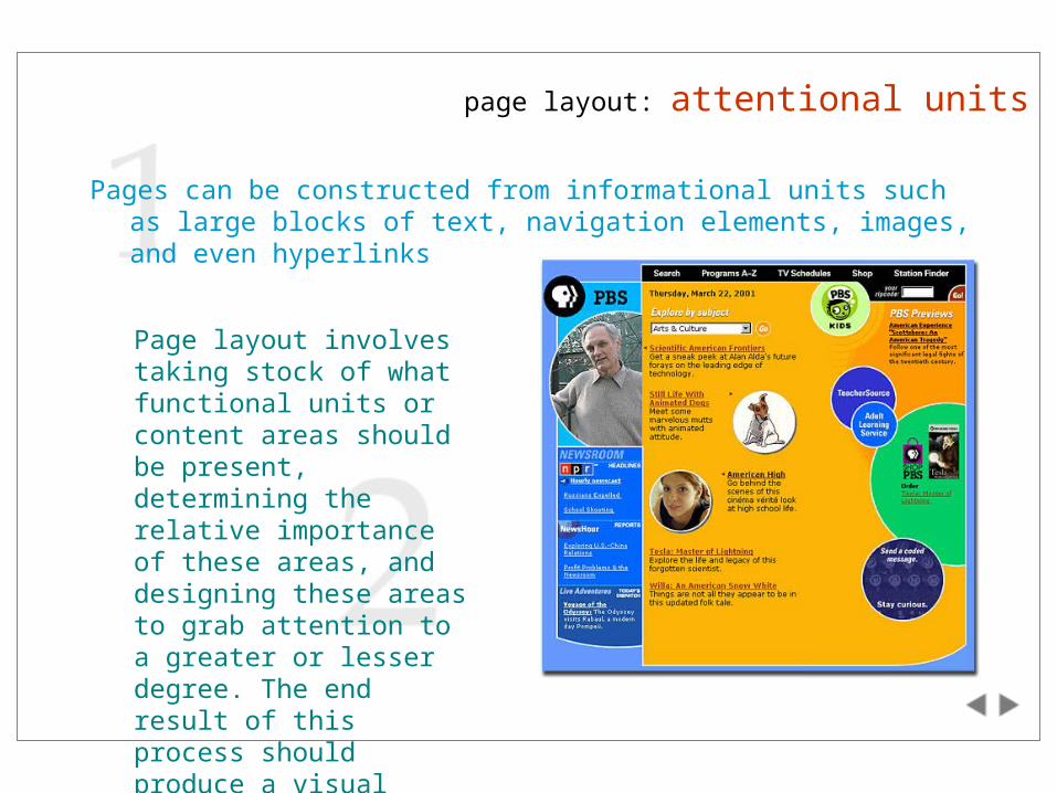
page layout: attentional units
Pages can be constructed from informational units such as large blocks of text, navigation elements, images, and even hyperlinks
Page layout involves taking stock of what functional units or content areas should be present, determining the relative importance of these areas, and designing these areas to grab attention to a greater or lesser degree. The end result of this process should produce a visual hierarchy.
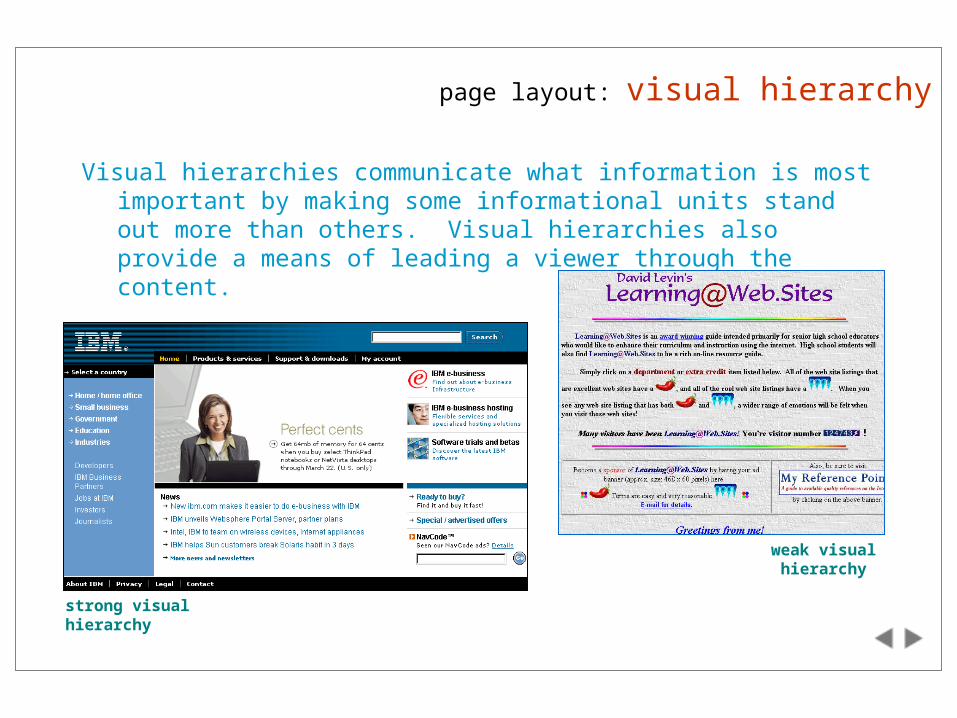
page layout: visual hierarchy
Visual hierarchies communicate what information is most important by making some informational units stand out more than others. Visual hierarchies also provide a means of leading a viewer through the content.
strong visual hierarchy
weak visual hierarchy
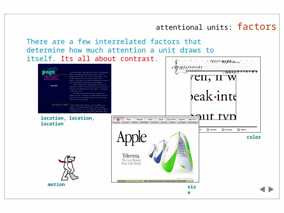
attentional units: factors
There are a few interrelated factors that determine how much attention a unit draws to itself. Its all about contrast.
location, location, location
size
color
motion
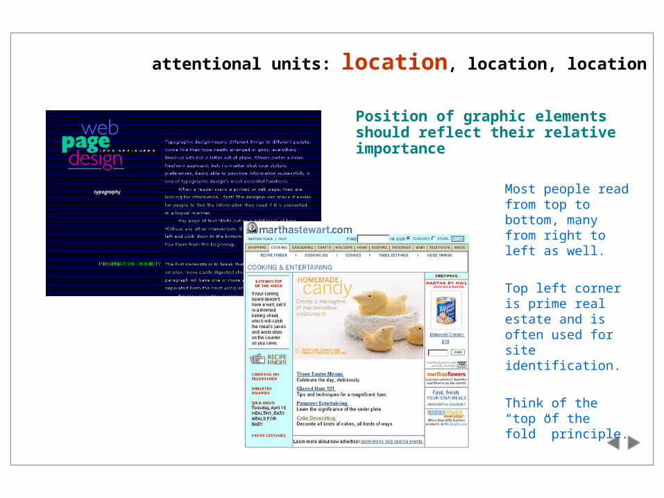
attentional units: location, location, location
Position of graphic elements should reflect their relative importance
Most people read from top to bottom, many from right to left as well.
Top left corner is prime real estate and is often used for site identification.
Think of the “top of the fold” principle.
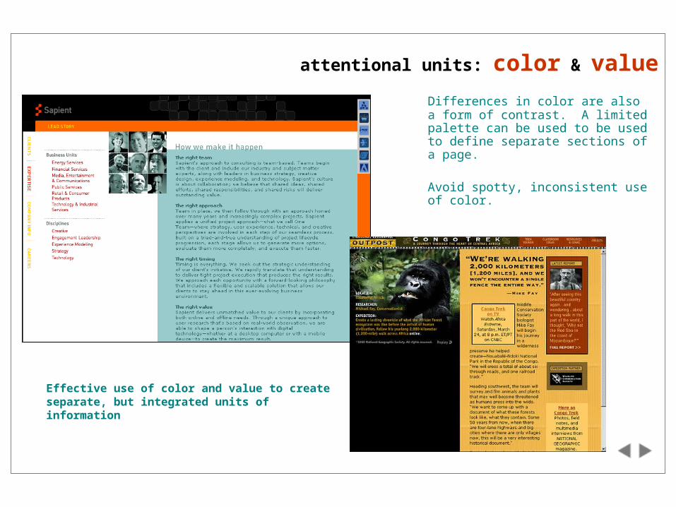
attentional units: color & value
Differences in color are also a form of contrast. A limited palette can be used to be used to define separate sections of a page.
Avoid spotty, inconsistent use of color.
Effective use of color and value to create separate, but integrated units of information
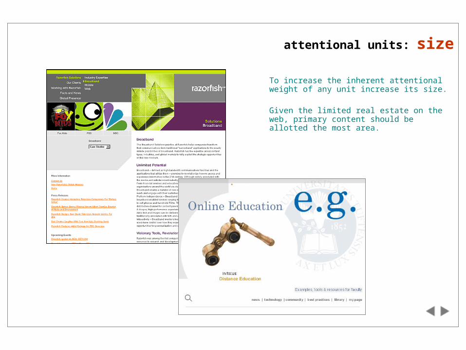
attentional units: size
To increase the inherent attentional weight of any unit increase its size.
Given the limited real estate on the web, primary content should be allotted the most area.
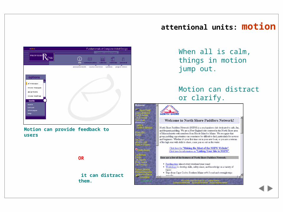
attentional units: motion
When all is calm, things in motion jump out.
Motion can distract or clarify.
Motion can provide feedback to users
OR
it can distract them.
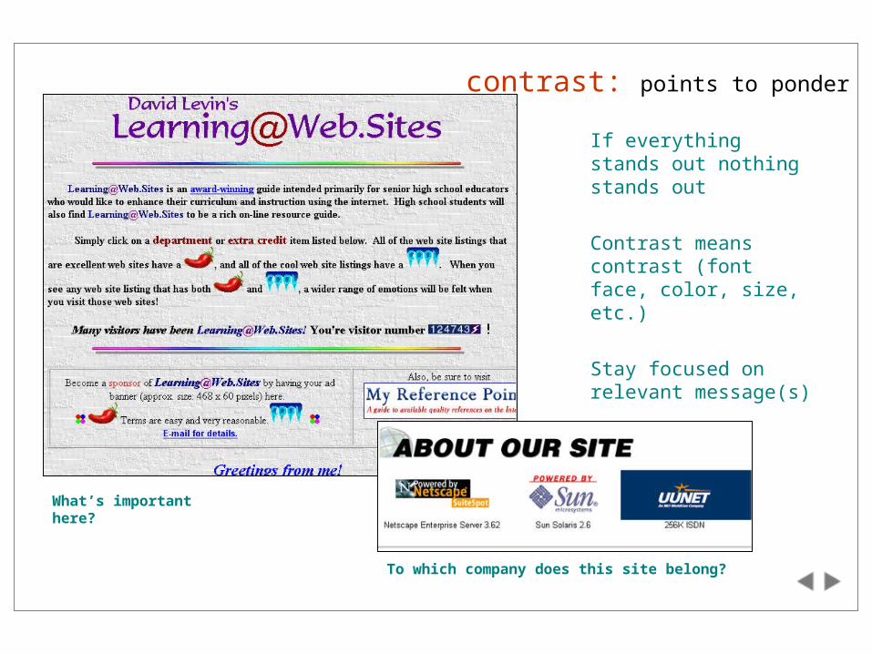
contrast: points to ponder
If everything stands out nothing stands out
Contrast means contrast (font face, color, size, etc.)
Stay focused on relevant message(s)
Images tend to stand out
What’s important here?
To which company does this site belong?
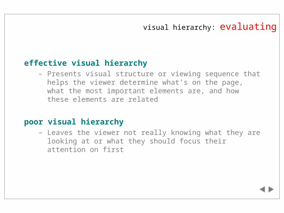
effective visual hierarchy– Presents visual structure or viewing sequence that helps the viewer
determine what’s on the page, what the most important elements are, and how these elements are related
poor visual hierarchy– Leaves the viewer not really knowing what they are looking at or
what they should focus their attention on first
visual hierarchy: evaluating
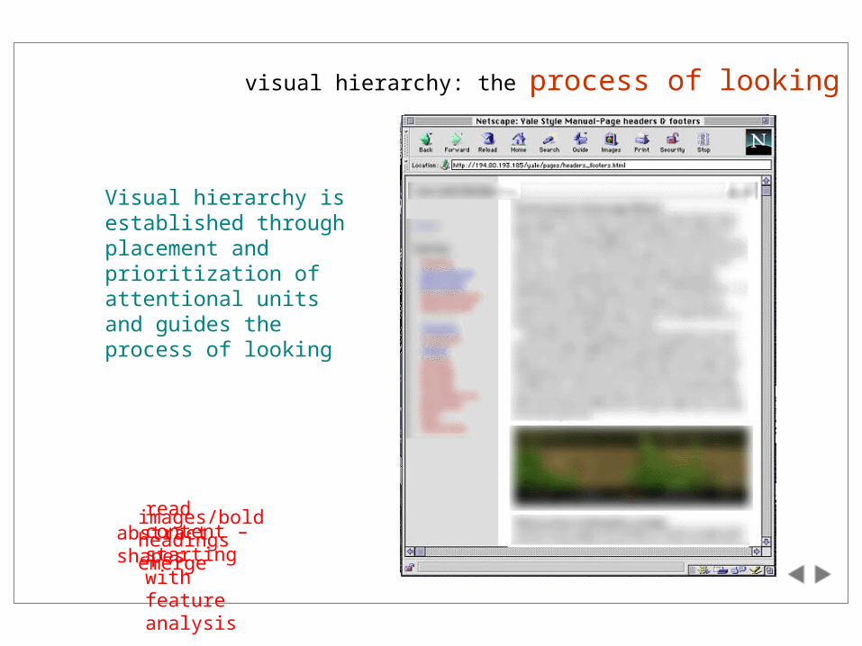
images/bold headings emerge
read content – starting with feature analysis
abstract shapes
Visual hierarchy is established through placement and prioritization of attentional units and guides the process of looking
visual hierarchy: the process of looking
visual hierarchy: guiding questions
What path do you wish your audience to travel when initially scanning your pages?
What can you do to differentiate between different functional or informational units?
What should viewers notice first, second and third?
What is least important?
What is most important?
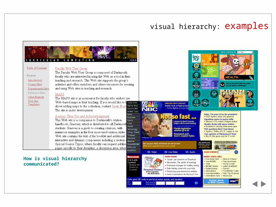
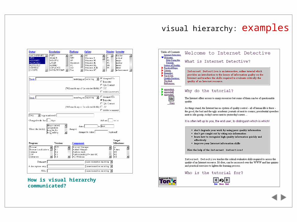
visual hierarchy: examples
How is visual hierarchy communicated?
visual hierarchy: examples
How is visual hierarchy communicated?
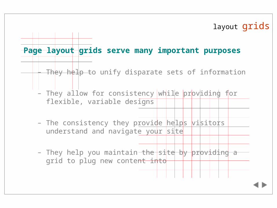
layout grids
Page layout grids serve many important purposes
– They help to unify disparate sets of information
– They allow for consistency while providing for flexible, variable designs
– The consistency they provide helps visitors understand and navigate your site
– They help you maintain the site by providing a grid to plug new content into
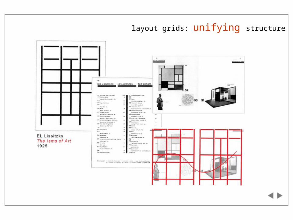
layout grids: unifying structure
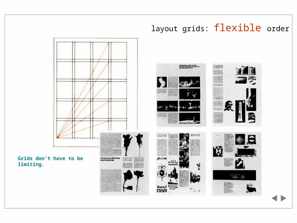
layout grids: flexible order
Grids don’t have to be limiting.
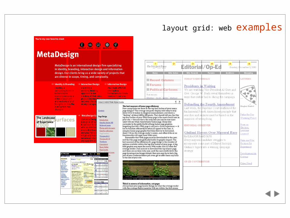
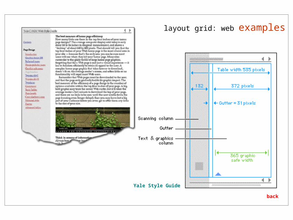
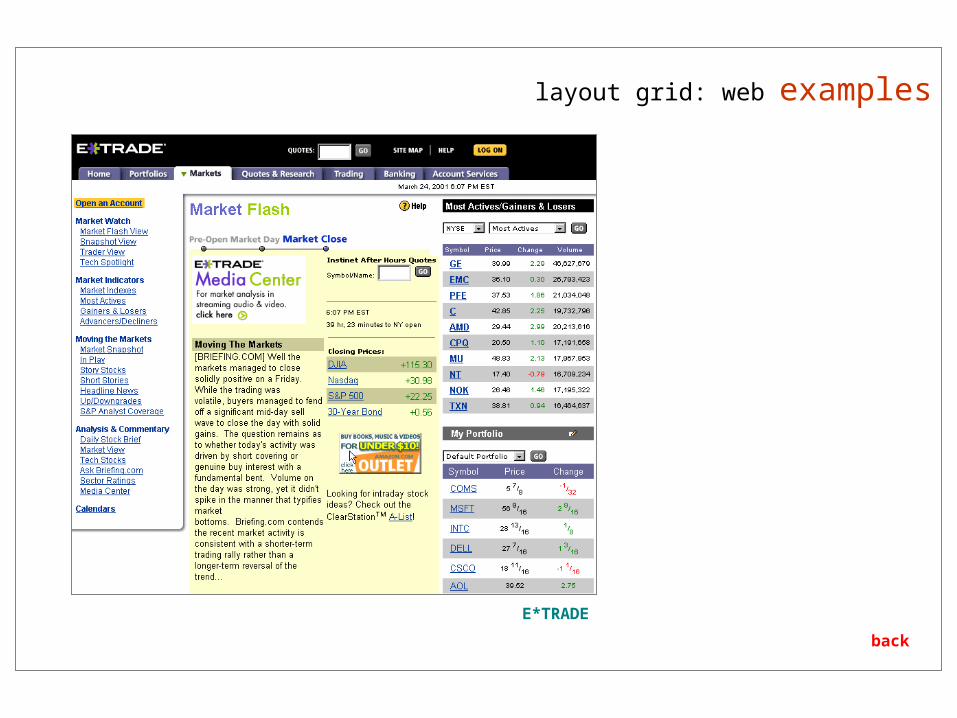
layout grid: web examples
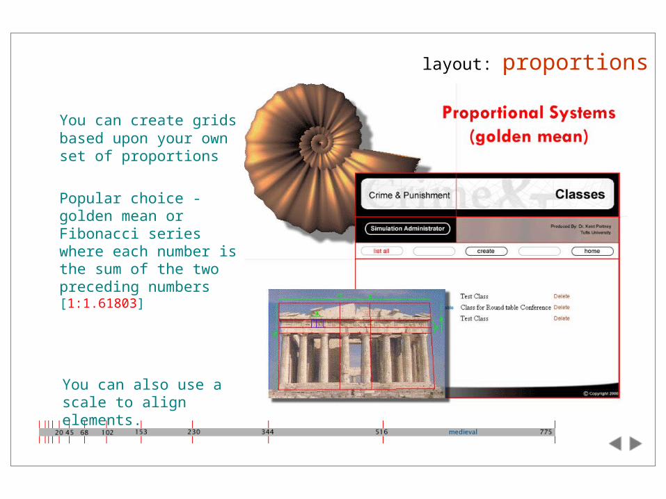
layout: proportions
You can create grids based upon your own set of proportions
Popular choice - golden mean or Fibonacci series where each number is the sum of the two preceding numbers [1:1.61803]
You can also use a scale to align elements.
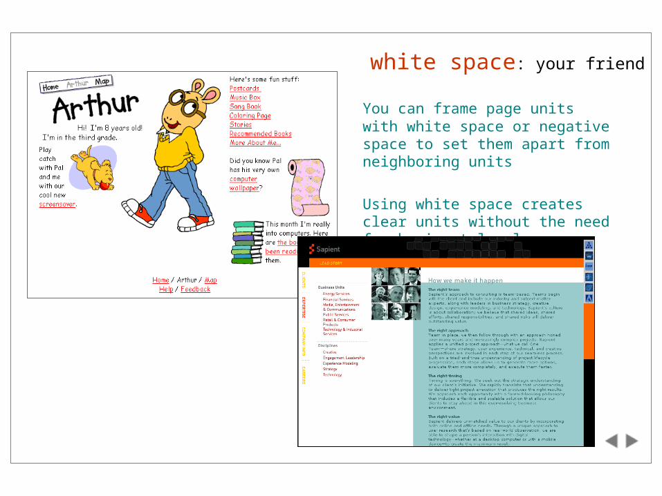
white space: your friend
You can frame page units with white space or negative space to set them apart from neighboring units
Using white space creates clear units without the need for horizontal rules, borders, or other distracting elements
web constraints for layout
Average computer monitor will not display a traditional page (8 1/2 x 11)
Use top 4-5 inches for critical information - 14-15” monitor: safe browser area is 600 x 300 pixels
Vertical dimension is often variable
Columns of text– Fine for shorter web pages– For longer pages would require reader to scroll up and down
Printing– Maximum size graphic that can be printed on standard size paper is 535 ppi
wide– Test to see if clipping occurs
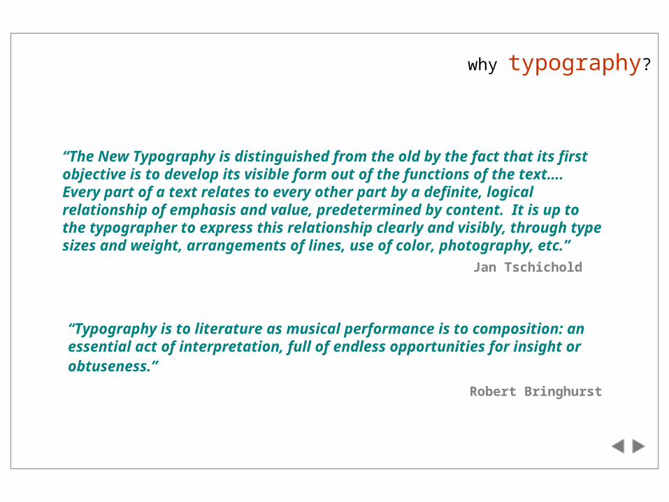
why typography?
“Typography is to literature as musical performance is to composition: an essential act of interpretation, full of endless opportunities for insight or obtuseness.”
Robert Bringhurst
“The New Typography is distinguished from the old by the fact that its first objective is to develop its visible form out of the functions of the text…. Every part of a text relates to every other part by a definite, logical relationship of emphasis and value, predetermined by content. It is up to the typographer to express this relationship clearly and visibly, through type sizes and weight, arrangements of lines, use of color, photography, etc.”
Jan Tschichold
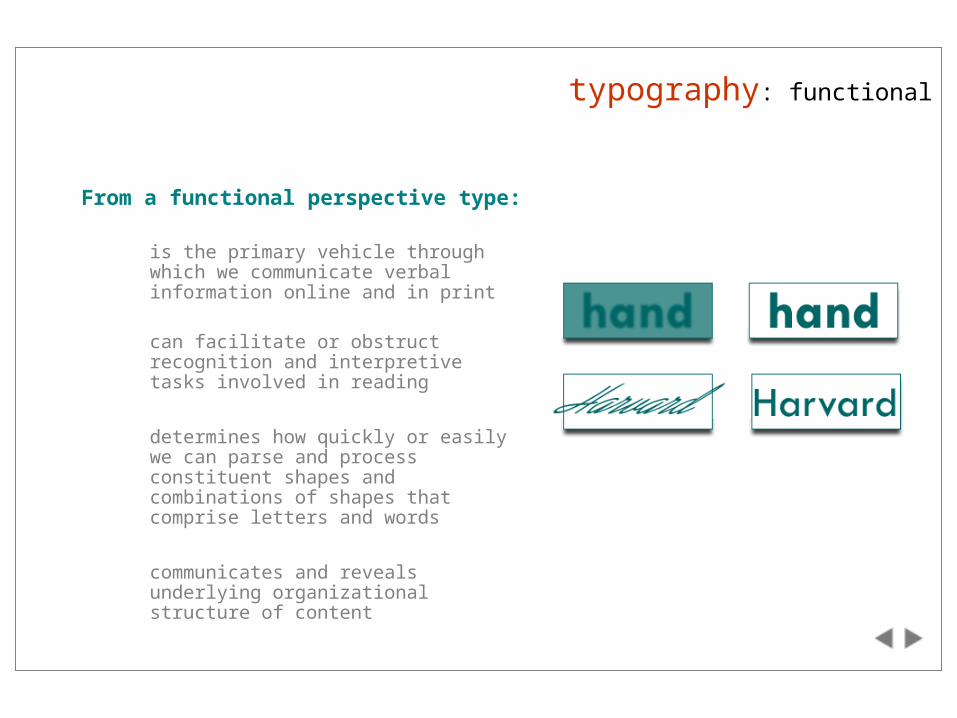
typography: functional
From a functional perspective type:
is the primary vehicle through which we communicate verbal information online and in print
can facilitate or obstruct recognition and interpretive tasks involved in reading
determines how quickly or easily we can parse and process constituent shapes and combinations of shapes that comprise letters and words
communicates and reveals underlying organizational structure of content
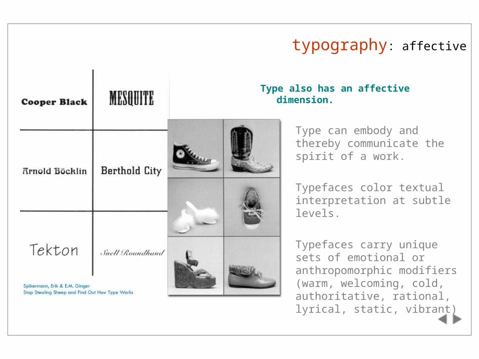
Type also has an affective dimension.
Type can embody and thereby communicate the spirit of a work.
Typefaces color textual interpretation at subtle levels.
Typefaces carry unique sets of emotional or anthropomorphic modifiers (warm, welcoming, cold, authoritative, rational, lyrical, static, vibrant)
typography: affective
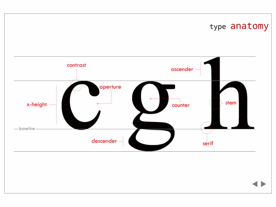
type anatomy
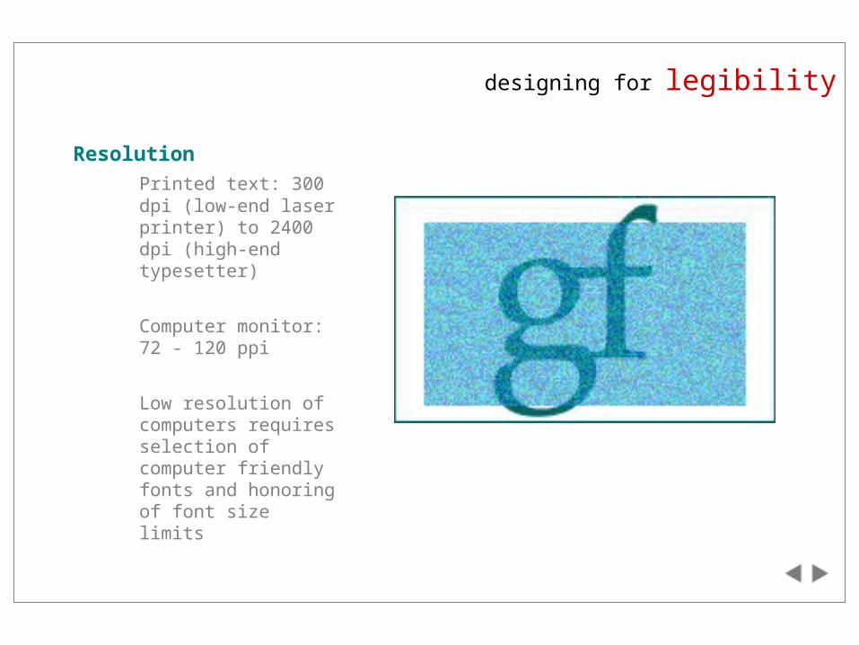
designing for legibility
Resolution
Printed text: 300 dpi (low-end laser printer) to 2400 dpi (high-end typesetter)
Computer monitor: 72 - 120 ppi
Low resolution of computers requires selection of computer friendly fonts and honoring of font size limits
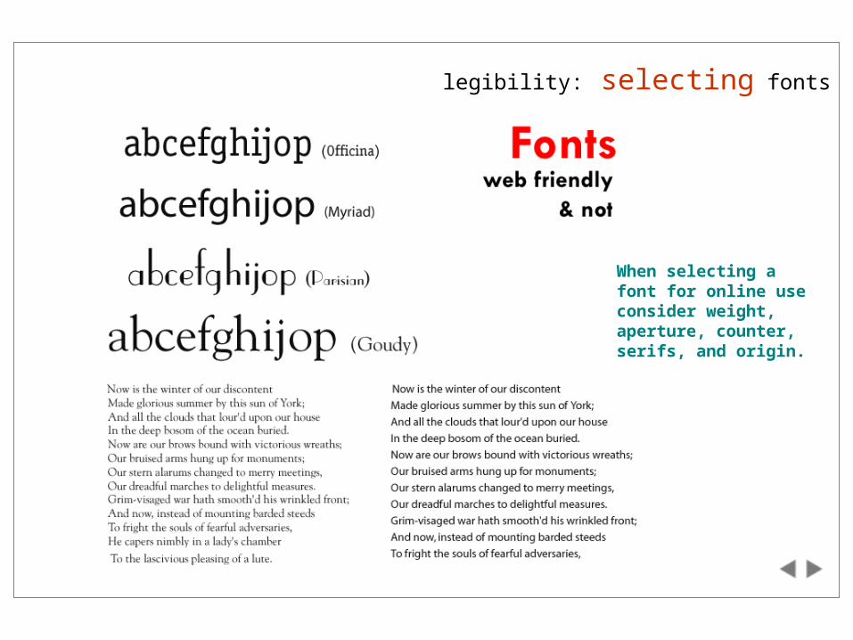
legibility: selecting fonts
When selecting a font for online use consider weight, aperture, counter, serifs, and origin.
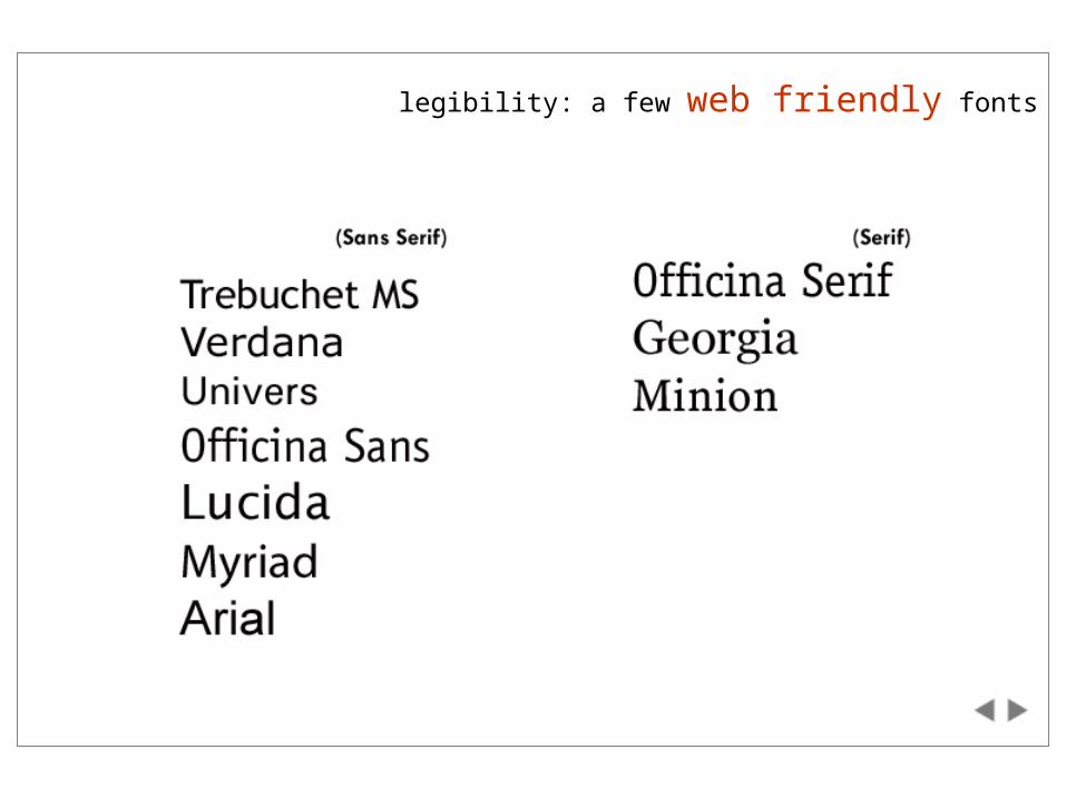
legibility: a few web friendly fonts
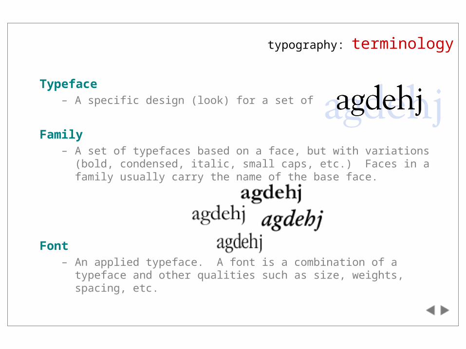
Typeface– A specific design (look) for a set of characters
Family– A set of typefaces based on a face, but with variations (bold,
condensed, italic, small caps, etc.) Faces in a family usually carry the name of the base face.
Font– An applied typeface. A font is a combination of a typeface and other
qualities such as size, weights, spacing, etc.
typography: terminology
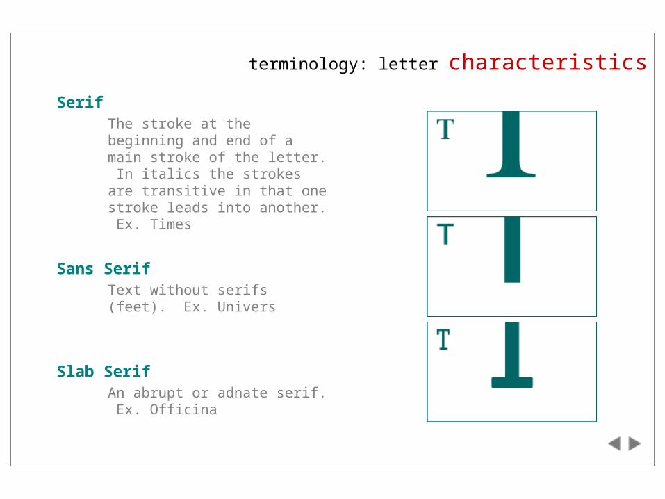
terminology: letter characteristics
SerifThe stroke at the beginning and end of a main stroke of the letter. In italics the strokes are transitive in that one stroke leads into another. Ex. Times
Sans SerifText without serifs (feet). Ex. Univers
Slab SerifAn abrupt or adnate serif. Ex. Officina
terminology: type characteristics
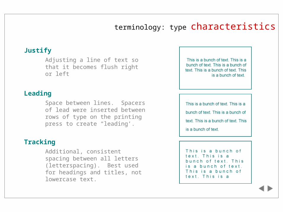
Justify
Adjusting a line of text so that it becomes flush right or left
Leading
Space between lines. Spacers of lead were inserted between rows of type on the printing press to create “leading’.
Tracking
Additional, consistent spacing between all letters (letterspacing). Best used for headings and titles, not lowercase text.
terminology: type text blocks
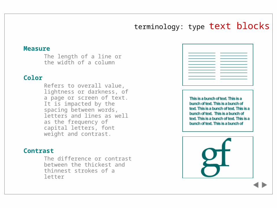
MeasureThe length of a line or the width of a column
ColorRefers to overall value, lightness or darkness, of a page or screen of text. It is impacted by the spacing between words, letters and lines as well as the frequency of capital letters, font weight and contrast.
ContrastThe difference or contrast between the thickest and thinnest strokes of a letter
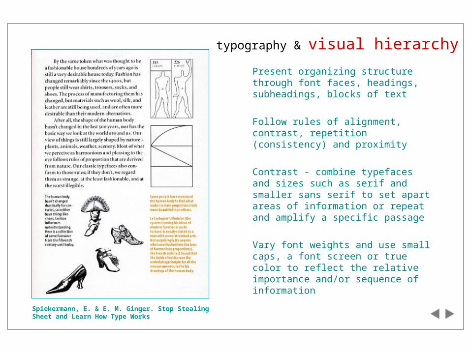
typography & visual hierarchy
Present organizing structure through font faces, headings, subheadings, blocks of text
Follow rules of alignment, contrast, repetition (consistency) and proximity
Contrast - combine typefaces and sizes such as serif and smaller sans serif to set apart areas of information or repeat and amplify a specific passage
Vary font weights and use small caps, a font screen or true color to reflect the relative importance and/or sequence of information
Spiekermann, E. & E. M. Ginger. Stop Stealing Sheet and Learn How Type Works
typography: additional information
Additional information
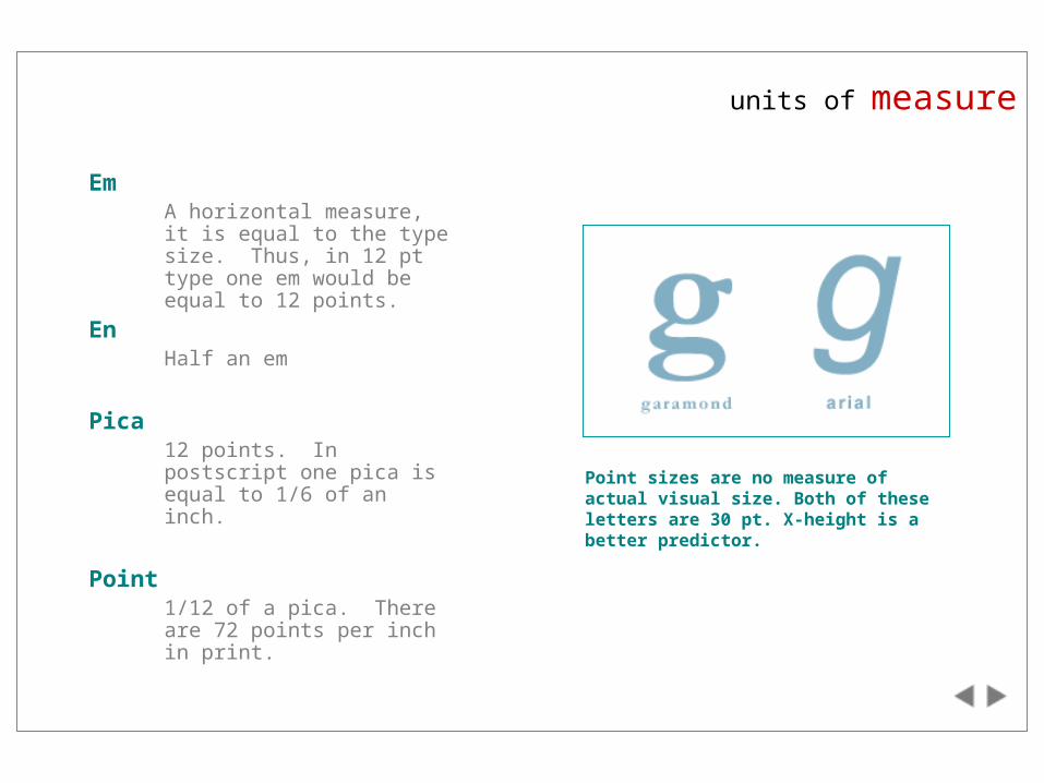
units of measure
EmA horizontal measure, it is equal to the type size. Thus, in 12 pt type one em would be equal to 12 points.
EnHalf an em
Pica12 points. In postscript one pica is equal to 1/6 of an inch.
Point1/12 of a pica. There are 72 points per inch in print.
Point sizes are no measure of actual visual size. Both of these letters are 30 pt. X-height is a better predictor.
legibility: serifs & caps
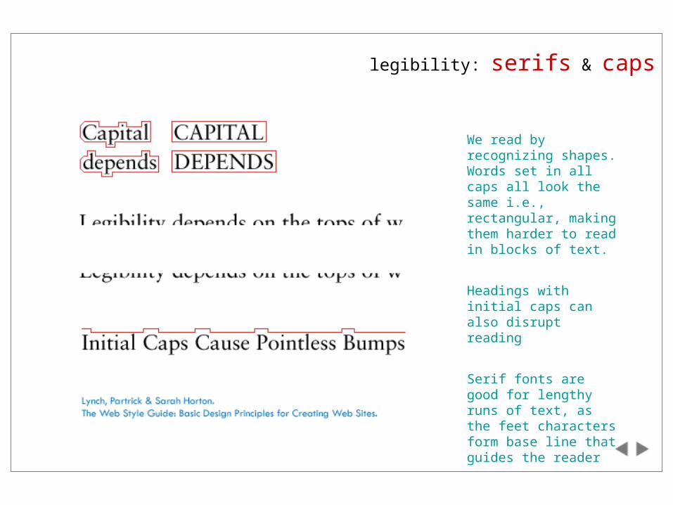
We read by recognizing shapes. Words set in all caps all look the same i.e., rectangular, making them harder to read in blocks of text.
Headings with initial caps can also disrupt reading
Serif fonts are good for lengthy runs of text, as the feet characters form base line that guides the reader
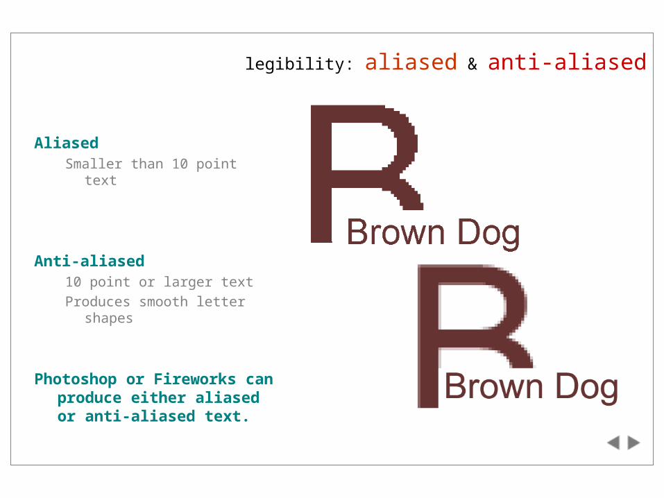
legibility: aliased & anti-aliased
AliasedSmaller than 10 point text
Anti-aliased10 point or larger text
Produces smooth letter shapes
Photoshop or Fireworks can produce either aliased or anti-aliased text.
type: font embedding
Text rendered through a browser with HTML is limited by the fonts resident on the user’s computer
MS Internet Explorer supports font embedding technology, allowing designers to embed fonts within their web pages. Netscape provides this functionality through Dynamic Fonts
However, users can override designer’s choices through the browsers’ preferences.
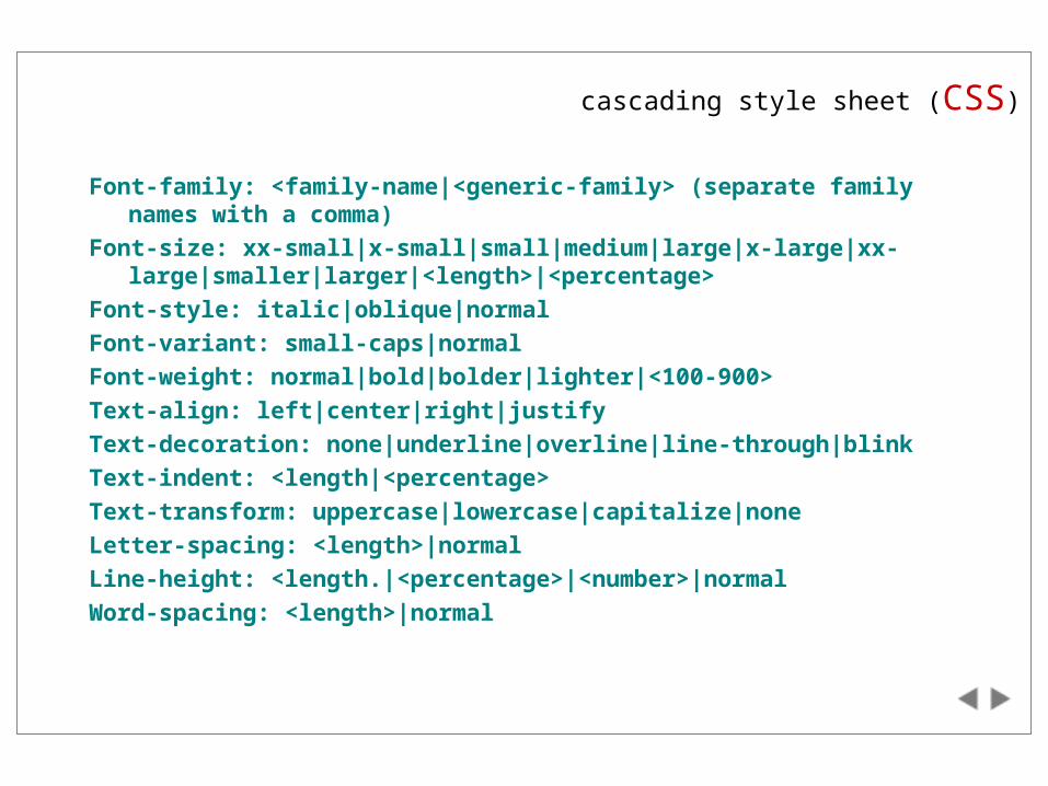
cascading style sheet (CSS)
Font-family: <family-name|<generic-family> (separate family names with a comma)
Font-size: xx-small|x-small|small|medium|large|x-large|xx-large|smaller|larger|<length>|<percentage>
Font-style: italic|oblique|normal
Font-variant: small-caps|normal
Font-weight: normal|bold|bolder|lighter|<100-900>
Text-align: left|center|right|justify
Text-decoration: none|underline|overline|line-through|blink
Text-indent: <length|<percentage>
Text-transform: uppercase|lowercase|capitalize|none
Letter-spacing: <length>|normal
Line-height: <length.|<percentage>|<number>|normal
Word-spacing: <length>|normal
session seven: references
Bringhurst, Robert. The Elements of Typographic Style.
Dowding, Geoffrey. Finer Points in the Spacing & Arrangement of Type.
Horton, Sarah and Patrick Lynch. The Web Style Guide: Basic Design Principles for Creating Web Sites.
Spiekermann, Erik and E.M. Ginger. Stop Stealing Sheep and Learn How Type Works.
Tschichold, Jan. The New Typography: A Handbook for Modern Designers.
back
back
back
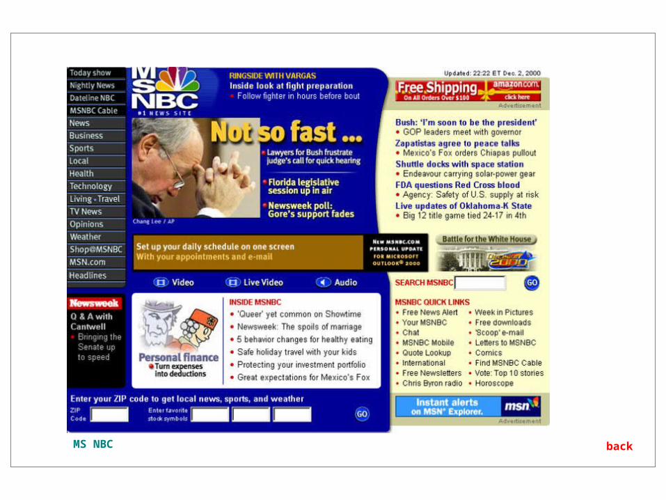
backMS NBC
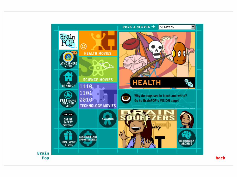
backBrain Pop
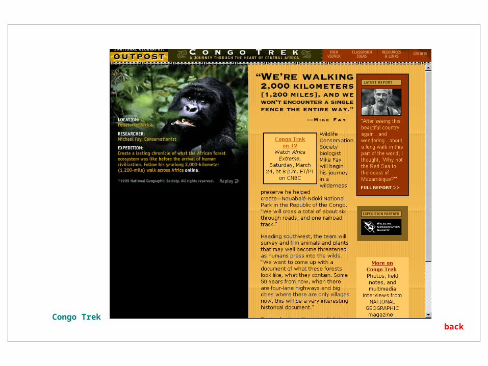
backCongo Trek
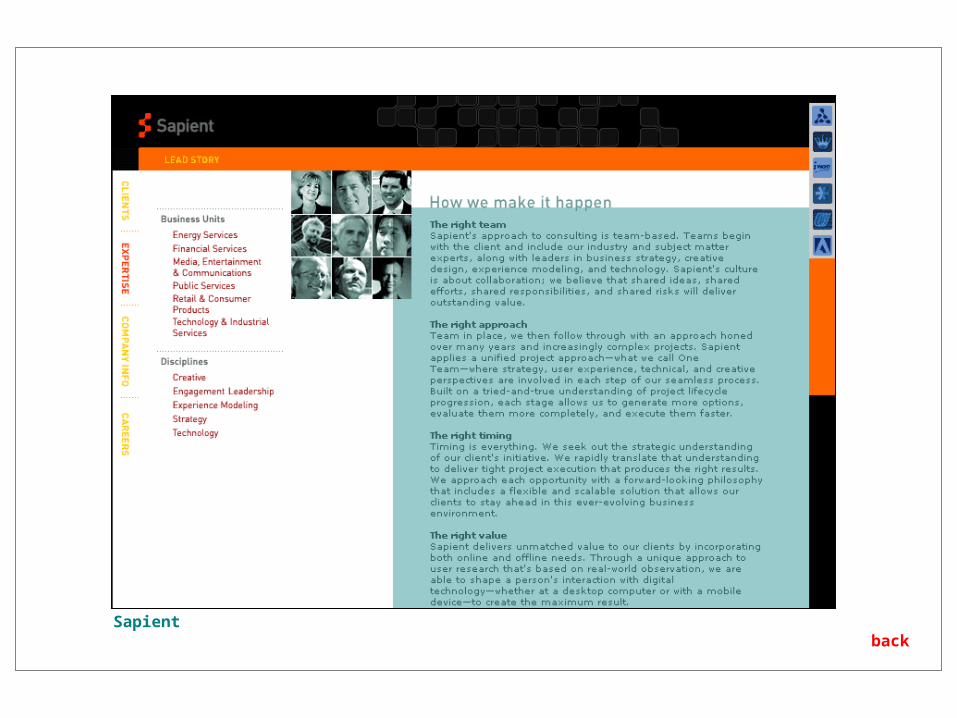
backSapient
back
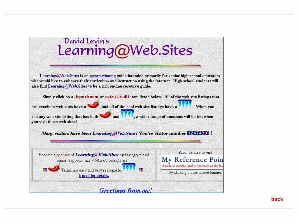
Yale Style Guide
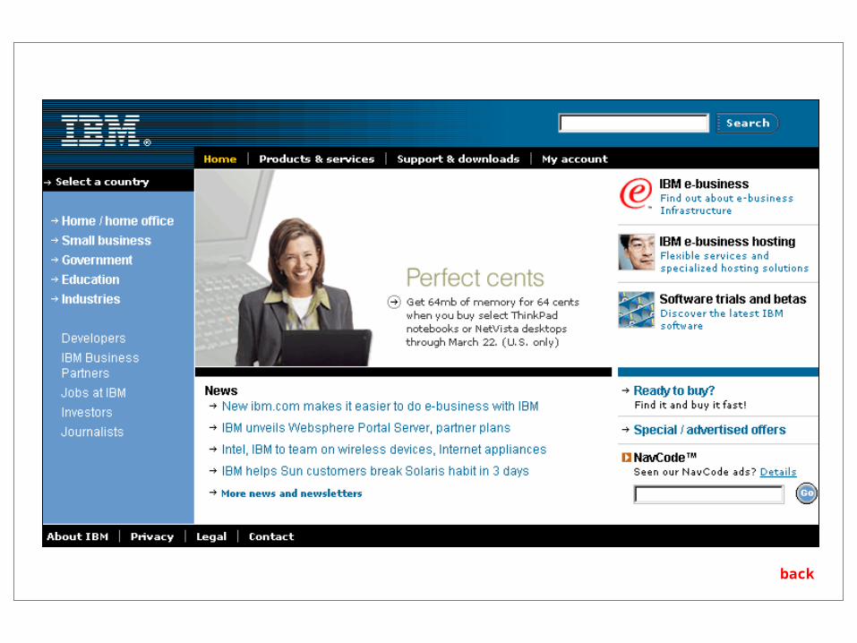
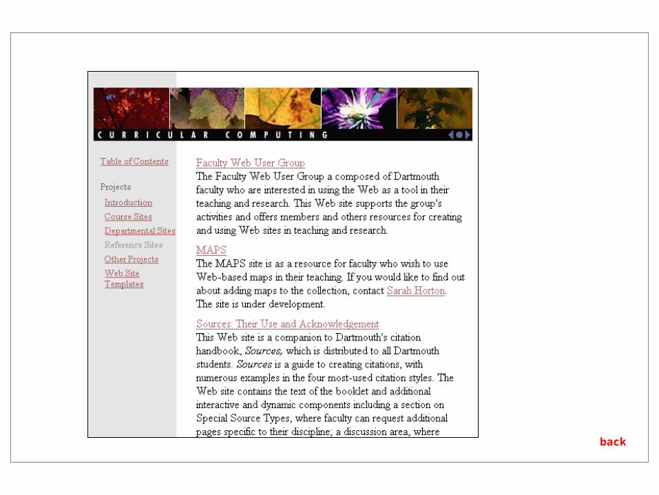
layout grid: web examples
back
E*TRADE
layout grid: web examples


