46
| Date post: | 22-Mar-2016 |
| Category: |
Documents |
| Upload: | rosie-little |
| View: | 215 times |
| Download: | 2 times |

What is graphics?
� Graphics although very difficult to explain, is very different to fine art, fine art is for you where as graphics is for someone else (a client) . Also graphics is usually done for a profit like the making of posters, where as fine art is not always done for money.
� Also when thought about graphics is around us much more than fine art is from anything from our wallpaper to posters etc. Graphics includes photography ,sometimes computers and drawn illustrations.

Genre for my book
� Action/Horror- About a boy who goes into a coma when he comes out of it hes the only one left ( reason unknown yet) Ends up eating his arm as food supplies run low, Finds out its SOMEONES doing why everyones gone. At the end he actually wakes up ……
� Or about a childs father been lost at sea with a twist toward the end of the novel.

Title and audience
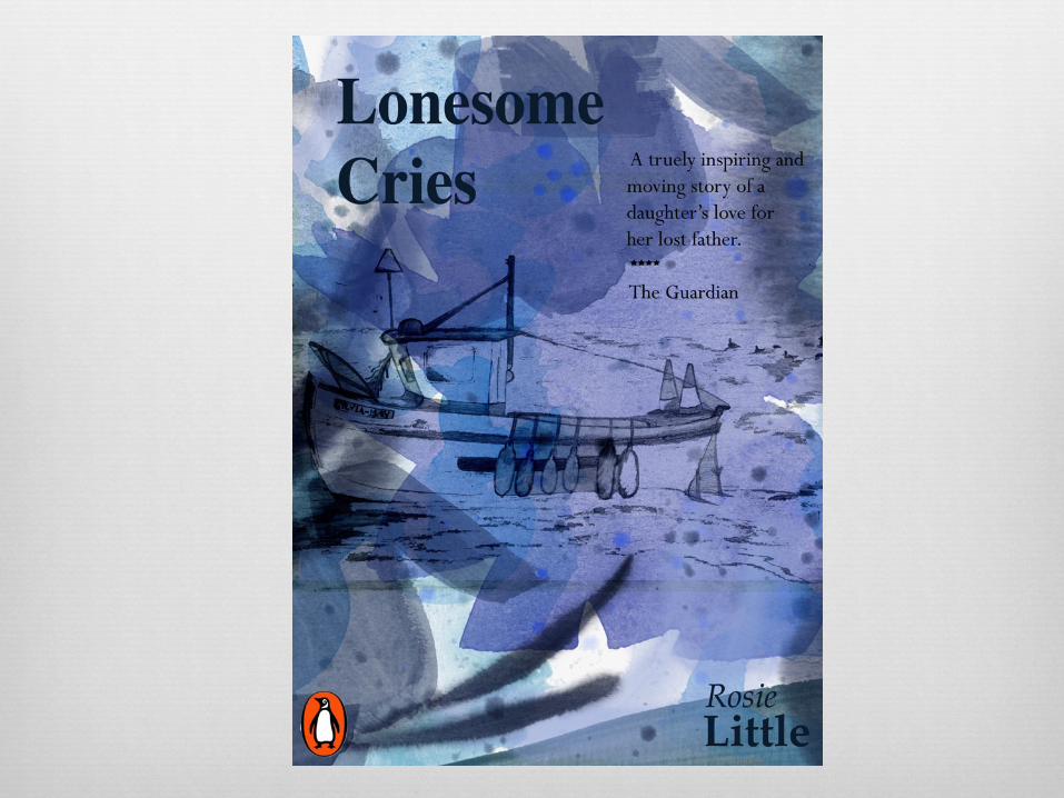
� Lonesome Cries
� Teenagers 16-18

Cover/ Colours
� Dark clouds (sadness) covering all but a small bottom section of the page in which a boy ( Loneliness) looking dirty and young with hands toward sky one tear ( Black tear can show hate or anger) clearly visible on cheek.
� Either a water colour or print image of a sea scape (use a lot of ink to create mood) Edit colours on PhotoShop in order to create the a few different ,moods and covers using one image.

This image gives me an idea of where line drawings are used and how they create effect in any image.


Horror Romance Biography Mystery

Change over time: This is a good example of a cover changing over
time, these covers clearly show that simplicity has become the modern thing, as they go from
detailed drawing to computerized simple designs.

Steve Edwards

Steve Edwards
� I like the three chosen images as I believe each image shows a different mood from a lighter blue showing happiness to a dark grey portraying anger .The colour aspect of these images has a connection to my work as within my prints I for example applied more or less ink in order to create different moods.

Structural
� Layout/Composition- All three of his images are similarly laid out with a city scape at the bottom with a large sky. Also in every image a lot of negative space is used above the horizon, simply using a few paint scrapes to create different effects. Also the horizon line is low which may show a somewhat unrealistic feel.

Cultural
� Time periods that may have influenced his work I believe is modern day as the city scape with the london eye clearly contains fairly new buildings and structures.

Stephen Robson
Biography
� Stephen Robson joined greenwich printmakers in 2010. He went on to Goldsmiths college and has a background in teaching and working in Photography. He is strongly drawn to the work of artists such as Samuel Palmer, Edward Hopper and Paul Nash. The thames estuary and the coast of Norfolk and Suffolk have been favourite subjects.

Steven Robson
� I like my three chosen images as I think within them that simplicity is the key as it really helps show different moods without containing complex images or drawing.

Structural
� Composition/Layout- Steven uses a lot of negative space with in his images I think this shows a sense of peace and happiness within the simple image of the sea with a solid blue sky. However the images are often laid very similar being of the sea with a fairly simple sky.

Cultural Edward Hopper influenced Steven within his work in many cases. The connection between there work is noticed within the composition and layout of there images for example the use of; low horizon lines and negative space. However Paul Nash creates a very different image that connects to Stephens work with the use of pastel colours. Samuel palmers connection To Stephen may be again the use of dark dull colours or may contrast to Stephans with the use of a high horizon rather than low .

My work
� The connection between my work and the artists spoke about is mainly the idea of printing, however my image like Steven Robsons contains a sea scape. I also varied the amount of ink used in order to create different moods depending on the darkness of the sky in each.

Nick Higgins

Nick Higgins
Biography
� Nick Higgins is a London based artist who completes his pieces of work by use of a computer and the programmes on it such as photo shop and illustrator. He edits photos and puts them together to create his own unique feel.


Subjective ideas
� I chose these Nick Higgins photos as they are the ones that stood out to me as having the most amount of character and the best composition, I also like the way each time you look at the picture a new image or section is noticed, which gives the picture a different feel every time you look at it
� I also like the negative space used in every photo as it does an extremely good job at easing the business of the photo and really breaks up the buildings or people from the rest of the image. Furthermore these pictures were my main piece of inspiration for my own work; including building structures and silhouettes. I also used his idea of different brush techniques in the background of my image.

Structural
� Nick Higgins edits photos on Photoshop and illustrator in order to create different effects, for example drawing patterns on the background using different brush techniques, making people silloheutes, and buildings different colours.
� The use of colours in his work is normal fairly easy on the eye by the main use of pastel colours. He also uses many contrasting factors in order to show a more decorative and different piece, from line drawings to coloured buildings.

Cultural � Nick Higgins work has been developing as the years go by as have
computers and the software that’s been available to him during the last twenty five years. Computer aided design has improved greatly since he started out. This may have influenced the simple line drawings and other aspects of his images.
� However if Nick Higgins started out now his work may have become much more complex as it is so much easier to achieve complexity, with the software available to us today. Although the simplicity within Nick Higgins work is sometimes good as his images are much easier to look at, and I like his pictures because he doesn’t do any images where the subject isn’t obvious. Or where I am not certain on what the image actually is.

Leigh Photos

I took this photograph at Leigh on Sea in order to have several images to work from when creating different images using Photoshop and illustrator afterward. I think this photo may have been useful to take as when creating different effects there are a lot of boats to add detail to, in order to create a busier more filled outcome.

I chose this image as I like the use of the boat and the tires in one image. Also when editing the image on illustrator there are a lot of things to pick out or darken to create more texture in the image.


Water colour on Photoshop

These are three of the water colour backgrounds I created to go in front of my photographs from Leigh in order to create a few different effects for each.
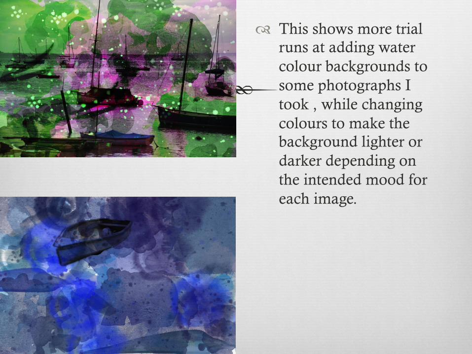
� This shows more trial runs at adding water colour backgrounds to some photographs I took , while changing colours to make the background lighter or darker depending on the intended mood for each image.


My drawing from boat

These images show the stages of experimentation when adding my drawing to one of the water colour backgrounds I creating while changing the colour of the lines and texture within my drawing.


Changing one particular image to create different effects.

� Working with the drawing I did to create a water colour background in front of the image, with different parts of the image and different colours coming through in each one. Personally my favorite image is image 2 as i believe the correct aspects are showing through, with the birds being slightly darker in the background.
My water colours

Live Trace

My book Cover designs