+ All Categories
Home > Documents > Introduction to Esri Integration in SAS® Visual Analytics · 19/2/2019  · Introduction to Esri...

Introduction to Esri Integration in SAS® Visual Analytics · 19/2/2019  · Introduction to Esri...

Date post: 21-Mar-2020
Category:
Upload: others
View: 20 times
Download: 0 times
Share this document with a friend
25
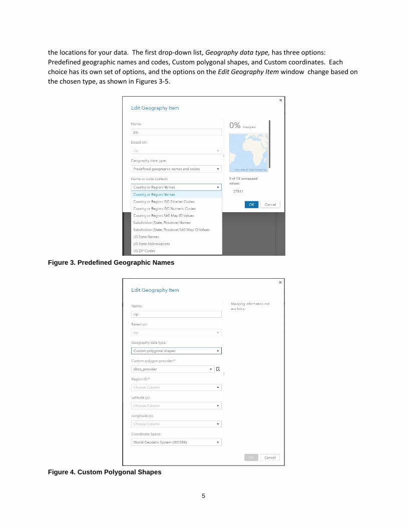
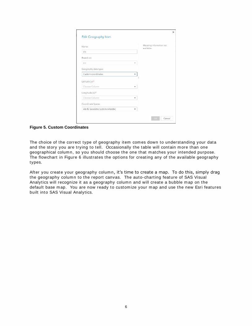
1 Paper SAS3304-2019 Introduction to Esri Integration in SAS ® Visual Analytics Jeff Phillips, Scott Hicks and Tony Graham, SAS Institute Inc. ABSTRACT SAS has partnered with Esri, the world’s leading mapping technology company, to provide access to geospatial features throughout SAS ® Visual Analytics. This paper shows you how to find trends and make decisions by adding location information to your data using geocoding, enriching your data by adding demographics, and analyzing your data using routing and drive-time calculations. We also show you how to incorporate your Esri shapefiles and feature services, and we give a preview of future integration. INTRODUCTION Location analytics is a vital tool to help in understanding your data. Most data have a geographic component, whether it is a point on a map or a reference to a known place. SAS Visual Analytics allows you to take advantage of a wide variety of geographic analyses and enrichment opportunities available from Esri. This paper will walk you through the foundations of geographic maps in SAS Visual Analytics and will demonstrate how dynamic features created through the Esri partnership can uncover new insights from your data. Many of the functions described in this paper are considered premium services and require an account on Esri’s ArcGIS Online with available service credits. Esri service credits can be acquired through a direct relationship with Esri either by purchasing directly or by being included with other licensed products and services. ESRI FEATURE SERVICES Esri feature services allow you to access predefined regions on an Esri server to be displayed in SAS Visual Analytics. To better incorporate Esri feature services into your maps, it is important to understand some of the fundamentals behind how location data is displayed and used. SAS Visual Analytics associates location information with your business data through a geography column. SAS VISUAL ANALYTICS AND GEOGRAPHY COLUMNS The geography column is a special type of data column in which each item in the table has an associated location. This can be in the form of a coordinate (latitude and longitude, for example) or a polygon identifier. When taken together as an identified coordinate pair or region, these values add a spatial dimension, or location, to the data. In other words, this location information allows the data to be displayed on a map. When combined with other location data or analyzed with dynamic Esri tools such as Drive-Time, Drive-Distance, Routing, or GeoEnrichment that are discussed later in this paper, relationships and patterns emerge from the data that might not be as obvious as if they were analyzed from a table or traditional graph.
Transcript

1

Paper SAS3304-2019

Introduction to Esri Integration in SAS® Visual Analytics

Jeff Phillips, Scott Hicks and Tony Graham, SAS Institute Inc.

ABSTRACT

SAS has partnered with Esri, the world’s leading mapping technology company, to provide

access to geospatial features throughout SAS® Visual Analytics. This paper shows you how

to find trends and make decisions by adding location information to your data using

geocoding, enriching your data by adding demographics, and analyzing your data using

routing and drive-time calculations. We also show you how to incorporate your Esri

shapefiles and feature services, and we give a preview of future integration.

INTRODUCTION

Location analytics is a vital tool to help in understanding your data. Most data have a

geographic component, whether it is a point on a map or a reference to a known place.

SAS Visual Analytics allows you to take advantage of a wide variety of geographic analyses

and enrichment opportunities available from Esri.

This paper will walk you through the foundations of geographic maps in SAS Visual Analytics

and will demonstrate how dynamic features created through the Esri partnership can

uncover new insights from your data.

Many of the functions described in this paper are considered premium services and require

an account on Esri’s ArcGIS Online with available service credits. Esri service credits can be

acquired through a direct relationship with Esri either by purchasing directly or by being

included with other licensed products and services.

ESRI FEATURE SERVICES

Esri feature services allow you to access predefined regions on an Esri server to be

displayed in SAS Visual Analytics. To better incorporate Esri feature services into your

maps, it is important to understand some of the fundamentals behind how location data is

displayed and used. SAS Visual Analytics associates location information with your business

data through a geography column.

SAS VISUAL ANALYTICS AND GEOGRAPHY COLUMNS

The geography column is a special type of data column in which each item in the table has

an associated location. This can be in the form of a coordinate (latitude and longitude, for

example) or a polygon identifier. When taken together as an identified coordinate pair or

region, these values add a spatial dimension, or location, to the data. In other words, this

location information allows the data to be displayed on a map. When combined with other

location data or analyzed with dynamic Esri tools such as Drive-Time, Drive-Distance,

Routing, or GeoEnrichment that are discussed later in this paper, relationships and patterns

emerge from the data that might not be as obvious as if they were analyzed from a table or

traditional graph.

2

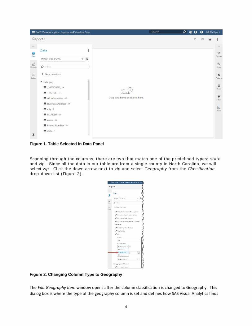
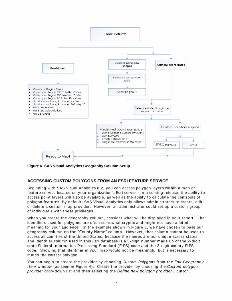
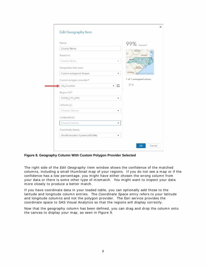
There are two types of geography columns that can be created in SAS Visual Analytics –

predefined and custom. Each type has its own advantages and limitations.

Predefined Geography Columns

SAS Visual Analytics comes with nine predefined lookup types ready to use. Examples of

known types include country names, International Organization for Standardization (ISO)

codes, U.S. state names, and postal abbreviations. To use this method for creating the

geography column, your data must contain a column that matches one of the predefined

types.

When you select one of these predefined types, SAS Visual Analytics performs an internal

lookup to find the latitude and longitude values for your data. In relational database

terminology, the selected lookup type becomes the primary key that allows the two tables

to be joined together. For bubble or coordinate maps, the lookup returns a single

coordinate pair for the data point. For a region map, the lookup returns an identifier for a

known region shape that can be retrieved and displayed in the map. See Figure 3 for the

dialog box used to select a predefined geography type.

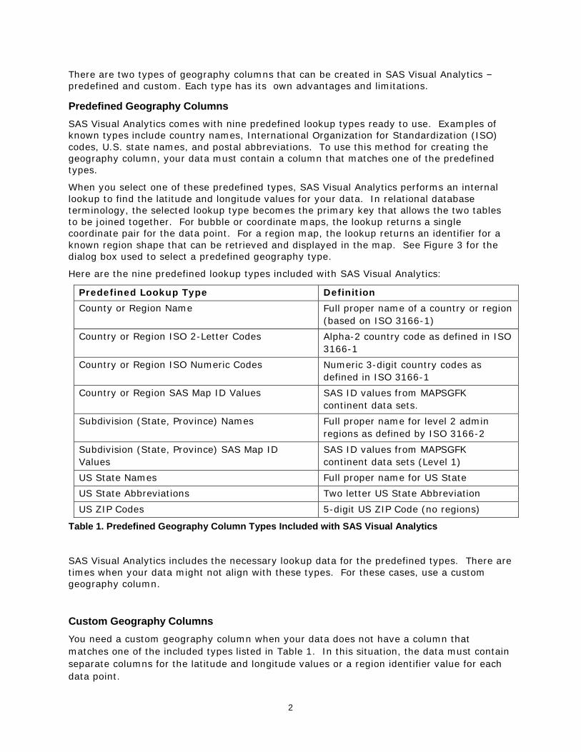
Here are the nine predefined lookup types included with SAS Visual Analytics:

Predefined Lookup Type Definition

County or Region Name Full proper name of a country or region

(based on ISO 3166-1)

Country or Region ISO 2-Letter Codes Alpha-2 country code as defined in ISO

3166-1

Country or Region ISO Numeric Codes Numeric 3-digit country codes as

defined in ISO 3166-1

Country or Region SAS Map ID Values SAS ID values from MAPSGFK

continent data sets.

Subdivision (State, Province) Names Full proper name for level 2 admin

regions as defined by ISO 3166-2

Subdivision (State, Province) SAS Map ID

Values

SAS ID values from MAPSGFK

continent data sets (Level 1)

US State Names Full proper name for US State

US State Abbreviations Two letter US State Abbreviation

US ZIP Codes 5-digit US ZIP Code (no regions)

Table 1. Predefined Geography Column Types Included with SAS Visual Analytics

SAS Visual Analytics includes the necessary lookup data for the predefined types. There are

times when your data might not align with these types. For these cases, use a custom

geography column.

Custom Geography Columns

You need a custom geography column when your data does not have a column that

matches one of the included types listed in Table 1. In this situation, the data must contain

separate columns for the latitude and longitude values or a region identifier value for each

data point.

3

Since these columns are not included in SAS Visual Analytics’ lookup tables, the application

is unaware of their function until you identify them. You can specify these columns on the

Edit Geography Item window by using the drop-down list as shown in Figure 3.

The flexibility of custom longitude and latitude values comes with the added responsibility of

using only accurate and trusted providers when selecting your data source.

Furthermore, you must correctly specify the coordinate space of your longitude (X) and

latitude (Y) values. The coordinate space defines the underlying grid used to plot the data.

If you specify the incorrect coordinate space, your points might show up in the wrong

location, or they might not show up at all.

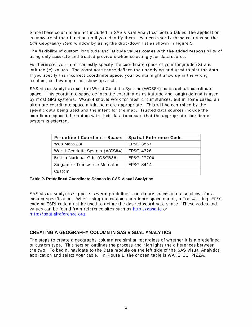
SAS Visual Analytics uses the World Geodetic System (WGS84) as its default coordinate

space. This coordinate space defines the coordinates as latitude and longitude and is used

by most GPS systems. WGS84 should work for most circumstances, but in some cases, an

alternate coordinate space might be more appropriate. This will be controlled by the

specific data being used and the intent for the map. Trusted data sources include the

coordinate space information with their data to ensure that the appropriate coordinate

system is selected.

Predefined Coordinate Spaces Spatial Reference Code

Web Mercator EPSG:3857

World Geodetic System (WGS84) EPSG:4326

British National Grid (OSGB36) EPSG:27700

Singapore Transverse Mercator EPSG:3414

Custom

Table 2. Predefined Coordinate Spaces in SAS Visual Analytics

SAS Visual Analytics supports several predefined coordinate spaces and also allows for a

custom specification. When using the custom coordinate space option, a Proj.4 string, EPSG

code or ESRI code must be used to define the desired coordinate space. These codes and

values can be found from reference sites such as http://epsg.io or

http://spatialreference.org.

CREATING A GEOGRAPHY COLUMN IN SAS VISUAL ANALYTICS

The steps to create a geography column are similar regardless of whether it is a predefined

or custom type. This section outlines the process and highlights the differences between

the two. To begin, navigate to the Data module on the left side of the SAS Visual Analytics

application and select your table. In Figure 1, the chosen table is WAKE_CO_PIZZA.

4

Figure 1. Table Selected in Data Panel

Scanning through the columns, there are two that match one of the predefined types: state

and zip. Since all the data in our table are from a single county in North Carolina, we will

select zip. Click the down arrow next to zip and select Geography from the Classification

drop-down list (Figure 2).

Figure 2. Changing Column Type to Geography

The Edit Geography Item window opens after the column classification is changed to Geography. This

dialog box is where the type of the geography column is set and defines how SAS Visual Analytics finds

5

the locations for your data. The first drop-down list, Geography data type, has three options:

Predefined geographic names and codes, Custom polygonal shapes, and Custom coordinates. Each

choice has its own set of options, and the options on the Edit Geography Item window change based on

the chosen type, as shown in Figures 3-5.

Figure 3. Predefined Geographic Names

Figure 4. Custom Polygonal Shapes

6

Figure 5. Custom Coordinates

The choice of the correct type of geography item comes down to understanding your data

and the story you are trying to tell. Occasionally the table will contain more than one

geographical column, so you should choose the one that matches your intended purpose.

The flowchart in Figure 6 illustrates the options for creating any of the available geography

types.

After you create your geography column, it’s time to create a map. To do this, simply drag

the geography column to the report canvas. The auto-charting feature of SAS Visual

Analytics will recognize it as a geography column and will create a bubble map on the

default base map. You are now ready to customize your map and use the new Esri features

built into SAS Visual Analytics.

7

Figure 6. SAS Visual Analytics Geography Column Setup

ACCESSING CUSTOM POLYGONS FROM AN ESRI FEATURE SERVICE

Beginning with SAS Visual Analytics 8.2, you can access polygon layers within a map or

feature service located on your organization’s Esri server. In a coming release, the ability to

access point layers will also be available, as well as the ability to calculate the centroids of

polygon features. By default, SAS Visual Analytics only allows administrators to create, edit,

or delete a custom map provider. However, an administrator could set up a custom group

of individuals with these privileges.

When you create the geography column, consider what will be displayed in your report. The

identifiers used for polygons are often somewhat cryptic and might not have a lot of

meaning for your audience. In the example shown in Figure 8, we have chosen to base our

geography column on the “County Name” column. However, that column cannot be used to

access all counties of the United States, because the names are not unique across states.

The identifier column used in this Esri database is a 5-digit number made up of the 2-digit

state Federal Information Processing Standard (FIPS) code and the 3-digit county FIPS

code. Showing that identifier in your map would not be meaningful but is necessary to

match the correct polygon.

You can begin to create the provider by choosing Custom Polygons from the Edit Geography

Item window (as seen in Figure 4). Create the provider by choosing the Custom polygon

provider drop-down list and then selecting the Define new polygon provider… button.

8

This opens a new window, as seen in Figure 7. Give the provider a unique name and a

label. The label will be used in the previous Custom polygon provider drop-down list to be

chosen after it has been created. There are two types of custom polygon providers: CAS

table reference and Esri feature service. When you change the type to Esri feature service,

you can now enter the FeatureServer or MapServer URL for the Esri service. The Feature

Service Layer updates to allow you to choose which layer to access. You also need to

choose the polygon identifier column used in the feature service layer. This is the column in

the Esri database that will match the identifier in the currently loaded table.

Figure 7. New Polygon Provider Set Up

After you have saved the provider and return to the Edit Geography Item window, you

should see the label for your new provider as the currently selected provider. Now you

need to enter the identifier column from your table that is needed to match with the Esri

database. As was stated earlier, often this can be a column that you don’t wish to show on

the map because it might have no meaning to someone viewing the report. Other times the

columns use the same value, such as U.S. ZIP Codes or unique region names. In our

example shown in Figure 8, we are using “STATE_CTY_FIPS” for the identifier, but “County

Name” for the displayed column.

9

Figure 8. Geography Column With Custom Polygon Provider Selected

The right side of the Edit Geography Item window shows the confidence of the matched

columns, including a small thumbnail map of your regions. If you do not see a map or if the

confidence has a low percentage, you might have either chosen the wrong column from

your data or there is some other type of mismatch. You might want to inspect your data

more closely to produce a better match.

If you have coordinate data in your loaded table, you can optionally add those to the

latitude and longitude column entries. The Coordinate Space entry refers to your latitude

and longitude columns and not the polygon provider. The Esri service provides the

coordinate space to SAS Visual Analytics so that the regions will display correctly.

Now that the geography column has been defined, you can drag and drop the column onto

the canvas to display your map, as seen in Figure 9.

10

Figure 9. Choropleth Map Using Custom Polygons for North Carolina Counties

After you have created the polygon provider, it is available to all report designers to use. It

is defined in SAS Visual Analytics and not in the individual report. Because this is a shared

resource, you should take caution in making many changes to the provider, because it can

adversely affect other reports.

LOCATION DISCOVERY AND EXPLORATION

There are many ways for you to discover and explore your maps in SAS Visual Analytics

using services from Esri. Routing can show the fastest or shortest path between two points.

Calculating an area, or buffer, around a point using Drive-Time or Drive-Distance analysis

allows you to see an area representing all possible routes up to a given distance. Once a

buffer is created, you can explore the demographics of the area using GeoEnrichment from

Esri.

Many factors can be applied in the routing and buffering analysis including historical traffic

conditions, traffic conditions at a specific time of day and day of week, live traffic conditions,

and truck routing and walking paths. Routing, Drive-Time analysis, and GeoEnrichment are

premium services and require an Esri login and available service credits.

ROUTING

SAS Visual Analytics allows you to add a pin on the map and route to or from another

location or pin. A route returning to a location might not be the same as leaving from that

location due to limitations such as one-way streets and highway ramps. Routes can be

easily reversed, if desired, and are shown on printouts. Figure 10 shows the routes to both

Dallas-Love Field and Dallas-Fort Worth airports from the convention center downtown.

11

Figure 10. Routing from Dallas Convention Center to DAL and DFW Airports

DRIVE-TIME AND DRIVE-DISTANCE ANALYSIS

From a known point, you can calculate a buffer that represents all the places that someone

could walk, drive a car or drive a truck in a given time. By selecting all the data points that

are within that buffer, you can explore and reveal additional information. You can combine

up to three concentric values at a time. For example, Figure 11 shows how to select 5- and

10-minute drive times in Hamburg, Germany, and Figure 12 shows the resulting buffers.

Data points that fall within any of these buffers will be selected, and they can potentially

interact with other visuals in your report.

Figure 11. Geographic Selection Setup Window.

12

Figure 12. Drive-time Analysis in Hamburg, Germany with Linked Bar Chart

GEOENRICHING A BUFFER

After you have created a buffer, you can click the Show Demographics button to display a

data selector to choose variables based on data for the country being displayed, as seen in

Figure 13.

SAS Visual Analytics queries the location of the origin of the buffer in order to attempts to

determine the current country of interest and help initialize the data selector. Some

countries contain a much larger number of variables to choose than others. In Figure 13,

the buffer has been placed in Germany, where there are over 400 variables available.

13

Figure 13. Demographics Data Selector for Esri GeoEnrichment

The results are aggregated for the outermost buffer and displayed as a pop-up window,

shown in Figure 14. Each set of values are displayed in its own panel that can be paged to

reveal the information. Some fields can be combined into a single graphical representation

based on age, gender, or year collected, for example.

Figure 14. Demographic Enrichment Using Hamburg Drive Time Analysis

14

ENHANCING YOUR DATA WITH ESRI

The partnership between SAS and Esri enables SAS Visual Analytics to enhance your data

with locations provided through importing geocoded locations. You can also add

demographic data that can be aggregated down to the city block level, depending on the

country. Both tasks are premium services from Esri and require a valid login to Esri’s

ArcGIS Online. You also need to have enough available service credits with Esri to perform

the specific operation.

GEOCODING

Geocoding is the process of looking up addresses and finding locations. Each time you

search for a point of interest or address when accessing any online map, that is a single

instance of geocoding. When you want to find the locations for numerous locations at once,

you need a geocoding service.

The result of geocoding is to add a latitude and longitude to each address entry. Esri’s

World Geocoding Service also provides additional information, such as the address that was

matched from the service’s database and an overall accuracy score.

Esri has a vast database of locations around the world, and most of the time any valid

address that is requested will be returned with a relatively high accuracy rating. New, rare,

unique, or undocumented addresses might only match at a state our country level, which

will be reflected in the score.

To access the Esri World Geocoding Service from within SAS Visual Analytics, open the Data

selector and choose the Import tab.

Figure 15. The Import Tab of the Data Selector

At this point you are prompted for an input table. After you’ve chosen the table, you are

presented with an import window that also prompts for the name and location for the output

table. The default name of the table has “_GEO_CODED” added to the end of the name.

15

The location is the same library in which the input data resides. You can choose to change

this name and even overwrite the input data.

You are also asked to supply, in order, the columns that make up the full address. You see

a sample of an address, which is read from the first row of data, as seen in Figure 16. Once

you are satisfied with the address sample and order, you can choose to test this one

address by selecting the Test button. Figure 16 also shows that the test returns a location

and a score. In this example, we have chosen a table containing 5,000 voters.

Figure 16. Address Sample and Tested Location

When you are ready to geocode all the addresses, select the Import Item button, which

then estimate the amount of Esri service credits this action will consume. The calculation is

not exact, because SAS Visual Analytics does not know how many duplicate or invalid

addresses might be in the data.

Figure 17. Esri Service Credit Estimation

Depending on the size of your data, the geocode process can take a few seconds to

complete. Figure 18 shows the results of geocoding our 5,000 voter addresses along with a

chart that shows how accurate the results are. The first five rows show some address

mismatches that have a slightly lower score. However, well over 99 percent of the data

16

matched with a score of 99 to 100. Figure 19 shows the points plotted on a map. You can

even see which side of the road each address is on.

Figure 18. Table of Geocoded Results

Figure 19. Map of Geocoded Addresses

DATA ENRICHMENT

While geocoding adds location information to your data, Esri can also enrich your location

data with a wide variety of demographic information. There is data available on almost

every country in the world - some countries have thousands of columns of data and others a

few dozen. To access Esri GeoEnrichment, return to the Import tab of the data selector as

shown in Figure 15. After you have chosen the input table, select an output destination. To

17

enrich your data, you must choose the country where your data is located. Setting this

value changes the Level options appropriately. For example, the States or ZIP Codes level

is present for the United States, but the Provinces and Territories or Census Districts are

present in Canada. You need to configure the importer to use a column from your table

that represents the level you have chosen. Figure 20 shows an example of setting the

source column to zip for the level of “ZIP Codes”.

Figure 20. GeoEnrichment Configuration

After selecting the appropriate source column, you can choose the columns you would like

to be added to your data from the categorized list. After you’ve selected all of the items,

click the Import Item button to display the Esri service credit estimation dialog box (Figure

17). The credits are estimated based on the number of rows in your data and the number

of columns you want to add.

After importing, the new columns are available to use in a map or any other type of chart.

Figure 21 shows a bubble map with size and color based on the average income and net

worth variables imported from Esri based on the ZIP code provided.

18

Figure 21. Bubble Map Using Geo-Enriched Data

Geo-enriched data can give your reports greater meaning and allow you to further analyze

and explore for results and solutions.

ESRI WEB MAPS

At ArcGIS.com, Esri enables its users to select from a variety of map backgrounds and

publicly accessible information to compose a multi-layered online presentation called a “web

map.” Using any browser, viewers can interact with a web map to pan, zoom, or toggle the

appearance of its layers.

19

Figure 22. A Web Map at ArcGIS.com: Buildings and Historic Sites of US National Parks

WEB CONTENT IN SAS VISUAL ANALYTICS

Until recently, there were limited ways for you to include Esri web maps in SAS Visual

Analytics reports. With the Web Content object, you could insert the URL of a published

web map to display it as you would any other web page.

However, if you wanted to include your data on the map, you could not do it from SAS

Visual Analytics. Instead, you would have to export your data from SAS and then use Esri’s

Web AppBuilder to upload and host the data on Esri’s servers—a process that becomes less

practical as your data grows more complex. And, even then, the result would be a

disconnected web page that does not participate in your report’s filters, selections, or

interactions.

Figure 23. Web Maps as Web Content

20

DATA-DRIVEN CONTENT

To solve this problem, SAS Visual Analytics 8.2 introduced the Data-Driven Content object.

This object combines the abilities of the Web Content object with a well-defined

communication protocol, allowing the content to detect and respond to report changes.

Figure 24. D3 Chart as Data-Driven Object (SAS Visual Analytics Third-Party Visualizations 2019)

What was missing from SAS Visual Analytics was an adapter that could “listen” to your

report and “drive” an Esri map.

VISUAL ANALYTICS GEOWEBMAP PROJECT

In 2018, SAS published the open-source SAS Visual Analytics “geowebmap” project to

GitHub. Using the geowebmap object, SAS Visual Analytics users can include their rich,

multi-layered Esri web maps in their reports while also adding their report’s data as an

interactive layer that can be toggled on or off and that participates fully in their report’s

filtering, selection, and interactions.

Figure 25. SAS Data as a Web Map Layer (2016 In-State Enrollment, NC Central Univ., by Diversity and Income)

Including an interactive web map requires three steps. First, you must obtain the web

map’s identifier. You can find the identifier several ways; the easiest might be simply to

read it from the URL of a map once it is saved:

21

Figure 26. Finding the Web Map's Identifier in the Address Bar at ArcGIS.com

Next, in SAS Visual Analytics, add a Data-Driven Content object to your report and assign

data to it. Set the object’s Content URL property on the Options panel to match the URL

where you are hosting the geowebmap. (This presentation uses a fictitious website as an

example. For instructions regarding hosting your own geowebmap, see the GitHub site

https://github.com/sassoftware/sas-visualanalytics-geowebmap). Append your web map’s

identifier to the URL as the “portalItemId”:

http://my.geowebmap.site/?portalItemId=497a2997a10d486886449cf578462f0d

Your web map appears in your report as shown in Figure 27.

Figure 27. Setting the Web Content URL of Your Data-Driven Object

22

Finally, the geowebmap supports a variety of parameters to identify the data roles and

visualization type for a dynamically generated SAS layer. For example, to specify a simple

scatter plot above a base map, you could add the following to your URL:

my.geowebmap.site/?visualizationType=scatter&x=Longitude&y=Latitude

Figure 28. Building a SAS Layer

If you also include a “portalItemId” in your URL, you can insert the SAS layer inside the web

map. In the following example, a SAS Visual Analytics report contains a data source that

contains the names of US national parks. It includes a Data-Driven Object whose URL

parameters are set to match those names with an ArcGIS feature service that describes

park boundaries. The report uses these boundaries to build a SAS layer. In the result, you

can filter and navigate among the parks as well as control the visibility of all the web map’s

layers.

23

Figure 29. Navigating National Park Service Data with Esri Web Maps in SAS Visual Analytics

For a full list of parameters and supported visualizations, see the geowebmap project on

GitHub (https://github.com/sassoftware/sas-visualanalytics-geowebmap). The open-source

code is available not only for the web map integration but also as a potential reference for

other custom Esri applications for SAS Visual Analytics. Collaboration is welcome. SAS

continues to investigate closer integration with Esri.

CONCLUSION

Regardless of your mapping needs, understanding your data and configuring the

appropriate geography column is a crucial first step for successful map creation in SAS

Visual Analytics. Once mastered, using the interactive mapping tools from the partnership

between SAS and Esri that are described in this paper will enable you to uncover

relationships and gain actionable information from your data that was not possible before.

24

REFERENCES

“Service Credits Overview.” Esri ArcGIS Online. Available https://www.esri.com/en-

us/arcgis/products/arcgis-online/pricing/credits. Accessed on February 15, 2019.

Website of MapTiler Team. Available at http://epsg.io/. Accessed on February 15, 2019.

Website of Spatial Reference. Available at http://spatialreference.org/. Accessed on

February 15, 2019.

Graham, T. 2018. “Esri Web Maps in SAS Visual Analytics 8.2—Now Available on GitHub.”

Available at https://communities.sas.com/t5/SAS-Communities-Library/ESRI-web-maps-in-

SAS-Visual-Analytics-8-2-now-available-on/ta-p/464884. March 29, 2018..

Graham, T. 2018. “Web Map Case Study in SAS Visual Analytics.” Available at

https://communities.sas.com/t5/SAS-Communities-Library/Webmap-case-study-in-SAS-

Visual-Analytics/ta-p/501270. Oct. 9, 2018.

Muhammad, N. 2018. “Everything You Need to Know about Web Maps in SAS Visual

Analytics.” Web Map Wednesday Series. Available at https://communities.sas.com/t5/SAS-

Communities-Library/Everything-you-need-to-know-about-web-maps-in-SAS-Visual/ta-

p/516042. December 5, 2018.

SAS Institute Inc. 2018. SAS Software / SAS ArcGISWebMapProvider. Accessed January 31,

2019. Available https://github.com/sassoftware/sas-visualanalytics-geowebmap.

SAS Institute Inc. 2018. SAS Software / SAS Visual Analytics Third Party Visualizations.

Accessed January 31, 2019. Available https://github.com/sassoftware/sas-visualanalytics-

thirdpartyvisualizations.

SAS Institute Inc. 2018. “Using ArcGIS WebMaps in SAS Visual Analytics.” Accessed

January 31, 2019. Available https://raw.githubusercontent.com/sassoftware/sas-

visualanalytics-geowebmap/master/doc/UsingArcGISWebMapsInSASVA.pdf.

Hicks, Scott. 2019. “Fundamentals of SAS Visual Analytics geo maps” SAS Users Blog.

Available at https://blogs.sas.com/content/sgf/2019/02/08/fundamentals-of-sas-visual-

analytics-geo-maps/. Accessed on February 19, 2019.

RECOMMENDED READING

• “WebMaps.” Esri. Available https://doc.arcgis.com/en/arcgis-online/reference/what-is-

web-map.htm. Accessed on February 15, 2019.

• “PROJ.” Proj.4. Available https://proj4.org/. Accessed on February 15, 2019.

• Phillips, Jeff; Graham, Tony; Hicks, Scott. April 2019. “There’s a Map for That! What’s

New and Coming Soon in SAS Mapping Technologies.” Proceedings of the SAS Global

Forum 2019 Conference. Cary, NC: SAS Institute Inc. Available

https://www.sas.com/content/dam/SAS/support/en/sas-global-forum-

proceedings/2019/3304-2019.pdf

• Powell, Robby. April 2019. “Add the ‘Where’ to the ‘What’ with Location Analytics in

SAS® Visual Analytics 8.3.” Proceedings of the SAS Global Forum 2019 Conference.

Cary, NC: SAS Institute Inc. Available

https://www.sas.com/content/dam/SAS/support/en/sas-global-forum-

proceedings/2019/3348-2019.pdf

25

CONTACT INFORMATION

Your comments and questions are valued and encouraged. Contact the authors at:

Jeff Phillips

SAS Institute, Cary, NC

[email protected]

Scott Hicks

SAS Institute, Cary, NC

[email protected]

Tony Graham

SAS Institute, Cary, NC

[email protected]

SAS and all other SAS Institute Inc. product or service names are registered trademarks or

trademarks of SAS Institute Inc. in the USA and other countries. ® indicates USA

registration.

Other brand and product names are trademarks of their respective companies.


Recommended