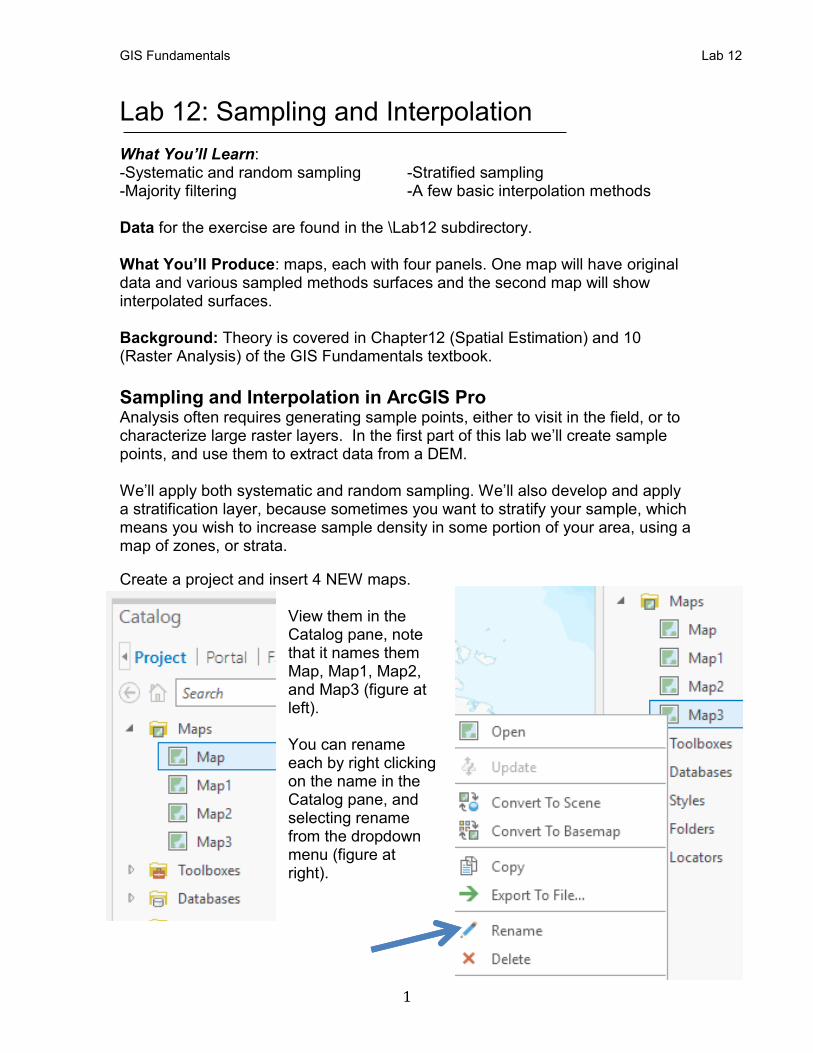
GIS Fundamentals Lab 12 1 Lab 12: Sampling and Interpolation What You’ll Learn: -Systematic and random sampling -Stratified sampling -Majority filtering -A few basic interpolation methods Data for the exercise are found in the \Lab12 subdirectory. What You’ll Produce: maps, each with four panels. One map will have original data and various sampled methods surfaces and the second map will show interpolated surfaces. Background: Theory is covered in Chapter12 (Spatial Estimation) and 10 (Raster Analysis) of the GIS Fundamentals textbook. Sampling and Interpolation in ArcGIS Pro Analysis often requires generating sample points, either to visit in the field, or to characterize large raster layers. In the first part of this lab we’ll create sample points, and use them to extract data from a DEM. We’ll apply both systematic and random sampling. We’ll also develop and apply a stratification layer, because sometimes you want to stratify your sample, which means you wish to increase sample density in some portion of your area, using a map of zones, or strata. Create a project and insert 4 NEW maps. View them in the Catalog pane, note that it names them Map, Map1, Map2, and Map3 (figure at left). You can rename each by right clicking on the name in the Catalog pane, and selecting rename from the dropdown menu (figure at right).
Transcript
GIS Fundamentals Lab 12
1
Lab 12: Sampling and Interpolation
What You’ll Learn: -Systematic and random sampling -Stratified sampling -Majority filtering -A few basic interpolation methods Data for the exercise are found in the \Lab12 subdirectory. What You’ll Produce: maps, each with four panels. One map will have original data and various sampled methods surfaces and the second map will show interpolated surfaces. Background: Theory is covered in Chapter12 (Spatial Estimation) and 10 (Raster Analysis) of the GIS Fundamentals textbook.
Sampling and Interpolation in ArcGIS Pro Analysis often requires generating sample points, either to visit in the field, or to characterize large raster layers. In the first part of this lab we’ll create sample points, and use them to extract data from a DEM. We’ll apply both systematic and random sampling. We’ll also develop and apply a stratification layer, because sometimes you want to stratify your sample, which means you wish to increase sample density in some portion of your area, using a map of zones, or strata.
Create a project and insert 4 NEW maps. View them in the Catalog pane, note that it names them Map, Map1, Map2, and Map3 (figure at left). You can rename each by right clicking on the name in the Catalog pane, and selecting rename from the dropdown menu (figure at right).
GIS Fundamentals Lab 12
2
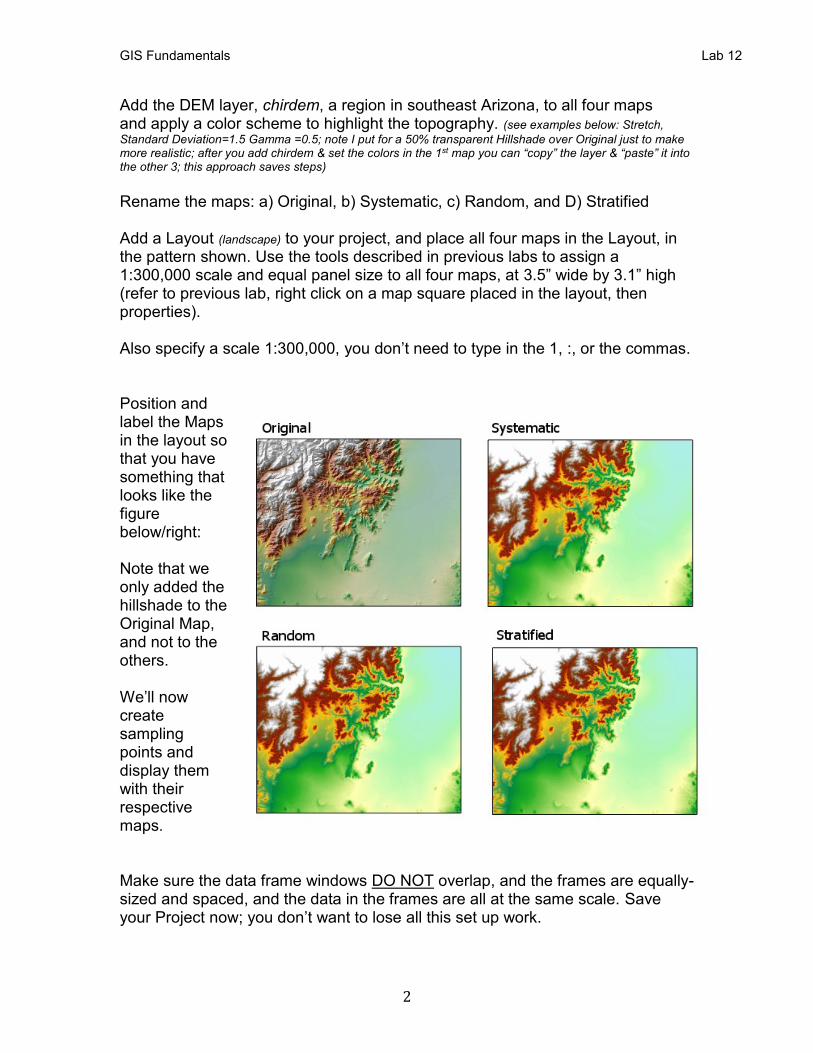
Add the DEM layer, chirdem, a region in southeast Arizona, to all four maps and apply a color scheme to highlight the topography. (see examples below: Stretch,
Standard Deviation=1.5 Gamma =0.5; note I put for a 50% transparent Hillshade over Original just to make more realistic; after you add chirdem & set the colors in the 1st map you can “copy” the layer & “paste” it into the other 3; this approach saves steps) Rename the maps: a) Original, b) Systematic, c) Random, and D) Stratified Add a Layout (landscape) to your project, and place all four maps in the Layout, in the pattern shown. Use the tools described in previous labs to assign a 1:300,000 scale and equal panel size to all four maps, at 3.5” wide by 3.1” high (refer to previous lab, right click on a map square placed in the layout, then properties). Also specify a scale 1:300,000, you don’t need to type in the 1, :, or the commas. Position and label the Maps in the layout so that you have something that looks like the figure below/right: Note that we only added the hillshade to the Original Map, and not to the others. We’ll now create sampling points and display them with their respective maps. Make sure the data frame windows DO NOT overlap, and the frames are equally-sized and spaced, and the data in the frames are all at the same scale. Save your Project now; you don’t want to lose all this set up work.
GIS Fundamentals Lab 12
3
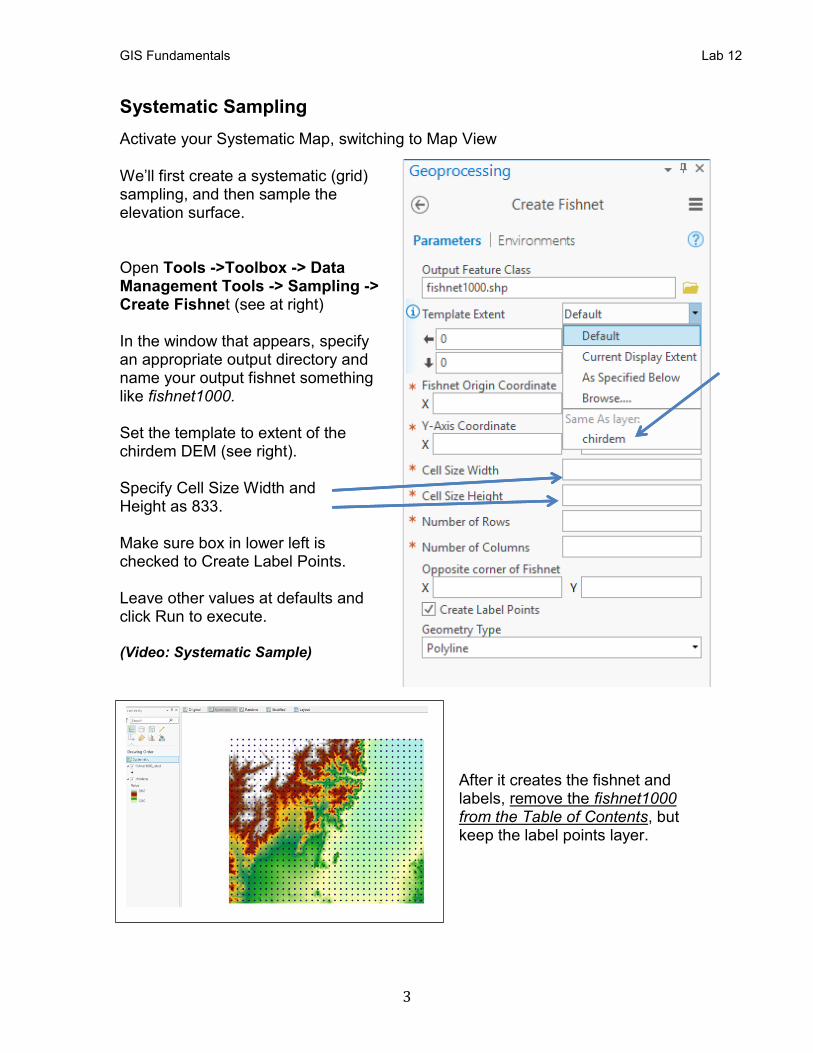
Systematic Sampling
Activate your Systematic Map, switching to Map View We’ll first create a systematic (grid) sampling, and then sample the elevation surface. Open Tools ->Toolbox -> Data Management Tools -> Sampling -> Create Fishnet (see at right) In the window that appears, specify an appropriate output directory and name your output fishnet something like fishnet1000. Set the template to extent of the chirdem DEM (see right). Specify Cell Size Width and Height as 833. Make sure box in lower left is checked to Create Label Points. Leave other values at defaults and click Run to execute. (Video: Systematic Sample)
After it creates the fishnet and labels, remove the fishnet1000 from the Table of Contents, but keep the label points layer.
GIS Fundamentals Lab 12
4
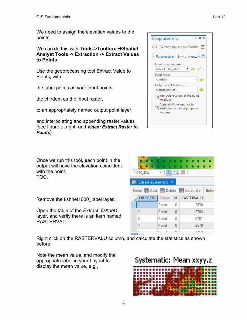
We need to assign the elevation values to the points. We can do this with Tools->Toolbox →Spatial Analyst Tools -> Extraction -> Extract Values to Points
Use the geoprocessing tool Extract Value to Points, with the label points as your input points, the chirdem as the input raster, to an appropriately named output point layer, and interpolating and appending raster values (see figure at right, and video: Extract Raster to
Points) Once we run this tool, each point in the output will have the elevation coincident with the point. TOC. Remove the fishnet1000_label layer. Open the table of the Extract_fishnet1 layer, and verify there is an item named RASTERVALU Right click on the RASTERVALU column, and calculate the statistics as shown before. Note the mean value, and modify the appropriate label in your Layout to display the mean value, e.g.,
GIS Fundamentals Lab 12
5
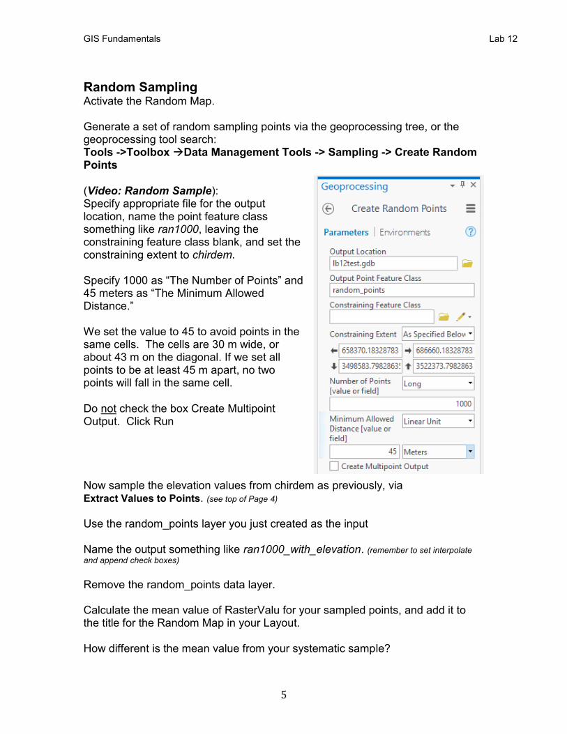
Random Sampling Activate the Random Map. Generate a set of random sampling points via the geoprocessing tree, or the geoprocessing tool search: Tools ->Toolbox →Data Management Tools -> Sampling -> Create Random Points (Video: Random Sample): Specify appropriate file for the output location, name the point feature class something like ran1000, leaving the constraining feature class blank, and set the constraining extent to chirdem. Specify 1000 as “The Number of Points” and 45 meters as “The Minimum Allowed Distance.” We set the value to 45 to avoid points in the same cells. The cells are 30 m wide, or about 43 m on the diagonal. If we set all points to be at least 45 m apart, no two points will fall in the same cell. Do not check the box Create Multipoint Output. Click Run Now sample the elevation values from chirdem as previously, via Extract Values to Points. (see top of Page 4) Use the random_points layer you just created as the input Name the output something like ran1000_with_elevation. (remember to set interpolate
and append check boxes)
Remove the random_points data layer. Calculate the mean value of RasterValu for your sampled points, and add it to the title for the Random Map in your Layout. How different is the mean value from your systematic sample?
GIS Fundamentals Lab 12
6
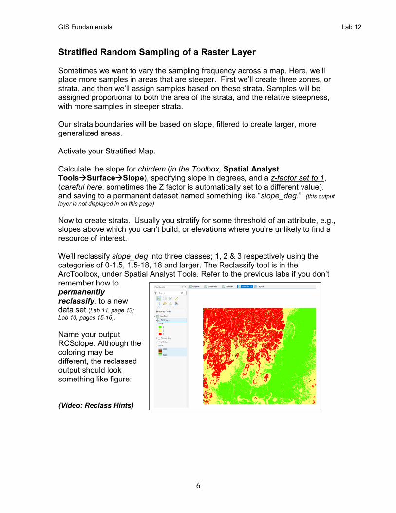
Stratified Random Sampling of a Raster Layer Sometimes we want to vary the sampling frequency across a map. Here, we’ll place more samples in areas that are steeper. First we’ll create three zones, or strata, and then we’ll assign samples based on these strata. Samples will be assigned proportional to both the area of the strata, and the relative steepness, with more samples in steeper strata. Our strata boundaries will be based on slope, filtered to create larger, more generalized areas. Activate your Stratified Map. Calculate the slope for chirdem (in the Toolbox, Spatial Analyst Tools→Surface→Slope), specifying slope in degrees, and a z-factor set to 1, (careful here, sometimes the Z factor is automatically set to a different value), and saving to a permanent dataset named something like “slope_deg.” (this output
layer is not displayed in on this page)
Now to create strata. Usually you stratify for some threshold of an attribute, e.g., slopes above which you can’t build, or elevations where you’re unlikely to find a resource of interest. We’ll reclassify slope_deg into three classes; 1, 2 & 3 respectively using the categories of 0-1.5, 1.5-18, 18 and larger. The Reclassify tool is in the ArcToolbox, under Spatial Analyst Tools. Refer to the previous labs if you don’t remember how to permanently reclassify, to a new data set (Lab 11, page 13;
Lab 10, pages 15-16). Name your output RCSclope. Although the coloring may be different, the reclassed output should look something like figure: (Video: Reclass Hints)
GIS Fundamentals Lab 12
7
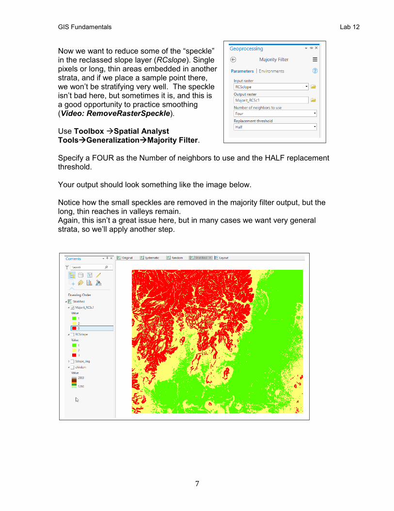
Now we want to reduce some of the “speckle” in the reclassed slope layer (RCslope). Single pixels or long, thin areas embedded in another strata, and if we place a sample point there, we won’t be stratifying very well. The speckle isn’t bad here, but sometimes it is, and this is a good opportunity to practice smoothing (Video: RemoveRasterSpeckle). Use Toolbox →Spatial Analyst Tools→Generalization→Majority Filter. Specify a FOUR as the Number of neighbors to use and the HALF replacement threshold. Your output should look something like the image below. Notice how the small speckles are removed in the majority filter output, but the long, thin reaches in valleys remain. Again, this isn’t a great issue here, but in many cases we want very general strata, so we’ll apply another step.
GIS Fundamentals Lab 12
8
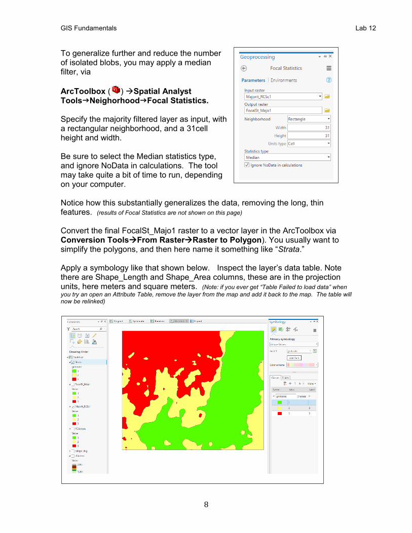
To generalize further and reduce the number of isolated blobs, you may apply a median filter, via
ArcToolbox ( ) →Spatial Analyst ToolsNeighorhoodFocal Statistics. Specify the majority filtered layer as input, with a rectangular neighborhood, and a 31cell height and width. Be sure to select the Median statistics type, and ignore NoData in calculations. The tool may take quite a bit of time to run, depending on your computer. Notice how this substantially generalizes the data, removing the long, thin features. (results of Focal Statistics are not shown on this page) Convert the final FocalSt_Majo1 raster to a vector layer in the ArcToolbox via Conversion Tools→From Raster→Raster to Polygon). You usually want to simplify the polygons, and then here name it something like “Strata.” Apply a symbology like that shown below. Inspect the layer’s data table. Note there are Shape_Length and Shape_Area columns, these are in the projection units, here meters and square meters. (Note: if you ever get “Table Failed to load data” when
you try an open an Attribute Table, remove the layer from the map and add it back to the map. The table will now be relinked)
GIS Fundamentals Lab 12
9
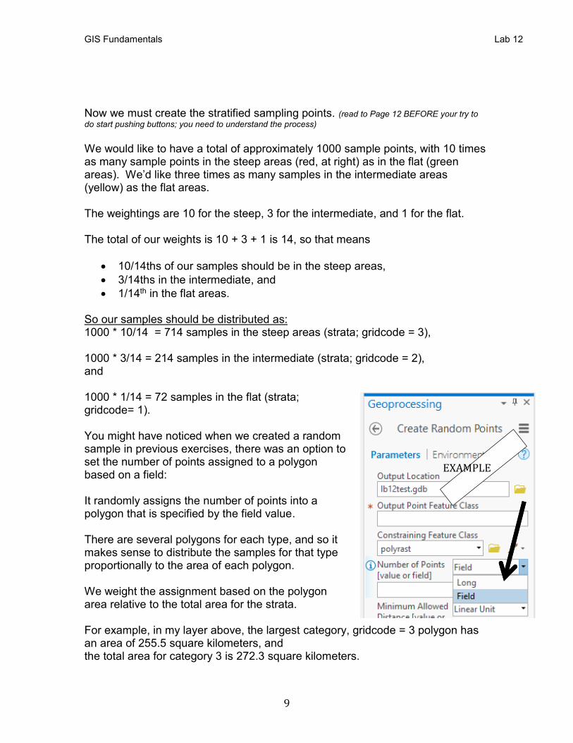
Now we must create the stratified sampling points. (read to Page 12 BEFORE your try to
do start pushing buttons; you need to understand the process)
We would like to have a total of approximately 1000 sample points, with 10 times as many sample points in the steep areas (red, at right) as in the flat (green areas). We’d like three times as many samples in the intermediate areas (yellow) as the flat areas. The weightings are 10 for the steep, 3 for the intermediate, and 1 for the flat. The total of our weights is 10 + 3 + 1 is 14, so that means
• 10/14ths of our samples should be in the steep areas,
• 3/14ths in the intermediate, and
• 1/14th in the flat areas. So our samples should be distributed as: 1000 * 10/14 = 714 samples in the steep areas (strata; gridcode = 3), 1000 * 3/14 = 214 samples in the intermediate (strata; gridcode = 2), and 1000 * 1/14 = 72 samples in the flat (strata; gridcode= 1). You might have noticed when we created a random sample in previous exercises, there was an option to set the number of points assigned to a polygon based on a field: It randomly assigns the number of points into a polygon that is specified by the field value. There are several polygons for each type, and so it makes sense to distribute the samples for that type proportionally to the area of each polygon. We weight the assignment based on the polygon area relative to the total area for the strata. For example, in my layer above, the largest category, gridcode = 3 polygon has an area of 255.5 square kilometers, and the total area for category 3 is 272.3 square kilometers.
EXAMPLE
GIS Fundamentals Lab 12
10
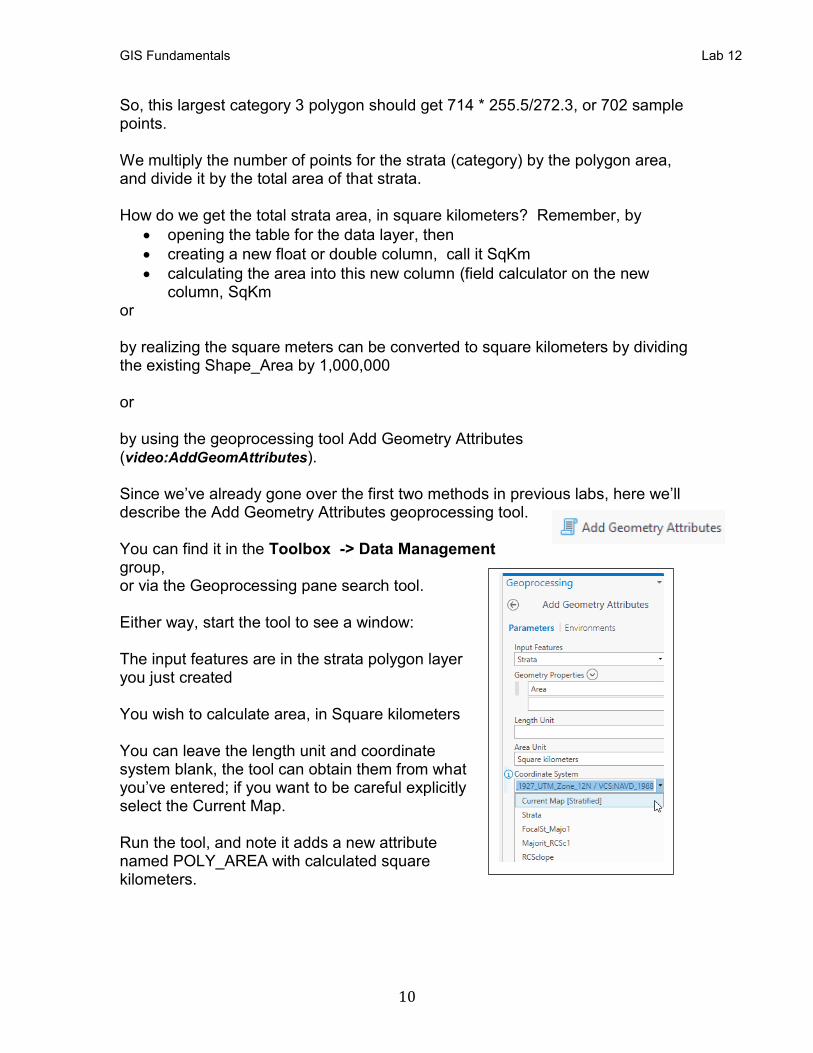
So, this largest category 3 polygon should get 714 * 255.5/272.3, or 702 sample points. We multiply the number of points for the strata (category) by the polygon area, and divide it by the total area of that strata. How do we get the total strata area, in square kilometers? Remember, by
• opening the table for the data layer, then
• creating a new float or double column, call it SqKm
• calculating the area into this new column (field calculator on the new column, SqKm
or by realizing the square meters can be converted to square kilometers by dividing the existing Shape_Area by 1,000,000 or by using the geoprocessing tool Add Geometry Attributes (video:AddGeomAttributes). Since we’ve already gone over the first two methods in previous labs, here we’ll describe the Add Geometry Attributes geoprocessing tool. You can find it in the Toolbox -> Data Management group, or via the Geoprocessing pane search tool. Either way, start the tool to see a window: The input features are in the strata polygon layer you just created You wish to calculate area, in Square kilometers You can leave the length unit and coordinate system blank, the tool can obtain them from what you’ve entered; if you want to be careful explicitly select the Current Map. Run the tool, and note it adds a new attribute named POLY_AREA with calculated square kilometers.
GIS Fundamentals Lab 12
11
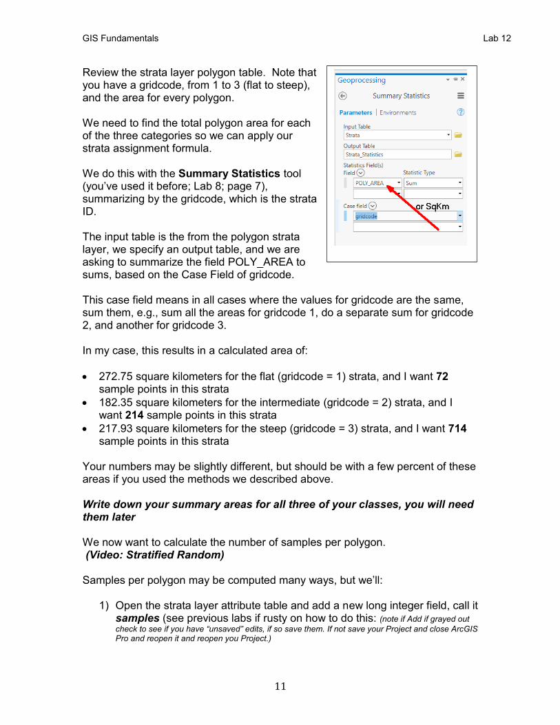
Review the strata layer polygon table. Note that you have a gridcode, from 1 to 3 (flat to steep), and the area for every polygon. We need to find the total polygon area for each of the three categories so we can apply our strata assignment formula. We do this with the Summary Statistics tool (you’ve used it before; Lab 8; page 7), summarizing by the gridcode, which is the strata ID. The input table is the from the polygon strata layer, we specify an output table, and we are asking to summarize the field POLY_AREA to sums, based on the Case Field of gridcode. This case field means in all cases where the values for gridcode are the same, sum them, e.g., sum all the areas for gridcode 1, do a separate sum for gridcode 2, and another for gridcode 3. In my case, this results in a calculated area of:
• 272.75 square kilometers for the flat (gridcode = 1) strata, and I want 72 sample points in this strata
• 182.35 square kilometers for the intermediate (gridcode = 2) strata, and I want 214 sample points in this strata
• 217.93 square kilometers for the steep (gridcode = 3) strata, and I want 714 sample points in this strata
Your numbers may be slightly different, but should be with a few percent of these areas if you used the methods we described above. Write down your summary areas for all three of your classes, you will need them later We now want to calculate the number of samples per polygon. (Video: Stratified Random) Samples per polygon may be computed many ways, but we’ll:
1) Open the strata layer attribute table and add a new long integer field, call it samples (see previous labs if rusty on how to do this: (note if Add if grayed out
check to see if you have “unsaved” edits, if so save them. If not save your Project and close ArcGIS Pro and reopen it and reopen you Project.)
GIS Fundamentals Lab 12
12
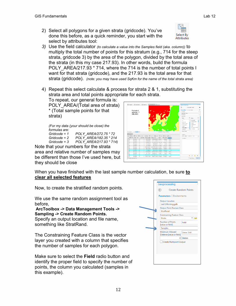
2) Select all polygons for a given strata (gridcode). You’ve done this before, as a quick reminder, you start with the select by attributes tool:
3) Use the field calculator (to calculate a value into the Samples field (aka. column)) to multiply the total number of points for this stratum (e.g., 714 for the steep strata, gridcode 3) by the area of the polygon, divided by the total area of the strata (in this my case 217.93). In other words, build the formula POLY_AREA/217.93 * 714, where the 714 is the number of total points I want for that strata (gridcode), and the 217.93 is the total area for that strata (gridcode). (note: you may have used SqKm for the name of the total strata area)
4) Repeat this select calculate & process for strata 2 & 1, substituting the
strata area and total points appropriate for each strata. To repeat, our general formula is: POLY_AREA/(Total area of strata) * (Total sample points for that strata) (For my data (your should be close) the formulas are: Gridcode = 1 POLY_AREA/272.75 * 72 Gridcode = 2 POLY_AREA/182.35 * 214 Gridcode = 3 POLY_AREA/217.93 * 714)
Note that your numbers for the strata area and relative number of samples may be different than those I’ve used here, but they should be close
When you have finished with the last sample number calculation, be sure to clear all selected features Now, to create the stratified random points. We use the same random assignment tool as before, ArcToolbox -> Data Management Tools -> Sampling -> Create Random Points.
Specify an output location and file name, something like StratRand. The Constraining Feature Class is the vector layer you created with a column that specifies the number of samples for each polygon. Make sure to select the Field radio button and identify the proper field to specify the number of points, the column you calculated (samples in this example).
GIS Fundamentals Lab 12
13
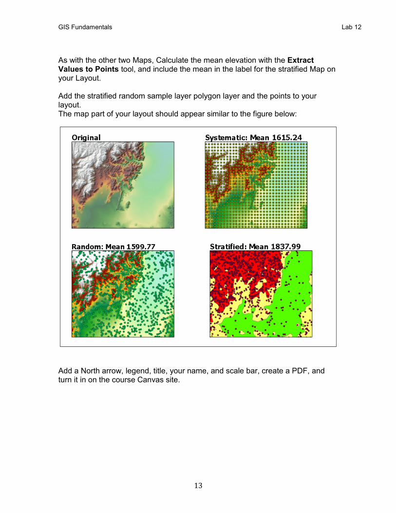
As with the other two Maps, Calculate the mean elevation with the Extract Values to Points tool, and include the mean in the label for the stratified Map on your Layout. Add the stratified random sample layer polygon layer and the points to your layout. The map part of your layout should appear similar to the figure below:
Add a North arrow, legend, title, your name, and scale bar, create a PDF, and turn it in on the course Canvas site.
GIS Fundamentals Lab 12
14
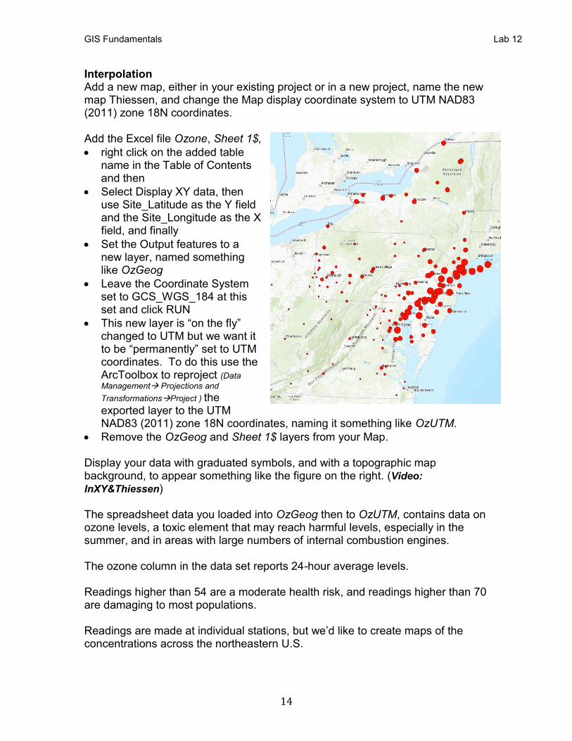
Interpolation Add a new map, either in your existing project or in a new project, name the new map Thiessen, and change the Map display coordinate system to UTM NAD83 (2011) zone 18N coordinates. Add the Excel file Ozone, Sheet 1$,
• right click on the added table name in the Table of Contents and then
• Select Display XY data, then use Site_Latitude as the Y field and the Site_Longitude as the X field, and finally
• Set the Output features to a new layer, named something like OzGeog
• Leave the Coordinate System set to GCS_WGS_184 at this set and click RUN
• This new layer is “on the fly” changed to UTM but we want it to be “permanently” set to UTM coordinates. To do this use the ArcToolbox to reproject (Data
Management→ Projections and
Transformations→Project ) the exported layer to the UTM NAD83 (2011) zone 18N coordinates, naming it something like OzUTM.
• Remove the OzGeog and Sheet 1$ layers from your Map. Display your data with graduated symbols, and with a topographic map background, to appear something like the figure on the right. (Video:
InXY&Thiessen) The spreadsheet data you loaded into OzGeog then to OzUTM, contains data on ozone levels, a toxic element that may reach harmful levels, especially in the summer, and in areas with large numbers of internal combustion engines. The ozone column in the data set reports 24-hour average levels. Readings higher than 54 are a moderate health risk, and readings higher than 70 are damaging to most populations. Readings are made at individual stations, but we’d like to create maps of the concentrations across the northeastern U.S.
GIS Fundamentals Lab 12
15
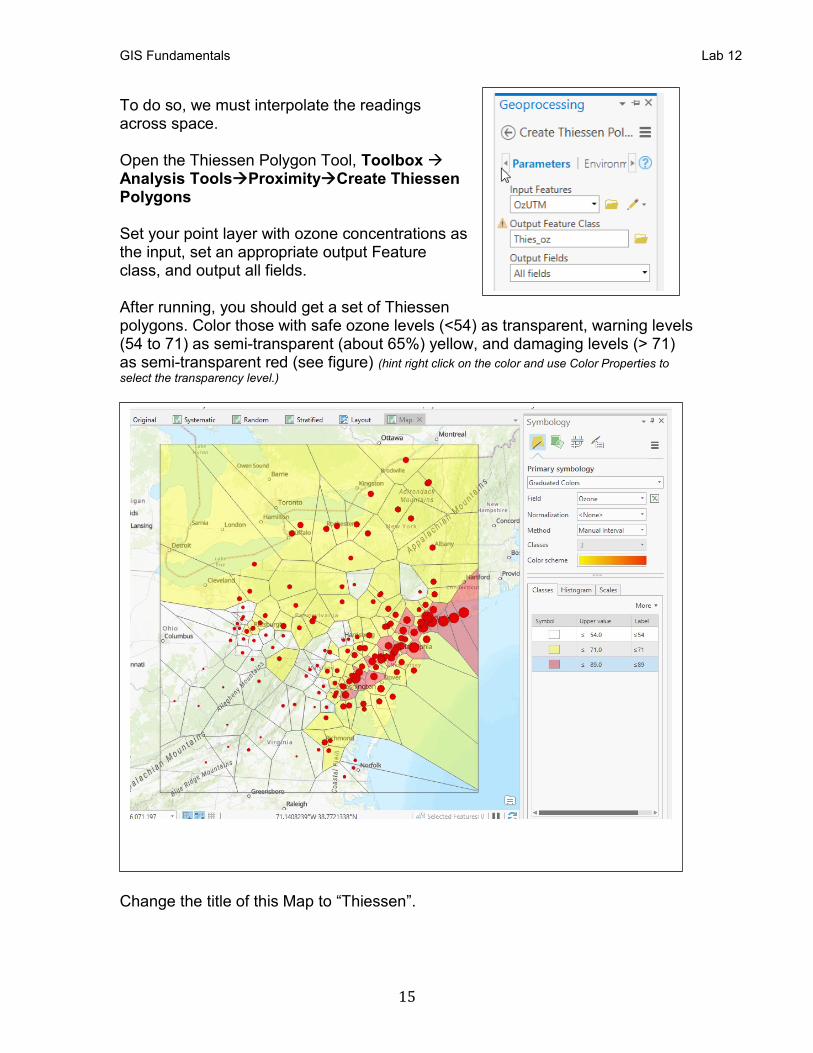
To do so, we must interpolate the readings across space. Open the Thiessen Polygon Tool, Toolbox → Analysis Tools→Proximity→Create Thiessen Polygons Set your point layer with ozone concentrations as the input, set an appropriate output Feature class, and output all fields. After running, you should get a set of Thiessen polygons. Color those with safe ozone levels (<54) as transparent, warning levels (54 to 71) as semi-transparent (about 65%) yellow, and damaging levels (> 71) as semi-transparent red (see figure) (hint right click on the color and use Color Properties to
select the transparency level.)
Change the title of this Map to “Thiessen”.
GIS Fundamentals Lab 12
16
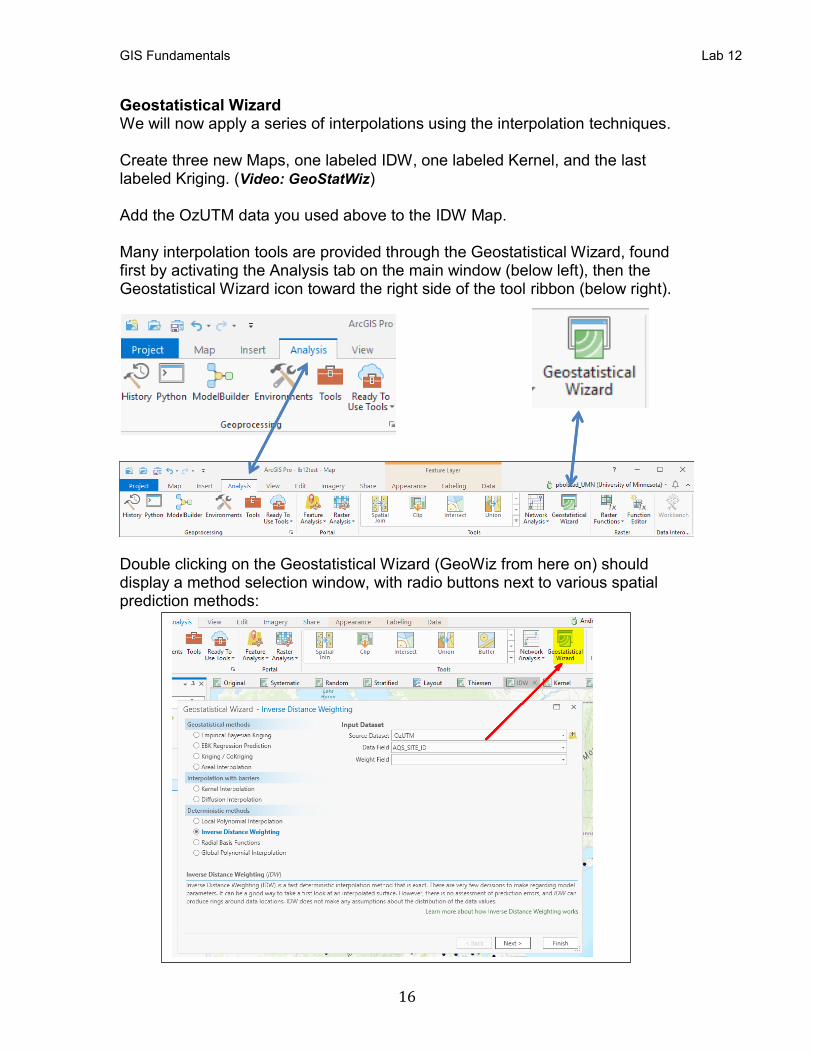
Geostatistical Wizard We will now apply a series of interpolations using the interpolation techniques. Create three new Maps, one labeled IDW, one labeled Kernel, and the last labeled Kriging. (Video: GeoStatWiz) Add the OzUTM data you used above to the IDW Map. Many interpolation tools are provided through the Geostatistical Wizard, found first by activating the Analysis tab on the main window (below left), then the Geostatistical Wizard icon toward the right side of the tool ribbon (below right).
Double clicking on the Geostatistical Wizard (GeoWiz from here on) should display a method selection window, with radio buttons next to various spatial prediction methods:
GIS Fundamentals Lab 12
17
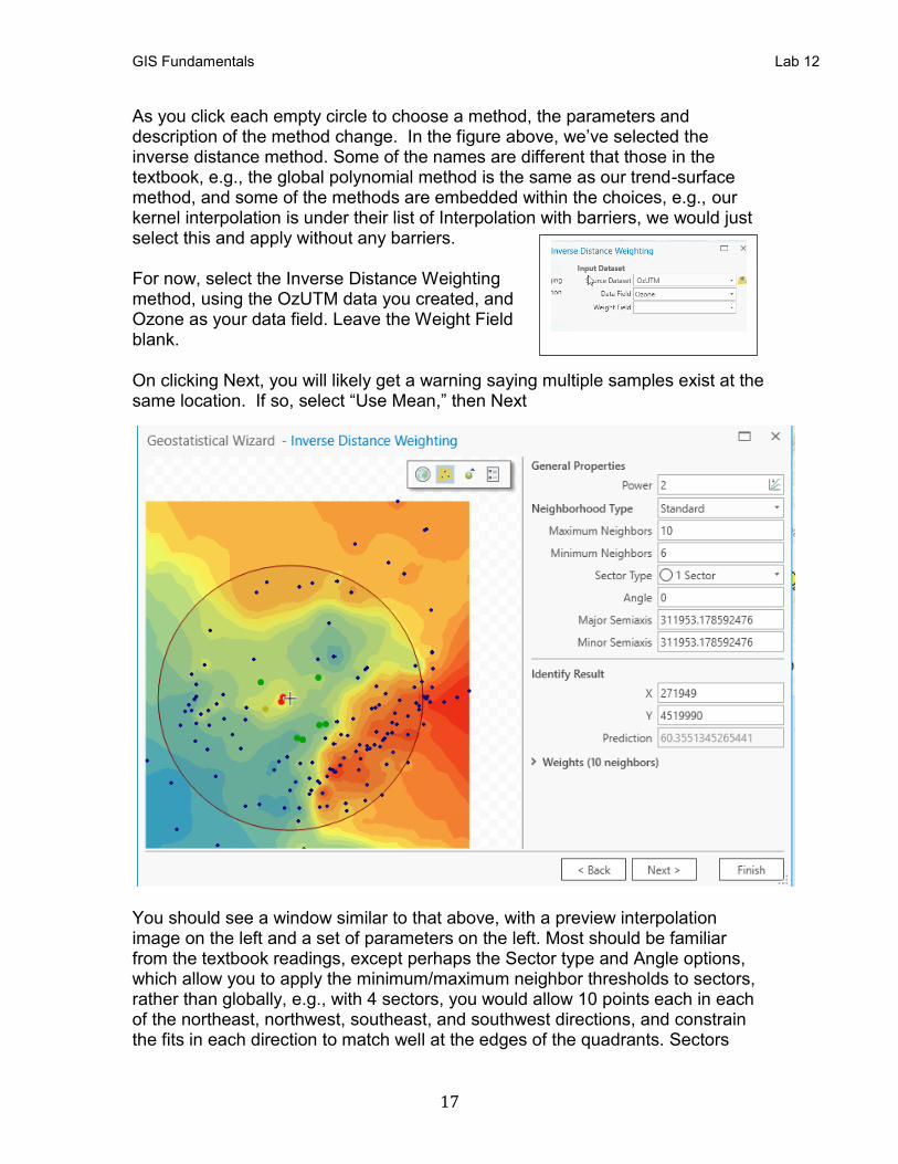
As you click each empty circle to choose a method, the parameters and description of the method change. In the figure above, we’ve selected the inverse distance method. Some of the names are different that those in the textbook, e.g., the global polynomial method is the same as our trend-surface method, and some of the methods are embedded within the choices, e.g., our kernel interpolation is under their list of Interpolation with barriers, we would just select this and apply without any barriers. For now, select the Inverse Distance Weighting method, using the OzUTM data you created, and Ozone as your data field. Leave the Weight Field blank. On clicking Next, you will likely get a warning saying multiple samples exist at the same location. If so, select “Use Mean,” then Next
You should see a window similar to that above, with a preview interpolation image on the left and a set of parameters on the left. Most should be familiar from the textbook readings, except perhaps the Sector type and Angle options, which allow you to apply the minimum/maximum neighbor thresholds to sectors, rather than globally, e.g., with 4 sectors, you would allow 10 points each in each of the northeast, northwest, southeast, and southwest directions, and constrain the fits in each direction to match well at the edges of the quadrants. Sectors
GIS Fundamentals Lab 12
18
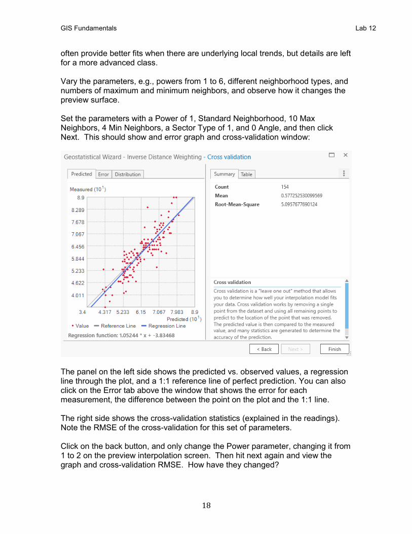
often provide better fits when there are underlying local trends, but details are left for a more advanced class. Vary the parameters, e.g., powers from 1 to 6, different neighborhood types, and numbers of maximum and minimum neighbors, and observe how it changes the preview surface. Set the parameters with a Power of 1, Standard Neighborhood, 10 Max Neighbors, 4 Min Neighbors, a Sector Type of 1, and 0 Angle, and then click Next. This should show and error graph and cross-validation window:
The panel on the left side shows the predicted vs. observed values, a regression line through the plot, and a 1:1 reference line of perfect prediction. You can also click on the Error tab above the window that shows the error for each measurement, the difference between the point on the plot and the 1:1 line. The right side shows the cross-validation statistics (explained in the readings). Note the RMSE of the cross-validation for this set of parameters. Click on the back button, and only change the Power parameter, changing it from 1 to 2 on the preview interpolation screen. Then hit next again and view the graph and cross-validation RMSE. How have they changed?
GIS Fundamentals Lab 12
19
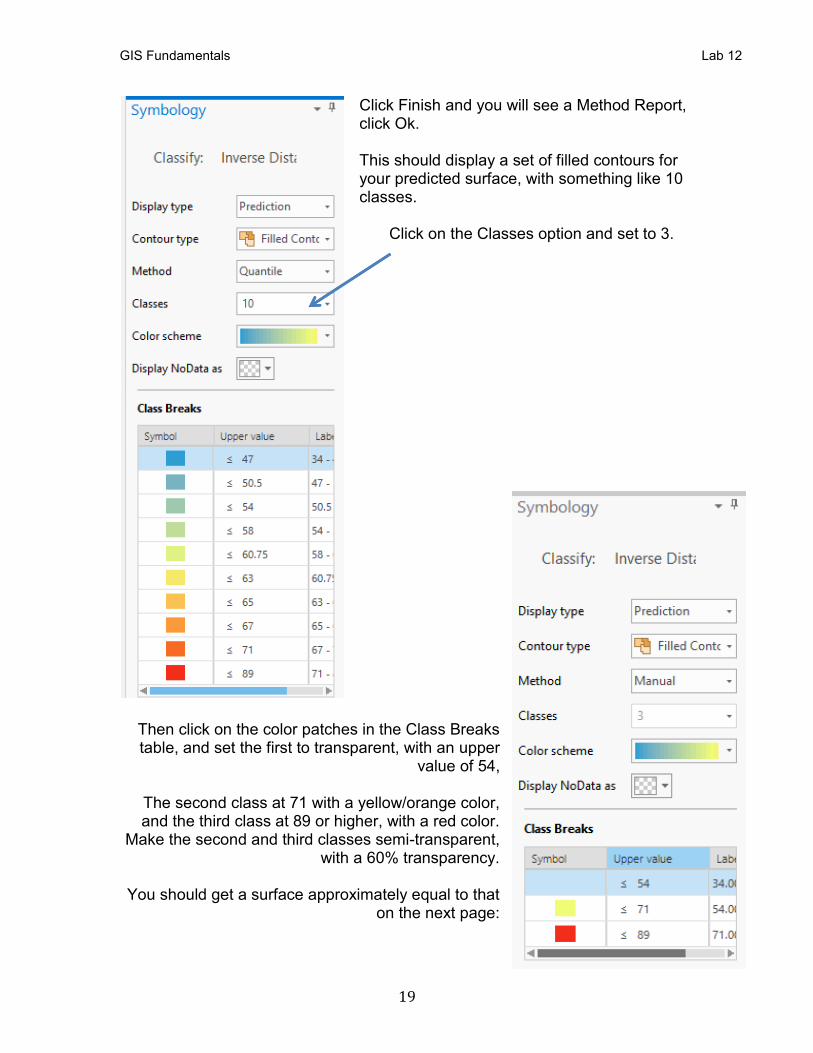
Click Finish and you will see a Method Report, click Ok. This should display a set of filled contours for your predicted surface, with something like 10 classes.
Click on the Classes option and set to 3.
Then click on the color patches in the Class Breaks table, and set the first to transparent, with an upper
value of 54,
The second class at 71 with a yellow/orange color, and the third class at 89 or higher, with a red color.
Make the second and third classes semi-transparent, with a 60% transparency.
You should get a surface approximately equal to that
on the next page:
GIS Fundamentals Lab 12
20
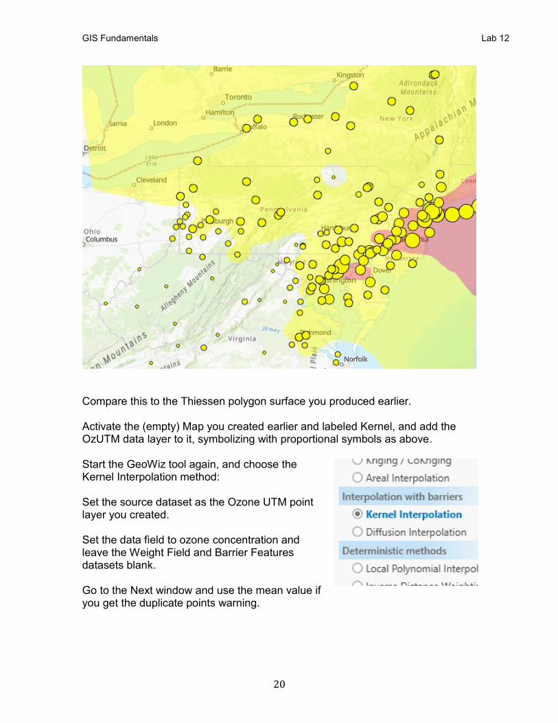
Compare this to the Thiessen polygon surface you produced earlier. Activate the (empty) Map you created earlier and labeled Kernel, and add the OzUTM data layer to it, symbolizing with proportional symbols as above. Start the GeoWiz tool again, and choose the Kernel Interpolation method: Set the source dataset as the Ozone UTM point layer you created. Set the data field to ozone concentration and leave the Weight Field and Barrier Features datasets blank. Go to the Next window and use the mean value if you get the duplicate points warning.
GIS Fundamentals Lab 12
21
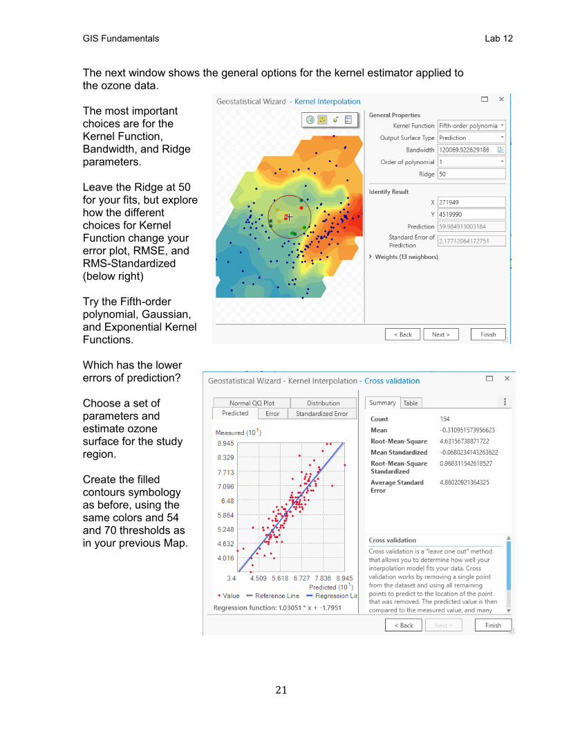
The next window shows the general options for the kernel estimator applied to the ozone data. The most important choices are for the Kernel Function, Bandwidth, and Ridge parameters. Leave the Ridge at 50 for your fits, but explore how the different choices for Kernel Function change your error plot, RMSE, and RMS-Standardized (below right) Try the Fifth-order polynomial, Gaussian, and Exponential Kernel Functions. Which has the lower errors of prediction? Choose a set of parameters and estimate ozone surface for the study region. Create the filled contours symbology as before, using the same colors and 54 and 70 thresholds as in your previous Map.
GIS Fundamentals Lab 12
22
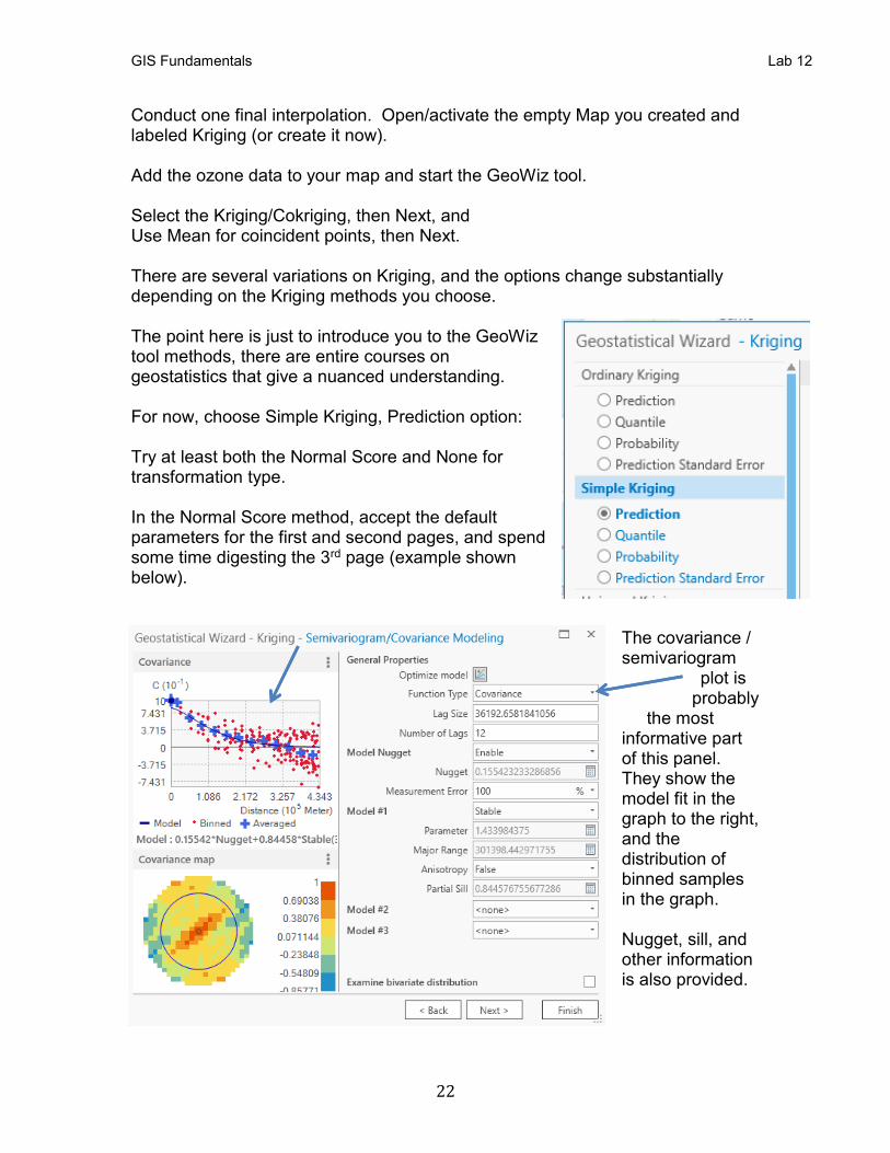
Conduct one final interpolation. Open/activate the empty Map you created and labeled Kriging (or create it now). Add the ozone data to your map and start the GeoWiz tool. Select the Kriging/Cokriging, then Next, and Use Mean for coincident points, then Next. There are several variations on Kriging, and the options change substantially depending on the Kriging methods you choose. The point here is just to introduce you to the GeoWiz tool methods, there are entire courses on geostatistics that give a nuanced understanding. For now, choose Simple Kriging, Prediction option: Try at least both the Normal Score and None for transformation type. In the Normal Score method, accept the default parameters for the first and second pages, and spend some time digesting the 3rd page (example shown below).
The covariance / semivariogram
plot is probably
the most informative part of this panel. They show the model fit in the graph to the right, and the distribution of binned samples in the graph. Nugget, sill, and other information is also provided.
GIS Fundamentals Lab 12
23
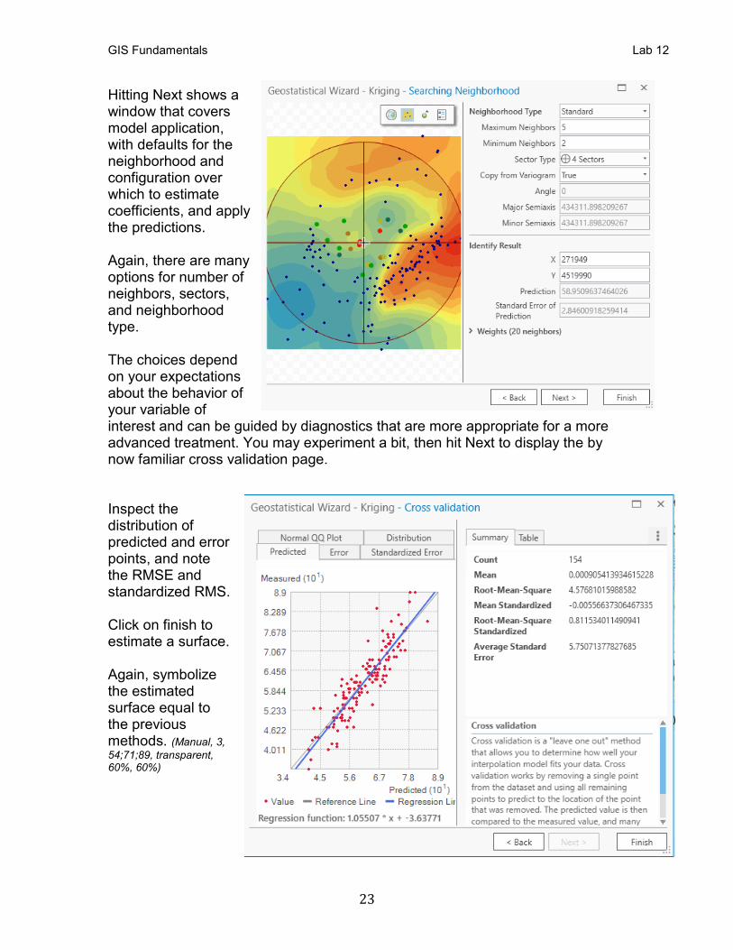
Hitting Next shows a window that covers model application, with defaults for the neighborhood and configuration over which to estimate coefficients, and apply the predictions. Again, there are many options for number of neighbors, sectors, and neighborhood type. The choices depend on your expectations about the behavior of your variable of interest and can be guided by diagnostics that are more appropriate for a more advanced treatment. You may experiment a bit, then hit Next to display the by now familiar cross validation page. Inspect the distribution of predicted and error points, and note the RMSE and standardized RMS. Click on finish to estimate a surface. Again, symbolize the estimated surface equal to the previous methods. (Manual, 3,
54;71;89, transparent, 60%, 60%)
GIS Fundamentals Lab 12
24
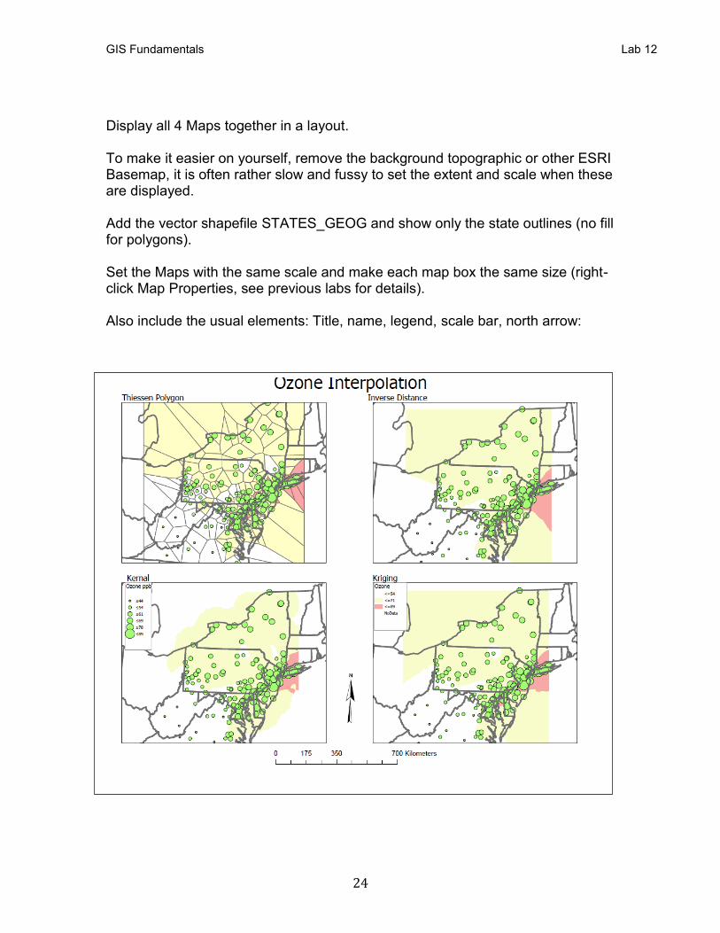
Display all 4 Maps together in a layout. To make it easier on yourself, remove the background topographic or other ESRI Basemap, it is often rather slow and fussy to set the extent and scale when these are displayed. Add the vector shapefile STATES_GEOG and show only the state outlines (no fill for polygons). Set the Maps with the same scale and make each map box the same size (right-click Map Properties, see previous labs for details). Also include the usual elements: Title, name, legend, scale bar, north arrow:


![New Iterative Methods for Interpolation, Numerical ... · and Aitken’s iterated interpolation formulas[11,12] are the most popular interpolation formulas for polynomial interpolation](https://static.documents.pub/doc/80x56/5ebfad147f604608c01bd287/new-iterative-methods-for-interpolation-numerical-and-aitkenas-iterated-interpolation.jpg)


