OCR Media Studies – AS Level Unit G321: Foundation Portfolio in Media Preliminary Task, Music Magazine and Log Book Name: Jade Cook Candidate Number: 6622 Center Name: St. Paul’s Catholic College Center Number: 64770
Transcript
OCR Media Studies – AS Level
Unit G321: Foundation Portfolio in Media
Preliminary Task, Music Magazine and Log Book
Name: Jade CookCandidate Number: 6622Center Name: St. Paul’s
Catholic CollegeCenter Number: 64770
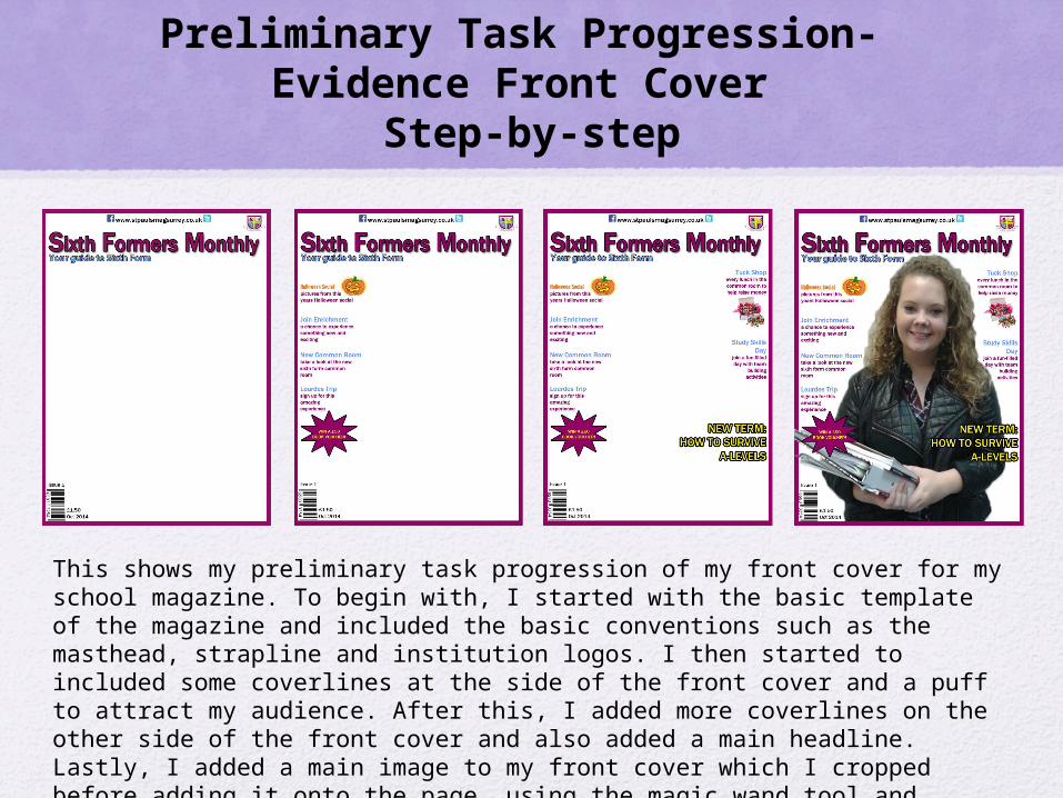
Preliminary Task Progression- Evidence Front Cover
Step-by-step
This shows my preliminary task progression of my front cover for my school magazine. To begin with, I started with the basic template of the magazine and included the basic conventions such as the masthead, strapline and institution logos. I then started to included some coverlines at the side of the front cover and a puff to attract my audience. After this, I added more coverlines on the other side of the front cover and also added a main headline. Lastly, I added a main image to my front cover which I cropped before adding it onto the page, using the magic wand tool and eraser tool on Photoshop.
This shows the production of my contents page for the preliminary task. Firstly, I did the basic layout of the contents and included the headings to give me an idea of where I wanted to place certain conventions such as the coverlines and editorial. I also ‘repeated’ the boarder from the front cover for continuity and also kept the colour scheme consistent. I then started to put in the coverlines with the page numbers next to each story. After this, I then wrote my editorial and added the ‘story of the week’. Lastly, I added an image to go with the ‘story of the week’ and also added a signature to my editorial.
Music Magazine Task Progression– Evidence
Front CoverStep-by-step
This shows the task progression for my magazine front cover. To start with, I including the main conventions to the front cover including the masthead, strapline, barcode and puff. I then started to add coverlines, the price as well as institution logos to add convergence so that the audience can interact with the magazine. After this, I started to finish adding in all of the coverlines and put a box around the names of the artists featured in my magazine to make them stand out to my target audience. I then added the main image by cropping it using the magic wand tool on Photoshop and added the main headline. Lastly, based on feedback I received, I changed the background colour to a lighter purple because some of the text was hard to read.
Music Magazine Task Progression– Evidence
Contents PageStep-by-step
This shows the stages of how I created my the contents page for my music magazine. Firstly, I added the masthead, added an editorial to create a personal relationship with my readers and also added an image which related to the main headline. I then added the coverlines and also a screengrab of the front cover to make my magazine look more professional and similar to my magazines of inspiration. I then changed the colour of the background to a darker purple and changed where I placed the puff as well as the screengrab of the front cover to make it look neater. After this, I changed the colour again to a lighter purple and also added a signature to my editorial after receiving feedback. I then get even more feedback and changed the font of the coverlines as some said it was quite hard to read from a distance. I also made the artists featured in the coverlines a different colour so that they stand out more, and attract a pass along audience.
Music Magazine Task Progression– EvidenceDouble Page Spread
Step-by-stepThis shows the stages of the production of my double page spread. I started by cropping an my main image and adding it in along with the main headline, masthead and web address with institution logos. I then changed the font because I didn’t think it looked aesthetically pleasing and also removed the image because it was quite poor quality and was very small so wouldn’t fill up the page. I also added the interview which I had previously typed up on Microsoft Word. I then added in a new image which filled up most of the space on the page and was of good quality. I also rearranged the main headline as I didn’t want it to be placed over the main image. Based on feedback, I then made the background colour a lighter purple and also added magazine responsibilities. I also changed the colour of the drop capital and rearranged the main headline again. Lastly, I changed the colour of the main headline and also added a stroke effect around the last sentence at the bottom which provided details relating to the interview. I also added a faint effect in the background by using the shape tool to fill up the blank space around the main image.
Section 1) – Log Book
Music Magazine – Genre Research
Billboard magazine is an American music magazine which is based in New York and owned by Prometheus Global Media. It was first published on November 1, 1894 and is known as one of the oldest trade magazines in the world. Billboard magazine publish weekly and their circulation is around 48,000. Their target audience are mostly teenagers and young adults aged around 16-25 because from the statistics below, you can see that college graduates are the highest percentage of people who read Billboard Magazine, however there are older readers as well. It’s USP is that Billboard contains a number of genres which helps to appeal to a wider audience.
inspiration because it is a modern music magazine which appeals to teenagers and young adults like myself. I chose Billboard as one of my magazine’s of inspiration because I like their choice of cover stars, for example, Katy Perry. By using ‘star appeal’ they are able to attract a wide audience as fans of these stars are likely to purchase this magazine. One of the conventions which is missing from this front cover is a strapline. A strapline is something above or below the masthead which tells the audience a bit about the magazine for example, “the UK’s number 1 music magazine”. Puff/Promotion is another convention which is missing from this front cover. This is used to attract readers to buy the magazine by including a competition of some kind that will make people want to buy the magazine and enter the competition.
Established Magazine for my Research
Masthead
Main image
Main headline
Barcode
Strapline
Coverlines
Price
My other magazine of inspiration is Clash. I chose this as one of my magazines of inspiration because of the simple layout as I thought that it was appealing as they haven’t overcrowded the page. As well as this, the main headline stands out as they have used an effect to make it look 3D. They have also used ‘star appeal’ for the main image which will attract a pass along audience, as fans of Rita Ora are likely to purchase this magazine. Clash is a multi-genre magazine which I will ‘repeat’ when producing my magazine as it targets a broader audience. Conventions not included on this front cover which I would like to include on my magazine is institution logos and a puff. This is because institution logos give readers an alternative way to read and interact with the magazine. Including a puff would also attract a wider audience as they are likely to purchase the magazine if they are interested in the puff.
Established Magazine for my Research-
Contents Page
I used the contents page of Billboard as the inspiration for my contents page as I like the layout, especially the large image in the middle of the page because it gives the audience something to look at visually rather than just reading a lot. A convention which I hope to ‘repeat’ in my music magazine is the layout of this contents page because I think it looks clear and professional which makes the magazine easier to read. However, a convention which I would add to my contents page which has not been added in this one is an editorial and an editorial image. I would choose to add this certain convention because it creates a ‘personal relationship’ with the audience. As well as this, I would also add convergence such as social networking logos as technology has become a large part in todays’ society so this allows the audience to connect with the magazine at any place and any time.
Masthead
Main image
Coverlines
Page number
Date
Established Magazine for my Research-
Double Page Spread
The double page spread which I used as inspiration when creating my magazine was from Clash. I chose this page because I liked how the main image stood out. This is something I hope to ‘repeat’ as it will attract my target audience through the use of star appeal. I also like how the main headline stands out and how the same colour and font have been used for the drop capital, as this creates continuity. A convention which I would add to my double page spread would be to differentiate the colour of the text so the audience know who is the interviewer and who is being interviewed. As well as this, I would also add convergence to allow the audience to interact with the magazine online. I also hope to add magazine responsibilities such as photography at the side of the page as it will make my double page spread look more professional.
Main image
Headline
Dropcapital
Interview
Pagenumber
Introduction to interview
Music Magazine – Audience
The target audience for Billboard can be denoted as a magazine for teenagers and young adults aged between 16-25. This connotes that Billboard are trying to attract a younger audience, which they do by generally putting more modern musicians on the front cover of each issue. According to Katz, readers will use Billboard magazine for their own personal gratifications depending on who is on the front cover or who is being interviewed. For example, Bruno Mars on the front cover of Billboard will attract mostly young girls because he is seen as an attractive man and therefore young girls will buy the magazine for the fact that he is on the front cover.From the research completed into this media product, I think the USP is that Billboard include a variety of music genres in their magazine so that they appeal to a wider audience, however they still aim the magazine at young people. For example, they use star appeal to attract their target audience-in this case, Taylor Swift and Eminem. These are two completely different musicians as one of them is a country singer, and the other a rapper. This is a USP for Billboard because by using different musicians on the front cover, this broadens the target audience because they include something which appeals to all young people.
Publisher research
The publisher of Billboard magazine is Prometheus Global Media. On December 10, 2009 the Nielsen Company announced that it would sell its Business Media division, which included brands such as Billboard to a new company called Global Media – a joint company between Guggenheim Partners and Pluribus Capital Management led by James Finkelstein, Matthew Doul, and George Green. In January 2013, Guggenheim took over Pluribus's stake in the company, giving it full ownership.
Before producing my music magazine, I decided to create a questionnaire which I gave to 8 people who represented my target audience (16-25 year olds). I did this so that when it came to producing my magazine, I could use these results to help me make my magazine as successful as possible.
Questionnaire Results
This shows the results from my questionnaire. I found these results helpful because they helped me when producing my magazine, as I used them as a guideline of what to include and what not to include. The results helped me to make decisions about my magazine, for example, the majority of people who took my questionnaire said that the most they would pay for a magazine was between £1-£2. Based on this, I made the price of my magazine £1.99 because not many people where willing to pay more for a music magazine, so if it was this price people would be more likely to buy my magazine.