6
MAKING OF THE CORPORATE IDENTITY IMAGES
| Date post: | 06-Aug-2015 |
| Category: |
Technology |
| Upload: | jmkyang |
| View: | 121 times |
| Download: | 0 times |
MAKING OF THE CORPORATE IDENTITY IMAGES
MAKING OF THE CORPORATE IDENTITY IMAGES
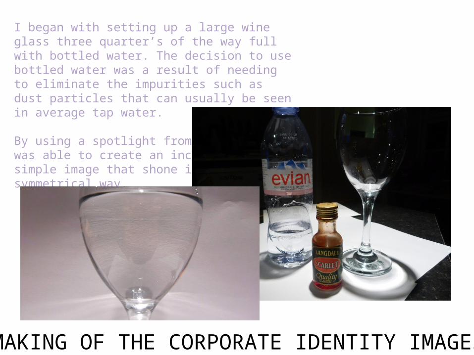
I began with setting up a large wine glass three quarter’s of the way full with bottled water. The decision to use bottled water was a result of needing to eliminate the impurities such as dust particles that can usually be seen in average tap water.
By using a spotlight from above, I was able to create an incrediblysimple image that shone in a symmetrical way.
MAKING OF THE CORPORATE IDENTITY IMAGES
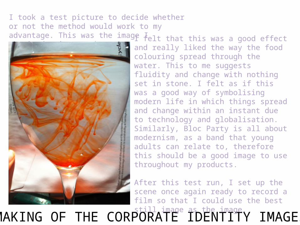
I took a test picture to decide whether or not the method would work to my advantage. This was the image I obtained using my phone: I felt that this was a good effect and really liked
the way the food colouring spread through the water. This to me suggests fluidity and change with nothing set in stone. I felt as if this was a good way of symbolising modern life in which things spread and change within an instant due to technology and globalisation. Similarly, Bloc Party is all about modernism, as a band that young adults can relate to, therefore this should be a good image to use throughout my products.
After this test run, I set up the scene once again ready to record a film so that I could use the best still image as the image.
MAKING OF THE CORPORATE IDENTITY IMAGES
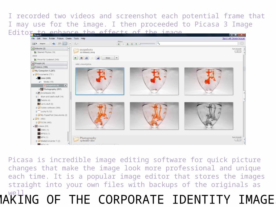
I recorded two videos and screenshot each potential frame that I may use for the image. I then proceeded to Picasa 3 Image Editor to enhance the effects of the image.
Picasa is incredible image editing software for quick picture changes that make the image look more professional and unique each time. It is a popular image editor that stores the images straight into your own files with backups of the originals as well.
MAKING OF THE CORPORATE IDENTITY IMAGES
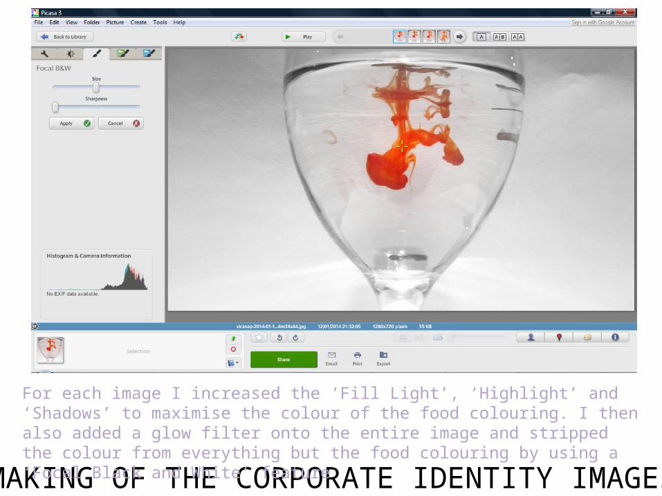
For each image I increased the ‘Fill Light’, ‘Highlight’ and ‘Shadows’ to maximise the colour of the food colouring. I then also added a glow filter onto the entire image and stripped the colour from everything but the food colouring by using a ‘Focal Black and White’ feature
MAKING OF THE CORPORATE IDENTITY IMAGES
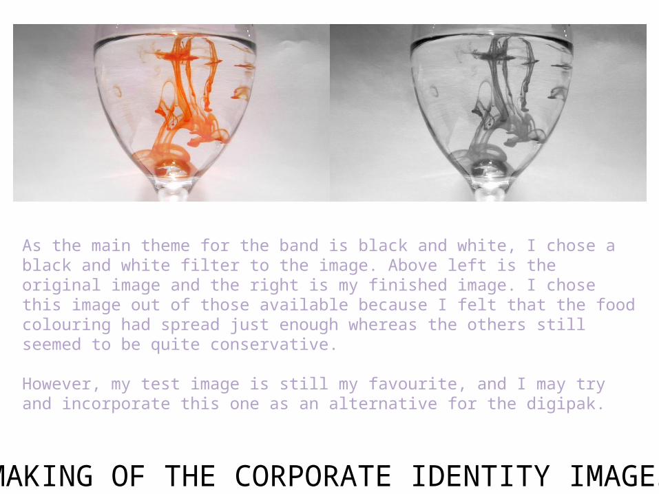
As the main theme for the band is black and white, I chose a black and white filter to the image. Above left is the original image and the right is my finished image. I chose this image out of those available because I felt that the food colouring had spread just enough whereas the others still seemed to be quite conservative.
However, my test image is still my favourite, and I may try and incorporate this one as an alternative for the digipak.


