23
Making PowerPoint Slides Avoiding the Pitfalls of Bad Slides
| Date post: | 02-Jan-2016 |
| Category: |
Documents |
| Upload: | declan-bowen |
| View: | 36 times |
| Download: | 1 times |
Making PowerPoint Slides
Avoiding the Pitfalls of Bad Slides
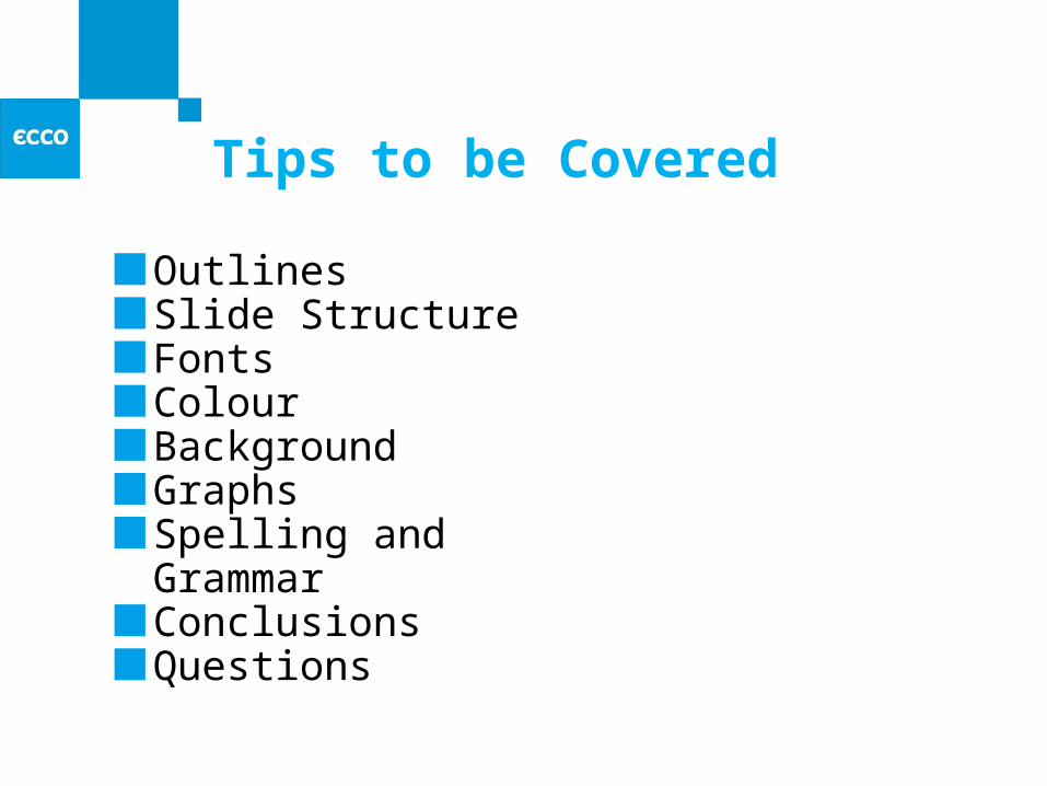
Tips to be Covered
OutlinesSlide StructureFontsColourBackgroundGraphsSpelling and GrammarConclusionsQuestions
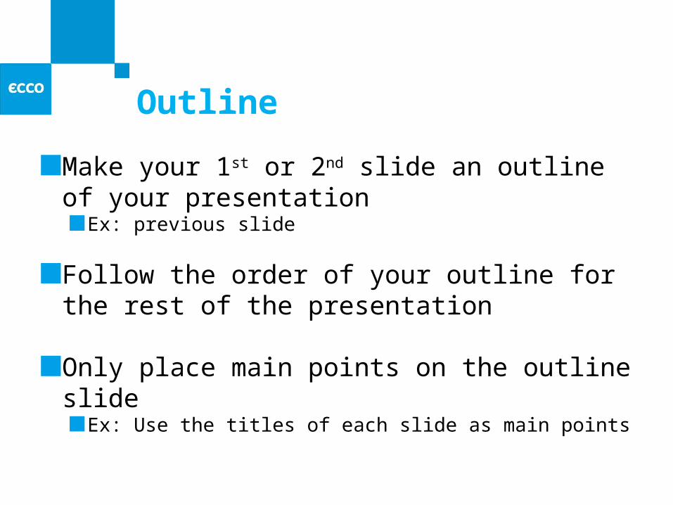
Outline
Make your 1st or 2nd slide an outline of your presentation
Ex: previous slide
Follow the order of your outline for the rest of the presentation
Only place main points on the outline slideEx: Use the titles of each slide as main points
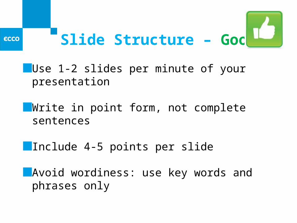
Slide Structure – Good
Use 1-2 slides per minute of your presentation
Write in point form, not complete sentences
Include 4-5 points per slide
Avoid wordiness: use key words and phrases only
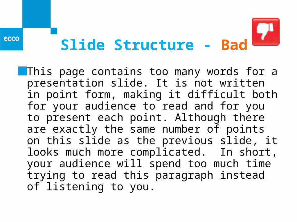
Slide Structure - Bad
This page contains too many words for a presentation slide. It is not written in point form, making it difficult both for your audience to read and for you to present each point. Although there are exactly the same number of points on this slide as the previous slide, it looks much more complicated. In short, your audience will spend too much time trying to read this paragraph instead of listening to you.
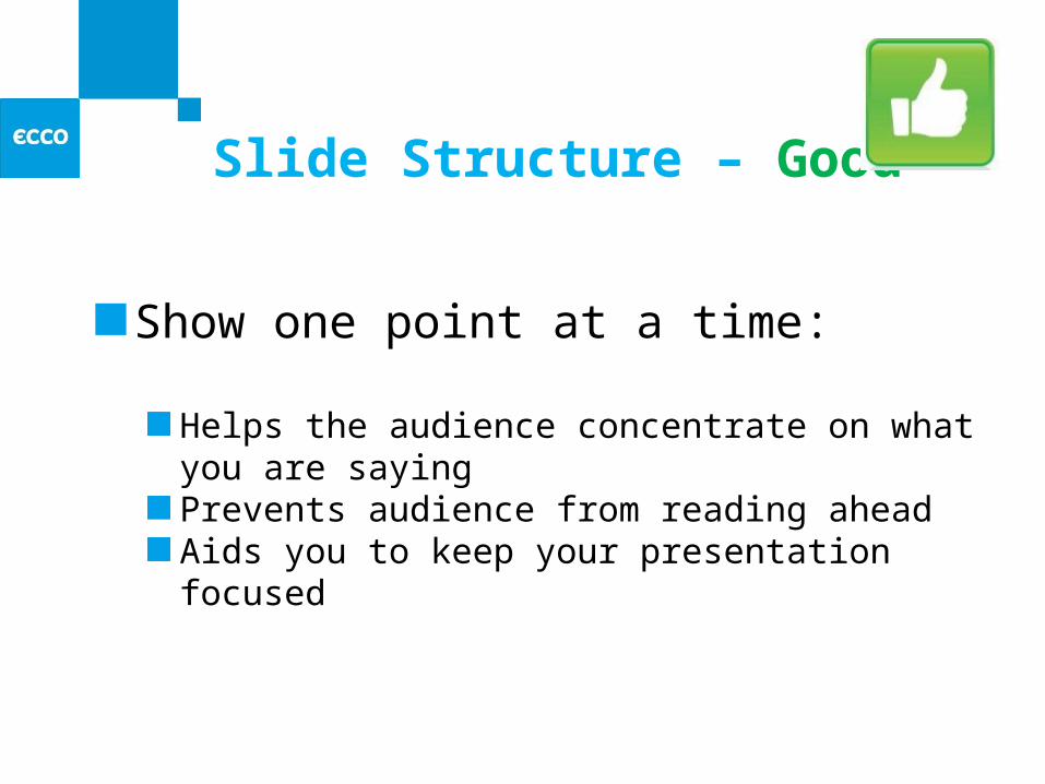
Slide Structure – Good
Show one point at a time:
Helps the audience concentrate on what you are sayingPrevents audience from reading aheadAids you to keep your presentation focused
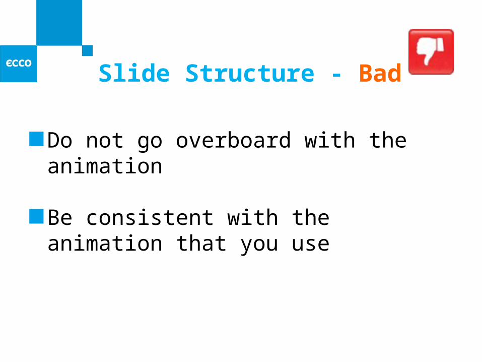
Slide Structure - Bad
Do not go overboard with the animation
Be consistent with the animation that you use
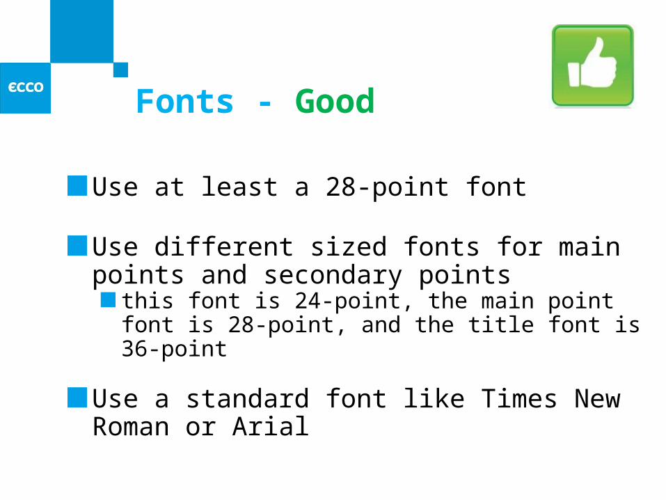
Fonts - Good
Use at least a 28-point font
Use different sized fonts for main points and secondary points
this font is 24-point, the main point font is 28-point, and the title font is 36-point
Use a standard font like Times New Roman or Arial
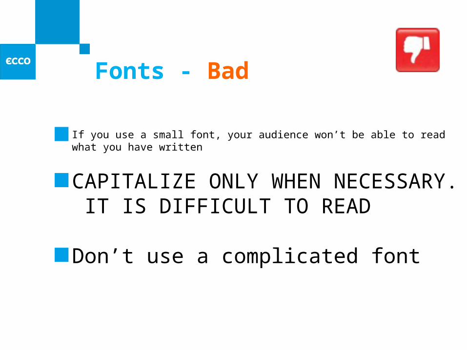
Fonts - Bad
If you use a small font, your audience won’t be able to read what you have written
CAPITALIZE ONLY WHEN NECESSARY. IT IS DIFFICULT TO READ
Don’t use a complicated font
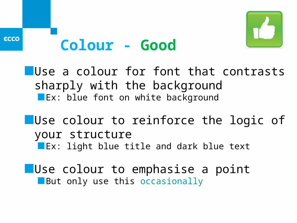
Colour - Good
Use a colour for font that contrasts sharply with the background
Ex: blue font on white background
Use colour to reinforce the logic of your structure
Ex: light blue title and dark blue text
Use colour to emphasise a pointBut only use this occasionally
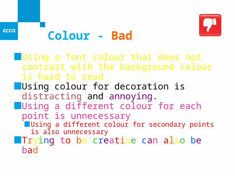
Colour - Bad
Using a font colour that does not contrast with the background colour is hard to read Using colour for decoration is distracting and annoying.Using a different colour for each point is unnecessary
Using a different colour for secondary points is also unnecessary
Trying to be creative can also be bad
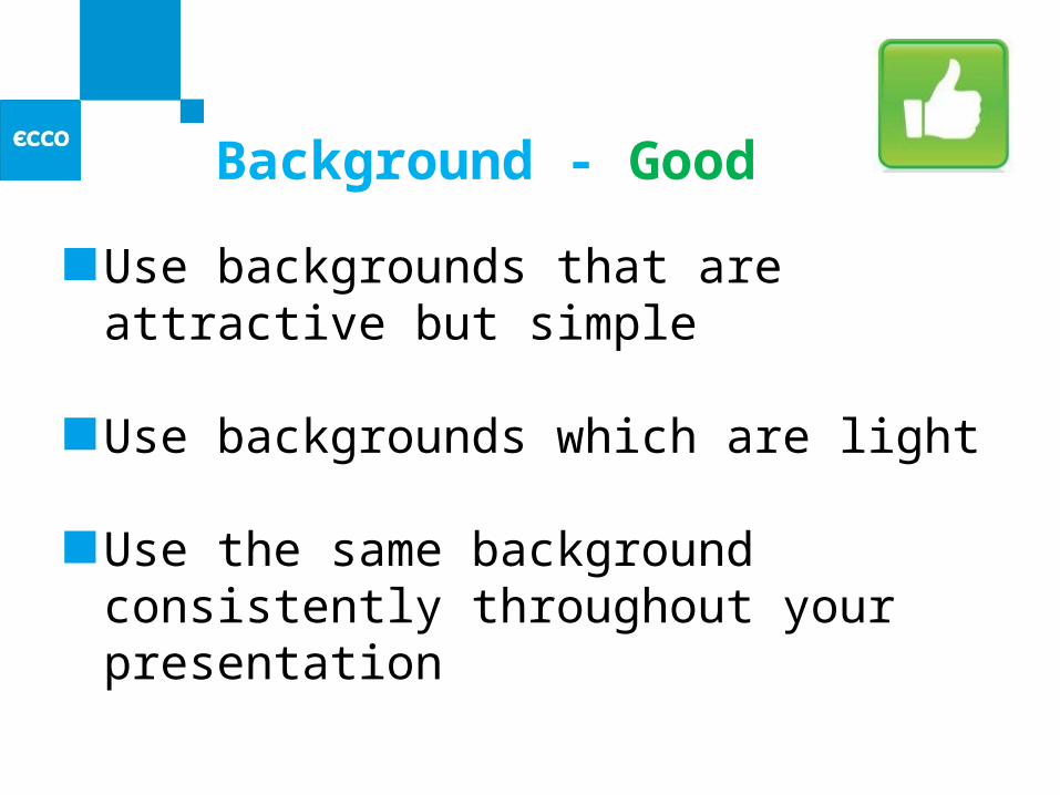
Background - Good
Use backgrounds that are attractive but simple
Use backgrounds which are light
Use the same background consistently throughout your presentation
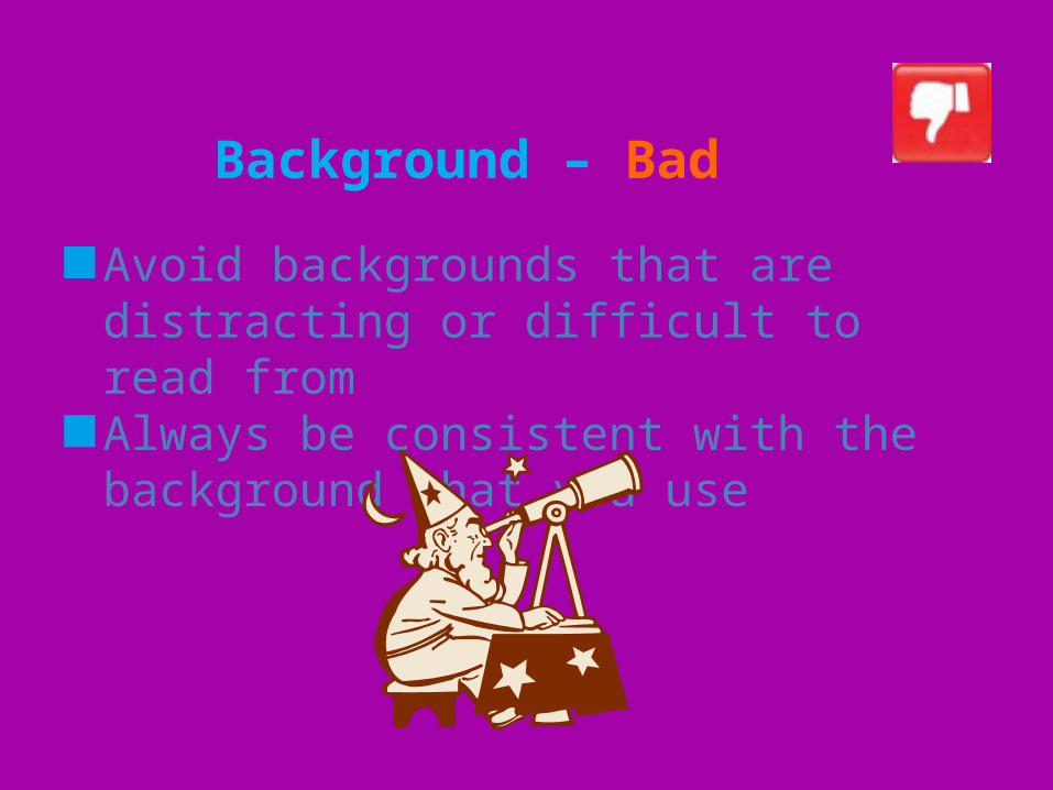
Background – Bad
Avoid backgrounds that are distracting or difficult to read fromAlways be consistent with the background that you use
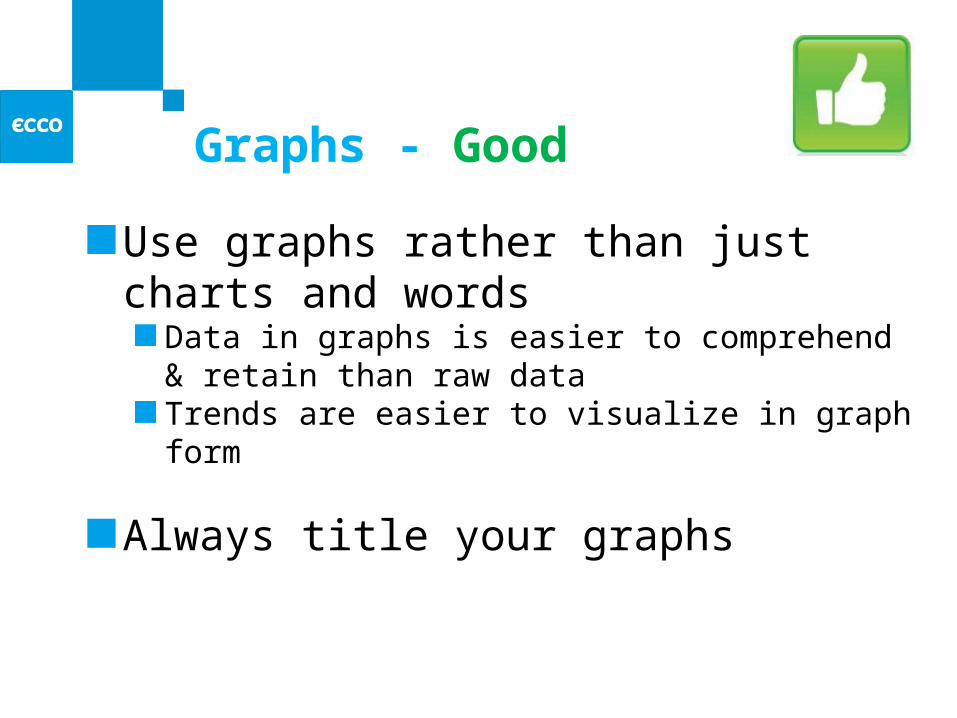
Graphs - Good
Use graphs rather than just charts and words
Data in graphs is easier to comprehend & retain than raw dataTrends are easier to visualize in graph form
Always title your graphs
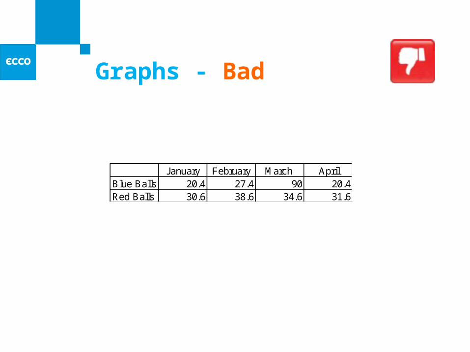
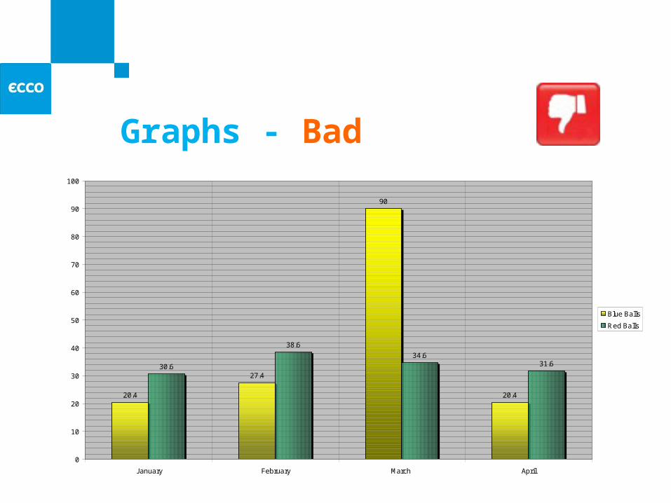
Graphs - Bad
January February March AprilBlue Balls 20.4 27.4 90 20.4Red Balls 30.6 38.6 34.6 31.6
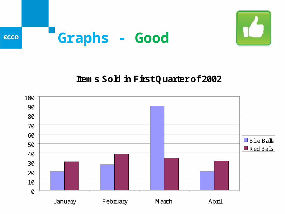
Graphs - Good
Items Sold in First Quarter of 2002
0
10
20
30
40
50
60
70
80
90
100
January February March April
Blue Balls
Red Balls
Graphs - Bad
20.4
27.4
90
20.4
30.6
38.6
34.631.6
0
10
20
30
40
50
60
70
80
90
100
January February March April
Blue Balls
Red Balls
Graphs - Bad
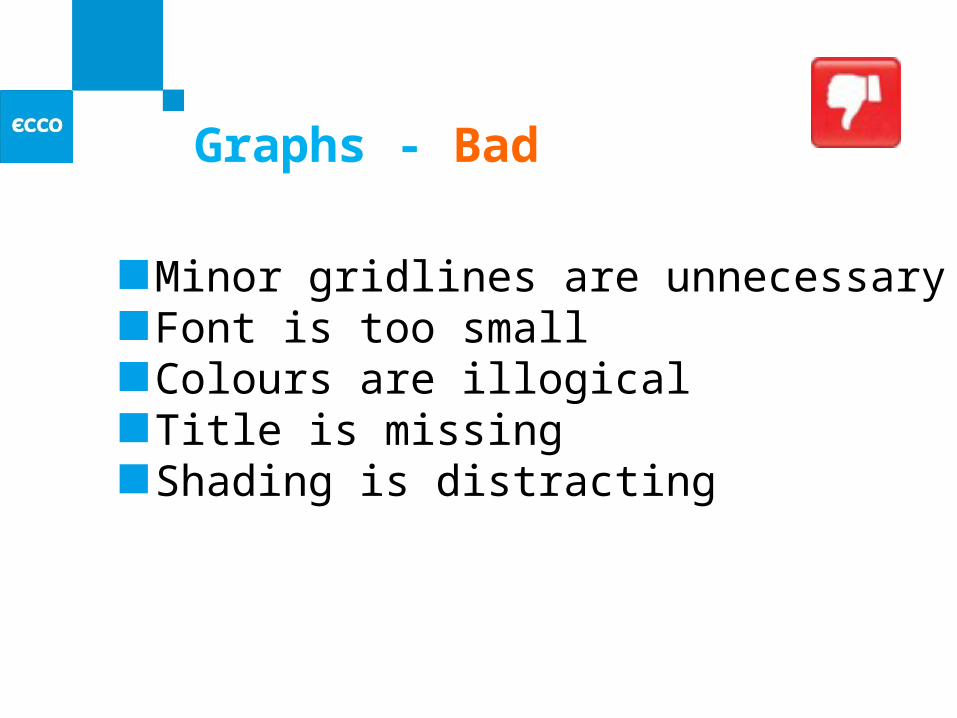
Minor gridlines are unnecessaryFont is too smallColours are illogicalTitle is missingShading is distracting
Spelling and Grammar
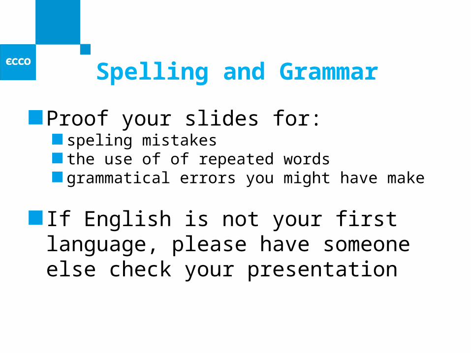
Proof your slides for:speling mistakesthe use of of repeated wordsgrammatical errors you might have make
If English is not your first language, please have someone else check your presentation
Conclusion
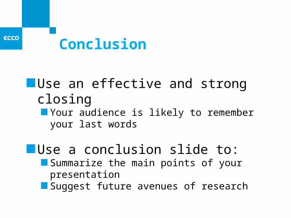
Use an effective and strong closingYour audience is likely to remember your last words
Use a conclusion slide to:Summarize the main points of your presentationSuggest future avenues of research
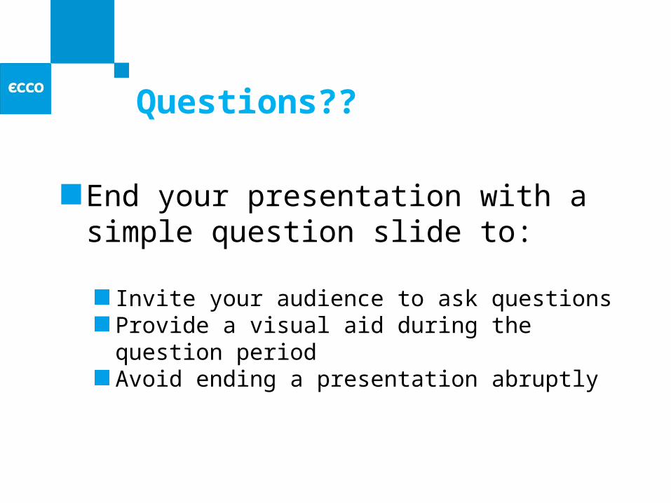
Questions??
End your presentation with a simple question slide to:
Invite your audience to ask questionsProvide a visual aid during the question periodAvoid ending a presentation abruptly
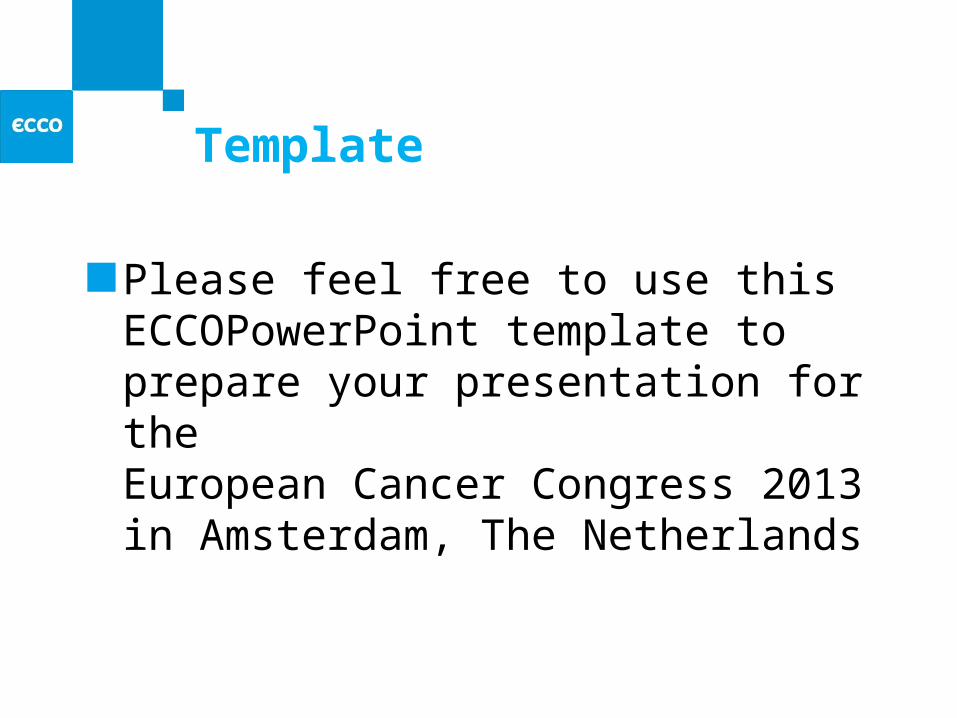
Template
Please feel free to use this ECCOPowerPoint template to prepare your presentation for theEuropean Cancer Congress 2013 in Amsterdam, The Netherlands
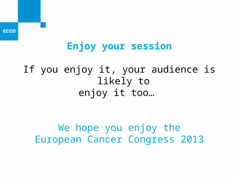
Enjoy your session
If you enjoy it, your audience is likely toenjoy it too…
We hope you enjoy theEuropean Cancer Congress 2013


