22
BRAND GUIDE

BRAND GUIDE
Manualfor what?
She is moved by TRUST AND VALUES OF PERCEPTION BY YOUR CONSUMERS.
And Heavyload brand conveys that confidence and also creates this perception!In every moment it presents itself to its customers, it has to represent all what he believes and works to achieve: an innovative,
customer-focused, investing in skills and values its employees and partners.
What you have on hands is not a guide rules, but an instrument for continuous building a successful brand. The brand guide are a set of attributes that the brand should translate visually.
A brand is not defined only by a logo, but the whole concept that relates to it. The HeavyLoad has a strong and authentic identity. For the standardization of the brand is maintained, it is extremely important to follow these instructions to ensure quality in the implementation of identity, whether in their ads, products or services.
What move a brand?
BRAND GUIDE SUMMARY 01
IDENTITY
GuidelinesVisual signatureVersionsVertical LayoutApplications on ImagesTypographyChromatic StandardImproper UseMinimum SizesSafety EdgeConstructive MeshGraphics Elements
0204
080910111213141516
05

The Brand Manual establishes identity models on which will serve as reference for various applications Heavyload logo.
This manual provides directives and guidelines aimed at consolidating the brand standard to ensure consistency and uniformity in the elements of visual identity, therefore, the rules set forth herein, shall be faithfully followed.APLICATION
VISUALSIGNATURE
SYMBOL SIGNATURE STANDARD CHROMATIC+ +
VISUAL IDENTITY
GUIDELINES 02BRAND GUIDE
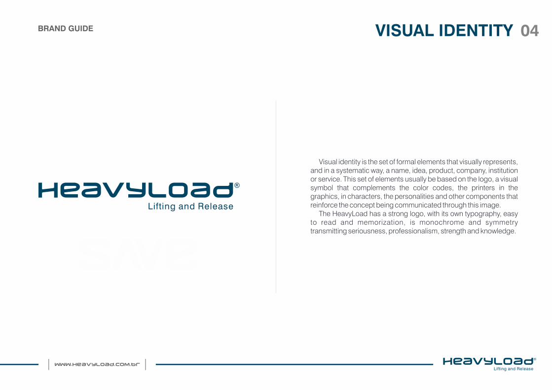
Visual identity is the set of formal elements that visually represents, and in a systematic way, a name, idea, product, company, institution or service. This set of elements usually be based on the logo, a visual symbol that complements the color codes, the printers in the graphics, in characters, the personalities and other components that reinforce the concept being communicated through this image.
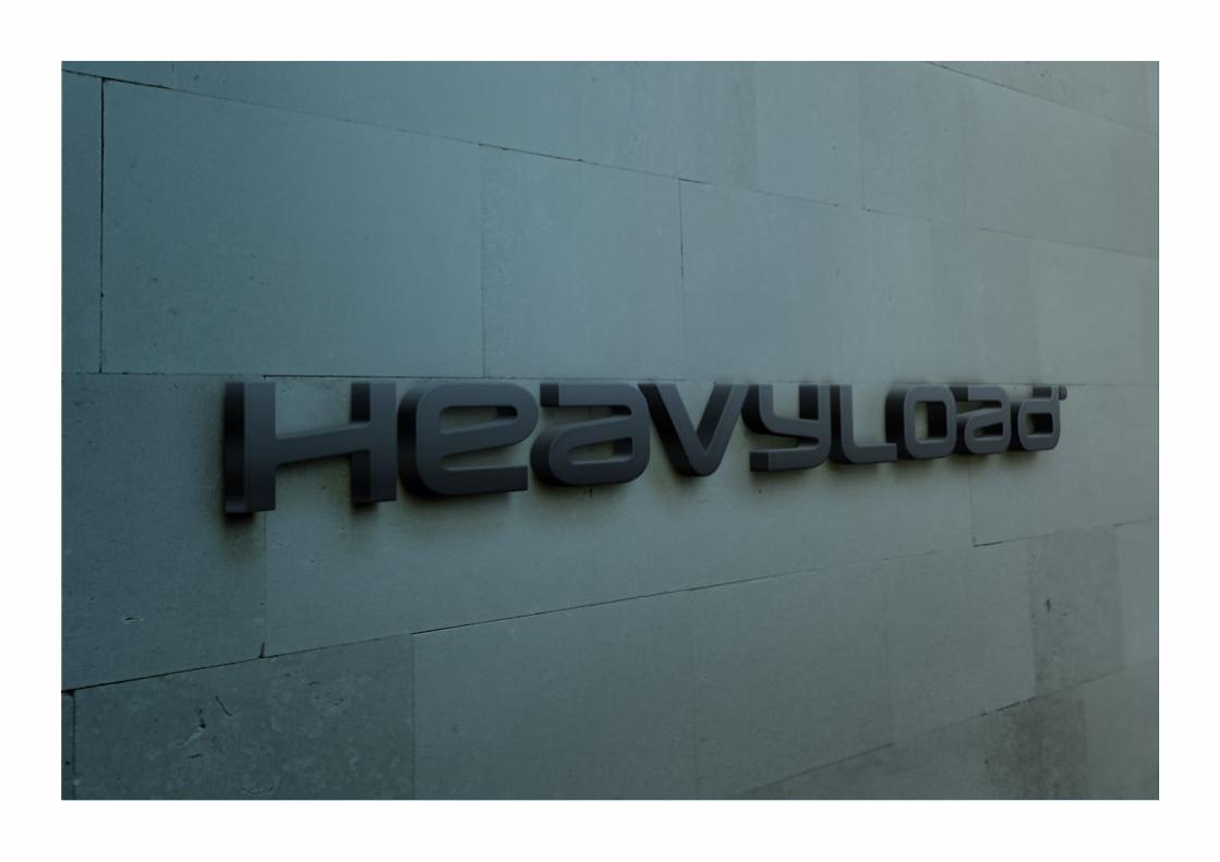
The HeavyLoad has a strong logo, with its own typography, easy to read and memorization, is monochrome and symmetry transmitting seriousness, professionalism, strength and knowledge.
VISUAL IDENTITY 04BRAND GUIDE
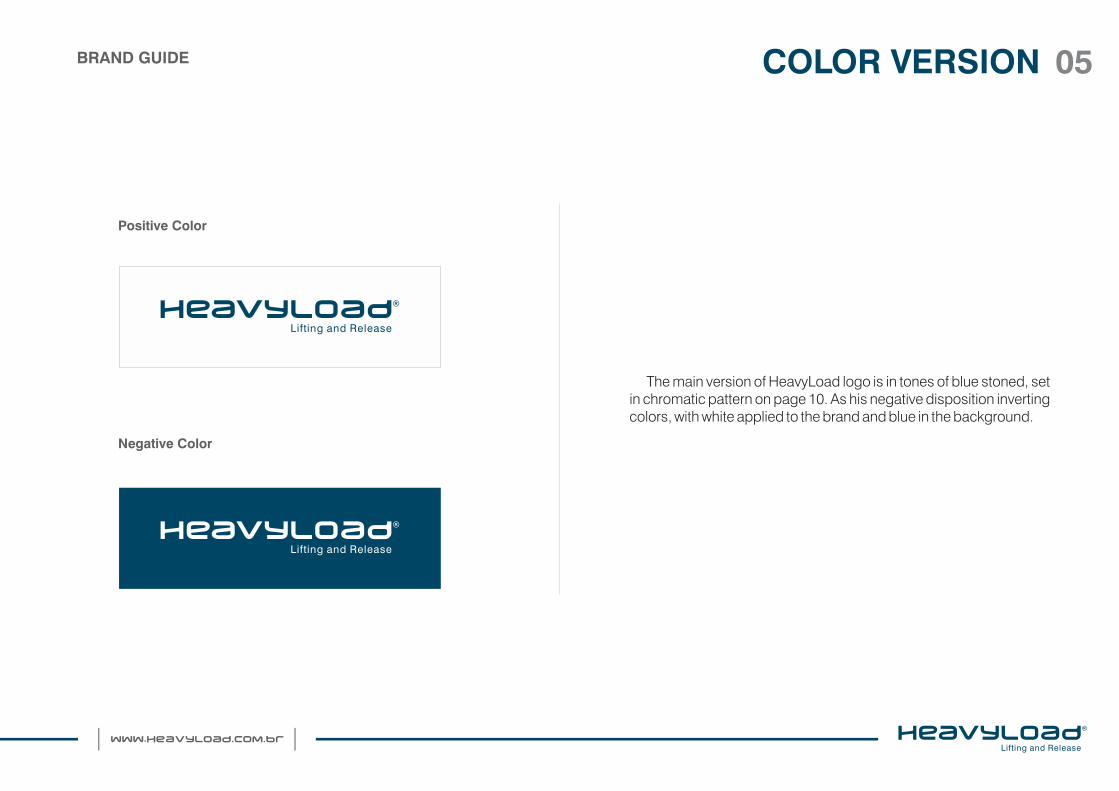
The main version of HeavyLoad logo is in tones of blue stoned, set in chromatic pattern on page 10. As his negative disposition inverting colors, with white applied to the brand and blue in the background.
COLOR VERSION 05
Positive Color
Negative Color
BRAND GUIDE
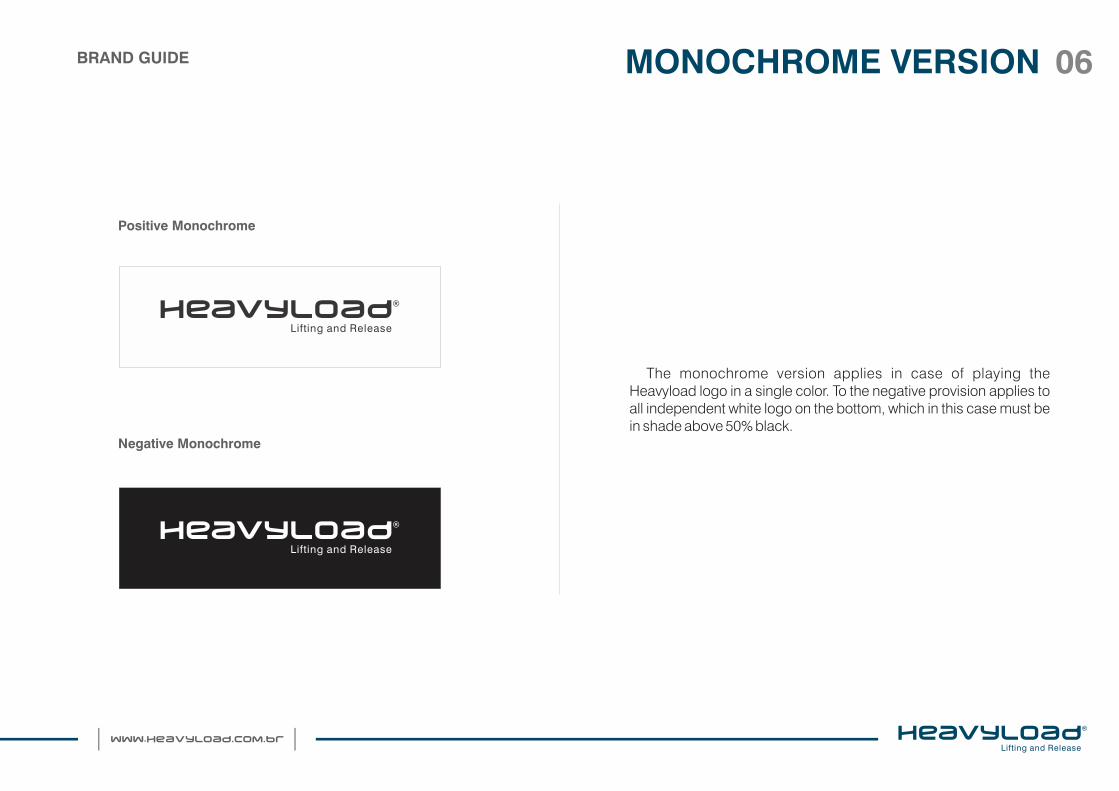
The monochrome version applies in case of playing the Heavyload logo in a single color. To the negative provision applies to all independent white logo on the bottom, which in this case must be in shade above 50% black.
Positive Monochrome
Negative Monochrome
MONOCHROME VERSION 06BRAND GUIDE

For printing in grayscale, the Heavyload logo is applied with 80% black in the signature on light below 50% black.
The same for the negative provision, therefore, reverse application, and this time applied to the white color visual signature with funds over 50% black, see next examples.
GRAYSCALE VERSION 07
Positiva Grayscale
Negativa Grayscale
BRAND GUIDE
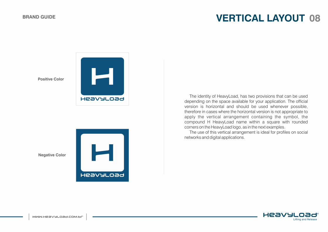
The identity of HeavyLoad, has two provisions that can be used depending on the space available for your application. The official version is horizontal and should be used whenever possible, therefore in cases where the horizontal version is not appropriate to apply the vertical arrangement containing the symbol, the compound H HeavyLoad name within a square with rounded corners on the HeavyLoad logo, as in the next examples.
The use of this vertical arrangement is ideal for profiles on social networks and digital applications.
VERTICAL LAYOUT 08
Positive Color
Negative Color
BRAND GUIDE

Anticipating the possible applications of the Heavyload Logo, as in the case of applications on images, it is recommended to analyze the image that will compose the background and, if the pitch exceeds 50% black, should apply the negative disposition, all white . For light colors, below 50% should be applied to positive disposition, see Example 1, so in cases where it is not possible to evaluate the black porcetagem in the image or there are more than one color, it is recommended the use of a white box, with 30% of transparency, under the logo, see example 2. This box must comply with the dimensions necessary to air your brand, defined on page 13.
Example 1
Example 2
APLICATION ON IMAGES 09BRAND GUIDE

Heavyload The logo consists of a unique typography. Already signed "LIFTING AND RELEASE", makes use of Swis 721 BT typography.
It is extremely important to the proper use of typography applied to Heavyload brand, to faithfully maintain its standardization. So for any kind of official documentation of the company and to create pieces of advertising support, such as brochures, flyers, posters, etc., the recommended typography to accompany the logo is the Swis 721 BT, and / or their versions of the typeface .
Swis 721 BT
Aa Bb Cc Dd Ee Ff Gg Hh Ii Jj Kk Ll MmNn Oo Pp Qq Rr Ss Tt Uu Vv Ww Xx Yy Zz1234567890!@¨&()?`
Swis 721 BT - BOLD
Aa Bb Cc Dd Ee Ff Gg Hh Ii Jj Kk Ll MmNn Oo Pp Qq Rr Ss Tt Uu Vv Ww Xx Yy Zz1234567890!@#$%¨&*()_+?`{^}<>:
TYPOGRAPHY 10BRAND GUIDE

100%
80%
60%
40%
20%
Gradient
The color standards set to the identity of HeavyLoad, should be faithfully followed. The standards CMYK, RGB, WEB and Pantone (coated solid), presented in this section can be used for print and digital applications, such as offset printing, artistic paintings and websites.
CMYK: 0 | 0 | 0 | 60 RGB: 127 | 129 | 130WEB: #7F8182PANTONE: 60% preto
Secundary Colors
CMYK: 0 | 0 | 0 | 80 RGB: 87 | 87 | 87WEB: #575757PANTONE: 80 % de preto
CMYK: 100 | 81 | 19 | 6 RGB: 29 | 69 | 135WEB: #1D4587PANTONE: PANTONE 653 C
CMYK: 100 | 30 | 0 | 70 RGB: 00 | 57 | 92WEB: #00395CPANTONE: PANTONE 302 C
Institutional Colors
CHROMATIC STANDARD 11BRAND GUIDE

Never alter or recreate the elements that make up the Heavyload logo.
It is forbidden the application of the brand using elements or formats that descaracterize its aesthetic standard, regardless of version or disposal.
Beside are shown some misuse of the mark, such as:Example 1: distortion of the logo;Example 2: Logo inclination;Example 3: use of other colors;Example 4: use of overlapping shadows and effects.
Example 1
Example 2
Example 3
Example 4
IMPROPER USE 12BRAND GUIDE

It is essential that the Heavyload logo has its guaranteed readability, which can vary according to the playback method chosen. It is necessary that all elements can be played in full.
For printing applications, as a general rule, the logo should not be HeavyLoad length less than 40 mm.
Already, digital media such as websites and CD-roms, the logo must not have the length less than 472 pixels.
40 mm
MINIMUM SIZES 13BRAND GUIDE
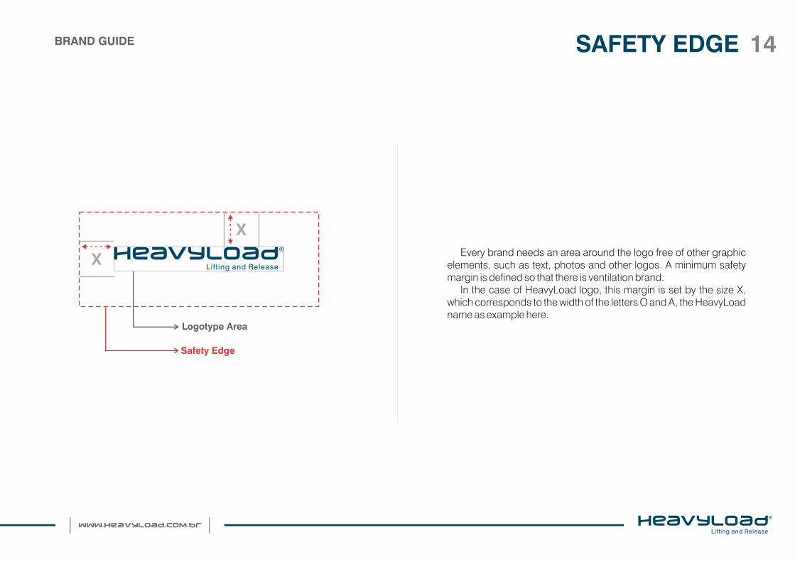
Every brand needs an area around the logo free of other graphic elements, such as text, photos and other logos. A minimum safety margin is defined so that there is ventilation brand.
In the case of HeavyLoad logo, this margin is set by the size X, which corresponds to the width of the letters O and A, the HeavyLoad name as example here.
X
Logotype Area
Safety Edge
X
SAFETY EDGE 14BRAND GUIDE

If playback is not possible from the logo HeavyLoad by electronic means, as in the case of mural painting, the mounting mesh must be used to guide the construction to ensure their perfect reproduction logo. Is constructive mesh is already following the airing brand defined in this manual.
1 cm
1 cm
3 modules
11 modules
CONSTRUCTIVE MESH 15BRAND GUIDE

The graphic accompanying the visual identity of HeavyLoad, was built on its market position, representing the seven services offered by the company.
GRAPHICS ELEMENTS 16
Management
Maintenance
Inspection
Cargo HandlingTest
LocationProducts
40°
Lifting and ReleaseEquipments
Vertical Horizontal
BRAND GUIDE

The application of the graphic should faithfully follow the guidelines of this manual. Their positive and negative versions can be applied in shades of gray defined in chromatic pattern, page 11.
17
Positivo NegativoInspiração
GRAPHICS ELEMENTSBRAND GUIDE
Follow the guidelines in this manual to ensure the quality implementation of their identity, whether in their services or ads.
Portant, ALWAYS present, this manual together with the files to be produced, for example, if you produce the company's business cards, send the file: HEAVYLOAD_Cartão visit - STANDARD (in Stationery / business card holder) + the manual PDF of brand.
DO NOT FORGET
Always request to the supplier of the material, which carefully follow the rules contained in the manual, such as:
- Typography;- Layout and appropriate version;- Applications on Images;- Chromatic Standard;- Improper Use;- Minimum size;- Safety Edge.
Besides, redefine, if necessary, cutting edges and bleeding.
Regards;I3Group - Strategic Marketing for Business
PRODUCTION AND PRESS 18
Important!
BRAND GUIDE

Manual developed by the Agency I3 Group.Any intention to include or change in this manual should be
notified in advance in order to safeguard the Company's visual identity.
The electronic files will be provided with the Manual for the production of materials.
contact:(22) 2791 [email protected]
SUPORT 19BRAND GUIDE


