1
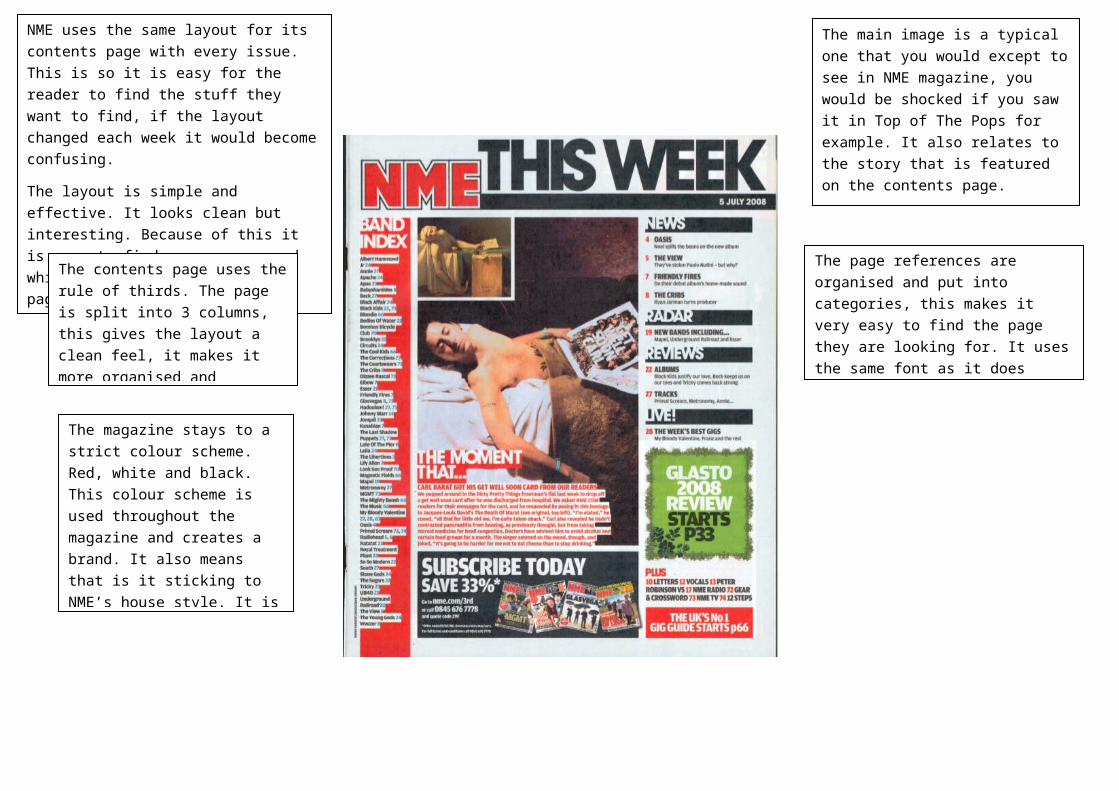
NME uses the same layout for its contents page with every issue. This is so it is easy for the reader to find the stuff they want to find, if the layout changed each week it would become confusing. The layout is simple and effective. It looks clean but interesting. Because of this it is easy to find your way around which is needed for a contents page. The contents page uses the rule of thirds. The page is split into 3 columns, this gives the layout a clean feel, it makes it more organised and The magazine stays to a strict colour scheme. Red, white and black. This colour scheme is used throughout the magazine and creates a brand. It also means that is it sticking to NME’s house style. It is The main image is a typical one that you would except to see in NME magazine, you would be shocked if you saw it in Top of The Pops for example. It also relates to the story that is featured on the contents page. The page references are organised and put into categories, this makes it very easy to find the page they are looking for. It uses the same font as it does