MIECHV Awardee Performance Data Dashboard - Form 1 General Information The intended purpose of these dashboards is to provide improved access for Maternal Infant Early Childhood Home Visiting (MIECHV) awardees to their performance data and to enhance data use and understanding. The performance dashboards can also serve as a technical assistance resource to support awardees in tracking and examining trends related to service utilization, participant demographics, and performance benchmark areas. Form 1 Dashboard The Form 1 dashboard provides data on MIECHV Program participant demographics, service utilization, and select clinical indicators. The dashboard presents both awardee-level data and national comparison data in the following 14 categories: Participants served Households served Ethnicity Race Education Housing Income Priority Population Characteristics Home Visits Family Engagement Home Visiting Model(s) Insurance Coverage Type Usual Source of Medical Care Usual Source of Dental Care Form 1 Dashboard Key Features Key Features Graphical and interactive views of performance measure data Comparison across multiple years of data starting with FY 2017 Trend line representing national average Tooltips provide additional information and detail to data points on a visual Dashboards Participants Served Dashboard On this page General Information Form 1 Dashboard Form 1 Dashboard Key Features Dashboards Participants Served Dashboard Households Served Dashboard Ethnicity Dashboard Race Dashboard Education Dashboard Housing Dashboard Income Dashboard Priority Population Dashboard Home Visits Dashboard Family Engagement Dashboard Home Visiting Model Dashboard Insurance Dashboard Medical Care Dashboard Dental Care Dashboard Accessing HVIS Form 1 Dashboards
Transcript
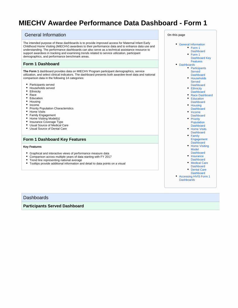
MIECHV Awardee Performance Data Dashboard - Form 1
General Information
The intended purpose of these dashboards is to provide improved access for Maternal Infant Early Childhood Home Visiting (MIECHV) awardees to their performance data and to enhance data use and understanding. The performance dashboards can also serve as a technical assistance resource to support awardees in tracking and examining trends related to service utilization, participant demographics, and performance benchmark areas.
Form 1 Dashboard
The Form 1 dashboard provides data on MIECHV Program participant demographics, service utilization, and select clinical indicators. The dashboard presents both awardee-level data and national comparison data in the following 14 categories:
Participants servedHouseholds servedEthnicityRaceEducationHousingIncomePriority Population CharacteristicsHome VisitsFamily EngagementHome Visiting Model(s)Insurance Coverage TypeUsual Source of Medical CareUsual Source of Dental Care
Form 1 Dashboard Key Features
Key Features
Graphical and interactive views of performance measure dataComparison across multiple years of data starting with FY 2017Trend line representing national averageTooltips provide additional information and detail to data points on a visual
Dashboards
Participants Served Dashboard
On this page
General InformationForm 1 DashboardForm 1 Dashboard Key Features
DashboardsParticipants Served DashboardHouseholds Served DashboardEthnicity DashboardRace DashboardEducation DashboardHousing DashboardIncome DashboardPriority Population DashboardHome Visits DashboardFamily Engagement DashboardHome Visiting Model DashboardInsurance DashboardMedical Care DashboardDental Care Dashboard
Accessing HVIS Form 1 Dashboards
Unduplicated Count of New and Continuing Program Participants Served by MIECHV Home Visitors
This visualization presents the awardee-level data reported on new and continuing program participants as a stacked bar chart for the selected fiscal years, grouped by the participant type.
Each participant type shows individual stacked bars for the reported fiscal year. The cumulative total of the newly enrolled and continuing participants is above each individual stacked bar.
This visualization can be filtered by the reporting fiscal year and participant type. When hovering over the stacks of the stacked bar chart, the tooltip displays the reporting fiscal year, participant type and the number of participants specific to the participant type.
Households Served Dashboard
Unduplicated Count of Households Served by MIECHV Home Visitors
This visualization presents awardee-level data reported on newly enrolled and continuing households as a stacked bar chart for the selected fiscal years.
Each fiscal year has individual stacked bars showing the cumulative total of the newly enrolled and continuing households above the bars.
This visualization can be filtered by the reporting fiscal year. When hovering over the stacks of the stacked bar chart, the tooltip displays the reporting fiscal year and the count of the newly enrolled or continuing households.
Ethnicity Dashboard
Participants by Ethnicity
This visualization presents awardee-level data reported on participant ethnicity. Each ethnicity is represented by an individual bar graph and grouped by the participant type for the reporting fiscal years selected. A radio button option to show/hide the national average can be selected to display the national average trend lines of the respective participant ethnicities along with the bar graph.
The percentage of the participants in each category is presented above each individual bar in the graph.
This visualization can be filtered by the reporting fiscal year, participant type. When hovering over the bar chart, the tooltip displays the reporting fiscal year, participant type, ethnicity, and the number of participants specific to the participant type and ethnicity. When hovering over the trend line, the tooltip displays the reporting fiscal year, participant type, ethnicity, and the national average percentage of participants specific to the participant type and ethnicity.
Race Dashboard
Participants by Race
This visualization presents awardee-level data reported on participant race. Each race is represented by an individual bar graph and grouped by the participant type for the reporting fiscal years selected. A radio button option to show/hide the national average can be selected to display the national average trend lines of the respective participant races along with the bar graph.
The percentage of the participants in each group is presented above each individual bar in the graph.
This visualization can be filtered by the reporting fiscal year, and the participant type. When hovering over the bar chart, the tooltip displays the reporting fiscal year, participant type, race, and number of participants specific to the participant type and race along with the percentage of the participants. When hovering over the trend line, the tooltip displays the reporting fiscal year, participant type, race and the national average percentage of participants specific to the participant type and race.
Education Dashboard
Participants by Education Attainment
This visualization presents awardee-level data reported on the level of education achieved by the participants. Each level of education is represented by an individual bar graph and grouped by the participant type for the reporting fiscal years selected. A radio button option to show/hide the national average can be selected to display the national average trend lines of the respective participant education level along with the bar graph.
The percentage of the participants by education attainment in each category is presented above each individual bar in the graph.
This visualization can be filtered by the reporting fiscal year, and the participant type. When hovering over the bar chart, the tooltip displays the reporting fiscal year, participant type, education attainment, and the number of participants specific to the participant type and education attained along with the percentage of the participants. When hovering over the trend line, the tooltip displays the reporting fiscal year, participant type, education attainment, and the national average percentage of participants specific to the participant type and education attained.
Housing Dashboard
Adult Participants by Housing Status
This visualization presents awardee-level data reported on the housing status of the participants. Each state of housing is represented by an individual bar graph and grouped by the participant type for the reporting fiscal years selected. A radio button option to show/hide the national average can be selected to display the national average trend lines of the respective participant housing status along with the bar graph.
The percentage of the adult participants by housing status in each category is presented above each individual bar in the graph.
This visualization can be filtered by the reporting fiscal year, and the participant type. When hovering over the bar chart, the tooltip displays the fiscal year, participant type, housing status and the number of participants in each category of the housing status. The housing status details provides the number of participants in each category of the housing status types. When hovering over the trend line, the tooltip displays the reporting fiscal year, participant type, housing status type, and the national average percentage of the participants specific to the participant type and housing status type.
Income Dashboard
Household Income in Relation to Federal Poverty Guidelines
This visualization presents awardee-level data reported on the income levels with respect to the federal poverty guidelines of households. The levels of income are represented in percentages with how they compare to the federal poverty guidelines. Each level of income is represented by an individual bar graph and grouped by the reporting fiscal years selected. A radio button option to show/hide the national average can be selected to display the national average trend lines of the household income level along with the bar graph.
The percentage of the participants in each category is presented above each individual bar in the graph.
This visualization can be filtered by the reporting fiscal year. When hovering over the bar chart, the tooltip displays the reporting fiscal year and the number of households specific to the income levels. When hovering over the trend line, the tooltip displays the reporting fiscal year and the national average percentage of households specific to the income levels.
Priority Population Dashboard
Households by Priority Population
This visualization presents awardee-level data reported on the households of different priority population characteristics. Each category of the priority population category is represented by an individual bar graph and grouped by columns which determine whether the households in the program fall under the sub-category (Yes/No columns) for the reporting fiscal years selected. A radio button option to show/hide the national average can be selected to display the national average trend lines of the respective priority population category for the households along with the bar graph.
The percentage of the participants in each category is presented above each individual bar in the graph.
This visualization can be filtered by the reporting fiscal year and the priority population category. When hovering over the bar charts, the tooltip displays the reporting fiscal year, priority population category, priority population sub-category, and the number of households specific to the priority population category and sub-category. When hovering over the trend line, the tooltip displays the reporting fiscal year, priority population category, sub-category, and the national average percentage for the households specific to the priority population category and sub-category.
Home Visits Dashboard
Home Visits
This visualization presents awardee-level data reported on the number of home visits.
The total number of home visits for each fiscal year is presented above each individual bar in the graph.
This visualization can be filtered by the reporting fiscal year. When hovering over the bar chart, the tooltip displays the reporting fiscal year and the number of home visits for the organization.
Family Engagement Dashboard
Family Engagement by Households
This visualization presents awardee-level data reported on the different types of family engagements (household typed) by households. Each type of the household is represented by an individual bar graph for the reporting fiscal years selected. A radio button option to show/hide the national average can be selected to display the national average trend lines of the respective household types by household, specific to the fiscal year along with the bar graph.
The percentage of the households in each category is presented above each individual bar in the graph.
This visualization can be filtered by the reporting fiscal year. When hovering over the bar chart, the tooltip displays the reporting fiscal year, household type, and the number of households specific to the household type. When hovering over the trend line, the tooltip displays the reporting fiscal year, household type, and the national average percentage of the households specific to the household type.
Home Visiting Model Dashboard
Unduplicated Count of Households by Evidence-Based Home Visiting Model or Promising Approach
This visualization presents awardee-level data reported on different types of evidence-based home visiting models and promising approaches for households. Each model/promising approach is represented by an individual stacked bar graph for the reporting fiscal years selected.
Each Home Visiting Model shows individual stacked bars for the reported fiscal year. The cumulative total of the newly enrolled and continuing households is above each individual stacked bar.
This visualization can be filtered by the reporting fiscal year. When hovering over the stacks of the stacked bar chart, the tooltip displays the reporting fiscal year, Home Visiting Model or Promising Approach, and the number of households specific to the participant type.
Insurance Dashboard
Participants by Type of Health Insurance Coverage
This visualization presents awardee-level data reported on the type of health insurance coverage of the participants. Each type of health insurance coverage is represented by an individual bar graph and grouped by the participant type for the reporting fiscal years selected. A radio button option to show/hide the national average can be selected to display the national average trend lines of the respective participant health insurance coverage along with the bar graph.
The percentage of the participants in each category is presented above each individual bar in the graph.
This visualization can be filtered by the reporting fiscal year and the participant type. When hovering over the bar chart, the tooltip displays the reporting fiscal year, participant type, health insurance coverage, and number of participants specific to the participant type and their health insurance coverage. When hovering over the trend line, the tooltip displays the reporting fiscal year, participant type, health insurance coverage, and the national average percentage of the participants specific to the participant type and their health insurance coverage.
Medical Care Dashboard
Index Children by Usual Source of Medical Care
This visualization presents the awardee-level data reported on index child by usual source of medical care. Each source of medical care is represented by an individual bar graph and grouped by the Participant Type (Female Index, Male Index and All Index) for the reporting fiscal years selected. A radio button option to show/hide the National Average can be selected to display the national average trend lines of the source of medical care for the respective participant type (Female Index, Male Index and All Index) along with the bar graph.
The percentage of the participants (Female Index, Male Index and All Index) in each source of medical care category is presented above each individual bar in the graph.
This visualization can be filtered by the reporting fiscal year, organization and the participant type. When hovering over the bar chart, the tooltip displays the reporting fiscal year, participant type, medical care, and the number of participants specific to the source of medical care they receive and participant type. When hovering over the trend line, the tooltip displays the reporting fiscal year, participant type, medical care, and the national average percentage of the participants specific to the source of medical care they receive and participant type.
Dental Care Dashboard
Index Children by Usual Source of Dental Care by 12 Months of Age
This visualization presents awardee-level data reported on the usual source of dental care to an index child (birth – kindergarten) entry. Each source of dental care is represented by an individual bar graph and grouped by the participant type (Female Index, Male Index and All Index) for the reporting fiscal years selected. A radio button option to show/hide the national average can be selected to display the national average trend lines of the source of dental care for the respective participant type (Female Index, Male Index and All Index) along with the bar graph.
The percentage of the participants (Female Index, Male Index and All Index) in each category is presented above each individual bar in the graph.
This visualization can be filtered by the reporting fiscal year, organization and the participant type. When hovering over the bar chart, the tooltip displays the reporting fiscal year, participant type, dental care and the number of participants specific to the source of dental care they receive and participant type. When hovering over the trend line, the tooltip displays the reporting fiscal year, participant type, dental care and the national average percentage of the participants specific to the source of dental care they receive and participant type.