96
MLC -3 Learning Session June 1-2 1
MLC -3Learning Session
June 1-2
1

This better be good, I’m giving up my nap.
2

Four Basic Principles
Develop a strong customer (client) focus
Continually improve all processes
Involve employees Mobilize both data and team
knowledge to improve decision-making
Three Key Questions
What are we trying to accomplish?
How will we know that a change is an improvement?
What changes can we make that will result in improvement?
3

Where
Do
We
Begin?
4

PDSA is the primary focus. Other sections include: Customers & Stakeholders Importance of Data Writing an Aim Statement QI Tools & Measures of
Improvement PH Example of PDSA Case Studies: Berrien,
Genesee, Kent & Ottawa
5

PDSA, made popular by Dr. W. Edwards Deming, is also known as Plan-Do-Check-Act (PDCA) is widely used by quality professionals, process improvement engineers & health care professionals
Science based, data driven, iterative process improvement methodology
Turns ideas into action and connects that action to learning
6

PDSA Four stages Nine steps Repeatable steps Can be used by one
person, a team, or department
Used to improve existing processes
7

Quick
Reference
Guide
8

Helpful when selecting an Improvement and writing an AIM Statement
S – Specific M – Measurable A – Achievable R – Relevant T – Time-bound
9

Plan
DoStudy
Act
Plan
DoStudy
Act
10

Are we having fun yet???
I really need a break!
1111

12

Identify improvement Convene team Discuss the improvement Establish initial timeline Develop initial AIM statement
13

A concise, specific, written statement that defines what the team hopes to accomplish with its improvement. Describes What, not How
What? When? How Much?
For Whom?
What is the team striving to accomplish?What is the timeline?What is the specific numerical measure the team wishes to
achieve?Who is the population?
14See page 29 of Michigan's Guidebook
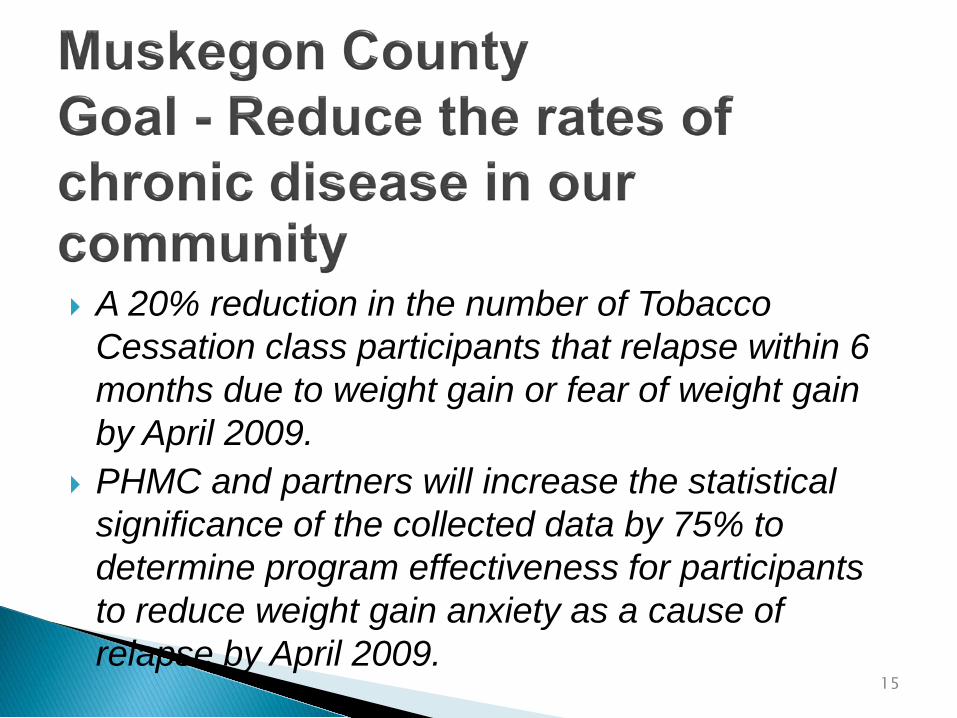
A 20% reduction in the number of Tobacco Cessation class participants that relapse within 6 months due to weight gain or fear of weight gain by April 2009.
PHMC and partners will increase the statistical significance of the collected data by 75% to determine program effectiveness for participants to reduce weight gain anxiety as a cause of relapse by April 2009.
15

PHMC and partners will improve the quality of the tobacco cessation data collection process by 75% to determine program effectiveness by April 2009 for participants who cite their reason for failure as weight gain anxiety.
A 50% increase in tobacco cessation participants completing the survey process by April 14, 2009.
16
I think I need an assistant to do this
stuff.
Hey MOM!
17

Break into teams Do Introductions if needed Identify a Recorder, a Reporter, and a Timekeeper Discuss improvement chosen, identify improvement
opportunity and problem you hope to resolve Create initial Aim Statement Be prepared to report
18

LUNCH
19

What are we doing? How do we do it? What are the major steps? Who is involved? What do they do? What is being done well? What could be done better?
20

Memory Jogger, page 5621

A process is a series of steps or actions performed to achieve a specific purpose.
A process can describe the way things get done.
Your work involves many processes.
22

A pictorial representation of the sequence of actions that comprise a process.
23

It provides an opportunity to learn about work that is being performed.
Dr. Myron Tribus said,“You don’t learn to flowchart,You flowchart to learn.”
Most processes today are undocumented.
24

Document processes. Provide a reference to discuss how things get done. Describe and understand the work we do.
Analyze and improve on processes. Identify of areas of complexity and re-work. To generate ideas for improvement. Illustrate process improvements.
25

Assemble the Team. Agree on which process you wish to flowchart. Agree on the purpose of the process. Agree on beginning and ending points. Agree on level of detail to be displayed. Start by preparing an outline of steps. Identify other people who should be involved in the
flowchart creation, or asked for input, or to review drafts as they are prepared.
26

Start & End: An oval is used to show the materials, information or action (inputs) to start the process or to show the results at the end (output) of the process.
Activity: A box or rectangle is used to show a task or activity performed in the process. Although multiple arrows may come into each box, usually only one arrow leaves each box.
Decision: A diamond shows those points in the process where a yes/no question is being asked or a decision is required.
Break: A circle with either a letter or a number identifies a break in the Flowchart and is continued elsewhere on the same page or another page.
27

Flowchart what is, not what you would like the process to be.
Flowcharting is dynamic. Use Post-it notes, dry erase markers, pencil, etc.
All flowcharts must have start and stop points.
28

Flowchart the process that is used to obtain approval to attend conferences.
29

Sample One
30

Sample Two
31

Sample Three
32

Brainstorming and Affinity Diagrams can be used to identify processes you wish to flowchart.
There is no single right way to flowchart. It is a tool to learn about your organization and work.
Flowcharts can be used in a variety of settings outside Quality Improvement, such as: Orienting new employees In-service presentations Brainstorming possible process changes Creating or revising policies and procedures that support the process Creating measures Identifying logical outcomes of a process
33

What’s wrong withfinger painting?
34

Each LHD meets and develop a Process Map documenting the existing process they plan to improve
35

BREAK
36
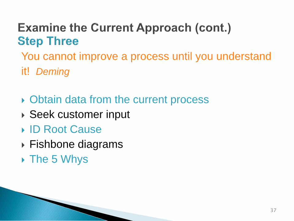
You cannot improve a process until you understandit! Deming
Obtain data from the current process Seek customer input ID Root Cause Fishbone diagrams The 5 Whys
37

To identify underlying or root causes of a problem
To identify a target for your improvement that is likely to lead to change
38

Construction Draw an arrow leading to a box that contains a statement of the
problem Draw smaller arrows (bones) leading to the center line, and label
these arrows with either major causal categories or process categories
For each cause, identify deeper, root causes
Cause 1
Effect/Problem
Cause 2
Cause 3
Cause 4
39

Find the right problem or effect statement The problem statement should reflect an outcome of a process that
you control or influence Be specific Reach consensus
Find causes that make sense and that you can impact Generate categories through: Brainstorming Looking at your data
Ask “why?” to achieve a deeper understanding Know when to stop Stick to what you and your managers can control or directly influence
Make use of your results Decide if you need more data Consider causes that come up again and again, and causes that
group members feel are particularly important
40Memory Jogger, page 32

Root causes for lack of BCHD general PH articles
Minimal articlesEffect
Causes
People/StaffMedia
Relations
TopicsProcess
No long-term arrangements
Secluded media teamOne writer, poor health
Articles for events only
Confusion/duplication
No time to develop
Sporadic writing
41

The 5 Whys is a question-asking method used to explore the cause/effect relationships underlying a particular problem. Ultimately, the goal of applying the 5 Whys method is to determine a root cause of a defect or problem.
Wikipedia
42

My car will not start. (the problem) Why? - The battery is dead. (first why) Why? - The alternator is not functioning. (second why) Why? - The alternator belt has broken. (third why) Why? - The alternator belt was well beyond its useful
service life and has never been replaced. (fourth why) Why? - I have not been maintaining my car according to
the recommended service schedule. (fifth why, root cause)
Wikipedia
43

Gee, Five Whys sounds like two year old talk.
I can’t count to five!
44

Each LHD meets and develops an initial Fishbone Diagram.
Perform five whys on the problem they hope to address in the process they have chosen to improve.
45

Good Morning!
46
Oh brother,I didn’t sleep worth a darn
last night!Did you?
4747

Using root cause Brainstorm for possible solutions Search for similar practices Narrow to those you have control or influence over Pick one most likely to accomplish Revisit AIM Statement
48

Group Discussion
49

BREAK
50

Make a prediction Define outcomes Use If….Then technique Develop strategy to test the improvement theory
51

Let’s seeIf I eat too much,
Then I’ll XXX too much!I’ve got it!
52

Group Discussion
53

LUNCH
54

Test the theory (small scale) Document everything Consider using Rapid Cycle Improvement (RCI)
55

Group Discussion
56

Test work? Results match prediction? Trends? Unintended side effects? Improvement? More testing? Report findings
57

I need a hug!
58

Group Discussion
59

Test on larger scale?
Implement?
New theory?
Plan for continuing
Repeat PDSA?
60

Group Discussion
61

Deming said of all the changes he had observed, “only about 5% were improvements… the rest, at best were illusions of progress!”
62

Data, pre-post Can be measures or
observations If you can observe an
event (or even its effects) you can measure it. If you can measure it you can improve it.
63

Every process and measure has variation There are two types, Common Cause and Special
Cause Important to understand the differences between
Common and Special Cause Special Cause is unpredictable and can lead to
unstable processes Improvement should focus on stable processes;
data can you help determine stability (Section 3 Guidebook)
64

Working with ideas/Concepts
Fishbone/Cause and Effect Gantt Flowchart Storyboard Logic Model
Tools in white to be presented in future webinar sessions.
Working with Numbers
Pareto Run Charts Scatter Diagram Check Sheet Stratification Data Points Histogram Control Charts
65
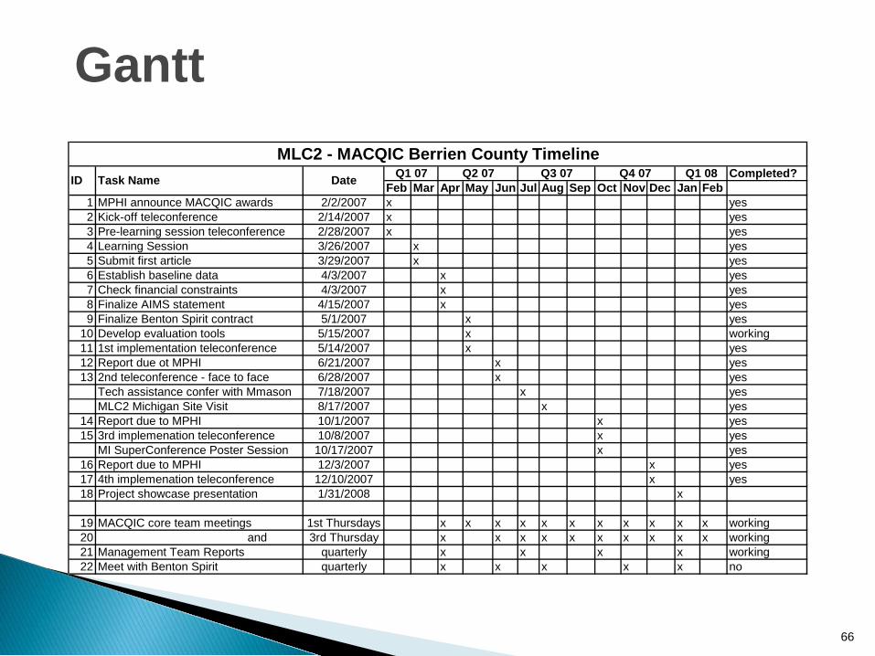
Completed?Feb Mar Apr May Jun Jul Aug Sep Oct Nov Dec Jan Feb
1 MPHI announce MACQIC awards 2/2/2007 x yes2 Kick-off teleconference 2/14/2007 x yes3 Pre-learning session teleconference 2/28/2007 x yes4 Learning Session 3/26/2007 x yes5 Submit first article 3/29/2007 x yes6 Establish baseline data 4/3/2007 x yes7 Check financial constraints 4/3/2007 x yes8 Finalize AIMS statement 4/15/2007 x yes9 Finalize Benton Spirit contract 5/1/2007 x yes
10 Develop evaluation tools 5/15/2007 x working11 1st implementation teleconference 5/14/2007 x yes12 Report due ot MPHI 6/21/2007 x yes13 2nd teleconference - face to face 6/28/2007 x yes
Tech assistance confer with Mmason 7/18/2007 x yesMLC2 Michigan Site Visit 8/17/2007 x yes
14 Report due to MPHI 10/1/2007 x yes15 3rd implemenation teleconference 10/8/2007 x yes
MI SuperConference Poster Session 10/17/2007 x yes16 Report due to MPHI 12/3/2007 x yes17 4th implemenation teleconference 12/10/2007 x yes18 Project showcase presentation 1/31/2008 x
19 MACQIC core team meetings 1st Thursdays x x x x x x x x x x x working20 and 3rd Thursday x x x x x x x x x x working21 Management Team Reports quarterly x x x x working22 Meet with Benton Spirit quarterly x x x x x no
MLC2 - MACQIC Berrien County TimelineQ1 08ID Task Name Date Q1 07 Q2 07 Q3 07 Q4 07
66
Gantt
Story Boards
67

Tell your QI story in an organized way
Harness the ‘power of the visual’
Depict your process improvement
Give users real content that is easy to digest
Provide an embraceable approach that needs little explanation
Highlight your accomplishments!
68
Story Boards

69
Sample Story Boards

Getting Started Assemble Team Examine Current Approach Identify Potential Solutions Develop Improvement Theory Test The Theory Study Results Standardize Improvement Establish Future Plans
70
Organization & CompositionOrganized around Plan-Do-Study-Act and the Nine Key Steps listed in Michigan’s QI Guidebook:

71
A Story Board Template

Formatting storyboards can be challenging and very time consuming
Graphic depictions & color add more interest than text
Building story boards throughout the improvement process may be more efficient than waiting until the end
72
Hints and Tips
Logic ModelsTime to organize the Data
73

A logic model is a valuable organizational planning, implementation, funding and quality improvement process tool. It describes how programs or projects are expected to work in achieving desired outcomes, while identifying the need for adjustments and improvements.
74
Logic Model

Commonly used in Program planning Helps managers “plan with the end in mind” Focus is on outcomes Provides “big picture” of the process improvement
75
Logic Model

76
Logic Model

Start the logic model early in the PDSA cycle Add and modify as the process improvement more
fully develops Share the model often with other members of the
department who may not be on the QI team, ask for input
77
Hints & Tips

Pareto Charts:What’s the problem?

To identify the causes that are likely to have the greatest impact on the problem if addressed
“80% of the effects come from 20% of the causes”
To bring focus to a small number of potential causes
To guide the process of selecting improvements to test
79
Pareto Charts: Purpose

When you have, or can collect, quantitative or numeric data on several potential causes
Example: When clients wait longer then 10 minutes to be seen, staff
track the primary reason for the long wait They use a form that includes a list of possible reasons, such
as: The previous appointment went long They couldn’t find the chart The provider was overbooked Emergency appointments came up They were short staffed
80
Pareto Charts: When to Use
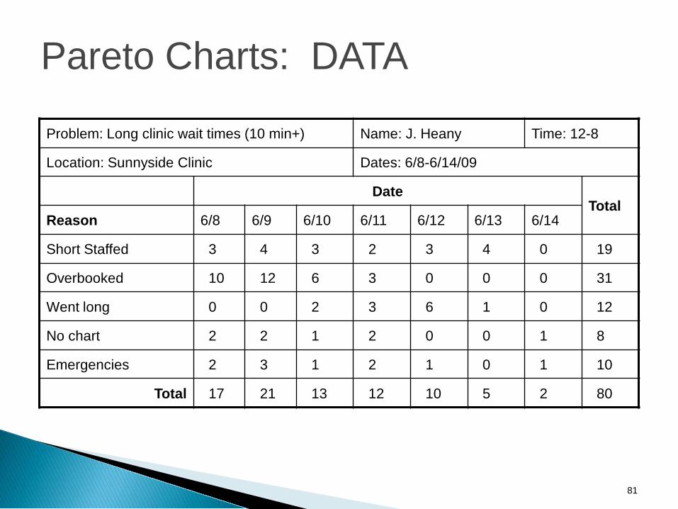
Problem: Long clinic wait times (10 min+) Name: J. Heany Time: 12-8
Location: Sunnyside Clinic Dates: 6/8-6/14/09
DateTotal
Reason 6/8 6/9 6/10 6/11 6/12 6/13 6/14
Short Staffed 3 4 3 2 3 4 0 19
Overbooked 10 12 6 3 0 0 0 31
Went long 0 0 2 3 6 1 0 12
No chart 2 2 1 2 0 0 1 8
Emergencies 2 3 1 2 1 0 1 10
Total 17 21 13 12 10 5 2 80
81
Pareto Charts: DATA

82
Reasons for Clinic Wait Longer than 10 Minutes
39%
24%
15% 12% 10%
0%5%
10%15%20%25%30%35%40%45%
Overbooking Short Staffed Appointment w entlong
Emergencies Lost Chart
Cause
% o
f D
ela
ys
wit
h t
his
C
au
se
0
20
40
60
80
100
Cu
mu
lati
ve
Pe
rce
nt
Percent
Cumulative PercentListed most to least common
Causes along x-axis
% of occurrences with each cause along y-axis
Cumulative percent along y-axis
Pareto Charts: Sample

You’ll only learn about causes that you investigate - be inclusive!
Check and double check your data Little errors can make a big difference
Results can be used in more than one way and they can be used differently at different points in time Revisit your Pareto throughout your project – the meaning may
change for you as you go A complete step-by-step example of creating Pareto Charts is in
your manual
83
Pareto Charts: Hints & Tips
Memory Jogger, page 95

Run ChartsTime to Measure
84

To study data measured over time
Run charts help to: Measure the performance of a process Identify trends over time Measure change in outcomes following a change in
process
85
Run Charts: Purpose

When you have, or can collect: Quantitative or numeric data On a measure of the performance of a process Over time
Example: Each month the health department tracks the number of
new BCCCP clients enrolled in the program to measure the impact of advertising the program in an additional local newspaper starting in April 2008.
86
Run Charts: When to Use

Number of New BCCCP Clients by Month in 2007 and 2008
05
101520253035404550
Janu
ary
Februa
ryMarc
hApri
lMay
June Ju
ly
Augus
t
Septem
ber`
Octobe
r
Novembe
r
Decembe
r
Month
Num
ber o
f New
Clie
nts
2007 2008
87
Run Chart: Sample

Every process will have some variation
Be cautious about assuming that variation from the average has meaning
Be sure to track data over a long enough period of time
This will help you identify the true mean and the true level of variability within the process
A complete step-by-step example of creating Pareto Charts is in your manual
88
Run Charts: Hints & Tips

Quality Improvement Guidebook, Page 98 Public Health Memory Jogger II Tool Time (Langford Press) Internet/Google
NOTE: These are all referenced in the Guidebook beginning on page 98
89

Tools? No way!Where are the
Toys?
90

BREAK
91

Aim statements Process Maps Fishbone Diagram Five Whys & Root Cause Notes of Key take a ways Tools
92
Meet and review notes from the Learning Session Revise work-plan based on Learning Session Revise AIM Statement Complete Process Map Complete Fishbone Diagram
93

Schedule date for Support Team Site Visit one month from Learning Session
Schedule teleconferences with all LHDs and support team
Schedule bi-monthly mini-collaborative teleconferences
94

Questions
Evaluations
Adjourn
95

Thank You!96


