16
typography 3 D
| Date post: | 08-Apr-2016 |
| Category: |
Documents |
| Upload: | agnes-jekli |
| View: | 217 times |
| Download: | 0 times |

typo
grap
hy3 D

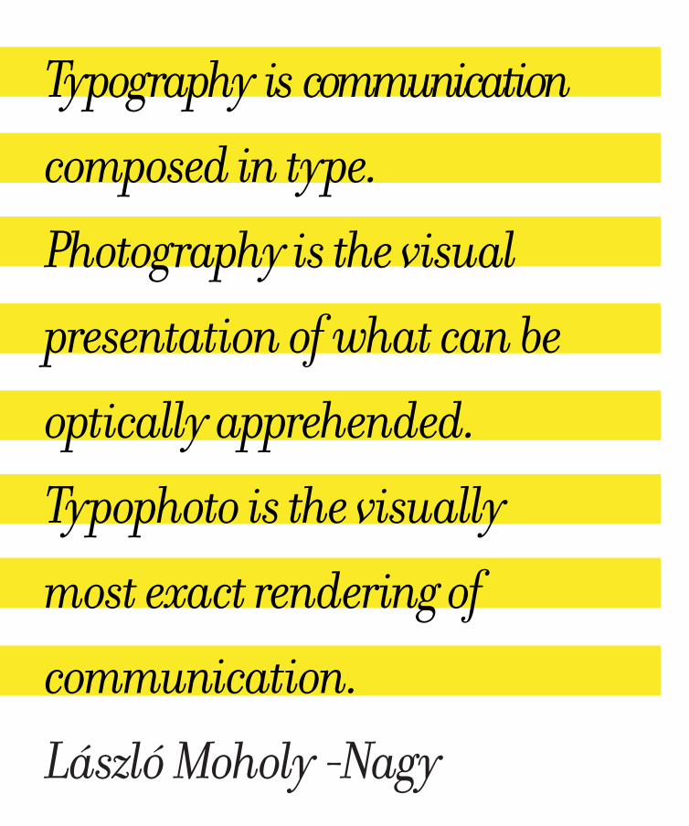
Typography is communication
composed in type.
Photography is the visual
presentation of what can be
optically apprehended.
Typophoto is the visually
most exact rendering of
communication.
László Moholy -Nagy

Dance with meamanDine alessanDrais an alphabet based on 26 choreographic micro-pieces. long-exposure photography reveals each letter, invisible to the naked eye.
type shoulD moveamanDine alessanDrathe use of people’s body as a display medium in exchange for money has been a fairly common vision in the streets of london for almost two hundred years. one of the only work prospects for non-english speakers involves standing on a busy street while holding printed advertising at the end of a stick or wearing it on boards around their neck, a position known as human billboard). using the human body as a message display facility is a way of evading a tax on advertising by making it mobile, but also by using the humanity of the subject and its “freedom of speech” as a legal argument.the flexibility of this casual form of communication, combined with the per-formative potential of togetherness, provided the right components to start thinking of a malleable letterform expressing an ephemeral message.

type
alp
habe
t

type
wor
ds

type
wor
ds
art GranDeur nature - tryinG to look GooD...stefan saGmeisterBroken up into 5 parts trying/to look/good/limits/my life and displayed in sequence as typographic billboards, they work like a sentimental greeting card left in a park north of paris.
art GranDeur nature - tryinG to look GooD...camilo rojasthe ambition of this exhibition project is to show the omnipresent existence of lettering in daily life and its influence on public perception. typography and lettering in context of art opens quite a new perspective to the topic - for lay-men, art connoisseurs, as well as professionals in graphic design.

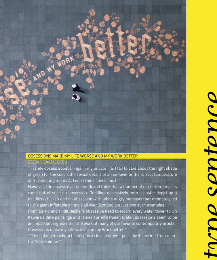
oBsessions make my life worse anD my work Betterstefan saGmeister” i rarely obsess about things in my private life. i fail to care about the right shade of green for the couch, the sexual details of an ex-lover or the correct temperature of the meeting room ac. i don’t think i miss much.however, i do obsess over our work and think that a number of our better projects came out of such an obsession. Doodling obsessively onto a poster depicting a headless chicken and an obsession with white angry monkeys that ultimately led to the giant inflatable animals all over scotland are just two such examples.from Bernd and hilda Becher’s obsessive need to record every water tower to on kawara’s date paintings and james turrell’s roden crater, obsessions seem to be an important ingredient in the work of many of our favorite contemporary artists.obsessions make my life worse and my work better.**”think dangerously, act safely” is a close relative - possibly its uncle - from men-tor tibor kalman.” type
sent
ence
type
in d
imen
sions

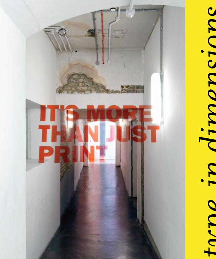
its more then just a printjoseph eGan & eD hunterwe chose this phrase for a number of different reasons. it's supposed to challenge what people consider to be conventional graphic design, working with flat 2D surfaces and designing business cards, posters etc. as well as being a comment on the process we used to create the piece.
letter asan toBin smithBela BorsoDi
type
in d
imen
sions

XyZ- spatial typoGraphychris toZerit’s an investigation into the possibilities of giving type a spatial context. By exploring let-terforms in relation to environments, exter-nal influences, 3D forms and virtual realms. it comes complete with a DvD too. unfortu-nately the DvD lacks any kinda soundtrack (at least it does on this youtube video) and it’s perfect for it too.

info & credits :
selected materials from the 7tv rebranding campaign i cre-ated.every single on-screen ele-ment was created using stop motion.
type
in d
imen
sions
the white DeskBenoit lemnoinea frame-by-frame animation created with cecile Boche. through a sequence of interactions between these two spaces, the scene plays on two levels. on one hand, there are the printed objects and, on the other, the character sitting at the desk. this animation addresses the concerns of my mother, who wonders about the nature of my work, and how i spend the day, and lists the diverse necessary attributes of a good graphic designer.

poBl + machinewhy not associatescollaboration with artist gordon young. letter shaped seats for the national waterfront museum, swan-sea, which charts the industrial heritage of wales. the seats spell pobl (welsh for people) + machines and each letter represents an item located in the museum.
poBl + machinewhy not associatescollaboration with artist gordon young. letter shaped seats for the national waterfront museum, swan-sea, which charts the industrial heritage of wales. the seats spell pobl (welsh for people) + machines and each letter represents an item located in the museum.

typ
e in
pub
licvoices of white city puBlic poemjohn morGan this granite sett poem is part of a wider programme of public letter-ing and landscape poetry at the BBc white city site. here was an oppor-tunity for a piece of lettering conceived at the commence-ment of building as an intrinsic and integral part of the architecture and landscape. in effect a mosaic, where the letters and surface are on the same plane. the scale is such, it's as if the landscape has begun to speak for itself. letter-forms are created using a variation in stone colour. 90mm square silver gran-ite setts in place are replaced with darker granite.

type
by
me
recycleD typewatching simple things in a new light,using simple pins to give a new meaning
iDeaanamorphosis on the stairs of mome created for the project optypo
levelek - lettersthe project is using the hungarian-english ambiguity of the words levelek-letters


